Balboa Park in San Diego is a 1,200-acre cultural park with attractions such as museums, theaters, gardens, shops, and restaurants. The park features Spanish Colonial Revival architecture, including the latticed Botanical Building and the Bea Evenson Fountain. With its beautiful scenery, free parking, and diverse exhibits, it's a must-visit destination worth spending a day strolling around, even if you don't visit any specific attractions.
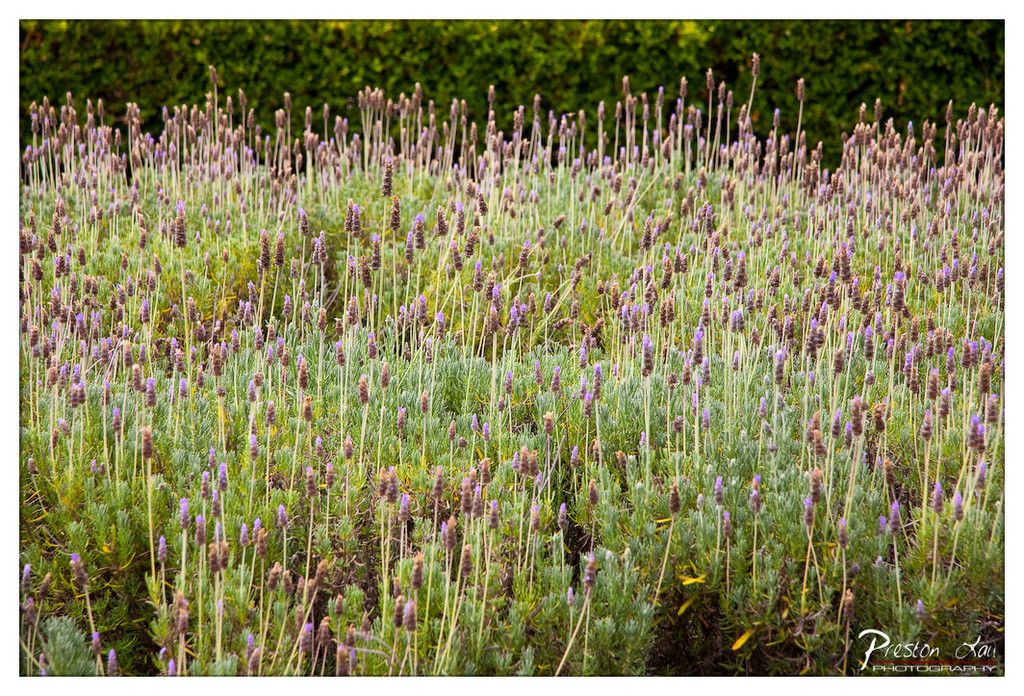

1. Overall Rating (0–10) — 7.0
This photograph captures the tranquil density of a lavender field in soft, natural light, evoking a sense of calm and botanical abundance. The rich textures of the purple blooms and silvery-green foliage create a visually soothing tapestry, though the composition feels slightly overexposed in the highlights, softening the crispness of the individual stems. With a stronger focal point and more deliberate framing, the image could achieve greater visual cohesion.
2. Composition (0–10) — 6.5
The frame is filled with a sea of lavender, creating a sense of immersion, but the lack of a clear focal point or leading line results in a somewhat scattered visual flow. A tighter crop or use of diagonal lines could guide the eye more effectively.
3. Lighting (0–10) — 7.5
Soft, diffused light enhances the natural hues of the lavender, avoiding harsh shadows and allowing the delicate textures to emerge. The gentle illumination contributes to the image’s serene mood.
4. Color & Tone (0–10) — 8.0
The palette is harmonious, with the purples and greens blending seamlessly into a natural gradient. The vibrancy is well-balanced, and the tonal range supports the organic feel of the scene.
5. Creativity (0–10) — 7.0
The image captures a familiar subject with a fresh, contemplative approach. The emphasis on texture and rhythm gives it an almost abstract quality, elevating it beyond a simple landscape photograph.
6. Technical Quality (0–10) — 8.0
Sharp focus across the frame highlights the fine details of the lavender stalks and leaves. The exposure is generally well-handled, though slight overexposure in the top portion detracts from subtlety.
7. Emotional Impact (0–10) — 7.5
The photograph evokes a quiet, meditative calm, inviting the viewer to pause and absorb the sensory richness of a blooming field. Its gentle rhythm and soft tones create a moment of peaceful connection with nature.
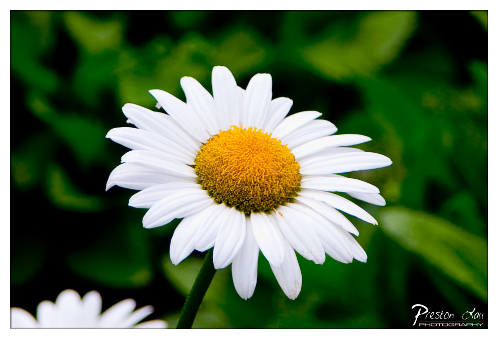

1. Overall Rating (0–10) — 8.0
This photograph captures the delicate beauty of a daisy in soft, natural light, evoking a sense of calm and simplicity. The vibrant yellow center contrasts sharply with the crisp white petals and lush green backdrop, creating a visually harmonious composition. While the image is strong in its clarity and color, the shallow depth of field slightly limits the contextual richness of the scene.
2. Composition (0–10) — 7.5
The daisy is centered with a slight offset, drawing the eye naturally to its intricate details. The blurred green background enhances the subject’s prominence, though the partial second flower in the lower-left corner adds a subtle distraction.
3. Lighting (0–10) — 8.0
Soft, diffused lighting highlights the texture of the petals and center without harsh shadows, giving the flower a gentle, lifelike glow. The light enhances the natural vibrancy of the subject.
4. Color & Tone (0–10) — 8.5
The contrast between the bright white petals, vivid yellow center, and deep green background creates a rich, balanced palette. The colors feel natural and well-saturated, contributing to the image’s freshness.
5. Creativity (0–10) — 7.0
While the subject is common, the photographer’s focus on detail and use of shallow depth of field lend a contemplative quality. The image feels like a quiet celebration of nature rather than a bold artistic statement.
6. Technical Quality (0–10) — 8.5
Sharp focus on the daisy, clean background blur, and even exposure demonstrate strong technical control. The watermark is discreet and does not detract from the image.
7. Emotional Impact (0–10) — 7.5
The image evokes a sense of tranquility and nostalgia, resonating with viewers through its simplicity and natural beauty. It invites quiet reflection on the small wonders of the natural world.
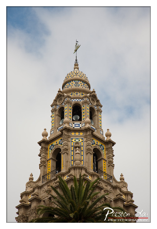

1. Overall Rating (0–10) — 7.5
This photograph captures the ornate grandeur of a Spanish Colonial Revival bell tower with striking clarity and reverence for architectural detail. The upward angle emphasizes the structure’s verticality and elegance, while the soft, overcast sky provides a neutral backdrop that allows the intricate tilework and stonework to stand out. The palm frond at the base adds a touch of natural framing and regional context, though its placement slightly interrupts the visual flow. The image succeeds in conveying both the craftsmanship of the building and a sense of place, though a touch more dynamic lighting could enhance its dramatic impact.
2. Composition (0–10) — 7.0
The low-angle perspective effectively conveys the tower’s height and dominance, while the palm frond grounds the image and adds a natural element. The subject is well-centered, but the frond partially obscures the lower portion of the tower, slightly disrupting the visual harmony.
3. Lighting (0–10) — 6.5
The soft, diffused light from the overcast sky minimizes harsh shadows, allowing the architectural details to be clearly visible. However, the lack of directional light reduces depth and dimensionality, giving the image a flat, even quality.
4. Color & Tone (0–10) — 7.5
The vibrant yellow and blue tile patterns contrast beautifully with the neutral stone and muted sky, creating a visually engaging palette. The color balance is natural and well-handled, with a subtle warmth that enhances the Mediterranean feel of the structure.
5. Creativity (0–10) — 7.0
The upward perspective and inclusion of the palm frond demonstrate thoughtful composition and a desire to convey cultural context. The image leans more toward architectural documentation than bold artistic interpretation, but its clarity and focus on detail lend it a quiet creativity.
6. Technical Quality (0–10) — 8.0
Sharp focus across the frame highlights the intricate details of the tower. The image is clean, with no noticeable noise or distortion, and the resolution is high enough to appreciate the fine craftsmanship.
7. Emotional Impact (0–10) — 7.0
The photograph evokes a sense of awe and appreciation for historical architecture, inviting the viewer to admire the artistry and cultural significance of the tower. The overcast sky lends a contemplative mood, though the lack of dramatic lighting keeps the emotional resonance restrained.
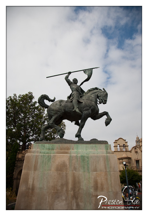

1. Overall Rating (0–10) — 7.0
This photograph captures the grandeur of a equestrian monument with a dramatic low-angle perspective that emphasizes its heroic stature. The dynamic pose of the rider and horse conveys motion and power, while the moody sky adds a sense of timelessness. Though the composition is strong, the overcast lighting and muted tones slightly dampen the visual impact, preventing the image from fully realizing its potential as a powerful artistic statement.
2. Composition (0–10) — 7.5
The low-angle framing enhances the monument’s imposing presence, with the rider centered and the horse’s powerful stride creating a strong diagonal line. The inclusion of surrounding architecture and foliage adds context without distracting from the subject.
3. Lighting (0–10) — 6.0
Diffused natural light from an overcast sky softens shadows and evenly illuminates the statue, but lacks the contrast and depth that directional light would provide. The sky’s brightness creates a slight imbalance, slightly washing out the upper portion of the frame.
4. Color & Tone (0–10) — 6.5
The palette is subdued, dominated by cool grays and muted greens from the patina on the bronze and stone. While cohesive, the lack of vibrant color reduces the image’s visual energy and emotional resonance.
5. Creativity (0–10) — 7.0
The choice of angle and framing gives the statue a mythic quality, transforming a historical monument into a cinematic figure. The juxtaposition of the heroic sculpture against the modern urban background adds narrative depth.
6. Technical Quality (0–10) — 8.0
The image is sharp and well-focused, with clear detail in the statue’s surface and texture. The exposure is balanced, and the depth of field is sufficient to keep the subject crisp while softly blurring the background.
7. Emotional Impact (0–10) — 6.5
The photograph evokes a sense of reverence and historical weight, but the somber lighting and lack of color intensity limit its ability to fully engage the viewer emotionally. The mood is contemplative rather than stirring.
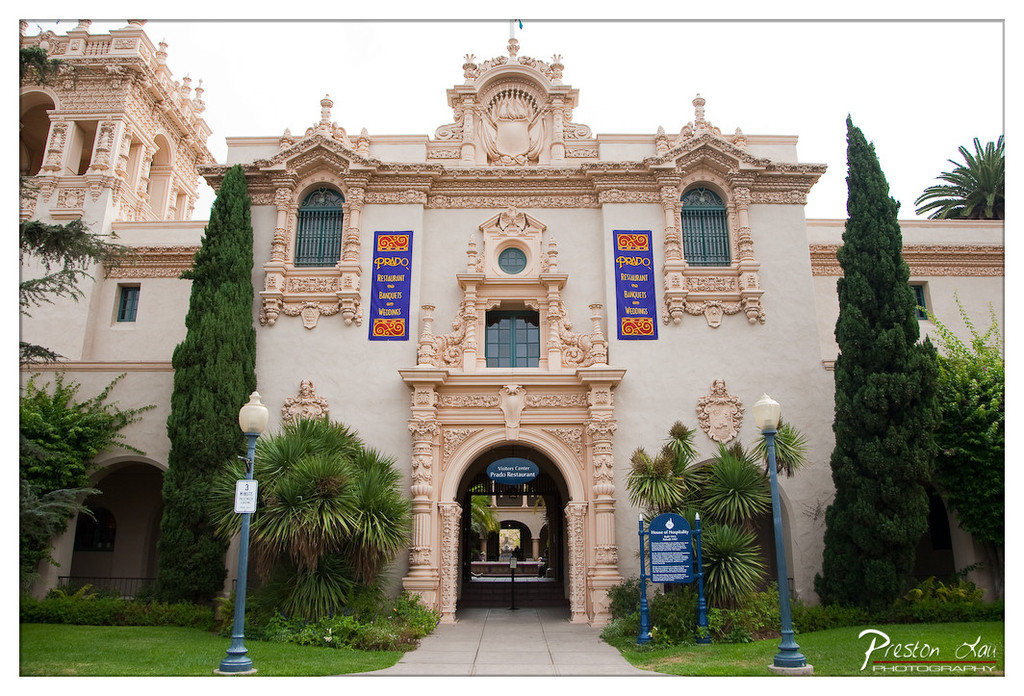

1. Overall Rating (0–10) — 7.0
This photograph captures the grandeur of a historic Spanish Colonial Revival structure with a sense of architectural dignity and cultural resonance. The symmetrical composition and rich detailing of the façade are highlighted effectively, though the overcast sky tempers the scene’s vibrancy. The image succeeds in conveying both the scale and elegance of the building, though it remains slightly restrained by its flat lighting and lack of dynamic contrast.
2. Composition (0–10) — 8.0
The centered framing emphasizes the symmetry of the architecture, drawing the eye directly to the ornate entrance. The flanking trees and lampposts provide balanced framing and lead the viewer into the scene, creating a natural path toward the archway.
3. Lighting (0–10) — 5.5
The soft, diffused light from the overcast sky minimizes harsh shadows and evenly illuminates the façade, allowing intricate details to be visible. However, the lack of directional sunlight reduces depth and drama, resulting in a somewhat flat and muted atmosphere.
4. Color & Tone (0–10) — 6.5
The warm beige of the stucco contrasts gently with the deep green of the trees and the rich blue of the banners, creating a harmonious palette. The tones are well-balanced, though the overall color temperature leans slightly cool, which slightly dampens the warmth typically associated with such architecture.
5. Creativity (0–10) — 6.0
The image is a straightforward architectural portrait, emphasizing clarity and detail over artistic interpretation. While the composition is strong, the approach is conventional, offering a realistic documentation rather than a unique visual narrative.
6. Technical Quality (0–10) — 8.0
The image is sharp and well-focused, with clean details visible in the ornamental stonework. The exposure is balanced, and the resolution is high, allowing for fine texture and clarity in both the building and surrounding foliage.
7. Emotional Impact (0–10) — 6.5
The photograph evokes a sense of reverence and historical continuity, inviting the viewer to appreciate the craftsmanship and cultural significance of the structure. While it lacks emotional intensity, it conveys a quiet pride and enduring beauty.
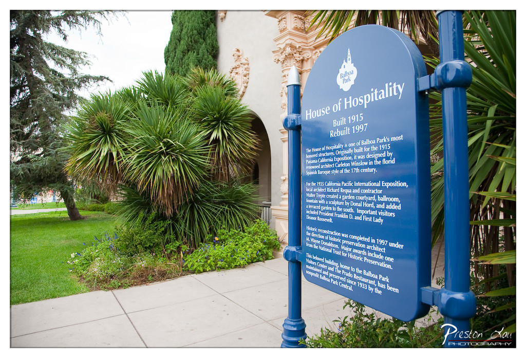

1. Overall Rating (0–10) — 6.8
This photograph captures the quiet dignity of a historic site, where architectural heritage and natural greenery coexist in deliberate harmony. The blue sign serves as both an informative anchor and a visual counterpoint to the earthy tones of the building and foliage, drawing the viewer into a story of preservation and memory. While the composition is balanced and the details clear, the image feels more documentary than evocative—functional in its purpose but lacking the emotional pull of a fully realized portrait.
2. Composition (0–10) — 7.0
The sign is well-framed on the right, creating a strong visual anchor, while the archway and plants on the left provide depth and balance. The diagonal path leads the eye naturally into the scene, though the overhang of the palm fronds slightly disrupts the clean lines of the architecture.
3. Lighting (0–10) — 6.5
Soft, diffused daylight evenly illuminates the scene, minimizing harsh shadows and allowing the details on the sign to remain legible. The overcast sky lends a neutral mood, but the lack of strong directional light limits the sense of depth and atmosphere.
4. Color & Tone (0–10) — 7.0
The deep blue of the sign contrasts effectively with the green foliage and beige stucco, creating a visually cohesive palette. The colors are rich but restrained, with a naturalistic tone that enhances the historical feel of the location.
5. Creativity (0–10) — 6.5
The image functions as a clear, informative document, but its creativity lies more in the arrangement of elements than in expressive interpretation. The inclusion of the sign as a central subject is thoughtful, but the narrative remains literal rather than poetic.
6. Technical Quality (0–10) — 8.0
Sharp focus across the frame, accurate exposure, and clean detail—especially on the text—demonstrate strong technical execution. The lens choice and depth of field are well-suited to the subject, preserving clarity without distortion.
7. Emotional Impact (0–10) — 6.0
The photograph evokes a sense of reverence for history and preservation, but the emotional resonance is subtle. It invites contemplation rather than stirring strong feeling, making it more of a quiet witness than an emotional experience.
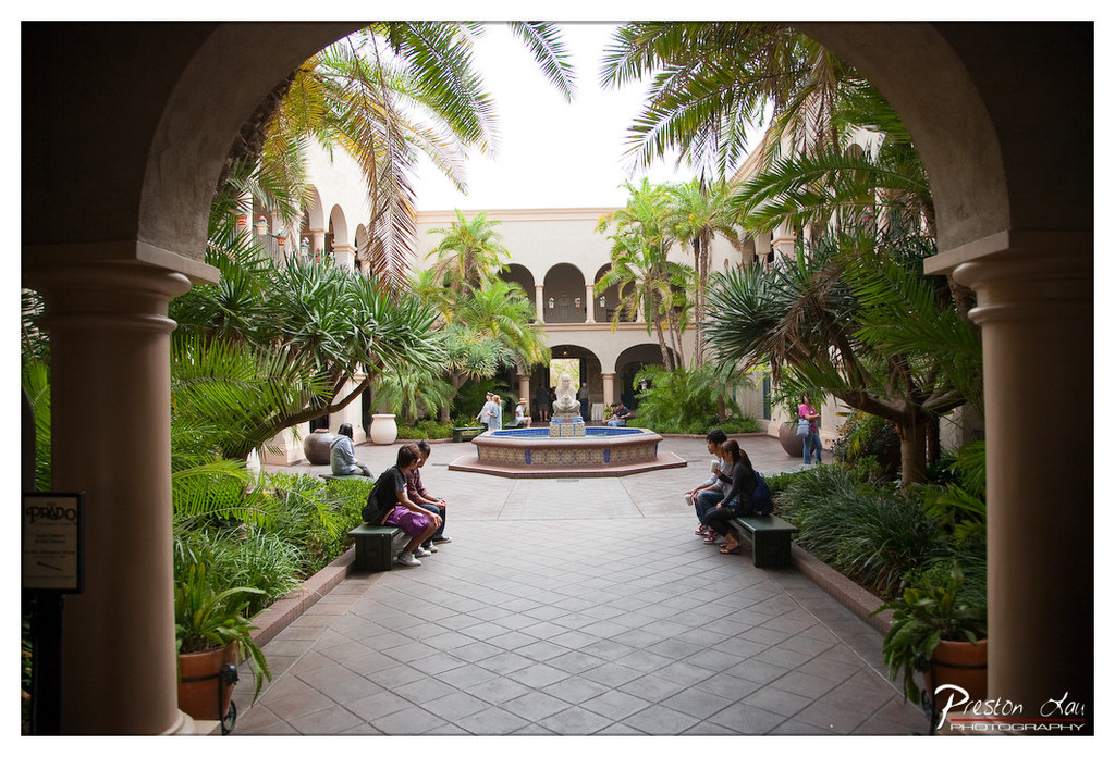

1. Overall Rating (0–10) — 7.5
This photograph captures the serene elegance of a Mediterranean-style courtyard, where architecture and nature harmonize to create a sense of timeless tranquility. The archway framing the scene draws the eye inward, guiding the viewer into a space of quiet contemplation, while the soft, diffused light enhances the lush greenery and warm stone textures. While the composition is strong and the mood inviting, the image’s slightly muted tones and lack of dynamic contrast keep it from achieving a truly striking presence.
2. Composition (0–10) — 8.0
The archway creates a natural frame, leading the eye through the space with strong visual depth. The placement of the fountain as a central focal point, balanced by the people seated on benches, offers symmetry and visual harmony.
3. Lighting (0–10) — 7.0
Soft, overcast light evenly illuminates the courtyard, minimizing harsh shadows and enhancing the calm atmosphere. The light is diffused, which suits the tranquil mood, though it slightly reduces the richness of textures and depth.
4. Color & Tone (0–10) — 7.0
The palette consists of earthy beiges, deep greens, and cool blues from the fountain, creating a cohesive and natural color scheme. While harmonious, the colors feel somewhat subdued, lacking the vibrancy that would make the scene pop.
5. Creativity (0–10) — 7.0
The use of the arch as a framing device is a classic but effective compositional choice, demonstrating a thoughtful approach to perspective. The photograph tells a quiet story of leisure and community, though it relies on familiar aesthetics rather than bold innovation.
6. Technical Quality (0–10) — 8.0
The image is sharp and well-focused throughout, with clean details in the architecture, foliage, and people. The exposure is balanced, and there are no noticeable technical flaws.
7. Emotional Impact (0–10) — 8.0
The photograph evokes a sense of peace and retreat, inviting the viewer to imagine themselves in the quiet courtyard, perhaps reading or simply enjoying the moment. The human presence adds warmth and relatability, enhancing the emotional resonance.
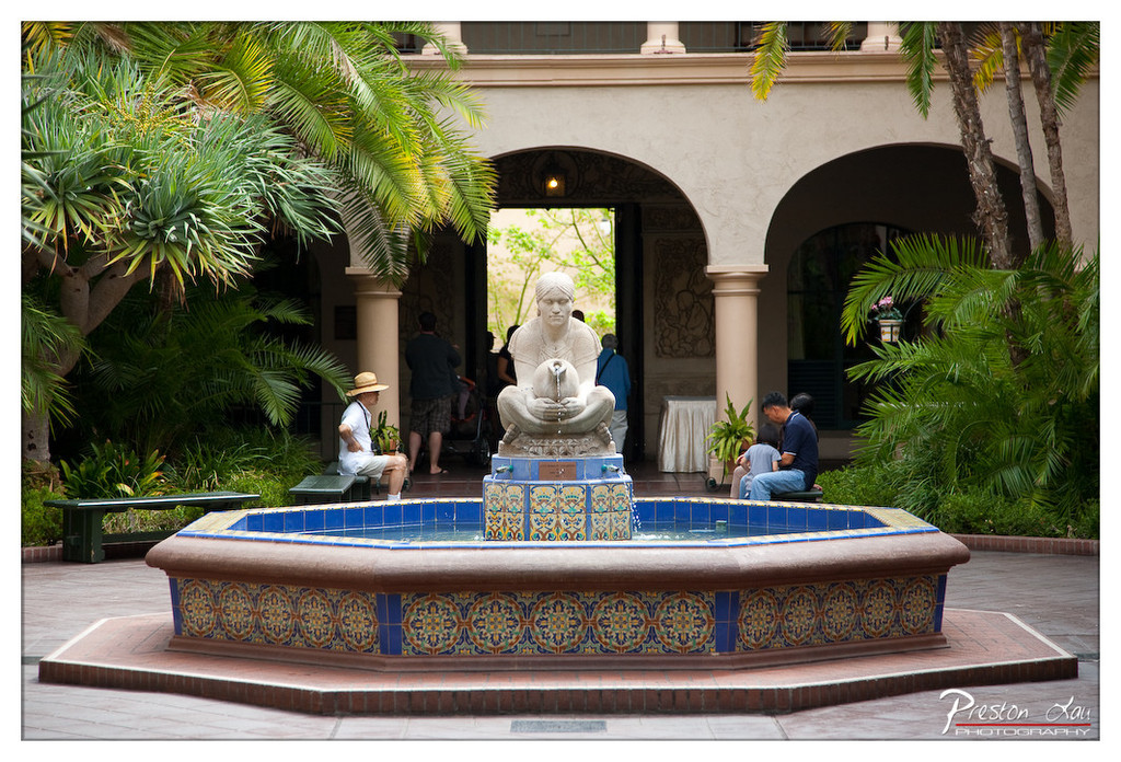

1. Overall Rating (0–10) — 7.0
This photograph captures a tranquil courtyard scene, where the interplay of architecture, nature, and human presence creates a harmonious sense of place. The fountain serves as a strong focal point, while the surrounding greenery and soft architectural lines lend a Mediterranean elegance. While the image is visually rich and layered, the slight clutter of people and objects in the background detracts from its compositional clarity, keeping it from achieving a fully refined aesthetic.
2. Composition (0–10) — 7.0
The fountain is well-centered, drawing the eye naturally, while the arches and foliage frame the scene effectively. The depth created by the layered elements—foreground fountain, mid-ground figures, and background archway—adds dimension, though the placement of the seated individuals slightly disrupts the visual balance.
3. Lighting (0–10) — 7.5
Soft, diffused daylight enhances the textures of the stone and tile, creating gentle shadows that add depth without overpowering the scene. The warm glow from the light source within the archway introduces a subtle focal warmth, complementing the natural light.
4. Color & Tone (0–10) — 8.0
The rich, earthy tones of the fountain tiles—deep blues, golds, and terracotta—stand out vividly against the lush greens of the palm fronds and the neutral beige of the building. The color harmony is strong, and the saturation enhances the image’s Mediterranean feel without appearing oversaturated.
5. Creativity (0–10) — 7.0
The photographer captures a moment of quiet life within a culturally rich setting, blending stillness and movement. The choice to include people in the background adds narrative depth, suggesting a living space rather than a staged scene, which gives the image a sense of authenticity.
6. Technical Quality (0–10) — 8.5
The image is sharp and well-focused, particularly on the fountain and the surrounding tiles. The depth of field is appropriately managed, keeping the main subject crisp while softly blurring the background. The exposure is balanced, with no significant overexposed or underexposed areas.
7. Emotional Impact (0–10) — 7.5
The photograph evokes a sense of calm and contemplation, inviting the viewer into a peaceful, sun-dappled courtyard. The presence of people enjoying the space adds warmth and relatability, enhancing the feeling of serenity and connection to place.
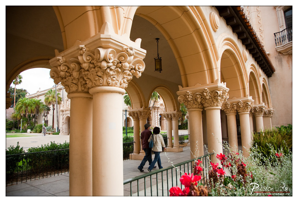

1. Overall Rating (0–10) — 7.5
This photograph captures the timeless elegance of a Spanish Colonial Revival courtyard, where architectural grandeur meets human movement. The ornate columns and rhythmic arches create a sense of depth and rhythm, while the couple strolling through the space adds narrative warmth and scale. The image balances formal composition with candid life, though a more deliberate focus on light and color could elevate its emotional resonance.
2. Composition (0–10) — 8.0
The repeating arches create a strong leading line, guiding the eye toward the couple and into the background. The foreground column anchors the frame, while the flowering plants add softness and contrast. The off-center placement of the couple enhances naturalism, though the composition slightly favors the left side.
3. Lighting (0–10) — 7.0
Soft, diffused daylight evenly illuminates the scene, highlighting the texture of the stonework without harsh shadows. The overhead lantern adds a subtle point of interest, though the overall lighting lacks dramatic contrast or directional warmth.
4. Color & Tone (0–10) — 7.5
The warm, earthy tones of the architecture harmonize beautifully with the vibrant red flowers in the foreground. The color palette is cohesive and inviting, with a slight cool cast in the background that adds depth and visual interest.
5. Creativity (0–10) — 7.0
The photograph successfully blends architectural beauty with everyday life, creating a narrative of movement and place. The framing and use of depth are thoughtful, but the concept remains grounded in traditional travel photography rather than pushing stylistic boundaries.
6. Technical Quality (0–10) — 8.0
Sharp focus on the foreground column and consistent clarity throughout the image reflect strong technical execution. The depth of field is well-managed, keeping both the foreground and background in view while maintaining detail.
7. Emotional Impact (0–10) — 7.0
The image evokes a sense of calm, leisure, and cultural richness, inviting the viewer to imagine walking through the arches themselves. The presence of the couple adds a human touch, making the space feel alive and welcoming.
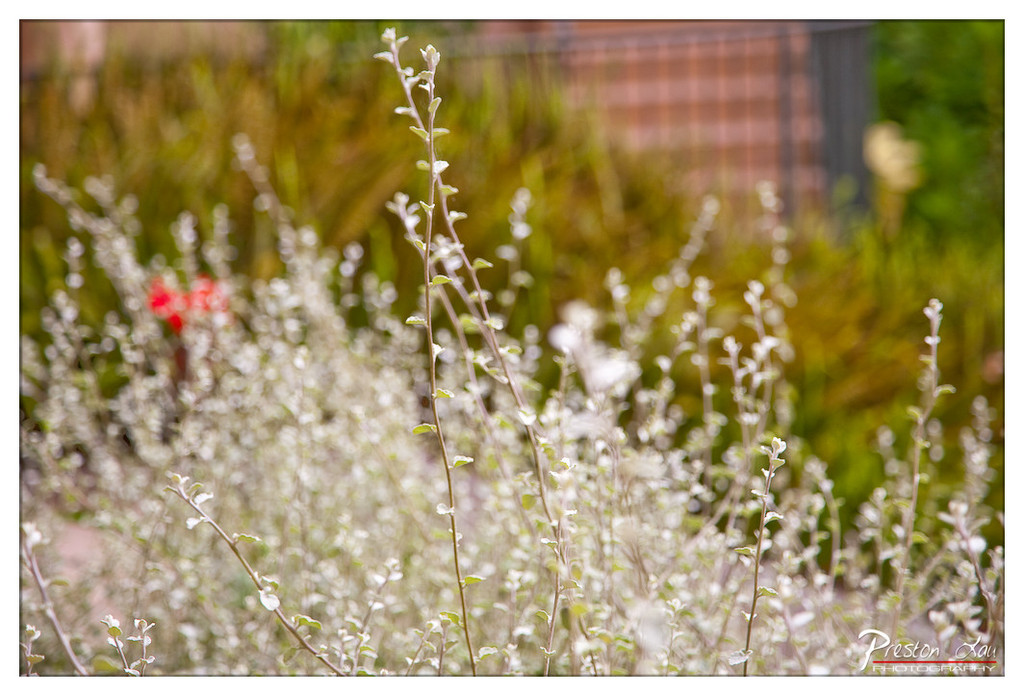

1. Overall Rating (0–10) — 7.0
This photograph captures a serene, sun-dappled garden scene with a dreamy, ethereal quality, where delicate white foliage takes center stage against a softly blurred backdrop. The shallow depth of field creates a painterly effect, drawing the eye to the intricate textures of the plants, while the subtle pop of red in the distance adds a touch of visual intrigue. Though the image is aesthetically pleasing and well-executed, it leans slightly toward the passive, lacking a stronger focal narrative or emotional punch.
2. Composition (0–10) — 7.0
The subject is well-placed with a natural, diagonal flow from the lower left to the upper right, guiding the viewer’s gaze through the frame. The use of foreground and background blur creates a pleasing sense of depth, though the composition feels slightly unbalanced due to the absence of a dominant focal point.
3. Lighting (0–10) — 8.0
Natural, diffused sunlight enhances the softness of the scene, casting a gentle glow that highlights the silvery leaves without harsh shadows. The light contributes to the tranquil mood, with a subtle warmth that complements the green and white tones.
4. Color & Tone (0–10) — 7.5
The palette is harmonious, dominated by soft whites, muted greens, and a delicate contrast from the red accent. The tonal range is well-managed, with a gentle balance between light and shadow that supports the image’s calm, natural aesthetic.
5. Creativity (0–10) — 7.0
The photographer employs a creative use of shallow depth of field and color contrast to transform a simple garden scene into something more poetic and contemplative. The approach is thoughtful, though it follows a familiar aesthetic rather than pushing into bold or experimental territory.
6. Technical Quality (0–10) — 8.0
The focus is sharp on the central stems, with a smooth transition into the background blur. The image is clean, with no noticeable noise or artifacts, and the watermark is tastefully placed in the corner.
7. Emotional Impact (0–10) — 7.5
The photograph evokes a sense of peace and quiet contemplation, inviting the viewer to pause and appreciate the delicate beauty of nature. The soft focus and gentle colors create a meditative mood, though the emotional resonance is subtle rather than profound.
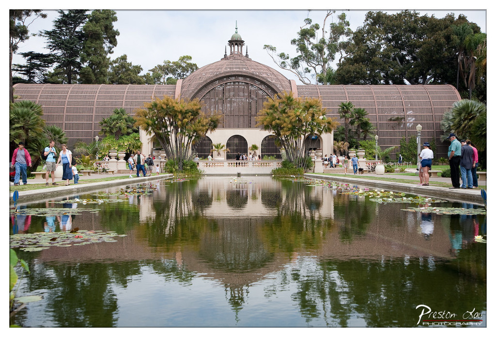

1. Overall Rating (0–10) — 7.5
This photograph captures the serene elegance of a grand conservatory reflected in a tranquil pond, evoking a sense of balance and timelessness. The composition draws the eye toward the domed structure, while the scattered visitors lend a gentle human presence without disrupting the scene’s harmony. Though the lighting is somewhat flat and the reflections slightly muted, the image successfully conveys the peaceful atmosphere of a botanical garden, blending architecture and nature with quiet grace.
2. Composition (0–10) — 8.0
The symmetrical framing centers the conservatory, with the pond acting as a natural mirror that enhances depth and balance. The placement of people along the edges adds scale and life, while the surrounding foliage guides the eye toward the focal point.
3. Lighting (0–10) — 6.0
Diffused daylight softens shadows and creates even illumination, but the overcast sky results in a lack of contrast and highlights, slightly dampening the image’s visual punch.
4. Color & Tone (0–10) — 7.0
The palette is rich with earthy browns, soft greens, and muted reflections in the water, creating a cohesive and naturalistic tone. The slight green cast in the pond adds a subtle moody quality, enhancing the scene’s calm atmosphere.
5. Creativity (0–10) — 7.0
The photographer leverages reflection and symmetry to transform a familiar scene into something visually striking, emphasizing the interplay between architecture and nature. The choice to include visitors adds narrative depth without overwhelming the composition.
6. Technical Quality (0–10) — 8.0
The image is sharp and detailed, with a well-balanced exposure and minimal noise. The reflection is clear enough to be a compelling visual element, though slight softness in the water suggests a slower shutter speed or minor motion blur.
7. Emotional Impact (0–10) — 7.5
The photograph evokes a sense of calm and contemplation, inviting the viewer to pause and appreciate the harmony of design and nature. The quiet activity of visitors adds a layer of gentle human warmth, making the scene feel both grand and accessible.
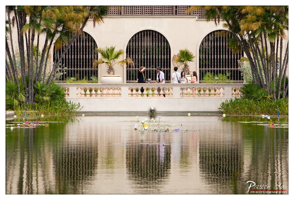

1. Overall Rating (0–10) — 7.5
This photograph captures a serene moment in a lush garden, where the stillness of the water mirrors the elegance of the architecture and the quiet activity of visitors. The composition balances natural elements with human presence, creating a sense of harmony and timelessness. While the image is rich in atmosphere, its emotional depth is slightly restrained by a lack of dynamic contrast and a somewhat generic color palette.
2. Composition (0–10) — 8.0
The symmetrical arrangement of the arches and the reflective surface of the pond create a balanced, visually pleasing frame. The placement of the people along the balustrade adds depth and scale, while the palm fronds on the left and right edges anchor the scene, drawing the eye toward the center.
3. Lighting (0–10) — 7.0
Soft, diffused daylight enhances the tranquil mood, minimizing harsh shadows and allowing the reflections on the water to appear smooth and clear. The even lighting supports the calm tone but lacks the dramatic interplay of light and shadow that could elevate the image’s visual impact.
4. Color & Tone (0–10) — 6.5
The dominant greens and muted beige tones create a cohesive palette, but the overall color rendering feels slightly flat. A touch more saturation in the water lilies and a subtle boost in contrast would bring the colors to life and enhance the visual richness.
5. Creativity (0–10) — 7.0
The photographer captures a timeless, almost cinematic quality by blending architecture, nature, and human interaction. The use of reflection as a compositional tool adds a layer of visual interest and invites contemplation, though the scene itself is more observational than boldly inventive.
6. Technical Quality (0–10) — 8.0
The image is sharp and well-focused, with clear details in both the foreground and background. The water’s surface is smooth, and the reflections are crisp, indicating strong technical control and careful attention to exposure.
7. Emotional Impact (0–10) — 7.0
The photograph evokes a sense of peace and quiet reflection, inviting the viewer to pause and absorb the beauty of a carefully composed garden moment. The presence of people adds a gentle human element, suggesting a shared experience of tranquility without disrupting the serenity.
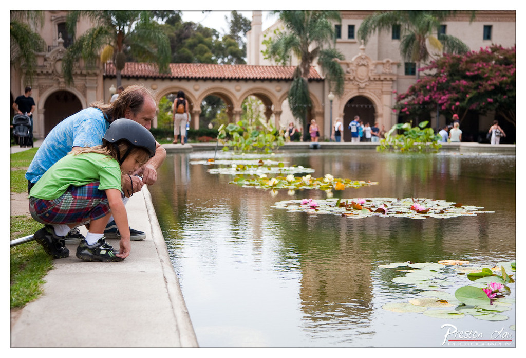

1. Overall Rating (0–10) — 7.5
This photograph captures a tender, candid moment between a man and a child at a serene outdoor pond, evoking warmth and quiet connection. The setting—rich with architectural detail and blooming lilies—adds a layer of visual poetry, while the natural interaction between the subjects grounds the image in authenticity. Though the composition is slightly cluttered by background activity, the emotional resonance of the scene elevates it beyond a simple snapshot.
2. Composition (0–10) — 7.0
The subjects are well-placed along the left third, drawing the eye into the frame, while the pond and lilies create a natural leading line toward the center. The background architecture provides context without overwhelming, though the scattered people on the far side slightly disrupt visual harmony.
3. Lighting (0–10) — 7.5
Soft, diffused daylight enhances the scene’s calm mood, with gentle highlights on the water and foliage. The even exposure preserves detail in both shadows and highlights, contributing to the image’s naturalistic feel.
4. Color & Tone (0–10) — 8.0
The palette is rich yet balanced, with the green of the child’s shirt and the pink blossoms creating vibrant focal points against the earthy tones of the architecture and water. The overall tone is warm and inviting, with excellent color harmony.
5. Creativity (0–10) — 7.5
The image succeeds in capturing a fleeting, intimate moment within a public space, transforming an ordinary scene into something emotionally resonant. The photographer’s choice to focus on the interaction rather than the landmark gives the image a personal, narrative quality.
6. Technical Quality (0–10) — 8.0
The image is sharp and well-focused, with clear details in both the foreground and background. The depth of field is appropriately managed, keeping the subjects crisp while softly blurring the distant activity.
7. Emotional Impact (0–10) — 8.5
The genuine connection between the man and child, combined with the tranquil setting, evokes a strong sense of care and wonder. The viewer is drawn into a quiet, reflective moment that feels both universal and deeply personal.
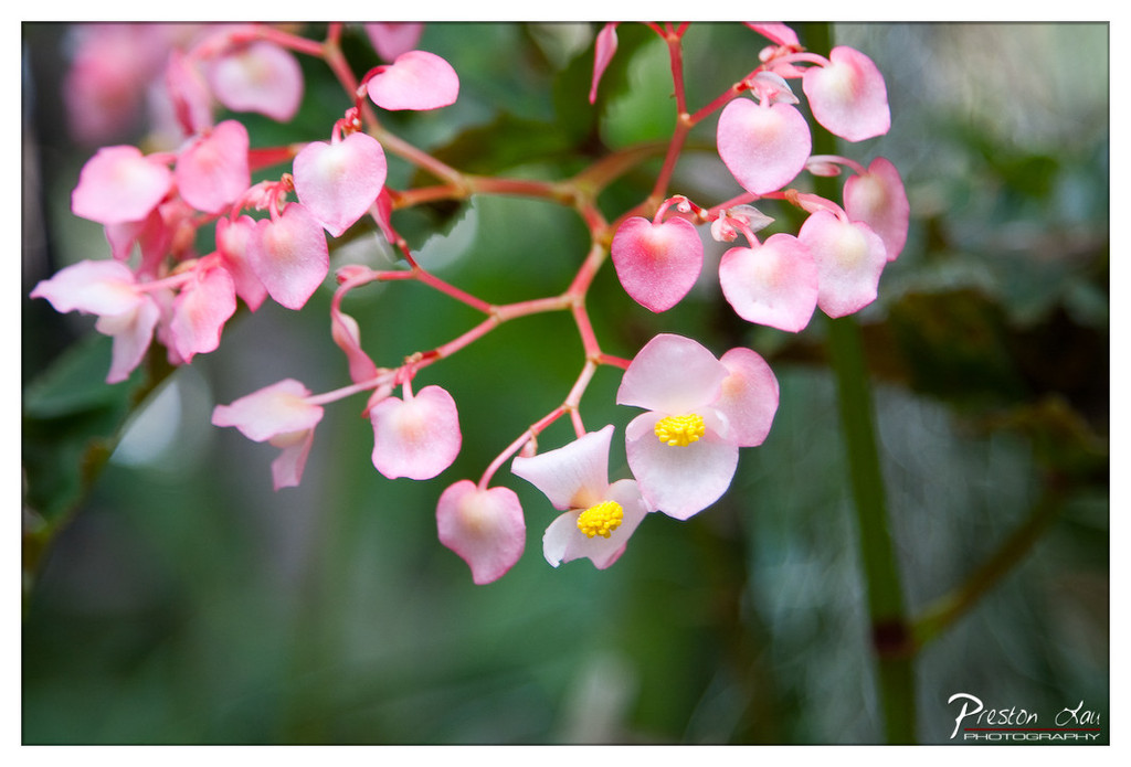

1. Overall Rating (0–10) — 7.5
This photograph captures the delicate grace of heart-shaped begonia blossoms in soft, natural light, evoking a sense of quiet beauty and gentle movement. The shallow depth of field isolates the flowers from their surroundings, creating a dreamlike intimacy, though the composition's slight asymmetry and faint watermark slightly detract from its overall elegance.
2. Composition (0–10) — 7.0
The diagonal arrangement of the flower cluster guides the eye naturally through the frame, while the negative space on the right provides balance. The focus on the lower-right blooms creates a focal point, though the inclusion of the watermark in the corner disrupts the visual flow.
3. Lighting (0–10) — 8.0
Soft, diffused light enhances the translucence of the petals and highlights their subtle gradations of pink. The gentle illumination adds depth without harsh shadows, contributing to the image’s serene and natural mood.
4. Color & Tone (0–10) — 8.0
The soft pink petals contrast beautifully with the muted green background, while the bright yellow centers add a pop of warmth. The color harmony is gentle and cohesive, with a natural tonal range that feels both delicate and vibrant.
5. Creativity (0–10) — 7.5
The choice to emphasize the heart-shaped form of the flowers and the use of shallow depth of field demonstrate a thoughtful approach to storytelling. The image captures a fleeting moment of botanical elegance, inviting quiet contemplation.
6. Technical Quality (0–10) — 8.5
Sharp focus on the foreground blooms contrasts with a smoothly blurred background, showcasing excellent control of depth of field. The image is clean, with minimal noise and well-handled detail in the petals.
7. Emotional Impact (0–10) — 8.0
The photograph evokes a sense of calm and tenderness, drawing the viewer into a quiet moment of natural beauty. The soft focus and delicate subject matter create an intimate, almost meditative emotional connection.
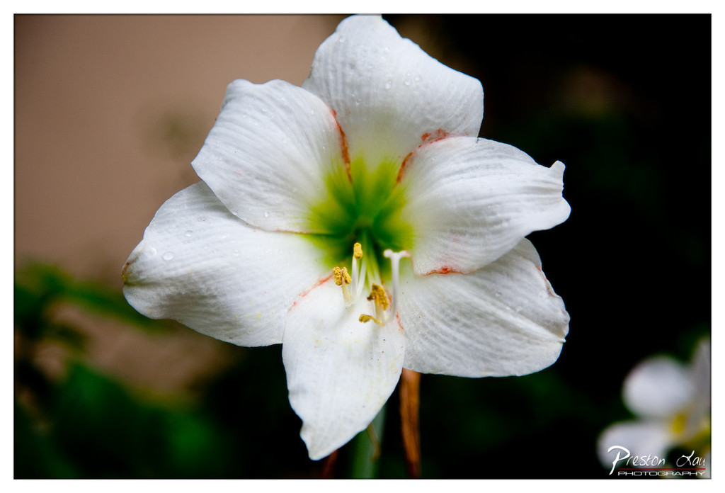

1. Overall Rating (0–10) — 8.0
This photograph captures the delicate elegance of a white amaryllis in exquisite detail, with water droplets glistening on its soft petals and a vibrant green center drawing the eye. The shallow depth of field isolates the flower beautifully, creating a sense of intimacy and stillness. While the composition is strong and the subject is compelling, the slightly overexposed background and subtle color cast detract from its overall refinement, keeping it from reaching full artistic potential.
2. Composition (0–10) — 8.0
The flower is centered with a slight tilt, creating a natural, organic feel. The use of negative space on the right and blurred background elements guide the eye directly to the bloom, emphasizing its form and texture.
3. Lighting (0–10) — 7.5
Soft, diffused light highlights the flower’s texture and droplets without harsh shadows. The light enhances the flower’s purity and delicacy, though the background remains underexposed, slightly obscuring context.
4. Color & Tone (0–10) — 7.0
The dominant white of the petals contrasts beautifully with the green center and subtle red streaks. The tone is balanced, though the warm background hue slightly mutes the natural coolness of the flower, giving the image a slightly artificial warmth.
5. Creativity (0–10) — 7.5
The choice to focus on the intimate details of the flower—droplets, texture, and inner structure—elevates a simple subject into something poetic. The shallow depth of field and tight framing suggest a quiet, contemplative narrative.
6. Technical Quality (0–10) — 8.5
The focus is sharp on the flower’s center, with crisp detail in the stamen and petals. The image is clean, with no noticeable noise, and the bokeh is smooth and pleasing.
7. Emotional Impact (0–10) — 8.0
The image evokes a sense of tranquility and quiet beauty, inviting the viewer to pause and appreciate the fragile elegance of nature. The softness and detail stir a gentle emotional resonance, suggesting renewal and stillness.
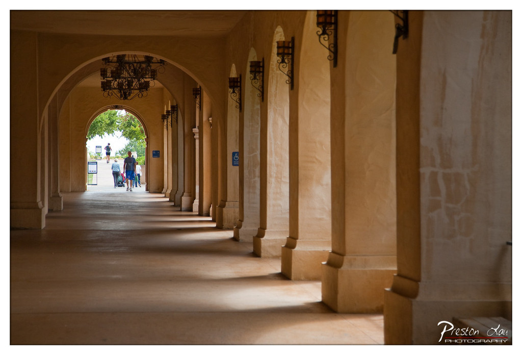

1. Overall Rating (0–10) — 7.5
This photograph captures a serene and timeless moment within a sun-dappled colonnade, where architecture and light converge to create a sense of quiet movement and depth. The long perspective draws the eye through the arches toward the bright exit, where figures walk in relaxed motion, grounding the scene in life and narrative. While the warm tones and soft light lend a painterly quality, the image could benefit from slightly more contrast to heighten its dramatic presence.
2. Composition (0–10) — 8.0
The strong leading lines of the arches and columns create a powerful sense of depth and symmetry, guiding the viewer’s gaze naturally toward the figures at the far end. The central alignment of the walkway reinforces balance, while the subtle asymmetry of the lanterns and signage adds visual interest without disrupting harmony.
3. Lighting (0–10) — 8.0
The interplay of warm sunlight and soft shadows enhances the texture of the stucco walls and adds dimension to the corridor. The light pools at the far end, naturally highlighting the exit and creating a luminous focal point that draws the eye forward with quiet elegance.
4. Color & Tone (0–10) — 7.5
The warm, earthy palette of golden yellows and soft tans evokes a Mediterranean or Spanish colonial atmosphere, with the subtle green of the trees at the end providing a refreshing contrast. The tonal range is rich but restrained, allowing the scene to feel calm and cohesive.
5. Creativity (0–10) — 7.0
The image succeeds in transforming an architectural space into a narrative passage, using light and perspective to suggest journey and continuity. While the concept is grounded in classic architectural photography, the choice of timing and framing gives it a contemplative, almost cinematic quality.
6. Technical Quality (0–10) — 8.0
Sharp focus across the frame, with excellent clarity in the foreground and midground, ensures that textures and details remain crisp. The exposure is well-balanced, preserving highlights in the distant light while maintaining depth in the shadows.
7. Emotional Impact (0–10) — 7.0
There’s a gentle sense of peace and introspection in the image, evoking the feeling of a quiet moment between movement and stillness. The presence of people adds a human element that invites the viewer to imagine their story, creating a quiet emotional resonance.
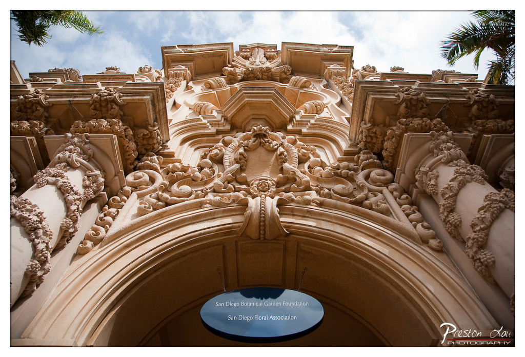

1. Overall Rating (0–10) — 8.0
This photograph captures the grandeur and intricate artistry of a historic architectural facade with striking clarity and reverence. The low-angle perspective emphasizes the monumentality of the structure, while the warm, sunlit stone and dramatic sky create a sense of timelessness and elegance. The inclusion of the sign adds narrative context without disrupting the visual harmony, though the composition could benefit from slightly more dynamic framing to elevate its artistic impact.
2. Composition (0–10) — 8.0
The low-angle view enhances the verticality and complexity of the ornate stonework, drawing the eye upward along the arches and columns. The balanced symmetry and use of leading lines guide the viewer’s gaze effectively, though the inclusion of the sign slightly interrupts the visual flow.
3. Lighting (0–10) — 8.5
Natural sunlight bathes the stone in warm, golden tones, accentuating the depth and texture of the carvings. The contrast between light and shadow adds dimension and drama, while the soft clouds in the sky provide a dynamic backdrop that complements the architectural detail.
4. Color & Tone (0–10) — 8.0
The warm beige and cream tones of the stone harmonize beautifully with the blue sky and the deep blue of the sign, creating a balanced and aesthetically pleasing palette. The subtle contrast between the sunlit areas and shaded recesses enhances the image’s depth and mood.
5. Creativity (0–10) — 7.5
The choice to capture the structure from a low angle and include the sign adds narrative context, transforming the image from a simple architectural record into a story of cultural preservation. While the composition is strong, the approach remains relatively conventional in its storytelling.
6. Technical Quality (0–10) — 9.0
The image is exceptionally sharp, with fine detail visible in every sculpted element. The focus is precise, and the exposure is well-balanced, capturing both the bright highlights and shadowed recesses without loss of detail.
7. Emotional Impact (0–10) — 7.5
The photograph evokes a sense of awe and appreciation for craftsmanship and history, inviting the viewer to pause and reflect on the artistry of the past. The warmth of the light and the grandeur of the architecture create a feeling of reverence and timelessness.
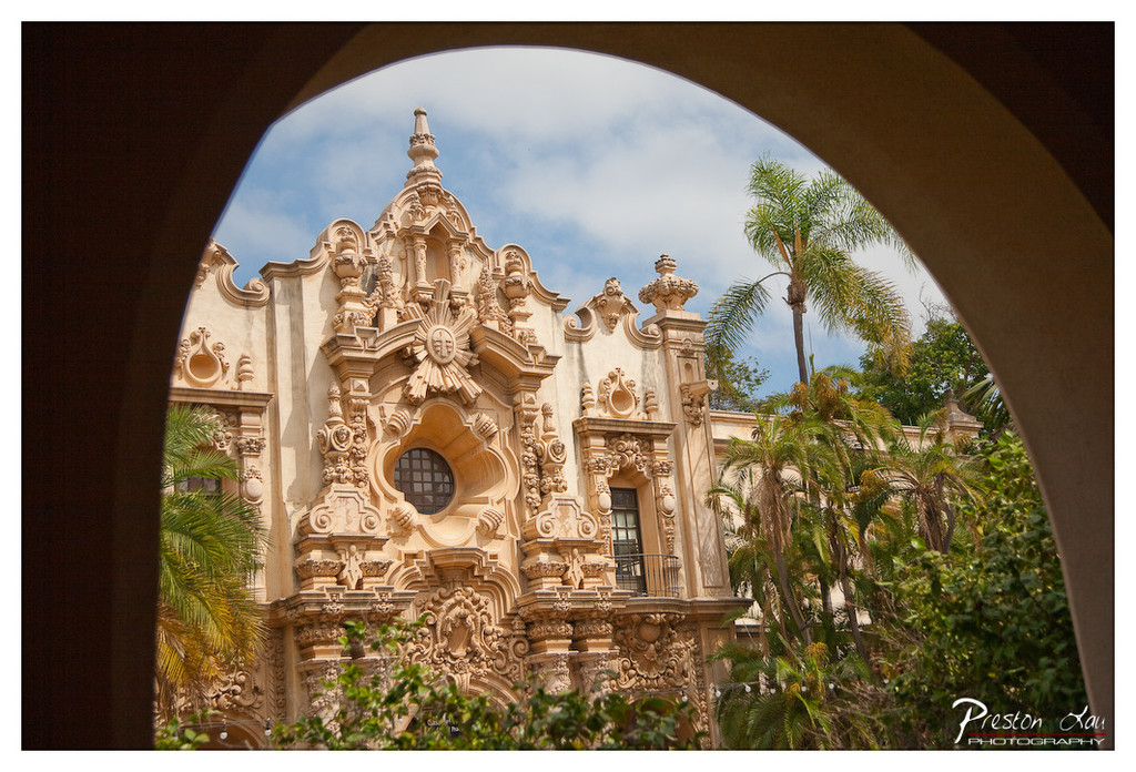

1. Overall Rating (0–10) — 8.0
This photograph masterfully frames a richly detailed Spanish Colonial Revival facade through a dark, arched opening, creating a sense of discovery and depth. The ornate architecture, with its intricate stonework and warm golden tones, stands in striking contrast to the soft blue sky and lush palm fronds, evoking a timeless, romantic atmosphere. While the image is visually compelling, the heavy vignette slightly overwhelms the composition, drawing attention to the frame rather than the subject.
2. Composition (0–10) — 8.5
The arch serves as a natural frame, guiding the viewer’s eye toward the central building and enhancing depth. The subject is well-centered, with the foliage at the bottom adding balance and grounding the scene.
3. Lighting (0–10) — 7.5
Natural daylight illuminates the façade evenly, highlighting its elaborate textures. The soft, diffused light enhances the warm tones of the stone while the sky provides a gentle contrast.
4. Color & Tone (0–10) — 8.0
The palette is harmonious, with earthy beige and cream tones of the architecture complemented by vibrant greens and a pale blue sky. The warm color temperature enhances the historic and inviting mood.
5. Creativity (0–10) — 8.5
The use of the arch as a framing device adds a narrative quality, transforming a simple architectural view into a moment of visual storytelling. The photographer’s choice of perspective and framing demonstrates strong artistic intent.
6. Technical Quality (0–10) — 8.5
Sharp focus on the building’s intricate details, precise exposure, and clean handling of highlights and shadows reflect strong technical execution.
7. Emotional Impact (0–10) — 8.0
The image evokes a sense of awe and tranquility, inviting the viewer to imagine stepping into a forgotten courtyard of a grand old mission. The interplay of light, shadow, and history creates a deeply evocative and contemplative mood.
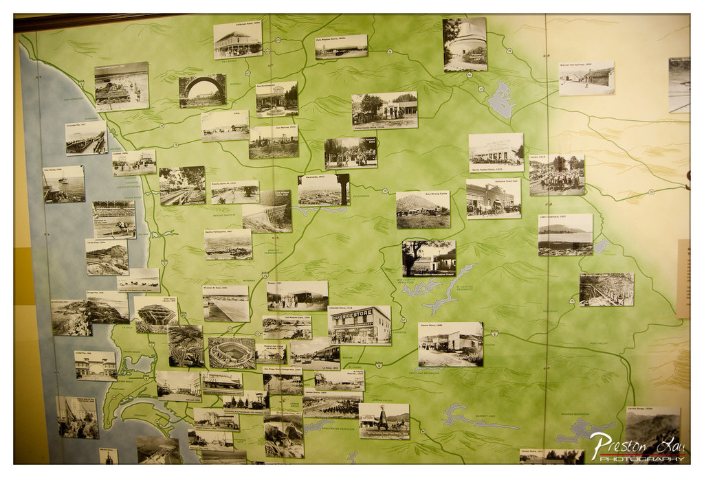

1. Overall Rating (0–10) — 6.8
This photograph captures a richly layered historical display, where a green-toned map serves as a canvas for a collage of vintage photographs, evoking a sense of nostalgia and regional storytelling. The interplay between the archival images and the geographical layout creates a compelling narrative of place and time, though the composition feels slightly crowded and the warm color cast lends a dated quality. While the image succeeds in conveying historical depth, it falls short of visual elegance due to its dense arrangement and lack of clear focal hierarchy.
2. Composition (0–10) — 5.8
The frame is filled with a dense arrangement of photographs, creating a busy, cluttered effect. While the map provides structure, the uneven placement of images disrupts visual flow and draws attention away from any single point of focus.
3. Lighting (0–10) — 6.0
The lighting is even and ambient, likely from indoor sources, which preserves detail across the map and photographs. However, the lack of directional light or contrast results in a flat, somewhat lifeless appearance, diminishing the image's atmospheric potential.
4. Color & Tone (0–10) — 6.5
The warm, sepia-tinged color palette enhances the nostalgic tone, but the dominant green of the map and the yellowish tint across the image create a monotonous and slightly unnatural color harmony. While the tonal choices support the historical theme, they limit visual vibrancy.
5. Creativity (0–10) — 7.0
The concept of overlaying historical photos onto a map is inherently creative and thoughtfully executed. The juxtaposition of time and space tells a layered story, though the execution leans more toward documentation than artistic interpretation.
6. Technical Quality (0–10) — 7.5
The image is sharp and clear, with fine detail visible in both the map and the photographs. Focus is consistent across the frame, and the lack of motion blur or noise indicates strong technical control.
7. Emotional Impact (0–10) — 6.0
The image stirs a sense of curiosity and reverence for the past, but the sheer volume of details and lack of a clear focal point prevent a deeper emotional connection. The viewer is invited to explore, but not to feel.
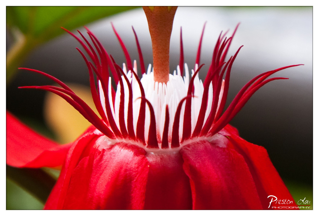

1. Overall Rating (0–10) — 8.5
This macro photograph captures the intricate, almost alien beauty of a flower’s center with striking clarity and vivid contrast. The bold red filaments radiating from the white core create a dynamic visual tension, drawing the eye into the heart of the bloom. While the composition is compelling, the slightly overexposed background detracts from the sense of depth, preventing the image from achieving full artistic cohesion.
2. Composition (0–10) — 8.0
The flower is centered with strong symmetry, emphasizing its natural geometry. The tight framing isolates the subject effectively, though the slight asymmetry in the foreground petals introduces a subtle imbalance that adds visual interest.
3. Lighting (0–10) — 8.5
The lighting is soft and even, highlighting the delicate textures of the filaments without harsh shadows. A gentle backlighting enhances the translucency of the red petals and the crispness of the white center, creating a luminous effect.
4. Color & Tone (0–10) — 9.0
The vibrant red and stark white create a powerful contrast, amplified by the rich saturation. The tonal range is well-balanced, with the dark background providing a dramatic backdrop that makes the colors pop.
5. Creativity (0–10) — 9.0
The image transforms a common floral subject into something extraordinary through a bold, close-up perspective. The interplay of form, color, and texture suggests a narrative of organic complexity, evoking both scientific curiosity and artistic wonder.
6. Technical Quality (0–10) — 9.0
The focus is sharp on the central filaments, with a shallow depth of field that beautifully blurs the surroundings. The resolution and clarity are excellent, capturing fine details with precision.
7. Emotional Impact (0–10) — 8.0
The photograph evokes a sense of awe and intimacy, inviting the viewer to contemplate the hidden intricacies of nature. The bold colors and detailed composition create a moment of quiet fascination that lingers.
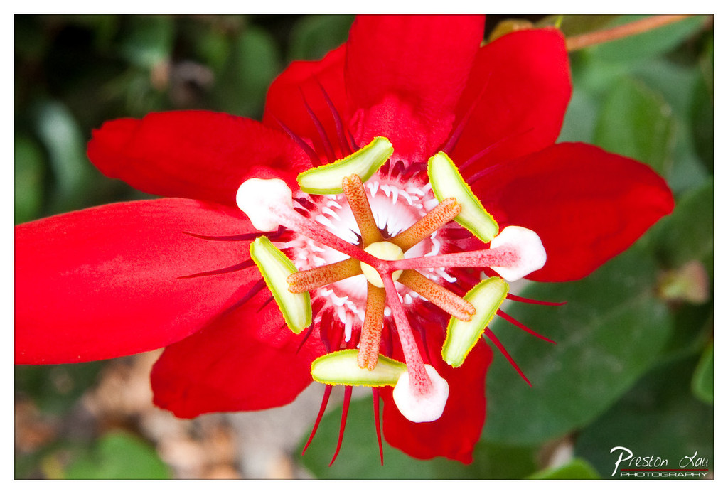

1. Overall Rating (0–10) — 8.5
This image captures the vibrant complexity of a passionflower in striking detail, where vivid red petals contrast dramatically with the intricate, star-like center. The composition draws the eye inward, emphasizing the flower’s natural symmetry and biological artistry. While the depth of field is tight and the background softly blurred, the image occasionally feels slightly over-processed in its color saturation, which slightly undermines the organic feel of the subject.
2. Composition (0–10) — 9.0
The flower is centered and framed tightly, creating a strong focal point. The radial symmetry of the bloom guides the viewer’s gaze toward the core, while the surrounding green foliage provides natural balance without distracting from the subject.
3. Lighting (0–10) — 8.0
Natural, diffused light enhances the flower’s rich reds and delicate textures, avoiding harsh shadows. The soft illumination highlights the intricate stamen and filaments, adding dimension and clarity to the center of the bloom.
4. Color & Tone (0–10) — 9.0
The color palette is bold and harmonious, with the saturated red petals contrasting beautifully against the pale green and white structures at the flower’s core. The tones are vivid yet natural, with a slight boost in saturation that enhances visual impact without appearing unnatural.
5. Creativity (0–10) — 8.5
The photographer captures a moment of botanical elegance with a clear artistic intent—celebrating the intricate beauty of nature. The choice of macro perspective and tight framing transforms a common flower into a dramatic, almost alien-like spectacle.
6. Technical Quality (0–10) — 9.0
Sharp focus on the flower’s center ensures crisp detail in the filaments and stigma, while the background remains softly blurred. The image is well-exposed, with no signs of noise or motion blur, demonstrating strong technical control.
7. Emotional Impact (0–10) — 8.0
The image evokes a sense of wonder and admiration for the complexity of natural forms. The vivid colors and intimate perspective invite the viewer to pause and appreciate the delicate beauty of a single bloom, creating a moment of quiet awe.
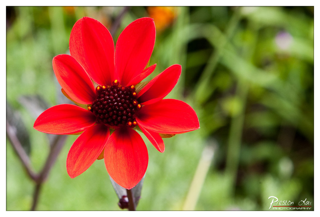

1. Overall Rating (0–10) — 8.0
This photograph captures the vibrant energy of a single dahlia in full bloom, its fiery red petals radiating against a soft, green backdrop. The shallow depth of field isolates the flower with striking clarity, transforming a simple garden scene into a moment of bold, natural elegance. While the composition is strong and the color pop is compelling, the image’s emotional resonance is slightly restrained by its conventional framing and lack of narrative tension.
2. Composition (0–10) — 7.5
The flower is slightly off-center, creating a dynamic diagonal flow that guides the eye toward the richly detailed center. The blurred green background enhances focus on the subject, though a tighter crop might have further emphasized the flower’s symmetry and form.
3. Lighting (0–10) — 8.0
Natural, diffused light illuminates the flower evenly, enhancing the saturation of the red petals without harsh shadows. The soft lighting enhances the texture of the petals and the intricate center, lending the image a gentle, almost painterly quality.
4. Color & Tone (0–10) — 9.0
The vivid red of the dahlia contrasts beautifully with the muted greens and deep brown of the center, creating a harmonious and visually arresting palette. The color balance is natural yet rich, with a warm tone that amplifies the flower’s vitality.
5. Creativity (0–10) — 7.0
The image is a classic floral study, relying on strong color and focus rather than conceptual innovation. While not groundbreaking, the photographer’s choice to emphasize texture and contrast in a natural setting demonstrates a thoughtful approach to botanical photography.
6. Technical Quality (0–10) — 9.0
The focus is sharp on the flower’s center, with a smooth bokeh effect in the background that demonstrates excellent control over aperture and depth of field. The image is clean, well-exposed, and free of noise.
7. Emotional Impact (0–10) — 7.5
The boldness of the red flower evokes a sense of joy and life, while the soft background lends a dreamy, contemplative mood. It invites quiet appreciation of nature’s beauty, though it doesn’t evoke a deeper emotional narrative.
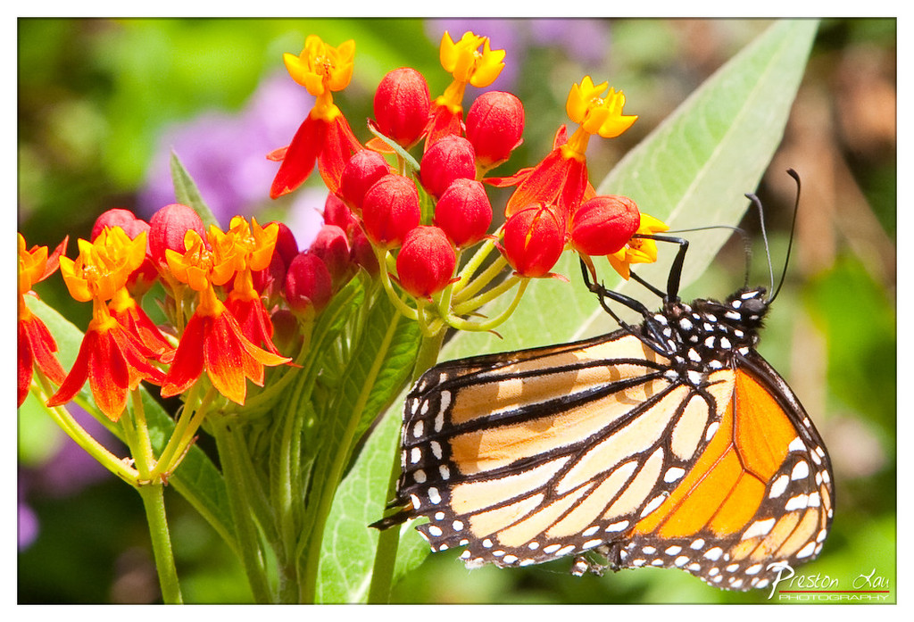

1. Overall Rating (0–10) — 8.5
This image captures a moment of natural elegance, where the vibrant monarch butterfly and the bright orange-red blossoms create a harmonious dialogue of color and life. The shallow depth of field beautifully isolates the subject, emphasizing the intricate details of the butterfly’s wings and the delicate texture of the flowers. While the composition is visually striking, the slightly overexposed highlights on the petals and wings hint at a subtle loss of detail, holding it back from perfection.
2. Composition (0–10) — 8.0
The butterfly is positioned diagonally, leading the eye across the frame and creating a sense of movement. The cluster of flowers forms a natural focal point, while the soft green and purple background enhances depth without distracting from the subject.
3. Lighting (0–10) — 9.0
Bright, natural sunlight enhances the vividness of the colors, creating a warm, inviting glow. The light strikes the butterfly and flowers directly, highlighting textures and patterns while maintaining a soft, diffused quality that avoids harsh shadows.
4. Color & Tone (0–10) — 9.0
The warm palette of orange, red, and yellow contrasts beautifully with the green foliage, creating a visually rich and cohesive image. The saturation is strong but controlled, preserving natural tones and enhancing the vibrancy of the scene.
5. Creativity (0–10) — 8.0
The photographer captures a classic nature moment with an artistic touch, emphasizing the interplay between the butterfly and the flower. The choice of angle and depth of field adds narrative depth, transforming a simple encounter into a moment of quiet beauty.
6. Technical Quality (0–10) — 8.5
Sharp focus on the butterfly and flowers, with a well-executed bokeh effect in the background. The image is clear and detailed, with minimal noise and balanced exposure, though a slight overexposure in highlights slightly reduces tonal range.
7. Emotional Impact (0–10) — 9.0
The image evokes a sense of peace and wonder, capturing the delicate beauty of a natural interaction. The vibrant colors and serene composition inspire a feeling of connection to the natural world, making the viewer pause and appreciate the quiet majesty of life.
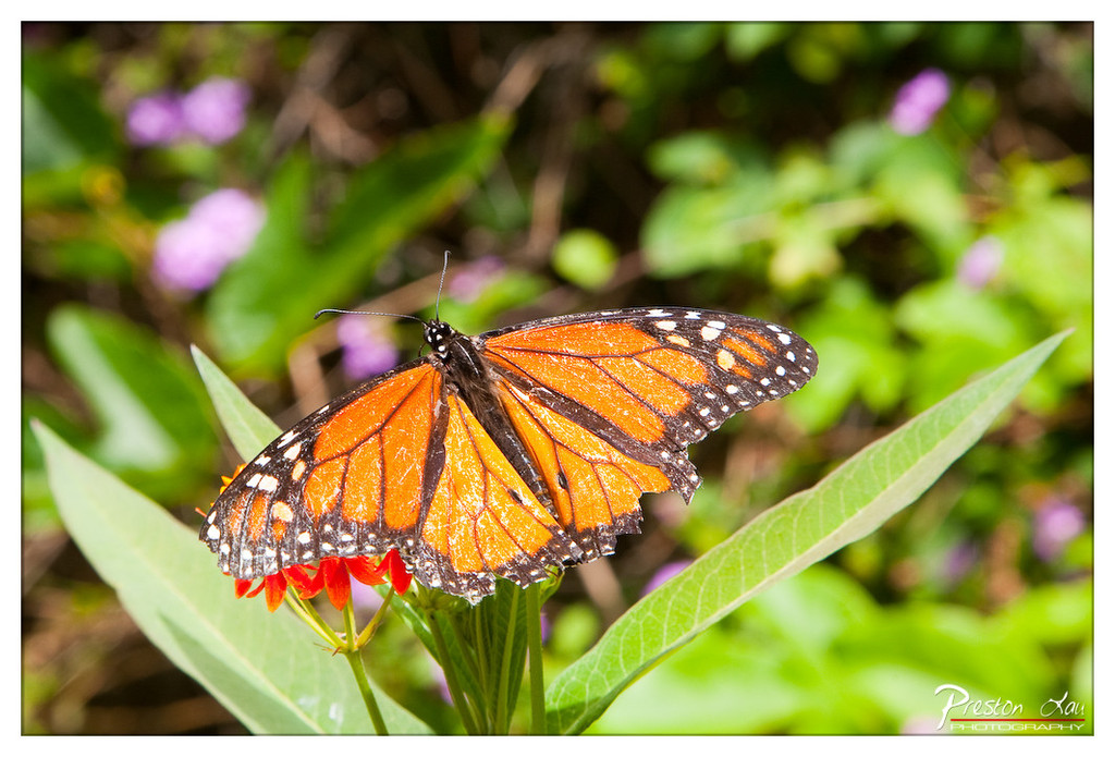

1. Overall Rating (0–10) — 8.0
This image captures the delicate grace of a monarch butterfly in a moment of stillness, its vibrant wings contrasting beautifully against the soft, green backdrop. The shallow depth of field isolates the subject with painterly precision, while the natural lighting enhances the butterfly’s intricate patterns. The only minor limitation is the slightly overexposed highlight on the leaf, which slightly distracts from the otherwise harmonious balance.
2. Composition (0–10) — 8.0
The butterfly is placed slightly off-center, creating a dynamic yet balanced composition. The leading lines of the surrounding leaves guide the eye toward the subject, and the blurred background enhances focus without overwhelming the frame.
3. Lighting (0–10) — 8.5
Natural, diffused sunlight highlights the texture and translucency of the butterfly’s wings, creating a soft glow without harsh shadows. The light direction emphasizes the subject’s form and adds dimension to the scene.
4. Color & Tone (0–10) — 9.0
The rich orange of the monarch contrasts vividly with the lush greens and soft purples in the background, creating a harmonious and visually striking palette. The color temperature feels warm and inviting, enhancing the organic, natural mood.
5. Creativity (0–10) — 8.0
The photographer captures a familiar subject with a sense of reverence and artistry, transforming a simple nature moment into a visually compelling portrait. The use of selective focus and color harmony elevates the image beyond mere documentation.
6. Technical Quality (0–10) — 8.5
Sharp focus on the butterfly’s wings and body, with a smooth bokeh effect in the background, demonstrates strong technical control. The image is clean, well-exposed, and free of noticeable noise.
7. Emotional Impact (0–10) — 8.0
The image evokes a sense of tranquility and wonder, inviting the viewer to pause and appreciate the beauty of a fleeting natural moment. The delicate presence of the butterfly resonates with themes of fragility and transformation.
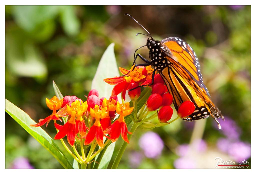

1. Overall Rating (0–10) — 8.5
This image captures a moment of delicate beauty, where the vibrant monarch butterfly rests gracefully upon a cluster of orange milkweed blossoms. The shallow depth of field beautifully isolates the subject, creating a sense of intimacy and stillness. While the composition is strong and the colors vivid, a slightly more dynamic angle or tighter framing could elevate the image from a lovely snapshot to a truly compelling portrait of nature.
2. Composition (0–10) — 8.0
The butterfly is placed slightly off-center, following the rule of thirds, which guides the eye naturally across the frame. The diagonal line of the stem adds movement, while the soft, blurred background keeps attention firmly on the subject.
3. Lighting (0–10) — 9.0
Bright, natural sunlight enhances the saturation of the butterfly’s wings and the flower’s petals, creating a warm and inviting glow. The light falls evenly, revealing fine textures without harsh shadows.
4. Color & Tone (0–10) — 9.0
The rich oranges and yellows of the flower contrast strikingly with the deep black and white of the monarch, creating a visually harmonious and vibrant palette. The soft green and purple bokeh in the background add depth and complement the dominant tones.
5. Creativity (0–10) — 8.5
The image captures a classic moment in nature with a fresh, intimate perspective. The choice to focus tightly on the interaction between butterfly and flower tells a quiet story of symbiosis, elevating the image beyond mere documentation.
6. Technical Quality (0–10) — 9.0
Sharp focus on the butterfly’s wings and face, with a smooth and controlled bokeh, demonstrates excellent technical execution. The depth of field is precise, and the image is free of noise or artifacts.
7. Emotional Impact (0–10) — 8.5
The image evokes a sense of peace and wonder, inviting the viewer to pause and appreciate the delicate balance of the natural world. The vibrant life of the butterfly and flower creates a feeling of joy and connection to the environment.
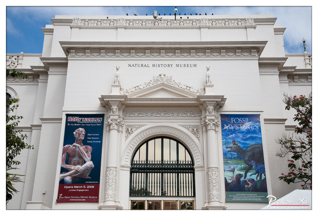

1. Overall Rating (0–10) — 7.5
This photograph captures the grandeur and cultural significance of the San Diego Natural History Museum with striking clarity and architectural detail. The composition highlights the building’s classical design, while the vibrant exhibition banners add a dynamic contrast to the white façade. The image successfully balances historical gravitas with modern engagement, though the slightly overcast sky tempers the overall visual drama.
2. Composition (0–10) — 8.0
The symmetrical framing centers the museum’s entrance, emphasizing its architectural elegance. The banners on either side create visual balance, while the surrounding foliage adds natural framing and depth. A slight tilt in the camera angle adds subtle dynamism without disrupting the formal structure.
3. Lighting (0–10) — 7.0
Natural daylight provides even illumination across the façade, enhancing the texture of the ornate stonework. The soft shadows under the arch and cornices add dimension, though the overcast sky slightly diffuses the light, reducing contrast and vibrancy.
4. Color & Tone (0–10) — 7.5
The white marble of the building contrasts beautifully with the rich blues and greens of the banners, creating a visually engaging palette. The overall tone is balanced and clean, with a slight cool cast from the sky that complements the museum’s scholarly atmosphere.
5. Creativity (0–10) — 7.0
The image captures a moment of cultural intersection—between past and present, education and spectacle—through the juxtaposition of classical architecture and modern exhibit promotions. While not overtly experimental, the narrative implied by the banners adds conceptual depth.
6. Technical Quality (0–10) — 8.5
Sharp focus, accurate exposure, and clear detail throughout the frame demonstrate strong technical execution. The clarity of the text on the banners and the fine carvings on the facade confirm a high level of precision.
7. Emotional Impact (0–10) — 7.0
The photograph evokes a sense of curiosity and reverence, inviting viewers to explore the wonders of science and history. The juxtaposition of the stately museum and the promise of discovery in the banners creates a subtle emotional pull toward learning and wonder.
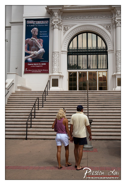

1. Overall Rating (0–10) — 7.0
This photograph captures a quiet, contemplative moment as a couple ascends the steps of a grand museum, their backs to the camera, suggesting a shared journey toward discovery. The juxtaposition of the human scale against the imposing architecture and the striking "Body Worlds" banner adds layers of narrative—curiosity, science, and the human body as both subject and observer. While the image is well-composed and evocative, its emotional depth is slightly restrained by the flat lighting and the lack of a more dynamic interaction between the figures and their surroundings.
2. Composition (0–10) — 7.5
The couple is placed off-center, leading the eye up the diagonal line of the stairs toward the ornate entrance and the poster, creating a natural visual progression. The symmetry of the building grounds the image, while the human element introduces warmth and narrative. The framing feels intentional, balancing architectural grandeur with personal scale.
3. Lighting (0–10) — 6.0
The light is bright but diffuse, likely midday, resulting in even exposure with minimal shadows. While this ensures clarity, it also flattens the scene’s depth and reduces the contrast that could enhance texture and mood.
4. Color & Tone (0–10) — 6.5
The color palette is restrained—dominated by the neutral grays of the stone and the muted tones of the couple’s clothing. The red and blue of the "Body Worlds" banner provide a strong focal point and a splash of vibrancy, but the overall tone remains subdued, lending a calm, observational quality.
5. Creativity (0–10) — 7.0
The concept of pairing a couple with a museum exhibit on the human body is rich with metaphor—exploring themes of life, knowledge, and the physical self. The image is not overtly staged, yet the composition and timing suggest a deliberate narrative intent, making it more than a simple snapshot.
6. Technical Quality (0–10) — 8.0
The image is sharp, well-focused, and free of technical flaws. The details in the architecture and the poster are clear, and the watermark is unobtrusive. The exposure is balanced, though the lack of dramatic lighting limits its visual impact.
7. Emotional Impact (0–10) — 6.5
The photograph evokes a sense of quiet anticipation and shared experience, inviting viewers to wonder about the couple’s destination and purpose. The emotional resonance is subtle but present—rooted in the universality of curiosity and the journey toward understanding.
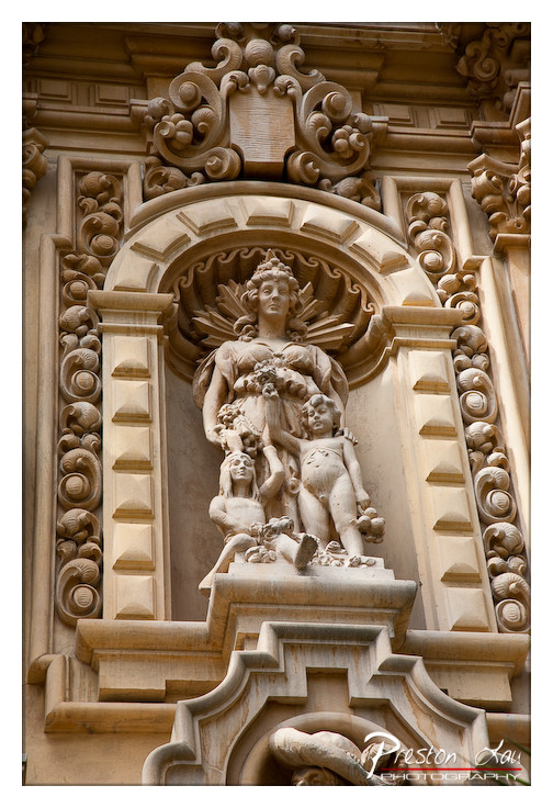

1. Overall Rating (0–10) — 7.5
This photograph captures the ornate grandeur of a classical stone relief, where intricate carvings and architectural detail converge to evoke a sense of historical reverence. The warm, golden light enhances the texture and depth of the stonework, giving the sculpture a dignified presence. While the image successfully highlights the craftsmanship, the tight framing slightly limits the viewer’s ability to fully appreciate the monument’s scale and context.
2. Composition (0–10) — 7.0
The central placement of the statue within the arch draws immediate attention, and the surrounding architectural elements frame it effectively. However, the slightly compressed perspective and tight crop reduce the sense of spatial depth, making the composition feel somewhat constrained.
3. Lighting (0–10) — 8.0
The soft, directional sunlight enhances the relief’s three-dimensional form, casting subtle shadows that accentuate the sculptural details. The warm tone of the light complements the stone’s color, creating a harmonious and dignified atmosphere.
4. Color & Tone (0–10) — 7.5
The palette is dominated by warm, earthy tones—beiges and golds—that unify the image and reinforce its historical character. The tonal contrast is well-balanced, allowing the textures of the stone to stand out without harshness.
5. Creativity (0–10) — 7.0
The focus on architectural sculpture with an emphasis on texture and light demonstrates a thoughtful approach. While the subject is traditional, the composition and lighting elevate it beyond mere documentation into a contemplative portrait of craftsmanship.
6. Technical Quality (0–10) — 8.5
The image is sharp and well-focused, with fine detail visible in the carvings. The exposure is clean, and there are no distracting artifacts, reflecting strong technical execution.
7. Emotional Impact (0–10) — 7.5
The photograph evokes a quiet reverence for history and artistry, inviting the viewer to pause and consider the skill and time invested in the sculpture. The warmth and detail create a sense of intimacy with a monument that might otherwise feel distant.
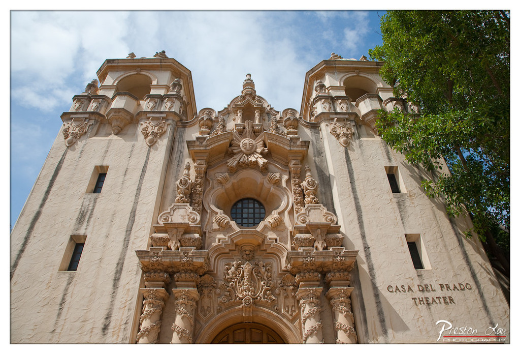

1. Overall Rating (0–10) — 8.0
This photograph captures the grandeur of the Casa del Prado Theater with a sense of architectural reverence, emphasizing its ornate details against a bright, cloud-dappled sky. The low-angle perspective enhances the building’s imposing presence, while the natural light highlights the texture and craftsmanship of the stonework. Though the framing feels slightly off-center, the image succeeds in conveying both the historical weight and aesthetic richness of the structure.
2. Composition (0–10) — 7.5
The low-angle shot creates a dynamic, upward-looking perspective that accentuates the building’s verticality and intricate facade. The inclusion of the tree on the right introduces an organic contrast to the stone structure, though it slightly disrupts the symmetry. The placement of the text and the photographer’s watermark in the lower right corner feels somewhat intrusive, pulling focus from the central architectural details.
3. Lighting (0–10) — 8.5
Natural daylight enhances the texture of the building’s surface, casting subtle shadows that define the depth of the carvings and architectural elements. The soft, diffused light from the partly cloudy sky prevents harsh contrasts, allowing the warm tones of the stucco to glow gently. The lighting contributes significantly to the image’s sense of time and place.
4. Color & Tone (0–10) — 8.0
The palette is dominated by warm beige and cream tones of the stucco, complemented by the deep blue of the sky and the lush green of the tree. The contrast between the earthy building and the vibrant natural elements creates a visually harmonious and balanced composition. The slight warmth in the overall tone enhances the Mediterranean feel of the architecture.
5. Creativity (0–10) — 8.0
The photographer’s choice to frame the image from a low angle and include the tree adds narrative depth, suggesting a dialogue between nature and human craftsmanship. The attention to architectural detail and the thoughtful use of light elevate the image beyond a simple documentary shot, transforming it into a contemplative homage to the building’s artistry.
6. Technical Quality (0–10) — 8.5
The image is sharp and well-focused, with fine detail visible in the carvings and textures of the facade. The exposure is balanced, with no areas of overexposure or underexposure, and the depth of field effectively captures the full scope of the architecture. The watermark is subtly placed and does not detract from the overall clarity.
7. Emotional Impact (0–10) — 7.5
The photograph evokes a sense of awe and nostalgia, inviting the viewer to appreciate the craftsmanship and history embodied in the theater. The grandeur of the structure, combined with the soft light and natural surroundings, creates a contemplative mood that resonates with quiet admiration for architectural legacy.
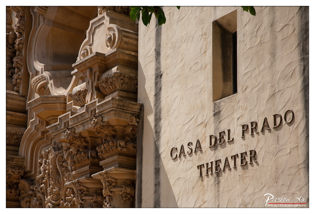

1. Overall Rating (0–10) — 7.5
This photograph captures the ornate elegance of Casa del Prado Theater with a strong sense of architectural grandeur and historical texture. The interplay between the richly detailed stonework and the smooth, sun-washed wall creates a compelling visual contrast, while the natural light enhances the tactile quality of the surfaces. A tighter framing and more intentional focus on the signage could elevate the image from a strong document to a more cohesive artistic statement.
2. Composition (0–10) — 7.0
The diagonal alignment of the ornate facade and the vertical wall creates dynamic tension, drawing the eye across the frame. The placement of the "Casa del Prado Theater" text anchors the right side, though the left-heavy composition slightly disrupts visual balance.
3. Lighting (0–10) — 8.0
Bright, directional sunlight enhances the three-dimensionality of the carvings and casts deep shadows that emphasize texture and form. The contrast between light and shadow adds depth and a sense of time, likely early morning or late afternoon.
4. Color & Tone (0–10) — 7.5
The warm, earthy tones of the stone and stucco are harmonious and evoke a sense of timelessness. The natural color palette is well-rendered, with subtle variation in tone that enhances the image’s architectural character.
5. Creativity (0–10) — 7.0
The photographer captures a moment of quiet beauty in an overlooked architectural detail, presenting the theater not as a landmark but as a textured, tactile object. The focus on materiality and light gives the image a contemplative quality.
6. Technical Quality (0–10) — 8.5
Sharp focus across the frame ensures clarity in both the intricate carvings and the lettering. The exposure is well-balanced, with no blown highlights or lost shadows, showcasing the image’s technical precision.
7. Emotional Impact (0–10) — 7.0
The image evokes a sense of reverence for craftsmanship and history, inviting the viewer to appreciate the quiet dignity of enduring architecture. While not emotionally charged, it resonates through its attention to detail and atmosphere.
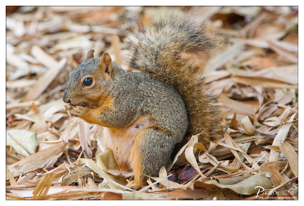

1. Overall Rating (0–10) — 8.0
This photograph captures a squirrel in a moment of quiet focus, its delicate paws holding a morsel as it feeds amidst a bed of dried leaves. The rich textures of the fur and foliage create a natural, intimate atmosphere, while the shallow depth of field draws attention to the subject with gentle precision. The image feels both candid and composed, offering a glimpse into a fleeting moment in the wild with a sense of warmth and stillness.
2. Composition (0–10) — 8.0
The squirrel is centered slightly off-frame, creating a natural and balanced composition that draws the eye to its expressive face. The surrounding leaves form a soft, organic frame, enhancing the subject’s presence without overwhelming the scene.
3. Lighting (0–10) — 8.5
Soft, diffused natural light highlights the squirrel’s fur with subtle highlights and shadows, enhancing texture without harshness. The even illumination complements the earthy tones of the environment and contributes to the image’s serene mood.
4. Color & Tone (0–10) — 8.0
The warm golden and brown hues of the leaves harmonize with the squirrel’s gray and orange fur, creating a cohesive and natural palette. The contrast between the subject and background is subtle but effective, enhancing depth and visual interest.
5. Creativity (0–10) — 7.5
The image captures a simple, everyday moment with artistic sensitivity. The choice to focus on the squirrel’s quiet behavior and the use of a shallow depth of field elevate it beyond a simple wildlife snapshot into a more contemplative portrait of nature.
6. Technical Quality (0–10) — 9.0
The image is sharp and well-focused on the squirrel’s face, with precise detail in the fur and eyes. The background is smoothly blurred, demonstrating excellent control over aperture and focus, and the overall clarity is high.
7. Emotional Impact (0–10) — 8.5
The photograph evokes a sense of calm and wonder, inviting the viewer to pause and appreciate the small, often overlooked moments of life. The squirrel’s alert gaze and gentle posture create a connection that feels both tender and alive.
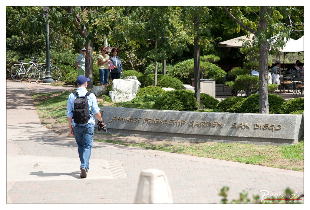

1. Overall Rating (0–10) — 6.8
This photograph captures a tranquil moment in the Japanese Friendship Garden, where the blend of nature and human presence evokes a sense of peaceful exploration. The composition effectively uses the curved pathway to guide the eye toward the engraved sign, grounding the scene in place and purpose. While the image conveys a sense of authenticity and everyday life, the slightly flat lighting and busy background prevent it from achieving a more cohesive and emotionally resonant atmosphere.
2. Composition (0–10) — 7.0
The diagonal path and the subject’s movement create a natural leading line, drawing attention toward the garden’s name. The framing balances foreground and background elements, though the group of people in the distance adds visual clutter that slightly disrupts the focus.
3. Lighting (0–10) — 6.5
Bright, even daylight illuminates the scene clearly, but the harsh overhead sun creates flat tones and reduces depth. The lack of soft, directional light diminishes the richness of the foliage and shadows.
4. Color & Tone (0–10) — 6.0
The palette is dominated by greens and muted earth tones, which align well with the garden setting. However, the colors appear slightly washed out, lacking vibrancy and contrast that could enhance the natural beauty of the environment.
5. Creativity (0–10) — 6.5
The image captures a candid moment of a visitor exploring the garden, offering a narrative of leisure and cultural appreciation. While not groundbreaking in concept, it succeeds in documenting a slice of life with quiet intention.
6. Technical Quality (0–10) — 7.5
The focus is sharp on the main subject and the sign, with good detail throughout. The exposure is well-balanced, though some highlights in the sky and shadows could benefit from subtle refinement.
7. Emotional Impact (0–10) — 6.0
The photograph evokes a mild sense of serenity and curiosity, inviting the viewer to imagine strolling through the garden. However, the lack of a strong emotional focal point limits its ability to deeply connect with the audience.
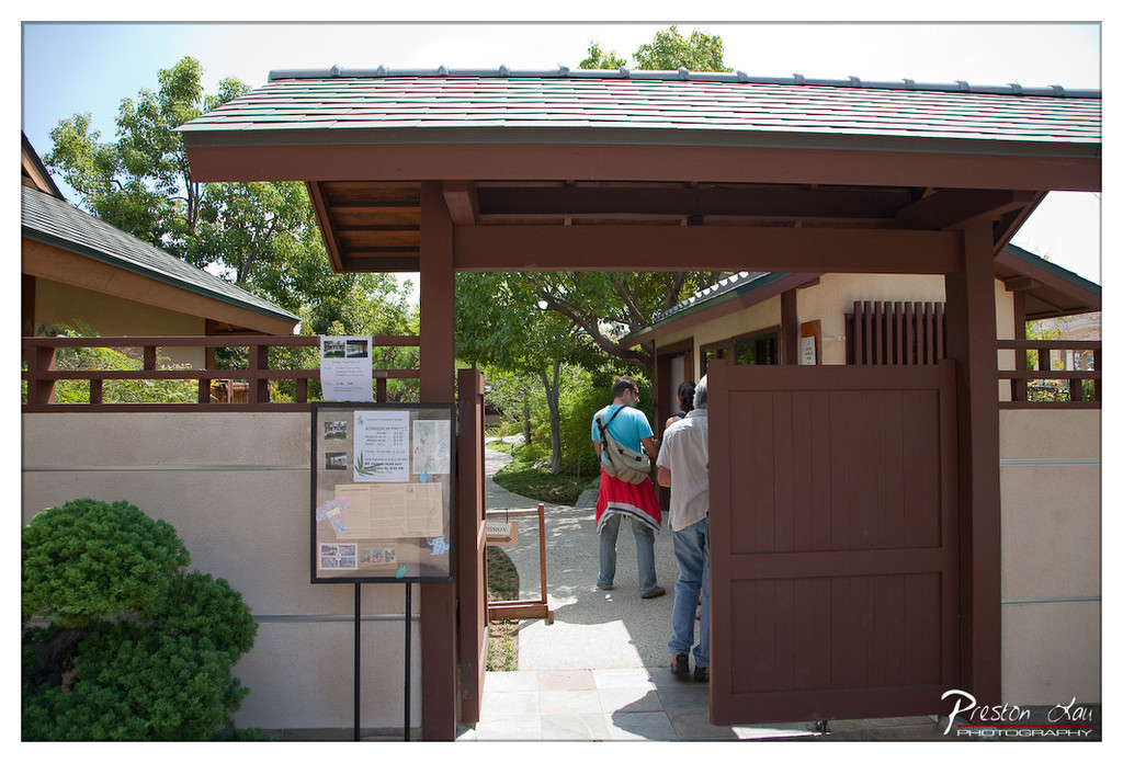

1. Overall Rating (0–10) — 6.8
This photograph captures a serene moment at the entrance to a traditional Japanese-style garden, where visitors step from the outside world into a space of calm and cultural reflection. The composition draws the eye through the gateway, creating a sense of invitation and journey, while the warm sunlight enhances the earthy tones of the architecture. Though the image is well-framed and clearly composed, the lack of a dominant focal point and the presence of a watermark slightly diminish its artistic cohesion.
2. Composition (0–10) — 7.0
The gateway serves as a natural frame, guiding the viewer’s gaze into the garden, with the visitors adding a sense of scale and narrative. The balance between the open gate and the closed door creates visual tension, while the path leading into the greenery enhances depth.
3. Lighting (0–10) — 7.5
Bright, natural daylight illuminates the scene with clarity and warmth, casting soft shadows that define the architectural lines and textures. The light enhances the sense of openness and tranquility, though the sky is slightly overexposed, losing some detail in the upper portion.
4. Color & Tone (0–10) — 7.0
The palette is composed of earthy browns, greens, and beige tones that harmonize well with the Japanese aesthetic. The colors are natural and consistent, with a slight warmth that complements the serene mood, though the saturation is moderate and could be more dynamic.
5. Creativity (0–10) — 6.5
The image tells a quiet story of transition and cultural immersion, but its approach is observational rather than experimental. The composition relies on traditional framing techniques, offering a familiar view rather than a fresh perspective.
6. Technical Quality (0–10) — 7.5
The photograph is sharp and well-focused, with clear detail in both the foreground and background. The exposure is generally balanced, though the sky shows signs of slight overexposure. The watermark is noticeable but does not significantly detract from the image.
7. Emotional Impact (0–10) — 6.5
The scene evokes a sense of peace and anticipation, inviting the viewer to imagine stepping into the tranquil garden beyond. While the emotional resonance is present, it remains subtle, allowing the setting and architecture to speak more than the people within it.
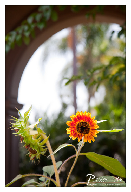

1. Overall Rating (0–10) — 7.5
This photograph captures a quiet moment of natural beauty framed by architectural grace, where the sunflower’s vibrant bloom contrasts with the soft, dreamy backdrop. The shallow depth of field draws the eye to the flower’s rich color and texture, while the arch adds a sense of structure and narrative. Though the image is visually pleasing, it slightly underplays the potential drama of the scene, leaving room for more emotional intensity.
2. Composition (0–10) — 7.0
The sunflower is placed off-center, creating visual interest, while the arch frames the background effectively. The inclusion of the wilting flower adds narrative depth, though the composition feels slightly unbalanced due to the asymmetrical framing.
3. Lighting (0–10) — 7.5
Natural daylight softly illuminates the scene, highlighting the sunflower’s warm tones without harsh shadows. The bright background creates a gentle glow, enhancing the flower’s vibrancy.
4. Color & Tone (0–10) — 8.0
The vivid orange and yellow of the sunflower pop against the muted greens and soft browns, creating a dynamic yet harmonious palette. The tonal contrast enhances the flower’s prominence.
5. Creativity (0–10) — 7.5
The juxtaposition of the thriving sunflower and the decaying one, framed by an arch, suggests themes of life and decay. The use of selective focus and natural framing adds a poetic, contemplative quality.
6. Technical Quality (0–10) — 8.0
Sharp focus on the sunflower, clean depth of field, and balanced exposure demonstrate strong technical control. The watermark is subtle and does not distract.
7. Emotional Impact (0–10) — 7.0
The image evokes a sense of gentle melancholy and resilience, inviting reflection on the cycle of life. The beauty of the bloom, paired with the fading one, creates a quiet emotional resonance.
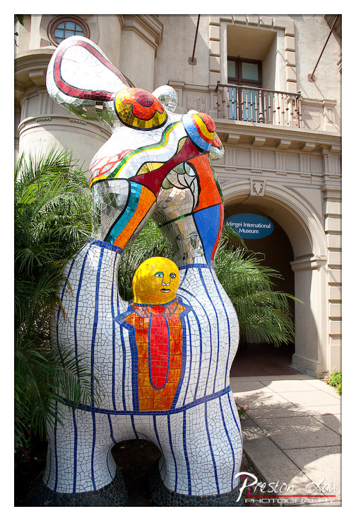

1. Overall Rating (0–10) — 7.5
This photograph captures a vibrant mosaic sculpture in dialogue with its architectural surroundings, blending whimsy and cultural context into a visually engaging scene. The bold colors and playful forms of the sculpture contrast beautifully with the muted tones of the historic building, creating a compelling juxtaposition of art and place. While the image is strong in composition and subject, the slight overexposure in the highlights and a busy background slightly detract from its overall refinement.
2. Composition (0–10) — 7.0
The sculpture is well-framed and positioned to draw the eye, with the archway of the museum providing a natural leading line into the background. However, the foliage on the left slightly intrudes into the frame, creating a minor distraction.
3. Lighting (0–10) — 7.0
Natural daylight illuminates the scene evenly, enhancing the mosaic’s rich textures and colors. The shadows are soft, and the lighting complements the sculpture’s reflective surface, though the sky is slightly overexposed.
4. Color & Tone (0–10) — 8.0
The palette is lively and engaging, with the warm yellows, reds, and blues of the mosaic standing out against the neutral beige of the building. The contrast between the bright art and the subdued architecture adds visual interest and depth.
5. Creativity (0–10) — 8.0
The image effectively captures the playful spirit of the sculpture while grounding it in its real-world context. The choice to include the museum entrance adds narrative depth, suggesting a story of art, culture, and public space.
6. Technical Quality (0–10) — 7.5
The photograph is sharp and detailed, with clear focus on the sculpture. The exposure is mostly balanced, though the highlights in the sky and on the upper parts of the sculpture are slightly blown out.
7. Emotional Impact (0–10) — 7.5
The image evokes a sense of joy and curiosity, inviting the viewer to appreciate the creativity of the artwork and its integration into the urban environment. The warmth of the colors and the whimsical subject matter contribute to a positive, uplifting mood.
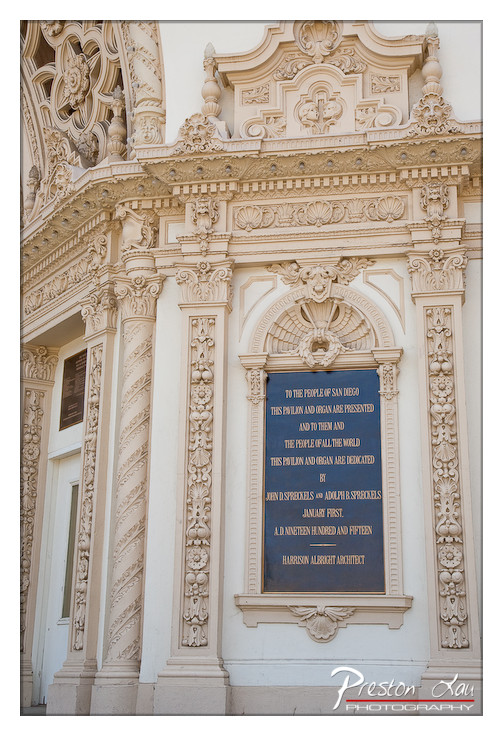

1. Overall Rating (0–10) — 7.5
This photograph captures the ornate elegance of a historic architectural detail, where craftsmanship and reverence converge in stone and light. The intricate carvings and solemn plaque evoke a sense of civic pride and cultural memory, though the image’s narrative depth is slightly muted by its conventional framing. The composition honors the building’s artistry, but a more dynamic perspective or atmospheric lighting could elevate it from documentation to storytelling.
2. Composition (0–10) — 7.0
The vertical symmetry of the facade is balanced and harmonious, with the plaque centered to draw the eye. However, the tight framing and lack of negative space limit the sense of scale, making the structure feel compressed rather than grand.
3. Lighting (0–10) — 6.5
Natural daylight illuminates the facade evenly, revealing texture and detail without harsh shadows. The soft, diffused light enhances the stone’s delicate carvings but lacks the dramatic contrast that could emphasize depth and dimension.
4. Color & Tone (0–10) — 7.0
The warm, off-white tones of the stonework create a cohesive and dignified palette, complemented by the deep blue of the plaque. The contrast between the light stone and the dark background enhances legibility and visual interest.
5. Creativity (0–10) — 6.5
The image is a respectful and accurate documentation of a significant architectural element, but it lacks a unique artistic vision. The focus on detail is strong, yet the approach remains conventional, prioritizing clarity over interpretation.
6. Technical Quality (0–10) — 8.0
Sharp focus and fine detail are evident throughout, particularly in the ornamental carvings. The exposure is well-balanced, and the watermark is discreet, preserving the image’s integrity.
7. Emotional Impact (0–10) — 7.0
The photograph conveys a quiet reverence for history and craftsmanship, inviting the viewer to appreciate the dedication behind public art. While it doesn’t evoke strong emotion, it successfully communicates a sense of permanence and cultural value.
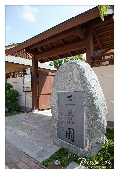

1. Overall Rating (0–10) — 7.5
This photograph captures the serene entrance to a traditional Japanese garden, where architecture and nature harmonize in quiet elegance. The weathered stone marker, inscribed with the name "三景園," anchors the composition, offering a sense of place and cultural authenticity. While the image successfully conveys the calm atmosphere of the setting, the slightly overexposed sky and busy foreground detract from the overall visual cohesion.
2. Composition (0–10) — 7.0
The stone marker is well-centered, creating a strong focal point, though the diagonal roofline and surrounding elements introduce visual tension. A tighter crop could enhance balance and direct attention more effectively.
3. Lighting (0–10) — 6.5
Natural daylight illuminates the scene clearly, but the bright sky creates a slight loss of detail in the upper portion. The shadows under the eaves add depth, but the overall lighting feels flat in the mid-ground.
4. Color & Tone (0–10) — 7.0
The palette is composed of earthy tones—browns, grays, and muted greens—that reflect the natural materials of the setting. The contrast between the stone and the soft greenery enhances visual interest, though the color saturation is restrained.
5. Creativity (0–10) — 7.5
The image offers a respectful and evocative portrayal of a cultural landmark, with the stone marker serving as both a sign and a symbol. The framing suggests a narrative of arrival and tradition, giving the photo a contemplative quality.
6. Technical Quality (0–10) — 8.0
The image is sharp and well-focused, with clean detail in the stone texture and surrounding architecture. The exposure is generally balanced, despite minor overexposure in the sky.
7. Emotional Impact (0–10) — 7.0
The photograph evokes a sense of tranquility and reverence, inviting the viewer to pause and reflect on the cultural significance of the space. The quiet stillness of the scene resonates with a meditative calm.
Loading map...