The Tokyo National Museum is Japan's oldest national museum, established in 1872, with over 110,000 objects in its collection. The museum includes galleries featuring Japanese art and Asian artifacts, as well as restaurants and shops. A special exhibition gallery was on display in 2010, showcasing the works of Hasegawa Tohaku, a renowned painter from the Momoyama period, whose masterpieces are considered national treasures.

1. Overall Rating (0–10) — 7.0
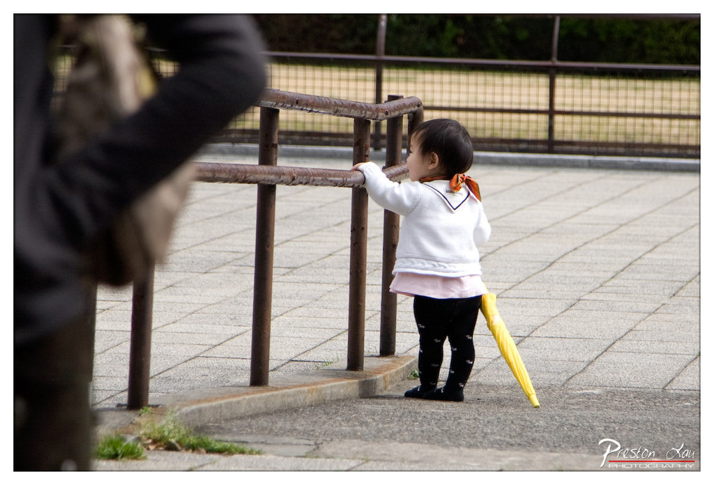
This photograph captures a quiet, candid moment of childhood curiosity, where a small child stands at the edge of a paved space, leaning on a rusted railing with a yellow umbrella at their side. The composition feels spontaneous and intimate, with the blurred figure in the foreground adding a layer of narrative depth—suggesting the child is not alone, but perhaps waiting or observing. While the image is emotionally resonant and well-framed, the slightly muted lighting and lack of vibrant color reduce its visual punch, keeping it from achieving full artistic impact.
2. Composition (0–10) — 7.5
The child is positioned slightly off-center, creating a natural focal point, while the diagonal line of the railing guides the eye toward them. The blurred foreground adds depth and a sense of immediacy, though the framing feels slightly tight, cutting into the space around the subject.
3. Lighting (0–10) — 6.0
The light is soft and diffused, likely from an overcast day, which creates even exposure but diminishes contrast and shadows. While this prevents harsh glare, it also flattens the scene and reduces the sense of texture in the pavement and railing.
4. Color & Tone (0–10) — 6.5
The palette is subdued, with neutral grays and browns dominating the scene. The yellow umbrella provides a bright, playful contrast, but the overall tone leans toward muted and understated, limiting the image’s visual energy.
5. Creativity (0–10) — 7.0
The photograph captures a fleeting, authentic moment with a strong sense of narrative. The use of foreground blur and the child’s contemplative pose suggest a story beyond the frame—perhaps a parent’s presence, a moment of transition, or a child’s first steps into independence. The composition and subject choice reflect thoughtful observation.
6. Technical Quality (0–10) — 7.5
The focus is sharp on the child, with a shallow depth of field that effectively isolates the subject. The image is clean and free of noise, and the detail in the textures—fabric, pavement, and railing—is well preserved.
7. Emotional Impact (0–10) — 7.5
There is a gentle melancholy and innocence in the image, evoking feelings of nostalgia and tenderness. The child’s stillness and the quiet setting invite the viewer to reflect on small, fleeting moments of childhood—making it emotionally engaging and quietly powerful.

1. Overall Rating (0–10) — 7.0
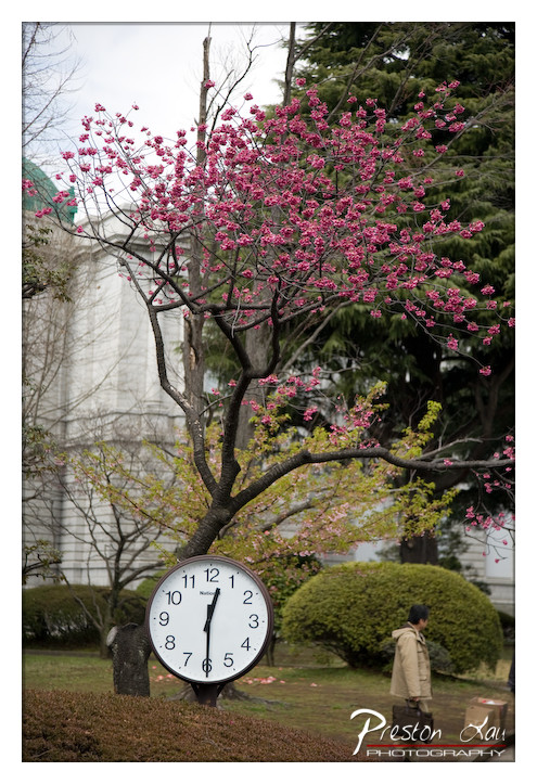
This photograph captures a serene spring moment, where the vibrant pink blossoms of a cherry tree contrast beautifully with the muted tones of the surrounding landscape. The juxtaposition of the clock and the blooming tree suggests a meditation on time and renewal, creating a quietly poetic narrative. While the image is visually engaging, its full emotional resonance is slightly held back by a lack of compositional cohesion and a somewhat busy background.
2. Composition (0–10) — 6.0
The clock and tree dominate the frame, but the placement of the person and the building behind them create visual distractions. A more deliberate framing would better balance the elements and guide the viewer’s eye toward the central theme.
3. Lighting (0–10) — 6.5
Soft, diffused daylight enhances the delicate texture of the blossoms and avoids harsh shadows. The overcast sky lends a calm, contemplative mood, though it slightly flattens the overall depth.
4. Color & Tone (0–10) — 7.5
The rich magenta of the cherry blossoms stands out against the subdued greens and grays, creating a striking contrast. The color palette feels natural and harmonious, with the warm tones of the blossoms adding a touch of life and energy.
5. Creativity (0–10) — 7.0
The conceptual pairing of the clock and the blooming tree offers a thoughtful commentary on the passage of time and seasonal renewal. The image succeeds in blending symbolism with natural beauty, though the execution could be more refined.
6. Technical Quality (0–10) — 8.0
The image is sharp and well-focused, particularly on the clock and the tree’s branches. The depth of field is well-managed, keeping the key elements in clear view while softly blurring the background.
7. Emotional Impact (0–10) — 7.0
There is a gentle, reflective quality to the photograph that evokes a sense of quiet contemplation. The fleeting beauty of the blossoms and the steady presence of the clock invite viewers to pause and consider the fleeting nature of moments.

1. Overall Rating (0–10) — 7.0
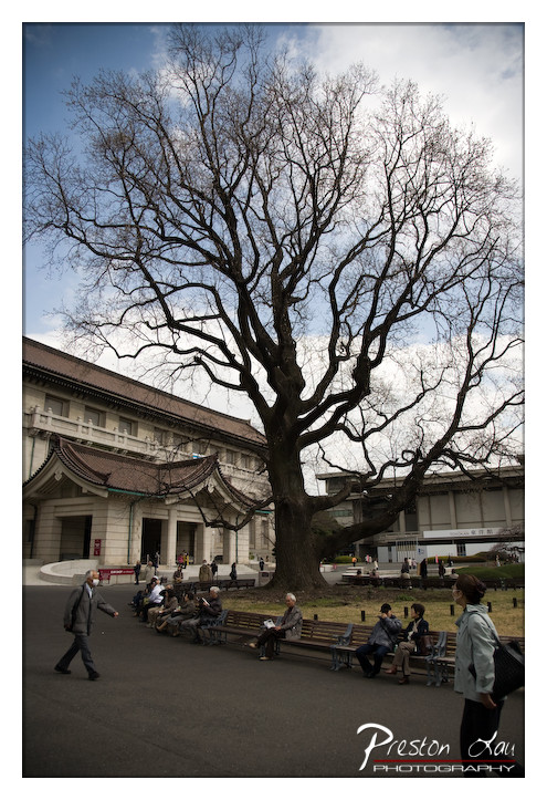
This photograph captures a striking juxtaposition between nature’s enduring presence and the structured quiet of a cultural space, with a bare, sprawling tree dominating the frame like a silent sentinel. The composition draws the eye upward through the intricate branches, while the human activity below grounds the scene in daily life. While the lighting and color are somewhat subdued, the image conveys a contemplative stillness, balancing architectural grandeur with natural elegance.
2. Composition (0–10) — 7.5
The tree is well-centered and dominates the frame, creating a natural focal point, while the diagonal lines of the building and benches guide the eye across the scene. The low-angle perspective enhances the tree’s stature and gives the image a sense of scale and depth.
3. Lighting (0–10) — 6.0
The light is soft and diffused, likely from an overcast sky, which minimizes harsh shadows and evenly illuminates the scene. While this creates a calm, muted atmosphere, it also reduces the contrast and depth that might otherwise highlight the tree’s intricate branches.
4. Color & Tone (0–10) — 6.5
The palette is subdued, with earthy browns, grays, and soft blues, which reinforce the quiet, transitional mood of early spring or late winter. The lack of vibrant color keeps the image grounded and realistic, though a touch more saturation could enhance the visual richness.
5. Creativity (0–10) — 7.0
The image successfully combines natural and architectural elements in a harmonious way, emphasizing the contrast between organic form and human design. The choice to include the people in motion adds narrative depth and a sense of time passing.
6. Technical Quality (0–10) — 7.5
The image is sharp and well-focused, particularly on the tree and the foreground figures. The clarity of the branches and the details of the building are strong, and the overall exposure is balanced.
7. Emotional Impact (0–10) — 7.0
There’s a quiet introspection in the scene—its stillness, the bare branches, and the unhurried pace of the people evoke a sense of reflection and transition. The viewer is invited to pause and consider the relationship between time, nature, and human spaces.

1. Overall Rating (0–10) — 7.0
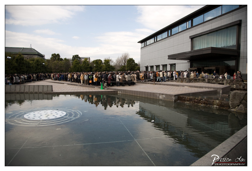
This photograph captures a moment of collective anticipation, with a long queue of people stretching along a modern architectural space, suggesting a cultural or public event of significance. The reflection in the water adds depth and symmetry, enhancing the visual narrative, though the muted color palette and slightly overcast lighting temper the image’s emotional resonance. While the scene feels authentic and grounded, it lacks the dynamic tension or striking contrast that would elevate it to a more compelling composition.
2. Composition (0–10) — 7.5
The long line of people creates a strong horizontal element that guides the eye across the frame, while the reflection in the water adds symmetry and balance. The placement of the modern building on the right and the distant green-roofed structure on the left create visual contrast, though the foreground water dominates slightly too much, drawing attention away from the main subject.
3. Lighting (0–10) — 6.0
The soft, diffused light of an overcast day provides even exposure across the scene, minimizing harsh shadows and allowing for clear detail. However, the lack of directional sunlight results in a flat, subdued atmosphere, diminishing the potential for dramatic highlights or deep shadows.
4. Color & Tone (0–10) — 6.5
The color palette is restrained, dominated by grays and muted earth tones, which reflect the subdued mood of the day. The cool tones of the water and building complement the overcast sky, but the absence of vibrant color reduces the image’s visual impact and emotional warmth.
5. Creativity (0–10) — 7.0
The inclusion of the water reflection introduces a thoughtful compositional layer, transforming a documentary scene into a more contemplative image. The juxtaposition of the crowd with the sleek architecture adds narrative depth, suggesting themes of modernity, order, and human connection.
6. Technical Quality (0–10) — 7.5
The image is sharp and well-focused, with fine detail visible in both the crowd and the architectural elements. The wide-angle perspective captures the scale of the scene effectively, though the slight distortion near the edges is a minor flaw.
7. Emotional Impact (0–10) — 6.5
The image evokes a sense of quiet patience and shared purpose, but the lack of expressive lighting and color keeps the emotional tone restrained. The viewer is invited to observe rather than feel, making the moment feel more like a record than a powerful experience.
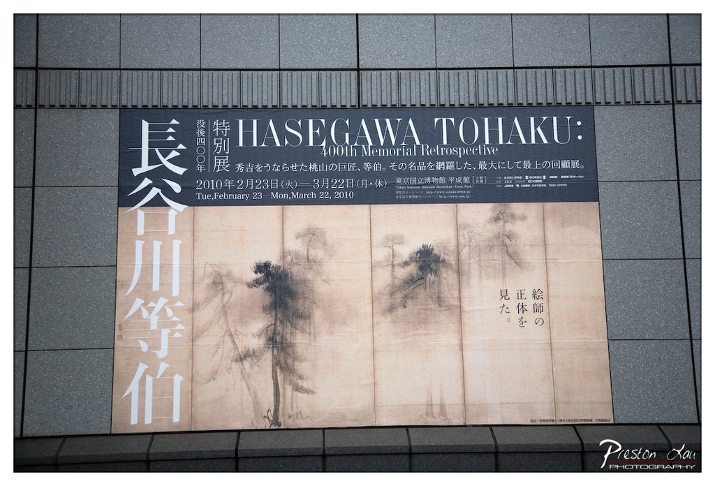

1. Overall Rating (0–10) — 7.0
This photograph captures a solemn and culturally rich moment, presenting a memorial retrospective poster with quiet dignity. The composition balances the stark modernity of the building’s facade with the traditional aesthetics of the artwork, creating a subtle dialogue between past and present. While the image is clear and well-framed, it feels more like a documentary record than an emotionally charged artistic statement, lacking a strong focal tension to elevate its impact.
2. Composition (0–10) — 7.5
The poster is centered and framed with a balanced, symmetrical approach, emphasizing the verticality of the text and the horizontal spread of the artwork. The surrounding gray tiles create a neutral, grid-like border that draws attention to the poster’s design without distraction.
3. Lighting (0–10) — 6.5
Natural, diffused daylight evenly illuminates the scene, preserving the texture and tonal range of the poster. The lighting is functional and clear, though it lacks dramatic contrast or directional emphasis that might enhance the mood.
4. Color & Tone (0–10) — 6.0
The palette is restrained—dominated by muted grays, blacks, and sepia tones—which aligns with the poster’s contemplative theme. However, the lack of vibrant color limits visual dynamism, giving the image a subdued, almost clinical feel.
5. Creativity (0–10) — 6.5
The photograph is conceptually grounded in the juxtaposition of historical art and contemporary architecture. While the idea is sound, the execution remains straightforward, offering little surprise or interpretive depth beyond its factual presentation.
6. Technical Quality (0–10) — 8.0
The image is sharp, with clean focus and minimal noise. The exposure is well-balanced, and the details of the text and artwork are clearly legible, reflecting solid technical control.
7. Emotional Impact (0–10) — 5.5
The image evokes a sense of reverence and cultural continuity, but its emotional resonance is restrained. The viewer is invited to observe rather than feel, leaving the emotional weight to the subject matter rather than the photographer’s vision.
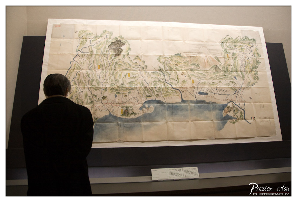

1. Overall Rating (0–10) — 7.0
This photograph captures a contemplative moment in a museum setting, where the viewer’s quiet engagement with a historical map creates a sense of cultural reverence. The juxtaposition of the modern observer against the aged, hand-drawn cartography evokes a dialogue between past and present. While the composition is thoughtful and the subject compelling, the muted lighting and slightly cluttered framing slightly diminish the image’s overall impact.
2. Composition (0–10) — 6.5
The subject is centered but framed too tightly, with the viewer’s back partially obscuring the lower portion of the map. The diagonal line of the display case adds visual interest, but the lack of negative space reduces the image’s elegance.
3. Lighting (0–10) — 6.0
Soft, ambient lighting illuminates the scene evenly but lacks depth, resulting in flatness that undercuts the intricate textures of the map. The glow from the display case enhances visibility but does little to create mood.
4. Color & Tone (0–10) — 6.5
The palette is restrained—muted greens, browns, and blues dominate, reflecting the aged paper and traditional artistry. The tonal range is narrow, limiting contrast and visual dynamism.
5. Creativity (0–10) — 7.0
The image succeeds in capturing a narrative moment—someone connecting with history—though it relies on a familiar museum trope. The choice to shoot from behind the viewer adds intimacy and invites speculation about their thoughts.
6. Technical Quality (0–10) — 7.5
The image is sharp and well-focused, with clean details in the map and a clear signature in the corner. The depth of field is appropriate, keeping both the subject and the artwork in focus.
7. Emotional Impact (0–10) — 7.0
There’s a quiet introspection in the scene, amplified by the solitary figure and the historical weight of the map. The image resonates with a sense of timelessness and respect for cultural heritage.
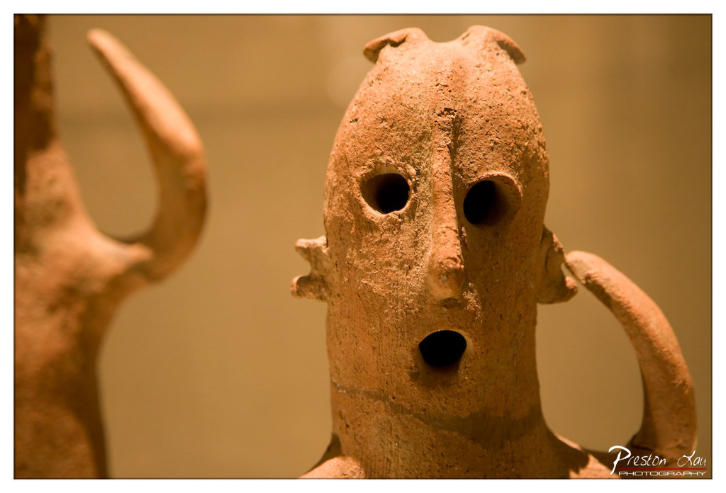

1. Overall Rating (0–10) — 7.5
This photograph captures the haunting presence of an ancient terracotta figure, its weathered features and expressive voids evoking a sense of forgotten ritual. The warm, golden light enhances the artifact’s organic texture, lending an almost sacred stillness to the scene. While the shallow depth of field creates a dreamlike focus, the framing feels slightly off-center, pulling attention away from the figure’s most compelling details.
2. Composition (0–10) — 6.5
The subject is slightly off-center with a distracting foreground element on the left, which disrupts visual balance. A tighter crop would better emphasize the figure’s face and gestures.
3. Lighting (0–10) — 8.0
Soft, directional lighting from the side accentuates the texture and form of the terracotta, creating gentle shadows that deepen the sculpture’s ancient character. The warm tone enhances the artifact’s earthy quality.
4. Color & Tone (0–10) — 7.5
The monochromatic warm palette—rich browns and golds—complements the material of the sculpture and evokes a sense of antiquity. The tonal contrast is subtle but effective, drawing attention to the figure’s facial features.
5. Creativity (0–10) — 8.0
The photographer captures a quiet narrative through the interplay of form, light, and texture. The decision to isolate the figure within a blurred context transforms an archaeological object into a contemplative portrait.
6. Technical Quality (0–10) — 8.5
Sharp focus on the face, clean depth of field, and minimal noise contribute to a high level of technical clarity. The attention to detail in the surface texture is well executed.
7. Emotional Impact (0–10) — 8.0
The sculpture’s wide eyes and open mouth evoke a primal sense of surprise or invocation, inviting viewers to imagine the stories behind its creation. The intimacy of the close-up fosters a quiet, meditative connection.
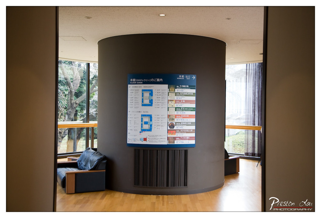

1. Overall Rating (0–10) — 6.0
This photograph captures the quiet functionality of a museum or gallery entrance, where architectural minimalism meets informational clarity. The composition frames the space through a doorway, creating a sense of entry and anticipation, while the circular pillar and directional signage anchor the viewer’s gaze. Though the scene is well-organized and purposeful, the lack of human presence and dynamic lighting gives it a slightly sterile, documentary feel—more a record than an evocative moment.
2. Composition (0–10) — 6.5
The framing through the doorway creates depth and guides the eye toward the central pillar and signage. The symmetrical placement of the column and the balanced arrangement of the seating and windows lend a sense of order, though the foreground elements slightly clutter the entrance.
3. Lighting (0–10) — 6.0
Natural light streams in from the large windows, illuminating the space evenly and enhancing visibility of the signage. The soft, diffused quality of the light complements the calm, institutional atmosphere, though it lacks dramatic contrast or directional warmth.
4. Color & Tone (0–10) — 6.5
The palette is restrained—muted browns, grays, and the blue of the signage—creating a cohesive and professional look. The warm wood floor provides a subtle contrast that softens the otherwise neutral tones, adding a touch of warmth to the scene.
5. Creativity (0–10) — 5.5
The image is straightforward and functional, prioritizing clarity over artistic expression. While the framing is intentional, the concept remains observational, offering little beyond a clear depiction of the space.
6. Technical Quality (0–10) — 7.5
The image is sharp and well-focused, with clean details visible in the signage and textures of the wood and upholstery. The exposure is balanced, and the depth of field effectively keeps the key elements in focus.
7. Emotional Impact (0–10) — 5.0
The scene conveys a sense of quiet anticipation, but the absence of people and emotional cues keeps the viewer emotionally detached. It invites curiosity about the space but does not elicit a strong personal response.
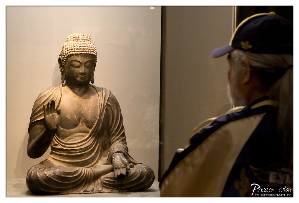

1. Overall Rating (0–10) — 7.5
This photograph captures a quiet, introspective moment between a visitor and a Buddha statue, evoking a sense of reverence and contemplation. The contrast between the stillness of the sculpture and the reflective presence of the observer creates a compelling narrative, though the composition’s asymmetry slightly weakens its visual cohesion. The image succeeds in conveying emotional depth and cultural resonance, grounded in a candid, museum-like atmosphere.
2. Composition (0–10) — 7.0
The off-center framing creates a dynamic balance between the statue and the viewer, with the man’s profile guiding the eye toward the Buddha. However, the large negative space on the left slightly dilutes the focus, and the tight crop on the man’s back feels slightly intrusive.
3. Lighting (0–10) — 8.0
Soft, directional lighting highlights the texture and form of the Buddha statue, creating gentle shadows that enhance its three-dimensionality. The warm glow emphasizes the spiritual presence of the sculpture, while the dimmer background helps isolate the subject and supports the contemplative mood.
4. Color & Tone (0–10) — 7.5
The muted palette of earth tones and soft grays enhances the solemn atmosphere, with subtle warmth on the statue adding depth. The contrast between the dark cap and lighter jacket adds visual interest without disrupting the overall harmony.
5. Creativity (0–10) — 8.0
The juxtaposition of the modern visitor with the ancient statue introduces a powerful narrative about connection across time and belief systems. The framing and focus on the moment of observation elevate the image beyond a simple snapshot into a thoughtful commentary on spirituality and reflection.
6. Technical Quality (0–10) — 8.5
Sharp focus on the Buddha statue and clean detail in the textures of the sculpture and fabric are well executed. The depth of field is appropriate, keeping both the subject and the observer in acceptable focus while gently blurring the background.
7. Emotional Impact (0–10) — 8.5
The image resonates deeply, inviting the viewer to reflect on the quiet communion between human and icon. The solemnity of the moment, captured with sensitivity and restraint, creates a strong emotional connection and a sense of shared reverence.
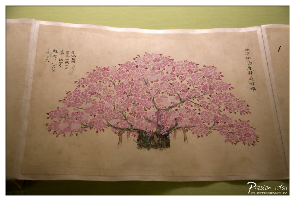

1. Overall Rating (0–10) — 7.0
This photograph captures a delicate traditional Japanese painting of a cherry blossom tree, rendered with soft pink hues and meticulous brushwork that evoke a sense of quiet elegance. The aged paper and calligraphic script add historical depth, grounding the image in cultural authenticity. While the composition is visually pleasing, the lighting and framing slightly diminish the artwork’s intended subtlety, keeping it from fully resonating as a compelling visual narrative.
2. Composition (0–10) — 6.5
The painting is centered but framed too closely, cutting into the edges of the paper and limiting the sense of space. The calligraphy on either side creates asymmetry, which works well for balance, though the top-left corner feels slightly crowded.
3. Lighting (0–10) — 6.0
The lighting is even and soft, avoiding harsh shadows, but it lacks directional warmth, giving the image a flat, slightly clinical feel that undercuts the organic beauty of the painting.
4. Color & Tone (0–10) — 7.5
The soft pinks of the blossoms contrast gently with the aged beige of the paper, creating a harmonious and traditionally Japanese palette. The tones are natural and subdued, reflecting the quiet mood of the piece.
5. Creativity (0–10) — 7.0
The image successfully captures a culturally rich artifact, presenting it with respect and clarity. While the approach is straightforward, the choice to include the surrounding paper and calligraphy adds narrative depth, making it more than a simple document.
6. Technical Quality (0–10) — 7.5
The focus is sharp on the central tree, and the details of the brushstrokes and ink are clear. The edges of the paper are slightly out of focus, but overall, the image is technically sound.
7. Emotional Impact (0–10) — 6.5
The image conveys a sense of tranquility and reverence, inviting contemplation of nature and tradition. However, the lack of dramatic lighting and tight framing prevents a deeper emotional connection, leaving the viewer as an observer rather than a participant.
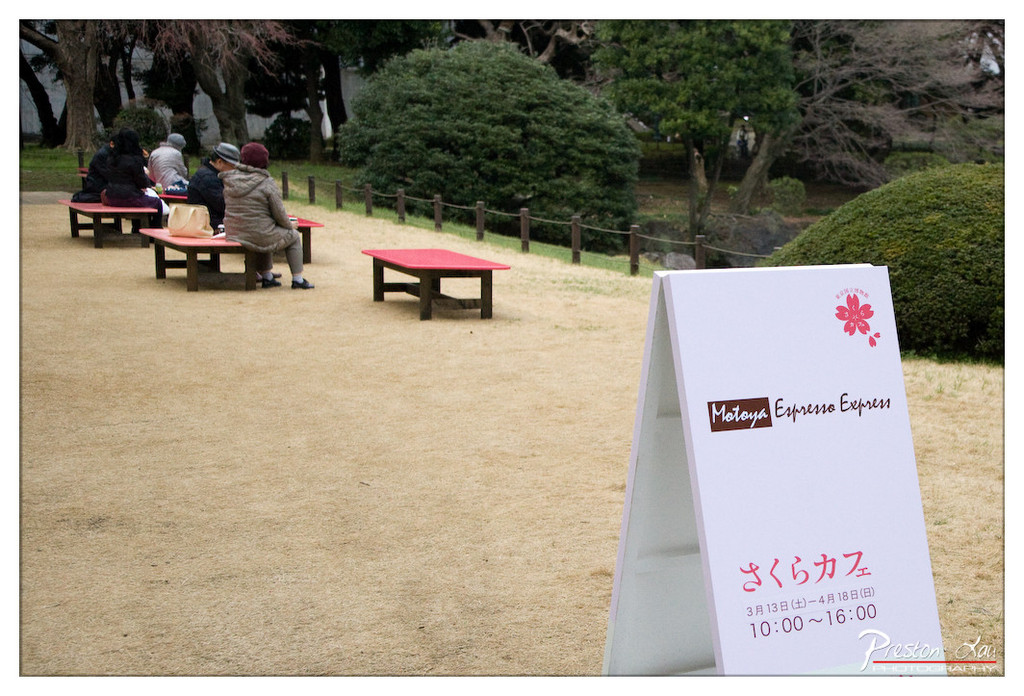

1. Overall Rating (0–10) — 6.0
This photograph captures a quiet, transient moment in a park setting, where the juxtaposition of a temporary café sign and everyday life creates a subtle narrative of urban leisure. The soft, diffused light and muted tones evoke a calm, contemplative mood, though the image's potential is slightly restrained by a lack of visual focus and dynamic tension. The scene feels authentic and grounded, yet it stops short of becoming emotionally resonant or visually striking.
2. Composition (0–10) — 6.0
The a-frame sign in the foreground anchors the image, but its placement creates a slight imbalance, pulling attention away from the people in the midground. The diagonal line of benches leads the eye into the scene, but the background foliage and scattered elements dilute the sense of cohesion.
3. Lighting (0–10) — 6.5
The overcast lighting provides even, soft illumination, minimizing harsh shadows and allowing for clear detail across the scene. While functional and natural, the flatness of the light lends a subdued, almost indifferent quality to the atmosphere.
4. Color & Tone (0–10) — 6.0
The palette is restrained, dominated by earthy browns and muted greens, with the red of the benches and sign providing a subtle pop. The tonal range is limited, giving the image a slightly washed-out appearance that tempers its visual impact.
5. Creativity (0–10) — 6.5
The image succeeds in documenting a slice of daily life with quiet intention, capturing the ephemeral nature of a pop-up café in a public space. The inclusion of the sign adds narrative depth, suggesting a story beyond the frame, though the execution remains observational rather than expressive.
6. Technical Quality (0–10) — 7.5
The image is sharp and well-focused, with clear details in both the foreground sign and the background figures. The exposure is balanced, and there is minimal noise, indicating strong technical control.
7. Emotional Impact (0–10) — 5.5
The scene evokes a sense of peaceful routine and quiet observation, but it lacks an emotional hook that would draw the viewer in. The distance between the camera and the subjects, combined with the neutral tone, keeps the emotional resonance at arm’s length.
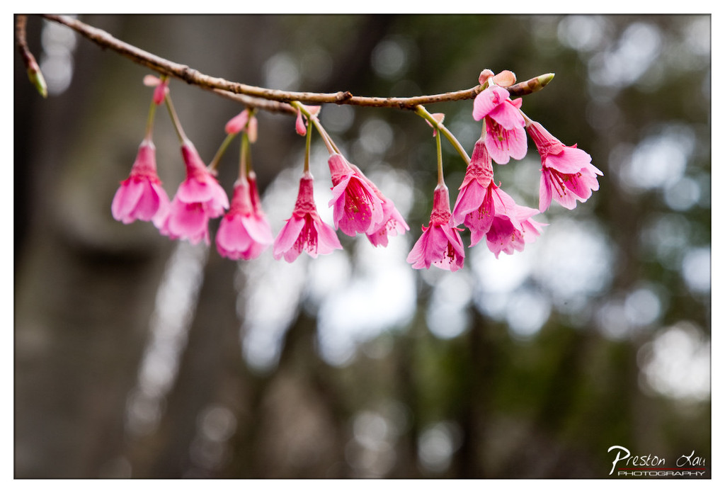

1. Overall Rating (0–10) — 8.0
This photograph captures the delicate grace of cherry blossoms in full bloom, where the soft pink petals contrast beautifully against a dreamy, blurred forest backdrop. The shallow depth of field enhances the floral subject, drawing the eye with a gentle, almost painterly quality. While the image is visually pleasing and well-executed, its emotional resonance is slightly restrained by the lack of a stronger narrative or environmental context.
2. Composition (0–10) — 8.0
The diagonal branch creates a dynamic line that guides the eye through the frame, while the off-center placement of the blossoms adds natural balance. The negative space in the background enhances the subject’s prominence without distraction.
3. Lighting (0–10) — 7.5
Soft, diffused natural light highlights the texture and translucency of the petals without harsh shadows, creating a serene and harmonious mood. The subtle glow on the blossoms enhances their delicate form.
4. Color & Tone (0–10) — 8.5
The vibrant pink of the blossoms stands out against the muted earthy tones of the background, creating a pleasing contrast. The color palette is harmonious and evokes a sense of springtime renewal and tranquility.
5. Creativity (0–10) — 7.0
The image leverages a classic floral subject with a strong focus on aesthetics and composition. While not overtly experimental, it demonstrates thoughtful use of bokeh and color to create a visually poetic moment.
6. Technical Quality (0–10) — 8.5
Sharp focus on the blossoms, precise depth of field, and clean details in the petals indicate excellent technical execution. The watermark is discreet and unobtrusive.
7. Emotional Impact (0–10) — 7.5
The image evokes a quiet sense of beauty and transience, resonating with themes of renewal and fragility. It invites contemplation and appreciation for nature’s fleeting elegance.
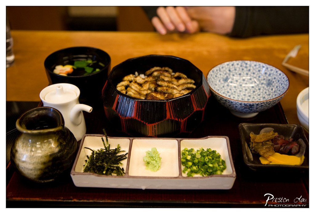

1. Overall Rating (0–10) — 7.5
This photograph captures the quiet elegance of a traditional Japanese meal, presenting a harmonious arrangement of textures and colors that evoke both ritual and comfort. The warm, intimate lighting enhances the sensory appeal of the food, while the blurred hands in the background suggest a moment of shared dining. Though the composition is slightly cluttered, the image succeeds in conveying the ritualistic beauty of a bento-style meal, balancing authenticity with aesthetic appeal.
2. Composition (0–10) — 6.5
The central placement of the eel bowl draws focus, but the surrounding elements—especially the teapot and side dishes—create a busy foreground. A tighter crop would improve visual flow and emphasize the main subject.
3. Lighting (0–10) — 7.0
Soft, warm lighting enhances the textures of the food and ceramics, creating a cozy, inviting atmosphere. The low-key illumination complements the traditional setting and adds depth without harsh shadows.
4. Color & Tone (0–10) — 7.5
The palette balances earthy browns, vibrant greens, and deep reds, with the blue-and-white ceramic adding a subtle contrast. The warm tone enhances the sense of comfort, while the natural color harmony reinforces the meal’s authenticity.
5. Creativity (0–10) — 7.0
The image captures a culturally rich moment with a strong sense of place. While not radically inventive, it effectively tells a story of tradition and shared experience through its thoughtful arrangement and mood.
6. Technical Quality (0–10) — 8.0
Sharp focus on the central dish, clear detail in the textures of the food and ceramics, and well-handled depth of field create a technically strong image. The watermark is unobtrusive.
7. Emotional Impact (0–10) — 7.5
The photograph evokes a sense of warmth and intimacy, inviting the viewer into a quiet moment of nourishment and connection. The presence of hands and the care in the meal’s presentation enhance its emotional resonance.
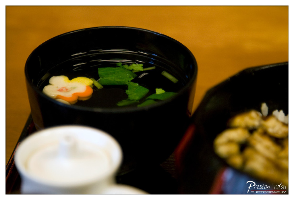

1. Overall Rating (0–10) — 7.0
This photograph captures the delicate artistry of a traditional Japanese meal, where simplicity meets visual elegance. The soft focus and warm lighting create a cozy, intimate atmosphere, drawing attention to the thoughtful presentation of the food. While the image is visually pleasing, the shallow depth of field and slightly cluttered foreground slightly diminish its overall impact.
2. Composition (0–10) — 6.5
The placement of the black bowl as the central focus works well, but the white teapot in the foreground and the blurred dish on the right create visual distractions. A tighter framing would enhance balance and direct attention more effectively.
3. Lighting (0–10) — 7.5
The warm, ambient lighting enhances the golden tones of the wooden surface and gives the scene a soft, inviting glow. The light reflects gently off the surface of the soup, emphasizing its clarity and the delicate garnish.
4. Color & Tone (0–10) — 7.0
The contrast between the deep black bowl and the bright green herbs and colorful flower-shaped garnish creates a visually striking palette. The warm color temperature reinforces the sense of comfort and tradition.
5. Creativity (0–10) — 7.5
The image successfully conveys the cultural and aesthetic values of Japanese cuisine through its attention to detail and composition. The use of a floral garnish adds a touch of whimsy and artistry, elevating the dish beyond mere sustenance.
6. Technical Quality (0–10) — 7.0
The focus is well-placed on the bowl, with the foreground and background softly blurred, creating a pleasing bokeh effect. The image is sharp where it matters, though the overall resolution and clarity could be improved.
7. Emotional Impact (0–10) — 6.5
The photograph evokes a sense of calm and appreciation for mindful dining, but the viewer’s connection is slightly hindered by the lack of a clear narrative or subject. It feels more like a still life than a moment captured in time.