Preston Lau: A Journey Through Memories, Tech, and Humanity
Welcome to my personal blog that delves into the intricate tapestry of personal albums and the fascinating intersection of ever-evolving technology and humanity. Come along on a journey with me as we delve into the seamless fusion of creativity, state-of-the-art AI and robotics, intricately interwoven within the tapestry of our shared awareness. Have fun!
From Gold Rush History to City Lights: Exploring Jiufen Old Street in Taiwan
Our journey took us from the historic hillside lanes of Jiufen to the modern heights of Taipei, offering a wonderful contrast of experiences. Jiufen (九份), originally founded during the Qing Dynasty, was a relatively quiet and isolated village until a significant event in 1893: the discovery of gold during the Japanese occupation. This sparked a dramatic gold rush that rapidly developed the town, attracting fortune seekers and transforming its landscape. The period of Japanese influence left an indelible mark, and many buildings in Jiufen today wonderfully retain the architectural style of that era, reflecting the fusion of Japanese and local culture on the island.
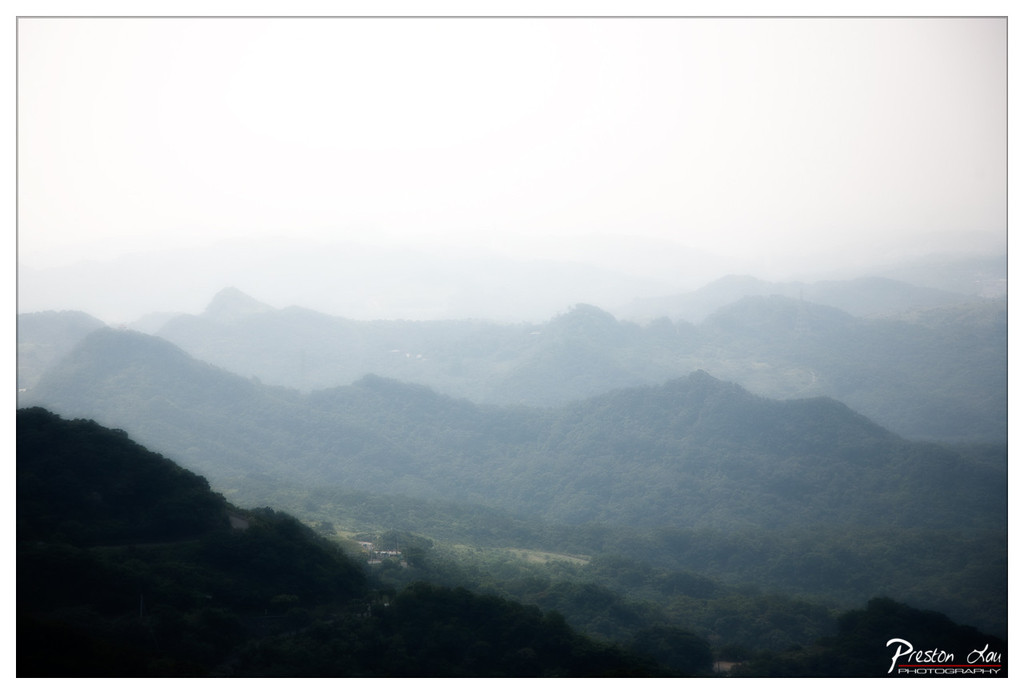
1. Overall Rating (0–10) — 7.0 This photograph captures a serene, atmospheric vista of layered mountains shrouded in mist, evoking a sense of quiet vastness and timelessness. The soft diffusion of light and the gradual fading of the landscape into the haze create a dreamlike quality, though the lack of sharp detail slightly undermines the image’s visual punch. While the mood is contemplative and immersive, the subdued contrast and muted tones keep it from achieving a more commanding presence.
2. Composition (0–10) — 7.5 The layered hills create a strong sense of depth, with the dark foreground hill anchoring the frame and guiding the eye into the hazy distance. The composition is balanced and expansive, though the lack of a clear focal point leaves the viewer’s gaze wandering without a definitive destination.
3. Lighting (0–10) — 6.5 The diffuse, overcast light enhances the misty atmosphere, softening edges and creating a seamless gradient from foreground to background. However, the flatness of the light reduces textural detail in the hills and contributes to the overall lack of contrast.
4. Color & Tone (0–10) — 6.0 The palette is dominated by cool, desaturated greens and grays, which reinforce the misty mood but also limit vibrancy. The tonal range is narrow, with the dark foreground providing a subtle contrast to the pale, hazy sky.
5. Creativity (0–10) — 7.0 The photographer successfully translates the ethereal quality of a misty landscape into a visual narrative, using atmospheric conditions as a central element. The choice to embrace the haze rather than fight it demonstrates an understanding of mood over clarity.
6. Technical Quality (0–10) — 7.0 The image is sharp in the foreground and free of visible noise, with a clean exposure. The soft focus on the distant hills is appropriate for the atmospheric intent, and the watermark is unobtrusive.
7. Emotional Impact (0–10) — 7.5 The photograph evokes a sense of calm and introspection, inviting the viewer into a quiet, meditative space. The vastness and mystery of the obscured landscape stir feelings of solitude and wonder, making it emotionally resonant despite its subtlety.
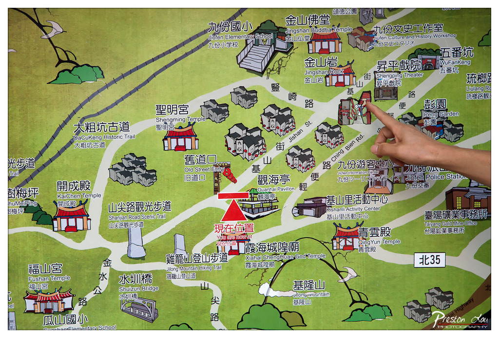
1. Overall Rating (0–10) — 6.0 This image captures a moment of orientation, where a hand points to a location on a stylized map of Jiufen, blending cultural navigation with personal exploration. The illustration’s whimsical design and layered labels convey a sense of place and history, though the photo’s documentary nature prevents it from feeling fully artistic. While the composition is functional and informative, it lacks visual tension or emotional depth, serving more as a travel snapshot than a compelling visual statement.
2. Composition (0–10) — 5.5 The hand enters from the right, drawing attention to the map’s central area, but the framing is slightly off-center, and the map’s detailed layout creates visual clutter. A tighter crop would improve focus and balance.
3. Lighting (0–10) — 6.0 The lighting is even and bright, likely from an overhead source, allowing all text and illustrations to be clearly visible. However, the flat illumination lacks directionality, giving the scene a neutral, utilitarian quality.
4. Color & Tone (0–10) — 6.5 The palette is vibrant and playful, with bold greens, reds, and yellows that reflect the map’s illustrative style. The color choices enhance readability and charm, though the saturation feels slightly overprocessed.
5. Creativity (0–10) — 6.0 The juxtaposition of a real hand pointing at a cartoonish map creates a subtle narrative of discovery. While not groundbreaking, the image successfully merges reality and illustration in a way that feels both personal and informative.
6. Technical Quality (0–10) — 7.5 The image is sharp, with clear focus on the map and hand. The resolution is high, and the text remains legible. However, the depth of field is shallow, and the background elements are slightly soft.
7. Emotional Impact (0–10) — 5.5 The photograph evokes a sense of curiosity and travel, but the emotional resonance is limited by its straightforward documentation. The viewer is invited to explore, but not deeply moved by the moment.
A more somber part of its history saw the town house a Japanese prisoner of war camp during World War II, where captured Allied soldiers were forced to work in the arduous conditions of the gold mines. After the war, as the gold mining activities declined, Jiufen transitioned, eventually becoming the charming tourist destination it is today, a place that remembers and celebrates Taiwanese history and culture. From the early 1990s, a renewed interest led to a tourism boom that has firmly established Jiufen as a popular and easily accessible day trip from Taipei City, approximately two hours away by public transit, making it a convenient escape from the urban environment.
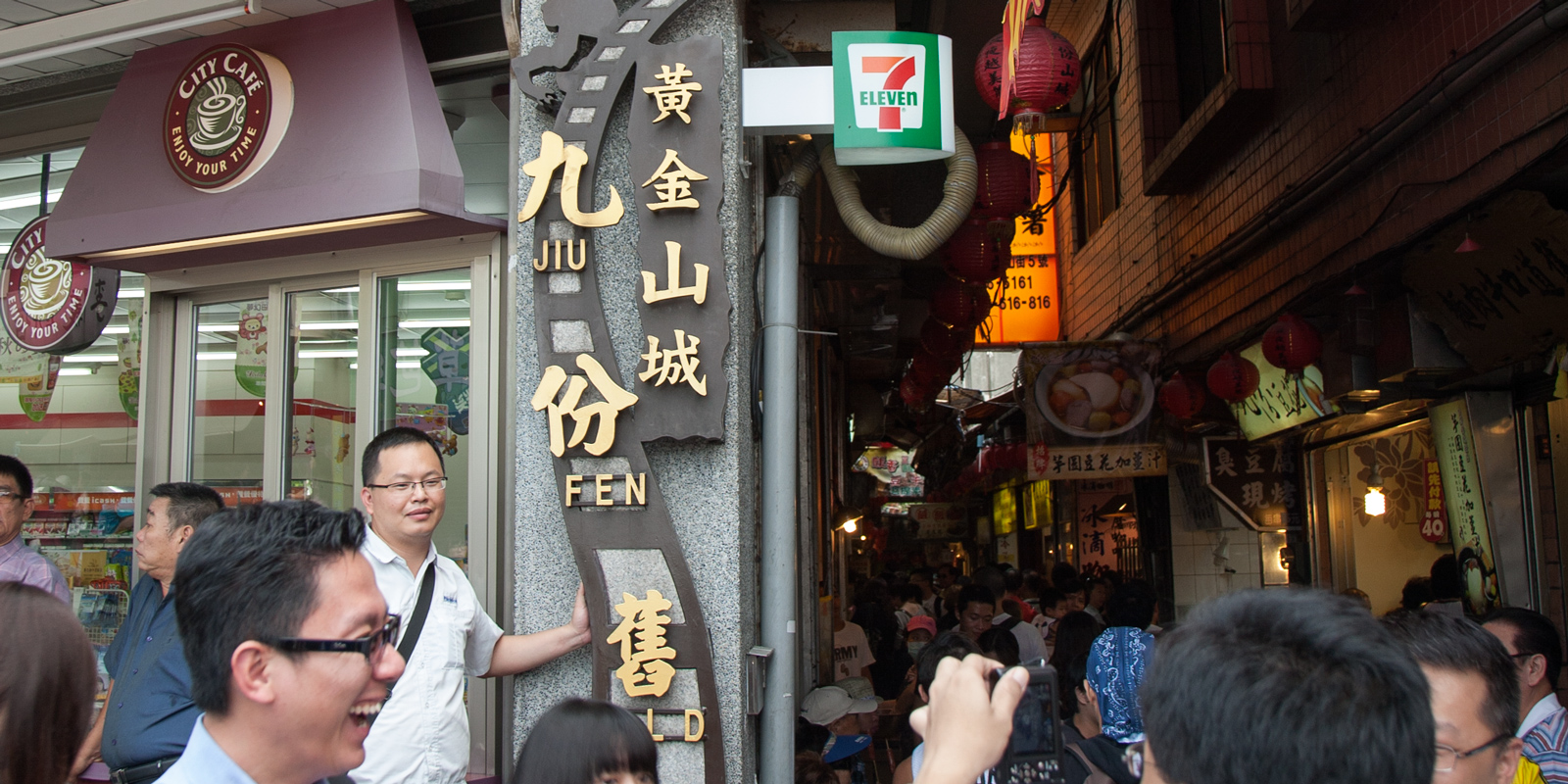
1. Overall Rating (0–10) — 7.0 This photograph captures the vibrant energy of a bustling urban alleyway, where tradition and modernity collide in a visually rich tapestry. The layered signage and dense crowd convey a sense of movement and cultural depth, while the contrast between the whimsical “Jiu Fen” sculpture and the commercial 7-Eleven sign speaks to the layered identity of the location. While the image is compelling in its narrative, it’s slightly hindered by the cluttered foreground and overexposed highlights, which distract from the central focus.
2. Composition (0–10) — 6.5 The subject is centered but partially obscured by the crowd in the foreground, creating a sense of depth while sacrificing clarity. The vertical sign draws the eye upward, but the busy scene below competes for attention.
3. Lighting (0–10) — 6.0 Natural daylight illuminates the scene evenly, but the bright reflections on the glass and signage cause some overexposure. The warm glow from the interior lights adds contrast, though it doesn’t fully balance the harsher outdoor light.
4. Color & Tone (0–10) — 7.0 The palette is rich and varied, with the bold reds and yellows of the awning and lanterns standing out against the muted grays and earth tones of the stone and signage. The warm highlights enhance the sense of a lively street scene.
5. Creativity (0–10) — 7.5 The juxtaposition of traditional Chinese signage with modern commercial branding creates a unique narrative. The inclusion of the whimsical figure on the sign adds a playful touch, elevating the image beyond mere documentation.
6. Technical Quality (0–10) — 7.5 Sharp focus on the central sign and clear detail in the background suggest a high-quality capture. The depth of field is appropriate, though some minor lens flare and overexposed areas slightly reduce overall clarity.
7. Emotional Impact (0–10) — 7.0 The photograph evokes a sense of place—alive, chaotic, and deeply rooted in local culture. The viewer feels immersed in the moment, caught in the pulse of a crowded street, though the lack of a clear focal point keeps the emotional resonance slightly diffuse.
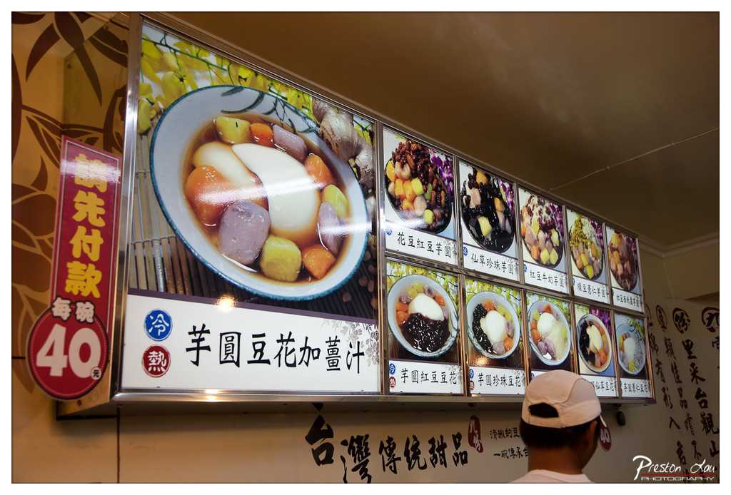
1. Overall Rating (0–10) — 6.0 This photograph captures the vibrant, sensory atmosphere of a traditional Taiwanese dessert shop, where color, text, and food converge to tell a story of local culture. The menu display, with its richly illustrated bowls of sweet treats, draws the eye and conveys a sense of abundance, while the presence of the customer in the foreground grounds the scene in everyday life. However, the image feels slightly cluttered and overexposed in places, and the angle gives it a candid, snapshot-like quality that limits its artistic polish.
2. Composition (0–10) — 5.5 The framing is slightly off-center, with the large menu sign dominating the upper half and the customer’s head partially obscuring the lower right. While the diagonal line of the menu creates visual movement, the lack of a clear focal point and the presence of distracting elements—like the red sign and text—reduce compositional harmony.
3. Lighting (0–10) — 5.0 The lighting is functional but flat, likely from overhead fluorescent fixtures, which wash out the colors and create harsh reflections on the glass cover of the menu. The warm tone of the interior helps temper the clinical feel, but the lack of directional or ambient light diminishes depth and mood.
4. Color & Tone (0–10) — 6.0 The palette is rich and varied, with the warm yellows and browns of the menu and wall contrasting with the vibrant purples, reds, and greens of the dessert images. However, the color saturation is uneven, and some areas appear oversaturated due to reflections and flash, disrupting visual balance.
5. Creativity (0–10) — 6.5 The image successfully captures a slice of authentic street food culture with a documentary eye. The layered text, food images, and human element make it feel narrative and immersive, though the execution leans more toward observation than deliberate artistic expression.
6. Technical Quality (0–10) — 7.0 The photograph is sharp and well-focused, particularly on the menu display. The depth of field is adequate, and the image retains detail in both highlights and shadows. However, the reflections on the glass and slight overexposure in bright areas detract from overall clarity.
7. Emotional Impact (0–10) — 5.5 The image evokes a sense of familiarity and curiosity about the flavors and traditions of Taiwanese desserts. While it conveys the energy of a bustling food stall, the emotional connection is limited by the lack of a strong subject or mood, leaving the viewer as a passive observer rather than an engaged participant.
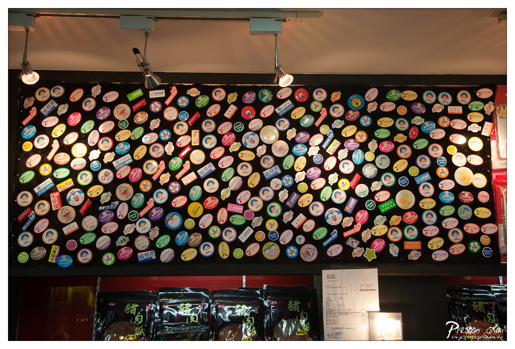
1. Overall Rating (0–10) — 7.0 This photograph captures the vibrant energy of a local shop, where a wall of colorful, densely packed badges tells a story of community and tradition. The warm lighting and rich textures create an inviting, almost nostalgic atmosphere, while the contrast between the playful badges and the serious product packaging below adds visual intrigue. While the sheer number of elements risks visual clutter, the image succeeds in conveying a sense of cultural richness and authenticity.
2. Composition (0–10) — 7.0 The horizontal framing emphasizes the breadth of the badge collection, with the product packaging anchoring the lower third. The slightly tilted angle of the wall adds dynamic tension, though a more centered composition might improve balance.
3. Lighting (0–10) — 7.5 Directional track lighting highlights the badges effectively, creating soft shadows and a warm glow that enhances their colors. The light sources are visible, adding a subtle sense of place, though their inclusion could be more seamlessly integrated.
4. Color & Tone (0–10) — 8.0 The palette is rich and varied, with bright, saturated hues of the badges contrasting against the dark background and deep red lower section. The warm tones lend a cozy, inviting feel, while the tonal contrast keeps the image visually engaging.
5. Creativity (0–10) — 7.5 The juxtaposition of collectible badges and packaged food products suggests a narrative of local identity and consumer culture. The photograph functions as both documentation and visual storytelling, capturing a unique aspect of everyday life with a playful, artistic eye.
6. Technical Quality (0–10) — 8.0 Sharp focus and clean detail are evident across the frame, particularly on the badges and text. The depth of field is well-managed, ensuring both foreground and background elements remain clear.
7. Emotional Impact (0–10) — 7.0 The image evokes a sense of warmth and familiarity, inviting viewers to imagine the stories behind each badge and the people who collected them. While it doesn’t elicit strong emotion, it resonates with quiet charm and cultural pride.
Today, the town of Jiufen is a picturesque maze of narrow alleys, clinging to the hillside and offering fantastic views of the ocean stretching out below. The architecture is a captivating mix of retro Chinese and Japanese styles, with many buildings adorned with traditional red lanterns, contributing to the town's iconic, atmospheric look, especially as dusk settles. The heart of the town is the bustling Jiu Fen Old Street (九份老街). Walking down this vibrant street truly feels like stepping back into "Taiwan in the olden days," with a wide variety of traditional shops, inviting restaurants, and cozy cafes crammed together along the winding path.
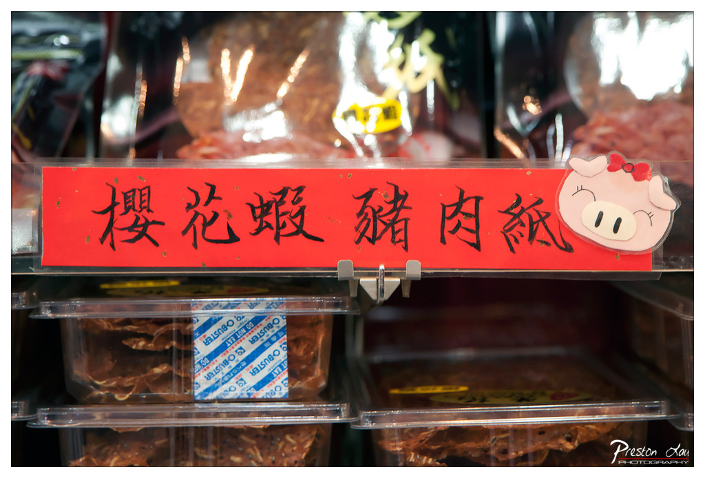
1. Overall Rating (0–10) — 6.0 This image captures a slice of everyday life in a bustling food market, where the bright red sign and whimsical pig sticker inject a playful energy into the scene. The composition draws attention to the product with clarity, yet the busy background and harsh reflections slightly dilute the visual focus. While the photograph effectively documents a moment of local commerce, it lacks the compositional refinement to elevate it beyond a simple snapshot.
2. Composition (0–10) — 6.0 The central red sign dominates the frame, but the cluttered background and uneven depth of field create visual noise. A tighter crop would emphasize the sign and its playful design.
3. Lighting (0–10) — 5.5 Harsh overhead lighting creates strong reflections on the plastic packaging, obscuring details and introducing glare. The light is functional but lacks the softness needed to enhance texture and mood.
4. Color & Tone (0–10) — 6.5 The bold red of the sign contrasts sharply with the muted browns and grays of the meat packaging, creating a dynamic visual anchor. However, the overall palette feels unbalanced due to the lack of tonal harmony.
5. Creativity (0–10) — 6.0 The inclusion of the cute pig sticker adds a touch of whimsy and cultural charm, suggesting a lighthearted approach to a mundane setting. The image is more observational than conceptual.
6. Technical Quality (0–10) — 7.0 The focus is sharp on the sign and the immediate foreground, and the details are clear. However, the reflections and slight overexposure in the background reduce overall clarity.
7. Emotional Impact (0–10) — 5.5 The image evokes a sense of curiosity and familiarity, inviting the viewer to imagine the flavors and stories behind the food. Yet the emotional resonance remains surface-level due to the lack of narrative depth.
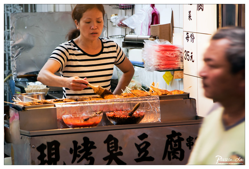
1. Overall Rating (0–10) — 7.5 This photograph captures the vibrant energy of a street food stall with a strong sense of immediacy and authenticity. The woman’s focused expression and the dynamic motion of brushing sauce infuse the scene with life, while the blurred passerby adds a layer of urban rhythm. Though the composition feels slightly cluttered, the image succeeds in conveying the tactile, sensory world of street cooking—its warmth, movement, and human connection. A more deliberate framing could enhance the narrative, but as it stands, it feels like a candid moment frozen in time.
2. Composition (0–10) — 6.5 The subject is well-placed, but the foreground blur and background clutter compete for attention. A tighter crop would sharpen focus on the vendor and her craft.
3. Lighting (0–10) — 7.0 Natural, directional light highlights the texture of the food and the vendor’s hands, creating depth. The warm glow of the grill enhances the scene’s authenticity, though some areas remain slightly underexposed.
4. Color & Tone (0–10) — 7.5 The reds of the sauce and the warm tones of the grilled items pop against the neutral background, while the black-and-white stripes of the shirt provide visual rhythm. The color palette feels natural and inviting.
5. Creativity (0–10) — 7.0 The use of motion blur and shallow depth of field creates a sense of realism and spontaneity. The choice to center on the action of cooking rather than a posed portrait adds narrative strength.
6. Technical Quality (0–10) — 8.0 Sharp focus on the subject, clean detail in the food and hands, and effective use of depth of field demonstrate strong technical control.
7. Emotional Impact (0–10) — 7.5 The image evokes a sense of warmth and connection to everyday life, inviting the viewer into a moment of simple, shared culture. The vendor’s concentration and the bustling environment resonate with quiet dignity.
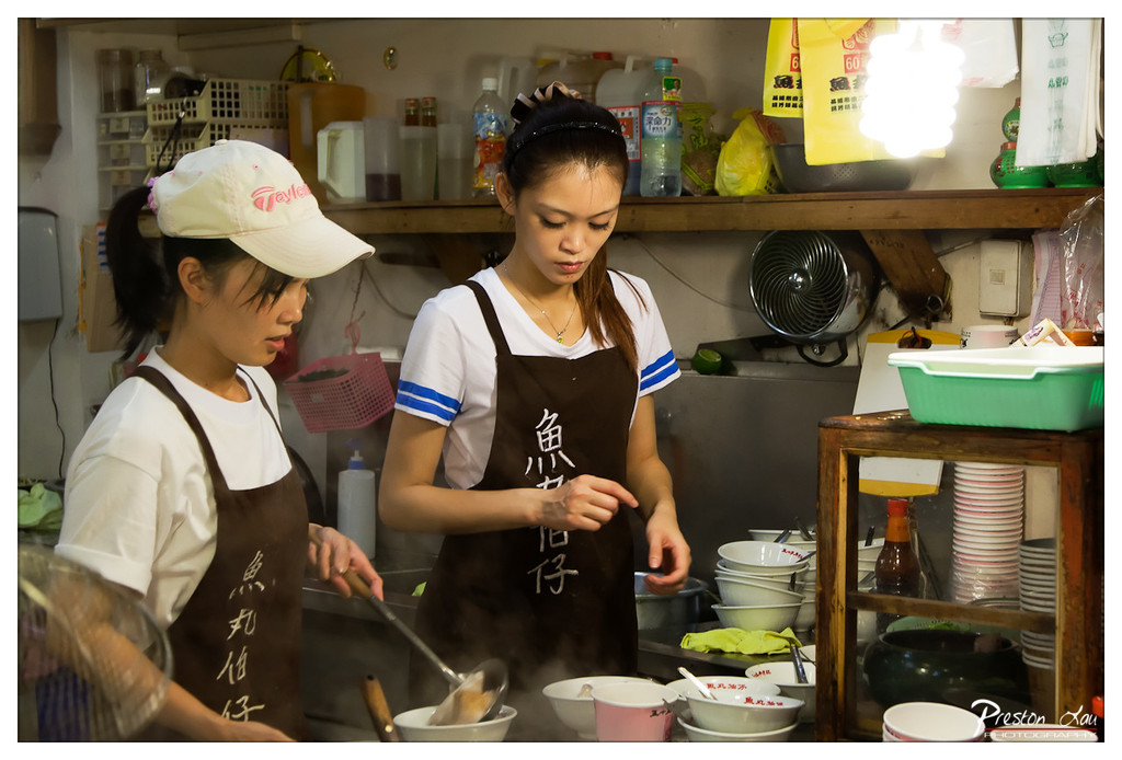
1. Overall Rating (0–10) — 7.0 This photograph captures the intimate, bustling energy of a small food stall, where two women work in tandem with quiet focus. The steam rising from the bowls and the cluttered, lived-in environment lend authenticity and warmth, making the scene feel both candid and deeply rooted in daily life. While the image is rich in narrative, the lighting and composition could be more refined to elevate the visual impact.
2. Composition (0–10) — 6.0 The framing is slightly off-center, with the left foreground slightly cut off and the right side feeling cluttered. The two women are well-positioned, but the visual weight is uneven due to the overexposed light source and the chaotic background.
3. Lighting (0–10) — 5.5 A harsh overhead light creates a bright, glaring spot that distracts from the scene. While it illuminates the subjects clearly, the lack of softness and directionality flattens the image and obscures subtle textures.
4. Color & Tone (0–10) — 6.5 The palette is dominated by warm browns and muted whites, punctuated by the green container and red bottle. While the colors feel natural, the overall tone is slightly flat, with the bright light washing out some detail and reducing contrast.
5. Creativity (0–10) — 7.0 The image succeeds in capturing a slice of everyday life with authenticity and cultural specificity. The handwritten characters on the aprons and the steamy, intimate setting suggest a personal story, offering a glimpse into a working environment that feels both familiar and unique.
6. Technical Quality (0–10) — 7.5 The focus is sharp on the subjects, and the depth of field is appropriate, drawing attention to the action. The details in the aprons and the steam are well captured, despite the challenging lighting conditions.
7. Emotional Impact (0–10) — 7.0 There is a quiet dignity in the women’s concentration, evoking a sense of dedication and routine. The steam and clutter create a sensory atmosphere that invites the viewer into the moment, fostering a connection to the labor and care behind the food.
Jiufen Old Street is particularly famous for its incredible array of local snacks, and the street is indeed filled with delicious temptations. It's said that almost every tourist who visits Jiufen makes a point to taste the renowned local specialties, and we certainly did our best! We savored traditional treats like Glutinous Rice Cake (草仔粿), often green in color with a soft, chewy texture and various sweet or savory fillings, and its taro-flavored cousin, Taro Glutinous Rice Cake (芋仔粿). We also tried Hongzao Meatball (紅槽肉圓), a unique dish with a distinctive reddish hue from fermented red yeast rice, featuring a chewy skin wrapped around a savory meat filling, served with a special sauce. But perhaps the most iconic Jiufen snack is Taro Rice Balls (芋圓). These delightful chewy balls, made from taro and sweet potato, are typically served in a bowl with a sweet syrup or soup, enjoyed either cold and refreshing or hot and comforting, often with added toppings like beans. The street is a constant culinary adventure, with the aromas of these and countless other snacks wafting through the air. We enjoyed the food so much that we ended up buying some herbal cakes and packs of taro balls to bring home as delicious souvenirs, extending the taste of Jiufen beyond our visit.
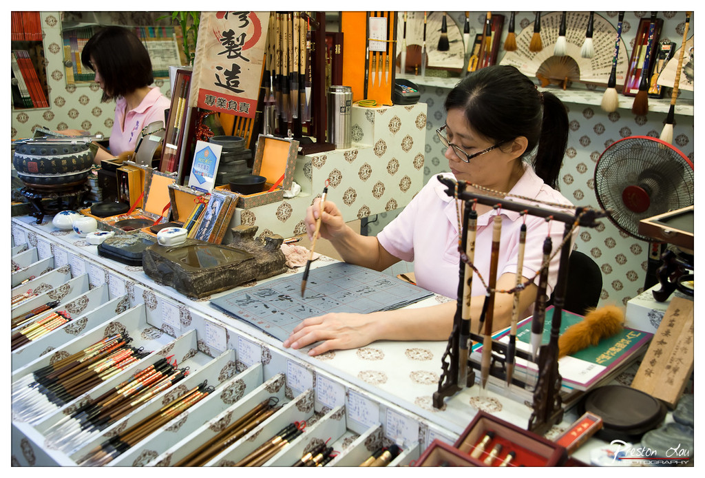
1. Overall Rating (0–10) — 7.5 This photograph captures the quiet focus of traditional calligraphy in a bustling shop, where artistry and commerce coexist. The rich detail of brushes, ink stones, and practiced hands conveys a deep cultural reverence, while the layered composition invites the viewer into a world of quiet craftsmanship. The image feels authentic and immersive, though the slight clutter tempers its visual elegance.
2. Composition (0–10) — 7.0 The frame is densely packed with objects, creating a sense of depth and context. The woman’s posture and the diagonal line of the brush guide the eye across the scene, though the arrangement feels slightly busy, with too many competing elements in the foreground.
3. Lighting (0–10) — 6.5 The lighting is functional and even, likely from overhead fluorescent sources, which flattens shadows and reduces the sense of atmosphere. While it ensures clarity, the lack of directional or ambient light diminishes the mood and depth of the scene.
4. Color & Tone (0–10) — 7.0 The palette is warm and cohesive, dominated by earthy browns, soft pinks, and muted golds that reflect the traditional materials. The tonal range is balanced, though slightly muted, giving the image a documentary feel rather than a polished aesthetic.
5. Creativity (0–10) — 8.0 The image succeeds in capturing a moment of cultural practice with authenticity and narrative depth. The inclusion of both the calligrapher and the array of tools tells a story of craftsmanship and continuity, elevating the photo beyond mere documentation.
6. Technical Quality (0–10) — 8.0 The focus is sharp on the central subject, with fine detail visible in the brush and paper. The image is well-exposed, with no significant noise or blur, indicating strong technical execution.
7. Emotional Impact (0–10) — 7.5 There is a quiet dignity in the woman’s concentration, evoking respect for tradition and the patience required in mastering calligraphy. The viewer is drawn into the ritual, feeling a connection to the enduring art form, even if the scene feels slightly removed due to its busy surroundings.
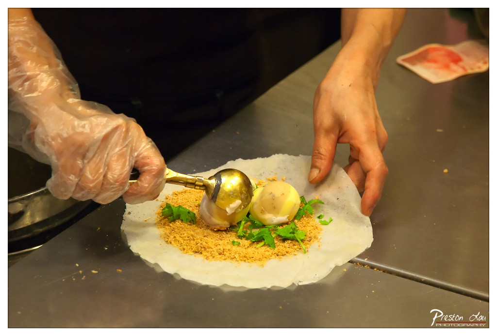
1. Overall Rating (0–10) — 7.0 This photograph captures the tactile intimacy of food preparation with vivid clarity and sensory appeal. The focus on hands at work, the contrast between the golden scoop and the fresh green herbs, and the textured bed of crumbs all contribute to a dynamic, appetizing moment. While the composition is strong and the lighting highlights the subject effectively, the image feels slightly overexposed in the highlights, which softens the overall depth.
2. Composition (0–10) — 7.5 The diagonal placement of the hands and the central positioning of the ingredients create a natural visual flow, drawing the eye from the scooping action to the finished arrangement. The shallow depth of field effectively isolates the subject, though the background clutter slightly distracts from the focal point.
3. Lighting (0–10) — 7.0 The warm, directional light enhances the golden tones of the scoop and the crumbly texture, creating a sense of warmth and immediacy. However, the highlights on the plastic glove and metal scoop are slightly blown out, reducing detail in the brightest areas.
4. Color & Tone (0–10) — 7.5 The palette is rich and inviting, with the contrast between the pale dough, vibrant green herbs, and golden crumbs creating a visually appealing composition. The warm tone enhances the feeling of freshly made food, though the overall saturation could be slightly more balanced.
5. Creativity (0–10) — 7.0 The image successfully captures a moment of culinary craftsmanship, emphasizing texture and process. The choice to focus on the hands and ingredients rather than a full dish adds a sense of authenticity and intimacy, making the scene feel personal and alive.
6. Technical Quality (0–10) — 8.0 The image is sharp and well-focused on the central action, with clean detail in the textures of the ingredients. The depth of field is controlled effectively, and the exposure is generally well-managed despite minor overexposure in highlights.
7. Emotional Impact (0–10) — 7.5 The photograph evokes a sense of care and craftsmanship, inviting the viewer into the moment of creation. The tactile quality of the scene—hands at work, fresh ingredients, warm light—generates a feeling of authenticity and anticipation, making the viewer almost taste the dish.
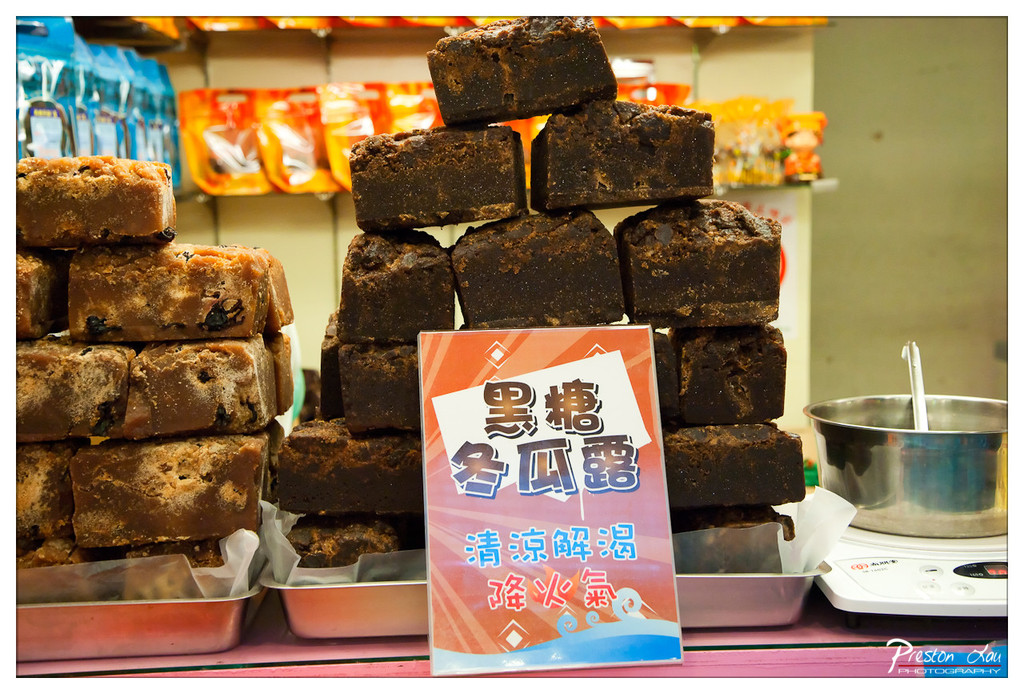
1. Overall Rating (0–10) — 6.8 This photograph captures the vibrant energy of a street food stall, where the rich textures of molasses-based sweets draw the eye. The warm lighting and layered composition create a sense of immediacy and authenticity, while the sign’s bold typography adds cultural context. Though the scene feels slightly cluttered, the image succeeds in conveying the sensory appeal of the product and the atmosphere of a bustling market.
2. Composition (0–10) — 6.5 The stacked sweets dominate the frame, creating visual weight, but the placement of the sign and the background elements introduce slight imbalance. A tighter crop could improve focus on the central subject.
3. Lighting (0–10) — 7.0 Warm, ambient lighting enhances the rich browns and golden tones of the sweets, giving them an inviting glow. The light appears natural and functional, supporting the scene’s authenticity.
4. Color & Tone (0–10) — 7.5 The contrast between the dark brown sweets and the bright orange and blue signage creates a lively palette. The colors feel energetic and culturally resonant, though the overall tone leans slightly toward the warm side.
5. Creativity (0–10) — 6.0 The image is strong as a documentary capture, emphasizing cultural specificity and product appeal. While it doesn’t push artistic boundaries, its strength lies in storytelling and context.
6. Technical Quality (0–10) — 8.0 Sharp focus on the foreground elements, clear detail in the textures of the sweets, and well-managed depth of field contribute to a polished technical execution.
7. Emotional Impact (0–10) — 6.5 The photograph evokes a sense of nostalgia and local flavor, inviting viewers to imagine the taste and aroma. It connects emotionally through cultural authenticity, though the distance created by the busy background tempers the intimacy.
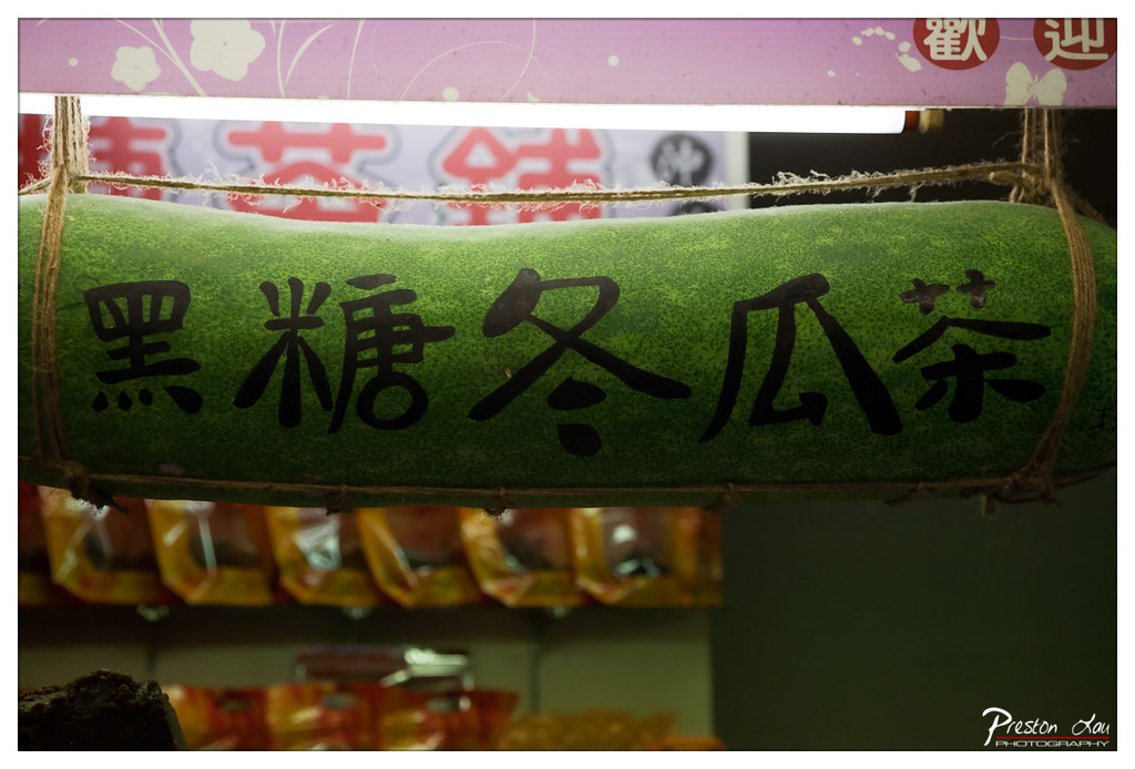
1. Overall Rating (0–10) — 7.0 This photograph captures the quirky charm of a traditional tea stall, where a repurposed winter melon serves as a whimsical sign for “Black Sugar Winter Melon Tea.” The bold, handwritten characters and the rustic rope binding lend an authentic, artisanal feel, while the warm lighting and blurred background evoke a cozy, street-side atmosphere. While the image is visually engaging, its narrative potential is slightly limited by the shallow depth of field, which obscures contextual details.
2. Composition (0–10) — 7.5 The winter melon is centered and framed to emphasize the calligraphy, creating a strong focal point. The diagonal ropes and the soft background blur guide the eye naturally, though the cluttered signage behind detracts slightly from the clean aesthetic.
3. Lighting (0–10) — 6.5 The warm, directional light from above highlights the texture of the melon and casts soft shadows, enhancing depth. However, the backlighting creates a slight glare on the sign, reducing legibility in parts.
4. Color & Tone (0–10) — 7.0 The contrast between the vibrant green melon and the warm golden tones of the background creates a lively palette. The black calligraphy stands out clearly, and the overall color harmony supports the image’s playful, cultural tone.
5. Creativity (0–10) — 8.0 The use of a real winter melon as a sign is inventive and culturally resonant, transforming an everyday object into a compelling visual metaphor. The composition celebrates local tradition with a sense of humor and authenticity.
6. Technical Quality (0–10) — 7.5 The focus is sharp on the melon and text, with clean detail and minimal noise. The exposure is well-balanced, though the slight overexposure on the sign suggests room for refinement in lighting control.
7. Emotional Impact (0–10) — 7.5 The image evokes a sense of curiosity and delight, inviting viewers into a world of traditional Taiwanese street food. The warmth and authenticity of the scene create a subtle emotional connection, suggesting a story of craftsmanship and local pride.
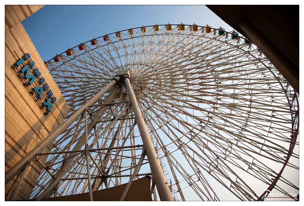
After our atmospheric journey through Jiufen's past and flavors, we returned to Taipei for a different kind of experience at Miramar Entertainment Park (美麗華百樂園). Located in the modern Dazhi area, Miramar is a large shopping mall offering a wide range of retail, dining, and indoor entertainment options, a stark contrast to the historic charm of Jiufen. Its most prominent and iconic feature is the magnificent Ferris wheel situated right on the roof of the building. Standing at 95 meters high with a 70-meter diameter, it's one of Taiwan's most significant and recognizable Ferris wheels, offering impressive views of the city.
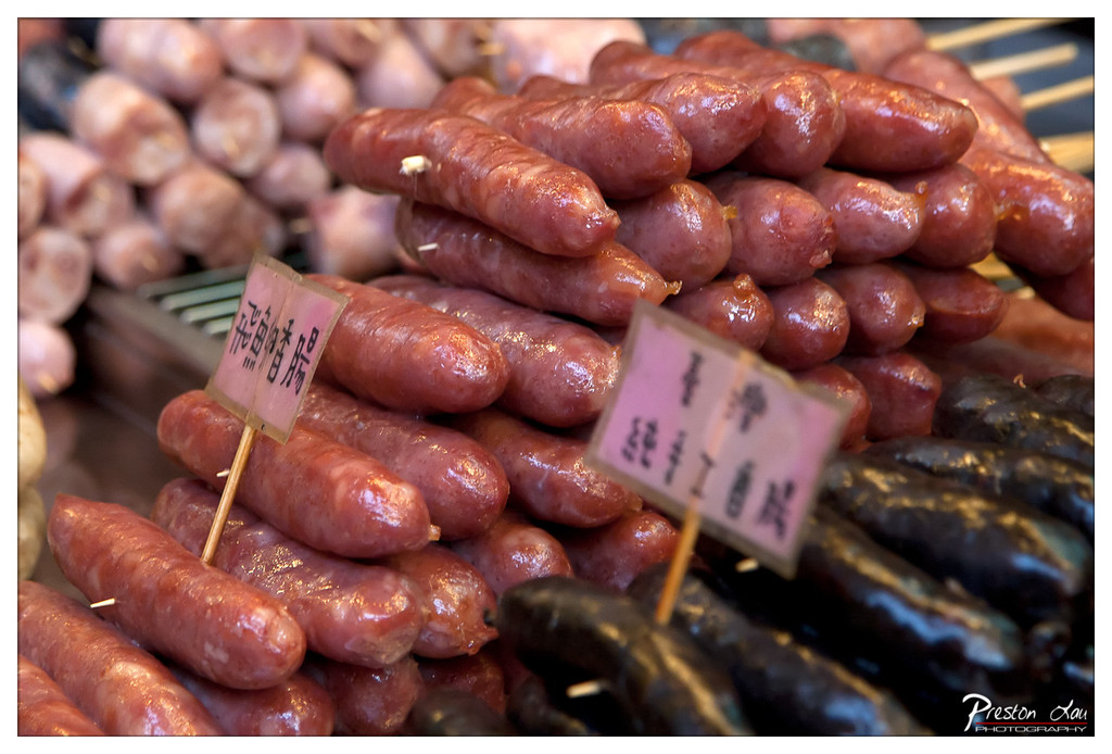
1. Overall Rating (0–10) — 7.0 This photograph captures the vibrant energy of a bustling street market, where the glossy sheen of sausages and the handwritten signs evoke a sense of authenticity and culinary tradition. The close-up framing immerses the viewer in the textures and colors of the scene, creating a tactile, almost sensory experience. While the composition leans slightly toward clutter, the rich detail and cultural specificity lend it a compelling, documentary-like charm.
2. Composition (0–10) — 6.5 The subject is well-centered with a strong foreground focus, but the overlapping sausages and signs create visual busyness. A tighter crop could enhance clarity and direct attention more effectively.
3. Lighting (0–10) — 7.0 Natural, directional light highlights the glistening surfaces of the sausages, emphasizing their freshness and texture. The shadows are soft and well-balanced, adding depth without obscuring details.
4. Color & Tone (0–10) — 7.5 The warm reds of the sausages contrast vividly with the dark, charred ones, creating a dynamic palette. The slight desaturation in the background helps the foreground pop, enhancing visual hierarchy.
5. Creativity (0–10) — 7.0 The image captures an everyday moment with a strong sense of place, using cultural signage and organic arrangement to tell a story of food and tradition. The choice to focus on the textures and labels adds narrative depth.
6. Technical Quality (0–10) — 8.0 Sharp focus on the central sausages and clear detail throughout demonstrate strong technical control. The depth of field is well-managed, keeping the subject crisp while softly blurring the background.
7. Emotional Impact (0–10) — 7.0 The photograph evokes a sense of warmth and familiarity, inviting the viewer to imagine the smell and taste of freshly grilled sausages at a lively market. It feels authentic and grounded, fostering a connection to the culture behind the food.
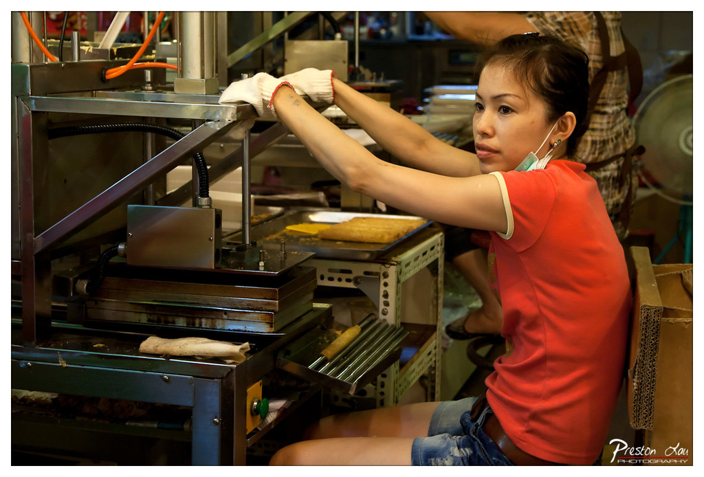
1. Overall Rating (0–10) — 7.0 This photograph captures the quiet intensity of a street food vendor at work, where precision and repetition define a daily ritual. The woman’s focused expression and the intricate machinery around her create a compelling narrative of labor and craft. While the scene is rich in detail and authenticity, the slightly cluttered background and flat lighting prevent it from achieving a more polished, cinematic feel.
2. Composition (0–10) — 6.5 The subject is well-placed off-center, creating a dynamic diagonal that leads the eye through the frame. However, the surrounding equipment and background elements compete for attention, slightly undermining the focus on the woman’s hands and expression.
3. Lighting (0–10) — 5.5 The lighting is functional and even, likely from overhead fluorescent sources, which highlights the subject clearly but lacks depth and mood. The shadows are flat, and the highlights on the metal surfaces are harsh, reducing the image’s atmospheric quality.
4. Color & Tone (0–10) — 6.5 The vibrant red of the woman’s shirt stands out against the muted metallic and cardboard tones, creating a strong focal point. However, the overall color palette is slightly desaturated, giving the image a clinical feel that contrasts with the warmth of the subject’s expression.
5. Creativity (0–10) — 7.0 The image succeeds in capturing an authentic moment of urban labor, with a strong narrative potential. The juxtaposition of human effort and industrial machinery offers a visually engaging story, though it remains grounded in realism rather than artistic interpretation.
6. Technical Quality (0–10) — 7.5 The image is sharp and well-focused, with clean detail in the hands, machine, and clothing. The depth of field is appropriately managed, keeping the subject in clear focus while softly blurring the background.
7. Emotional Impact (0–10) — 6.5 There is a quiet dignity in the woman’s concentration, evoking a sense of respect for the unseen labor behind street food culture. While the emotional resonance is present, it is restrained by the lack of dramatic lighting and compositional subtlety.
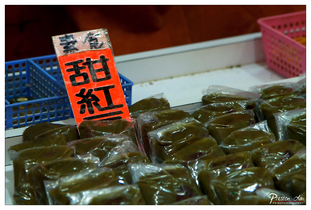
1. Overall Rating (0–10) — 6.8 This image captures a vibrant street food scene with a strong sense of cultural specificity, drawing the viewer into a moment of everyday commerce. The bold red sign with Chinese characters immediately commands attention, while the neatly wrapped green parcels evoke a sense of tradition and craftsmanship. While the composition is visually engaging, the slightly cluttered background and uneven lighting prevent it from achieving a more refined aesthetic.
2. Composition (0–10) — 6.0 The sign is well-positioned as the focal point, but the scattered plastic bags and baskets in the foreground create visual noise, distracting from the subject. A tighter crop would enhance focus and balance.
3. Lighting (0–10) — 5.5 The lighting is functional but flat, with harsh reflections on the plastic wrap that obscure texture. The warm ambient light gives the scene a slightly artificial glow, reducing depth and contrast.
4. Color & Tone (0–10) — 7.0 The vivid red of the sign creates a striking contrast against the muted green and white tones, making the image pop. The color palette is cohesive, though the overall saturation feels slightly over-processed.
5. Creativity (0–10) — 6.5 The photograph successfully captures a slice of local life with a clear cultural narrative. The choice of subject and framing reflects an interest in street-level storytelling, though the execution lacks subtlety.
6. Technical Quality (0–10) — 7.5 The image is sharp and clear, with good focus on the sign and foreground items. The shallow depth of field helps isolate the subject, though some details are lost in the reflections.
7. Emotional Impact (0–10) — 6.0 The image evokes curiosity and a sense of place, but the lack of human presence and emotional warmth keeps the viewer at a distance. It feels more like an observation than an intimate moment.
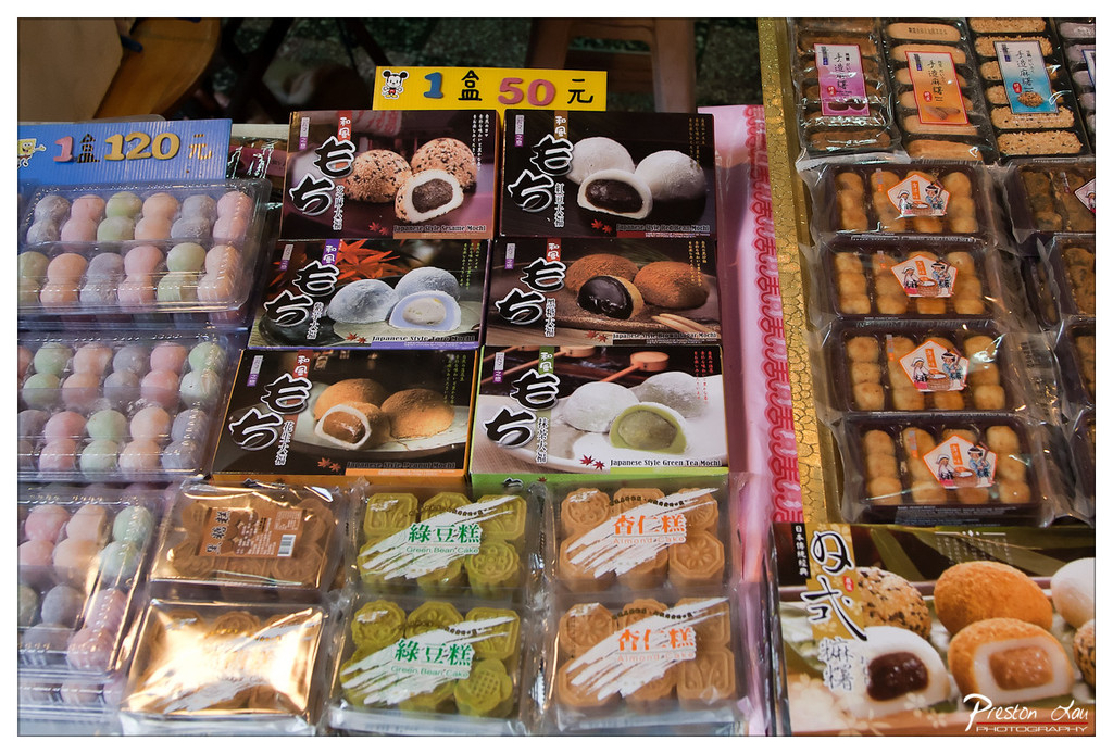
1. Overall Rating (0–10) — 7.0 This photograph captures the vibrant, colorful chaos of a traditional Asian confectionery stall, brimming with cultural specificity and tactile appeal. The variety of packaged mochi and sweets, each labeled with distinct branding, creates a rich visual tapestry that speaks to both craftsmanship and commercial appeal. While the composition feels slightly overwhelming due to the sheer number of products, the image succeeds in conveying the sensory excitement of a market scene—its strength lies in its authenticity and the subtle narrative of everyday commerce.
2. Composition (0–10) — 6.0 The frame is densely packed with products, leading to a cluttered and slightly disorganized feel. The central arrangement of mochi boxes provides a focal point, but the surrounding items compete for attention, reducing visual clarity.
3. Lighting (0–10) — 6.5 The lighting is bright and even, likely from overhead market lights, which enhances the visibility of colors and packaging details. However, the flat illumination lacks depth and shadows, giving the scene a slightly commercial, unembellished quality.
4. Color & Tone (0–10) — 7.5 The palette is rich and varied, with soft pastels, warm browns, and bright greens creating a dynamic and appetizing visual effect. The color contrast between the packaging and the products enhances the sense of abundance and variety.
5. Creativity (0–10) — 6.5 The image is more documentary than artistic, capturing a real-world scene with straightforward accuracy. While the variety of items offers visual interest, the lack of a strong compositional or conceptual narrative limits its creative impact.
6. Technical Quality (0–10) — 8.0 The image is sharp and clear, with good detail in the packaging text and textures. The focus is consistent across the frame, and the lighting allows for easy readability of labels and colors.
7. Emotional Impact (0–10) — 6.0 The photograph evokes a sense of curiosity and delight, inviting the viewer to imagine the taste and texture of the sweets. However, the overwhelming density of the scene keeps the emotional connection at a surface level, preventing deeper resonance.
Riding the Miramar Ferris wheel provides a fantastic panoramic perspective of Taipei. From the comfortable gondolas, you can take in sweeping views of the sprawling city landscape, the surrounding mountains, and on a clear day, perhaps even catch a glimpse of the distant coastline. The ride is particularly beautiful at night when the city lights twinkle below, creating a dazzling spectacle.
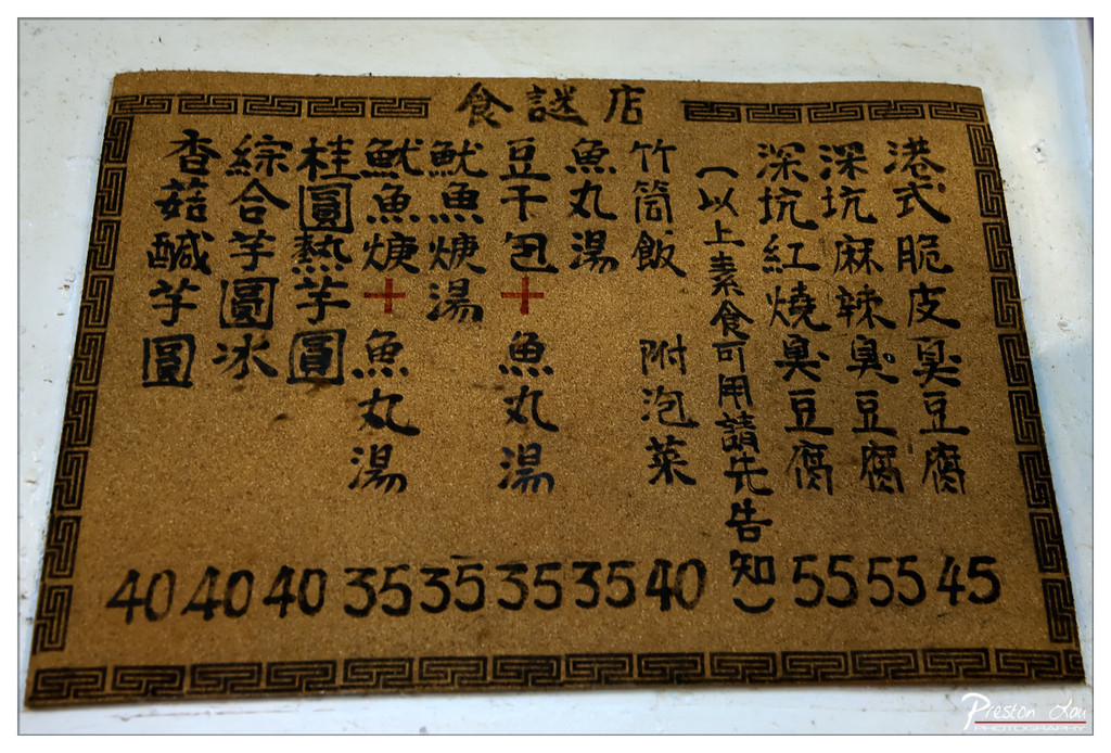
1. Overall Rating (0–10) — 6.0 This photograph captures a rustic, handwritten menu on a traditional doormat, evoking the charm of a humble, family-run eatery. The composition feels authentic and candid, with the worn texture of the mat and the bold, uneven brushstrokes lending a sense of lived-in history. While the image succeeds in conveying cultural character and nostalgia, its lack of visual polish and slightly cluttered layout prevent it from achieving greater artistic impact.
2. Composition (0–10) — 6.0 The menu is centered but slightly skewed, with uneven edges and a busy layout that draws the eye in multiple directions. The ornate border frames the text well, but the lack of negative space and overlapping elements create a sense of visual congestion.
3. Lighting (0–10) — 6.5 The lighting is even and functional, with soft shadows that highlight the texture of the mat without creating harsh contrasts. It’s adequate for documentation but lacks the directional warmth or dramatic quality that could elevate the mood.
4. Color & Tone (0–10) — 6.0 The muted brown of the mat and the black ink create a subdued, earthy palette. The red accents in the text add a touch of vibrancy, but the overall tone is flat and underwhelming, with no strong contrast or dynamic range.
5. Creativity (0–10) — 7.0 The choice to photograph a menu on a doormat is inventive and culturally resonant, transforming an everyday object into a narrative artifact. The hand-painted script and traditional design elements suggest a story of authenticity and continuity.
6. Technical Quality (0–10) — 7.5 The image is sharp and well-focused, with clear legibility of the text and a clean capture of the mat’s surface texture. The slight grain and watermark are minor distractions but do not significantly detract from the overall clarity.
7. Emotional Impact (0–10) — 6.5 The photograph stirs a sense of nostalgia and quiet pride in tradition, inviting viewers to imagine the flavors and rhythms of a small, unpretentious eatery. While emotionally engaging, it stops short of evoking deep resonance due to its straightforward presentation.
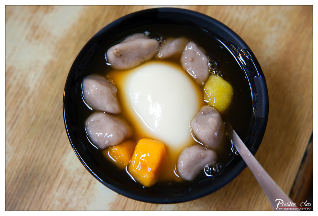
1. Overall Rating (0–10) — 7.5 This photograph captures a comforting and visually rich dessert, where the contrast between textures and colors invites the viewer into a moment of indulgence. The composition draws the eye to the central white sphere, while the surrounding elements—tapioca pearls, fruit, and syrup—add depth and narrative. The image successfully balances detail and mood, though the slightly cluttered arrangement of ingredients tempers its overall elegance.
2. Composition (0–10) — 7.0 The overhead framing centers the bowl effectively, with the spoon adding a dynamic diagonal. However, the scattered placement of the fruit and pearls creates a slightly busy feel, detracting from the clean symmetry that could elevate the image.
3. Lighting (0–10) — 7.5 Soft, diffused lighting enhances the glistening textures of the syrup and gelatinous components, creating a warm, inviting glow. The subtle highlights on the surface of the liquid add depth without harsh glare.
4. Color & Tone (0–10) — 8.0 The warm golden tones of the wood contrast beautifully with the deep black bowl, while the vibrant orange of the fruit and the creamy white center create a harmonious and appetizing palette. The overall tonal range is rich and balanced.
5. Creativity (0–10) — 7.5 The image captures a common dessert with a sense of care and intention, transforming a simple dish into a visually compelling subject. The choice of angle and focus on texture shows thoughtful storytelling.
6. Technical Quality (0–10) — 8.0 Sharp focus on the central elements, with a shallow depth of field that gently blurs the background, enhances clarity and directs attention. The image is clean and well-exposed.
7. Emotional Impact (0–10) — 8.0 The photograph evokes warmth, comfort, and indulgence—almost a sensory invitation to taste the dessert. The combination of textures and colors stirs a sense of nostalgia and pleasure, making it emotionally resonant.
1. Overall Rating (0–10) — 7.0 This photograph captures the grandeur of a towering Ferris wheel with a striking sense of scale and architectural complexity. The low-angle perspective emphasizes the structure’s dominance against the sky, while the inclusion of the Samsung IMAX sign grounds the scene in a modern urban context. Though the image is visually compelling, its potential is slightly diminished by a lack of dynamic lighting and a muted color palette that holds back the emotional punch of the moment.
2. Composition (0–10) — 7.5 The low-angle, wide-angle framing creates a dramatic sense of scale, drawing the eye upward through the intricate lattice of the Ferris wheel. The diagonal lines of the support beams and the building’s edge guide the viewer’s gaze toward the center, while the inclusion of the IMAX sign adds narrative context without disrupting the balance.
3. Lighting (0–10) — 6.0 The soft, diffused light of early morning or late afternoon casts a gentle glow across the scene, minimizing harsh shadows and highlighting the delicate framework of the wheel. However, the lighting lacks depth and contrast, resulting in a somewhat flat appearance that reduces the visual drama.
4. Color & Tone (0–10) — 6.5 The color palette is dominated by neutral grays and soft blues, creating a calm, almost monochromatic tone. While the blue of the sky provides a subtle contrast, the overall lack of saturation dampens the vibrancy of the scene, making it feel more documentary than evocative.
5. Creativity (0–10) — 7.0 The choice of perspective and the integration of urban signage lend a narrative quality to the image, transforming a simple architectural subject into a commentary on modern leisure and technology. The composition suggests a quiet moment of awe, elevating the photograph beyond mere documentation.
6. Technical Quality (0–10) — 8.0 The image is sharp and well-focused, with clear detail visible in the metal framework of the Ferris wheel. The wide-angle lens is used effectively to capture the full scale of the structure, and the exposure is balanced, avoiding overexposed highlights or crushed shadows.
7. Emotional Impact (0–10) — 6.5 The photograph evokes a sense of wonder and quiet contemplation, inviting the viewer to consider the intersection of human engineering and everyday life. While the emotional resonance is present, it is held back by the subdued lighting and color, leaving the image feeling more observational than deeply moving.
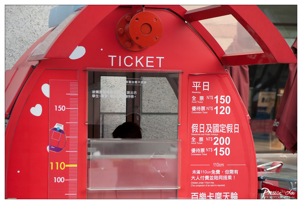
1. Overall Rating (0–10) — 6.0 This image captures a vibrant red ticket booth with a playful, child-friendly design, emphasizing accessibility and whimsy. The bold color and clear signage make the subject instantly legible, but the composition feels slightly cluttered, with text and graphics competing for attention. While the photo effectively conveys the functional purpose of the booth, it lacks a deeper narrative or visual elegance, settling for a straightforward documentation rather than an artistic interpretation.
2. Composition (0–10) — 5.5 The frame centers on the ticket booth, but the inclusion of the background shop and partial awning creates visual distraction. The height chart and price list on the left and right edges divide the image unevenly, disrupting the balance.
3. Lighting (0–10) — 6.0 Natural daylight illuminates the scene evenly, preserving the vivid red of the booth and ensuring legibility of the text. However, the flat lighting lacks depth and fails to highlight texture or create dynamic shadows.
4. Color & Tone (0–10) — 7.0 The dominant red is striking and cohesive, complemented by white text and subtle purple accents. The color palette is functional and eye-catching, though the overall tone remains somewhat neutral due to the lack of contrast and vibrancy in the surroundings.
5. Creativity (0–10) — 6.0 The choice of a whimsical, child-sized ticket booth is inherently creative, suggesting a family-oriented attraction. However, the photograph itself is more observational than imaginative, relying on the subject's novelty rather than a unique visual approach.
6. Technical Quality (0–10) — 7.5 Sharp focus on the booth ensures clarity of text and details. The exposure is well-balanced, with no significant overexposed or underexposed areas, and the image is free of noticeable noise.
7. Emotional Impact (0–10) — 5.5 The scene evokes a sense of lightheartedness and accessibility, hinting at fun and shared experiences. Yet the emotional resonance is limited by the lack of human presence or storytelling, leaving the viewer with a sense of curiosity rather than connection.
Our day trip, moving from the historical, culinary, and scenic delights of Jiufen to the modern entertainment and commanding city views offered by Miramar Entertainment Park
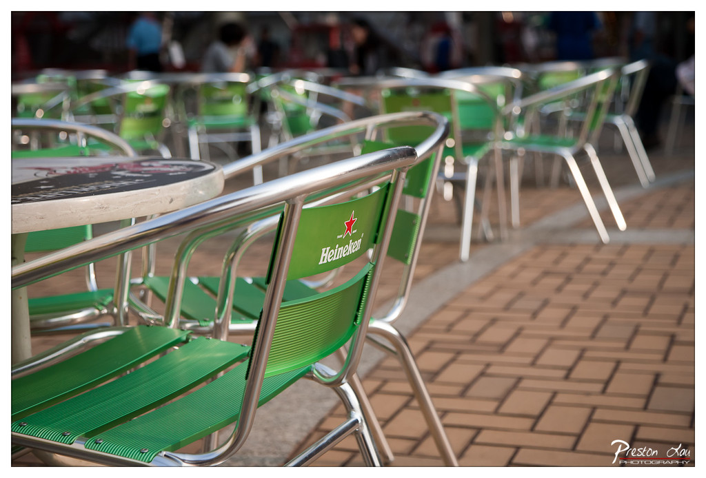
1. Overall Rating (0–10) — 7.0 This photograph captures the quiet stillness of an outdoor café after hours, where the empty green chairs and tables suggest a pause in the day’s rhythm. The shallow depth of field draws focus to the Heineken-branded chair in the foreground, creating a sense of intimate observation. While the scene is compelling in its simplicity, the muted lighting and lack of human presence give it a slightly detached feel, holding the viewer at a distance despite the inviting setting.
2. Composition (0–10) — 7.5 The diagonal arrangement of chairs leads the eye into the frame, creating a sense of depth. The placement of the foreground chair anchors the image, while the blurred background adds narrative context without distracting from the focal point.
3. Lighting (0–10) — 6.0 Soft, diffused daylight provides even illumination, but the lack of strong directional light results in a flat, untextured appearance. The overcast quality tempers contrast and reduces the visual drama of the scene.
4. Color & Tone (0–10) — 7.0 The dominant green of the chairs contrasts nicely with the warm tones of the brick pavement, creating a balanced and harmonious palette. The subtle color saturation enhances the image’s calm, contemplative mood.
5. Creativity (0–10) — 6.5 The photographer uses a simple, everyday setting to evoke a sense of quiet melancholy and urban solitude. The focus on branding and repetition suggests a commentary on commercial culture, though the concept remains understated.
6. Technical Quality (0–10) — 8.0 Sharp focus on the foreground chair contrasts beautifully with the soft blur of the background. The image is clean, well-exposed, and demonstrates strong control over depth of field.
7. Emotional Impact (0–10) — 6.5 The emptiness of the café evokes a quiet loneliness, tinged with nostalgia. The viewer is invited to imagine the life that once filled the space, but the emotional pull remains subtle and introspective.
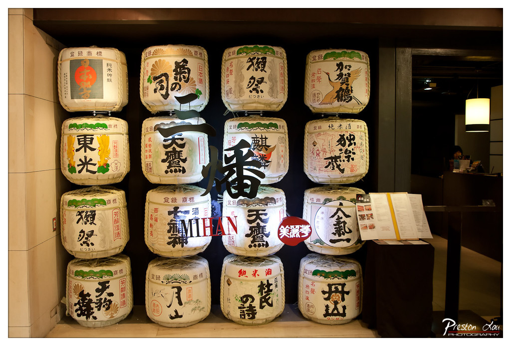
1. Overall Rating (0–10) — 7.0 This photograph captures the rich cultural texture of a Japanese sake brewery or restaurant, where tradition is displayed through an array of beautifully labeled rice wine barrels. The arrangement of the barrels creates a visually rhythmic grid, enhanced by the warm, ambient lighting that lends a sense of intimacy and authenticity. While the image is strong in its cultural storytelling, the superimposed text and watermark slightly disrupt the visual harmony, softening its overall impact.
2. Composition (0–10) — 7.5 The grid-like arrangement of the barrels provides a strong sense of order and symmetry, with the central vertical axis drawing the eye through the frame. The inclusion of the table and menu on the right adds depth and context, grounding the scene in a real-world setting. However, the placement of the large text overlay disrupts the visual flow and feels slightly intrusive.
3. Lighting (0–10) — 7.0 The lighting is warm and directional, emphasizing the textures of the paper-wrapped barrels and creating soft shadows that enhance the three-dimensional quality of the scene. The contrast between the brightly lit display and the darker background adds depth, though the overhead light source introduces some harshness in the upper right corner.
4. Color & Tone (0–10) — 7.5 The palette is dominated by earthy tones—beige, cream, and soft browns—accented by pops of red, green, and black from the Japanese calligraphy and design elements. The color harmony is strong, with the traditional motifs lending a sense of authenticity and cultural richness. The warm tone enhances the inviting atmosphere of the space.
5. Creativity (0–10) — 7.0 The photograph successfully blends cultural documentation with aesthetic appeal, using the arrangement of sake barrels as a visual metaphor for Japanese craftsmanship and heritage. The creative choice to include the stylized text overlay adds a modern graphic element, though it slightly undermines the organic feel of the scene.
6. Technical Quality (0–10) — 8.0 The image is sharp and well-focused, with fine detail visible in the text and textures of the barrels. The depth of field is appropriately managed, keeping the central barrels in focus while softly blurring the background. The exposure is balanced, though the bright light source in the upper right introduces a minor flare.
7. Emotional Impact (0–10) — 7.5 The photograph evokes a sense of warmth, tradition, and quiet reverence for Japanese craftsmanship. The viewer is drawn into a space where culture is not just observed but lived—where the barrels stand as silent witnesses to generations of brewing. The emotional resonance lies in the authenticity of the scene, though the added text and watermark create a subtle distance between the viewer and the moment.
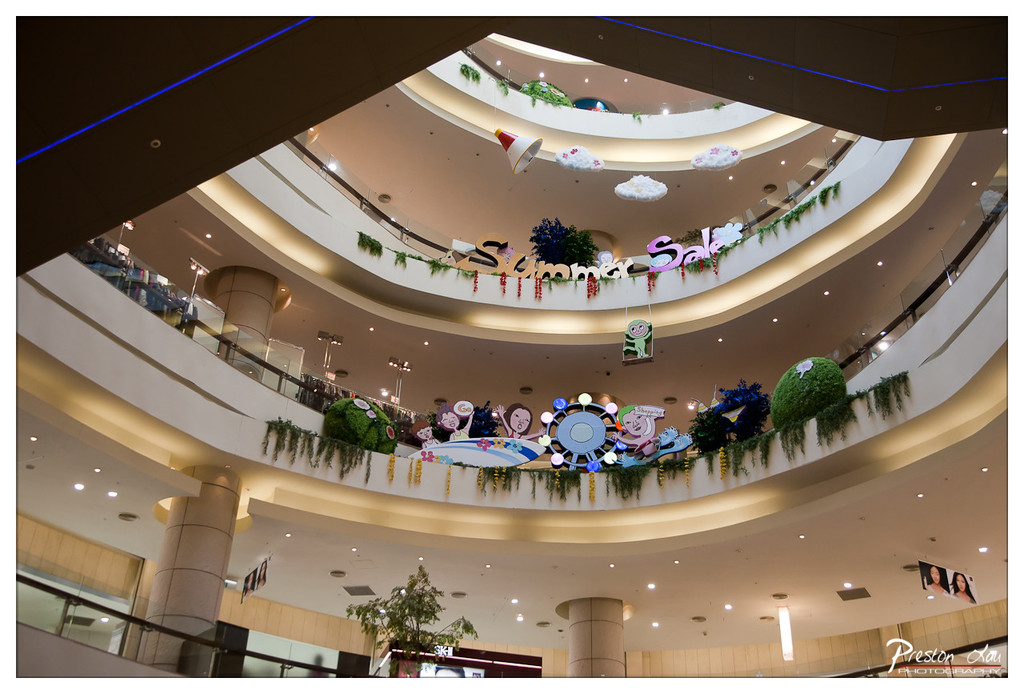
1. Overall Rating (0–10) — 6.0 This photograph captures the lively, multi-level interior of a shopping mall with a playful "Summer Sale" theme, evoking a sense of commercial festivity and movement. The wide-angle perspective emphasizes the architecture’s grandeur and the layered decorations, though the composition feels slightly overwhelmed by visual clutter. While the image succeeds in conveying the energy of a retail environment, its emotional resonance is tempered by a lack of focus and narrative cohesion.
2. Composition (0–10) — 5.5 The low-angle, wide shot captures the verticality of the mall’s atrium, but the framing is unbalanced, with too much empty ceiling space and a slightly off-center focus. The decorative elements are scattered across multiple levels, creating visual noise rather than a clear focal point.
3. Lighting (0–10) — 6.0 The lighting is functional and even, with recessed ceiling lights providing consistent illumination. The blue accent lighting along the upper edge adds a subtle modern touch, but the overall brightness is flat and lacks dynamic contrast, giving the scene a sterile feel.
4. Color & Tone (0–10) — 6.5 The palette is dominated by warm beige and white tones, punctuated by pops of color from the summer-themed decorations. While the colors are bright and cheerful, their vibrancy is muted by the fluorescent lighting, resulting in a slightly washed-out appearance.
5. Creativity (0–10) — 6.0 The photographer captures a common commercial setting with a sense of place, but the approach is more documentary than artistic. The use of a wide-angle lens and upward angle is effective, but the lack of a strong conceptual or emotional thread limits the image’s originality.
6. Technical Quality (0–10) — 7.5 The image is sharp and well-focused throughout, with clear details in the architectural elements and decorations. The exposure is well-managed, and there are no significant technical flaws, though some areas of the frame appear slightly overexposed.
7. Emotional Impact (0–10) — 5.5 The photograph conveys a sense of activity and celebration, but the emotional connection is shallow. The festive decorations suggest joy and excitement, yet the impersonal setting and lack of human presence keep the viewer at a distance, preventing a deeper emotional engagement.