Preston Lau: A Journey Through Memories, Tech, and Humanity
Welcome to my personal blog that delves into the intricate tapestry of personal albums and the fascinating intersection of ever-evolving technology and humanity. Come along on a journey with me as we delve into the seamless fusion of creativity, state-of-the-art AI and robotics, intricately interwoven within the tapestry of our shared awareness. Have fun!
Vacation in LA: Iconic Sights, Hidden Gems, and Culinary Adventures
AI Summary
The blog features a traveler's journey through Los Angeles, covering various attractions such as the La Brea Tar Pits, Los Angeles County Museum of Art, and NASA's Space Shuttle Endeavour. The writer also visits iconic landmarks like Venice Beach, Santa Monica Pier, and shares recommendations for restaurants with unique flavors, including White Elephant, Du-Pars, Urth Caffe Santa Monica, DTLA Ramen, Holey Grail Donuts, Egg Tuck, and Chuncheon Dakgalbi Donghae Makguksu.
Welcome to my vibrant and star-studded journey through the city of Los Angeles! Join me as I recount the unforgettable experiences and cherished memories I made while exploring the Southern California. Upon arriving in Los Angeles, I was immediately greeted by a warm breeze and a palpable sense of excitement in the air. Los Angeles welcomed me with open arms, ready to unveil its treasures and secrets. As I ventured into the heart of the city, I couldn't help but feel a surge of anticipation building within me. The possibilities seemed endless, and I was eager to immerse myself in the magic that awaited.So, fasten your seatbelts as I take you on a whirlwind journey through the heart and soul of Los Angeles. From iconic landmarks to hidden gems, from bustling streets to serene pockets of nature, let me share the enchantment, the excitement, and the sheer joy of discovering the magic that the City of Angels holds!
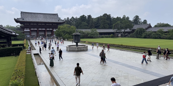
The Awesome La Brea Tar Pits
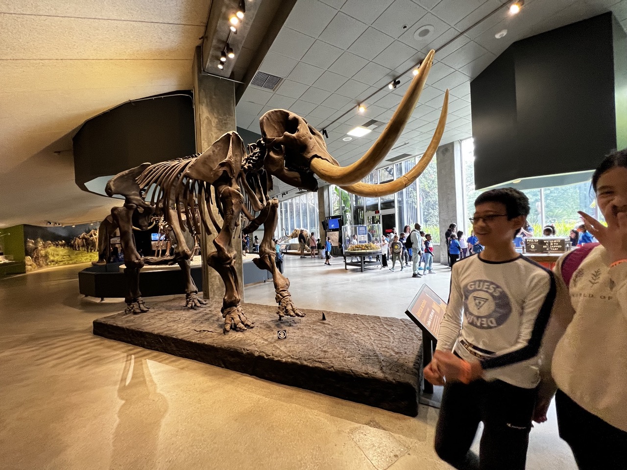
1. Overall Rating (0–10) — 6.8 This photograph captures the awe of a museum visit, where the grandeur of a mammoth skeleton meets the youthful curiosity of visitors. The juxtaposition of ancient remains and modern life creates a narrative of time and discovery, though the framing feels slightly rushed and distracted by foreground activity. While the subject matter is inherently compelling, the image’s potential is held back by a lack of visual cohesion.
2. Composition (0–10) — 6.0 The mammoth skeleton dominates the left side, creating a strong focal point, but the children in the foreground disrupt the balance and draw attention away from the exhibit. A tighter crop or adjusted angle could have emphasized the scale and majesty of the fossil.
3. Lighting (0–10) — 7.0 The overhead track lighting highlights the skeleton effectively, casting subtle shadows that enhance its three-dimensional form. The ambient light from the large windows adds natural brightness, though the reflections on the polished floor slightly diffuse the overall clarity.
4. Color & Tone (0–10) — 6.5 The palette is warm and earthy, dominated by the browns of the fossil and the beige floor, which harmonize well with the museum’s interior. However, the cool tones of the children’s clothing create a slight visual clash, weakening the overall tonal unity.
5. Creativity (0–10) — 7.0 The image succeeds in capturing a candid moment of discovery, blending science and human emotion. The inclusion of visitors grounds the scene in reality, offering a relatable perspective on learning and wonder.
6. Technical Quality (0–10) — 7.5 Sharp focus is maintained on the mammoth skeleton, with good detail visible in the bones. The exposure is balanced, and there are no major technical flaws, though some motion blur in the background suggests a slightly slow shutter speed.
7. Emotional Impact (0–10) — 7.0 The photograph evokes a sense of wonder and connection across time—children experiencing the past through a tangible relic. The subtle smiles and gestures suggest joy and engagement, making the image feel personal and memorable.
Get ready to travel back in time at the La Brea Tar Pits, the ultimate fossil adventure in the heart of Los Angeles! This place is like a prehistoric treasure hunt, with over 100 exciting excavations to explore. You can witness paleontology magic happening right before your eyes! These tar pits have preserved a mind-boggling collection of plants and animals from the last 50,000 years, giving us a unique window into the past. It's no wonder the Tar Pits are a registered National Natural Landmark. Picture heavy oil turning into asphalt, forming stubby mounds and mysterious pools that dot the park. It's like stepping into a tar-filled wonderland!
Let's get artsy at the Los Angeles County Museum of Art
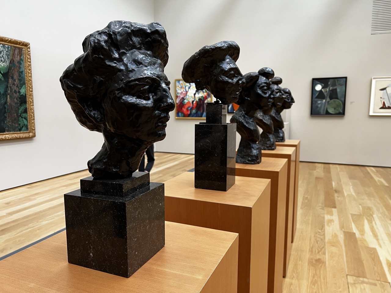
1. Overall Rating (0–10) — 7.5 This photograph captures the quiet intensity of a museum gallery, where a series of expressive bronze busts commands attention with their raw, sculptural power. The rhythmic repetition of the figures creates a compelling visual line, drawing the eye down the row, while the surrounding paintings offer subtle context without distraction. The image succeeds in conveying the atmosphere of contemplation and artistic dialogue, though the lighting and framing slightly limit its emotional depth.
2. Composition (0–10) — 8.0 The diagonal alignment of the pedestals and sculptures creates a strong sense of depth and movement, guiding the viewer’s gaze through the space. The placement of the largest bust in the foreground establishes a clear focal point, while the diminishing scale of the subsequent figures enhances perspective.
3. Lighting (0–10) — 7.0 Even, diffused gallery lighting illuminates the sculptures effectively, highlighting their textured surfaces and form. The overhead illumination is soft and consistent, avoiding harsh shadows, though it slightly flattens the three-dimensionality of the bronze.
4. Color & Tone (0–10) — 7.5 The palette is restrained—dark, matte bronze against warm wood and neutral walls—creating a cohesive, gallery-appropriate atmosphere. The subtle contrast between the black sculptures and the light wood enhances visual clarity, while the muted tones support a contemplative mood.
5. Creativity (0–10) — 7.0 The photograph captures a narrative of artistic repetition and evolution, using the arrangement of sculptures to suggest a progression of thought or emotion. While not highly experimental, the composition is deliberate and evocative of the gallery experience.
6. Technical Quality (0–10) — 8.5 Sharp focus and clear detail are maintained across the image, with a balanced depth of field that keeps both the foreground and background elements discernible. The exposure is well-managed, with no overexposed highlights or lost shadows.
7. Emotional Impact (0–10) — 7.0 The image evokes a sense of reverence and quiet introspection, inviting the viewer to consider the emotional weight of the sculpted faces. The presence of the figures, though silent, suggests a collective human presence, lending a poignant stillness to the scene.
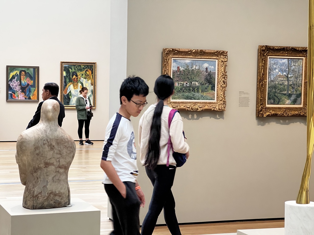
1. Overall Rating (0–10) — 6.8 This photograph captures the quiet rhythm of a museum gallery, where visitors move between art and reflection in a space of curated stillness. The juxtaposition of modern casual wear against classical paintings and sculptures creates a subtle tension between the present and the historical, grounding the scene in contemporary life. While the image successfully conveys the atmosphere of an art museum, the lack of a strong focal point and the slightly awkward framing limit its visual power.
2. Composition (0–10) — 6.0 The foreground sculpture and walking figures create a layered depth, but the central subjects are partially obscured, and the frame feels unbalanced due to the asymmetrical placement of the golden sculptures and paintings.
3. Lighting (0–10) — 7.5 Even, diffuse gallery lighting illuminates the artworks clearly without harsh shadows, enhancing visibility and preserving the integrity of the displayed pieces.
4. Color & Tone (0–10) — 6.5 The neutral beige walls and wooden floor create a calm, unified backdrop, allowing the gold frames and colorful paintings to stand out. However, the overall palette is restrained, limiting visual dynamism.
5. Creativity (0–10) — 6.0 The image documents a common museum experience with a sense of realism, but it lacks a distinctive artistic vision or narrative twist, functioning more as a snapshot than a statement.
6. Technical Quality (0–10) — 7.0 Sharp focus and clear detail are maintained throughout, with good exposure and no visible noise, though the motion blur of the walking subjects slightly detracts from crispness.
7. Emotional Impact (0–10) — 5.5 The image evokes a sense of quiet contemplation and cultural engagement, but the viewer remains an observer rather than an emotional participant, held at a distance by the scene’s documentary nature.
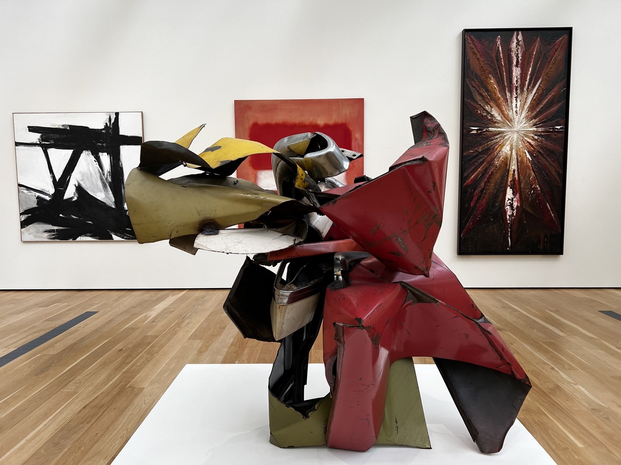
1. Overall Rating (0–10) — 7.5 This photograph captures the dynamic tension between industrial abstraction and expressive painting within a gallery space, where the central sculpture commands attention through its bold form and color. The juxtaposition of the fragmented metal sculpture with the gestural paintings behind it creates a compelling dialogue between materiality and expression. While the composition is strong, the gallery’s neutral backdrop slightly diminishes the emotional intensity of the artwork, leaving a sense of restrained power rather than overwhelming impact.
2. Composition (0–10) — 7.0 The sculpture is well-centered and dominates the frame, with the paintings providing balanced visual counterpoints on either side. The wide perspective captures the full context of the installation, though the slight asymmetry in wall arrangement creates a subtle imbalance in spatial harmony.
3. Lighting (0–10) — 8.0 Even, diffused gallery lighting illuminates the scene without harsh shadows, allowing the textures and metallic surfaces of the sculpture to be clearly visible. The light enhances the reflective qualities of the metal and the depth of the painted works.
4. Color & Tone (0–10) — 7.5 The palette is striking—vibrant reds, yellows, and metallic grays contrast sharply with the black and white abstraction and the warm wood floor. The tonal range is rich, with the red sculpture serving as a vivid focal point that draws the eye through the image.
5. Creativity (0–10) — 8.0 The photograph effectively captures the interplay between sculpture and painting, presenting a curated moment of artistic dialogue. The choice to include multiple works in a single frame adds narrative depth and emphasizes the installation’s conceptual cohesion.
6. Technical Quality (0–10) — 8.5 The image is sharp, well-focused, and free of technical flaws. The clarity of the sculpture’s textures and the clean lines of the gallery space reflect a high level of technical execution.
7. Emotional Impact (0–10) — 7.0 The image conveys a sense of quiet intensity and intellectual engagement, inviting contemplation of the relationship between form, material, and expression. While it doesn’t evoke strong emotion, it successfully communicates the gravity and complexity of the art on display.
Prepare to have your mind blown at the Los Angeles County Museum of Art (LACMA)! This place is an art lover's paradise, and it's huge! We're talking the largest art museum in the western United States, attracting almost a million visitors every year. They've got it all—over 150,000 mind-blowing works of art spanning centuries! From ancient artifacts to cutting-edge contemporary pieces, this place has something for everyone. And that's not all! They even have film and concert series to keep the creative vibes flowing. Get ready to immerse yourself in the art world and be prepared to have your imagination run wild!
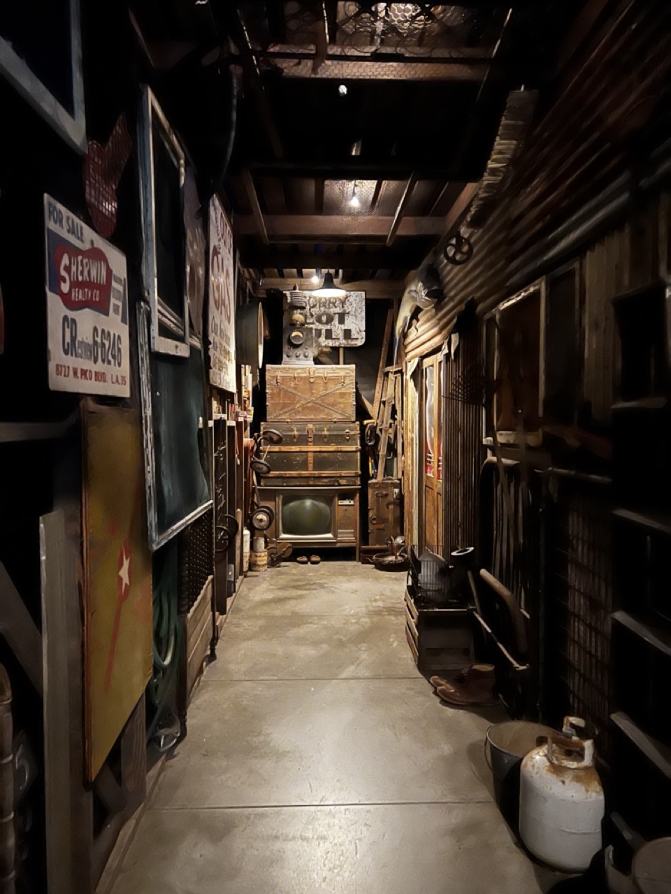
1. Overall Rating (0–10) — 7.0 This photograph captures the atmospheric depth of a cluttered, nostalgic alleyway, where time seems to have paused. The interplay of shadow and warm, focused light enhances the sense of hidden history, while the accumulation of vintage objects tells a silent story of past lives. Though the scene feels staged and slightly overwhelming, its authenticity and layered textures make it compelling, balancing documentary realism with artistic narrative.
2. Composition (0–10) — 6.5 The strong linear perspective draws the eye down the corridor, creating a sense of depth. However, the asymmetry and clutter on both sides slightly disrupt visual harmony, making the scene feel more chaotic than intentional.
3. Lighting (0–10) — 7.0 The use of directional, warm lighting from above creates dramatic contrast and highlights key objects, enhancing mood and texture. The deep shadows add mystery, though some areas remain underexposed, obscuring detail.
4. Color & Tone (0–10) — 6.5 The palette is dominated by earthy browns, muted yellows, and dark tones, reinforcing the aged, industrial atmosphere. While the color temperature is consistent and evocative, the lack of vibrancy slightly dampens the visual impact.
5. Creativity (0–10) — 7.5 The photograph succeeds in crafting a narrative through its carefully curated collection of objects and lighting. The blend of found elements and deliberate staging suggests a conceptual vision, transforming a cluttered space into a character-rich environment.
6. Technical Quality (0–10) — 7.0 The image is sharp and clear, with well-managed focus and minimal noise. The exposure is balanced overall, though some dark areas lose detail, indicating room for improvement in low-light handling.
7. Emotional Impact (0–10) — 7.0 The scene evokes a sense of quiet nostalgia and discovery, inviting the viewer to imagine the stories behind the objects. The intimate, enclosed space fosters a feeling of intimacy and intrigue, drawing the viewer into a forgotten world.
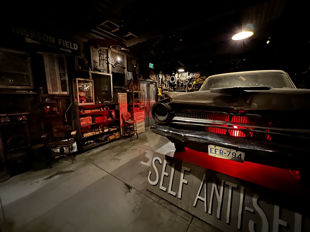
1. Overall Rating (0–10) — 7.0 This photograph captures the moody, nostalgic essence of a vintage auto workshop, where time seems to have paused among relics of mid-century mechanics and Americana. The dramatic lighting and rich textures give the scene a cinematic weight, though the cluttered background slightly undermines clarity. While the image succeeds in evoking a sense of history and craftsmanship, its visual narrative is held back by a lack of intentional focus.
2. Composition (0–10) — 6.5 The low-angle framing emphasizes the car’s front end, drawing attention to the glowing grille, but the left side’s clutter creates visual noise. A tighter crop could improve balance and guide the eye more effectively.
3. Lighting (0–10) — 8.0 The use of directional, high-contrast lighting enhances the scene’s mystery, with the red glow from the car’s grille acting as a powerful focal point. The single overhead light adds depth and reinforces the dark, intimate atmosphere.
4. Color & Tone (0–10) — 7.5 The dominant red and black palette creates a bold, moody contrast, while the muted tones of the surrounding objects add authenticity. The red glow introduces warmth and drama, elevating the image’s emotional resonance.
5. Creativity (0–10) — 7.0 The photograph blends documentary realism with a cinematic aesthetic, suggesting a story behind the workshop’s contents. The inclusion of the “SELF ANTI-SE” sign adds a layer of intrigue, though its meaning remains ambiguous.
6. Technical Quality (0–10) — 7.5 The image is sharp where it counts—particularly on the car’s grille and license plate—and the focus is well-controlled. The low-light conditions are managed effectively, with minimal noise.
7. Emotional Impact (0–10) — 7.0 The photograph evokes a sense of quiet reverence for forgotten craftsmanship, inviting viewers to imagine the hands that once worked in this space. The atmosphere is immersive, though the lack of a clear narrative keeps the emotional connection just out of reach.
Hold on to your hats, folks, because we're about to enter the Modern Art Galleries on BCAM, Level 3, and get our minds blown! The entrance to Central Meridian (The Garage) feels like stepping into a parallel universe of mixed-media awesomeness. As we walk through those vintage doors adorned with found objects and symbols, we'll find ourselves in a dim hallway that looks like a forgotten stucco building. The rooms ahead are like treasure troves from the past, filled with thousands of artifacts collected from all corners of Los Angeles. We're talking 1950s TV sets, Tesla coils salvaged from garages, and even a cluster of bodiless doll arms left behind by a plastic factory. And to top it all off, there's a whole room dominated by a badass 1964 Dodge Dart. Buckle up for a wild ride through time and art!
Uncover the Mysteries of the Maya at The California Science Center
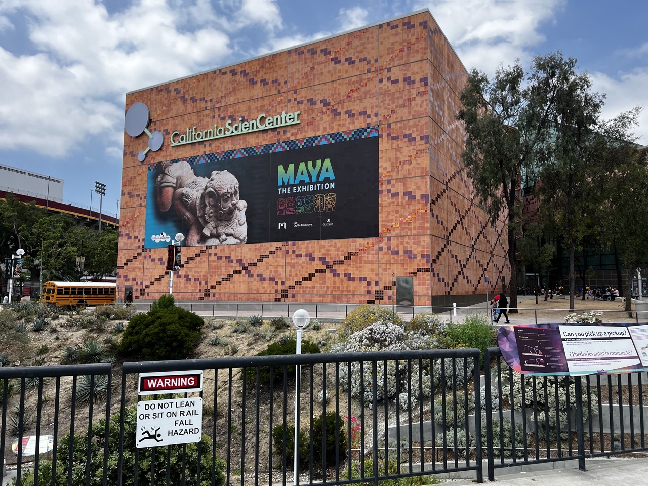
1. Overall Rating (0–10) — 6.8 This photograph effectively captures the California Science Center as a vibrant cultural hub, with the Maya exhibition signage adding narrative depth and historical intrigue. The juxtaposition of the modern building, ancient iconography, and urban surroundings creates a layered visual story. While the image is clear and well-framed, the foreground elements—particularly the warning sign and rail—introduce visual clutter that slightly detracts from the overall aesthetic cohesion.
2. Composition (0–10) — 6.5 The building dominates the frame, creating a strong focal point, but the low-angle perspective and foreground fence disrupt visual flow. The diagonal lines of the tiles and the bus in the background add dynamic tension, though the composition feels slightly unbalanced due to the placement of the warning sign and the overexposed sky.
3. Lighting (0–10) — 7.0 Natural daylight illuminates the scene evenly, highlighting the warm terracotta tones of the building’s facade. The soft shadows suggest midday sun, and the scattered clouds add texture to the sky without overwhelming the subject. The lighting enhances the texture of the tiles and the clarity of the signage.
4. Color & Tone (0–10) — 7.2 The warm earth tones of the building contrast nicely with the vibrant green of the sign and the cool blue of the sky. The colors are rich and well-saturated, with the Maya exhibition’s graphic design providing a pop of color that draws the eye. The overall palette feels balanced and engaging.
5. Creativity (0–10) — 6.7 The image successfully merges contemporary architecture with ancient cultural themes, creating a compelling narrative. The inclusion of the bus and pedestrian elements grounds the scene in urban reality, offering a documentary-style feel. While not overtly experimental, the composition reflects thoughtful observation and contextual storytelling.
6. Technical Quality (0–10) — 7.5 The image is sharp and well-focused, with clear detail in both the building’s tilework and the signage. The exposure is balanced, and the depth of field is appropriate for a wide-angle shot. There are no significant technical flaws, though the presence of the warning sign and railing slightly compromises the image’s visual purity.
7. Emotional Impact (0–10) — 6.2 The photograph evokes a sense of curiosity and discovery, inviting viewers to consider the intersection of science, history, and culture. The presence of people and everyday urban elements adds a human touch, but the overall mood remains more observational than emotionally resonant, leaving the viewer as a passive observer rather than an engaged participant.
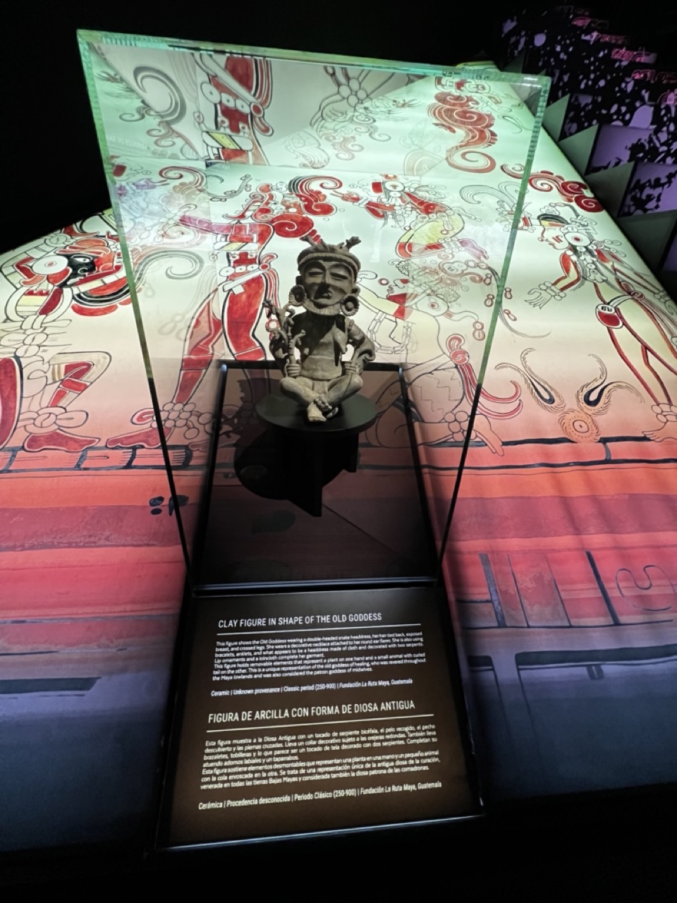
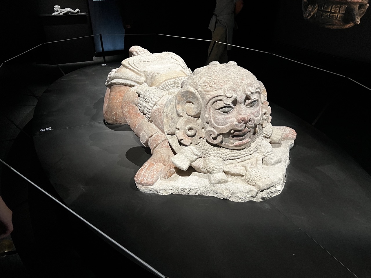
1. Overall Rating (0–10) — 7.0 This photograph captures the quiet reverence of a museum exhibit, where ancient art is presented with both historical dignity and modern visual flair. The interplay between the tactile clay figure and the vibrant, illuminated backdrop creates a compelling dialogue between past and present. While the image effectively conveys the artifact’s cultural significance, its somewhat flat lighting and busy background slightly dilute the focus on the central subject.
2. Composition (0–10) — 6.5 The figure is centered and well-framed, but the surrounding graphic elements and angled glass create visual distractions. A tighter shot would emphasize the artifact and reduce the sense of clutter.
3. Lighting (0–10) — 7.0 The backlighting enhances the intricate details of the mural and casts a warm glow on the display, while the spotlight on the figure ensures it remains the focal point. The lighting is deliberate and atmospheric, though some reflections on the glass slightly compromise clarity.
4. Color & Tone (0–10) — 7.5 The rich reds, oranges, and earth tones of the mural create a dynamic and culturally resonant palette. The contrast between the muted clay figure and the vivid background adds visual interest and depth.
5. Creativity (0–10) — 8.0 The fusion of ancient artifact with a modern, animated display demonstrates a creative approach to museum storytelling. The use of light and graphics elevates the exhibit into an immersive experience, blending history with contemporary presentation.
6. Technical Quality (0–10) — 7.5 The image is sharp and well-exposed, with clean details in both the artifact and the background. However, reflections on the glass and slight lens distortion from the angle affect the overall clarity.
7. Emotional Impact (0–10) — 7.0 The photograph evokes a sense of awe and connection to ancient traditions, inviting the viewer to reflect on the enduring legacy of the Old Goddess. The mood is contemplative and respectful, though the busy composition tempers the emotional intimacy.
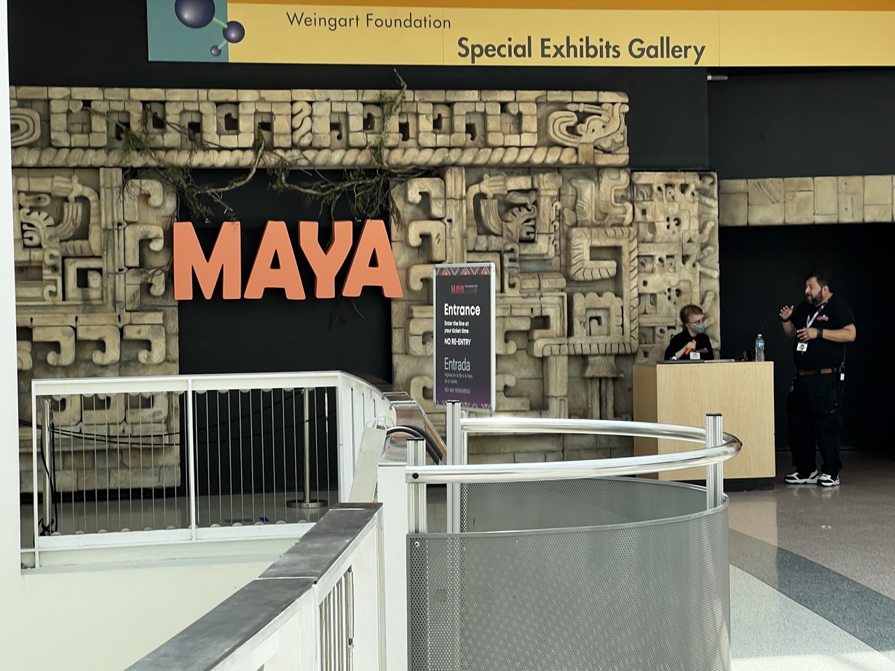
1. Overall Rating (0–10) — 6.0 This photograph captures the entrance to the "MAYA" exhibit with a sense of cultural gravitas, anchored by the imposing stone-carved backdrop and bold signage. While the composition effectively communicates the setting and purpose of the space, the lighting feels functional rather than atmospheric, and the human presence—though contextually relevant—adds a slightly candid, unposed quality that detracts from the exhibit’s intended mystique. The image succeeds as a clear documentation but falls short of evoking the deeper wonder the subject deserves.
2. Composition (0–10) — 6.5 The framing balances the monumental "MAYA" sign with the textured Mayan-style relief, creating a strong visual anchor. The railing in the foreground adds depth and guides the eye toward the entrance, though its modern design contrasts slightly with the ancient aesthetic. The placement of the two individuals on the right adds narrative interest but introduces a slight asymmetry that disrupts the central focus.
3. Lighting (0–10) — 5.5 Even, overhead lighting provides clear visibility but lacks directional warmth or shadow play, resulting in a flat, institutional feel. The bright sign and signage are well-lit, but the deeper areas of the gallery remain underexposed, reducing the sense of depth and mystery.
4. Color & Tone (0–10) — 6.0 The bold coral-orange of the "MAYA" sign creates a striking contrast against the muted beige and gray tones of the stone and walls. The color palette is balanced and purposeful, but the overall tone leans toward clinical neutrality, with limited vibrancy in the surrounding environment.
5. Creativity (0–10) — 6.5 The juxtaposition of ancient Mayan motifs with modern museum infrastructure offers a compelling visual dialogue. The use of the stone relief as a backdrop is conceptually strong, and the signage design effectively communicates the exhibit’s theme. However, the execution remains largely literal, with little attempt to elevate the image beyond documentation.
6. Technical Quality (0–10) — 7.0 The image is sharp and well-focused, with clean lines and no noticeable technical flaws. The depth of field is appropriate, capturing both the foreground railing and the background details clearly, though the exposure is slightly uneven in the shadowed areas.
7. Emotional Impact (0–10) — 5.5 While the image conveys a sense of anticipation and cultural significance, the emotional resonance is muted by the impersonal setting and lack of atmospheric lighting. The viewer is informed but not moved, left with a sense of arrival rather than awe.
The California Science Center is exhibiting Maya, featuring over 250 authentic artifacts—many on tour outside of Guatemala for the first time—highlighting the ancient Maya civilization of Mexico and Central America. Enhance your experience by seeing the IMAX movie Mystery of the Maya and join an archaeologist and young Maya descendant as they unlock the secrets of the past. Marvel at a majestic 9-foot-long sculpture of a jaguar warrior and gaze into a magnificent mask made of obsidian and jade. Through priceless artifacts and hands-on exhibits, discover how the ancient Maya built and sustained complex cities in the heart of the rainforest. With roots extending back 3,000 years, learn how the Maya live on today—in their inventions that continue to shape our daily lives and the millions of people who carry on the Maya tradition in language and lineage.
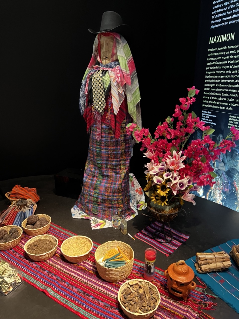
1. Overall Rating (0–10) — 7.5 This photograph captures a richly layered cultural display centered on the veneration of Maximón, blending ritual, tradition, and visual storytelling. The composition draws the eye through a vibrant tapestry of textiles, offerings, and symbolic objects, creating a sense of reverence and authenticity. While the lighting and background text slightly distract, the image succeeds in conveying the complexity and emotional weight of a living tradition, making it both informative and visually compelling.
2. Composition (0–10) — 7.0 The central figure of Maximón is well-placed, drawing immediate attention, while surrounding elements like the baskets, flowers, and textiles create a balanced, layered arrangement. The diagonal spread of offerings adds dynamic flow, though the inclusion of the informational panel on the right slightly disrupts the visual harmony.
3. Lighting (0–10) — 6.5 The lighting is functional and even, highlighting the textures and colors of the offerings and textiles. However, it appears somewhat flat and directional, lacking the warmth or depth that would enhance the spiritual atmosphere of the scene.
4. Color & Tone (0–10) — 8.0 The palette is rich and varied, with bold reds, blues, and greens in the textiles contrasting beautifully with the vivid pink and yellow flowers. The warm tones of the clay pot and dried herbs add earthiness, while the dark background enhances the vibrancy of the colors.
5. Creativity (0–10) — 8.0 The image successfully captures a complex cultural tableau, blending ritualistic elements with artistic presentation. The integration of traditional objects and textiles into a museum-like display reflects thoughtful curation and storytelling, emphasizing both the sacred and the celebratory aspects of the tradition.
6. Technical Quality (0–10) — 7.5 The image is sharp and detailed, with clear focus on the central figure and surrounding objects. The resolution is high, allowing for fine texture details in the fabrics, baskets, and offerings to be visible, though some minor noise appears in the darker areas.
7. Emotional Impact (0–10) — 7.5 The scene evokes a sense of reverence and cultural continuity, inviting viewers to reflect on the spiritual significance of the offerings and the enduring legacy of Maximón. The richness of detail and symbolism creates a contemplative mood, bridging the gap between observation and emotional connection.
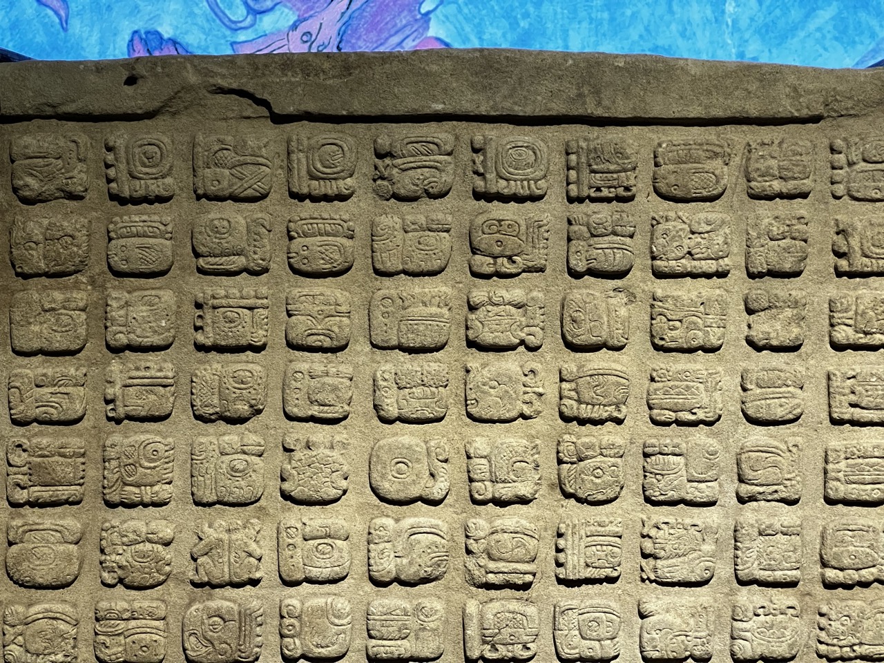
1. Overall Rating (0–10) — 7.0 This photograph captures the intricate rhythm of Mayan hieroglyphs with striking clarity, transforming a historical artifact into a visual tapestry of ancient language and symbolism. The grid-like arrangement of glyphs conveys order and continuity, while the vibrant blue and purple background adds a surreal, almost cosmic contrast that elevates the stone’s solemnity. Though the image is rich in detail, its emotional resonance is slightly tempered by the artificiality of the backdrop, which feels more like a museum display than a natural setting.
2. Composition (0–10) — 7.5 The tight, centered framing emphasizes the repetitive symmetry of the glyphs, creating a visually harmonious and almost meditative pattern. The top edge of the stone and the colorful backdrop provide a subtle framing device that guides the eye across the grid without overwhelming the subject.
3. Lighting (0–10) — 8.0 Even, directional lighting highlights the texture and depth of the carved stone, enhancing the three-dimensional quality of the glyphs. The soft shadows cast within the recessed carvings add a tactile richness that draws the viewer into the surface’s history.
4. Color & Tone (0–10) — 6.5 The muted, earthy tones of the stone contrast sharply with the vivid blue and purple hues in the background, creating a visually arresting but slightly jarring palette. While the color contrast adds drama, it also risks distracting from the historical authenticity of the artifact.
5. Creativity (0–10) — 7.0 The juxtaposition of ancient stone with a modern, abstract backdrop is an imaginative choice that suggests a dialogue between past and present. This creative layering transforms a straightforward documentation into a conceptual piece, inviting viewers to consider how history is framed and displayed.
6. Technical Quality (0–10) — 8.5 The image is exceptionally sharp, with fine detail visible in every glyph. Focus is consistent across the frame, and the exposure is well-balanced, allowing both the texture of the stone and the vibrancy of the background to be clearly rendered.
7. Emotional Impact (0–10) — 6.0 The photograph evokes a sense of awe for the craftsmanship of the Mayan civilization, but the artificial backdrop introduces a detachment that limits the emotional intimacy. The viewer is impressed by the artifact’s beauty but not deeply moved by its historical weight.
1. Overall Rating (0–10) — 7.0 This photograph captures the imposing presence of an ancient stone sculpture in a museum setting, where dramatic lighting enhances its mythical character. The interplay of shadow and light accentuates the intricate carvings and weathered textures, giving the piece a sense of timelessness. While the composition effectively frames the subject, the surrounding environment slightly distracts from the sculpture’s full narrative impact.
2. Composition (0–10) — 6.5 The sculpture is well-placed and centered, drawing the eye naturally, though the visible glass barrier and reflections create a subtle visual interruption. A tighter crop could have minimized distractions and heightened focus on the subject’s details.
3. Lighting (0–10) — 8.0 The use of directional, focused lighting creates strong contrast and depth, emphasizing the sculpture’s form and texture. The dark background isolates the subject, enhancing its dramatic presence.
4. Color & Tone (0–10) — 6.5 The muted tones of the stone—ranging from pale beige to reddish-brown—stand out against the black backdrop. The color palette is subdued but appropriate, though a slightly warmer tone might have added more warmth and life to the ancient material.
5. Creativity (0–10) — 7.0 The photograph successfully captures the sculpture’s mythic quality and cultural weight, using light and framing to evoke a sense of reverence. The choice to include a partial view of the museum environment adds context without overwhelming the subject.
6. Technical Quality (0–10) — 7.5 Sharp focus and clear detail allow the viewer to appreciate the fine craftsmanship of the carving. The exposure is well-balanced, with no significant loss of detail in shadows or highlights.
7. Emotional Impact (0–10) — 7.5 The image conveys a quiet awe, inviting the viewer to contemplate the history and artistry of the artifact. The combination of light, texture, and isolation evokes a contemplative mood, creating a strong emotional connection to the past.
We watched the "Mystery of the Maya" IMAX movie, it follows an archaeologist and a young Maya descendant through spectacular ancient ruins as they unlock the secrets of the past. Journey back in time and witness the splendor of Maya culture at its zenith as a handful of intrepid archaeologists and explorers unearth long-lost temples and a tomb of an ancient king in the dense jungle. Filmed on location at numerous sites throughout the Maya regions, Mystery of the Maya features the culture, scientific achievements, and history of the Maya. This fascinating look into Maya culture blends dramatic recreations with actual archaeological excavations, rare archival material, and animation sequences. Their legacy in stone, which has survived only in a fragmentary fashion in magnificent ruins, lives on as do the millions of Maya descendants.
NASA's Space Shuttle Program
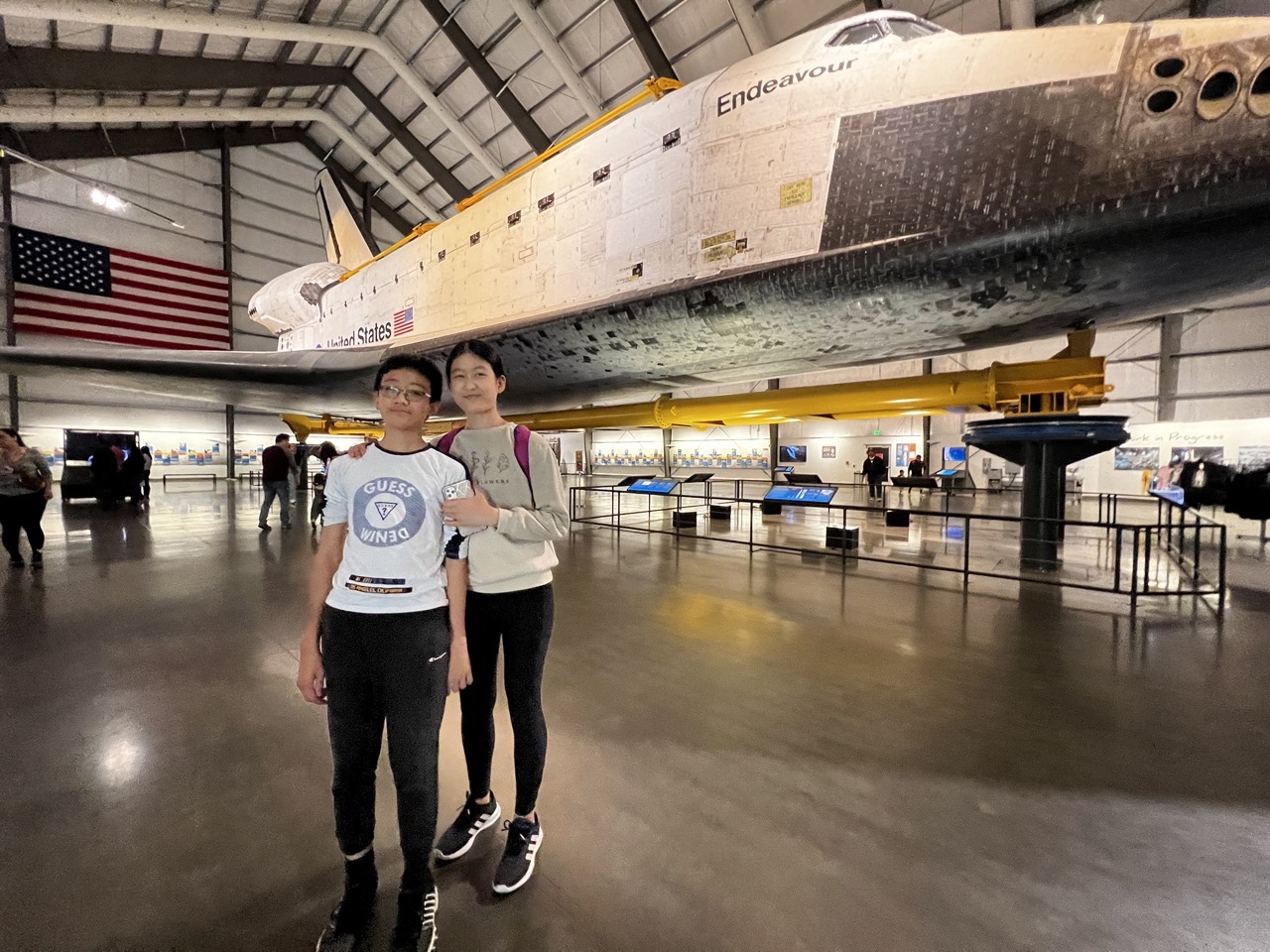
1. Overall Rating (0–10) — 6.8 This photograph captures a moment of quiet awe in a vast museum hall, where two individuals stand before the retired space shuttle *Endeavour*, symbolizing both human achievement and personal wonder. The scale of the shuttle looms powerfully over the subjects, creating a striking contrast between human presence and technological grandeur. While the image effectively conveys the majesty of the exhibit, its candid nature and slightly cluttered background detract from a more refined visual narrative.
2. Composition (0–10) — 6.5 The subjects are placed off-center, drawing attention to the shuttle’s massive form, which dominates the upper half of the frame. The low-angle perspective enhances the shuttle’s imposing scale, though the scattered background activity and uneven spacing between people introduce a sense of visual distraction.
3. Lighting (0–10) — 6.0 The space is illuminated by bright, overhead artificial light that evenly illuminates the scene, minimizing harsh shadows. However, the flatness of the lighting diminishes depth and mood, making the environment feel functional rather than atmospheric.
4. Color & Tone (0–10) — 6.5 The palette is dominated by industrial grays, whites, and the bold red, white, and blue of the American flag, creating a patriotic and institutional tone. The shuttle’s weathered white and black thermal tiles add texture and contrast, though the overall color balance feels slightly cool and sterile.
5. Creativity (0–10) — 7.0 The juxtaposition of two young visitors against the monumental shuttle offers a compelling narrative of aspiration and discovery. The image captures a genuine, personal moment within a larger cultural landmark, lending it a sense of storytelling that feels both personal and universal.
6. Technical Quality (0–10) — 7.5 The image is sharp and well-focused, with clear details visible on both the subjects and the shuttle. The camera’s depth of field is sufficient to keep the foreground and mid-ground in focus, though the wide-angle perspective introduces slight distortion at the edges.
7. Emotional Impact (0–10) — 7.0 The photograph evokes a sense of wonder and humility, reflecting the emotional weight of standing in the presence of human ingenuity. The subtle smiles and relaxed posture of the subjects suggest pride and awe, inviting viewers to imagine their own place in the story of exploration.
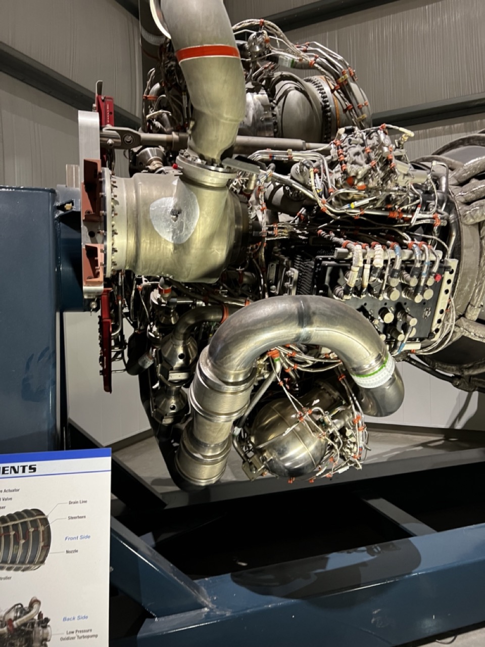
1. Overall Rating (0–10) — 7.0 This photograph captures the intricate complexity of a jet engine with impressive clarity, presenting it as both a technological marvel and a sculptural object. The composition highlights the interplay of metallic surfaces, wiring, and mechanical components, evoking a sense of industrial elegance. While the lighting and framing are effective, the image feels more like a technical documentation than an artistic statement, slightly limiting its emotional resonance.
2. Composition (0–10) — 7.5 The engine is framed diagonally, guiding the eye through its layered components. The inclusion of the informational placard adds context and balance, though it slightly interrupts the visual flow. The tight crop emphasizes the machine’s complexity without overwhelming the viewer.
3. Lighting (0–10) — 7.0 Even, diffuse lighting highlights the metallic textures and shadows without creating harsh reflections. The light quality enhances the three-dimensionality of the engine while maintaining clarity across its many parts.
4. Color & Tone (0–10) — 6.5 The dominant silver and gray tones are consistent with the industrial subject, but the lack of vibrant color limits visual dynamism. The blue of the display stand and the placard’s accent hues offer subtle contrast, grounding the image in a museum-like context.
5. Creativity (0–10) — 6.0 The image is technically strong and conceptually sound, but it prioritizes accuracy over originality. The subject is inherently compelling, but the execution remains conventional, offering little surprise or reinterpretation.
6. Technical Quality (0–10) — 8.0 Sharp focus and clean detail allow the viewer to appreciate the fine textures and complexity of the engine. The exposure is well-balanced, and the image is free of noticeable noise or distortion.
7. Emotional Impact (0–10) — 6.5 The photograph conveys a quiet awe for human engineering, inviting contemplation of the machine’s power and precision. While it doesn’t evoke strong emotion, it succeeds in creating a sense of reverence for technological achievement.
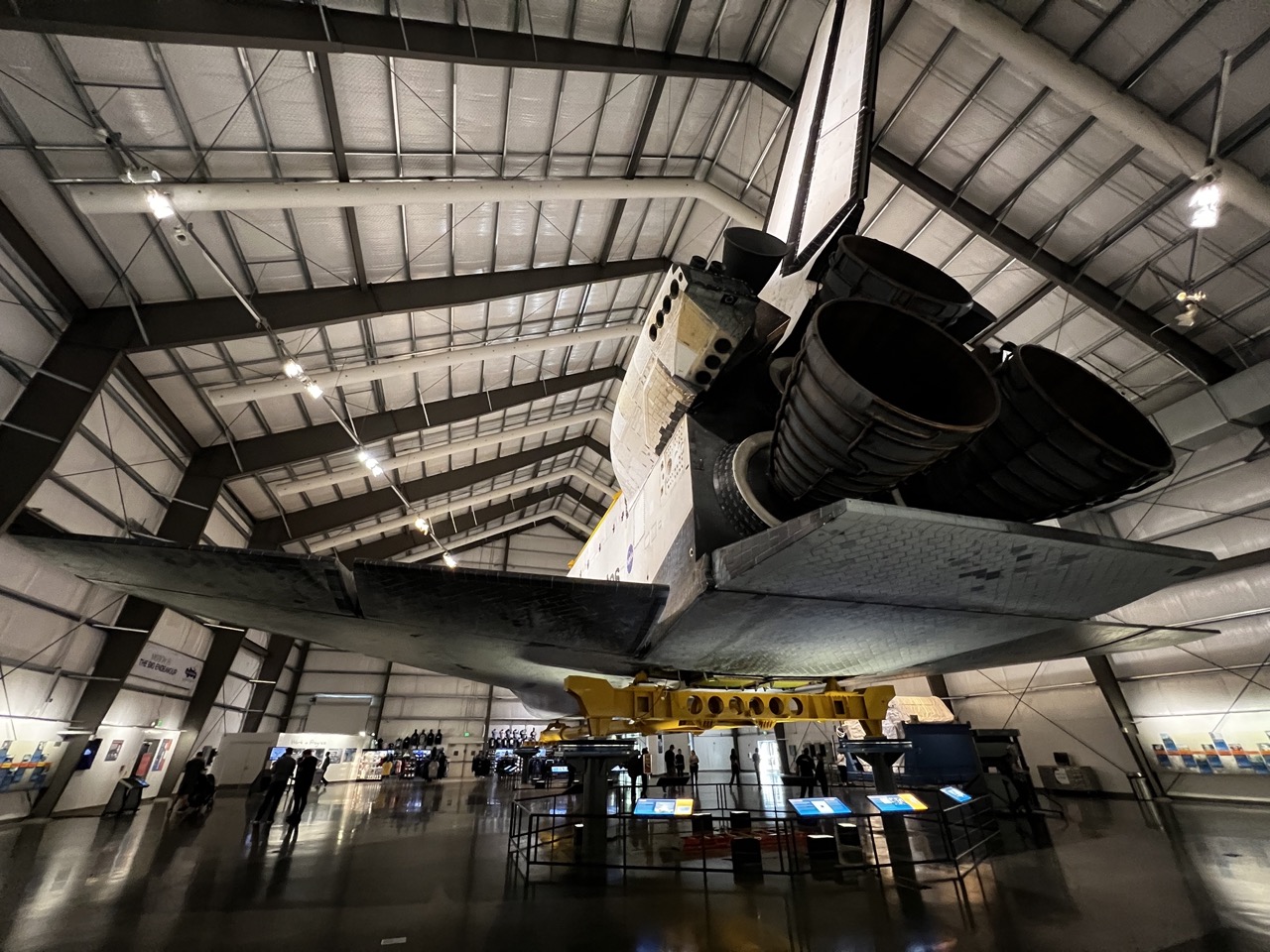
1. Overall Rating (0–10) — 7.5 This photograph captures the awe-inspiring scale of a space shuttle suspended within a vast museum hall, where engineering marvel meets public spectacle. The low-angle perspective amplifies the shuttle’s grandeur, while the interplay of artificial light and industrial architecture lends a cinematic weight to the scene. Though the composition feels slightly crowded by foreground elements, the image succeeds in conveying both the technological ambition and the human reverence surrounding this historic artifact.
2. Composition (0–10) — 7.0 The low-angle shot emphasizes the shuttle’s dominance, with its diagonal lines drawing the eye upward. However, the inclusion of the lower walkway and scattered visitors introduces visual clutter, slightly disrupting the clean architectural flow.
3. Lighting (0–10) — 7.5 The overhead spotlights create a dramatic interplay of light and shadow, highlighting the shuttle’s contours and texture. The reflections on the polished floor add depth, though some areas remain underexposed, softening the overall clarity.
4. Color & Tone (0–10) — 7.0 The palette is dominated by industrial grays and whites, punctuated by the yellow of the shuttle’s support structure. The cool tones reinforce the technological theme, while the contrast between light and dark adds visual tension and dimension.
5. Creativity (0–10) — 8.0 The choice of perspective and the focus on the shuttle’s underside offer a fresh, dynamic view of a well-documented object. The inclusion of visitors grounds the image in reality, adding narrative context and scale.
6. Technical Quality (0–10) — 8.0 The image is sharp and well-focused, with clean details visible on the shuttle and structural elements. The wide-angle lens captures the full scope without significant distortion, though some minor chromatic aberration is present at the edges.
7. Emotional Impact (0–10) — 8.0 The photograph evokes a sense of wonder and reverence, capturing the moment when human achievement is transformed into cultural heritage. The vastness of the space and the presence of onlookers invite contemplation of progress, ambition, and legacy.
NASA's Space Shuttle program, officially called the Space Transportation System (STS), was the U.S. government's manned launch vehicle program from 1981 to 2011. The Space Shuttle is the only winged manned spacecraft to have achieved orbit and land, and the only reusable space vehicle that has ever made multiple flights into orbit. On October 30, 2012, the Science Center became the permanent home of the Endeavour, which landed at Los Angeles International Airport (LAX) in September 2012. After an extraordinary journey through the streets of LA, the Endeavour went on public display in the Samuel Oschin Space Shuttle Endeavour Display Pavilion. “Endeavour belongs to all of us and was part of a fleet of vehicles that defined America’s human space exploration for the past 30 years," said Kenneth E. Phillips, Ph.D, the Science Center’s Curator for Aerospace Science. "It represents the best that we can do as human beings when we choose to work together.”
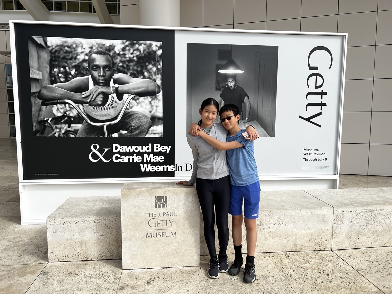
Gettin' Artsy at The Getty
1. Overall Rating (0–10) — 7.0 This photograph captures a candid moment of connection between two children in front of a prominent art exhibition, grounding the personal in the cultural. The subjects’ genuine embrace and relaxed expressions contrast beautifully with the formal, monochrome imagery of the exhibit behind them, creating a layered narrative of youth, identity, and public art. While the lighting and composition are functional, the image’s strength lies in its emotional authenticity and contextual richness.
2. Composition (0–10) — 7.5 The children are centered and well-framed, with the exhibition signage providing context without overwhelming the scene. The stone pedestal and clean lines of the architecture guide the eye naturally toward the subjects, creating a balanced and harmonious arrangement.
3. Lighting (0–10) — 8.0 Even, diffused daylight illuminates the subjects clearly, avoiding harsh shadows and preserving detail in both the children and the background. The ambient light enhances the neutral, indoor setting while allowing the black-and-white photographs to stand out.
4. Color & Tone (0–10) — 6.5 The palette is largely muted—beige stone, gray clothing, and the monochrome backdrop—creating a cohesive but subdued tone. While the lack of vibrant color keeps the focus on the subjects and the exhibit, a subtle warmth could have added emotional depth.
5. Creativity (0–10) — 7.0 The image succeeds in blending personal memory with cultural context, using the juxtaposition of lived experience and curated art to tell a quiet story. The framing feels intentional, yet the moment remains unposed and authentic.
6. Technical Quality (0–10) — 8.5 Sharp focus, proper exposure, and clean detail throughout the image demonstrate strong technical execution. The depth of field keeps both subjects and background clearly visible, supporting the narrative without distraction.
7. Emotional Impact (0–10) — 8.0 The warmth of the children’s embrace and their shared smile evoke a sense of joy and familial connection. The image resonates emotionally not just through the subjects, but through the implied story of visiting a museum and making a personal memory—making it both intimate and meaningful.
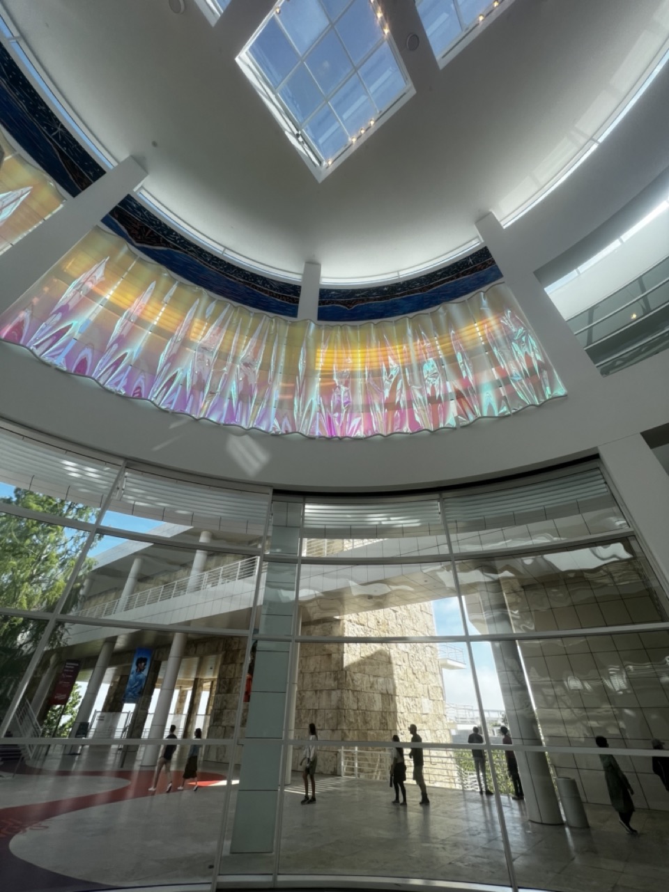
1. Overall Rating (0–10) — 8.0 This photograph captures the awe-inspiring interplay of architecture and light within a modern, circular atrium, where a vibrant, iridescent curtain of colored glass draws the eye upward like a celestial canopy. The dynamic play of natural light through the skylight and the reflective surface creates a sense of wonder and movement, while the silhouetted figures below ground the scene in human scale. The image successfully balances structural clarity with poetic luminosity, though its slightly wide-angle distortion tempers its compositional elegance.
2. Composition (0–10) — 7.5 The low-angle perspective emphasizes the grandeur of the dome and the suspended artwork, with the circular architecture guiding the eye toward the central installation. The placement of the people provides scale and rhythm, but the wide-angle lens introduces subtle distortion that slightly disrupts the symmetry.
3. Lighting (0–10) — 9.0 Natural light streams through the skylight and glass walls, illuminating the iridescent fabric with shifting hues of pink, yellow, and blue. The quality of light is soft yet vibrant, creating a luminous atmosphere that enhances the visual drama and depth of the space.
4. Color & Tone (0–10) — 8.5 The palette is rich and dynamic, with the colorful, translucent curtain serving as a radiant focal point against the neutral white architecture. The contrast between the warm, shifting tones of the glass and the cool, reflective surfaces of the stone and glass amplifies the image’s visual energy.
5. Creativity (0–10) — 9.0 The photograph captures a moment of architectural and artistic synergy, transforming a functional space into a sensory experience. The interplay of light, color, and structure suggests a narrative of human creativity and transcendence, making the image both visually striking and conceptually resonant.
6. Technical Quality (0–10) — 8.0 The image is sharp and clear, with excellent detail in both the foreground and background. The exposure is well-balanced, capturing the brightness of the sky without overexposing the glass installation, though the wide-angle lens introduces slight distortion near the edges.
7. Emotional Impact (0–10) — 8.5 The image evokes a sense of wonder and tranquility, inviting the viewer to pause and reflect on the beauty of light and space. The combination of human presence and architectural grandeur creates a meditative, almost spiritual atmosphere that resonates deeply.
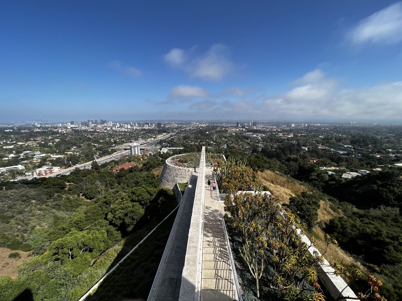
1. Overall Rating (0–10) — 8.0 This panoramic view captures the striking contrast between urban sprawl and natural elevation, with the elevated walkway serving as a powerful visual anchor. The bright, clear sky and expansive framing evoke a sense of freedom and perspective, while the interplay of light and shadow adds depth. A slight adjustment in exposure balance could better highlight the mid-tones in the cityscape, but the image succeeds in conveying both scale and serenity.
2. Composition (0–10) — 8.5 The diagonal line of the walkway draws the eye through the frame, creating strong leading lines that guide the viewer toward the distant skyline. The placement of the structure and surrounding foliage balances the composition, with the curve of the retaining wall adding visual interest and framing the scene effectively.
3. Lighting (0–10) — 8.0 Bright, natural sunlight enhances the clarity and vibrancy of the scene, casting defined shadows that give depth to the landscape and architecture. The lighting is consistent and well-distributed, highlighting textures in the stone and foliage while maintaining a dynamic contrast between sunlit and shaded areas.
4. Color & Tone (0–10) — 8.5 The vivid blue of the sky contrasts beautifully with the earthy greens and browns of the hillside and the neutral tones of the city. The color palette feels natural and balanced, with a slight warmth that enhances the midday atmosphere and adds visual richness.
5. Creativity (0–10) — 7.5 The image leverages the unique vantage point of the elevated walkway to create a compelling juxtaposition of nature and urban life. While the concept is strong and visually engaging, the scene's familiarity limits its originality—yet the execution elevates it beyond a standard landscape shot.
6. Technical Quality (0–10) — 9.0 The image is sharp, well-focused, and free of noticeable artifacts or distortions. The high resolution captures fine details in both the foreground and background, and the dynamic range is well-managed, preserving detail in both highlights and shadows.
7. Emotional Impact (0–10) — 8.0 The photograph evokes a sense of awe and contemplation, inviting the viewer to reflect on the relationship between human development and the natural world. The expansive view and open sky create a feeling of openness and possibility, making the image both visually and emotionally resonant.
Prepare to be dazzled at the Getty Museum, where art and beauty collide in the most extraordinary ways! Perched high on a hill in the Brentwood neighborhood, this place is like a medieval castle with a serious dose of academic coolness. Floating bridges, burbling fountains, and breathtaking views in every direction—it's a dream come true! And the art collectionwill blow your mind. Ancient Etruscan statues, Van Gogh's Irises, delicate illuminated manuscripts, and captivating 20th-century photography—it's like a time-traveling journey through the world of art.
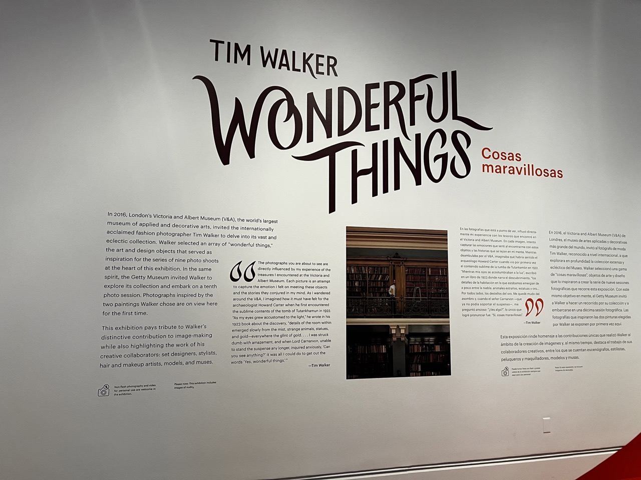
1. Overall Rating (0–10) — 7.0 This exhibition wall presentation effectively communicates the conceptual framework of Tim Walker’s “Wonderful Things” with clarity and visual cohesion. The bold typography and bilingual text create an inviting and professional atmosphere, while the integration of a photograph within the narrative adds depth and context. The layout, though dense, remains legible and purposeful, though a more dynamic visual hierarchy could enhance engagement.
2. Composition (0–10) — 7.0 The layout balances textual and visual elements well, with the title commanding attention at the top. The placement of the photograph and quotes creates a natural flow, though the right side feels slightly more crowded. A more balanced distribution of text and imagery would improve visual rhythm.
3. Lighting (0–10) — 8.0 Even, diffuse lighting ensures all text and images are clearly visible without glare or shadows. The soft illumination enhances readability and gives the space a calm, museum-like ambiance.
4. Color & Tone (0–10) — 6.5 The monochromatic scheme of black text on a light gray wall provides a clean, sophisticated look, while the red accent in “Cosas maravillosas” adds subtle contrast. The overall tone is restrained and professional, though a more varied palette could lend greater visual energy.
5. Creativity (0–10) — 7.5 The integration of Walker’s own words, the bilingual presentation, and the inclusion of a photograph within the narrative demonstrate thoughtful curation. The design reflects the whimsical yet intellectual spirit of Walker’s work, bridging art and storytelling in a compelling way.
6. Technical Quality (0–10) — 8.5 The typography is crisp and well-executed, with clear legibility across all text sizes. The photograph is sharp and well-placed, and the overall print quality is high, reflecting professional exhibition standards.
7. Emotional Impact (0–10) — 7.0 The wall evokes a sense of curiosity and reverence for Walker’s creative process, inviting viewers to reflect on the intersection of art, history, and imagination. While it doesn’t elicit strong emotion, it successfully fosters intellectual engagement and appreciation.
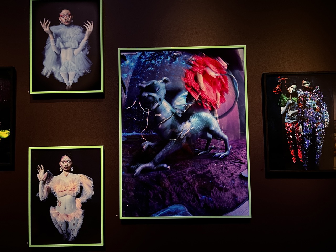
1. Overall Rating (0–10) — 7.5 This gallery installation presents a striking collection of surreal, high-fashion portraits that blend theatricality with digital manipulation, creating a dreamlike atmosphere. The central piece, with its motion-blurred figure atop a fantastical creature, commands attention and anchors the narrative, while the surrounding images echo its themes of transformation and otherworldly elegance. The dark, gallery-like setting enhances the mystique, though the arrangement feels slightly crowded, diluting the impact of individual works.
2. Composition (0–10) — 6.5 The arrangement of the photographs is asymmetrical, with the largest image dominating the center, creating a focal point. However, the uneven spacing and varying frame sizes create visual tension, and the framing of the central image slightly overlaps the one above, disrupting balance.
3. Lighting (0–10) — 7.0 The lighting is focused and directional, highlighting each photograph while allowing the dark background to recede. The contrast between the illuminated works and the surrounding darkness enhances depth and draws attention to the vivid colors and textures of the images.
4. Color & Tone (0–10) — 8.0 The palette is rich and varied, with bold contrasts between the neon green frames, the deep purples and blues of the central image, and the bright reds and pinks of the figures. The use of saturated colors against dark backgrounds creates a dramatic, almost theatrical tone that reinforces the surreal aesthetic.
5. Creativity (0–10) — 8.5 The images display a high degree of originality, combining elements of fashion, fantasy, and digital artistry to create visually arresting and conceptually layered works. The use of motion blur, exaggerated costumes, and mythical creatures suggests a deliberate exploration of identity and transformation.
6. Technical Quality (0–10) — 8.0 The photographs are sharp and well-defined, with excellent clarity and detail in both the figures and the background elements. The digital effects are rendered smoothly, and the framing of each piece is consistent with the gallery presentation.
7. Emotional Impact (0–10) — 7.5 The images evoke a sense of wonder and unease, blending beauty with the uncanny. The surrealism and theatricality invite contemplation, while the intense expressions and elaborate costumes convey a powerful emotional undercurrent of vulnerability and empowerment.
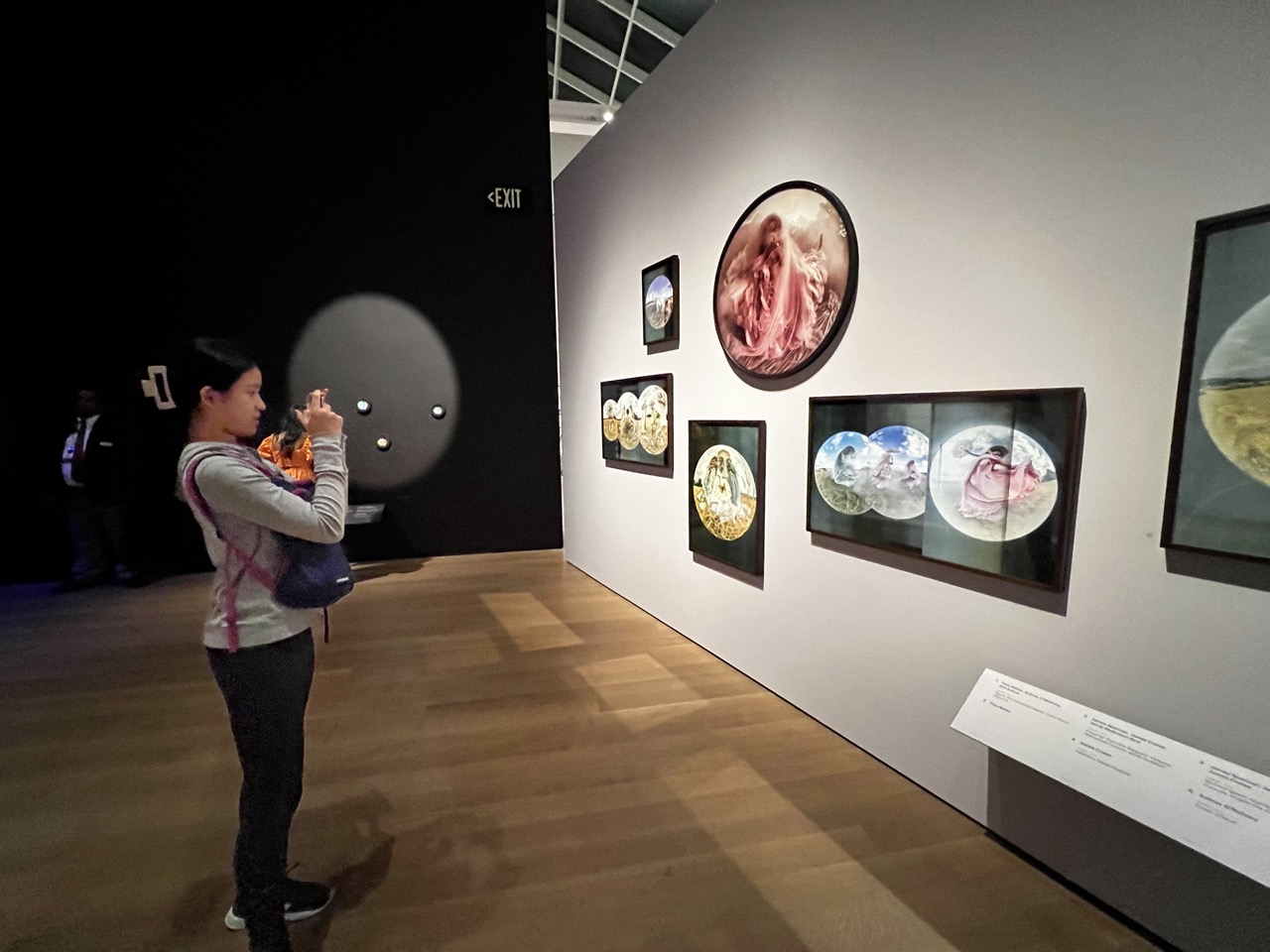
1. Overall Rating (0–10) — 7.0 This photograph captures a quiet, contemplative moment within a museum gallery, where the viewer becomes part of the narrative by engaging with the art. The contrast between the darkened space and the illuminated artworks creates a sense of reverence, while the woman’s focused interaction with the display adds a human dimension to the scene. Though the composition is balanced and the lighting effective, the image’s documentary nature slightly limits its emotional resonance.
2. Composition (0–10) — 7.0 The diagonal line of the gallery wall and the placement of the viewer on the left create a dynamic flow, guiding the eye toward the artworks. The inclusion of the exit sign and ambient details adds context without distracting from the central subject.
3. Lighting (0–10) — 7.5 The focused spotlights on the artworks create a dramatic contrast with the dim gallery space, emphasizing their importance. The soft illumination on the viewer adds depth and highlights her engagement with the work.
4. Color & Tone (0–10) — 6.5 The palette is subdued, dominated by neutral whites and browns, which allows the warm tones of the artworks to stand out. The lack of vibrant color across the scene gives it a contemplative, almost clinical feel.
5. Creativity (0–10) — 6.0 The image functions as a narrative document, capturing a real-life interaction with art. While the concept is grounded and authentic, it leans more toward observation than bold artistic expression.
6. Technical Quality (0–10) — 8.0 The image is sharp and well-exposed, with clean detail in both the foreground and background. The depth of field is appropriate, keeping both the viewer and the artworks in focus.
7. Emotional Impact (0–10) — 6.5 The scene evokes a sense of quiet curiosity and cultural engagement. While the emotional pull is moderate, it invites the viewer to reflect on the act of seeing and being seen in a shared space.
At the Getty Museum, Journey into the fantastical worlds created by internationally acclaimed fashion photographer Tim Walker. The exhibition pays tribute to Walker’s distinctive contribution to image-making while also highlighting the work of his creative collaborators: set designers, stylists, makeup artists, models, and muses. At the heart of the show is a new series of photographs inspired by his research into the collections of the Getty Museum and the Victoria and Albert Museum (V&A), London.
Bike, Sand, and Fun at Venice Beach and Santa Monica Pier
1. Overall Rating (0–10) — 7.0 This selfie captures a warm, candid moment of a family at the beach, radiating casual joy and familial connection. The overcast sky softens the light, creating a relaxed, natural atmosphere, while the vibrant orange of the man’s shirt provides a striking contrast against the muted coastal backdrop. While the image feels slightly unpolished in its composition, its authenticity and emotional honesty elevate it beyond a simple snapshot.
2. Composition (0–10) — 6.5 The subjects are framed closely, emphasizing intimacy, but the off-center positioning and slight tilt give the image an informal, spontaneous feel. The background beach scene offers context but competes for attention, slightly disrupting the focus on the family.
3. Lighting (0–10) — 6.0 Diffused light from the overcast sky eliminates harsh shadows and creates even illumination, flattering the subjects’ features. However, the lack of directional light limits depth and dimensionality in the scene.
4. Color & Tone (0–10) — 6.5 The cool, muted tones of the sky and ocean contrast effectively with the warm orange of the shirt, creating visual interest. The color palette is natural but subdued, lacking vibrancy that could enhance the mood.
5. Creativity (0–10) — 7.0 The image succeeds in capturing a genuine, personal moment with a sense of narrative. The juxtaposition of a family selfie against a busy beach backdrop adds layers of story and context, making it feel both intimate and expansive.
6. Technical Quality (0–10) — 7.5 The image is sharp and clear, with well-managed focus on the subjects. The resolution and exposure are solid, though minor noise is visible in the sky, likely due to low-light conditions.
7. Emotional Impact (0–10) — 8.0 The genuine smiles and closeness between the family members convey warmth and affection, evoking a sense of shared experience and contentment. The viewer is drawn into the moment, feeling a quiet joy in the simplicity of the scene.
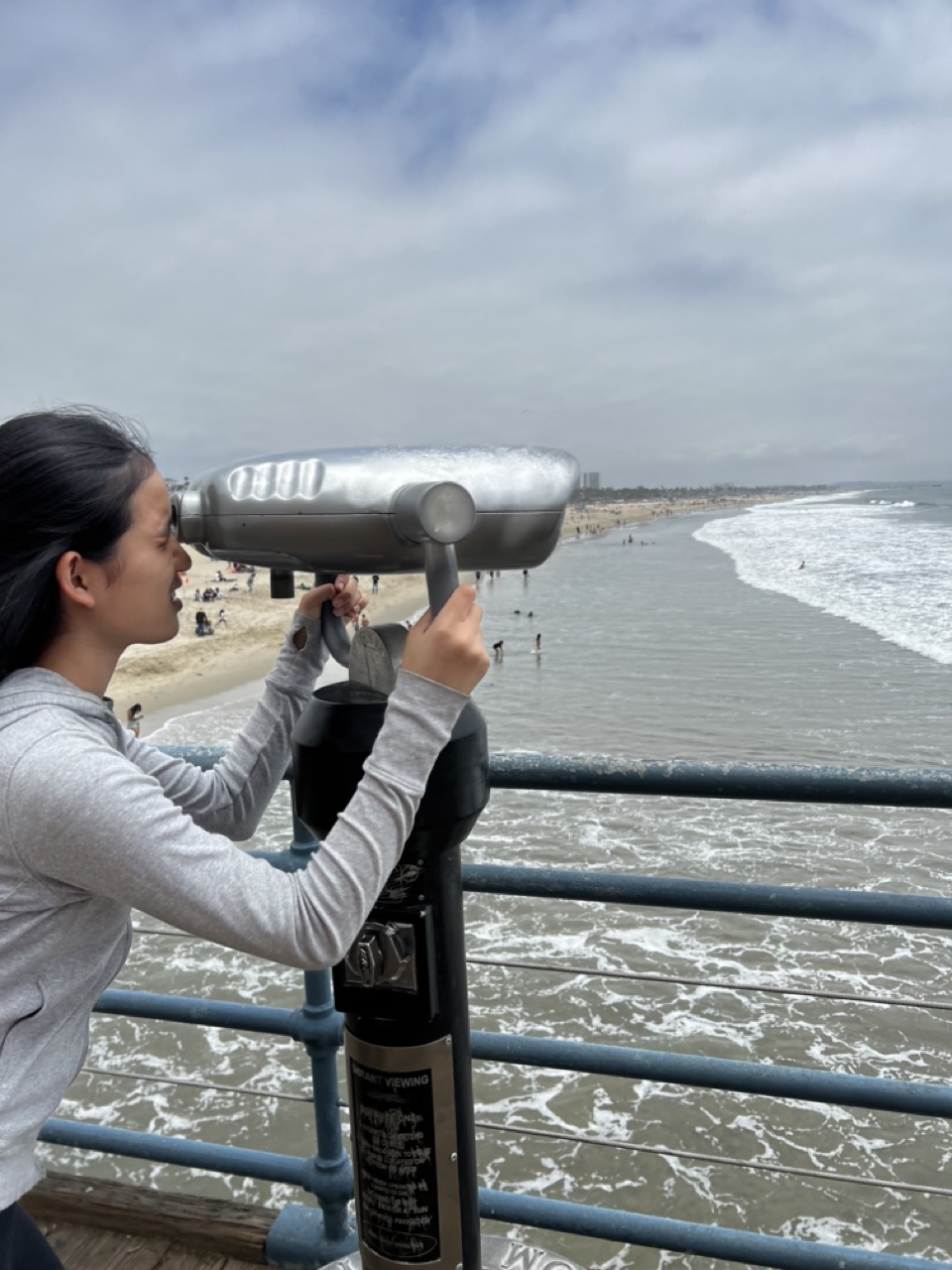
1. Overall Rating (0–10) — 6.8 This photograph captures a candid, contemplative moment of a woman using a coin-operated binocular viewer at a coastal pier, blending human interaction with a scenic seascape. The overcast sky and muted tones lend a reflective mood, while the subject’s engagement with the viewer adds a narrative layer of curiosity and exploration. While the image is grounded in authenticity, its visual energy is tempered by a lack of dynamic lighting and a slightly cluttered foreground, holding it back from greater artistic impact.
2. Composition (0–10) — 6.5 The subject is well-placed on the left, creating a balanced diagonal that leads the eye toward the ocean. The railing and binoculars act as framing devices, but the foreground elements slightly distract from the central focus.
3. Lighting (0–10) — 5.5 Diffused, overcast lighting creates a soft, even exposure but lacks contrast and directional drama. The gray sky and muted water tone contribute to a subdued atmosphere that feels more documentary than evocative.
4. Color & Tone (0–10) — 6.0 The palette is restrained, dominated by cool grays and blues, with the silver binoculars providing a metallic accent. While cohesive, the lack of vibrant color reduces visual excitement and emotional resonance.
5. Creativity (0–10) — 7.0 The concept—using a public binocular viewer to engage with the seascape—introduces a subtle layer of storytelling. It captures a quiet, personal moment within a public space, suggesting themes of observation and connection.
6. Technical Quality (0–10) — 7.5 The image is sharp and well-focused, with clear details in the binoculars and the subject’s expression. The exposure is balanced, and the noise level is low, indicating strong technical execution.
7. Emotional Impact (0–10) — 6.5 The photograph evokes a sense of calm introspection and curiosity. The viewer is invited to imagine what the woman sees—perhaps distant memories, fleeting moments, or the vastness of the ocean—creating a quiet emotional pull, though it remains restrained by the overall mood.
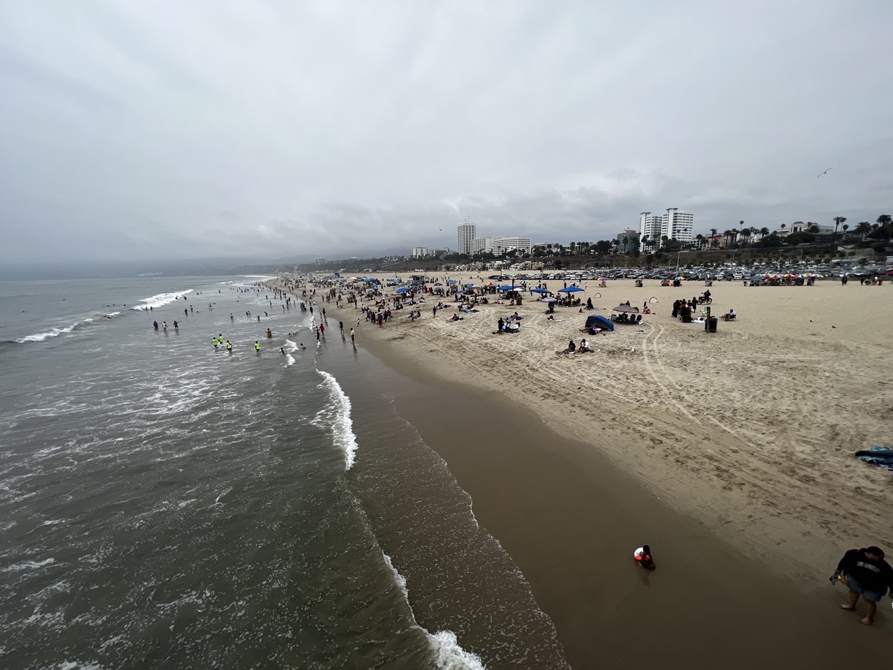
1. Overall Rating (0–10) — 6.0 This photograph captures the quiet energy of a crowded beach under an overcast sky, where the muted palette and diffused light lend a contemplative, almost melancholic mood. While the wide-angle perspective effectively conveys the scale of the scene, the lack of a clear focal point and the flat lighting prevent the image from achieving visual cohesion. The photograph succeeds as a documentary record of a day at the shore but falls short of evoking deeper emotional resonance.
2. Composition (0–10) — 6.0 The diagonal sweep of the shoreline draws the eye from the foreground into the distance, creating a sense of depth. However, the crowded beach and scattered figures lack a central subject, resulting in a composition that feels more like a snapshot than a curated scene.
3. Lighting (0–10) — 5.0 The overcast sky casts a uniform, flat light across the scene, reducing contrast and diminishing the texture of the sand and waves. While the lighting is consistent, it lacks drama and fails to highlight the natural beauty of the coastal environment.
4. Color & Tone (0–10) — 5.0 The palette is dominated by muted grays and beige, reflecting the cloudy weather. While the colors are natural, they lack vibrancy and emotional warmth, contributing to a subdued and somewhat lifeless atmosphere.
5. Creativity (0–10) — 5.5 The image offers a straightforward, observational approach to beach life, capturing the diversity of human activity without imposing a strong artistic vision. The lack of a distinctive stylistic choice or narrative focus limits its creative impact.
6. Technical Quality (0–10) — 7.0 The image is sharp and well-exposed, with clear details in both the water and the distant buildings. The high dynamic range allows for visibility in both the bright sand and the darker sky, though it comes at the cost of tonal richness.
7. Emotional Impact (0–10) — 5.0 The somber weather and restrained energy of the scene create a sense of quiet detachment. While the image invites reflection on daily life, it does not strongly engage the viewer emotionally, feeling more like a moment captured than a moment felt.
Time to soak up the sun and embrace the laid-back vibes of Venice Beach and Santa Monica Pier! Hop on a bike and cruise along the picturesque coastline. The bike path is like a never-ending adventure, stretching for 22 miles from Palos Verdes to Pacific Palisades. Feel the wind in your hair as you pedal past beautiful beaches, with no cars in sight to spoil the fun. It's the perfect way to take in the breathtaking scenery and enjoy a leisurely ride. And when you're ready for some thrills, head to the iconic Santa Monica Pier. From the Ferris wheel to the roller coasters, this place is a playground for the young and young at heart. Indulge in delicious treats, play games, and soak up the vibrant atmosphere. It's a beachside adventure you'll remember forever!
Here are some of the great restaurants we visited in LA:
White Elephant
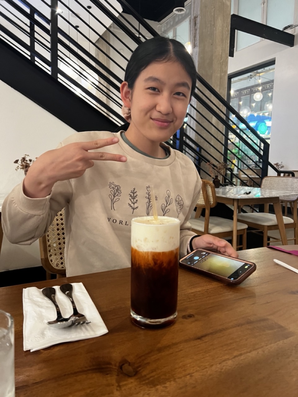
1. Overall Rating (0–10) — 7.0 This photograph captures a warm, candid moment of a young person enjoying a drink in a modern café, radiating quiet confidence and ease. The subject’s friendly expression and playful gesture create an inviting atmosphere, while the layered coffee and natural wood table add a sense of authenticity and comfort. While the lighting and composition are functional, they don’t quite elevate the image into the realm of fine photography, but the genuine mood makes it engaging and relatable.
2. Composition (0–10) — 6.5 The subject is centered and clearly the focal point, with the coffee drink placed prominently in the foreground to anchor the frame. The diagonal lines of the staircase in the background add visual interest and depth, though the cluttered table and background elements slightly distract from the subject’s presence.
3. Lighting (0–10) — 6.0 The lighting is bright and even, likely from overhead artificial sources, which illuminates the scene clearly but lacks the softness or directionality to create mood. The shadows are minimal, giving the image a flat, documentary feel.
4. Color & Tone (0–10) — 6.5 The palette is warm and natural, dominated by the browns of the wood table and the cream tones of the subject’s sweater. The dark coffee contrasts well with the lighter surroundings, and the soft beige and black tones lend a cohesive, calm aesthetic, though the color vibrancy is moderate.
5. Creativity (0–10) — 7.0 The image is simple yet effective in storytelling—capturing a personal, everyday moment with charm. The subject’s gesture and the composition suggest a narrative of connection and joy, making it feel personal and spontaneous rather than staged.
6. Technical Quality (0–10) — 7.5 The image is sharp and well-focused, with clean details in the subject’s face, clothing, and the drink. The phone screen and napkin are clearly visible, and the depth of field is appropriately managed to keep the foreground and midground in focus.
7. Emotional Impact (0–10) — 7.5 The warmth of the subject’s smile and relaxed body language evoke a sense of happiness and contentment. The viewer is drawn into the moment, feeling a quiet connection to the subject’s joy in a simple, shared experience.
White Elephant at 541 S Spring St Suite 106, Los Angeles, CA 90013. Prepare yourself for an incredible culinary experience at White Elephant. Their Milk Tea will have you jumping with joy, and the Pad Thai is cooked to perfection. Trust me, you won't be able to resist the flavorful Yellow Curry or the mouthwatering Drunken Noodle. The modern and clean ambiance adds an extra touch of awesomeness. You'll be back for more!
Du-Pars | Restaurant and Bakery
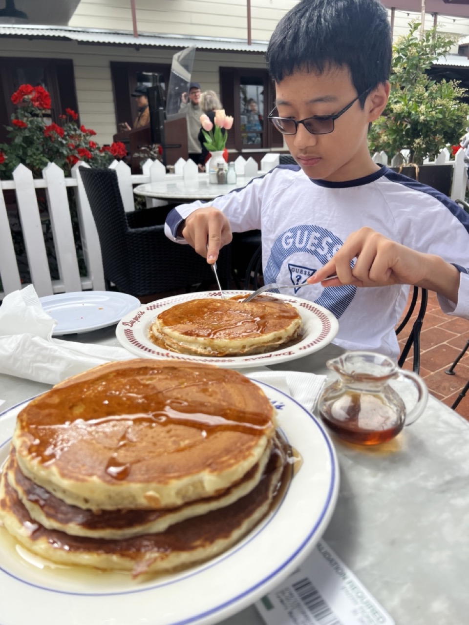
1. Overall Rating (0–10) — 7.0 This photograph captures a warm, candid moment of a young boy enjoying a hearty breakfast, evoking a sense of everyday joy and comfort. The rich textures of the pancakes and the natural daylight enhance the scene’s authenticity, while the layered composition draws the viewer into the moment. While the image feels slightly cluttered and lacks a strong focal point, its charm lies in its unposed sincerity and inviting atmosphere.
2. Composition (0–10) — 6.5 The foreground pancake stack draws immediate attention, creating a layered depth that leads the eye toward the boy. However, the composition feels slightly unbalanced due to the off-center subject and the overlapping elements in the mid-ground.
3. Lighting (0–10) — 7.0 Natural daylight illuminates the scene evenly, enhancing the golden tones of the pancakes and the soft textures of the surroundings. The lighting feels authentic and enhances the outdoor café ambiance.
4. Color & Tone (0–10) — 7.0 The warm golden browns of the pancakes contrast nicely with the white plates and the red flowers in the background, creating a balanced and appetizing palette. The overall tone is natural and inviting.
5. Creativity (0–10) — 6.5 The image captures a simple, relatable moment with a focus on food and human connection, but the composition and framing lack a more deliberate artistic intent, leaning more toward documentation than storytelling.
6. Technical Quality (0–10) — 7.5 The image is sharp and well-focused, with clear details in the pancakes and the boy’s expression. The depth of field is appropriate, keeping the main subject in focus while softly blurring the background.
7. Emotional Impact (0–10) — 7.0 The photograph conveys a sense of contentment and warmth, evoking nostalgia and the simple pleasure of a satisfying meal. The viewer is invited to share in the quiet joy of the moment.
Du-Pars | Restaurant and Bakery at 6333 W 3rd St, Los Angeles, CA 90036. Step into this classic diner with a retro vibe and indulge in their good-quality food. The short stack pancakes are so massive that sharing is highly recommended. With a great selection of food options and delectable pastries, you'll be spoilt for choice. Plus, the fantastic service and parking validation are the icing on the cake!
Urth Caffe Santa Monica
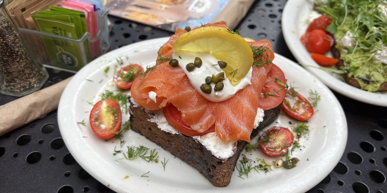
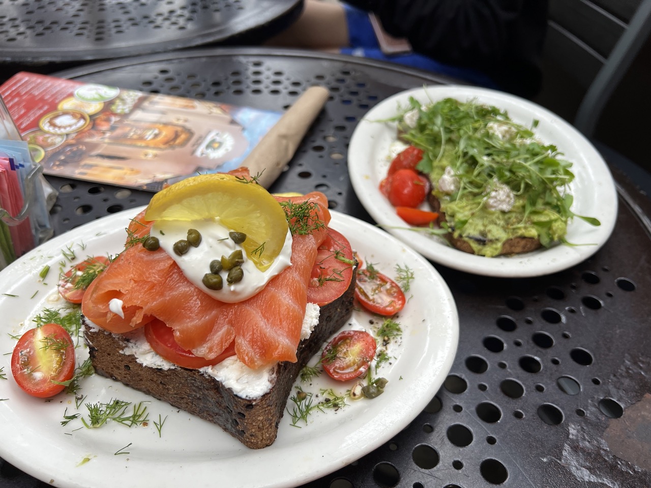
1. Overall Rating (0–10) — 7.0 This photograph captures a vibrant, appetizing breakfast scene with an inviting sense of immediacy, as if the viewer is seated at the table, ready to eat. The textures of the smoked salmon, creamy spread, and fresh greens are richly detailed, while the natural daylight enhances the freshness of the ingredients. While the background elements slightly clutter the frame, the image successfully conveys the pleasure of a simple, well-prepared meal, balanced between documentary realism and culinary allure.
2. Composition (0–10) — 6.5 The main subject, the smoked salmon toast, is well-placed and dominates the foreground, drawing the eye effectively. However, the second plate and the menu in the background create visual competition, slightly disrupting the balance. A tighter crop would have strengthened focus and eliminated distractions.
3. Lighting (0–10) — 7.5 Natural daylight illuminates the scene evenly, highlighting the freshness of the ingredients with soft, diffused quality. The light enhances the vivid colors without harsh shadows, creating a warm, inviting atmosphere that complements the meal.
4. Color & Tone (0–10) — 8.0 The palette is rich and harmonious, with the bright orange of the salmon, red tomatoes, and green herbs creating a dynamic contrast against the dark rye bread and white plates. The overall tone is fresh and appetizing, with just enough warmth to feel natural and inviting.
5. Creativity (0–10) — 7.0 The image presents a common subject—breakfast—through a lens of casual elegance. The thoughtful arrangement and emphasis on texture and color elevate the everyday, offering a moment of visual delight. While not groundbreaking, it captures a relatable and pleasing scene with strong aesthetic intent.
6. Technical Quality (0–10) — 8.0 The image is sharp and clear, with fine detail visible in the dill, capers, and texture of the bread. Focus is well-managed, and the depth of field appropriately isolates the main dish while keeping the surrounding elements slightly soft.
7. Emotional Impact (0–10) — 7.5 The photograph evokes a sense of calm indulgence and morning satisfaction. It resonates with viewers who appreciate fresh food and quiet moments, creating a subtle emotional connection through its warmth and authenticity.
Urth Caffe Santa Monica at 2327 Main St, Santa Monica, CA 90405. Prepare to be amazed at Urth Caffe Santa Monica, a true gem that offers an exceptional dining experience. The beautiful decor creates a relaxed and inviting atmosphere, perfect for a casual brunch or a cozy coffee date with friends. Their menu is extensive, with delicious breakfast options, healthy salads, and mouthwatering sandwiches. Fresh, organic ingredients make every bite a burst of flavor. And don't even get me started on their outstanding coffee and tea selection. But the real showstopper? The desserts! From heavenly cakes to scrumptious pies and pastries, they'll satisfy even the most insatiable sweet tooth. Top it off with friendly and attentive staff, and you've got the recipe for a memorable dining experience.
DTLA Ramen
1. Overall Rating (0–10) — 7.0 This photograph captures the vibrant warmth of a ramen dining experience, where rich textures and warm tones evoke a sense of comfort and indulgence. The foreground ramen bowl is richly detailed and inviting, though the background elements, including the ambient purple lighting and out-of-focus diner, slightly distract from the central subject. While the image succeeds in conveying the sensory appeal of the meal, its composition and lighting feel more candid than curated, limiting its overall aesthetic cohesion.
2. Composition (0–10) — 6.5 The ramen bowl is well-centered and dominates the frame, drawing immediate attention. However, the cluttered table and background activity create visual noise, pulling focus from the main subject. A tighter crop or shallow depth of field would enhance the emphasis on the dish.
3. Lighting (0–10) — 6.0 The warm ambient lighting enhances the inviting tone of the scene, though the presence of purple and blue hues from the background lighting creates an uneven color temperature. This mix softens the natural warmth of the food and introduces a slightly artificial feel.
4. Color & Tone (0–10) — 7.0 The rich orange of the broth contrasts beautifully with the green scallions and red chopsticks, creating a visually appetizing palette. The warm wood tones of the table ground the image, while the cool blue and purple reflections add subtle contrast, though they slightly disrupt the harmony.
5. Creativity (0–10) — 6.5 The image tells a story of shared dining and culinary enjoyment, using natural elements like the steaming bowl and condiments to evoke authenticity. While not overtly experimental, the composition captures a genuine moment in a restaurant setting, offering a sense of place and experience.
6. Technical Quality (0–10) — 7.5 The focus is sharp on the ramen bowl, capturing fine details in the ingredients and broth. The image is well-exposed, with no significant issues in clarity or noise, despite the challenging lighting conditions.
7. Emotional Impact (0–10) — 7.5 The photograph evokes a strong sense of warmth and satisfaction, inviting the viewer to imagine the aroma and taste of the dish. The intimate, casual setting enhances the feeling of shared enjoyment, making the image emotionally resonant and relatable.
DTLA Ramen at 952 S Broadway, Los Angeles, CA 90015. Get ready to slurp your way to happiness at DTLA Ramen. Despite the bustling crowd, the friendly staff goes the extra mile to make you feel welcome. Dive into their deliciously spicy ramen, which hits just the right spot. The fresh and delightful veggies on the tuna bowl will have you craving more. With a fun ambiance and fantastic vegan options, this place is a must-visit for ramen lovers.
Holey Grail Donuts
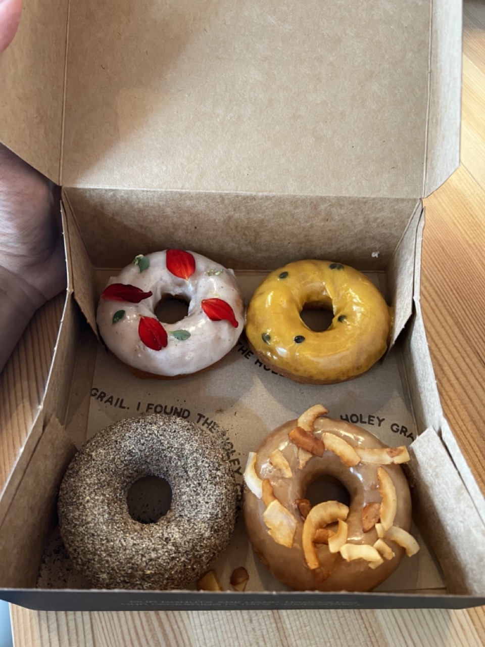
1. Overall Rating (0–10) — 7.0 This photograph captures a tempting assortment of artisanal donuts with a sense of immediacy and charm, inviting the viewer into a moment of indulgence. The natural lighting and casual framing give it an authentic, snapshot-like quality, though the composition feels slightly unbalanced and the focus could be sharper to fully highlight the textures.
2. Composition (0–10) — 6.0 The donuts are arranged in a diamond pattern, but the off-center hand and uneven box lid disrupt visual harmony. A more centered and symmetrical framing would enhance the balance.
3. Lighting (0–10) — 7.0 Soft, natural light illuminates the scene evenly, enhancing the glossy glazes and textured toppings without harsh shadows. The light feels warm and inviting, complementing the subject.
4. Color & Tone (0–10) — 7.5 The palette is rich and varied—creamy whites, golden yellows, and earthy browns—creating a visually appealing contrast. The warm tones evoke a cozy, indulgent atmosphere, though the overall color rendering is slightly muted.
5. Creativity (0–10) — 6.5 The concept is straightforward—showcasing a box of donuts—but the inclusion of edible garnishes and the brand’s subtle branding add a touch of artisanal personality. It’s more observational than conceptual, but the details tell a small story of craftsmanship.
6. Technical Quality (0–10) — 7.0 The image is sharp in the center, with clear detail on the donuts’ surfaces, but slight softness appears at the edges and in the background. Focus is adequate, but not perfectly crisp.
7. Emotional Impact (0–10) — 7.0 The image evokes a sense of comfort and delight, tapping into the universal appeal of sweet treats. The casual, handheld perspective adds intimacy, making the viewer feel like they’re about to enjoy one themselves.
Holey Grail Donuts at 2441 Main St, Santa Monica, CA 90405. Prepare yourself for a donut experience like no other at Holey Grail Donuts! These made-to-order treats will blow your mind. Picture warm, fluffy donuts with a twist—the base is made from taro root! It's a creative and unique concept that delivers incredible flavor. And the best part? They're constantly coming up with new and exciting flavors that will leave you craving more. These donuts are perfect for sharing with friends and family, and everyone you introduce them to will become an instant fan. Light as a French Cruller, yet not as dense as a cake donut, they strike the perfect balance. Don't miss out on this one-of-a-kind donut adventure!
Egg Tuck
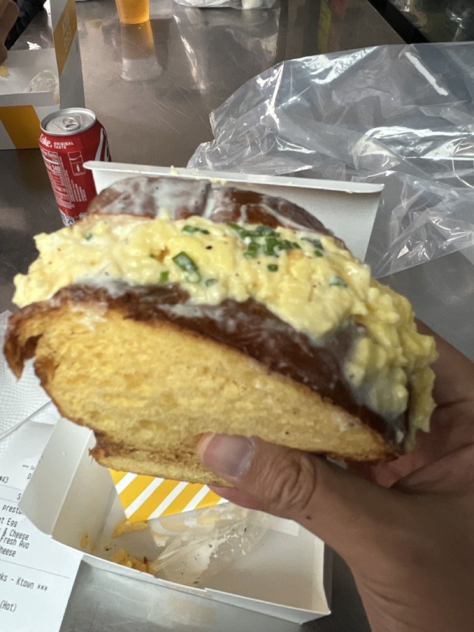
1. Overall Rating (0–10) — 6.0 This photograph captures a casual, in-the-moment food experience with a strong sense of authenticity. The focus on the egg-stuffed bread, held in hand with a diner’s receipt and soda can in the background, conveys the unpretentious charm of street food. While the image feels candid and relatable, it lacks compositional refinement and visual polish, holding back its potential to feel truly compelling.
2. Composition (0–10) — 5.5 The hand holding the sandwich dominates the frame, creating a tight, slightly awkward perspective. The background elements—can, receipt, and plastic—add context but clutter the scene, distracting from the main subject.
3. Lighting (0–10) — 5.0 Bright, even ambient light illuminates the scene without harsh shadows, but it also flattens texture and depth. The reflective surface of the table adds glare, reducing clarity in the background.
4. Color & Tone (0–10) — 5.5 The color palette is muted, with the red of the can providing a minor pop of contrast. The overall tone is neutral and slightly washed out, lacking richness or vibrancy.
5. Creativity (0–10) — 6.0 The image succeeds in capturing a real, everyday moment with a sense of spontaneity. However, it relies on subject matter rather than artistic vision, offering little beyond a simple documentation of a meal.
6. Technical Quality (0–10) — 6.5 The focus is sharp on the sandwich, with clear details in the bread and egg. The image is free of major technical flaws, though the shallow depth of field and background distractions reduce overall impact.
7. Emotional Impact (0–10) — 5.5 The photograph evokes a sense of immediacy and casual enjoyment, but it doesn’t strongly connect emotionally. The viewer is shown a meal, but not invited into the experience.
Egg Tuck at 3458 Wilshire Blvd Ste 1/2, Los Angeles, CA 90010. Get ready to tuck into some seriously delicious breakfast fare at Egg Tuck. From their signature egg sandwiches to their mouthwatering dishes, every bite is a flavor explosion. They take breakfast to a whole new level, and you won't be disappointed. The combination of flavors and textures will leave your taste buds dancing with joy. It's the ultimate breakfast experience that will keep you coming back for more.
Chuncheon Dakgalbi Donghae Makguksu
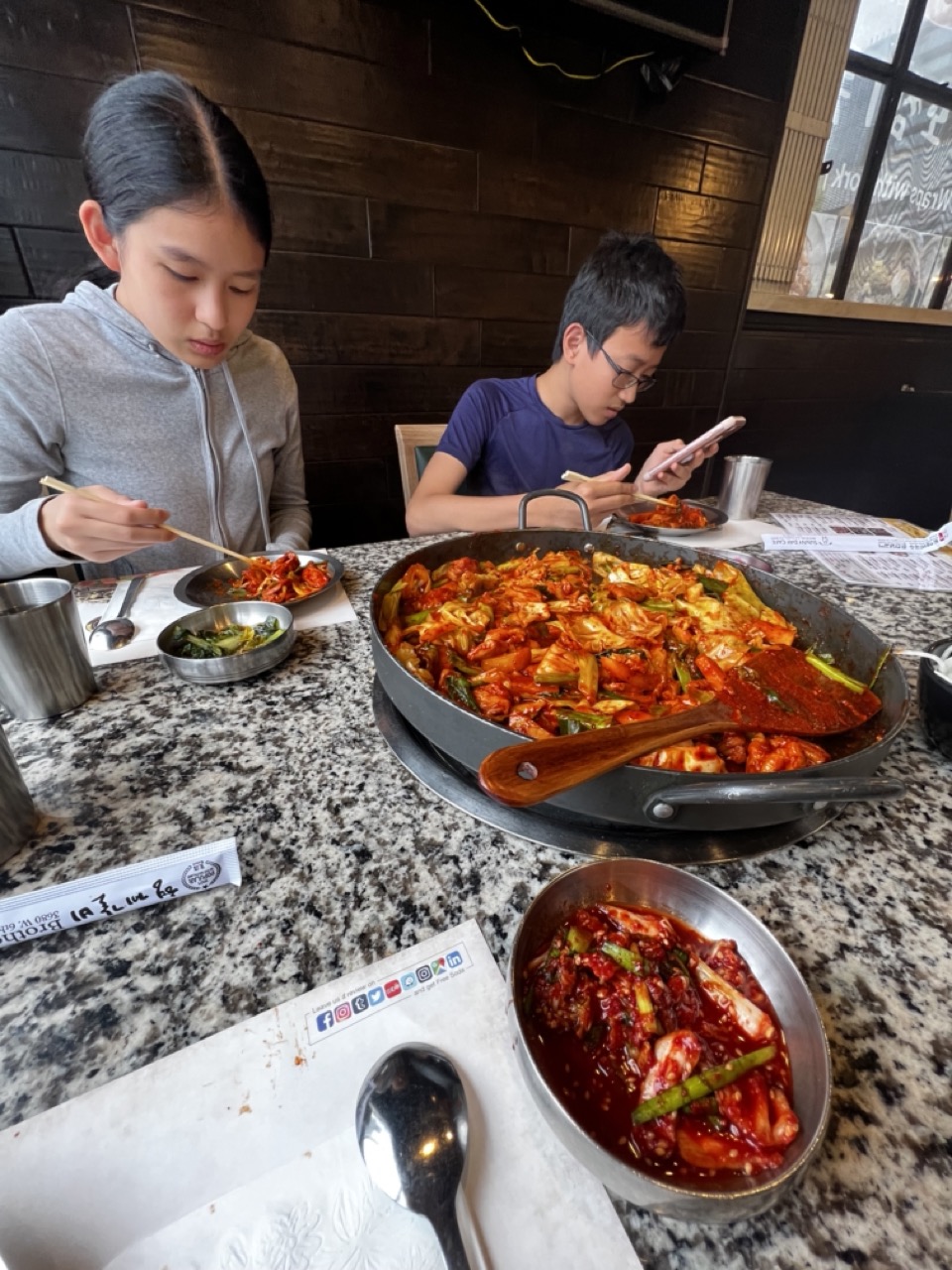
1. Overall Rating (0–10) — 6.8 This photograph captures an intimate, candid moment of two children sharing a meal at a Korean restaurant, evoking a sense of everyday warmth and familial connection. The vibrant kimchi stew and traditional tableware add cultural richness, while the natural interaction between the siblings grounds the scene in authenticity. While the composition and lighting are functional, they lack the dynamic tension needed to elevate it into a truly compelling image—its strength lies in its narrative honesty rather than its visual artistry.
2. Composition (0–10) — 6.0 The framing feels slightly awkward, with the foreground elements (spoon, napkin, and metal bowl) competing for attention and creating visual clutter. The main subject—especially the boy on the right—appears partially obscured by the large pan, which dominates the center but disrupts the balance. A tighter crop or adjusted angle would better focus on the subjects and their interaction.
3. Lighting (0–10) — 6.5 The ambient lighting is even and functional, likely from overhead fixtures, but it lacks directionality and warmth. While it clearly illuminates the scene, the flat, neutral tone flattens the textures of the food and the expressions of the children, preventing the image from feeling inviting or atmospheric.
4. Color & Tone (0–10) — 7.0 The bold reds of the kimchi contrast beautifully with the neutral gray and black tones of the table and background, creating a visually engaging palette. The warm, earthy wood wall adds depth, while the metallic sheen of the dishes enhances the realism. The color harmony is strong, though the overall tone remains somewhat muted due to the lighting.
5. Creativity (0–10) — 7.0 The image succeeds in capturing a genuine, unposed moment that tells a story—of family, culture, and shared meals. The inclusion of traditional Korean elements, like the stone bowl and communal cooking style, adds a layer of cultural authenticity. While not highly stylized, the photograph’s strength lies in its narrative authenticity and cultural resonance.
6. Technical Quality (0–10) — 7.5 The focus is sharp on the foreground elements, particularly the central pan and the bowl of kimchi. The depth of field is appropriate, keeping the main subjects clear while softly blurring the background. There are no obvious technical flaws such as noise or blur, and the camera seems to have captured the scene accurately and with clarity.
7. Emotional Impact (0–10) — 7.0 The photograph evokes a sense of quiet domesticity and connection, especially with the girl focused on her food and the boy absorbed in his phone—suggesting a familiar, modern family dynamic. The viewer is drawn into the warmth of the shared meal, even if the emotional depth is restrained by the casual, documentary-style approach. It feels like a memory captured, not staged, which enhances its emotional resonance.
Chuncheon Dakgalbi Donghae Makguksu at 3601 W 6th St, Los Angeles, CA 90020. You come here for one thing and one thing only. Spicy stir fried chicken (닭갈비). If you order the 2-persons servings, it’ll feed 3 hungry people EASY. Also, highly recommend ordering the fried rice on the side, perfect complement to the stir fried chicken.