Preston Lau: A Journey Through Memories, Tech, and Humanity
Welcome to my personal blog that delves into the intricate tapestry of personal albums and the fascinating intersection of ever-evolving technology and humanity. Come along on a journey with me as we delve into the seamless fusion of creativity, state-of-the-art AI and robotics, intricately interwoven within the tapestry of our shared awareness. Have fun!
Duels The Art of Fighting at Army Museum Paris
AI Summary
The Army Museum Paris features an extensive collection of military artifacts, including medieval armor, modern uniforms, and artillery shells. Its latest exhibition, "Duels - The Art of Fighting," explores the history and culture of dueling from its origins to its decline in the 19th century, offering a comprehensive look at this fascinating and often perilous practice.
Exploring the Army Museum in Paris
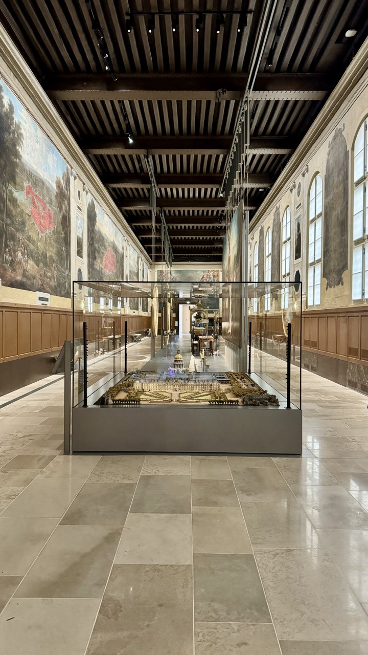
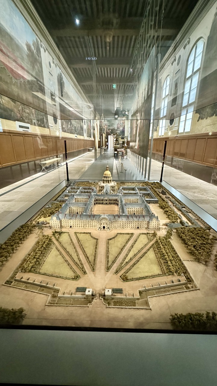
The Army Museum is located within the stunning Hôtel des Invalides, an architectural masterpiece commissioned by King Louis XIV in 1670. Originally designed as a hospital and retirement home for war veterans, the Hôtel des Invalides remains an active residence for veterans, preserving its historical function while housing one of the most extensive military museums in the world.
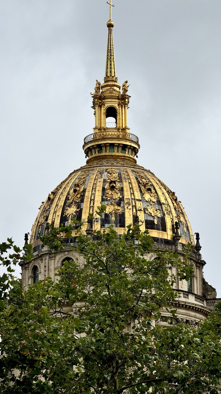
1. Overall Rating (0–10) — 7.5 This photograph captures the majestic dome of Les Invalides with a striking interplay between architectural grandeur and natural framing. The golden spire and ornate details stand out against the muted sky, while the foreground foliage adds depth and a sense of grounded perspective. Though the overcast lighting tempers the vibrancy of the gold, the image conveys a quiet reverence for the landmark, balancing historical weight with a contemporary, human-scale viewpoint.
2. Composition (0–10) — 7.0 The low-angle shot emphasizes the dome’s verticality and scale, while the tree branches in the foreground create a natural frame that adds depth and layers. The composition is slightly asymmetrical, with the dome offset to the left, which gives a dynamic feel but slightly disrupts the visual balance.
3. Lighting (0–10) — 6.0 The overcast sky produces soft, diffused light that minimizes harsh shadows and allows for even exposure across the dome. However, the lack of direct sunlight dulls the richness of the gold leaf, muting its luminosity and reducing the sense of opulence.
4. Color & Tone (0–10) — 6.5 The palette is dominated by the contrast between the warm gold of the dome and the cool, gray sky, with the deep green of the foliage adding a natural counterpoint. While the tones are harmonious, the overall image feels somewhat subdued due to the flat lighting and lack of color saturation.
5. Creativity (0–10) — 7.0 The choice to frame the dome through the tree canopy introduces a poetic, almost reverent quality, blending nature with human achievement. This perspective feels intentional and personal, offering a fresh vantage point on a well-documented landmark.
6. Technical Quality (0–10) — 8.0 The image is sharp and well-focused, with clear detail visible in both the architectural ornamentation and the leaves. The exposure is balanced, with no blown highlights or crushed shadows, and the depth of field is appropriately managed.
7. Emotional Impact (0–10) — 7.0 The photograph evokes a sense of awe and contemplation, inviting the viewer to pause and reflect on the history and artistry of the structure. The framing through the trees creates an intimate, almost meditative connection to the scene.
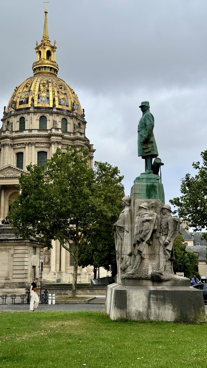
1. Overall Rating (0–10) — 7.0 This photograph captures a striking juxtaposition of historical grandeur and solemn commemoration, with the golden dome of Les Invalides standing as a luminous counterpoint to the weathered green patina of the war memorial. The composition balances architectural majesty with human scale, though the overcast sky tempers the scene’s emotional intensity. While the image succeeds in conveying a sense of place and time, its muted lighting and slightly cluttered foreground prevent it from achieving a more profound visual resonance.
2. Composition (0–10) — 7.0 The statue is well-placed on the right, creating a strong diagonal that leads the eye toward the dome, while the tree in the mid-ground adds depth and softens the transition between foreground and background. The person walking in the lower left provides scale and a subtle sense of life, though their placement slightly disrupts the balance.
3. Lighting (0–10) — 5.5 Diffuse, overcast lighting flattens the scene’s contrast and reduces the richness of the gold dome’s reflective surface. While it ensures even exposure, it also robs the image of dynamic shadows and atmospheric drama.
4. Color & Tone (0–10) — 6.5 The golden dome provides a striking focal point against the muted grays and greens, but the overall palette feels subdued. The contrast between the warm gold and cool tones of the sky and statue is compelling, yet the lack of vibrancy dampens the visual impact.
5. Creativity (0–10) — 6.0 The image is a straightforward documentation of a historic site, with strong compositional intent but limited artistic interpretation. The inclusion of the walking figure adds a layer of narrative, but the approach remains largely observational.
6. Technical Quality (0–10) — 7.5 The image is sharp and well-focused, with clear detail in both the statue and the architectural elements. The camera appears to have handled the complex scene well, maintaining clarity despite the mixed lighting conditions.
7. Emotional Impact (0–10) — 6.5 The scene evokes a quiet reverence for history and memory, amplified by the solemnity of the monument and the grandeur of the dome. However, the flat lighting and lack of dramatic contrast keep the emotional resonance restrained, leaving the viewer more contemplative than moved.
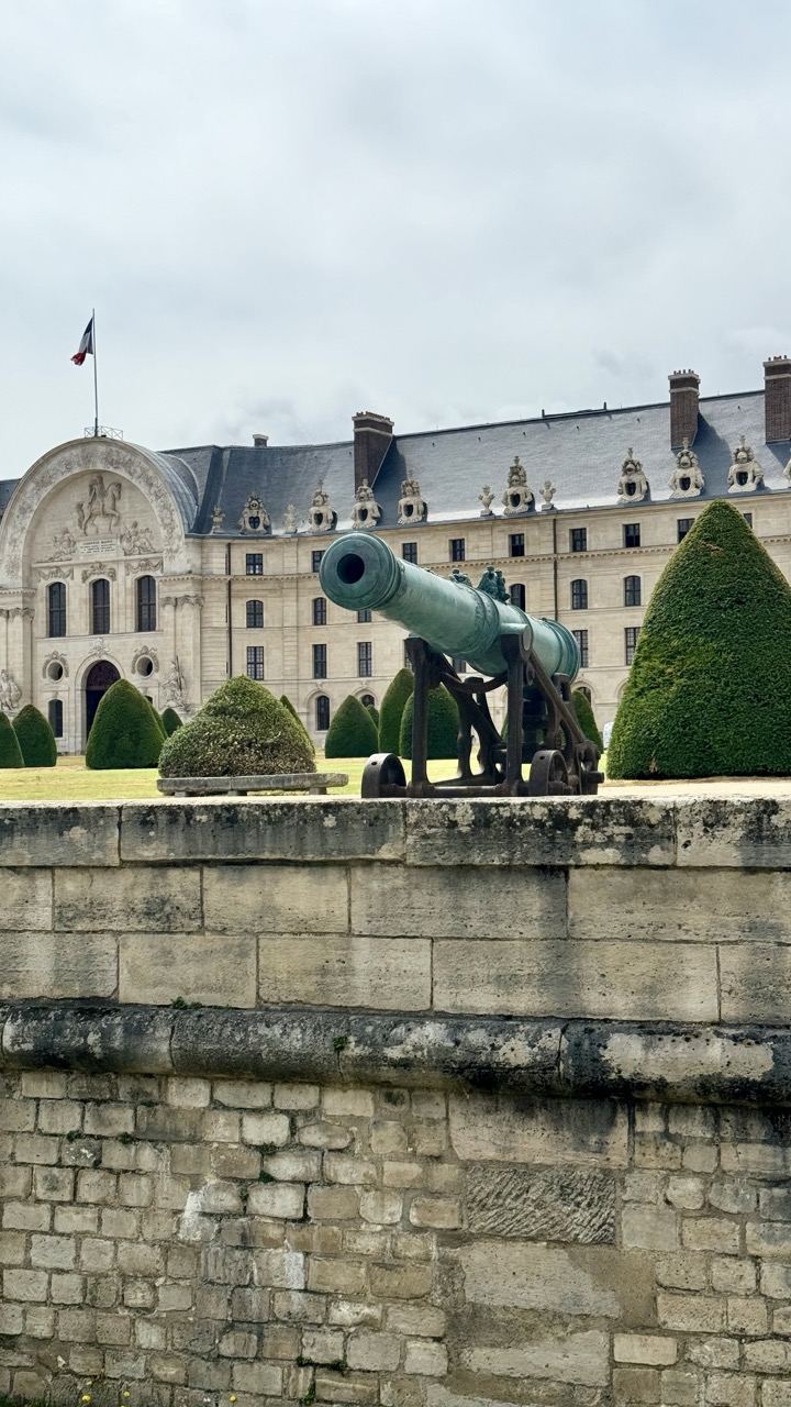
1. Overall Rating (0–10) — 7.0 This photograph captures the stately presence of a historic French château, with a weathered cannon serving as a silent sentinel in the foreground. The composition balances architectural grandeur and natural order, while the overcast sky lends a contemplative mood. Though the image is well-framed and rich in historical resonance, the muted lighting and slightly cluttered foreground detract from its visual cohesion, keeping it from achieving full artistic impact.
2. Composition (0–10) — 7.0 The cannon is positioned slightly off-center, drawing the eye toward the ornate façade, while the stone wall in the foreground grounds the image and adds depth. The symmetrical topiary and repeating architectural details create a sense of order, though the wall's dominance slightly disrupts the visual flow.
3. Lighting (0–10) — 5.5 The overcast sky produces soft, diffused light that minimizes harsh shadows and highlights textures in the stonework and patina of the cannon. However, the lack of contrast and warmth gives the scene a flat, subdued quality that limits atmospheric depth.
4. Color & Tone (0–10) — 6.0 The palette is restrained, dominated by muted grays, greens, and earth tones, which align with the historical and somber tone of the setting. The green patina of the cannon and the manicured hedges provide subtle color accents, but the overall tonal range lacks vibrancy.
5. Creativity (0–10) — 6.5 The juxtaposition of the cannon with the refined château suggests a narrative of power and history, blending military and cultural heritage. While the concept is strong, the execution remains largely observational, with little stylistic experimentation.
6. Technical Quality (0–10) — 7.5 The image is sharp and clear, with well-defined textures in the stone and metal. The focus is consistent across the frame, and the exposure is balanced, capturing detail without overexposure or loss in shadows.
7. Emotional Impact (0–10) — 6.0 The photograph evokes a quiet reverence for history and the passage of time, inviting reflection on the site’s past. The stillness and symmetry create a contemplative mood, though the lack of dramatic lighting or emotional contrast keeps the viewer at a polite distance.
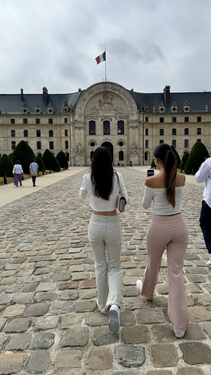
1. Overall Rating (0–10) — 6.0 This photograph captures a moment of quiet exploration at a historic French landmark, where modern visitors walk toward an ornate palace under an overcast sky. The symmetry of the cobblestone path and the grand architecture create a sense of timelessness, while the two women in the foreground add a contemporary, personal touch. Though the image feels like a candid snapshot rather than a fully realized artistic statement, it succeeds in blending human presence with cultural grandeur—its strength lies in its narrative simplicity and architectural context.
2. Composition (0–10) — 6.5 The strong leading lines of the cobblestone path guide the eye toward the central arch of the palace, creating a sense of depth and direction. The two women are well-placed in the foreground, serving as both subjects and visual anchors, though their slightly off-center positioning introduces a subtle asymmetry that prevents complete balance.
3. Lighting (0–10) — 5.0 The overcast sky produces soft, diffused light that minimizes shadows and flattens the scene’s texture. While this ensures even exposure across the frame, it also diminishes the dramatic potential of the architecture and gives the image a muted, almost grayish quality.
4. Color & Tone (0–10) — 5.5 The palette is largely neutral—beige stone, gray cobblestones, and a cloudy sky—accented by the soft pastels of the women’s clothing. The French flag adds a touch of color, but it’s too small to make a significant impact. The overall tone is subdued, with little contrast or vibrancy to elevate the image.
5. Creativity (0–10) — 6.0 The image captures a familiar travel moment—tourists approaching a landmark—but the framing and perspective offer a fresh, eye-level view that emphasizes the journey toward the architecture. The contrast between modern fashion and historic setting provides a subtle commentary on time and place, though the idea remains understated.
6. Technical Quality (0–10) — 7.5 The image is sharp and well-focused, particularly on the central figures and the architectural details of the palace. The camera appears to be held steady, with minimal motion blur despite the subjects in motion. The exposure is balanced, though the lack of dynamic range holds back detail in the highlights and shadows.
7. Emotional Impact (0–10) — 5.5 The mood is calm and contemplative, evoking a sense of quiet discovery. While the viewer is drawn into the scene by the path and architecture, the emotional resonance remains restrained—more observational than deeply moving. The overcast weather and distant figures contribute to a slightly detached, dreamlike atmosphere.
The Creation of the Army Museum
The museum itself was established in 1905, merging the Artillery Museum and the Historical Army Museum. This merger created an institution dedicated to showcasing France's military achievements, from medieval times to the contemporary era. Over the years, the museum has expanded its collection, offering a comprehensive overview of the evolution of military technology, tactics, and uniforms.
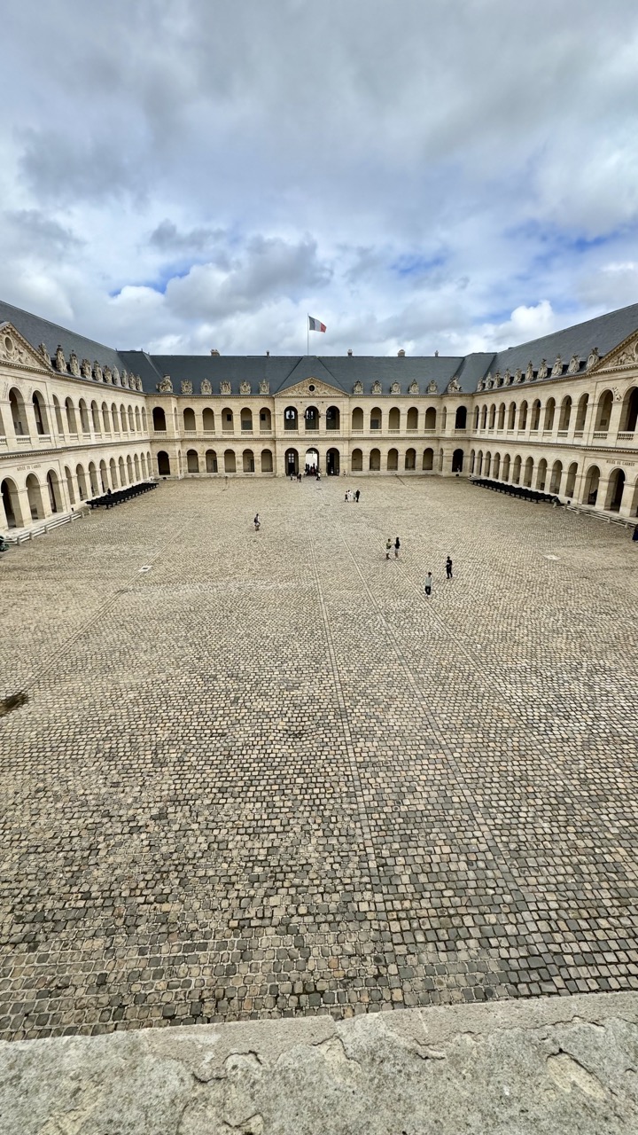
1. Overall Rating (0–10) — 7.0 This photograph captures the grandeur and symmetry of a historic courtyard, evoking a sense of timelessness and architectural elegance. The expansive cobblestone court, framed by classical arcades and a distant French flag, invites contemplation of the site’s cultural weight. While the overcast sky tempers the mood with a subdued tone, the image succeeds in conveying both scale and quiet dignity, though it lacks the dramatic lighting or dynamic composition to feel truly transcendent.
2. Composition (0–10) — 7.5 The symmetrical framing and leading lines of the courtyard create a strong sense of balance and depth, drawing the eye toward the central archway. The low vantage point enhances the scale of the space, while the scattered figures provide subtle human reference without disrupting the harmony.
3. Lighting (0–10) — 6.0 The diffused light from the overcast sky produces even illumination, minimizing harsh shadows and allowing the architectural details to be clearly visible. However, the lack of direct sunlight or golden hour warmth limits the atmospheric richness, giving the scene a neutral, documentary feel.
4. Color & Tone (0–10) — 6.5 The palette is composed of muted earth tones—grays, beiges, and soft blues—creating a cohesive and historically grounded aesthetic. While the colors are natural and restrained, they lack vibrancy, contributing to a somewhat flat visual presence.
5. Creativity (0–10) — 6.5 The image is conceptually strong in its celebration of symmetry and historical architecture, but it follows a conventional approach to capturing landmarks. There is little experimental or interpretive flair, making it more of a straightforward architectural record than a bold artistic statement.
6. Technical Quality (0–10) — 8.0 The photograph is sharp and well-focused, with clean detail in the cobblestones and building facades. The exposure is balanced, and there is minimal noise, indicating a high level of technical competence.
7. Emotional Impact (0–10) — 6.0 The scene evokes a sense of quiet reverence and historical continuity, but the emotional resonance is tempered by the impersonal lighting and lack of human intimacy. It feels more like an observer’s snapshot than a deeply moving portrait of place and memory.
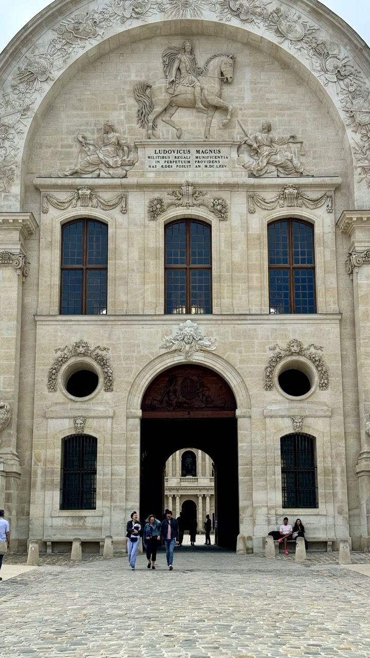
1. Overall Rating (0–10) — 7.0 This photograph captures the grandeur of a historic French architectural façade with striking clarity and reverence for its ornate details. The composition effectively frames the monumental archway and sculptural elements, while the presence of visitors adds scale and a subtle human narrative. The image’s strength lies in its balance of formality and life, though the slightly flat lighting tempers its emotional resonance.
2. Composition (0–10) — 8.0 The symmetrical framing emphasizes the architectural harmony, with the central arch drawing the eye through the image. The people in the foreground provide a sense of scale and movement, grounding the imposing structure in everyday life.
3. Lighting (0–10) — 6.0 Diffuse daylight evenly illuminates the façade, preserving detail in the stone carvings without creating harsh shadows. However, the lack of strong directional light softens the texture and depth of the relief work.
4. Color & Tone (0–10) — 6.5 The warm, neutral tones of the stone create a dignified and timeless palette. The dark blue of the windows provides subtle contrast, while the muted cobblestone foreground grounds the scene in earthy realism.
5. Creativity (0–10) — 7.0 The photograph successfully captures both the architectural majesty and the quiet presence of daily life, suggesting a narrative of continuity between past and present. The inclusion of people adds a layer of storytelling beyond mere documentation.
6. Technical Quality (0–10) — 8.0 Sharp focus and clear detail throughout the image, particularly in the sculptural elements and inscriptions. The exposure is well-balanced, with no blown highlights or lost shadows.
7. Emotional Impact (0–10) — 6.5 The image evokes a sense of awe and historical continuity, inviting contemplation of the past while acknowledging the present. The quiet dignity of the scene resonates with a subtle melancholy and reverence.
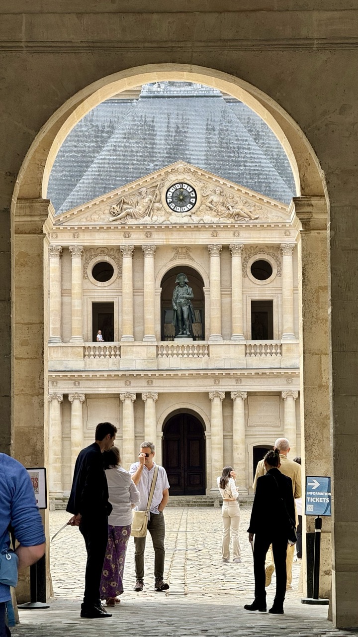
1. Overall Rating (0–10) — 7.0 This photograph captures the grandeur of a historic courtyard framed by a classical arch, with the viewer drawn into a scene of quiet exploration and architectural beauty. The composition effectively uses the arch as a natural frame, guiding the eye toward the ornate façade and its central statue, while the presence of visitors adds a sense of scale and life. While the image is visually compelling and rich in detail, the slightly cluttered foreground and overcast lighting temper its overall elegance.
2. Composition (0–10) — 8.0 The arch creates a strong, symmetrical frame that centers the viewer’s attention on the building’s façade, enhancing depth and leading the eye toward the statue and clock. The placement of people adds balance and scale, though the framing feels slightly off-center, which subtly disrupts the symmetry.
3. Lighting (0–10) — 6.0 Diffuse, overcast light softens shadows and evenly illuminates the scene, preserving architectural detail without harsh contrasts. However, the lack of directional sunlight gives the image a muted, flat quality that reduces atmospheric drama.
4. Color & Tone (0–10) — 6.5 The palette is dominated by warm, earthy tones of beige and stone, with subtle accents of white and gray from the sky and clothing. While cohesive, the colors feel restrained and slightly desaturated, diminishing the vibrancy of the scene.
5. Creativity (0–10) — 7.5 The use of the arch as a framing device is both traditional and effective, creating a sense of discovery. The inclusion of tourists introduces a narrative layer—travel, culture, and time—transforming the image from a mere architectural record into a moment of lived experience.
6. Technical Quality (0–10) — 8.0 The image is sharp and well-focused, with clear details in the stone architecture and the people in the foreground. The exposure is balanced, and the dynamic range is sufficient to retain texture in both light and shadow areas.
7. Emotional Impact (0–10) — 7.0 The photograph evokes a sense of reverence and curiosity, inviting the viewer to step into the courtyard and contemplate the history embedded in the stone. The quiet presence of people enhances the feeling of shared human experience, making the scene feel both timeless and immediate.
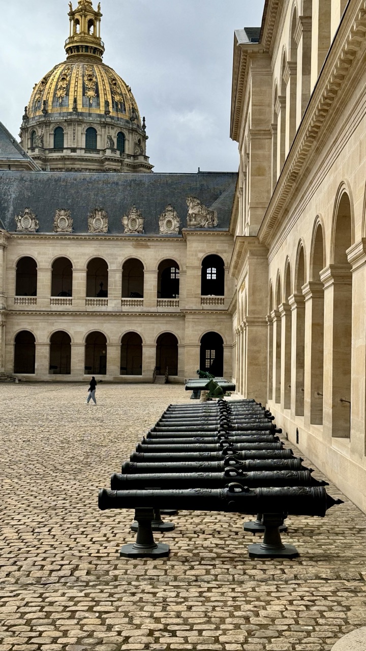
1. Overall Rating (0–10) — 7.5 This photograph captures the solemn grandeur of the Hôtel des Invalides with striking architectural clarity, where the golden dome of the Dôme des Invalides rises as a commanding focal point. The orderly row of cannons in the foreground adds a historical weight, grounding the scene in both time and place. While the composition benefits from strong symmetry and scale, the overcast sky tempers the visual drama, slightly dampening the emotional resonance of the moment.
2. Composition (0–10) — 8.0 The diagonal alignment of cannons draws the eye toward the dome, creating a strong sense of depth. The balance between the ornate building and the open courtyard enhances the architectural symmetry, though the lone figure in the distance slightly disrupts the formal rhythm.
3. Lighting (0–10) — 6.0 The soft, diffused light from the overcast sky evenly illuminates the scene but lacks contrast, muting the richness of the gold dome and casting a muted tone over the stone façade.
4. Color & Tone (0–10) — 7.0 The palette is dominated by warm beige stone and the golden hue of the dome, contrasted by the dark cannons and gray sky. The tonal range is harmonious, though the lack of vibrant color limits visual excitement.
5. Creativity (0–10) — 7.0 The image successfully blends historical narrative with architectural grandeur, using the cannons as a narrative device to evoke the site’s military past. The perspective is deliberate and evocative, offering a layered view of history.
6. Technical Quality (0–10) — 8.0 Sharp focus across the frame, clean detail in the stonework and cannons, and well-balanced exposure contribute to a technically strong image.
7. Emotional Impact (0–10) — 7.0 The scene conveys a quiet reverence for history and legacy, with the empty courtyard and solitary figure suggesting contemplation and timelessness. The emotional pull is subtle but persistent.
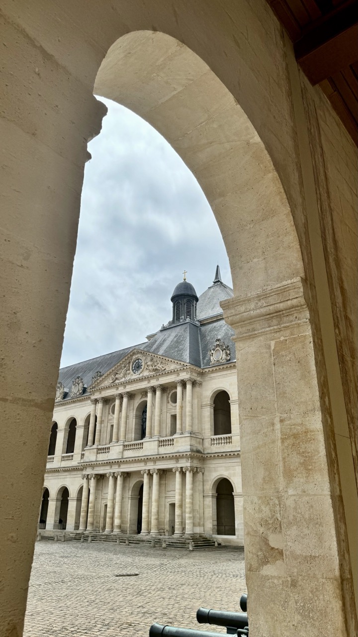
1. Overall Rating (0–10) — 7.5 This photograph captures the grandeur of a classical European courtyard with a masterful use of framing, drawing the viewer’s eye through a stone archway to a stately building crowned by a dome. The muted tones and overcast sky lend a contemplative mood, while the architectural symmetry and historical weight evoke a sense of timelessness. The image succeeds in blending composition and atmosphere, though it feels slightly restrained by the lack of dynamic lighting or a more striking focal point.
2. Composition (0–10) — 8.0 The archway creates a natural frame, guiding the viewer’s gaze toward the central building and enhancing depth. The placement of the structure within the frame is balanced, though the slight tilt in the horizon introduces a subtle asymmetry that slightly disrupts the formal geometry.
3. Lighting (0–10) — 6.0 The soft, diffused light of an overcast day evenly illuminates the scene, minimizing harsh shadows and preserving detail in the stonework. While this creates a calm, even mood, it also reduces contrast and diminishes the architectural textures that could otherwise add visual interest.
4. Color & Tone (0–10) — 6.5 The palette is restrained, dominated by warm beige stone and a muted gray sky, creating a harmonious and subdued tone. The lack of vibrant color limits emotional intensity, but the tonal consistency supports the historical and solemn atmosphere of the setting.
5. Creativity (0–10) — 7.5 The use of the arch as a framing device is both traditional and effective, demonstrating a thoughtful approach to composition. The perspective adds narrative depth, suggesting a journey into a historical space, and the inclusion of the cannons in the foreground subtly anchors the scene in its military past.
6. Technical Quality (0–10) — 8.0 The image is sharp and well-focused, with clear detail in the stonework and architectural elements. The exposure is balanced, and the camera appears steady, resulting in a clean and technically sound photograph.
7. Emotional Impact (0–10) — 7.0 The image evokes a quiet reverence for history and architecture, inviting reflection on the passage of time. The viewer is drawn into a moment of stillness, creating a sense of connection to the past, though the subdued lighting and lack of human presence keep the emotional resonance at a measured distance.
Exploring the Army Museum's Collections
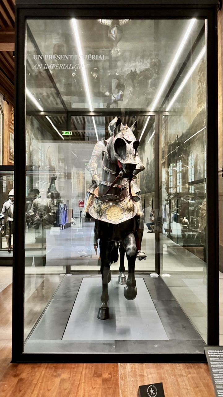
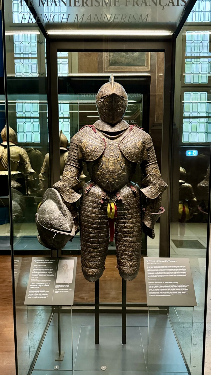
The Army Museum's vast collections are divided into several sections, each offering a unique perspective on different periods and aspects of military history. Step back in time to the era of knights and chivalry with the museum's extensive collection of medieval and Renaissance armor and weapons. From intricately crafted suits of armor to formidable swords and crossbows, this section provides a fascinating glimpse into the martial traditions of the past.
1. Overall Rating (0–10) — 7.0 This photograph captures the grandeur of a historical equestrian armor display, evoking a sense of imperial majesty and meticulous craftsmanship. The reflective glass and museum setting lend a formal, reverent tone, though the image’s clarity is slightly diminished by glare and reflections. While the subject is compelling and rich in narrative, the composition struggles to fully convey the scale and artistry of the piece due to the constraints of the glass enclosure.
2. Composition (0–10) — 6.0 The central placement of the armored horse provides strong visual focus, but the reflections and surrounding exhibits disrupt the balance. The vertical framing emphasizes the height of the display, yet the cluttered background and mirrored surfaces detract from the subject’s dominance.
3. Lighting (0–10) — 5.5 Bright overhead fluorescent lights create harsh reflections on the glass, obscuring parts of the display. While the lighting is functional for documentation, it lacks the subtlety needed to highlight the textures and details of the armor.
4. Color & Tone (0–10) — 6.5 The palette is dominated by metallic grays and dark tones, punctuated by the gold embellishments on the horse’s armor. The cool, neutral lighting flattens the image slightly, but the contrast between the polished metal and the deep shadows enhances the sense of depth.
5. Creativity (0–10) — 6.0 The image successfully documents a rare and impressive artifact, but its approach is more observational than expressive. The interplay between the historical object and the modern museum environment offers narrative potential, though it is underexplored in this straightforward capture.
6. Technical Quality (0–10) — 7.5 The photograph is sharp and well-focused, with clean details visible in the armor and text on the glass. The exposure is generally balanced, though the reflections and glare introduce technical imperfections.
7. Emotional Impact (0–10) — 6.5 The image conveys a quiet reverence for history and craftsmanship, inviting contemplation of the power and ritual of the past. However, the barrier of glass and the sterile museum environment create a sense of distance, limiting the viewer’s emotional connection.
1. Overall Rating (0–10) — 7.5 This photograph captures the regal presence of a French Renaissance armor within a museum setting, where historical grandeur meets institutional stillness. The intricate detailing of the suit, combined with the reflective glass and ambient museum lighting, creates a sense of reverence and timelessness. While the composition is strong, the reflections in the glass slightly distract from the subject’s clarity, softening the impact of the armor’s craftsmanship.
2. Composition (0–10) — 7.0 The armor is centered and framed effectively, drawing immediate attention. The symmetry of the display and the placement of informational placards provide context without overwhelming the visual focus. However, reflections from surrounding glass and exhibits disrupt the clean lines, creating visual noise.
3. Lighting (0–10) — 6.5 Soft, diffused lighting enhances the metallic textures and engravings of the armor, allowing its craftsmanship to shine. The overhead lighting is balanced but not dramatic, resulting in a neutral mood that suits a museum environment. The reflections in the glass slightly diminish contrast and depth.
4. Color & Tone (0–10) — 7.0 The palette is dominated by muted golds, bronzes, and grays, reflecting the aged metal and the somber museum interior. The color temperature is slightly cool, reinforcing the formal atmosphere. Subtle highlights on the armor add depth, though the overall tone leans toward subdued and realistic rather than vivid or expressive.
5. Creativity (0–10) — 7.0 The image successfully captures the intersection of art, history, and museum presentation. The choice to include the surrounding context—placards, reflections, and architectural details—adds narrative depth, framing the armor not just as an object but as part of a curated story.
6. Technical Quality (0–10) — 8.0 The image is sharp and well-focused, with clear details visible in the armor’s engravings and construction. The exposure is balanced, and the depth of field adequately isolates the subject from the background. Minor reflections in the glass are the primary technical limitation.
7. Emotional Impact (0–10) — 7.5 The photograph evokes a sense of awe and contemplation, inviting the viewer to reflect on the craftsmanship and historical significance of the armor. The quiet dignity of the display, combined with the intricate design, creates a subtle emotional resonance—respect for the past, and the weight of history.
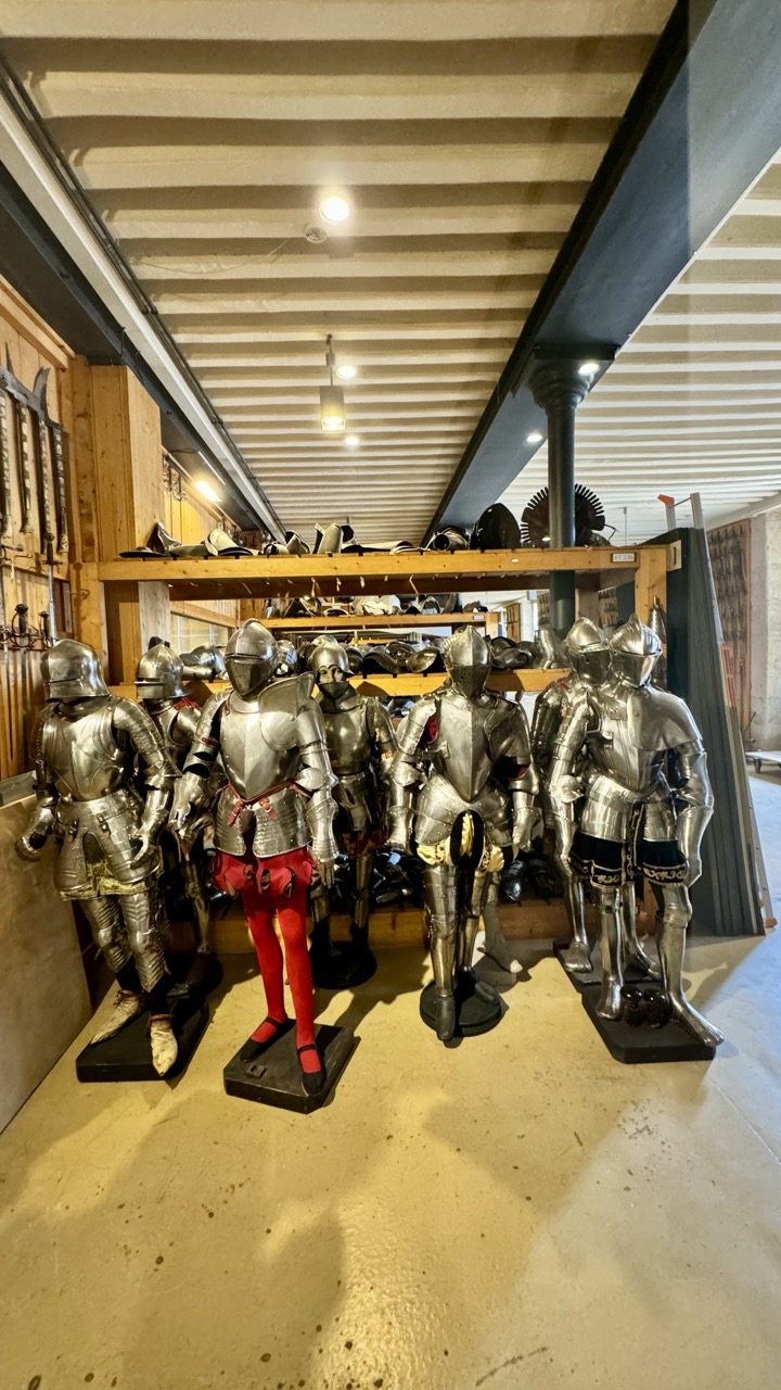
1. Overall Rating (0–10) — 7.0 This photograph captures a striking juxtaposition of historical craftsmanship and theatrical whimsy, where the gleaming armor suits stand as solemn sentinels in a workshop-like space. The inclusion of a single figure in vibrant red tights disrupts the metallic monotony, injecting a touch of playful irreverence. While the scene is visually engaging and rich in narrative potential, the lighting and composition slightly undermine its overall impact, leaving it feeling more like a snapshot than a fully realized image.
2. Composition (0–10) — 6.0 The arrangement of armor suits creates a strong horizontal line, drawing the eye across the frame, but the uneven spacing and cluttered background detract from visual harmony. The central figure in red, while attention-grabbing, disrupts the symmetry and feels slightly out of place within the otherwise uniform display.
3. Lighting (0–10) — 6.5 The overhead fluorescent lights create a flat, functional illumination that highlights the reflective surfaces of the armor but lacks depth and mood. Shadows are minimal, and the ceiling’s linear structure dominates the upper frame, creating a sense of visual clutter rather than atmospheric tension.
4. Color & Tone (0–10) — 7.0 The cool, metallic silver of the armor contrasts sharply with the warm red of the tights, creating a bold visual anchor. The neutral beige floor and wooden shelves provide a balanced backdrop, allowing the colors to stand out without overwhelming the scene.
5. Creativity (0–10) — 8.0 The concept of blending historical artifacts with a modern, theatrical element is highly original and thought-provoking. It invites questions about authenticity, performance, and the relationship between past and present, making the image memorable and conceptually rich.
6. Technical Quality (0–10) — 7.5 The image is sharp and clear, with good detail visible in the armor’s surface textures. The focus is consistent, and the exposure is adequate, though the lack of dynamic range limits the image’s depth.
7. Emotional Impact (0–10) — 6.5 The scene evokes curiosity and mild amusement, with the red-clad figure suggesting a narrative of play or performance. However, the emotional resonance is tempered by the sterile environment and lack of human presence, keeping the viewer at a slight remove from the moment.
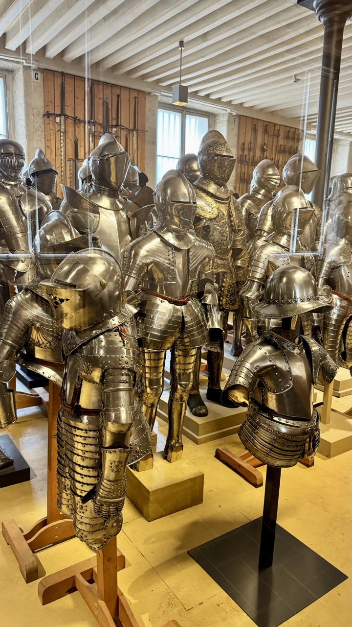
1. Overall Rating (0–10) — 7.0 This photograph captures the imposing grandeur of a medieval armor collection, where gleaming metal and historical craftsmanship converge in a museum setting. The reflective surfaces and meticulous arrangement convey both the artistry and function of these suits, while the soft ambient light enhances their metallic sheen. Though the composition feels slightly cluttered, the image successfully communicates the awe and scale of the display, grounding the viewer in a tangible sense of history.
2. Composition (0–10) — 6.0 The image is densely packed with armor suits, creating visual weight that risks overwhelming the frame. A more deliberate arrangement or tighter framing would improve balance and guide the viewer’s eye more effectively.
3. Lighting (0–10) — 6.5 Natural light from the windows in the background provides soft illumination, while overhead fixtures add subtle highlights. The lighting is functional but not dramatic, allowing the metallic surfaces to reflect light without harsh glare or deep shadows.
4. Color & Tone (0–10) — 6.5 The palette is dominated by cool metallic grays and silvers, punctuated by the warm wood tones of the floor and display stands. The contrast between the cool metal and warm wood adds depth, though the overall tone remains restrained and somewhat monochromatic.
5. Creativity (0–10) — 7.0 The image presents a straightforward documentation of a historical collection, but the choice to emphasize the reflective qualities of the armor and the layered arrangement introduces a subtle sense of rhythm and texture. The narrative of legacy and craftsmanship is conveyed with quiet strength.
6. Technical Quality (0–10) — 8.0 Sharp focus and clean detail allow the viewer to appreciate the intricate craftsmanship of the armor. The depth of field is appropriate, capturing both foreground and background elements clearly.
7. Emotional Impact (0–10) — 6.5 The photograph evokes a sense of reverence and historical contemplation, inviting the viewer to reflect on the lives and battles of those who once wore these suits. While not emotionally charged, it successfully conveys a quiet dignity and timelessness.
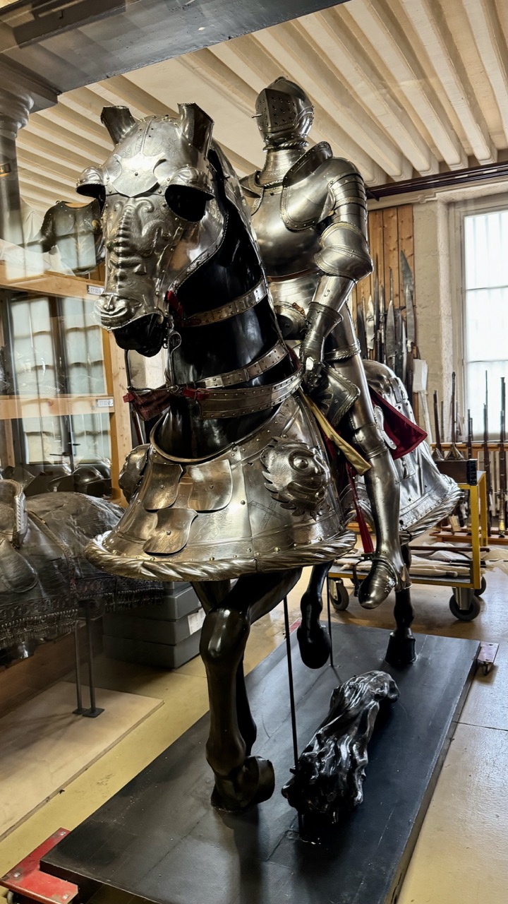
1. Overall Rating (0–10) — 7.5 This photograph captures the imposing grandeur of a fully armored knight on horseback, evoking a sense of historical weight and martial elegance. The intricate details of the armor, from the articulated joints to the ornate horse barding, are rendered with clarity, and the museum setting adds a layer of authenticity. While the image is compelling in its subject matter, the surrounding clutter and uneven lighting slightly detract from its visual cohesion.
2. Composition (0–10) — 6.5 The subject is well-centered, drawing immediate attention to the armored figure, but the background clutter—shelves, weapons, and equipment—creates visual distraction. A tighter framing or slight repositioning would enhance focus and elevate the composition.
3. Lighting (0–10) — 6.0 Natural light from the window on the right casts soft highlights on the metal surfaces, emphasizing texture and form. However, the flat, diffuse overhead lighting creates a slightly muddy atmosphere, reducing the contrast and depth that would better showcase the armor’s reflective qualities.
4. Color & Tone (0–10) — 6.5 The palette is dominated by cool metallic grays and muted browns, creating a somber, historical tone. While the lack of vibrant color is appropriate for the subject, a bit more tonal contrast would help the armor stand out more vividly against the background.
5. Creativity (0–10) — 7.0 The choice to photograph this display in situ, rather than in a controlled studio setting, gives the image a documentary quality that enhances its narrative. The inclusion of the horse’s armor and the surrounding weaponry adds context, offering a glimpse into the broader world of medieval arms and armor.
6. Technical Quality (0–10) — 7.5 The image is sharp and well-focused, with clear detail in the metalwork and textures. The depth of field is adequate, keeping the main subject in crisp focus while slightly softening the background—though the focus could be slightly more precise on the horse’s head and rider’s chest.
7. Emotional Impact (0–10) — 7.0 The image conveys a powerful sense of awe and reverence for historical craftsmanship. The stillness of the display and the imposing presence of the armor evoke a contemplative mood, inviting viewers to reflect on the power and ritual of medieval warfare.
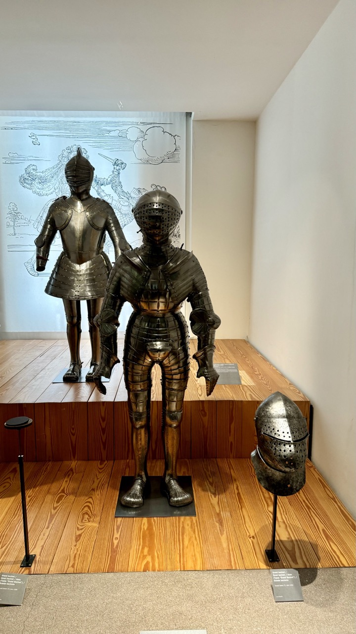
1. Overall Rating (0–10) — 7.0 This photograph captures the quiet dignity of medieval armor on display, where historical craftsmanship meets museum stillness. The contrast between the polished metal and the soft, ambient light gives the scene a contemplative tone, though the composition’s symmetry slightly diminishes its visual dynamism. While the image successfully conveys the weight and texture of the suits, it feels more like a documentary record than a compelling artistic statement.
2. Composition (0–10) — 6.5 The two armors are framed with deliberate symmetry, but the placement of the foreground helmet and the off-center wall drawing disrupts balance. A tighter focus on the central figure would enhance visual cohesion.
3. Lighting (0–10) — 7.0 Soft, diffused lighting from above highlights the metallic sheen of the armor without harsh reflections, creating a calm, museum-like atmosphere.
4. Color & Tone (0–10) — 6.5 The palette is restrained—dominated by metallic grays and warm wood tones—with a slight coolness in the background. The tonal range is adequate but lacks vibrancy, lending a muted quality to the scene.
5. Creativity (0–10) — 6.0 The juxtaposition of historical objects with a faint, etched illustration in the background adds narrative depth, but the overall presentation remains conventional and illustrative rather than imaginative.
6. Technical Quality (0–10) — 7.5 Sharp focus and clean detail are evident, particularly in the textures of the armor and wood flooring. The exposure is well-balanced, with no distracting shadows or overexposed highlights.
7. Emotional Impact (0–10) — 6.5 The image evokes a sense of reverence and historical weight, inviting quiet reflection. However, the distance created by the sterile museum setting limits deeper emotional engagement.
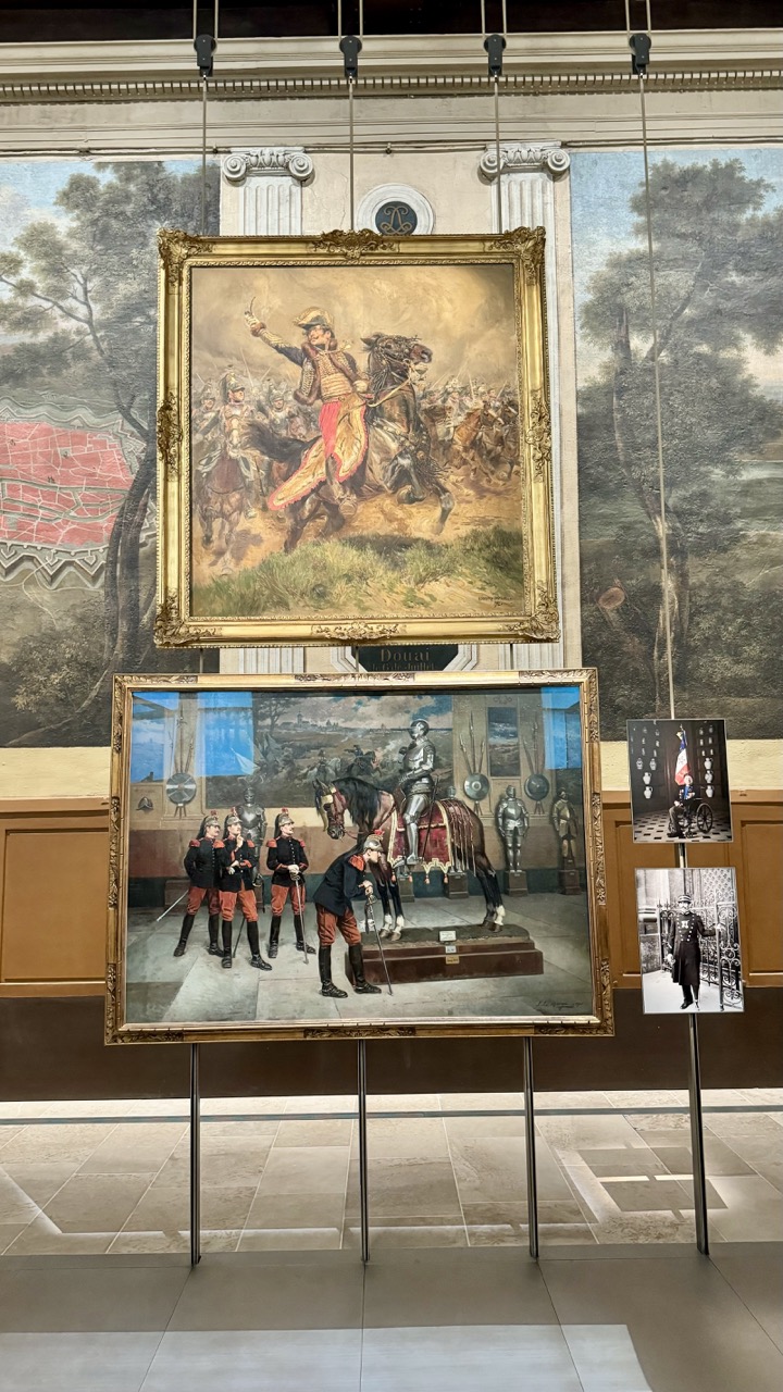
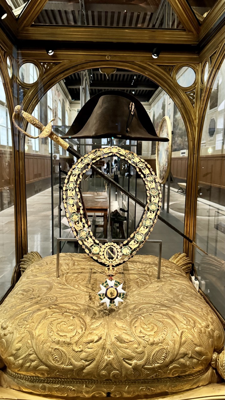
The Modern Era section covers the period from the 17th century to the 19th century, featuring the uniforms, weapons, and artifacts from pivotal conflicts such as the Napoleonic Wars. This section is a testament to the innovations and changes in military technology and strategy that occurred during this transformative period.
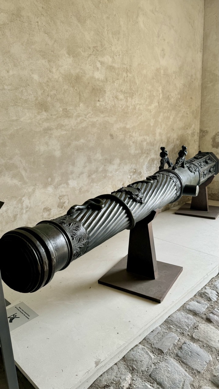
1. Overall Rating (0–10) — 7.0 This photograph captures a historic cannon with quiet dignity, its intricate engravings and aged patina speaking to centuries of craftsmanship. The setting—a weathered stone wall and cobblestone floor—enhances the artifact’s historical weight, while the low-angle framing emphasizes its imposing presence. Though the composition feels slightly off-center and the lighting is flat, the image succeeds in evoking a sense of time and place, balancing documentary clarity with subtle artistry.
2. Composition (0–10) — 6.5 The cannon is angled diagonally across the frame, creating a dynamic visual path, but the off-center placement and uneven framing slightly disrupt balance. A tighter crop could enhance focus on the object’s details.
3. Lighting (0–10) — 5.5 Soft, diffused lighting illuminates the cannon evenly but lacks directional warmth or contrast, resulting in a somewhat neutral, clinical feel that underplays the texture of the metal and stone.
4. Color & Tone (0–10) — 6.0 The muted palette of grays, blacks, and beige reinforces the historical and somber mood, though the lack of tonal variation slightly flattens the image’s visual depth.
5. Creativity (0–10) — 6.5 The photograph’s strength lies in its observational honesty—capturing the cannon as a relic rather than a staged subject. The focus on craftsmanship and context gives it narrative weight, though it remains restrained in visual invention.
6. Technical Quality (0–10) — 7.5 Sharp focus and clear detail reveal the cannon’s ornate carvings and surface wear, while the image is free from noticeable flaws like blur or noise.
7. Emotional Impact (0–10) — 6.5 The image evokes a quiet reverence for history and craftsmanship, inviting contemplation of the past. While it doesn’t stir strong emotion, it resonates with a thoughtful stillness that lingers.
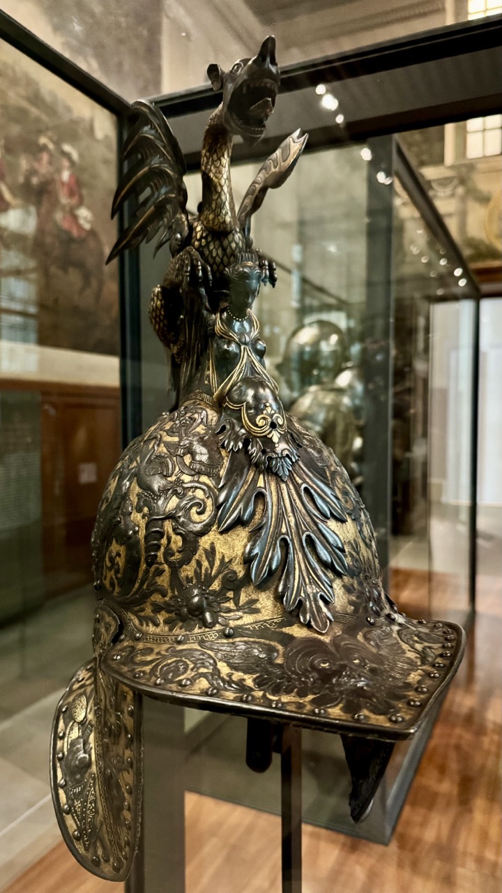
1. Overall Rating (0–10) — 8.0 This photograph captures the opulent craftsmanship of a historical armor helmet, its intricate metalwork and mythical adornments glowing under museum lighting. The rich contrast between dark patina and gilded details draws the eye to the helmet’s elaborate design, while the surrounding gallery space provides context without distraction. A slight shift in angle could better emphasize the three-dimensional form, but the image succeeds in conveying both the artifact’s grandeur and its narrative weight.
2. Composition (0–10) — 7.5 The helmet is centered with a slight tilt, creating a dynamic balance that guides the viewer’s gaze upward along the dragon’s form. The reflections in the glass case and the depth of field effectively frame the subject, though the background elements occasionally compete for attention.
3. Lighting (0–10) — 8.0 The lighting is soft and directional, highlighting the helmet’s textures and embossed patterns while avoiding harsh glare. The interplay of light and shadow enhances the sculpture-like quality of the piece, lending it a sense of gravitas.
4. Color & Tone (0–10) — 8.5 The palette is dominated by deep metallic tones—brass, bronze, and darkened silver—set against the warm brown of the wooden floor and the neutral backdrop. The tonal contrast is strong, with a subtle warmth that enhances the historical feel of the object.
5. Creativity (0–10) — 8.0 The image captures not just an artifact, but a story—of power, myth, and artistry. The decision to include reflections and background context adds layers, transforming a simple display into a visual narrative.
6. Technical Quality (0–10) — 8.5 Sharp focus on the helmet’s surface reveals fine details, while the depth of field is well managed. The exposure is balanced, with no blown highlights or lost shadows, and the camera’s resolution captures the complexity of the metalwork.
7. Emotional Impact (0–10) — 8.0 There is a quiet awe in the image, evoking respect for the skill and imagination behind the helmet’s creation. It invites contemplation of the past, suggesting a world where armor was both weapon and masterpiece.
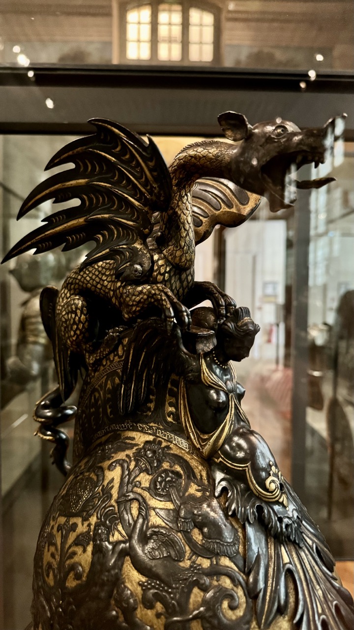
1. Overall Rating (0–10) — 8.0 This photograph captures the intricate artistry of a mythological sculpture with a sense of reverence and grandeur, highlighting the interplay of light, texture, and form. The rich gold and dark patina create a striking contrast that draws the eye to the detailed craftsmanship, while the museum setting adds a layer of historical weight. A subtle reflection in the glass and slightly soft focus detract just enough to keep it from feeling fully immersive, but the composition powerfully conveys the sculpture’s majesty.
2. Composition (0–10) — 8.0 The framing centers the dragon and figure, emphasizing their dramatic pose and dynamic interaction. The diagonal sweep of the wings and the curve of the body create a strong visual flow, guiding the eye through the image with a sense of movement.
3. Lighting (0–10) — 7.5 The soft, directional lighting enhances the sculpture’s three-dimensional form, highlighting the gilded details and casting subtle shadows that deepen the texture. The ambient light from the background windows adds warmth without overpowering the subject.
4. Color & Tone (0–10) — 8.5 The rich contrast between the dark bronze and luminous gold creates a visually striking palette, with warm tones that evoke antiquity and opulence. The tonal range is balanced, allowing the intricate details to stand out without appearing washed out.
5. Creativity (0–10) — 8.0 The photograph successfully elevates a museum object into a narrative scene, using perspective and lighting to suggest mythic drama. The choice to capture the sculpture through the glass adds a layer of distance and contemplation, enhancing its story-like quality.
6. Technical Quality (0–10) — 8.0 The image is sharp and clear, with excellent detail in the sculptural elements. Focus is precise on the central figures, though the background remains slightly soft, which helps isolate the subject.
7. Emotional Impact (0–10) — 8.5 The image evokes awe and wonder, inviting the viewer to reflect on the craftsmanship and symbolism of the piece. The combination of artistry, light, and context creates a deeply resonant and contemplative mood.
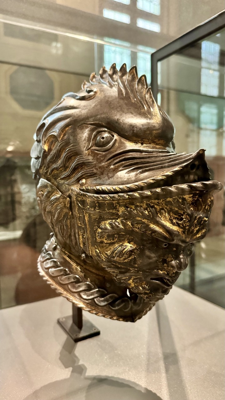
1. Overall Rating (0–10) — 7.5 This photograph captures the intricate craftsmanship of a historical helmet, its metallic textures and dual-faced design evoking both power and artistry. The composition highlights the object’s dramatic form, though the reflections in the glass case slightly distract from its presence. The image succeeds in conveying the artifact’s mystique, balancing historical gravitas with aesthetic intrigue.
2. Composition (0–10) — 7.0 The helmet is centered and well-framed, allowing its symmetrical yet complex design to command attention. The shallow depth of field isolates the subject from the museum backdrop, though the background reflections introduce minor visual clutter.
3. Lighting (0–10) — 7.5 Soft, diffused lighting enhances the metallic sheen and highlights the intricate engravings. The interplay of light and shadow across the helmet’s surfaces adds dimension and depth, while avoiding harsh glare.
4. Color & Tone (0–10) — 7.0 The palette is dominated by warm golds and cool silvers, creating a rich contrast that emphasizes the object’s age and craftsmanship. The tonal range is balanced, with subtle highlights that enhance the texture without overpowering the scene.
5. Creativity (0–10) — 8.0 The choice to focus on the helmet’s dual-faced motif—symbolic and grotesque—adds a layer of narrative intrigue. The photograph treats the artifact not just as an object, but as a character, inviting interpretation beyond mere documentation.
6. Technical Quality (0–10) — 8.0 The image is sharp and well-focused, with clear detail in the metalwork and fine engravings. The shallow depth of field is effectively used to isolate the subject, and there is minimal noise despite the low-light museum environment.
7. Emotional Impact (0–10) — 7.5 The helmet’s fierce, almost mythical visage evokes a sense of awe and unease, suggesting the power and danger of the warrior it once protected. The viewer is drawn into a silent dialogue with history, feeling both reverence and fascination.
The museum's comprehensive exhibits on World War I and World War II provide an in-depth look at the global conflicts that shaped the 20th century. From trench warfare to the development of new weaponry, these sections are both sobering and enlightening, offering a deep appreciation for the sacrifices made by those who served.
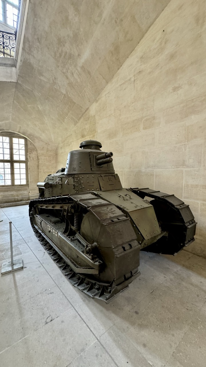
1. Overall Rating (0–10) — 7.0 This photograph captures a vintage tank displayed within a grand, vaulted stone hall, evoking a sense of historical weight and quiet reverence. The juxtaposition of the mechanical, war-worn armor against the soft, aged architecture creates a compelling narrative of time and memory. While the image is strong in atmosphere, the lighting and composition could be more dynamic to fully elevate its emotional resonance.
2. Composition (0–10) — 6.5 The tank is positioned diagonally, leading the eye through the frame, but the wide perspective dilutes focus. The arched window and ceiling lines offer natural framing, though the empty space to the left feels unbalanced.
3. Lighting (0–10) — 6.0 Natural light from the window illuminates the tank from the side, creating soft shadows that define its form. However, the overall exposure is flat, and the lighting lacks depth, failing to accentuate texture or drama.
4. Color & Tone (0–10) — 6.5 The muted, earthy tones of the tank harmonize with the stone surroundings, creating a cohesive palette. The subtle greenish-gray of the metal and the warm beige of the walls lend a subdued, historic feel, though color vibrancy is limited.
5. Creativity (0–10) — 7.0 The juxtaposition of military technology within a stately, civilian space is inherently evocative. The image tells a story of transition—of war machinery repurposed into historical artifact—offering a contemplative, almost poetic contrast.
6. Technical Quality (0–10) — 7.5 The image is sharp and well-focused, with clear detail visible on the tank’s armor and tracks. The exposure is consistent, and the lens choice effectively captures the scale and environment.
7. Emotional Impact (0–10) — 7.0 There is a quiet solemnity in the stillness of the tank, suggesting a pause between conflict and remembrance. The viewer is invited to reflect on history, loss, and the passage of time, making the image emotionally resonant despite its restrained aesthetic.
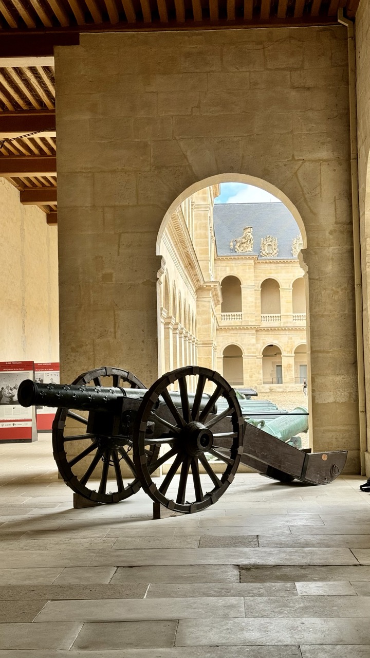
1. Overall Rating (0–10) — 7.0 This photograph captures a quiet, historical moment within a grand courtyard, where the weight of the past is embodied in the weathered cannon and stone architecture. The archway acts as a natural frame, drawing the eye through layers of history and creating a sense of depth and timelessness. While the scene is rich in atmosphere, the lighting and color lack the vibrancy to fully convey the emotional gravity of the space.
2. Composition (0–10) — 7.5 The cannon is placed off-center, creating a dynamic balance with the archway and the building beyond. The arch functions as a strong leading line, guiding the viewer’s gaze into the courtyard and enhancing the sense of depth. The composition is well-structured, with the repeating arches in the background adding rhythm and visual interest.
3. Lighting (0–10) — 6.5 Natural light enters through the archway, illuminating the courtyard and casting soft shadows that emphasize texture and depth. However, the lighting within the foreground is somewhat dim, creating a contrast that slightly flattens the immediate space. The exposure is well-handled, but the overall tone leans toward flatness due to the overcast sky visible through the arch.
4. Color & Tone (0–10) — 6.0 The palette is dominated by warm, earthy tones—beige stone, dark metal, and muted gray pavement—creating a cohesive, historically grounded aesthetic. However, the colors lack saturation, giving the image a somewhat muted and lifeless quality. The blue sky peeking through the arch provides a subtle contrast but does little to enliven the overall tonal range.
5. Creativity (0–10) — 7.0 The image leverages architectural framing and historical context to tell a quiet story of time and memory. The placement of the cannon within the colonnade suggests a deliberate narrative, inviting contemplation of the site’s military and cultural significance. While not overtly experimental, the composition is thoughtful and evocative.
6. Technical Quality (0–10) — 8.0 The image is sharp and clear, with fine detail visible in the cannon’s metal and the stone walls. The focus is well-managed, and the camera’s resolution captures the textures of the materials effectively. There are no noticeable technical flaws, and the exposure is consistent across the frame.
7. Emotional Impact (0–10) — 6.5 The photograph evokes a sense of stillness and reverence, suggesting the weight of history in a space once filled with action. The viewer is invited to imagine the sounds of cannons and the presence of soldiers, but the subdued lighting and lack of human presence keep the emotional connection at a distance. It is contemplative but not deeply moving.
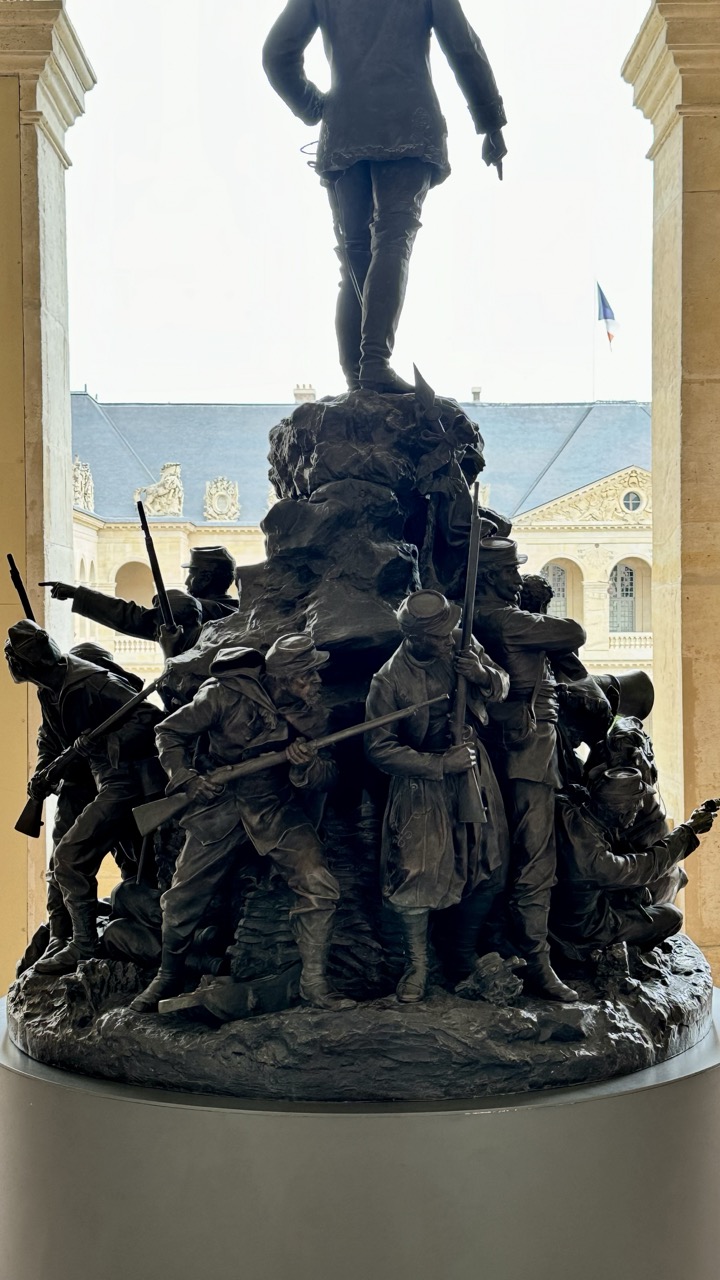
1. Overall Rating (0–10) — 7.0 This photograph captures a powerful bronze war monument with a dramatic sense of movement and historical gravity, framed by the classical architecture of its setting. The composition draws the eye upward from the struggling soldiers to the commanding figure above, evoking themes of sacrifice and leadership. While the lighting is somewhat flat and the background slightly distracting, the sculpture’s emotional weight and detailed craftsmanship make the image compelling and resonant.
2. Composition (0–10) — 7.5 The statue is centered within the archway, creating a strong focal point, while the surrounding architecture frames the scene like a gallery display. The diagonal lines of the soldiers' poses and the upward gaze of the viewer enhance the sense of motion and purpose.
3. Lighting (0–10) — 6.0 The lighting is soft and diffused, likely from an overcast sky, which evenly illuminates the sculpture but diminishes the depth and texture of the bronze. The bright background creates a slight overexposure, reducing contrast and detail in the upper portions.
4. Color & Tone (0–10) — 6.5 The monochromatic palette of dark bronze against the pale stone and muted sky creates a somber, cohesive tone. The subtle variations in patina and shadow add texture, though the lack of vibrant color limits visual dynamism.
5. Creativity (0–10) — 7.0 The framing cleverly juxtaposes the dramatic, dynamic sculpture with the stillness of the classical architecture, creating a narrative tension between past and present. The inclusion of the French flag in the background adds a layer of national identity and historical context.
6. Technical Quality (0–10) — 7.5 The image is sharp and clear, with fine detail visible in the sculptural elements. The focus is consistent across the statue, and the exposure is generally well-balanced despite the bright background.
7. Emotional Impact (0–10) — 7.5 The photograph conveys a strong sense of solemnity and reverence, capturing the gravity of the monument’s subject. The viewer is drawn into the scene’s narrative of struggle and leadership, evoking respect and reflection.
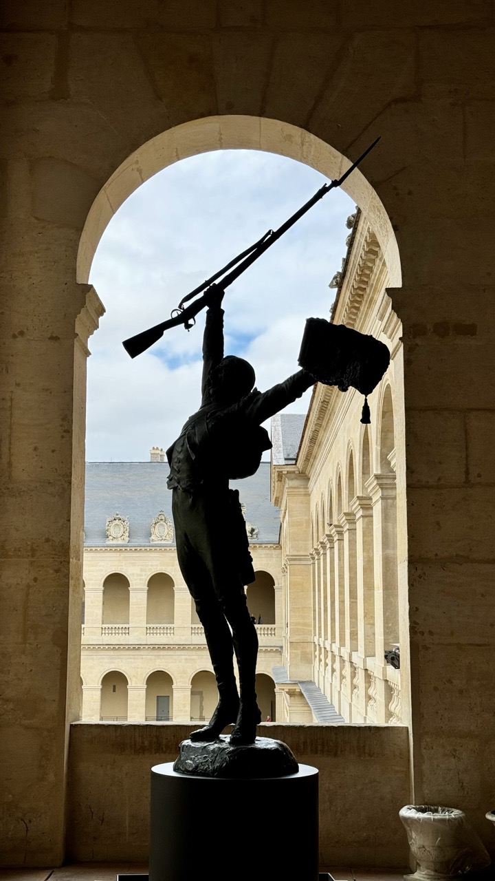
1. Overall Rating (0–10) — 7.5 This photograph captures a powerful juxtaposition of historical sculpture and architectural grandeur, where the silhouetted figure of a revolutionary soldier stands as a defiant symbol against the soft, overcast sky. The strong contrast between the dark statue and the luminous background creates a dramatic, almost theatrical mood, while the classical archway frames the scene with timeless elegance. Though the lighting is somewhat flat, the image succeeds in evoking a sense of historical weight and quiet resistance, drawing the viewer into a moment of suspended time.
2. Composition (0–10) — 8.0 The statue is centered within the archway, creating a strong focal point and a sense of symmetry. The arch acts as a natural frame, guiding the eye toward the subject while the surrounding architecture adds depth and context.
3. Lighting (0–10) — 7.0 The backlighting creates a bold silhouette, emphasizing the form and gesture of the statue. However, the overcast sky diffuses the light, resulting in a somewhat muted contrast and a loss of detail in the background.
4. Color & Tone (0–10) — 6.5 The palette is dominated by neutral beiges and grays, with the dark silhouette providing a stark contrast. The limited color range enhances the solemn, contemplative mood, though the lack of vibrancy slightly dampens the image’s visual energy.
5. Creativity (0–10) — 8.0 The choice to photograph the statue through the archway adds a layer of narrative and spatial depth. The silhouetted figure against the sky transforms a historical monument into a symbolic, almost cinematic statement.
6. Technical Quality (0–10) — 7.5 The image is sharp and well-focused, with clear detail in the architectural elements. The exposure is balanced, though the silhouette is slightly underexposed, which may obscure some texture.
7. Emotional Impact (0–10) — 8.0 The photograph evokes a sense of reverence and historical reflection, with the raised rifle and flag suggesting triumph and sacrifice. The quiet dignity of the scene resonates emotionally, inviting contemplation on memory, power, and legacy.
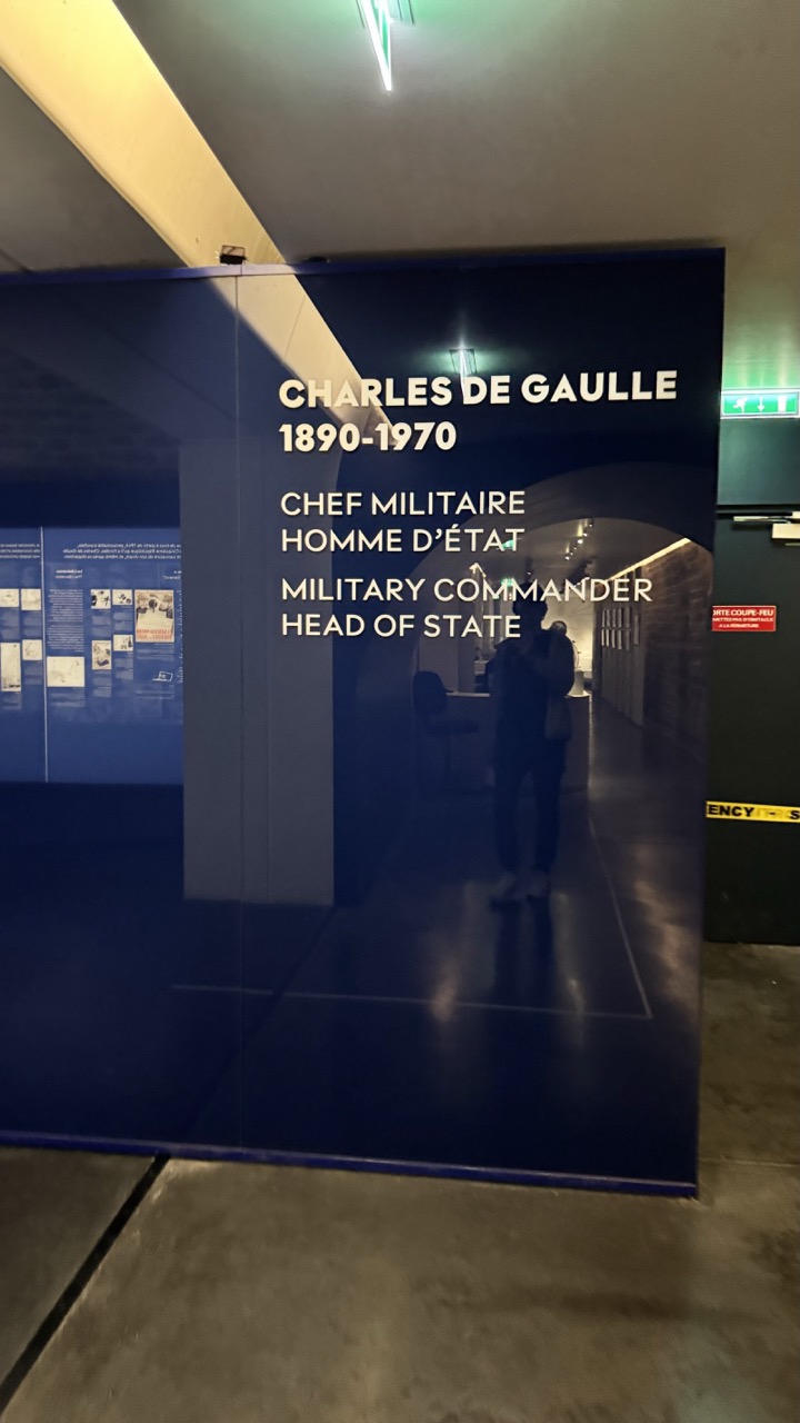
Charles de Gaulle Historical Center
Dedicated to the life and legacy of General Charles de Gaulle, this section explores the role of the famed French leader during World War II and his impact on post-war France. Through personal artifacts, documents, and multimedia displays, visitors can gain a deeper understanding of de Gaulle's contributions to French history.
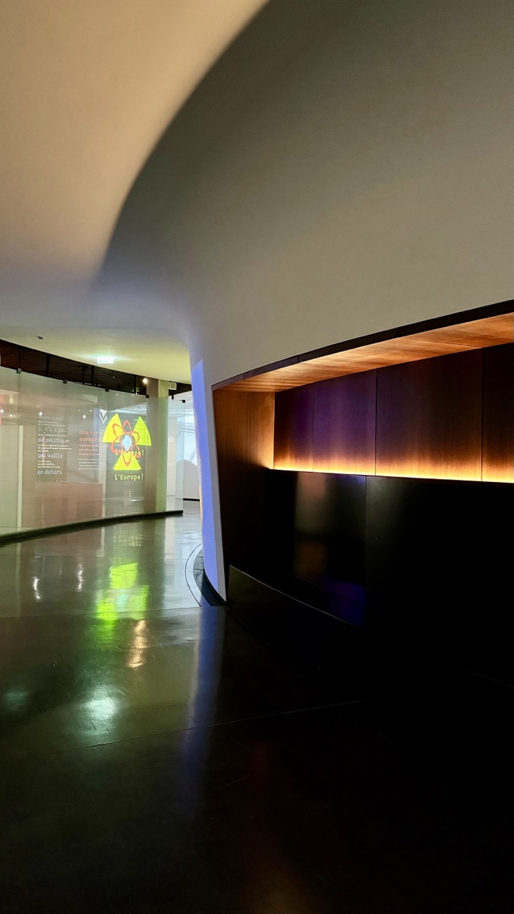
1. Overall Rating (0–10) — 7.0 This photograph captures the quiet elegance of a modern exhibition space, where architecture and lighting converge to evoke a sense of contemplative movement. The sweeping curve of the ceiling and the interplay of shadow and glow lend the scene a sculptural quality, while the reflective floor amplifies the ambient light, creating a sense of depth. Though the image succeeds in conveying atmosphere, the composition’s lack of a clear focal point slightly dilutes its visual impact.
2. Composition (0–10) — 7.0 The curved architecture guides the eye naturally into the frame, with the recessed wall and illuminated panel drawing attention. The low angle enhances the sense of space, though the absence of a strong subject or leading line keeps the focus diffuse.
3. Lighting (0–10) — 8.0 The warm backlighting under the wooden panel creates a soft, inviting glow, contrasting beautifully with the cool tones of the polished floor and glass. The lighting design is deliberate and mood-enhancing, using contrast to highlight form and texture.
4. Color & Tone (0–10) — 7.0 The palette is restrained—deep blacks, warm amber, and cool reflections—creating a balanced and sophisticated tone. The subtle color temperature shift from warm to cool adds visual interest without overwhelming the scene.
5. Creativity (0–10) — 7.5 The image leverages architectural elements as both subject and narrative device, transforming a museum corridor into a contemplative space. The use of light and reflection suggests a quiet story of human interaction with space.
6. Technical Quality (0–10) — 8.0 The image is sharp and well-exposed, with clean details in both light and shadow. The low-light handling is effective, preserving texture and depth without introducing noise.
7. Emotional Impact (0–10) — 7.0 The atmosphere is calm and introspective, inviting the viewer to pause and reflect. The combination of space, light, and silence evokes a sense of quiet reverence, though the lack of human presence limits emotional engagement.
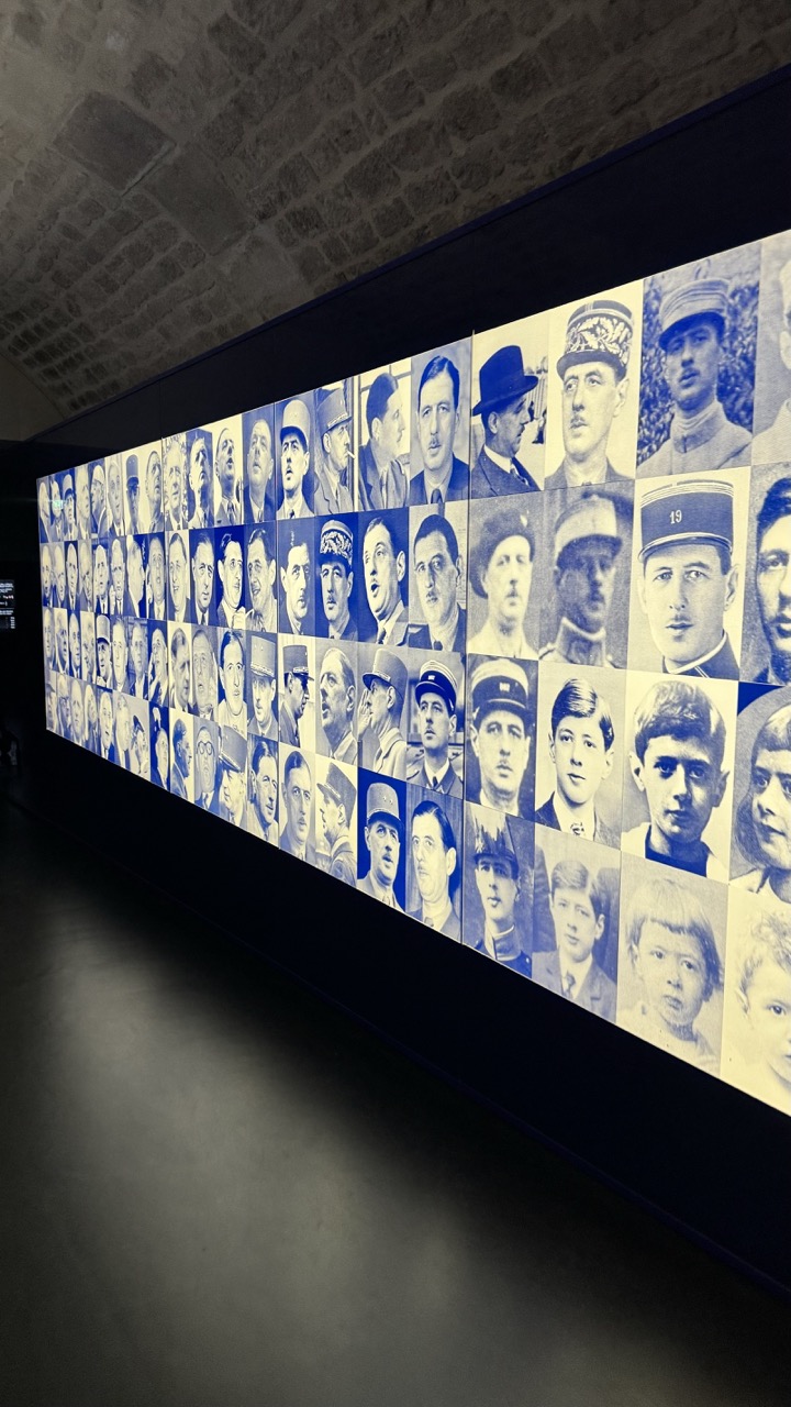
1. Overall Rating (0–10) — 7.5 This photograph captures the solemn weight of a memorial installation, where a vast wall of historical portraits conveys both individual memory and collective loss. The cool blue and sepia tones lend a haunting, documentary quality, while the long, receding perspective draws the viewer into the depth of the archive. Though the image is powerful in concept, its technical execution—particularly the flat lighting and slight visual clutter—somewhat diminishes the emotional resonance, leaving the viewer with a sense of reverence but not profound connection.
2. Composition (0–10) — 7.0 The diagonal framing of the wall creates a strong sense of depth and movement, guiding the eye along the grid of faces. The low-angle perspective enhances the monumentality of the display, though the dark foreground slightly obscures the lower edge of the installation, reducing visual balance.
3. Lighting (0–10) — 6.0 The lighting is functional but uneven, with a cool, artificial glow that flattens the tonal range of the portraits. While it ensures visibility, the lack of directional or dramatic illumination weakens the mood and fails to highlight the textures and emotional gravity of the individual faces.
4. Color & Tone (0–10) — 6.5 The monochromatic blue and sepia palette creates a unified, somber tone that reinforces the historical and commemorative nature of the work. However, the lack of rich contrast and subtle color variation makes the image feel visually restrained and somewhat muted.
5. Creativity (0–10) — 8.0 The concept of a wall composed of countless individual portraits is striking and deeply symbolic, transforming a simple display into a powerful narrative of remembrance. The choice to present the images in a grid format echoes archival documentation, enhancing the work’s gravity and conceptual strength.
6. Technical Quality (0–10) — 7.0 The focus is generally sharp across the wall of portraits, and the image is free of major technical flaws. However, the slight softness in the lower portion and the presence of digital noise in the darker areas detract from the overall clarity.
7. Emotional Impact (0–10) — 7.5 The sheer number of faces and their solemn expressions evoke a quiet, contemplative sorrow. The viewer is confronted with the scale of loss, and while the emotional pull is strong, the cool, detached presentation keeps the experience more intellectual than visceral.
1. Overall Rating (0–10) — 6.0 This photograph captures a quiet, contemplative moment within a museum or exhibition space, where the legacy of Charles de Gaulle is presented with solemn dignity. The reflective surface of the display panel adds depth and introspection, mirroring a visitor who seems absorbed in the historical narrative. While the image succeeds in conveying the atmosphere of a curated space, it lacks visual dynamism and feels slightly underexposed, limiting its emotional resonance.
2. Composition (0–10) — 6.5 The composition is balanced, with the central text panel anchoring the frame and the reflection drawing the eye into the depth of the corridor. However, the inclusion of the silhouetted figure and the adjacent signage creates a slight visual clutter, pulling focus from the primary subject. A tighter crop would enhance clarity and emphasize the exhibit’s gravitas.
3. Lighting (0–10) — 5.5 The lighting is functional but flat, dominated by overhead fluorescent fixtures that cast a cool, clinical glow. While adequate for readability, it fails to create mood or highlight the texture of the display. The reflections on the glossy surface add complexity but also contribute to a somewhat washed-out appearance.
4. Color & Tone (0–10) — 6.0 The deep blue of the display contrasts sharply with the neutral tones of the floor and walls, creating a sense of formality. The limited palette—primarily blues, grays, and whites—reinforces the institutional tone, though the lack of tonal variation gives the image a muted, almost sterile feel.
5. Creativity (0–10) — 6.5 The inclusion of the reflection introduces a layer of narrative depth, suggesting the visitor’s engagement with history. The dual-language text adds cultural authenticity, but the overall approach is conventional, prioritizing information over artistic expression.
6. Technical Quality (0–10) — 7.0 The image is sharp and well-focused, with clear text and readable details. The reflection is captured with precision, and the exposure is generally balanced. However, the low-light environment results in slight noise and a lack of dynamic range.
7. Emotional Impact (0–10) — 6.0 The photograph evokes a sense of reverence and quiet contemplation, inviting the viewer to reflect on the historical significance of de Gaulle’s life. The presence of the observer grounds the image in personal experience, yet the subdued lighting and clinical setting prevent a deeper emotional connection.
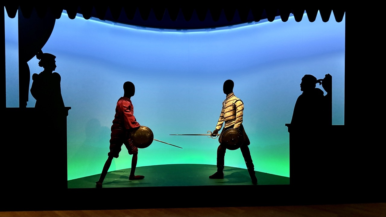
Special Exhibition: Duels - The Art of Fighting
One of the most intriguing exhibitions currently on display at the Army Museum is "Duels - The Art of Fighting." This exhibition delves into the history, culture, and art of dueling, a practice that has fascinated societies for centuries.
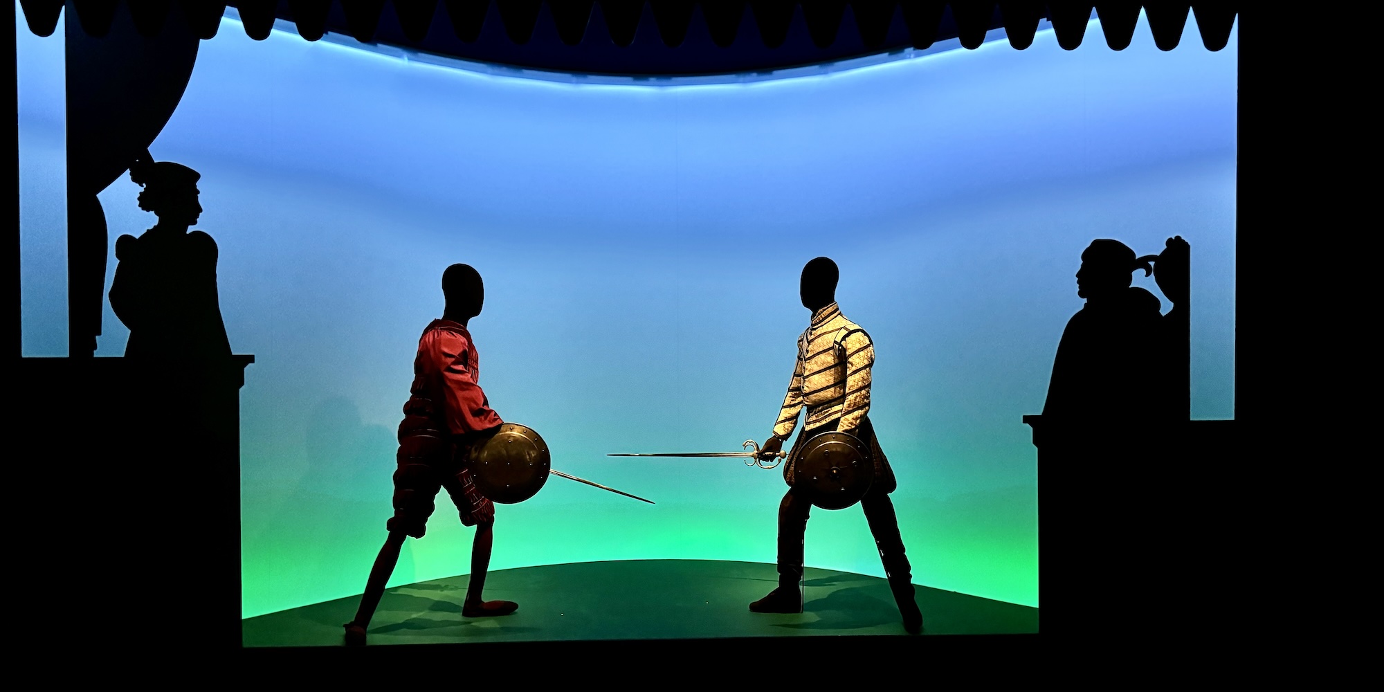
1. Overall Rating (0–10) — 7.5 This photograph captures a theatrical and evocative diorama of a duel, where silhouetted figures stand in dramatic opposition against a luminous gradient backdrop. The interplay of shadow and color gives the scene a stage-like intensity, suggesting both historical narrative and artistic staging. While the subject is compelling, the image's emotional depth is slightly restrained by the flatness of the silhouettes, which limit individual expression.
2. Composition (0–10) — 8.0 The balanced framing centers the duelists with strong symmetry, while the silhouetted figures on either side create a natural stage-like border. The curved backdrop draws the eye inward, enhancing the sense of performance and focus.
3. Lighting (0–10) — 8.5 The gradient lighting—cool blue fading into green—casts a dramatic glow that isolates the figures and enhances the theatrical mood. The backlighting effectively creates strong silhouettes, emphasizing form over detail.
4. Color & Tone (0–10) — 8.0 The cool blue-to-green gradient provides a moody, almost otherworldly atmosphere, while the dark silhouettes offer stark contrast. The limited palette is cohesive and intentional, reinforcing the scene’s performative tone.
5. Creativity (0–10) — 8.5 The use of silhouettes and theatrical lighting transforms a simple display into a narrative moment, evoking themes of conflict, honor, and performance. The composition feels deliberate and conceptually rich, suggesting a blend of history and art.
6. Technical Quality (0–10) — 8.0 Sharp focus and clean exposure capture the scene clearly, with well-defined silhouettes and balanced lighting. The image is technically sound and effectively conveys its intended mood.
7. Emotional Impact (0–10) — 7.0 The image evokes a sense of tension and drama, drawing the viewer into a moment of historical reenactment. While the silhouettes limit personal connection, the atmosphere is compelling and thoughtfully staged.
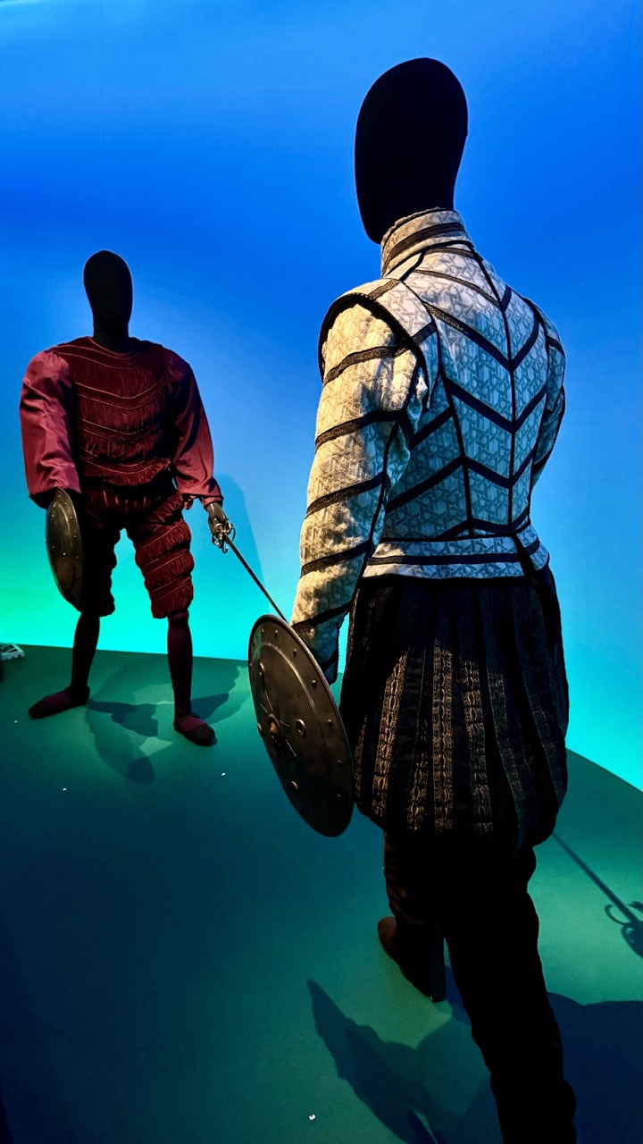
1. Overall Rating (0–10) — 7.0 This photograph captures a striking, theatrical confrontation between two costumed figures, evoking the drama of a staged battle. The bold color contrast between the deep blue backdrop and the green floor creates a vivid, almost cinematic atmosphere, while the detailed armor and poised stances lend a sense of narrative tension. The image's strength lies in its visual storytelling, though the absence of faces on the mannequins limits emotional intimacy, leaving the viewer to interpret the scene through costume and posture alone.
2. Composition (0–10) — 7.5 The diagonal arrangement of the two figures creates dynamic tension, leading the eye from the foreground to the background. The framing effectively balances the composition, with the larger figure anchoring the right side and the smaller figure providing counterweight on the left, though the slight imbalance in scale could be more intentional than it appears.
3. Lighting (0–10) — 8.0 The lighting is dramatic and purposeful, with a cool blue wash dominating the background and a green hue illuminating the floor, creating a stark, theatrical contrast. The shadows are well-defined and contribute to the sense of depth, while the focused illumination on the costumes highlights their textures and details.
4. Color & Tone (0–10) — 8.0 The palette is bold and deliberate, with the deep blue and emerald green creating a strong visual contrast that enhances the scene's dramatic mood. The muted tones of the armor—beige, black, and maroon—stand out against the vibrant background, giving the costumes a sense of historical gravitas.
5. Creativity (0–10) — 8.0 The concept is highly original, blending historical costume with modern display techniques to create a compelling visual narrative. The use of headless mannequins adds an abstract, almost symbolic quality, inviting viewers to project their own interpretations onto the scene.
6. Technical Quality (0–10) — 7.5 The image is sharp and well-focused, with clear details in the fabric and armor textures. The exposure is balanced, and the color rendering is accurate, though minor noise in the darker areas suggests a high ISO setting.
7. Emotional Impact (0–10) — 7.0 The image evokes a sense of anticipation and tension, as if capturing a pivotal moment in a larger story. While the lack of facial expression limits direct emotional connection, the overall mood is compelling and immersive, drawing the viewer into the staged drama.
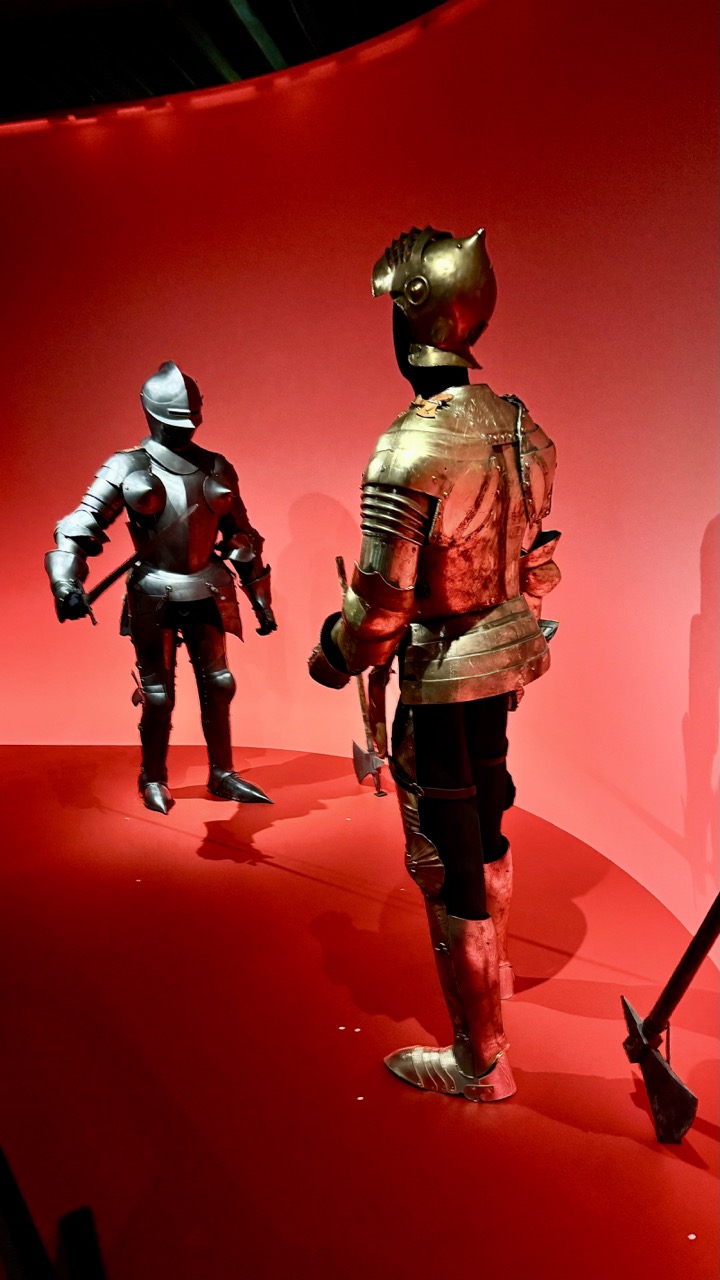
1. Overall Rating (0–10) — 7.5 This photograph captures a dramatic confrontation between two armored figures, transformed into a striking visual dialogue through bold color and composition. The deep red backdrop creates an intense, almost theatrical atmosphere, amplifying the metallic textures and the tension between the two suits of armor. While the staging feels deliberate and museum-like, the image's power lies in its ability to evoke both historical weight and modern aesthetic drama—though it occasionally borders on stylized excess.
2. Composition (0–10) — 7.0 The diagonal placement of the two armor suits creates dynamic tension, guiding the eye across the frame. The larger figure on the right dominates the foreground, while the smaller one in the background establishes depth. A slight crop could improve balance and eliminate the distracting axe in the lower right.
3. Lighting (0–10) — 8.0 The soft, directional lighting enhances the reflective surfaces of the armor, creating rich highlights and subtle shadows that emphasize texture and form. The ambient red glow enhances mood without overpowering the subject, giving the scene a cinematic, otherworldly quality.
4. Color & Tone (0–10) — 8.5 The dominant red field creates a bold, unified tone that contrasts beautifully with the metallic silver and gold of the armor. The warm color palette evokes a sense of danger, power, and ritual, while the tonal contrast between the bright armor and dark background enhances visual impact.
5. Creativity (0–10) — 8.0 The juxtaposition of historical artifacts with a theatrical, immersive environment demonstrates strong conceptual intent. The image transforms a museum display into a narrative moment, inviting viewers to imagine a battle or ritual between the figures, making it both educational and artistically compelling.
6. Technical Quality (0–10) — 7.5 The image is sharp and well-focused, with excellent detail in the armor’s surface and reflections. The exposure is balanced, and the colors are rich, though a slight loss of detail in the shadows suggests minor overexposure in the red backdrop.
7. Emotional Impact (0–10) — 8.0 The image evokes a sense of awe and solemnity, merging historical reverence with dramatic tension. The viewer is drawn into a silent narrative of power and conflict, creating a strong emotional resonance rooted in both visual grandeur and implied story.
The "Duels - The Art of Fighting" exhibition offers a comprehensive look at the evolution of dueling from its origins in medieval times to its decline in the 19th century. It explores the various forms of dueling, including sword fighting, pistol duels, and even duels with less conventional weapons.
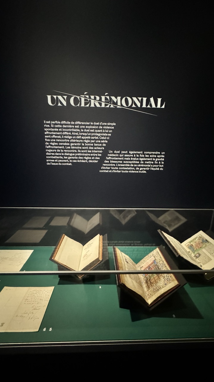
1. Overall Rating (0–10) — 7.0 This photograph captures the solemn atmosphere of a museum exhibit, where historical artifacts are presented with reverence and narrative depth. The interplay between the illuminated manuscripts and the dark, contemplative background creates a sense of timelessness, while the text panel adds intellectual weight to the scene. Though the lighting is functional, it slightly flattens the visual texture of the books, and the composition feels more documentary than artistic—nonetheless, the image effectively conveys the gravity and curated nature of the display.
2. Composition (0–10) — 6.5 The framing centers the display case, balancing the open manuscripts and the descriptive text above. The horizontal lines of the case and the text create a structured, orderly feel, though the slight tilt of the books introduces subtle asymmetry that prevents perfect harmony.
3. Lighting (0–10) — 6.0 The overhead lighting is adequate but lacks nuance, casting a flat, even glow that minimizes the texture of the aged paper and the depth of the glass case. The contrast between the dark wall and the illuminated display is effective, but the lighting lacks directional warmth or shadow play.
4. Color & Tone (0–10) — 6.5 The palette is restrained, dominated by deep greens, blacks, and the muted yellows of the ancient pages. While the tonal range is cohesive, the colors lack vibrancy, reinforcing the archival tone but slightly diminishing visual engagement.
5. Creativity (0–10) — 7.0 The image successfully frames a museum narrative, blending historical artifacts with interpretive text in a way that suggests a story beyond the objects themselves. The choice to include the title “UN CÉRÉMONIAL” as a conceptual anchor adds intellectual depth, transforming the display into a thematic installation.
6. Technical Quality (0–10) — 7.5 The focus is sharp on the central manuscripts, and the clarity of the text is legible. The exposure is well-balanced, though minor reflections on the glass case slightly obscure the lower portion of the display.
7. Emotional Impact (0–10) — 6.5 The image evokes a quiet reverence, inviting contemplation of history and ritual. While the emotional resonance is restrained by the clinical presentation, the subject matter and tone suggest a deeper human story beneath the surface.
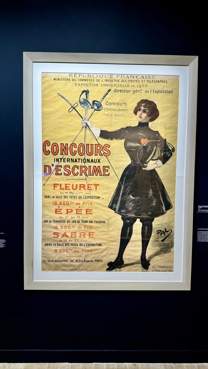
1. Overall Rating (0–10) — 7.0 This vintage poster, framed and displayed in a museum setting, captures the dynamism and elegance of early 20th-century French graphic design. The bold typography and confident pose of the fencer convey both athleticism and modernity, while the warm, aged paper and rich color palette lend it an authentic historical aura. Though the photograph itself is straightforward in presentation, the poster’s artistic and cultural significance shines through, offering a compelling glimpse into the intersection of sport, art, and national pride.
2. Composition (0–10) — 8.0 The poster’s composition is balanced and dynamic, with the central figure of the fencer anchoring the frame and drawing the eye. The diagonal lines of the swords create movement, while the text is rhythmically arranged to guide the viewer’s gaze. The framing of the photograph emphasizes the poster’s full visual impact, though slight corner cropping slightly disrupts the symmetry.
3. Lighting (0–10) — 7.5 The lighting is soft and directional, likely from a spotlight, which enhances the poster’s texture and depth without causing glare. The dark background isolates the image, allowing its warm tones and details to stand out, though the lower edge shows a slight shadow from the frame.
4. Color & Tone (0–10) — 8.0 The palette is rich and harmonious, with deep reds, warm yellows, and dark tones creating a sense of vintage authenticity. The contrast between the golden background and the black-and-white figure gives the image a theatrical quality, while the subtle fading of the paper adds a layer of historical character.
5. Creativity (0–10) — 9.0 The poster is a masterful blend of propaganda and art, using the figure of the female fencer to promote both sport and national identity. The stylized illustration, bold lettering, and clever use of symbolic elements—like the heart-shaped cutout on the dress—showcase a high degree of artistic innovation and cultural messaging.
6. Technical Quality (0–10) — 8.0 The photograph is sharp and clear, capturing fine details of the poster’s texture, typography, and signature. The focus is consistent across the image, and the framing is well-executed, though minor reflections on the glass could have been minimized.
7. Emotional Impact (0–10) — 7.5 The image evokes a sense of nostalgia and admiration for a bygone era of elegance and athletic ambition. The confident posture of the fencer and the grandeur of the event announcement inspire a feeling of pride and excitement, inviting viewers to imagine the spectacle of the 1900 Exposition.
The exhibition provides historical context for the practice of dueling, examining its role in resolving disputes, defending honor, and demonstrating prowess. It highlights famous duels from history, including notable participants and the outcomes that shaped their lives and legacies.
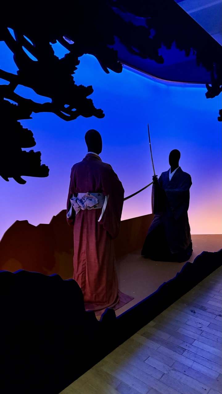
1. Overall Rating (0–10) — 7.0 This photograph captures a striking and atmospheric scene, evoking the solemnity and drama of a traditional Japanese theatrical or ceremonial moment. The silhouetted figures, clad in kimono and wielding a sword, stand against a vivid gradient sky, creating a powerful visual contrast that suggests both narrative depth and cultural reverence. While the composition is compelling, the lighting, though dramatic, feels slightly artificial, and the lack of facial detail limits emotional engagement. The image succeeds as a visual statement, though it stops short of transcendent impact.
2. Composition (0–10) — 7.0 The figures are well-placed within the frame, with the central figure in the red kimono drawing the eye, while the second figure with the sword adds narrative tension. The silhouette of the tree at the top left creates a natural framing device, guiding the viewer’s gaze toward the scene. The low-angle perspective enhances the figures’ presence, though the foreground elements slightly disrupt the visual flow.
3. Lighting (0–10) — 8.0 The lighting is dramatic and intentional, with a smooth gradient from deep blue to warm purple and orange, suggesting either dawn or dusk. The backlighting creates strong silhouettes, emphasizing form and posture over facial detail. The ambient glow enhances the mood without overwhelming the scene, contributing to the theatrical atmosphere.
4. Color & Tone (0–10) — 7.5 The color palette is rich and evocative, with a cool blue dominating the background and warm undertones at the horizon. The deep red of the kimono provides a striking contrast, while the overall tonal balance remains harmonious. The gradient adds a sense of depth and timelessness, reinforcing the image’s contemplative tone.
5. Creativity (0–10) — 8.0 The image is highly creative in its use of light, shadow, and cultural symbolism. The fusion of traditional Japanese elements with a modern, theatrical staging suggests a deliberate artistic vision. The silhouettes and lack of facial features invite interpretation, transforming the scene into a symbolic representation rather than a literal depiction.
6. Technical Quality (0–10) — 7.5 The image is sharp and well-focused, with clean edges on the silhouettes and smooth transitions in the background lighting. The exposure is balanced, capturing both the dark foreground and the luminous backdrop without significant loss of detail. Minor digital noise in the lower-right corner is negligible and does not detract from the overall clarity.
7. Emotional Impact (0–10) — 7.0 The image evokes a sense of quiet drama and introspection, drawing the viewer into a moment suspended between past and present. The absence of facial expressions creates a universal quality, allowing the viewer to project their own emotions onto the scene. While the mood is strong, the emotional connection is somewhat mediated by the stylized presentation, leaving a sense of detachment.
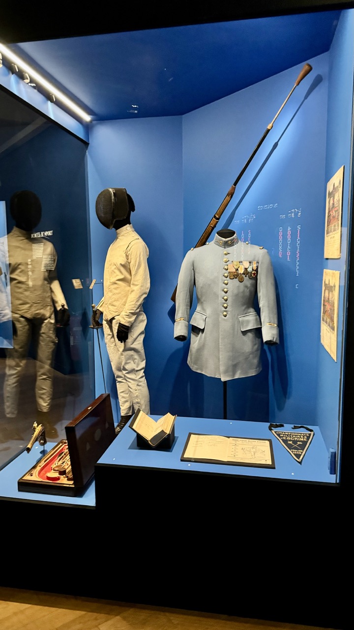
1. Overall Rating (0–10) — 7.0 This photograph captures a museum exhibit with a strong sense of narrative and historical weight, where the juxtaposition of ceremonial and athletic fencing gear speaks to the evolution of the sport. The cool blue backdrop enhances the formal tone, while the careful arrangement of artifacts—uniforms, weapons, and documents—invites contemplation. A slightly wider perspective would better convey the full scope of the display, but the composition effectively centers the viewer’s attention on the key objects of significance.
2. Composition (0–10) — 7.0 The framing centers on the main display elements, with the fencing uniform and mannequins creating a balanced diagonal flow. The use of the glass case and reflection adds depth, though the left-side reflection slightly competes for attention.
3. Lighting (0–10) — 7.5 The overhead lighting highlights the artifacts effectively, with soft shadows that enhance texture and form. The blue ambient glow complements the display without overpowering the objects, maintaining clarity and focus.
4. Color & Tone (0–10) — 7.0 The dominant blue creates a cohesive and contemplative atmosphere, while the neutral tones of the uniforms and the warm wood of the display case provide subtle contrast. The color palette is restrained but effective, reinforcing the formal tone of the exhibit.
5. Creativity (0–10) — 6.5 The arrangement tells a story of tradition and discipline, using the juxtaposition of old and modern fencing gear to suggest historical continuity. While the presentation is conventional, the narrative layering gives it thoughtful depth.
6. Technical Quality (0–10) — 8.0 The image is sharp and well-focused, with clean detail visible on the uniforms, medals, and open book. The exposure is balanced, and there is minimal noise, even in the lower-lit areas.
7. Emotional Impact (0–10) — 6.5 The photograph evokes a sense of reverence and quiet admiration for the history and discipline of fencing. While the mood is subdued and intellectual rather than visceral, it successfully conveys the dignity of the displayed heritage.
Visitors will be captivated by the array of dueling weapons on display, from ornate rapiers and sabers to intricately crafted pistols. The exhibition also delves into the techniques and rules that governed duels, illustrating the skill and precision required to engage in these often-deadly encounters.
Fun Fact: The Cannonball Collection
Here’s a fun fact about the Army Museum that might surprise you: it houses one of the most extensive collections of cannonballs in the world! Ranging from ancient stone projectiles to modern artillery shells, this collection offers a fascinating look at the evolution of artillery over the centuries. The display of cannonballs, some of which weigh hundreds of pounds, is a testament to the ingenuity and engineering prowess of military forces throughout history.
1. Overall Rating (0–10) — 6.0 This photograph captures a detailed architectural model of a historic fortress, presented behind glass in what appears to be a museum setting. The model’s intricate stonework and layered fortifications convey a sense of historical gravity, though the reflective surface and dim lighting introduce visual distractions. While the subject is compelling and rich in narrative, the image’s technical execution limits its overall impact, leaving it more as a documentary record than a powerful visual statement.
2. Composition (0–10) — 5.5 The model is centered but framed loosely, with uneven negative space and reflections cutting into the composition. The glass reflection and background elements disrupt the viewer’s focus on the primary subject.
3. Lighting (0–10) — 5.0 The lighting is dim and ambient, likely from overhead museum fixtures, creating a flat, diffused quality that obscures texture and detail. Reflections on the glass further scatter and mute the light, reducing clarity.
4. Color & Tone (0–10) — 5.5 The palette is desaturated, dominated by muted earth tones and greys, which align with the model’s materiality but lack vibrancy. The cool, greenish tint from the glass reflection adds an unnatural layer to the color balance.
5. Creativity (0–10) — 6.0 The image successfully documents a historically significant artifact, but its approach is observational rather than interpretive. The challenge of photographing a model behind glass limits creative expression, though the subject itself offers rich storytelling potential.
6. Technical Quality (0–10) — 6.5 The image is reasonably sharp, with fine detail visible in the model’s textures. However, the reflections, slight haze from the glass, and uneven exposure detract from technical clarity.
7. Emotional Impact (0–10) — 5.5 The photograph evokes a sense of quiet reverence for history, but the visual barriers—glass, reflections, and dim lighting—create emotional distance, preventing a deeper connection with the viewer.
1. Overall Rating (0–10) — 7.0 This photograph captures the intricate detail of a historical architectural model, evoking a sense of timelessness and scholarly reverence. The warm, subdued lighting enhances the texture of the miniature structures, lending the scene a contemplative, museum-like atmosphere. While the image succeeds in conveying the model’s complexity, its slightly cluttered framing and soft focus detract from the visual clarity of the subject.
2. Composition (0–10) — 6.5 The model is centered but slightly tilted, with a distracting background that draws attention away from the main subject. A tighter crop would emphasize the architectural detail and improve visual cohesion.
3. Lighting (0–10) — 7.0 The soft, directional lighting enhances the three-dimensionality of the model, casting gentle shadows that highlight texture and depth. The warm tone contributes to the image’s historical mood, though some areas remain underexposed.
4. Color & Tone (0–10) — 6.5 The palette is restrained, dominated by earthy beiges and muted browns, which suit the model’s materiality. However, the lack of vibrant contrast limits the image’s visual energy, making it feel somewhat flat.
5. Creativity (0–10) — 6.0 The choice to photograph a historical model is thoughtful, but the execution remains observational rather than interpretive. The image documents the model well but doesn’t elevate it into a more poetic or conceptual statement.
6. Technical Quality (0–10) — 7.5 The focus is generally sharp on the central buildings, and the fine textures of the model are well captured. However, slight softness in the background and uneven exposure reduce overall technical precision.
7. Emotional Impact (0–10) — 6.0 The image conveys quiet reverence and intellectual curiosity, inviting viewers to imagine the past. Yet, the lack of a stronger narrative or emotional hook keeps the connection to the subject at a distance.
Visiting the Army Museum in Paris is more than just a tour through a collection of artifacts; it is a journey through the rich and complex tapestry of military history. From the grandeur of Napoleon's tomb to the sobering exhibits on the world wars, the museum offers an unparalleled experience that educates and inspires.
1. Overall Rating (0–10) — 7.0 This photograph captures the grandeur and historical weight of a museum gallery, where architectural model and frescoes converge in a dialogue across time. The long perspective draws the eye down the hall with a sense of reverence, while the polished stone floor and rich wood accents lend a timeless elegance. Though the lighting is functional rather than dramatic, the image succeeds in conveying the quiet dignity of a space dedicated to preservation and memory.
2. Composition (0–10) — 8.0 The symmetrical framing and leading lines of the corridor create a strong sense of depth and balance, guiding the viewer’s gaze toward the model as the central focal point. The placement of the display case in the foreground anchors the image, while the receding murals and windows enhance spatial clarity.
3. Lighting (0–10) — 6.0 Even, diffuse lighting from overhead fixtures illuminates the space clearly but lacks contrast and mood. The recessed track lights are functional but do little to highlight textures or create dramatic shadows, resulting in a somewhat flat atmosphere.
4. Color & Tone (0–10) — 7.0 The palette is composed of warm earth tones—beige stone, deep wood, and muted fresco hues—that harmonize well and evoke a sense of historical continuity. Subtle tonal variations across the floor and walls add richness, though the overall tone leans toward neutrality.
5. Creativity (0–10) — 6.5 The image is observational rather than interpretive, focusing on architectural grandeur and institutional narrative. While the composition is strong, the approach is documentary, with limited personal vision or artistic manipulation.
6. Technical Quality (0–10) — 8.0 Sharp focus and clean detail are evident throughout, especially in the model and architectural elements. The camera’s level alignment and exposure are well-executed, ensuring clarity and balance across the frame.
7. Emotional Impact (0–10) — 6.5 The image evokes quiet contemplation and respect for history, but its clinical precision keeps the viewer at a distance. The emotional resonance is intellectual rather than visceral—more a tribute to legacy than an intimate human moment.
1. Overall Rating (0–10) — 7.0 This photograph captures the grandeur of a meticulously crafted architectural model within a museum gallery, evoking a sense of historical reverence and precision. The interplay between the model’s symmetrical design and the surrounding gallery space creates a layered narrative of art, history, and preservation. While the reflections in the glass slightly disrupt the clarity, the image successfully conveys the scale and significance of the structure on display.
2. Composition (0–10) — 7.5 The model is centered and framed symmetrically, emphasizing its geometric order and architectural complexity. The long perspective of the gallery enhances depth, drawing the eye toward the model as the focal point.
3. Lighting (0–10) — 6.5 Even, ambient lighting illuminates the model clearly, though the reflections on the glass case slightly obscure details. The natural light from the windows adds softness, but some areas remain underexposed.
4. Color & Tone (0–10) — 6.0 The palette is muted, dominated by earthy browns and grays, which reflect the model’s materials and the gallery’s subdued atmosphere. While consistent, the lack of vibrancy slightly diminishes visual impact.
5. Creativity (0–10) — 7.0 The juxtaposition of the detailed model against the vast, ornate gallery space offers a compelling visual dialogue between past and present. The framing captures both the artifact and its institutional context.
6. Technical Quality (0–10) — 7.0 The image is sharp and well-focused, with clean lines and minimal noise. The reflections are a minor technical distraction but do not significantly impair clarity.
7. Emotional Impact (0–10) — 6.5 The photograph conveys quiet awe and intellectual curiosity, inviting contemplation of history and design. The sense of scale and permanence resonates, though the reflections slightly distance the viewer from the emotional core.
The "Duels - The Art of Fighting" exhibition adds a unique dimension to the museum, exploring the fascinating and often perilous world of dueling. This exhibition, combined with the museum’s extensive permanent collections, ensures that there is something for everyone to enjoy and learn from.
1. Overall Rating (0–10) — 7.0 This photograph captures the layered narrative of a museum gallery, where historical art and archival images coexist in a space rich with cultural weight. The juxtaposition of grand oil paintings and candid photographs creates a dialogue between past and present, while the formal architecture enhances the sense of legacy. Though the composition is slightly cluttered by the number of displayed works, the image successfully conveys the atmosphere of a living archive—where history is preserved, curated, and remembered.
2. Composition (0–10) — 6.0 The framing is wide and slightly off-center, with multiple artworks competing for visual dominance. The stacked arrangement of paintings creates a sense of depth, but the placement of the smaller photographs on the right disrupts visual harmony, drawing attention away from the main subjects.
3. Lighting (0–10) — 7.0 Even, diffused lighting illuminates the gallery space effectively, allowing the details of the paintings and photographs to be clearly visible. The overhead fixtures cast soft shadows, contributing to the calm, contemplative mood of the room without creating glare or overexposure.
4. Color & Tone (0–10) — 6.5 The palette is dominated by warm golds and earth tones from the frames and the paintings, contrasted with the cooler grays and whites of the gallery walls and floor. While the colors are rich and historically evocative, the overall tone is somewhat muted, slightly dampened by the fluorescent lighting.
5. Creativity (0–10) — 7.5 The image demonstrates strong conceptual creativity by capturing the interplay between different eras of visual storytelling—romanticized battle scenes, ceremonial portraits, and historical documentation—all within a single frame. The arrangement suggests a curated narrative, inviting the viewer to reflect on how history is preserved and displayed.
6. Technical Quality (0–10) — 7.5 The photograph is sharp and well-focused, with clear detail in the textures of the paintings and the reflections on the glass cases. The exposure is balanced, and the image is free of distracting artifacts or motion blur.
7. Emotional Impact (0–10) — 7.0 There is a quiet reverence in the image, evoking a sense of continuity and respect for the past. The viewer is drawn into a contemplative space, where the weight of history is both visually and emotionally palpable—though the abundance of visual information may limit the immediacy of emotional connection.
1. Overall Rating (0–10) — 8.0 This photograph captures the regal splendor of a historical French imperial artifact with striking clarity and reverence. The intricate goldwork of the coronation mantle, the ornate sash, and the ceremonial sword are framed with dramatic precision, evoking the grandeur of Napoleon’s era. While the reflections in the glass slightly distract, the composition effectively conveys both the weight of history and the meticulous craftsmanship of the objects.
2. Composition (0–10) — 8.0 The central placement of the ceremonial regalia within the arched glass case creates a strong focal point, enhanced by the symmetry of the sash and the diagonal line of the sword. The depth of the gallery space in the background adds context without overwhelming the primary subject.
3. Lighting (0–10) — 7.5 The lighting is warm and directional, highlighting the metallic textures and engravings of the gold elements. Soft shadows enhance dimensionality, though some glare on the glass slightly reduces clarity.
4. Color & Tone (0–10) — 8.0 The dominant gold tones are rich and harmonious, complemented by the deep brown of the hat and the dark background. The contrast between the luminous regalia and the subdued museum interior enhances visual impact.
5. Creativity (0–10) — 7.5 The image successfully transforms a museum display into a narrative of imperial power and legacy. The framing and perspective elevate the objects beyond mere relics, suggesting a story of conquest, ceremony, and enduring symbolism.
6. Technical Quality (0–10) — 8.5 Sharp focus and high resolution reveal fine details in the embroidery and metalwork. The exposure is balanced, and the image is free of noise or distortion.
7. Emotional Impact (0–10) — 8.5 The photograph evokes awe and reverence, drawing the viewer into the solemnity of a bygone era. The presence of the crown jewels and ceremonial items stirs a sense of historical grandeur and human ambition.
As you wander through its halls and marvel at its treasures, remember that the Army Museum is not just about weapons and battles; it is about the courage, innovation, and resilience of those who have served their countries. Whether you are a history buff, a military enthusiast, or simply a curious traveler, the Army Museum in Paris is a destination that should not be missed.