Preston Lau: A Journey Through Memories, Tech, and Humanity
Welcome to my personal blog that delves into the intricate tapestry of personal albums and the fascinating intersection of ever-evolving technology and humanity. Come along on a journey with me as we delve into the seamless fusion of creativity, state-of-the-art AI and robotics, intricately interwoven within the tapestry of our shared awareness. Have fun!
San Jose Museum of Art: A Downtown Hub for West Coast Creativity in California
AI Summary
The San Jose Museum of Art is an art museum in Downtown San Jose, California, founded in 1969. It features a large permanent collection of West Coast artists from the 20th and 21st centuries, with exhibits that often incorporate different mediums and perspectives. The museum occupies a historic building designed by Willoughby J. Edbrooke, added to the National Register of Historic Places in 1973.
Nestled in the heart of Downtown San Jose, California, the San Jose Museum of Art (SJMA) stands as a significant cultural institution, offering a dedicated space to experience the arts in Silicon Valley's central city. Founded in 1969, the museum has built a large permanent collection with a distinct emphasis, primarily focusing on West Coast artists of the 20th- and 21st-century.
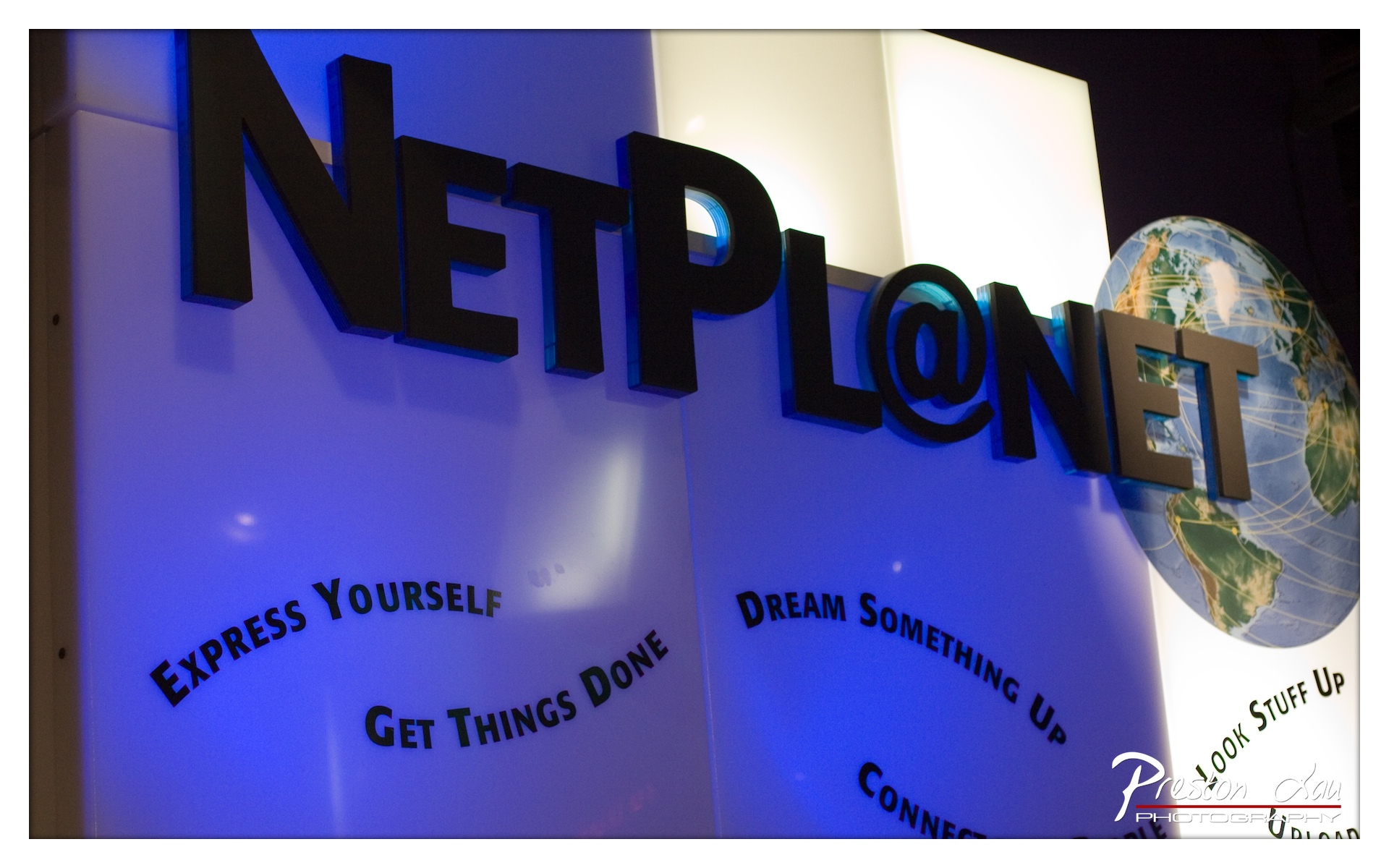
1. Overall Rating (0–10) — 7.0 This photograph captures the bold, high-tech energy of a corporate exhibition space, where branding and messaging converge with a sense of global connectivity. The dramatic blue backlighting and three-dimensional lettering create a dynamic, modern aesthetic, while the globe motif reinforces the theme of global reach. While the image successfully conveys the atmosphere of a tech-forward event, a slightly more balanced exposure and tighter framing could elevate its visual impact.
2. Composition (0–10) — 6.5 The diagonal placement of the “NETPL@NET” sign creates a sense of movement, though the cluttered lower right corner and uneven framing distract from the central message. A more focused crop would emphasize the branding and reduce visual noise.
3. Lighting (0–10) — 8.0 The cool blue backlighting enhances the futuristic tone and highlights the 3D lettering, casting a clean glow that draws attention to the brand. The contrast between the illuminated sign and darker surroundings adds depth and drama.
4. Color & Tone (0–10) — 7.5 The dominant blue hue establishes a cohesive, tech-oriented mood, with the white and green tones of the globe providing subtle contrast. The color palette is intentional and effective, though slightly oversaturated in the highlights.
5. Creativity (0–10) — 7.0 The image leverages visual storytelling through branding elements and thematic design, successfully communicating a message of innovation and connectivity. The use of a globe and bold typography reflects a clear conceptual intent.
6. Technical Quality (0–10) — 8.0 Sharp focus on the sign and clean detail in the lettering demonstrate strong technical execution. The exposure is well-managed, though some overexposure in the background light sources slightly detracts from balance.
7. Emotional Impact (0–10) — 6.5 The image evokes a sense of ambition and forward-thinking, but its corporate tone keeps the viewer at a slight remove. The emotional resonance is more intellectual than visceral, appealing to themes of progress rather than personal connection.
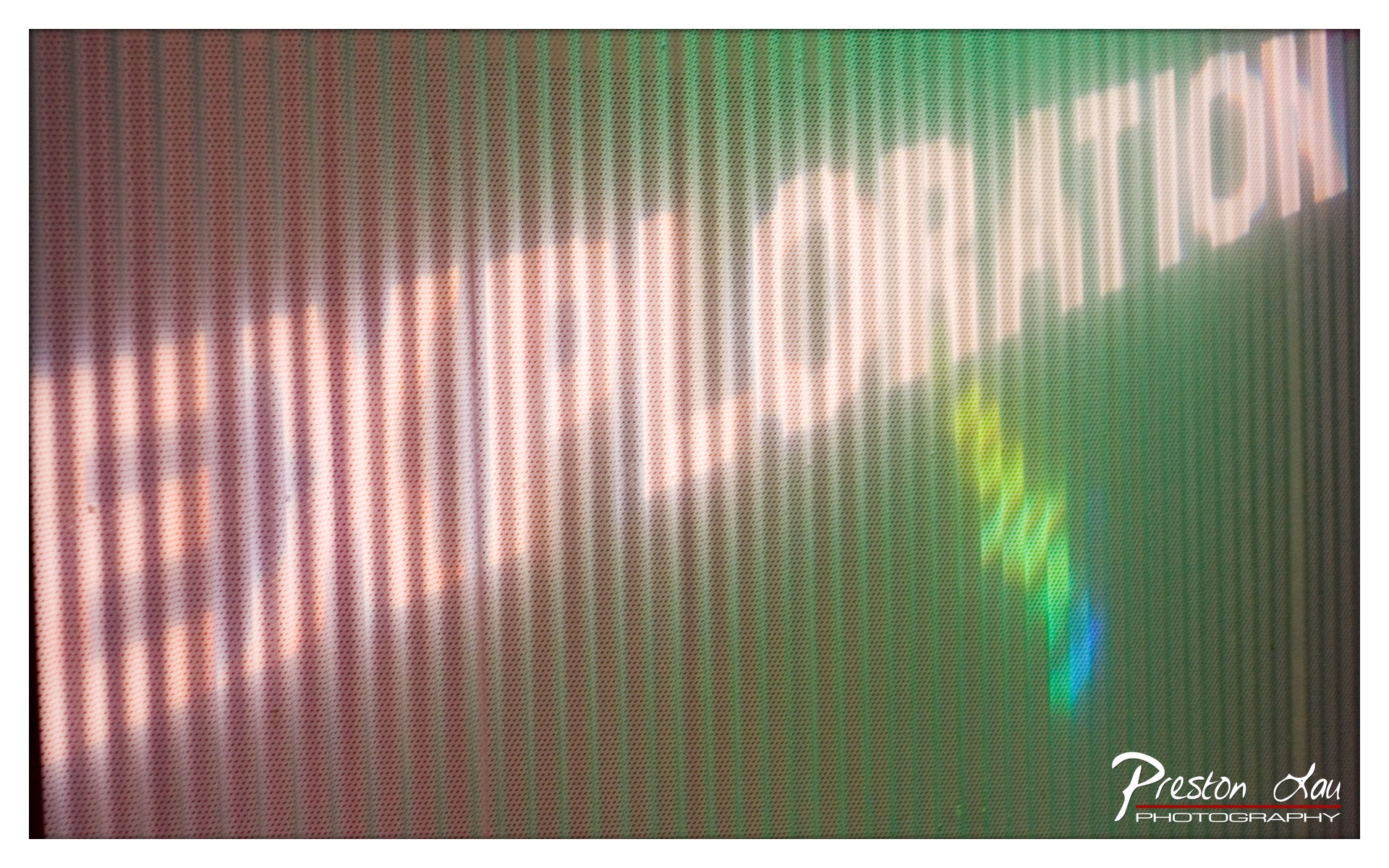
1. Overall Rating (0–10) — 5.5 This photograph captures the abstract texture of a digital screen through a perforated surface, creating a layered, almost dreamlike visual. The interplay of light and pattern suggests a commentary on technology and perception, but the image’s lack of clear subject and overexposed highlights diminish its narrative power. While visually intriguing in its complexity, it struggles to cohere into a compelling statement, leaving the viewer with more questions than answers.
2. Composition (0–10) — 5.0 The diagonal streaks of light and the scattered text fragments create a chaotic arrangement, with no clear focal point. The perforated screen dominates the frame, but the composition feels unbalanced, with too much visual noise and too little intentional structure.
3. Lighting (0–10) — 5.5 The lighting is uneven, with bright, blown-out areas disrupting the overall tone. The light appears to pass through the perforated material, creating a grainy, diffused effect that obscures detail and introduces distracting flare, especially on the right side.
4. Color & Tone (0–10) — 6.0 A dominant green hue overlays the image, punctuated by warm white and orange glows and a hint of blue. While the color palette is atmospheric, it lacks harmony—overwhelming greens and bright highlights clash with the darker tones, reducing visual cohesion.
5. Creativity (0–10) — 7.0 The concept of viewing a digital display through a textured barrier is conceptually strong, suggesting themes of mediated reality and visual distortion. The abstract quality gives the image an experimental edge, though its execution feels more accidental than intentional.
6. Technical Quality (0–10) — 6.5 The image is sharp enough to reveal the screen’s pixel grid and the perforated texture, but the exposure issues and lack of focus on any specific element reduce its technical polish. The watermark is clear, but the overall image quality is compromised by lighting and focus inconsistencies.
7. Emotional Impact (0–10) — 4.5 The image evokes a sense of disorientation and digital haze, but its emotional resonance is muted by the lack of clarity and narrative focus. It feels more like a technical experiment than a work that connects with the viewer on a deeper level.
The museum's architecture itself tells a story, a fascinating blend of historical significance and modern expansion. Its historic wing was originally a grand public building, designed by architect Willoughby J. Edbrooke and constructed in 1892 to serve as the San Jose post office. Later, it took on a new role as the city's library from 1937 to 1969, before being converted by The Fine Arts Gallery Association and reopening as the "Civic Art Gallery" (the museum's predecessor). This beautiful older section, with its potentially classical or imposing 19th-century design, is recognized for its historical importance, having been named a California Historical Landmark (#854) in 1972 and added to the National Register of Historic Places in 1973. Complementing this historical structure is the "New Wing," which opened in 1991 and comprises the majority of the current exhibition space, providing more modern, expansive galleries for temporary and rotating displays.
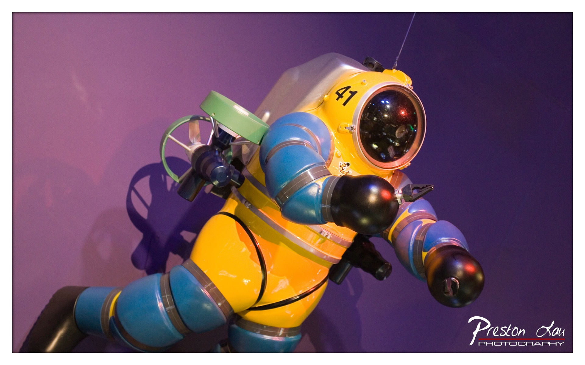
1. Overall Rating (0–10) — 7.5 This photograph captures a striking, almost cinematic portrayal of a vintage deep-sea diving suit, rendered with vibrant color and dynamic lighting that gives it an otherworldly presence. The bold yellow and blue hues contrast sharply against the deep purple backdrop, creating a visually arresting composition that feels both nostalgic and futuristic. While the image excels in mood and color, the slightly cluttered foreground elements and strong shadowing detract from its overall clarity and balance.
2. Composition (0–10) — 7.0 The subject is diagonally framed, creating a sense of movement and tension, though the left side feels slightly overfilled with shadow and equipment. The low angle enhances the suit’s imposing presence, but tighter cropping could have improved visual focus.
3. Lighting (0–10) — 8.0 The directional lighting from the upper left highlights the suit’s contours and reflective surfaces, casting dramatic shadows that add depth. The interplay of light and dark enhances the object’s three-dimensional form and gives the scene a theatrical quality.
4. Color & Tone (0–10) — 8.5 The rich, saturated yellows and blues pop against the moody purple background, creating a bold, harmonious palette. The warm highlights on the suit contrast effectively with the cool ambient tone, enhancing visual interest and emotional resonance.
5. Creativity (0–10) — 8.0 The choice to frame the diving suit as if in motion, combined with the stylized lighting and color treatment, elevates a museum exhibit into a narrative moment. The image suggests a story of exploration and human ambition, transforming a static object into a dynamic character.
6. Technical Quality (0–10) — 8.0 Sharp focus on the helmet and arms, with clean detail in the textures and reflections. The exposure is well-managed, preserving highlights and shadows without significant loss of information.
7. Emotional Impact (0–10) — 7.5 The image evokes a sense of awe and curiosity, blending fascination with the past and wonder at human ingenuity. The dramatic lighting and bold colors stir a feeling of adventure, inviting the viewer to imagine the depths the suit once explored.
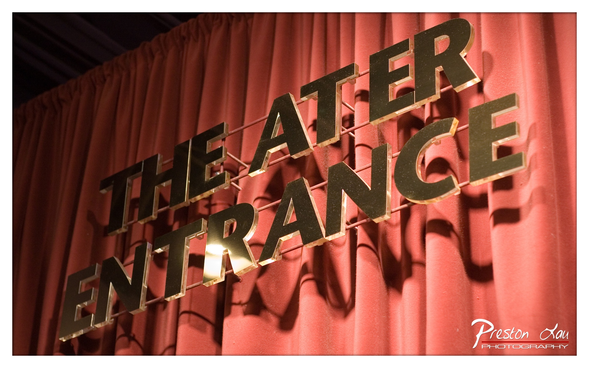
1. Overall Rating (0–10) — 7.5 This photograph captures the quiet anticipation of a theater entrance with a strong sense of place and atmosphere. The bold, three-dimensional letters create a dynamic interplay of light and shadow against the deep red curtain, evoking a sense of drama and narrative before the curtain even rises. While the composition is compelling, the slightly uneven lighting and tight framing prevent it from achieving full visual elegance.
2. Composition (0–10) — 7.0 The diagonal placement of the sign creates a sense of movement, drawing the eye across the frame. However, the off-center alignment and partial framing of the sign slightly disrupt visual balance, making the composition feel more like a snapshot than a carefully constructed image.
3. Lighting (0–10) — 8.0 The directional lighting enhances the three-dimensional quality of the letters, casting dramatic shadows that emphasize texture and depth. The warm glow on the edges of the acrylic letters adds a touch of theatricality, effectively reinforcing the mood of the setting.
4. Color & Tone (0–10) — 8.5 The rich, saturated red of the curtain provides a strong, emotive backdrop, complementing the dark, metallic tones of the letters. The contrast between warm highlights and deep shadows enhances the visual richness, creating a classic, cinematic palette.
5. Creativity (0–10) — 7.5 The image successfully captures the essence of a theater environment through a focus on signage and texture. The choice of lighting and angle adds a layer of narrative, suggesting the anticipation of a performance—though it remains grounded in the literal rather than the abstract.
6. Technical Quality (0–10) — 8.0 The focus is sharp on the sign, with clean detail visible on the edges of the letters. The image is well-exposed, with no significant noise or artifacts, though the tight crop and slight overexposure on the highlights slightly diminish overall refinement.
7. Emotional Impact (0–10) — 7.0 The photograph evokes a sense of quiet excitement and anticipation, tapping into the emotional resonance of live performance. The combination of light, shadow, and color invites the viewer to imagine the stories unfolding behind the curtain.
While perhaps considered "pretty minimalist" for a city the size of San Jose, the museum excels in its curation and the impact of its exhibitions. They consistently do well to bring in creative and thought provoking displays, utilizing different mediums and perspectives to engage visitors. This might involve unconventional installations, multi-media works, or thematic groupings that encourage deeper thought about art and its context.
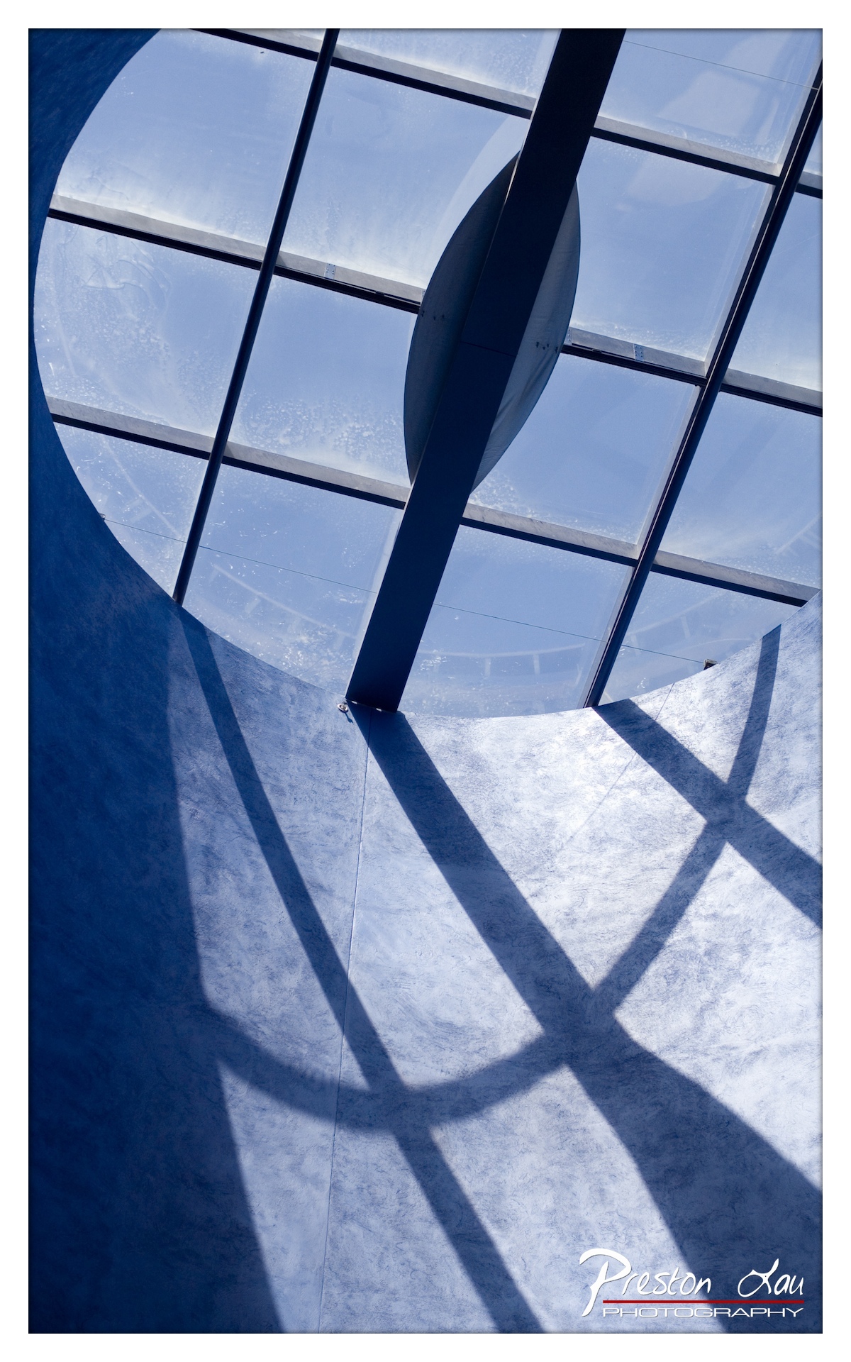
1. Overall Rating (0–10) — 8.0 This photograph captures a striking interplay of geometry and light, transforming an architectural space into a contemplative visual poem. The bold contrast between the deep blue tones and the crisp, intersecting shadows creates a sense of depth and rhythm, while the circular window and structural lines guide the eye with deliberate elegance. While the image is visually compelling, its strong graphic quality occasionally overshadows subtle textural details, making it feel more like a design study than an emotionally resonant scene.
2. Composition (0–10) — 8.5 The low-angle perspective emphasizes the curvature of the interior and the symmetry of the window grid, creating a strong sense of balance and visual harmony. The diagonal shadow lines intersect dynamically, drawing attention to the central vertical beam and reinforcing the image’s architectural focus.
3. Lighting (0–10) — 9.0 The interplay of natural light filtering through the glass and the resulting sharp, elongated shadows adds dramatic depth and dimension. The soft, diffused quality of the light enhances the cool blue tone while preserving detail in both highlights and midtones.
4. Color & Tone (0–10) — 8.5 The monochromatic blue palette is cohesive and mood-enhancing, lending the image a serene, almost meditative atmosphere. The subtle gradations in tone—from deep navy to pale, sunlit blue—add texture and visual interest, reinforcing the architectural narrative.
5. Creativity (0–10) — 8.0 The photographer’s choice to emphasize form, shadow, and repetition demonstrates a strong conceptual approach. The image transcends mere documentation, inviting viewers to consider the beauty in structural design and light manipulation.
6. Technical Quality (0–10) — 8.5 The image is sharp and well-focused, with clean lines and minimal noise. The exposure is balanced, and the tonal range is effectively captured, showcasing both the bright sky and the darker architectural elements with clarity.
7. Emotional Impact (0–10) — 7.5 The photograph evokes a quiet sense of awe and introspection, inviting the viewer to pause and reflect on the elegance of modern architecture. While the emotional resonance is subtle, it is sustained through the deliberate use of form and light, creating a contemplative and immersive experience.
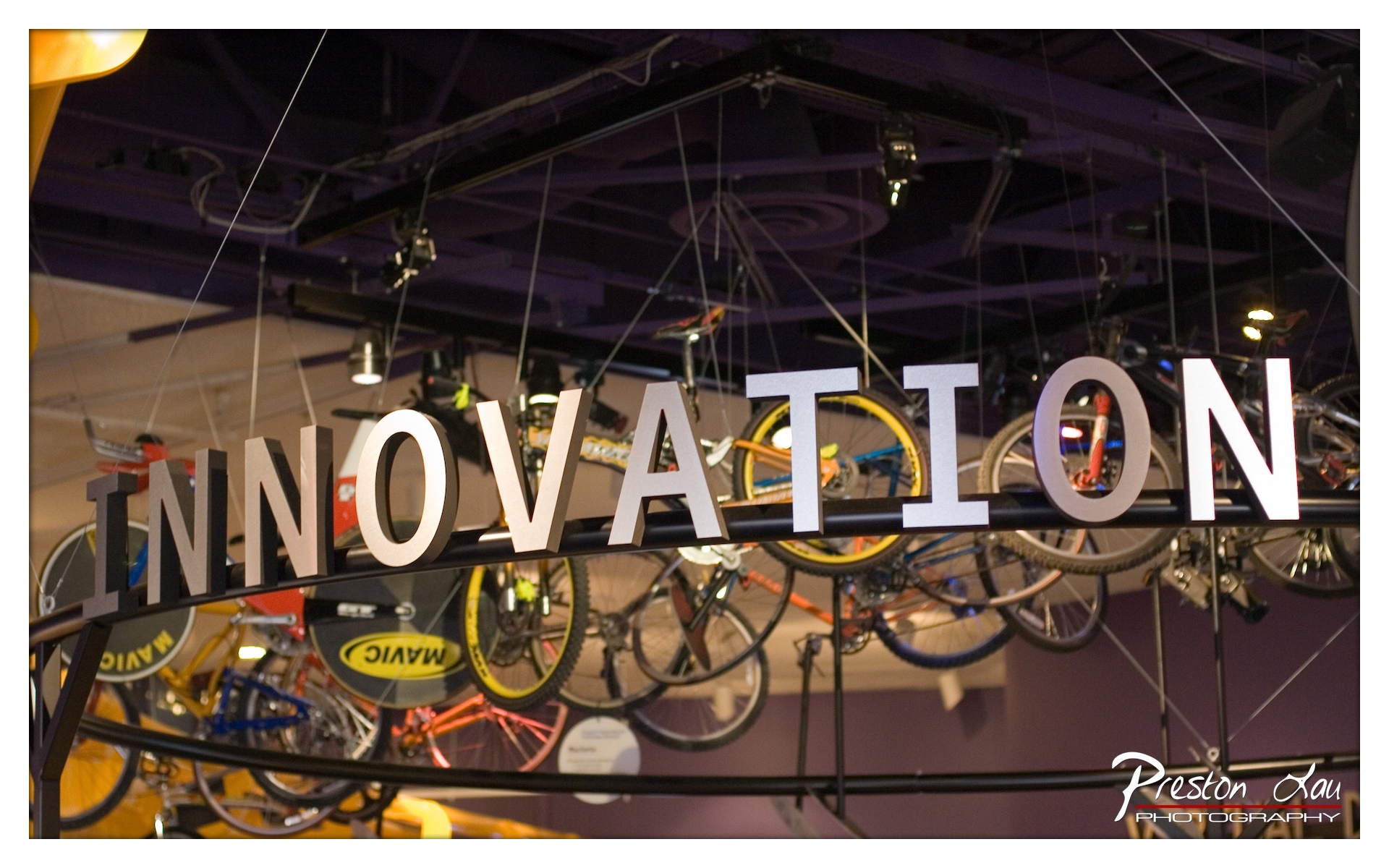
1. Overall Rating (0–10) — 7.0 This image captures a vibrant, dynamic space where the theme of innovation is both literal and symbolic, with bicycles suspended like artifacts in a museum of progress. The bold, three-dimensional "INNOVATION" sign commands attention, while the colorful bikes and industrial ceiling create a sense of creative energy. While the composition is engaging and thematically strong, the cluttered background and slightly uneven lighting reduce its visual cohesion, keeping it from achieving a more refined aesthetic.
2. Composition (0–10) — 6.5 The subject is well-placed and centered, drawing the eye immediately to the word "INNOVATION." However, the background is busy, with multiple bikes and structural elements competing for attention, which slightly undermines the focus and creates visual noise.
3. Lighting (0–10) — 6.0 The lighting is functional, with spotlights highlighting the sign and parts of the bikes. However, the overall illumination is uneven, with some areas appearing overexposed while others fall into shadow, creating a mix of harsh and dim zones that disrupt the scene's harmony.
4. Color & Tone (0–10) — 7.0 The palette is rich and varied, with pops of color from the bicycles contrasting against the deep purple ceiling and neutral tones of the sign. The warm highlights and cool shadows add depth, though the color balance could be more consistent to enhance overall cohesion.
5. Creativity (0–10) — 8.0 The concept is highly original—using bicycles as symbols of innovation in a museum-like display—giving the image a layered narrative. The juxtaposition of industrial design with the theme of progress makes it visually and intellectually engaging.
6. Technical Quality (0–10) — 7.5 The image is sharp and clear, with fine detail visible in the lettering and bike components. The depth of field is well-managed, keeping the sign in focus while softly blurring the background, though some lens flare and slight overexposure in the top-left corner detract from perfection.
7. Emotional Impact (0–10) — 7.5 The photograph evokes a sense of curiosity and optimism, suggesting a space where creativity and technology intersect. The viewer is invited to reflect on the idea of innovation through a tangible, accessible lens, making the image both thought-provoking and visually stimulating.
The museum's permanent collection, which is seen in rotating shows throughout the year, offers a valuable insight into the artistic landscape of the region. It concentrates specifically on California and West Coast artists, and boasts particularly strong holdings in the Bay Area's abstract expressionist painters of the post-World War II era. This focus means that a visit can offer a unique perspective on art shaped by the history, geography, and cultural dynamics of the West Coast.
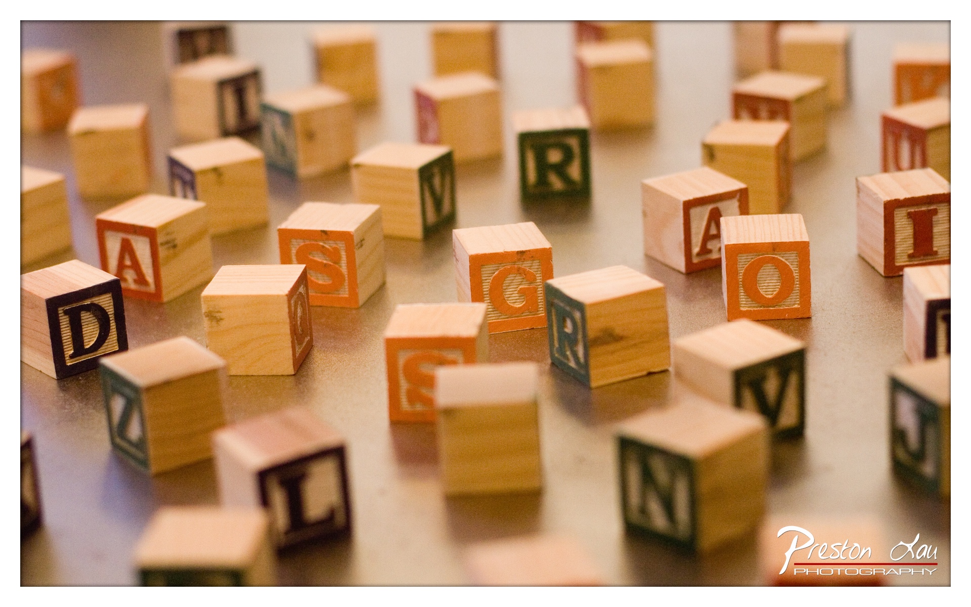
1. Overall Rating (0–10) — 7.0 This photograph captures the nostalgic charm of childhood learning with a gentle, warm sensibility. The shallow depth of field draws attention to select letter blocks while softly blurring the rest, creating a sense of quiet discovery. While the composition feels deliberate and inviting, the scattered arrangement lacks a clear narrative, leaving the image more as a visual still life than a story in motion.
2. Composition (0–10) — 6.5 The arrangement of blocks feels organic and scattered, with a strong focal point in the center. However, the lack of directional flow or intentional framing results in a slightly chaotic feel, though the selective focus helps guide the eye.
3. Lighting (0–10) — 7.0 Warm, diffused lighting enhances the natural wood tones and adds a cozy, intimate atmosphere. The soft shadows contribute to the image’s gentle mood, though the lighting lacks dramatic contrast.
4. Color & Tone (0–10) — 7.0 The warm color palette, dominated by soft oranges and browns, evokes nostalgia and comfort. The color contrast between the letter blocks and the neutral background adds visual interest without overwhelming the scene.
5. Creativity (0–10) — 6.5 While the subject is familiar, the use of shallow depth of field and warm tones gives it a personal, artistic touch. The image leans more toward sentimental observation than conceptual innovation.
6. Technical Quality (0–10) — 8.0 The focus is sharp on the central blocks, with smooth transitions into the background. The image is clear and well-exposed, with minimal noise and strong detail in the wood grain.
7. Emotional Impact (0–10) — 7.5 The photograph evokes a sense of innocence and memory, resonating with viewers who recall early learning or childhood play. The warmth and focus on tactile objects create a quiet emotional connection.
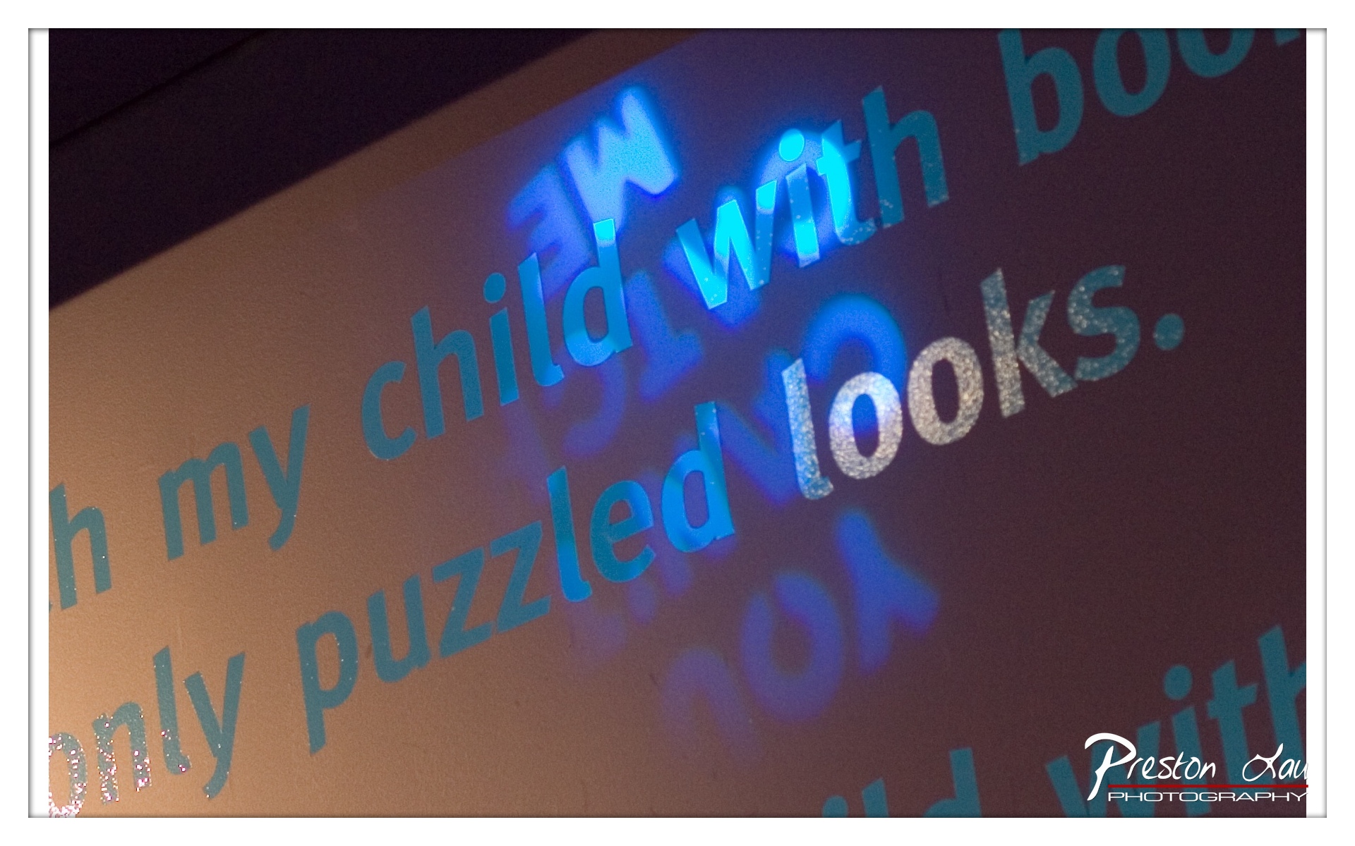
1. Overall Rating (0–10) — 6.0 This photograph captures a layered, atmospheric interplay of light and text, evoking a sense of introspection and quiet mystery. The projection of glowing blue letters over the physical text creates a dreamlike duality, suggesting a narrative beneath the surface. While the visual effect is compelling, the image’s emotional resonance is slightly diluted by the lack of a clear focal point and the somewhat cluttered arrangement of text.
2. Composition (0–10) — 5.5 The diagonal arrangement of the projected text adds dynamism, but the overlapping layers and off-center framing create a sense of visual disarray. The composition leans toward abstraction, sacrificing clarity for texture.
3. Lighting (0–10) — 7.0 The cool blue projection creates a striking contrast against the warm background, enhancing the image’s mood and depth. The interplay of light and shadow adds dimension, though the uneven exposure slightly muddies the details.
4. Color & Tone (0–10) — 6.5 The cool blue of the projection contrasts effectively with the warm, muted background, creating a balanced but subdued palette. The use of glittery text adds a subtle sparkle, enhancing the sense of wonder.
5. Creativity (0–10) — 7.5 The fusion of projected and physical text demonstrates a strong conceptual idea, blending reality with illusion. The choice to focus on language and light suggests a poetic intent, though the execution could be more refined.
6. Technical Quality (0–10) — 6.0 The image is reasonably sharp, with good focus on the projected text. However, some areas suffer from slight blur and uneven lighting, which detracts from overall clarity.
7. Emotional Impact (0–10) — 6.5 The image invites contemplation, hinting at themes of memory, connection, and the quiet moments of childhood. The soft glow and layered text evoke a sense of nostalgia, though the lack of a clear narrative keeps the emotional response somewhat distant.
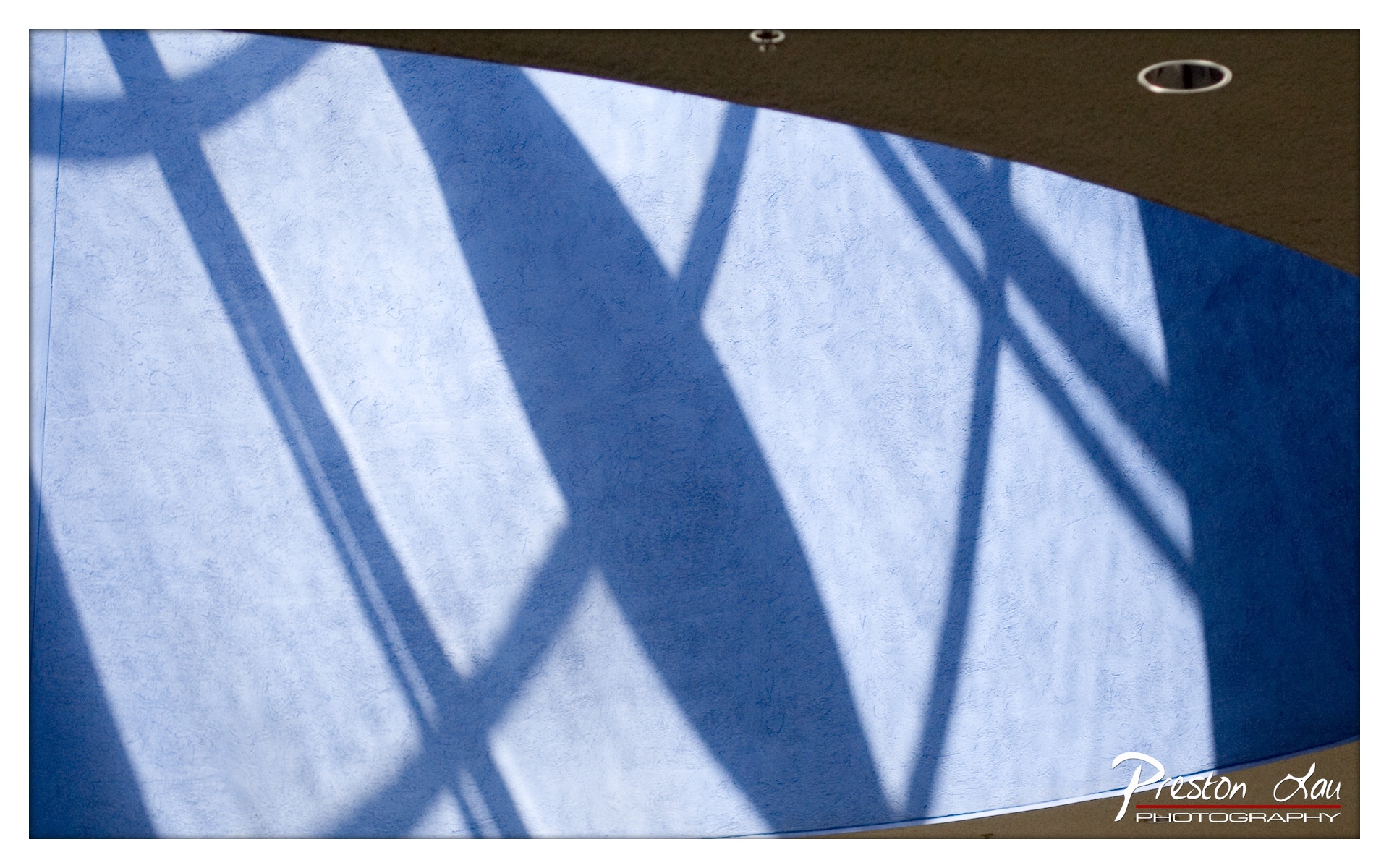
1. Overall Rating (0–10) — 7.5 This photograph transforms an ordinary architectural surface into a compelling interplay of light and geometry, where shadow becomes the primary subject. The diagonal lattice of light and dark forms creates a dynamic rhythm across the textured blue wall, evoking both order and mystery. While the image lacks a clear narrative anchor, its visual strength lies in its abstract elegance and the subtle tension between form and space.
2. Composition (0–10) — 8.0 The diagonal lines of the shadow create a strong sense of movement, leading the eye across the frame with a natural flow. The curved ceiling edge in the upper right adds balance and frames the composition effectively, while the textured surface enhances depth and tactility.
3. Lighting (0–10) — 8.5 The interplay of bright, sharp sunlight and deep shadow produces a striking contrast that defines the geometric pattern. The light appears directional and natural, casting clean, defined edges that emphasize the architectural structure, lending a sculptural quality to the scene.
4. Color & Tone (0–10) — 7.0 The cool blue of the wall provides a calm, cohesive backdrop, while the white highlights of the sunlight offer a crisp contrast. The tone is consistent and moody, though a slightly warmer or cooler cast might have enhanced the atmospheric tension.
5. Creativity (0–10) — 8.0 The photographer transforms a mundane architectural detail into a visually arresting abstraction, demonstrating a keen eye for pattern and light. The absence of human presence allows the image to function as a meditative study in form, showcasing originality in perspective and composition.
6. Technical Quality (0–10) — 8.5 The image is sharp, well-exposed, and free of noise, with excellent detail in both the highlights and the textured wall. The focus is precise, and the lighting is balanced, allowing the interplay of shadow and surface to be clearly rendered.
7. Emotional Impact (0–10) — 7.5 The image evokes a sense of quiet contemplation and structural harmony, inviting the viewer to pause and reflect on the beauty of everyday light. Its abstract nature allows for personal interpretation, creating a subtle emotional resonance that lingers.
SJMA has hosted many memorable exhibits over the years, showcasing the breadth of its programming. These include shows featuring the compelling "meta-outsider images of Martn Ramrez," the imaginative and "fantastical collages of Jess," and the dynamic "illuminated installations of Jennifer Steinkamp" (suggesting immersive works involving light and perhaps movement). Reflecting the region's identity, a particularly fitting past exhibit was "Robots: Evolution of a Cultural Icon," directly connecting the museum's themes to Silicon Valley's technological focus.
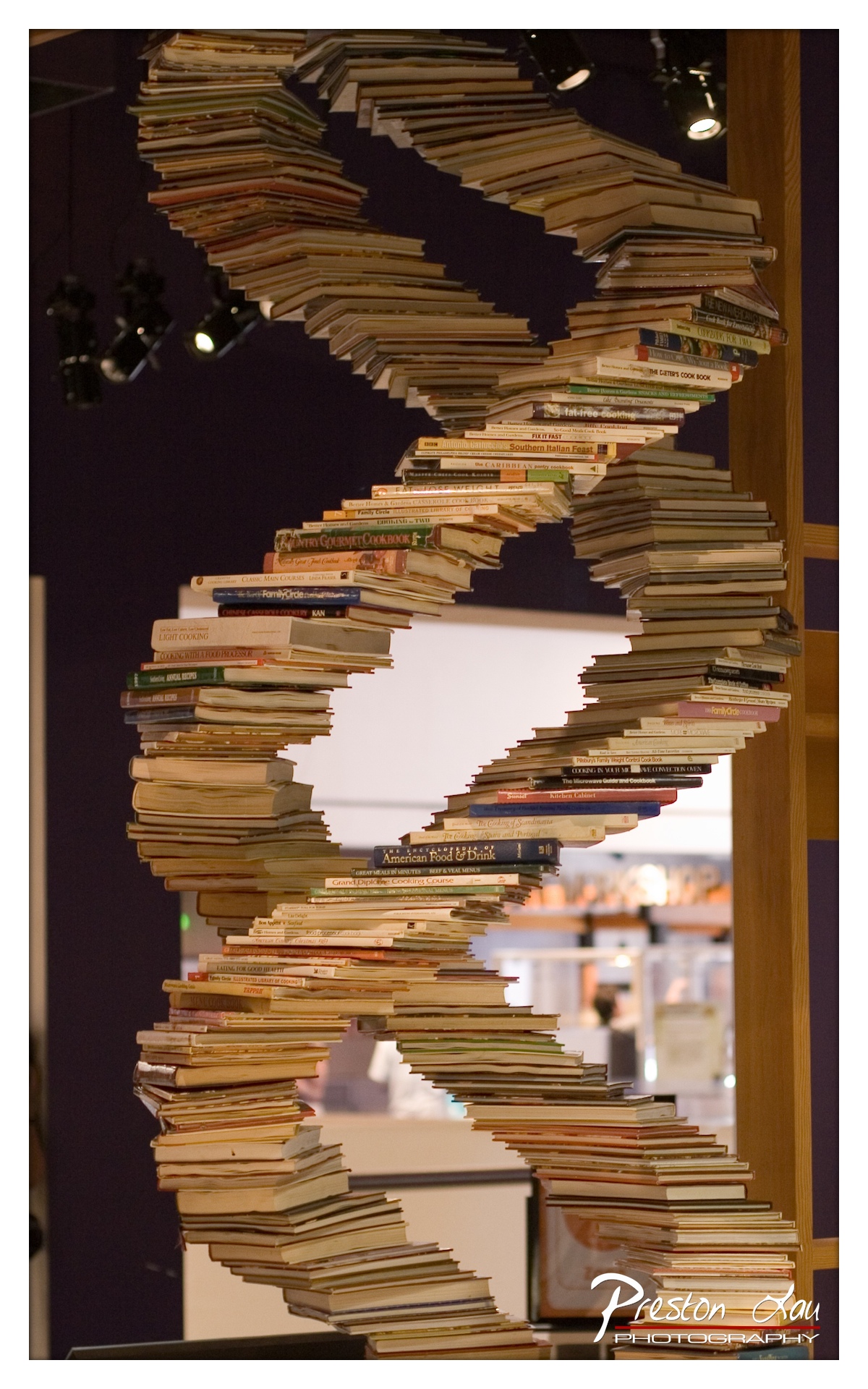
1. Overall Rating (0–10) — 8.0 This photograph captures a striking and intellectually rich sculpture—a DNA helix formed from cookbooks—evoking a fusion of science and culinary art. The composition draws the eye upward along the spiraling structure, emphasizing both the physical form and its symbolic meaning. While the background remains slightly distracting, the image succeeds in conveying a sense of wonder and thoughtful design, elevated by its conceptual depth and visual clarity.
2. Composition (0–10) — 8.5 The spiral structure dominates the frame with a strong diagonal flow, guiding the viewer’s gaze through the depth of the image. The central placement and upward trajectory create a sense of movement and balance, while the blurred background helps isolate the subject, though the wooden beam on the right slightly disrupts the visual continuity.
3. Lighting (0–10) — 7.5 The use of spotlights from above enhances the three-dimensional quality of the sculpture, casting subtle shadows that emphasize its layered construction. The lighting is directional and effective, though some areas of the book spines appear overexposed, slightly flattening the texture of the individual volumes.
4. Color & Tone (0–10) — 7.0 The warm, earthy tones of the book spines contrast beautifully with the deep purple background, creating a rich and inviting palette. The variation in cover colors adds visual texture, though the overall tone is slightly muted, possibly due to the fluorescent lighting and digital processing.
5. Creativity (0–10) — 9.0 The concept of constructing a DNA helix from cookbooks is highly original, merging the biological blueprint of life with the cultural essence of food. This metaphorical pairing—genetic code and culinary tradition—elevates the image beyond mere documentation into the realm of conceptual art.
6. Technical Quality (0–10) — 8.0 The photograph is sharp and well-focused, particularly on the central portion of the sculpture, with fine detail visible on the book spines. The depth of field is appropriately managed, blurring the background to emphasize the subject while retaining enough context to ground the scene.
7. Emotional Impact (0–10) — 8.0 The image evokes curiosity and admiration, inviting viewers to contemplate the relationship between biology, culture, and human knowledge. Its intellectual elegance and visual harmony create a sense of awe, making it both thought-provoking and aesthetically pleasing.
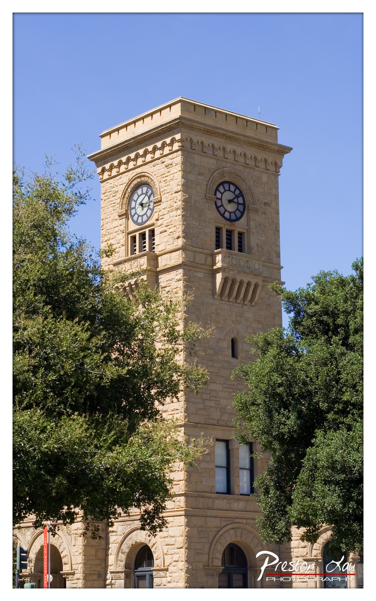
1. Overall Rating (0–10) — 7.5 This photograph captures the stately presence of a historic clock tower with a sense of architectural grandeur and timelessness. The warm stone and clear blue sky create a striking contrast, while the framing through the trees adds depth and a touch of natural softness. The image succeeds in conveying both the monumentality of the structure and its harmonious integration into its surroundings, though the composition could benefit from more deliberate framing to enhance visual focus.
2. Composition (0–10) — 7.0 The tower is centered and dominates the frame, creating a strong focal point, but the overhanging tree branches on both sides slightly distract from the symmetry. The low-angle perspective emphasizes the tower’s height, enhancing its imposing presence.
3. Lighting (0–10) — 8.0 Bright, direct sunlight enhances the texture of the stone and casts subtle shadows that define the building’s architectural details. The clear blue sky provides a clean backdrop, allowing the tower to stand out vividly.
4. Color & Tone (0–10) — 7.5 The warm, golden tones of the sandstone contrast beautifully with the deep blue sky and vibrant green foliage. The color balance is natural and pleasing, with strong saturation that enhances the visual appeal without appearing over-processed.
5. Creativity (0–10) — 7.0 The inclusion of the trees framing the tower adds a natural, organic element that softens the rigid geometry of the architecture. The choice to shoot from below adds a sense of reverence, though the concept remains conventional in its approach to architectural documentation.
6. Technical Quality (0–10) — 8.5 The image is sharp and detailed, with excellent focus on the tower’s intricate stonework. The exposure is well-balanced, with no significant loss of detail in highlights or shadows, and the watermark is discreet and unobtrusive.
7. Emotional Impact (0–10) — 7.0 The photograph evokes a sense of permanence and civic pride, capturing a moment of quiet dignity. The viewer is drawn to the enduring quality of the structure, suggesting continuity and tradition in a modern setting.
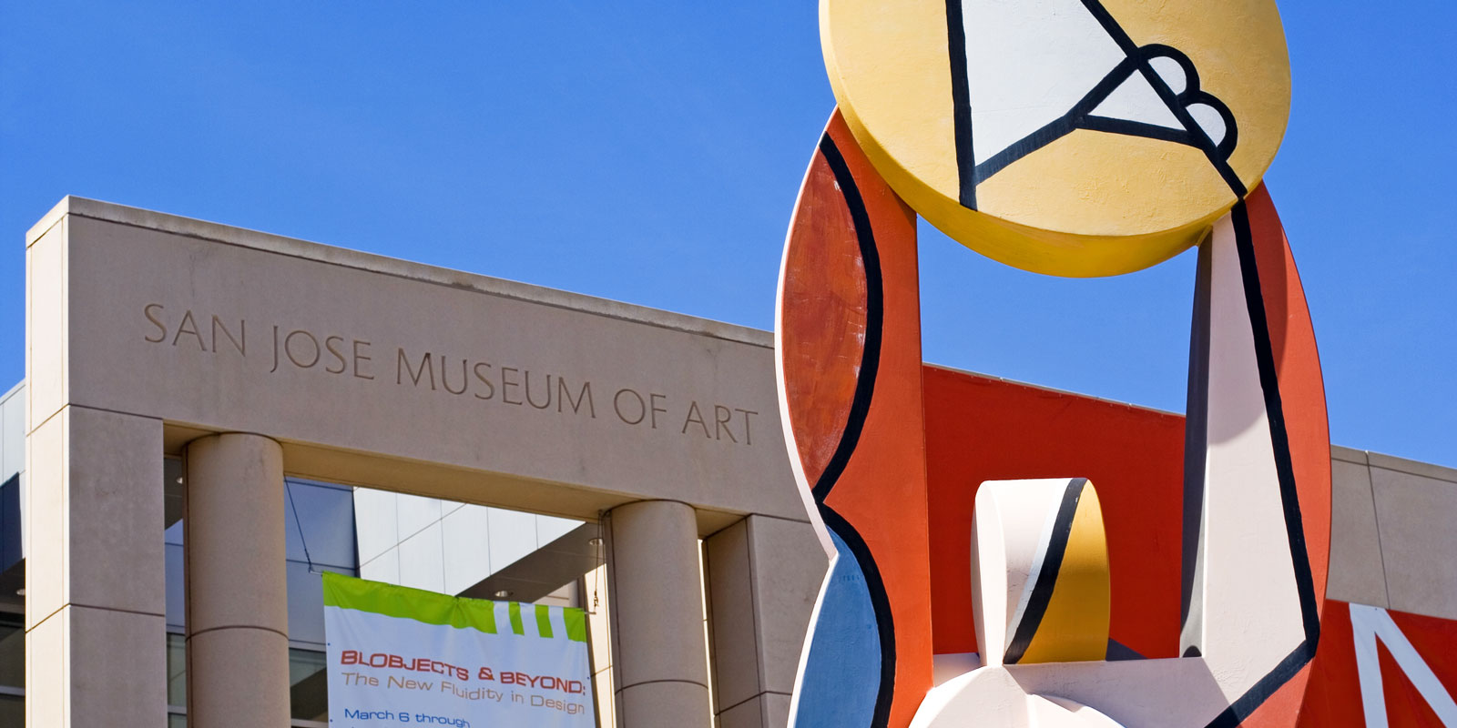
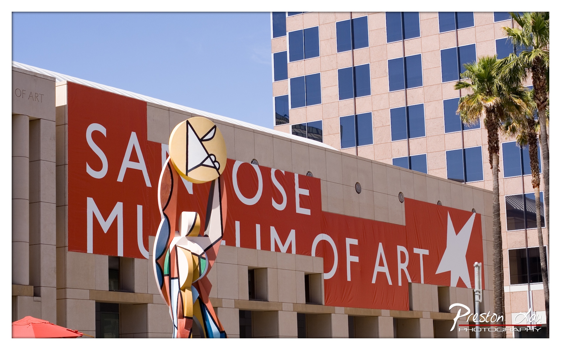
1. Overall Rating (0–10) — 7.5 This image captures the vibrant identity of the San Jose Museum of Art with a bold, graphic presence, where the interplay of architecture, sculpture, and signage creates a visually dynamic urban scene. The bright red banners and colorful abstract sculpture inject energy into the frame, while the juxtaposition of modern art and commercial architecture adds narrative depth. While the composition is strong, the slightly cluttered foreground and overexposed sky slightly detract from the overall polish.
2. Composition (0–10) — 7.0 The sculpture is well-placed as a focal point, leading the eye toward the museum signage. The diagonal sweep of the banners creates visual movement, though the inclusion of the red umbrella in the lower-left corner adds a minor distraction that disrupts balance.
3. Lighting (0–10) — 8.0 Strong, direct sunlight enhances the vividness of the red banners and casts clean shadows, emphasizing the geometric structure of the building. The bright blue sky provides excellent contrast, though it’s slightly overexposed, losing some detail in the upper portion of the frame.
4. Color & Tone (0–10) — 8.5 The dominant red of the banners and the warm tones of the building create a striking color palette, amplified by the cool blue of the sky. The sculpture’s multicolored, abstract design adds vibrancy and visual interest, while the overall tonal range is rich and engaging.
5. Creativity (0–10) — 8.0 The photograph successfully blends documentary and artistic intent, capturing both the institution and its cultural context. The framing emphasizes the intersection of public art, architecture, and urban life, presenting a story beyond mere documentation.
6. Technical Quality (0–10) — 8.0 Sharp focus is maintained across the scene, with clear details in both the sculpture and the building’s facade. The exposure is well-handled overall, though the sky’s overexposure slightly reduces technical precision.
7. Emotional Impact (0–10) — 7.0 The image conveys a sense of civic pride and cultural vibrancy, evoking curiosity about the art and community behind the museum. The bold colors and dynamic composition generate optimism and energy, though the emotional resonance is somewhat restrained by the image’s more commercial, promotional tone.
For anyone who enjoy[s] the arts, the San Jose Museum of Art provides a welcome and valuable place to experience culture in San Jose. Its combination of a historically significant building, a focused and strong permanent collection highlighting regional art, and a commitment to presenting creative and thoughtful temporary exhibitions makes it a worthwhile stop for art lovers visiting or residing in Downtown San Jose.
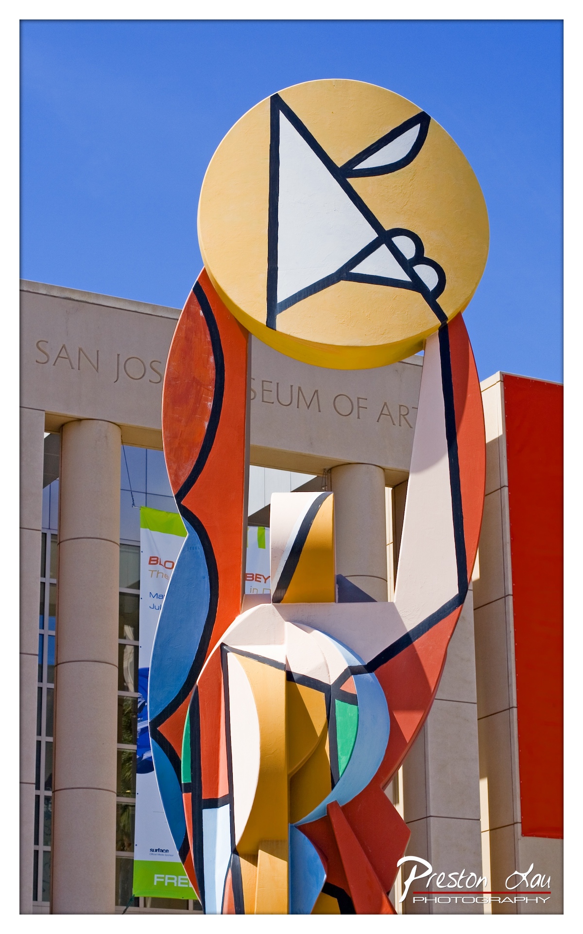
1. Overall Rating (0–10) — 7.5 This photograph captures a bold, colorful sculpture in front of the San Jose Museum of Art with a striking sense of energy and modernity. The vivid abstraction of the sculpture contrasts beautifully with the clean lines of the building and the deep blue sky, creating a dynamic interplay between art and architecture. While the image is visually engaging and well-composed, the slight overexposure in the sky and the busy background signage slightly detract from its overall refinement.
2. Composition (0–10) — 8.0 The sculpture dominates the frame with a strong diagonal presence, drawing the eye upward and emphasizing its scale. The low-angle perspective enhances its monumentality, while the framing balances the architectural elements without overwhelming the subject.
3. Lighting (0–10) — 7.5 Bright, direct sunlight enhances the sculpture’s vivid colors and creates sharp shadows that add depth and dimension. The clear blue sky provides a clean backdrop, though the sky itself is slightly overexposed, losing some texture.
4. Color & Tone (0–10) — 8.5 The palette is rich and expressive, with bold primary and secondary hues that stand out against the neutral tones of the building. The contrast between the warm reds, yellows, and blues and the cool sky creates a vibrant, energetic feel.
5. Creativity (0–10) — 8.0 The image successfully captures the spirit of the sculpture—abstract, dynamic, and celebratory of modern art. The juxtaposition of the organic, flowing forms with the rigid architecture adds narrative depth and highlights the sculpture’s role as a public art statement.
6. Technical Quality (0–10) — 8.0 The image is sharp and detailed, with clear focus on the sculpture and crisp rendering of textures. The exposure is generally well-handled, though the sky’s brightness slightly flattens its detail.
7. Emotional Impact (0–10) — 7.0 The photograph evokes a sense of joy and cultural vibrancy, inviting viewers to appreciate the fusion of art, architecture, and public space. The bold colors and confident composition generate a feeling of optimism and artistic celebration.
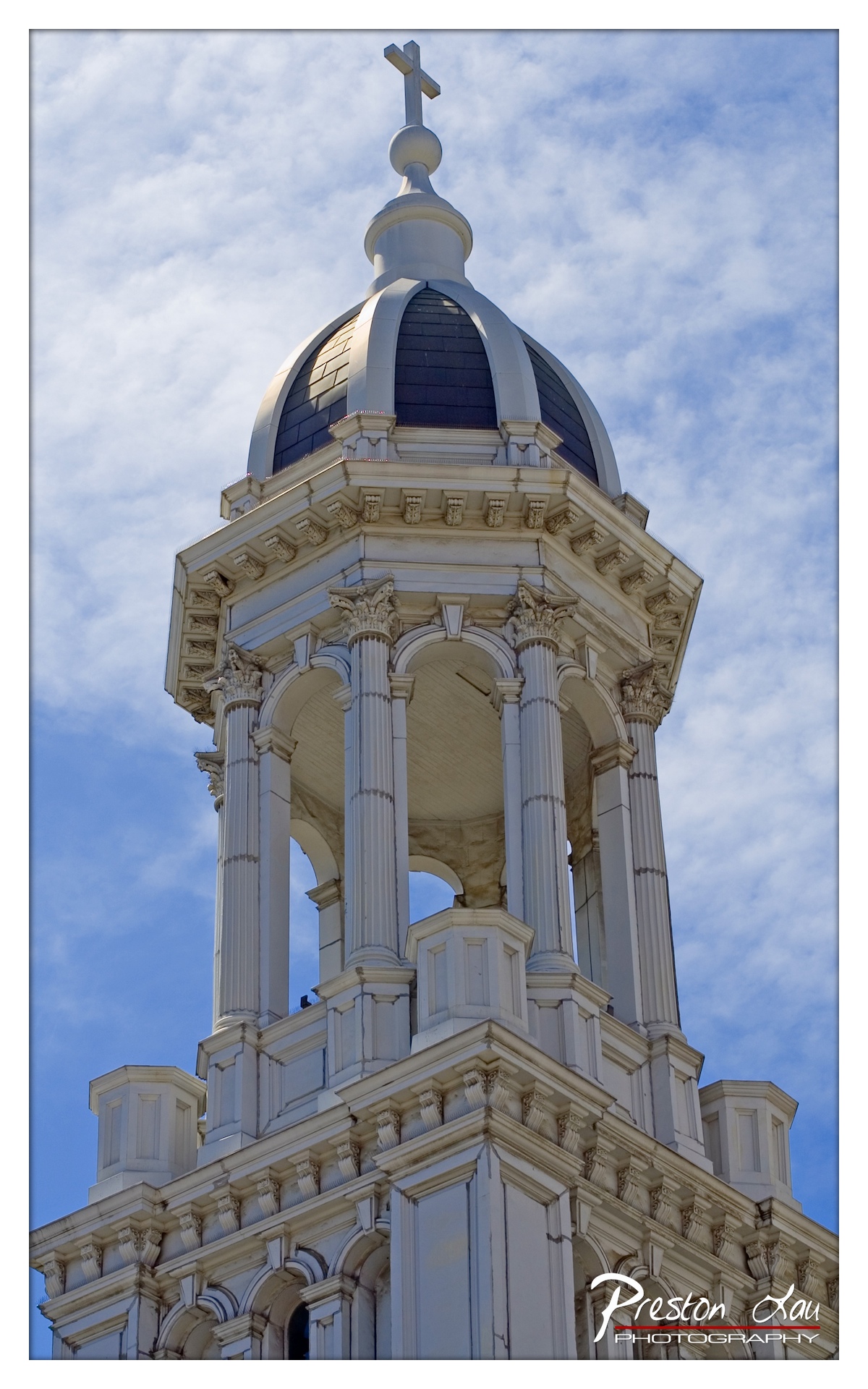
1. Overall Rating (0–10) — 8.0 This photograph captures the grandeur and intricate detail of a church steeple with a striking sense of verticality and reverence. The upward angle emphasizes the structure’s soaring elegance, while the contrast between the white architecture and the dynamic blue sky enhances its visual presence. The image succeeds in conveying both architectural beauty and spiritual aspiration, though subtle signs of weathering on the stonework hint at a deeper narrative of endurance.
2. Composition (0–10) — 8.5 The low-angle perspective creates a powerful sense of scale, drawing the viewer’s eye upward along the lines of the columns and dome. The steeple is well-centered, with the cross positioned at the apex, reinforcing symmetry and balance. The framing effectively uses negative space to highlight the structure’s silhouette against the sky.
3. Lighting (0–10) — 8.0 Natural daylight enhances the texture and depth of the stonework, with soft shadows defining the columns and moldings. The light appears to come from the side, creating subtle highlights that emphasize the building’s three-dimensional form. The sky is evenly lit, avoiding harsh glare and preserving detail in the clouds.
4. Color & Tone (0–10) — 7.5 The palette is dominated by crisp whites and deep blue tones, creating a harmonious and serene contrast. The dark tiles of the dome add visual weight and contrast, while the sky’s soft gradient adds depth. The overall tone is clean and bright, though slightly cool, which enhances the sense of purity and elevation.
5. Creativity (0–10) — 8.0 The choice of a low-angle, upward-looking shot transforms a familiar architectural subject into a dramatic and almost reverent composition. The focus on the dome and cross suggests a spiritual ascent, elevating the image beyond mere documentation into a contemplative visual statement.
6. Technical Quality (0–10) — 9.0 The image is sharp and well-focused throughout, with excellent clarity in the architectural details. The exposure is balanced, and there are no visible sensor noise or chromatic aberrations. The watermark is discreet, not distracting from the composition.
7. Emotional Impact (0–10) — 8.5 The photograph evokes a sense of awe and tranquility, inviting reflection on faith, history, and human aspiration. The upward movement of the frame and the serene sky combine to create a deeply uplifting and contemplative mood, resonating with viewers on both visual and emotional levels.
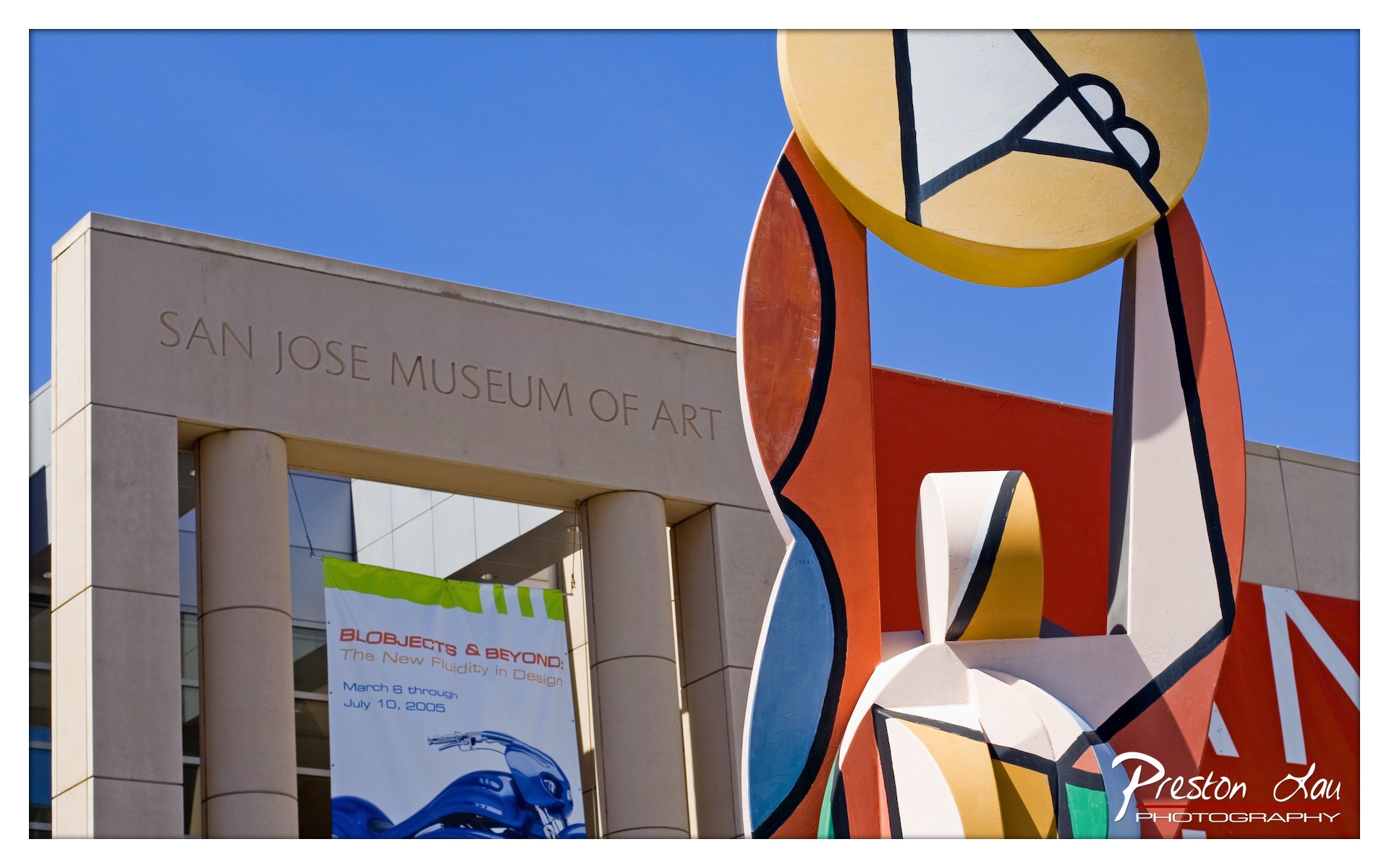
1. Overall Rating (0–10) — 7.5 This photograph captures the vibrant energy of the San Jose Museum of Art with a bold, dynamic composition that celebrates both architecture and contemporary sculpture. The juxtaposition of the clean, modern building and the colorful, abstract sculpture creates a striking visual dialogue, enhanced by the crisp blue sky. While the framing slightly favors the sculpture over the museum’s identity, the image succeeds in conveying a sense of artistic innovation and cultural vibrancy.
2. Composition (0–10) — 7.0 The low-angle perspective emphasizes the scale of the sculpture and the museum entrance, creating a sense of grandeur. The sculpture dominates the right side, drawing the eye, while the museum’s signage anchors the left, creating a balanced asymmetry. However, the sculpture slightly intrudes into the frame, creating a minor visual imbalance.
3. Lighting (0–10) — 8.5 The bright, direct sunlight enhances the vividness of the sculpture’s colors and casts clean, defined shadows that add depth. The clear blue sky provides a strong, uncluttered backdrop that makes the colors pop, and the even lighting ensures excellent clarity across the scene.
4. Color & Tone (0–10) — 8.0 The palette is rich and harmonious, with the warm reds, yellows, and blues of the sculpture contrasting beautifully against the cool blue sky and neutral tones of the building. The colors are saturated yet natural, conveying the energy of the space without appearing overprocessed.
5. Creativity (0–10) — 8.0 The photographer effectively uses the juxtaposition of architectural form and abstract art to create a narrative about modern design and artistic expression. The choice of angle and framing highlights the sculpture’s movement and the museum’s identity, making the image feel both documentary and interpretive.
6. Technical Quality (0–10) — 8.5 The image is sharp and well-focused, with excellent clarity in both the sculpture and the building. The exposure is balanced, and there is minimal noise, indicating strong technical execution. The watermark is discreet and does not detract from the image.
7. Emotional Impact (0–10) — 7.0 The photograph evokes a sense of optimism and cultural vitality, inviting the viewer to appreciate the intersection of art, design, and public space. The bold colors and open sky contribute to a feeling of freedom and possibility, though the emotional resonance is slightly tempered by the image’s more observational tone.