Preston Lau: A Journey Through Memories, Tech, and Humanity
Welcome to my personal blog that delves into the intricate tapestry of personal albums and the fascinating intersection of ever-evolving technology and humanity. Come along on a journey with me as we delve into the seamless fusion of creativity, state-of-the-art AI and robotics, intricately interwoven within the tapestry of our shared awareness. Have fun!
Exploring Portugal's Soul: Lisbon, Sintra, Fátima & Cabo da Roca in Portugal
AI Summary
Lisbon, Portugal's capital, is a historic city with over 800 km of Atlantic Coast. The city features many notable buildings, including the National Palace in Sintra and the Sanctuary Basilica in Fatima, where apparitions took place. The Belém Tower and Jerónimos Monastery are also must-visit attractions, designated as UNESCO World Heritage sites.
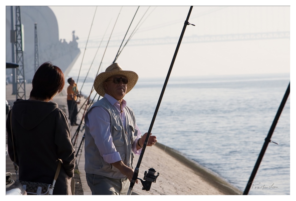
Lisbon (Lisboa), the vibrant capital of Portugal, welcomed us with its old-world charm and buzzing energy. Stepping into this city feels like stepping into a history book, reminding you that this was once the heart of one of the world's most formidable empires, its reach extending across continents to colonies in America, Asia, and Africa. Portugal itself, a relatively small country nestled on the western edge of the Iberian peninsula, boasts over 800 km of dramatic Atlantic coastline. As the most western country in mainland Europe, it's a land steeped in history, dotted with countless historical buildings and monuments that tell tales of explorers, kings, and ordinary people.
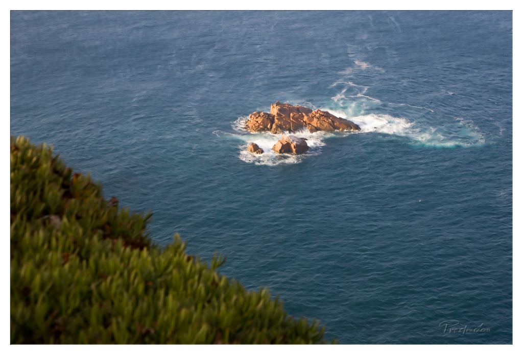
1. Overall Rating (0–10) — 7.5 This photograph captures the quiet drama of a solitary rock formation emerging from the deep blue sea, where nature’s raw power meets serene stillness. The interplay of light on the water and the textured stone creates a sense of timelessness, while the blurred foliage in the foreground adds depth and a personal, vantage-point intimacy. The image excels in mood and atmosphere, though its narrative remains understated, leaving room for more emotional resonance.
2. Composition (0–10) — 7.0 The diagonal framing from the foliage in the lower left draws the eye toward the central rock, creating a natural leading line. The subject is well-placed, but the foreground blur slightly diminishes the sense of scale and grounding.
3. Lighting (0–10) — 8.0 Soft, directional sunlight enhances the texture of the rocks and highlights the white foam of the waves, adding dimension to the scene. The gentle glow on the stone contrasts beautifully with the cool blue of the sea, creating a balanced and natural light quality.
4. Color & Tone (0–10) — 8.0 The palette of deep blue and warm amber tones is harmonious and evocative, with a natural contrast that emphasizes the ruggedness of the rock against the fluidity of the water. The tonal range is rich and well-integrated.
5. Creativity (0–10) — 7.0 The choice to frame through foliage introduces a contemplative, almost voyeuristic perspective, adding a layer of narrative. While the subject is classic coastal imagery, the framing and lighting lend it a personal, reflective quality.
6. Technical Quality (0–10) — 8.0 Sharp focus on the rocks contrasts with the softly blurred foreground, demonstrating effective use of depth of field. The image is clean, with no visible noise or artifacts.
7. Emotional Impact (0–10) — 7.0 The scene evokes a sense of solitude and resilience, with the lone rock standing firm against the sea’s constant motion. It invites introspection and a quiet connection to nature, though the emotional pull could be deeper with more human or environmental context.
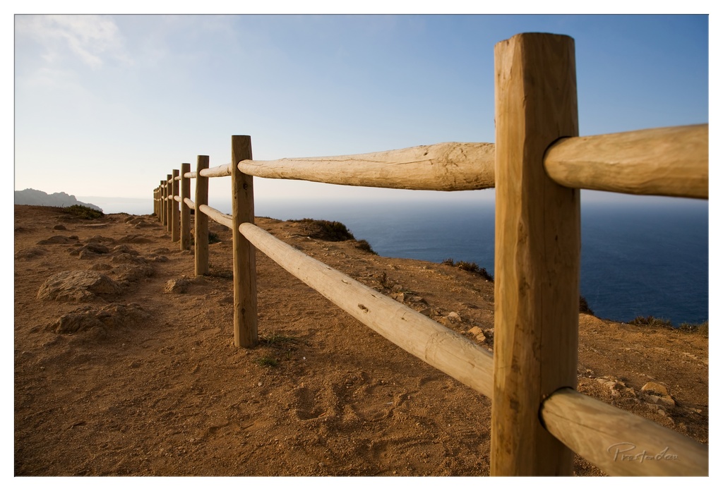
1. Overall Rating (0–10) — 7.5 This photograph captures a serene coastal path with a quiet sense of journey and solitude, where the wooden railing guides the eye toward the vast horizon. The warm, golden light and expansive seascape evoke a feeling of calm contemplation, though the image’s strength lies more in its atmospheric clarity than in dramatic visual impact. A subtle lack of depth in the midground slightly diminishes the immersive quality, but the composition remains compelling and evocative.
2. Composition (0–10) — 8.0 The diagonal line of the railing creates a strong leading line, drawing the viewer’s gaze through the frame toward the distant sea and sky. The low angle emphasizes the texture of the earth and the rustic character of the fence, while the balanced placement of the horizon enhances the sense of openness.
3. Lighting (0–10) — 8.5 Soft, directional sunlight bathes the scene in a warm, golden glow, suggesting early morning or late afternoon. The light enhances the natural textures of the wood and soil while casting gentle shadows that add depth and dimension.
4. Color & Tone (0–10) — 7.5 The palette is harmonious, with earthy browns and sandy tones contrasting against the deep blue of the ocean and the pale sky. The tonal range is well-balanced, with a slight warmth that reinforces the tranquil mood.
5. Creativity (0–10) — 7.0 The image effectively uses a simple, grounded composition to evoke a sense of journey and quiet reflection. While not highly experimental, it demonstrates a thoughtful approach to capturing place and mood.
6. Technical Quality (0–10) — 8.0 The focus is sharp on the foreground rail, with a gradual fall-off that adds depth. The exposure is well-handled, with no blown highlights or crushed shadows, and the fine detail in the wood and ground is clear.
7. Emotional Impact (0–10) — 8.0 The photograph conveys a peaceful, meditative atmosphere, inviting the viewer to pause and reflect. The combination of natural light, open space, and the suggestion of a journey creates a strong sense of calm and introspection.
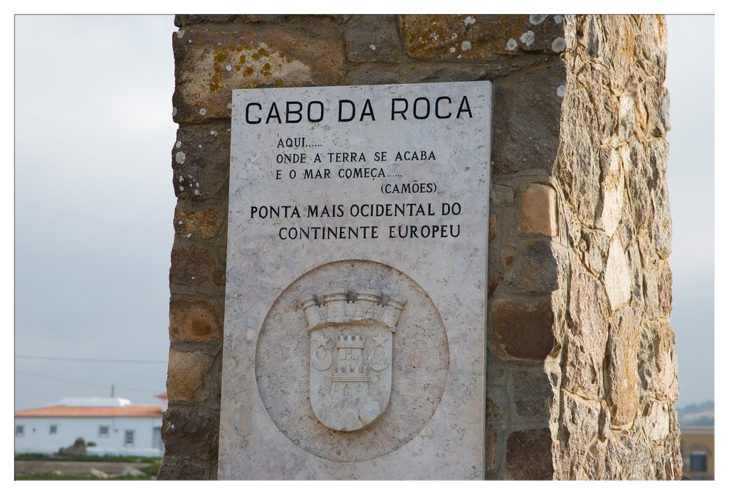
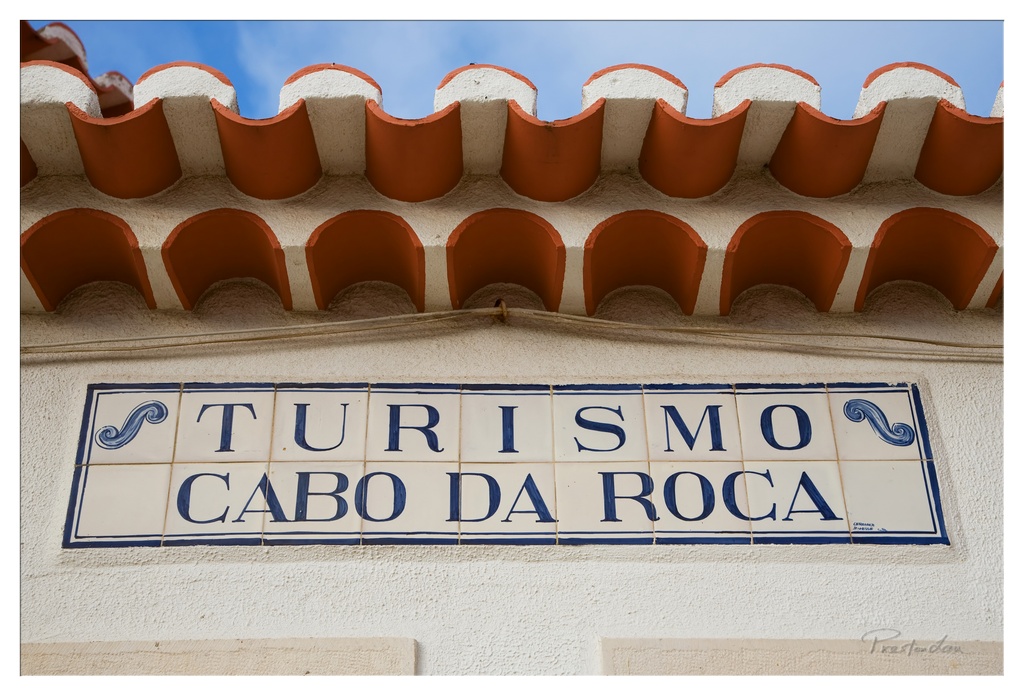
1. Overall Rating (0–10) — 7.0 This photograph captures a poignant moment of geographical and cultural significance at Cabo da Roca, where land ends and sea begins. The monument’s inscribed message, paired with the weathered stone and overcast sky, evokes a sense of quiet contemplation and historical weight. While the image is strong in its documentary purpose, it lacks dynamic lighting and compositional tension, slightly diminishing its artistic resonance.
2. Composition (0–10) — 6.5 The plaque is centered but slightly off-kilter within the frame, with the stone pillar on the right creating a visual imbalance. The background buildings and distant horizon provide context but also distract from the monument’s focal role. A tighter crop and more deliberate framing would enhance focus.
3. Lighting (0–10) — 6.0 The diffuse, overcast light evenly illuminates the scene, minimizing harsh shadows and allowing the text to remain legible. However, the lack of directional light results in a flat, muted atmosphere that fails to accentuate the texture of the stone or evoke a dramatic mood.
4. Color & Tone (0–10) — 6.5 The palette is subdued, dominated by grays, beiges, and soft whites, which align with the solemn tone of the location. The slight warmth in the stone and the pale blue of the sky offer a subtle contrast, but the overall tonal range is limited, reducing visual depth.
5. Creativity (0–10) — 7.0 The image effectively combines informational and atmospheric elements, capturing a moment of geographic and poetic significance. The inclusion of the quote and heraldic emblem adds narrative depth, transforming a simple marker into a story of boundaries and beginnings.
6. Technical Quality (0–10) — 8.0 The image is sharp and well-focused, with clear text and clean detail in the stone surface. The exposure is balanced, and the noise level is low, indicating strong technical execution despite the challenging lighting conditions.
7. Emotional Impact (0–10) — 7.5 The photograph evokes a contemplative mood, inviting the viewer to reflect on the edge of the world and the passage of time. The combination of history, geography, and quiet atmosphere creates a subtle but meaningful emotional connection.
1. Overall Rating (0–10) — 7.0 This photograph captures the essence of a sun-drenched Mediterranean locale with quiet elegance, where architectural detail and cultural identity converge. The ceramic tile sign, a hallmark of Portuguese design, stands out against the textured stucco wall, while the scalloped red tiles add rhythm and warmth. Though the composition is straightforward, the interplay of pattern, color, and light gives the image a timeless, inviting quality—though it lacks a dynamic narrative to fully elevate it beyond a simple travel snapshot.
2. Composition (0–10) — 7.5 The horizontal alignment of the sign and roofline creates a balanced, grounded frame. The tile patterns and the curve of the roof provide visual rhythm, drawing the eye across the image with subtle repetition.
3. Lighting (0–10) — 8.0 Bright, even daylight enhances the textures and colors without harsh shadows. The clear blue sky provides a strong contrast to the warm terracotta and white wall, giving the image a vibrant, airy feel.
4. Color & Tone (0–10) — 8.0 The palette of terracotta, white, and deep blue is both harmonious and evocative, reinforcing the regional aesthetic. The contrast between the cool sky and warm tiles adds visual interest and depth.
5. Creativity (0–10) — 6.5 While the subject is culturally rich and visually appealing, the approach is conventional—focusing on documentation rather than reinterpretation. The image feels more like a postcard than an artistic statement.
6. Technical Quality (0–10) — 8.5 Sharp focus and clean detail highlight the textures of the tiles and stucco. The exposure is well-balanced, with no blown highlights or lost shadows.
7. Emotional Impact (0–10) — 7.0 The image evokes a sense of place and tranquility, inviting the viewer to imagine the warmth and rhythm of life in Cabo da Roca. Its charm lies in its quiet authenticity and nostalgic appeal.
Standing at the Edge of the Continent: Cabo da Roca
Our adventure began with a journey to Cabo da Roca, the absolute westernmost point on the European continent. Standing on these windswept cliffs, gazing out at the vast, endless Atlantic, truly evokes the feeling captured by the great Portuguese poet Luís de Camões: "where the land ends and the sea begins." The raw power of the ocean meeting the rugged coastline is a breathtaking sight. Apart from the iconic lighthouse standing sentinel against the elements, there's a small tourist desk where, like many who make the pilgrimage here, we purchased a charming certificate commemorating our visit to this significant geographical marker – a tangible memento of standing at the edge of the Old World.
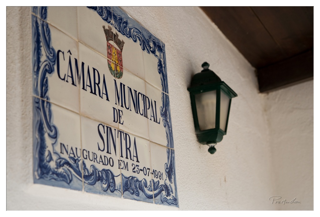
1. Overall Rating (0–10) — 7.0 This photograph captures the quiet dignity of a historic municipal sign, blending cultural identity with architectural detail. The tiled plaque, with its traditional azulejo design and formal inscription, evokes a sense of place and continuity, while the vintage lantern adds a touch of rustic charm. Though the image is strong in atmosphere and subject matter, the slightly flat lighting and narrow depth of field limit its visual dynamism, keeping it more documentary than evocative.
2. Composition (0–10) — 7.5 The diagonal arrangement of the sign and lantern creates a dynamic visual flow, drawing the eye across the frame. The placement of the sign as the primary subject, with the lantern as a complementary element, achieves a balanced and harmonious composition, though the left-heavy framing slightly disrupts symmetry.
3. Lighting (0–10) — 6.0 Soft, diffused lighting evenly illuminates the scene, preserving the detail in the tilework and text. However, the lack of strong directional light or shadow reduces depth and mood, giving the image a somewhat flat, neutral quality.
4. Color & Tone (0–10) — 7.0 The restrained palette—dominated by white, blue, and dark green—enhances the traditional aesthetic of the azulejo tile. The contrast between the deep blue and crisp white is visually pleasing, while the subtle warmth of the lantern’s green adds a grounding tone.
5. Creativity (0–10) — 7.5 The choice to focus on a municipal sign as a subject elevates the ordinary into a cultural artifact. The combination of historical elements—the crest, date, and tilework—conveys a narrative of civic pride, demonstrating thoughtful composition and thematic intent.
6. Technical Quality (0–10) — 8.0 Sharp focus on the sign ensures legibility of the text and clarity of the tile details. The depth of field is appropriately controlled, with the background softly blurred to emphasize the main subject. The image is clean, well-exposed, and free of noticeable technical flaws.
7. Emotional Impact (0–10) — 6.5 The photograph evokes a sense of quiet reverence for tradition and place. While it doesn’t elicit strong emotional reactions, it invites contemplation about heritage and local identity, resonating most with viewers familiar with Portuguese culture.
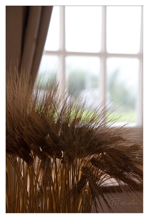
1. Overall Rating (0–10) — 7.0 This photograph captures a quiet, contemplative still life, where the golden wheat stalks stand in soft contrast to the diffused light of a sunlit window. The shallow depth of field creates a dreamy, almost painterly quality, emphasizing texture and atmosphere. While the image is visually pleasing and evocative, it feels slightly restrained—its emotional resonance lies more in its mood than in a compelling narrative or bold aesthetic.
2. Composition (0–10) — 7.5 The wheat is placed diagonally across the lower frame, leading the eye toward the bright window, which acts as a natural backdrop. The off-center framing and soft focus create a balanced, organic feel, though the heavy weight of the wheat on the left slightly unbalances the composition.
3. Lighting (0–10) — 8.0 Natural light streams through the window, creating a soft glow that backlights the wheat and highlights its fine textures. The diffused quality of the light enhances the warmth and tranquility of the scene, with subtle shadows adding depth without harshness.
4. Color & Tone (0–10) — 7.5 The palette is dominated by warm golden yellows and soft browns, harmonizing beautifully with the muted beige of the curtain. The tonal range is gentle and cohesive, with a slight coolness in the background that prevents the image from feeling flat.
5. Creativity (0–10) — 7.0 The choice of wheat as a subject against a domestic backdrop offers a subtle contrast between nature and interior space. The use of shallow focus and natural light gives the image an artistic, almost nostalgic quality, though the concept remains familiar rather than groundbreaking.
6. Technical Quality (0–10) — 8.0 The image is sharp in the foreground, with clear detail in the wheat heads, while the background remains softly blurred. The exposure is well-managed, preserving detail in both highlights and shadows, and the overall image is free of noise or distortion.
7. Emotional Impact (0–10) — 7.5 The photograph evokes a sense of calm, nostalgia, and quiet beauty, inviting the viewer to pause and reflect. The combination of natural elements and soft light creates a deeply peaceful atmosphere, making the image emotionally resonant and memorable.
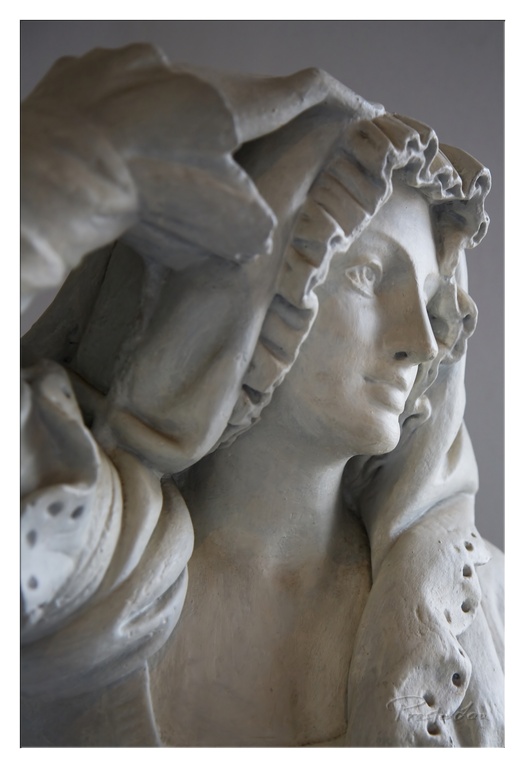
1. Overall Rating (0–10) — 7.5 This sculpture captures a moment of quiet introspection, where the soft contours of the figure’s face and the delicate drapery evoke a sense of timeless grace. The texture of the material, though modest in finish, enhances the tactile quality of the work, inviting the viewer to consider the craftsmanship behind its creation. While the composition is intimate and emotionally resonant, the lack of dramatic lighting and background depth slightly limits its visual impact.
2. Composition (0–10) — 8.0 The subject is framed in a close-up, emphasizing facial expression and fabric detail. The diagonal flow of the drapery guides the eye naturally across the face, creating a sense of movement within stillness.
3. Lighting (0–10) — 6.5 Soft, diffused light highlights the sculpture’s form and texture without creating harsh shadows. However, the flat background and even lighting reduce the sense of depth and dimensionality.
4. Color & Tone (0–10) — 7.0 The monochromatic palette of muted gray tones enhances the classical feel, with subtle tonal variations adding visual interest. The lack of vibrant color keeps the focus on form and texture.
5. Creativity (0–10) — 8.0 The artist’s choice to focus on the interplay of fabric and face conveys a quiet narrative of contemplation. The subtle asymmetry and naturalistic rendering suggest a personal, expressive interpretation rather than a strict classical ideal.
6. Technical Quality (0–10) — 8.0 The sculpture demonstrates strong craftsmanship, with fine detail in the facial features and folds of fabric. The surface texture is consistent and well-executed, though minor imperfections in the material are visible upon close inspection.
7. Emotional Impact (0–10) — 7.5 The serene expression and delicate handling of the subject evoke a sense of calm introspection, allowing the viewer to connect with the quiet dignity of the figure.
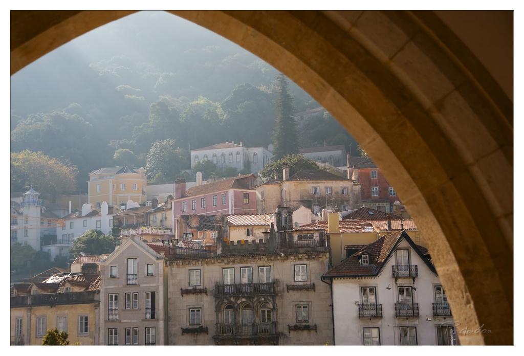
1. Overall Rating (0–10) — 8.0 This photograph captures a serene, sun-drenched view of a historic hillside town, framed by a warm, weathered stone arch that lends a sense of timelessness and discovery. The interplay of light and shadow enhances the depth of the scene, while the vibrant yet harmonious colors of the buildings evoke a quiet Mediterranean charm. The composition is strong, but the slightly soft focus and subtle haze reduce its overall visual punch, keeping it from reaching full artistic mastery.
2. Composition (0–10) — 8.5 The arch acts as a natural frame, drawing the eye into the layered scene with excellent balance and depth. The buildings cascade down the hill in a pleasing diagonal, creating a dynamic yet cohesive arrangement.
3. Lighting (0–10) — 8.0 Golden morning light filters through the trees, creating soft beams that illuminate the hillside and add a dreamy, atmospheric quality. The light enhances texture and form without creating harsh shadows.
4. Color & Tone (0–10) — 7.5 The palette is warm and inviting, with earthy tones of ochre, terracotta, and muted pastels complementing the golden sunlight. The slight haze softens the contrast, giving the image a painterly quality.
5. Creativity (0–10) — 8.0 The use of the arch as a framing device is both traditional and effective, offering a unique vantage point that transforms a simple cityscape into a story of place and memory.
6. Technical Quality (0–10) — 7.5 The image is sharp in the mid-ground, with good detail in the architecture and foliage. However, the overall softness suggests a slight loss in resolution or focus, possibly due to atmospheric conditions or lens choice.
7. Emotional Impact (0–10) — 8.0 The photograph evokes a deep sense of calm and nostalgia, inviting the viewer to pause and reflect on the beauty of quiet, sunlit places steeped in history and daily life.
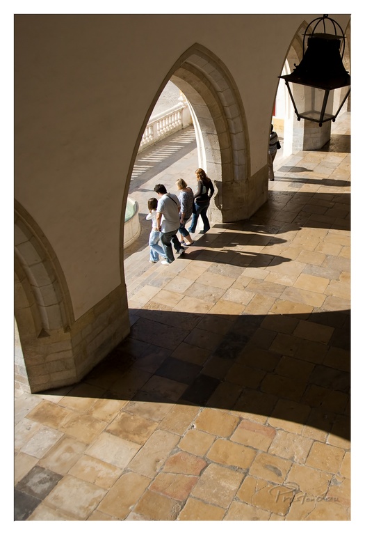
1. Overall Rating (0–10) — 7.5 This photograph captures a moment of quiet movement within a historic cloister, where light and shadow sculpt the space into a rhythmic, almost meditative composition. The interplay of warm sunlight and deep architectural shadows gives the image a timeless quality, while the figures walking through the arches add a subtle narrative of passage and continuity. The image is strong in mood and composition, though the slightly low contrast and muted tones prevent it from achieving greater visual depth.
2. Composition (0–10) — 8.0 The strong diagonal lines of the arches and shadows guide the eye through the frame, creating a dynamic sense of movement. The placement of the figures within the central arch draws focus while maintaining balance with the surrounding architectural elements.
3. Lighting (0–10) — 8.5 The high-contrast sunlight enhances the texture of the stone and casts long, dramatic shadows that define the space. The warm, directional light adds depth and a sense of time, emphasizing the interplay between architecture and natural elements.
4. Color & Tone (0–10) — 6.5 The palette is warm and earthy, dominated by golden yellows and soft browns, which harmonize well with the historic setting. However, the tones lack richness and vibrancy, giving the image a slightly flat appearance despite the strong contrast.
5. Creativity (0–10) — 7.0 The image leverages architecture and light as expressive tools, transforming a simple walk through a courtyard into a visually compelling narrative. The use of symmetry and leading lines demonstrates thoughtful composition, though the concept remains rooted in classic architectural photography.
6. Technical Quality (0–10) — 7.5 The focus is sharp on the central arch and the figures, with good detail in the stonework and floor tiles. The exposure is well-handled, preserving detail in both highlights and shadows, though the slight underexposure in the darkest areas reduces depth.
7. Emotional Impact (0–10) — 7.0 The photograph evokes a sense of peace and timelessness, inviting contemplation of movement through space and history. The quiet presence of the people enhances the feeling of continuity, making the viewer feel like a silent observer in a moment suspended between past and present.
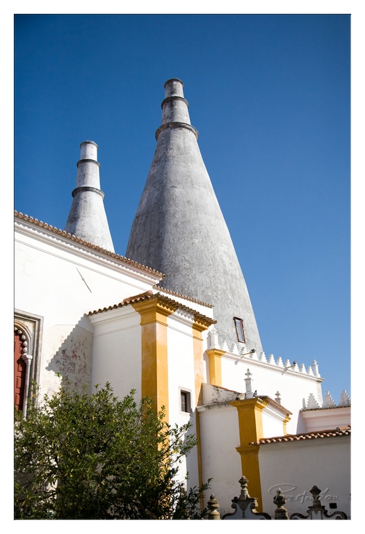
1. Overall Rating (0–10) — 7.5 This photograph captures the striking silhouette of traditional Portuguese chimneys against a deep blue sky, evoking a sense of timelessness and cultural heritage. The bold contrast between the white and ochre architecture and the clear sky creates a visually compelling scene, though the slightly cluttered foreground and low-angle perspective risk distracting from the main subject. The image succeeds in highlighting a distinctive architectural feature with clarity and dignity.
2. Composition (0–10) — 7.0 The low-angle perspective emphasizes the height and grandeur of the chimneys, while the diagonal lines of the building guide the eye upward. However, the overgrown foliage in the lower left slightly disrupts the balance and draws attention away from the central structure.
3. Lighting (0–10) — 8.5 The bright, direct sunlight enhances the crispness of the white walls and the texture of the chimneys, casting sharp shadows that add depth. The clear blue sky provides a clean, dramatic backdrop that accentuates the subject.
4. Color & Tone (0–10) — 8.0 The contrast between the deep blue sky, the warm ochre accents, and the clean white stonework creates a rich, harmonious palette. The tones are vibrant yet natural, reinforcing the Mediterranean atmosphere.
5. Creativity (0–10) — 7.5 The choice to focus on the iconic chimneys with a strong architectural angle demonstrates a clear artistic intent. While the subject is recognizable, the framing and lighting elevate it beyond a simple snapshot into a stylized celebration of regional identity.
6. Technical Quality (0–10) — 8.0 The image is sharp and well-exposed, with precise focus on the chimneys and architectural details. The dynamic range captures both the bright sky and the shadowed areas of the building effectively.
7. Emotional Impact (0–10) — 7.0 The photograph evokes a sense of awe and cultural pride, inviting the viewer to appreciate the unique beauty of traditional Portuguese design. While emotionally resonant, it remains more visually than deeply affecting, relying on the power of the image’s form and context.
Royal Retreats and Moorish Tiles: Sintra National Palace
From the dramatic coast, our path led us inland to the enchanting town of Sintra and its spectacular National Palace. Rising distinctly above the town, its two colossal, conical chimneys are instantly recognizable and have become the enduring symbol of Sintra itself. This palace is not just a building; it's one of the most important examples of Portuguese royal architecture, having served Portuguese kings and their courts as a favoured summer residence and a hunting lodge for over 600 years. Walking through its halls feels like tracing the footsteps of royalty. The palace is particularly renowned for housing the greatest collection of Mudéjar tiles in Portugal – intricate, colourful geometric patterns reflecting Moorish influence that are simply stunning to behold. Declared a National Monument in 1910, the palace underwent significant restoration in the 1940s under architect Raul Lino. He meticulously worked to restore its former splendour, bringing in period furniture from other palaces and painstakingly restoring the exquisite tile panels. It has deservedly remained an important and fascinating historical tourist attraction ever since, offering a unique glimpse into centuries of royal life and artistic fusion.
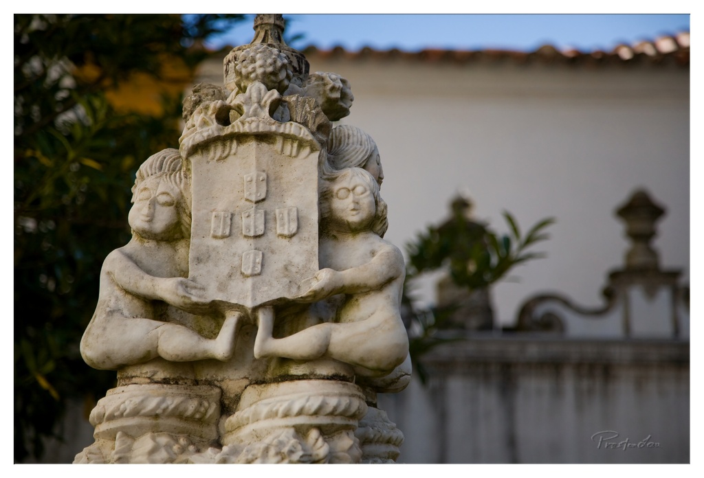
1. Overall Rating (0–10) — 7.5 This photograph captures the quiet dignity of a weathered stone sculpture, its intricate carvings and symbolic elements evoking a sense of historical reverence. The shallow depth of field draws attention to the central figures and coat of arms, while the soft golden light of late afternoon enhances the texture and age of the stone. While the image is rich in detail and atmosphere, the composition’s slight asymmetry and muted tonal range prevent it from achieving full visual harmony.
2. Composition (0–10) — 7.0 The statue is framed slightly off-center, creating a dynamic balance between the sculptural subject and the soft, out-of-focus background. The use of negative space and depth of field effectively isolates the subject, though the inclusion of the faint railing on the right slightly disrupts the visual flow.
3. Lighting (0–10) — 8.0 The warm, directional light of the golden hour enhances the texture and three-dimensionality of the stone, casting subtle shadows that emphasize the sculpture’s intricate details. The soft glow adds a contemplative mood, highlighting the craftsmanship and time-worn character of the piece.
4. Color & Tone (0–10) — 7.0 The palette is dominated by earthy whites and warm golds, with a soft blue in the sky providing gentle contrast. The tonal range is well-balanced, though the overall color temperature, while appropriate, lacks a strong vibrancy that could elevate the image’s emotional resonance.
5. Creativity (0–10) — 7.5 The photographer’s choice to focus on the symbolic and narrative elements of the sculpture—two cherubic figures supporting a coat of arms—adds a layer of storytelling. The selective focus and thoughtful lighting elevate a potentially mundane subject into a contemplative visual meditation on heritage and artistry.
6. Technical Quality (0–10) — 8.0 The image is sharp where it matters—on the central figures and shield—while the background remains softly blurred, demonstrating excellent control of depth of field. The exposure is balanced, with no blown highlights or crushed shadows, and the fine detail in the stone’s surface is clearly rendered.
7. Emotional Impact (0–10) — 7.5 There is a quiet solemnity in the image, evoking a sense of respect for tradition and the passage of time. The viewer is invited to reflect on the story behind the sculpture, making the photograph not just a record, but a moment of visual reverence.
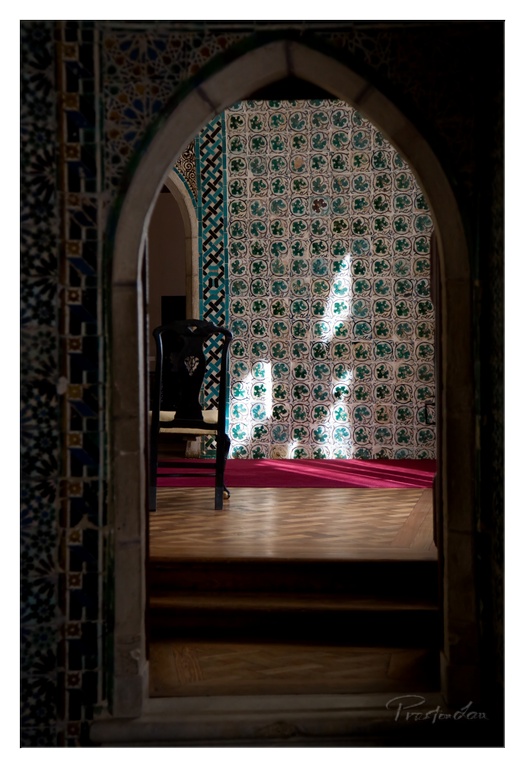
1. Overall Rating (0–10) — 8.0 This photograph masterfully captures the quiet grandeur of an ornate interior, where light and shadow play through an arched threshold like a silent invitation. The composition draws the eye through layers of pattern and depth, evoking a sense of mystery and reverence. While the scene is rich in detail and atmosphere, the slightly dark foreground edges risk obscuring the full narrative of the space.
2. Composition (0–10) — 8.5 The arched frame creates a natural vignette, guiding the viewer’s gaze toward the central chair and patterned wall. The symmetry of the composition is balanced by the diagonal play of light, while the placement of the chair anchors the scene and adds a human scale.
3. Lighting (0–10) — 9.0 Soft, directional light filters through an unseen window, creating a dramatic interplay of light and shadow that enhances the texture of the tiles and wood. The use of chiaroscuro adds depth and mood, emphasizing the sacred or ceremonial quality of the space.
4. Color & Tone (0–10) — 8.0 The rich teal and white tilework contrasts beautifully with the deep shadows and the warm wooden floor. The bold red rug adds a striking accent, grounding the composition with warmth and visual energy. The tonal range is well-balanced, allowing the colors to feel both vibrant and harmonious.
5. Creativity (0–10) — 8.5 The image transcends mere documentation by framing a moment of stillness within a space of deep cultural and architectural significance. The interplay of geometry, light, and pattern suggests a narrative of contemplation, elevating the photograph into a poetic reflection on space and silence.
6. Technical Quality (0–10) — 8.0 Sharp focus and clean detail capture the intricate tile patterns and wood grain, while the depth of field effectively isolates the subject. The exposure is well-handled, preserving detail in both highlights and shadows.
7. Emotional Impact (0–10) — 8.5 There is a profound sense of peace and introspection in the image, evoking the stillness of a sacred or private chamber. The viewer is drawn into a moment suspended in time, feeling both awe and quiet intimacy with the space.
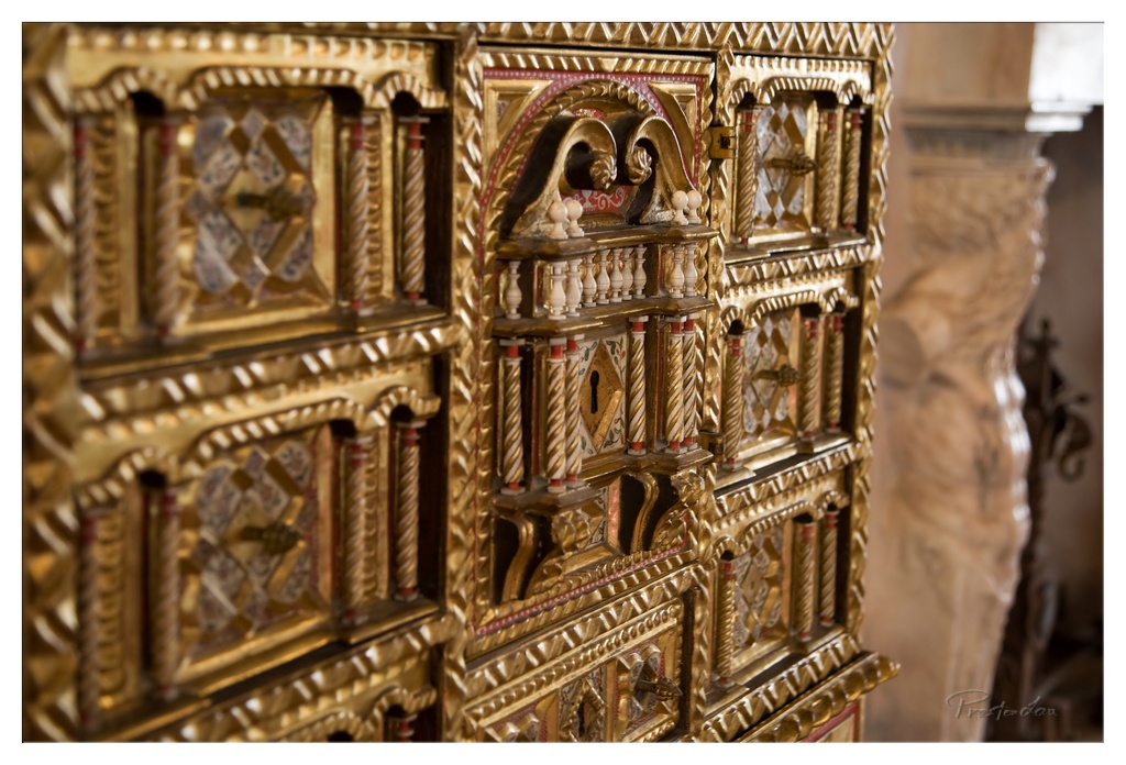
1. Overall Rating (0–10) — 7.5 This photograph captures the opulent intricacy of a gilded cabinet, where every carved detail and inlaid pattern speaks to a legacy of craftsmanship. The warm golden tones and rich textures create a sense of historical grandeur, though the depth of field slightly softens the focus on the most elaborate elements. While the image excels in conveying luxury and artistry, a more deliberate framing could further emphasize the cabinet’s architectural symmetry and narrative depth.
2. Composition (0–10) — 7.0 The diagonal alignment of the cabinet draws the eye through the frame, with the ornate central section serving as a focal point. The blurred column on the right adds depth but slightly disrupts the balance, suggesting a tighter crop might enhance cohesion.
3. Lighting (0–10) — 8.0 Soft, directional light enhances the metallic sheen of the gold and highlights the three-dimensional texture of the carvings. The subtle shadows add dimension without obscuring details, creating a luminous, almost reverent mood.
4. Color & Tone (0–10) — 8.5 The dominant gold palette is rich and harmonious, with accents of red and cream providing visual contrast. The warm tone reinforces the sense of antiquity and elegance, while the tonal range is well-balanced and inviting.
5. Creativity (0–10) — 8.0 The choice to focus on the cabinet’s intricate details transforms a static object into a story of artistry and history. The shallow depth of field adds a painterly quality, inviting contemplation of the craftsmanship rather than mere documentation.
6. Technical Quality (0–10) — 8.0 Sharp focus on the central carvings contrasts effectively with the soft background, demonstrating strong control over depth of field. The image is clear and well-exposed, with minimal noise despite the low-light setting.
7. Emotional Impact (0–10) — 7.5 The photograph evokes a sense of awe and reverence, drawing the viewer into a quiet appreciation of cultural heritage. There is a meditative stillness in the frame, suggesting a moment of pause before a forgotten treasure.
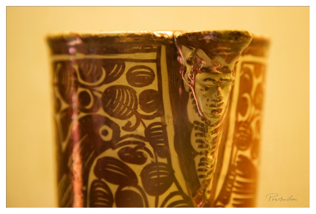
1. Overall Rating (0–10) — 7.0 This photograph captures the intricate craftsmanship of a ceramic vessel, where pattern and form converge in a moment of quiet elegance. The warm, golden lighting enhances the glaze’s texture and the depth of the design, creating a sense of timelessness and reverence. While the image is visually rich and evocative, the shallow depth of field and tight framing slightly limit the viewer’s ability to fully appreciate the object’s context and scale.
2. Composition (0–10) — 6.5 The subject is centered with a strong focus on the vessel’s handle and pattern, but the tight crop creates a slightly cramped feel. The diagonal line of the handle draws the eye effectively, though the composition feels more like a detail shot than a full portrait of the object.
3. Lighting (0–10) — 8.0 Warm, directional lighting enhances the glossy surface and highlights the texture of the glaze, creating a soft glow that complements the earthy tones. The light source appears carefully chosen, adding depth and a sense of intimacy to the scene.
4. Color & Tone (0–10) — 7.5 The warm, monochromatic palette of amber and brown tones is cohesive and enhances the antique quality of the piece. The contrast between the dark patterns and the lighter background adds visual interest without overwhelming the composition.
5. Creativity (0–10) — 7.0 The photographer emphasizes texture and pattern over literal documentation, creating a more artistic interpretation of the object. The focus on the handle and the play of light on the glaze show thoughtful intent, though the approach remains within the realm of traditional still-life photography.
6. Technical Quality (0–10) — 8.0 The image is sharp in the focal plane, with excellent detail in the glaze and painted patterns. The shallow depth of field is controlled, and the background is smoothly blurred, indicating a deliberate and technically sound approach.
7. Emotional Impact (0–10) — 6.5 The photograph evokes a sense of reverence and quiet contemplation, inviting the viewer to appreciate the craftsmanship and history behind the object. The warmth of the light and the focus on detail create a meditative mood, though the lack of human presence keeps the emotional connection subtle.
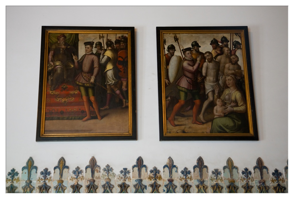
1. Overall Rating (0–10) — 7.0 This photograph presents a quiet, contemplative view of two historical paintings mounted on a plain wall, framed by an elegant row of decorative tiles. The composition balances the weight of the artworks with the subtle rhythm of the tile pattern below, creating a sense of cultural continuity. While the image captures the visual richness of the paintings and their surroundings, the lighting feels somewhat flat, limiting the depth and emotional resonance of the scene.
2. Composition (0–10) — 7.0 The two paintings are symmetrically placed, creating a balanced and harmonious arrangement. The tiled border at the bottom adds visual rhythm and anchors the image, while the white wall provides neutral space that emphasizes the artwork. A slightly tighter crop could enhance focus on the paintings themselves.
3. Lighting (0–10) — 5.5 The lighting is even and functional, illuminating the paintings clearly but without dramatic direction. It feels more like ambient indoor light than intentional illumination, which softens the textures and depth of the paintings and reduces the overall mood.
4. Color & Tone (0–10) — 6.5 The palette is restrained, dominated by the earthy tones of the paintings and the muted blues and greens of the tiles. While the colors are authentic and historically grounded, they lack vibrancy, resulting in a somewhat subdued and muted tonal range.
5. Creativity (0–10) — 6.0 The image is more documentary than expressive, capturing the scene as it exists rather than interpreting it through a unique visual lens. The choice to include the tiled border adds a decorative element, but the overall approach remains conventional.
6. Technical Quality (0–10) — 8.0 The image is sharp and clear, with good detail visible in both the paintings and the tiles. The focus is consistent across the frame, and there are no apparent technical flaws in exposure or noise.
7. Emotional Impact (0–10) — 6.5 The photograph evokes a sense of reverence and timelessness, inviting reflection on the historical and cultural significance of the artworks. While the emotional pull is subtle, the quiet dignity of the scene lingers, especially for viewers familiar with the context.
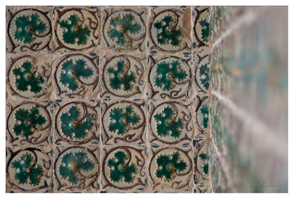
1. Overall Rating (0–10) — 7.5 This photograph captures the intricate beauty of traditional ceramic tiles with a quiet reverence for craftsmanship. The repeating pattern of green leaf motifs creates a rhythmic, almost musical quality, while the subtle wear on the tiles suggests a history of time and touch. The shallow depth of field adds a dreamlike softness to the right edge, gently guiding the eye into the texture without disrupting the composition’s balance. While the image is visually rich, it could benefit from a more dynamic interplay between light and shadow to elevate its emotional resonance.
2. Composition (0–10) — 7.0 The grid-like arrangement of tiles provides strong visual order, with the diagonal shift toward the right edge introducing subtle asymmetry. The placement of the tiles in the lower-left quadrant creates a sense of grounded stability, while the blurred corner adds a soft, contemplative frame. The composition is harmonious but slightly predictable, relying on repetition rather than dramatic contrast.
3. Lighting (0–10) — 6.5 The lighting is soft and diffused, evenly illuminating the tiles and preserving their delicate textures. The gentle highlights on the glazed surfaces enhance the three-dimensional quality of the tiles, but the lack of directional light limits the depth and drama. A more directional source could have accentuated the relief of the leaf patterns and created richer tonal contrast.
4. Color & Tone (0–10) — 7.5 The palette is rich and harmonious, with deep emerald greens set against warm cream and earthy brown tones. The color temperature feels natural and slightly warm, enhancing the vintage quality of the tiles. The contrast between the glossy glaze and the matte grout adds visual interest, though the overall tone remains somewhat restrained.
5. Creativity (0–10) — 7.0 The photographer has chosen a subject that celebrates cultural and artistic heritage, capturing the beauty of everyday craftsmanship. The use of shallow depth of field to blur the edge of the wall adds a layer of abstraction, transforming a simple architectural detail into a meditative image. While the concept is familiar, the execution feels thoughtful and intentional.
6. Technical Quality (0–10) — 8.0 The image is sharp in the focused area, with excellent detail in the tile textures and glaze. The focus is precisely placed, allowing the viewer to appreciate the fine craftsmanship. The exposure is well-balanced, and the digital clarity supports the intricate design without noise or distortion.
7. Emotional Impact (0–10) — 7.0 The photograph evokes a sense of quiet contemplation and appreciation for tradition. The tactile quality of the tiles and the soft focus on the edge create a meditative mood, inviting the viewer to pause and reflect. While it doesn’t deliver a powerful emotional punch, it lingers with a subtle warmth and nostalgia.
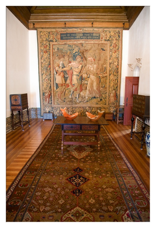
1. Overall Rating (0–10) — 7.5 This photograph captures the quiet dignity of a historic interior, where centuries-old craftsmanship unfolds in rich textures and layered details. The tapestry commands attention as the centerpiece, its intricate narrative and warm tones anchoring the composition, while the surrounding furniture and rug lend a sense of lived-in elegance. The image balances documentation and artistry, though slight overexposure in the upper corners and a slightly flat color cast temper its visual richness.
2. Composition (0–10) — 8.0 The symmetrical framing draws the eye toward the tapestry, using the long rug and table as leading lines. The placement of objects creates a balanced, harmonious depth, with the central table and orange accents providing visual anchors.
3. Lighting (0–10) — 6.5 Soft, ambient light enhances the textures of the tapestry and wood, but the upper corners are slightly overexposed, washing out subtle details. The light feels natural and evenly diffused, contributing to the room’s quiet atmosphere.
4. Color & Tone (0–10) — 7.0 The warm earth tones—browns, ochres, and deep reds—create a cohesive palette that complements the historical setting. The orange bowls add a subtle pop of color, while the overall tone remains slightly muted, enhancing the vintage feel.
5. Creativity (0–10) — 7.5 The image successfully captures the narrative potential of a space steeped in history, transforming a simple interior into a story of culture and time. The thoughtful arrangement of objects and emphasis on detail convey a strong artistic intent.
6. Technical Quality (0–10) — 7.5 Sharp focus on the tapestry and foreground elements is well-executed, with good clarity throughout. The image is clean and free of major technical flaws, though the exposure control could be more refined.
7. Emotional Impact (0–10) — 8.0 There’s a palpable sense of reverence and stillness, inviting the viewer to imagine the lives that passed through this room. The combination of artistry and history evokes a contemplative, almost nostalgic response.
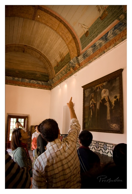
1. Overall Rating (0–10) — 7.0 This photograph captures a moment of quiet discovery within a historic gallery, where visitors engage with art and architecture in a space rich with cultural resonance. The upward gaze of the figures and the ornate ceiling fresco create a sense of reverence and narrative depth, while the warm, ambient lighting enhances the room’s aged grandeur. Though the composition is slightly cluttered, the image succeeds in conveying the atmosphere of a living museum—where history is both observed and experienced.
2. Composition (0–10) — 6.5 The framing includes a mix of foreground and midground activity, with the raised hand drawing attention upward. While the composition is dynamic, the overlapping figures and off-center subject create a slight imbalance, distracting from the ceiling’s visual dominance.
3. Lighting (0–10) — 7.0 Soft, directional lighting from wall-mounted fixtures highlights the painting and ceiling fresco, casting subtle shadows that enhance depth. The warm tone of the light complements the historic character of the space, though some areas remain underexposed.
4. Color & Tone (0–10) — 7.0 The palette is subdued and earthy, with warm browns, soft whites, and muted blues in the fresco and painting. The tonal contrast is gentle but effective, allowing the artwork and architectural details to stand out without overpowering the scene.
5. Creativity (0–10) — 7.5 The photographer captures a candid, narrative moment—blending human interaction with historical context. The upward gesture and focused attention of the visitors add a layer of storytelling, transforming a simple gallery scene into a moment of shared wonder.
6. Technical Quality (0–10) — 7.5 The image is sharp and well-focused, with clear detail in the painting and ceiling. The slight digital noise in the shadows suggests a high ISO setting, but overall image clarity is strong.
7. Emotional Impact (0–10) — 7.0 The photograph evokes a sense of curiosity and reverence, inviting the viewer to look up and imagine the stories behind the art and architecture. The human element adds warmth and relatability, making the scene feel both intimate and grand.
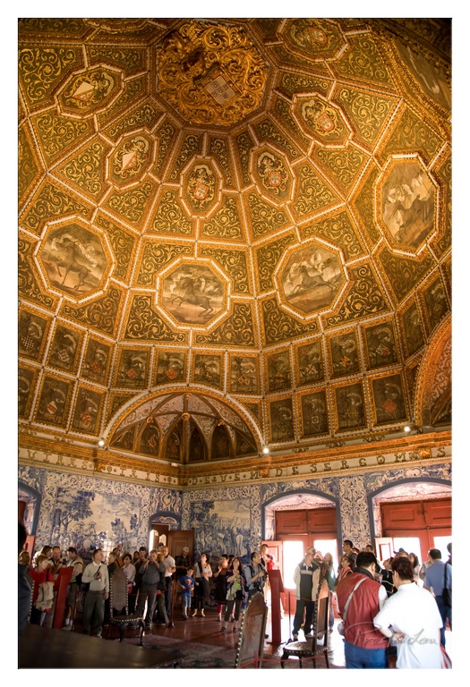
1. Overall Rating (0–10) — 7.0 This photograph captures the opulent grandeur of a historic hall, where intricate ceiling frescoes and blue-and-white azulejo tiles convey centuries of cultural richness. The composition draws the eye upward, emphasizing the architectural majesty, while the presence of visitors grounds the scene in lived experience. Though the image is visually rich, a slightly warmer tone and tighter framing could enhance its artistic resonance.
2. Composition (0–10) — 6.5 The low-angle perspective effectively emphasizes the vaulted ceiling, but the inclusion of too much foreground crowd and architectural detail creates visual clutter. A more focused composition would better highlight the ornate ceiling as the primary subject.
3. Lighting (0–10) — 6.0 The lighting is functional but uneven, with harsh overhead spots creating glare on the ceiling and casting deep shadows in the corners. The natural light from the doors helps balance the scene, but the overall illumination lacks subtlety.
4. Color & Tone (0–10) — 7.0 The warm golden tones of the ceiling contrast beautifully with the cool blue and white of the tiles, creating a balanced and historically evocative palette. However, the color temperature could be slightly warmed to enhance the sense of antiquity and richness.
5. Creativity (0–10) — 7.0 The photograph successfully captures both the architectural splendor and the human presence within the space, offering a narrative of heritage and tourism. The upward gaze and layered composition suggest a story of time and place, though the execution leans more toward documentation than artistic interpretation.
6. Technical Quality (0–10) — 7.5 The image is sharp and detailed, particularly in the ceiling’s intricate patterns and the tiles’ fine lines. Focus is consistent, and the exposure is generally well-managed despite the challenging lighting conditions.
7. Emotional Impact (0–10) — 6.5 The viewer is invited to feel a sense of awe and reverence, but the crowded foreground and slightly flat lighting temper the emotional depth. The image evokes curiosity about the history behind the space, but it stops short of a truly immersive emotional connection.
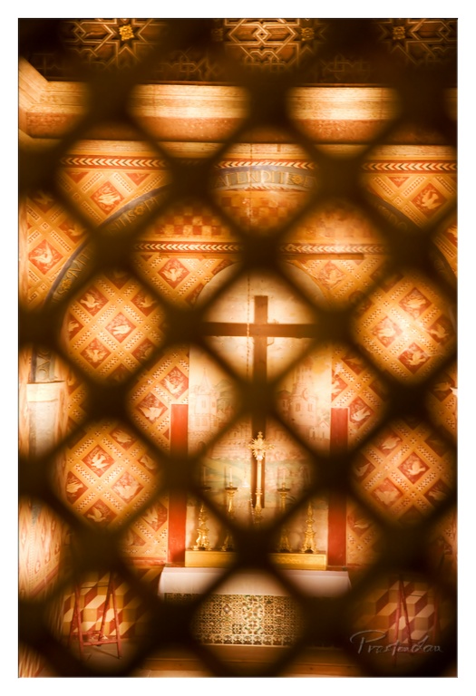
1. Overall Rating (0–10) — 7.5 This photograph captures a moment of sacred stillness, where the interplay of light and geometry evokes a sense of reverence and mystery. The diamond-patterned screen in the foreground frames the altar with a meditative rhythm, transforming a simple view into a layered narrative. While the warm glow and rich textures are compelling, the image's emotional depth is slightly restrained by the lack of sharp contrast and the overexposed highlights that soften the scene’s edge.
2. Composition (0–10) — 8.0 The lattice screen creates a strong geometric frame, drawing the eye through the pattern to the central cross and altar. The symmetry of the composition enhances the spiritual balance, though the slight asymmetry of the foreground elements adds subtle tension.
3. Lighting (0–10) — 7.0 The warm, directional light filters through the screen, casting soft shadows and enhancing the texture of the walls. While the glow adds a sense of reverence, some highlights are overexposed, slightly diminishing the richness of detail.
4. Color & Tone (0–10) — 8.0 The golden and amber tones dominate the palette, creating a harmonious and spiritually resonant atmosphere. The rich reds and golds of the mosaic walls contrast beautifully with the dark silhouette of the screen, enhancing the image’s depth and mood.
5. Creativity (0–10) — 8.0 The use of the lattice as a framing device is both inventive and symbolic, transforming the act of viewing into a spiritual experience. The layered perspective invites contemplation and elevates the image beyond mere documentation.
6. Technical Quality (0–10) — 7.5 The image is sharp and well-focused, particularly on the altar and cross. The depth of field is well-managed, with the foreground slightly softened to emphasize the subject. The slight overexposure in the highlights is the main technical limitation.
7. Emotional Impact (0–10) — 8.0 The photograph evokes a quiet, meditative reverence, drawing the viewer into a space of contemplation. The combination of light, pattern, and sacred imagery creates a powerful emotional resonance, suggesting a moment of quiet devotion.
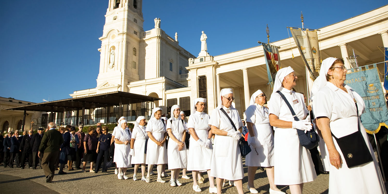
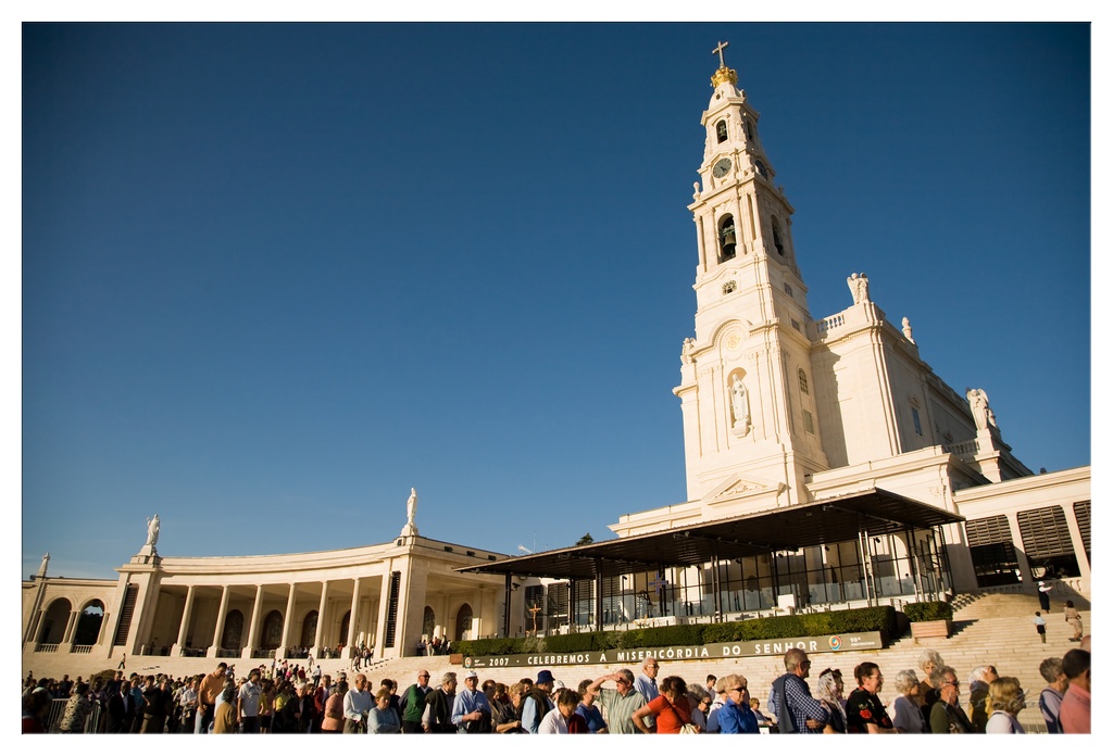
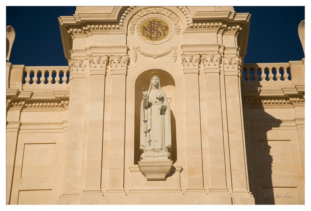
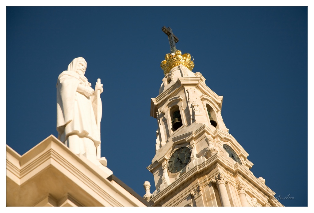
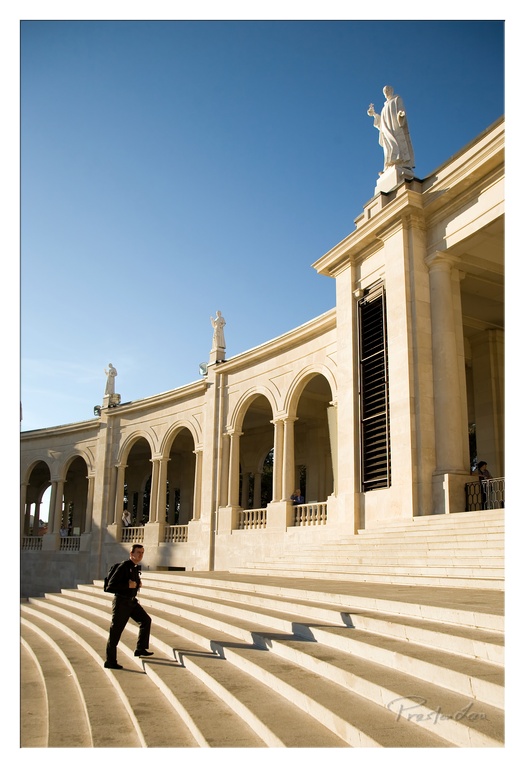
A Place of Faith and Pilgrimage: Fátima
The following day brought a change of pace and a journey of spiritual significance as we made our way to Fátima. The air here feels different, imbued with a sense of reverence and devotion. We visited the Sanctuary Basilica, a grand edifice where the tombstones of Blessed Jacinta and Francisco Marto, two of the children who witnessed the apparitions, are located. The true heart of the shrine, however, is the humble Chapel of Apparitions, built on the very spot where the Virgin Mary is said to have appeared to the three shepherd children. We were fortunate enough to be there during a mass, experiencing the powerful communal faith of the pilgrims gathered from around the world. Just a short distance away in Valinhos is another poignant site, marking the place where the Lady of Fátima appeared for the fourth time on August 19, 1917. Visiting these sites offers a profound insight into the history and deep religious significance of Fátima for millions.
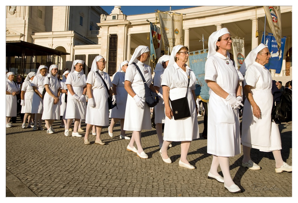
1. Overall Rating (0–10) — 7.5 This photograph captures a solemn procession of nuns in white habits, moving with quiet dignity through a sunlit urban space. The warm golden light and the sense of movement lend the scene a ceremonial grace, while the uniformity of the figures creates a powerful visual rhythm. Though the image is rich in atmosphere, the lack of a strong focal point slightly diminishes its emotional punch.
2. Composition (0–10) — 7.0 The diagonal line of nuns leads the eye through the frame, creating a sense of motion and continuity. The slight asymmetry adds dynamism, though the crowded foreground and background elements distract from the central subject.
3. Lighting (0–10) — 8.0 Warm, golden sunlight bathes the scene, casting long shadows and enhancing the texture of the cobblestones and fabric. The directional light adds depth and a sense of time, emphasizing the solemnity of the occasion.
4. Color & Tone (0–10) — 7.5 The dominant white of the habits contrasts with the warm tones of the stone and the blue banners, creating a balanced and harmonious palette. The overall tone is soft and natural, with a subtle richness that enhances the ceremonial mood.
5. Creativity (0–10) — 7.0 The image captures a moment of collective ritual with a strong sense of narrative. While the subject is conventional, the photographer’s use of light and composition elevates it beyond a simple documentation into something more evocative.
6. Technical Quality (0–10) — 8.0 The image is sharp and well-exposed, with clean detail in both the foreground and background. The focus is consistent, and the depth of field is appropriate for capturing the procession in its entirety.
7. Emotional Impact (0–10) — 7.5 The quiet determination of the nuns and the reverent atmosphere of the procession evoke a sense of peace and devotion. The viewer is drawn into the moment, feeling the weight of tradition and shared purpose.
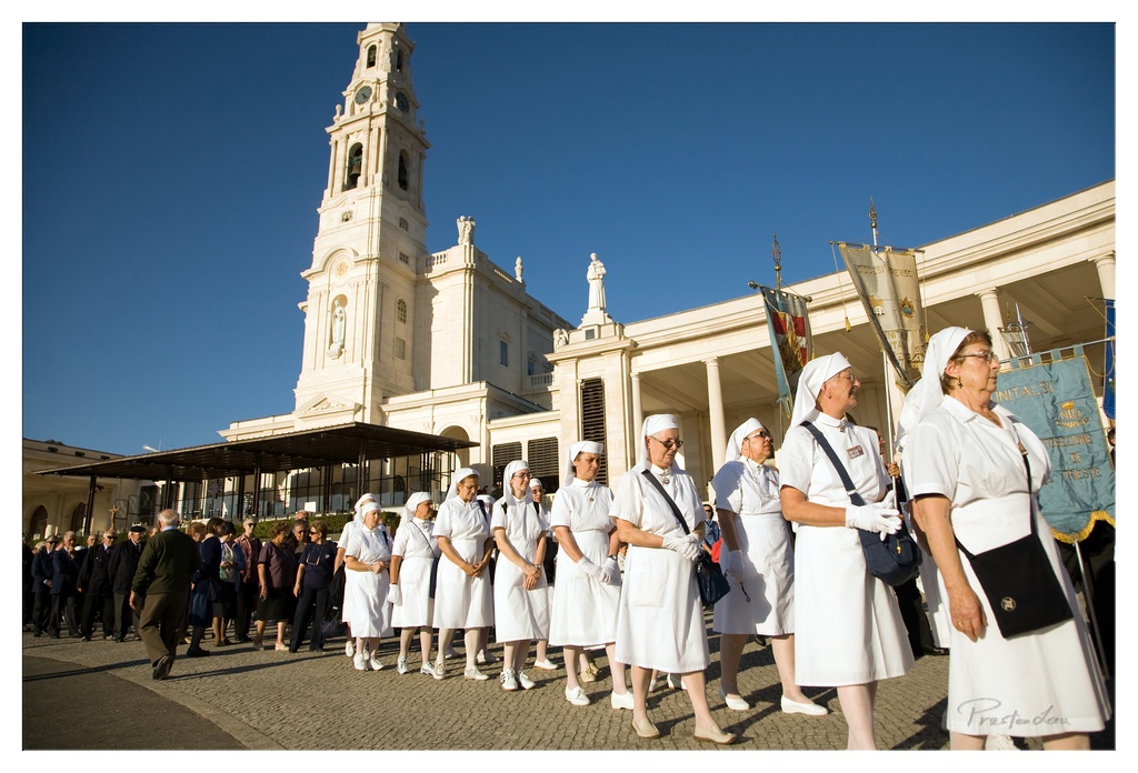
1. Overall Rating (0–10) — 7.5 This photograph captures a solemn religious procession with a powerful sense of unity and devotion, set against the iconic backdrop of the Fatima sanctuary. The bright sunlight and deep blue sky create a striking contrast with the white habits of the sisters, enhancing the visual clarity and spiritual atmosphere. While the image is compelling in its documentation of faith in action, the slightly cluttered foreground and lack of dynamic movement prevent it from achieving a more transcendent emotional resonance.
2. Composition (0–10) — 7.0 The diagonal line of the procession leads the eye naturally toward the towering bell tower, creating a sense of depth and direction. The framing effectively balances the architectural grandeur with the human element, though the inclusion of the man in dark clothing on the left slightly disrupts the visual harmony.
3. Lighting (0–10) — 8.0 The strong, directional sunlight from the side casts clean, defined shadows and highlights the texture of the white garments and stone architecture. The clear blue sky provides a vivid backdrop, emphasizing the brightness and openness of the moment.
4. Color & Tone (0–10) — 7.5 The dominant palette of white and blue evokes purity and serenity, while the warm sunlight adds a golden glow to the scene. The contrast between the bright clothing and the deep blue sky enhances the image’s visual impact, though the tonal range could be slightly more nuanced.
5. Creativity (0–10) — 7.0 The image is a strong example of documentary photography, capturing a culturally significant event with respect and clarity. The choice of angle and timing allows for a narrative feel, but the composition remains largely conventional, with little experimental or interpretive flair.
6. Technical Quality (0–10) — 8.5 The image is sharp, well-focused, and free of technical flaws. The exposure is balanced, capturing detail in both the highlights and shadows, and the resolution is high, allowing for a clear view of the textures and expressions.
7. Emotional Impact (0–10) — 7.0 The photograph conveys a deep sense of reverence and collective purpose, particularly through the disciplined formation and solemn expressions of the sisters. While the emotion is palpable, the viewer is positioned as an observer rather than an active participant, limiting the intensity of the emotional connection.
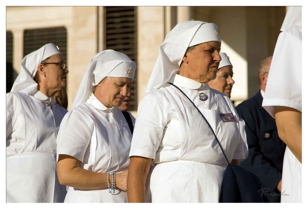
1. Overall Rating (0–10) — 7.0 This photograph captures a moment of solemnity and devotion among a group of nurses in white uniforms, their expressions reflecting quiet reverence. The warm, golden light enhances the dignity of the scene, while the subtle depth of field draws attention to the central figure, creating a sense of narrative and shared purpose. While the composition is strong, the slightly busy background and soft focus on some subjects prevent it from achieving greater visual cohesion.
2. Composition (0–10) — 6.5 The central figure is well-placed, creating a natural focal point, though the overlapping figures and partial framing of others introduce visual clutter. A tighter crop would improve balance and clarity.
3. Lighting (0–10) — 8.0 Golden-hour sunlight bathes the scene in warm, directional light, accentuating texture and form while casting soft shadows that add depth and dimension.
4. Color & Tone (0–10) — 7.0 The dominant white of the uniforms contrasts beautifully with the warm beige tones of the background and the deep navy of the bag, creating a harmonious and restrained palette that enhances the solemn mood.
5. Creativity (0–10) — 7.5 The image captures a rare blend of spiritual and professional devotion, offering a narrative glimpse into a ceremonial moment. The use of natural light and candid expressions lends authenticity and emotional weight.
6. Technical Quality (0–10) — 8.0 Sharp focus on the central figure, clean detail in the fabric and facial features, and good exposure control demonstrate strong technical execution.
7. Emotional Impact (0–10) — 8.0 The quiet dignity and introspective expressions evoke a sense of respect and reverence, inviting the viewer to reflect on the dedication and faith embodied in the scene.
1. Overall Rating (0–10) — 7.5 This photograph captures the grandeur of the Fatima Sanctuary under a vast, cloudless sky, conveying a sense of reverence and collective pilgrimage. The composition effectively balances the monumental architecture with the human presence below, grounding the spiritual scale in tangible reality. While the image’s clarity and scale are impressive, the slightly tilted horizon and dense crowd slightly detract from its visual harmony.
2. Composition (0–10) — 7.0 The low-angle perspective emphasizes the towering bell tower, creating a strong sense of verticality. The crowd occupies the lower third, providing scale and grounding, though the slight tilt and uneven crowd distribution create a subtle imbalance.
3. Lighting (0–10) — 8.0 Warm, golden-hour light bathes the white façade, enhancing texture and depth while casting soft shadows that define the building’s architectural details. The clear blue sky provides strong contrast, emphasizing the structure’s purity and elevation.
4. Color & Tone (0–10) — 7.5 The rich, saturated blue of the sky creates a striking contrast with the pale stone of the sanctuary, while the warm sunlight imparts a golden glow to the scene. The palette feels balanced and evocative, enhancing the spiritual atmosphere.
5. Creativity (0–10) — 7.0 The image successfully captures a moment of communal faith, blending architectural grandeur with human presence. The choice of time of day and angle gives it a cinematic quality, though the subject matter is familiar in religious photography.
6. Technical Quality (0–10) — 8.0 Sharp focus across the frame, clean exposure, and minimal noise contribute to a technically strong image. The wide-angle lens captures the full scope without significant distortion.
7. Emotional Impact (0–10) — 8.0 The photograph evokes a powerful sense of awe and spiritual gathering, with the crowd’s quiet reverence enhancing the emotional weight. The vastness of the space and the shared moment create a palpable connection to faith and tradition.
1. Overall Rating (0–10) — 8.0 This photograph captures the serene grandeur of a religious monument, where light and shadow converge to emphasize sacred geometry and devotion. The warm, golden sunlight enhances the texture of the stone and casts dramatic shadows that deepen the sense of reverence. While the composition is strong and the subject compelling, the deep blue sky creates a slight visual tension that could be balanced more harmoniously.
2. Composition (0–10) — 8.0 The statue is centered within the niche, creating a strong focal point, while the architectural elements frame it symmetrically. The use of negative space in the deep blue sky contrasts with the stone facade, guiding the eye toward the central figure.
3. Lighting (0–10) — 9.0 The low-angle sunlight creates rich, directional highlights and deep, sculptural shadows that accentuate the building’s ornate details. The warmth of the light enhances the stone’s texture and imparts a contemplative, almost spiritual mood.
4. Color & Tone (0–10) — 7.5 The warm, golden tones of the stone contrast beautifully with the deep blue of the sky, creating a bold and dramatic palette. The limited color range contributes to a sense of timelessness, though the blue is slightly over-saturated, giving it a slightly artificial quality.
5. Creativity (0–10) — 8.0 The photographer has chosen a strong vantage point that highlights both the architectural beauty and the spiritual significance of the statue. The interplay of light and shadow, combined with the elevated perspective, transforms a simple religious structure into a visually compelling narrative.
6. Technical Quality (0–10) — 9.0 The image is sharp and well-focused, with excellent clarity in the fine details of the statue and stonework. The exposure is well-managed, preserving highlights and shadows without loss of detail.
7. Emotional Impact (0–10) — 8.5 The photograph evokes a sense of awe and quiet reverence, drawing the viewer into a moment of stillness and reflection. The combination of light, scale, and sacred imagery creates a powerful emotional resonance that feels both intimate and monumental.
1. Overall Rating (0–10) — 8.0 This photograph captures a striking juxtaposition of sacred architecture and spiritual symbolism against a vivid blue sky, evoking a sense of reverence and timelessness. The low-angle perspective amplifies the grandeur of the clock tower and the statue, while the crisp contrast between the white stone and deep blue enhances the image’s visual power. A slight overexposure in the highlights tempers its overall impact, but the composition remains compelling and artistically resonant.
2. Composition (0–10) — 8.5 The low-angle framing creates a dynamic sense of scale, with the statue and tower rising diagonally into the frame. The balance between the two architectural elements—statue on the left and clock tower on the right—offers visual harmony, while the negative space of the sky provides breathing room and emphasis.
3. Lighting (0–10) — 8.0 Bright, direct sunlight highlights the textures of the stone and casts strong shadows that define the building’s intricate details. The light enhances the contrast between the illuminated surfaces and the deep blue sky, creating a dramatic and clear visual statement.
4. Color & Tone (0–10) — 8.5 The deep, saturated blue of the sky creates a powerful backdrop, complementing the warm, creamy tones of the stone. The golden crown atop the tower adds a rich accent, and the overall palette feels both balanced and evocative, enhancing the sacred atmosphere.
5. Creativity (0–10) — 8.0 The photographer’s choice to frame the image from below and focus on the interplay between religious iconography and architectural form demonstrates thoughtful intent. The composition elevates a familiar scene into something more monumental and symbolic.
6. Technical Quality (0–10) — 8.5 Sharp focus across the frame, clean detail in the stonework, and well-managed exposure contribute to a technically strong image. The slight overexposure in the highlights is minimal and does not detract significantly from the clarity.
7. Emotional Impact (0–10) — 8.0 The image conveys a quiet awe and spiritual elevation, inviting contemplation through its grand scale and solemn beauty. The viewer is drawn into a moment of stillness and reverence, making the emotional resonance both immediate and enduring.
1. Overall Rating (0–10) — 7.5 This photograph captures a striking interplay between human scale and monumental architecture, evoking a sense of reverence and movement within a sacred space. The low-angle perspective emphasizes the grandeur of the structure, while the lone figure ascending the steps imbues the scene with narrative and purpose. Though the composition is strong, the image’s emotional depth is slightly restrained by the cool, distant tone of the lighting and the lack of intimate detail.
2. Composition (0–10) — 8.0 The diagonal sweep of the steps creates a dynamic leading line, guiding the eye from the foreground to the figure and beyond to the arches and statues. The subject is placed off-center, enhancing visual balance, while the curved architecture adds rhythm and depth to the frame.
3. Lighting (0–10) — 7.5 The warm, directional sunlight from the side casts long, defined shadows, accentuating texture and form. The contrast between light and shadow enhances the three-dimensional quality of the steps and columns, while the clear blue sky provides a crisp backdrop that isolates the subject and structure.
4. Color & Tone (0–10) — 7.0 The palette is dominated by warm beige and cream tones of the stone, complemented by the deep blue of the sky. The color contrast is harmonious and natural, though the overall tone leans slightly cool, which tempers the warmth of the light and reduces the sense of immediacy.
5. Creativity (0–10) — 7.5 The image successfully merges architectural grandeur with human presence, transforming a static structure into a moment of quiet journey. The choice of a low angle and the inclusion of the walking figure lend narrative depth, suggesting pilgrimage, contemplation, or transition.
6. Technical Quality (0–10) — 8.5 Sharp focus throughout the frame, precise exposure, and clean detail in both the foreground and background indicate strong technical execution. The lens choice effectively captures the expansive scale without distortion.
7. Emotional Impact (0–10) — 7.0 The photograph conveys a contemplative, almost meditative mood, inviting the viewer to reflect on the journey—both physical and spiritual—represented by the figure ascending the steps. While the emotion is subtle, it lingers through the quiet dignity of the scene.
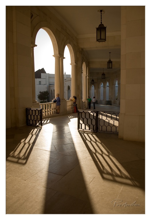
1. Overall Rating (0–10) — 8.0 This photograph masterfully captures the interplay of light and architecture, transforming a simple corridor into a poetic passage of shadow and warmth. The long, sweeping shadows cast by the balustrade create a rhythmic visual pattern that guides the eye through the space, while the soft golden light imbues the scene with a serene, almost sacred atmosphere. The presence of visitors adds subtle life without disrupting the quiet elegance, though the composition’s strength lies in its balance between structure and serenity.
2. Composition (0–10) — 8.5 The use of leading lines created by the arches and shadows draws the viewer’s gaze deep into the frame, creating a strong sense of depth. The placement of the figures off-center adds visual interest without distracting from the architectural harmony.
3. Lighting (0–10) — 9.0 The warm, directional sunlight enhances the texture of the stone and casts dramatic, elongated shadows that define the space. The backlighting creates a halo effect around the arches, emphasizing form and creating a tranquil, contemplative mood.
4. Color & Tone (0–10) — 8.0 The warm, golden tones dominate the palette, creating a cohesive and harmonious atmosphere. The subtle contrast between the illuminated areas and the deep shadows adds depth and richness to the image.
5. Creativity (0–10) — 8.5 The photographer captures a moment of quiet beauty in an everyday architectural setting, transforming it into something evocative and timeless. The deliberate use of light and shadow suggests a deep understanding of visual storytelling.
6. Technical Quality (0–10) — 8.5 The image is sharp and well-exposed, with excellent detail in both highlights and shadows. The focus is precise, and the clarity of the textures enhances the overall impact.
7. Emotional Impact (0–10) — 8.0 The photograph evokes a sense of peace and timelessness, inviting the viewer to pause and reflect. The interplay of light and shadow creates a meditative quality that resonates emotionally, suggesting a moment suspended in time.
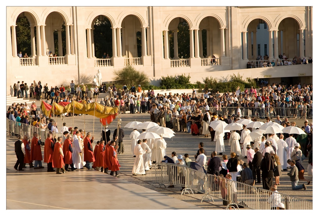
1. Overall Rating (0–10) — 7.5 This photograph captures a solemn religious procession in a grand, sun-drenched plaza, where the interplay of light, movement, and ritual creates a powerful sense of reverence and communal faith. The warm golden hour light enhances the ceremonial atmosphere, while the architectural backdrop of arches and columns lends a timeless dignity to the scene. Though the image is rich in narrative and atmosphere, its wide composition occasionally dilutes focus, making it feel more like a moment captured than a moment composed.
2. Composition (0–10) — 7.0 The wide-angle perspective effectively conveys the scale of the gathering, with the procession leading the eye from the foreground into the depth of the plaza. The diagonal line of clergy and umbrellas creates visual rhythm, though the sheer number of figures and barriers slightly disrupts the flow and balance.
3. Lighting (0–10) — 8.5 The low-angle sunlight bathes the scene in a warm, golden glow, enhancing textures and creating long, dramatic shadows that add depth and dimension. The backlighting on the figures emphasizes their silhouettes, giving the procession a ceremonial luminosity.
4. Color & Tone (0–10) — 7.5 The palette is dominated by warm beige tones from the architecture and the soft gold of the sunlight, contrasted by the bold red of the vestments and the crisp white of the clergy’s robes and umbrellas. The colors are harmonious and evocative, reinforcing the solemnity and unity of the event.
5. Creativity (0–10) — 7.0 The image succeeds in capturing a moment of cultural and spiritual significance with a strong sense of authenticity. The combination of traditional ceremony and modern crowd dynamics offers a compelling narrative, though the composition leans more toward documentation than artistic interpretation.
6. Technical Quality (0–10) — 8.0 The image is sharp and well-exposed, with clear detail across the frame. The focus is consistent, and the lighting conditions allow for rich tonal range without harsh overexposure or loss of shadow detail.
7. Emotional Impact (0–10) — 8.0 The photograph evokes a deep sense of awe and reverence, drawing the viewer into the quiet solemnity of the procession. The interplay of light, movement, and shared purpose creates a powerful emotional resonance, especially for those familiar with the religious context.
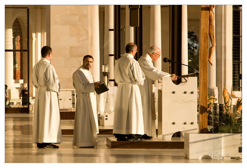
1. Overall Rating (0–10) — 7.5 This photograph captures a solemn religious ceremony with a quiet dignity, where the interplay of light and shadow elevates the ritual into something almost sacred. The golden hour sunlight bathes the scene in warmth, highlighting the white robes and architectural details, while the stillness of the moment conveys reverence and contemplation. Though the composition feels slightly staged, the emotional resonance and atmospheric depth give the image a compelling, documentary-like quality.
2. Composition (0–10) — 7.0 The arrangement of figures creates a natural diagonal leading toward the speaker at the lectern, drawing the eye through the scene. The balance between the standing priests and the architectural elements grounds the image, though the inclusion of the crucifix on the right slightly disrupts the visual flow.
3. Lighting (0–10) — 9.0 The warm, directional sunlight from the side creates dramatic highlights and soft shadows, enhancing texture and depth. The golden glow infuses the scene with a spiritual warmth, while the contrast between light and shadow adds visual richness and mood.
4. Color & Tone (0–10) — 8.0 The palette is dominated by warm golds and soft whites, creating a harmonious and serene atmosphere. The subtle pops of color from the flowers and the stained glass in the background provide visual interest without disrupting the overall tonal unity.
5. Creativity (0–10) — 7.5 The image successfully captures a moment of spiritual significance with a strong sense of narrative and atmosphere. The photographer’s choice to shoot during golden hour and the careful attention to light and framing elevate a routine liturgical moment into something artistically compelling.
6. Technical Quality (0–10) — 8.5 The image is sharp and well-exposed, with excellent detail in both the foreground and background. Focus is precise on the central figures, and the depth of field effectively separates the subjects from the architectural surroundings.
7. Emotional Impact (0–10) — 8.0 The photograph evokes a deep sense of peace and reverence, inviting the viewer into a moment of quiet reflection. The combination of light, composition, and the solemn expressions of the participants creates a powerful emotional connection to the spiritual nature of the event.
Lisbon's Grandeur and Discovery Era Gems
Before departing Portugal, we returned to Lisbon for more exploration. Our visit included strolling through the magnificent Praça do Comércio, one of Europe's largest and most beautiful squares. This grand, arcaded plaza opens dramatically onto the wide Tejo (Tagus) River, historically serving as Lisbon's majestic gateway to the world. It sits proudly in the heart of downtown Lisbon, the Cidade Baixa, a district meticulously rebuilt on a grid system after the devastating 1755 earthquake. The sheer scale and elegance of the square, lined with government buildings and cafes, is truly impressive.
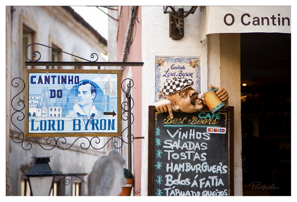
1. Overall Rating (0–10) — 7.0 This photograph captures the lively, rustic charm of a traditional Portuguese café with a keen eye for cultural detail. The juxtaposition of the ornate tiled sign, the whimsical ceramic figure, and the handwritten menu creates a rich tapestry of local character. While the composition is engaging and layered, the slight overexposure in the background and the cluttered right side slightly dilute the visual clarity. Still, the image succeeds in evoking the warmth and personality of a neighborhood eatery.
2. Composition (0–10) — 7.5 The arrangement balances multiple elements—signs, textures, and figures—without feeling chaotic. The tilted sign and the ceramic figure draw the eye naturally, creating a sense of depth and storytelling. The diagonal lines of the wrought iron and the arrow on the sign guide the viewer through the frame effectively.
3. Lighting (0–10) — 6.5 Natural daylight illuminates the scene evenly, highlighting textures and colors. However, the bright sky and overexposed areas in the background create a loss of detail, and the interior of the café remains in deep shadow, reducing the sense of invitation.
4. Color & Tone (0–10) — 7.0 The palette is rich and authentic, with deep blues on the tiles, warm terracotta tones, and the contrast of the blackboard and white lettering. The saturation enhances the visual appeal without appearing unnatural, though the highlights are slightly washed out.
5. Creativity (0–10) — 8.0 The image stands out through its narrative potential—the playful ceramic figure, the vintage signage, and the handwritten menu all suggest a story of tradition and hospitality. The photographer captures a moment that feels both spontaneous and deeply rooted in place.
6. Technical Quality (0–10) — 7.5 Sharp focus on the signs and figures ensures clarity, and the depth of field is well-controlled, isolating the main subjects. The slight blur of the background adds context without distraction.
7. Emotional Impact (0–10) — 7.5 The photograph evokes a sense of nostalgia and curiosity, inviting the viewer to imagine stepping into a place where time moves slowly and meals are served with warmth. The human touch in the ceramic figure and the handwritten menu adds an intimate, welcoming quality.
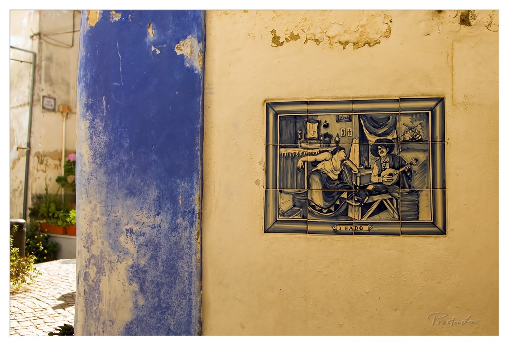
1. Overall Rating (0–10) — 7.5 This photograph captures the quiet poetry of a sun-drenched alley, where history and art merge in the weathered textures of a Portuguese azulejo tile. The bold contrast between the vibrant blue column and the golden-yellow wall creates an immediate visual anchor, while the narrative tile adds a layer of storytelling that feels both intimate and timeless. Though the composition is strong, the scene’s charm lies in its authenticity—slightly imperfect, yet rich with cultural resonance.
2. Composition (0–10) — 7.0 The frame balances the strong vertical blue column with the central placement of the tile, creating a dynamic yet harmonious structure. The off-center tile and the cobblestone path in the lower-left corner guide the eye naturally, though the left-side foliage slightly disrupts the visual flow.
3. Lighting (0–10) — 8.0 Warm, directional sunlight enhances the textures of the wall and column, casting soft shadows that deepen the sense of depth. The light’s golden hue complements the wall’s color and adds a nostalgic, late-afternoon glow to the scene.
4. Color & Tone (0–10) — 8.0 The contrast between the saturated cobalt blue and the warm ochre wall is striking, while the monochromatic tones of the tile provide a visual anchor. The warm color grading enhances the aged, sun-bleached feel, lending a cohesive and evocative mood.
5. Creativity (0–10) — 8.0 The image transcends mere documentation by emphasizing the interplay of color, texture, and cultural detail. The tile’s narrative, paired with the aged architecture, evokes a sense of place and story—suggesting a life lived in the shadows of the past.
6. Technical Quality (0–10) — 7.5 Sharp focus and well-managed exposure preserve detail in both the tile and the surrounding textures. The depth of field is appropriate, keeping the subject clear while allowing the background to softly recede.
7. Emotional Impact (0–10) — 7.5 There is a quiet melancholy and warmth in the image—evoking a sense of memory and place. The viewer is invited to wonder about the lives that passed through this alley, making the scene emotionally engaging without overt sentimentality.
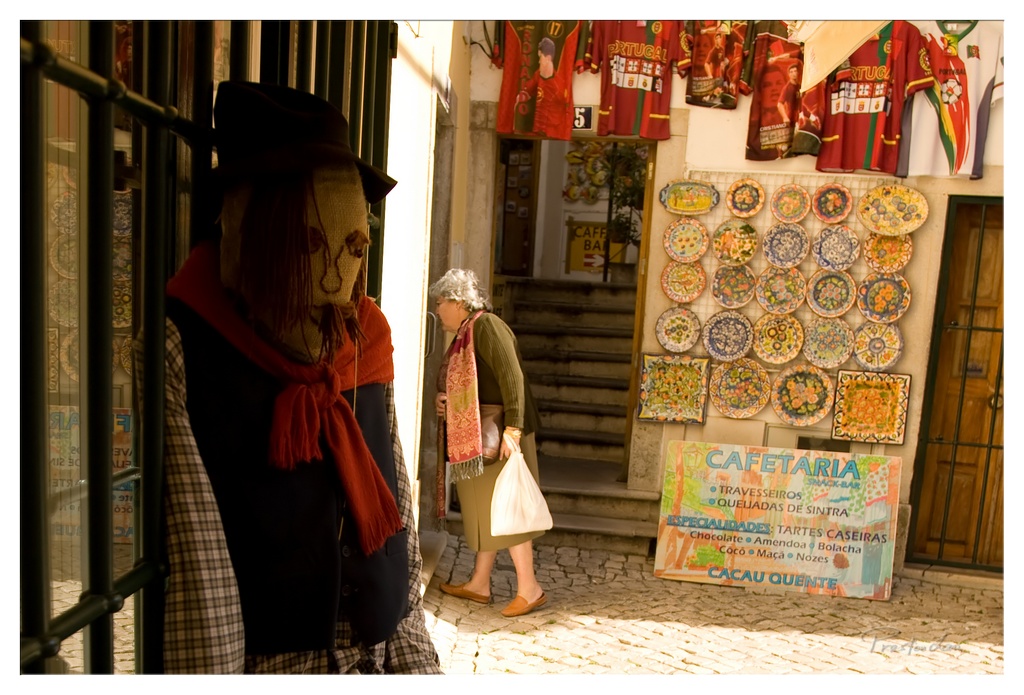
1. Overall Rating (0–10) — 7.0 This photograph captures a vibrant street scene in Portugal, where tradition and daily life intersect with quiet charm. The juxtaposition of the weathered scarecrow and the passing woman evokes a sense of timelessness, while the colorful ceramics and jerseys add a rich cultural texture. The warm sunlight enhances the scene’s authenticity, though the composition feels slightly crowded, pulling focus from the emotional core.
2. Composition (0–10) — 6.0 The scarecrow dominates the left foreground, creating a strong visual anchor, but its proximity and framing slightly overwhelm the scene. The woman’s movement adds dynamism, yet the placement of the café sign and ceramics on the right creates a visual imbalance, drawing attention away from the human subject.
3. Lighting (0–10) — 7.5 Golden sunlight bathes the cobblestone street and wall, creating a warm, inviting glow that enhances texture and depth. The interplay of light and shadow on the scarecrow and the woman’s face adds dimension, though the highlights on the left edge are slightly overexposed.
4. Color & Tone (0–10) — 8.0 The palette is rich and varied, with the deep reds of the scarf and jerseys contrasting beautifully against the earthy tones of the stone and the vibrant blues and yellows of the ceramic plates. The warm color temperature reinforces the Mediterranean atmosphere, giving the image a lively, authentic feel.
5. Creativity (0–10) — 7.5 The image tells a subtle story of cultural continuity—between folklore, commerce, and daily life. The scarecrow, a symbol of tradition, stands in quiet contrast to the modern woman and the commercial displays, creating a layered narrative that feels both authentic and thoughtfully composed.
6. Technical Quality (0–10) — 7.0 The focus is sharp on the scarecrow and the woman, with good clarity throughout. The exposure is generally well-managed, though slight overexposure in the upper-left corner detracts from the detail in the glass and shadows.
7. Emotional Impact (0–10) — 7.0 There’s a quiet nostalgia in the scene—of places that carry history in their stones and in their people. The interaction between the still figure and the moving woman invites reflection on time, memory, and continuity, making the image emotionally resonant despite its busy surface.
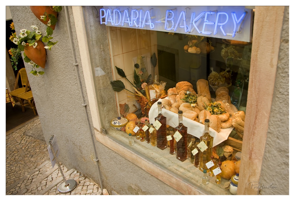
1. Overall Rating (0–10) — 7.0 This photograph captures the inviting warmth of a traditional bakery, where the glow of the neon sign and the abundance of bread and preserves evoke a sense of rustic charm. The composition draws the eye into the window display, suggesting a story of craftsmanship and local pride. While the image is rich in detail and atmosphere, a slightly more balanced framing and stronger contrast could elevate its visual impact.
2. Composition (0–10) — 6.5 The angled perspective creates depth, guiding the viewer’s gaze into the window display. However, the off-center placement of the neon sign and the cluttered foreground slightly disrupt visual harmony, making the composition feel more candid than deliberate.
3. Lighting (0–10) — 7.0 The cool blue of the neon sign contrasts warmly with the golden tones of the bread and the soft interior light, creating a dynamic and inviting mood. The natural daylight from the street enhances the textures without overpowering the scene.
4. Color & Tone (0–10) — 7.5 The palette balances warm yellows and browns of the bread with the cool blue of the neon, creating a visually pleasing contrast. The tones are rich and slightly saturated, enhancing the artisanal feel of the bakery.
5. Creativity (0–10) — 7.0 The image successfully blends documentary realism with a touch of narrative storytelling, capturing the essence of a local establishment. The inclusion of the bottles and floral accents adds layers of authenticity and visual interest.
6. Technical Quality (0–10) — 7.5 The focus is sharp on the window display, with clean details in the bread and labels. The depth of field is well-managed, and the image shows minimal noise, reflecting strong technical execution.
7. Emotional Impact (0–10) — 7.0 The photograph evokes a sense of nostalgia and comfort, inviting the viewer to imagine the aroma of fresh bread and the quiet rhythm of a small bakery. It feels intimate and grounded in place, resonating with a universal appreciation for simple pleasures.
No visit to Lisbon is complete without seeing the iconic landmarks in the Belém district, testaments to Portugal's Age of Discovery. We visited the exquisite Belém Tower and the awe-inspiring Jerónimos Monastery, both dating back to the 16th century. These structures, classified together as a UNESCO World Heritage site, are masterpieces of the Manueline architectural style, characterized by intricate maritime motifs and ornate stonework celebrating Portugal's seafaring prowess. The Belém Tower, originally a fortress, looks like a jewel box on the river's edge, while the Jerónimos Monastery is a breathtakingly vast complex, its cloisters and church adorned with incredibly detailed carvings. They are truly a must-see, not just for their architectural beauty, but for the powerful sense of history they embody, representing the peak of Portugal's global influence.
1. Overall Rating (0–10) — 8.0 This photograph captures the timeless grandeur of the Belém Tower with a striking balance of light and shadow, evoking a sense of historical depth and architectural elegance. The interplay between the sunlit stonework and the deep silhouette of the turret’s shadow adds drama and dimension, while the clear blue sky provides a clean backdrop that enhances the structure’s intricate details. The image succeeds in conveying both the monumentality and the delicate craftsmanship of the site, though the composition feels slightly restrained by the tight framing.
2. Composition (0–10) — 7.5 The framing emphasizes the tower’s verticality and ornate features, with the shadow of the turret adding a dynamic diagonal element. The left side is slightly cluttered with crenellations and shields, but the central focus on the domed turret and the arched balcony creates a strong visual anchor.
3. Lighting (0–10) — 9.0 Strong, directional sunlight enhances texture and form, casting a crisp, elongated shadow that adds depth and narrative to the image. The contrast between the bright stone and the dark shadow creates a compelling visual rhythm.
4. Color & Tone (0–10) — 8.0 The warm, sun-kissed tones of the limestone contrast beautifully with the deep blue sky, creating a harmonious and balanced palette. The subtle tonal variations in the stone add richness without overwhelming the scene.
5. Creativity (0–10) — 8.0 The use of shadow as a compositional element—mirroring the turret’s form—adds a layer of visual storytelling. The choice to frame the shot this way transforms a standard architectural view into a contemplative study of light and structure.
6. Technical Quality (0–10) — 9.0 The image is sharp, with fine detail visible in the stonework and carvings. The exposure is well-managed, preserving highlights and shadows without clipping, and the focus is precise.
7. Emotional Impact (0–10) — 8.5 The photograph evokes a sense of awe and reverence for historical craftsmanship, inviting the viewer to pause and reflect on the passage of time. The dramatic lighting and quiet composition create a contemplative mood that resonates deeply.
1. Overall Rating (0–10) — 7.0 This photograph captures a serene moment of urban fishing, where the quiet dedication of the angler contrasts with the subtle hum of city life in the background. The soft golden light and layered composition evoke a sense of calm contemplation, while the inclusion of the bridge and distant figures grounds the scene in a specific, lived-in place. Though the image feels slightly overexposed in the sky, its emotional weight and atmospheric depth give it a quiet power.
2. Composition (0–10) — 7.0 The subject is well-placed off-center, creating a balanced diagonal flow from the man’s rod into the distance. The leading lines of the fishing poles and the edge of the embankment guide the eye naturally through the frame, while the blurred figure in the foreground adds depth and narrative context.
3. Lighting (0–10) — 6.5 Warm, diffused sunlight from the side creates soft highlights on the man’s face and straw hat, enhancing texture and form. However, the sky is slightly overexposed, losing detail in the upper portion and giving the image a hazy, washed-out quality.
4. Color & Tone (0–10) — 6.0 The palette is subdued, dominated by muted blues, grays, and earth tones, which complement the tranquil mood. The warm light adds a gentle golden cast, but the overall tonal range lacks punch, with a slight flatness in the midtones.
5. Creativity (0–10) — 7.0 The image succeeds in blending documentary realism with a poetic stillness, capturing a fleeting moment of human routine against an urban backdrop. The juxtaposition of leisure and infrastructure suggests a quiet story of life along the water.
6. Technical Quality (0–10) — 7.5 Sharp focus on the man and his gear, with a shallow depth of field that softly blurs the background. The image is clean and well-exposed overall, with only minor overexposure in the sky.
7. Emotional Impact (0–10) — 7.0 There is a quiet dignity in the man’s focused posture, evoking a sense of patience and connection to place. The viewer is drawn into a moment of peaceful solitude, made more poignant by the unseen city beyond.
1. Overall Rating (0–10) — 6.8 This photograph captures a quiet, contemplative moment at a waterfront, where the stillness of the water mirrors the muted tones of a hazy day. The juxtaposition of the lone fisherman, parked vehicles, and distant industrial structures creates a layered narrative of everyday life intersecting with the landscape. While the image conveys a sense of calm and introspection, its subdued palette and slightly overcast lighting limit its emotional depth, leaving the viewer with a sense of detachment rather than immersion.
2. Composition (0–10) — 7.0 The horizontal alignment of the pier and the reflection create a strong sense of symmetry, drawing the eye across the frame. The placement of the fisherman near the left third adds visual interest, while the parked vehicles on the right balance the composition, though the clutter slightly disrupts the flow.
3. Lighting (0–10) — 6.0 The soft, diffused light of an overcast day enhances the calm mood but flattens the scene’s depth. The lack of strong shadows reduces contrast and diminishes the visual impact of the reflections, giving the image a muted, almost dreamlike quality.
4. Color & Tone (0–10) — 6.5 The palette is dominated by cool grays and whites, reinforcing the serene yet melancholic atmosphere. While the tonal harmony is strong, the lack of vibrant color limits the image’s visual excitement and emotional resonance.
5. Creativity (0–10) — 7.0 The image successfully blends documentary realism with artistic composition, using reflection and symmetry to create a visually cohesive scene. The contrast between the quiet human activity and the industrial backdrop introduces a subtle narrative tension, suggesting themes of coexistence and change.
6. Technical Quality (0–10) — 7.5 The focus is sharp across the frame, and the water’s surface is rendered with clarity, allowing the reflections to be crisp and well-defined. The exposure is balanced, with no significant overexposed or underexposed areas, contributing to a clean and professional appearance.
7. Emotional Impact (0–10) — 6.0 The photograph evokes a sense of solitude and quiet reflection, inviting the viewer to pause and consider the passage of time. While the mood is contemplative, the lack of strong emotional cues keeps the experience somewhat reserved, preventing a deeper personal connection.
1. Overall Rating (0–10) — 6.0 This photograph captures a contemplative moment at a historic monument, where the scale of the sculpture contrasts with the solitary figure in the foreground. The composition draws the viewer’s eye from the man to the intricate details of the stone figures, evoking a sense of time and memory. While the image has a strong conceptual foundation, its technical execution—particularly in lighting and color—holds it back from greater visual impact.
2. Composition (0–10) — 7.0 The subject is placed off-center, creating a balanced yet dynamic frame. The large sculpture dominates the upper portion of the image, while the man grounds the scene, providing scale and narrative context. The diagonal lines of the monument add visual interest and guide the eye upward.
3. Lighting (0–10) — 5.5 The soft, directional sunlight from the right creates gentle shadows that highlight the texture of the stone. However, the overall exposure is slightly flat, and the sky appears overexposed, losing detail in the clouds and background.
4. Color & Tone (0–10) — 6.0 The palette is muted, with warm beige tones in the stone contrasting against the pale blue of the sky. While the colors are natural, they lack vibrancy, giving the image a somewhat washed-out appearance.
5. Creativity (0–10) — 6.5 The juxtaposition of the individual with the monumental sculpture adds a layer of storytelling—hinting at personal reflection against the backdrop of collective history. The choice to include the photographer adds a personal touch, though it remains conventional in its approach.
6. Technical Quality (0–10) — 7.5 The image is sharp and well-focused, with clear details in both the man and the sculpture. The exposure is generally accurate, though the highlights in the sky could have been better managed.
7. Emotional Impact (0–10) — 6.0 The photograph evokes a quiet, introspective mood, suggesting a moment of connection between the individual and history. While the emotion is present, it is subtle and may not resonate strongly without additional context.
1. Overall Rating (0–10) — 7.0 This photograph captures a striking monument under a vast blue sky, where the interplay of architecture, water, and reflection creates a sense of timelessness and solemnity. The composition balances the imposing verticality of the central column with the fragmented, sculptural forms in the foreground, while the still water doubles the scene’s visual weight. Though the image is strong in mood and structure, the lack of human presence and the slightly overexposed sky diminish its emotional depth, leaving it more as a formal study than a deeply resonant portrait of place.
2. Composition (0–10) — 7.5 The strong vertical lines of the monument contrast effectively with the horizontal plane of the water, creating a balanced and structured frame. The placement of the broken stone elements in the foreground adds visual interest and depth, while the reflection grounds the image in symmetry.
3. Lighting (0–10) — 7.0 The bright, direct sunlight enhances the clarity and definition of the stone textures, while casting sharp shadows that emphasize form. The clear blue sky provides a clean backdrop, though the high contrast slightly flattens the tonal range in the highlights.
4. Color & Tone (0–10) — 6.5 The palette is dominated by cool blues and neutral grays, reinforcing a sense of calm and permanence. The water’s greenish tint adds a subtle natural warmth, but the overall tone is restrained and slightly desaturated, limiting the image’s vibrancy.
5. Creativity (0–10) — 7.0 The use of reflection doubles the visual narrative, transforming the scene into a layered meditation on memory and ruin. The juxtaposition of intact and fragmented architecture suggests a quiet story of endurance, making the composition both conceptually and visually compelling.
6. Technical Quality (0–10) — 8.0 The image is sharp and well-focused, with clear detail in both the stone surfaces and the reflections. The exposure is well-handled, though the sky is slightly overexposed, indicating minor technical trade-offs.
7. Emotional Impact (0–10) — 6.5 The monument’s solemn presence and the stillness of the water evoke a contemplative mood, but the absence of human figures or dynamic elements keeps the emotional resonance at a distance, making the image more observational than intimate.