Preston Lau: A Journey Through Memories, Tech, and Humanity
Welcome to my personal blog that delves into the intricate tapestry of personal albums and the fascinating intersection of ever-evolving technology and humanity. Come along on a journey with me as we delve into the seamless fusion of creativity, state-of-the-art AI and robotics, intricately interwoven within the tapestry of our shared awareness. Have fun!
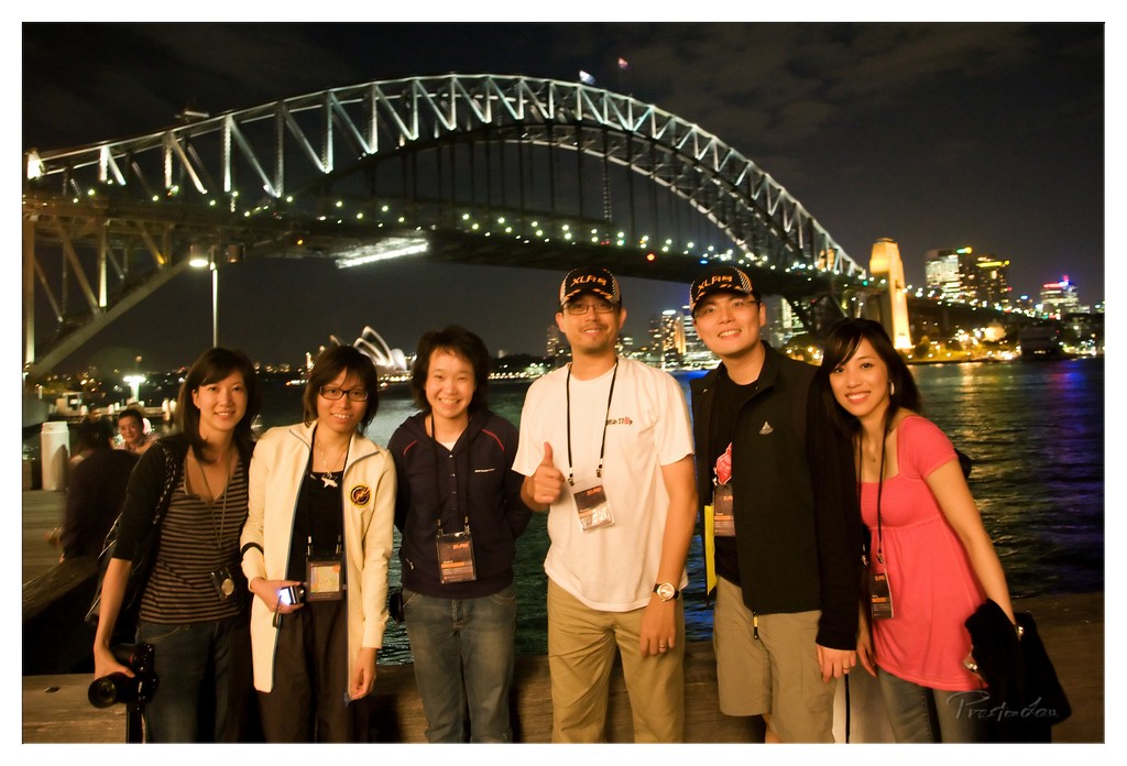
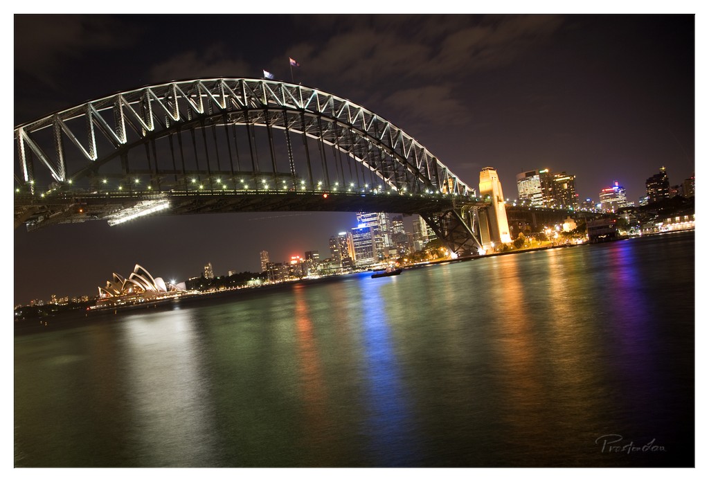
Sydney's Iconic Waterfront: Opera House, Harbour Bridge, Darling Harbour, and Luna Park in Australia
AI Summary
The blog likely features information and descriptions about iconic landmarks in Sydney, Australia, such as the Sydney Opera House, Darling Harbour, Luna Park, and the Sydney Harbour Bridge. These sites are well-known for their historical significance and popular tourist attractions. The blog may also include details about each location's history, notable events, and insider tips for visitors.
Sydney, as the largest city in Australia, is a dynamic metropolis defined by its stunning natural harbour and collection of world-famous landmarks. With a population of over 4 million people in greater Sydney, it's a city of considerable scale, offering a vibrant mix of culture, history, and breathtaking scenery.
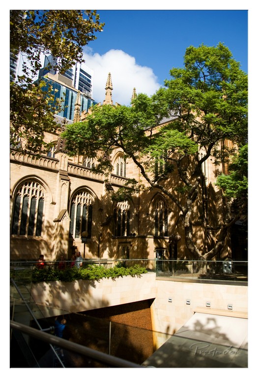
1. Overall Rating (0–10) — 7.5 This photograph captures a compelling juxtaposition of historical architecture and modern urban life, where the Gothic spires of a cathedral stand in quiet dialogue with the sleek glass towers of the city skyline. The interplay of light and shadow through the trees adds depth and a sense of time, while the inclusion of people grounds the scene in everyday life. While the composition is strong and layered, the framing feels slightly off-kilter, and the image could benefit from a more deliberate focus on the symbolic contrast between old and new.
2. Composition (0–10) — 7.0 The image uses natural framing from the trees and architectural elements effectively, but the tilted horizon and uneven balance between the cathedral and the skyscraper create a slight visual tension. A tighter crop would better emphasize the narrative of coexistence.
3. Lighting (0–10) — 8.0 Bright, natural sunlight enhances the textures of the stone and casts dynamic shadows, creating a sense of depth and movement. The contrast between the sunlit facade and shaded areas adds visual interest and emphasizes the building’s intricate details.
4. Color & Tone (0–10) — 7.5 The warm tones of the sandstone building harmonize beautifully with the vibrant green of the trees and the deep blue of the sky. The color palette is rich and balanced, with a subtle warmth that enhances the scene’s timeless quality.
5. Creativity (0–10) — 8.0 The photograph successfully captures a moment of urban storytelling, blending history, nature, and modernity in a visually engaging way. The perspective invites viewers to consider the relationship between past and present, making it more than just a scenic snapshot.
6. Technical Quality (0–10) — 8.5 Sharp focus, clean detail, and well-managed exposure demonstrate strong technical execution. The clarity of the textures and the absence of noise suggest a high-quality capture, even in bright daylight.
7. Emotional Impact (0–10) — 7.0 The image evokes a sense of reverence and continuity, inviting reflection on how cities evolve while preserving their heritage. The presence of people adds a human scale, grounding the grandeur in relatable experience.
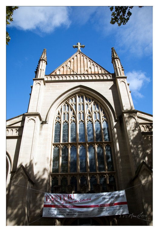
1. Overall Rating (0–10) — 7.5 This photograph captures the grandeur of St. Andrew’s Cathedral with a striking sense of reverence and scale, elevated by the dramatic low-angle perspective and the vivid contrast between the stone facade and the brilliant blue sky. The inclusion of the Easter banner adds a narrative layer, grounding the image in a specific time and tradition. While the composition is strong, the shadowed foreground and slightly cluttered banner detract from the cathedral’s elegant lines, preventing the image from achieving full visual harmony.
2. Composition (0–10) — 7.0 The low-angle framing emphasizes the cathedral’s verticality and Gothic architecture, drawing the eye upward toward the cross. However, the banner and tree shadows in the lower third disrupt the clean lines of the facade, slightly weakening the balance.
3. Lighting (0–10) — 8.0 Bright, direct sunlight enhances the texture of the stone and casts deep shadows that accentuate the architectural details. The clear blue sky provides a dynamic backdrop, with soft clouds adding depth and contrast.
4. Color & Tone (0–10) — 7.5 The warm beige of the stone contrasts beautifully with the deep blue of the sky, creating a rich and harmonious palette. The red and white of the banner adds a pop of color that draws attention but slightly disrupts the overall tonal cohesion.
5. Creativity (0–10) — 7.0 The choice of perspective and the inclusion of the Easter banner give the image a layered, documentary quality. While not overtly experimental, the photograph successfully blends architectural beauty with cultural context.
6. Technical Quality (0–10) — 8.0 Sharp focus and high detail capture the intricate stonework and stained glass. The exposure is well-balanced, with no blown-out highlights or lost shadows.
7. Emotional Impact (0–10) — 7.5 The image evokes a sense of awe and solemnity, enhanced by the cathedral’s imposing presence and the spiritual significance of the Easter season. The viewer is invited to reflect on both the architectural and religious weight of the scene.
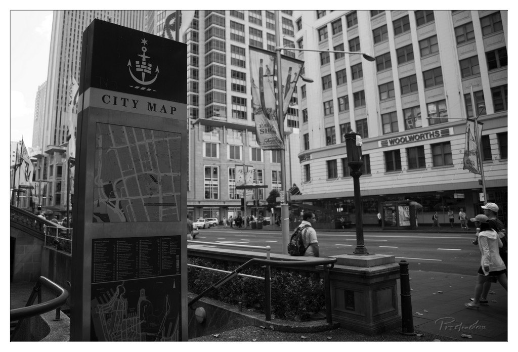
1. Overall Rating (0–10) — 7.0 This black-and-white street photograph captures the rhythm of urban life with a quiet, observational grace. The juxtaposition of the city map kiosk against the bustling background creates a narrative tension between navigation and motion. While the monochrome treatment lends a timeless quality, the image’s emotional resonance is tempered by a slightly flat dynamic range and a composition that feels more candid than deliberate.
2. Composition (0–10) — 6.5 The city map kiosk anchors the left side of the frame, drawing the eye into the depth of the street, while the diagonal lines of the railings and banners guide movement through the scene. The placement of pedestrians and buildings creates a layered, dynamic feel, though the right side feels slightly crowded and underutilized.
3. Lighting (0–10) — 6.0 The lighting is even and diffused, suggesting an overcast day, which flattens shadows and reduces tonal contrast. While this suits the monochrome aesthetic, it limits the depth and drama that directional light could have provided.
4. Color & Tone (0–10) — 7.0 The grayscale palette is well-balanced, with a wide tonal range that emphasizes textures in the architecture and pavement. The absence of color allows focus on form and detail, though a more nuanced gradient between midtones and shadows would enhance visual richness.
5. Creativity (0–10) — 7.0 The image succeeds in capturing a slice of urban reality with a contemplative tone. The use of the city map as a framing device adds conceptual depth, inviting the viewer to consider both the literal and metaphorical navigation of city life.
6. Technical Quality (0–10) — 7.5 Sharp focus and clean detail are evident throughout, particularly in the map and signage. The exposure is well-managed, with no significant areas of over- or underexposure, though some midtone detail is lost due to the flat lighting.
7. Emotional Impact (0–10) — 6.5 The photograph evokes a sense of quiet detachment, a moment suspended in the flow of the city. It invites reflection on the anonymity and rhythm of urban existence, though the emotional pull is subtle, relying more on atmosphere than intensity.
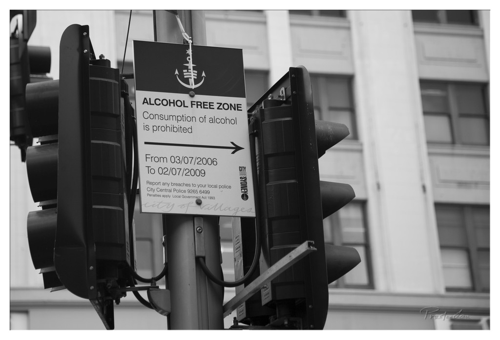
1. Overall Rating (0–10) — 6.0 This black-and-white photograph captures a moment of urban regulation, where a sign declaring an "Alcohol Free Zone" becomes the focal point of a quiet, almost melancholic street scene. The monochrome palette lends a timeless, documentary feel, while the juxtaposition of the sign’s rigid authority against the soft, blurred architecture creates a subtle tension. While the image effectively conveys a sense of place and policy, it lacks the visual dynamism to fully engage the viewer, relying more on context than emotional resonance.
2. Composition (0–10) — 6.0 The sign is centered between two traffic lights, creating a balanced but slightly cluttered frame. The diagonal lines of the sign and pole introduce visual tension, while the out-of-focus building in the background provides depth without distracting.
3. Lighting (0–10) — 6.5 Even, diffused lighting enhances the grayscale tones and avoids harsh shadows, allowing the text and details on the sign to remain legible. The soft light supports the image’s documentary mood.
4. Color & Tone (0–10) — 7.0 The monochrome treatment emphasizes contrast and texture, particularly in the grain of the sign and the smoothness of the building facade. The absence of color reinforces the stark, institutional tone of the subject.
5. Creativity (0–10) — 5.5 The concept is straightforward and observational, capturing a slice of urban life with minimal artistic embellishment. While the idea is grounded and conceptually sound, it lacks a distinctive visual or narrative twist.
6. Technical Quality (0–10) — 7.5 Sharp focus on the sign ensures clarity, and the clean black-and-white conversion enhances detail. The image is technically sound, with no visible flaws in exposure or focus.
7. Emotional Impact (0–10) — 5.0 The photograph feels detached and impersonal, reflecting the impersonal nature of municipal regulation. While it invites contemplation about social control and public space, it does not evoke strong emotional engagement.
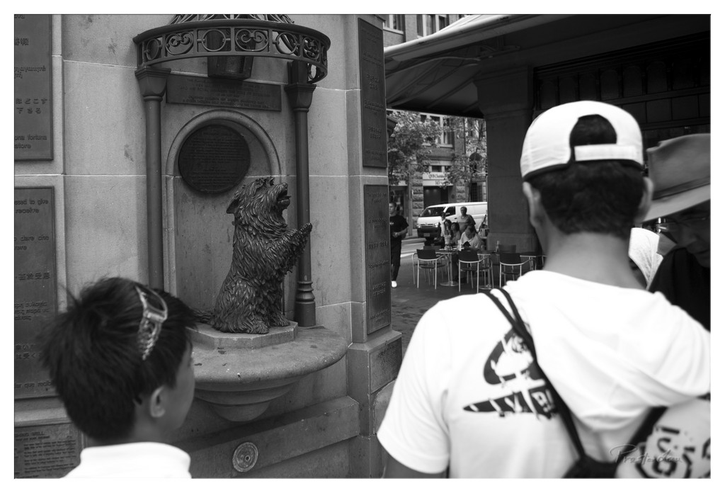
1. Overall Rating (0–10) — 7.0 This black-and-white photograph captures a quiet urban moment, where the juxtaposition of a whimsical dog statue and the passersby creates a subtle narrative of curiosity and routine. The monochromatic palette lends a timeless, documentary quality to the scene, enhancing its contemplative mood. While the image is well-composed and conceptually engaging, the lack of strong tonal contrast slightly diminishes its visual punch.
2. Composition (0–10) — 7.0 The statue is centered and framed effectively by the architectural elements, drawing the eye naturally. The placement of the two figures in the foreground creates depth and a sense of shared experience, though the right-side subject slightly disrupts the balance.
3. Lighting (0–10) — 6.5 The light is even and diffused, typical of an overcast day, which works well with the monochrome aesthetic. However, the lack of strong shadows or highlights limits the image’s atmospheric depth.
4. Color & Tone (0–10) — 7.5 The grayscale tones are rich and well-graded, with a strong contrast between the dark texture of the dog statue and the lighter stone. The tonal range is balanced, enhancing the image’s graphic quality.
5. Creativity (0–10) — 7.0 The choice to shoot in black and white elevates the everyday scene into something more reflective and poetic. The framing invites viewers to consider the relationship between public art, memory, and the fleeting nature of urban life.
6. Technical Quality (0–10) — 8.0 The image is sharp, with fine detail visible in the statue’s fur and the surrounding textures. The focus is consistent, and there are no noticeable technical flaws.
7. Emotional Impact (0–10) — 6.5 The photograph evokes a sense of quiet observation and subtle humor, inviting the viewer to imagine the stories behind the people and the statue. While not emotionally overwhelming, it lingers with a gentle, thoughtful resonance.
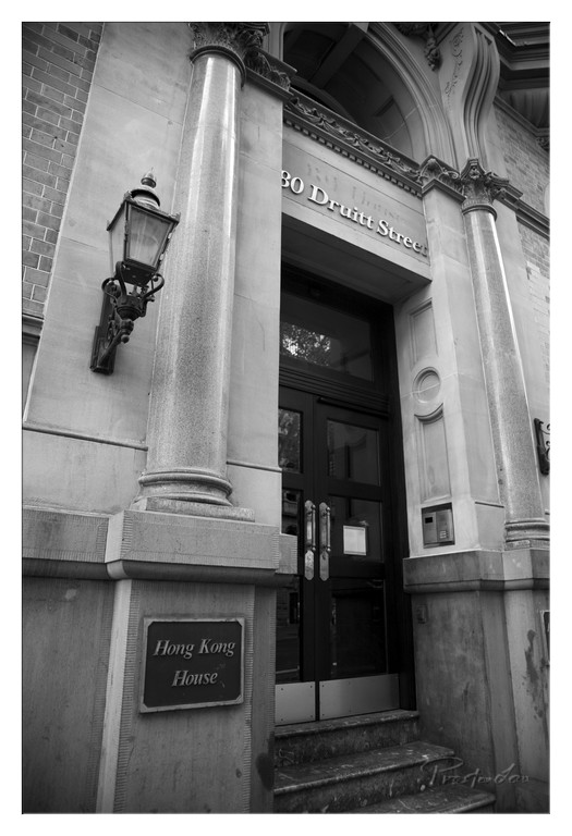
1. Overall Rating (0–10) — 7.0 This black-and-white photograph captures the dignified presence of an historic building, where architectural detail and quiet grandeur converge. The monochromatic treatment enhances the texture and form of the stone, lending a timeless quality to the image. While the composition is strong and the details are rich, the lack of color limits the emotional warmth, creating a formal, almost documentary feel.
2. Composition (0–10) — 7.5 The low-angle perspective emphasizes the building’s verticality and grandeur, with the columns framing the entrance and guiding the eye toward the door. The lantern and signage are well-placed, adding narrative context without disrupting balance. A slight shift in angle could have improved symmetry and depth.
3. Lighting (0–10) — 6.5 The light is soft and diffused, likely from an overcast day, which minimizes harsh shadows and highlights the texture of the stonework. The contrast between the light stone and dark door creates visual interest, though the overall tonal range is somewhat flat, reducing atmospheric depth.
4. Color & Tone (0–10) — 7.0 The monochrome palette is appropriate, emphasizing form and texture. The mid-tones are well-managed, with strong contrast between the dark door and lighter facade. The absence of color keeps the focus on architecture and history, though a hint of tonal warmth could have added subtle emotion.
5. Creativity (0–10) — 6.5 The choice to shoot in black and white is deliberate and effective, lending a classic, contemplative mood. The image tells a story of place and identity through architecture, but the approach is more traditional than innovative.
6. Technical Quality (0–10) — 8.0 Sharp focus across the frame, clean grain, and well-exposed tonal range demonstrate strong technical control. The image is free of distractions, with clear details in both the stone and signage.
7. Emotional Impact (0–10) — 6.0 The photograph evokes a sense of quiet reverence and historical continuity, but its formal tone keeps the viewer at a distance. It invites admiration for the structure rather than deep emotional connection.
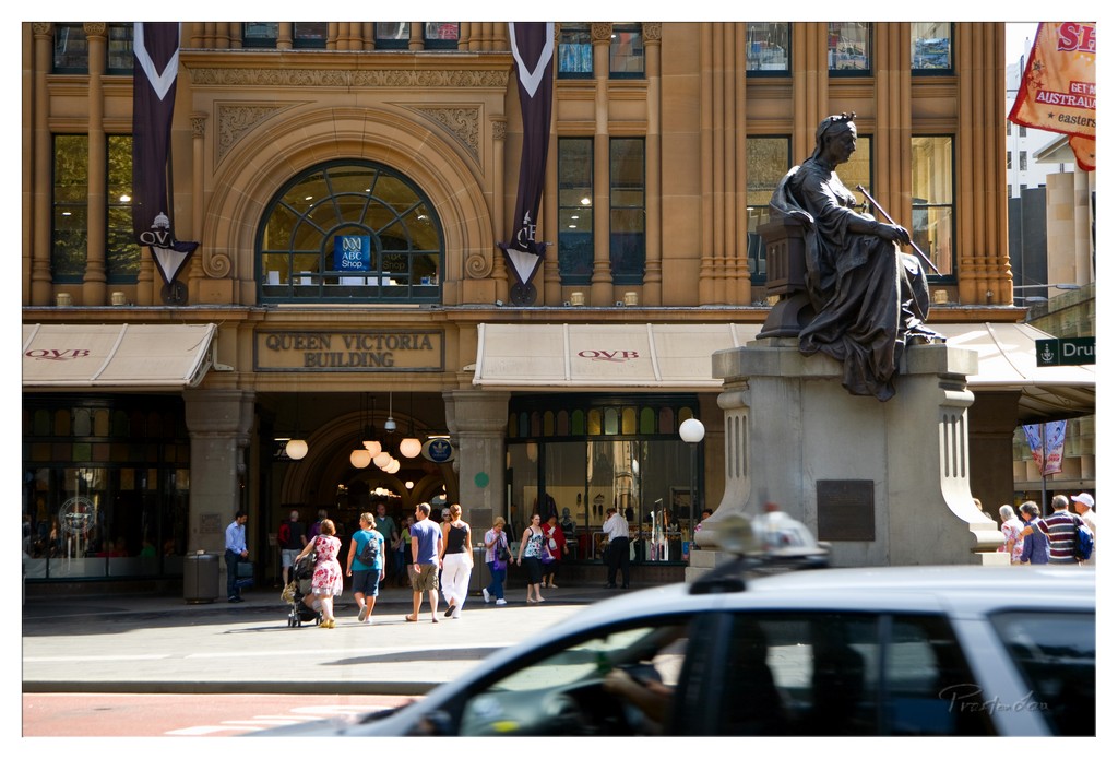
1. Overall Rating (0–10) — 7.0 This photograph captures the vibrant pulse of a bustling urban square, where history and modern life converge under a bright sun. The Queen Victoria Building stands as a stately centerpiece, its ornate sandstone facade and arched windows radiating a sense of enduring grandeur, while the bronze statue and passing pedestrians infuse the scene with motion and narrative. The composition is strong, but the inclusion of a blurred car in the foreground slightly disrupts the visual harmony, hinting at the tension between timeless architecture and the chaos of city life.
2. Composition (0–10) — 7.5 The framing balances the architectural symmetry of the building with the organic flow of pedestrians, creating a dynamic yet structured scene. The statue on the right provides a strong visual anchor, while the diagonal movement of people adds energy. The low-angle perspective enhances the building’s scale, though the foreground vehicle intrudes slightly, drawing attention away from the central focus.
3. Lighting (0–10) — 8.0 The bright, direct sunlight enhances the textures and depth of the sandstone, casting crisp shadows that emphasize the building’s intricate details. The contrast between light and shadow adds dimension, while the warm golden tones give the scene a lively, midday atmosphere.
4. Color & Tone (0–10) — 7.0 The warm, earthy tones of the sandstone harmonize beautifully with the neutral beige awnings and the dark bronze of the statue. The color palette is cohesive, though the cool gray of the car and the muted tones of some clothing slightly disrupt the visual warmth. A touch more saturation could elevate the vibrancy of the scene.
5. Creativity (0–10) — 7.0 The image successfully blends historical architecture with contemporary urban life, creating a narrative of continuity and change. The use of motion blur in the foreground adds a subtle layer of dynamism, suggesting the fleeting nature of the moment. While not groundbreaking, the photographer captures a compelling slice of city life with thoughtful composition.
6. Technical Quality (0–10) — 8.0 The focus is sharp on the building and statue, with clear detail in the architectural elements. The exposure is well-balanced, preserving highlights in the windows and shadows in the archway. The low-angle shot and wide perspective effectively capture the scene’s scale, though the foreground blur is slightly distracting.
7. Emotional Impact (0–10) — 6.5 The image evokes a sense of place and time—alive with movement and history. It invites the viewer to imagine the stories unfolding within the frame, yet the emotional resonance is tempered by the intrusion of the car and the somewhat crowded feel of the scene. It feels authentic and grounded, but not profoundly moving.
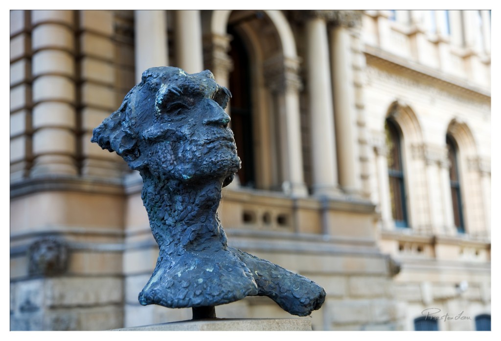
1. Overall Rating (0–10) — 7.5 This photograph captures a striking juxtaposition between the raw, textured surface of a bronze bust and the refined, classical architecture behind it. The sculptural form, with its weathered patina and expressive detail, commands attention, while the soft-focus background enhances its presence without distraction. The composition balances urban history and artistic expression, though the image's quiet mood could be more emotionally charged with stronger lighting or a more dynamic angle.
2. Composition (0–10) — 7.0 The bust is placed off-center to the left, creating visual interest and leading the eye toward the architectural details on the right. The shallow depth of field effectively isolates the subject, though the composition feels slightly static due to the lack of a clear directional line or leading element.
3. Lighting (0–10) — 6.5 Natural daylight illuminates the sculpture evenly, highlighting its texture and form. The soft, diffused light minimizes harsh shadows, allowing the details of the patina to emerge subtly. However, the lighting lacks dramatic contrast, which slightly diminishes the sculpture’s three-dimensional presence.
4. Color & Tone (0–10) — 7.0 The cool blue-green patina of the bronze contrasts beautifully with the warm beige and cream tones of the stone building. The palette is harmonious and restrained, enhancing the timeless quality of the scene. Slight tonal separation between the subject and background adds depth without overwhelming the viewer.
5. Creativity (0–10) — 7.5 The choice to focus on a single sculptural element against a grand architectural backdrop creates a compelling narrative of art in public space. The photographer’s decision to emphasize texture and detail over the broader scene reflects a thoughtful, contemplative approach to urban photography.
6. Technical Quality (0–10) — 8.0 The image is sharp on the bust, with excellent focus and clarity in the subject's surface details. The background blur is smooth and intentional, indicating skilled use of aperture. The exposure is well-balanced, with no obvious over- or underexposed areas.
7. Emotional Impact (0–10) — 7.0 The photograph evokes a sense of quiet reverence for art and history, inviting reflection on the relationship between sculpture and its environment. While the mood is contemplative and grounded, it remains somewhat reserved, leaving room for deeper emotional engagement.
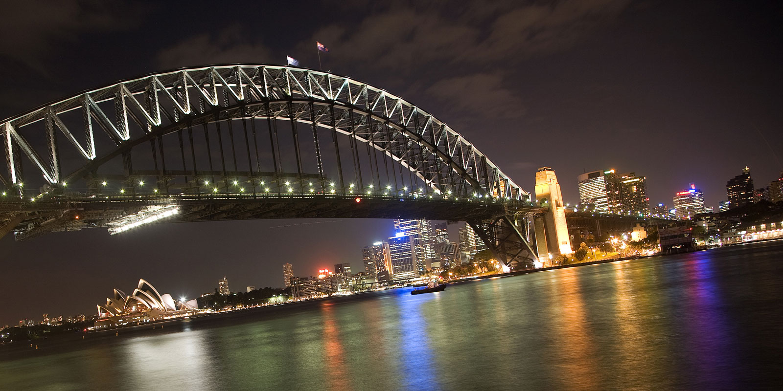
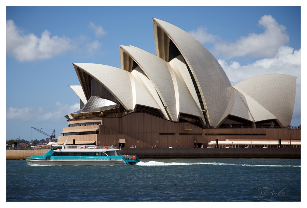
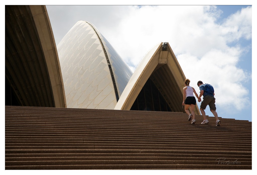
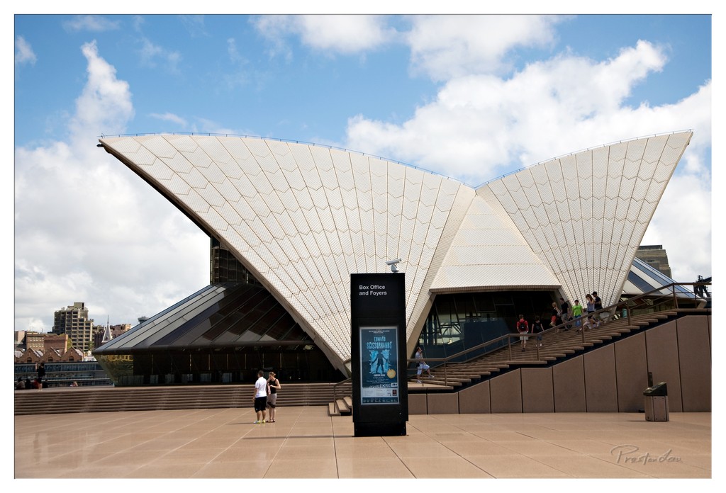
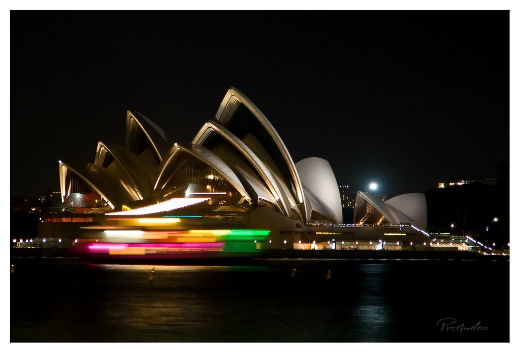
No visit to Sydney is complete without seeing the Sydney Opera House. Destined for greatness since its opening in 1973, this architectural masterpiece is easily Australia's most recognizable icon. Its unique, sail-like structures sit gracefully on the edge of the harbour, a UNESCO World Heritage listed site recognized globally as one of the world's 'must-see' travel attractions. Standing on the Opera House steps, with the harbour stretching out before you and the Harbour Bridge in the distance, is a quintessential Sydney experience, offering incredible photo opportunities and a tangible connection to this globally celebrated building.
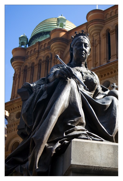
1. Overall Rating (0–10) — 7.5 This photograph captures the regal presence of a bronze statue with a commanding sense of historical weight, set against the ornate backdrop of a grand architectural structure. The low-angle perspective enhances the monumentality of the figure, while the contrast between the dark patina of the metal and the bright sky adds dramatic depth. Though the composition is strong, the image feels slightly overexposed in the highlights, softening the architectural details and reducing the overall richness of the scene.
2. Composition (0–10) — 8.0 The low-angle framing emphasizes the statue’s authority, placing it as the dominant subject. The inclusion of the building behind it creates a layered composition that grounds the figure in its cultural context, though the slightly tight crop on the left margin slightly disrupts visual balance.
3. Lighting (0–10) — 7.5 Strong, direct sunlight enhances the textures of the bronze and the stone, casting deep shadows that accentuate form. The bright blue sky provides a vivid backdrop, though the harsh lighting slightly overexposes the upper facade, losing some tonal detail.
4. Color & Tone (0–10) — 7.0 The palette is dominated by the dark, weathered bronze of the statue and the warm terracotta tones of the building, contrasted by the cool blue of the sky. While the colors are rich and harmonious, the high contrast reduces the subtlety in midtones, giving the image a somewhat stark appearance.
5. Creativity (0–10) — 8.0 The choice to photograph the statue against the grand building adds narrative depth, suggesting themes of legacy and empire. The perspective and framing elevate the subject beyond mere documentation, transforming it into a visual tribute.
6. Technical Quality (0–10) — 7.5 The image is sharp and well-focused, particularly on the statue, with clear detail in the folds of the drapery and the crown. The exposure is generally well-handled, though some loss of detail in the bright areas suggests a narrow dynamic range.
7. Emotional Impact (0–10) — 8.0 The statue’s solemn expression and regal posture evoke a sense of dignity and timelessness, while the architectural setting reinforces a feeling of enduring power. The viewer is drawn into a moment of quiet reverence, connecting with the weight of history.
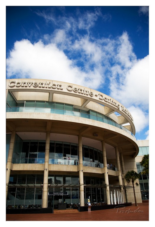
1. Overall Rating (0–10) — 7.5 This image captures the bold architectural presence of the Convention Centre-Darling Harbour with striking clarity and a sense of grandeur. The low-angle perspective emphasizes the building’s sweeping curves and structural strength, while the vibrant blue sky and dramatic clouds lend a dynamic, almost cinematic quality. The composition feels intentional and confident, though the slightly overexposed highlights in the sky and the busy signage detract from a more refined aesthetic.
2. Composition (0–10) — 8.0 The low-angle shot enhances the monumentality of the building, with the curved façade drawing the eye upward. The inclusion of the sky and clouds creates a strong vertical balance, while the palm tree on the right adds a subtle touch of natural contrast. The framing feels deliberate, though the signage occupies a large portion of the upper edge, slightly disrupting visual flow.
3. Lighting (0–10) — 8.0 The bright, natural daylight enhances the building’s textures and architectural lines, with strong contrast between the sunlit stone and the darker glass panels. The sky is richly saturated, and the cloud formations provide dynamic shape and depth. The light is directional enough to create subtle shadows that define the structure’s form.
4. Color & Tone (0–10) — 8.0 The deep blue of the sky creates a powerful contrast with the warm beige of the building, resulting in a visually striking palette. The colors are vibrant but not oversaturated, and the overall tonal range—from dark glass to bright sky—adds richness to the image. The warm tones of the stone lend a sense of permanence and elegance.
5. Creativity (0–10) — 7.0 The choice of angle and timing demonstrates a clear artistic intent, elevating a functional building into a compelling subject. The juxtaposition of modern architecture with the organic shapes of the clouds adds a layer of visual storytelling. While not radically innovative, the image is thoughtfully composed and emotionally resonant.
6. Technical Quality (0–10) — 8.0 The photograph is sharp and well-focused, with clean detail visible in both the architectural elements and the sky. The exposure is generally balanced, though the sky’s highlights are slightly blown out, indicating a minor technical limitation. The image is free of noise and artifacts, suggesting strong sensor performance.
7. Emotional Impact (0–10) — 7.5 The image evokes a sense of awe and civic pride, capturing the scale and ambition of urban design. The interplay of light, structure, and sky creates a moment of quiet grandeur that resonates with the viewer, inviting contemplation of the space’s purpose and place in the city.
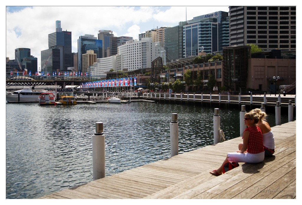
1. Overall Rating (0–10) — 7.0 This photograph captures a serene moment of urban leisure, where the quiet stillness of two figures on a dock contrasts with the bustling city skyline beyond. The composition balances intimacy and scale, drawing the eye from the foreground’s calm to the distant architectural grandeur. While the image effectively conveys a sense of place, the slightly overexposed sky and flat lighting prevent it from achieving a more evocative atmosphere.
2. Composition (0–10) — 7.5 The diagonal line of the pier leads the viewer’s eye into the frame, creating a natural path toward the cityscape. The two figures are placed off-center, adding visual interest and grounding the scene in human presence. The balance between foreground and background is strong, though the scattered poles slightly disrupt the flow.
3. Lighting (0–10) — 6.0 The scene is lit by bright, direct sunlight, which creates harsh reflections on the water and washes out parts of the sky. While the light clearly defines the textures of the wood and the buildings, the lack of softness or directional nuance diminishes the mood, making the image feel more documentary than artistic.
4. Color & Tone (0–10) — 6.5 The palette is dominated by cool blues and grays in the water and sky, contrasted with the warm tones of the wooden dock. The red polka-dot top of the woman adds a pop of color that draws attention, though the overall tonal range is somewhat limited by the bright conditions, reducing depth in the shadows.
5. Creativity (0–10) — 7.0 The juxtaposition of stillness and motion—two people resting against the energy of a major city—gives the image a contemplative narrative. The framing suggests a pause in a fast-paced environment, and the inclusion of the marina flags adds a subtle sense of celebration or occasion.
6. Technical Quality (0–10) — 7.5 The image is sharp and well-focused, with clear details in both the foreground and background. The exposure is generally accurate, though the overexposed sky suggests a slight lack of dynamic range control, possibly due to challenging lighting conditions.
7. Emotional Impact (0–10) — 6.5 The photograph evokes a sense of calm reflection, inviting the viewer to imagine the quiet moment shared by the two figures. The emotional resonance lies in the contrast between personal stillness and urban dynamism, though the lack of dramatic lighting or intimacy limits its deeper emotional pull.
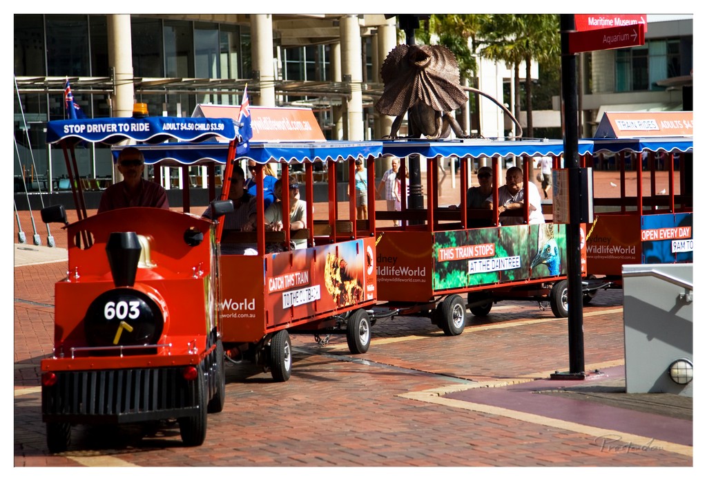
1. Overall Rating (0–10) — 6.0 This photograph captures a vibrant urban scene with a whimsical twist, where a miniature train tour injects playfulness into a bustling city environment. The bright red train and its passengers create a sense of movement and joy, while the juxtaposition of the real-world setting with the childlike charm of the ride offers a layered narrative. While the image is lively and engaging, its overall impact is slightly diminished by a lack of visual cohesion and overabundance of text, which distracts from the aesthetic flow.
2. Composition (0–10) — 6.0 The train is well-framed on the left, creating a natural leading line into the scene, but the inclusion of too many signage elements—especially the red pole and overhead signs—creates visual clutter. The diagonal alignment of the train adds dynamism, yet the composition feels slightly crowded, with the background architecture and pedestrian activity competing for attention.
3. Lighting (0–10) — 7.0 The scene is illuminated by bright, natural daylight, which enhances the vividness of the red train and the warm tones of the brick pavement. The harsh sunlight creates strong shadows, adding depth, but also results in some overexposed highlights on the glass buildings in the background, reducing detail in those areas.
4. Color & Tone (0–10) — 7.0 The palette is energetic, with the bold red of the train contrasting against the neutral tones of the pavement and the muted greens and grays of the surrounding environment. The color balance is largely effective, though the presence of multiple bright advertisements and signs introduces a slightly jarring, commercial quality to the image.
5. Creativity (0–10) — 6.5 The concept of combining a tourist train with a cityscape is inherently creative, and the inclusion of the large frilled lizard sculpture adds a touch of local cultural flair. However, the image leans more toward documentation than artistic expression, with its primary strength lying in its narrative rather than its visual innovation.
6. Technical Quality (0–10) — 7.5 The image is sharp and well-focused, with clear details visible on the train, signage, and passengers. The depth of field is adequate, keeping the train and foreground elements in focus while slightly softening the background. There is minimal noise, and the exposure is generally balanced despite the challenging lighting conditions.
7. Emotional Impact (0–10) — 6.0 The photograph evokes a sense of lightheartedness and urban exploration, appealing to both tourists and locals. The presence of passengers enjoying the ride suggests a moment of shared joy, but the overall emotional resonance is tempered by the busy, commercial atmosphere, which keeps the viewer from fully immersing in the experience.
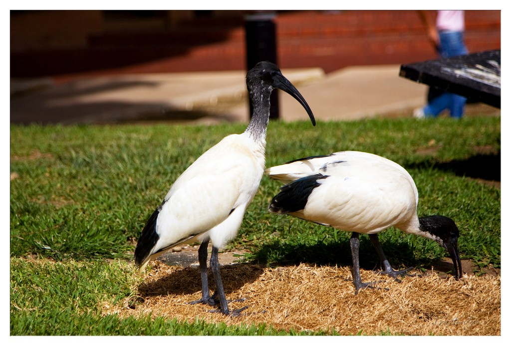
1. Overall Rating (0–10) — 7.0 This photograph captures a serene moment in a park-like setting, where two sacred ibises engage in natural behavior with striking clarity. The contrast between the birds’ black-and-white plumage and the sunlit grass creates a visually engaging scene, while the shallow depth of field isolates the subjects from the softly blurred background. While the composition feels slightly casual, the image succeeds in conveying a quiet dignity and ecological presence, enhanced by the warm, natural lighting.
2. Composition (0–10) — 6.5 The ibises are well-placed along the diagonal, guiding the viewer’s eye across the frame. However, the right side of the image is slightly crowded by the bench edge and background elements, which distract from the natural focus on the birds.
3. Lighting (0–10) — 7.5 Bright, natural sunlight highlights the texture of the birds’ feathers and casts soft shadows, enhancing depth. The light appears to come from the side, accentuating form and creating a warm, midday glow that complements the subject matter.
4. Color & Tone (0–10) — 7.0 The palette is balanced, with rich greens and the crisp white of the ibises providing strong contrast. The black markings on the birds and the warm brown of the straw ground create a harmonious earthy tone, though the red brick in the background adds a slightly jarring note.
5. Creativity (0–10) — 6.5 The image captures a moment of quiet observation rather than a bold artistic statement. While the subject is inherently compelling, the approach is more documentary than interpretive, relying on natural beauty rather than stylized composition.
6. Technical Quality (0–10) — 8.0 Sharp focus on the birds, clean detail in the feathers, and a well-managed depth of field demonstrate strong technical execution. The exposure is balanced, with no significant over- or underexposed areas.
7. Emotional Impact (0–10) — 6.0 The image evokes a sense of calm and curiosity, inviting viewers to appreciate the quiet grace of the birds. However, the emotional resonance is moderate, held back by the lack of a stronger narrative or intimate connection.
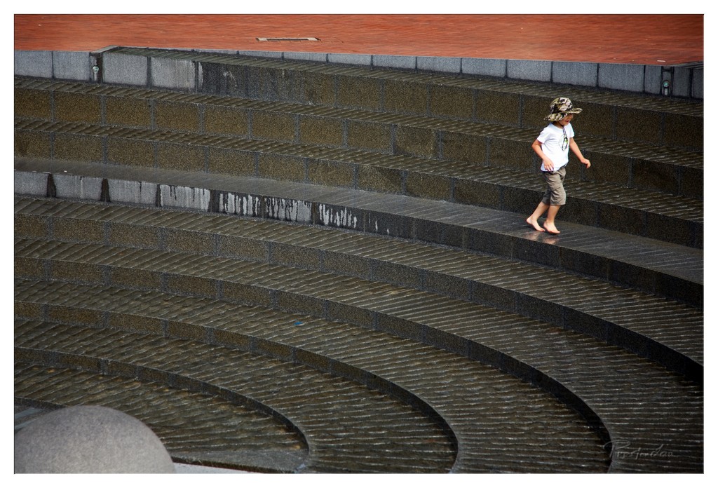
1. Overall Rating (0–10) — 7.0 This photograph captures a quiet, contemplative moment of a child walking barefoot across a series of curved, water-slicked steps, evoking a sense of solitude and urban poetry. The interplay between the child’s small figure and the vast, rhythmic architecture creates a striking contrast, emphasizing both vulnerability and resilience. While the image is visually compelling, its emotional depth is slightly restrained by a lack of atmospheric richness and a somewhat muted color palette.
2. Composition (0–10) — 7.5 The diagonal placement of the child guides the eye through the sweeping curves of the steps, creating a dynamic flow. The use of leading lines and negative space enhances the sense of scale and movement, though the composition feels slightly unbalanced due to the top-heavy framing.
3. Lighting (0–10) — 6.0 The lighting is flat and diffused, likely from an overcast sky, which softens shadows and minimizes texture. While this approach preserves detail across the wet surfaces, it also reduces the dramatic contrast and mood that could have elevated the scene.
4. Color & Tone (0–10) — 6.5 The palette is restrained, dominated by earthy grays and muted tones, with a subtle warmth in the red-tiled upper section. The lack of vibrant color keeps the image grounded and realistic, but limits its visual impact and emotional resonance.
5. Creativity (0–10) — 7.0 The concept of juxtaposing a child’s innocence against a large, industrial environment is compelling and original. The curved architecture serves as a metaphor for life’s winding path, adding a layer of narrative that invites interpretation.
6. Technical Quality (0–10) — 7.5 The image is sharp and clear, with fine detail visible in the wet stone and the child’s clothing. Focus is consistent, and the exposure is well-balanced, capturing the reflective surfaces without overexposure.
7. Emotional Impact (0–10) — 6.5 The photograph evokes a quiet sense of introspection and solitude, with the child’s solitary journey suggesting themes of independence and exploration. While the emotional pull is present, it remains subtle, leaving the viewer to infer deeper meaning.
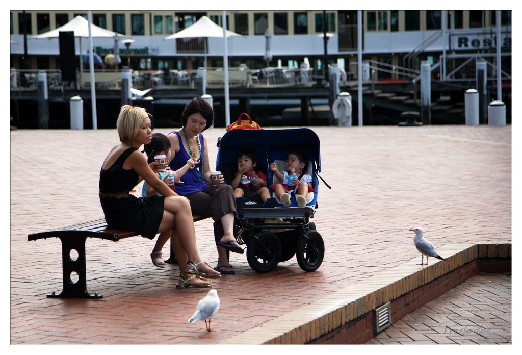
1. Overall Rating (0–10) — 7.0 This photograph captures a candid moment of two women and children resting on a waterfront promenade, evoking a sense of quiet urban life. The composition balances human interaction with the surrounding environment, and the presence of seagulls adds a subtle layer of narrative, suggesting the encroachment of nature into a man-made space. While the image feels authentic and grounded, its visual impact is slightly diminished by a lack of strong tonal contrast and a somewhat flat color rendering.
2. Composition (0–10) — 7.0 The subjects are well-placed along the diagonal of the frame, creating a natural flow from the foreground bench to the background dock. The inclusion of the seagulls on the right edge adds depth and visual interest, though the background signage and structures slightly distract from the central narrative.
3. Lighting (0–10) — 6.0 The scene is illuminated by soft, diffused daylight, likely from an overcast sky, which flattens the shadows and reduces depth. While the lighting is even and avoids harsh contrasts, it lacks the warmth or directionality that would enhance the mood and texture of the scene.
4. Color & Tone (0–10) — 6.0 The color palette is subdued, dominated by muted tones of brick red, gray, and blue. While the colors are cohesive, they lack vibrancy, giving the image a slightly washed-out appearance. The blue of the stroller provides a subtle focal point, but the overall tonal range is narrow.
5. Creativity (0–10) — 7.0 The image succeeds in capturing a slice of everyday life with a documentary sensibility. The juxtaposition of people, stroller, and seagulls introduces a quiet narrative about coexistence in urban spaces. The framing and timing reflect a thoughtful, observational approach, though it stops short of bold artistic interpretation.
6. Technical Quality (0–10) — 7.5 The image is sharp and well-focused, particularly on the subjects in the foreground. The depth of field is adequate, keeping the people and stroller clear while softly blurring the background. The technical execution is solid, with minimal noise and clean detail throughout.
7. Emotional Impact (0–10) — 6.5 The photograph conveys a sense of calm and familiarity, inviting viewers to reflect on moments of pause in daily life. The intimacy of the scene—children eating, women conversing—resonates emotionally, though the lack of strong lighting and color limits its ability to fully engage the viewer on a deeper level.
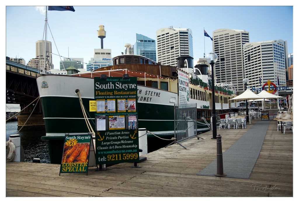
1. Overall Rating (0–10) — 7.0 This photograph captures the vibrant juxtaposition of Sydney’s historic maritime heritage and modern urban skyline, with the South Steyne steamship anchoring the scene as a nostalgic centerpiece. The composition effectively frames the iconic Sydney Tower in the distance, reinforcing the city’s layered identity. While the image is rich in narrative and context, the slightly overexposed sky and cluttered signage detract from its visual harmony, preventing it from achieving greater elegance.
2. Composition (0–10) — 7.5 The low-angle perspective emphasizes the scale of the steamship and the surrounding architecture, with the pier’s leading lines guiding the eye toward the city skyline. The placement of the South Steyne slightly off-center creates a balanced asymmetry, while the foreground signage adds narrative depth without overwhelming the frame.
3. Lighting (0–10) — 6.5 Natural daylight provides even illumination, highlighting the textures of the wooden pier and the steamship’s hull. However, the sky is slightly washed out, reducing contrast and diminishing the atmospheric quality of the scene.
4. Color & Tone (0–10) — 7.0 The palette blends earthy greens and whites of the steamship with the cool blues and grays of the city, creating a cohesive urban maritime tone. The vibrant green of the signage adds a pop of color, though it slightly competes with the overall balance.
5. Creativity (0–10) — 7.5 The image successfully blends historical and contemporary elements, telling a story of Sydney’s evolving waterfront. The inclusion of the "Lobster Special" sign adds a touch of whimsy and authenticity, grounding the scene in everyday life.
6. Technical Quality (0–10) — 8.0 The photograph is sharp and well-focused, with clear detail visible in both the foreground and background. The exposure is generally well-managed, though the sky’s brightness slightly compromises dynamic range.
7. Emotional Impact (0–10) — 6.5 The image evokes a sense of nostalgia and urban pride, inviting viewers to reflect on the city’s past and present. While emotionally resonant, the visual clutter and flat lighting prevent a deeper emotional connection.
Another key waterfront area is Darling Harbour, one of Sydney's most popular recreation spots today. This lively precinct has a colourful history, having played an integral role in Sydney's early market days when it served as a vital point for receiving fresh produce and timber transported from areas like Parramatta and the north coast. Today, it's transformed into a modern entertainment hub featuring a wide array of attractions including museums, aquariums, restaurants, and shops, making it a fantastic place to stroll, dine, and relax by the water.
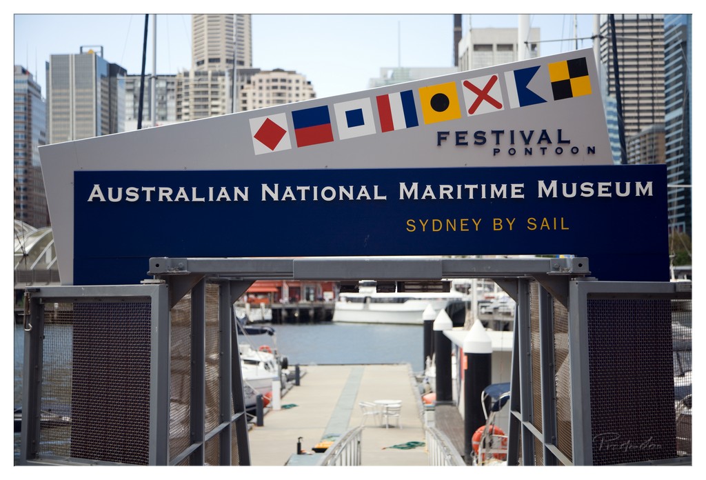
1. Overall Rating (0–10) — 6.0 This photograph captures the bustling intersection of urban life and maritime tradition, with the signage for the Australian National Maritime Museum serving as a clear focal point. The composition effectively frames the city skyline and harbor, suggesting a narrative of movement and culture. However, the image feels slightly overexposed and lacks visual depth, diminishing the emotional pull of the scene despite its strong documentary intent.
2. Composition (0–10) — 7.0 The sign is well-centered, with the dock and cityscape creating a layered depth. The leading lines of the walkway guide the eye toward the background, though the foreground railing slightly disrupts the flow.
3. Lighting (0–10) — 6.0 Bright daylight illuminates the scene, but the harsh sun flattens shadows and washes out some details in the background. The overall exposure is slightly too high, reducing contrast and detail in the sky.
4. Color & Tone (0–10) — 6.5 The palette is clean and functional, with the blue and white of the sign standing out against the muted urban backdrop. The yellow text provides a subtle accent, though the overall tone leans toward clinical rather than evocative.
5. Creativity (0–10) — 5.5 The image functions as a straightforward informational capture rather than an artistic interpretation. While the juxtaposition of modern architecture and nautical elements offers potential for storytelling, the execution remains largely literal.
6. Technical Quality (0–10) — 7.5 The focus is sharp on the sign, and the image is free of major flaws. The slight overexposure is the primary technical weakness, but the clarity of the text and structure remains strong.
7. Emotional Impact (0–10) — 5.0 The photograph conveys a sense of place and occasion but fails to evoke a deeper emotional response. It feels more like a record than a moment—familiar, functional, and slightly detached.
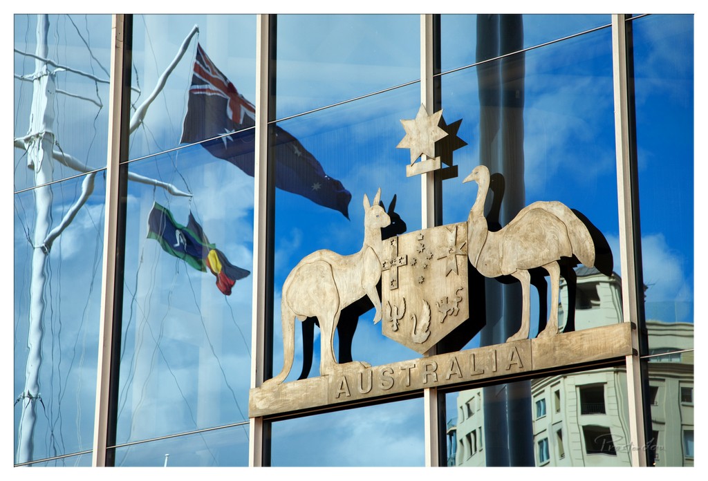
1. Overall Rating (0–10) — 7.5 This photograph masterfully blends symbolism and reflection, using the glass facade of a modern building to create a layered narrative of national identity. The interplay between the physical Australian coat of arms and its mirrored image—alongside the fluttering flags and urban backdrop—gives the scene a dynamic, almost cinematic quality. While the composition is rich with meaning, the reflections slightly distract from the central subject, preventing the image from achieving a more cohesive visual statement.
2. Composition (0–10) — 7.0 The central placement of the coat of arms anchors the image, while the diagonal lines of the window panes and reflections guide the eye across the frame. The inclusion of the flags and surrounding architecture adds depth, though the left-side reflections create a minor visual imbalance.
3. Lighting (0–10) — 8.0 Bright, natural daylight enhances the clarity and contrast of the scene, allowing the reflections to stand out vividly against the blue sky. The strong light emphasizes the textures of the carved emblem and the transparency of the glass, creating a dynamic interplay between solid and ephemeral forms.
4. Color & Tone (0–10) — 8.0 The vivid blue of the sky dominates the palette, complemented by the warm gold of the emblem and the deep navy of the Australian flag. The balance between cool and warm tones adds visual harmony, while the high saturation enhances the image’s bold, patriotic mood.
5. Creativity (0–10) — 8.5 The use of reflections to layer the national symbol with real-world elements demonstrates strong conceptual thinking. The image transcends mere documentation, becoming a metaphor for how national identity is both displayed and refracted through modernity and context.
6. Technical Quality (0–10) — 8.5 The image is sharp and well-focused, with fine detail visible in both the emblem and the reflections. The exposure is balanced, and the clarity of the glass and carved wood suggests precise control over camera settings and timing.
7. Emotional Impact (0–10) — 7.0 The photograph evokes a sense of pride and contemplation, inviting the viewer to reflect on the relationship between tradition and modernity. While the emotional resonance is strong, the slightly cluttered reflections temper its immediacy, leaving the viewer to piece together the full narrative.
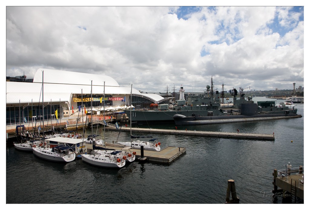
1. Overall Rating (0–10) — 6.8 This photograph captures a striking juxtaposition of maritime heritage and modern leisure, set against the dramatic backdrop of a partly cloudy sky. The juxtaposition of the sleek, white sailboats with the imposing naval vessel and the bold architecture of the National Maritime Museum creates a compelling visual narrative. While the composition effectively conveys the layered history of the harbor, the slightly overcast lighting and muted tones temper the scene’s emotional resonance, leaving it feeling more documentary than evocative.
2. Composition (0–10) — 7.0 The wide-angle perspective frames the scene with a balanced arrangement of elements, leading the eye from the sailboats in the foreground to the museum and the naval ship in the midground. The diagonal line of the dock adds dynamic movement, while the strong horizontal lines of the buildings provide stability. However, the cluttered foreground and the slightly off-center placement of the main subjects create a subtle imbalance.
3. Lighting (0–10) — 6.0 The soft, diffused light from the overcast sky minimizes harsh shadows and allows for even exposure across the scene. While this helps capture detail in both the bright white sails and the darker hull of the ship, the lack of strong directional light limits depth and atmosphere, resulting in a somewhat flat visual impact.
4. Color & Tone (0–10) — 6.5 The palette is dominated by cool grays and blues, reflecting the maritime setting, with the white of the boats and the museum providing contrast. The muted tones lend a subdued, almost melancholic mood, which is fitting for the historical context but slightly dampens the image’s vibrancy. A touch of warmth or richer saturation could enhance the visual appeal.
5. Creativity (0–10) — 7.0 The image succeeds in capturing a unique narrative by contrasting civilian and military maritime life within a cultural space. The inclusion of the museum as a framing device adds conceptual depth, suggesting a dialogue between past and present. While the concept is strong, the execution remains conventional, with little stylistic innovation.
6. Technical Quality (0–10) — 7.5 The photograph is sharp and well-focused, with clear details visible in the boats, the ship, and the museum signage. The wide dynamic range handles the bright and dark areas effectively, and the image is free from significant technical flaws. The slight grain and minor noise in the sky suggest a high ISO or post-processing, but do not detract significantly from overall quality.
7. Emotional Impact (0–10) — 6.0 The image evokes a sense of quiet contemplation, inviting the viewer to reflect on the history and function of the harbor. The juxtaposition of leisure and military vessels, set against the backdrop of a major cultural institution, creates a subtle tension. However, the muted lighting and lack of a strong focal point prevent the emotional connection from deepening, leaving the viewer with a sense of observation rather than engagement.
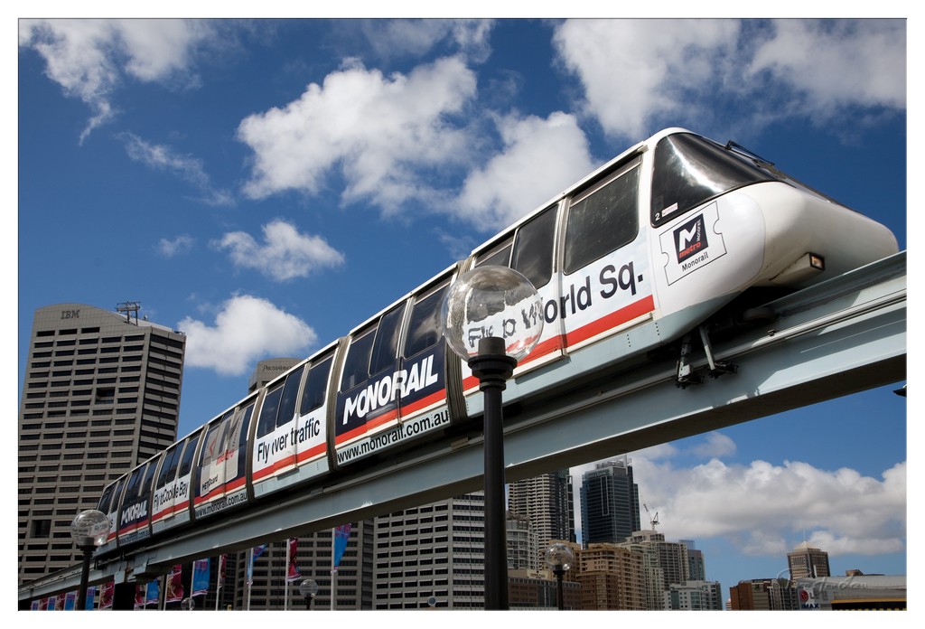
1. Overall Rating (0–10) — 7.0 This image captures the dynamic energy of a monorail gliding through a vibrant urban landscape, with the city’s modern architecture rising beneath a dramatic sky. The low-angle perspective emphasizes the train’s movement and scale, creating a sense of motion and progress. While the composition is strong and the subject engaging, the clutter of advertising on the monorail slightly detracts from the visual purity of the scene.
2. Composition (0–10) — 7.5 The diagonal line of the monorail track draws the eye across the frame, creating a sense of motion and direction. The inclusion of the streetlamp in the foreground adds depth and a subtle sense of scale, while the city skyline provides a balanced backdrop.
3. Lighting (0–10) — 8.0 Bright, natural daylight enhances the vividness of the blue sky and the crisp white clouds. The sunlight creates clear highlights on the monorail’s surface, adding dimension and a sense of realism.
4. Color & Tone (0–10) — 7.5 The contrast between the deep blue sky and the white clouds provides a dynamic backdrop, while the monorail’s red, white, and black branding adds a bold, graphic element. The overall palette is vibrant and well-balanced, though the ads on the train introduce a slightly commercial tone.
5. Creativity (0–10) — 7.0 The choice of a low-angle shot and the inclusion of urban elements lend a cinematic quality to the image. While the subject is familiar, the perspective and timing offer a fresh take on a common cityscape.
6. Technical Quality (0–10) — 8.0 The image is sharp and well-focused, with fine detail visible in the monorail, buildings, and clouds. The exposure is well-managed, preserving detail in both highlights and shadows.
7. Emotional Impact (0–10) — 6.5 The photograph evokes a sense of modernity and forward momentum, capturing the rhythm of city life. While it is visually striking, the emotional resonance is tempered by the commercial elements and the familiar nature of the subject.
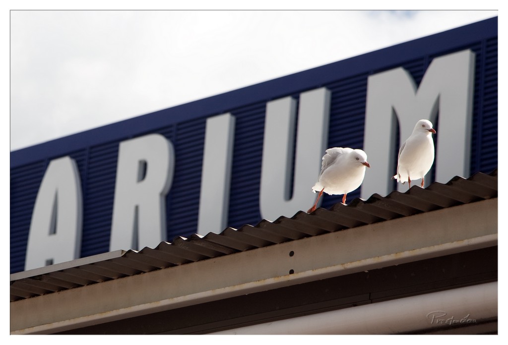
1. Overall Rating (0–10) — 7.0 This photograph captures a quiet, urban moment where nature and architecture intersect with subtle humor. The two seagulls perched on the corrugated roof create a focal point against the bold, partially obscured sign, lending the scene a sense of playful irony. While the image is well-composed and technically sound, the muted sky and lack of dynamic lighting keep it from feeling truly vivid or emotionally charged.
2. Composition (0–10) — 7.5 The birds are well-placed along the diagonal roofline, drawing the eye across the frame. The angled perspective and the partially visible signage create depth and context, though the framing could be tighter to emphasize the subjects.
3. Lighting (0–10) — 6.0 Diffuse, overcast light softens the scene, reducing shadows and creating a flat, even exposure. While it prevents harsh contrasts, it also limits the image’s visual drama.
4. Color & Tone (0–10) — 6.5 The deep blue of the sign provides a strong contrast to the white birds and the neutral roof, but the overall palette is restrained. A slightly cooler tone might enhance the urban atmosphere, while a touch more saturation could elevate the visual impact.
5. Creativity (0–10) — 7.0 The juxtaposition of wild birds against a man-made structure—especially one that hints at a public space—adds a layer of conceptual interest. The partially visible sign invites interpretation, giving the image a quiet narrative edge.
6. Technical Quality (0–10) — 8.0 Sharp focus on the birds and clean detail in the texture of the roof and signage demonstrate strong technical control. The image is free of noise and artifacts, with well-handled depth of field.
7. Emotional Impact (0–10) — 6.5 The scene evokes a sense of calm observation, with a hint of urban irony. While not deeply moving, it resonates with viewers familiar with the coexistence of wildlife and city life, offering a quiet moment of connection.
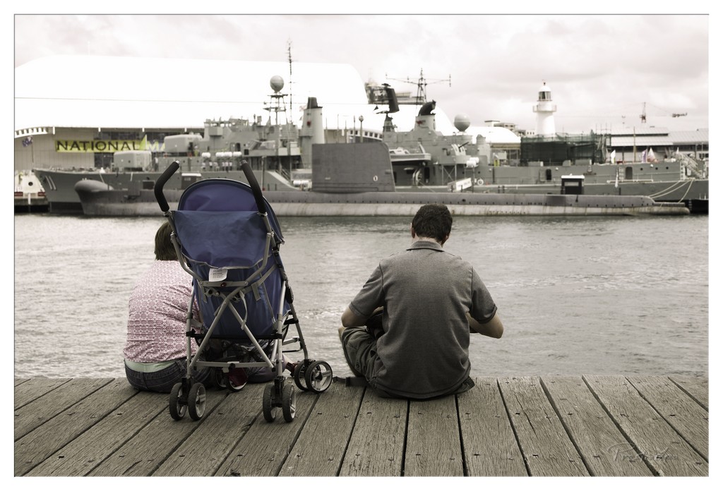
1. Overall Rating (0–10) — 6.8 This photograph captures a quiet, contemplative moment between two people on a dock, their backs turned as they gaze toward a naval vessel and the distant lighthouse. The muted, sepia-toned palette lends a nostalgic and introspective mood, while the juxtaposition of domesticity—symbolized by the stroller—against the imposing military backdrop creates a subtle tension between peace and power. While the image is emotionally resonant, its technical execution and compositional balance could be more refined to elevate its impact.
2. Composition (0–10) — 6.0 The subjects are centered in the lower third, creating a grounded, balanced foundation, but the composition feels slightly cluttered by the stroller and the expansive background. The eye is drawn toward the naval ship, which dominates the frame, potentially overwhelming the human element. A tighter framing might have strengthened the emotional connection between the figures and the viewer.
3. Lighting (0–10) — 6.5 The overcast sky casts a soft, diffused light across the scene, minimizing harsh shadows and lending a somber, unified tone. While the lighting is even and suitable for the mood, it lacks dynamic range and contrast, contributing to the image’s flatness and muted atmosphere.
4. Color & Tone (0–10) — 7.0 The selective color treatment—primarily desaturated with a warm sepia tone—effectively enhances the nostalgic and reflective mood. The single touch of color in the blue stroller adds a subtle focal point, drawing attention to the presence of family life within the industrial setting. The palette is cohesive, though slightly underwhelming in vibrancy.
5. Creativity (0–10) — 7.5 The image succeeds in its conceptual contrast between civilian life and military strength, evoking a quiet narrative about family, duty, and peace. The use of a familiar, everyday scene to frame a larger societal theme demonstrates thoughtful storytelling and originality in composition.
6. Technical Quality (0–10) — 7.5 The image is sharp and well-focused, particularly on the figures and the stroller in the foreground. The wooden dock’s texture is clearly rendered, and the depth of field is appropriate, keeping both the subjects and the distant ship in view. The post-processing is clean, though the tonal adjustments could be more nuanced to enhance dimension.
7. Emotional Impact (0–10) — 7.0 The photograph resonates emotionally through its portrayal of quiet reflection and the implied bond between the two figures. The presence of the stroller adds a layer of tenderness and vulnerability, making the viewer contemplate the future and the weight of legacy. While the mood is poignant, the emotional connection is somewhat restrained by the image’s subdued tonal quality.
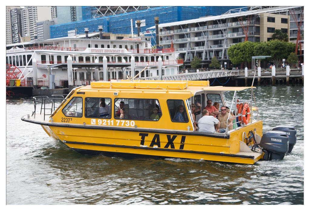
1. Overall Rating (0–10) — 6.8 This image captures a vibrant slice of urban water life, where the bright yellow water taxi cuts through the harbor with a sense of motion and purpose. The juxtaposition of the modern ferry in the background and the bustling city skyline adds depth and context, grounding the scene in a recognizable metropolitan rhythm. While the composition is dynamic and engaging, the slightly chaotic framing and overexposed highlights detract from its visual cohesion, keeping it from achieving a more polished, cinematic quality.
2. Composition (0–10) — 6.5 The boat is well-framed and positioned diagonally, guiding the eye across the image and emphasizing movement. However, the cluttered background and uneven distribution of elements slightly disrupt the balance, making the scene feel more candid than composed.
3. Lighting (0–10) — 7.0 Natural daylight illuminates the scene evenly, enhancing the vivid yellow of the taxi and creating lively reflections on the water. The light is bright but not harsh, allowing details in both the boat and the background to remain visible.
4. Color & Tone (0–10) — 7.5 The dominant yellow of the taxi creates a striking contrast against the muted grays and blues of the water and cityscape. The color palette is energetic and balanced, with warm tones in the boat and life jackets complementing the cooler urban backdrop.
5. Creativity (0–10) — 7.0 The concept of a water taxi in a bustling city is both familiar and compelling, offering a unique perspective on urban transit. The photograph captures a moment of everyday life with a sense of narrative and motion, though it doesn't break new visual ground.
6. Technical Quality (0–10) — 7.5 The image is sharp and clear, with well-defined details on the boat, passengers, and background structures. The focus is consistent, and the exposure is well-managed, though some highlights on the water and buildings are slightly overexposed.
7. Emotional Impact (0–10) — 6.0 The photograph evokes a sense of movement and urban vitality, capturing the energy of a city in motion. While it conveys a lively atmosphere, the lack of a deeper emotional hook or personal connection keeps the viewer from fully engaging with the moment.
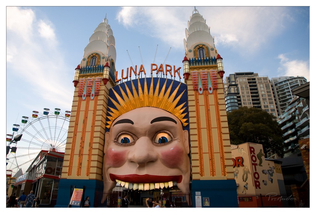
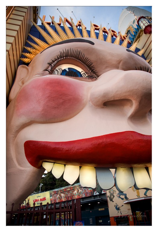
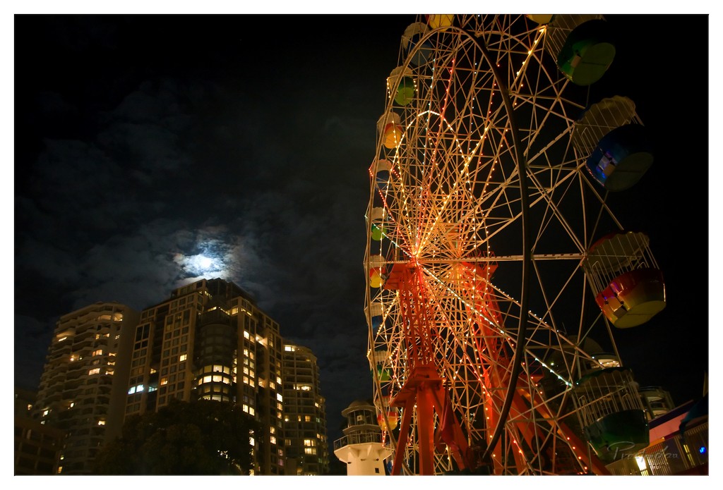
Across the harbour, offering a touch of vintage fun, is Luna Park, Sydney's charming Coney Island-type amusement park. Located right on the harbour's edge, with its iconic smiling face entrance, Luna Park has a history stretching back to the 1930s. Although it faced challenges, including a closure in the mid-1960s after a fire, the park happily reopened in April 2004 and has been open daily since then, continuing to delight visitors. This vibrant entertainment venue features classic carnival rides like a prominent ferris wheel, a beautiful merry-go-round, and other exciting attractions, making it a favorite of the young and the young at heart. Getting there is part of the fun; it's an easy and scenic journey, no more than a five-minute ferry ride from Circular Quay, offering lovely views as you approach. The view from Luna Park's Ferris wheel, especially at night with the city lights and the Opera House and Harbour Bridge illuminated, is simply stunning.
1. Overall Rating (0–10) — 7.5 This photograph captures the grandeur of the Sydney Harbour Bridge under a vibrant blue sky, evoking a sense of scale and urban majesty. The dynamic interplay of light and shadow across the steel arch and water adds depth and energy, while the inclusion of the boat’s wake introduces movement and life. Though the composition is strong, the slightly heavy-handed color saturation and tight framing limit its emotional subtlety, keeping it from achieving true artistic resonance.
2. Composition (0–10) — 7.0 The bridge dominates the frame, creating a powerful diagonal that draws the eye across the image. The inclusion of the pier and buildings on the right balances the composition, though the left side feels slightly more crowded, and a tighter crop might enhance focus.
3. Lighting (0–10) — 8.0 Bright, natural daylight enhances the textures of the steel structure and highlights the clouds above. The contrast between sunlit peaks and shaded undercarriage adds dimension, while the reflections on the water amplify the sense of openness.
4. Color & Tone (0–10) — 7.0 The sky is vividly saturated, with rich blues and crisp whites, but the water’s tone leans slightly toward a flat greenish-blue. The overall palette is bold and energetic, though the color treatment feels slightly overprocessed, reducing the scene’s natural subtlety.
5. Creativity (0–10) — 7.5 The perspective from the water offers a fresh viewpoint of a well-known landmark, emphasizing both its engineering and its relationship to the surrounding environment. The inclusion of the boat’s wake adds a narrative thread, transforming a standard cityscape into a moment of motion and journey.
6. Technical Quality (0–10) — 8.5 The image is sharp and clear, with precise focus on the bridge and surrounding structures. The dynamic range is well-managed, preserving detail in both the bright sky and darker areas of the steelwork.
7. Emotional Impact (0–10) — 7.0 The photograph conveys a sense of awe and civic pride, capturing the iconic presence of the bridge in a lively, sunlit setting. While it evokes the familiar grandeur of the landmark, it stops short of profound emotional intimacy, feeling more like a strong travel snapshot than a deeply moving portrait.
1. Overall Rating (0–10) — 7.5 This image captures the iconic Sydney Opera House with a dynamic sense of movement, enhanced by the passing ferry that adds life and scale to the scene. The crisp detail and balanced composition highlight the architectural grandeur against a vibrant sky, though the slightly overexposed highlights on the sails soften their texture. While it’s a strong travel photograph, it leans toward the conventional, offering a familiar view with just enough energy to feel engaging.
2. Composition (0–10) — 7.0 The Opera House dominates the frame, with the ferry positioned diagonally to guide the eye across the water, creating a sense of motion. The low-angle perspective emphasizes the building’s scale, though the background elements—crane and distant structures—introduce minor visual distractions.
3. Lighting (0–10) — 8.0 Bright, natural daylight enhances the clean lines of the Opera House, casting soft shadows that define its form. The sky is vivid but not overblown, and the water reflects the light with a natural sheen, contributing to the scene’s clarity and openness.
4. Color & Tone (0–10) — 7.5 The palette is strong, with the contrast between the white sails, deep blue water, and bright sky creating a visually striking image. The turquoise of the ferry adds a pop of color that complements the overall tone without overwhelming the scene.
5. Creativity (0–10) — 6.5 While the subject is highly recognizable, the inclusion of the moving ferry introduces a narrative element—commuters, tourism, daily life—that elevates it beyond a simple landmark shot. The timing and framing suggest intention, but the concept remains within the realm of well-executed travel photography.
6. Technical Quality (0–10) — 8.5 The image is sharp and well-focused, with excellent clarity across the frame. The exposure is balanced, and the water’s motion is captured with smooth detail, indicating a fast shutter speed and precise control.
7. Emotional Impact (0–10) — 7.0 The photograph evokes a sense of place and movement, capturing the energy of Sydney’s harbor. The viewer is drawn into the scene, not just as a spectator of architecture, but as a participant in the rhythm of the city’s waterfront.
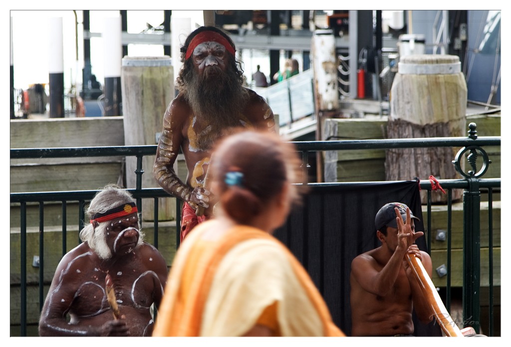
1. Overall Rating (0–10) — 7.5 This photograph captures a powerful cultural moment, blending traditional Indigenous Australian ceremony with the modern urban environment of a dockside setting. The presence of body paint, ceremonial adornments, and the didgeridoo creates a striking contrast against the industrial backdrop, emphasizing the continuity of tradition in contemporary life. While the image succeeds in conveying cultural authenticity and emotional gravity, the shallow depth of field and slightly cluttered framing dilute its visual clarity.
2. Composition (0–10) — 6.5 The layered arrangement creates depth, but the foreground figure’s out-of-focus back distracts from the central subject. A tighter focus on the standing elder would strengthen the narrative balance.
3. Lighting (0–10) — 7.0 Natural daylight provides even illumination, highlighting the textures of the body paint and wood. The soft shadows enhance the subject’s presence without overwhelming the scene.
4. Color & Tone (0–10) — 7.5 The earthy tones of the body paint and wood harmonize with the muted urban palette, while the red headband and orange garment provide focal warmth. The tonal range is balanced, supporting the cultural narrative.
5. Creativity (0–10) — 8.0 The juxtaposition of traditional ceremony against a modern, industrial setting is conceptually strong and visually compelling. The image tells a story of resilience and cultural continuity.
6. Technical Quality (0–10) — 7.0 Sharp focus on the central figure, though the foreground blur detracts from clarity. The exposure is well-managed, with no significant technical flaws.
7. Emotional Impact (0–10) — 8.0 The image evokes a sense of reverence and quiet strength, inviting reflection on cultural identity and survival. The solemn expressions and ceremonial context resonate deeply.
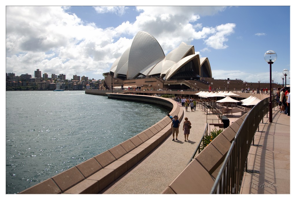
1. Overall Rating (0–10) — 7.5 This image captures the iconic Sydney Opera House with a sense of grandeur and everyday life, where architecture and human activity coexist harmoniously. The composition balances the monumental structure with the lively promenade, while the dynamic sky adds visual energy. While the scene is familiar, the interplay of light and perspective gives it a fresh, immersive quality—though the framing feels slightly unbalanced, it remains compelling.
2. Composition (0–10) — 6.5 The diagonal walkway leads the eye toward the Opera House, creating a natural flow, but the inclusion of the right-side railing and lampposts introduces visual clutter. The left side feels more open, while the right edge is crowded, disrupting compositional harmony.
3. Lighting (0–10) — 7.5 Bright, natural daylight enhances the textures of the Opera House’s shells and the shimmering water. The contrast between sunlit clouds and shadows adds depth, and the reflections on the water contribute to a lively, dynamic atmosphere.
4. Color & Tone (0–10) — 7.0 The palette is vibrant, with rich blues in the sky and water contrasting against the warm beige of the walkway and the white of the sails. The color balance is natural, though slightly cool, which emphasizes the crispness of the day.
5. Creativity (0–10) — 6.5 While the subject is iconic and widely photographed, the perspective offers a slightly fresh angle by emphasizing the human scale and movement along the waterfront. However, the image leans more toward documentation than conceptual expression.
6. Technical Quality (0–10) — 8.0 Sharp focus, accurate exposure, and clean detail throughout. The camera captures fine textures in the stone and fabric of the sails, and the dynamic range is well-managed, preserving detail in both highlights and shadows.
7. Emotional Impact (0–10) — 7.0 The image evokes a sense of travel, wonder, and connection to a globally recognized landmark. The presence of people strolling and enjoying the view adds warmth and relatability, making the viewer feel part of the moment.
1. Overall Rating (0–10) — 7.5 This photograph captures a quiet, intimate moment of two people ascending the steps of the Sydney Opera House, framed by its iconic shells against a dynamic sky. The low-angle perspective amplifies the grandeur of the architecture while grounding the human element in a sense of scale and journey. While the composition is strong and the mood contemplative, the slightly overexposed sky and muted tones temper its visual impact, holding it back from transcendent beauty.
2. Composition (0–10) — 8.0 The low-angle framing emphasizes the sweeping lines of the steps and the monumental architecture, drawing the eye upward along the diagonal path of the couple. The subjects are placed off-center, creating a natural flow that leads into the frame and balances the weight of the Opera House’s forms.
3. Lighting (0–10) — 6.5 The scene is lit by bright daylight, with strong overhead light casting subtle shadows on the steps. The sky is slightly overexposed, losing some detail in the clouds, but the natural light enhances the texture of the shells and gives the image a crisp, open feel.
4. Color & Tone (0–10) — 6.0 The palette is dominated by neutral tones—beige, gray, and muted blue—creating a calm, almost documentary feel. While the colors are true to the scene, they lack vibrancy and warmth, giving the image a somewhat flat and restrained quality.
5. Creativity (0–10) — 7.0 The choice to capture the couple from behind as they ascend adds a narrative layer—suggesting arrival, exploration, or shared experience. The juxtaposition of the monumental and the personal offers a fresh, humanizing perspective on a well-known landmark.
6. Technical Quality (0–10) — 8.0 The image is sharp and well-focused, with clear detail visible in both the foreground steps and the textured shells. The depth of field is appropriately managed, keeping the subjects and architecture in focus while allowing the background to remain open and uncluttered.
7. Emotional Impact (0–10) — 7.5 The photograph evokes a sense of journey and connection, both personal and cultural. The quiet intimacy of the couple against the backdrop of one of the world’s most recognizable structures creates a subtle emotional resonance, inviting viewers to reflect on their own travels and shared moments.
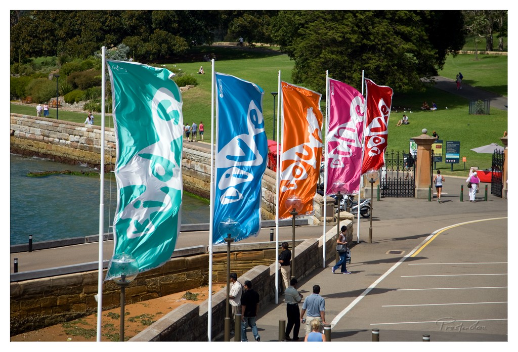
1. Overall Rating (0–10) — 6.8 This photograph captures a vibrant public space where color and movement converge along a coastal promenade. The bold, waving flags create a dynamic visual rhythm, drawing the eye across the frame and infusing the scene with energy. While the image successfully conveys a sense of place and activity, the slightly cluttered foreground and uneven spacing of the flags dilute the overall impact, preventing the composition from achieving a more cohesive and polished aesthetic.
2. Composition (0–10) — 6.5 The diagonal arrangement of the flags leads the eye from left to right, creating a sense of motion. However, the uneven spacing and overlapping elements introduce visual tension, and the inclusion of the parking lot on the right feels disconnected from the natural and architectural elements on the left.
3. Lighting (0–10) — 7.0 Bright, direct sunlight enhances the vividness of the flags and casts sharp shadows, emphasizing the midday setting. The strong light also brings out the texture of the stone wall and the clarity of the water, though some areas are slightly overexposed.
4. Color & Tone (0–10) — 7.5 The palette is rich and varied, with the vibrant teal, blue, orange, pink, and red flags creating a lively contrast against the green park and muted stone tones. The colors are well-saturated and harmonize effectively, adding visual excitement to the scene.
5. Creativity (0–10) — 7.0 The use of colorful, branded flags as a central motif is a strong creative choice, transforming a simple public space into a visually engaging tableau. The interplay of movement, color, and urban life suggests a celebration of community and place.
6. Technical Quality (0–10) — 7.5 The image is sharp and well-focused, with clear details in the flags, people, and background. The exposure is generally well-balanced, though some highlights in the sky and on the pavement are slightly blown out.
7. Emotional Impact (0–10) — 6.5 The photograph evokes a sense of energy and optimism, capturing a moment of everyday life infused with color and motion. While it is engaging and pleasant, it doesn’t evoke a deeper emotional resonance, feeling more like a lively snapshot than a profound visual statement.
1. Overall Rating (0–10) — 7.5 This photograph captures the iconic Sydney Opera House with a strong sense of architectural grandeur and everyday life unfolding beneath its sweeping shells. The composition balances the monumental scale of the building with human presence, grounding the image in relatable context. While the lighting and color are solid, the scene feels slightly overexposed, and the framing lacks a more dynamic tension—yet it remains a compelling and well-executed travel portrait.
2. Composition (0–10) — 7.0 The Opera House dominates the frame, its curved forms drawing the eye upward, while the foreground signage and people provide scale and narrative. The low angle emphasizes the structure’s imposing presence, though the right side feels slightly crowded with the staircase and visitors, creating a subtle imbalance.
3. Lighting (0–10) — 7.5 Bright, natural daylight enhances the texture of the shell tiles and casts soft shadows that define the building’s form. The sky is vivid, with clouds adding depth, though the sun’s intensity slightly flattens detail in the highlights on the white surfaces.
4. Color & Tone (0–10) — 7.0 The palette is dominated by the crisp white of the shells, contrasted with the blue sky and earthy tones of the plaza. While the colors are vibrant and true to life, the overall tone leans toward a slightly cool, daylight cast, which, while effective, could benefit from more warmth to evoke a more inviting atmosphere.
5. Creativity (0–10) — 7.0 The image successfully captures a well-known landmark in a familiar yet visually engaging way. The inclusion of people and signage adds narrative depth, suggesting a living, breathing city rather than a static monument. The creativity lies in the balance between architectural awe and human scale.
6. Technical Quality (0–10) — 8.0 Sharp focus is maintained across the frame, with clear detail in the Opera House’s tiles and the surrounding environment. The exposure is well-handled overall, though some highlight clipping in the sky and bright areas suggests minor post-processing refinement could enhance tonal range.
7. Emotional Impact (0–10) — 7.5 The image evokes a sense of wonder and civic pride, capturing a moment of connection between people and one of the world’s most recognizable buildings. The presence of visitors adds a layer of warmth and accessibility, inviting viewers to imagine themselves in the scene.
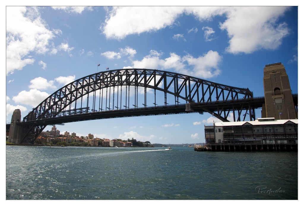
Spanning the harbour with impressive grace is the Sydney Harbour Bridge, affectionately known by locals as the 'Coathanger'. This is another of Australia's most well known and photographed landmarks. It is the world's largest (but not the longest) steel arch bridge, a remarkable feat of engineering with the top of the bridge standing a dramatic 134 metres above the harbour. The bridge officially opened in March 1932, celebrating its 70th birthday in 2002 (a testament to its enduring structure). Seeing the bridge from various vantage points around the harbour, or even walking or climbing it, offers a profound sense of its scale and its integral role in the Sydney skyline.
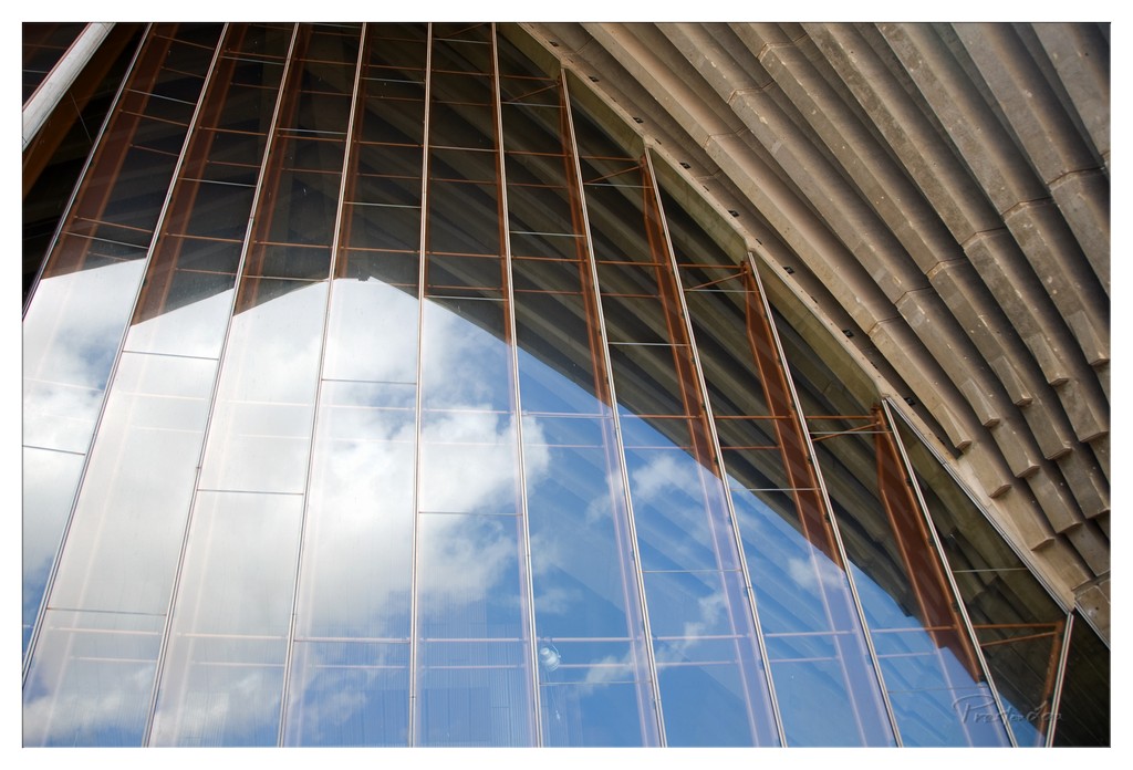
1. Overall Rating (0–10) — 7.5 This photograph captures the interplay between architecture and sky with striking clarity, transforming a modern structure into a canvas for light and reflection. The diagonal lines of the glass and concrete create a dynamic tension, while the mirrored clouds lend a sense of fluidity and movement. While the image is visually compelling, its potential is slightly restrained by a lack of deeper atmospheric nuance, leaving it as a strong architectural study rather than a transcendent moment.
2. Composition (0–10) — 8.0 The strong diagonal lines of the glass panels and concrete ribs guide the eye through the frame with purpose, creating a sense of rhythm and direction. The asymmetrical framing adds visual energy, though the slight imbalance near the right edge slightly disrupts the overall harmony.
3. Lighting (0–10) — 7.5 Natural daylight illuminates the scene with clarity, highlighting the transparency of the glass and the texture of the concrete. The reflections of the sky are sharp and well-exposed, with subtle gradations of light and shadow enhancing depth.
4. Color & Tone (0–10) — 7.0 The cool blue of the sky contrasts beautifully with the warm bronze tones of the metal framing, creating a balanced and modern palette. The tones are well-saturated without appearing overprocessed, though the overall color temperature leans slightly cool, dampening the warmth of the concrete.
5. Creativity (0–10) — 8.0 The concept of using a building’s surface as a mirror to the sky is both clever and visually poetic. The photographer captures an unusual perspective that transforms a mundane architectural detail into a contemplative image of structure and sky.
6. Technical Quality (0–10) — 8.5 The image is sharp and well-focused, with clean details visible in both the glass and the structural elements. The exposure is balanced, and the reflections are rendered with clarity, indicating strong technical execution.
7. Emotional Impact (0–10) — 7.0 The photograph evokes a sense of quiet awe, inviting the viewer to consider the relationship between human design and natural elements. It feels contemplative and serene, though the emotional resonance is more intellectual than visceral.
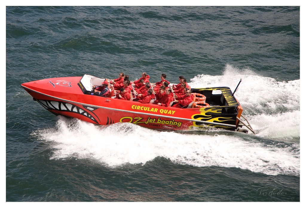
1. Overall Rating (0–10) — 7.5 This photograph captures the raw energy of a high-speed jet boat tour, with the red vessel slicing through the water like a blade through silk. The dynamic motion and vivid branding evoke a sense of adventure and speed, while the passengers' expressions hint at both thrill and exhilaration. Though the image is strong in capturing action, the slightly cluttered composition and flat lighting prevent it from achieving a more refined aesthetic.
2. Composition (0–10) — 6.5 The boat is angled diagonally across the frame, creating a sense of movement, but the tight framing cuts into the bow and stern, slightly disrupting balance. The water spray and wake add depth, but the lack of negative space diminishes the visual breathing room.
3. Lighting (0–10) — 6.0 The scene is lit by natural daylight, which is even but lacks contrast. The overcast quality of the light flattens the textures of the water and reduces the vibrancy of the red hull.
4. Color & Tone (0–10) — 7.0 The bold red of the boat dominates the frame, creating a striking contrast against the dark blue-green water. The yellow and black flame decals add visual interest, though the overall tone feels slightly muted due to the lighting.
5. Creativity (0–10) — 7.5 The image successfully conveys the excitement of jet boating through motion and vivid branding. The choice to capture the boat mid-turn, with passengers reacting, adds narrative depth and a sense of immediacy.
6. Technical Quality (0–10) — 8.0 The focus is sharp on the boat and passengers, and the image is free from major technical flaws. The high-speed motion is captured cleanly, with minimal blur, indicating a fast shutter speed.
7. Emotional Impact (0–10) — 7.0 The photograph evokes a sense of adrenaline and adventure, drawing the viewer into the experience. The passengers’ expressions of excitement and awe create a relatable emotional connection, even if the distance of the shot keeps the intimacy restrained.
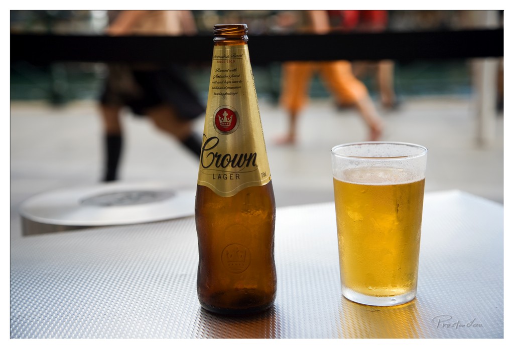
1. Overall Rating (0–10) — 7.0 This photograph captures a moment of quiet refreshment, where the crispness of a chilled beer contrasts with the blurred motion of a bustling background. The shallow depth of field isolates the bottle and glass, creating a sense of intimacy amid urban energy. While the composition is strong and the subject clear, the lighting feels slightly flat, and the scene, though relatable, lacks a deeper emotional or narrative pull.
2. Composition (0–10) — 7.5 The bottle and glass are well-placed along the horizontal axis, creating a balanced and focused foreground. The blurred background adds depth without distracting, though a slightly tighter crop might enhance the sense of immediacy.
3. Lighting (0–10) — 6.0 Natural daylight illuminates the scene evenly, but the lack of directional warmth or shadowing gives the image a neutral, almost clinical feel. The highlights on the glass are soft, and the overall exposure leans toward the cooler side.
4. Color & Tone (0–10) — 6.5 The golden amber of the beer and label provides a warm focal point against the cool gray of the table. The color palette is harmonious but restrained, with a slightly muted tone that softens the image’s overall impact.
5. Creativity (0–10) — 6.0 The image tells a simple, everyday story—refreshment in motion—but doesn’t push beyond a standard observational style. The use of shallow depth of field is effective, but the concept remains conventional.
6. Technical Quality (0–10) — 8.0 Sharp focus on the bottle and glass, clean details on the label, and a well-executed bokeh in the background indicate strong technical control. The image is crisp and well-processed.
7. Emotional Impact (0–10) — 6.5 There’s a subtle sense of relaxation and satisfaction conveyed through the chilled drink and casual setting. While it evokes a moment of pause, it doesn’t deeply resonate—more a snapshot than a revelation.
1. Overall Rating (0–10) — 6.8 This photograph captures a candid moment of personal presence against the iconic backdrop of the Sydney Opera House, blending travel memory with subtle narrative. The subject’s relaxed expression and casual attire ground the image in authenticity, while the soft, overcast light lends a quiet, contemplative mood. Though the composition feels slightly unbalanced and the focus is uneven, the image succeeds in conveying a sense of place and personal experience—more a snapshot of a journey than a polished portrait.
2. Composition (0–10) — 6.0 The subject is centered but slightly off-kilter, creating visual tension. The railing and background figures introduce distractions, while the Opera House, though recognizable, is slightly out of focus, weakening the intended depth.
3. Lighting (0–10) — 6.5 Diffused natural light from the overcast sky creates even illumination with minimal harsh shadows, giving the scene a calm, muted atmosphere. However, the lack of contrast and highlights limits visual drama.
4. Color & Tone (0–10) — 6.0 The palette is dominated by cool grays and muted blues, with the white t-shirt and black cap offering contrast. The colors are natural but subdued, giving the image a slightly flat appearance.
5. Creativity (0–10) — 6.5 The juxtaposition of the everyday traveler with a world-famous landmark provides a relatable, personal perspective. While not groundbreaking, the image captures a quiet moment of travel that feels genuine and grounded.
6. Technical Quality (0–10) — 7.0 The focus is sharp on the man’s face and torso, with a shallow depth of field that softly blurs the background. The image is clean, with no visible noise or distortion.
7. Emotional Impact (0–10) — 6.0 The photograph evokes a sense of quiet pride and travel nostalgia, but the emotional resonance is limited by the lack of dynamic expression and the somewhat generic setting.
1. Overall Rating (0–10) — 7.0 This photograph captures a serene urban sunset, where the silhouetted palm fronds and distant high-rise create a contemplative contrast between nature and city life. The warm glow of the setting sun casts a golden sheen across the water, evoking a sense of calm and quiet reflection. While the image is visually rich and emotionally resonant, the strong silhouettes slightly obscure detail, softening the overall impact.
2. Composition (0–10) — 7.5 The framing through the palm fronds adds depth and a natural vignette, drawing the eye toward the sun and the building. The diagonal line of the horizon and the placement of the tower create visual interest, though the left side feels slightly unbalanced.
3. Lighting (0–10) — 8.0 The golden hour light creates a dramatic and warm atmosphere, with the sun’s glow breaking through the clouds and reflecting on the water. The silhouetted elements enhance the contrast and mood, though some detail is lost in the deep shadows.
4. Color & Tone (0–10) — 7.5 The palette is dominated by warm oranges and deep blacks, creating a harmonious and atmospheric tone. The subtle gradation of light across the sky adds depth, while the dark silhouettes provide strong contrast.
5. Creativity (0–10) — 7.0 The use of natural framing with palm fronds adds a unique, personal touch, transforming a standard sunset into a more intimate moment. The juxtaposition of urban and natural elements gives the image a thoughtful narrative.
6. Technical Quality (0–10) — 8.0 The image is sharp in the areas of focus, with clean exposure and minimal noise. The composition is well-executed, though the silhouette of the palm fronds is slightly soft, suggesting a shallow depth of field.
7. Emotional Impact (0–10) — 7.5 The photograph evokes a peaceful, introspective mood, inviting the viewer to pause and reflect on the quiet beauty of a city at dusk. The warm light and framing create a sense of intimacy and stillness.
1. Overall Rating (0–10) — 7.5 This photograph captures the bold, theatrical spirit of Luna Park with striking clarity and energy. The towering face and Art Deco towers dominate the frame, creating an immediate sense of wonder and nostalgia. The juxtaposition of the whimsical amusement park against the modern city skyline adds narrative depth, though the image slightly loses cohesion due to the busy background elements.
2. Composition (0–10) — 7.0 The low-angle perspective emphasizes the grandeur of the entrance, while the symmetrical towers frame the central face effectively. However, the inclusion of the Ferris wheel and surrounding structures on the left introduces visual clutter, slightly disrupting the balance.
3. Lighting (0–10) — 8.0 Natural daylight enhances the scene with soft, even illumination, highlighting the textures and colors of the facade. The golden glow of the illuminated sign contrasts beautifully with the blue sky, creating a vibrant and inviting atmosphere.
4. Color & Tone (0–10) — 8.0 The rich palette—vibrant yellows, deep blues, and bold reds—evokes a playful, retro charm. The tones are well-balanced, with the warm accents of the sign and face standing out against the cooler background hues.
5. Creativity (0–10) — 8.5 The image successfully blends nostalgia and modernity, using the contrast between the amusement park’s vintage design and the surrounding urban landscape to create a compelling visual narrative. The choice to include the skyline adds a layer of context that elevates the photograph beyond a simple tourist shot.
6. Technical Quality (0–10) — 8.5 The image is sharp and detailed, with excellent focus on the main subject. The dynamic range is well-managed, preserving detail in both the bright sky and darker areas of the structure.
7. Emotional Impact (0–10) — 8.0 The photograph evokes a sense of childlike wonder and urban nostalgia, capturing the joy and spectacle of a beloved landmark. The exaggerated facial features and bold colors invite viewers to step into a world of imagination and delight.
These key landmarks – the Sydney Opera House, the Sydney Harbour Bridge, and Luna Park – are all intrinsically linked by their presence around the magnificent Sydney Harbour. Circular Quay serves as a central point connecting these areas via the frequent ferry services, making it easy to hop between these iconic sites and experience the different facets of Sydney's vibrant waterfront.
1. Overall Rating (0–10) — 8.0 This photograph captures the whimsical grandeur of Luna Park with a bold, almost theatrical presence, where the oversized face dominates the frame like a living signpost to nostalgia and fun. The low-angle perspective amplifies the monumentality of the structure, while the vivid colors and dramatic lighting infuse the scene with energy and playfulness. Though the composition borders on overwhelming, it effectively conveys the spectacle and charm of the amusement park’s iconic entrance.
2. Composition (0–10) — 8.0 The low-angle shot emphasizes the scale and theatricality of the giant face, with its mouth and eyes framing the background. The placement of the "Luna Park" sign above creates a visual hierarchy, drawing the eye upward and enhancing the sense of awe.
3. Lighting (0–10) — 7.5 The warm, golden light of late afternoon enhances the textures and colors of the face, casting soft shadows that give depth to the features. The contrast between the lit face and the slightly darker sky adds dimension and drama.
4. Color & Tone (0–10) — 8.5 The bold reds, pinks, and yellows of the face pop against the muted sky, creating a vibrant, cartoon-like palette that reinforces the playful mood. The tonal range is well-balanced, with rich saturation that makes the image visually arresting.
5. Creativity (0–10) — 8.0 The choice of perspective and focus on the exaggerated facial features transforms a simple amusement park sign into a surreal, almost cinematic portrait. The image captures not just a place, but the spirit of whimsy and nostalgia.
6. Technical Quality (0–10) — 8.0 The image is sharp and well-focused, with fine detail visible in the textures of the face and teeth. The exposure is well-managed, preserving highlights and shadows without loss of information.
7. Emotional Impact (0–10) — 7.5 The photograph evokes a sense of wonder and delight, inviting the viewer to step into a world of fantasy and fun. The exaggerated features and bright colors stir childhood memories and the joy of play, creating a strong emotional resonance.
1. Overall Rating (0–10) — 7.0 This photograph captures a moment of poised professionalism among a line of servers, conveying both discipline and anticipation. The diagonal composition draws the eye through the row, while the soft, natural light enhances the quiet intensity of the scene. Though the image is slightly underexposed and lacks depth in the background, its documentary quality and focus on human presence give it a compelling, almost cinematic feel.
2. Composition (0–10) — 7.5 The diagonal arrangement of the servers creates a strong visual rhythm, guiding the viewer’s gaze from foreground to background. The shallow depth of field isolates the subjects, emphasizing their focus and unity, though the slightly off-center framing feels just slightly unbalanced.
3. Lighting (0–10) — 6.5 Natural light from the windows illuminates the scene from the side, creating soft highlights on the faces and glassware. The backlighting adds dimension but also results in slight underexposure in the foreground, muting detail in the darker areas.
4. Color & Tone (0–10) — 6.0 The palette is dominated by muted blacks and grays, punctuated by the pale gold of the champagne and the amber of the bottles. While cohesive, the tones lack vibrancy, giving the image a subdued, almost monochromatic quality that limits its visual impact.
5. Creativity (0–10) — 7.0 The image successfully captures a narrative moment—perhaps a pre-service lineup—transforming a routine scene into one of quiet dignity. The juxtaposition of formal attire and the casual presence of a passerby in the background adds narrative intrigue.
6. Technical Quality (0–10) — 7.0 The focus is sharp on the central figures, with clear detail in the glassware and facial expressions. However, the overall image appears slightly soft, possibly due to lens choice or slight motion blur, and the exposure could be more balanced.
7. Emotional Impact (0–10) — 7.0 There’s a palpable sense of readiness and quiet tension, evoking the anticipation before a major event. The uniformity of the staff and their focused expressions create a feeling of unity and purpose, inviting the viewer to reflect on the unseen performance about to unfold.
1. Overall Rating (0–10) — 7.0 This photograph captures the electric energy of a lively cocktail bar at night, where cool blue light transforms a simple service scene into a cinematic moment. The glowing bar counter and illuminated glasses create a striking visual rhythm, drawing the eye through the composition. While the image effectively conveys atmosphere and mood, the heavy blue cast and silhouetted figures slightly obscure the human element, softening the emotional connection.
2. Composition (0–10) — 7.5 The curved bar forms a natural leading line, guiding the viewer from the foreground to the bartender at the center. The diagonal placement of the sign and the scattered glasses add dynamic tension, though some foreground silhouettes risk distracting from the focal point.
3. Lighting (0–10) — 8.0 The use of cool blue backlighting creates a dramatic, immersive atmosphere, emphasizing the glowing glassware and casting the surrounding space into shadow. The light source is well-controlled, enhancing the mood without sacrificing visibility of the main subject.
4. Color & Tone (0–10) — 7.0 The monochromatic blue palette is bold and cohesive, establishing a nighttime, high-energy ambiance. While the limited tonal range enhances mood, the lack of warm accents keeps the scene emotionally distant and slightly sterile.
5. Creativity (0–10) — 7.5 The choice to use blue lighting as both a narrative and aesthetic tool is inspired, turning a routine moment into a stylized, almost futuristic scene. The interplay of light and shadow suggests a story beyond the frame—of celebration, anonymity, and urban nightlife.
6. Technical Quality (0–10) — 7.5 The image is sharp and well-exposed, with clean focus on the bartender and the illuminated bar. The handling of the low-light environment is skillful, with minimal noise and effective use of light to define form.
7. Emotional Impact (0–10) — 6.5 The mood is cool and detached, evoking a sense of modernity and social distance. While the atmosphere is engaging, the silhouetted faces and cool lighting keep the viewer from fully connecting with the individuals, limiting the emotional depth.
1. Overall Rating (0–10) — 7.5 This nighttime portrait of the Sydney Opera House captures a striking contrast between architectural grandeur and urban motion. The illuminated sails stand out against the dark sky, while vibrant light trails from passing boats add energy and dynamism to the scene. Though the composition feels slightly unbalanced due to the heavy focus on the lower third, the interplay of stillness and movement gives the image a compelling, almost cinematic quality.
2. Composition (0–10) — 6.5 The Opera House is slightly off-center, creating visual tension, while the horizontal light trails dominate the lower frame, drawing attention away from the main subject. A more balanced framing would enhance the architectural focus.
3. Lighting (0–10) — 8.0 The interplay of artificial lighting on the Opera House and the ambient glow from the city creates a rich, layered darkness. The long exposure effectively captures the light trails, enhancing the sense of motion.
4. Color & Tone (0–10) — 7.5 The warm golden tones of the Opera House contrast beautifully with the cool blues of the night sky and the vivid, streaked colors of the light trails. The palette feels vibrant without appearing overprocessed.
5. Creativity (0–10) — 8.0 The use of long exposure to capture light trails adds a dynamic, almost surreal element to a well-known landmark. This technique transforms a familiar scene into a moment of motion and memory.
6. Technical Quality (0–10) — 8.0 Sharp focus on the Opera House, clean exposure, and well-managed noise levels indicate strong technical execution. The long exposure is controlled and effective.
7. Emotional Impact (0–10) — 7.0 The image evokes a sense of awe and movement, capturing both the timelessness of the architecture and the fleeting energy of city life. It invites contemplation of time, place, and motion.
1. Overall Rating (0–10) — 7.0 This photograph captures a striking nocturnal urban scene, where the interplay of warm interior lights and the cool, luminous moon creates a dramatic contrast against the dark sky. The composition draws the eye upward, emphasizing the towering architecture and the celestial presence above. While the image succeeds in conveying a sense of quiet grandeur, the heavy cloud cover slightly diffuses the moonlight, softening its impact and lending a somewhat overcast mood that could be more dynamic.
2. Composition (0–10) — 7.5 The low-angle perspective enhances the verticality of the buildings, creating a sense of scale and dominance. The curved facade of the central structure adds visual interest and leads the eye through the frame, while the placement of the moon near the top center balances the composition. The inclusion of tree tops at the bottom grounds the image, preventing it from feeling too abstract.
3. Lighting (0–10) — 7.0 The warm glow from the lit windows provides a strong contrast to the cool, diffused light of the moon, creating a layered and atmospheric effect. The interplay between artificial and natural light enhances the mood, though the cloud cover softens the moon’s brightness, reducing its crispness and dramatic potential.
4. Color & Tone (0–10) — 6.5 The palette is dominated by warm yellows and oranges from the building lights, set against deep blues and grays in the sky. The color contrast is effective, but the lack of vibrant saturation gives the image a muted, almost somber tone. The overall warmth is inviting, yet the cloudy sky tempers the richness of the color.
5. Creativity (0–10) — 7.0 The juxtaposition of urban architecture and the moon creates a compelling narrative, suggesting a moment of stillness in a bustling city. The use of the moon as a focal point within the frame is both poetic and visually engaging, offering a sense of wonder amid the concrete landscape.
6. Technical Quality (0–10) — 7.5 The image is sharp and well-exposed, with clean detail in both the lit windows and the darker areas of the building. The focus is consistent, and the low-light conditions are handled effectively, though slight digital noise is present in the sky, a common trade-off in night photography.
7. Emotional Impact (0–10) — 6.5 The photograph evokes a contemplative mood, inviting the viewer to reflect on the relationship between humanity and nature in an urban environment. The quiet glow of the lights and the distant moon create a sense of solitude and introspection, though the overcast sky tempers the emotional intensity.
1. Overall Rating (0–10) — 7.5 This nighttime photograph captures a striking juxtaposition between urban life and playful wonder, with the illuminated Ferris wheel standing as a vibrant focal point against the quiet, cloud-draped moonlit sky. The contrast between the warm, glowing structure and the cool, dimly lit cityscape creates a dreamlike atmosphere, though the slightly cluttered framing and overexposed highlights slightly diminish its visual cohesion.
2. Composition (0–10) — 6.5 The low-angle perspective emphasizes the Ferris wheel’s scale, but the off-center placement and uneven balance between the wheel and the building create a slightly unbalanced composition. The moon’s placement behind the building adds depth but competes for attention.
3. Lighting (0–10) — 7.0 The interplay of artificial lights on the Ferris wheel and the natural glow of the moon creates a compelling contrast. However, the overexposure of the wheel’s lights and the underexposed sky result in lost detail, particularly in the brightest areas.
4. Color & Tone (0–10) — 7.0 The warm yellows and reds of the Ferris wheel lights stand out against the cool blues and grays of the night sky, creating a dynamic color contrast. The overall tone is moody and atmospheric, though the color balance leans slightly toward a neutral, unfiltered digital capture.
5. Creativity (0–10) — 7.5 The choice to pair a whimsical amusement park element with a serene urban backdrop is imaginative and evocative. The moon partially obscured by clouds adds a narrative quality, suggesting a moment suspended between reality and fantasy.
6. Technical Quality (0–10) — 7.0 The image is sharp and clear, with well-defined details in the Ferris wheel’s structure and building windows. However, the high dynamic range challenge is evident in the blown-out highlights and lack of shadow detail in the clouds.
7. Emotional Impact (0–10) — 7.0 The photograph evokes a sense of nostalgia and quiet wonder, blending the excitement of a carnival with the calm of a city at night. The viewer is drawn into a contemplative moment where urban life and childhood joy coexist.
1. Overall Rating (0–10) — 7.5 This photograph captures a quiet, introspective moment of a photographer immersed in the beauty of a city at night, with the Sydney Harbour Bridge and skyline glowing in the background. The interplay between the subject and the iconic landscape creates a layered narrative of observation and creation. While the image is rich in atmosphere and context, it is slightly held back by a lack of technical polish in exposure and focus, giving it a candid rather than a refined feel.
2. Composition (0–10) — 7.0 The subject is placed off-center, creating a natural balance with the expansive cityscape, while the bridge diagonally anchors the frame and leads the eye. The low angle and use of the foreground ledge add depth, though the cluttered railing on the right slightly disrupts the visual flow.
3. Lighting (0–10) — 7.5 The ambient city lights create a warm, inviting glow that reflects beautifully on the water, while the subject is softly lit from the side, preserving detail without overpowering the scene. The long exposure captures light trails and bokeh, enhancing the nocturnal mood.
4. Color & Tone (0–10) — 7.0 A balanced palette of warm yellows and oranges from the city contrasts with the cool blues of the water and night sky. The colors feel authentic and cohesive, though the overall tone leans slightly warm, slightly flattening the distinction between light sources.
5. Creativity (0–10) — 8.0 The self-referential nature of the photograph—capturing a photographer photographing the city—adds a layer of meta-narrative that feels both personal and universal. The choice to include the city as both subject and backdrop elevates the image beyond a simple portrait.
6. Technical Quality (0–10) — 6.5 The image is generally sharp, but the subject’s face and camera are slightly soft, likely due to motion or focus issues. The long exposure introduces some minor noise and uneven focus in the background, though the overall clarity remains acceptable.
7. Emotional Impact (0–10) — 8.0 There is a strong sense of solitude and contemplation, evoked by the lone figure against the vast urban expanse. The quiet intimacy of the moment invites viewers to reflect on the act of seeing and capturing beauty in the world.
1. Overall Rating (0–10) — 7.0 This photograph captures a joyful group of travelers posing in front of the illuminated Sydney Harbour Bridge at night, evoking a sense of adventure and shared memory. The warm glow of the city lights contrasts beautifully with the cool tones of the water and sky, creating a dynamic backdrop. While the image succeeds in conveying the energy of the moment, the slightly cluttered foreground and uneven lighting detract from its overall polish, preventing it from achieving a more refined aesthetic.
2. Composition (0–10) — 6.5 The group is centered but slightly crowded, with the bridge forming a strong arch above. The composition feels balanced, though the depth of field is shallow, causing some background elements to blur slightly, which slightly disrupts the visual harmony.
3. Lighting (0–10) — 6.0 The scene is lit by ambient city lights and the bridge’s illumination, creating a natural nighttime glow. However, the direct flash on the subjects introduces harsh shadows and overexposed highlights, reducing the overall subtlety of the lighting.
4. Color & Tone (0–10) — 7.0 The warm yellows and oranges of the city lights contrast with the cool blues of the night sky and water, creating a vibrant yet balanced palette. The colors are rich and well-saturated, enhancing the lively atmosphere of the scene.
5. Creativity (0–10) — 6.5 The image captures a classic travel photo moment with a strong sense of place, but its approach is conventional. The creativity lies in the storytelling rather than in a unique visual perspective or technique.
6. Technical Quality (0–10) — 7.5 The image is sharp and clear, with good detail in both the foreground and background. The camera’s ability to capture the scene in low light is commendable, though the flash use slightly compromises the natural lighting balance.
7. Emotional Impact (0–10) — 7.5 The genuine smiles and relaxed poses convey warmth and camaraderie, making the viewer feel the joy of the moment. The iconic backdrop adds a layer of nostalgia and significance, enhancing the emotional resonance.
Sydney, as Australia's largest city, offers a travel experience defined by its breathtaking harbour and collection of instantly recognizable landmarks. The blend of architectural marvels like the Opera House, engineering feats like the Harbour Bridge, historical areas like Darling Harbour, and classic fun at Luna Park, all set against the backdrop of the beautiful harbour, makes it a truly unforgettable destination.
1. Overall Rating (0–10) — 8.0 This nighttime cityscape captures the grandeur of Sydney with a striking balance of architectural drama and reflective serenity. The iconic Sydney Harbour Bridge dominates the frame, its illuminated trusses glowing against the dark sky, while the Opera House anchors the left side with its soft, sculptural light. The long exposure smooths the water into a glassy mirror, amplifying the city’s glow and creating a dreamlike, almost cinematic mood. The image feels both powerful and contemplative, though a slightly tighter composition could enhance the focus on the bridge’s structural elegance.
2. Composition (0–10) — 7.5 The bridge arch creates a strong diagonal leading the eye from left to right, while the Opera House and city skyline provide visual weight and depth. The wide angle captures the expansive scene, but the framing includes a bit too much empty sky and water, which slightly dilutes the impact.
3. Lighting (0–10) — 8.5 The interplay of artificial lights—warm yellows from the bridge, cool blues and whites from the city—creates a rich contrast. The long exposure allows for crisp, glowing highlights without harsh overexposure, and the reflections on the water add depth and luminosity.
4. Color & Tone (0–10) — 8.0 The palette is vibrant yet harmonious, blending warm golds and whites with deep blues and blacks. The contrast between the illuminated structures and the dark sky enhances the visual drama, while the reflections introduce subtle color gradients across the water.
5. Creativity (0–10) — 7.5 The photographer captures a familiar scene with a fresh, cinematic approach, emphasizing mood and reflection over mere documentation. The choice of long exposure adds a layer of time and tranquility, transforming a bustling city into a meditative tableau.
6. Technical Quality (0–10) — 8.5 Sharp focus across the frame, clean exposure, and excellent control of light and motion blur. The image is free from noise and artifacts, showcasing strong technical execution.
7. Emotional Impact (0–10) — 8.0 The image evokes a sense of awe and stillness, capturing the quiet beauty of a city at rest. The reflections and soft glow invite contemplation, creating a powerful emotional resonance that feels both intimate and grand.