Preston Lau: A Journey Through Memories, Tech, and Humanity
Welcome to my personal blog that delves into the intricate tapestry of personal albums and the fascinating intersection of ever-evolving technology and humanity. Come along on a journey with me as we delve into the seamless fusion of creativity, state-of-the-art AI and robotics, intricately interwoven within the tapestry of our shared awareness. Have fun!
Riding the Waves of History: The Santa Cruz Surfing Museum in California
AI Summary
The Santa Cruz Surfing Museum is located in a converted lighthouse overlooking Steamer's Lane, showcasing the history of surfing in Santa Cruz. The museum features a small collection of surfboards, including wooden and fiberglass models, as well as exhibits on the light's construction and relocation due to erosion. Admission is free, with optional donations to support the museum.
Perched dramatically on a bluff overlooking the iconic Steamer's Lane, the Santa Cruz Surfing Museum offers a fascinating dive into the heart of local surf culture. Steamer's Lane itself is legendary among surfers, a stretch of coastline renowned for its consistent waves but also its challenging lineup. If you plan to paddle out here, be prepared – it's a spot where skill is paramount, and localism can be a factor for those who aren't mindful of the established pecking order in the water. Earning your place in this lineup is a sign of true surfing prowess in Santa Cruz.
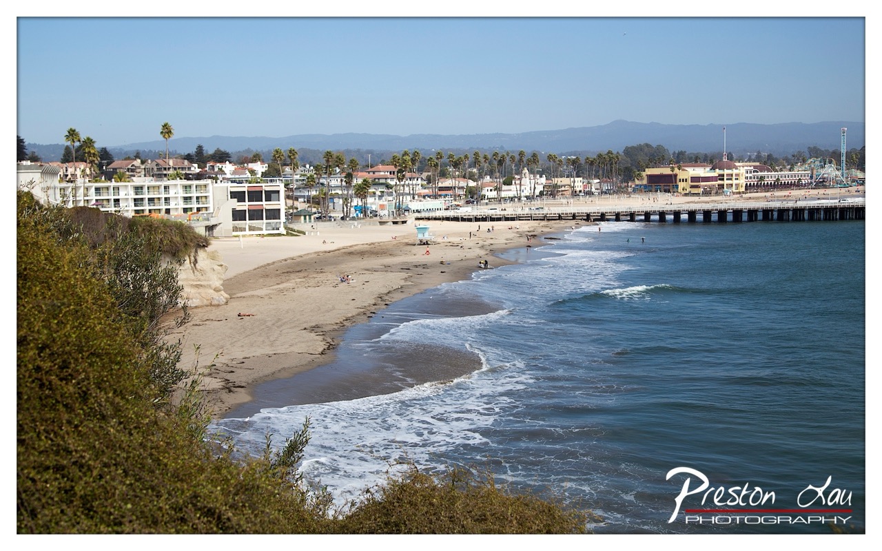
1. Overall Rating (0–10) — 7.0 This photograph captures the serene rhythm of a coastal town on a clear day, where the gentle waves meet a sandy shore lined with palm trees and a long pier. The expansive view offers a sense of place and calm, with the distant mountains adding depth and a touch of grandeur. While the image is visually balanced and rich in detail, the slightly overexposed sky and lack of strong focal point keep it from feeling truly immersive.
2. Composition (0–10) — 7.0 The diagonal sweep of the shoreline guides the eye naturally from the foreground foliage to the distant pier, creating a dynamic flow. The framing from an elevated vantage point adds perspective, though the left edge feels slightly crowded by the cliffside vegetation.
3. Lighting (0–10) — 6.5 Bright, even daylight illuminates the scene, highlighting textures in the sand and water. However, the sky is slightly washed out, losing subtle gradations and contributing to a flat appearance in the upper third of the frame.
4. Color & Tone (0–10) — 7.0 The palette is rich with natural blues, greens, and sandy beiges, evoking a classic coastal feel. The contrast between the deep ocean and the pale sand enhances visual interest, though the colors are restrained and lean toward neutral tones.
5. Creativity (0–10) — 6.0 The image succeeds as a strong documentary landscape, capturing the essence of a seaside community. While not particularly experimental, it conveys a sense of place with clarity and intention.
6. Technical Quality (0–10) — 8.0 The image is sharp and well-focused, with clean details in both the foreground and background. The exposure is generally balanced, aside from the overexposed sky.
7. Emotional Impact (0–10) — 6.5 The scene evokes a quiet sense of peace and nostalgia, inviting the viewer to imagine a slow afternoon by the sea. While emotionally resonant, the lack of human drama or narrative tension keeps the connection at a distance.
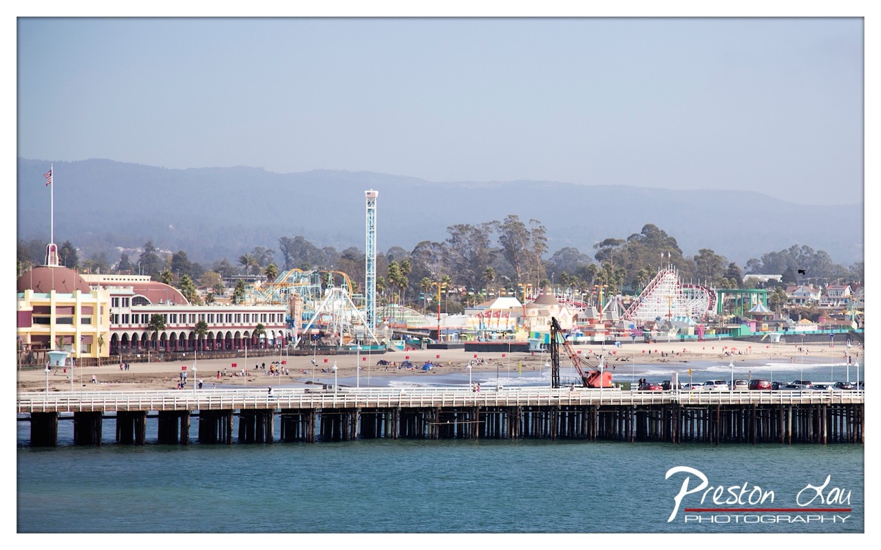
1. Overall Rating (0–10) — 7.0 This photograph captures the lively energy of a coastal amusement park with a sense of expansive calm, where the vibrant attractions contrast gently with the hazy mountains in the distance. The wide-angle perspective effectively conveys the scale of the pier and the beach, though the slightly muted atmosphere tempers the scene’s vibrancy. While the image succeeds in documenting a moment of leisure and coastal charm, it lacks the dynamic tension that would elevate it beyond a pleasant snapshot.
2. Composition (0–10) — 7.0 The pier creates a strong horizontal anchor across the lower third, leading the eye toward the amusement park and mountains. The balanced framing includes both foreground and background elements, though the composition feels slightly compressed, with the central zone crowded by rides and structures.
3. Lighting (0–10) — 6.0 The light is soft and diffused, likely from an overcast or hazy day, which flattens shadows and reduces contrast. While this creates a gentle, even exposure, it also diminishes the richness of colors and the sense of depth in the landscape.
4. Color & Tone (0–10) — 6.5 The palette is dominated by soft blues, sandy beiges, and pastel tones of the rides, lending a nostalgic, slightly dreamlike quality. The colors are pleasant but not vivid, and the haze lends a muted, slightly washed-out appearance.
5. Creativity (0–10) — 6.0 The image captures a familiar coastal scene with a straightforward approach, emphasizing documentation over artistic interpretation. The composition and timing suggest a desire to showcase the full scope of the location, but it lacks a distinctive visual narrative or emotional hook.
6. Technical Quality (0–10) — 7.5 The image is sharp and well-focused, with clear detail in the pier structure and distant rides. The watermark is unobtrusive, and the exposure is consistent across the frame, indicating solid technical execution.
7. Emotional Impact (0–10) — 6.5 The photograph evokes a sense of nostalgia and leisure, suggesting a day of fun by the sea. While it connects with the viewer through its familiar subject matter, the lack of dramatic lighting or intimate perspective keeps the emotional resonance at a moderate level.
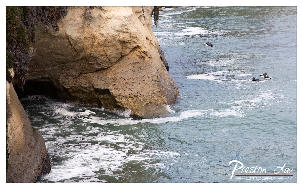
1. Overall Rating (0–10) — 7.0 This photograph captures a dynamic coastal scene where the raw power of the ocean meets the enduring presence of stone, creating a mood of quiet adventure. The surfers, small against the vastness of the cliff and sea, evoke a sense of human resilience and connection to nature. While the composition feels slightly overexposed and the colors lack depth, the image successfully conveys the energy and solitude of a remote surf spot.
2. Composition (0–10) — 7.0 The diagonal line of the cliff draws the eye into the frame, while the surfers are placed to create a sense of scale and movement. The balance between the landmass and open water feels natural, though the lower-left corner is slightly heavy, pulling focus from the central action.
3. Lighting (0–10) — 6.0 The light is bright and even, likely from an overcast sky, which flattens the textures of the rock and reduces contrast. While this ensures clarity, it also diminishes the dramatic interplay of light and shadow that could have enhanced the scene’s depth.
4. Color & Tone (0–10) — 6.0 The palette is dominated by muted blues and grays, with a warm, sandy tone in the cliff face that provides subtle contrast. The colors feel slightly washed out, reducing the vibrancy of the waves and surfers.
5. Creativity (0–10) — 7.0 The image captures a moment of quiet tension between nature and human activity, with the surfers adding narrative intrigue. The choice to frame the scene from a high vantage point gives it a contemplative quality, suggesting a story beyond the frame.
6. Technical Quality (0–10) — 7.5 The image is sharp and clear, with good focus on both the surfers and the rock face. The exposure is consistent, though a slight overexposure in the highlights of the water and sky could be improved.
7. Emotional Impact (0–10) — 7.0 The photograph evokes a sense of solitude and adventure, inviting the viewer to imagine the cold water, the crash of waves, and the quiet determination of the surfers. The scale of the natural world against the small figures creates a powerful emotional resonance.
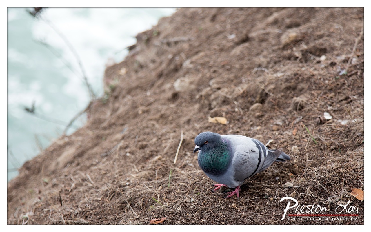
1. Overall Rating (0–10) — 7.0 This photograph captures a quiet, contemplative moment in nature, where a pigeon stands poised on a muddy embankment beside a softly blurred body of water. The shallow depth of field isolates the bird, drawing attention to its subtle iridescence and natural grace. While the image feels intimate and observational, its subdued palette and lack of dynamic tension keep it from fully resonating as a powerful visual statement.
2. Composition (0–10) — 6.5 The pigeon is placed slightly off-center, creating a balanced but slightly asymmetrical frame. The diagonal slope of the embankment adds visual interest, though the background’s soft blur could be more intentional to emphasize the subject.
3. Lighting (0–10) — 6.0 Diffuse, overcast light softens shadows and evenly illuminates the scene, enhancing the pigeon’s subtle coloration without harsh contrast. However, the lack of directional light limits the sense of depth and drama.
4. Color & Tone (0–10) — 6.5 The muted earth tones of the soil and the pigeon’s soft gray and green feathers create a cohesive palette, complemented by the pale blue of the water. While harmonious, the overall tone feels restrained, with little vibrancy to elevate the image.
5. Creativity (0–10) — 7.0 The choice to focus on a common urban bird in a naturalistic setting offers a quiet narrative of coexistence between nature and human environments. The composition suggests a thoughtful, almost poetic observation.
6. Technical Quality (0–10) — 7.5 The focus is sharp on the pigeon, with a clean depth of field and minimal noise. The image is well-exposed, with clear detail in both the subject and background textures.
7. Emotional Impact (0–10) — 6.5 The image evokes a sense of stillness and solitude, inviting reflection on the overlooked beauty of everyday life. While emotionally restrained, it carries a quiet dignity that resonates upon closer viewing.
Fittingly, this small but impactful museum is housed within a converted lighthouse, a beacon that has watched over these very waves for generations. Stepping inside this historic structure, you are immediately immersed in the rich history of surfing and its deep roots in the Santa Cruz community. The museum meticulously displays the history of surfing and how it has become ingrained within Santa Cruz, showcasing the evolution of the sport and the unique characters who shaped it in this area.
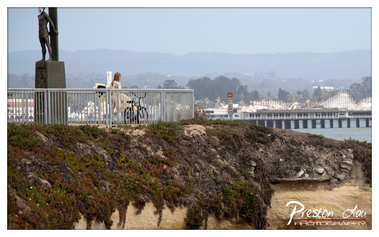
1. Overall Rating (0–10) — 6.8 This photograph captures a quiet, contemplative moment at a coastal viewpoint, where human presence is softened by distance and atmosphere. The layered composition—foreground vegetation, midground figures, and distant amusement park—creates a sense of narrative depth, though the muted tones and overcast sky temper its emotional punch. While the image succeeds in conveying a mood of stillness and reflection, it lacks the visual dynamism to feel truly compelling, resting more as a documentary snapshot than a poetic statement.
2. Composition (0–10) — 7.0 The diagonal slope of the cliff and the railing guide the eye naturally toward the central figure, creating a balanced yet dynamic frame. The statue on the left anchors the composition, while the distant pier and roller coaster add context without overwhelming the scene.
3. Lighting (0–10) — 5.5 Diffuse, overcast light flattens contrast and softens detail, creating a hazy, melancholic atmosphere. While appropriate for the mood, it diminishes the richness of textures and depth.
4. Color & Tone (0–10) — 6.0 The palette leans toward muted greens, grays, and pale blues, lending the image a subdued, almost monochromatic quality. The lack of vibrant color keeps the scene grounded but limits visual energy.
5. Creativity (0–10) — 6.5 The juxtaposition of a serene natural landscape with the faint outline of an amusement park introduces a subtle narrative tension—between solitude and spectacle, nature and industry. While the concept is strong, the execution feels restrained.
6. Technical Quality (0–10) — 7.5 The image is sharp and well-exposed, with clean detail in the foreground vegetation and clear focus on the subject. The watermark is unobtrusive and professionally placed.
7. Emotional Impact (0–10) — 6.0 The photograph evokes a quiet sense of introspection and solitude, inviting the viewer to pause and reflect. However, the emotional resonance is held back by the muted atmosphere and distant framing, leaving the moment feeling more observed than felt.
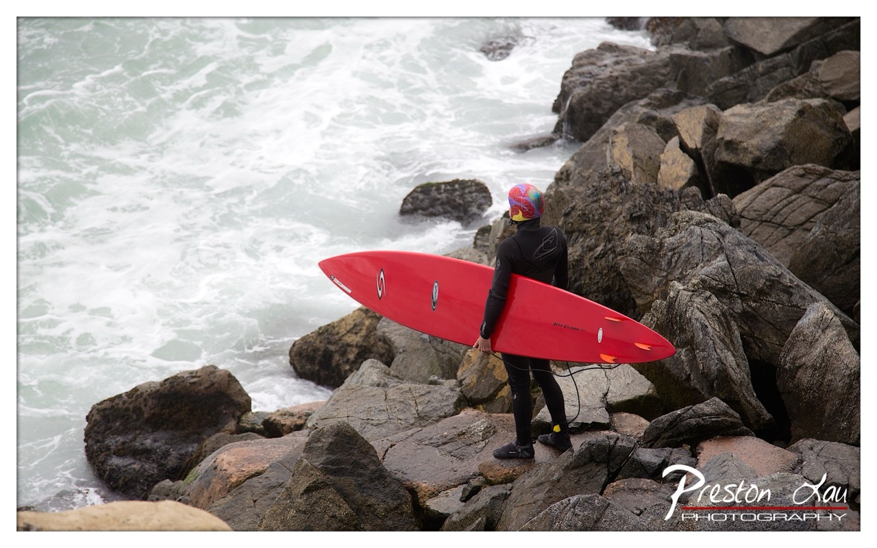
1. Overall Rating (0–10) — 7.0 This photograph captures a quiet moment of anticipation at the edge of the sea, where a surfer stands poised against the raw power of crashing waves. The bold red surfboard contrasts vividly with the muted tones of the rocky shore and churning water, drawing the eye and emphasizing the human presence within nature’s chaos. While the image is compelling in its narrative, the lighting and color balance slightly undercut the emotional depth, leaving the scene feeling more observational than immersive.
2. Composition (0–10) — 7.5 The surfer is positioned off-center, creating a dynamic balance with the expansive waves on the left. The diagonal lines of the rocks and the surfboard guide the eye toward the action, while the negative space of the water enhances the sense of scale and solitude.
3. Lighting (0–10) — 6.0 The overcast sky produces soft, diffused light that flattens the scene slightly, reducing texture and depth in the rocks and waves. While the lighting is even and avoids harsh shadows, it lacks the warmth or contrast that could elevate the mood.
4. Color & Tone (0–10) — 7.0 The vibrant red of the surfboard creates a striking focal point against the cool grays and whites of the ocean and stone. The subdued palette of the environment enhances the color contrast, though the overall tone remains somewhat muted, giving the image a slightly clinical feel.
5. Creativity (0–10) — 7.5 The juxtaposition of the colorful, modern surfboard and helmet against the rugged, timeless coastal landscape suggests a story of human endeavor meeting natural force. The composition and subject choice convey a strong sense of place and purpose, offering more than just a snapshot.
6. Technical Quality (0–10) — 8.0 The image is sharp and well-focused, particularly on the surfer and board. The details in the wetsuit and surfboard are clear, and the depth of field is appropriately managed to keep both subject and environment in view.
7. Emotional Impact (0–10) — 7.0 There is a palpable tension between stillness and motion—the surfer’s pause before entering the turbulent sea evokes a mix of resolve and vulnerability. The image resonates with quiet determination, inviting the viewer to imagine the roar of the waves and the moment of decision.
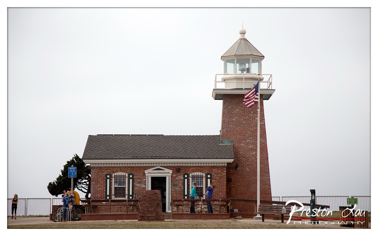
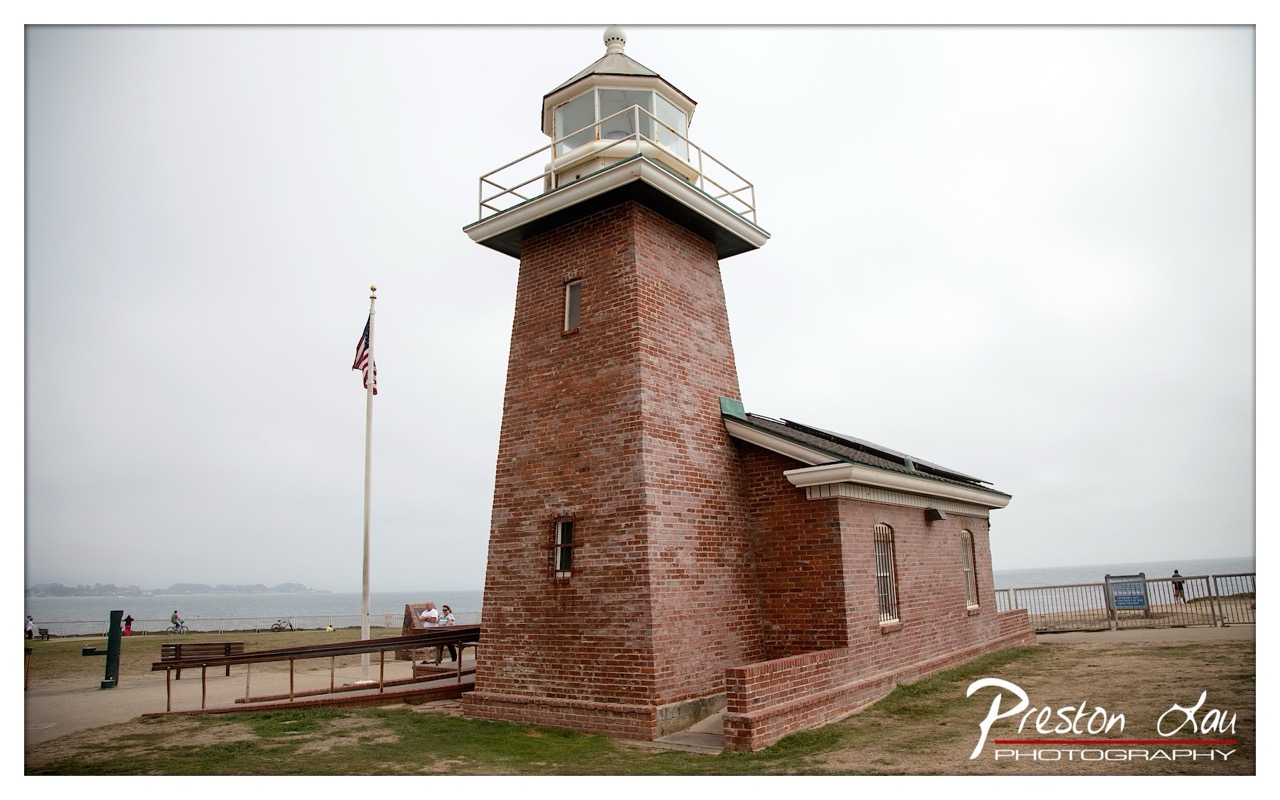
1. Overall Rating (0–10) — 6.0 This photograph presents a quiet, documentary-style view of the Santa Cruz Surfing Museum, a brick lighthouse structure set against an overcast sky. The muted tones and expansive sky lend a sense of stillness, while the presence of visitors grounds the scene in everyday life. While the composition is straightforward and the subject clear, the lack of dramatic lighting or dynamic perspective keeps the image from feeling truly compelling.
2. Composition (0–10) — 6.5 The lighthouse and building are centered, creating a balanced and stable composition. However, the wide framing and flat horizon leave a large portion of empty sky, which diminishes visual tension and reduces the impact of the subject.
3. Lighting (0–10) — 5.5 The overcast sky provides soft, even light that minimizes shadows and highlights, resulting in a flat, diffused quality. While this avoids harsh contrasts, it also dulls the texture of the brick and the overall mood of the scene.
4. Color & Tone (0–10) — 5.0 The palette is dominated by muted grays and browns, with only the American flag offering a touch of color. The lack of vibrancy and contrast gives the image a subdued, almost melancholic tone that feels underwhelming for such a historically resonant location.
5. Creativity (0–10) — 5.5 The image functions more as a straightforward record than a creative interpretation. While the inclusion of visitors adds a human element, the approach is conventional, lacking a distinctive perspective or artistic vision.
6. Technical Quality (0–10) — 7.5 The image is sharp and well-focused, with clean details in the brickwork and signage. The exposure is balanced, and the watermark is discreet, indicating solid technical execution.
7. Emotional Impact (0–10) — 5.0 The scene evokes a sense of quiet contemplation, but the emotional resonance is limited by the flat lighting and lack of narrative depth. It feels more like a snapshot than a moment captured with feeling.
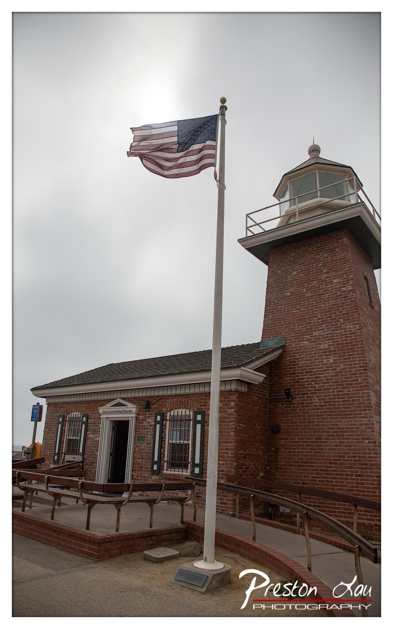
1. Overall Rating (0–10) — 6.8 This photograph captures a solemn, windswept moment at a historic lighthouse, where the American flag serves as a bold focal point against a moody, overcast sky. The composition emphasizes the structure’s enduring presence, with the flag’s movement adding a subtle sense of life to an otherwise still scene. While the muted lighting and restrained palette convey a contemplative mood, the image feels slightly underwhelming in its visual impact, lacking the dynamic contrast needed to fully elevate the subject.
2. Composition (0–10) — 7.0 The flagpole creates a strong vertical line that draws the eye upward, while the lighthouse and building form a balanced diagonal composition. The low-angle perspective enhances the structure’s stature, though the framing could be tighter to reduce distracting foreground elements.
3. Lighting (0–10) — 5.5 The overcast sky produces soft, diffused light that minimizes harsh shadows and creates a somber atmosphere. However, the lack of directional light results in a flat appearance, diminishing texture and depth in the brickwork and flag.
4. Color & Tone (0–10) — 6.0 The muted tones—grays, browns, and the faded red and blue of the flag—contribute to a subdued, almost melancholic palette. While the colors are consistent with the mood, they lack vibrancy, giving the image a slightly dull quality.
5. Creativity (0–10) — 6.5 The photographer captures a familiar scene with a respectful, documentary-style approach, emphasizing the lighthouse’s historical character. The use of the flag as a narrative element adds a layer of symbolism, though the execution remains conventional.
6. Technical Quality (0–10) — 7.5 The image is sharp and well-focused, with clean details in the brickwork and flag. The exposure is balanced, and the watermark is unobtrusive, maintaining professionalism.
7. Emotional Impact (0–10) — 6.0 The photograph evokes a sense of quiet patriotism and timelessness, but the lack of dramatic lighting and emotional intensity keeps the viewer at a distance, making the moment feel more observed than felt.
The collection, though small, is thoughtfully curated and tells a compelling story through its artifacts. Among the most striking pieces is a display of surfboards that highlight the sport's evolution. You'll see everything from an incredibly hefty solid wood longboard, truly a colossal "log" weighing in at 90+ pounds, a testament to the early, challenging days of surfing, to more modern boards. One particularly eye-catching exhibit features a foam and fiberglassed board that bears the unmistakable marks of a close encounter with a white shark, a potent reminder of the raw power of the ocean and its inhabitants. These boards, in their varied forms and histories, offer a tangible connection to the surfers who rode the waves here through the decades.
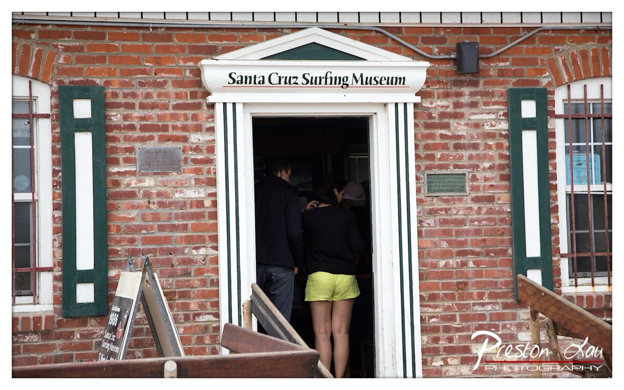
1. Overall Rating (0–10) — 6.0 This photograph captures a quiet moment at the Santa Cruz Surfing Museum, where the juxtaposition of a historic brick facade and modern visitors creates a subtle narrative of continuity and place. The composition centers on the doorway, drawing the eye into the museum’s interior, while the muted lighting and restrained color palette lend a sense of calm authenticity. While the image effectively documents the scene, it lacks the visual dynamism or emotional punch to feel truly compelling—more a snapshot than a statement.
2. Composition (0–10) — 6.5 The doorway is well-centered, creating a natural focal point, and the symmetry of the brick wall and green shutters adds visual balance. However, the foreground elements—such as the A-frame sign and wooden benches—slightly disrupt the frame’s harmony and distract from the main subject.
3. Lighting (0–10) — 5.5 The light is flat and diffused, likely from an overcast sky, which softens textures but also diminishes contrast and depth. The interior remains dark, creating a visual barrier that limits the viewer’s sense of invitation into the space.
4. Color & Tone (0–10) — 5.5 The dominant red of the brick contrasts with the green trim and the bright yellow shorts, but the overall tone is muted and slightly desaturated. The lack of vibrancy dampens the potential energy of the scene.
5. Creativity (0–10) — 5.5 The image functions as a straightforward documentary shot, capturing a place and its visitors without a strong artistic or conceptual angle. While the subject matter has inherent interest, the execution leans toward the literal rather than the evocative.
6. Technical Quality (0–10) — 7.5 The image is sharp and well-focused, with clear details in the brickwork and signage. The exposure is balanced, and there are no obvious technical flaws, though the overall image lacks refinement.
7. Emotional Impact (0–10) — 5.0 The photograph conveys a sense of quiet observation, but it doesn’t strongly evoke emotion or curiosity. The viewer is positioned as a passive observer, and the lack of narrative tension or personal connection limits its emotional resonance.
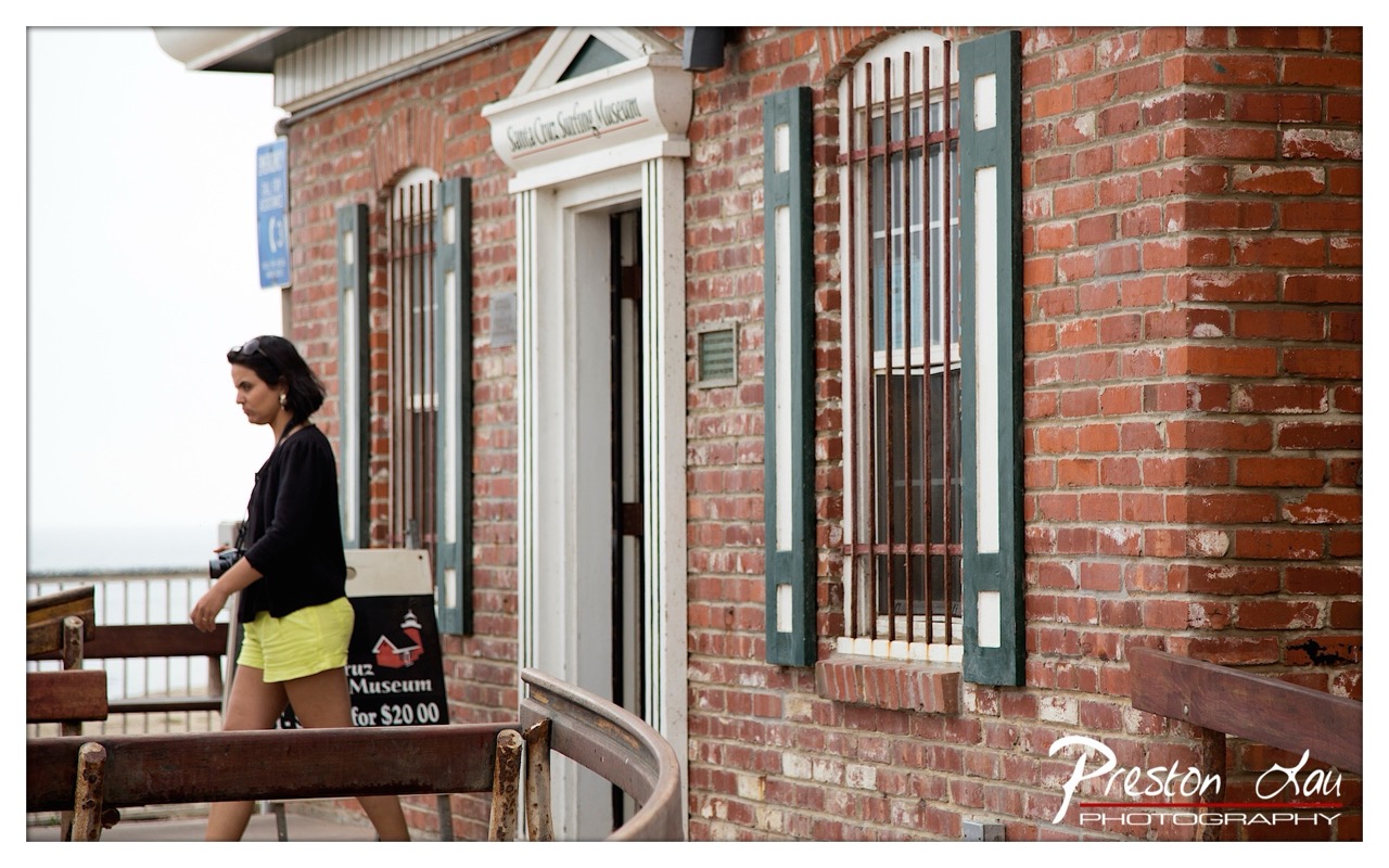
1. Overall Rating (0–10) — 7.0 This photograph captures a quiet, candid moment outside the Santa Cruz Surfing Museum, where the juxtaposition of a passing figure and the weathered brick facade creates a subtle narrative of place and movement. The warm tones and soft light lend a nostalgic quality, while the woman’s downward gaze adds a layer of introspection. Though the image is well-composed and rich in texture, its emotional depth is slightly muted by the lack of dynamic interaction between subject and environment.
2. Composition (0–10) — 7.0 The diagonal line of the railing and the woman’s movement guide the eye through the frame, creating a sense of forward motion. The off-center placement of the subject balances the visual weight of the brick wall, though the left side feels slightly underdeveloped due to the overexposed sky.
3. Lighting (0–10) — 6.5 Soft, diffused light from an overcast sky evenly illuminates the scene, minimizing harsh shadows and preserving texture in the brick. The lack of strong directional light, however, slightly flattens the mood, giving the image a more documentary feel than a cinematic one.
4. Color & Tone (0–10) — 7.5 The warm reds of the brick contrast beautifully with the black and neon yellow of the woman’s outfit, drawing the eye and adding vibrancy. The cool tones of the sky and the green shutters provide a balanced palette, with subtle tonal shifts enhancing the image’s depth.
5. Creativity (0–10) — 7.0 The photograph captures a fleeting, unposed moment that feels both personal and public, using the museum’s signage and the woman’s attire to suggest a story without overtly stating it. The framing and timing demonstrate a thoughtful approach to street photography.
6. Technical Quality (0–10) — 8.0 The image is sharp and well-focused, with fine detail visible in the brickwork and the woman’s clothing. The exposure is balanced, and the watermark is unobtrusive, indicating strong technical execution.
7. Emotional Impact (0–10) — 6.5 The quiet contemplation of the subject and the nostalgic setting evoke a sense of calm and reflection. While the image resonates with a subtle melancholy, the emotional connection remains somewhat distant due to the passive nature of the moment captured.
1. Overall Rating (0–10) — 7.0 This photograph captures the quiet dignity of a coastal lighthouse under an overcast sky, where the muted tones and expansive emptiness evoke a sense of solitude and timelessness. The brick structure stands as a steadfast anchor in the frame, its weathered texture and architectural lines offering a tactile contrast to the soft, diffused background. While the image successfully conveys atmosphere, it holds back from emotional depth due to a slightly flat color palette and lack of dynamic contrast, leaving the scene feeling more observational than evocative.
2. Composition (0–10) — 7.5 The lighthouse is well-placed off-center, creating a balanced diagonal that draws the eye from the flagpole to the structure and beyond to the water. The inclusion of the bench, railing, and distant figures adds narrative context without distracting from the main subject.
3. Lighting (0–10) — 6.0 The soft, even light of an overcast day minimizes harsh shadows and highlights the texture of the brick, but it also flattens the scene and reduces depth. The lack of directional light limits the dramatic interplay of light and shadow that could have enhanced the mood.
4. Color & Tone (0–10) — 6.5 The muted palette—dominated by grays and earthy reds—supports the somber, contemplative tone. However, the colors lack vibrancy, and the overall coolness lends a slightly sterile quality that tempers the warmth of the brick.
5. Creativity (0–10) — 7.0 The image presents a familiar subject with a calm, grounded perspective, emphasizing stillness and quiet observation. While not overtly experimental, it conveys a sense of place with thoughtful framing and environmental storytelling.
6. Technical Quality (0–10) — 8.0 The image is sharp and well-focused, with clean detail in the brickwork and clear visibility of the surrounding elements. The exposure is balanced, and the depth of field is appropriate for a landscape-oriented scene.
7. Emotional Impact (0–10) — 6.5 The photograph invites quiet reflection, with the lighthouse standing as a symbol of endurance and watchfulness. The subdued atmosphere and sparse human presence evoke a gentle melancholy, though the lack of strong emotional contrast keeps the viewer at a slight remove.
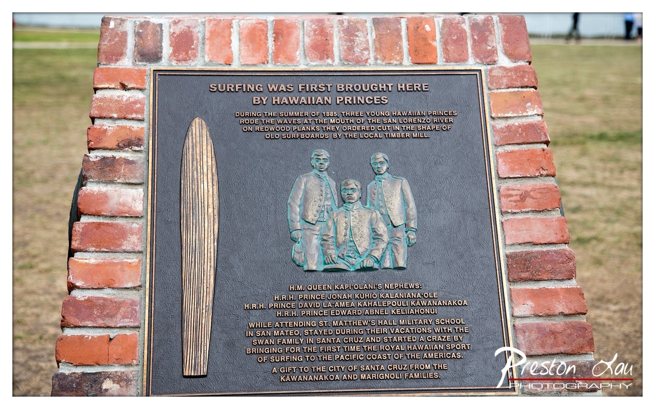
1. Overall Rating (0–10) — 6.8 This photograph captures a historical marker with a strong sense of place, honoring the introduction of surfing to the Pacific Coast of the Americas. The composition centers on the plaque’s narrative, with the embossed figures and surfboard offering a tactile, almost ceremonial feel. While the image is clear and informative, the background distractions and slightly flat lighting prevent it from achieving a more compelling visual presence. The story is rich, but the presentation feels more documentary than artistic.
2. Composition (0–10) — 7.0 The plaque is centered and framed by the brick structure, creating a balanced, symmetrical composition that draws the eye to the central text and figures. The slight tilt of the frame adds subtle dynamism, though the background’s soft focus helps keep attention on the subject.
3. Lighting (0–10) — 6.5 Natural daylight provides even illumination across the plaque, preserving legibility of the text and details. The light is diffused, avoiding harsh shadows, but lacks the warmth or directional quality that might enhance texture and depth.
4. Color & Tone (0–10) — 6.0 The palette is restrained, dominated by the earthy tones of the brick and the dark patina of the metal plaque. The muted greens and browns lend a historical, grounded quality, but the lack of contrast or vibrancy gives the image a subdued, almost flat appearance.
5. Creativity (0–10) — 6.5 The image functions as a historical document, capturing a significant cultural moment with clarity. While not overtly innovative in technique, the framing and focus on the narrative elements convey respect for the subject, blending documentation with a quiet reverence.
6. Technical Quality (0–10) — 7.5 Sharp focus on the plaque ensures legibility of the text and detail in the embossed figures. The depth of field is well-managed, with a clean background blur that isolates the subject. The watermark is present but unobtrusive.
7. Emotional Impact (0–10) — 6.0 The image evokes a sense of historical pride and cultural continuity, but the emotional resonance is limited by the lack of human presence or dynamic storytelling. It invites reflection but does not deeply engage the viewer’s emotions.
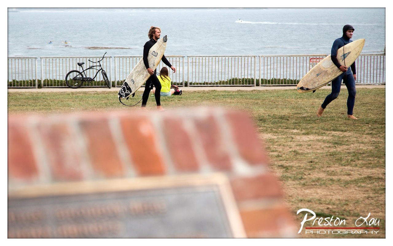
1. Overall Rating (0–10) — 6.8 This photograph captures a candid moment of surfers preparing to enter the water, evoking a sense of anticipation and quiet purpose. The shallow depth of field, with the blurred brick in the foreground, adds a layer of intimacy and frames the scene as a personal observation. While the image conveys the atmosphere of a coastal day, the muted lighting and slightly cluttered background reduce its visual impact, leaving the composition feeling more like a snapshot than a polished narrative.
2. Composition (0–10) — 6.5 The diagonal movement of the surfers creates a dynamic flow across the frame, while the foreground brick adds depth and a sense of place. However, the central subject placement and the presence of the bicycle and distant figures slightly distract from the primary action, weakening the overall balance.
3. Lighting (0–10) — 5.5 The overcast sky produces soft, diffused light that minimizes harsh shadows, but it also drains the scene of vibrancy and emotional warmth. The flat lighting contributes to the subdued mood, which, while realistic, lacks the dramatic contrast needed to elevate the image.
4. Color & Tone (0–10) — 6.0 The palette is restrained, dominated by muted blues, grays, and earth tones. While this reflects the natural atmosphere of a cloudy day at the coast, the lack of color saturation reduces the image’s visual punch and makes it feel somewhat lifeless.
5. Creativity (0–10) — 7.0 The use of foreground blur to create depth and frame the scene is a thoughtful compositional choice. The image successfully captures a slice of everyday life with a documentary feel, suggesting a quiet story unfolding without staging.
6. Technical Quality (0–10) — 7.5 The focus is sharp on the subjects, with the foreground intentionally blurred to guide the eye. The exposure is well-balanced, and the image is free of noticeable noise, indicating strong technical execution.
7. Emotional Impact (0–10) — 6.0 The photograph evokes a sense of calm anticipation and the simple dedication of surfers. While it connects emotionally through its authenticity, the lack of strong lighting and color limits its ability to deeply resonate with the viewer.
Beyond the boards, the museum features various exhibits that delve into the origins and development of Santa Cruz surf culture. Informative displays likely showcase vintage photographs, historical documents, and artifacts that paint a vivid picture of the pioneers who first rode these waves, the evolution of surfboard design, and the становление of surfing as a central part of the Santa Cruz identity. It's a place where you can learn about the legendary breaks, the local heroes, and the unique spirit that permeates the surfing scene here.
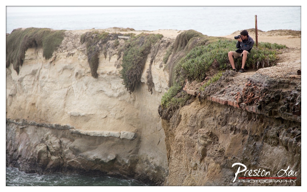
1. Overall Rating (0–10) — 7.0 This photograph captures a quiet, introspective moment of a photographer immersed in his craft against a dramatic coastal backdrop. The layered cliffs and overhanging greenery add depth and texture, while the subject’s focused posture creates a sense of narrative and solitude. Though the image is grounded in realism, a more deliberate use of light and framing could elevate its emotional resonance and visual impact.
2. Composition (0–10) — 7.5 The subject is placed off-center, following the rule of thirds, which draws the eye naturally across the frame. The diagonal line of the cliff edge leads the viewer’s gaze from the foreground to the horizon, enhancing depth. However, the right side feels slightly crowded, and a tighter crop could improve balance.
3. Lighting (0–10) — 6.0 The soft, diffused light of an overcast day evenly illuminates the scene, minimizing harsh shadows and allowing texture in the cliff face to emerge. While this creates a calm, muted mood, it also flattens the contrast and diminishes the dramatic potential of the coastal environment.
4. Color & Tone (0–10) — 6.5 The palette is natural and restrained, dominated by earthy beiges, muted greens, and grayish-blue tones. While harmonious, the colors lack vibrancy, giving the image a subdued, almost monochromatic feel that reflects the weather but limits visual excitement.
5. Creativity (0–10) — 7.0 The concept of a photographer capturing the same scene as the viewer adds a layer of meta-narrative, enhancing the image’s storytelling. The juxtaposition of human focus against the vast, timeless landscape evokes contemplation, making the image more than a simple snapshot.
6. Technical Quality (0–10) — 8.0 The image is sharp, with clear focus on both the subject and the cliff textures. The exposure is well-balanced, and the resolution captures fine details in the rock and foliage. The watermark is present but unobtrusive.
7. Emotional Impact (0–10) — 6.5 The scene evokes a sense of quiet solitude and dedication, inviting the viewer to reflect on the act of creation. While the mood is contemplative, the lack of strong lighting and color dynamics keeps the emotional connection from fully resonating.
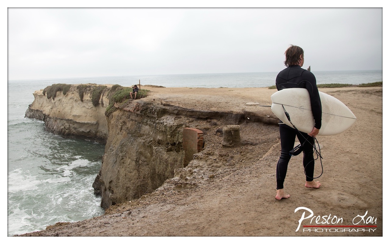
1. Overall Rating (0–10) — 7.0 This photograph captures a contemplative moment on a windswept coastal cliff, where the solitude of the surfer and the vastness of the sea converge in quiet harmony. The muted tones and overcast sky lend a moody, introspective atmosphere, while the natural textures of the cliff and ocean add depth and authenticity. Though the image is grounded in realism, its emotional resonance is slightly muted by a lack of dynamic contrast and a composition that feels more observational than evocative.
2. Composition (0–10) — 6.5 The surfer is positioned off-center, creating a natural visual path toward the distant cliff and horizon. However, the wide framing dilutes focus, and the foreground's uneven terrain slightly disrupts the balance.
3. Lighting (0–10) — 5.5 Diffuse, overcast light creates a flat, even exposure that minimizes shadows and depth. While it suits the somber mood, it also flattens the scene’s textural richness.
4. Color & Tone (0–10) — 5.0 A muted palette of grays, beiges, and soft blues dominates, conveying the chill of a coastal day. The lack of saturation reduces visual impact, though the tonal harmony prevents any harshness.
5. Creativity (0–10) — 6.0 The image tells a quiet story of preparation and anticipation, with the lone figure and expansive landscape evoking themes of solitude and connection to nature. While conceptually strong, the execution remains restrained.
6. Technical Quality (0–10) — 7.5 Sharp focus and clear detail across the frame, with minimal noise. The watermark is cleanly integrated, preserving the image's integrity.
7. Emotional Impact (0–10) — 6.5 The mood is reflective and melancholic, drawing the viewer into a moment of stillness. The emotional pull is subtle, relying on atmosphere rather than dramatic expression.
1. Overall Rating (0–10) — 7.0 This photograph captures the raw energy of a surfer riding a powerful wave, with the motion of the water conveying a sense of speed and balance. The green-hued wave and white foam create a dynamic contrast, emphasizing the intensity of the moment. While the image effectively conveys action, the composition and lighting could be more refined to elevate the visual impact and emotional resonance.
2. Composition (0–10) — 6.5 The surfer is positioned slightly off-center, creating a sense of movement toward the right, but the frame feels slightly unbalanced due to the large amount of negative space on the left. A tighter crop would better focus attention on the subject and the wave’s arc.
3. Lighting (0–10) — 6.0 The lighting is flat and diffused, typical of an overcast day, which softens shadows and reduces the sense of depth. While this preserves detail in the water, it also diminishes the dramatic contrast that could enhance the scene’s mood.
4. Color & Tone (0–10) — 6.5 The dominant green of the wave is compelling, but the overall tone is somewhat muted, with limited vibrancy. A slight increase in saturation and contrast could make the water pop and better highlight the texture of the foam.
5. Creativity (0–10) — 7.0 The image captures a moment of athletic grace and natural power, presenting a compelling narrative of man versus nature. The choice to freeze the surfer mid-ride adds a sense of narrative tension, though the execution remains somewhat conventional.
6. Technical Quality (0–10) — 7.5 The image is sharp and clear, with fine detail visible in the water’s surface and the surfer’s wetsuit. Focus is well-placed on the subject, and the exposure is balanced despite the challenging lighting conditions.
7. Emotional Impact (0–10) — 6.5 The photograph evokes a sense of exhilaration and focus, capturing the surfer’s concentration and the wave’s force. While the emotion is present, the lack of dramatic lighting and composition keeps the viewer from fully immersing in the experience.
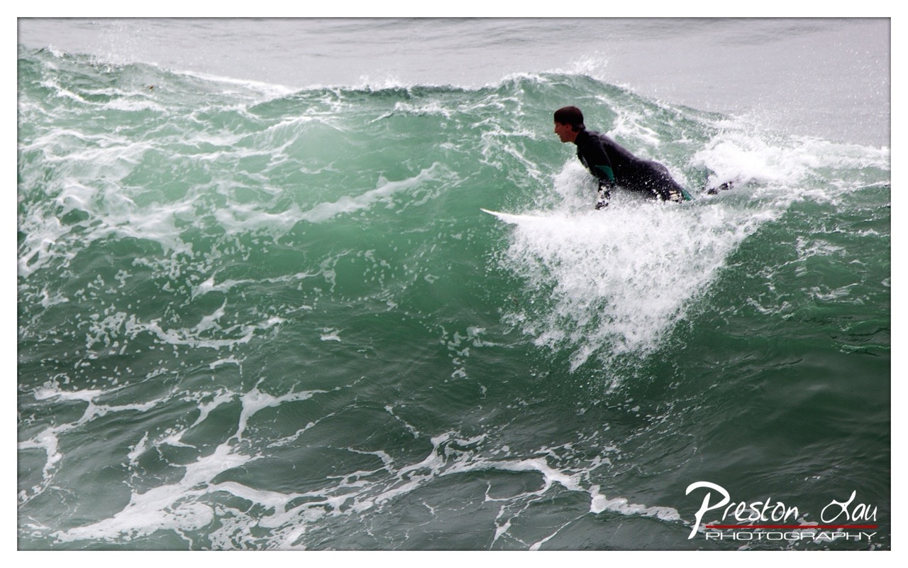
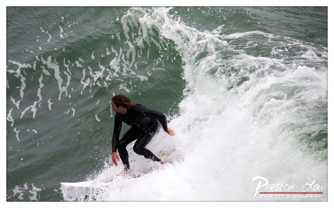
1. Overall Rating (0–10) — 7.5 This photograph captures the raw energy and motion of a surfer carving through a wave, with a dynamic sense of movement that draws the viewer into the moment. The high vantage point and tight framing emphasize the surfer’s control and the power of the ocean, while the contrast between the white foam and dark green water creates a visually striking scene. While the image effectively conveys action, its emotional resonance could be heightened with more intentional lighting or a stronger sense of narrative context.
2. Composition (0–10) — 7.0 The surfer is placed slightly off-center, creating a sense of forward motion and balance within the frame. The diagonal line of the wave guides the eye naturally toward the subject, though the composition feels slightly crowded by the surrounding water and spray.
3. Lighting (0–10) — 6.5 The light is even and diffused, likely from an overcast sky, which softens shadows and enhances the textures of the water and foam. While this contributes to a realistic and immersive mood, it lacks dramatic contrast or directional warmth that might elevate the scene.
4. Color & Tone (0–10) — 7.0 The palette is dominated by cool greens and whites, creating a natural, oceanic atmosphere. The contrast between the white surf and the darker water enhances visual clarity, though the overall tone remains somewhat muted, limiting emotional intensity.
5. Creativity (0–10) — 7.5 The high-angle perspective offers a unique viewpoint on a familiar subject, transforming a standard action shot into a more dynamic and cinematic moment. The inclusion of the photographer’s watermark subtly grounds the image in its real-world context, adding a layer of authenticity.
6. Technical Quality (0–10) — 8.0 The image is sharp and well-focused, capturing the motion of the surfer and the spray with clarity. The exposure is balanced, with no areas of overexposure or loss of detail in the highlights or shadows.
7. Emotional Impact (0–10) — 7.0 The photograph evokes a sense of adventure and connection with nature, capturing the thrill of riding a wave. The surfer’s posture and the surrounding chaos of water convey intensity and focus, inviting viewers to feel the adrenaline of the moment.
On a cold, windy day overlooking the often-chilly Pacific, stepping into the warm embrace of the museum within the lighthouse is a welcome respite. The cozy interior provides a comfortable space to browse the exhibits and soak in the history, offering a different perspective on the powerful ocean just outside the windows. It's a chance to appreciate the dedication and passion of the individuals who braved these waters and built the surf culture that thrives today. While you're there, you can also browse a selection of trinkets and souvenirs, perfect for taking a piece of Santa Cruz surf history home with you. Admission to this little gem of a museum is free, but leaving a donation is a great way to show your support for the preservation of this fascinating history.
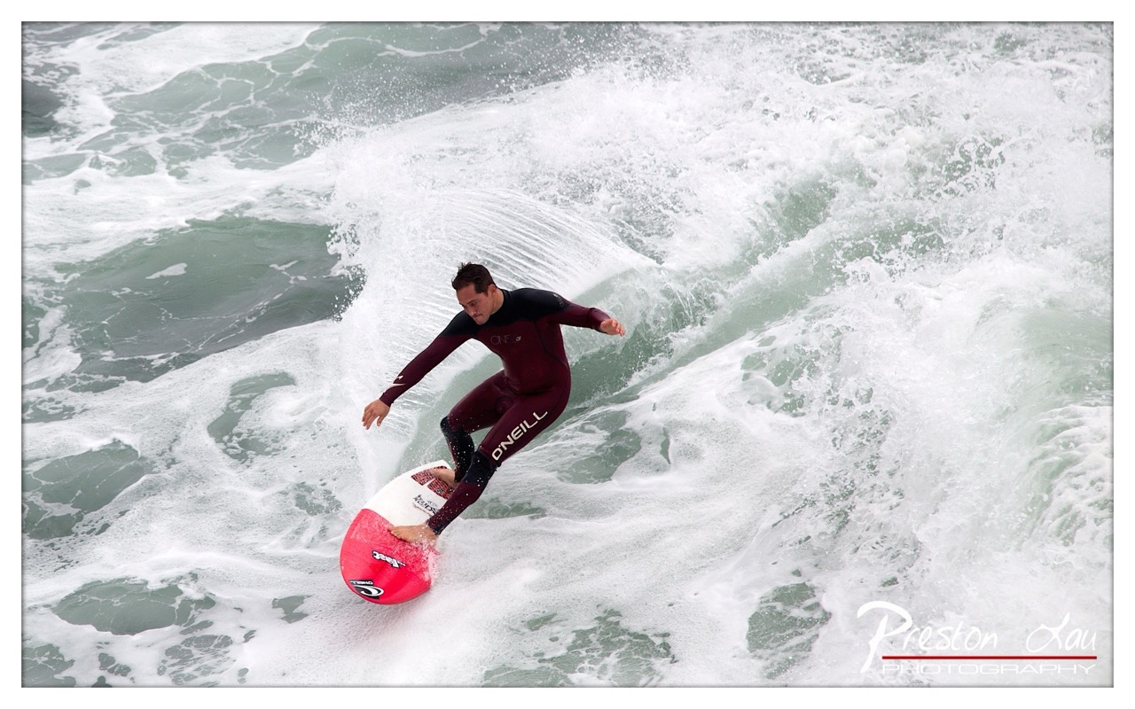
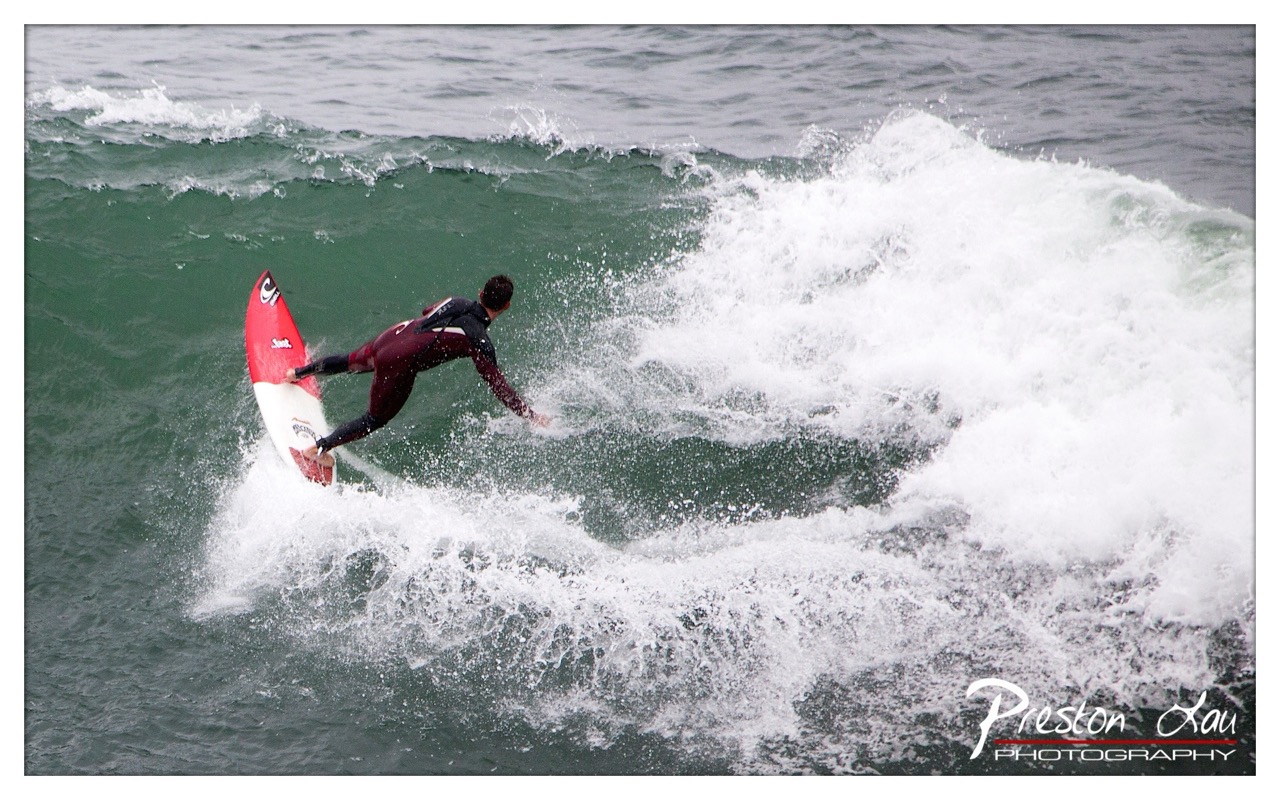
1. Overall Rating (0–10) — 7.5 This photograph captures the raw energy and precision of a surfer carving through a powerful wave, with motion and tension frozen in a single frame. The dynamic angle and splash of white foam convey the power of the ocean and the surfer’s control, creating a visceral sense of movement. While the composition is strong, the image’s impact is slightly tempered by the overexposed highlights and a less-than-ideal balance between subject and environment.
2. Composition (0–10) — 7.0 The surfer is placed slightly off-center, creating a sense of motion and direction, with the wave curling around him to guide the eye. The diagonal lines of the wave and spray enhance dynamism, though the framing feels slightly tight, cutting into the top of the wave and reducing the sense of scale.
3. Lighting (0–10) — 6.5 The lighting is bright and even, likely from an overcast sky, which softens shadows and allows details in the surfer’s wetsuit and board to be visible. However, the intense white foam from the wave creates harsh highlights that blow out detail, reducing depth in the most active part of the image.
4. Color & Tone (0–10) — 7.0 The palette is dominated by cool greens and whites of the ocean, contrasted by the deep maroon of the wetsuit and the vibrant red of the surfboard. The color contrast adds visual punch, while the cool tones reinforce the aquatic, energetic atmosphere.
5. Creativity (0–10) — 8.0 The photographer captures a moment of peak action with clarity and timing, conveying both athleticism and the raw power of nature. The choice to shoot from above adds a unique perspective, emphasizing the surfer’s interaction with the wave’s curvature.
6. Technical Quality (0–10) — 8.0 The image is sharp and well-focused on the surfer, with fast shutter speed effectively freezing the motion of the wave and spray. The watermark is subtle and unobtrusive, maintaining professionalism.
7. Emotional Impact (0–10) — 7.5 The photograph evokes a sense of exhilaration and focus, inviting the viewer to feel the rush of riding a wave. The surfer’s intense concentration and the wave’s force create a compelling narrative of human skill meeting natural power.
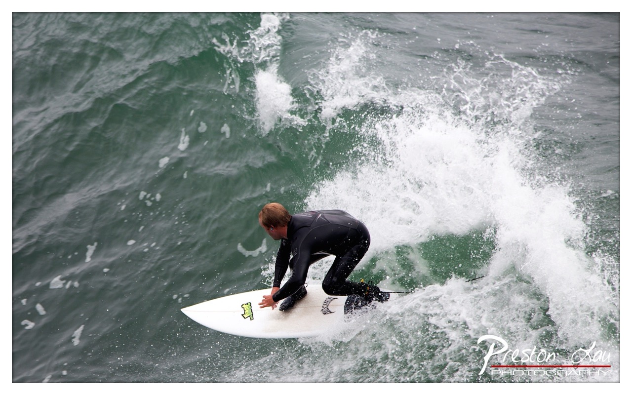
1. Overall Rating (0–10) — 7.0 This photograph captures the raw energy and motion of a surfer carving through a powerful wave, with a dynamic interplay between the athlete and the ocean. The moment is charged with action, and the splash of white water adds a sense of immediacy and power. While the composition and lighting are strong, the muted color palette slightly dampens the visual excitement, keeping the image from feeling fully immersive.
2. Composition (0–10) — 7.5 The surfer is positioned slightly off-center, creating a sense of movement and leading the eye along the wave’s curve. The diagonal flow of the water and the spray enhance the dynamic feel, though a tighter crop might have better emphasized the subject’s control and balance.
3. Lighting (0–10) — 6.5 The overcast sky provides soft, diffused light that evenly illuminates the scene, minimizing harsh shadows and highlighting the texture of the water. However, the lack of direct sunlight gives the image a subdued, grayish tone that reduces the contrast and vibrancy of the wave’s white foam.
4. Color & Tone (0–10) — 6.0 The palette is dominated by cool grays and whites, with the black wetsuit providing strong contrast. While the colors are natural and consistent with the environment, they lack richness and warmth, which slightly limits the image’s visual punch.
5. Creativity (0–10) — 7.0 The photograph effectively captures a high-energy moment in surfing, with a strong sense of motion and physical engagement. The choice to focus on the surfer’s form against the churning wave conveys both power and grace, offering a compelling narrative of human interaction with nature.
6. Technical Quality (0–10) — 8.0 The image is sharp and clear, with well-defined details in the water spray and the surfer’s wetsuit. The focus is precise on the subject, and the exposure is well-balanced, preserving detail in both the highlights and shadows.
7. Emotional Impact (0–10) — 7.5 There’s a palpable sense of adrenaline and focus in the image, as the surfer appears fully absorbed in the wave. The viewer can almost feel the spray and hear the roar of the water, creating a visceral connection to the moment of intense physical exertion and natural force.
1. Overall Rating (0–10) — 7.5 This photograph captures the raw energy and motion of a surfer carving through a powerful wave, conveying both the thrill and precision of the sport. The dynamic composition and natural lighting enhance the sense of speed and movement, while the contrast between the surfer’s dark wetsuit and the frothy white water creates visual drama. While the image is strong in capturing action, a more intentional framing could elevate its storytelling impact.
2. Composition (0–10) — 7.0 The surfer is positioned slightly off-center, creating a sense of motion and direction toward the right. The wave’s curve forms a natural leading line, guiding the eye through the frame. However, the tight crop on the lower half of the surfer and the wave slightly cuts into the action, reducing the sense of full context.
3. Lighting (0–10) — 7.5 Natural, overcast lighting provides even exposure across the scene, allowing details in both the dark water and white foam to remain visible. The diffuse light enhances texture in the splashing water and gives the image a moody, atmospheric quality without harsh shadows.
4. Color & Tone (0–10) — 7.0 The palette is dominated by deep greens and whites, creating a strong contrast that highlights the surfer against the wave. The limited color range enhances the image’s focus on motion and form, though a subtle increase in saturation could further emphasize the energy of the moment.
5. Creativity (0–10) — 8.0 The photographer captures a compelling moment of athletic grace and natural power. The high-angle perspective offers a unique vantage point, emphasizing the surfer’s relationship with the wave and lending a cinematic quality to the action.
6. Technical Quality (0–10) — 8.5 Sharp focus on the surfer and the water’s surface demonstrates excellent control. The high shutter speed freezes motion effectively, capturing fine details in the spray and wave texture with clarity.
7. Emotional Impact (0–10) — 8.0 The image evokes a sense of adventure, freedom, and intensity. The viewer is drawn into the moment, feeling the rush of the wave and the surfer’s focus, creating a visceral connection to the experience of riding the ocean.
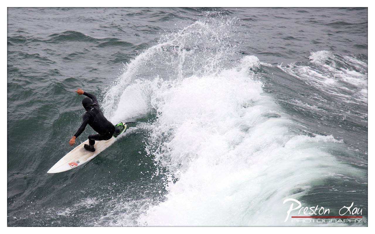
1. Overall Rating (0–10) — 7.5 This photograph captures the raw energy and precision of a surfer mid-turn, carving through a powerful wave with dynamic motion and control. The composition draws the eye into the action, emphasizing the surfer’s form against the churning water, while the splash of white foam adds a sense of immediacy and power. While the lighting and color are somewhat subdued, the image succeeds in conveying the intensity and focus of the moment, making it both visually engaging and emotionally charged.
2. Composition (0–10) — 7.0 The surfer is placed slightly off-center, creating a diagonal flow that guides the viewer’s eye across the wave. The wave’s curve frames the subject effectively, enhancing the sense of movement. However, the lower right corner is slightly underdeveloped, with the watermark and empty space competing for attention.
3. Lighting (0–10) — 6.0 The light is diffused and even, likely due to overcast conditions, which softens shadows and reduces contrast. While this allows for clear visibility of the surfer and wave texture, it also mutes the overall drama and depth of the scene.
4. Color & Tone (0–10) — 6.5 The palette is dominated by muted greens and whites, with the red and white surfboard providing a strong visual contrast. The tonal range is moderate, with the white foam offering brightness, but the overall color feels somewhat flat and lacks vibrancy.
5. Creativity (0–10) — 7.5 The image captures a compelling moment of athletic grace and natural force. The photographer’s choice to shoot from a high angle emphasizes the wave’s shape and the surfer’s interaction with the water, creating a dynamic and narrative-driven composition that feels both spontaneous and intentional.
6. Technical Quality (0–10) — 8.0 The image is sharp and well-focused, with clear detail in the water spray and the surfer’s wetsuit. The exposure is balanced, avoiding blown highlights or lost shadows, and the watermark is discreetly placed in the corner.
7. Emotional Impact (0–10) — 8.0 There is a palpable sense of energy and risk in the photograph—the surfer’s lean, the curling wave, the spray—evoking excitement and awe. The viewer is drawn into the moment, feeling the rush of speed and the power of the ocean, creating a strong emotional connection to the action.
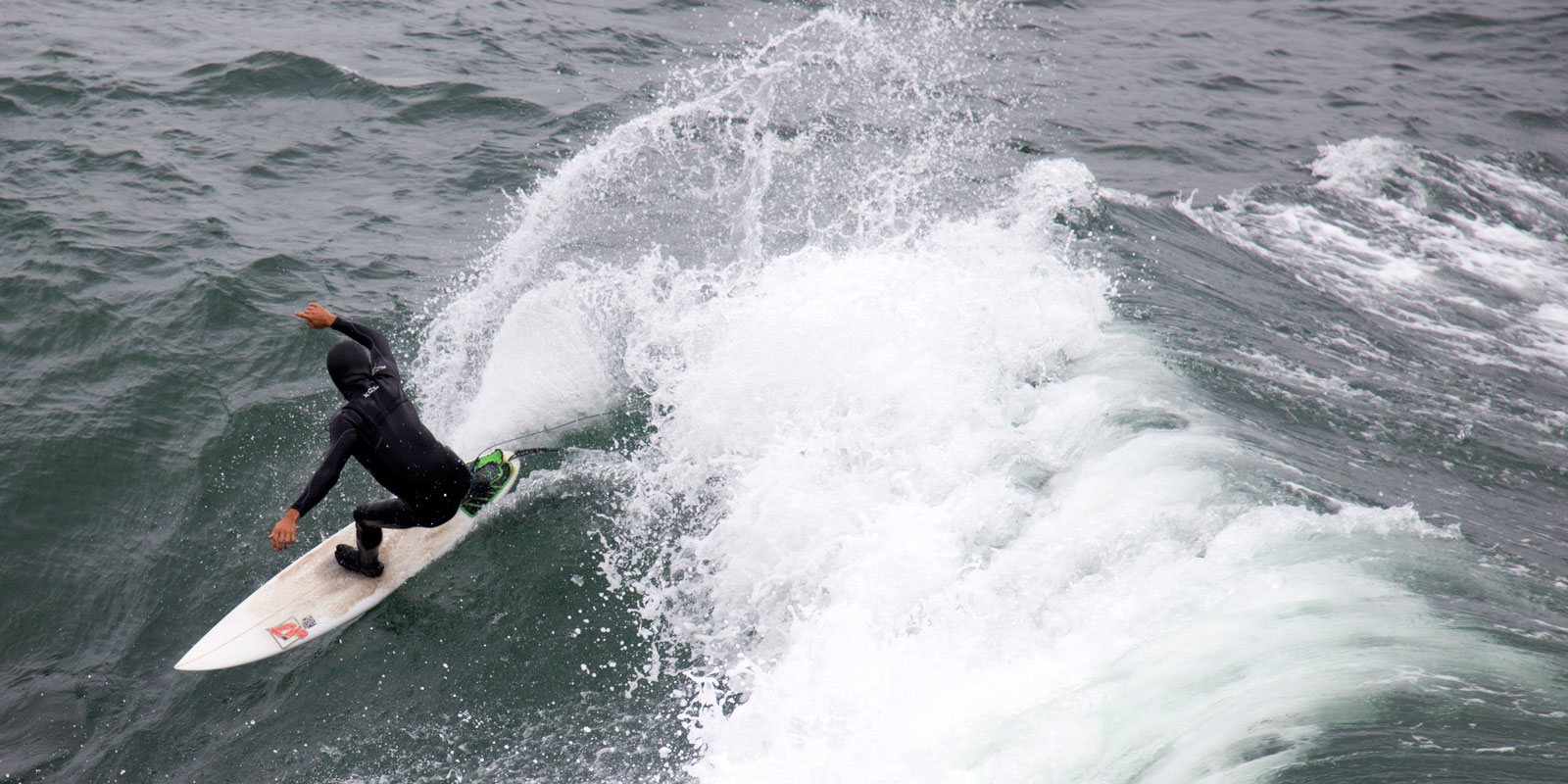
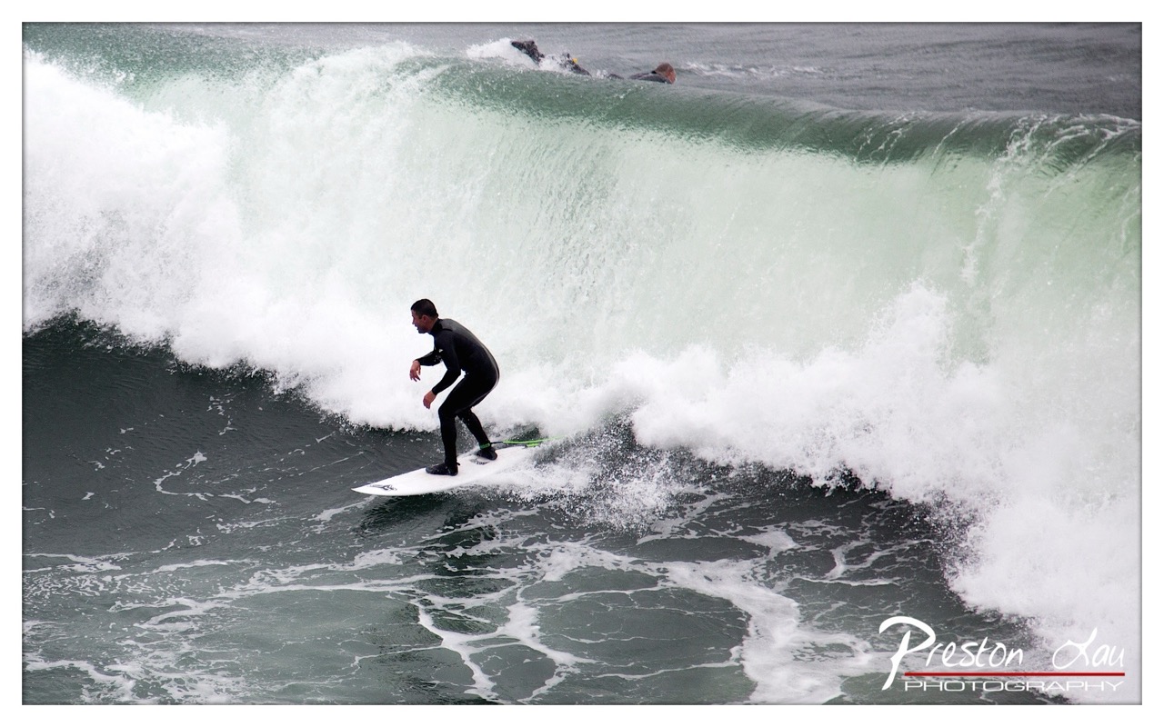
1. Overall Rating (0–10) — 7.5 This photograph captures the raw energy of a surfer carving through a powerful wave, with the curling water forming a dramatic, almost cathedral-like arch. The motion is frozen with clarity, conveying both the surfer’s focus and the ocean’s untamed force. While the composition is dynamic and the moment is compelling, the image feels slightly overexposed in the white foam, which softens the detail in the most intense part of the wave.
2. Composition (0–10) — 7.0 The surfer is well-placed in the lower left third, creating a sense of forward momentum and balance. The curved line of the breaking wave guides the eye naturally toward the subject, while the second surfer in the background adds depth and context. The framing is tight enough to emphasize action without sacrificing environmental scale.
3. Lighting (0–10) — 6.5 The lighting is diffused, likely from an overcast sky, which softens shadows and evenly illuminates the scene. This works well for the neutral mood, though it results in slightly flat highlights in the white water, where detail is lost. The lack of direct sunlight limits contrast but preserves the cool, atmospheric tone of the ocean environment.
4. Color & Tone (0–10) — 7.0 The palette is dominated by cool tones—deep blues and grays—accented by the stark white of the breaking wave. The subtle green tint in the wave’s face adds visual interest and depth. While the colors are natural and cohesive, they lean toward a muted, almost monochromatic feel, which slightly diminishes the vibrancy of the scene.
5. Creativity (0–10) — 8.0 The image captures a classic surfing moment with strong visual storytelling. The choice to frame the surfer beneath the lip of the wave creates a sense of intimacy and danger, emphasizing the relationship between human and nature. The inclusion of the second surfer adds narrative layering, suggesting a shared experience in the water.
6. Technical Quality (0–10) — 8.0 The image is sharp and well-focused, with excellent clarity in the water’s texture and the surfer’s form. The fast shutter speed effectively freezes motion without introducing motion blur, and the ISO appears controlled, minimizing noise. The watermark is cleanly placed in the corner, preserving the visual integrity of the scene.
7. Emotional Impact (0–10) — 7.5 The photograph evokes a sense of exhilaration and respect for the ocean’s power. The surfer’s posture—balanced, intent, and in control—conveys confidence and mastery, while the towering wave suggests the ever-present risk. Viewers are drawn into the moment, feeling the rush of speed and the tension of the ride.
The lighthouse building itself has a history intertwined with the coastline it overlooks. The original light was allocated funding by congress back in 1852, though land disputes delayed construction until 1868. The initial structure was a modest one-story wooden building housing a fifth-order Fresnel lens to guide mariners. However, the relentless erosion of Point Santa Cruz necessitated the relocation of the lighthouse a significant 300 feet (91 meters) in 1879. Further improvements were made around 1909 when the lens was upgraded to a fourth-order Fresnel for better visibility against the growing lights of the city. The light was eventually electrified in 1917, and the original wooden building was replaced by a new wooden tower in 1941 before being completely demolished in 1948. This history of adaptation and resilience of the lighthouse mirrors the spirit of the surfers who have navigated the ever-changing conditions of the sea below. The Santa Cruz Surfing Museum, in its historic lighthouse home, beautifully captures this intertwined history of a community, a sport, and the powerful Pacific.
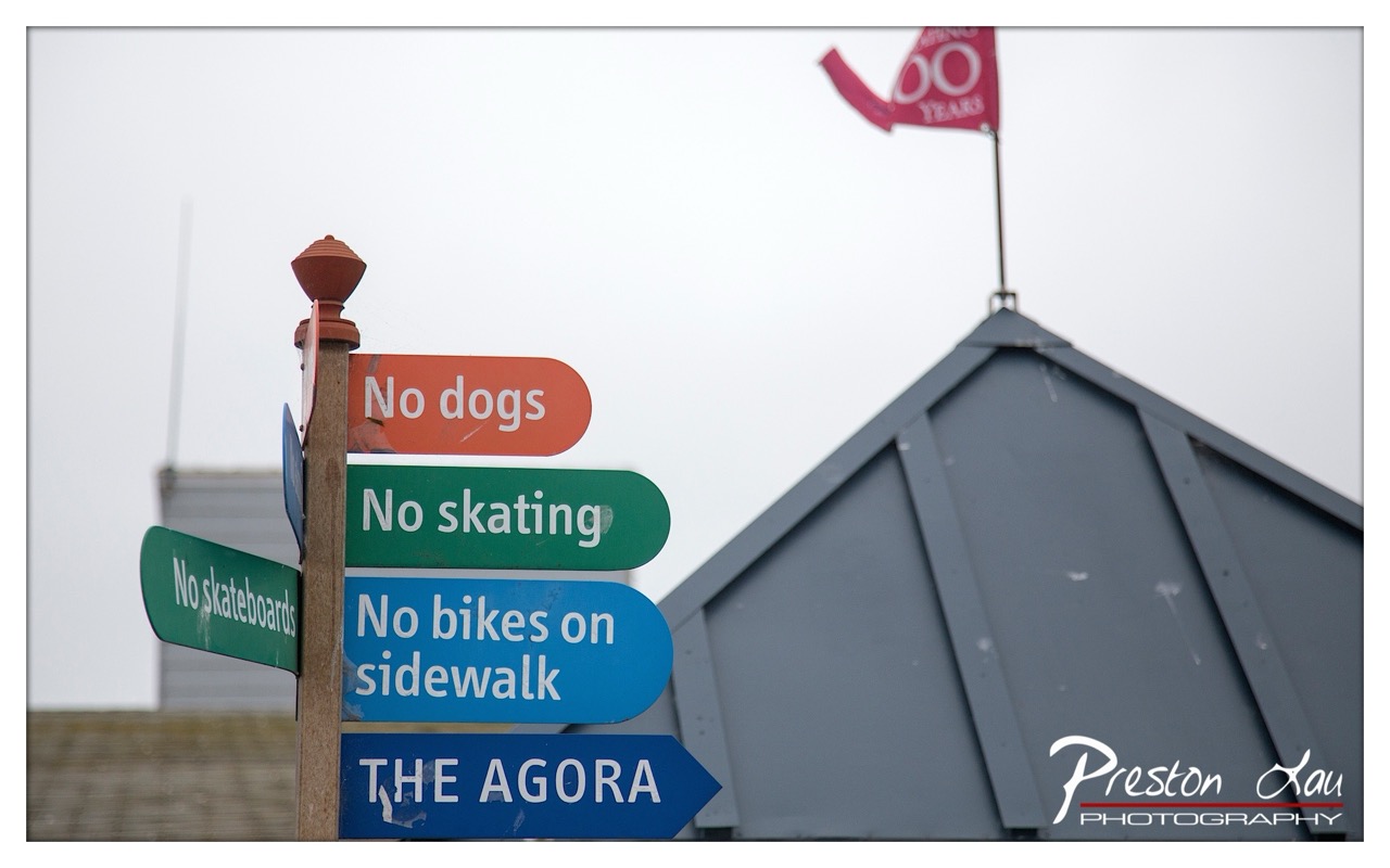
1. Overall Rating (0–10) — 6.0 This photograph captures a quiet, observational moment at a public space, where a cluster of directional signs conveys a sense of order and restriction. The muted sky and subdued tones create a contemplative atmosphere, while the red flag and the "100 YEARS" marker hint at a local celebration or milestone. The image feels candid and slightly humorous in its documentation of rules, but it lacks visual dynamism—its strength lies in narrative rather than aesthetic impact.
2. Composition (0–10) — 5.5 The signs are stacked vertically and slightly off-center, creating a sense of visual weight that pulls the eye upward. The diagonal roofline provides a subtle counterbalance, but the composition feels slightly cluttered and lacks a strong focal point.
3. Lighting (0–10) — 5.0 The overcast sky results in flat, diffused light that minimizes shadows and depth. While this allows for even exposure across the signs, it also flattens the image and reduces visual interest.
4. Color & Tone (0–10) — 5.5 The color palette is restrained, dominated by gray and muted tones, with pops of orange, green, and blue from the signs. While the colors are functional and legible, they lack vibrancy and emotional warmth.
5. Creativity (0–10) — 6.0 The juxtaposition of multiple "no" signs with the celebratory flag creates a subtle irony, offering a narrative layer beyond the literal scene. The concept is clever, but the execution remains observational rather than expressive.
6. Technical Quality (0–10) — 7.0 The image is sharp and well-focused on the signs, with clear text and clean edges. The depth of field isolates the subject effectively, though the background remains slightly soft.
7. Emotional Impact (0–10) — 5.0 The image evokes mild amusement and curiosity, but its emotional resonance is limited. The viewer is invited to read the signs and infer the story, but the scene itself does not stir strong emotion or connection.
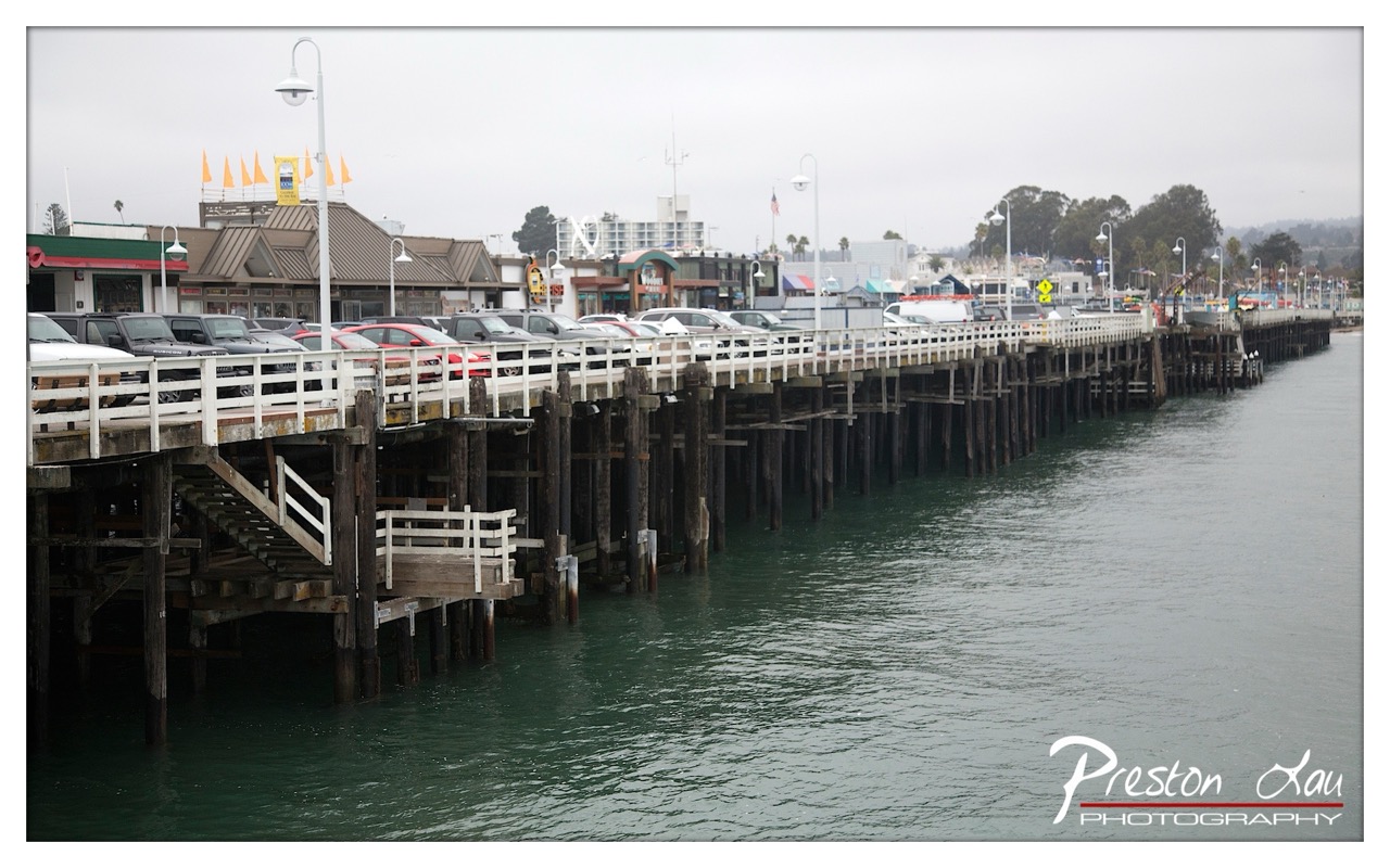
1. Overall Rating (0–10) — 6.0 This photograph captures the quiet melancholy of a fog-draped harbor, where the weight of overcast skies presses down on a long, weathered pier. The muted tones and steady perspective evoke a sense of stillness, though the scene feels slightly subdued by the lack of dynamic contrast. While the composition effectively conveys the mood of a damp coastal day, the image remains more observational than emotionally stirring, offering a glimpse of place rather than a profound visual narrative.
2. Composition (0–10) — 6.5 The diagonal line of the pier draws the eye into the frame, creating a sense of depth and continuity. However, the slightly off-center placement of the pier and the cluttered foreground of parked cars introduce visual tension, slightly disrupting the harmony of the composition.
3. Lighting (0–10) — 5.5 The overcast sky produces soft, diffused light that flattens shadows and reduces contrast. While this creates a cohesive, atmospheric mood, it also diminishes the visual richness of the scene, leaving the image feeling somewhat muted.
4. Color & Tone (0–10) — 5.5 The palette is dominated by cool grays and murky greens, which reinforce the damp, subdued atmosphere. While the colors are consistent with the mood, they lack vibrancy and warmth, contributing to a somewhat lifeless visual tone.
5. Creativity (0–10) — 6.0 The image captures a familiar coastal scene with a quiet, contemplative tone. While the perspective is effective and the mood is well-communicated, it relies on a conventional approach without significant artistic innovation or unique storytelling.
6. Technical Quality (0–10) — 7.5 The image is sharp and well-focused, with clear detail in both the foreground and background. The exposure is balanced, and the watermark is unobtrusive, indicating solid technical execution.
7. Emotional Impact (0–10) — 5.5 The photograph evokes a sense of calm melancholy and quiet solitude, but the lack of strong focal points or emotional intensity keeps the viewer at a distance. It invites contemplation but does not elicit a powerful emotional response.
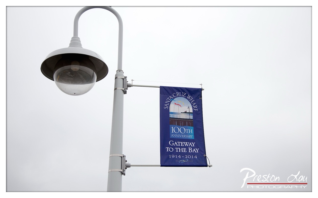
1. Overall Rating (0–10) — 6.0 This photograph captures a quiet, overcast moment at Santa Cruz Wharf, where the muted sky and subdued tones lend a contemplative mood. The banner commemorating the 100th anniversary adds a layer of historical context, grounding the image in place and time. While the composition is clean and deliberate, the lack of vibrant contrast and emotional depth keeps it from feeling truly evocative—more a functional record than a compelling visual statement.
2. Composition (0–10) — 6.5 The low-angle perspective emphasizes the lamppost and banner, creating a sense of scale and urban presence. The vertical alignment of the banner and the diagonal sweep of the pole guide the eye effectively, though the large expanse of empty sky slightly dilutes the focus.
3. Lighting (0–10) — 5.5 The overcast conditions produce soft, even light with minimal shadows, which flattens the image’s depth. While this prevents harsh highlights, it also robs the scene of dramatic atmosphere and visual texture.
4. Color & Tone (0–10) — 5.0 The palette is restrained, dominated by grays and the deep blue of the banner. While the blue provides a focal point, the overall tonal range lacks vibrancy, giving the image a muted, almost washed-out appearance.
5. Creativity (0–10) — 6.0 The image functions as a straightforward commemorative document, capturing a specific moment and location. While the concept is grounded in place and history, it lacks a strong artistic reinterpretation or unique visual angle.
6. Technical Quality (0–10) — 7.5 The image is sharp and well-focused, with clean details visible in the banner’s text and the lamppost’s structure. The exposure is balanced, avoiding blown highlights or lost shadows, and the watermark is unobtrusive.
7. Emotional Impact (0–10) — 5.0 The photograph conveys a sense of quiet nostalgia, but the lack of dynamic lighting and emotional resonance keeps the viewer at a distance. It invites recognition of the location and occasion but doesn’t provoke a deeper emotional response.
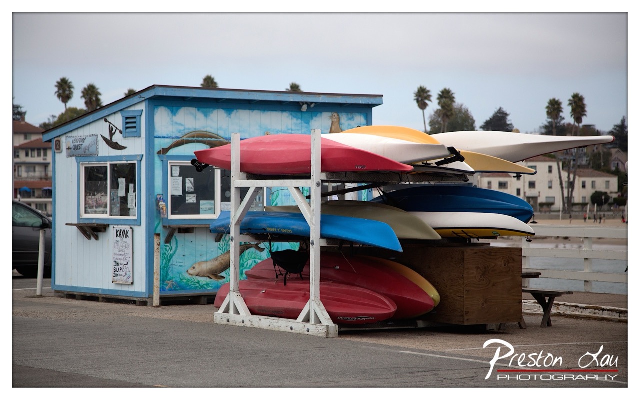
1. Overall Rating (0–10) — 6.8 This photograph captures the laid-back charm of a coastal kayak rental station, where vibrant colors and maritime life converge in a quiet, everyday scene. The painted mural on the blue shed and the stacked kayaks create a visually engaging focal point, while the overcast sky lends a subdued, contemplative mood. Though the image feels grounded and authentic, it lacks the dynamic lighting or compositional tension to elevate it beyond a pleasant snapshot into a compelling work of art.
2. Composition (0–10) — 6.5 The subject is well-centered, with the kayak rack drawing the eye forward and the shed anchoring the left side. However, the wide framing and scattered background elements—like the distant buildings and palm trees—dilute focus, creating a sense of visual clutter.
3. Lighting (0–10) — 5.5 The overcast sky produces soft, even light that minimizes harsh shadows, allowing the colors of the kayaks to stand out. However, the lack of contrast and directionality flattens the image, reducing depth and atmosphere.
4. Color & Tone (0–10) — 7.0 The palette is rich with bold reds, blues, and yellows against the soft blue of the shed and the muted gray of the sky. The color temperature feels appropriately cool and coastal, enhancing the seaside mood.
5. Creativity (0–10) — 6.0 The scene is familiar but well-framed, with the mural adding a narrative layer. While the concept is grounded in reality, the execution remains conventional, with little surprise or originality in the approach.
6. Technical Quality (0–10) — 7.5 The image is sharp and well-focused, with clean details throughout the kayak rack and the building. The depth of field is adequate, and the white balance is accurate, though the overall tonal range is limited by the flat lighting.
7. Emotional Impact (0–10) — 6.0 The photograph evokes a sense of calm and leisure, suggesting a peaceful day by the water. It invites the viewer into a quiet coastal moment, but the emotional resonance is moderate, held back by the lack of dramatic lighting or personal connection.