Preston Lau: A Journey Through Memories, Tech, and Humanity
Welcome to my personal blog that delves into the intricate tapestry of personal albums and the fascinating intersection of ever-evolving technology and humanity. Come along on a journey with me as we delve into the seamless fusion of creativity, state-of-the-art AI and robotics, intricately interwoven within the tapestry of our shared awareness. Have fun!
When Shopping Malls Meet Safari Dreams at Zoolung Zoo South Korea
AI Summary
An extraordinary urban adventure awaits visitors to Seoul's Times Square Mall, where Zoolung Zoolung, Korea's first indoor animal theme park, offers a unique opportunity to interact closely with diverse creatures like toucans, sloths, and bunnies on the 5th floor. This innovative attraction seamlessly blends a vibrant shopping experience with an intimate natural wonderland, allowing for fence-free encounters and educational engagement, culminating in the surprising possibility of witnessing an impromptu K-pop performance in the mall lobby, showcasing Seoul's dynamic fusion of nature, culture, and urban life.
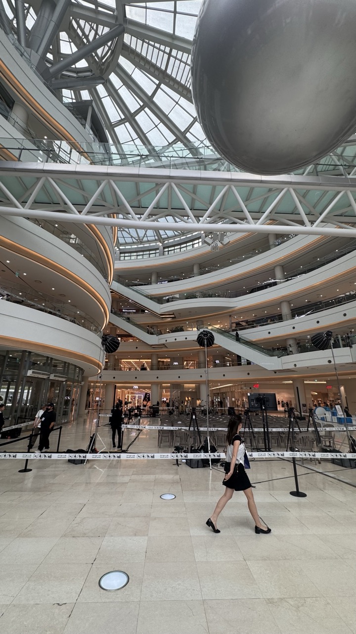
Picture this: you're shopping for the latest Korean fashion trends, grabbing some bubble tea, and suddenly you hear the exotic calls of tropical birds echoing through the mall corridors. Welcome to Seoul, where the impossible becomes possible, and where I discovered one of the most extraordinary attractions I've ever encountered - Zoolung Zoo, a full-scale indoor zoo perched on the 5th floor of Times Square Mall.
1. Overall Rating (0–10) — 6.8 This photograph captures the grand, architectural drama of a modern shopping mall’s atrium, where human scale contrasts with soaring structural elegance. The sweeping curves and glass ceiling create a sense of openness and movement, though the presence of event staging equipment introduces a subtle tension between public space and commercial function. While the image conveys the atmosphere of a contemporary urban environment, it lacks a strong focal point, and the composition feels more observational than intentional.
2. Composition (0–10) — 6.5 The diagonal lines of the walkway and the curved balconies guide the eye upward, creating visual rhythm. However, the central subject—a woman in motion—is underutilized, and the foreground staging elements distract from the architectural grandeur.
3. Lighting (0–10) — 6.0 Natural light filters through the glass dome, providing even illumination, but the overall tone is cool and clinical. The artificial lights on the balconies add warmth but do little to enhance depth or mood.
4. Color & Tone (0–10) — 6.2 A neutral palette of grays, whites, and blacks dominates, with subtle beige tones from the floor. The lack of vivid color reduces visual excitement, though the tonal consistency supports the clean, modern aesthetic.
5. Creativity (0–10) — 6.0 The juxtaposition of human movement against the monumental architecture is conceptually interesting, but the image remains largely documentary. The event setup introduces a narrative layer, yet it’s not fully explored.
6. Technical Quality (0–10) — 7.5 The image is sharp and well-focused, with clear detail throughout. The wide-angle perspective is handled effectively, though it slightly distorts the geometry of the space.
7. Emotional Impact (0–10) — 5.8 The photo evokes a sense of quiet urban solitude—there’s a feeling of being in a public space that feels both vast and impersonal. The lone figure adds a human element, but the overall mood remains detached and observational.
1. Overall Rating (0–10) — 6.0 This photograph captures the bustling energy of a modern, multi-level atrium, where architecture and human activity intersect in a dynamic, almost cinematic way. The sweeping glass ceiling and geometric steel framework lend a sense of grandeur, while the scattered event setup—chairs, cameras, and a large screen—suggests a moment of anticipation. However, the image feels more like a snapshot than a composed scene, with too many competing elements and a lack of clear focal point, preventing it from fully conveying its potential atmosphere.
2. Composition (0–10) — 5.5 The wide-angle perspective captures the scale of the space but results in a crowded and slightly chaotic layout. The diagonal lines of the ceiling structure guide the eye upward, yet the placement of people and equipment across the floor creates visual fragmentation and weakens the sense of unity.
3. Lighting (0–10) — 6.0 Natural light floods the space through the expansive glass roof, creating a bright, evenly lit environment. The light enhances the transparency of the architecture but also flattens depth, reducing contrast and shadow detail that could add dimension.
4. Color & Tone (0–10) — 5.5 The palette is dominated by neutral grays, whites, and metallic tones, punctuated only by the red vehicle and the vivid display on the screen. While functional, the color scheme lacks cohesion and emotional resonance, making the scene feel more like a documentation than an evocative image.
5. Creativity (0–10) — 6.0 The image leverages the architectural drama and the event setup to create a narrative of public gathering, but it doesn't push beyond the obvious. The concept is grounded in realism, but the execution lacks a unique perspective or artistic interpretation.
6. Technical Quality (0–10) — 7.0 The image is sharp and well-exposed, with clear details throughout the frame. The focus is consistent, and the wide dynamic range captures both the bright ceiling and the darker areas under the screen with reasonable clarity.
7. Emotional Impact (0–10) — 5.0 While the space conveys a sense of movement and activity, the emotional connection remains distant. The viewer is positioned as an observer rather than a participant, and the lack of a compelling subject or narrative arc limits the image’s ability to resonate deeply.
The Mall That Changed Everything
My journey to Zoolung Zoo began like any typical shopping expedition in Seoul's bustling Yeongdeungpo district. Times Square Mall, one of Seoul's largest shopping complexes, initially seemed like your standard retail paradise. With its gleaming floors, designer boutiques, and the familiar buzz of shoppers, nothing prepared me for what awaited me five floors up.
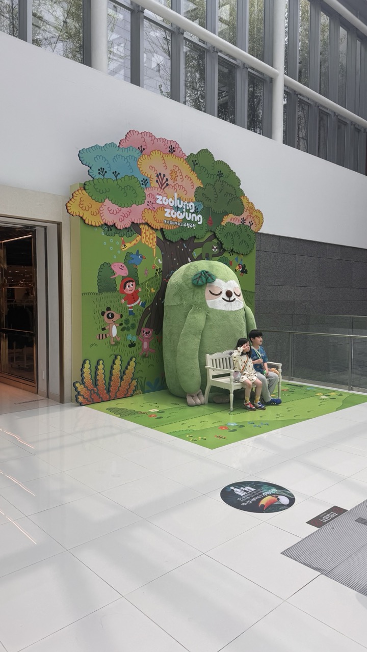
1. Overall Rating (0–10) — 6.8 This image captures a whimsical, family-friendly installation in a modern indoor space, where playful design and human interaction create a moment of gentle charm. The vibrant mural and oversized sloth figure invite curiosity and delight, though the sterile, brightly lit environment tempers the emotional warmth. While the scene feels staged and slightly commercial, its lighthearted energy and inviting composition make it visually engaging and accessible.
2. Composition (0–10) — 7.0 The subjects are well-placed on the right, with the large mural anchoring the left side and creating visual balance. The wide shot includes contextual elements like the polished floor and glass railing, which frame the scene effectively.
3. Lighting (0–10) — 7.5 Even, diffused overhead lighting illuminates the space uniformly, highlighting the colorful mural without harsh shadows. The bright, clean light enhances the cheerful tone and keeps details sharp.
4. Color & Tone (0–10) — 8.0 The palette is rich and playful, with saturated greens, pinks, and yellows in the mural contrasting against the neutral white and gray surroundings. The tonal balance is warm and inviting, reinforcing the lighthearted atmosphere.
5. Creativity (0–10) — 7.5 The blend of whimsical art and real-life interaction demonstrates strong conceptual intent—turning a public space into an immersive experience. The oversized character and child-friendly design reflect thoughtful, imaginative storytelling.
6. Technical Quality (0–10) — 7.0 The image is sharp and well-focused, with clear details in both the mural and the subjects. The wide-angle perspective captures the full scene without significant distortion.
7. Emotional Impact (0–10) — 6.5 The scene evokes a sense of joy and wonder, particularly through the children’s relaxed presence and the playful design. While the emotional resonance is pleasant and uplifting, it remains somewhat surface-level due to the commercial context.
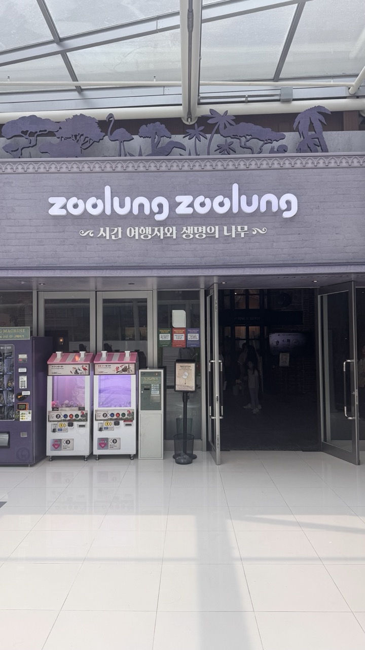
1. Overall Rating (0–10) — 5.5 This photograph captures the entrance of a themed attraction with a clean, modern aesthetic, but the lack of human presence and emotional engagement makes it feel more like a functional snapshot than an evocative image. The signage and claw machines add visual interest, but the flat lighting and sterile environment dilute the potential for storytelling. While the composition is orderly, it fails to convey the energy or whimsy one might expect from a place called "Zoolung."
2. Composition (0–10) — 6.0 The central alignment of the entrance and signage creates a balanced, symmetrical frame, but the wide perspective and empty space in the foreground flatten the sense of depth. The claw machines on the left add visual weight but disrupt the clean symmetry.
3. Lighting (0–10) — 5.0 The overhead fluorescent lighting is bright and even, ensuring clarity, but it lacks direction and warmth, resulting in a flat, clinical atmosphere that undermines any sense of mood or ambiance.
4. Color & Tone (0–10) — 5.5 The palette is dominated by muted grays and whites, with the soft purple of the claw machines providing a subtle contrast. The color scheme is cohesive but lacks vibrancy, giving the scene a subdued, almost sterile feel.
5. Creativity (0–10) — 5.0 The concept of blending a zoo theme with a game arcade is intriguing, but the execution here feels literal and unexplored. The image presents information rather than interpretation, missing an opportunity to capture the playful spirit suggested by the name.
6. Technical Quality (0–10) — 7.0 The image is sharp and well-focused, with clean lines and no visible noise. The camera’s resolution captures the details of the signage and machines clearly, though the overall image lacks artistic refinement.
7. Emotional Impact (0–10) — 4.5 The photograph evokes a sense of quiet neutrality—neither excitement nor disappointment. The absence of people and the sterile environment make it difficult to connect emotionally, leaving the viewer with a detached impression of a place that could be fun, but doesn’t feel alive.
The moment I stepped off the elevator onto the 5th floor, I knew I was in for something special. The transformation from commercial space to natural wonderland was so seamless it felt like stepping through a portal into another world. The subtle sounds of nature began to replace the typical mall ambiance, and the air itself seemed to carry a different energy.
Korea's First Urban Animal Kingdom
Zoolung Zoolung is Korea's first animal theme park where you can meet living, breathing creatures in the heart of the city. But calling it simply a "zoo" doesn't do justice to what this place represents. More than just a "zoo" where you can watch animals, it is a place where you can feel the importance of life through close interaction with them without fences.
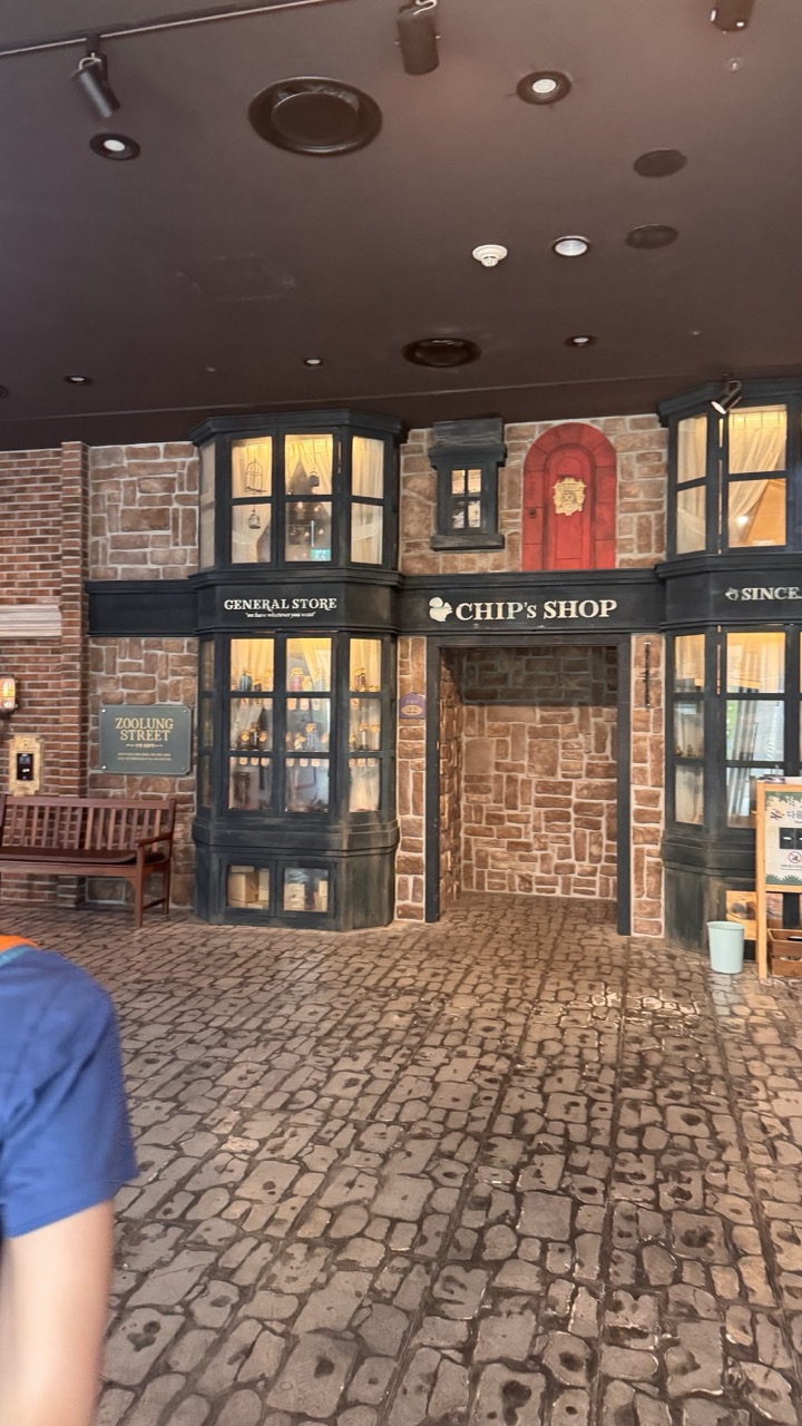
1. Overall Rating (0–10) — 5.5 This photograph captures a whimsical, themed storefront reminiscent of a fantasy village, but the image feels more like a casual snapshot than a composed scene. The setting, with its cobblestone floor and quaint shop signs like “CHIP’s SHOP” and “GENERAL STORE,” evokes a sense of playful escapism. However, the composition is undermined by the partial figure in the foreground and the flat, utilitarian ceiling lighting, which detract from the intended charm and narrative depth.
2. Composition (0–10) — 5.0 The framing is slightly off-center, with a person’s shoulder intruding into the lower-left corner, disrupting visual balance. The central storefront is well-placed, but the lack of leading lines or depth makes the scene feel static and cluttered.
3. Lighting (0–10) — 4.5 The lighting is functional but unflattering—overhead track lights cast harsh, uneven illumination that flattens textures and creates glare on the glass windows. The warm glow inside the shops contrasts with the cool, artificial overhead light, creating a disjointed atmosphere.
4. Color & Tone (0–10) — 5.5 The palette is dominated by earthy browns and muted tones, with the red door offering a modest pop of color. The overall tone is subdued, with little contrast or vibrancy, giving the image a dull, underexposed feel.
5. Creativity (0–10) — 6.0 The concept of a themed “Zoolung Street” is imaginative and evocative of a storybook world. However, the execution lacks intentional storytelling—what could be a magical scene reads more like a generic amusement park set piece.
6. Technical Quality (0–10) — 6.0 The image is reasonably sharp, with clear details in the signage and stonework. However, focus is uneven, and the foreground obstruction reduces overall clarity and professionalism.
7. Emotional Impact (0–10) — 4.5 The image conveys a mild sense of nostalgia and whimsy, but the lack of human presence and emotional engagement leaves it feeling detached and impersonal. The viewer is invited to observe rather than feel.
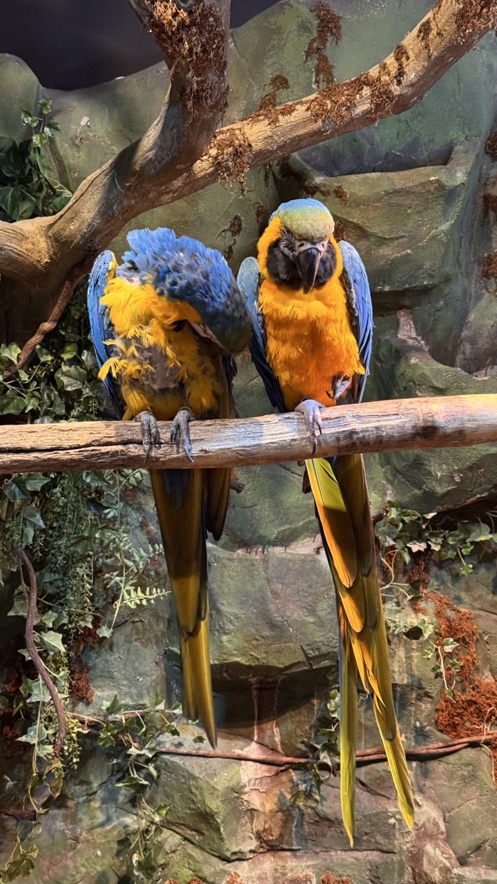
1. Overall Rating (0–10) — 7.0 This photograph captures a vivid moment between two macaws, their brilliant plumage standing out against a lush, artificial jungle backdrop. The birds’ contrasting poses—one preening, the other alert—create a dynamic sense of life and interaction, while the rich coloration and detailed feathers draw the eye. The setting, though clearly constructed, successfully evokes a naturalistic atmosphere, though the staged quality tempers the image’s emotional authenticity.
2. Composition (0–10) — 7.5 The horizontal branch frames the macaws centrally, creating a balanced and engaging focal point. The layered background of foliage and rock enhances depth, while the birds’ placement on opposite sides of the frame adds visual symmetry and rhythm.
3. Lighting (0–10) — 6.5 Soft, even lighting illuminates the subjects without harsh shadows, allowing the vibrant feathers to shine. The light appears diffused, likely from overhead sources, which enhances color saturation but slightly flattens the scene’s dimensionality.
4. Color & Tone (0–10) — 8.5 The rich blues, yellows, and greens create a striking, harmonious palette. The contrast between the birds’ vivid feathers and the muted earth tones of the background is compelling, giving the image a lively, tropical energy.
5. Creativity (0–10) — 7.0 The image effectively captures the beauty of these exotic birds in a controlled environment. While the setting is not wild, the composition and framing suggest intentionality and an effort to evoke the spirit of the natural world.
6. Technical Quality (0–10) — 8.0 Sharp focus and clear detail highlight the texture of the feathers and the bark of the branch. The image is well-exposed, with minimal noise, demonstrating strong technical execution.
7. Emotional Impact (0–10) — 7.5 The intimacy of the moment—two birds in quiet proximity—evokes a sense of companionship and calm. The viewer is drawn into the stillness of the scene, feeling a connection to the quiet dignity of the animals, even if the environment is artificial.
As I entered the main area, I was immediately struck by the thoughtful design. The place is well designed with different areas for different types of animals. There are lots of interactive booths, and the whole area is clean and spacious. The creators have managed to transform what could have been a sterile mall environment into something that feels genuinely alive and vibrant.
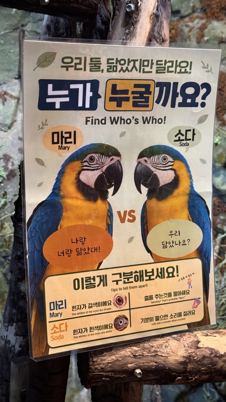
1. Overall Rating (0–10) — 7.0 This playful educational sign invites visitors to distinguish between two parrots with humor and clarity, blending language, illustration, and interactive design into a charming experience. The vibrant colors and engaging layout make the information accessible and memorable, though the slightly cluttered background detracts from its visual focus. The poster succeeds as both an informative tool and a whimsical piece of zoo signage.
2. Composition (0–10) — 6.5 The central placement of the parrots draws immediate attention, but the surrounding text and decorative elements create a busy layout. A more balanced use of negative space would enhance readability and visual harmony.
3. Lighting (0–10) — 6.0 Natural ambient light evenly illuminates the sign, preserving the clarity of the text and colors. However, the lack of directional lighting results in a flat appearance, diminishing the poster’s visual depth.
4. Color & Tone (0–10) — 8.0 The bold blue and yellow of the macaws contrast sharply with the warm beige background, creating a lively and eye-catching palette. The consistent use of color supports the playful tone and improves legibility.
5. Creativity (0–10) — 8.5 The concept of turning a simple identification guide into a game-like "Find Who’s Who!" challenge demonstrates strong creativity. The bilingual presentation and use of visual cues add both educational value and cultural accessibility.
6. Technical Quality (0–10) — 7.5 The image is sharp and well-focused, with clear typography and clean print quality. The sign appears to be in good condition, with no visible distortions or blurring.
7. Emotional Impact (0–10) — 7.0 The lighthearted tone and friendly design evoke curiosity and amusement, encouraging engagement. The anthropomorphized parrots and playful language create a sense of connection and delight.
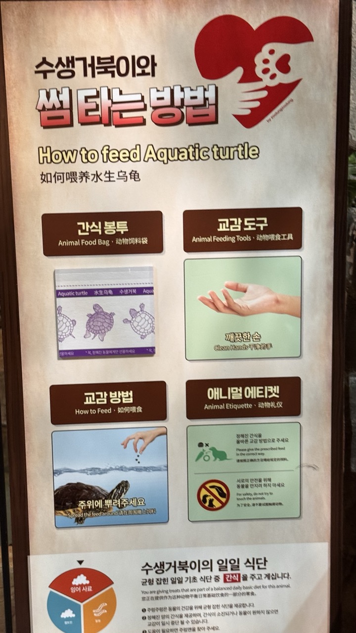
1. Overall Rating (0–10) — 5.5 This informational sign effectively communicates how to feed aquatic turtles, blending practical guidance with a clean, bilingual layout. The use of icons and multilingual text enhances accessibility, but the image’s flat, utilitarian presentation lacks visual engagement. While informative and functional, it feels more like a public service notice than a compelling visual narrative.
2. Composition (0–10) — 6.0 The layout is structured and balanced, with clear sections and logical flow. However, the vertical framing and dense text blocks create a slightly cluttered impression, reducing visual harmony and making the information feel overwhelming.
3. Lighting (0–10) — 6.5 The lighting is even and functional, illuminating the sign without glare or shadow. The neutral, ambient light supports readability but does little to enhance the image’s aesthetic appeal.
4. Color & Tone (0–10) — 5.5 The color palette is muted, relying on earthy browns and soft greens, which support the educational tone but lack vibrancy. The red heart logo adds a pop of color, but the overall scheme feels subdued and slightly dated.
5. Creativity (0–10) — 5.0 The design is practical and informative, prioritizing clarity over artistic expression. While the multilingual approach and iconography demonstrate thoughtful communication, the execution is conventional and lacks originality.
6. Technical Quality (0–10) — 7.0 The image is sharp and well-focused, with clear legibility of text and graphics. The photograph captures the sign accurately, though the lack of dynamic lighting or depth limits its technical impact.
7. Emotional Impact (0–10) — 4.5 The image evokes a sense of duty and responsibility, but its clinical presentation keeps the viewer emotionally detached. It informs rather than inspires, resonating more with logic than with feeling.
A Menagerie of Wonders
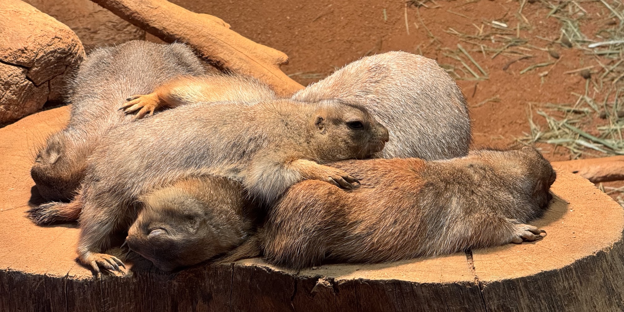
The animal inhabitants of Zoolung Zoo are as diverse as they are captivating. With toucans, sloths, turtles and bunnies and more it's a great place to take children or the young at heart. Each species seemed perfectly adapted to their indoor environment, and the care taken in creating suitable habitats was evident everywhere I looked.
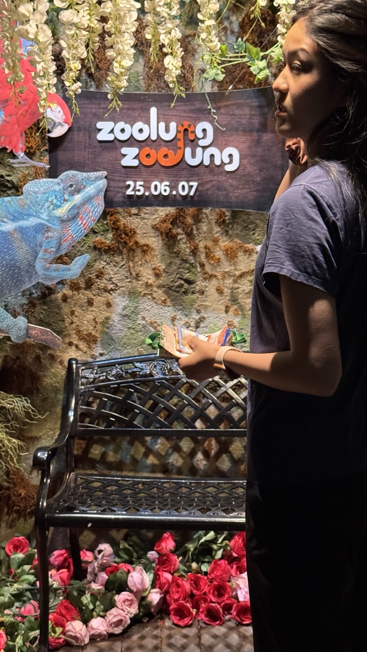
1. Overall Rating (0–10) — 5.5 This photograph captures a moment at a themed zoo event, blending whimsy with a sense of place through its decorative elements. The playful "zoolung zoolung" sign and vibrant floral arrangements create a festive atmosphere, yet the image feels slightly disjointed due to uneven lighting and a cluttered foreground. While the subject’s engagement with the scene suggests narrative potential, the overall composition lacks cohesion, leaving the viewer with a snapshot that feels more casual than intentional.
2. Composition (0–10) — 5.0 The subject is positioned off-center, with the bench and flowers creating a busy lower third that competes for attention. The large sign dominates the upper frame, drawing focus away from the person and reducing the sense of balance.
3. Lighting (0–10) — 5.5 The lighting is uneven, with strong shadows cast on the subject and the wall, likely from a direct flash. This creates harsh contrasts and flattens the depth of the scene, particularly in the background foliage.
4. Color & Tone (0–10) — 6.0 The palette is rich with vibrant pinks, reds, and greens, but the color temperature is inconsistent—some areas appear overly warm while others are cool and shadowed. This disrupts the visual harmony and weakens the overall mood.
5. Creativity (0–10) — 6.5 The concept of blending zoo imagery with floral and playful design elements is imaginative. However, the execution feels more like a candid moment than a deliberate artistic statement, limiting its originality.
6. Technical Quality (0–10) — 6.0 The image is reasonably sharp, with clear details in the sign and flowers. However, focus is slightly soft on the subject, and the low-light conditions contribute to some noise and loss of texture.
7. Emotional Impact (0–10) — 5.0 The image conveys a sense of celebration and amusement, but the emotional connection is muted by the lack of focus and the overwhelming visual elements. The viewer is left observing rather than feeling.
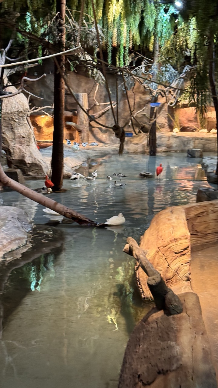
1. Overall Rating (0–10) — 6.0 This indoor aviary scene captures a tranquil moment of avian life within a simulated natural habitat, where the interplay of water, light, and foliage creates a sense of quiet immersion. The composition is rich in detail and texture, yet the image feels slightly overexposed and visually cluttered, diminishing its overall clarity and emotional resonance. While the environment is convincingly rendered, the photograph struggles to rise above the level of a casual snapshot, lacking the intentional balance and mood that would elevate it into a more compelling visual narrative.
2. Composition (0–10) — 5.5 The frame is filled with multiple elements—birds, water, rocks, and hanging vegetation—that compete for attention. The diagonal placement of the log in the foreground provides some depth, but the off-center and busy arrangement detracts from a clear focal point, creating a sense of visual chaos.
3. Lighting (0–10) — 5.0 The lighting is uneven and overly bright, with harsh reflections on the water surface and a washed-out glow in the upper foliage. While the ambient illumination suggests an indoor setting, the lack of directional warmth or shadowing prevents the scene from feeling natural or atmospheric.
4. Color & Tone (0–10) — 5.5 The color palette is dominated by muted earth tones—browns, grays, and dull greens—with the red birds providing a subtle pop of color. However, the overall tone is flat and lacks vibrancy, with the bright lighting washing out subtle color nuances and reducing contrast.
5. Creativity (0–10) — 6.0 The concept of capturing a naturalistic habitat within a controlled environment is strong, and the inclusion of diverse bird species adds visual interest. However, the execution is more documentary than artistic, with little use of creative perspective or intentional framing to enhance storytelling.
6. Technical Quality (0–10) — 6.5 The image is reasonably sharp, with clear detail in the water and surrounding structures. However, slight overexposure and a lack of dynamic range reduce technical refinement, and the overall image appears slightly soft, likely due to lighting conditions and camera settings.
7. Emotional Impact (0–10) — 5.0 While the scene conveys a sense of calm and biodiversity, the emotional connection is limited by the lack of focus and mood. The viewer is presented with a scene, but not a story, leaving the moment feeling more observational than evocative.
What sets this experience apart is the proximity you can achieve with these creatures. Unlike traditional zoos where thick glass or high fences separate visitors from animals, Zoolung Zoo offers an intimate experience that feels more like stepping into the animals' world rather than observing them from a distance.
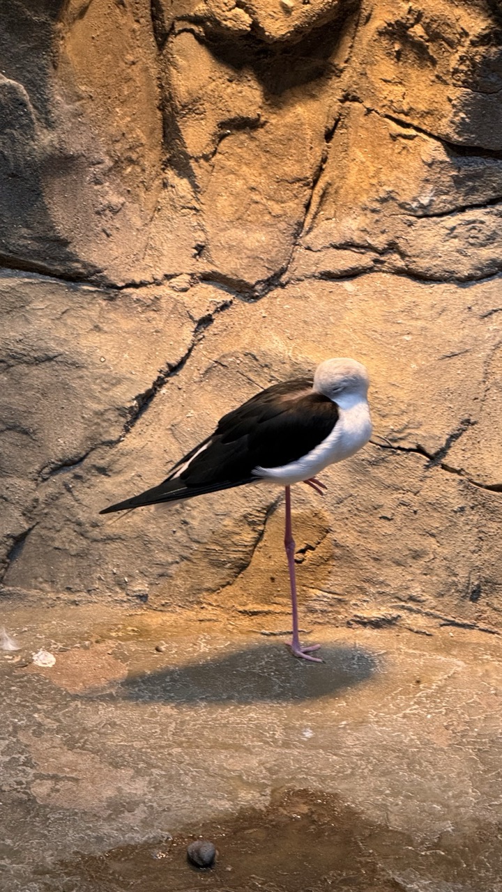
1. Overall Rating (0–10) — 7.0 This photograph captures a striking moment of stillness, with a black-winged stilt standing gracefully on one leg against a rugged, sunlit rock face. The bird’s elegant posture and the warm, natural lighting create a sense of quiet dignity, while the textured background adds depth and context. The image is visually compelling but slightly restrained by a lack of dynamic tension, holding a serene beauty that feels more observational than immersive.
2. Composition (0–10) — 7.0 The stilt is well-placed off-center, creating visual interest, and the strong vertical line of its leg draws the eye upward. The textured rock wall provides a natural backdrop that frames the subject without overwhelming it.
3. Lighting (0–10) — 7.5 The warm, directional light enhances the scene’s earthy tones and casts a soft shadow beneath the bird, adding dimension and a sense of time—possibly late afternoon. The lighting feels natural and supports the tranquil mood.
4. Color & Tone (0–10) — 7.0 The palette is harmonious, with rich browns and tans in the rock contrasting with the bird’s stark black, white, and pink. The tones are warm and cohesive, though slightly muted, giving the image a grounded, natural feel.
5. Creativity (0–10) — 6.5 The image captures a quiet, intimate moment in a naturalistic setting, but it leans more toward documentation than bold artistic interpretation. The subject’s poised stillness offers a quiet narrative, but the composition doesn’t push beyond the familiar.
6. Technical Quality (0–10) — 8.0 The image is sharp and clear, with fine detail visible in the bird’s feathers and the rock surface. The focus is precise, and the exposure is well-balanced, preserving texture and tone.
7. Emotional Impact (0–10) — 6.5 The stillness of the stilt evokes a sense of calm and patience, inviting quiet contemplation. While the mood is peaceful, the emotional resonance is subtle—more meditative than deeply moving.
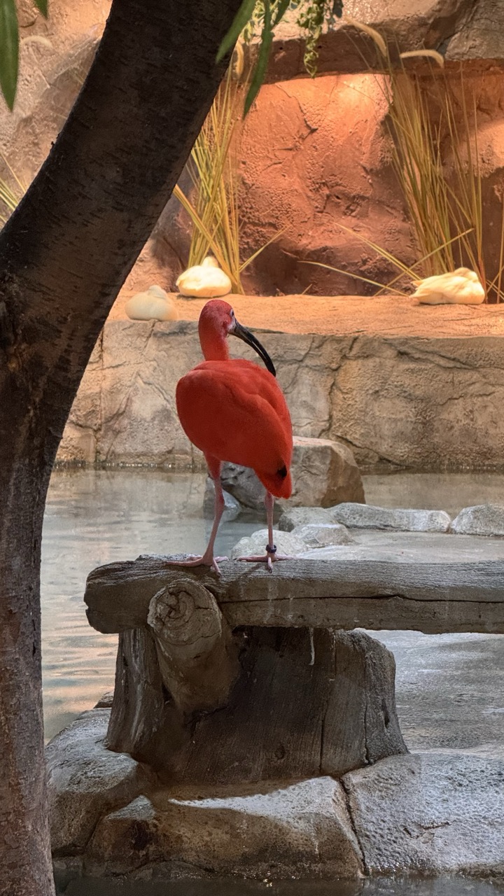
1. Overall Rating (0–10) — 7.0 This photograph captures the striking vibrancy of a scarlet ibis in a naturalistic enclosure, where the bird’s bold color contrasts beautifully with the muted, earthy tones of its surroundings. The composition draws the eye to the subject with a strong focal point, though the framing feels slightly obstructed by the foreground tree trunk. While the image conveys a serene, zoo-like atmosphere, it falls just short of artistic refinement due to a lack of depth and visual tension.
2. Composition (0–10) — 6.5 The ibis is well-centered, but the large tree trunk on the left disrupts the balance and creates a visual barrier. A tighter crop would improve focus and flow.
3. Lighting (0–10) — 7.0 Warm, directional lighting enhances the texture of the rocks and the bird’s feathers, creating a soft glow that complements the indoor habitat setting.
4. Color & Tone (0–10) — 8.0 The vivid crimson of the ibis stands out dramatically against the neutral grays and tans of the environment, resulting in a visually striking contrast that immediately captures attention.
5. Creativity (0–10) — 6.0 The image is observational and well-executed, but lacks narrative or conceptual depth. It functions more as a wildlife portrait than a creative statement.
6. Technical Quality (0–10) — 7.5 Sharp focus on the bird, clean detail in the textures, and balanced exposure contribute to strong technical execution.
7. Emotional Impact (0–10) — 6.5 The quiet dignity of the ibis evokes a sense of calm and natural beauty, though the viewer remains somewhat detached due to the sterile, curated environment.
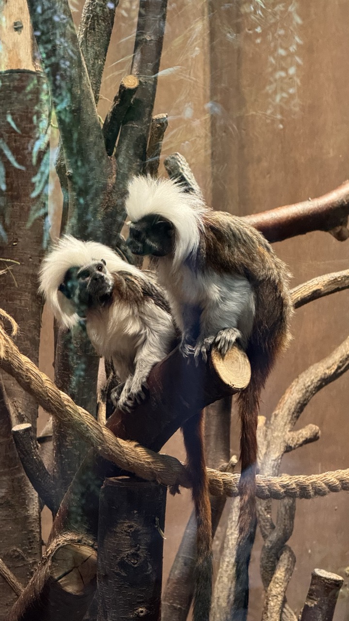
1. Overall Rating (0–10) — 7.0 This photograph captures a tender moment between two cotton-top tamarins, their distinctive white crests and expressive faces lending a sense of intimacy and charm. The naturalistic enclosure, with its interwoven branches and soft, diffused lighting, enhances the animals' wild grace. While the image is compelling and well-framed, a slightly more dynamic angle or tighter crop could amplify the emotional connection and visual impact.
2. Composition (0–10) — 7.0 The subjects are well-placed along the diagonal of the frame, creating a sense of movement and balance. The overlapping branches and rope provide depth, though some foreground elements slightly distract from the focal point.
3. Lighting (0–10) — 7.5 Soft, even lighting highlights the texture of the tamarins’ fur and creates a warm, inviting atmosphere. The reflections on the glass subtly remind the viewer of the enclosure, but do not detract from the natural feel.
4. Color & Tone (0–10) — 7.0 The earthy tones of brown and beige dominate the scene, complemented by the striking white of the tamarins’ crests. The color palette is harmonious and enhances the organic mood, though a touch more vibrancy could elevate the visual richness.
5. Creativity (0–10) — 7.5 The photograph captures a quiet, narrative moment—two animals in close proximity—offering a glimpse into their social behavior. The framing and focus on interaction lend a narrative depth that elevates it beyond a simple wildlife snapshot.
6. Technical Quality (0–10) — 8.0 The image is sharp and clear, with fine detail visible in the fur and surrounding textures. Focus is well-managed, and the depth of field appropriately isolates the subjects from the background.
7. Emotional Impact (0–10) — 7.5 There is a gentle warmth in the interaction between the tamarins, evoking a sense of curiosity and affection. The viewer is drawn into the quiet bond between the animals, making the image both visually and emotionally engaging.
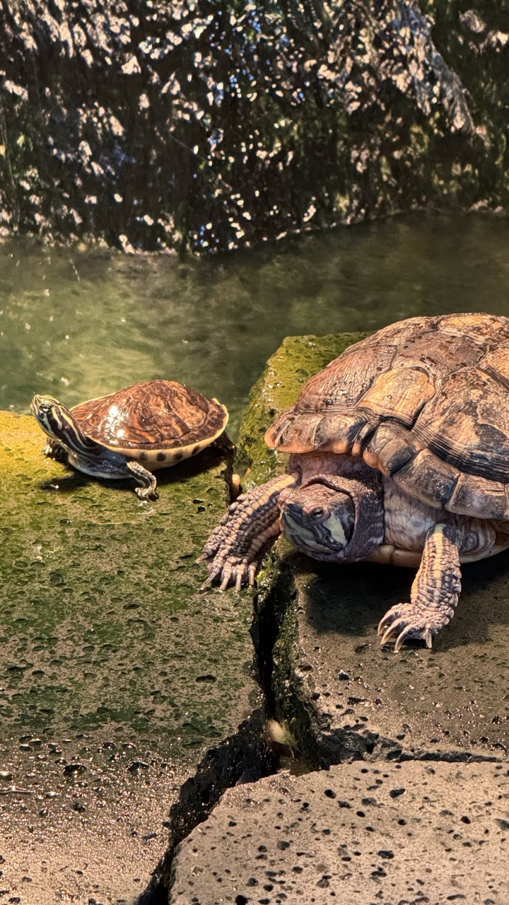
1. Overall Rating (0–10) — 7.0 This photograph captures a quiet, natural moment between two turtles, evoking a sense of peaceful coexistence in a damp, earthy habitat. The interplay of light and shadow across the mossy rocks and water adds depth and texture, while the contrast between the smaller, patterned turtle and the larger, more rugged one creates a subtle narrative of age and scale. The image is grounded in realism, though its emotional resonance is slightly muted by the lack of a stronger focal point or narrative tension.
2. Composition (0–10) — 7.0 The turtles are placed diagonally across the frame, creating a sense of movement and balance. The foreground rock leads the eye toward the larger turtle, while the smaller one on the left provides visual counterweight. The cracked stone and waterline add natural leading lines, though the composition feels slightly asymmetrical and could benefit from tighter framing.
3. Lighting (0–10) — 7.5 Natural, directional light highlights the textures of the turtles’ shells and the glistening moss, creating a warm, sun-dappled effect. The interplay of light and shadow enhances depth, especially on the larger turtle’s head and limbs. Slight overexposure in the upper background softens the details of the foliage, but overall the lighting feels organic and atmospheric.
4. Color & Tone (0–10) — 7.0 The palette is rich with earthy browns, muted greens, and subtle golds, evoking a natural, organic environment. The contrast between the warm tones of the turtles and the cool green of the water adds visual interest. While the colors are harmonious, they are slightly desaturated, which tempers their vibrancy.
5. Creativity (0–10) — 6.5 The image captures a simple, everyday moment with a sense of quiet observation. While not overtly experimental, the framing and attention to detail suggest a deliberate effort to convey the life and character of the subjects. The narrative of age and companionship is implied but not overtly stated.
6. Technical Quality (0–10) — 8.0 The image is sharp and well-focused, particularly on the larger turtle’s head and limbs. The detail in the shell texture and the wet surface of the rocks is clear. There is minimal noise, and the exposure is balanced, though the top of the image shows some loss of detail in highlights.
7. Emotional Impact (0–10) — 6.5 The photograph conveys a sense of calm and stillness, inviting the viewer to pause and reflect on the quiet lives of these creatures. While the emotional pull is subtle, the intimate scale and natural setting foster a gentle connection, especially for those attuned to wildlife and nature.
The interactive elements throughout the space kept me engaged for hours. From feeding opportunities to educational stations, every corner offered a new way to connect with the natural world. The staff members were knowledgeable and passionate, always ready to share fascinating facts about each species and their unique behaviors.
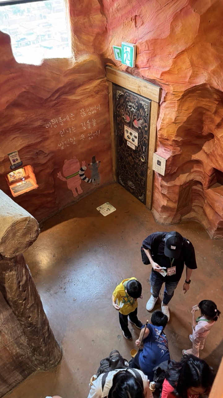
1. Overall Rating (0–10) — 6.0 This photograph captures a whimsical, immersive environment that blends playful storytelling with a sense of adventure, evoking the feeling of stepping into a storybook cave. The warm, earthy tones and imaginative details—like the hand-painted Korean text and cartoon animals—give the space a cozy, child-friendly charm. However, the composition feels slightly chaotic due to the overlapping figures and cluttered foreground, which dilutes the visual focus and reduces the image’s overall impact.
2. Composition (0–10) — 5.5 The high-angle perspective provides a comprehensive view of the scene, but the placement of people and the log in the foreground creates visual clutter. The central door and wall text are strong focal points, yet they are partially obscured by the crowd, weakening the narrative clarity.
3. Lighting (0–10) — 5.0 The lighting is functional but flat, relying on ambient indoor light that lacks directionality or mood. The bright window in the upper left casts a harsh glare, creating uneven exposure and reducing depth in the scene.
4. Color & Tone (0–10) — 6.5 The dominant warm orange and brown tones enhance the cave-like atmosphere and contribute to a sense of warmth and playfulness. However, the color palette is somewhat muted, and the lack of contrast between the wall and floor dulls the visual separation of elements.
5. Creativity (0–10) — 7.0 The setting is highly imaginative and clearly designed for storytelling and engagement. The integration of Korean text and cartoon figures adds a unique cultural and narrative layer, making the space feel both whimsical and purposeful.
6. Technical Quality (0–10) — 6.0 The image is sharp and clear, with good detail in the textures of the walls and door. However, the framing and slight overexposure from the window compromise the technical polish.
7. Emotional Impact (0–10) — 5.5 While the scene suggests joy and curiosity, the emotional resonance is held back by the disorganized composition and lack of a clear focal point. The viewer is invited into the space but not guided through it, resulting in a sense of observation rather than connection.
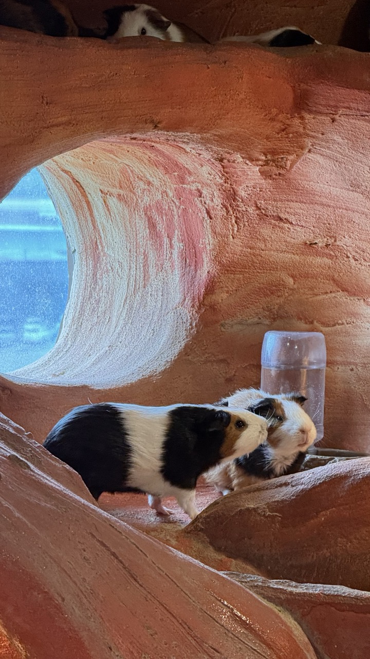
1. Overall Rating (0–10) — 7.0 This photograph captures a serene and intimate moment among guinea pigs in a whimsical, cave-like enclosure, where the natural textures and warm tones evoke a sense of cozy exploration. The composition draws the eye through the tunnel-like opening, creating a narrative of curiosity and companionship. While the image is visually engaging, its full potential is slightly held back by the flatness of the lighting and the lack of a strong focal point.
2. Composition (0–10) — 7.0 The framing uses the tunnel as a natural leading line, guiding the viewer toward the guinea pigs in the foreground. The arrangement feels balanced, with the animals positioned to create visual interest, though the upper animal slightly distracts from the main subjects.
3. Lighting (0–10) — 5.5 The light is soft and diffused, likely from an ambient indoor source, which evenly illuminates the scene but lacks directionality or contrast. The cool blue glow from the background window creates a subtle contrast but does not add significant mood or depth.
4. Color & Tone (0–10) — 7.0 The warm terracotta tones of the enclosure dominate, creating a rich, earthy palette that complements the natural hues of the guinea pigs. The cool blue from the window introduces a gentle contrast, enhancing visual interest without disrupting the harmony.
5. Creativity (0–10) — 7.5 The setting—resembling a desert canyon—adds a playful, imaginative quality to the scene, transforming a simple animal portrait into a storybook moment. The choice to capture the animals within this sculpted environment feels intentional and whimsical.
6. Technical Quality (0–10) — 7.5 The image is sharp and clear, with fine detail visible in the guinea pigs’ fur and the textured walls. The focus is well-placed on the foreground subjects, and there are no visible technical flaws such as noise or blur.
7. Emotional Impact (0–10) — 7.0 The gentle expressions and close proximity of the animals evoke a sense of calm and companionship. The cozy, enclosed setting enhances the feeling of safety and warmth, inviting the viewer to feel a quiet connection to these small creatures.
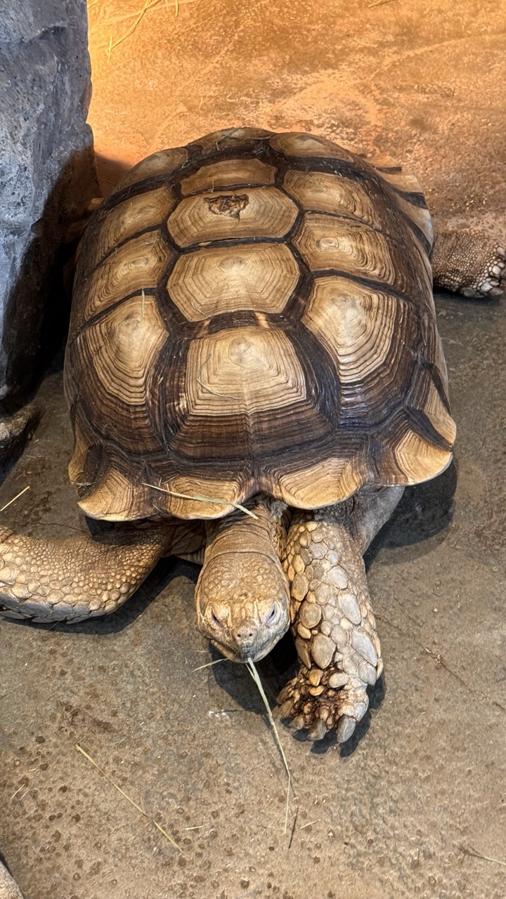
1. Overall Rating (0–10) — 7.0 This photograph captures the quiet dignity of a large tortoise in a naturalistic enclosure, with its textured shell and weathered limbs conveying a sense of age and resilience. The warm lighting enhances the organic tones of the subject, while the slightly off-center framing gives the image a candid, observational feel. While the composition is effective, a more deliberate focus on the tortoise’s gaze might deepen the emotional connection.
2. Composition (0–10) — 6.5 The tortoise is well-centered but slightly low in the frame, creating a sense of imbalance. The rock on the left provides visual weight, but the open space on the right feels underutilized, reducing compositional tension.
3. Lighting (0–10) — 7.5 Warm, directional lighting from the upper right highlights the tortoise’s shell texture and casts subtle shadows that enhance depth. The light feels natural and enhances the earthy tones without creating harsh contrasts.
4. Color & Tone (0–10) — 7.0 The palette is cohesive, dominated by warm browns and tans that reflect the tortoise’s natural habitat. The contrast between the light shell and dark scutes is strong, and the overall tonal balance feels harmonious.
5. Creativity (0–10) — 6.5 The image is a straightforward wildlife portrait, capturing the subject with clarity and respect. While not highly conceptual, the attention to detail and natural lighting lend it a quiet artistic merit.
6. Technical Quality (0–10) — 8.0 Sharp focus on the tortoise’s head and shell reveals fine textural detail. The exposure is well-balanced, with no significant noise or loss of detail in shadows or highlights.
7. Emotional Impact (0–10) — 6.5 The tortoise’s calm demeanor and slow, deliberate posture evoke a sense of patience and endurance. The viewer is drawn into a moment of quiet observation, though the lack of eye contact with the camera keeps the emotional connection subdued.
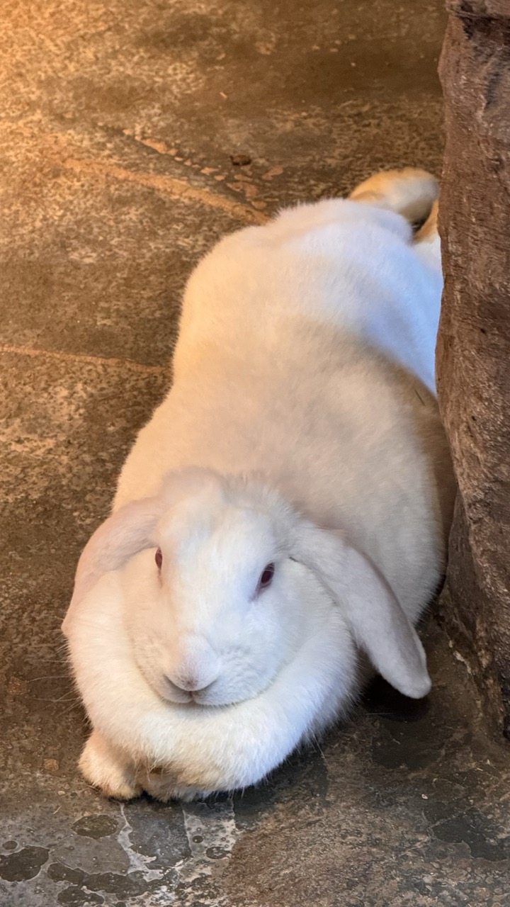
1. Overall Rating (0–10) — 7.0 This photograph captures a moment of serene stillness, with a white lop-eared rabbit nestled into a quiet corner, exuding calm and vulnerability. The warm lighting and soft texture of the rabbit’s fur create an intimate, almost meditative atmosphere, though the composition feels slightly constrained by the tight framing and uneven background. The image succeeds in evoking tenderness but could benefit from a more deliberate balance between subject and environment.
2. Composition (0–10) — 6.0 The rabbit is centered but partially cropped, with the large rock on the right creating an asymmetrical frame. While the diagonal placement of the rabbit adds subtle movement, the lack of negative space and the intrusive background elements detract from visual harmony.
3. Lighting (0–10) — 7.0 Warm, directional light from above highlights the rabbit’s fur, enhancing texture and creating soft shadows that lend depth. The lighting feels natural and enhances the subject’s peaceful demeanor without harshness.
4. Color & Tone (0–10) — 6.5 The palette is dominated by soft whites and warm earth tones, creating a cohesive, gentle mood. The slightly muted contrast and lack of vibrancy keep the image from feeling dynamic, though the tonal harmony supports the tranquil subject.
5. Creativity (0–10) — 6.5 The image captures a quiet, endearing moment with a strong focus on texture and mood. While the concept is simple and accessible, the composition’s minor flaws limit its artistic impact, leaving it more observational than imaginative.
6. Technical Quality (0–10) — 7.5 The focus is sharp on the rabbit’s face, capturing fine details in the fur. The image is clean, with no visible noise or distortion, and the exposure is well-balanced despite the dim environment.
7. Emotional Impact (0–10) — 7.5 The rabbit’s calm posture and direct gaze create a gentle emotional connection, evoking feelings of peace and affection. The intimacy of the moment resonates with the viewer, making it a tender and quietly moving image.
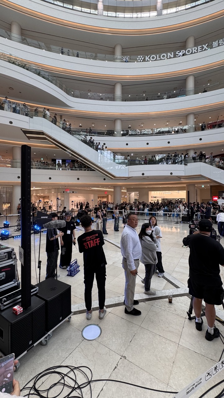
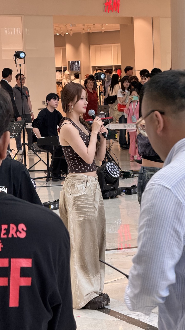
An Unexpected Musical Interlude
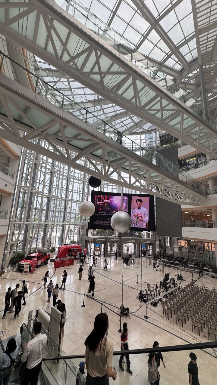
Just when I thought my day couldn't get any more surreal, the universe had one more surprise in store. As I made my way back through the mall lobby after my zoo adventure, I noticed an unusual crowd gathering near the main entrance. The energy was electric, and I could hear the distinctive sounds of Korean pop music beginning to fill the space.
1. Overall Rating (0–10) — 6.0 This photograph captures the bustling energy of a large-scale public event inside a modern shopping mall, where the scale of the architecture contrasts with the intimate chaos of production. The wide-angle perspective effectively conveys the density of people, equipment, and activity, giving a sense of being in the middle of the action. While the scene is visually dynamic, the lack of a clear focal point and the cluttered foreground slightly diminish the overall impact, making it feel more like a candid snapshot than a composed image.
2. Composition (0–10) — 5.5 The wide-angle shot captures the full scope of the space, but the framing feels unbalanced due to the foreground equipment and cables. The subject placement is scattered, with no strong central focus, and the diagonal lines of the escalators compete for attention.
3. Lighting (0–10) — 6.0 The lighting is functional and even, typical of commercial interiors, with recessed ceiling lights providing consistent illumination. However, the flatness of the light lacks depth and mood, and the reflections on the polished floor add to the visual noise.
4. Color & Tone (0–10) — 5.5 The palette is dominated by neutral whites and grays, punctuated by the black of the equipment and the red text on the staff shirt. The lack of color vibrancy gives the image a subdued, documentary feel, which aligns with the scene but limits visual excitement.
5. Creativity (0–10) — 5.0 The image documents a real-world event with a sense of immediacy, but it lacks a distinct artistic vision. The composition feels reactive rather than intentional, and the narrative is left to the viewer to interpret.
6. Technical Quality (0–10) — 7.5 The image is sharp and well-exposed, with clear detail in both the foreground and background. The wide lens captures the environment effectively, though the presence of cables and clutter slightly compromises the aesthetic cleanliness.
7. Emotional Impact (0–10) — 5.0 The photograph conveys the energy of a live event but does not evoke a strong emotional response. The viewer is positioned as an observer rather than a participant, and the scene’s busyness feels more overwhelming than engaging.
1. Overall Rating (0–10) — 6.0 This photograph captures a candid moment during a public performance in a mall, where the energy of a live event collides with the impersonal atmosphere of commercial space. The subject, a woman holding a microphone, is framed by onlookers and staff, creating a sense of authenticity and immediacy. While the scene feels spontaneous and engaging, the image lacks visual cohesion—cluttered surroundings and uneven lighting detract from its artistic potential, leaving it more as a snapshot than a refined composition.
2. Composition (0–10) — 5.5 The framing is tight and slightly off-center, with foreground elements partially obscuring the view. The performer is positioned well, but the surrounding crowd and equipment create visual noise, disrupting balance and focus.
3. Lighting (0–10) — 5.0 Harsh overhead lighting from the mall’s fixtures creates flat illumination with minimal shadows, while stage lights add pockets of contrast. The mix of ambient and artificial light results in uneven exposure and a lack of mood.
4. Color & Tone (0–10) — 5.5 The palette is dominated by neutral tones—beige, black, and gray—broken only by the red H&M sign and the performer’s polka-dot top. The color temperature is cool and clinical, which fits the setting but diminishes warmth and emotional depth.
5. Creativity (0–10) — 6.5 The image captures a real-world moment with a sense of narrative—between performer, audience, and environment. While not highly stylized, it succeeds in conveying the energy of a live public performance.
6. Technical Quality (0–10) — 7.0 The focus is sharp on the subject, and the image is free from major technical flaws. However, slight motion blur and uneven exposure reduce overall clarity.
7. Emotional Impact (0–10) — 5.0 The photograph conveys a sense of public engagement, but the viewer remains detached due to the busy environment and lack of intimate framing. The emotional resonance is muted by the scene’s impersonal setting.
To my absolute amazement, a K-pop group had set up for an impromptu live performance right there in the lobby! The contrast was almost too perfect to believe - I had just spent hours with exotic animals from around the world, and now I was witnessing one of Korea's most beloved cultural exports in the same building.
The performance was intimate and energetic, with the group's vocals echoing through the mall's impressive architecture. Fellow shoppers and zoo visitors gathered around, creating an impromptu concert atmosphere that felt uniquely Seoul. The seamless blend of wildlife wonder and pop culture spectacle perfectly encapsulated what makes this city so special.
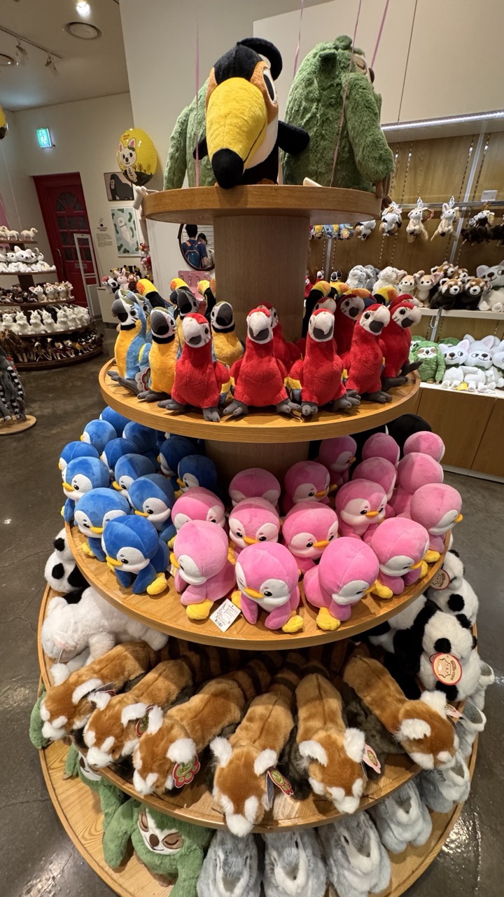
1. Overall Rating (0–10) — 7.0 This photograph captures the cheerful abundance of a plush toy display, radiating a playful, childlike energy that feels both inviting and nostalgic. The vibrant colors and layered arrangement create a sense of whimsy, though the slightly cluttered background and neutral lighting keep the image from achieving a more polished, gallery-worthy aesthetic. It succeeds as a lively snapshot of a retail environment, balancing visual charm with documentary clarity.
2. Composition (0–10) — 7.5 The circular display draws the eye naturally from bottom to top, creating a sense of movement and depth. The central placement of the tiered stand provides a strong focal point, while the surrounding shelves add context without overwhelming the frame.
3. Lighting (0–10) — 6.0 Even, overhead lighting illuminates the scene clearly but lacks direction or drama. The fluorescent tone flattens the textures slightly, diminishing the plushness of the toys and reducing the potential for atmospheric depth.
4. Color & Tone (0–10) — 8.0 A lively palette of bright pinks, blues, reds, and yellows creates a joyful, engaging visual rhythm. The variety of colors enhances the sense of abundance and playfulness, though the lack of tonal contrast prevents any single hue from truly standing out.
5. Creativity (0–10) — 7.0 The arrangement of the plush toys in a tiered, circular display is inherently creative and effective for storytelling. The image captures a moment of curated delight, suggesting a brand or experience built on charm and character.
6. Technical Quality (0–10) — 7.5 Sharp focus and clear detail across the frame highlight the textures of the plush materials. The exposure is well-balanced, and there are no visible artifacts or distortions.
7. Emotional Impact (0–10) — 7.5 The image evokes warmth and nostalgia, tapping into a sense of childhood wonder and the joy of discovery. The abundance of soft, friendly characters invites a smile and a feeling of comfort, making it emotionally resonant despite its commercial setting.
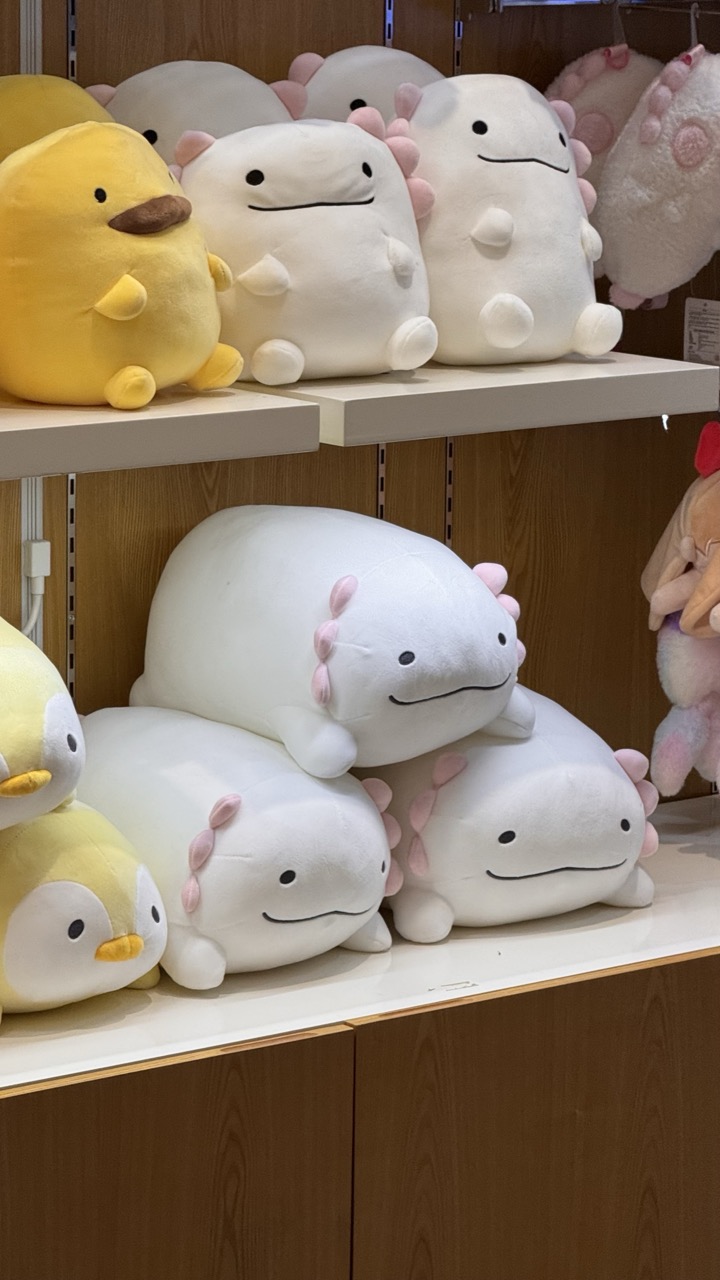
1. Overall Rating (0–10) — 6.8 This photograph captures a cozy and inviting display of plush toys, where the soft textures and gentle expressions evoke a sense of childlike delight. The arrangement feels playful and abundant, with the repeated motif of the axolotl plush creating visual rhythm. While the scene is charming and well-organized, the lack of dramatic lighting or compositional tension keeps it from feeling truly dynamic or artistically elevated.
2. Composition (0–10) — 6.5 The framing is slightly off-center, with the top shelf cutting into the frame and creating a sense of clutter. The stacked plushes on the lower shelf provide visual weight, but the composition could benefit from a tighter crop to emphasize the subjects and reduce background distraction.
3. Lighting (0–10) — 7.0 The lighting is bright and even, typical of retail environments, which highlights the soft textures of the plushes. While functional, the light lacks warmth or directionality, resulting in a somewhat sterile feel that flattens depth.
4. Color & Tone (0–10) — 7.5 The palette is harmonious, with soft whites, pastel pinks, and cheerful yellows creating a gentle and cohesive aesthetic. The subtle contrast between the plushes and the warm wood backdrop enhances visual appeal without overwhelming the senses.
5. Creativity (0–10) — 7.0 The image captures a whimsical, commercial subject with a sense of charm and repetition. While not groundbreaking, the choice to focus on the plushes’ cute, minimalist design offers a playful commentary on modern kawaii culture.
6. Technical Quality (0–10) — 8.0 The image is sharp and well-focused, with clean details visible in the plush textures and stitching. The depth of field is sufficient to keep both shelves in focus, though a slightly lower aperture could enhance background separation.
7. Emotional Impact (0–10) — 7.5 The image evokes feelings of warmth, nostalgia, and comfort, appealing to viewers who appreciate softness, cuteness, and the simple joy of plush toys. Its gentle mood resonates with a sense of innocence and delight.
As I left Times Square Mall that evening, I couldn't help but reflect on the day's unexpected journey. From exotic birds to chart-topping musicians, from shopping corridors to animal habitats, Seoul had once again proven its ability to surprise and delight in the most unexpected ways. It's a vision of how urban spaces can be transformed to include nature, education, and wonder. It challenges the traditional separation between wild and urban, creating a space where both can thrive together.