Preston Lau: A Journey Through Memories, Tech, and Humanity
Welcome to my personal blog that delves into the intricate tapestry of personal albums and the fascinating intersection of ever-evolving technology and humanity. Come along on a journey with me as we delve into the seamless fusion of creativity, state-of-the-art AI and robotics, intricately interwoven within the tapestry of our shared awareness. Have fun!
Discovering Hiroshima Spiritual Transformation and Island Treasures Japan
AI Summary
Stepping off the shinkansen into Hiroshima is an emotionally profound experience, a journey through history, healing, and the remarkable resilience of the human spirit. The city, once the tragic ground zero, has transformed into a beacon of peace activism and cultural preservation. Key sites like the Hiroshima Peace Memorial Park with its poignant monuments and the skeletal remains of the A-Bomb Dome serve as powerful, enduring testaments to the past. The city masterfully balances the weight of history with moments of spiritual serenity and the warmth of local culture, creating a uniquely moving and hopeful experience.
As I stepped off the shinkansen into Japan's most emotionally profound city Hiroshima, I knew this wouldn't be an ordinary travel experience. This was a journey through history, healing, and the remarkable resilience of the human spirit, all while discovering some of Japan's most sacred and delicious treasures.
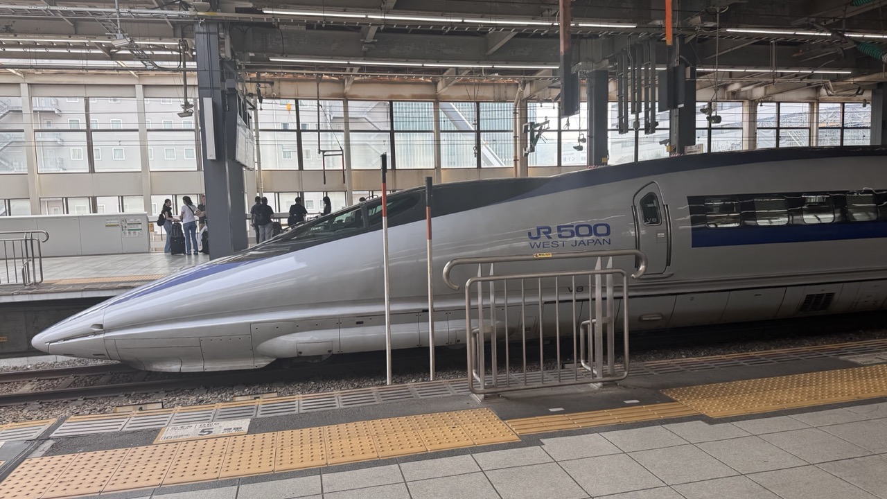
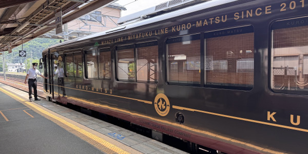
1. Overall Rating (0–10) — 7.0 This photograph captures the sleek, futuristic presence of a JR 500 Shinkansen at a Japanese station, evoking a sense of speed and modernity. The train’s aerodynamic form contrasts with the utilitarian architecture of the platform, creating a compelling juxtaposition of design and function. While the image effectively conveys the train’s grandeur, its overall impact is tempered by a somewhat flat presentation and a lack of dynamic perspective.
2. Composition (0–10) — 6.5 The train dominates the frame, with its pointed nose leading the eye diagonally across the image. However, the composition feels slightly static due to the straight-on angle and the clutter of platform elements, which disrupt the visual flow. A tighter crop or lower angle might have enhanced the sense of scale and motion.
3. Lighting (0–10) — 6.0 Natural light filters through the station’s large windows, providing even illumination that highlights the train’s metallic surface. The overhead fluorescent fixtures add a subtle industrial glow, but the lighting lacks dramatic contrast, resulting in a neutral, documentary-like quality.
4. Color & Tone (0–10) — 7.0 The palette is composed of cool grays and silvers, punctuated by the blue stripe of the JR 500 branding. The muted tones reflect the clean, efficient aesthetic of Japanese rail travel, with just enough contrast to keep the image visually engaging without overwhelming the viewer.
5. Creativity (0–10) — 6.5 The image successfully captures a recognizable symbol of modern engineering, but its approach is conventional rather than inventive. The choice to document the train in a candid, unposed manner lends authenticity, though a more interpretive angle or timing could have elevated its artistic appeal.
6. Technical Quality (0–10) — 8.0 The image is sharp and well-focused, with clean detail visible on the train’s body and surrounding infrastructure. The depth of field is adequate, and there are no noticeable technical flaws such as blur or noise, suggesting a well-executed capture.
7. Emotional Impact (0–10) — 6.0 The photograph conveys a quiet sense of awe at human ingenuity and technological advancement. While the subject matter is inherently impressive, the emotional resonance is restrained by the neutral environment and lack of human interaction, leaving the viewer with a sense of observation rather than connection.
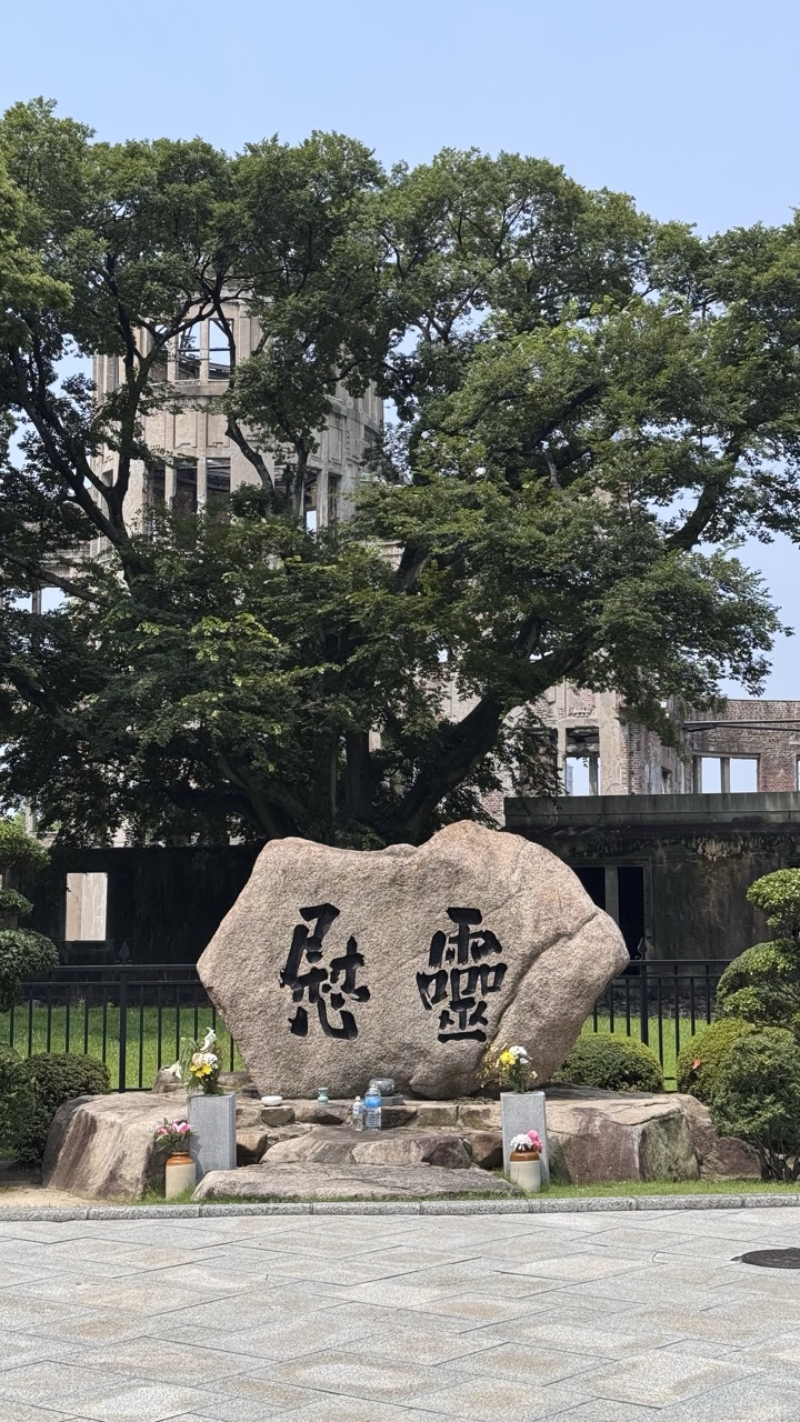
1. Overall Rating (0–10) — 7.5 This photograph powerfully conveys the solemnity and resilience of the Hiroshima Peace Memorial Park, where nature and memory coexist in quiet harmony. The juxtaposition of the weathered stone monument, vibrant green trees, and the skeletal remains of the A-Bomb Dome creates a poignant visual narrative of destruction and renewal. While the image is strong in mood and symbolism, its emotional weight is slightly diminished by a lack of dramatic lighting and a somewhat neutral color palette that fails to fully amplify the gravity of the site.
2. Composition (0–10) — 7.0 The large inscribed stone anchors the frame, drawing the eye forward, while the A-Bomb Dome is partially framed by the canopy of the tree, creating a layered and balanced composition. The low-angle perspective enhances the monument’s prominence, though the foreground pavement feels slightly overwhelming, competing for attention.
3. Lighting (0–10) — 6.5 The bright, even daylight provides clarity and detail, but the flat, midday light lacks the warmth or shadow play that could lend depth and emotional resonance. The harsh overhead sun flattens the textures of the stone and architecture, softening the solemn atmosphere.
4. Color & Tone (0–10) — 6.0 The palette is dominated by muted earth tones—grays of the stone and concrete, greens of the foliage—under a pale blue sky. While harmonious, the colors feel restrained and somewhat washed out, reducing the visual impact of the scene’s symbolic power.
5. Creativity (0–10) — 7.5 The image captures a deeply meaningful site with a thoughtful balance between nature and history. The framing—using the tree to partially obscure the dome—adds a poetic layer, suggesting both protection and remembrance. The creative strength lies in the narrative implied by the composition rather than in bold visual choices.
6. Technical Quality (0–10) — 8.0 The image is sharp and well-focused, with clean details in the stone inscription and surrounding elements. The exposure is well-managed, avoiding harsh overexposure despite the bright conditions.
7. Emotional Impact (0–10) — 8.0 The photograph evokes a profound sense of reflection and reverence. The presence of flowers and offerings at the base of the stone adds a human element, inviting contemplation of loss, survival, and peace. While the lighting tempers the emotional intensity, the site’s inherent gravity resonates strongly with the viewer.
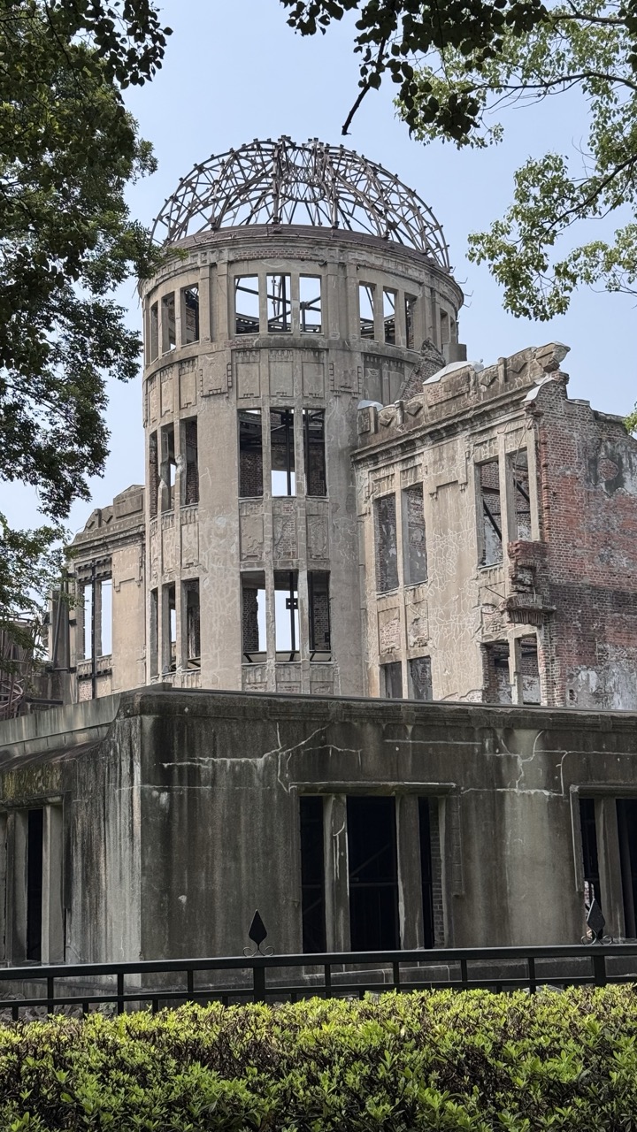
1. Overall Rating (0–10) — 8.0 This photograph powerfully captures the haunting resilience of the Hiroshima Peace Memorial, where the skeletal remains of the former Genbaku Dome stand as a solemn testament to destruction and hope. The juxtaposition of the weathered concrete against the soft green foliage and clear sky creates a poignant visual tension, balancing ruin with renewal. While the image is technically sound and emotionally resonant, its emotional depth could be further amplified with more dramatic lighting or a tighter compositional focus.
2. Composition (0–10) — 7.5 The frame is well-balanced, with the dome centered and framed by trees that add natural depth. The low-angle perspective emphasizes the structure’s height and fragility, while the hedge in the foreground grounds the image and creates a sense of scale.
3. Lighting (0–10) — 7.0 Natural daylight provides even illumination, highlighting the textures of the damaged concrete and reinforcing the somber mood. The light is soft and diffused, avoiding harsh shadows and allowing the details of the ruin to be clearly visible.
4. Color & Tone (0–10) — 7.5 The muted gray of the concrete contrasts effectively with the vibrant green of the foliage and the pale blue of the sky. The tonal range is well-managed, with a restrained palette that enhances the image’s reflective and solemn atmosphere.
5. Creativity (0–10) — 8.0 The image is both documentary and evocative, using the setting’s inherent symbolism to convey a powerful narrative. The inclusion of natural elements like the trees and hedge softens the scene’s harshness, offering a subtle metaphor for healing and continuity.
6. Technical Quality (0–10) — 8.5 The photograph is sharp, with fine detail visible in the structural elements of the dome. Focus is consistent throughout, and the exposure is well-balanced, capturing both the bright sky and the darker recesses of the building.
7. Emotional Impact (0–10) — 9.0 The image carries a profound emotional weight, evoking contemplation, sorrow, and reverence. The viewer is immediately drawn into the gravity of the site’s history, making it a deeply moving and thought-provoking visual experience.
Hiroshima Emotional Journey: Where History Meets Hope
The weight of history hits you immediately in Hiroshima. This isn't tourism in the traditional sense; it's witnessing, remembering, and ultimately finding hope in humanity's capacity for both destruction and renewal. The city has transformed from the world's most tragic ground zero into a beacon of peace activism and cultural preservation.
1. Overall Rating (0–10) — 8.0 This photograph powerfully conveys the solemnity and enduring presence of the Hiroshima Peace Memorial, where history and nature coexist in quiet tension. The framing through the tree branches adds a layer of symbolic depth, suggesting life emerging from destruction, while the weathered ruin stands as a stark testament to human resilience and loss. Though the image is grounded in realism, its emotional weight and historical resonance elevate it beyond mere documentation into the realm of visual memorial.
2. Composition (0–10) — 8.0 The diagonal sweep of the tree branches creates a natural frame that draws the eye toward the Atomic Bomb Dome, while the monument in the foreground anchors the scene and provides context. The balance between nature, structure, and human inscription creates a layered and contemplative composition.
3. Lighting (0–10) — 7.0 Natural daylight illuminates the scene evenly, allowing the textures of the concrete and foliage to emerge with clarity. The soft shadows suggest a midday sun, which enhances the monument’s solemnity without creating harsh contrasts or obscuring detail.
4. Color & Tone (0–10) — 7.5 The palette is restrained and cohesive, dominated by muted grays of the ruins and vibrant greens of the trees, creating a visual dialogue between destruction and renewal. The blue sky provides a subtle but effective contrast, enhancing the emotional gravity of the scene.
5. Creativity (0–10) — 8.0 The use of the tree’s limbs as a natural frame is both structurally effective and poetically symbolic, transforming a straightforward documentary shot into a narrative image. The inclusion of the inscription adds historical weight, inviting reflection rather than mere observation.
6. Technical Quality (0–10) — 8.5 The image is sharp and well-focused, with excellent detail in both the foreground monument and the distant ruin. The exposure is balanced, and the alignment of architectural and natural elements suggests careful composition.
7. Emotional Impact (0–10) — 9.0 The photograph evokes a profound sense of reverence and melancholy, capturing not just a place but a memory. The juxtaposition of life and ruin, along with the quiet dignity of the scene, resonates deeply, prompting contemplation on peace, loss, and the persistence of hope.
1. Overall Rating (0–10) — 7.0 This photograph captures the haunting beauty of architectural decay, where time and destruction have transformed a once-solid structure into a layered monument of ruin. The juxtaposition of crumbling brick and weathered stone, framed by the archway, evokes a quiet melancholy and a sense of historical weight. While the image is visually compelling, its emotional resonance is slightly restrained by a lack of dramatic lighting and a somewhat generic perspective.
2. Composition (0–10) — 6.5 The archway creates a strong focal point, framing the inner ruin and drawing the eye through the layers of decay. However, the slightly off-center framing and overexposed background reduce compositional balance, and the inclusion of the tree trunk in the lower-left corner feels distracting.
3. Lighting (0–10) — 6.0 Natural daylight provides even illumination, highlighting textures in the brick and stone, but lacks directional contrast. The flat lighting diminishes the sense of depth and drama, softening the impact of the ruin’s imposing form.
4. Color & Tone (0–10) — 6.5 The palette is restrained, dominated by earthy reds, grays, and muted greens, which suit the theme of decay. While the tones are cohesive, they lack vibrancy and contrast, resulting in a somewhat subdued visual impact.
5. Creativity (0–10) — 7.0 The image leverages the inherent narrative of the ruin, using the arch as a natural frame to suggest layers of history and loss. The choice to include the distant greenery through the opening adds a subtle contrast between nature and decay, offering a quiet commentary on resilience.
6. Technical Quality (0–10) — 7.5 The image is sharp and well-focused, with clear detail in both the foreground and background. The exposure is balanced, though slight overexposure in the distant foliage reduces detail in highlights.
7. Emotional Impact (0–10) — 7.0 The photograph conveys a contemplative mood, inviting reflection on time, memory, and the passage of human endeavor. While not overwhelmingly dramatic, the quiet dignity of the ruins elicits a sense of reverence and sorrow.
Before diving into the itinerary, understand that Hiroshima requires emotional preparation. The Peace Memorial sites will move you deeply, but they're balanced beautifully by the spiritual serenity of Miyajima Island and the warmth of local food culture. This contrast isn't accidental, it's what makes Hiroshima uniquely powerful.
1. Overall Rating (0–10) — 6.0 This photograph presents a solemn historical stone monument set against a backdrop of modern urban development, creating a compelling contrast between past and present. The weathered surface and carved Japanese inscriptions lend authenticity and gravity to the subject, while the surrounding architecture grounds the scene in contemporary life. Though the image is conceptually strong, its visual execution feels slightly flat, with muted tones and a lack of dynamic lighting that limit its emotional resonance.
2. Composition (0–10) — 6.0 The monument is centered and framed well, allowing the inscription to remain the focal point. However, the cluttered background and the slightly off-kilter angle of the stone create a sense of visual imbalance, distracting from the monument’s significance.
3. Lighting (0–10) — 5.5 The lighting is even and diffused, likely due to an overcast sky, which reduces contrast and softens textures. While it prevents harsh shadows, it also diminishes the stone’s ruggedness and historical depth.
4. Color & Tone (0–10) — 5.5 The palette is subdued, dominated by earthy grays and browns, with faint greenery and muted building tones. The lack of vibrant color contributes to a neutral, documentary feel, but also limits visual engagement.
5. Creativity (0–10) — 6.5 The juxtaposition of the ancient stone with modern buildings offers a thoughtful narrative about continuity and change. The image succeeds in conveying historical weight, though it does so in a conventional, observational manner.
6. Technical Quality (0–10) — 7.0 The focus is sharp on the inscription, and the detail of the stone’s texture is well preserved. The image is technically sound, though the composition and lighting prevent it from achieving greater impact.
7. Emotional Impact (0–10) — 5.5 The photograph evokes a quiet contemplation of history, but the lack of dramatic lighting and emotional depth keeps the viewer at a distance. It invites reflection but fails to stir a strong emotional response.
1. Overall Rating (0–10) — 7.0 This photograph captures a poignant memorial sculpture with quiet dignity, its emotional weight amplified by the natural surroundings and the inscription etched into stone. The composition balances the somber tone of the bronze figures with the soft green of the trees and the reflective water, creating a contemplative atmosphere. While the image is strong in mood and subject, the slightly cluttered framing and subdued lighting keep it from achieving greater visual resonance.
2. Composition (0–10) — 6.5 The sculpture is centered, but the surrounding foliage and uneven ground create visual distractions. A tighter crop would enhance focus on the figures and the inscription.
3. Lighting (0–10) — 6.0 Diffused daylight provides even illumination, but lacks the warmth or contrast to highlight texture or emotion. The flat lighting softens the emotional impact of the scene.
4. Color & Tone (0–10) — 6.5 The palette is restrained—dominated by the muted greens of the trees, the gray stone, and the dark patina of the bronze. While harmonious, the lack of tonal contrast limits visual depth.
5. Creativity (0–10) — 7.0 The image captures a deeply symbolic subject with a respectful, observational approach. The integration of nature and inscription enhances the memorial's narrative, offering a thoughtful and reflective perspective.
6. Technical Quality (0–10) — 7.5 The focus is sharp, detail is clear, and the image is well-exposed. The depth of field is appropriate, keeping both the sculpture and the background legible.
7. Emotional Impact (0–10) — 7.5 The solemnity of the sculpture, combined with the quiet setting, evokes a sense of remembrance and reflection. The presence of flowers at the base adds a human touch, deepening the emotional connection.
Standing in Sacred Ground: Hiroshima Peace Memorial Park
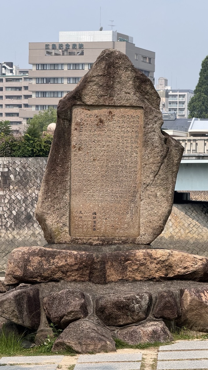
The Hiroshima Peace Memorial Park serves as the emotional epicenter of any visit. Walking through these meticulously maintained grounds, you're treading on hallowed earth where thousands of lives were lost in an instant on August 6, 1945. The park's design is intentionally contemplative, with wide pathways that encourage reflection and multiple monuments that tell different aspects of the atomic bombing story.
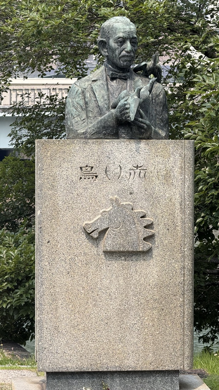
1. Overall Rating (0–10) — 6.8 This photograph captures a contemplative bronze bust of a man on a stone pedestal, surrounded by lush greenery that softens the monument’s solemnity. The interplay of natural elements and the weathered sculpture evokes a quiet reverence, though the slightly cluttered background and flat lighting detract from its visual poise. While the image succeeds in documenting the memorial’s presence, it lacks the dynamic tension needed to elevate it beyond mere documentation.
2. Composition (0–10) — 6.0 The subject is centered, but the framing is too wide, allowing distracting foliage and background structures to compete for attention. A tighter crop would better emphasize the bust and its inscriptions.
3. Lighting (0–10) — 5.5 Diffused daylight provides even illumination, but the lack of strong directional light flattens the texture of the bronze and stone, muting the monument’s sculptural depth.
4. Color & Tone (0–10) — 6.0 The palette is natural and subdued—grays, greens, and the muted patina of the bronze—creating a harmonious but somewhat lifeless atmosphere. The tonal range is limited, reducing visual engagement.
5. Creativity (0–10) — 6.5 The image approaches a documentary style with a quiet artistic sensibility, capturing the monument’s cultural significance. However, the lack of bold composition or interpretive framing limits its originality.
6. Technical Quality (0–10) — 7.5 Sharp focus and clear detail are maintained throughout, especially on the bust and the carved horse emblem. The image is technically sound, though compositionally underwhelming.
7. Emotional Impact (0–10) — 6.0 The monument’s stillness and the man’s thoughtful expression invite reflection, but the image’s neutral presentation keeps the viewer at a respectful distance rather than drawing them into an emotional connection.
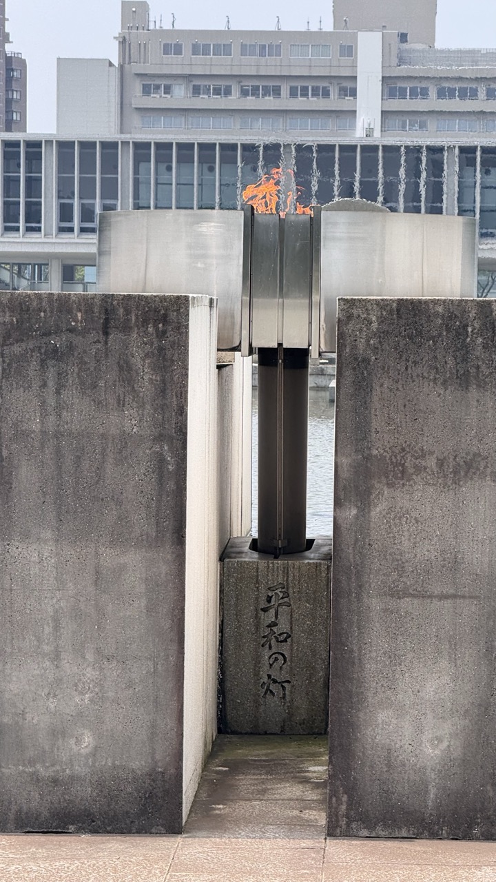
1. Overall Rating (0–10) — 7.0 This photograph captures the solemnity of a peace memorial with quiet power, where the flickering flame becomes a focal point of hope amid urban austerity. The juxtaposition of the enduring concrete structure and the fragile fire evokes a poignant narrative of resilience and remembrance. While the composition is strong and the symbolism clear, the overcast lighting tempers the emotional intensity, leaving the image feeling more documentary than transcendent.
2. Composition (0–10) — 7.5 The central framing of the flame between two concrete walls creates a strong visual corridor, drawing the eye directly to the symbolic heart of the monument. The symmetry is balanced, though the slight tilt of the camera introduces a subtle tension that enhances the scene’s gravity.
3. Lighting (0–10) — 5.5 Diffuse daylight under an overcast sky softens shadows and flattens the scene’s depth, reducing the visual drama of the flame. The lack of contrast or directional light mutes the glow of the fire, making it less striking than it could be.
4. Color & Tone (0–10) — 6.0 The palette is dominated by muted grays and cool tones, which support the somber mood. The flame’s warm orange provides a necessary contrast, but its vibrancy is limited by the overall tonal dampness of the image.
5. Creativity (0–10) — 7.0 The image effectively combines architectural form with symbolic meaning, using the structure’s lines and the inscription to enhance narrative depth. The choice to frame the flame through the concrete gate is both literal and metaphorical, suggesting a passage toward peace.
6. Technical Quality (0–10) — 7.5 The image is sharp and well-focused, with clean details in the concrete and text. The exposure is balanced, though not particularly dynamic, and the focus on the flame is precise, capturing its movement clearly.
7. Emotional Impact (0–10) — 7.0 The photograph conveys a quiet, reflective solemnity that resonates with the site’s purpose. The viewer is invited to contemplate the enduring nature of peace in the face of destruction, and the flame—though modest—holds a symbolic weight that lingers.
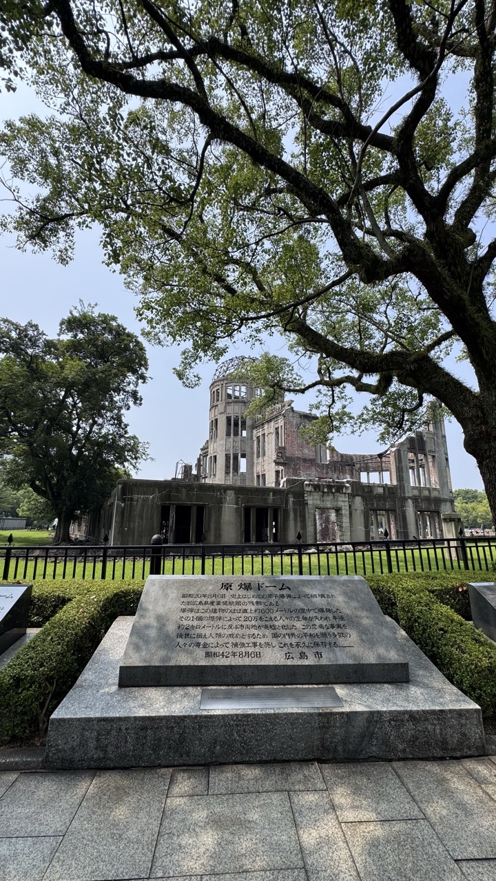
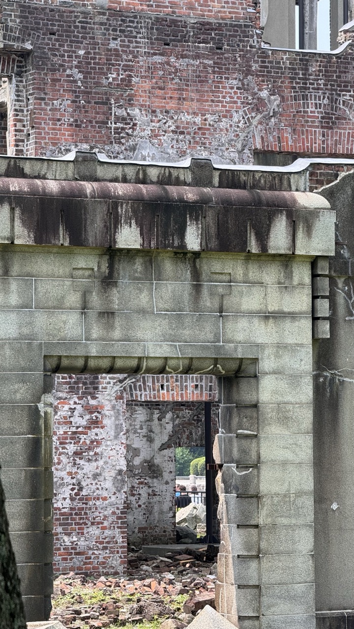
The Atomic Bomb Dome, or Genbaku Domu, stands as perhaps the world's most powerful architectural witness to nuclear destruction. This UNESCO World Heritage site was one of the few structures left standing near the hypocenter, its skeletal dome forever frozen in time. The building, originally designed by Czech architect Jan Letzel in 1915, has become an internationally recognized symbol of peace and nuclear disarmament.
What strikes visitors most is the dome's proximity to everyday life. Modern Hiroshima bustles around this preserved ruin, with office workers passing by on their lunch breaks and students gathering nearby. This juxtaposition of ordinary life continuing around extraordinary tragedy creates a uniquely moving experience.
Voices from the Past: Inside the Hiroshima Peace Memorial Museum
The Hiroshima Peace Memorial Museum offers the most comprehensive understanding of the atomic bombing's impact. Recent renovations have made the exhibits more accessible while maintaining their emotional impact. The museum displays personal belongings of victims, photographs, and detailed accounts that convey the horror of that August morning.
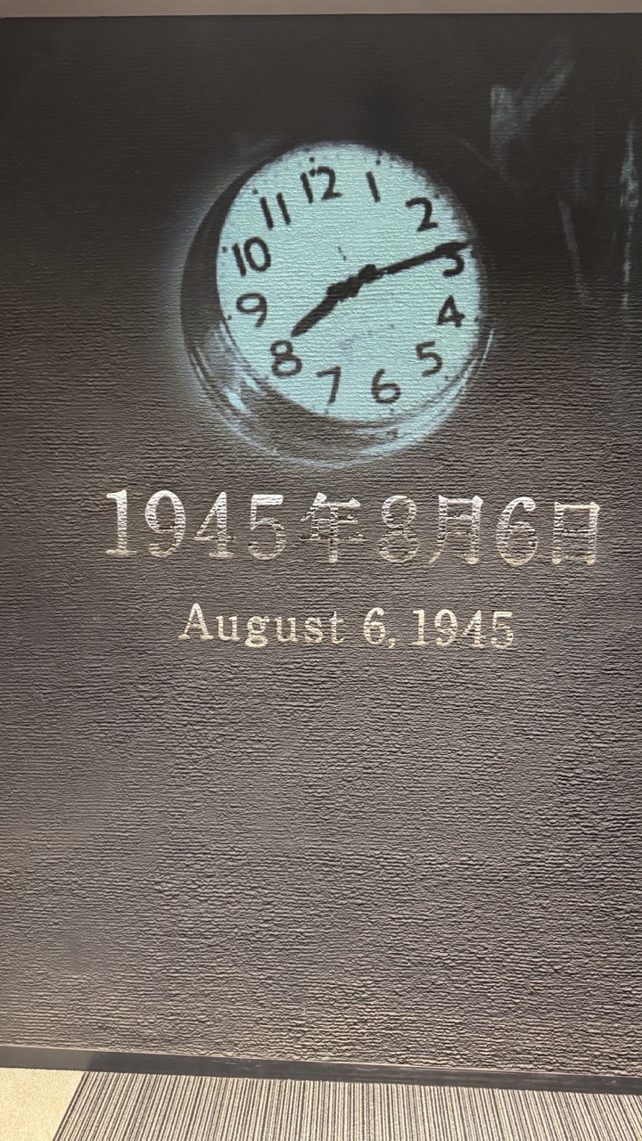
1. Overall Rating (0–10) — 7.0 This photograph captures a solemn and historically resonant memorial, where time and memory converge in a single frame. The glowing clock, suspended in darkness, evokes a moment frozen in history, while the bilingual inscription grounds the image in a specific, tragic event. Though the composition is simple and the lighting somewhat flat, the emotional weight of the subject elevates the image beyond mere documentation into a contemplative monument.
2. Composition (0–10) — 6.5 The central placement of the clock draws immediate focus, but the off-center text and uneven framing create a slight visual imbalance. The texture of the wall adds depth, yet the lack of leading lines or dynamic perspective keeps the composition static.
3. Lighting (0–10) — 7.0 The spotlight on the clock creates a dramatic focal point, enhancing its symbolic weight. The surrounding darkness isolates the image, though the lighting is somewhat harsh and lacks subtle gradation, flattening the texture of the wall.
4. Color & Tone (0–10) — 6.5 The muted, cool-toned palette—dominated by dark grays and a pale blue glow—reinforces the somber mood. The contrast between the illuminated clock and the shadowed surroundings is effective, but the limited range of hues reduces visual richness.
5. Creativity (0–10) — 7.5 The juxtaposition of the clock and the date transforms a simple display into a powerful metaphor for a pivotal moment in time. The use of light and shadow to highlight the symbolic object is both deliberate and evocative.
6. Technical Quality (0–10) — 7.0 The image is sharp and clear, with good detail in the texture of the wall and the clock face. The focus is consistent, though the lighting and exposure suggest a handheld capture rather than a controlled studio setup.
7. Emotional Impact (0–10) — 8.0 The image carries a profound sense of gravity and reflection, inviting viewers to contemplate the weight of history. The silence of the scene, underscored by the stillness of the clock, resonates deeply, making it emotionally impactful despite its minimalism.
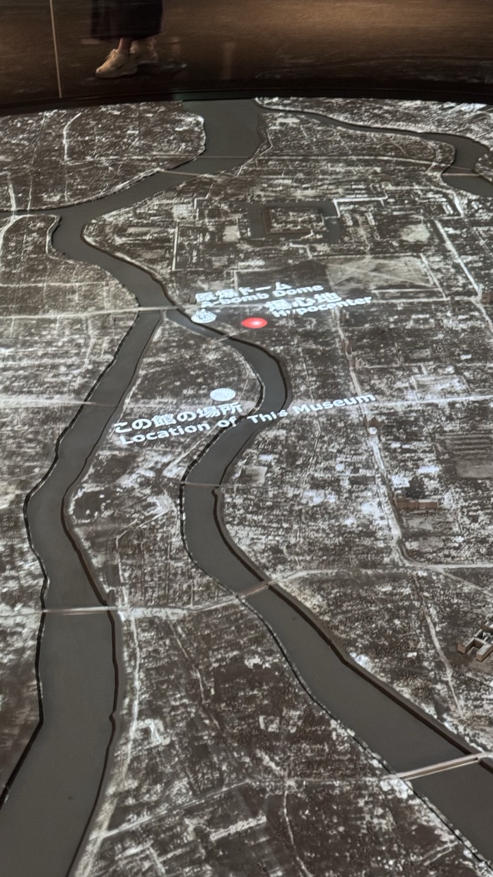
1. Overall Rating (0–10) — 6.0 This photograph captures a poignant and immersive museum exhibit—a historical map projected onto a floor, marking the site of the Hiroshima atomic bombing. The interplay of light and shadow on the archival image lends a somber weight, while the presence of a visitor’s foot in the frame grounds the scene in the present, creating a powerful temporal duality. The image’s emotional resonance is strong, but its technical execution—particularly the flat lighting and cluttered top edge—detracts from its overall impact.
2. Composition (0–10) — 5.5 The frame is slightly tilted and dominated by the upper edge of the visitor’s leg, which disrupts the visual balance. The diagonal flow of the river and the text overlay guide the eye effectively, but the composition lacks a clean, intentional structure, making the image feel more like a snapshot than a curated shot.
3. Lighting (0–10) — 5.0 The lighting is functional but flat, with harsh reflections on the glossy surface of the map that obscure details. The ambient light is dim, appropriate for a museum setting, but it doesn’t enhance the depth or texture of the projected image.
4. Color & Tone (0–10) — 5.5 The monochromatic palette—shades of gray and black—reflects the historical nature of the subject, but the lack of tonal contrast and the washed-out appearance of the projection reduce visual interest. The red dot marking the hypocenter stands out, but it’s not enough to break the visual monotony.
5. Creativity (0–10) — 6.5 The concept of overlaying a historical map with modern annotations is compelling and thoughtfully executed. The juxtaposition of past and present, along with the visitor’s presence, adds a layer of narrative depth, making the image more than just documentation—it becomes a meditation on memory and place.
6. Technical Quality (0–10) — 6.0 The image is sharp and clear, with the projected text and geographical features legible. However, the reflections on the polished surface and the slightly unbalanced framing suggest a lack of attention to technical refinement in the moment of capture.
7. Emotional Impact (0–10) — 7.0 The image evokes a quiet, reflective mood, prompting contemplation of loss, memory, and the passage of time. The combination of the historical map, the red dot of destruction, and the faint footprint of a visitor creates a powerful emotional resonance, connecting the viewer to a moment of profound human consequence.
One of the most powerful sections shows Hiroshima before the bombing, a thriving city with families, businesses, and dreams. This humanizes the statistics and makes the loss more tangible. The museum also dedicates significant space to the aftermath, including the long-term effects of radiation and the city's remarkable rebuilding process.
1. Overall Rating (0–10) — 6.8 This photograph captures a museum exhibit with historical gravitas, presenting pivotal moments of World War II diplomacy through archival images and bilingual text. The interplay of black-and-white photographs and stark informational plaques evokes a solemn, reflective mood, though the composition feels slightly cluttered and the lighting underwhelming. While the content is rich and meaningful, the visual presentation lacks the emotional resonance and visual harmony needed to elevate it beyond mere documentation.
2. Composition (0–10) — 6.0 The arrangement of plaques and photographs creates a layered, slightly asymmetrical layout that draws the eye across multiple focal points. However, the overlapping elements and uneven spacing disrupt visual flow, making the scene feel more like a display than a cohesive narrative.
3. Lighting (0–10) — 5.5 The lighting is functional but flat, casting soft shadows and failing to highlight key details. A more directional, controlled light would enhance contrast and draw attention to the historical artifacts, particularly the text and photographs.
4. Color & Tone (0–10) — 6.5 The monochromatic palette—dominated by dark browns, grays, and black—reflects the serious tone of the subject matter. While consistent, the lack of tonal variation and muted contrast slightly dulls the visual impact.
5. Creativity (0–10) — 6.0 The exhibit presents a strong historical narrative, but the approach is conventional and documentary in nature. The integration of Japanese and English text adds cultural depth, yet the visual storytelling remains restrained and literal.
6. Technical Quality (0–10) — 7.5 The image is sharp and clear, with good focus on the text and photographs. Minor distractions from reflections on the glass and the slightly uneven framing reduce technical polish, but the details remain largely legible.
7. Emotional Impact (0–10) — 7.0 The subject matter—Yalta and Potsdam—carries profound historical weight, and the exhibit successfully conveys a sense of gravity and consequence. The viewer is invited to reflect on pivotal decisions in global history, though the subdued presentation keeps emotional engagement at a contemplative distance.
1. Overall Rating (0–10) — 7.0 This informational display effectively conveys a somber and historically significant narrative about the U.S. military’s atomic bomb training exercises in the Pacific. The bilingual text and detailed map provide clarity and context, grounding the viewer in a dark chapter of wartime preparation. While the presentation is informative and well-organized, its stark, documentary style limits emotional resonance, making it more educational than evocative.
2. Composition (0–10) — 6.5 The layout balances text and map well, with the vertical Japanese title drawing immediate attention. The slightly angled framing adds a sense of depth, though the proximity of the two panels creates a slight visual clutter. A more deliberate spacing between the sign and map would enhance readability and visual harmony.
3. Lighting (0–10) — 7.0 The lighting is even and functional, illuminating the text clearly without glare or shadow. The subdued, ambient tone complements the serious subject matter, allowing the content to be read without distraction. A touch more contrast would help the white text stand out against the dark background.
4. Color & Tone (0–10) — 6.5 The monochromatic palette—dark brown and white—creates a solemn, archival mood appropriate to the historical theme. The use of red for the bomb icons adds a subtle but effective visual cue for danger and impact. The lack of vibrant color reinforces the gravity of the subject, though it risks appearing visually flat.
5. Creativity (0–10) — 7.0 The integration of bilingual text and a geographically detailed map is a strong narrative choice, transforming historical data into a spatial and emotional journey. The vertical Japanese title, combined with the horizontal English text, creates a dynamic visual rhythm that reflects the cross-cultural context of the story.
6. Technical Quality (0–10) — 8.0 The image is sharp and well-focused, with clean lines and legible typography. The text and map are clearly readable, and the camera’s angle captures the display without distortion. Minor noise in the background is negligible and does not detract from the overall clarity.
7. Emotional Impact (0–10) — 6.0 The display carries weight through its content rather than visual drama. While the information is deeply impactful—highlighting the human cost of war preparation—the cold, factual presentation keeps the viewer in a reflective, detached space. A more emotive design choice might deepen the connection to the victims and the historical significance.
The museum's approach is educational rather than accusatory, focusing on the human cost of nuclear weapons and advocating for worldwide peace. Visitors often spend hours here, processing the emotional weight of the exhibits and contemplating their own relationship with history and responsibility.
1. Overall Rating (0–10) — 6.0 This photograph captures a detailed architectural model in a museum or exhibition setting, where the interplay of human presence and object documentation creates a sense of context and scale. The model itself is rich in texture and structure, suggesting a historical or civic building, but the framing and lighting undercut its visual potential. While the scene is informative and grounded in reality, it lacks the compositional elegance to elevate the subject into a compelling image.
2. Composition (0–10) — 5.5 The model is centered but partially framed by the viewer’s presence and the display table, creating a slightly cluttered foreground. The inclusion of a person’s hands and phone introduces a candid, documentary feel, but it disrupts the visual balance and draws attention away from the model.
3. Lighting (0–10) — 5.0 The lighting is functional and even, likely from overhead museum fixtures, but it fails to highlight the model’s texture or depth. Harsh shadows and a lack of directional warmth flatten the scene and diminish the model’s three-dimensional qualities.
4. Color & Tone (0–10) — 5.5 The palette is dominated by muted earth tones and metallic grays, which match the model’s materials. However, the lack of vibrancy and contrast makes the image feel subdued and visually inert.
5. Creativity (0–10) — 6.0 The image succeeds in documenting a cultural artifact, but its approach is observational rather than expressive. The inclusion of the human element adds a layer of narrative, but the execution is more documentary than artistic.
6. Technical Quality (0–10) — 7.0 The focus is sharp on the model, and the details are clear. The image is well-exposed overall, though the lighting and composition limit its visual impact.
7. Emotional Impact (0–10) — 5.0 The photograph conveys a sense of quiet reverence for history and craftsmanship, but it remains emotionally distant. The viewer is positioned as an observer rather than a participant, limiting the image’s ability to evoke deeper connection.
1. Overall Rating (0–10) — 7.0 This photograph captures a solemn and historically resonant model of the Hiroshima Peace Memorial, its intricate details standing as a quiet testament to resilience and remembrance. The low-angle perspective emphasizes the model’s significance, while the dark, reflective surroundings amplify its emotional weight. Though the framing is slightly awkward, the image successfully conveys the gravity of the subject, inviting reflection without overt staging.
2. Composition (0–10) — 6.5 The model is centered but slightly tilted, creating a subtle imbalance. The inclusion of feet in the background and the visible edge of the display table distract from the focus, though the low angle helps draw the eye toward the structure.
3. Lighting (0–10) — 7.0 The overhead lighting casts a soft glow on the model, highlighting its texture and architectural details without creating harsh shadows. The contrast between the illuminated model and the dark surroundings enhances its prominence.
4. Color & Tone (0–10) — 6.5 The muted metallic tones of the model—dark gray and gold—convey a somber, dignified atmosphere. The overall palette is restrained, which suits the subject, though a slightly warmer tone might have added emotional depth.
5. Creativity (0–10) — 7.0 The choice to photograph the model in its museum context, with ambient human presence, adds narrative layering. It transforms a static exhibit into a moment of silent contemplation, blending documentation with storytelling.
6. Technical Quality (0–10) — 7.5 The image is sharp, with clear focus on the model. The depth of field is appropriate, and the exposure is well-balanced, preserving detail in both the model and the darker surroundings.
7. Emotional Impact (0–10) — 8.0 The photograph evokes a profound sense of reverence and solemnity. The juxtaposition of the detailed memorial with the faint presence of visitors underscores the enduring weight of history, making it deeply moving and thought-provoking.
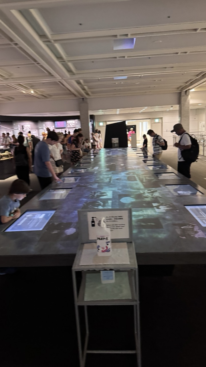
1. Overall Rating (0–10) — 5.5 This photograph captures the ambient energy of a modern exhibition space, where visitors engage with a long interactive display table. The scene feels dynamic and immersive, yet the image’s technical limitations—soft focus, dim lighting, and a cluttered foreground—detract from its visual clarity. While the subject matter suggests a compelling fusion of technology and human interaction, the photo itself remains a functional record rather than an evocative portrait of the moment.
2. Composition (0–10) — 6.0 The long table creates a strong leading line, guiding the eye through the space and drawing attention to the activity along its length. However, the composition is slightly unbalanced by the foreground elements, particularly the stand and hand sanitizer bottle, which interrupt the visual flow and create a sense of clutter.
3. Lighting (0–10) — 4.5 The lighting is flat and uneven, with overhead fluorescent fixtures casting a cool, institutional glow. This contributes to a somewhat sterile atmosphere, and the lack of directional light or highlights diminishes depth and texture in the scene.
4. Color & Tone (0–10) — 5.0 The palette is dominated by muted grays and blues, with minimal contrast. The color temperature is cool and clinical, reinforcing the utilitarian feel of the space, but it lacks the warmth or vibrancy needed to make the scene feel engaging or emotionally resonant.
5. Creativity (0–10) — 6.0 The concept of an interactive exhibition is inherently creative, and the image attempts to capture the interplay between people and technology. However, the execution feels observational rather than interpretive, with little effort to elevate the scene through framing, timing, or mood.
6. Technical Quality (0–10) — 6.0 The image is reasonably sharp in the mid-ground, but the overall resolution and focus are inconsistent. There’s a noticeable softness, especially in the foreground, and the low-light conditions likely contributed to a loss of detail in the shadows.
7. Emotional Impact (0–10) — 5.0 The photograph conveys a sense of quiet activity and curiosity, but it fails to evoke a strong emotional response. The viewer is positioned as an observer rather than an participant, and the lack of visual drama or personal connection limits the image’s ability to resonate.
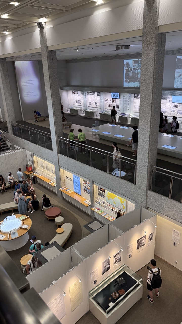
1. Overall Rating (0–10) — 6.8 This photograph captures the quiet dynamism of a museum exhibition space, where visitors engage with history through curated artifacts and multimedia displays. The layered architecture and overlapping activity create a sense of depth and narrative continuity, though the scene feels slightly overwhelmed by the sheer volume of information and people. The image succeeds in conveying the atmosphere of a living archive, but its visual cohesion is compromised by the cluttered layout and lack of a clear focal point.
2. Composition (0–10) — 6.0 The high-angle perspective offers a comprehensive view of the multi-level space, but the composition is hindered by the chaotic placement of exhibits and visitors. The diagonals of the railings and columns create visual tension, while the central walkway and display cases draw the eye unevenly, resulting in a somewhat disorienting balance.
3. Lighting (0–10) — 6.5 Even, artificial lighting illuminates the space effectively, allowing details in the displays to be visible. However, the overhead fixtures create harsh reflections on glass cases and produce flat, shadowless areas, diminishing the sense of depth and mood.
4. Color & Tone (0–10) — 6.0 The palette is dominated by neutral grays, whites, and muted browns, reflecting the institutional nature of the space. While this creates a cohesive, subdued tone, the lack of color contrast and warmth gives the image a sterile, documentary feel that limits its emotional resonance.
5. Creativity (0–10) — 6.5 The image demonstrates a strong observational approach, capturing the interplay between people and their environment in a cultural institution. The layered composition and use of perspective show a thoughtful attempt to convey complexity, though the lack of narrative focus or stylistic refinement keeps it from feeling fully artistic.
6. Technical Quality (0–10) — 7.0 The photograph is sharp and well-exposed, with clean detail across the frame. The high resolution allows for discernment of text and objects in the background, and the camera's focus is consistent throughout the scene.
7. Emotional Impact (0–10) — 5.5 The image evokes a sense of quiet contemplation and intellectual engagement, but the emotional distance created by the impersonal environment and busy composition prevents a deeper connection. The viewer is invited to observe, but not to feel.
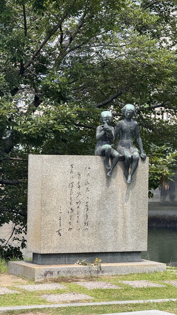
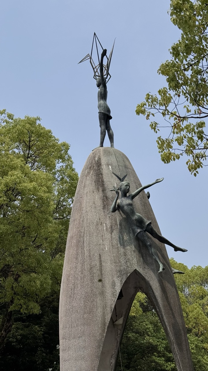
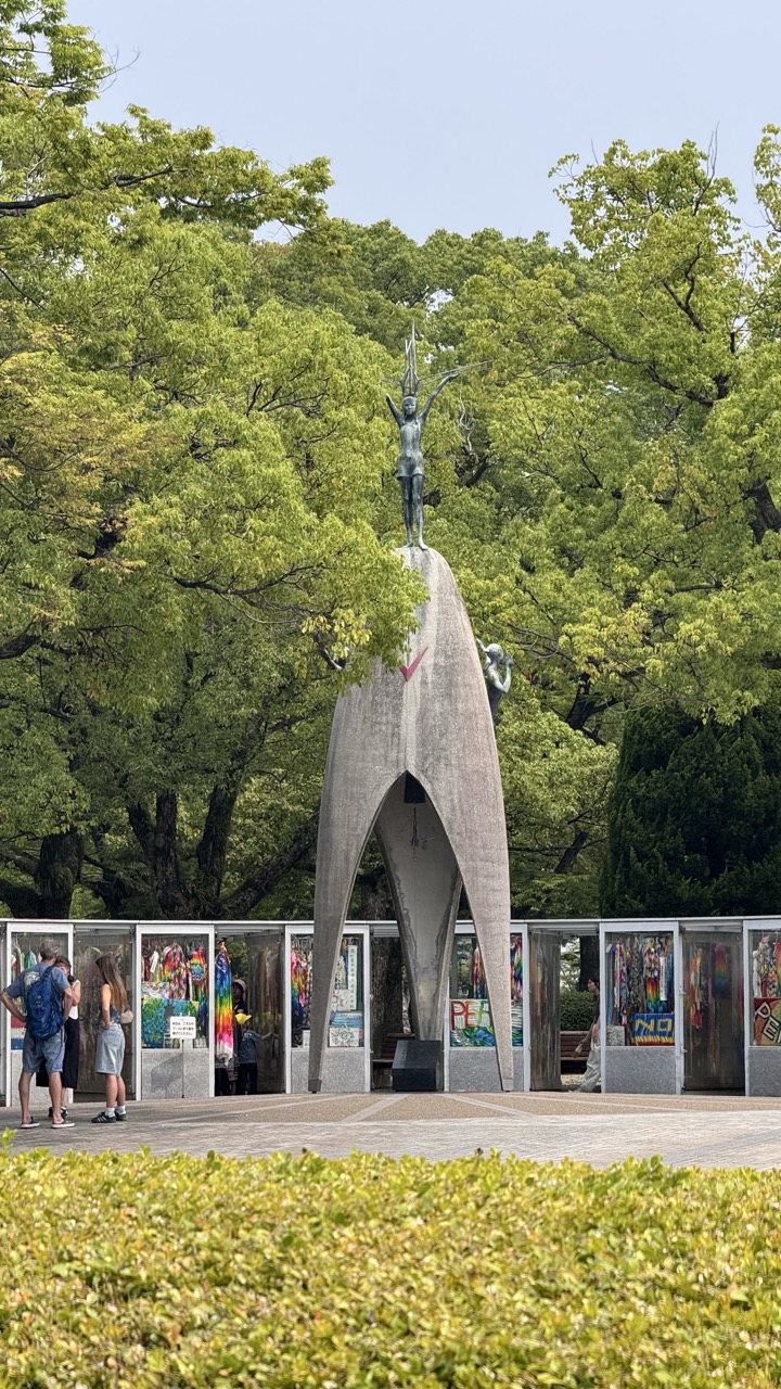
Hope in Small Hands: The Children's Peace Monument
Among the park's many memorials, the Children's Peace Monument holds special significance. Inspired by Sadako Sasaki, a young girl who developed leukemia from radiation exposure and folded paper cranes while hoping for recovery, this monument represents the innocent victims of war.
1. Overall Rating (0–10) — 7.0 This photograph captures a striking monument with a sculptural elegance that evokes both aspiration and movement. The upward-reaching figures, set against a soft blue sky and framed by lush green foliage, convey a sense of hope and transcendence. While the composition is strong, the slightly cluttered framing and muted tones prevent it from achieving a more refined aesthetic, though the symbolic weight of the sculpture remains compelling.
2. Composition (0–10) — 7.0 The low-angle perspective emphasizes the monument’s height and grandeur, with the figures positioned to guide the eye upward. The asymmetrical placement of the tree branches on the right adds visual interest, though the left side feels slightly more open than balanced.
3. Lighting (0–10) — 6.5 Natural daylight provides even illumination, highlighting the texture of the stone and the metallic sheen of the sculptures. The soft, overcast quality of the light enhances the contemplative mood without creating harsh shadows.
4. Color & Tone (0–10) — 6.0 The palette is dominated by muted greens and grays, which complement the solemnity of the sculpture. While the blue sky offers a subtle contrast, the overall tone leans toward desaturation, slightly dampening the visual impact.
5. Creativity (0–10) — 7.5 The choice to photograph the monument from below imbues it with a sense of monumentality, and the interplay between the human forms and the natural surroundings suggests a narrative of harmony between art and nature.
6. Technical Quality (0–10) — 7.5 The image is sharp and well-focused, with clear detail in both the sculpture and the surrounding foliage. The exposure is balanced, and the depth of field effectively isolates the subject.
7. Emotional Impact (0–10) — 7.0 The sculpture's dynamic forms and upward motion evoke a sense of aspiration and resilience, inviting quiet reflection. The serene setting enhances the emotional resonance, creating a moment of stillness and meaning.
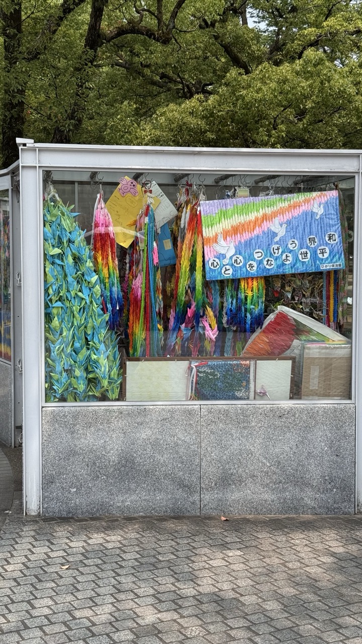
1. Overall Rating (0–10) — 7.0 This photograph captures a vibrant display of origami cranes and peace banners within a glass shelter, evoking a sense of hope and cultural reverence. The rich colors and symbolic objects create a visually compelling narrative, though the reflection on the glass slightly disrupts the clarity of the scene. The juxtaposition of natural greenery above with the structured, man-made display below adds depth and context, grounding the image in both place and meaning.
2. Composition (0–10) — 7.5 The central placement of the display within the glass case creates a balanced focal point, while the surrounding trees and tiled pavement frame the subject naturally. The slight tilt of the camera adds a subtle dynamic quality, though the reflection and clutter within the case slightly distract from the visual harmony.
3. Lighting (0–10) — 6.5 Soft, diffused daylight illuminates the scene evenly, enhancing the vividness of the colorful paper without harsh shadows. However, the reflections on the glass surface reduce clarity and introduce a slight visual noise, dampening the overall luminosity.
4. Color & Tone (0–10) — 8.0 The palette is rich and diverse, with the rainbow-hued cranes and banner creating a striking contrast against the muted gray of the shelter and pavement. The warm tones of the paper, combined with the cool green foliage, contribute to a balanced and emotionally resonant color scheme.
5. Creativity (0–10) — 7.5 The image successfully blends cultural symbolism with everyday urban life, transforming a simple display into a poignant statement about peace and remembrance. The inclusion of handwritten messages and handmade elements adds authenticity and personal touch, elevating the narrative beyond mere documentation.
6. Technical Quality (0–10) — 7.0 The focus is sharp on the central display, and the image is free of major technical flaws. However, the reflection on the glass and the slightly cluttered interior reduce the overall visual clarity, suggesting a need for better positioning or timing to capture the scene more cleanly.
7. Emotional Impact (0–10) — 8.0 The photograph resonates with a quiet sense of hope and collective memory, particularly through the symbolism of the origami cranes and the Japanese message for peace. The viewer is invited to reflect on themes of healing and unity, making the image emotionally engaging despite its modest setting.
The monument features a bronze statue of a girl holding a golden crane, surrounded by thousands of colorful paper cranes sent by children worldwide. The base inscription reads: "This is our cry, this is our prayer, peace in the world." These cranes, constantly refreshed by school groups and peace activists, create a living memorial that evolves daily.
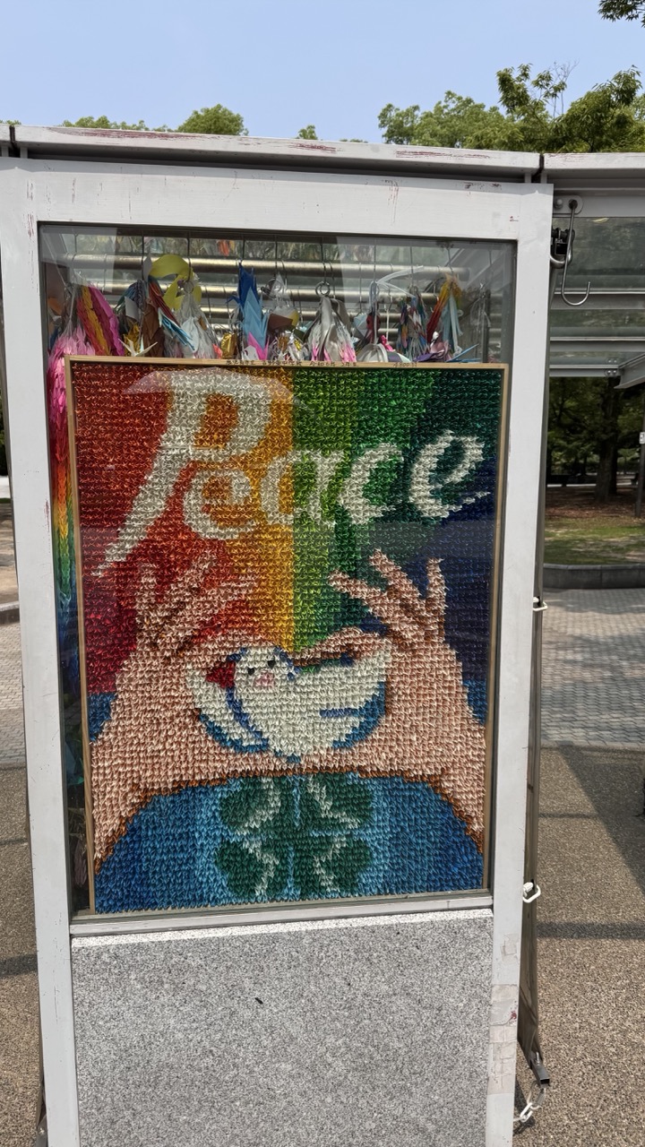
1. Overall Rating (0–10) — 7.0 This image captures a vibrant, handcrafted mosaic of peace, its colorful, textured surface conveying a message of hope and unity. The intricate details of the origami-style artwork stand out against the muted backdrop of a public space, creating a compelling contrast between art and environment. While the composition is strong and the subject meaningful, the surrounding context feels slightly underdeveloped, limiting the image’s overall visual power.
2. Composition (0–10) — 6.5 The mosaic is centered and framed by the display case, creating a balanced and focused composition. However, the surrounding elements—such as the pavement and foliage—introduce visual clutter, slightly distracting from the central artwork.
3. Lighting (0–10) — 7.0 Natural daylight illuminates the scene evenly, enhancing the vivid colors of the mosaic. The bright, even lighting allows the textures and details of the artwork to stand out clearly.
4. Color & Tone (0–10) — 8.0 The rainbow palette of the mosaic is rich and expressive, conveying warmth and positivity. The contrast between the colorful artwork and the neutral tones of the display case and background enhances the visual impact.
5. Creativity (0–10) — 8.5 The use of folded paper to create a mosaic of peace is a thoughtful and original artistic choice. The symbolic imagery of hands holding a dove is both powerful and universally resonant, elevating the piece beyond mere decoration.
6. Technical Quality (0–10) — 7.5 The image is sharp and well-focused, with clear detail in the mosaic’s texture. The reflections in the glass are minimal and do not significantly detract from the overall clarity.
7. Emotional Impact (0–10) — 8.0 The image evokes a sense of optimism and collective hope, with the message of peace resonating deeply. The tactile, handmade quality of the artwork adds an emotional warmth that invites reflection and connection.
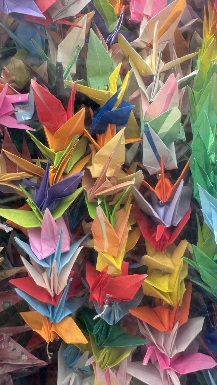
1. Overall Rating (0–10) — 7.5 This photograph bursts with vibrant color and intricate detail, capturing the delicate artistry of countless origami cranes in a dense, textured arrangement. The sheer variety of hues and forms creates a visually rich tapestry that evokes a sense of communal hope and tradition. While the composition is lively and engaging, the lack of a clear focal point slightly dilutes its narrative power, leaving the image feeling more like a decorative display than a cohesive story.
2. Composition (0–10) — 6.0 The frame is tightly packed with origami cranes, resulting in a busy, almost chaotic arrangement. While the density adds visual interest, the lack of negative space and clear subject placement makes it difficult to guide the viewer’s eye.
3. Lighting (0–10) — 6.5 Even, diffused lighting highlights the colors and folds of the paper without harsh shadows, allowing the details of each crane to emerge. However, the lighting is somewhat flat, lacking depth and directional emphasis.
4. Color & Tone (0–10) — 9.0 The rainbow palette is rich and harmonious, with a wide range of saturated tones that create a joyful, celebratory mood. The interplay of warm and cool colors enhances the visual dynamism and emotional resonance.
5. Creativity (0–10) — 8.0 The image celebrates a cultural tradition through a visually compelling and imaginative lens. The sheer volume and variety of the cranes suggest themes of hope, peace, and collective memory, making the photograph both conceptually and aesthetically engaging.
6. Technical Quality (0–10) — 7.5 The image is sharp and well-focused, with clear detail in the folds and edges of the paper. The colors are vivid and accurately rendered, though some areas are slightly overexposed due to the lighting conditions.
7. Emotional Impact (0–10) — 8.0 The density and vibrancy of the cranes evoke a powerful sense of shared humanity and hope. The image feels deeply personal and symbolic, inviting viewers to reflect on the meaning behind each folded paper bird.
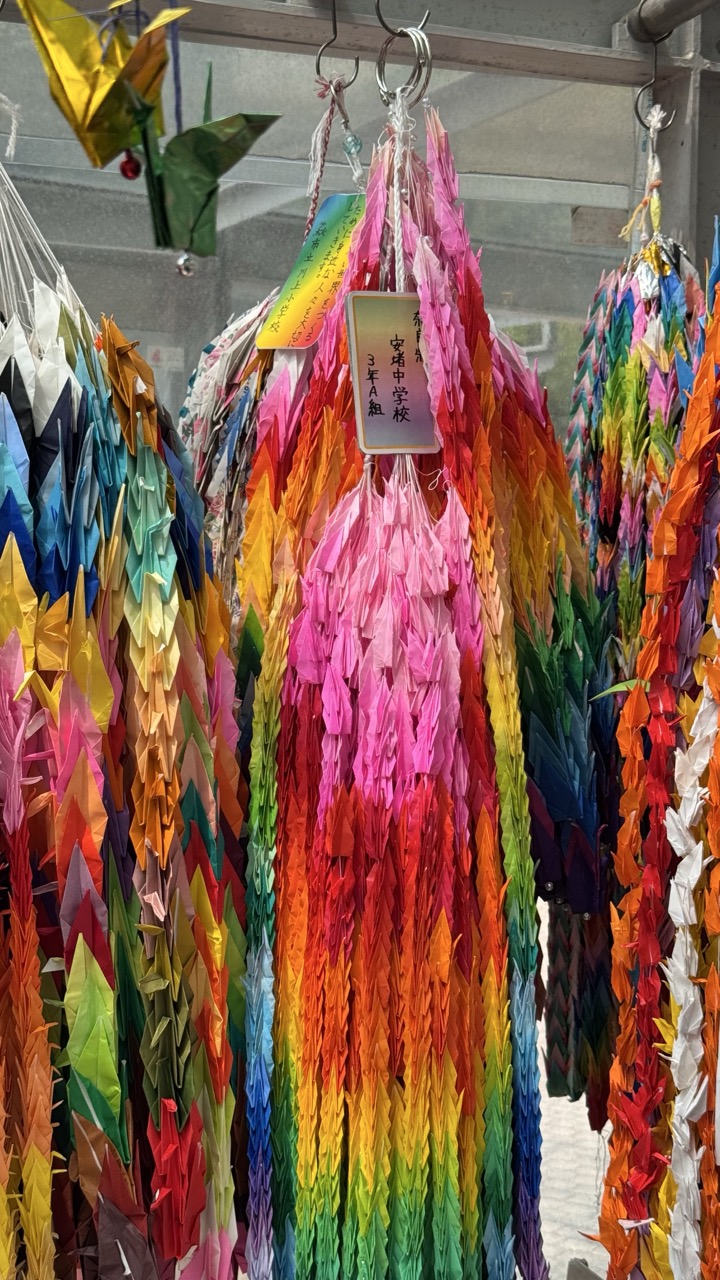
1. Overall Rating (0–10) — 7.5 This photograph bursts with color and cultural resonance, capturing a vibrant display of origami cranes that symbolize hope and peace. The rainbow gradient of the central cluster draws the eye and evokes a sense of unity and joy, while the handwritten tags add a human, personal touch. While the composition feels slightly crowded and the background is underexposed, the image successfully conveys the emotional weight and aesthetic richness of a sacred tradition.
2. Composition (0–10) — 7.0 The central rainbow-colored crane cluster acts as a strong focal point, with surrounding strands creating a sense of depth and abundance. The slight asymmetry and overlapping forms add visual complexity, though the frame feels tight and could benefit from a slightly wider perspective to emphasize the scale of the display.
3. Lighting (0–10) — 6.5 The lighting is diffused and even, likely from an overcast sky or indoor source, which allows the colors to appear rich and saturated. However, the background lacks definition due to underexposure, creating a flat, gray backdrop that diminishes the image’s overall depth.
4. Color & Tone (0–10) — 9.0 The palette is exceptionally vibrant, with a near-perfect rainbow spectrum that radiates energy and positivity. The contrast between the bright, saturated cranes and the muted background enhances the visual impact, creating a striking and emotionally uplifting effect.
5. Creativity (0–10) — 8.0 The photograph captures a deeply meaningful cultural practice with artistic flair, transforming a simple display into a celebration of color, hope, and community. The inclusion of personal notes and the thoughtful arrangement of the cranes lend a narrative depth that elevates the image beyond mere documentation.
6. Technical Quality (0–10) — 7.5 The image is sharp and well-focused, with fine detail visible in the folds of the paper cranes. The depth of field is appropriate, keeping the central subject clear while softly blurring the periphery. The overall clarity is strong, though the low contrast in the background slightly reduces technical polish.
7. Emotional Impact (0–10) — 8.5 The image resonates deeply with themes of hope, healing, and collective aspiration. The sheer number of cranes, each representing a personal wish, creates a powerful sense of connection and shared humanity. The viewer is invited to reflect on the quiet strength of tradition and the beauty of collective dreams.
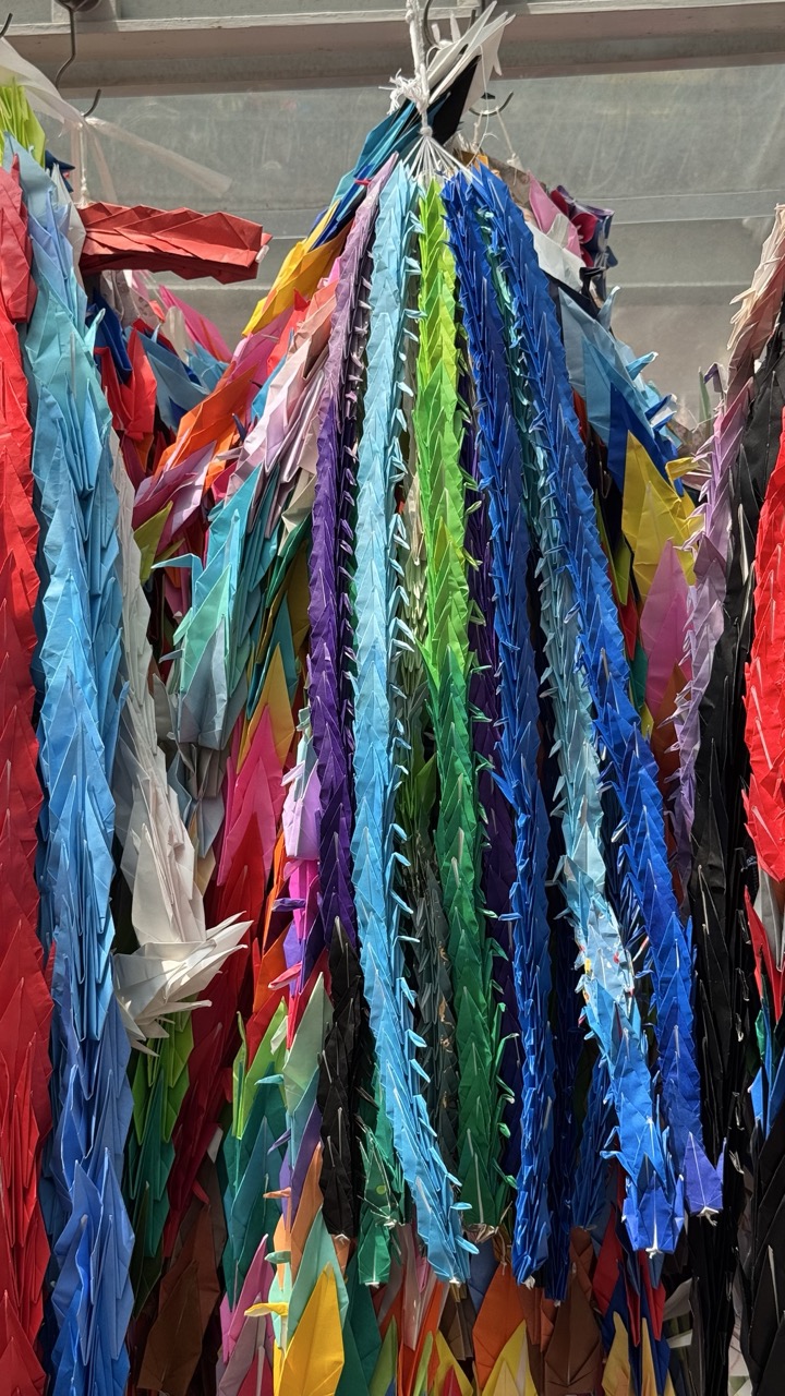
1. Overall Rating (0–10) — 7.5 This photograph bursts with vibrant color and intricate detail, capturing the joyful chaos of a cascading display of origami cranes. The sheer density of folded paper creates a sense of abundance and cultural resonance, while the vertical flow draws the eye through the frame. While the composition is visually rich, the lack of clear focal point and slight overexposure in the upper left detract from its overall cohesion.
2. Composition (0–10) — 6.5 The vertical arrangement of the cranes creates a strong directional flow, but the frame is crowded and lacks a clear subject, resulting in a slightly disorienting effect. A more intentional focal point would enhance visual hierarchy.
3. Lighting (0–10) — 6.0 The lighting is bright and even, likely from overhead fluorescent sources, which illuminates the colors well but flattens the depth and texture of the paper. The overexposed upper left corner suggests a light imbalance.
4. Color & Tone (0–10) — 8.5 The vivid, saturated hues of the origami—ranging from deep blues and purples to bright reds and greens—create a dynamic and joyful palette. The contrast between the bold colors and the neutral background enhances the visual impact.
5. Creativity (0–10) — 8.0 The concept of a massive, colorful installation of origami cranes is inherently creative and evocative, suggesting themes of peace, hope, and community. The sheer volume and arrangement transform a simple craft into a powerful artistic statement.
6. Technical Quality (0–10) — 7.0 The image is sharp and detailed, capturing the fine folds and textures of the paper. However, the slight overexposure and lack of depth due to flat lighting limit its technical refinement.
7. Emotional Impact (0–10) — 7.5 The explosion of color and repetition of the crane motif evoke a sense of wonder and celebration, tapping into universal themes of hope and connection. The viewer is invited to reflect on the collective effort and meaning behind the installation.
Standing here, watching Japanese schoolchildren add their own cranes to the collection, you witness peace education in action. The monument serves as a bridge between historical tragedy and contemporary hope, showing how young people worldwide continue to advocate for peace.
1. Overall Rating (0–10) — 7.0 This photograph captures a poignant monument amidst lush greenery, where the weight of history is softened by the quiet presence of nature. The interplay between the solemn sculpture and the vibrant life surrounding it creates a contemplative mood, though the casual tourists in the foreground slightly disrupt the monument’s solemnity. The image succeeds in conveying both reverence and resilience, balancing the symbolic weight of the site with the everyday continuity of life.
2. Composition (0–10) — 7.0 The monument is centered and framed effectively by the surrounding trees and the hedge in the foreground, creating a layered depth. The verticality of the sculpture contrasts with the horizontal lines of the display cases and pavement, guiding the eye upward toward the figure. The inclusion of people on the left adds narrative context without overwhelming the composition.
3. Lighting (0–10) — 7.0 Natural daylight illuminates the scene evenly, with soft, diffused light that enhances the texture of the concrete and the vibrancy of the foliage. The sky is bright but not overexposed, allowing details in both the monument and the trees to remain visible without harsh shadows.
4. Color & Tone (0–10) — 7.0 The palette is dominated by the rich greens of the trees and the neutral gray of the concrete, creating a natural harmony. The colorful tie-dye shirts in the display cases introduce a striking contrast that draws attention and adds a layer of cultural expression. The overall tone is balanced, with a slight coolness that reinforces the reflective mood.
5. Creativity (0–10) — 6.5 The photograph effectively captures a site of historical and emotional significance, using the juxtaposition of nature, architecture, and human presence to suggest themes of peace and remembrance. While the composition is straightforward, the inclusion of the colorful memorabilia adds a subtle narrative layer that elevates the image beyond a simple documentary shot.
6. Technical Quality (0–10) — 8.0 The image is sharp and clear, with good focus on the monument and a well-balanced depth of field. The foreground hedge is slightly out of focus, which helps to frame the scene without distracting from the central subject. There are no noticeable technical flaws, and the exposure is well-managed.
7. Emotional Impact (0–10) — 7.5 The photograph evokes a sense of quiet reflection, inviting the viewer to contemplate the monument’s meaning. The presence of visitors suggests continuity and remembrance, while the peaceful setting enhances the emotional resonance. The image successfully conveys a mix of solemnity and hope, making it emotionally engaging.
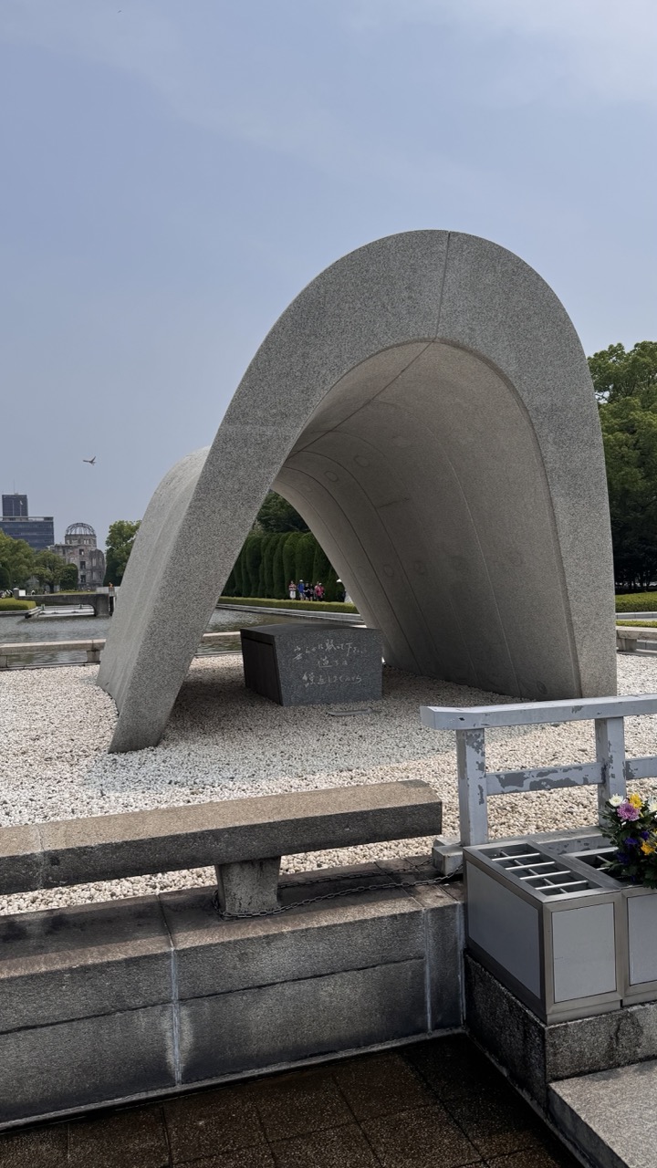
1. Overall Rating (0–10) — 7.5 This photograph captures the solemnity and enduring symbolism of the Hiroshima Peace Memorial, where architecture becomes a vessel for collective memory. The arch, weathered and monumental, frames both the past and the future, while the distant dome of the Atomic Bomb Dome anchors the scene in its historical gravity. The composition balances monumentality with quiet human presence, though the muted lighting and overcast sky slightly dampen the emotional resonance. Still, the image succeeds as a respectful and contemplative document of peace and remembrance.
2. Composition (0–10) — 7.0 The arch dominates the frame, creating a strong visual anchor, while the inclusion of the bench and railing grounds the image in the viewer’s perspective. The diagonal line of the railing leads the eye toward the monument, though the slightly cluttered foreground risks drawing attention away from the central subject.
3. Lighting (0–10) — 6.0 The overcast sky provides soft, diffused light that minimizes harsh shadows and highlights the texture of the stone. However, the lack of direct sunlight or dramatic contrast reduces the sense of depth and atmosphere, giving the scene a somewhat flat, documentary quality.
4. Color & Tone (0–10) — 6.5 The palette is restrained—grays and muted greens dominate, reinforcing the somber mood. The small splash of color from the flowers in the planter offers a subtle but meaningful contrast, symbolizing life and renewal amid ruin.
5. Creativity (0–10) — 7.0 The image is conceptually strong, using the arch as a metaphorical frame to connect the past with the present. The inclusion of visitors in the distance adds narrative depth, suggesting the ongoing relevance of the memorial. While not overtly experimental, the photograph is thoughtful in its intent and framing.
6. Technical Quality (0–10) — 8.0 The image is sharp and well-focused, with clear detail in the stone texture and inscriptions. The exposure is balanced, and the dynamic range is handled well despite the overcast conditions.
7. Emotional Impact (0–10) — 8.0 The photograph evokes a quiet reverence, inviting contemplation of loss, resilience, and hope. The scale and stillness of the monument, combined with the subtle presence of people, create a powerful sense of continuity between memory and the living world.
Ferry to the Sacred: Crossing to Miyajima Island
After the emotional intensity of the Peace Memorial sites, the ferry journey to Miyajima Island (Itsukushima) provides necessary spiritual cleansing. The 10-minute ride from Miyajimaguchi Port transforms your mental state as Hiroshima's urban landscape gives way to the sacred island's forested peaks.
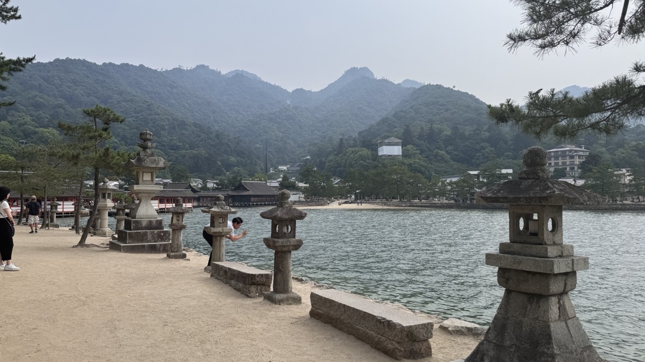
1. Overall Rating (0–10) — 6.0 This photograph captures the serene yet bustling atmosphere of a sacred Japanese shrine, where tradition meets daily life. The stone lantern in the foreground anchors the image, drawing the eye toward the iconic torii gate and the gathering of visitors beyond. While the overcast sky dampens the scene’s vibrancy, the composition effectively conveys a sense of place and cultural continuity—though the lack of dynamic light and emotional depth limits its impact.
2. Composition (0–10) — 6.5 The stone lantern on the right creates a strong visual anchor, while the torii gate in the midground serves as a natural focal point. The diagonal path and scattered visitors guide the eye through the frame, though the wide shot feels slightly unbalanced due to the asymmetry and lack of tighter framing.
3. Lighting (0–10) — 5.0 The diffuse, overcast lighting flattens the scene, reducing contrast and depth. While it ensures even exposure across the stone structures and people, it also diminishes the textural richness and mood that more directional light could provide.
4. Color & Tone (0–10) — 5.5 The palette is muted, dominated by grays and earth tones that reflect the cloudy sky and stone architecture. The lack of vivid color limits the image’s visual appeal, though the tonal consistency supports a calm, contemplative mood.
5. Creativity (0–10) — 6.0 The image is grounded in documentary realism, capturing a genuine moment at a cultural site. While it lacks a unique artistic vision, it succeeds in conveying the quiet rhythm of a sacred space shared by both locals and visitors.
6. Technical Quality (0–10) — 7.0 The focus is sharp across the frame, and the detail in the lantern and torii is clear. The exposure is well-managed, avoiding harsh shadows or blown highlights, though the overall image lacks dynamic range.
7. Emotional Impact (0–10) — 5.5 The scene evokes a sense of reverence and quiet observation, but the flat lighting and distant perspective keep the viewer emotionally at arm’s length. The presence of people adds life, yet the image feels more like a record than a moment of profound connection.
1. Overall Rating (0–10) — 6.0 This photograph captures a serene yet slightly disjointed moment at a coastal shrine, where nature, culture, and tourism intersect. The presence of the deer and traditional stone lanterns evokes a sense of timeless harmony, while the tourists add a contemporary layer of everyday life. However, the composition feels crowded and unfocused, with too many elements competing for attention, and the overcast lighting dampens the scene’s potential for emotional resonance.
2. Composition (0–10) — 5.5 The frame is cluttered with foreground elements—the deer, the woman, the lantern—pulling focus away from a cohesive narrative. The couple on the bench is slightly obscured, and the large tree branch at the top cuts across the frame, disrupting visual flow.
3. Lighting (0–10) — 5.0 The diffuse, overcast light flattens the scene, minimizing shadows and depth. While it evenly illuminates the subjects, it also reduces the richness of textures and mood, lending a muted, documentary feel.
4. Color & Tone (0–10) — 5.5 The palette is largely neutral—beige sand, gray stone, and pale green foliage—creating a subdued, almost washed-out atmosphere. The red cap provides a focal point but doesn’t add enough vibrancy to elevate the overall tone.
5. Creativity (0–10) — 6.0 The juxtaposition of wild deer, cultural artifacts, and tourists offers a compelling narrative about coexistence, but the execution lacks a strong artistic vision. The image documents a moment rather than interpreting it.
6. Technical Quality (0–10) — 7.0 The focus is sharp on the foreground subjects, and the exposure is well-balanced. However, the slightly low resolution and lack of depth-of-field control diminish the image’s visual impact.
7. Emotional Impact (0–10) — 5.0 The image feels observational rather than evocative. While it hints at quiet contemplation and cultural immersion, it doesn’t fully draw the viewer into the scene’s atmosphere or emotional core.
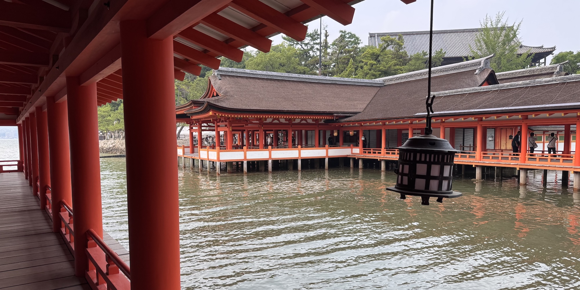
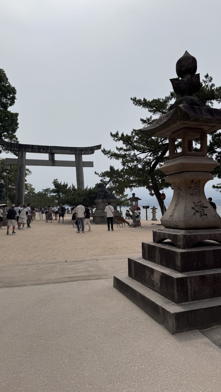
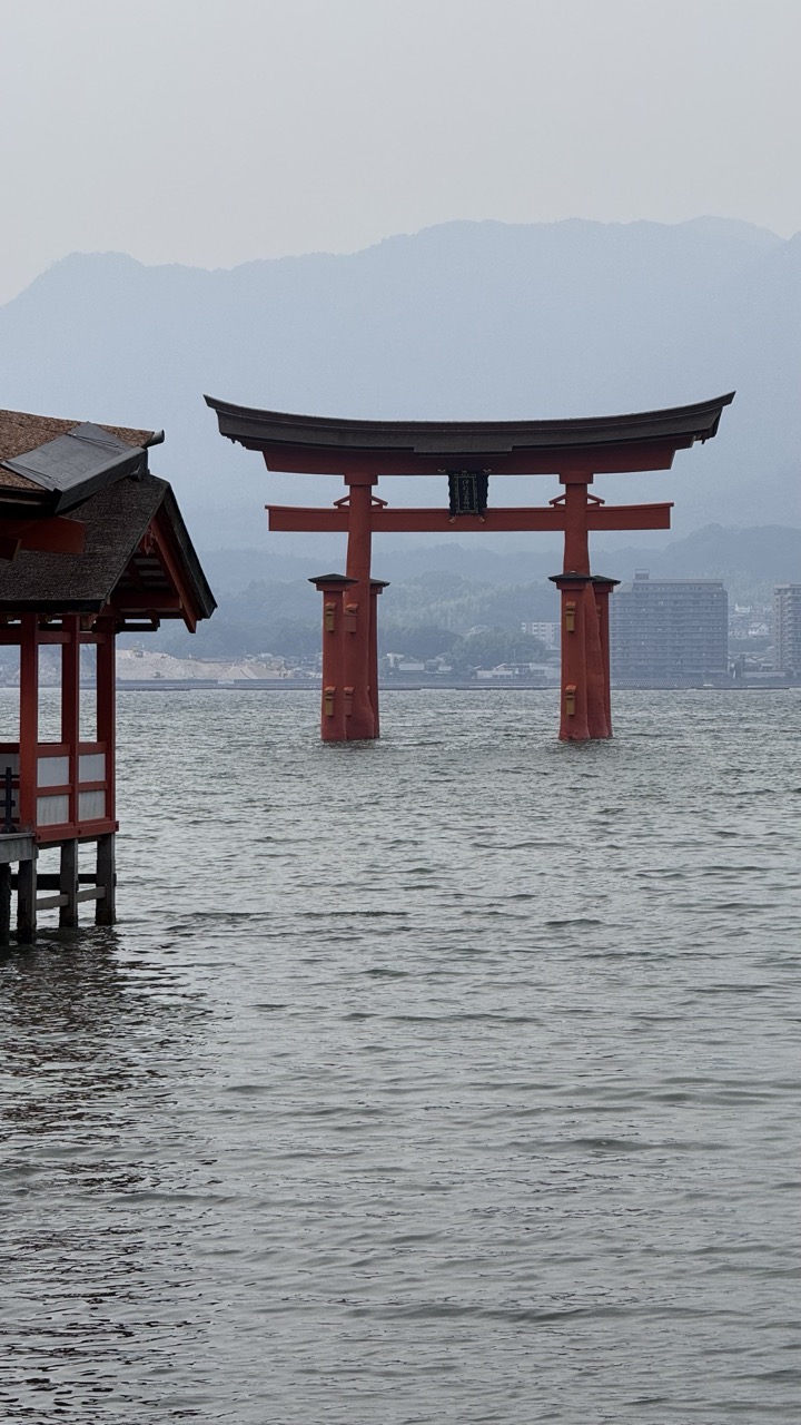
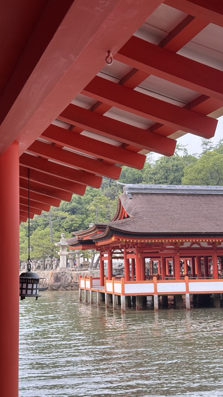
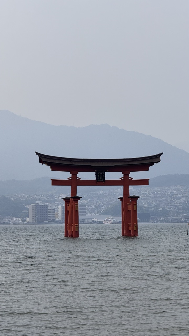
Miyajima, literally meaning "shrine island," has been considered sacred for over 1,400 years. The island's spiritual significance stems from its association with the three daughters of the sea god, making it one of Japan's most revered Shinto sites. As the ferry approaches, the famous floating torii gate of Itsukushima Shrine comes into view, creating one of Japan's most photographed moments.
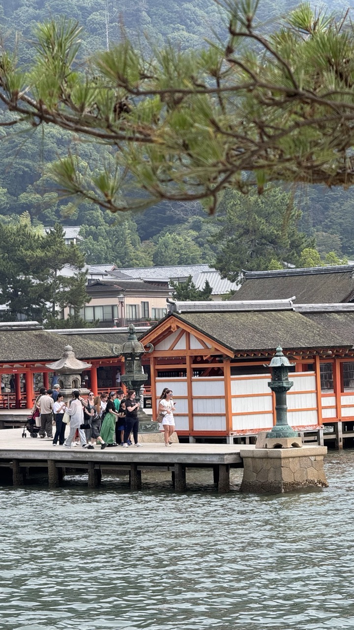
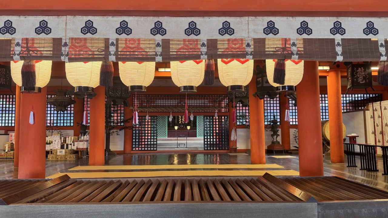
1. Overall Rating (0–10) — 7.0 This photograph captures the serene yet bustling atmosphere of a traditional Japanese shrine, where cultural heritage and tourism intersect. The framing through the pine branches adds a natural, contemplative layer, while the red and white architecture stands out against the lush green backdrop. Though the image is visually engaging, the presence of numerous tourists slightly diminishes the sense of spiritual stillness one might expect from such a location.
2. Composition (0–10) — 7.0 The foreground pine branches create a natural frame, guiding the eye toward the shrine and enhancing depth. The composition balances the man-made structures with the natural environment, though the crowd slightly disrupts the visual harmony.
3. Lighting (0–10) — 6.5 The soft, diffused daylight evenly illuminates the scene, avoiding harsh shadows and highlighting the textures of the wooden structures and water. The overcast conditions lend a calm, muted tone that complements the setting’s tranquil mood.
4. Color & Tone (0–10) — 7.0 The palette is rich with earthy tones—deep greens of the trees, the warm orange of the shrine’s wood, and the muted grays of the stone and water. The contrast between the vibrant architecture and the subdued surroundings enhances visual interest.
5. Creativity (0–10) — 6.5 The use of the pine branches as a framing device adds a poetic, layered quality, suggesting a moment of quiet observation. However, the inclusion of the crowd tempers the image’s ability to convey timeless serenity.
6. Technical Quality (0–10) — 7.5 The image is sharp and well-focused, with clear details in both the architecture and the water’s surface. The exposure is balanced, preserving detail in both highlights and shadows.
7. Emotional Impact (0–10) — 6.0 The photograph evokes a sense of cultural wonder and peaceful coexistence between nature and tradition. While the presence of tourists introduces a note of modernity, the scene still carries a quiet reverence that invites reflection.
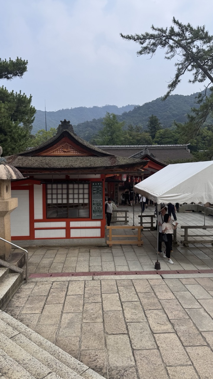
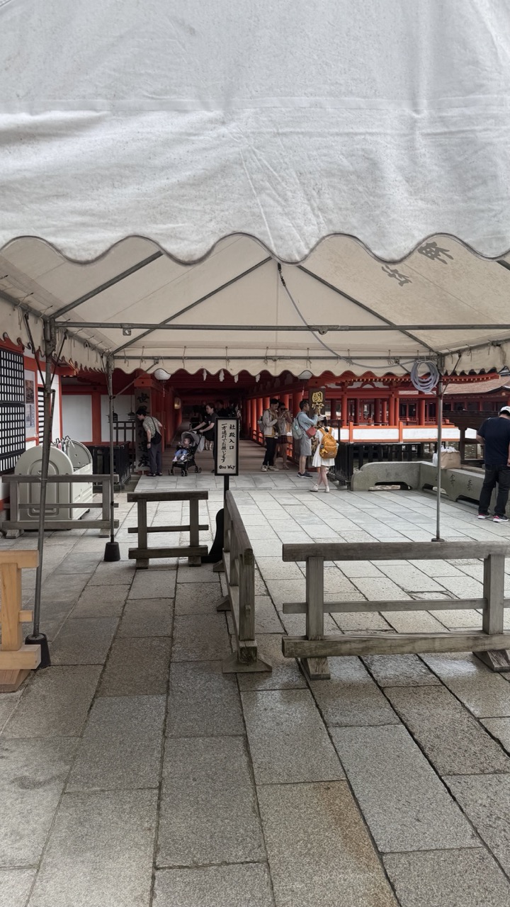
1. Overall Rating (0–10) — 6.0 This photograph captures a tranquil moment at a traditional Japanese shrine, where cultural heritage meets everyday life. The red and white architecture stands out against the soft, overcast sky, while the surrounding greenery and distant mountains lend a sense of serenity. However, the presence of modern elements like the white tent and casual visitors slightly disrupts the timelessness of the scene, creating a subtle tension between tradition and contemporary tourism.
2. Composition (0–10) — 5.5 The image is framed from a slightly elevated perspective, with the stone steps leading the eye into the scene. The shrine building is off-center, creating an asymmetrical balance, while the white tent on the right introduces visual clutter. A tighter crop could have focused more on the architectural details and minimized the distraction of the tent.
3. Lighting (0–10) — 5.0 The overcast sky produces soft, diffused light that evenly illuminates the scene, minimizing harsh shadows. While this contributes to a calm mood, it also flattens the image and reduces the richness of textures and depth in the architecture and landscape.
4. Color & Tone (0–10) — 5.5 The color palette is muted due to the cloudy weather, with dominant tones of gray and green. The red accents of the shrine provide a subtle contrast, but the overall tone lacks vibrancy. A slight increase in saturation could enhance the visual appeal without compromising authenticity.
5. Creativity (0–10) — 6.0 The photograph successfully captures a real-world moment at a culturally significant site, blending architecture, nature, and human activity. While not overtly artistic, it conveys a narrative of tradition coexisting with modern life, offering a contemplative perspective on place and time.
6. Technical Quality (0–10) — 7.0 The image is sharp and well-focused, with clear details in the stone pavement and architectural elements. The exposure is balanced, avoiding blown highlights or deep shadows. However, the slightly grainy texture suggests a high ISO or lower resolution, which slightly reduces the overall clarity.
7. Emotional Impact (0–10) — 5.5 The image evokes a quiet sense of reverence and calm, inviting the viewer to reflect on the enduring presence of tradition. Yet, the modern intrusions and lack of dramatic lighting keep the emotional resonance from fully resonating, leaving the viewer in a state of mild contemplation rather than deep connection.
The island's sacred status historically prohibited commoners from setting foot on it, requiring worshippers to approach by boat. Today, while visitors can walk freely, the island maintains its spiritual atmosphere through careful preservation and the absence of modern development.
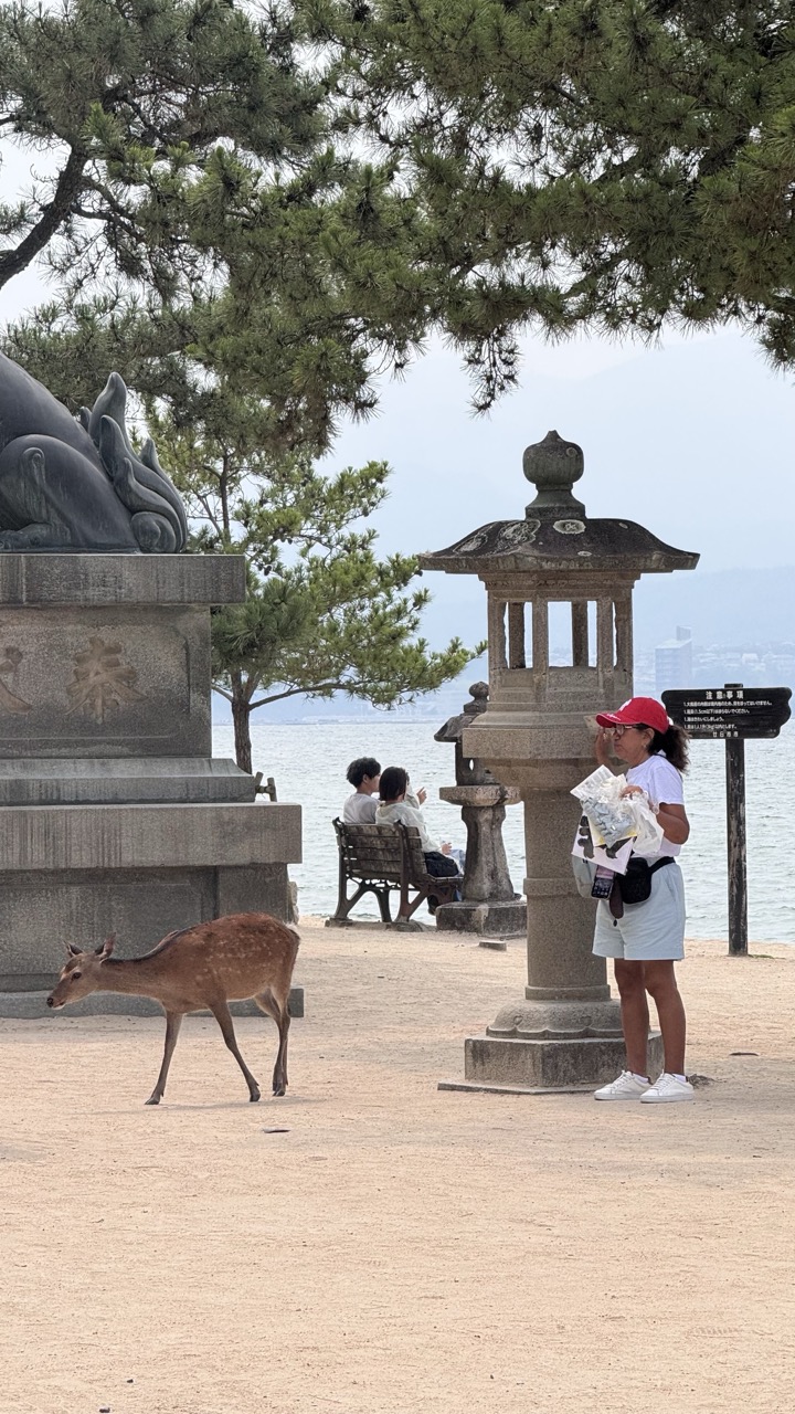
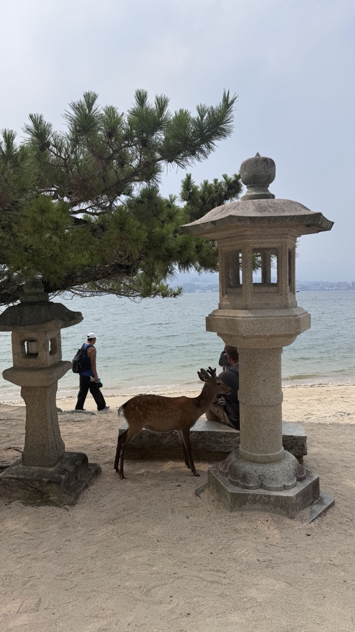
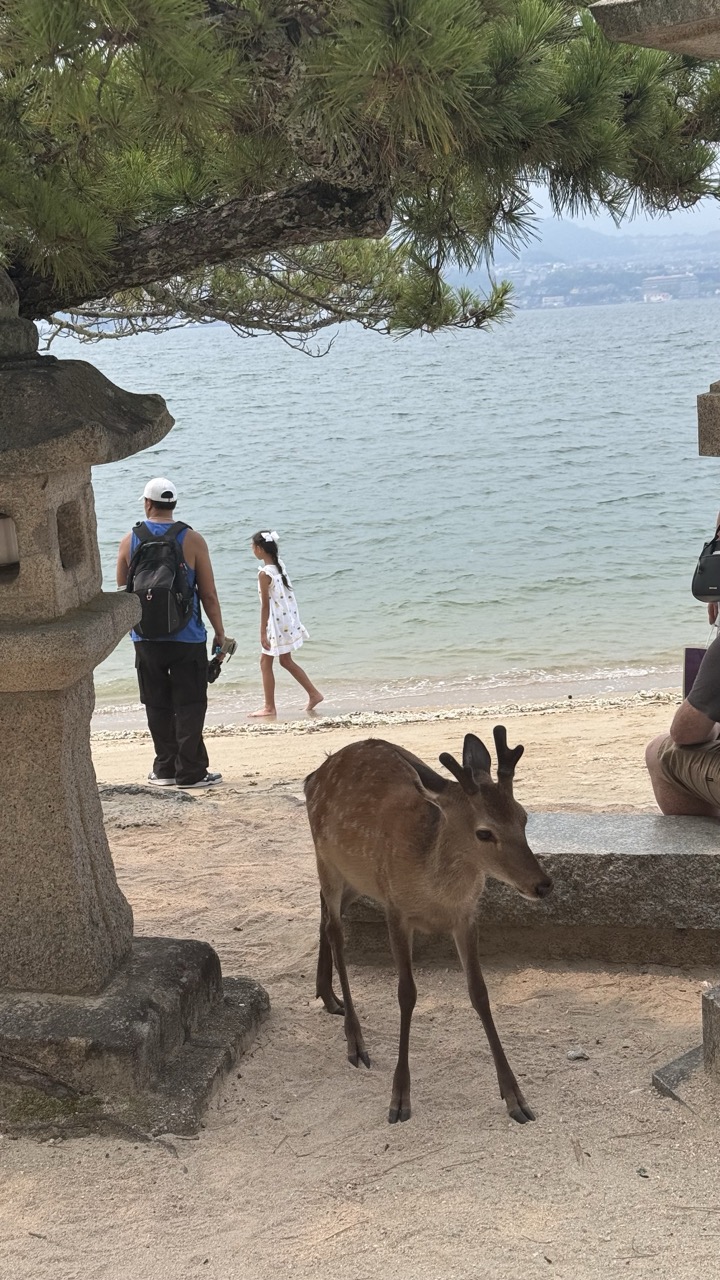
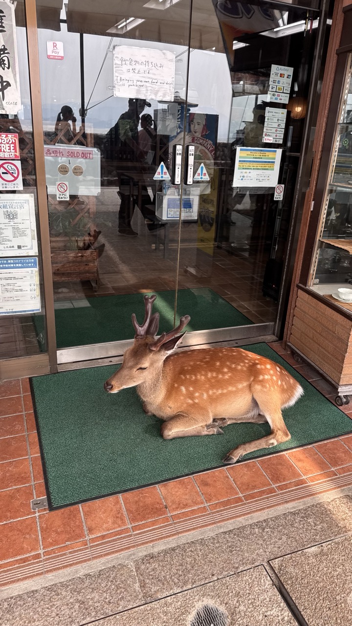
Among the Sacred Messengers: Miyajima's Deer Population
Miyajima's deer population adds an enchanting element to the island experience. These sacred messengers, considered divine in Shinto tradition, roam freely throughout the island. Unlike their more aggressive cousins in Nara, Miyajima's deer are generally gentler, though they remain wild animals deserving respect.
1. Overall Rating (0–10) — 7.0 This photograph captures a serene yet subtly dynamic moment where nature and human presence coexist on a tranquil seaside. The juxtaposition of the deer, traditional stone lanterns, and the calm ocean creates a sense of cultural harmony and quiet beauty. While the composition is strong and the scene feels authentic, the muted lighting and slightly cluttered foreground slightly diminish its visual impact.
2. Composition (0–10) — 6.5 The framing is balanced, with the lanterns anchoring the sides and the deer drawing the eye toward the center. The overhanging pine tree adds depth and visual interest, though the person walking in the background introduces a slight distraction, pulling focus from the central subject.
3. Lighting (0–10) — 5.5 The overcast sky produces soft, diffused light that minimizes shadows and flattens the scene. While this creates an even exposure, it also reduces contrast and depth, lending a somewhat muted quality to the image.
4. Color & Tone (0–10) — 6.0 The palette is restrained, dominated by earthy tones of sand, gray stone, and green pine, with the soft blue of the water providing a gentle contrast. The colors are natural but lack vibrancy, contributing to the subdued atmosphere.
5. Creativity (0–10) — 7.0 The image succeeds in capturing a unique cultural moment—deer roaming freely near sacred lanterns on a beach—blending nature, tradition, and modern life. The storytelling is compelling, though the execution leans more toward documentation than artistic interpretation.
6. Technical Quality (0–10) — 7.5 The image is sharp and clear, with well-defined textures in the stone lanterns and pine needles. Focus is consistent, and the exposure is balanced, though the lack of dynamic range slightly limits the image’s richness.
7. Emotional Impact (0–10) — 6.5 The photograph evokes a sense of peace and timelessness, inviting the viewer to reflect on the quiet coexistence of wildlife and human culture. While not emotionally overwhelming, it leaves a lingering impression of calm and subtle wonder.
1. Overall Rating (0–10) — 6.8 This photograph captures a serene and culturally rich moment where nature and human life intersect along a tranquil shoreline. The presence of the young deer in the foreground adds a sense of wonder and immediacy, while the stone lantern and pine branch lend a traditional Japanese aesthetic. The scene feels candid and authentic, though the composition's depth is slightly disrupted by the cluttered foreground and the distant, less focused background.
2. Composition (0–10) — 6.0 The deer is well-placed in the lower right, drawing the eye, but the large pine branch and stone lantern in the upper left create visual weight that slightly disrupts balance. The diagonal line of the shoreline guides the gaze toward the background, but the depth of field feels uneven, with the foreground too dominant.
3. Lighting (0–10) — 6.5 Soft, diffused daylight evenly illuminates the scene, minimizing harsh shadows and allowing natural colors to emerge. The overcast sky contributes to a calm, muted mood, though it reduces contrast and subtle detail in the deer’s fur and the water’s surface.
4. Color & Tone (0–10) — 6.2 The palette is subdued, dominated by earthy browns, soft greens, and the pale blue-gray of the sea. While harmonious, the colors lack vibrancy, giving the image a slightly flat appearance. The white dress of the girl provides a subtle point of contrast.
5. Creativity (0–10) — 7.0 The image successfully blends wildlife, human presence, and cultural elements into a cohesive narrative. The framing from beneath the pine branch offers a unique perspective, enhancing the sense of place and inviting the viewer into the scene.
6. Technical Quality (0–10) — 7.0 The focus is sharp on the deer and the immediate foreground, with decent detail in the textures of the stone lantern and sand. The exposure is balanced, with no blown highlights or crushed shadows, though the overall image lacks the crispness of a higher-resolution capture.
7. Emotional Impact (0–10) — 6.5 The photograph evokes a sense of peace and quiet coexistence, capturing a fleeting moment of connection between people and nature. While not emotionally overwhelming, it resonates with quiet beauty and a gentle nostalgia for a place where time moves slowly.
The deer serve as living connections to the island's spiritual heritage. In Shinto belief, they're messengers of the gods, and their presence reinforces the island's sacred nature. Watching them graze peacefully near the torii gate or wander through the temple grounds creates magical moments that feel straight from a Studio Ghibli film.
1. Overall Rating (0–10) — 7.0 This photograph captures the serene yet layered atmosphere of a traditional Japanese lakeside shrine, where nature and culture converge in quiet harmony. The stone lanterns lead the eye toward the water and distant mountains, creating a sense of depth and contemplation, though the overcast sky tempers the scene’s emotional resonance. While the image feels authentic and grounded, it lacks the dramatic lighting or compositional tension to elevate it beyond a strong documentary capture.
2. Composition (0–10) — 7.5 The lanterns form a natural leading line, guiding the viewer from the foreground through the midground toward the shrine and mountains. The off-center placement of the main subject and the framing by pine branches add depth and a sense of intimacy, though the right side feels slightly more crowded than the left.
3. Lighting (0–10) — 6.0 Diffused, overcast light creates soft shadows and even exposure, preserving detail across the scene. While this avoids harsh contrasts, it also flattens the mood, reducing the potential for dramatic contrast or atmosphere.
4. Color & Tone (0–10) — 6.5 The palette is restrained, dominated by muted greens, grays, and earth tones that reflect the natural setting. The subtle contrast between the stone lanterns and the green water adds visual interest, but the lack of vibrant color limits the image’s emotional punch.
5. Creativity (0–10) — 7.0 The photographer captures a moment of cultural authenticity with a respectful, observational eye. The use of natural elements—lanterns, trees, water—as compositional tools demonstrates a thoughtful approach to storytelling, though the scene is familiar and does not break new ground.
6. Technical Quality (0–10) — 7.5 Sharp focus across the frame, accurate exposure, and clean detail in the stone textures and water surface indicate strong technical execution. The camera’s resolution and focus settings are well-suited to the scene.
7. Emotional Impact (0–10) — 6.5 The image evokes a quiet sense of peace and reverence, inviting reflection on tradition and nature. However, the lack of dynamic lighting and emotional contrast keeps the viewer at a respectful distance, limiting deeper emotional engagement.
Visitors should avoid feeding the deer, as this disrupts their natural behavior and diet. Instead, simply observe these beautiful creatures as they go about their daily lives, adding movement and life to the island's already spectacular scenery.
Mountain Sanctuary: Exploring Mitaki-dera Temple
Away from Miyajima's crowds, Mitaki-dera Temple offers a more intimate spiritual experience. This hidden gem, nestled in Hiroshima's mountains, provides the perfect complement to the island's grand shrines. The temple's name, meaning "three waterfalls temple," references the three sacred waterfalls that flow through the grounds.
1. Overall Rating (0–10) — 6.0 This photograph captures a quiet moment at a traditional Japanese shrine, where the interplay of modern temporary structures and historic architecture creates a subtle tension. The white tent dominates the frame, casting a neutral, overcast mood that softens the vibrant reds of the shrine in the background. While the scene feels authentic and grounded in place, the composition’s lack of visual focus and the flat lighting keep it from feeling truly compelling or evocative.
2. Composition (0–10) — 5.5 The frame is anchored by the tent’s curved edge and the leading lines of the stone path, but the foreground elements—benches and railings—distract from the central shrine. The subject is slightly off-center and partially obscured, creating a cluttered, observational feel rather than a deliberate narrative.
3. Lighting (0–10) — 5.0 Diffuse, overcast light flattens the scene, reducing contrast and depth. The absence of strong shadows or directional light makes the image feel muted and passive, undermining the potential drama of the red shrine behind.
4. Color & Tone (0–10) — 5.5 The dominant whites and grays of the tent and pavement mute the vibrancy of the red shrine, while the overall tonal range is compressed. A more dynamic contrast between the bright red and the neutral palette could enhance visual interest.
5. Creativity (0–10) — 6.0 The juxtaposition of temporary and permanent structures offers a subtle commentary on tradition and modernity. However, the execution feels more like documentation than artistic interpretation, with limited visual storytelling.
6. Technical Quality (0–10) — 7.0 The image is sharp and well-focused, with clean detail throughout the stone pavement and tent fabric. The exposure is balanced, though the lack of contrast and depth limits its technical impact.
7. Emotional Impact (0–10) — 5.0 The photograph evokes a sense of calm and quiet observation, but the emotional distance created by the framing and lighting prevents a deeper connection. It captures a place, but not a feeling.
1. Overall Rating (0–10) — 7.0 This photograph captures the serene yet solemn presence of the Itsukushima Shrine’s iconic torii gate, standing resiliently in the water under a muted sky. The composition balances tradition and nature, with the red structure offering a striking contrast against the gray tones of water and misty mountains. While the overcast conditions temper the image’s vibrancy, they enhance its contemplative mood, allowing the cultural significance of the scene to resonate with quiet dignity.
2. Composition (0–10) — 7.5 The torii gate is centered with strong visual weight, flanked by the wooden structure on the left and the distant cityscape, creating a layered depth. The diagonal line of the roof guides the eye toward the gate, while the calm water reinforces a sense of stillness.
3. Lighting (0–10) — 6.0 Diffuse, overcast light softens the scene, reducing shadows and creating a uniform tone. While this flattens contrast, it suits the tranquil, meditative atmosphere of the location.
4. Color & Tone (0–10) — 6.5 The deep vermilion of the torii stands out against the subdued grays and blues, but the overall palette feels restrained due to the hazy atmosphere. A slight increase in saturation would enhance the visual impact without compromising authenticity.
5. Creativity (0–10) — 7.0 The image captures a familiar landmark with a quiet, introspective approach, emphasizing harmony between man-made structure and natural elements. The choice to frame it under a cloudy sky adds a contemplative layer, elevating it beyond a simple travel snapshot.
6. Technical Quality (0–10) — 8.0 The image is sharp and clear, with fine detail visible in the wood grain and water texture. The exposure is well-balanced, and there are no noticeable flaws in focus or noise.
7. Emotional Impact (0–10) — 7.5 The photograph evokes a sense of reverence and timelessness, inviting reflection on cultural heritage and the passage of time. The quiet stillness of the water and sky creates a meditative space, allowing viewers to feel a personal connection to the sacred site.
The temple's autumn colors are legendary among locals, with maple trees creating a fiery canopy that rivals Kyoto's famous displays. The temple grounds feature multiple halls connected by stone pathways that wind through the forest, creating a sense of discovery and spiritual journey.
1. Overall Rating (0–10) — 7.5 This photograph captures the serene elegance of a traditional Japanese shrine, where the interplay of water, light, and architecture evokes a sense of timeless tranquility. The hanging lantern, sharply detailed and centered, draws the eye while the blurred red structure in the background provides cultural context and depth. While the image is visually compelling, its muted lighting and slightly overcast atmosphere temper its emotional intensity, leaving a sense of calm rather than awe.
2. Composition (0–10) — 8.0 The lantern is well-centered, creating a strong focal point, while the receding lines of the shrine’s veranda lead the eye into the frame. The use of water as a foreground element adds depth and balance, though the composition is slightly off-kilter due to the angle of the lantern’s suspension.
3. Lighting (0–10) — 6.5 Soft, diffused natural light enhances the textures of the lantern and water without creating harsh shadows. However, the overcast conditions result in a flat, subdued tone that limits the dramatic contrast and warmth typically associated with such sacred spaces.
4. Color & Tone (0–10) — 7.0 The rich vermilion of the shrine contrasts beautifully with the muted greens and grays of the water and sky, creating a balanced, harmonious palette. The tonal range is consistent, though slightly desaturated, lending the image a contemplative, almost monochromatic mood.
5. Creativity (0–10) — 7.5 The framing emphasizes cultural symbolism through the juxtaposition of the lantern and shrine, suggesting a narrative of tradition and reverence. The choice to focus on a single, suspended object within a larger architectural context offers a meditative, introspective perspective.
6. Technical Quality (0–10) — 8.0 The image is sharp, with fine detail visible in the lantern’s metalwork and the water’s surface. The depth of field is appropriately managed, keeping the foreground in focus while softly blurring the background to enhance subject isolation.
7. Emotional Impact (0–10) — 7.0 The photograph conveys a quiet reverence and stillness, inviting the viewer to pause and reflect. While not emotionally overwhelming, it succeeds in evoking a sense of peace and connection to tradition, particularly through its thoughtful composition and subdued atmosphere.
1. Overall Rating (0–10) — 7.5 This photograph captures the serene majesty of a traditional Japanese shrine, where bold architectural lines meet tranquil waters in a harmonious composition. The vibrant vermilion of the wooden structures contrasts beautifully with the muted greens and grays of the natural surroundings, evoking a sense of timeless spirituality. While the image is rich in cultural resonance, its slightly cluttered foreground and soft focus on the distant shrine prevent it from achieving a more refined aesthetic balance.
2. Composition (0–10) — 7.0 The overhanging red beams create a strong diagonal leading line, guiding the eye toward the shrine across the water. The framing by the foreground structure adds depth and context, though the lantern on the left slightly disrupts the visual flow.
3. Lighting (0–10) — 6.5 Soft, diffused daylight evenly illuminates the scene, preserving detail without harsh shadows. The lighting enhances the calm mood but lacks dramatic contrast, slightly muting the vibrancy of the reds.
4. Color & Tone (0–10) — 7.5 The rich vermilion of the shrine contrasts vividly with the earthy tones of the roof and the green foliage, while the grayish water provides a neutral backdrop. The color palette is balanced and culturally evocative, though the saturation could be slightly enhanced to amplify the emotional impact.
5. Creativity (0–10) — 7.0 The perspective from under the eaves offers an intimate, immersive viewpoint, inviting the viewer into the sacred space. The interplay of structure and nature reflects a thoughtful composition that honors the site’s spiritual significance.
6. Technical Quality (0–10) — 7.5 The image is sharp and well-focused, with clean detail in the architectural elements. The exposure is balanced, and the depth of field appropriately frames the subject without distracting artifacts.
7. Emotional Impact (0–10) — 8.0 The scene evokes a profound sense of peace and reverence, enhanced by the quiet stillness of the water and the solemn presence of the shrine. The viewer is drawn into a contemplative space, feeling both awe and tranquility.
Mitaki-dera's relative obscurity among international tourists makes it feel like a secret discovered rather than a destination visited. The temple's peaceful atmosphere, combined with the sound of flowing water and rustling leaves, provides profound tranquility after the emotional intensity of the Peace Memorial sites.
1. Overall Rating (0–10) — 7.5 This photograph captures the solemn grandeur of a traditional Japanese shrine, where architectural symmetry and cultural symbolism converge in a quiet moment of stillness. The warm glow of the lanterns contrasts beautifully with the bold orange pillars and intricate latticework, evoking a sense of reverence and timelessness. While the scene is rich in detail, the composition’s slight busyness and overexposed highlights detract from its overall harmony.
2. Composition (0–10) — 7.0 The image employs strong symmetry, with the central aisle and row of lanterns drawing the eye toward the distant shrine entrance. However, the cluttered foreground and scattered elements on the left side create visual distractions that slightly disrupt the intended balance.
3. Lighting (0–10) — 7.5 The soft, diffused light from the paper lanterns creates a warm and inviting glow, enhancing the spiritual atmosphere. The natural light from the windows adds depth and contrast, though the overexposure in the lanterns slightly diminishes their luminous quality.
4. Color & Tone (0–10) — 8.0 The rich orange of the pillars and the deep reds of the decorative patterns create a bold, harmonious palette. The neutral tones of the wooden floor and white lanterns provide balance, while the overall tonal range is well-managed, emphasizing the scene’s cultural richness.
5. Creativity (0–10) — 7.0 The photograph successfully captures the essence of a sacred space through a balanced blend of tradition and visual storytelling. While not overtly experimental, the composition reflects a thoughtful interpretation of cultural aesthetics, inviting viewers into a moment of quiet contemplation.
6. Technical Quality (0–10) — 8.0 The image is sharp and well-focused, with fine detail visible in the textures of the wood, paper, and fabric. The exposure is generally accurate, though minor overexposure in the lanterns suggests a slight adjustment in dynamic range would have improved the overall finish.
7. Emotional Impact (0–10) — 8.0 The photograph evokes a deep sense of peace and reverence, inviting the viewer to pause and reflect. The interplay of light, color, and architecture creates a meditative atmosphere that resonates with cultural and spiritual significance.
Culinary Comfort: Savoring Hiroshima's Okonomiyaki at Monjitei
No Hiroshima experience is complete without trying the city's signature dish: okonomiyaki. While many cities claim this savory pancake, Hiroshima's version is distinctly layered rather than mixed, creating a unique texture and flavor profile. Monjitei, a beloved local establishment, serves some of the city's best okonomiyaki in an authentic setting.
1. Overall Rating (0–10) — 5.5 This image captures a quirky, anime-inspired menu cover with a playful, chaotic energy, but its visual impact is undercut by a lack of focus and awkward framing. The vibrant artwork and bold typography suggest a fun, whimsical restaurant concept, yet the cluttered composition and poor lighting dampen the intended charm. While the subject matter is inherently engaging, the photo fails to elevate it into a compelling visual narrative.
2. Composition (0–10) — 4.5 The frame is unbalanced, with the hand and table edge cutting into the image, distracting from the menu’s central artwork. The angled shot and partial occlusion of text create visual clutter, weakening the focus on the menu’s design.
3. Lighting (0–10) — 5.0 The lighting is flat and uneven, likely from overhead indoor sources, casting soft shadows and washing out the colors. The glare on the plastic cover further reduces clarity and detail.
4. Color & Tone (0–10) — 6.0 The palette is lively, with bold reds and bright character colors, but the overall tone is muted by poor lighting and low contrast. The orange sticky note stands out but disrupts the harmony of the composition.
5. Creativity (0–10) — 7.0 The use of anime art to represent a food menu is original and playful, reflecting a unique branding choice. The juxtaposition of pop culture with dining rules adds a layer of charm, though the execution is less polished.
6. Technical Quality (0–10) — 6.0 The image is reasonably sharp, but the angle and framing detract from technical precision. Focus is adequate, though the reflective surface of the menu cover introduces minor distractions.
7. Emotional Impact (0–10) — 5.0 The image evokes mild amusement and curiosity due to its quirky aesthetic, but the lack of visual polish and emotional depth prevents a stronger connection. It feels more like a casual snapshot than a purposeful capture.
1. Overall Rating (0–10) — 6.0 This photograph captures the intimate energy of a bustling kitchen, where focused labor unfolds behind a counter. The candid moment, centered on a cook in a graphic tee and cap, conveys authenticity and quiet dedication. While the scene feels genuine and lived-in, the flat lighting and slightly cluttered composition prevent it from achieving a more refined visual impact.
2. Composition (0–10) — 5.5 The subject is well-placed in the mid-ground, but the large empty space at the bottom and the slightly off-center framing create imbalance. A tighter crop would emphasize the action and reduce visual distraction.
3. Lighting (0–10) — 5.0 Harsh, overhead fluorescent light flattens the scene, casting minimal shadows and diminishing depth. While functional for documentation, it lacks the warmth or drama needed to elevate the mood.
4. Color & Tone (0–10) — 5.5 The palette is dominated by muted grays and browns, with a small burst of color from the graphic on the t-shirt. The lack of tonal contrast and vibrancy makes the image feel visually subdued.
5. Creativity (0–10) — 6.5 The photograph succeeds in capturing an authentic moment of culinary work, offering a glimpse into a real kitchen environment. Its strength lies in its observational honesty rather than artistic flair.
6. Technical Quality (0–10) — 7.0 The image is sharp and clear, with good detail in the subject and background. Focus is consistent, though the lighting and exposure limit the overall technical finesse.
7. Emotional Impact (0–10) — 6.0 There’s a quiet dignity in the cook’s concentration, evoking a sense of respect for the craft. While the viewer is drawn into the scene, the emotional resonance is restrained by the lack of atmospheric lighting and compositional focus.
Hiroshima-style okonomiyaki features distinct layers: a thin crepe base, mountains of cabbage, bean sprouts, your choice of meat or seafood, yakisoba noodles, egg, and the signature sauce. Watching skilled chefs construct these architectural marvels on massive griddles is entertainment in itself.
1. Overall Rating (0–10) — 7.0 This photograph captures the vibrant energy of a Japanese okonomiyaki restaurant, where the warmth of the dish and the quiet focus of the cook create a compelling narrative. The composition draws the eye to the sizzling pancake, rich with texture and color, while the background hints at the rhythm of a working kitchen. Though slightly unbalanced in framing, the image succeeds in conveying both the sensory appeal of the food and the authenticity of the setting.
2. Composition (0–10) — 6.0 The foreground dominates the frame, emphasizing the okonomiyaki, but the background elements—especially the cook and kitchen tools—feel slightly cluttered and underutilized. A tighter focus on the dish with more intentional negative space could enhance visual clarity.
3. Lighting (0–10) — 6.5 Natural, ambient light illuminates the scene evenly, highlighting the glistening sauce and the steam rising from the hot plate. While functional, the lighting lacks drama, giving the image a documentary feel rather than a cinematic one.
4. Color & Tone (0–10) — 7.5 The warm golden-brown of the pancake contrasts beautifully with the red sauce, green seaweed, and pale shrimp. The tonal range is rich and appetizing, with a balanced palette that enhances the food’s visual appeal.
5. Creativity (0–10) — 7.0 The image tells a story of place and tradition, capturing a moment of culinary craft. The inclusion of the cook in the background adds depth, suggesting a lived-in space rather than a staged presentation.
6. Technical Quality (0–10) — 7.5 The focus is sharp on the okonomiyaki, with clear detail in the sauce, shrimp, and sesame seeds. The image is free of major technical flaws, though the slightly uneven lighting and depth of field could be refined.
7. Emotional Impact (0–10) — 7.5 There's a quiet warmth and intimacy in the scene—comforting, familiar, and inviting. The viewer is drawn into the experience of eating a handmade meal in a cozy, authentic eatery, evoking feelings of comfort and cultural connection.
1. Overall Rating (0–10) — 7.0 This photograph captures the soul of a casual, authentic ramen or yakiniku-style eatery with an inviting sense of immediacy. The sizzling plate in the foreground, topped with a vibrant raw egg yolk and fresh green onions, draws the eye with its rich textures and warm colors. The background, with the chef at work and the kitchen’s utilitarian details, adds narrative depth, grounding the image in a lived-in reality. While the framing feels slightly cluttered, the overall authenticity and warmth elevate it beyond a simple food snapshot.
2. Composition (0–10) — 6.5 The low-angle perspective emphasizes the dish, making it the undeniable focal point. However, the cluttered background and uneven framing slightly disrupt visual harmony, with the chair and stool creating a sense of imbalance.
3. Lighting (0–10) — 6.0 Natural, ambient light from the interior casts a soft, even glow, enhancing the textures of the meat and egg. The lighting lacks dramatic contrast, which keeps the mood grounded but slightly flat.
4. Color & Tone (0–10) — 7.5 The rich golden yolk, deep brown of the seared meat, and bright green of the scallions create a vivid, appetizing palette. The overall tone is warm and earthy, with a slight desaturation that adds to the rustic, unpolished charm.
5. Creativity (0–10) — 7.0 The image successfully blends documentary realism with culinary artistry, using the setting and food to tell a story of everyday dining. The choice to include the chef in the background adds a layer of authenticity and narrative intrigue.
6. Technical Quality (0–10) — 7.5 The focus is sharp on the plate, capturing fine details like the glistening meat and scattered sesame seeds. The image is clear and well-exposed, though the depth of field could be tighter to isolate the subject more effectively.
7. Emotional Impact (0–10) — 7.0 The photograph evokes a sense of comfort and anticipation, tapping into the universal appeal of a hearty, freshly prepared meal. It invites the viewer to imagine the sizzle, aroma, and taste, creating a strong emotional connection to the moment.
The restaurant's atmosphere captures authentic Hiroshima dining culture, with locals and tourists sharing counter space while chefs work their magic. The sizzling sounds, aromatic steam, and communal dining experience provide comfort food in the truest sense, nourishment for both body and soul after emotionally intense sightseeing.
Island Flavors: Miyajima's Snack Culture Adventure
Miyajima's food scene extends far beyond formal restaurants, with a vibrant snack culture that reflects both local traditions and modern Japanese innovation. The island's main street, Omotesando, is lined with specialty shops offering unique treats that can't be found elsewhere.
1. Overall Rating (0–10) — 7.0 This photograph captures the tranquil rhythm of a traditional Japanese street leading toward a temple nestled in lush green hills, evoking a sense of serene pilgrimage. The composition draws the eye naturally up the slope, where the architecture and nature merge harmoniously, though the presence of modern visitors and vehicles subtly disrupts the timelessness of the scene. While the image succeeds in conveying place and atmosphere, its narrative feels more observational than immersive, leaving the viewer as a passive witness rather than an engaged participant.
2. Composition (0–10) — 7.5 The street acts as a strong leading line, guiding the viewer’s gaze toward the temple at the top of the frame. The placement of people along the path adds scale and movement, while the asymmetrical balance of buildings and foliage creates visual interest without feeling cluttered.
3. Lighting (0–10) — 6.5 Diffused daylight softens shadows and evenly illuminates the scene, enhancing the lushness of the surrounding trees. However, the lack of strong directional light or golden-hour warmth gives the image a slightly flat, overcast quality that tempers its emotional resonance.
4. Color & Tone (0–10) — 7.0 The palette is dominated by natural greens and earthy tones, punctuated by the muted blue of the temple roof and the black and white of the traditional buildings. The colors feel authentic and harmonious, though they lack vibrancy, contributing to a subdued, almost documentary-like mood.
5. Creativity (0–10) — 6.5 The photograph is grounded in realism, capturing a moment of everyday life in a culturally rich setting. While it doesn’t push creative boundaries, its strength lies in its ability to convey a quiet narrative of place and tradition, inviting contemplation rather than surprise.
6. Technical Quality (0–10) — 7.5 The image is sharp and well-focused, with clear details in both the foreground and background. The exposure is balanced, and the depth of field effectively renders the temple and street in focus, preserving the sense of depth.
7. Emotional Impact (0–10) — 6.0 The scene evokes a sense of calm and reverence, especially with the temple as a focal point, but the modern elements and casual demeanor of the people temper the spiritual weight. The emotional pull is gentle and reflective, resonating more with wanderers and travelers than with those seeking a transcendent moment.
1. Overall Rating (0–10) — 6.8 This photograph captures a quiet, intimate moment of focus within a café environment, where the subject’s concentration on a simple task—wiping a counter—becomes a quiet act of professionalism and care. The composition, though candid, feels slightly staged, with a clean, minimalist setting that emphasizes routine and order. While the image lacks dramatic flair, its strength lies in its authenticity and the subtle narrative of dedication in everyday labor—though it could benefit from more dynamic lighting and a stronger visual anchor to elevate its emotional resonance.
2. Composition (0–10) — 6.0 The subject is centered but slightly off-kilter, with a cluttered foreground and background elements that distract from the focal point. A tighter crop would better emphasize the subject’s expression and action, while the over-the-shoulder framing introduces an unnecessary layer of distance.
3. Lighting (0–10) — 5.5 The lighting is functional and even, likely from overhead fluorescent sources, which flattens shadows and gives the scene a sterile, documentary feel. While adequate for clarity, it lacks warmth or directionality, resulting in a muted atmosphere that undercuts the potential for emotional depth.
4. Color & Tone (0–10) — 6.0 The palette is dominated by neutral whites, grays, and soft blues, creating a clean, modern aesthetic that suits the café setting. However, the colors are somewhat desaturated, with little contrast or vibrancy, giving the image a slightly washed-out appearance.
5. Creativity (0–10) — 6.5 The photograph tells a simple but effective story of quiet diligence, relying on naturalism rather than stylistic flair. The candid nature of the moment lends authenticity, though the lack of visual tension or unique perspective limits its originality.
6. Technical Quality (0–10) — 7.5 The image is sharp and well-focused, with clear details in the subject’s face, hands, and clothing. The camera’s depth of field is adequate, keeping the main subject in focus while softly blurring the background, though some noise is visible in the darker areas.
7. Emotional Impact (0–10) — 6.0 There’s a quiet dignity in the subject’s focus, evoking a sense of calm and routine. However, the flat lighting and neutral composition keep the viewer at arm’s length, preventing a deeper emotional connection. The image suggests, but does not fully convey, the dignity of everyday work.
The island's famous momiji manju (maple leaf-shaped cakes) come in dozens of flavors, from traditional red bean to modern chocolate and custard fillings. These bite-sized treats make perfect souvenirs while providing quick energy for exploring the island's temples and trails.
1. Overall Rating (0–10) — 6.0 This photograph captures a quiet urban moment outside a pancake café, where the inviting menu board draws the eye while the surrounding architecture grounds it in a real-world context. The composition balances the commercial appeal of the sign with the textures of the street, creating a candid snapshot of daily life. While the scene is functional and clearly communicates its purpose, it lacks the visual drama or emotional depth to feel truly compelling—more a document than a story.
2. Composition (0–10) — 6.0 The A-frame sign is well-placed as a focal point, but the off-center framing and the diagonal sidewalk edge create a slightly cluttered feel. The depth of field is shallow, drawing attention to the sign while softly blurring the background, which helps guide the eye but also reduces context.
3. Lighting (0–10) — 5.5 Natural daylight provides even illumination, though the overcast quality softens shadows and reduces contrast. The interior lighting is warm and inviting, creating a subtle contrast with the cooler tones of the street.
4. Color & Tone (0–10) — 6.5 The warm tones of the pancakes and desserts on the menu stand out against the neutral grays and muted tones of the pavement and wall. The color palette is balanced and realistic, though not particularly vibrant or expressive.
5. Creativity (0–10) — 5.5 The image is straightforward and observational, capturing a moment without strong artistic interpretation. The use of the A-frame sign as a narrative device is effective, but the overall approach is conventional rather than inventive.
6. Technical Quality (0–10) — 7.0 The image is sharp and well-focused on the menu board, with clean detail in the textures of the sign and pavement. The exposure is balanced, and there are no obvious technical flaws.
7. Emotional Impact (0–10) — 5.0 The photograph evokes a sense of everyday routine and mild curiosity, but it doesn’t provoke a strong emotional response. The viewer is invited to look, but not to feel.
1. Overall Rating (0–10) — 6.0 This photograph captures the lively, cluttered charm of a Japanese convenience-style beverage shop, where a mix of handwritten signs and product displays convey a sense of casual authenticity. The eye is drawn to the colorful menu boards and the array of drinks, but the composition feels slightly overexposed and chaotic, as if the scene were captured in a rush rather than composed with intention. While it successfully conveys the energy of a local spot, it lacks the visual harmony to elevate it beyond a simple snapshot.
2. Composition (0–10) — 5.5 The frame is wide and slightly tilted, with too much emphasis on the lower foreground and a busy counter layout that distracts from a clear focal point. The depth is uneven, and the placement of signs and objects creates visual clutter rather than intentional balance.
3. Lighting (0–10) — 6.0 The lighting is bright and functional, likely from overhead fluorescent fixtures, which evenly illuminates the space but flattens shadows and reduces depth. A warm bulb on the right adds a subtle touch of ambiance, but it’s not enough to counteract the sterile overhead light.
4. Color & Tone (0–10) — 6.5 The palette is dominated by bright yellows, oranges, and whites from the signs, creating a cheerful and energetic tone. However, the colors are somewhat oversaturated, giving the image a slightly artificial feel, and the neutral gray wall lacks contrast to anchor the composition.
5. Creativity (0–10) — 6.0 The image successfully captures the cultural specificity of a Japanese beverage corner, with its mix of handwritten Japanese text and product photography. While not artistically bold, it tells a story of everyday life in a way that feels authentic and relatable.
6. Technical Quality (0–10) — 6.5 The image is sharp and clear, with good focus on the menu and counter area. However, the wide-angle perspective and slight tilt detract from the technical polish, and the lighting conditions result in a somewhat flat and unrefined look.
7. Emotional Impact (0–10) — 5.5 The photograph evokes a sense of everyday familiarity and local charm, but its visual busyness and lack of focus prevent it from resonating emotionally. It feels more like a document than a moment—functional, but not deeply moving.
Local ice cream shops offer flavors that reflect Hiroshima's specialties, including oyster ice cream (surprisingly delicious) and various seasonal fruit options. The island's soy sauce shops showcase the region's brewing heritage, offering tastings and unique varieties that highlight the complexity of this essential Japanese condiment.
Sweet Discoveries: Miyajima's Modern Treat Revolution
Miyajima's snack scene has evolved to include contemporary Japanese treats that blend traditional techniques with modern flavors. Beyond pancakes shops serve fluffy, Instagram-worthy creations that contrast beautifully with the island's ancient architecture.
1. Overall Rating (0–10) — 7.0 This photograph captures the charming, whimsical atmosphere of a Japanese snack shop with delightful visual storytelling. The pyramid of smiling dumplings draws the eye as a playful centerpiece, while the warm wood textures and cultural signage add layers of authenticity and charm. The scene feels inviting and lively, though the cluttered signage and busy framing slightly dilute the focus, preventing it from feeling fully cohesive.
2. Composition (0–10) — 6.5 The pyramid of dumplings is well-centered and acts as a strong focal point, drawing the viewer’s gaze into the frame. However, the surrounding elements—menu board, signs, and background activity—create a busy composition that distracts from the main subject. A tighter crop or more deliberate framing would enhance visual harmony.
3. Lighting (0–10) — 7.0 Natural daylight illuminates the scene evenly, preserving the warmth of the wooden interiors and enhancing the textures of the food and signage. The soft shadows suggest a pleasant overcast or midday light, which supports the inviting mood without harsh contrasts.
4. Color & Tone (0–10) — 7.5 The palette is balanced, with warm wood tones, soft browns, and pops of red and blue from the signage creating visual interest. The colors feel authentic and harmonious, with a gentle contrast that keeps the image from feeling flat or oversaturated.
5. Creativity (0–10) — 8.0 The photograph successfully captures a slice of Japanese street culture with a playful twist, using the pyramid of dumplings as a clever visual metaphor. The integration of cute branding, traditional wave motifs, and modern ordering cues reflects a unique blend of tradition and whimsy, making the image both charming and memorable.
6. Technical Quality (0–10) — 7.5 The image is sharp and clear, with good focus on the foreground display and sufficient detail in the background. The depth of field is appropriate, keeping the main subject in focus while allowing context to remain visible without distraction.
7. Emotional Impact (0–10) — 7.0 The image evokes a sense of joy, curiosity, and cultural warmth, inviting the viewer into a world of small pleasures and artisanal treats. The smiling dumplings and cheerful branding create a lighthearted, welcoming feeling that resonates with both food lovers and cultural explorers.
1. Overall Rating (0–10) — 6.0 This photograph captures a charming and whimsical display of Rilakkuma-themed statues, evoking a sense of playful nostalgia and cultural charm. The warm sunlight and soft shadows lend a cozy atmosphere, while the clean composition and familiar branding create a welcoming, storybook-like mood. However, the image feels slightly generic and lacks the depth or narrative tension to feel truly compelling beyond its surface appeal.
2. Composition (0–10) — 6.5 The subjects are well-centered and balanced, with the larger bear figure drawing immediate attention. The vertical banner in the background provides context and visual framing, though the slight angle of the bench creates a subtle imbalance. The inclusion of the "photo spot" sign adds narrative intent but slightly disrupts the natural flow.
3. Lighting (0–10) — 7.0 Natural daylight bathes the scene in soft, even light, enhancing the glossy textures of the statues and creating gentle shadows that add dimension. The sun’s angle suggests late morning or early afternoon, casting a warm glow that complements the cheerful subject matter.
4. Color & Tone (0–10) — 6.5 The palette is warm and harmonious, with the yellow duck, brown bear, and cream-colored figure creating a soft, cohesive triad. The muted wood tones and white backdrop allow the characters to stand out without overwhelming the frame. Slight oversaturation in the yellows and browns lends a slightly artificial sheen, but overall the tone is pleasant and inviting.
5. Creativity (0–10) — 6.0 The image leverages a popular cultural motif with a straightforward, accessible approach. While it effectively communicates the theme and setting, it lacks originality in framing or conceptual depth—more of a snapshot than a deliberate artistic statement.
6. Technical Quality (0–10) — 7.5 The focus is sharp on the foreground figures, and the image is free from visible noise or blur. The exposure is well-balanced, with no blown-out highlights or crushed shadows. The slight tilt in perspective is minor and does not detract significantly from the overall clarity.
7. Emotional Impact (0–10) — 6.0 The scene evokes a sense of gentle joy and childlike wonder, particularly for fans of the Rilakkuma franchise. The warmth of the light and the familiar characters create a comforting, nostalgic resonance, though the emotional pull remains limited by the image’s straightforward, tourist-oriented context.
Matcha culture thrives here, with specialty shops offering everything from traditional tea ceremonies to modern matcha-lemon yogurt drinks that provide refreshing respites from sightseeing. The island's Sumikko Gurashi yaki cake shops appeal to character culture enthusiasts, serving adorable treats that are almost too cute to eat.
1. Overall Rating (0–10) — 6.0 This photograph captures the understated elegance of a Japanese beverage bar, where tradition meets modernity in a curated display of spirits. The composition balances the quiet focus of the bartender with the rich textures of wood, glass, and paper, creating a scene that feels both authentic and inviting. While the image effectively communicates the atmosphere of a well-stocked sake or shochu shop, its technical execution is restrained, with flat lighting and a slightly cluttered foreground that detract from its visual impact.
2. Composition (0–10) — 6.5 The arrangement of bottles and the basket in the foreground create a layered depth, drawing the eye toward the bartender and the shelves behind. However, the off-center framing and the intrusion of the doorframe on the right edge disrupt visual harmony, slightly weakening the overall balance.
3. Lighting (0–10) — 5.5 The lighting is functional but unremarkable—flat and evenly distributed, likely from overhead fixtures. While it clearly illuminates the scene, it lacks directionality and warmth, preventing the creation of mood or dramatic contrast.
4. Color & Tone (0–10) — 6.0 The palette is dominated by earthy browns, muted golds, and soft whites, which align well with the traditional Japanese aesthetic. However, the overall tone is somewhat dull and lacks vibrancy, with the colors appearing slightly washed out due to the lighting.
5. Creativity (0–10) — 6.5 The image presents a familiar scene—Japanese bar culture—but frames it with a sense of quiet narrative. The inclusion of handwritten price tags and the mix of modern and traditional elements suggests a thoughtful approach to storytelling, though the execution remains largely observational rather than imaginative.
6. Technical Quality (0–10) — 7.0 The focus is sharp on the bottles in the foreground, and the details on the labels are legible. The image is free of noticeable noise or distortion, but the overall clarity is limited by the lighting and composition.
7. Emotional Impact (0–10) — 5.5 The photograph evokes a sense of calm and routine, capturing a moment of quiet service. While it conveys the atmosphere of a real place, it doesn’t strongly engage the viewer emotionally—there’s a sense of distance, as if the viewer is passing by rather than being drawn into the scene.
1. Overall Rating (0–10) — 6.0 This photograph presents a charming, if slightly cluttered, glimpse into a Japanese confectionery shop’s storefront display. The vibrant green of the matcha sweets contrasts pleasantly with the warm wood tones and muted pavement, evoking a sense of traditional craftsmanship and seasonal indulgence. While the composition is functional and clearly communicates the subject, it lacks the visual refinement to feel truly artistic—its appeal lies in its authenticity rather than its aesthetic polish.
2. Composition (0–10) — 5.5 The subject is centered but slightly low in the frame, creating an imbalance with the empty sidewalk in the foreground. The surrounding elements—menu, signage, and glass case—add context but also contribute to a sense of visual busyness.
3. Lighting (0–10) — 6.0 Natural daylight provides even illumination, highlighting the texture of the matcha cubes without harsh shadows. The overcast tone softens the scene, which complements the delicate nature of the sweets but reduces overall vibrancy.
4. Color & Tone (0–10) — 6.5 The dominant green of the matcha sweets is rich and consistent, creating a strong focal point. The supporting tones—wood, black, and muted gray—are subdued, allowing the green to stand out while maintaining a cohesive, natural palette.
5. Creativity (0–10) — 6.0 The image captures a unique and playful presentation—the pyramid of matcha mochi—offering a narrative of artisanal food culture. However, the approach is more documentary than interpretive, with little use of perspective or abstraction to elevate the scene.
6. Technical Quality (0–10) — 7.0 The image is sharp and well-focused, particularly on the display case and the pyramid of sweets. The depth of field is appropriate, and the details of the labels and packaging are legible, though the overall resolution is modest.
7. Emotional Impact (0–10) — 6.0 The photograph evokes a sense of curiosity and delight, inviting the viewer to imagine the taste and texture of the matcha treats. While not emotionally charged, it carries a quiet charm that reflects the peacefulness of a traditional Japanese sweet shop.
Yamasaki drinks, a local beverage specialist, offers unique flavor combinations that reflect seasonal ingredients and regional preferences. Their matcha mochi creations provide the perfect balance of traditional flavors and modern presentation, making them ideal for both satisfying hunger and capturing social media moments.
1. Overall Rating (0–10) — 7.0 This photograph captures the serene yet solemn presence of the Itsukushima Shrine’s floating torii gate, a powerful symbol of spiritual harmony with nature. The misty atmosphere softens the scene, lending it a dreamlike quality, while the bold red of the gate creates a striking contrast against the muted tones of water and sky. Though the overcast lighting dampens the vibrancy, the image succeeds in evoking a sense of quiet reverence and timeless beauty.
2. Composition (0–10) — 7.5 The torii gate is centered with strong symmetry, drawing the eye directly to the focal point. The layered background—water, cityscape, and distant mountains—adds depth and context, grounding the spiritual structure in its real-world setting.
3. Lighting (0–10) — 5.5 The diffused, overcast light creates a flat, even illumination that minimizes shadows and reduces visual drama. While this preserves detail across the scene, it also weakens the contrast and mood that could have elevated the image.
4. Color & Tone (0–10) — 6.0 The palette is dominated by soft grays and blues, with the red of the torii providing a powerful but restrained focal point. The lack of rich saturation limits the emotional intensity, though the color harmony remains balanced and cohesive.
5. Creativity (0–10) — 7.0 The image captures a well-known subject with a contemplative mood, using atmospheric conditions to enhance its meditative quality. While not technically innovative, it offers a thoughtful interpretation of a classic scene.
6. Technical Quality (0–10) — 8.0 The image is sharp and clear, with good detail in the torii’s structure and water surface. The focus is consistent, and the exposure is balanced, though slightly underexposed due to the overcast conditions.
7. Emotional Impact (0–10) — 7.5 The photograph conveys a sense of peace and spiritual stillness, inviting quiet reflection. The vastness of the water and sky around the torii emphasizes solitude and transcendence, creating a strong emotional resonance.
1. Overall Rating (0–10) — 7.0 This photograph captures a serene and whimsical moment where nature intersects with urban life, as a spotted deer rests peacefully on a green mat at the entrance of a shop. The juxtaposition of the calm animal against the human-made environment—complete with signage, reflections, and glass—creates a quiet narrative of coexistence. While the scene is visually engaging and emotionally resonant, the composition's clutter and flat lighting slightly diminish its artistic impact.
2. Composition (0–10) — 6.5 The deer is well-placed and centered, drawing immediate attention, but the surrounding elements—signs, reflections, and framing—create visual noise that distracts from the subject. A tighter crop would enhance focus and reduce the clutter.
3. Lighting (0–10) — 6.0 Natural daylight illuminates the scene evenly, but the reflections in the glass and the flat quality of the light reduce depth and dimensionality. The light is functional but lacks mood or dramatic contrast.
4. Color & Tone (0–10) — 6.5 The warm tones of the tiled floor and the deer’s golden coat create a harmonious palette, while the green mat offers a soft accent. However, the muted overall color balance and slight oversaturation in the greens limit the image's visual richness.
5. Creativity (0–10) — 7.5 The image is striking for its unusual subject and narrative—a deer resting at a storefront—offering a glimpse into a unique cultural context. The candid nature and spontaneous moment lend it a sense of authenticity and charm.
6. Technical Quality (0–10) — 7.0 The focus is sharp on the deer, and the detail is clear, with no noticeable noise or blur. However, the reflections and signage slightly compromise the image’s technical clarity.
7. Emotional Impact (0–10) — 7.0 The image evokes a sense of peace and wonder, inviting viewers to reflect on the delicate balance between wildlife and human spaces. The deer’s calm demeanor resonates emotionally, creating a quiet moment of connection.
Hiroshima ultimately teaches that remembering tragedy doesn't mean living in sadness. Instead, it shows how communities can transform devastating experiences into powerful forces for education, peace, and cultural preservation. This lesson, learned through temples and monuments, shared meals and sacred deer, creates understanding that extends far beyond tourism into lifelong perspective and responsibility.