Preston Lau: A Journey Through Memories, Tech, and Humanity
Welcome to my personal blog that delves into the intricate tapestry of personal albums and the fascinating intersection of ever-evolving technology and humanity. Come along on a journey with me as we delve into the seamless fusion of creativity, state-of-the-art AI and robotics, intricately interwoven within the tapestry of our shared awareness. Have fun!
Summer Bliss in Hokkaido: Exploring Cities, Colorful Fields, and Local Brews at Hill of Shikisai Hokkaido in Japan
AI Summary
The writer spent their summer vacation in Hokkaido, Japan, visiting cities like Sapporo and Furano for its natural beauty and rural landscapes. They enjoyed the lavender fields, scenic hills, and visited the Asahi Brewery for a beer factory tour and tasting. The blog also highlights the writer's favorite spot, the Hill of Shikisai, and their experience with tractor rides through the fields to escape the hot sun.
Choosing Hokkaido (北海道), Japan's second largest island, for our summer vacation proved to be an inspired decision. While summers elsewhere can be stiflingly hot and humid, the climate in Hokkaido during this season is wonderfully pleasant and much more comfortable, a welcome contrast to the heat we experience back home in Hong Kong. With its vast, unspoiled natural landscapes, Hokkaido truly is a fantastic destination offering a wide array of activities, from exploring national parks and volcanic lakes to enjoying fresh produce and vibrant city life.
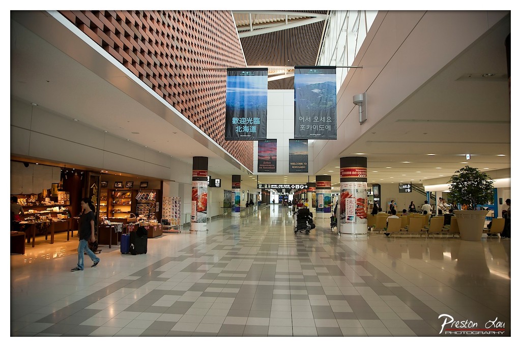
1. Overall Rating (0–10) — 7.0 This photograph captures the quiet grandeur of a modern airport terminal, where architecture and human activity coexist in a measured rhythm. The expansive space, defined by its geometric ceiling and polished floor, evokes a sense of calm transit and cultural openness. While the image successfully conveys the atmosphere of a public space in motion, its emotional resonance is slightly muted by a lack of dynamic engagement with the subject.
2. Composition (0–10) — 7.5 The wide-angle perspective emphasizes the scale and symmetry of the terminal, with leading lines from the tiled floor guiding the eye toward the distant gates. The placement of the walking figure on the left adds narrative weight, while the banners and columns create visual rhythm without overcrowding the frame.
3. Lighting (0–10) — 6.5 The artificial lighting is even and functional, illuminating the space without creating harsh shadows. However, the cool, diffuse quality lacks depth and warmth, giving the scene a sterile, impersonal feel that undermines the potential for atmospheric drama.
4. Color & Tone (0–10) — 6.0 The palette is dominated by neutral grays and whites, with subtle accents from the red-tiled ceiling and the blue-toned banners. While the colors are harmonious, they lack vibrancy and contrast, contributing to a somewhat flat visual tone.
5. Creativity (0–10) — 6.5 The image is a strong architectural document, capturing both the design and function of the space. The inclusion of multilingual signage and cultural banners adds narrative layers, suggesting a gateway between regions and identities, though the execution remains more observational than expressive.
6. Technical Quality (0–10) — 8.0 The image is sharp and well-focused, with clean details throughout the frame. The wide-angle lens is used effectively to capture the vastness of the space, and the exposure is well-balanced, preserving detail in both highlights and shadows.
7. Emotional Impact (0–10) — 6.0 The photograph evokes a sense of quiet anticipation and transience, capturing the liminal space of travel. However, the lack of strong emotional cues or human connection keeps the viewer at a distance, making the experience more observational than deeply felt.
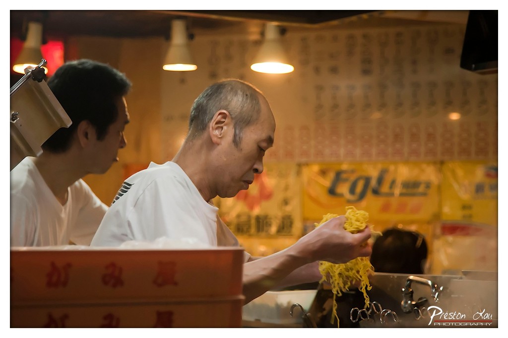
1. Overall Rating (0–10) — 7.0 This photograph captures the focused intensity of a noodle vendor at work, immersing the viewer in the rhythm of a traditional food stall. The warm, ambient lighting and shallow depth of field lend a candid, almost cinematic quality to the scene, while the subject’s concentrated expression and the motion of the noodles suggest a moment rich in cultural authenticity. Though the background signage is slightly distracting, the image succeeds in conveying both the physicality and the quiet dedication of street food craftsmanship.
2. Composition (0–10) — 7.0 The subject is placed off-center, creating a natural visual flow toward the action of the hands, with the foreground box adding depth. The slight tilt and busy background, while slightly overwhelming, reinforce the sense of an active, unposed environment.
3. Lighting (0–10) — 7.5 Warm, directional lighting from above enhances the golden tones of the noodles and skin, casting soft shadows that add dimension. The ambient glow contributes to a cozy, intimate atmosphere, though some areas remain slightly underexposed.
4. Color & Tone (0–10) — 7.0 The palette is dominated by warm yellows and soft whites, with the vibrant yellow of the noodles creating a focal point. The color harmony is pleasing, though the yellow signage in the background introduces a competing hue that slightly disrupts the visual flow.
5. Creativity (0–10) — 7.5 The image captures a moment of everyday labor with an artistic sensibility, elevating a mundane act into a narrative of tradition and skill. The use of shallow depth of field and natural light gives it a documentary yet poetic quality.
6. Technical Quality (0–10) — 7.5 Sharp focus on the hands and noodles, with a well-controlled depth of field, ensures the subject remains clear. The exposure is balanced, and the image retains detail in both highlights and shadows.
7. Emotional Impact (0–10) — 7.0 There is a strong sense of dedication and quiet pride in the vendor’s expression, evoking a feeling of respect for artisanal work. The scene feels authentic and personal, inviting the viewer to appreciate the humanity behind the craft.
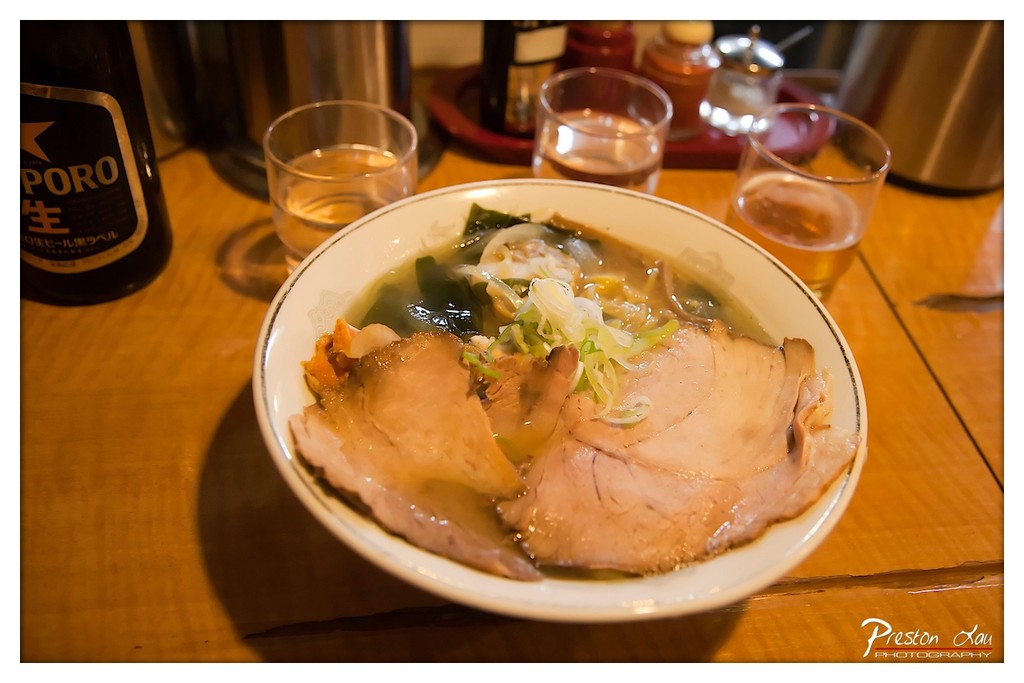
1. Overall Rating (0–10) — 7.0 This photograph captures the comforting warmth of a ramen meal in a dimly lit, intimate setting, evoking a sense of quiet satisfaction and authenticity. The rich, golden glow of the ambient light enhances the textures of the broth and toppings, while the presence of the Sapporo beer bottle grounds the scene in a specific cultural context. While the composition is inviting, the slightly cluttered background and uneven focus detract from the overall visual harmony.
2. Composition (0–10) — 6.5 The bowl is well-centered, drawing the eye to the ramen as the focal point, but the surrounding elements—glasses, bottles, and tray—create a sense of visual clutter that distracts from the main subject. A tighter crop could enhance focus and balance.
3. Lighting (0–10) — 8.0 The warm, low-key lighting enhances the cozy, intimate atmosphere, casting soft shadows that accentuate the steam and texture of the ramen. The use of ambient light creates a natural, candid mood, though some areas are slightly underexposed.
4. Color & Tone (0–10) — 7.0 The warm color palette—dominated by golden yellows and browns—complements the food and setting, creating a harmonious and appetizing tone. The contrast between the dark beer bottle and the lighter bowl adds visual depth, though the colors lack a bit of vibrancy.
5. Creativity (0–10) — 7.5 The image tells a simple yet evocative story of a casual dining experience, capturing a moment of everyday pleasure. The inclusion of cultural elements like the Sapporo bottle adds narrative depth and authenticity, elevating the photograph beyond mere documentation.
6. Technical Quality (0–10) — 7.5 The image is sharp in the center, with good focus on the ramen, though some background elements are slightly soft. The exposure is well-handled, with no harsh highlights or deep shadows, and the focus falloff adds to the intimate feel.
7. Emotional Impact (0–10) — 7.5 The photograph conveys a sense of warmth, comfort, and quiet enjoyment, inviting the viewer to imagine the taste and aroma of the meal. The intimate setting and candid composition create a personal, relatable moment that resonates emotionally.
1. Overall Rating (0–10) — 6.8 This photograph captures a lively, sun-drenched scene at a lavender-themed café, where the interplay of commerce and nature creates a sense of casual charm. The vibrant green menu boards and the purple expanse of lavender in the background provide a strong visual contrast, while the mix of people strolling and dining adds life to the setting. Though the image is rich in context and atmosphere, the slightly cluttered composition and overexposed sky slightly diminish its visual cohesion.
2. Composition (0–10) — 6.0 The frame is anchored by the two menu boards in the foreground, which guide the eye toward the lavender field in the distance. However, the left side feels congested with people and structural elements, creating visual tension. A tighter crop or slight shift in perspective would better balance the elements and emphasize the main subject.
3. Lighting (0–10) — 7.0 Natural daylight illuminates the scene with soft, even light, enhancing the vividness of the lavender and the green signage. The slightly overexposed sky suggests strong overhead sunlight, which, while reducing detail in the upper portion of the frame, contributes to the bright, airy mood.
4. Color & Tone (0–10) — 7.5 The palette is rich and harmonious, with the deep purple of the lavender complementing the green of the menu boards and foliage. The cool tones of the blue bottles and the warm skin tones of the people create a balanced contrast. Slight post-processing enhances saturation without appearing unnatural.
5. Creativity (0–10) — 7.0 The image successfully blends commercial and natural elements into a cohesive narrative—marketing a lavender-themed experience within a real-world setting. The inclusion of Japanese text and branding adds cultural specificity, elevating it beyond a generic travel snapshot.
6. Technical Quality (0–10) — 7.5 The focus is sharp on the menu boards, with the background slightly softened, drawing attention to the intended subject. The image is clear, with minimal noise, and the depth of field is well-controlled. The watermark is unobtrusive and professionally placed.
7. Emotional Impact (0–10) — 6.5 The photograph evokes a sense of leisure and tranquility, capturing a moment of simple pleasure in a scenic setting. While the emotional resonance is pleasant, the lack of a strong focal point or personal story keeps the viewer from fully connecting with the scene.
1. Overall Rating (0–10) — 7.5 This photograph captures the vibrant harmony of a meticulously arranged flower field, where bold color blocks unfold like a painter’s palette beneath a soft, overcast sky. The framing through the foreground leaves adds a sense of intimacy and depth, drawing the viewer into the scene as if stepping through a natural archway. While the composition is striking, the slightly muted lighting tempers the visual punch of the colors, preventing the image from fully radiating its potential energy.
2. Composition (0–10) — 8.0 The layered arrangement—foreground foliage, midground flower beds, and background cabin and trees—creates a strong sense of depth. The natural frame of the leaves enhances focus, guiding the eye toward the colorful rows and the distant structure, though the composition feels slightly unbalanced due to the heavy foliage on the right.
3. Lighting (0–10) — 6.0 Diffused light from the overcast sky softens shadows and evenly illuminates the scene, preserving detail across the flower beds. However, the lack of direct sunlight reduces contrast and diminishes the richness of the colors, lending a slightly flat quality to the image.
4. Color & Tone (0–10) — 8.5 The bold, saturated bands of red, purple, and blue create a visually arresting palette, enhanced by the cool green tones of the surrounding foliage. The tonal range is well-balanced, with the natural color harmony contributing to the image’s aesthetic appeal and sense of order.
5. Creativity (0–10) — 7.5 The use of framing through the leaves adds a narrative quality, suggesting discovery and immersion. The structured layout of the flower fields evokes a sense of human intention and design, blending nature and artistry in a compelling way.
6. Technical Quality (0–10) — 8.0 The image is sharp and well-focused, with fine detail visible in both the foreground and background. The exposure is consistent, and there are no distracting artifacts, indicating strong technical execution.
7. Emotional Impact (0–10) — 7.0 The scene evokes a sense of calm wonder and delight, inviting the viewer to pause and appreciate the beauty of cultivated nature. The quiet presence of distant figures adds a subtle human element, enhancing the feeling of peaceful coexistence with the landscape.
1. Overall Rating (0–10) — 6.0 This photograph presents a straightforward yet charming snapshot of a Japanese melon stand, capturing the meticulous care and cultural value placed on these fruits. The orderly arrangement of boxes and clearly labeled prices convey a sense of authenticity and local pride. While the image is rich in detail and context, its technical execution—particularly in lighting and color—holds it back from emotional resonance, making it feel more like a document than a compelling visual story.
2. Composition (0–10) — 6.5 The symmetrical layout of the melons on two shelves creates a balanced, almost grid-like composition, emphasizing repetition and order. However, the slightly off-center framing and cluttered background distract from the clean visual rhythm, reducing the overall impact.
3. Lighting (0–10) — 5.5 Natural daylight illuminates the scene evenly, but the lack of directional light results in flat, untextured shadows. The bright overhead light washes out some details in the white boxes, diminishing depth and contrast.
4. Color & Tone (0–10) — 6.0 The palette is dominated by muted whites, greens, and purples, creating a cohesive but subdued tone. The green labels stand out slightly, drawing attention to the pricing, yet the overall color harmony feels functional rather than expressive.
5. Creativity (0–10) — 6.5 The image captures a culturally specific moment with sincerity, showcasing a local tradition with clarity. However, the approach is observational rather than interpretive, offering little in the way of originality or narrative twist.
6. Technical Quality (0–10) — 7.0 The photograph is sharp and well-focused, with clear details in the melons, labels, and wood textures. The exposure is mostly balanced, though slight overexposure in the upper right corner detracts from overall refinement.
7. Emotional Impact (0–10) — 5.5 While the scene evokes a sense of quiet tradition and pride in craftsmanship, the lack of emotional depth and intimate framing keeps the viewer at a distance, making the experience more informational than evocative.
1. Overall Rating (0–10) — 6.0 This photograph presents a clear and informative map of Farm Tomita, capturing its layout with a blend of practicality and illustrative charm. The vibrant, hand-drawn style of the map adds a whimsical, welcoming tone, while the surrounding greenery grounds it in a natural setting. However, the image feels slightly underwhelming due to the lack of dynamic lighting and the absence of human presence, which keeps the scene from feeling fully alive.
2. Composition (0–10) — 7.0 The map is centered and framed well, with the green post and foliage providing natural borders. The text and illustrations are legible, though the information density on the left side creates a slight visual imbalance. A tighter crop could improve focus and reduce distraction.
3. Lighting (0–10) — 6.0 Soft, diffused daylight evenly illuminates the sign, minimizing harsh shadows and preserving the legibility of the map. While the lighting is functional, it lacks the warmth or contrast that would elevate the mood or emphasize the colors.
4. Color & Tone (0–10) — 7.0 The map’s palette is bright and engaging, with pastel hues lending a playful, pastoral feel. The green frame and background foliage create a harmonious color harmony, though the overall tone remains somewhat flat due to the neutral lighting.
5. Creativity (0–10) — 7.0 The choice to photograph a map as a subject is unconventional yet effective, transforming a utilitarian object into a narrative document of place. The hand-drawn style of the map adds artistic flair, suggesting a thoughtful, curated experience at the farm.
6. Technical Quality (0–10) — 8.0 The image is sharp and well-focused, with clear details in both the map’s text and the surrounding environment. The exposure is balanced, and the depth of field keeps the sign in crisp focus while softly blurring the background.
7. Emotional Impact (0–10) — 5.5 The photograph evokes a sense of quiet anticipation and wanderlust, inviting the viewer to imagine strolling through the fields and gardens. However, the lack of human interaction or personal connection limits its emotional resonance, leaving the scene more informational than evocative.
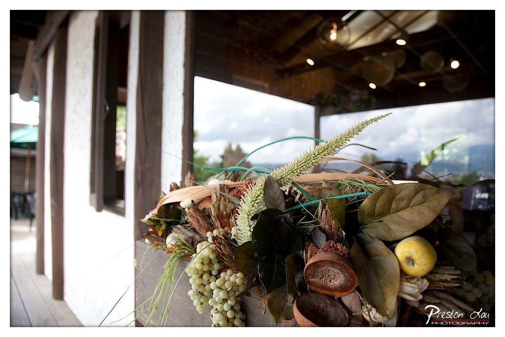
1. Overall Rating (0–10) — 7.0 This photograph captures a richly textured still life of dried botanicals and fruit, set against a softly blurred outdoor backdrop that suggests a rustic, contemplative space. The interplay of natural materials and ambient light lends a warm, earthy mood, though the composition feels slightly crowded, preventing a more cohesive visual narrative. The image succeeds in evoking a sense of seasonal abundance and quiet domesticity, but could benefit from tighter framing and more intentional focus.
2. Composition (0–10) — 6.5 The arrangement is visually dense, with the floral and fruit elements filling the lower half of the frame, creating a strong base. However, the left side feels underutilized, and the diagonal lines of the foliage and structural beams create a slightly unbalanced feel. A more centered or asymmetrical composition would enhance visual harmony.
3. Lighting (0–10) — 7.0 Natural light filters in from the background, softly illuminating the textures of the dried leaves and fruit. The warm glow from the overhead lights adds depth and a subtle glow to the upper portion of the frame, enhancing the cozy, indoor-outdoor atmosphere.
4. Color & Tone (0–10) — 7.0 The palette is rich with earthy tones—browns, olive greens, and soft yellows—complemented by the cool gray of the distant sky. The contrast between the warm foreground and cool background adds visual interest, while the muted tones contribute to a calm, organic feel.
5. Creativity (0–10) — 7.5 The choice to blend natural textures with a blurred architectural backdrop creates a layered, narrative quality. The inclusion of both real and artificial elements suggests a deliberate, artistic approach to still life, evoking themes of memory and the passage of time.
6. Technical Quality (0–10) — 8.0 The focus is sharp on the central bouquet, with a shallow depth of field that effectively isolates the subject from the background. The image is clear, well-exposed, and free of noticeable flaws, demonstrating strong technical control.
7. Emotional Impact (0–10) — 7.0 The photograph evokes a sense of warmth, nostalgia, and quiet contemplation. The organic textures and soft lighting invite the viewer to pause and reflect, creating a gentle emotional resonance that lingers beyond the initial glance.
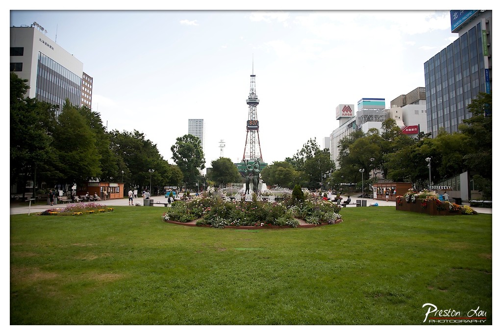
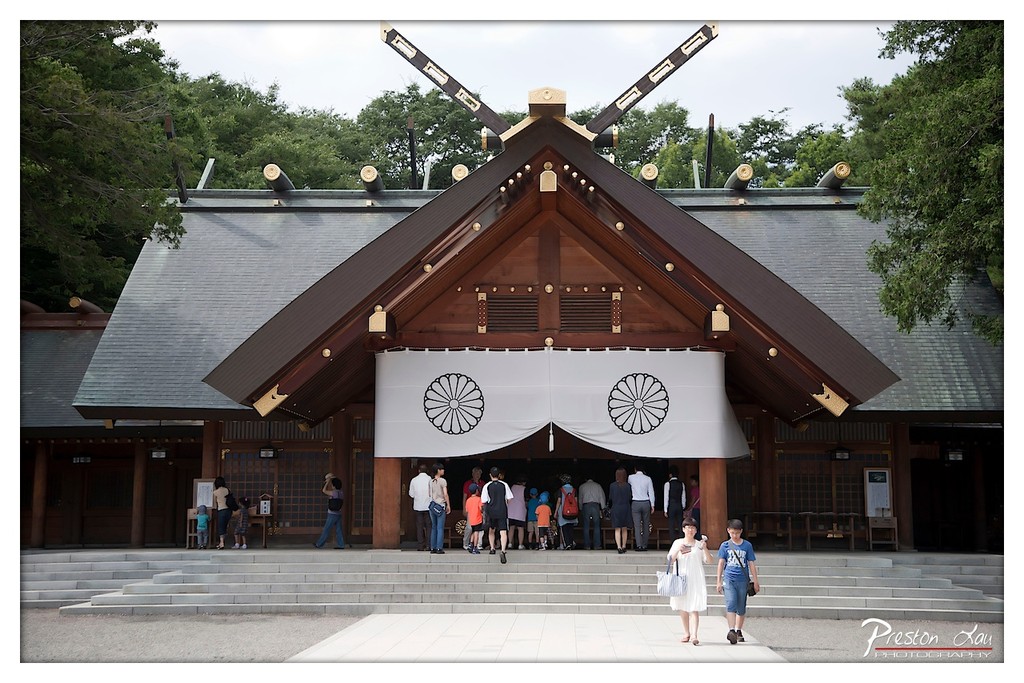
Our journey began as we arrived in Sapporo (札幌), the capital and one of Japan's youngest major cities. Sapporo has a lively, modern feel, serving as a hub for culture, food, and entertainment in Hokkaido. While internationally famous for its spectacular annual Snow Festival held each February, the city has plenty to offer in the summer too, including being the birthplace of renowned ramen and beer styles that are a must-try for any visitor.
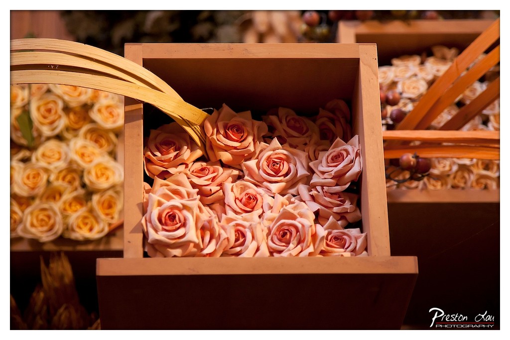
1. Overall Rating (0–10) — 7.0 This photograph captures a warm, intimate still life of artificial roses nestled in wooden crates, evoking a sense of rustic elegance and quiet celebration. The soft, golden lighting enhances the delicate textures of the flowers and the natural grain of the wood, creating a visually harmonious and inviting scene. While the composition is rich in detail and mood, it lacks a strong focal point, allowing the background elements to distract from the central subject.
2. Composition (0–10) — 6.5 The central crate is well-framed, but the surrounding elements—especially the blurred flowers and basket handles—create visual noise. A tighter crop would improve focus and balance.
3. Lighting (0–10) — 8.0 Warm, directional lighting enhances the depth and texture of the roses and wood, casting soft shadows that add dimension and a cozy, intimate atmosphere.
4. Color & Tone (0–10) — 7.5 The palette of soft peach, cream, and golden brown is harmonious and evocative, with a subtle warmth that enhances the romantic, autumnal feel of the scene.
5. Creativity (0–10) — 7.0 The choice of artificial roses and rustic containers suggests a curated, thematic display, likely for a wedding or event. While not entirely original in concept, the execution conveys a thoughtful aesthetic.
6. Technical Quality (0–10) — 8.0 The image is sharp in focus, with clear detail in the roses and wood grain. The shallow depth of field effectively isolates the subject while keeping the background softly out of focus.
7. Emotional Impact (0–10) — 7.5 The photograph evokes a sense of warmth, nostalgia, and gentle beauty, inviting the viewer into a quiet, celebratory moment. The emotional resonance lies in its simplicity and tactile richness.
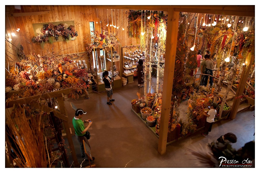
1. Overall Rating (0–10) — 7.5 This photograph captures the warm, immersive atmosphere of a seasonal floral and gift shop, where natural textures and autumnal hues create a rich, sensory experience. The elevated perspective offers a sweeping view of the space, highlighting its abundance and inviting complexity. While the composition feels slightly crowded, the interplay of light, color, and human activity gives the image a lively, almost theatrical energy—though it occasionally risks overwhelming the viewer with detail.
2. Composition (0–10) — 7.0 The high-angle shot provides a comprehensive view of the space, with strong diagonal lines formed by wooden beams and hanging decorations guiding the eye through the scene. The placement of figures adds scale and life, though the left side feels slightly more cluttered, drawing attention away from the central display.
3. Lighting (0–10) — 8.0 Warm, ambient lighting from numerous hanging bulbs creates a cozy, inviting glow that enhances the autumnal theme. The soft illumination highlights textures and depth, casting gentle shadows that add dimension without obscuring key elements.
4. Color & Tone (0–10) — 8.5 The palette of oranges, browns, and golds evokes a rich, seasonal warmth, complemented by the natural wood tones of the interior. The contrast between the warm lights and cooler shadows creates a balanced and harmonious tone that feels both organic and curated.
5. Creativity (0–10) — 8.0 The photographer captures the space not just as a commercial environment, but as a curated, immersive experience. The use of elevated perspective and attention to seasonal detail conveys a sense of wonder, transforming a simple shop into a celebration of nature and craftsmanship.
6. Technical Quality (0–10) — 8.0 Sharp focus across the frame ensures clarity in both foreground and background elements. The wide-angle lens is used effectively to capture the full scope of the space, with minimal distortion and clean detail throughout.
7. Emotional Impact (0–10) — 7.5 The image evokes a sense of warmth, nostalgia, and quiet joy, inviting the viewer to step into a world where nature and commerce blend seamlessly. The presence of people exploring the space adds a human touch, making the scene feel alive and relatable.
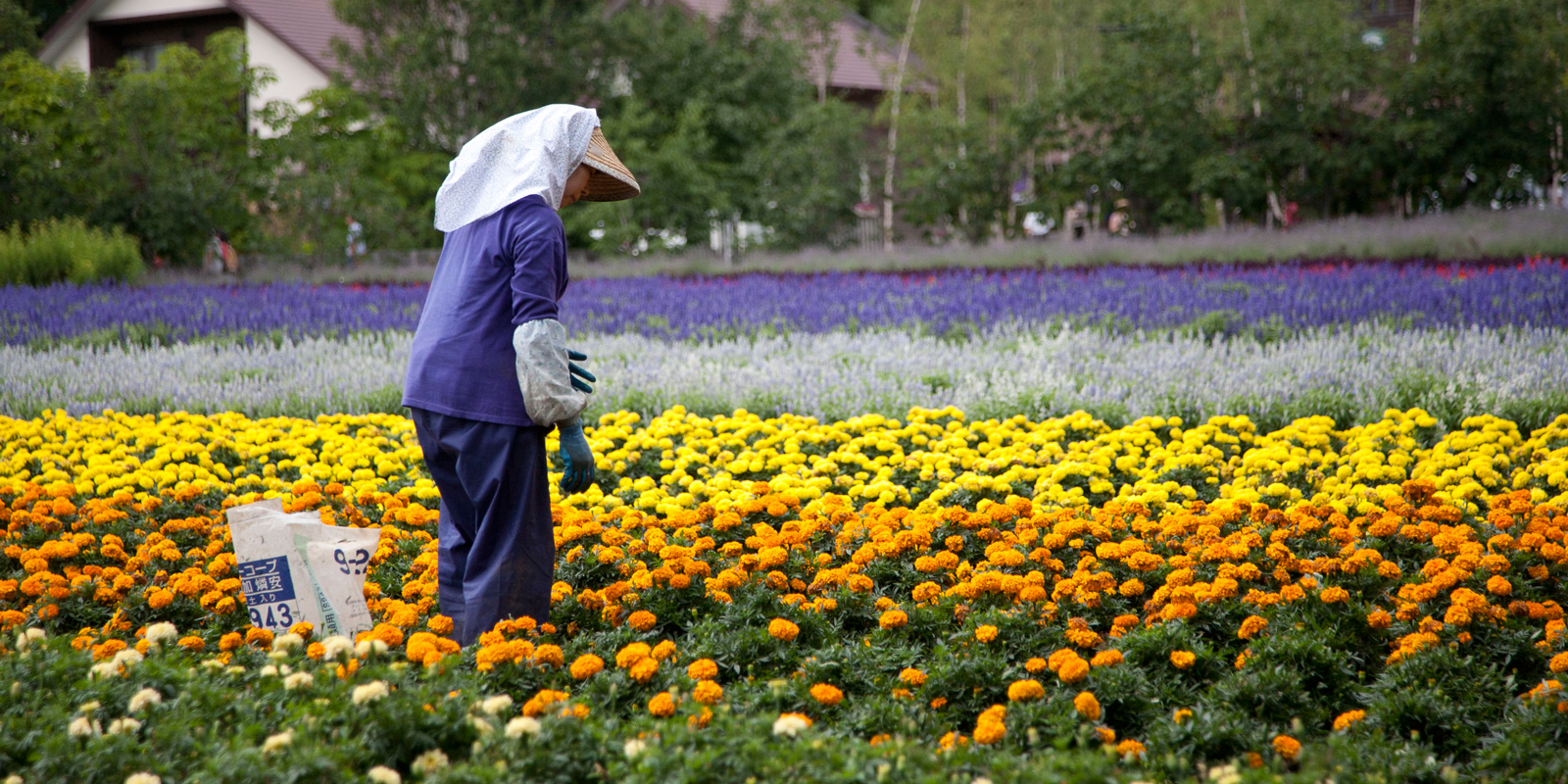
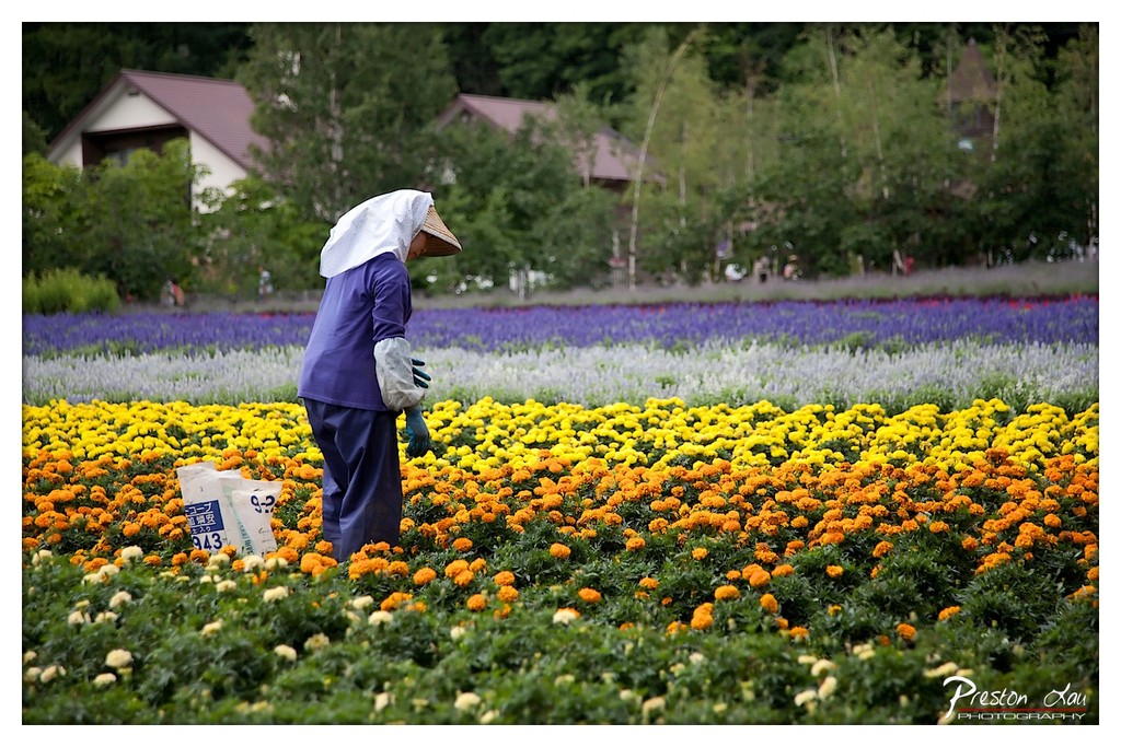
1. Overall Rating (0–10) — 7.5 This photograph captures a serene moment of labor amidst a vibrant floral landscape, where the harmony of color and human presence evokes a sense of quiet dedication. The contrast between the orderly rows of marigolds and the solitary figure in traditional attire creates a visually poetic narrative of cultivation and care. While the composition is rich in color and context, the image could benefit from stronger focal depth and a more dynamic sense of movement to elevate its emotional resonance.
2. Composition (0–10) — 7.0 The subject is placed off-center, creating a natural flow from the foreground flowers toward the figure and background, though the wide framing slightly dilutes focus. The rows of flowers lead the eye effectively, but the inclusion of distant houses introduces visual noise.
3. Lighting (0–10) — 7.0 Soft, diffused daylight evenly illuminates the scene, enhancing the richness of the flower colors without harsh shadows. The overcast light contributes to a calm, contemplative mood, though it slightly flattens the depth of the landscape.
4. Color & Tone (0–10) — 8.5 The vivid contrast between the golden-orange marigolds, purple lupines, and soft white blossoms creates a striking, layered palette. The cool green backdrop and the figure’s purple garment harmonize with the scene’s natural tones, giving the image a rich, painterly quality.
5. Creativity (0–10) — 8.0 The juxtaposition of traditional agricultural practice against a meticulously landscaped flower field suggests a thoughtful blend of culture and nature. The image feels both documentary and artistic, capturing a moment that is both authentic and visually elevated.
6. Technical Quality (0–10) — 8.0 The image is sharp and well-focused, with clear detail in the flowers and subject. The depth of field is appropriately managed, allowing the foreground and midground to remain crisp while softly blurring the background.
7. Emotional Impact (0–10) — 7.5 The quiet dignity of the worker, combined with the beauty of the blooms, evokes a sense of reverence for nature and labor. The image invites reflection on tradition, care, and the quiet beauty of everyday work.
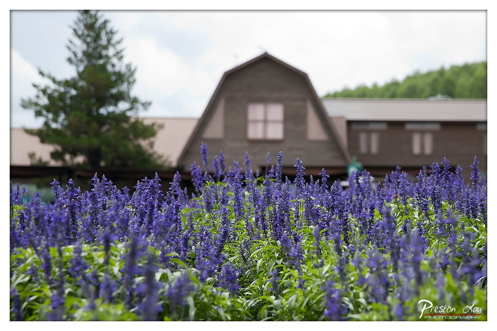
1. Overall Rating (0–10) — 7.0 This photograph captures a serene, pastoral moment where vibrant purple flowers bloom in the foreground, leading the eye toward a softly blurred wooden structure nestled among trees. The shallow depth of field creates a dreamy, painterly quality that emphasizes the natural beauty of the scene. While the image is visually pleasing and well-composed, it lacks a strong focal point or narrative edge, making it more of a tranquil landscape than a compelling story.
2. Composition (0–10) — 7.5 The low-angle perspective places the viewer at eye level with the flowers, creating an immersive experience. The blurred building in the background provides context without distracting, and the placement of the foliage on the left balances the frame effectively.
3. Lighting (0–10) — 6.5 Soft, diffused light from an overcast sky evenly illuminates the scene, preventing harsh shadows and preserving the delicate texture of the blossoms. While the lighting is gentle and flattering, it lacks the warmth or contrast that could enhance the mood.
4. Color & Tone (0–10) — 8.0 The rich purple of the flowers contrasts beautifully with the lush green leaves and the muted brown of the building. The color palette is harmonious and natural, with a subtle cool tone that reinforces the calm, tranquil atmosphere.
5. Creativity (0–10) — 7.0 The use of shallow depth of field and natural framing is effective and intentional, evoking a sense of intimacy with nature. The image feels like a still moment from a quiet countryside retreat, though it leans toward conventional scenic photography rather than bold artistic expression.
6. Technical Quality (0–10) — 8.0 The focus is sharp on the foreground blooms, while the background is smoothly out of focus, demonstrating strong technical control. The image is clean, well-exposed, and free of noise, with a clear signature of the photographer in the corner.
7. Emotional Impact (0–10) — 7.5 The photograph evokes a sense of peace and quiet contemplation, inviting the viewer to pause and appreciate the simple beauty of nature. The soft focus and gentle colors create a calming, meditative mood that resonates emotionally.
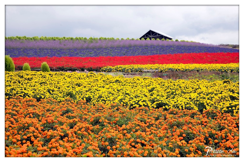
1. Overall Rating (0–10) — 7.5 This photograph bursts with vibrant color and geometric harmony, capturing the grandeur of a meticulously arranged flower field under an overcast sky. The bold horizontal bands of orange, yellow, red, and purple create a striking visual rhythm, while the distant barn adds a subtle narrative anchor. Though the cloudy sky tempers the mood with a soft, muted light, the composition's sheer vibrancy and scale give it a joyful, almost theatrical energy. A tighter framing might have intensified the impact, but as it stands, the image succeeds in celebrating nature’s artistry and human design in equal measure.
2. Composition (0–10) — 8.0 The layered rows of flowers create strong horizontal lines that guide the eye across the frame, with the barn positioned slightly off-center to add balance. The foreground’s depth of field and the gradual progression of color bands enhance the sense of scale and perspective.
3. Lighting (0–10) — 6.5 Diffuse, overcast light softens shadows and evenly illuminates the scene, preserving the integrity of the colors. While the lack of direct sunlight mutes the warmth and contrast, it allows the vivid hues to stand out without harsh highlights or blown-out whites.
4. Color & Tone (0–10) — 9.0 The palette is exceptionally rich and harmonious, with bold, saturated bands of orange, yellow, red, and purple creating a dynamic yet cohesive visual rhythm. The natural green foliage and muted sky serve as a neutral backdrop, allowing the flowers to dominate with clarity and emotional resonance.
5. Creativity (0–10) — 8.0 The photograph leverages the inherent order and color theory of the flower fields to create a visually arresting composition. The choice to capture the full expanse emphasizes the scale and intentionality of the design, transforming a simple landscape into a celebration of pattern and color.
6. Technical Quality (0–10) — 8.5 The image is sharp and detailed throughout, with clear focus across the foreground and midground. The white border enhances the presentation, and the watermark is discreet, maintaining professionalism without distracting from the subject.
7. Emotional Impact (0–10) — 8.0 The scene evokes a sense of awe and delight, inviting the viewer into a world of color and order. The vibrant fields, though man-made, feel alive and joyful, stirring feelings of wonder and serenity in the viewer.
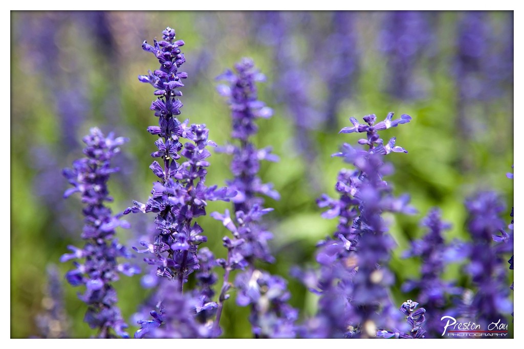
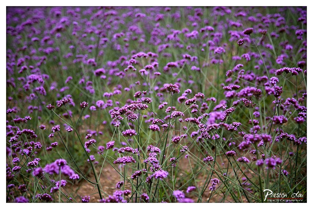
1. Overall Rating (0–10) — 7.5 This photograph captures the delicate elegance of lavender in soft focus, where the interplay of color and depth creates a dreamlike, almost meditative quality. The vibrant purple blooms stand out against a gently blurred green backdrop, evoking a sense of calm and natural beauty. While the image is visually pleasing and well-executed, it lacks a strong focal point or narrative tension, making it more of a pleasant observation than a compelling statement.
2. Composition (0–10) — 7.0 The central cluster of lavender draws the eye, but the scattered placement of additional blooms across the frame creates a slightly uneven balance. A tighter crop or more deliberate subject placement could enhance visual harmony.
3. Lighting (0–10) — 8.0 Soft, diffused daylight bathes the scene in a gentle glow, enhancing the natural saturation of the purple without harsh shadows or overexposure. The light supports the tranquil mood and highlights the texture of the flowers.
4. Color & Tone (0–10) — 8.5 The complementary contrast between rich purple and soft green creates a visually harmonious palette. The colors are vibrant yet natural, with a subtle tonal gradient that adds depth and visual interest.
5. Creativity (0–10) — 7.5 The photographer uses shallow depth of field effectively to isolate the subject and evoke a sense of intimacy. The choice to focus on a single cluster while allowing the rest to dissolve into bokeh adds a contemplative, artistic touch.
6. Technical Quality (0–10) — 8.0 The image is sharp where it matters, with clean focus on the foreground blossoms and smooth transitions into the background. The color balance and exposure are well-managed, showcasing technical proficiency.
7. Emotional Impact (0–10) — 8.0 The soft focus and soothing color scheme evoke a sense of peace and serenity, inviting the viewer to pause and reflect. There’s a quiet beauty here that resonates emotionally, if not dramatically.
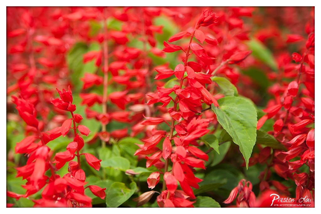
1. Overall Rating (0–10) — 8.0 This photograph captures the vibrant energy of a dense floral display, where the bold reds of salvia blossoms burst with life against a soft, green backdrop. The shallow depth of field creates a dreamy, immersive quality, drawing the eye into the textured cascade of petals. While the image is visually arresting, it occasionally borders on overwhelming due to the saturation and repetition of form, which slightly dilutes the emotional subtlety.
2. Composition (0–10) — 7.5 The central cluster of flowers draws immediate attention, with the diagonal lines of the stems guiding the eye through the frame. The balance between red and green creates visual harmony, though the lack of a clear focal point in the background risks visual clutter.
3. Lighting (0–10) — 8.0 Soft, diffused light enhances the natural vibrancy of the reds without harsh shadows, allowing the petals to glow with rich saturation. The even illumination contributes to the photograph’s lush, almost painterly quality.
4. Color & Tone (0–10) — 9.0 The vivid reds contrast beautifully with the lush green foliage, creating a dynamic and harmonious palette. The warm tones evoke a sense of vitality and warmth, while the subtle tonal variations within the reds add depth and dimension.
5. Creativity (0–10) — 8.5 The use of selective focus and tight framing transforms a common floral subject into an intimate, sensory experience. The photographer’s intent to emphasize texture and color is executed with a strong sense of visual storytelling.
6. Technical Quality (0–10) — 8.5 Sharp focus on the central bloom, combined with a smooth bokeh background, demonstrates excellent control over depth of field. The image is clean, well-exposed, and free of distracting artifacts.
7. Emotional Impact (0–10) — 8.0 The photograph evokes a sense of joy and natural abundance, inviting the viewer to pause and appreciate the beauty of the moment. The intensity of the reds stirs a feeling of passion and vitality, making the image both visually and emotionally engaging.
1. Overall Rating (0–10) — 7.5 This photograph captures the serene beauty of a vast field of purple flowers, evoking a sense of calm and natural abundance. The soft focus and rich color palette create a dreamy, almost impressionistic quality, while the depth of field draws the viewer into the floral expanse. Though the image is visually pleasing, it lacks a strong focal point, which slightly diminishes its narrative impact.
2. Composition (0–10) — 6.5 The frame is filled with dense floral clusters, creating a textured pattern that fills the scene. The lack of a clear subject or leading line results in a somewhat diffuse composition, though the diagonal arrangement of stems adds subtle movement.
3. Lighting (0–10) — 7.0 Soft, diffused light enhances the delicate texture of the blossoms and creates a gentle glow across the field. The even illumination prevents harsh shadows, supporting the image’s tranquil mood.
4. Color & Tone (0–10) — 8.0 The vibrant purples contrast beautifully with the muted green stems and earthy background, creating a harmonious and visually rich palette. The color grading enhances saturation without appearing artificial.
5. Creativity (0–10) — 7.0 The photographer uses selective focus and color to transform a simple field into an atmospheric landscape. While the concept is familiar, the execution offers a poetic interpretation of nature.
6. Technical Quality (0–10) — 8.0 Sharpness is well-managed in the mid-ground, with a pleasing bokeh effect in the background. The image is clean, with minimal noise and good dynamic range.
7. Emotional Impact (0–10) — 7.5 The image evokes a sense of peace and wonder, inviting contemplation of nature’s quiet beauty. The soft focus and color palette create a meditative, almost nostalgic atmosphere.
From Sapporo, we ventured out to the central Hokkaido region, specifically the beautiful cities of Furano (富良野) and Biei (美瑛). This area is celebrated for its incredibly pleasant and picturesque rural landscapes, characterized by gently rolling hills, vast agricultural fields, and charming farmhouses. The summer months transform this region into a breathtaking spectacle, as the famous lavender fields burst into vibrant bloom everywhere you look, painting the countryside in hues of purple.
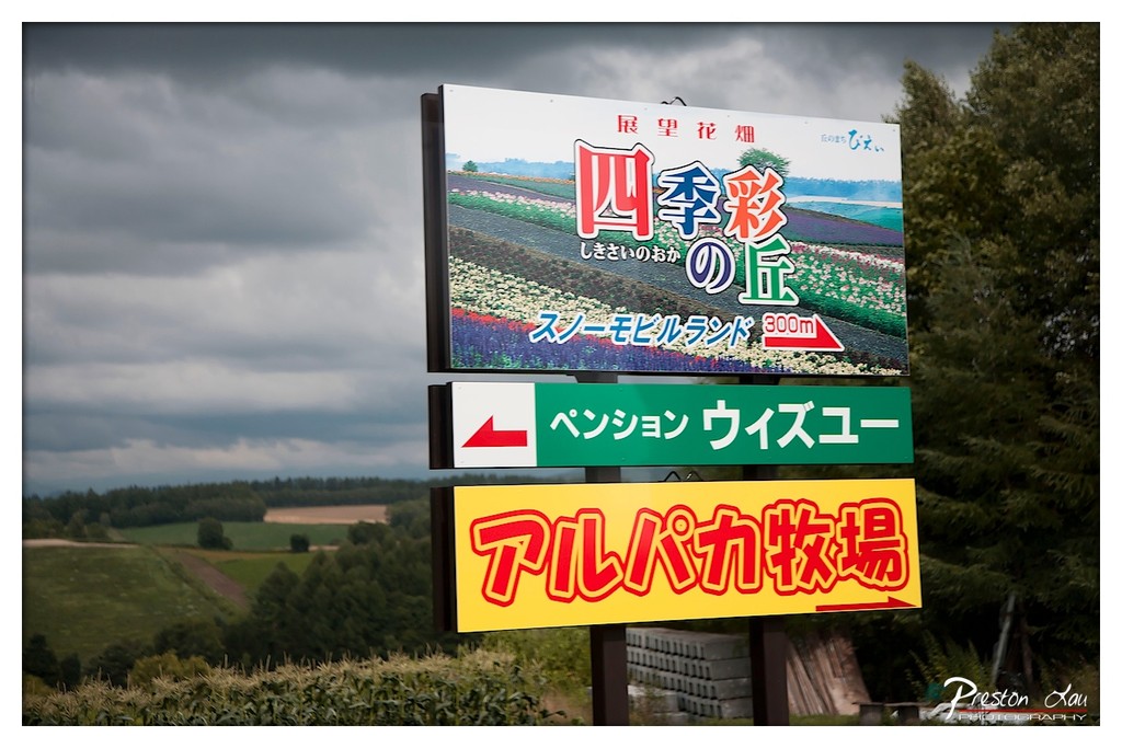
1. Overall Rating (0–10) — 6.0 This photograph captures a striking contrast between the vibrant, commercial signage and the moody, overcast landscape behind it, evoking a sense of quiet anticipation. The layered signs, with their bold colors and Japanese text, stand out against the somber sky and rolling fields, creating a visual tension between nature and human intervention. While the composition is strong in its juxtaposition, the image feels slightly heavy with information, and the lack of a clear focal point keeps the viewer from fully engaging with the scene.
2. Composition (0–10) — 6.0 The vertical arrangement of signs creates a strong central axis, but the framing is slightly off-center, placing too much emphasis on the left side. The background landscape provides context but competes for attention, weakening the focus on the primary subject.
3. Lighting (0–10) — 5.5 The overcast sky casts a flat, diffused light across the scene, minimizing shadows and reducing depth. While this lighting supports the moody atmosphere, it also dulls the vibrancy of the signs, making them appear less dynamic than intended.
4. Color & Tone (0–10) — 6.5 The bright reds, yellows, and greens of the signs create a bold contrast against the muted greens and grays of the landscape. The color palette is lively and attention-grabbing, though the tonal range is limited by the flat lighting, preventing deeper visual impact.
5. Creativity (0–10) — 6.5 The image successfully juxtaposes the commercial and natural, offering a commentary on tourism and rural development. The choice to frame the signs against a dramatic sky adds narrative depth, though the execution leans more on documentation than artistic interpretation.
6. Technical Quality (0–10) — 7.0 The image is sharp and well-focused, with clean details in the signage and background. The exposure is balanced, and the depth of field is appropriate, allowing both the signs and the landscape to remain clear.
7. Emotional Impact (0–10) — 5.5 The scene evokes a sense of quiet melancholy and subtle irony, as the cheerful signage contrasts with the somber weather and expansive, untouched land. While the emotional resonance is present, it remains understated, leaving the viewer with a sense of distance rather than deep connection.
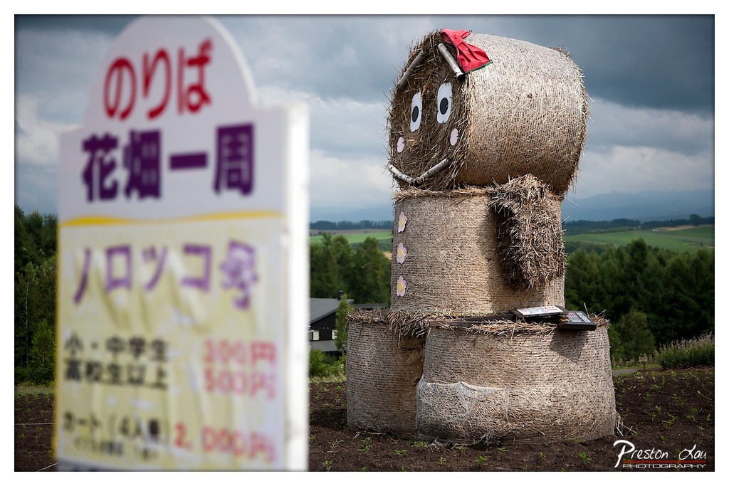
1. Overall Rating (0–10) — 6.0 This image captures a whimsical rural installation—a hay bale figure resembling a character—set against a moody, overcast sky and a sweeping countryside. The juxtaposition of the playful sculpture with the serious, text-heavy sign in the foreground creates a curious narrative tension. While the scene is visually engaging and rich in cultural context, the shallow depth of field and slight blur on the sign reduce clarity, making the overall composition feel somewhat disjointed.
2. Composition (0–10) — 6.5 The hay figure is well-centered and dominates the frame, drawing immediate attention. However, the large, out-of-focus sign on the left disrupts visual balance, creating a compositional clash between foreground and background. A tighter crop or deeper focus on the sign could better unify the elements.
3. Lighting (0–10) — 6.0 The overcast sky provides soft, diffused light that evenly illuminates the scene, minimizing harsh shadows. While this suits the moody atmosphere, it also flattens the texture of the hay and reduces the depth of the landscape in the background.
4. Color & Tone (0–10) — 6.5 The palette is natural and earthy, with muted browns of the hay and greens of the distant fields. The red of the bow on the figure provides a subtle pop, but the overall tone is subdued due to the cloudy sky, giving the image a quiet, contemplative feel.
5. Creativity (0–10) — 7.0 The concept of a hay bale character is imaginative and culturally specific, likely tied to a local festival or agricultural art. The integration of the sign with Japanese text adds authenticity and narrative depth, suggesting a story beyond the visual.
6. Technical Quality (0–10) — 6.0 The focus is sharp on the hay figure, but the foreground sign is blurred, likely due to shallow depth of field. While intentional, this choice compromises legibility and visual coherence. The image is technically competent but not fully resolved in its execution.
7. Emotional Impact (0–10) — 6.5 The scene evokes a sense of rural charm and quiet celebration, with the hay figure conveying a gentle, playful spirit. The overcast sky adds a touch of melancholy, creating a bittersweet mood that resonates with the fleeting nature of seasonal events.
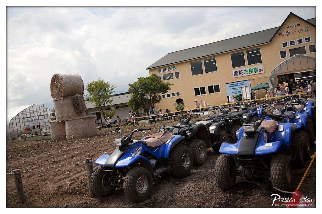
1. Overall Rating (0–10) — 6.0 This image captures a lively rural attraction, blending agricultural elements with recreational activity in a way that feels both authentic and inviting. The lineup of blue ATVs draws the eye, while the stacked hay bales and greenhouse add texture and context to the setting. However, the composition is slightly overbusy, and the muted sky tempers the overall energy, resulting in a photograph that feels more like a snapshot than a polished scene.
2. Composition (0–10) — 5.5 The diagonal line of ATVs leads the viewer’s eye through the frame, but the cluttered background and off-center building disrupt visual harmony. The hay bales on the left provide a strong focal point, though they compete with the building and people for attention.
3. Lighting (0–10) — 5.0 Diffuse, overcast light flattens the scene, minimizing shadows and reducing depth. While it ensures even exposure, the lack of directional light gives the image a muted, almost documentary feel.
4. Color & Tone (0–10) — 5.5 The dominant blue of the ATVs contrasts with the earthy browns and muted greens, but the overall palette is subdued. The yellow building provides a point of warmth, but the cloudy sky drains vibrancy from the scene.
5. Creativity (0–10) — 6.0 The juxtaposition of farm life and recreational vehicles suggests a modern agritourism concept. The image tells a story of rural innovation, though it lacks a strong visual hook or emotional narrative.
6. Technical Quality (0–10) — 7.0 The image is sharp and well-focused, with clear details in the ATVs and background elements. The watermark is unobtrusive, and the exposure is balanced, though some areas lack depth due to lighting.
7. Emotional Impact (0–10) — 5.0 The scene evokes a sense of casual fun and rural charm, but the lack of human engagement and emotional warmth keeps the viewer at a distance. It feels more like a place than a moment.
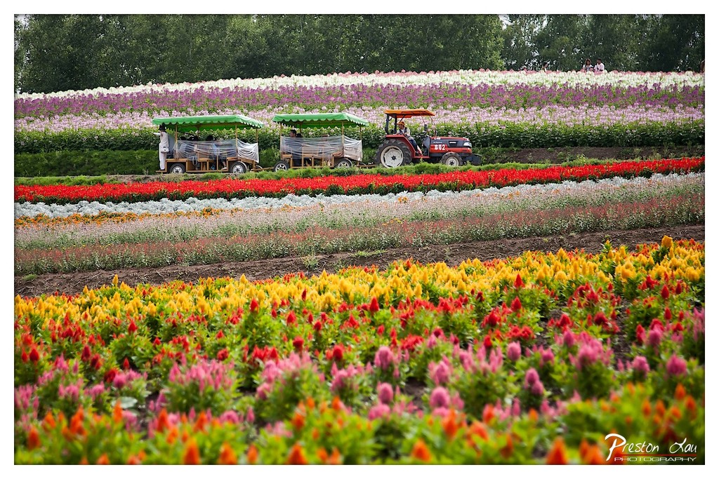
1. Overall Rating (0–10) — 8.0 This photograph bursts with color and vitality, capturing the joyful chaos of a flower farm in full bloom. The sweeping rows of vivid blossoms create a natural rhythm that draws the eye across the frame, while the presence of the tractor and passenger carts adds a narrative layer of human activity and leisure. The image is rich in detail and emotional warmth, though the slightly busy composition risks overwhelming the viewer if not carefully balanced.
2. Composition (0–10) — 7.5 The layered rows of flowers create a strong sense of depth and leading lines, guiding the viewer from the foreground into the middle ground. The placement of the tractor and carts adds a human element without disrupting the visual harmony, though the central positioning slightly flattens the dynamic tension.
3. Lighting (0–10) — 8.0 Soft, diffused daylight enhances the saturation of the flowers without harsh shadows, allowing the colors to glow naturally. The even exposure preserves detail across the entire frame, from the foreground blooms to the distant treeline.
4. Color & Tone (0–10) — 9.0 The palette is vibrant and varied, with rich yellows, reds, pinks, and purples creating a joyful, almost painterly effect. The contrast between warm tones in the foreground and cooler hues in the background adds visual interest and depth.
5. Creativity (0–10) — 8.5 The photograph captures both the beauty of nature and the human touch of cultivation, blending landscape and narrative in a compelling way. The use of a wide perspective and the inclusion of people and machinery elevate it beyond a simple floral portrait into a celebration of place and activity.
6. Technical Quality (0–10) — 8.5 The image is sharp and well-focused throughout, with excellent clarity and detail in the foreground flowers. The depth of field is effectively managed, keeping the key subjects in focus while softly blurring the background to maintain balance.
7. Emotional Impact (0–10) — 8.0 The scene evokes a sense of wonder, tranquility, and delight—inviting the viewer to imagine the scent of blossoms and the sound of a gentle breeze through the fields. The presence of people enjoying the space adds a warm, communal feel that enhances the emotional resonance.
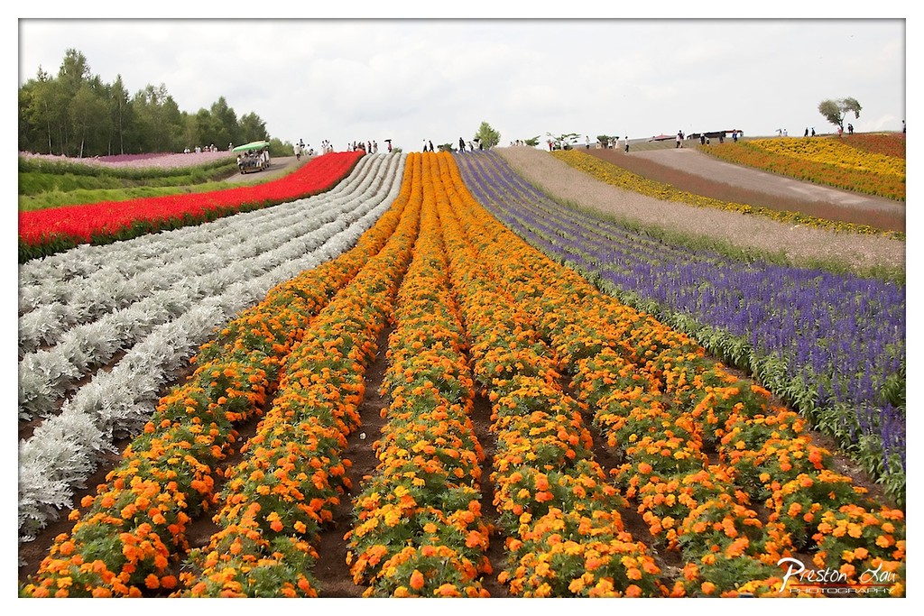
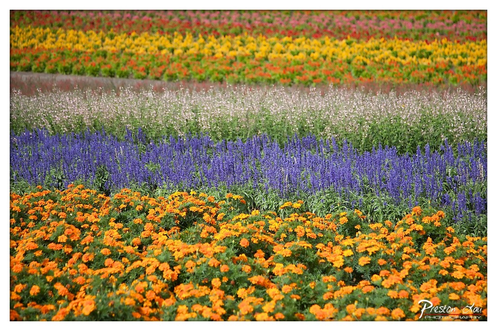
1. Overall Rating (0–10) — 7.5 This photograph captures the vibrant rhythm of a vast flower field, where color and geometry converge to create a striking visual harmony. The orderly rows of marigolds, lavender, and silver foliage draw the eye deep into the frame, evoking a sense of abundance and meticulous design. While the composition is inherently compelling, the overcast sky tempers the vibrancy of the blooms, slightly dampening the image’s emotional punch.
2. Composition (0–10) — 8.0 The strong leading lines of the flower rows create a powerful sense of depth and perspective, guiding the viewer’s gaze toward the distant horizon. The placement of the winding path and scattered visitors adds scale and human context, enhancing the image’s narrative quality.
3. Lighting (0–10) — 6.0 The diffused light from the overcast sky softens shadows and evenly illuminates the scene, but it also flattens the color intensity and reduces contrast. While this prevents harsh highlights, it diminishes the dynamic quality that might otherwise elevate the image.
4. Color & Tone (0–10) — 7.5 The palette is rich and diverse, with bold oranges, purples, and whites arranged in a visually satisfying sequence. The cool tones of the sky contrast gently with the warmth of the flowers, creating a balanced and engaging chromatic harmony.
5. Creativity (0–10) — 7.0 The image leverages natural patterns and color gradients to create a visually compelling scene. While the concept is not novel, the photographer’s framing and attention to detail lend it a unique, almost painterly quality.
6. Technical Quality (0–10) — 8.0 The image is sharp and well-focused, with fine detail visible in the petals and foliage. The exposure is balanced, and the overall clarity supports the richness of the scene.
7. Emotional Impact (0–10) — 7.0 The photograph evokes a sense of wonder and tranquility, inviting the viewer to imagine walking through the fields and experiencing the sensory richness of the blooms. Its beauty lies in its celebration of nature’s artistry and human cultivation.
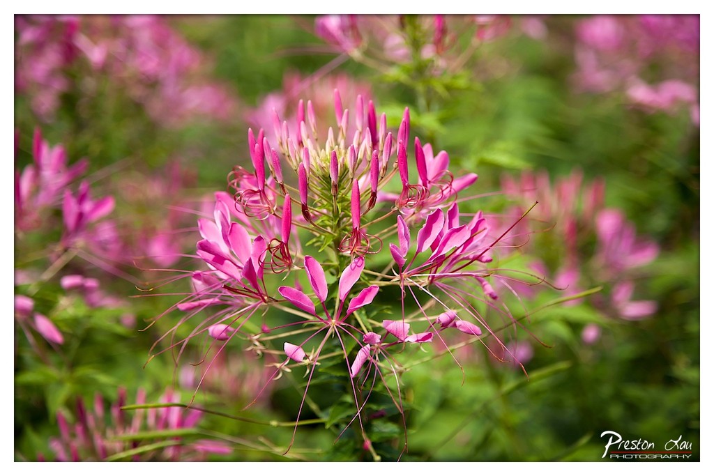
1. Overall Rating (0–10) — 7.5 This photograph captures the delicate complexity of a spider flower in full bloom, where vibrant magenta petals and wispy filaments create a sense of graceful motion. The shallow depth of field isolates the subject with painterly softness, enhancing its natural elegance. While the composition is strong and the color harmonies are pleasing, the image could benefit from slightly more contrast to give the magenta hues greater punch and presence.
2. Composition (0–10) — 7.0 The central placement of the flower draws immediate attention, and the use of a shallow depth of field effectively blurs the background into a soft wash of complementary pinks and greens. The diagonal lines of the filaments guide the eye across the frame, adding subtle dynamism.
3. Lighting (0–10) — 7.5 Natural, diffused daylight illuminates the scene evenly, enhancing the soft textures of the petals without harsh shadows. The lighting complements the subject’s delicate nature, creating a luminous, almost ethereal quality.
4. Color & Tone (0–10) — 8.0 The vibrant magenta of the flower contrasts beautifully with the lush green foliage, resulting in a rich, harmonious palette. The tonal range is well-balanced, with the soft background tones supporting the main subject without overpowering it.
5. Creativity (0–10) — 7.5 The photographer captures a fleeting moment of natural beauty with an artistic sensitivity, using selective focus to transform a common flower into a subject of visual intrigue. The emphasis on texture and color suggests a thoughtful, observational approach.
6. Technical Quality (0–10) — 8.5 The image is sharp on the subject, with excellent focus control and minimal noise. The depth of field is precisely managed, and the overall clarity is high, reflecting strong technical execution.
7. Emotional Impact (0–10) — 8.0 The photograph evokes a sense of tranquility and wonder, inviting the viewer to pause and appreciate the quiet complexity of nature. The softness and color create a meditative mood, resonating with calm beauty and delicate resilience.
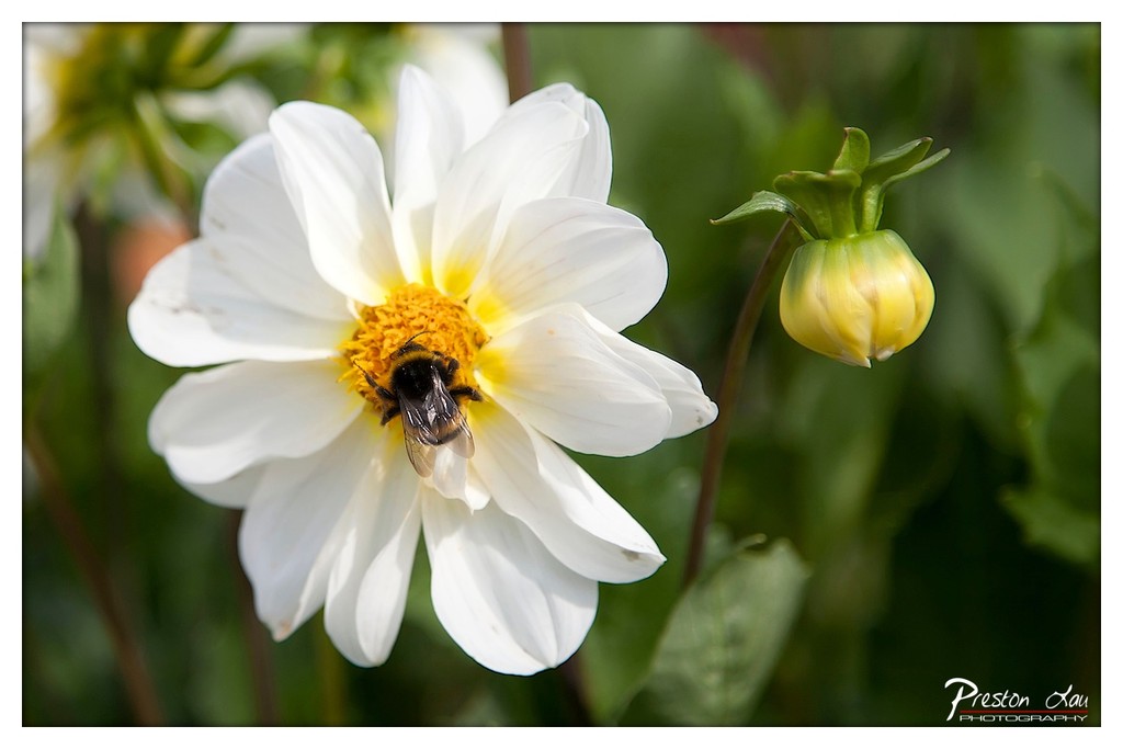
1. Overall Rating (0–10) — 8.0 This photograph captures a delicate moment of natural harmony, where the bee’s quiet labor on the white dahlia becomes a focal point of life and stillness. The shallow depth of field beautifully isolates the subject, drawing the eye to the intricate textures of the flower and the bee’s fuzzy body. While the composition is strong and the subject matter inherently engaging, the muted green backdrop slightly limits the image’s visual drama—though it enhances the sense of intimacy.
2. Composition (0–10) — 8.0 The bee and flower are positioned slightly off-center, following the rule of thirds, which creates a natural and balanced visual flow. The inclusion of the unopened bud adds depth and narrative, suggesting continuity and growth.
3. Lighting (0–10) — 8.5 Soft, diffused daylight highlights the delicate petals and the bee’s form without harsh shadows, creating a gentle glow that enhances texture and detail. The light emphasizes the flower’s purity while casting a warm tone on the yellow center.
4. Color & Tone (0–10) — 8.0 The contrast between the crisp white petals, the vibrant yellow center, and the soft green background creates a harmonious and natural palette. The warm tones of the flower stand out against the cooler greens, enhancing visual appeal without appearing overprocessed.
5. Creativity (0–10) — 7.5 The image captures a familiar subject with fresh clarity, emphasizing the beauty in everyday nature. The choice to include the bud adds a subtle narrative layer, suggesting time and transformation.
6. Technical Quality (0–10) — 9.0 Exceptionally sharp focus on the bee and flower, with smooth bokeh in the background. The depth of field is precisely controlled, and the image is free of noise or blur.
7. Emotional Impact (0–10) — 8.0 The photograph evokes a sense of peace and wonder, inviting the viewer to pause and appreciate the quiet beauty of a single moment in nature. The intimacy of the scene fosters a quiet connection to the natural world.
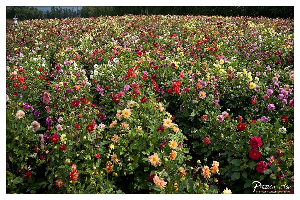
1. Overall Rating (0–10) — 7.5 This photograph bursts with life, capturing a vast field of dahlias in a riot of color that feels both natural and painterly. The sheer density of blooms creates a sense of abundance and vitality, while the subtle inclusion of a lone figure in the distance adds a human scale and quiet narrative. Though the composition is visually overwhelming, the image succeeds in conveying the joy of nature in full bloom—its only limitation is the lack of a clear focal point to guide the eye.
2. Composition (0–10) — 6.0 The frame is filled densely with flowers, creating a textured but somewhat chaotic foreground. The diagonal line of blooms leads the eye into the scene, but the lack of a strong central subject or leading line results in a scattered visual experience.
3. Lighting (0–10) — 7.0 Soft, diffused daylight evenly illuminates the field, preserving rich color saturation without harsh shadows. The overcast sky enhances the vibrancy of the flowers while maintaining a gentle, natural mood.
4. Color & Tone (0–10) — 8.5 A vibrant and diverse palette of reds, yellows, pinks, and purples contrasts beautifully with the deep green foliage. The tones are rich and harmonious, creating a dynamic yet balanced color scheme that captures the essence of a thriving garden.
5. Creativity (0–10) — 7.0 The image celebrates the natural beauty of a flower field with an almost impressionistic feel, emphasizing color and texture over narrative. The wide-angle perspective and high level of detail lend it a sense of grandeur, though it leans more toward documentation than conceptual expression.
6. Technical Quality (0–10) — 8.0 The image is sharp and detailed throughout, with excellent focus across the frame. The resolution and clarity allow individual petals and leaves to be seen, showcasing strong technical execution.
7. Emotional Impact (0–10) — 8.0 The sheer exuberance of color and life evokes a sense of wonder and delight. The viewer is immersed in the beauty of nature, and the quiet solitude suggested by the distant figure adds a contemplative, almost meditative quality.
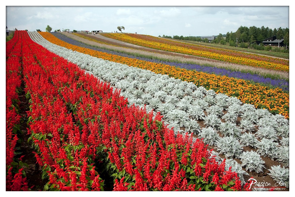
1. Overall Rating (0–10) — 8.0 This photograph bursts with vibrant color and a sense of organized grandeur, capturing a flower field that feels both meticulously planned and naturally exuberant. The sweeping rows create a dynamic rhythm, leading the eye through a kaleidoscopic palette that feels alive and immersive. While the composition is visually striking, the slightly overcast sky tempers the mood, lending a restrained tone that contrasts with the vividness of the blooms.
2. Composition (0–10) — 8.5 The diagonal arrangement of flower rows creates strong leading lines that guide the viewer’s gaze deep into the frame, enhancing depth and perspective. The placement of the red flowers in the foreground establishes a bold anchor, while the gradual transition of colors across the hill maintains balance and visual harmony.
3. Lighting (0–10) — 6.5 Diffuse, overcast lighting softens shadows and evenly illuminates the scene, preserving detail across the diverse textures of the flowers. While this prevents harsh contrasts and highlights color saturation, the lack of direct sunlight slightly dampens the vibrancy and emotional warmth of the moment.
4. Color & Tone (0–10) — 9.0 The rich, saturated hues of red, orange, purple, and silver create a stunning contrast, with the silvery foliage providing a cool counterpoint to the warm tones. The color palette is both harmonious and dynamic, evoking a sense of natural abundance and artistic precision.
5. Creativity (0–10) — 8.0 The photographer captures a familiar subject—flower fields—with a bold and structured approach, emphasizing pattern and rhythm. The use of wide-angle perspective and color zoning transforms the scene into a visual symphony, demonstrating a strong artistic vision.
6. Technical Quality (0–10) — 8.0 The image is sharp and detailed, with clean focus across the foreground and midground. The wide dynamic range allows for rich texture in the flowers and foliage, and the slight vignette subtly frames the composition without distracting.
7. Emotional Impact (0–10) — 7.5 The photograph evokes a sense of awe and tranquility, inviting the viewer to wander through the rows and lose themselves in the beauty of nature’s design. While the overcast sky tempers the emotional uplift, the sheer scale and color still inspire wonder and delight.
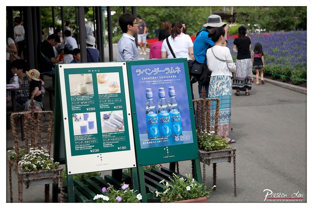
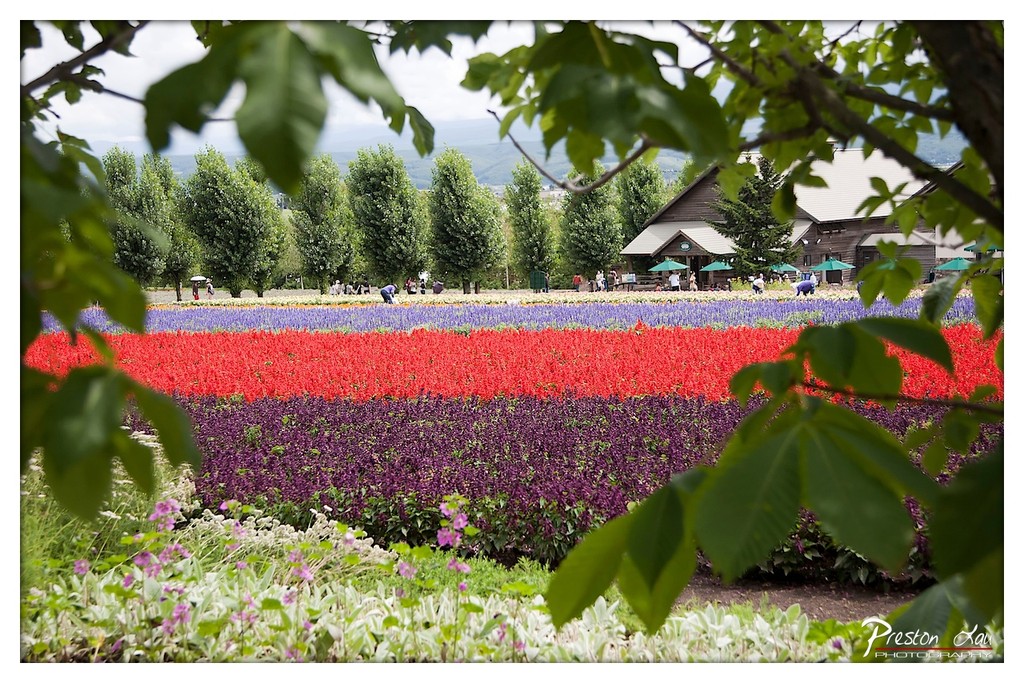
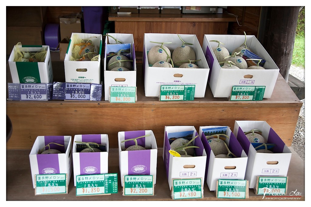
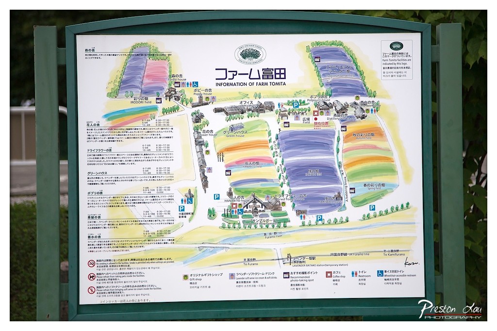
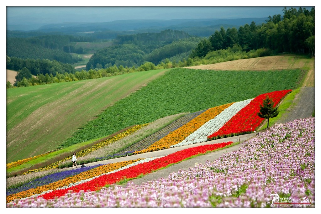
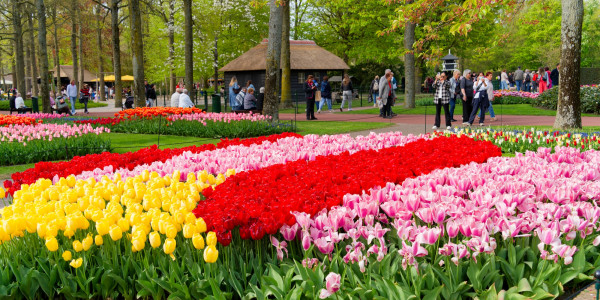
A highlight of our time in Furano was visiting the gorgeous Tomita Farm. This is arguably the most famous of the lavender farms, and it certainly lives up to its reputation. The fields here are not just vast expanses of purple; they are meticulously arranged and expertly manicured into stunning patchwork quilts of color. Beyond the iconic lavender, fields of poppies, lupins, and other seasonal flowers are planted in vibrant stripes, creating a visual feast that stretches towards the horizon. The scent of lavender hanging in the air is intoxicatingly fresh and calming. The farm also features delightful cafes and shops. We were particularly impressed by the unique lavender-flavored ice cream and pudding available at the cafe – subtly floral and wonderfully refreshing. There were also plenty of other Japanese lunch options, allowing us to refuel amidst the beauty.
1. Overall Rating (0–10) — 7.5 This photograph bursts with vibrant color and rhythmic organization, capturing the joyous energy of a flower field in full bloom. The layered rows of blossoms create a dynamic visual rhythm, while the rich saturation brings the scene to life. A slightly cooler color temperature and more intentional focus on the foreground could enhance the depth and emotional pull, but as it stands, the image is a celebration of natural beauty and deliberate design.
2. Composition (0–10) — 8.0 The layered bands of color create strong horizontal lines that guide the eye across the frame, with the orange marigolds in the foreground anchoring the composition. The diagonal shift of the rows adds subtle movement, preventing the image from feeling static.
3. Lighting (0–10) — 7.5 Soft, diffused daylight evenly illuminates the scene, enhancing the vividness of the flowers without harsh shadows. The even lighting allows each hue to stand out clearly, contributing to the image’s overall harmony.
4. Color & Tone (0–10) — 9.0 The palette is striking—vibrant oranges, deep purples, and warm yellows create a powerful contrast that is both balanced and visually exciting. The color temperature leans slightly cool, which enhances the richness of the blues and purples, while still allowing the warm tones to shine.
5. Creativity (0–10) — 8.0 The photographer captures the beauty of agricultural artistry, transforming a cultivated field into a canvas of color. The composition’s rhythm and intentional color placement reflect thoughtful planning, elevating the image beyond a simple snapshot.
6. Technical Quality (0–10) — 8.5 Sharp focus across the frame ensures that the details of the flowers are crisp and well-defined. The exposure is well-managed, with no blown-out highlights or lost shadows, and the watermark is discreetly placed.
7. Emotional Impact (0–10) — 8.0 The image evokes a sense of joy, peace, and wonder, reminiscent of a serene spring day in a botanical haven. The abundance of color and order in the field inspires delight and a quiet appreciation for nature’s beauty.
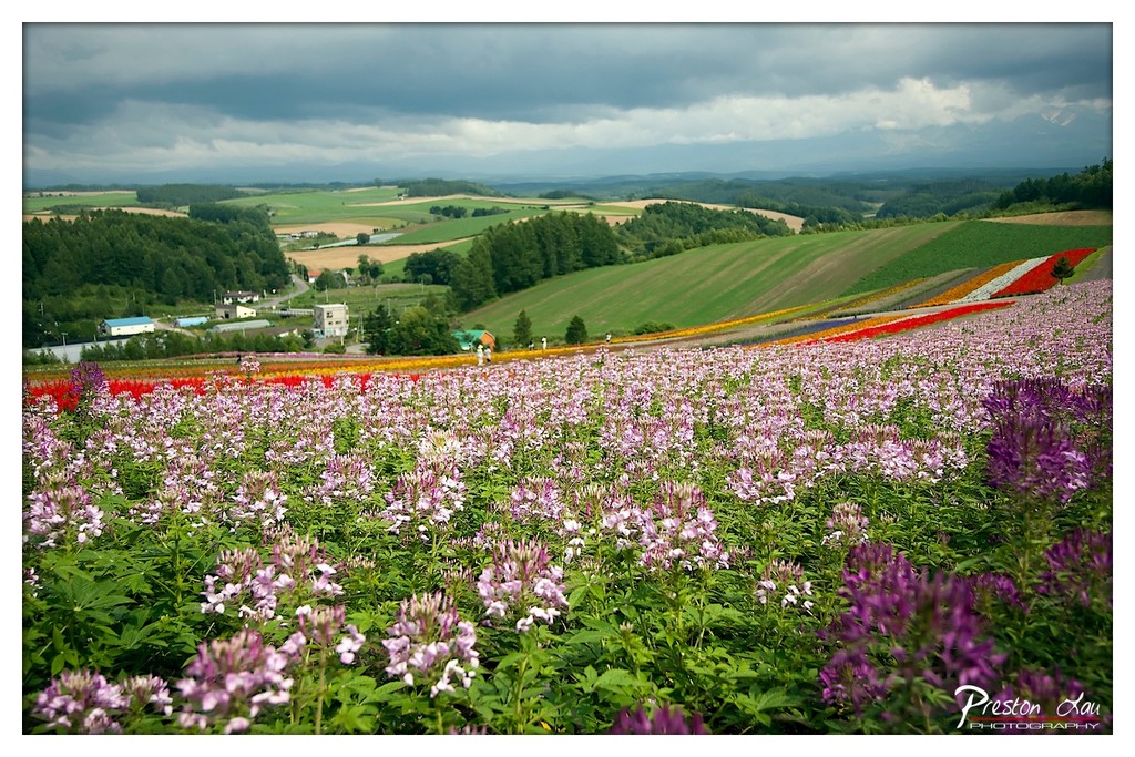
1. Overall Rating (0–10) — 7.5 This photograph captures a breathtaking tapestry of color and texture, where a vast flower field unfolds beneath a brooding sky, creating a striking contrast between natural vibrancy and atmospheric tension. The layered composition draws the eye through sweeping rows of blossoms into the distant hills, evoking both serenity and drama. While the dramatic clouds lend a cinematic quality, the image’s emotional depth is slightly tempered by a subtle color cast that softens the visual punch.
2. Composition (0–10) — 8.0 The diagonal sweep of the flower beds guides the viewer’s gaze through the frame, creating a dynamic sense of movement and depth. The placement of the foreground flowers enhances scale, while the distant village and rolling hills provide a balanced, expansive backdrop.
3. Lighting (0–10) — 6.5 Diffused light from the overcast sky softens shadows and evenly illuminates the scene, lending a moody, contemplative tone. While the lighting is consistent, the lack of direct sunlight reduces the intensity of color saturation and diminishes the potential for dramatic highlights.
4. Color & Tone (0–10) — 7.0 The palette bursts with rich purples, pinks, and reds, creating a vivid contrast against the green landscape and gray sky. The tonal balance is strong, though the overall cool cast slightly dampens the warmth of the blossoms, giving the image a restrained, almost melancholic quality.
5. Creativity (0–10) — 7.5 The juxtaposition of the colorful, manicured flower field against the wild, stormy sky creates a compelling narrative of human intervention within nature. The photographer’s choice to capture the scene during an overcast moment adds a layer of drama, transforming a picturesque landscape into something more emotionally resonant.
6. Technical Quality (0–10) — 8.5 The image is sharp and detailed, with fine focus across the foreground and midground. The depth of field is well-managed, and the post-processing enhances clarity without introducing harsh artifacts.
7. Emotional Impact (0–10) — 7.0 The image evokes a sense of awe and quiet contemplation, inviting the viewer to reflect on the beauty of cultivated nature under a changing sky. The emotional resonance is strong, though the cool tone and lack of sunlight keep the viewer slightly detached from the scene’s vibrancy.
1. Overall Rating (0–10) — 8.0 This photograph captures the breathtaking beauty of a meticulously landscaped flower field, where vibrant color and natural topography converge into a visually harmonious spectacle. The sweeping rows of blossoms create a dynamic, almost painterly effect, while the lone figure provides scale and quiet human connection. Though the scene feels slightly over-saturated in places, the overall composition radiates joy, serenity, and the artistry of cultivated nature.
2. Composition (0–10) — 8.5 The diagonal flow of the flower beds guides the eye through the frame, creating a sense of depth and movement. The placement of the solitary figure on the left provides balance and scale, while the curving road adds rhythm and direction. The layered hills and distant treeline enhance the sense of vastness and perspective.
3. Lighting (0–10) — 7.5 The soft, diffused light of an overcast or hazy day evenly illuminates the scene, preventing harsh shadows and allowing the colors to glow. While the light is not dramatic, it enhances the saturation of the flowers and contributes to the dreamy, serene atmosphere.
4. Color & Tone (0–10) — 9.0 The palette is rich and varied, with bold bands of red, yellow, white, and purple contrasting beautifully against the lush green hills. The colors are vivid yet harmonious, creating a joyful and visually engaging experience. The subtle blue tint in the background adds depth and a touch of coolness to the warm foreground.
5. Creativity (0–10) — 8.0 The image showcases a creative blend of nature and human design, transforming a landscape into a living canvas. The careful arrangement of flowers in geometric patterns reflects intentional artistry, elevating the scene beyond mere documentation into a celebration of color and form.
6. Technical Quality (0–10) — 8.5 The image is sharp and well-focused, with excellent clarity in the foreground blooms and a smooth transition into the background. The depth of field is well-managed, allowing both the immediate flowers and the distant hills to remain distinct and visually engaging.
7. Emotional Impact (0–10) — 8.5 The photograph evokes a deep sense of wonder and tranquility, inviting the viewer to imagine walking among the flowers and feeling the calm of the open landscape. The harmony of color, scale, and natural beauty creates a powerful emotional resonance, suggesting peace, joy, and the beauty of human connection with nature.
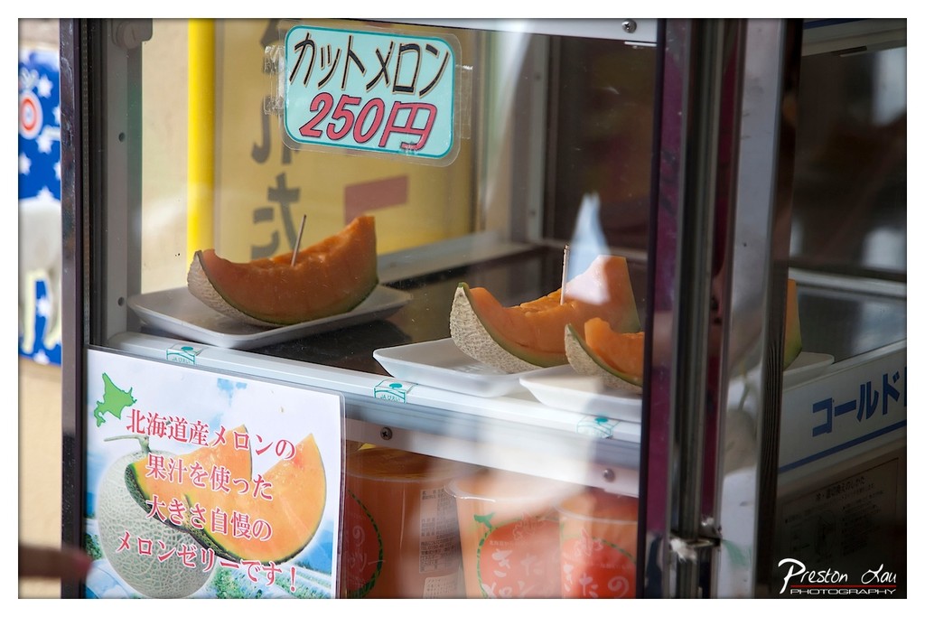
1. Overall Rating (0–10) — 6.0 This photograph captures the inviting simplicity of a Japanese melon stand, where vibrant fruit and local pride converge behind glass. The composition balances commercial detail with cultural specificity, drawing the viewer into a quiet moment of street-side refreshment. While the image conveys a sense of place, it’s held back by a slightly cluttered foreground and a lack of visual focus, preventing it from fully engaging the senses.
2. Composition (0–10) — 5.5 The subject is centered but partially obscured by reflections and signage, creating visual noise. A tighter crop would emphasize the melon slices and enhance narrative clarity.
3. Lighting (0–10) — 6.0 Natural daylight illuminates the scene with even, soft quality, allowing the bright orange of the melon to stand out. Reflections on the glass introduce minor distractions but don’t overpower the subject.
4. Color & Tone (0–10) — 6.5 The warm orange of the melon contrasts with the cool white and blue of the display, creating a balanced, appetizing palette. The colors feel authentic and regionally grounded.
5. Creativity (0–10) — 6.0 The image succeeds in documenting a slice of everyday life with cultural specificity. The use of Japanese text and local branding adds narrative depth, though the execution remains observational rather than interpretive.
6. Technical Quality (0–10) — 7.0 Sharp focus on the melon slices and clean detail in the signage indicate strong technical control. The depth of field is appropriate, though reflections slightly compromise clarity.
7. Emotional Impact (0–10) — 5.5 The photograph evokes a sense of quiet delight and local authenticity, but the viewer remains slightly detached due to the visual clutter and indirect framing.
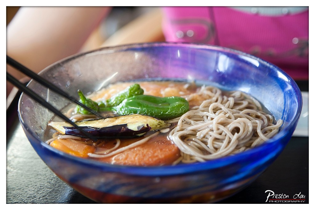
1. Overall Rating (0–10) — 7.0 This photograph captures the inviting warmth of a traditional Japanese noodle dish, with its vibrant ingredients and richly colored bowl drawing the eye. The shallow depth of field emphasizes the textures of the soba noodles and vegetables, creating a sense of intimacy and immediacy. While the composition is strong and the subject is compelling, the background distraction and slightly overexposed highlights prevent it from achieving a more refined aesthetic.
2. Composition (0–10) — 7.5 The bowl is centered and fills the frame effectively, with the chopsticks adding a natural diagonal that guides the viewer’s gaze. The use of shallow depth of field isolates the subject, though the blurred pink background introduces a minor visual clash.
3. Lighting (0–10) — 6.5 Natural light softly illuminates the dish, enhancing the textures of the noodles and vegetables. However, a slight overexposure in the upper right creates harsh reflections on the bowl’s rim, disrupting the otherwise balanced lighting.
4. Color & Tone (0–10) — 7.0 The deep blue of the bowl contrasts beautifully with the earthy tones of the soba and the bright green peppers, creating a visually rich palette. The warm, golden broth adds depth, though the background’s pink hue competes slightly with the scene’s natural harmony.
5. Creativity (0–10) — 7.5 The choice to focus tightly on the bowl and use a shallow depth of field gives the image a personal, almost tactile quality. The inclusion of the chopsticks suggests a moment of consumption, adding narrative depth.
6. Technical Quality (0–10) — 7.0 The focus is sharp on the bowl’s contents, with clean detail in the noodles and vegetables. However, minor lens flare and slight overexposure in the highlights reduce overall technical polish.
7. Emotional Impact (0–10) — 7.0 The image evokes a sense of comfort and warmth, inviting the viewer to savor a simple yet satisfying meal. The focus on food and personal interaction creates an intimate, relatable moment.
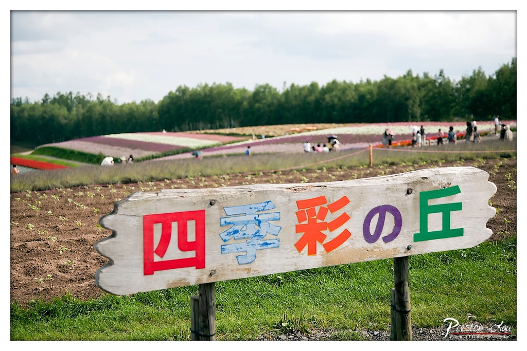
1. Overall Rating (0–10) — 7.0 This photograph captures the vibrant charm of a seasonal flower field, with a rustic sign in the foreground anchoring the scene in a distinctly Japanese aesthetic. The colorful, striped flower beds stretch into the distance, creating a sense of wonder and natural abundance. While the composition draws the eye effectively, the slightly overcast lighting tempers the vibrancy of the colors, and the shallow depth of field risks obscuring the full context of the landscape.
2. Composition (0–10) — 7.5 The weathered sign serves as a strong focal point, leading the viewer’s gaze into the layered landscape. The diagonal sweep of the flower beds adds dynamic movement, while the soft blur of the background keeps attention on the sign’s text and the distant activity. The framing feels intentional, though a slightly tighter crop might enhance the sense of intimacy.
3. Lighting (0–10) — 6.0 Diffused daylight under a cloudy sky provides even illumination, minimizing harsh shadows. While this ensures clarity across the scene, it also softens the colors and reduces atmospheric contrast, giving the image a somewhat muted tone.
4. Color & Tone (0–10) — 7.0 The vivid red, orange, blue, and green of the sign create a playful, eye-catching contrast against the natural greens and browns. The background flowers, though slightly out of focus, contribute a soft pastel gradient that enhances the sense of seasonal variety. The overall palette feels balanced and harmonious.
5. Creativity (0–10) — 7.5 The juxtaposition of the rustic sign with the expansive, colorful flower fields introduces a charming narrative of place and seasonal celebration. The use of shallow depth of field to emphasize the sign while hinting at the broader landscape adds a thoughtful layer of storytelling.
6. Technical Quality (0–10) — 8.0 The image is sharp on the sign, with fine detail visible in the wood grain and paint. Focus is well-managed, and the exposure is balanced, preserving detail in both the foreground and background. The watermark is subtle and does not distract.
7. Emotional Impact (0–10) — 7.0 The photograph evokes a sense of peaceful joy and seasonal wonder, inviting the viewer to imagine strolling through the flower fields on a quiet day. The human figures in the distance add a touch of life and scale, enhancing the feeling of shared experience and natural beauty.
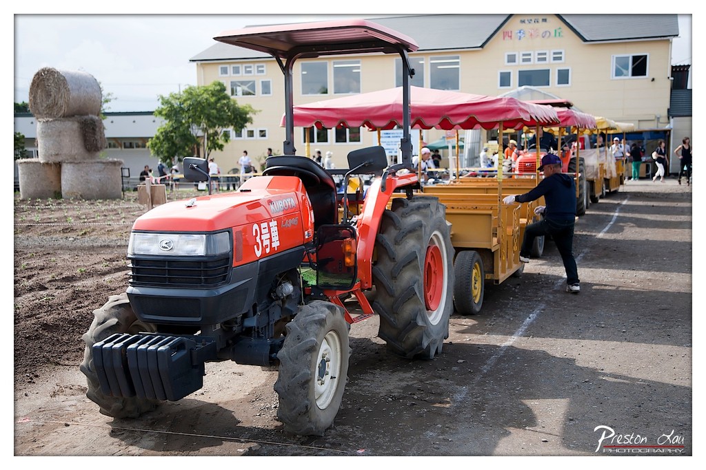
1. Overall Rating (0–10) — 6.8 This photograph captures a lively rural scene where agriculture meets tourism, with a red Kubota tractor pulling a colorful passenger cart through what appears to be a farm-themed attraction. The contrast between the industrial tractor and the whimsical passenger setup creates a sense of playful functionality, while the background activity and stacked hay bales add narrative depth. While the image is rich in context and cultural detail, its composition and lighting lack a certain visual polish, preventing it from feeling fully cinematic.
2. Composition (0–10) — 6.5 The tractor is well-framed and leads the eye diagonally into the scene, with the line of carts creating a sense of movement. However, the background elements—buildings, people, and hay bales—introduce visual clutter that slightly distracts from the main subject.
3. Lighting (0–10) — 6.0 The daylight is bright but diffused, casting soft shadows that flatten the image’s depth. The strong sunlight creates some overexposed areas on the building and highlights on the tractor’s body, reducing tonal nuance.
4. Color & Tone (0–10) — 6.5 The red of the tractor and canopy stands out against the muted earth tones and pale yellow building, creating a vibrant focal point. The color palette is balanced but not particularly rich, with a slight coolness in the shadows that dampens the overall warmth.
5. Creativity (0–10) — 7.0 The juxtaposition of a working farm tractor with a tourist ride is inventive and culturally specific, suggesting a celebration of rural life and community engagement. The scene feels authentic and tells a small story of agricultural tourism.
6. Technical Quality (0–10) — 7.5 The image is sharp and well-focused, particularly on the tractor, with clear details in the text and mechanical components. The exposure is generally balanced, though some highlights show minor clipping.
7. Emotional Impact (0–10) — 6.0 The image evokes a sense of everyday rural charm and quiet activity, with a hint of nostalgia. While it captures a moment of local life, it doesn’t elicit a strong emotional response—more observational than evocative.
Just a short drive away, in the southern part of Biei, we explored the Hill of Shikisai (四季彩の丘). This spot offers another breathtaking display of Biei's natural beauty. Covering the top of a rolling hill, the flower fields here create a stunning panorama, with vibrant colors sweeping across the landscape. The elevated position makes it a particularly fantastic spot for photos, offering expansive views of the surrounding countryside and mountain ranges. To comfortably explore the vast fields without having to walk under the warm summer sun, we opted for a ride on the tractor train. This leisurely ride took us directly through the flower patches, allowing us to take in the incredible scenery up close and at a relaxed pace – a truly enjoyable experience, especially for tired feet! It's interesting to think that this same area, particularly around Furano town, transforms into a popular destination for downhill and cross-country skiing during the winter months, showcasing the dramatic seasonal change in Hokkaido.
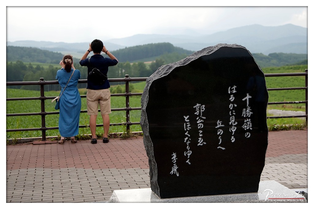
1. Overall Rating (0–10) — 7.0 This photograph captures a contemplative moment at a scenic overlook, where two figures stand in quiet observation of a vast, misty landscape. The juxtaposition of the polished black stone inscribed with Japanese calligraphy against the natural expanse creates a sense of cultural depth and timelessness. While the image is visually balanced and emotionally resonant, the muted lighting and overcast sky slightly dampen its atmospheric impact.
2. Composition (0–10) — 7.5 The stone monument in the foreground anchors the frame, creating a strong visual anchor that draws the eye toward the couple and the distant hills. The diagonal line of the railing guides the viewer’s gaze through the scene, enhancing depth and spatial harmony.
3. Lighting (0–10) — 6.0 Soft, diffused light from an overcast sky evenly illuminates the scene, minimizing harsh shadows and preserving detail across the landscape. While this creates a calm, subdued mood, it also reduces contrast and depth, lending the image a slightly flat quality.
4. Color & Tone (0–10) — 6.5 The palette is dominated by muted greens and grays, with the dark stone providing a strong tonal contrast. The blue dress of the woman adds a subtle pop of color, but the overall tonal range lacks vibrancy, contributing to a subdued and contemplative atmosphere.
5. Creativity (0–10) — 7.0 The inclusion of the stone monument with Japanese script adds narrative and cultural context, transforming the image from a simple landscape into a story of place and memory. The composition balances natural beauty with human presence in a thoughtful, reflective manner.
6. Technical Quality (0–10) — 8.0 The image is sharp and well-focused, particularly on the stone and the figures. The exposure is balanced, with no significant areas of over- or underexposure, and the fine details in the landscape are clearly rendered.
7. Emotional Impact (0–10) — 7.5 The scene evokes a sense of quiet introspection and connection to nature and heritage. The couple’s posture—gazing outward, absorbed in the view—invites the viewer to share in their moment of stillness, creating a subtle but powerful emotional resonance.
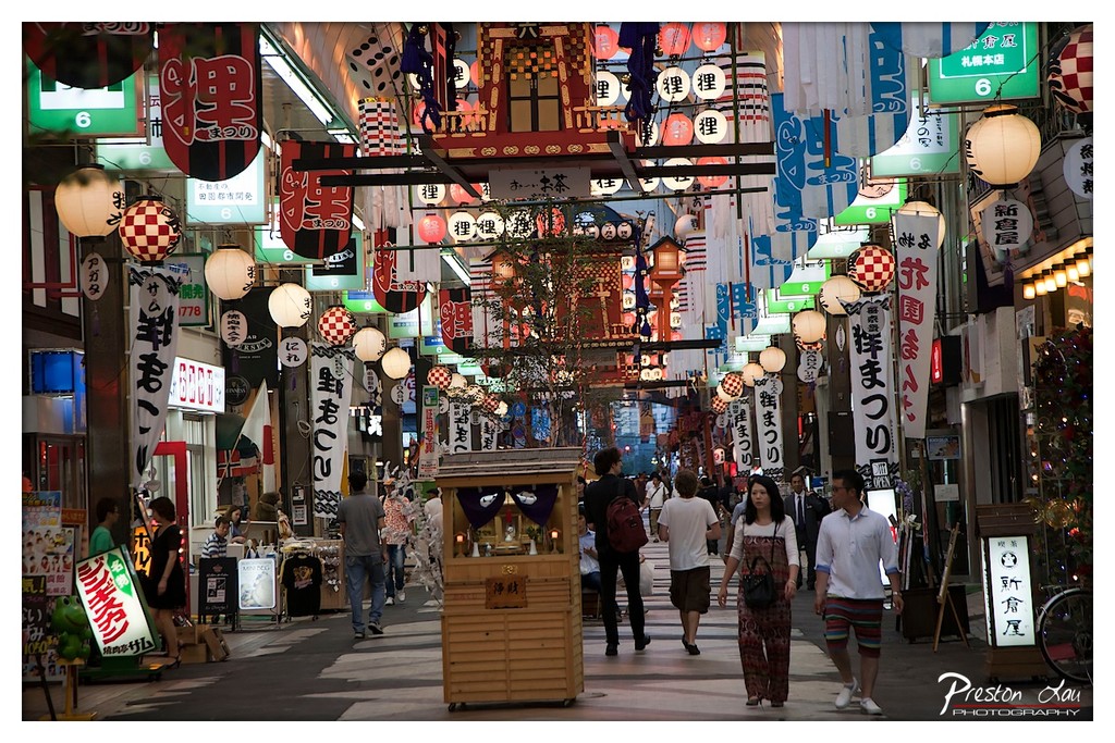
1. Overall Rating (0–10) — 7.5 This photograph captures the vibrant, layered energy of a bustling Japanese street market, where tradition and commerce collide under a canopy of glowing lanterns and colorful signage. The composition teems with visual rhythm, drawing the eye through the maze of hanging banners and the steady flow of pedestrians. While the scene is rich with cultural detail, the sheer density of elements risks overwhelming the viewer, slightly diluting the emotional clarity of any single focal point.
2. Composition (0–10) — 8.0 The frame is anchored by a central wooden shrine, creating a natural focal point that guides the viewer’s gaze down the alley. The symmetrical arrangement of lanterns and banners enhances depth and rhythm, while the diagonal flow of pedestrians adds movement and life.
3. Lighting (0–10) — 7.0 Warm, ambient light from lanterns and shop signs creates a cozy, inviting glow that contrasts with the cool blue of the evening sky. The mix of artificial sources adds depth and texture, though some areas remain slightly underexposed, obscuring finer details.
4. Color & Tone (0–10) — 8.0 The palette is rich with warm yellows and reds from the lanterns and banners, set against cooler blues and grays of the twilight sky. The contrast enhances the scene’s festive mood, while the varied textures and patterns add visual interest.
5. Creativity (0–10) — 8.0 The photographer captures the essence of a living cultural space, transforming a busy street into a dynamic tapestry of tradition and modernity. The layered composition and use of light elevate the scene beyond mere documentation into a celebration of place and atmosphere.
6. Technical Quality (0–10) — 7.5 Sharp focus across the midground ensures clarity in the central elements, while the depth of field keeps the background slightly soft, enhancing the sense of space. The long exposure allows for smooth motion blur in the pedestrians, adding to the scene’s energy.
7. Emotional Impact (0–10) — 7.0 The image evokes a sense of wonder and immersion, inviting the viewer into a world of sensory richness and cultural authenticity. The lively energy of the street, combined with the warm lighting, creates a feeling of joy and connection to a moment outside the ordinary.
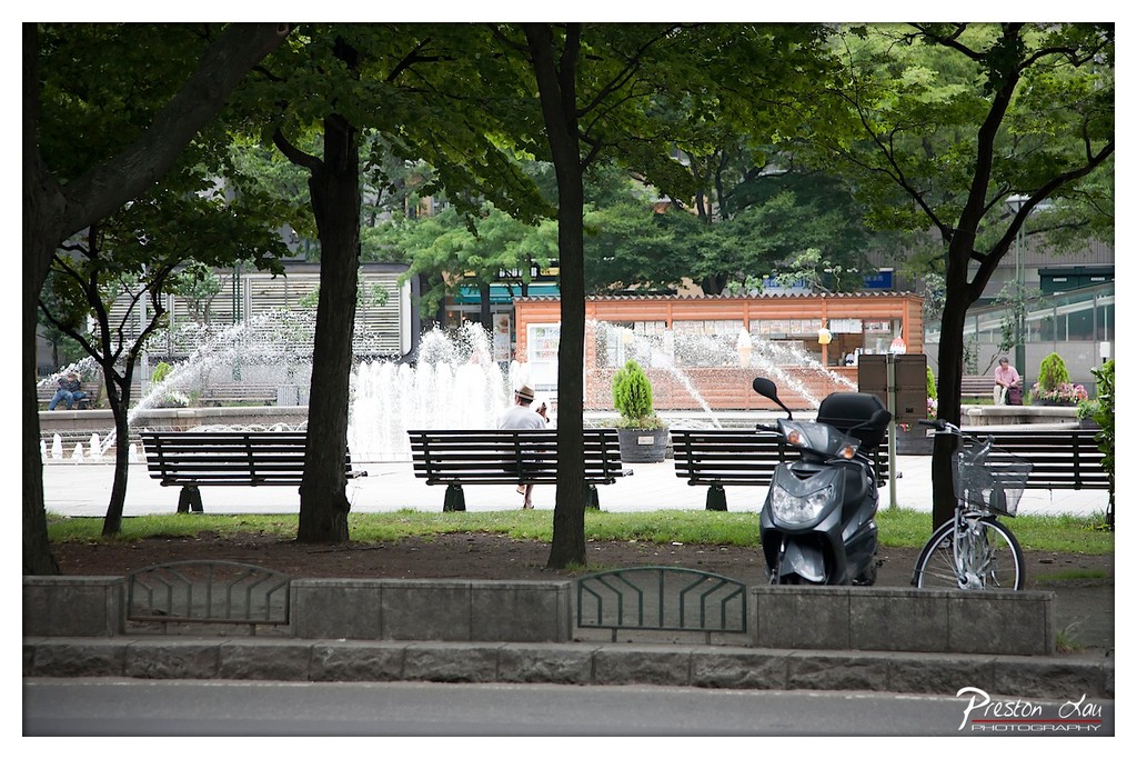
1. Overall Rating (0–10) — 7.0 This photograph captures a tranquil urban park scene, where the interplay of nature and city life unfolds in quiet harmony. The framing through tree branches adds depth and a sense of intimacy, while the fountain’s motion provides a subtle focal point. Though the image is visually balanced and atmospheric, the slightly muted colors and flat lighting temper its emotional resonance, leaving it more observational than evocative.
2. Composition (0–10) — 7.5 The foreground trees create a natural frame, guiding the eye toward the central fountain and benches. The placement of the scooter and bicycle adds asymmetry and a sense of everyday life, though the wide shot slightly dilutes focus.
3. Lighting (0–10) — 6.0 Diffuse, overcast light softens the scene, minimizing harsh shadows and creating a calm, even exposure. However, this also results in a lack of contrast and depth, muting the vibrancy of the greens and the sparkle of the water.
4. Color & Tone (0–10) — 6.5 The palette is dominated by cool greens and grays, lending a subdued, almost monochromatic tone. While cohesive, the lack of rich color saturation gives the image a slightly washed-out quality.
5. Creativity (0–10) — 6.5 The photograph is grounded in realism, capturing a slice of urban life with authenticity. The framing through trees adds a narrative layer, suggesting a quiet observer’s perspective, but the composition lacks bold artistic intervention.
6. Technical Quality (0–10) — 7.5 The image is sharp and clear, with well-defined details in the scooter, benches, and foliage. Focus is consistent across the midground, and the slight blur in the foreground enhances depth.
7. Emotional Impact (0–10) — 6.0 The scene evokes a sense of peaceful solitude and urban routine, but the cool, distant lighting and neutral subject matter keep the viewer emotionally detached, leaning more toward documentation than emotional engagement.
1. Overall Rating (0–10) — 6.8 This photograph captures a tranquil urban park framed by the iconic Sapporo TV Tower, blending natural serenity with city life. The expansive lawn and floral beds draw the eye toward the central monument, creating a sense of balance and purpose. While the image successfully conveys a peaceful moment in a bustling city, the overcast lighting and slightly cluttered background detract from its visual cohesion, holding it back from true artistic distinction.
2. Composition (0–10) — 7.0 The central placement of the monument and the symmetrical arrangement of the flower beds create a strong focal point, while the surrounding trees and buildings frame the scene effectively. The wide perspective enhances the sense of space, though the scattered people and signage introduce minor visual distractions.
3. Lighting (0–10) — 5.5 The soft, diffused light from the overcast sky results in even exposure and minimal harsh shadows, which suits the calm mood of the scene. However, the lack of directional light diminishes depth and texture, giving the image a flat, muted quality.
4. Color & Tone (0–10) — 6.0 The palette is dominated by soft greens and grays, with subtle pops of color from the flowers and signage. While harmonious, the overall tone leans toward desaturation, reducing the vibrancy that could elevate the scene’s visual appeal.
5. Creativity (0–10) — 6.5 The image leverages a familiar urban landscape with a clear narrative of nature within the city. The inclusion of the TV Tower adds cultural context, but the composition remains largely conventional, with little stylistic risk or interpretive flair.
6. Technical Quality (0–10) — 7.5 The photograph is sharp and well-focused, with clean detail in the grass, trees, and architectural elements. The wide-angle perspective is executed with precision, and the watermark is unobtrusive.
7. Emotional Impact (0–10) — 6.0 The image evokes a sense of calm and quiet reflection, inviting the viewer to pause in the midst of urban life. While emotionally resonant, the lack of dramatic lighting or dynamic elements keeps the connection to the viewer at a polite distance.
1. Overall Rating (0–10) — 7.0 This photograph captures the vibrant energy of a well-tended flower garden, where a rich tapestry of color and texture invites the eye to wander. The composition balances natural chaos with intentional arrangement, offering a sense of abundance and seasonal life. While the image is visually engaging and rich in detail, the presence of the sign and the slightly overexposed sky prevent it from feeling fully immersive, holding it in the realm of documentation rather than artistry.
2. Composition (0–10) — 7.5 The flowers are arranged in layered bands, creating depth and guiding the viewer’s gaze from the foreground to the background. The central sign is slightly off-center, providing a focal anchor without disrupting the visual flow. The framing is wide enough to include the full scope of the garden’s diversity while maintaining a sense of balance.
3. Lighting (0–10) — 6.5 The lighting appears to be natural daylight, with a slightly flat quality due to an overcast sky or diffused sun. While it allows for even exposure across the scene, it lacks the warmth and contrast that would enhance the vibrancy of the colors. The highlights in the sky are slightly blown out, indicating a minor exposure issue.
4. Color & Tone (0–10) — 8.0 The palette is rich and varied, with deep purples, fiery reds, golden yellows, and soft pinks creating a dynamic and harmonious visual experience. The contrast between the lush foliage and the colorful blooms enhances the overall vibrancy, and the tonal range is well-managed despite the flat lighting.
5. Creativity (0–10) — 7.0 The photograph successfully captures the diversity and beauty of a curated garden, presenting it as both a natural and human-made landscape. The inclusion of the sign adds a layer of cultural context, grounding the image in a specific place. While the approach is straightforward, the attention to color and composition shows a thoughtful eye.
6. Technical Quality (0–10) — 7.5 The image is sharp and detailed, with clear focus across the midground and foreground. The depth of field is well-controlled, keeping the main floral elements in focus while softly blurring the background. The watermark is subtle and unobtrusive, and the overall resolution is strong.
7. Emotional Impact (0–10) — 6.5 The photograph evokes a sense of peace and delight, capturing the joy of a well-kept garden in full bloom. The abundance of color and life suggests a moment of quiet beauty, though the presence of the sign and the slightly clinical lighting keep the emotional connection from feeling deeply personal.
1. Overall Rating (0–10) — 6.8 This photograph captures a candid moment in an urban park, where the rhythm of daily life unfolds with quiet intimacy. The composition balances human interaction and natural elements, creating a narrative of connection and stillness amidst city movement. While the image is rich in detail and authenticity, its emotional depth is slightly muted by the flat lighting and a composition that, while engaging, lacks a strong focal anchor.
2. Composition (0–10) — 6.5 The diagonal lines of the bench and steps guide the eye through the frame, creating a sense of depth. However, the subject placement—particularly the couple in the foreground—feels slightly off-center, and the background activity distracts from the main narrative, creating a sense of visual clutter.
3. Lighting (0–10) — 5.5 The light is diffused and even, likely from an overcast sky, which flattens the scene and reduces texture. While it allows for clear visibility, it also diminishes the contrast and atmosphere that could have heightened the mood.
4. Color & Tone (0–10) — 6.0 The palette is grounded in earthy greens and browns, with pops of red from the flowers providing visual interest. The colors are natural and harmonious, but lack vibrancy, contributing to a subdued tone.
5. Creativity (0–10) — 6.5 The image succeeds in capturing a slice of everyday life with authenticity, offering a quiet story of companionship and urban serenity. Its strength lies in its observational honesty, though it lacks a distinctive artistic vision or conceptual twist.
6. Technical Quality (0–10) — 7.5 The image is sharp and well-focused, with clean detail in the foreground and background. The depth of field is appropriately managed, allowing key elements to stand out while maintaining context.
7. Emotional Impact (0–10) — 6.0 The scene evokes a sense of calm and quiet companionship, with the couple’s relaxed posture and the gentle presence of the pigeons adding to the peaceful mood. However, the emotional resonance is restrained by the lack of dramatic lighting or a more compelling narrative focus.
Our exploration of Hokkaido also included a visit to the renowned Asahi Brewery. Asahi is one of Japan's top-selling alcohol brands, standing alongside names like Sapporo Beer and Suntory. Visiting the brewery offered an interesting insight into the scale and precision of Japanese beer production. We joined a guided factory tour, which walked us through the various stages of the beer-making process, from the raw ingredients to the bottling line. The tour was informative and well-presented. The highlight for many, of course, was the complimentary beer tasting session that followed the tour. We had the chance to sample several different Asahi beers, fresh from the source, often accompanied by small snacks – a perfect way to appreciate the craftsmanship that goes into the brewing process.
1. Overall Rating (0–10) — 8.0 This photograph bursts with life, capturing a vibrant tapestry of zinnias in full bloom, where color and texture dance in joyful harmony. The composition is rich and engaging, drawing the eye into a lush, sun-drenched garden scene that feels both spontaneous and meticulously balanced. While the sheer density of flowers creates a slightly chaotic feel, the image’s strength lies in its celebration of natural abundance and vivid color.
2. Composition (0–10) — 7.5 The flowers are densely packed, filling the frame with a sense of abundance, though the lack of clear focal point creates a slightly scattered visual rhythm. The diagonal arrangement of blooms guides the eye across the image, but a more deliberate subject placement might enhance narrative clarity.
3. Lighting (0–10) — 8.0 Natural, diffused sunlight illuminates the scene evenly, enhancing the flowers’ saturated hues without harsh shadows. The soft light allows the delicate textures of petals and leaves to emerge, contributing to a warm, inviting atmosphere.
4. Color & Tone (0–10) — 9.0 A bold and harmonious palette of yellows, pinks, reds, and whites creates a striking contrast against the deep green foliage. The color temperature is warm and natural, evoking the feeling of a late afternoon in a sunlit garden.
5. Creativity (0–10) — 7.5 The image captures a familiar subject—garden flowers—but transforms it into a dynamic, almost painterly composition through its rich color and tight framing. The photographer’s choice to focus on the interplay of variety and density demonstrates an eye for visual rhythm and pattern.
6. Technical Quality (0–10) — 8.5 The image is sharp, with crisp detail in the flower petals and leaves. The depth of field is well-managed, allowing key blooms to stand out while softly blurring the background. The watermark is clean and unobtrusive.
7. Emotional Impact (0–10) — 8.5 The photograph radiates joy and vitality, evoking a sense of wonder at nature’s beauty and diversity. The viewer is immediately uplifted by the exuberance of color and life, making it both visually pleasing and emotionally resonant.
1. Overall Rating (0–10) — 7.0 This photograph captures the solemn grandeur of a traditional Japanese shrine, with its bold architectural lines and cultural symbolism inviting both reverence and curiosity. The presence of visitors adds a human element, grounding the scene in everyday life while emphasizing the shrine’s role as a living cultural space. While the image effectively conveys the site’s significance, the slightly overcast lighting and busy foreground slightly dilute its visual impact.
2. Composition (0–10) — 7.5 The central placement of the shrine’s entrance creates a strong focal point, reinforced by the symmetrical roofline and the wide steps leading up to it. The people in the foreground add depth and scale, though their positioning slightly disrupts the visual harmony.
3. Lighting (0–10) — 6.0 Diffuse, overcast light softens the scene, reducing shadows and creating a muted atmosphere. While it allows for even exposure, it lacks the dramatic contrast that could enhance the shrine’s textures and details.
4. Color & Tone (0–10) — 6.5 The palette is dominated by earthy browns, grays, and the crisp white of the shimenawa banner, creating a restrained and traditional aesthetic. The green foliage adds a subtle contrast, but the overall tone remains subdued.
5. Creativity (0–10) — 7.0 The image successfully blends architectural documentation with cultural narrative, using the juxtaposition of people and sacred space to suggest continuity between tradition and modern life. The composition is thoughtful, though not particularly groundbreaking.
6. Technical Quality (0–10) — 8.0 Sharp focus across the frame captures fine details in the woodwork and roof tiles, and the exposure is well-balanced, preserving detail in both shadows and highlights.
7. Emotional Impact (0–10) — 6.5 The photograph evokes a sense of quiet reverence and cultural continuity, but the lack of strong lighting and dynamic interaction among the people keeps the emotional resonance from fully resonating.
1. Overall Rating (0–10) — 7.0 This photograph captures the quiet reverence of a Japanese shrine, where rows of wooden ema plaques brim with handwritten wishes and prayers. The density of the tags creates a layered, almost tactile sense of devotion, while the warm tones and soft focus lend a dreamlike quality to the scene. Though the composition is rich with cultural detail, the sheer number of overlapping elements risks visual clutter, slightly diminishing the clarity of individual messages.
2. Composition (0–10) — 6.5 The image is densely packed with ema plaques, creating a sense of abundance and tradition. The diagonal arrangement of the plaques leads the eye through the frame, though the lack of a clear focal point results in a somewhat chaotic visual flow.
3. Lighting (0–10) — 7.0 Soft, diffused natural light enhances the warm, earthy tones of the wood, casting gentle shadows that add depth. The lighting feels authentic and unobtrusive, preserving the quiet atmosphere of the shrine.
4. Color & Tone (0–10) — 7.0 The palette is dominated by warm browns and beige, with subtle reds from the cords and occasional pops of color from printed logos. The tonal range is balanced, with a gentle contrast that emphasizes texture without overwhelming the scene.
5. Creativity (0–10) — 7.5 The image successfully conveys the cultural significance of the ema tradition, using the accumulation of wishes as a metaphor for collective hope. The inclusion of modern elements like printed logos adds a layer of contemporary context, blending tradition with the present.
6. Technical Quality (0–10) — 7.5 The photograph is sharp and well-focused, with fine detail visible in the handwriting and wood grain. The depth of field is appropriately managed, allowing certain plaques to stand out while keeping the background softly blurred.
7. Emotional Impact (0–10) — 7.0 There is a palpable sense of hope and serenity, evoked by the quiet act of writing and hanging wishes. The viewer is invited to reflect on the personal stories behind each plaque, creating a moment of quiet connection and contemplation.
1. Overall Rating (0–10) — 7.0 This photograph captures a tender moment of personal devotion within a traditional Japanese setting, where modern affection meets ancient ritual. The shallow depth of field draws the viewer’s eye to the heartfelt inscription and beloved Rilakkuma characters, creating a quiet intimacy. While the image effectively conveys emotion and cultural context, its slightly cluttered background and modest lighting limit its visual elegance.
2. Composition (0–10) — 7.0 The subject is well-placed off-center, with a strong diagonal leading line created by the row of ema plaques. The use of shallow depth of field isolates the main tag effectively, though the overlapping elements in the background create a slight sense of visual noise.
3. Lighting (0–10) — 6.0 Natural, soft light illuminates the scene evenly, preserving detail without harsh shadows. However, the light lacks warmth and directionality, resulting in a slightly flat and unengaging atmosphere.
4. Color & Tone (0–10) — 6.5 The warm brown tones of the wooden plaques dominate, complemented by the red of the cords and the soft beige of the paper. The palette is cohesive and culturally resonant, though it lacks vibrancy and contrast, giving the image a muted quality.
5. Creativity (0–10) — 7.5 The juxtaposition of a whimsical, modern character with traditional Japanese spiritual practice is both charming and meaningful. The handwritten message and personal touch elevate the image beyond mere documentation into a narrative of love and connection.
6. Technical Quality (0–10) — 7.5 Sharp focus on the central tag, with smooth bokeh in the background, demonstrates strong technical control. The image is well-exposed, with minimal noise and clear text, though the slightly soft focus in the background detracts from overall crispness.
7. Emotional Impact (0–10) — 8.0 The personal inscription—“Joe & Carmen, 永結同心” (eternal unity)—and the presence of Rilakkuma evoke a deep sense of love, commitment, and hope. The viewer is invited into a private moment of shared dreams, making the image emotionally resonant and touching.
Overall, our summer trip to Hokkaido provided a wonderful blend of urban exploration in Sapporo, breathtaking natural beauty in the flower fields of Furano and Biei, and interesting cultural experiences like visiting a Shinto shrine and a major brewery. The comfortable summer weather made outdoor activities a joy, and the stunning landscapes and delicious local produce left a lasting impression.
1. Overall Rating (0–10) — 7.0 This photograph captures a candid moment of joy and cultural significance at a Japanese shrine, where tradition and modern life intersect. The subjects’ playful gestures and smiles contrast beautifully with the solemn architecture, creating a narrative of celebration and personal connection. While the composition is strong and the cultural context is rich, the image’s emotional depth is slightly tempered by a lack of visual dynamism in the background.
2. Composition (0–10) — 7.0 The subjects are well-placed along the horizontal axis, with the steps leading the eye toward them. The framing includes enough context to ground the scene without overcrowding, though the wide shot slightly dilutes the intimacy of the moment.
3. Lighting (0–10) — 7.5 Natural daylight illuminates the scene evenly, enhancing the textures of the wood and stone. The soft shadows suggest a slightly overcast day, which contributes to a balanced exposure and prevents harsh highlights.
4. Color & Tone (0–10) — 6.5 The palette is restrained, dominated by earthy browns and the crisp white of the banner. While the colors are true to life, they lack vibrancy, giving the image a slightly muted, documentary feel.
5. Creativity (0–10) — 7.0 The juxtaposition of traditional architecture with the modern, joyful expressions of the subjects is both clever and meaningful. The peace signs add a layer of contemporary personality, making the image feel both personal and culturally grounded.
6. Technical Quality (0–10) — 8.0 The image is sharp, with clear focus on the subjects and well-managed depth of field. The exposure is accurate, and the fine details in the wood grain and fabric are well-preserved.
7. Emotional Impact (0–10) — 7.5 There’s a warm, celebratory energy in the subjects’ expressions and gestures that resonates with the viewer. The sense of occasion—perhaps a wedding or coming-of-age ceremony—evokes feelings of happiness and cultural pride.
1. Overall Rating (0–10) — 6.8 This photograph captures the lively, organic energy of a local farmers’ market nestled within a wooded setting, where the interplay of nature and community creates a compelling narrative. The composition draws the viewer into the scene through the inviting chalkboard sign and the flow of people browsing under the green canopy. While the image successfully conveys the atmosphere of a casual, everyday gathering, its technical execution—particularly in lighting and color—holds back its emotional resonance, leaving it feeling more documentary than evocative.
2. Composition (0–10) — 7.0 The diagonal placement of the chalkboard sign and the arrangement of crates guide the eye naturally toward the market stall, creating a sense of depth and movement. The balance between foreground and background is strong, though the presence of distant figures slightly distracts from the central activity.
3. Lighting (0–10) — 6.5 The daylight is bright but diffused, with soft shadows suggesting an overcast sky or tree cover. While adequate for clarity, the lack of strong directional light diminishes the scene’s dramatic contrast and depth, resulting in a somewhat flat appearance.
4. Color & Tone (0–10) — 6.0 The dominant green of the tent and foliage creates a cohesive natural palette, but the overall tone is muted, with a slight cool cast that dulls the vibrancy of the produce and clothing. A touch of warmth and increased saturation would enhance the scene’s inviting quality.
5. Creativity (0–10) — 7.0 The image captures a candid, authentic moment of daily life, with a subtle narrative suggested by the sign and the interactions at the stall. The juxtaposition of nature and commerce offers a quiet commentary on sustainability and community, elevating it beyond a simple snapshot.
6. Technical Quality (0–10) — 7.5 The focus is sharp on the foreground elements, particularly the chalkboard, and the image is free of noticeable noise or blur. The exposure is well-balanced, with no significant overexposed or underexposed areas.
7. Emotional Impact (0–10) — 6.5 The photograph evokes a sense of calm, everyday life and local connection, but the subdued lighting and color limit its ability to fully engage the viewer emotionally. The scene feels observed rather than experienced, leaving room for deeper resonance.
1. Overall Rating (0–10) — 6.0 This photograph captures a charming, culturally specific moment—a pair of Asahi Beer mascot figurines displayed in a clear case, welcoming visitors to the Sapporo brewery. The scene is warm and inviting, with a gentle sense of hospitality conveyed through the figures’ friendly expressions and the cheerful sunflower backdrop. While the composition is slightly cluttered by the nearby sign and the shallow depth of field, the image successfully communicates a sense of place and brand identity, though it lacks the visual sophistication to feel truly artistic.
2. Composition (0–10) — 6.0 The subject is centered and well-framed, but the presence of the sign on the left disrupts visual balance. A tighter crop would enhance focus on the mascots and improve the overall harmony.
3. Lighting (0–10) — 6.5 Soft, even lighting illuminates the scene without harsh shadows, preserving the vibrant colors of the figurines and background. The light enhances the friendly, approachable mood of the display.
4. Color & Tone (0–10) — 7.0 The bright reds, blues, and sunny yellows create a lively, cheerful palette that reflects the brand’s energetic personality. The contrast between the warm foreground and cool green background adds visual depth.
5. Creativity (0–10) — 6.5 The image leverages a unique cultural detail—corporate mascots—as a storytelling device, giving it a personal and authentic feel. While not groundbreaking, it offers a subtle commentary on branding and hospitality in Japan.
6. Technical Quality (0–10) — 7.5 Sharp focus on the figurines and clean detail in the foreground suggest strong technical execution. The shallow depth of field effectively isolates the subject, though some background elements remain slightly distracting.
7. Emotional Impact (0–10) — 6.0 The image evokes a sense of warmth and welcome, particularly for those familiar with Japanese corporate culture. The mascots’ expressions invite connection, though the emotional resonance remains modest due to the scene’s documentary nature.
1. Overall Rating (0–10) — 6.0 This photograph presents a vibrant and densely packed display of Japanese beverages, capturing the visual rhythm of a retail shelf with a sense of organized abundance. The variety of brands and packaging creates a dynamic, almost rhythmic pattern, while the warm lighting enhances the inviting atmosphere of the shop. However, the sheer number of items and the cluttered arrangement detract from visual clarity, making the image feel more like a product catalog than a composed photograph.
2. Composition (0–10) — 5.5 The image is framed tightly, emphasizing the rows of bottles and cans, but the lack of negative space and the cluttered foreground create a sense of visual overwhelm. The central alignment of the shelves provides a sense of order, yet the scattered items on the lower shelves disrupt balance and draw the eye away from a clear focal point.
3. Lighting (0–10) — 6.5 The warm, ambient lighting enhances the golden tones of the glass bottles and casts soft shadows that add depth to the shelves. However, the reflections on the glass are slightly distracting, and the lighting lacks directional contrast, giving the scene a flat, commercial quality.
4. Color & Tone (0–10) — 7.0 The palette is rich with warm yellows, reds, and metallic tones, creating a lively and inviting atmosphere. The variety of packaging colors adds visual interest, though some labels are partially obscured, reducing the impact of individual hues. The overall tonal range is well-balanced, with a pleasing warmth that complements the subject.
5. Creativity (0–10) — 6.0 The image leverages the inherent pattern and repetition of the products to create a visually engaging composition. While the arrangement is inherently rhythmic, the lack of a strong narrative or unique perspective limits its artistic originality. The photograph functions more as documentation than as a creative statement.
6. Technical Quality (0–10) — 7.5 The image is sharp and well-focused, with clear detail visible on the labels and bottle shapes. The depth of field is adequate, allowing most of the shelves to remain in focus, though some reflections on the glass slightly reduce clarity. The exposure is consistent, with no significant over- or underexposed areas.
7. Emotional Impact (0–10) — 5.5 The photograph evokes a sense of curiosity and familiarity, particularly for viewers familiar with Japanese beverages. However, the overwhelming abundance and lack of human presence prevent a deeper emotional connection. The image feels more functional than evocative, capturing a moment in a store rather than a moment of feeling.