Preston Lau: A Journey Through Memories, Tech, and Humanity
Welcome to my personal blog that delves into the intricate tapestry of personal albums and the fascinating intersection of ever-evolving technology and humanity. Come along on a journey with me as we delve into the seamless fusion of creativity, state-of-the-art AI and robotics, intricately interwoven within the tapestry of our shared awareness. Have fun!
Harker Middle School Campus Opening September 2021
AI Summary
Harker Middle School is relocating from its Blackford Ave. campus to a Union Ave. location starting September 2021. The new campus features smaller classrooms, interior hallway doors, and exterior doors for science classes, as well as spacious areas for students to interact in-person after over a year of remote learning. This transition aims to create a fresh start with a new energy, closer community, and improved atmosphere for teachers and students.
Over the summer, the Harker Middle School began moving locations from the Blackford Ave. campus to the Union Ave. campus, which was previously the location of the Harker Preschool. After leasing the property on Blackford Ave. for sixteen years, the middle school started developing its own property at a new location on Union Ave., making adjustments for the needs of the students, faculty and administration. History teacher and Middle School History Department Chair Keith Hirota shares his enthusiasm for the transition to the Union Ave. location.
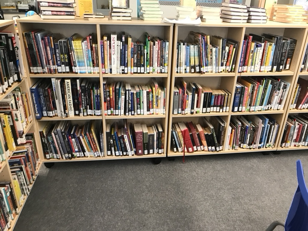
1. Overall Rating (0–10) — 6.0 This photograph captures the quiet order of a library or classroom bookshelf, where the density of books suggests a space rich with knowledge and potential. The composition feels functional and observational, like a snapshot of daily life rather than a crafted image, and while the scene is visually busy, it lacks the emotional resonance or visual rhythm to feel truly compelling. The flat lighting and cluttered top shelves slightly undermine the sense of purpose, though the image succeeds as a straightforward document of an educational environment.
2. Composition (0–10) — 5.5 The wide-angle framing captures the full breadth of the bookshelves but feels unbalanced, with a crowded left edge and an empty foreground that draws attention away from the subject. The diagonal line of the shelves creates a sense of depth, but the lack of a clear focal point makes the image feel scattered.
3. Lighting (0–10) — 5.0 The lighting is flat and utilitarian, likely from overhead fluorescent fixtures, which casts minimal shadows and washes out the colors of the book spines. While it ensures visibility, it contributes to a sterile and unengaging atmosphere.
4. Color & Tone (0–10) — 5.0 The palette is dominated by muted browns, grays, and the occasional pop of color from book covers, but the overall tone is subdued and lacks contrast. The colors appear slightly desaturated, which diminishes the vibrancy of the scene.
5. Creativity (0–10) — 6.0 The image functions more as documentation than artistic expression. The arrangement of books, while seemingly random, suggests a lived-in space, but the lack of intentional framing or thematic focus limits its originality.
6. Technical Quality (0–10) — 7.0 The image is sharp and clear, with good focus across the bookshelves. The camera appears to be steady, and the details of the book spines are legible, indicating a well-executed technical capture.
7. Emotional Impact (0–10) — 5.5 The photograph evokes a sense of quiet routine and intellectual possibility, but the emotional connection is distant. It feels more like a record than an invitation to feel, leaving the viewer as an observer rather than an participant in the space.
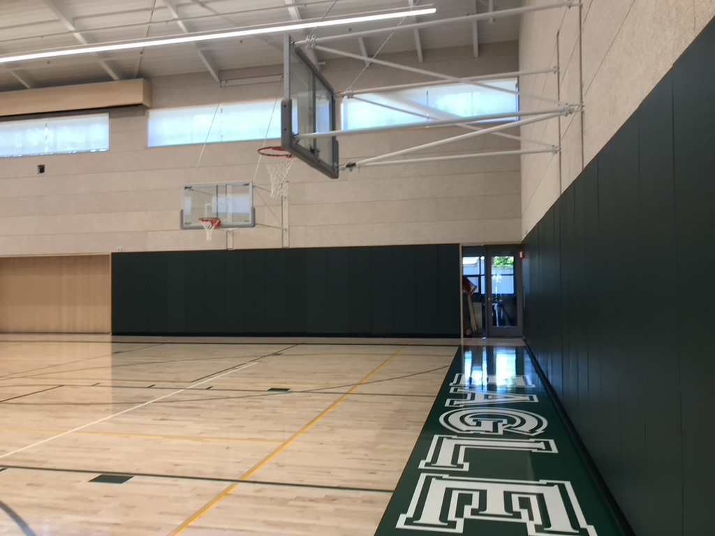
1. Overall Rating (0–10) — 6.0 This image captures the quiet stillness of an empty gymnasium, where the absence of people lends a contemplative calm to the space. The clean lines of the basketball court and the bold “EAGLE” lettering ground the scene in institutional identity, while the interplay of light and shadow adds subtle depth. However, the composition feels slightly flat and unengaged, with the viewer’s eye drawn more to the signage than the space itself, limiting the photograph’s emotional reach.
2. Composition (0–10) — 6.5 The low-angle perspective emphasizes the length of the court and the bold lettering, creating a sense of depth. However, the asymmetrical framing and the off-center placement of the basketball hoop introduce visual imbalance, distracting from the intended focus on the gym’s architecture and identity.
3. Lighting (0–10) — 7.0 The overhead fluorescent lights provide even, functional illumination, with soft reflections on the polished floor adding texture. Natural light from the high windows contributes a gentle glow, enhancing the sense of openness without creating harsh shadows or glare.
4. Color & Tone (0–10) — 6.5 The palette is restrained—neutral wood tones, dark green walls, and white markings—creating a clean, institutional aesthetic. The limited color range works well for the setting, though the lack of vibrancy slightly diminishes the visual energy of the scene.
5. Creativity (0–10) — 6.0 The photograph approaches the space as a documentary record rather than an expressive interpretation. While the perspective and signage offer narrative potential, the image remains largely observational, lacking a strong conceptual or emotional hook.
6. Technical Quality (0–10) — 7.5 Sharp focus and clear detail are evident throughout, particularly in the polished floor and painted lettering. The exposure is well-balanced, and there are no noticeable flaws in clarity or noise.
7. Emotional Impact (0–10) — 5.5 The stillness of the empty gym evokes a sense of quiet anticipation, as if waiting for the first game or practice to begin. While the mood is palpable, it remains understated, leaving the viewer with a sense of neutrality rather than deep resonance.
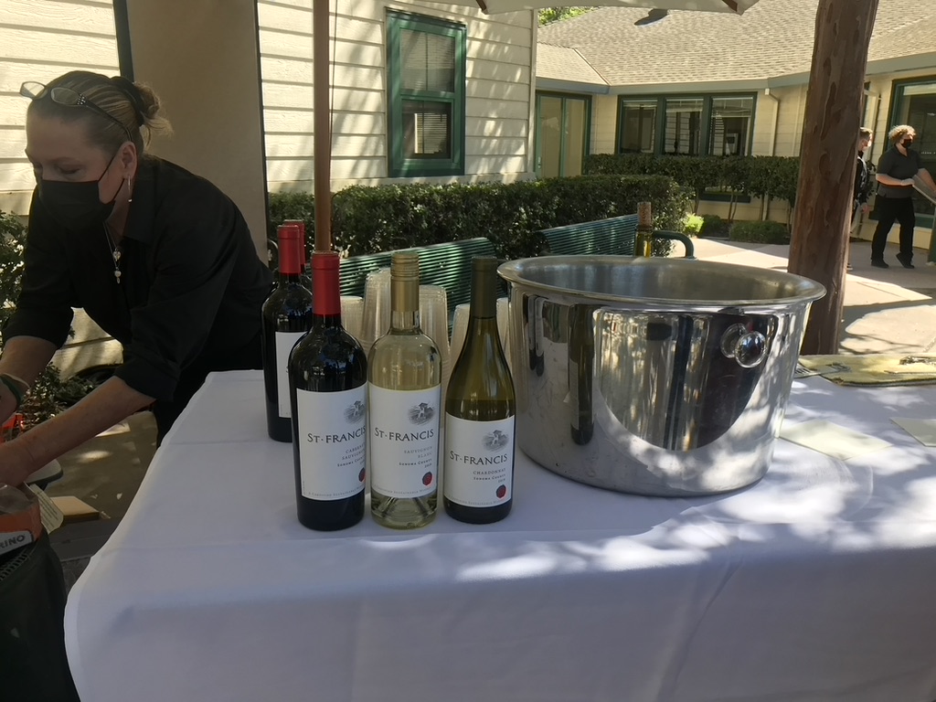
1. Overall Rating (0–10) — 6.0 This photograph captures a casual outdoor wine sampling event with a clear focus on St. Francis wines, but the scene feels more like a snapshot than a composed image. The presence of a masked server and the natural daylight lend authenticity, yet the composition is cluttered and lacks visual harmony. While the subject matter is engaging, the image’s technical and artistic execution falls short of elevating it beyond documentary.
2. Composition (0–10) — 5.5 The arrangement is uneven, with the wine bottles clustered tightly in the center and the large ice bucket occupying too much space on the right. The server on the left is partially cut off, creating an unbalanced frame that disrupts visual flow.
3. Lighting (0–10) — 6.5 Natural daylight provides adequate exposure, but the harsh shadows cast by the umbrella and tree create distracting contrast. The bright sunlight overexposes parts of the white tablecloth, while other areas fall into deep shadow, reducing overall tonal balance.
4. Color & Tone (0–10) — 5.5 The color palette is muted, dominated by whites and grays, with the green of the wine bottles and the dark clothing offering only slight contrast. The overall tone is flat and lacks richness, diminishing the vibrancy of the wine labels and the scene’s atmosphere.
5. Creativity (0–10) — 5.0 The image functions as a straightforward documentation of an event, with no deliberate artistic framing or storytelling intent. The repetition of the St. Francis branding is clear, but the composition does not suggest a creative or conceptual approach.
6. Technical Quality (0–10) — 6.0 The image is sharp and in focus, with the wine labels clearly legible. However, exposure issues and lack of attention to framing reduce its overall technical polish.
7. Emotional Impact (0–10) — 5.0 The photograph conveys a sense of routine and service, but it fails to evoke deeper emotion or connection. The masked server and casual setting suggest a moment of pandemic-era normalcy, yet the image remains emotionally distant due to its unrefined presentation.
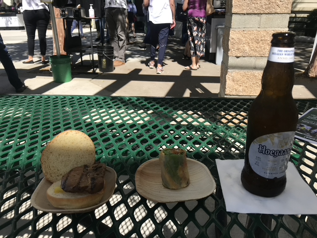
1. Overall Rating (0–10) — 6.0 This photograph captures a casual outdoor dining moment with a sense of immediacy and authenticity, placing the viewer right at the table. The juxtaposition of the simple meal—grilled meat, a spring roll, and a Hoegaarden beer—against the backdrop of a bustling street scene adds a layer of narrative about everyday life. While the image feels candid and relatable, its composition and lighting lack refinement, keeping it from achieving a more elevated aesthetic.
2. Composition (0–10) — 5.5 The foreground elements are well-framed, but the busy background distracts from the main subject. The diagonal line of the table and the scattered objects create visual tension without clear focus.
3. Lighting (0–10) — 6.0 Bright daylight illuminates the scene evenly, though harsh shadows and overexposed highlights reduce detail in the background. The lighting feels natural but uncontrolled.
4. Color & Tone (0–10) — 5.5 The green of the table contrasts sharply with the warm tones of the food and the brown bottle, but the overall palette is flat. The lack of color vibrancy and dynamic range gives the image a slightly muted feel.
5. Creativity (0–10) — 6.5 The photo tells a small story of a meal shared in public space, with an interesting mix of textures and cultural elements. While not particularly original in concept, it succeeds in capturing a slice of life with quiet charm.
6. Technical Quality (0–10) — 7.0 The image is sharp and clear, with good focus on the foreground objects. However, minor issues in exposure and composition limit its overall polish.
7. Emotional Impact (0–10) — 5.5 The image evokes a sense of relaxed enjoyment and casual connection, but the lack of emotional depth and the cluttered background keep the viewer from fully engaging with the moment.
“We’re seeing the students after 18 months,” Hirota said. “ I’m excited about having a fresh start at a new campus, especially coming out of COVID-19. Since the new campus is smaller, I think it will bring everyone closer. I’m really looking forward to having that new energy.”
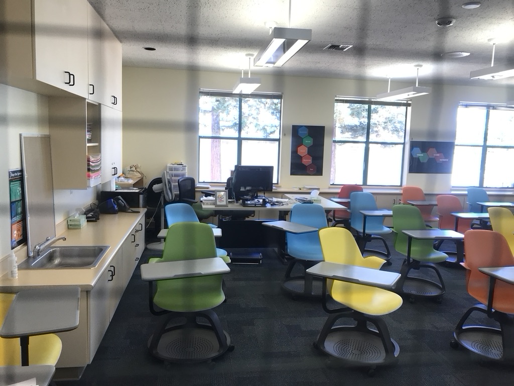
1. Overall Rating (0–10) — 6.0 This image presents a modern classroom environment with a vibrant, functional aesthetic, where the colorful chairs and open layout suggest a space designed for active learning. While the composition captures the essence of a contemporary educational setting, the reflections on the glass and slightly cluttered work area detract from its visual clarity, giving it a more documentary feel than an artistic one. The scene conveys a sense of potential and readiness, yet lacks the polish and cohesion needed to fully engage the viewer.
2. Composition (0–10) — 6.0 The framing is wide and captures the full breadth of the classroom, but the presence of reflections on the glass in the foreground disrupts the balance and draws attention away from the central subject. The placement of the teacher’s desk and chairs creates a sense of depth, though the cluttered counter and scattered items on the left edge slightly weaken the overall harmony.
3. Lighting (0–10) — 6.5 Natural light floods the room through the large windows, creating a bright and evenly lit environment. The overhead fluorescent fixtures complement the daylight, though their harshness adds a slightly sterile tone. The combination of light sources results in a functional illumination that prioritizes visibility over mood.
4. Color & Tone (0–10) — 7.0 The palette is vibrant, with the green, yellow, blue, and orange chairs providing a lively contrast against the neutral walls and dark carpet. The color distribution is dynamic and engaging, reflecting the energy of a modern learning space. However, the brightness of the windows slightly washes out the tones, reducing the richness of the colors in the foreground.
5. Creativity (0–10) — 6.0 The image captures a realistic and well-organized classroom, with thoughtful use of color and spatial design. While the concept is straightforward and functional, it lacks a strong narrative or conceptual twist, presenting a conventional snapshot rather than an imaginative interpretation of the space.
6. Technical Quality (0–10) — 7.0 The image is sharp and clear, with good detail in both the foreground and background. The focus is consistent across the room, and the exposure is well-managed, though the reflections on the glass and slight overexposure from the windows slightly compromise technical perfection.
7. Emotional Impact (0–10) — 5.5 The photograph evokes a sense of order and readiness, suggesting a space where learning and collaboration are encouraged. However, the lack of human presence and the sterile lighting prevent a deeper emotional connection, leaving the viewer as an observer rather than an participant in the scene.
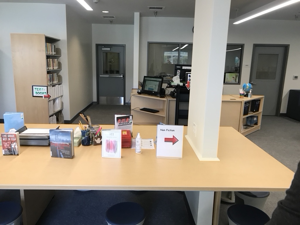
1. Overall Rating (0–10) — 6.0 This photograph captures a quiet, functional library space with a clear focus on organization and accessibility, yet it lacks visual dynamism. The scene is informative and grounded in everyday reality, with signage and books arranged to guide users, but the flat lighting and sterile environment limit emotional engagement. While it succeeds as a documentation of a modern library’s layout, it feels more like a functional snapshot than a compelling image.
2. Composition (0–10) — 6.5 The wide-angle perspective creates a sense of space, but the central column disrupts visual flow, dividing the frame unevenly. The placement of the table and signage provides a clear focal point, though the cluttered foreground slightly distracts from the overall balance.
3. Lighting (0–10) — 5.5 Bright, even fluorescent lighting illuminates the space clearly but results in a flat, untextured look. The lack of shadows or directional warmth diminishes depth and gives the scene a sterile, institutional feel.
4. Color & Tone (0–10) — 5.0 The palette is dominated by neutral beiges, grays, and muted browns, with only small pops of color from book covers and signs. While the colors are consistent, the overall tone is subdued and lacks vibrancy or emotional resonance.
5. Creativity (0–10) — 6.0 The image is straightforward and functional, emphasizing clarity over artistic expression. The arrangement of books and signs tells a story of organization and purpose, but the approach is conventional and lacks a unique visual perspective.
6. Technical Quality (0–10) — 7.5 The image is sharp and well-focused, with clean details visible in the books, signs, and desk surfaces. The exposure is balanced, and there are no obvious technical flaws, though the wide-angle lens introduces slight distortion.
7. Emotional Impact (0–10) — 5.0 The scene conveys a sense of quiet order and routine, but the lack of human presence and emotional warmth keeps the viewer at a distance. It feels more like a document than an evocative moment, offering information without inviting deeper connection.
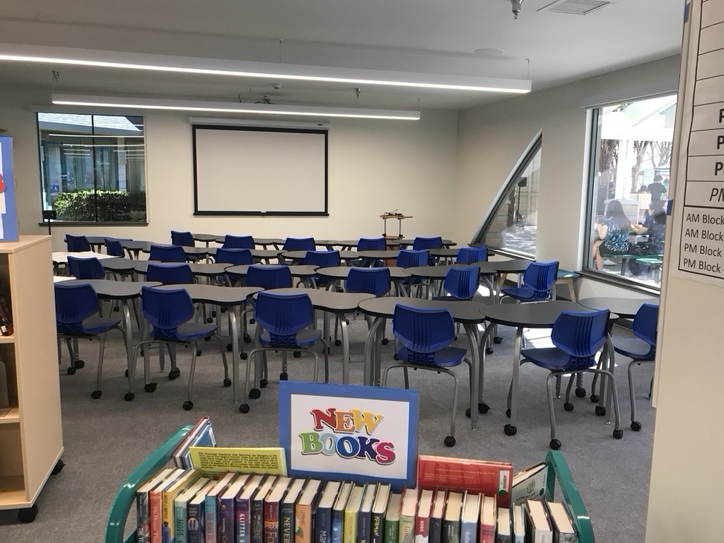
1. Overall Rating (0–10) — 6.0 This photograph captures the clean, organized atmosphere of a school library or classroom, with rows of tables and chairs arranged for learning. The “NEW BOOKS” sign adds a touch of vibrancy and purpose, grounding the scene in a sense of discovery and education. While the image is clear and functional, it lacks visual drama, feeling more like a documentation than an evocative portrait of a space. A more dynamic angle or moment of human presence could elevate its emotional resonance.
2. Composition (0–10) — 6.0 The framing is straightforward, with the book cart in the foreground providing a natural lead-in to the room. However, the symmetry of the tables and chairs creates a repetitive, almost sterile rhythm, and the large window on the right introduces a slight visual imbalance. A tighter composition or shift in perspective might better emphasize the space’s purpose.
3. Lighting (0–10) — 6.5 The overhead fluorescent lights provide even, functional illumination, ensuring clarity across the scene. While adequate for visibility, the light lacks warmth or directionality, resulting in a flat, institutional feel that diminishes the room’s potential for inviting atmosphere.
4. Color & Tone (0–10) — 6.0 The dominant blue of the chairs contrasts sharply with the neutral gray and beige tones of the room, creating a structured, school-appropriate palette. The “NEW BOOKS” sign injects a burst of bright, playful colors that stand out but don’t fully harmonize with the surrounding environment, giving the image a slightly disjointed feel.
5. Creativity (0–10) — 5.5 The concept is grounded in realism and function, with a clear focus on the educational setting. However, the image offers little in the way of originality or narrative beyond the surface-level depiction of a classroom. The absence of people or activity limits its storytelling potential.
6. Technical Quality (0–10) — 7.5 The image is sharp and well-focused, with clean lines and minimal noise. The exposure is balanced, and the details—such as the book spines and text on the sign—are clearly visible. The camera appears to have captured the scene with precision, though the overall execution is technically competent rather than artistically compelling.
7. Emotional Impact (0–10) — 5.0 The image evokes a sense of quiet order and routine, but it remains emotionally distant. The lack of human presence or personal connection makes it feel more like a place than a lived experience, limiting its ability to stir nostalgia, curiosity, or warmth in the viewer.
The layout of the Union Ave. campus provides new opportunities for teachers and students alike. For instance, the science classrooms are all located on the ground floor and contain interior hallway doors as well as exterior doors. Morgensen feels that the design of her classroom contributes to her students’ learning experience. The new campus, which will open for classes on Monday, Aug. 23, contains many different areas where people can spend time together. After more than a year of remote learning, these spaces provide opportunities for the students to share in-person interactions.
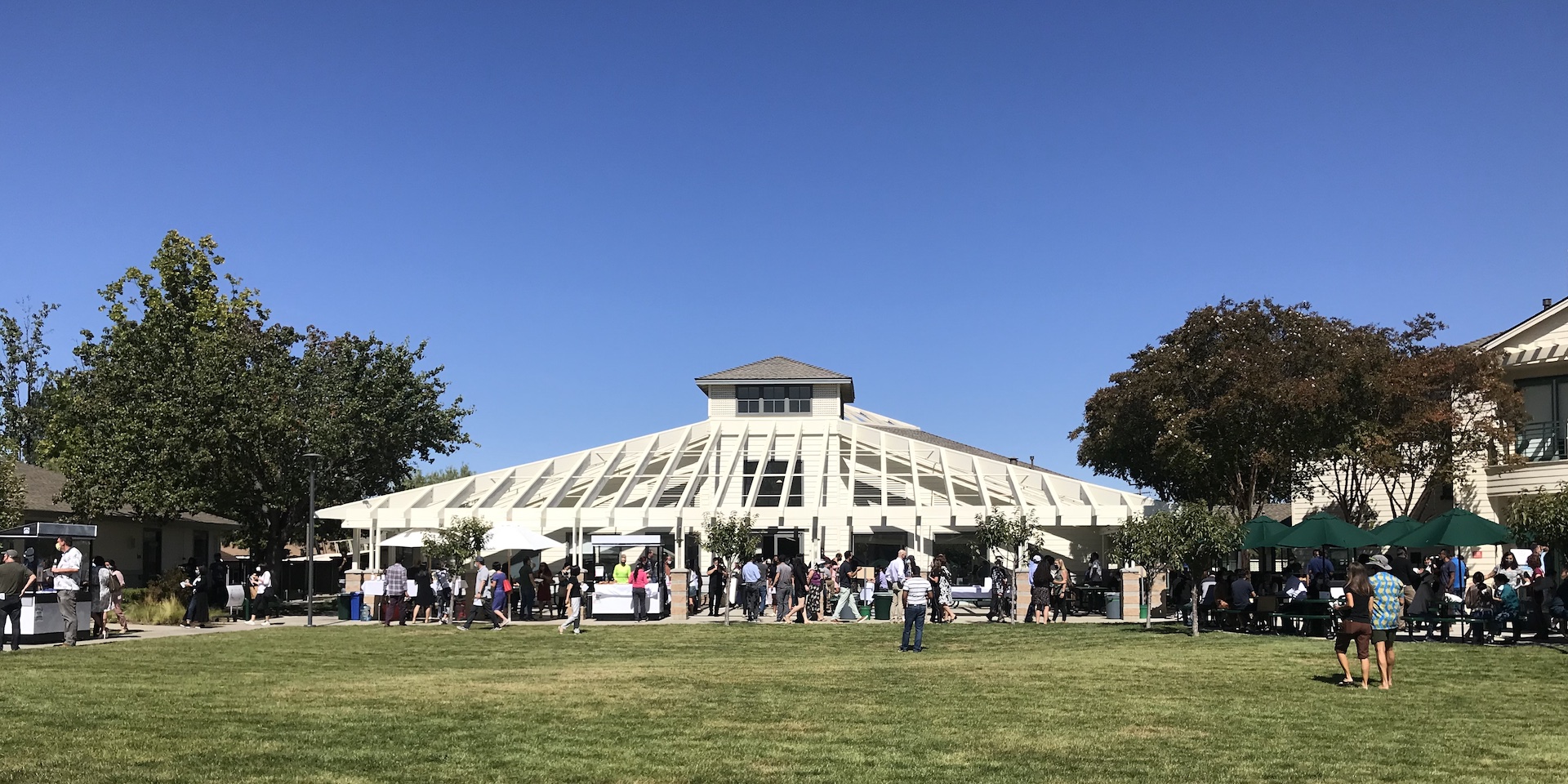
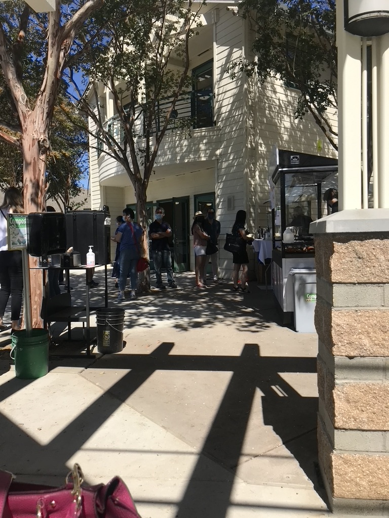
1. Overall Rating (0–10) — 6.0 This photograph captures a candid moment of daily life at an outdoor food service area, where the interplay of light and shadow adds a dynamic, almost cinematic quality. The composition draws the viewer into a scene of casual interaction, yet the cluttered foreground and slightly awkward framing detract from its visual cohesion. While the image effectively conveys a sense of place and atmosphere, it feels more like a snapshot than a composed photograph, missing a strong focal point to anchor the narrative.
2. Composition (0–10) — 5.5 The frame is anchored by strong diagonal shadows that lead the eye into the scene, but the inclusion of the pink handbag and green bucket in the foreground creates a distracting imbalance. The subjects are positioned slightly off-center, which adds a sense of spontaneity, but the lack of clear focal hierarchy weakens the overall structure.
3. Lighting (0–10) — 7.5 The bright, natural sunlight creates deep, well-defined shadows that add depth and texture to the image. The dappled light filtering through the trees enhances the scene’s realism and gives it a warm, midday feel, though some areas are slightly overexposed in the highlights.
4. Color & Tone (0–10) — 6.0 The palette is dominated by neutral beiges and grays, punctuated by the green bucket and pink handbag. While these pops of color add visual interest, they feel somewhat arbitrary and disrupt the otherwise subdued tonal harmony. The overall tone is slightly flat due to the harsh sunlight.
5. Creativity (0–10) — 6.5 The photograph captures a slice of everyday life with authenticity, but the creative potential of the strong shadow patterns and natural light is underutilized. The image leans more toward documentation than artistic expression, with limited narrative or conceptual depth.
6. Technical Quality (0–10) — 7.0 The image is sharp and well-focused, with clear detail in both the foreground and background. The exposure is generally balanced, though some loss of detail occurs in the bright areas of the sky and building facade.
7. Emotional Impact (0–10) — 5.5 The scene evokes a sense of routine and community, but the lack of a compelling emotional focal point keeps the viewer at a distance. The mood is observational rather than evocative, leaving the emotional resonance underdeveloped.
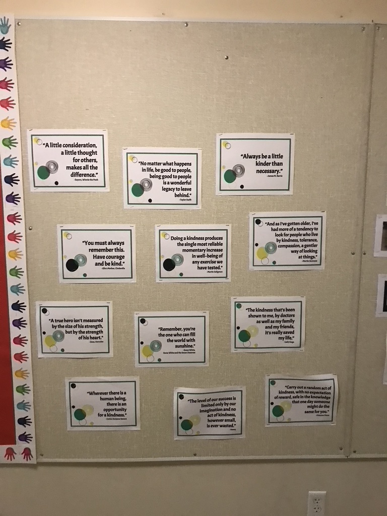
1. Overall Rating (0–10) — 6.0 This photograph captures a thoughtfully arranged bulletin board promoting kindness, with each quote framed as a small, deliberate act of inspiration. The layout is orderly and purposeful, conveying a sense of community and intentionality, though the overall effect is slightly restrained by the flat, utilitarian lighting and lack of visual dynamism. The image succeeds as a documentation of a positive environment, but it doesn’t fully transcend its functional roots to become a compelling visual statement.
2. Composition (0–10) — 6.5 The arrangement of quotes creates a balanced, grid-like pattern that guides the eye across the board, while the colorful handprints on the left add a playful, human touch. The slightly off-center framing and visible wall outlet at the bottom edge introduce minor compositional distractions.
3. Lighting (0–10) — 5.0 The lighting is even and functional, likely from overhead fluorescent sources, which flattens the image and minimizes texture and depth. While it ensures all text is legible, it lacks warmth or directional emphasis, giving the scene a sterile quality.
4. Color & Tone (0–10) — 6.0 The color palette is largely neutral, dominated by beige and white, with subtle pops of color from the handprints and circular graphics. The tone is consistent and clean, though the limited contrast and desaturated hues reduce visual impact.
5. Creativity (0–10) — 6.5 The concept of curating kindness quotes is inherently meaningful and well-executed, with thoughtful design choices in the layout and recurring visual motifs. However, the presentation remains conventional, with little attempt to elevate the message through unique framing or artistic interpretation.
6. Technical Quality (0–10) — 7.0 The image is sharp and clear, with good focus across the board. The text is easily readable, and there are no obvious technical flaws such as blur or noise, though the depth of field is limited.
7. Emotional Impact (0–10) — 6.5 The quotes themselves evoke warmth and hope, creating a gentle emotional resonance. However, the photograph’s straightforward, documentary style prevents it from fully conveying the emotional weight of the message, leaving the viewer with a sense of approval rather than deep connection.
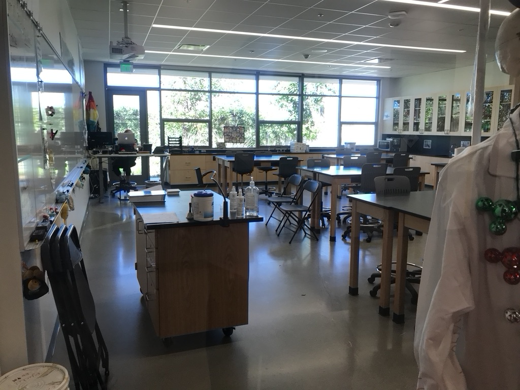
1. Overall Rating (0–10) — 6.0 This photograph captures the quiet stillness of a modern science classroom, where the promise of experimentation lingers in the empty desks and lab equipment. The composition, though functional, feels slightly cluttered, with foreground elements competing for attention. While the scene conveys a sense of order and readiness, it lacks the visual dynamism or narrative tension to feel truly compelling—more a snapshot than a story.
2. Composition (0–10) — 5.5 The image is framed with a wide perspective that emphasizes the length of the room, but the foreground lab coat and stacked chairs create visual distractions. The central aisle leads the eye toward the back, but the asymmetrical balance and overlapping elements reduce compositional clarity.
3. Lighting (0–10) — 6.0 Bright, even fluorescent lighting from the ceiling dominates, creating a clinical, institutional feel. Natural light from the large windows softens the scene, but the harsh overheads flatten the depth and contribute to a sterile atmosphere.
4. Color & Tone (0–10) — 5.5 The palette is dominated by neutral whites, grays, and wood tones, with subtle pops of color from the rainbow flag and green-and-red ornaments on the lab coat. The overall tone is flat and desaturated, lacking warmth or contrast to draw the viewer in.
5. Creativity (0–10) — 6.0 The juxtaposition of the lab coat adorned with festive ornaments against the sterile classroom environment introduces an intriguing, slightly whimsical element. However, the concept is underdeveloped, leaving the viewer to wonder about the context rather than engaging with a clear narrative.
6. Technical Quality (0–10) — 7.0 The image is sharp and well-exposed, with clear detail throughout the space. The focus is consistent, and there is minimal noise, suggesting a capable camera and steady hand. The reflections on the whiteboard and polished floor add texture without detracting from clarity.
7. Emotional Impact (0–10) — 5.0 The photograph evokes a sense of anticipation and quiet potential, but the emotional resonance is muted by the lack of human presence and narrative focus. It feels more like a record of a space than an invitation to a moment.
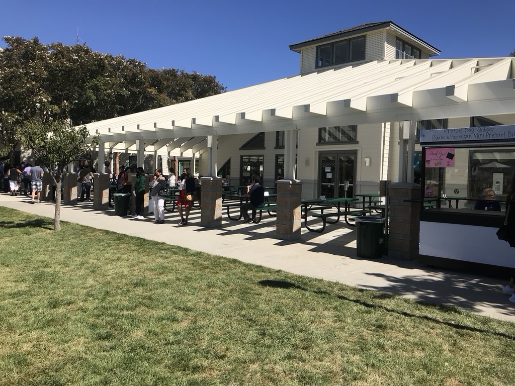
1. Overall Rating (0–10) — 6.0 This photograph captures a lively, sun-drenched outdoor cafeteria scene with a sense of everyday rhythm and community. The bright daylight and open architecture lend a cheerful, welcoming atmosphere, while the scattered groups of people add a natural dynamism. However, the composition feels slightly unbalanced, with the strong diagonal of the walkway pulling attention away from the central activity, and the image lacks a clear focal point that would elevate it beyond a simple documentation of place.
2. Composition (0–10) — 5.5 The diagonal path and long colonnade create a strong leading line, but the framing is uneven, with too much empty grass in the foreground and a partially cut-off vendor booth on the right. The subject is distributed across the frame, diluting visual focus.
3. Lighting (0–10) — 7.5 Bright, direct sunlight creates sharp shadows and high contrast, emphasizing the midday setting. The light is clear and evenly distributed, enhancing textures and form, though it results in some harshness under the roofline.
4. Color & Tone (0–10) — 6.5 The palette is dominated by natural tones—green grass, beige building, and blue sky—with a clean, realistic quality. While the colors are well-saturated, the overall tone leans toward neutrality, lacking a distinctive mood or color harmony.
5. Creativity (0–10) — 5.5 The image functions as a straightforward observational snapshot, capturing a moment without strong narrative or stylistic intent. The architectural lines and movement of people offer visual interest, but the approach is conventional and lacks a unique artistic perspective.
6. Technical Quality (0–10) — 7.0 The image is sharp and well-exposed, with clean details in both the foreground and background. The focus is consistent across the frame, and there are no noticeable technical flaws.
7. Emotional Impact (0–10) — 5.0 The photograph evokes a sense of casual community and routine, but it remains emotionally distant. The lack of a central human subject or narrative moment limits its ability to connect deeply with the viewer.
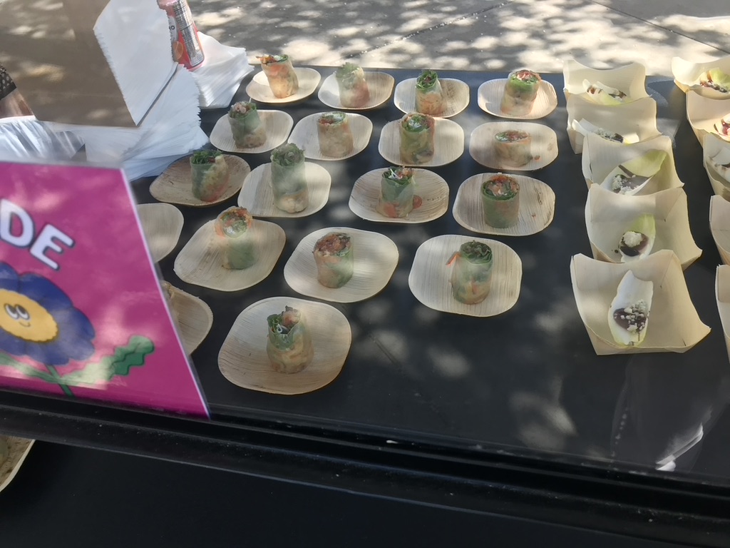
1. Overall Rating (0–10) — 5.5 This photograph captures a vibrant food display, likely at a festival or market, where the focus is on fresh spring rolls and other small bites. The natural daylight enhances the freshness of the ingredients, and the colorful sign adds a playful touch, suggesting a casual, community-oriented event. However, the composition feels slightly cluttered, and the image lacks a strong focal point, which dilutes its visual impact.
2. Composition (0–10) — 5.0 The arrangement of food items is orderly but lacks a clear focal point, with the bright sign in the foreground partially obstructing the view. The diagonal line of the table edge and the scattered shadows create visual tension, but the overall layout feels more functional than intentional.
3. Lighting (0–10) — 6.5 Natural daylight provides even illumination across the scene, with dappled shadows adding texture and depth. The light enhances the translucency of the spring rolls, but the overexposed highlights on the table surface slightly reduce detail.
4. Color & Tone (0–10) — 6.0 The color palette is balanced, with the earthy tones of the bamboo plates complementing the green and orange hues of the spring rolls. The bright pink sign injects a burst of energy, though it feels slightly out of place in the otherwise natural aesthetic.
5. Creativity (0–10) — 5.5 The image is straightforward and documentary in style, capturing a moment without significant artistic interpretation. The choice of subject and casual presentation suggest a focus on authenticity, but the lack of a distinctive visual narrative limits its creative impact.
6. Technical Quality (0–10) — 6.5 The image is sharp and well-focused, with clear details visible in the food and signage. The exposure is generally well-handled, though some areas are overexposed due to direct sunlight.
7. Emotional Impact (0–10) — 5.0 The photograph evokes a sense of casual enjoyment and community gathering, but the lack of emotional depth or storytelling prevents a strong connection with the viewer. The scene feels familiar and pleasant, yet not particularly moving or memorable.
The design of the Union Ave. location also creates a different atmosphere, with spacious classrooms that have colorful doors and high ceilings. Assistant Middle School Division Head Patricia Burrows, who has been part of the Harker community since the opening of the Blackford Ave. campus in 2005, reflects on the moving process to the new campus so far.
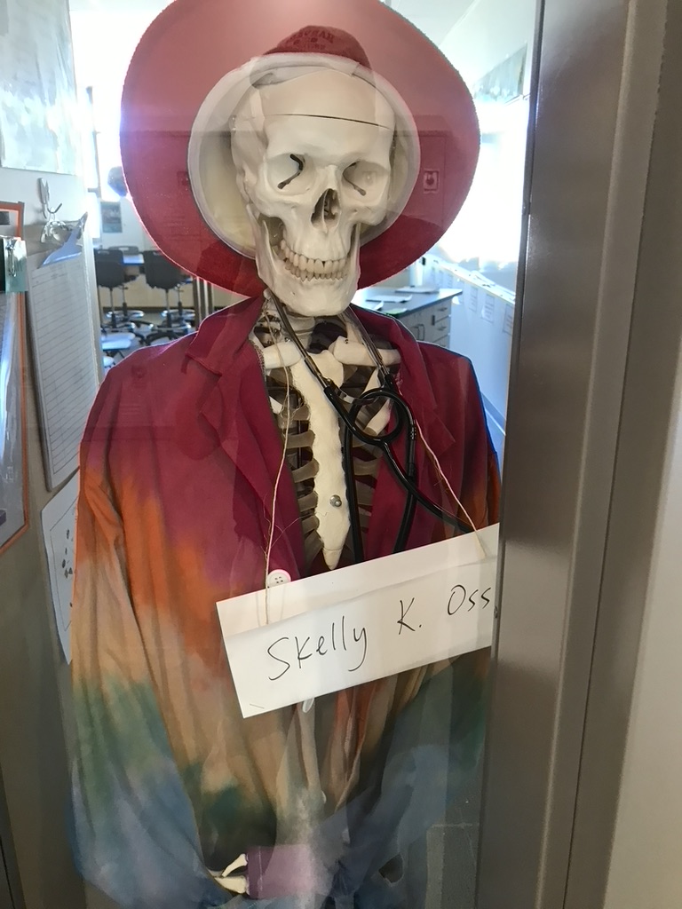
1. Overall Rating (0–10) — 6.0 This photograph captures a whimsical and slightly surreal classroom display, where a skeleton dressed in a tie-dye jacket and wide-brimmed hat becomes a humorous stand-in for a teacher. The playful costume and handwritten name tag suggest a lighthearted tribute, possibly for a school event or science fair. While the concept is charming and imaginative, the image’s clarity is hampered by reflections and a cluttered background, which detract from the subject’s impact.
2. Composition (0–10) — 5.5 The skeleton is centered but partially obscured by reflections on the glass and a door frame on the right, creating a sense of visual distraction. The background elements—desks, chairs, and wall displays—compete for attention, weakening the focus on the main subject.
3. Lighting (0–10) — 5.0 The scene is lit by diffuse indoor lighting, which flattens the image and washes out details. Reflections from the window and overhead lights add glare, further reducing contrast and depth.
4. Color & Tone (0–10) — 6.0 The tie-dye jacket introduces a vibrant mix of warm and cool tones—reds, oranges, and blues—that contrast playfully with the white skull and the sterile environment. However, the colors appear muted due to the lighting and reflections.
5. Creativity (0–10) — 8.0 The idea of dressing a skeleton as a teacher is original and humorous, blending science with humor in a way that feels both educational and entertaining. The handwritten sign adds a personal, narrative touch that enhances the storytelling.
6. Technical Quality (0–10) — 6.0 The image is reasonably sharp, but reflections on the glass and slight overexposure in the background reduce overall clarity. The framing could be tighter to eliminate distractions.
7. Emotional Impact (0–10) — 6.5 The photograph evokes a sense of amusement and warmth, suggesting a classroom culture that values creativity and humor. The playful tone invites viewers to smile, though the technical limitations keep the emotional resonance from fully resonating.
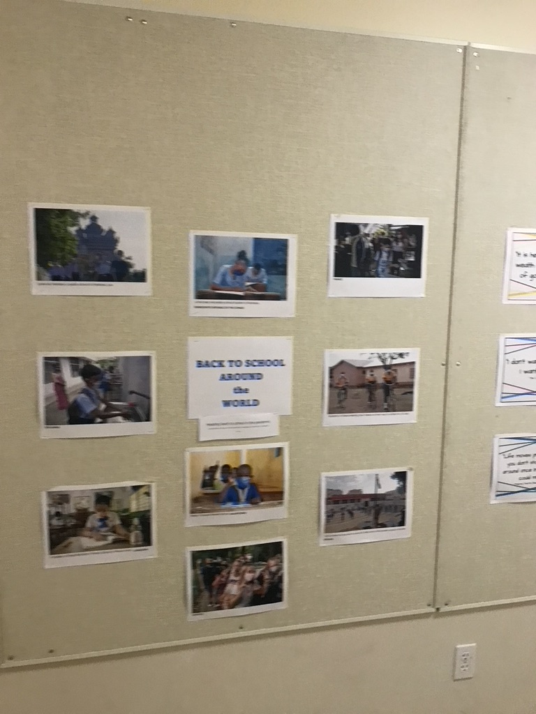
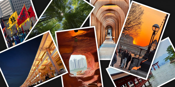
1. Overall Rating (0–10) — 5.5 This photograph captures a classroom bulletin board titled "Back to School Around the World," presenting a collage of international student life. The arrangement conveys a sense of global education and cultural connection, but the image itself feels flat and documentary-like, lacking visual dynamism. While the subject matter is meaningful and inclusive, the execution falls short in creating an engaging or emotionally resonant experience.
2. Composition (0–10) — 6.0 The arrangement of photos is somewhat balanced but uneven, with a central title anchoring the composition. The off-center placement of some images creates visual tension, and the framing feels slightly awkward, cutting off the edge of the board and leaving the viewer with an incomplete sense of space.
3. Lighting (0–10) — 4.5 Harsh, overhead fluorescent lighting creates a sterile atmosphere, flattening the textures of the bulletin board and casting subtle shadows that detract from the clarity of the photographs. The light lacks warmth or direction, diminishing the visual impact of the display.
4. Color & Tone (0–10) — 5.0 The overall palette is muted and desaturated, dominated by beige and off-white tones. The colors in the individual photos vary, but they are not allowed to stand out due to the dull surrounding environment, resulting in a lack of visual harmony.
5. Creativity (0–10) — 6.0 The concept of showcasing global education through student photos is inherently creative and meaningful. However, the presentation is more functional than artistic, with little attention to visual storytelling or aesthetic cohesion.
6. Technical Quality (0–10) — 7.0 The image is reasonably sharp, with clear focus on the bulletin board. However, the angle and slight blur from motion or focus issues reduce the overall technical polish, especially around the edges.
7. Emotional Impact (0–10) — 5.5 The image evokes a sense of quiet curiosity and global awareness, but the emotional resonance is limited by the clinical presentation. It feels more like an archive than a story, offering insight without stirring deeper connection.