The Osaka World Expo 2025, running from April 13 to October 13, 2025, on Yumeshima Island, is a spectacular celebration of human achievement and cultural diversity under the theme "Designing Future Society for Our Lives." Its centerpiece is the Grand Ring, the world's largest wooden structure, designed by Sou Fujimoto, which serves as both a magnificent architectural marvel and a functional elevated walkway providing shelter and breathtaking night views. The Expo offers an unparalleled culinary journey with diverse food stalls from across the globe, particularly highlighting the rich flavors and cultural stories of the Southeast Asian pavilions like Vietnam, the Philippines, and Malaysia.
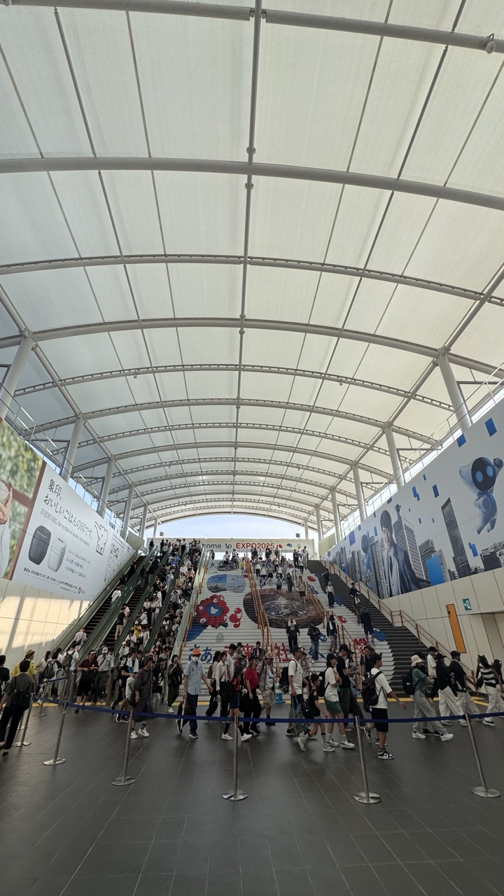

1. Overall Rating (0–10) — 6.0
This photograph captures the bustling energy of a large-scale public event, with crowds moving through a modern, architecturally striking entryway. The wide-angle perspective emphasizes the scale and flow of people, but the image feels slightly overwhelmed by the density and lack of a clear focal point. While it effectively conveys the atmosphere of a busy exhibition venue, the composition lacks a compelling narrative thread to elevate it beyond a mere snapshot.
2. Composition (0–10) — 5.5
The low-angle shot emphasizes the expansive arched ceiling and the flow of people, but the composition is cluttered, with too many subjects and elements competing for attention. The central staircase and banners provide some visual structure, but the lack of a dominant subject creates a sense of visual noise.
3. Lighting (0–10) — 6.5
Natural daylight filters through the translucent roof, creating a bright, even illumination that highlights the space’s clean lines. However, the flatness of the light minimizes shadows and depth, reducing the dramatic impact of the architecture.
4. Color & Tone (0–10) — 6.0
The palette is dominated by neutral whites, grays, and the occasional pop of color from banners and clothing. While the color balance is consistent, the overall tone is muted, with a lack of vibrancy that diminishes the visual excitement of the scene.
5. Creativity (0–10) — 6.0
The image successfully documents a moment in time at a public event, but it leans more toward documentation than artistic expression. The wide-angle perspective and focus on movement suggest an attempt to capture energy, but the lack of a unique viewpoint or thematic focus limits its creative impact.
6. Technical Quality (0–10) — 7.5
The image is sharp and well-focused, with clean details visible in the architecture and crowd. The wide-angle lens is used effectively to capture the environment, though the slight distortion near the edges is noticeable.
7. Emotional Impact (0–10) — 5.5
The photograph conveys a sense of movement and anticipation, but the sheer volume of people and the lack of personal connection make it difficult for the viewer to emotionally engage. The energy is present, but it remains impersonal and observational.
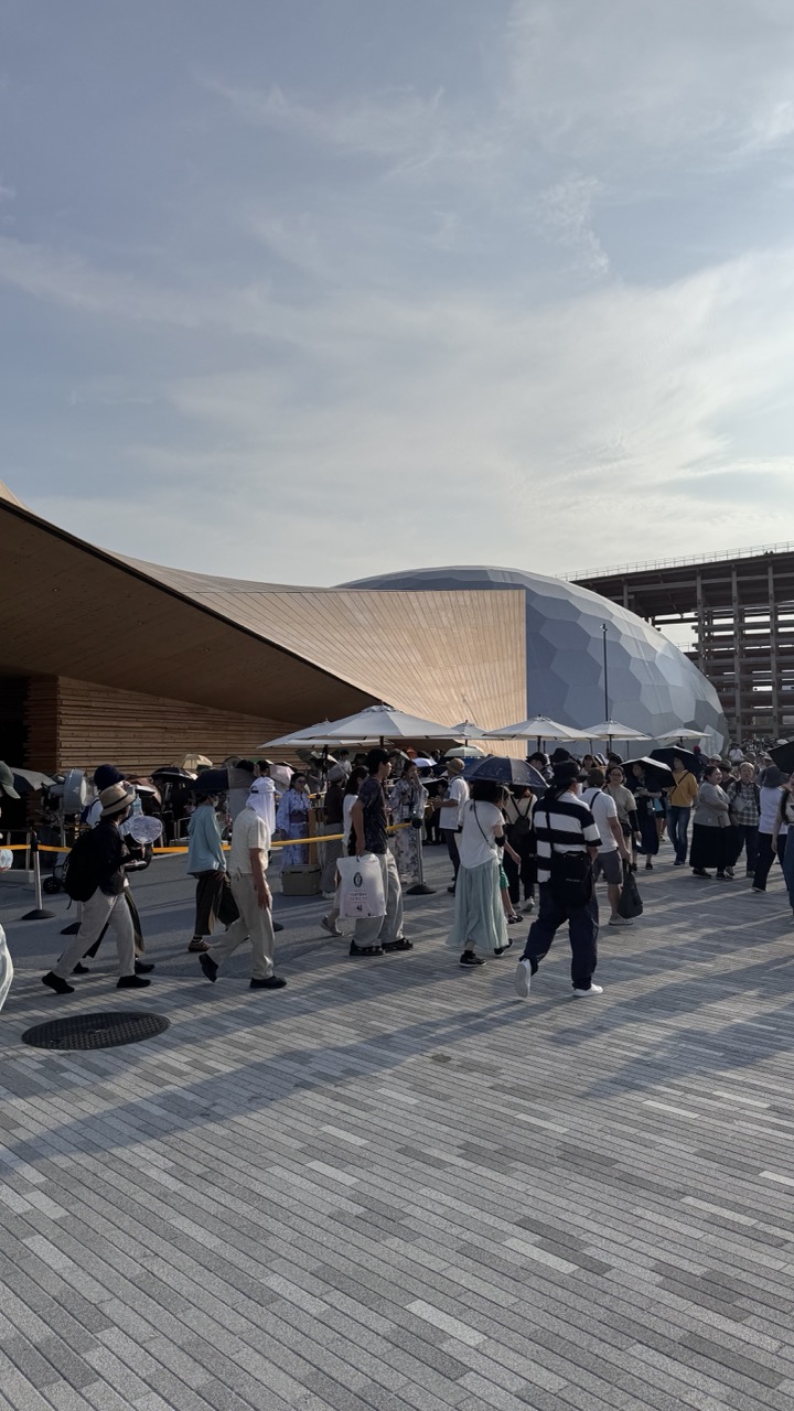

1. Overall Rating (0–10) — 6.0
This photograph captures a bustling public space with a striking architectural backdrop, where modern design meets everyday life. The interplay between the sweeping wooden structure and the geometric dome creates visual interest, while the crowd adds a sense of movement and scale. However, the image feels slightly overexposed and lacks a strong focal point, giving it a candid, almost documentary quality that borders on chaotic.
2. Composition (0–10) — 5.5
The wide-angle framing includes too much empty sky and background, diluting the impact of the architectural forms. The crowd is scattered across the frame, creating visual noise rather than a clear narrative.
3. Lighting (0–10) — 5.0
Harsh midday sunlight flattens the scene with high contrast and overexposed highlights, particularly on the white umbrellas and the dome’s surface, reducing texture and depth.
4. Color & Tone (0–10) — 5.5
The palette is dominated by neutral grays and whites, with the warm wood of the building offering a subtle contrast. The overall tone feels washed out, with muted saturation that diminishes the vibrancy of the environment.
5. Creativity (0–10) — 6.0
The juxtaposition of people with avant-garde architecture suggests a narrative about urban life and design, but the execution lacks intentional framing or artistic direction, feeling more observational than conceptual.
6. Technical Quality (0–10) — 6.5
The image is sharp and well-focused, with clear details in the pavement and architecture. However, exposure control and composition limit the overall impact.
7. Emotional Impact (0–10) — 5.0
The photograph conveys a sense of everyday activity and urban rhythm, but the lack of a compelling subject or emotional anchor keeps the viewer at a distance.
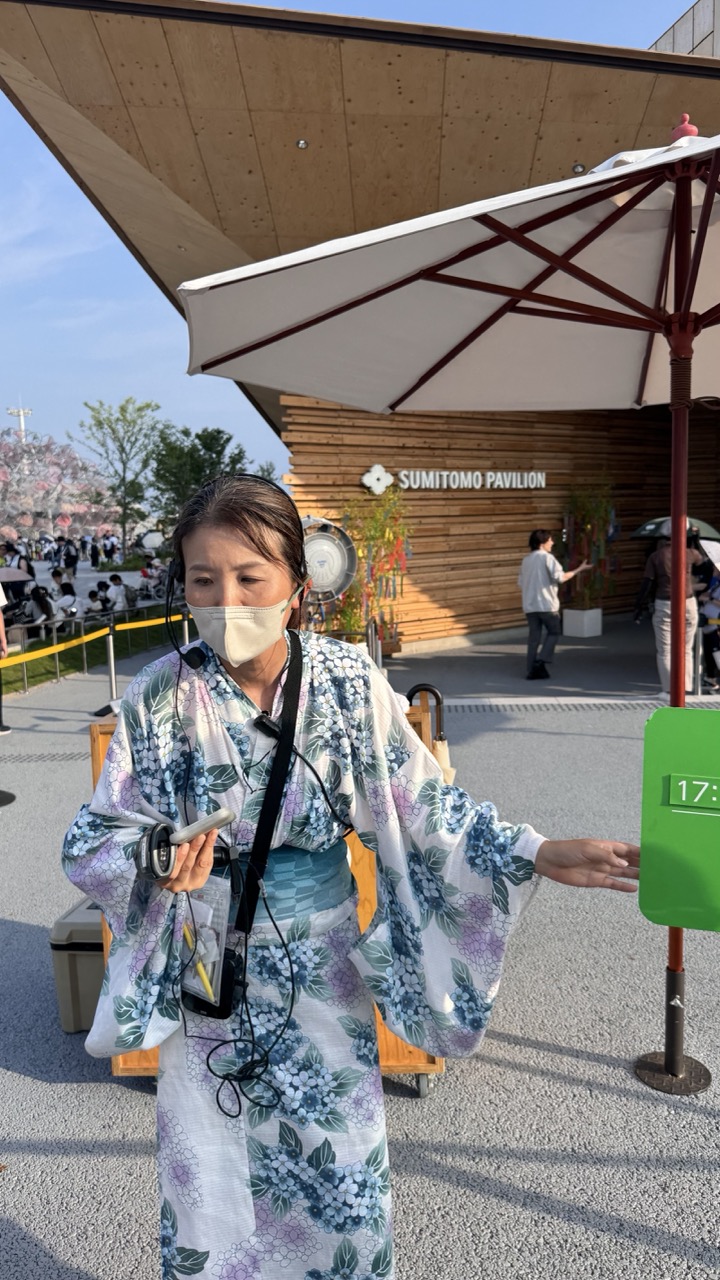

1. Overall Rating (0–10) — 6.8
This photograph captures a candid moment at the Sumitomo Pavilion, blending cultural tradition with modern public life. The woman in the floral kimono, equipped with a headset and microphone, suggests she is a guide or performer, adding a narrative layer of purpose to the scene. While the image is grounded in authenticity and context, its composition feels slightly unbalanced, and the flat lighting diminishes the visual richness of the kimono’s intricate pattern. Still, it succeeds in conveying a sense of place and cultural engagement.
2. Composition (0–10) — 6.0
The subject is placed slightly off-center, creating a dynamic but uneven frame. The large umbrella and green sign on the right disrupt visual flow, while the background elements—though informative—add clutter without enhancing focus.
3. Lighting (0–10) — 6.5
Natural daylight provides even illumination, but the overhead sun casts harsh shadows and flattens the scene’s depth. The bright sky and shaded pavilion create high contrast, which slightly undermines the image’s overall cohesion.
4. Color & Tone (0–10) — 7.0
The kimono’s soft blue and purple floral pattern stands out against the neutral tones of the pavement and wooden structure. The green sign adds a pop of color, though it competes with the natural palette. Overall, the tones are balanced but lack the vibrancy needed to make the image truly striking.
5. Creativity (0–10) — 7.0
The image captures a unique cultural moment—someone in traditional attire engaging with a modern event—offering a compelling juxtaposition. The use of a microphone and headset adds narrative intrigue, suggesting a blend of tradition and contemporary communication.
6. Technical Quality (0–10) — 7.5
The image is sharp, with clear focus on the subject. The details in the kimono and facial expression are well-defined, and the exposure is mostly balanced, despite the challenging lighting conditions.
7. Emotional Impact (0–10) — 6.5
The photograph evokes curiosity and a sense of cultural continuity, inviting the viewer to wonder about the woman’s role and the event’s purpose. While the emotional resonance is present, it remains restrained by the image’s documentary tone rather than cinematic depth.
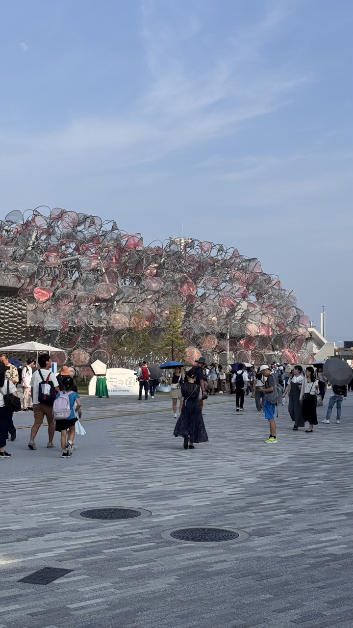

1. Overall Rating (0–10) — 6.8
This photograph captures a vibrant public space centered around an extraordinary architectural sculpture, blending human activity with artistic innovation. The interplay of the organic, cage-like structure and the orderly plaza creates a dynamic tension between nature and design. While the image effectively conveys the scale and energy of the scene, it is slightly held back by a lack of compositional focus and underwhelming lighting, which softens the visual impact of the structure’s intricate details.
2. Composition (0–10) — 6.0
The wide-angle framing includes a broad view of the plaza and the sculpture, but the placement of the structure too far in the background and the scattered pedestrians create a sense of visual clutter. A tighter composition or lower vantage point could better emphasize the sculpture’s form and its relationship with the people.
3. Lighting (0–10) — 6.5
The soft, even daylight provides clear visibility across the scene, but the lack of strong shadows or directional light flattens the sculpture’s texture and depth. The overcast quality of the sky mutes the colors and reduces the drama of the moment.
4. Color & Tone (0–10) — 6.2
The palette is dominated by neutral grays of the pavement and the soft blues of the sky, with the sculpture’s pink and silver tones offering a subtle contrast. While the colors are harmonious, they lack vibrancy, which diminishes the visual punch of the artwork.
5. Creativity (0–10) — 7.5
The choice to photograph this unique architectural installation in a public setting is inherently creative, capturing the interplay between art, space, and everyday life. The inclusion of people adds a narrative layer, suggesting the structure as a cultural and social hub.
6. Technical Quality (0–10) — 7.0
The image is sharp and well-focused, with clean details in both the foreground and background. The exposure is balanced, though the low contrast and lack of dynamic range limit the overall clarity.
7. Emotional Impact (0–10) — 6.0
The photograph evokes a sense of curiosity and urban exploration, inviting viewers to consider the relationship between people and art. While it captures the atmosphere of the location, the emotional resonance is tempered by the distance and neutrality of the composition.
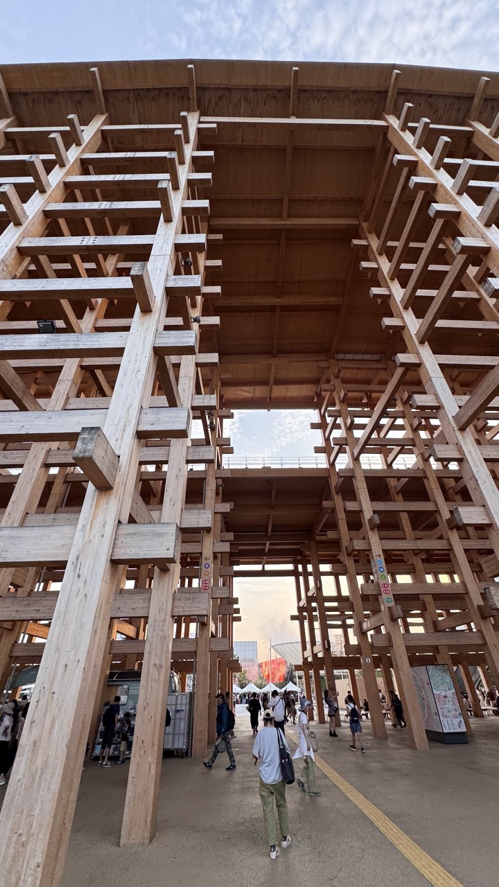

1. Overall Rating (0–10) — 7.0
This photograph captures the grandeur and intricate geometry of a massive wooden architectural installation, evoking a sense of structural poetry and human scale. The low-angle perspective emphasizes the towering lattice, while the presence of people beneath grounds the image in reality. Though the composition is strong, the slightly cluttered background and overcast sky temper its visual impact, leaving room for greater atmospheric cohesion.
2. Composition (0–10) — 7.5
The low-angle framing draws the eye upward, emphasizing the verticality and complexity of the wooden structure. The people below provide scale and movement, while the open archway creates a natural leading line toward the distant event space. The balance between the massive structure and the human figures enhances the sense of awe, though the wide perspective slightly dilutes focus.
3. Lighting (0–10) — 6.5
Natural daylight provides even, soft illumination, avoiding harsh shadows and highlighting the wood’s texture. The overcast sky diffuses light evenly, contributing to a calm, neutral mood. However, the lack of strong directional light or golden-hour warmth limits the image’s emotional depth and dramatic contrast.
4. Color & Tone (0–10) — 6.0
The palette is dominated by warm, earthy tones of natural wood, contrasted subtly by the muted gray pavement and sky. While harmonious, the colors feel somewhat flat and restrained, lacking vibrancy or tonal richness. The occasional pop of color from signage and clothing adds visual interest but doesn’t fully elevate the overall tonal balance.
5. Creativity (0–10) — 7.0
The choice of a low-angle perspective and the focus on structural complexity demonstrate a strong artistic intent. The interplay between architecture and human activity suggests a narrative of interaction with space. While the subject is inherently compelling, the execution remains observational, with room for more dynamic storytelling or conceptual layering.
6. Technical Quality (0–10) — 8.0
The image is sharp and well-focused, with clear detail in the wood grain and structural elements. The exposure is balanced, with no significant over- or underexposed areas. The wide-angle lens captures the scale effectively, though slight distortion at the edges is present, a minor trade-off for the expansive view.
7. Emotional Impact (0–10) — 6.5
The photograph conveys a sense of wonder and curiosity, inviting viewers to contemplate the relationship between people and monumental design. The quiet movement of individuals beneath the structure evokes a contemplative mood, but the lack of a strong emotional focal point or narrative arc keeps the connection to the viewer somewhat intellectual rather than visceral.
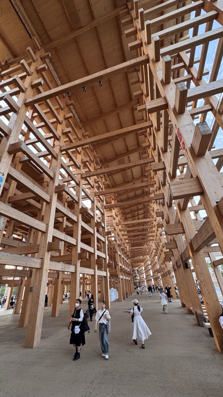

1. Overall Rating (0–10) — 7.0
This photograph captures the awe-inspiring scale and intricate geometry of a wooden architectural installation, where human figures provide a sense of proportion and movement. The interplay of light and shadow through the lattice structure creates a dynamic rhythm, drawing the eye into the depth of the space. While the image effectively conveys the site’s structural beauty and public engagement, its straightforward perspective and modest lighting limit its emotional resonance.
2. Composition (0–10) — 7.5
The low-angle perspective emphasizes the towering wooden framework, creating a strong sense of depth and grandeur. The diagonal lines of the beams guide the viewer’s gaze toward the vanishing point, while the placement of people adds scale and narrative interest without disrupting the architectural harmony.
3. Lighting (0–10) — 6.5
Natural daylight filters through the gaps in the structure, producing soft, diffused illumination and subtle shadows. The light enhances the texture of the wood and adds depth, though the overall exposure is slightly flat, reducing contrast and mood.
4. Color & Tone (0–10) — 7.0
The warm, natural tones of the timber dominate the palette, creating a cohesive and organic feel. The neutral concrete floor and the varied clothing of the visitors introduce small bursts of color that do not distract but instead ground the scene in reality.
5. Creativity (0–10) — 7.5
The image captures a moment of architectural wonder with a clear artistic intent—highlighting the interplay between structure, space, and human presence. The choice of angle and framing transforms a public space into a visually compelling composition, suggesting both order and fluidity.
6. Technical Quality (0–10) — 8.0
The image is sharp and well-focused, with clean details in the wood grain and structure. The exposure is balanced, and the camera appears to be stable, resulting in a clear and technically sound photograph.
7. Emotional Impact (0–10) — 6.5
The photograph evokes a sense of curiosity and contemplation, inviting the viewer to imagine walking through the space and experiencing its scale firsthand. While it conveys the beauty of the architecture, the emotional connection remains somewhat intellectual rather than deeply personal.
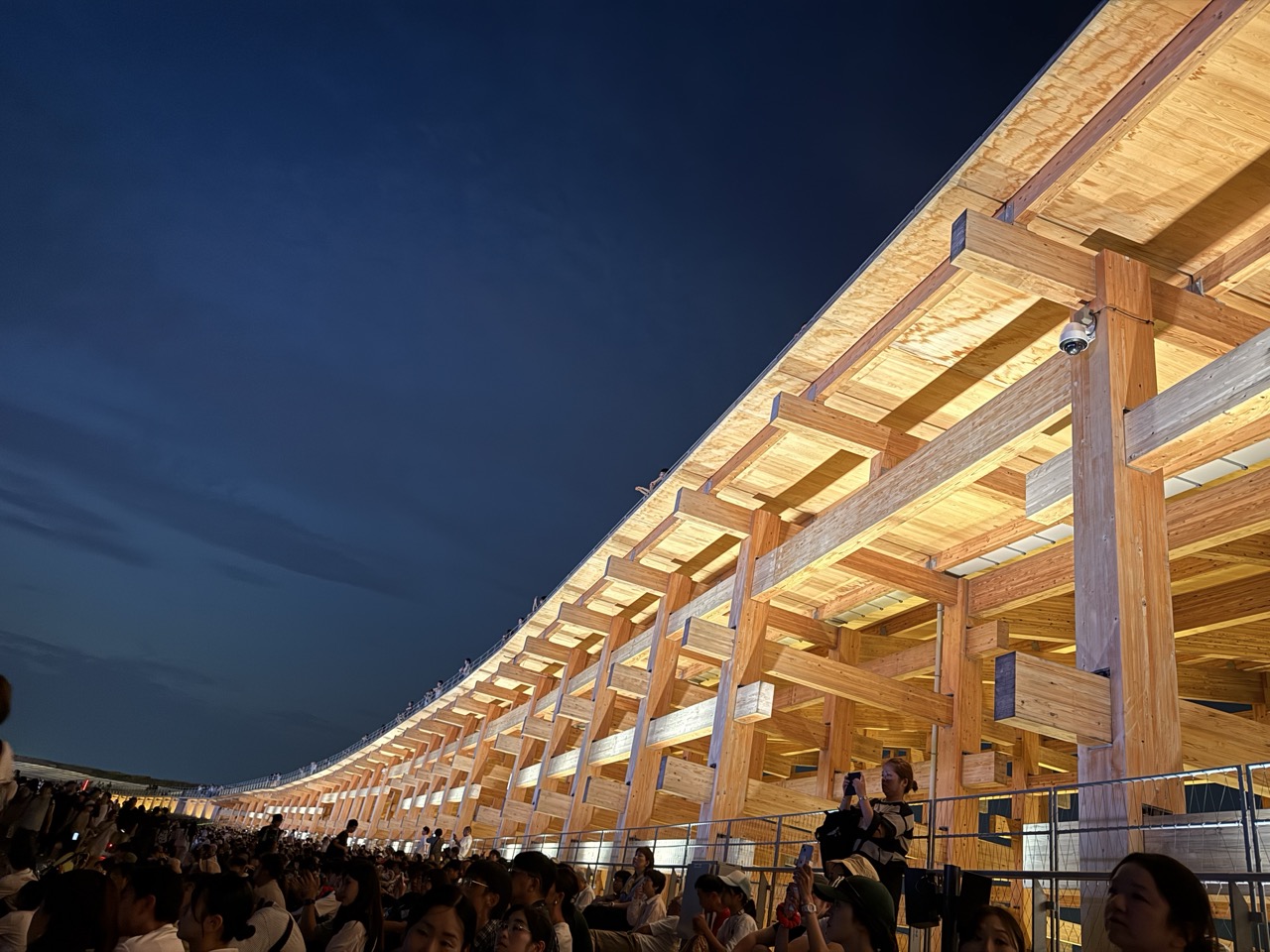

1. Overall Rating (0–10) — 7.0
This photograph captures the grand scale and intricate architecture of a modern wooden structure at dusk, where human presence and architectural form converge in a moment of shared experience. The low-angle perspective emphasizes the structure’s sweeping lines and rhythmic repetition, while the crowd below adds a sense of life and movement. Though the image is visually compelling, the slightly overexposed highlights in the wood and the uneven lighting reduce its overall polish, preventing it from achieving a truly cinematic quality.
2. Composition (0–10) — 7.5
The low-angle, diagonal framing draws the eye along the length of the structure, creating a strong sense of depth and movement. The crowd in the foreground provides scale and context, while the vast dark sky balances the composition’s weight toward the right.
3. Lighting (0–10) — 6.5
The warm artificial lighting illuminates the wooden beams with a soft glow, enhancing texture and depth. However, the overexposure in the upper sections of the structure and the cool, underexposed sky create a contrast that feels slightly unbalanced, reducing the atmospheric cohesion.
4. Color & Tone (0–10) — 6.0
The warm amber tones of the wood contrast sharply with the deep indigo of the evening sky, creating a visually striking palette. The overall tone is moody and contemplative, though the color temperature is uneven, with some areas appearing too bright and others too flat.
5. Creativity (0–10) — 7.0
The perspective and subject matter are compelling—fusing architecture, crowd, and twilight into a narrative of modern public gathering. The low angle and diagonal lines lend a cinematic quality, and the use of the structure as both a setting and a visual motif demonstrates strong conceptual intent.
6. Technical Quality (0–10) — 6.5
The image is sharp and well-focused, with clear details in the wood grain and structural elements. However, the exposure control is inconsistent, with blown-out highlights on the illuminated beams and underexposed shadows in the crowd, indicating a challenge in balancing the dynamic range.
7. Emotional Impact (0–10) — 6.5
The image evokes a sense of awe and communal energy, capturing the atmosphere of a public event or festival at dusk. The juxtaposition of the massive, warm structure against the dark sky and the human figures below creates a feeling of both grandeur and intimacy, though the technical imperfections slightly dampen the emotional resonance.
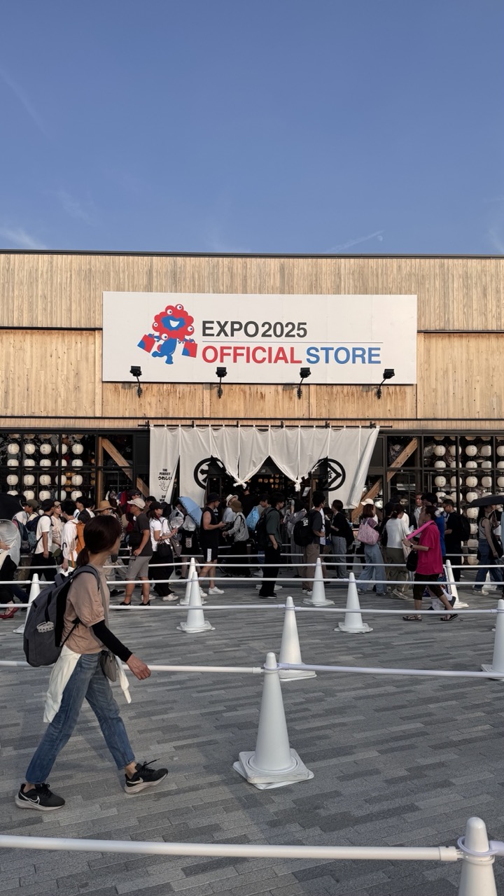

1. Overall Rating (0–10) — 6.8
This photograph captures the lively energy of a public event space, with the EXPO 2025 Official Store serving as a vibrant focal point. The bustling crowd and dynamic foreground movement convey a sense of anticipation and activity, while the clean sky and bold signage lend a modern, celebratory tone. However, the composition feels slightly over-crowded, and the lack of visual hierarchy prevents the image from achieving greater impact.
2. Composition (0–10) — 6.0
The framing is balanced, with the store sign anchoring the upper third and the foreground movement drawing the eye through the scene. However, the density of people and cones creates visual clutter, disrupting flow and diminishing focus on the main subject.
3. Lighting (0–10) — 7.5
Natural daylight provides even, bright illumination, enhancing clarity and detail across the scene. The clear blue sky contributes to a crisp, open atmosphere, though the overhead sun creates subtle flattening in shadows.
4. Color & Tone (0–10) — 7.0
The palette is clean and well-coordinated, with the white and red of the sign standing out against the neutral wood and gray pavement. The vibrant colors of the crowd add life, while the cool blue sky adds depth and contrast.
5. Creativity (0–10) — 6.5
The image captures a moment of real-world activity with a sense of place and occasion. While not artistically stylized, it effectively documents a cultural event with a clear narrative of public engagement.
6. Technical Quality (0–10) — 8.0
Sharp focus and clear detail are evident throughout, particularly in the signage and foreground subject. The exposure is well-managed, with no significant over- or underexposed areas.
7. Emotional Impact (0–10) — 6.0
The image evokes a sense of excitement and anticipation, but the sheer number of people and barriers creates a slightly impersonal feel. It invites the viewer into the scene but doesn’t deeply connect emotionally.
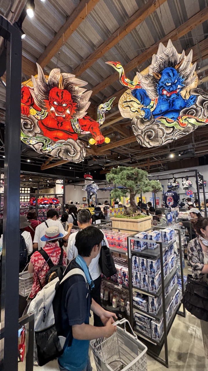

1. Overall Rating (0–10) — 7.0
This photograph captures the vibrant energy of a Japanese-themed retail space, where traditional folklore collides with modern consumer culture. The bold, colorful koi and demon lanterns hanging from the ceiling create a striking visual anchor, drawing the eye upward and infusing the scene with mythic grandeur. While the composition is rich in detail and cultural references, the busy environment and cluttered foreground slightly dilute the image’s overall clarity and focus.
2. Composition (0–10) — 6.0
The frame is crowded with people and merchandise, creating a sense of depth but also visual noise. The large lanterns dominate the upper half, providing strong focal points, but the lower third is cluttered with shopping baskets and bodies, which disrupts the flow.
3. Lighting (0–10) — 6.5
The overhead lighting is bright and even, typical of a retail environment, which ensures clarity across the scene. However, the harshness of the artificial light flattens shadows and reduces the atmospheric depth that might have enhanced the mythical feel of the lanterns.
4. Color & Tone (0–10) — 8.0
The rich reds and blues of the lanterns stand out vividly against the neutral tones of the store interior, creating a powerful contrast. The color palette is dynamic and culturally resonant, with the traditional motifs adding visual excitement.
5. Creativity (0–10) — 7.5
The juxtaposition of ancient Japanese iconography with a modern shopping mall setting is imaginative and conceptually strong. The photograph tells a story of cultural continuity and commercial adaptation, making it more than just a snapshot—it’s a commentary on tradition in the contemporary world.
6. Technical Quality (0–10) — 7.5
The image is sharp and well-focused, with clear details in both the foreground and background. The wide-angle perspective captures the scale of the space effectively, though slight distortion at the edges is noticeable.
7. Emotional Impact (0–10) — 6.5
The scene evokes a sense of wonder and curiosity, particularly through the dramatic lanterns, but the bustling environment and lack of a single human focal point keep the emotional connection from fully resonating. The viewer feels like an observer rather than a participant in the moment.
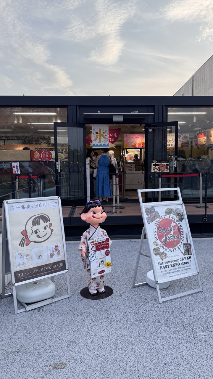

1. Overall Rating (0–10) — 6.8
This photograph captures a lively, culturally rich moment at a Japanese souvenir shop, where playful branding and authentic detail converge. The inclusion of a life-sized mascot and vibrant signage infuses the scene with whimsy and commercial charm, while the soft evening light adds a gentle warmth. The composition is slightly cluttered, and the background activity competes for attention, but the image effectively conveys the bustling atmosphere of a popular cultural attraction.
2. Composition (0–10) — 6.5
The subject is centered and framed by two prominent signs, creating a balanced but slightly busy visual field. The depth of field is adequate, but the background activity and signage distract from the main focal point—the mascot—reducing compositional clarity.
3. Lighting (0–10) — 7.0
Natural light during the late afternoon or early evening casts soft, even illumination across the scene, enhancing the colors without harsh shadows. The ambient glow from the shop’s interior adds warmth and draws the eye into the space.
4. Color & Tone (0–10) — 7.5
The palette is bright and inviting, with strong contrasts between the colorful signage and the neutral pavement. The warm tones of the sky and interior lighting complement the cheerful branding, creating a cohesive and engaging visual atmosphere.
5. Creativity (0–10) — 7.0
The image successfully blends commercial and cultural elements, with the mascot and Japanese text adding narrative depth. The approach is straightforward but effective in capturing the essence of a tourist-oriented Japanese experience.
6. Technical Quality (0–10) — 7.5
Sharp focus and clear detail are maintained throughout, with no noticeable lens distortion or noise. The framing and exposure are well-executed, allowing the scene to be read clearly despite its complexity.
7. Emotional Impact (0–10) — 6.0
The image evokes a sense of curiosity and delight, particularly for viewers familiar with Japanese pop culture. However, the lack of human interaction or emotional connection limits its deeper resonance, leaving it more as an informative snapshot than an emotionally compelling moment.
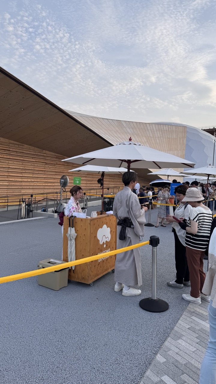

1. Overall Rating (0–10) — 6.0
This photograph captures a moment of cultural exchange at a modern event space, where traditional Japanese attire contrasts with contemporary architecture and casual visitors. The scene feels authentic and lively, with natural interactions and a sense of organized activity. However, the composition is slightly cluttered, and the lighting lacks the dramatic quality that could elevate the mood, leaving the image feeling more like a snapshot than a curated statement.
2. Composition (0–10) — 5.5
The framing includes a variety of elements—people, umbrellas, barriers, and architecture—but the central subject is slightly off-center and partially obscured by the foreground rope, reducing visual clarity. A tighter crop would better focus on the interaction between the staff and guests.
3. Lighting (0–10) — 5.0
The soft, diffused light of an overcast day evenly illuminates the scene but flattens depth and texture. While it prevents harsh shadows, it also diminishes the contrast and mood that could highlight the interplay between traditional and modern elements.
4. Color & Tone (0–10) — 5.5
The palette is restrained, dominated by neutral grays, whites, and soft earth tones, which align with the modern setting. However, the lack of vivid color limits visual energy, making the scene feel subdued and less engaging.
5. Creativity (0–10) — 6.0
The juxtaposition of traditional kimono wearers and modern architectural design offers a thoughtful narrative about cultural continuity. While the idea is strong, the execution remains observational rather than transformative, with little emphasis on artistic interpretation.
6. Technical Quality (0–10) — 7.0
The image is sharp and well-focused, with clean details in the wooden structure and fabric textures. The exposure is balanced, and the camera’s perspective is steady, though the framing and composition hold it back from technical excellence.
7. Emotional Impact (0–10) — 5.0
The scene evokes a sense of calm activity and cultural curiosity, but the emotional resonance is limited by the distance created by the crowd and barriers. It captures a moment without inviting deeper connection or reflection.
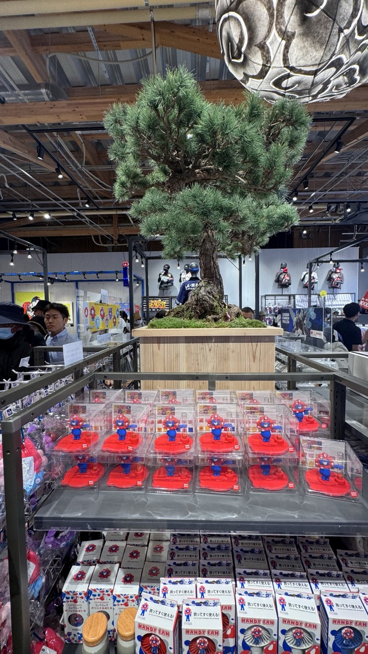

1. Overall Rating (0–10) — 6.0
This photograph captures a vibrant, layered scene from a Japanese pop culture retail space, where the juxtaposition of traditional bonsai and mass-produced collectibles creates a curious visual dialogue. The composition balances commercial energy with subtle cultural reverence, though the cluttered foreground and competing elements slightly dilute the image’s narrative focus. While the setting is rich with detail and context, the image feels more like a snapshot than a fully realized artistic statement.
2. Composition (0–10) — 6.5
The central bonsai tree acts as a strong focal point, drawing the eye upward, while the rows of Mario figures create a rhythmic, repeating pattern that grounds the lower half. However, the overlapping display shelves and background activity introduce visual noise, slightly disrupting the balance and leading to a sense of visual overcrowding.
3. Lighting (0–10) — 6.0
The overhead fluorescent lighting provides even illumination, ensuring clarity across the scene, but it flattens the depth and texture of the bonsai’s foliage and the packaging. The ambient light feels functional rather than atmospheric, lacking the warmth or drama that could elevate the mood.
4. Color & Tone (0–10) — 6.5
The bright red of the Mario figures contrasts sharply with the muted greens and browns of the bonsai and wooden planter, creating visual interest. The overall palette is balanced between the playful and the traditional, though the dominance of white and gray in the packaging and background tones tempers the vibrancy.
5. Creativity (0–10) — 7.0
The conceptual contrast between the carefully cultivated bonsai and the commercialized collectibles is compelling, offering a subtle commentary on tradition versus pop culture. This juxtaposition adds narrative depth, making the image more than just a documentation of a store display.
6. Technical Quality (0–10) — 7.0
The image is sharp and well-focused, with clear details in both the foreground and background. The exposure is balanced, and the resolution is high, allowing for easy identification of the products and surrounding environment.
7. Emotional Impact (0–10) — 5.5
While the scene evokes a sense of curiosity and cultural intrigue, the emotional resonance is tempered by the busy composition and lack of a strong human element. The viewer is invited to observe, but not deeply moved—more intrigued by the visual irony than emotionally engaged.
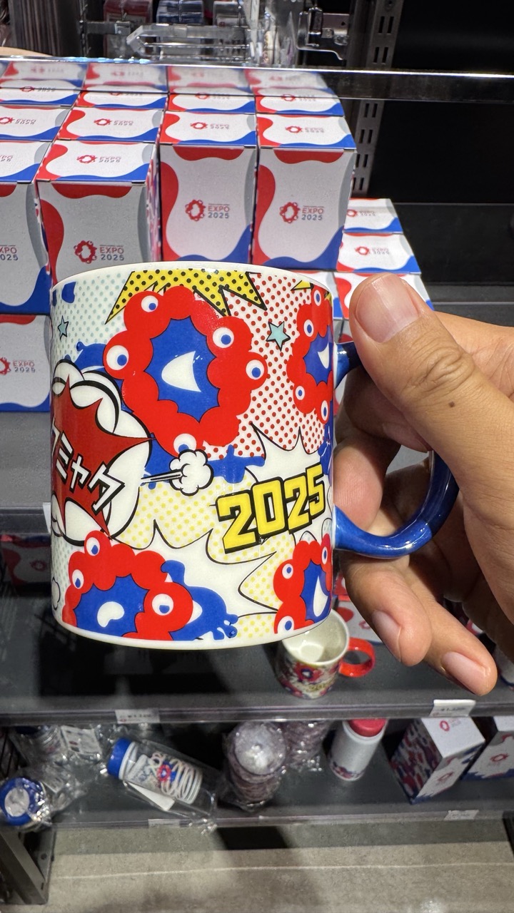

1. Overall Rating (0–10) — 6.0
This photograph captures a vibrant, pop-art-inspired mug for Expo 2025, held in a retail setting with branded merchandise in the background. The bold colors and graphic design of the mug stand out, offering a sense of playful energy and cultural identity. However, the cluttered background and casual framing diminish the image’s visual impact, making it feel more like a snapshot than a polished composition.
2. Composition (0–10) — 5.5
The mug is centered and well-framed, but the background is visually busy with stacked boxes and scattered products, creating distractions. A tighter crop and cleaner background would enhance focus on the subject.
3. Lighting (0–10) — 5.0
Harsh, overhead fluorescent lighting flattens the image and washes out some of the vibrant colors. While the mug is clearly visible, the lack of directional light reduces depth and mood.
4. Color & Tone (0–10) — 7.5
The color palette is lively and energetic, with strong reds, blues, and yellows that reflect the playful design of the mug. The contrast between the bright graphics and the neutral background helps the subject pop, though the overall tone feels slightly flat due to lighting.
5. Creativity (0–10) — 7.0
The choice to photograph a branded souvenir in a retail context is clever, capturing both product and cultural moment. The pop-art style of the mug adds a layer of visual storytelling, though the image itself is more documentary than artistically inventive.
6. Technical Quality (0–10) — 7.0
The image is sharp and clear, with good focus on the mug. However, the lack of depth of field and background clutter slightly undermines the technical polish.
7. Emotional Impact (0–10) — 6.0
The image evokes a sense of anticipation and celebration tied to the Expo 2025 event. The bright design elicits joy and nostalgia, but the casual presentation keeps the emotional resonance from feeling fully immersive.


1. Overall Rating (0–10) — 6.0
This photograph captures a vibrant art exhibit featuring a whimsical, oversized sculpture of a child-like figure in a red-and-white striped suit, evoking a playful yet slightly surreal atmosphere. The reflections on the glass and the cluttered background of posters and visitors introduce visual noise, which detracts from the sculpture’s presence. While the subject is engaging and the setting clearly communicates a pop-culture context, the image feels more like a casual snapshot than a polished artistic composition.
2. Composition (0–10) — 5.5
The central figure is well-framed but partially obscured by reflections and a foreground element. The inclusion of visitors and background artwork creates a layered, dynamic scene, but the composition lacks focus and feels slightly cluttered.
3. Lighting (0–10) — 6.0
The lighting is bright and even, typical of an indoor exhibition space, allowing the sculpture’s details and colors to stand out. However, the reflections on the glass and overhead lighting create distracting glares and reduce overall clarity.
4. Color & Tone (0–10) — 6.5
The bold red and white stripes of the sculpture create a strong visual contrast, complemented by the bright yellow background posters. The overall palette is lively and energetic, though the muted tones of the glass and floor slightly dampen the vibrancy.
5. Creativity (0–10) — 7.0
The choice of subject and its placement within a gallery setting suggest a playful commentary on pop art and consumer culture. The juxtaposition of the oversized sculpture with real people and commercial art adds a layer of narrative and conceptual depth.
6. Technical Quality (0–10) — 6.5
The image is reasonably sharp with clear details, but the reflections on the glass and the slightly off-center framing reduce its technical polish. The focus is adequate, though the reflections and background elements interfere with visual clarity.
7. Emotional Impact (0–10) — 6.0
The image evokes a sense of curiosity and lighthearted amusement, drawing the viewer into the whimsical world of the sculpture. However, the reflections and busy background prevent a deeper emotional connection, leaving the experience feeling more observational than immersive.
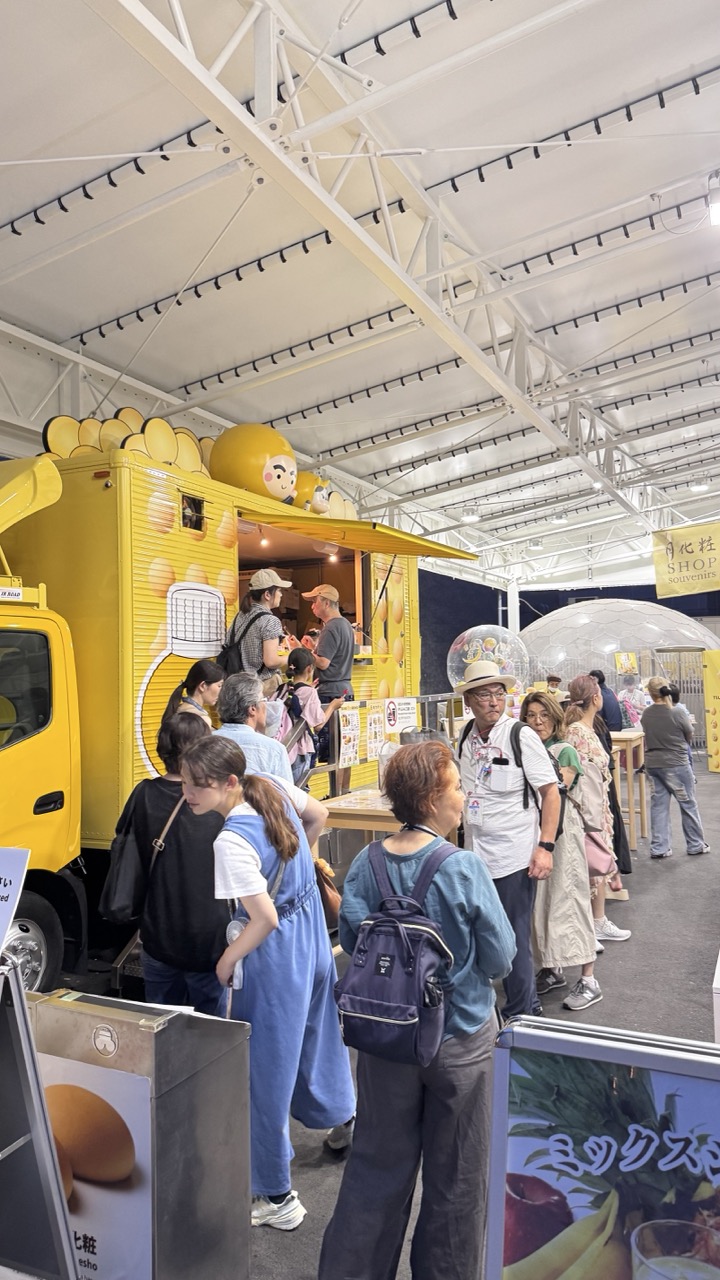

1. Overall Rating (0–10) — 6.0
This photograph captures the vibrant energy of a bustling food market, where a whimsical yellow food truck draws a crowd with its playful design and inviting presence. The scene is lively and full of human interaction, yet the composition feels slightly chaotic, with overlapping figures and a cluttered foreground that dilute the focus. While the image succeeds in conveying the atmosphere of a busy event, it lacks the visual cohesion and intentional framing that would elevate it into a more compelling narrative.
2. Composition (0–10) — 5.0
The framing is crowded and unbalanced, with the food truck partially cut off on the left and a mix of foreground and midground elements competing for attention. A tighter crop would improve focus and reduce visual noise.
3. Lighting (0–10) — 6.0
The overhead fluorescent lighting provides even illumination but lacks depth and mood, creating a flat, commercial feel. The bright white ceiling and reflective surfaces contribute to a slightly sterile atmosphere.
4. Color & Tone (0–10) — 7.0
The dominant yellow of the food truck stands out vividly against the neutral tones of the venue, creating a strong focal point. The color palette is bright and energetic, though slightly oversaturated in some areas, giving the image a playful, commercial edge.
5. Creativity (0–10) — 6.5
The choice of a whimsical food truck with cartoon characters adds a layer of fun and cultural context, suggesting a lighthearted, family-friendly event. The image tells a story of community and consumption, but the execution leans more toward documentation than artistic interpretation.
6. Technical Quality (0–10) — 7.5
The image is sharp and well-focused, with clean details visible on clothing, signage, and the truck’s surface. The exposure is generally balanced, though some areas appear slightly overexposed due to the bright overhead lighting.
7. Emotional Impact (0–10) — 6.0
The photograph evokes a sense of everyday joy and shared experience, capturing the warmth of people gathered around a common treat. While the emotion is present, the lack of a clear focal point and slightly disorganized composition keeps the viewer from fully connecting with the moment.
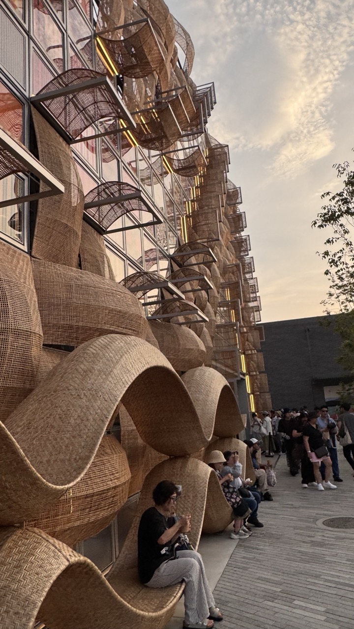

1. Overall Rating (0–10) — 7.5
This photograph captures a striking fusion of organic architecture and urban life, where the warm, sculptural forms of woven bamboo seating create a visual rhythm against the modern glass facade. The low-angle perspective enhances the grandeur of the structure, while the soft golden hour light infuses the scene with a contemplative, almost meditative atmosphere. Though the composition is strong, the presence of people slightly disrupts the architectural harmony, grounding the image in reality but softening its aesthetic cohesion.
2. Composition (0–10) — 7.0
The diagonal line of the seating and the building’s structure guides the eye upward and into the frame, creating dynamic movement. The low-angle shot emphasizes scale and form, though the inclusion of the crowd on the right introduces a slight visual imbalance.
3. Lighting (0–10) — 8.0
The warm, diffused light of late afternoon enhances the natural textures of the bamboo and casts soft shadows, adding depth and mood. The glow from the interior lights subtly accentuates the layered design, creating a harmonious interplay between natural and artificial light.
4. Color & Tone (0–10) — 7.5
The earthy tones of the woven structures contrast beautifully with the cool grays of the pavement and the muted sky, creating a balanced and natural palette. The golden hue of the sunset adds warmth and cohesion, elevating the overall tonal harmony.
5. Creativity (0–10) — 8.0
The image presents a compelling narrative of contemporary design rooted in traditional materials, blending cultural heritage with modern architecture. The choice to capture the scene at dusk adds poetic resonance, transforming a public space into a moment of quiet reflection.
6. Technical Quality (0–10) — 8.5
Sharp focus and clear detail highlight the intricate textures of the woven elements. The exposure is well-managed, with no blown-out highlights or lost shadows, allowing the image to retain depth and clarity.
7. Emotional Impact (0–10) — 7.0
The photograph evokes a sense of calm and wonder, inviting the viewer to appreciate the interplay between human scale and architectural ambition. The seated figures add a layer of relatability, grounding the image in everyday life while preserving its artistic allure.
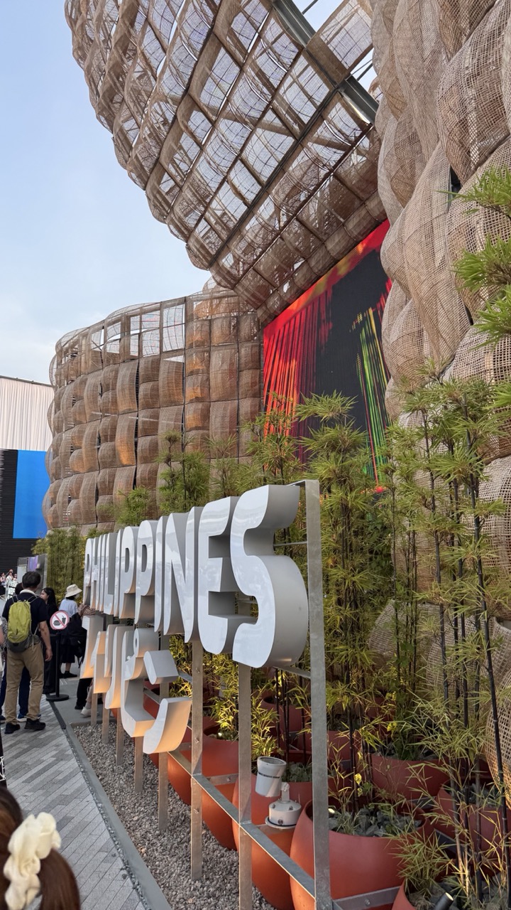

1. Overall Rating (0–10) — 6.8
This photograph captures the vibrant energy of a cultural pavilion, where organic architecture and bold signage converge to celebrate national identity. The interplay of natural textures—woven mesh and bamboo—with modern digital displays creates a compelling visual dialogue between tradition and innovation. While the composition feels slightly cluttered, the scene's dynamic energy and cultural specificity give it a strong sense of place and purpose.
2. Composition (0–10) — 6.0
The low-angle perspective emphasizes the scale of the structure, but the foreground signage and scattered visitors create visual distraction. A tighter crop or more deliberate framing could enhance focus on the architectural details.
3. Lighting (0–10) — 6.5
Natural daylight provides even illumination, highlighting the textures of the woven facade. The contrast between the soft outdoor light and the glowing digital screen adds visual interest and depth.
4. Color & Tone (0–10) — 7.0
The warm, earthy tones of the woven structure and terracotta planters harmonize with the cool white of the signage. The pop of red and green from the digital display injects vibrancy, creating a balanced and engaging palette.
5. Creativity (0–10) — 7.5
The fusion of sustainable materials with modern design and cultural expression demonstrates thoughtful creativity. The juxtaposition of natural elements with digital media reflects a forward-thinking vision of national identity.
6. Technical Quality (0–10) — 7.5
Sharp focus and clear detail are evident in both the architectural textures and the signage. The image is well-exposed, with no obvious technical flaws.
7. Emotional Impact (0–10) — 7.0
The photograph evokes a sense of pride and celebration, inviting viewers to reflect on cultural heritage and innovation. The presence of people adds life and relatability, enhancing the emotional resonance.
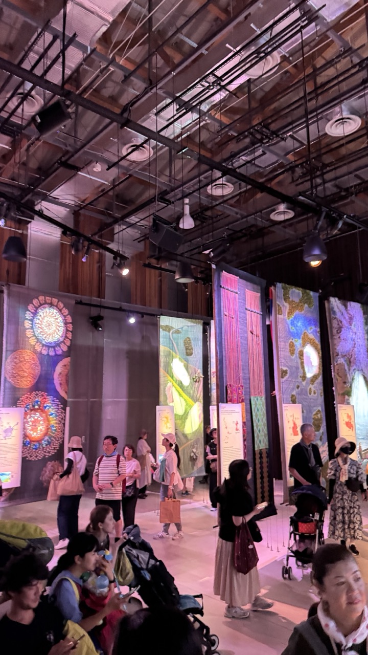

1. Overall Rating (0–10) — 6.0
This photograph captures the bustling energy of a contemporary art exhibition, where vibrant textiles and immersive installations draw visitors into a shared cultural experience. The high ceiling and exposed industrial elements lend an urban, gallery-like atmosphere, while the warm lighting enhances the vivid colors of the artworks. However, the composition feels slightly cluttered, and the focus is divided between the diverse elements in the frame, preventing a singular, compelling narrative from emerging.
2. Composition (0–10) — 5.5
The wide-angle perspective captures the scale of the space but results in a crowded and uneven arrangement. The placement of visitors and artworks creates visual noise, with no clear focal point guiding the viewer’s eye.
3. Lighting (0–10) — 6.5
The lighting is warm and atmospheric, with spotlights accentuating the textures and colors of the hanging textiles. While effective in highlighting the art, the ambient glow creates soft shadows that reduce contrast in the background.
4. Color & Tone (0–10) — 7.0
A rich and varied palette dominates the image, with bold hues in the textile art contrasting against the neutral tones of the industrial ceiling and floor. The warmth of the lighting enhances the vibrancy, giving the scene a lively, inviting feel.
5. Creativity (0–10) — 7.0
The juxtaposition of traditional textile art within a modern, industrial setting creates an engaging dialogue between culture and contemporary design. The choice of a candid, documentary-style shot adds authenticity, though the narrative remains open-ended.
6. Technical Quality (0–10) — 6.5
The image is sharp and well-exposed, with clear details in both the foreground and background. However, the wide-angle lens introduces slight distortion, and the depth of field is inconsistent, resulting in some areas appearing slightly soft.
7. Emotional Impact (0–10) — 6.0
The photograph conveys a sense of community and curiosity, inviting the viewer to imagine themselves in the space. While the mood is positive and engaging, the lack of a strong emotional focal point limits its resonance.
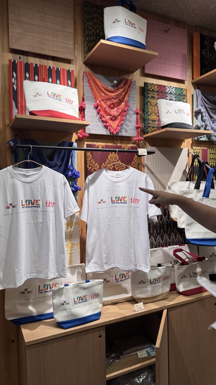

1. Overall Rating (0–10) — 6.0
This photograph captures the vibrant essence of a cultural merchandise display, showcasing traditional Filipino textiles and event-themed apparel with a sense of pride and authenticity. The composition is rich in detail and color, yet the framing feels slightly cluttered, and the presence of a pointing finger disrupts the visual harmony. While the image effectively communicates the spirit of the "Love the Philippines" campaign, it lacks the editorial polish to elevate it beyond a simple souvenir store snapshot.
2. Composition (0–10) — 5.5
The framing is tight and slightly off-center, with a hand pointing into the scene that draws attention away from the main subject. The overlapping elements—t-shirts, bags, and textiles—create visual busyness, but the layered shelves provide depth and context.
3. Lighting (0–10) — 6.0
Even, overhead lighting illuminates the scene without harsh shadows, allowing the colors and textures of the textiles to stand out. However, the lighting lacks warmth and drama, resulting in a flat, commercial appearance.
4. Color & Tone (0–10) — 6.5
The palette is lively and culturally resonant, with bold reds, blues, and earthy tones in the textiles complementing the white and colorful branding. The tonal range is moderate, with sufficient contrast to distinguish details, though the overall tone feels slightly muted.
5. Creativity (0–10) — 6.0
The image is conceptually strong, blending cultural heritage with modern branding. The inclusion of the hand adds a human element, suggesting engagement, but the execution leans toward documentation rather than artistic interpretation.
6. Technical Quality (0–10) — 7.0
The focus is sharp on the central t-shirt, and the image is free of noticeable noise or blur. The depth of field is appropriate, capturing both foreground and background details clearly.
7. Emotional Impact (0–10) — 5.5
The image evokes a sense of cultural celebration and pride, but the direct, unmediated presentation keeps the viewer at a distance. The emotional resonance is more intellectual than visceral, appealing to those familiar with the campaign rather than inspiring a broader emotional connection.
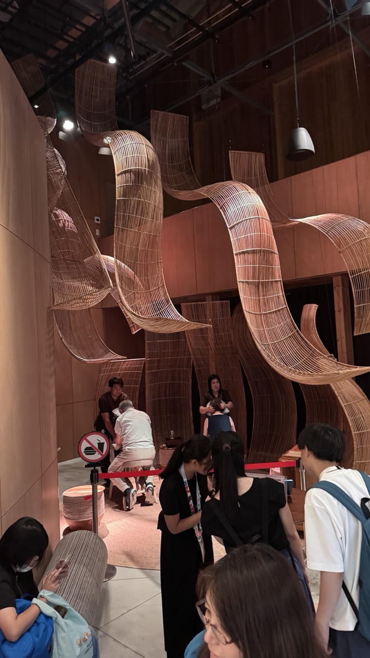

1. Overall Rating (0–10) — 7.0
This photograph captures the dynamic interplay between architectural artistry and human interaction within a contemporary exhibition space. The sweeping bamboo installations dominate the scene with fluid elegance, creating a sense of movement and organic rhythm. While the image effectively conveys the scale and texture of the installation, the cluttered foreground and candid composition slightly undermine its visual cohesion.
2. Composition (0–10) — 6.5
The framing includes a mix of foreground activity and background artistry, but the overlapping figures and red rope barrier disrupt visual flow. A tighter focus on the sculpture’s form would enhance balance.
3. Lighting (0–10) — 6.0
Warm, ambient lighting accentuates the natural texture of the bamboo, but overhead spotlights create uneven highlights and shadows. The dimness in the background slightly obscures details.
4. Color & Tone (0–10) — 6.5
The palette of earthy browns and soft beige tones complements the organic materials, lending a cohesive and calming atmosphere. However, the muted contrast limits visual depth.
5. Creativity (0–10) — 7.5
The integration of large-scale, curvilinear bamboo structures demonstrates innovative design, merging traditional craft with modern spatial expression. The scene captures both artistic intent and public engagement.
6. Technical Quality (0–10) — 7.0
The image is sharp and well-exposed, with clear detail in the bamboo weave. Slight motion blur in the foreground suggests a lower shutter speed, but overall clarity remains strong.
7. Emotional Impact (0–10) — 6.5
The photograph evokes a sense of curiosity and cultural richness, inviting viewers into a space where art and everyday life converge. The presence of people adds warmth, though the lack of a clear focal point tempers the emotional resonance.
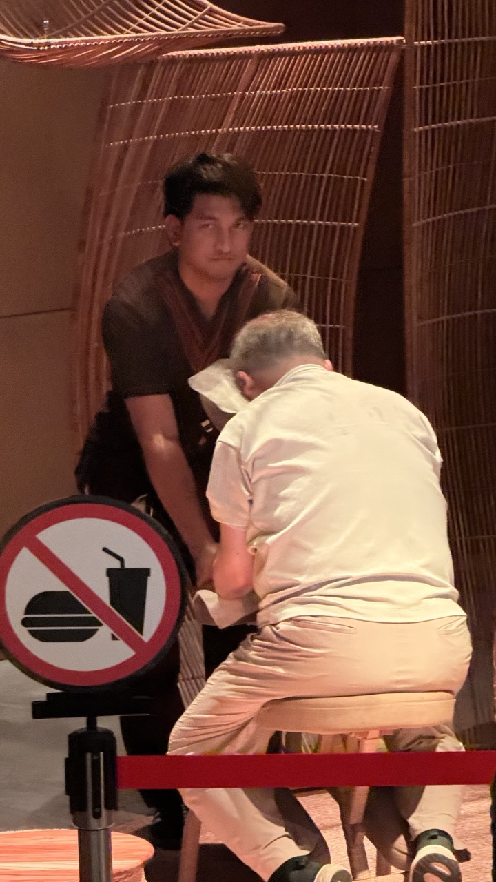

1. Overall Rating (0–10) — 5.5
This photograph captures a candid moment in what appears to be a performance or staged interaction, where the tension between observer and participant is palpable. The composition is slightly chaotic, with a distracting foreground sign that competes for attention, yet the raw energy of the scene—highlighted by the seated man’s bowed posture and the standing man’s intense gaze—suggests a narrative worth exploring. While the image feels more like a documentation than a polished portrait, its authenticity and underlying drama give it a modest emotional pull.
2. Composition (0–10) — 4.5
The framing is awkward, with the no-food sign dominating the lower left and partially obstructing the view. The subjects are off-center, and the vertical lines of the bamboo screen create a cluttered backdrop that distracts from the human interaction at the heart of the image.
3. Lighting (0–10) — 5.0
The lighting is flat and artificial, likely from overhead fixtures, casting minimal shadows and reducing depth. While it adequately illuminates the scene, it lacks the warmth or directionality needed to enhance mood or highlight the subjects’ expressions.
4. Color & Tone (0–10) — 5.0
The color palette is muted, dominated by beige, brown, and off-white tones, with the red of the sign providing a jarring contrast. The overall tone feels neutral and unbalanced, with the red drawing attention in a way that disrupts visual harmony.
5. Creativity (0–10) — 5.5
The image captures a moment that feels staged or performative, suggesting a narrative beyond the surface. However, the lack of intentional framing and the intrusive sign limit its artistic impact, making the creativity feel more accidental than deliberate.
6. Technical Quality (0–10) — 6.0
The image is reasonably sharp, with clear details in the subjects’ clothing and the sign. Focus is adequate, but the low-light conditions and digital noise reduce overall clarity and richness.
7. Emotional Impact (0–10) — 5.0
The emotional tension is present but underdeveloped—there’s a sense of unease or ritual, but the viewer is kept at a distance by the framing and composition. The image hints at a deeper story but fails to fully convey it.
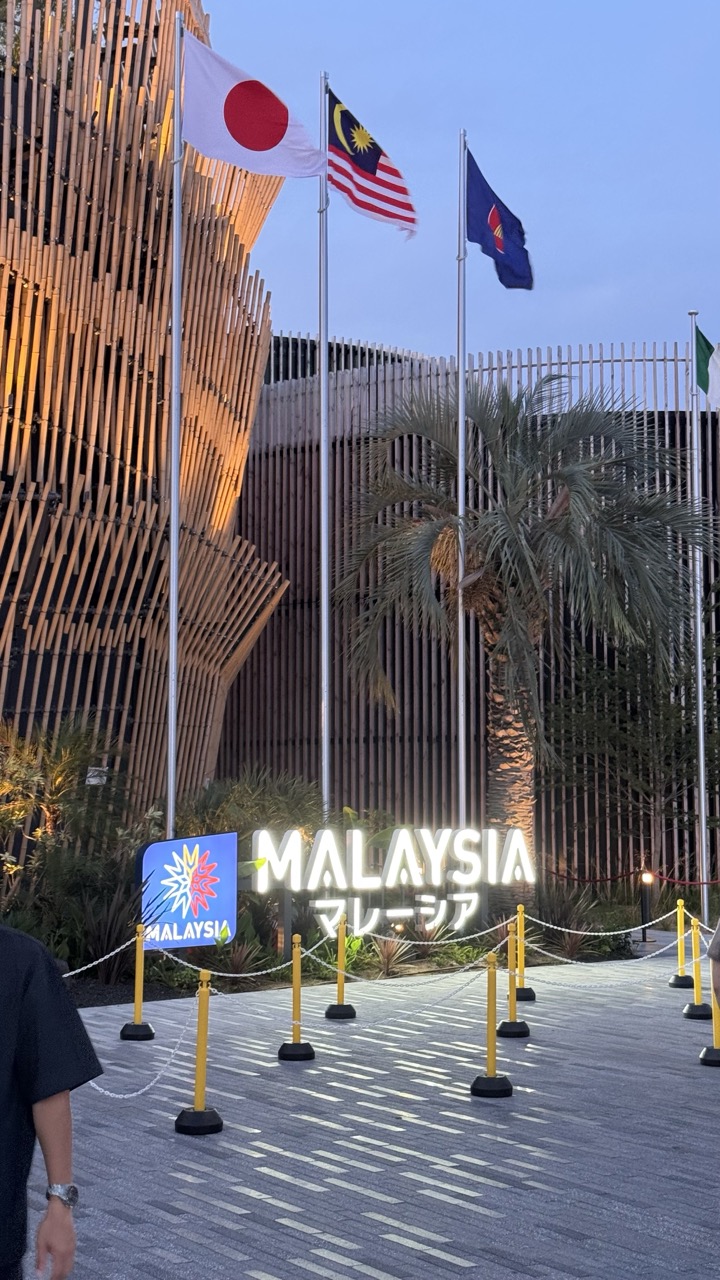

1. Overall Rating (0–10) — 6.0
This photograph captures a vibrant cultural showcase at dusk, where the interplay of modern architecture, national identity, and ambient light creates a sense of global connection. The illuminated "MALAYSIA" sign and the fluttering flags—Japan, Malaysia, and another—anchor the scene with symbolic weight, while the warm glow on the bamboo façade adds depth. However, the composition feels slightly cluttered by foreground elements and the casual presence of a person, which detracts from the intended grandeur of the moment.
2. Composition (0–10) — 5.5
The subject is centered and framed by the flags and architecture, but the inclusion of the person in the lower-left corner disrupts visual harmony. The leading lines of the pathway and rope barriers guide the eye toward the sign, yet the framing feels more like a snapshot than a deliberate composition.
3. Lighting (0–10) — 7.0
The soft, golden light of dusk enhances the texture of the bamboo structure and casts a warm glow on the scene. The illuminated signage provides strong focal points, and the ambient lighting creates a balanced contrast between the lit and unlit areas, though the sky remains underexposed.
4. Color & Tone (0–10) — 6.5
The palette is harmonious, with the earthy tones of the bamboo and the vivid colors of the flags creating visual interest. The cool blue of the evening sky contrasts with the warm artificial lights, adding depth. However, the overall tone is slightly muted, lacking richness in the shadows and midtones.
5. Creativity (0–10) — 6.0
The image successfully merges cultural symbolism with contemporary design, but the execution leans toward documentation rather than artistic interpretation. The juxtaposition of Japanese and Malaysian flags suggests a collaborative theme, yet the narrative remains implicit rather than compelling.
6. Technical Quality (0–10) — 7.5
The image is sharp and well-focused, with clear details in the signage, flags, and architectural elements. The exposure is balanced, though the sky appears slightly overexposed, and the lower-left corner shows a slight blur due to motion.
7. Emotional Impact (0–10) — 5.5
The photograph evokes a sense of international cooperation and cultural pride, but the emotional resonance is tempered by the casual, unposed nature of the scene. The viewer is invited to observe rather than feel, leaving the moment feeling more like a passing glance than a profound connection.
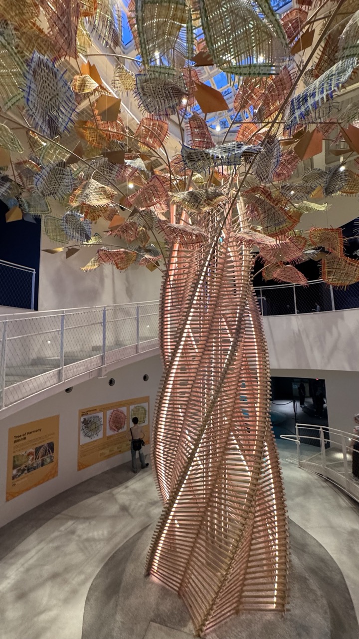

1. Overall Rating (0–10) — 8.0
This photograph captures the grandeur and intricate artistry of a large-scale woven sculpture, evoking a sense of organic growth and cultural resonance. The interplay of light, texture, and scale creates a visually compelling narrative, drawing the viewer into the space with quiet awe. While the composition is strong, the inclusion of a person adds a touch of scale but slightly disrupts the sculpture’s immersive presence.
2. Composition (0–10) — 7.5
The low-angle perspective emphasizes the sculpture’s height and complexity, with the spiraling trunk and branching canopy filling the frame dynamically. The surrounding architecture and walkway provide context without overwhelming the central subject, though the placement of the viewer’s eye slightly favors the left, creating a subtle imbalance.
3. Lighting (0–10) — 8.0
Soft, ambient lighting filters through the glass ceiling, illuminating the sculpture from above and casting gentle shadows that accentuate its layered texture. The warm glow on the copper-toned weave enhances its organic quality, while the natural light from the skylight adds depth and dimension.
4. Color & Tone (0–10) — 7.5
A harmonious palette of earthy copper, beige, and muted blues blends seamlessly with the gallery’s neutral tones. The contrast between the warm sculpture and the cool, shadowed background creates visual interest, while the overall tonal balance supports a contemplative mood.
5. Creativity (0–10) — 9.0
The sculpture’s design—a fusion of natural form and intricate craftsmanship—exemplifies innovative artistic expression. Its integration into the architectural space suggests a deliberate dialogue between art, culture, and environment, making it not just a visual object but a conceptual statement.
6. Technical Quality (0–10) — 8.0
The image is sharp and well-focused, with excellent clarity in the fine details of the woven structure. The depth of field is appropriate, capturing both the foreground and midground with precision, while the exposure remains balanced despite the mixed lighting conditions.
7. Emotional Impact (0–10) — 8.5
The sculpture inspires a sense of wonder and reverence, inviting reflection on themes of nature, community, and sustainability. Its scale and beauty create an emotional resonance, drawing the viewer into a moment of quiet contemplation and admiration.
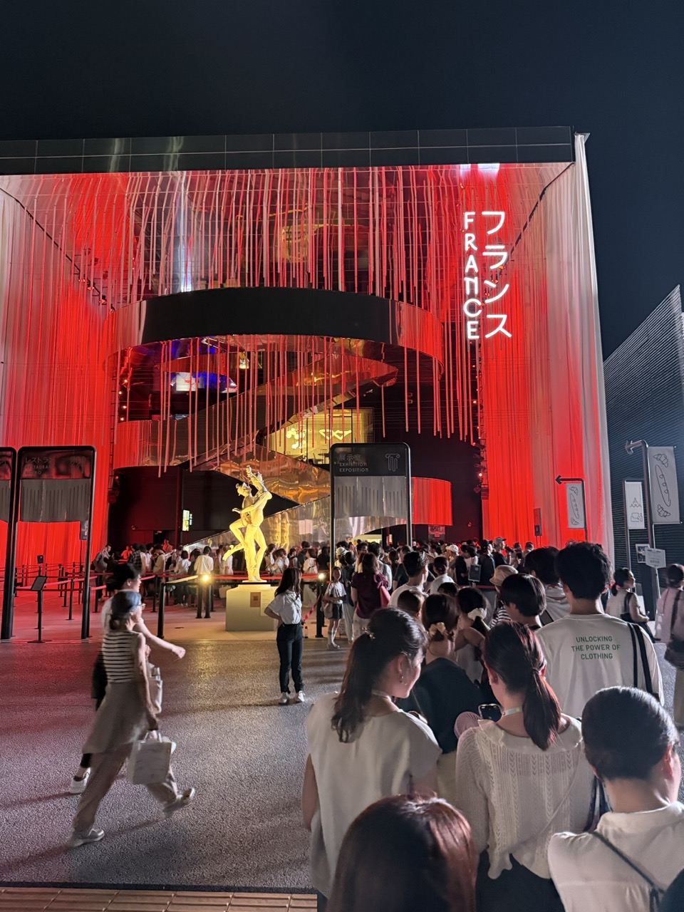

1. Overall Rating (0–10) — 7.0
This photograph captures the vibrant energy of a nighttime public exhibition, where the interplay of light, architecture, and human movement creates a dynamic urban spectacle. The bold red illumination and the golden sculpture command attention, while the crowd’s presence grounds the scene in real-world engagement. While the composition is visually striking, the sheer density of elements slightly dilutes the focus, preventing the image from achieving a more cohesive, polished impact.
2. Composition (0–10) — 6.5
The framing centers on the illuminated structure, with the crowd in the foreground providing depth and scale. However, the low-angle perspective and overlapping figures create visual clutter, slightly disrupting the balance between subject and environment.
3. Lighting (0–10) — 8.0
The dramatic red backlighting and the golden glow on the sculpture create a powerful contrast against the dark night sky, enhancing mood and visual drama. The light sources are well-placed to highlight key features, though some areas of the crowd remain underexposed.
4. Color & Tone (0–10) — 7.5
The dominant red and warm gold tones convey energy and excitement, while the cool shadows provide contrast. The color palette is cohesive and purposeful, though the saturation could be slightly more refined to avoid a slightly harsh digital look.
5. Creativity (0–10) — 7.0
The fusion of modern architecture, neon signage, and public art reflects a contemporary cultural moment. The image successfully captures a unique event, blending narrative and spectacle in a way that feels both timely and visually engaging.
6. Technical Quality (0–10) — 7.0
The image is sharp and clear, with good detail in both the architecture and the crowd. Exposure is generally well-managed, though some highlights in the red lighting show slight overexposure.
7. Emotional Impact (0–10) — 6.5
The photograph evokes a sense of wonder and collective excitement, inviting the viewer to imagine themselves in the crowd. While the emotional resonance is strong, the lack of a singular focal point or intimate detail keeps the connection somewhat distant.
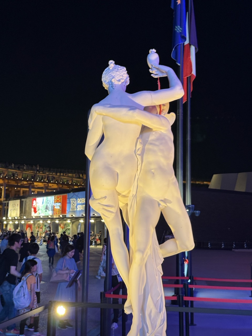

1. Overall Rating (0–10) — 6.0
This photograph captures a striking juxtaposition of classical art and modern urban life, where a luminous white sculpture stands as a beacon amid the bustling night. The interplay of artificial lighting and the statue’s elegant form creates a moment of visual intrigue, though the surrounding environment—crowded, commercial, and slightly chaotic—dilutes the sculpture’s timeless presence. While the image succeeds in capturing a compelling cultural collision, it feels more like a snapshot than a refined composition.
2. Composition (0–10) — 5.5
The sculpture is well-framed and dominates the center, but the cluttered background and diagonal flagpoles disrupt visual harmony. The red ropes and scattered people add layers but lack intentional arrangement.
3. Lighting (0–10) — 6.5
The sculpture is illuminated with a warm, golden glow that highlights its form and texture, creating a dramatic contrast against the dark night. However, the ambient lighting from the surrounding buildings and signage introduces competing colors and distractions.
4. Color & Tone (0–10) — 6.0
The palette is a mix of warm yellows on the statue, cool blues in the shadows, and flashes of red and white from the flags and signage. While the contrast enhances the sculpture’s prominence, the color mix feels slightly disjointed and overexposed.
5. Creativity (0–10) — 6.5
The image creatively blends classical and contemporary elements, emphasizing the tension between art and public space. The nighttime setting and lighting choices lend a cinematic quality, though the narrative remains more observational than deeply interpretive.
6. Technical Quality (0–10) — 7.0
The focus is sharp on the sculpture, and the image is clear despite low-light conditions. There is minimal noise, and the exposure is balanced enough to preserve detail in both the subject and background.
7. Emotional Impact (0–10) — 5.5
The photograph evokes a sense of wonder at the endurance of art in everyday life, but the emotional resonance is muted by the visual clutter and lack of personal connection. The viewer is invited to observe, not to feel.
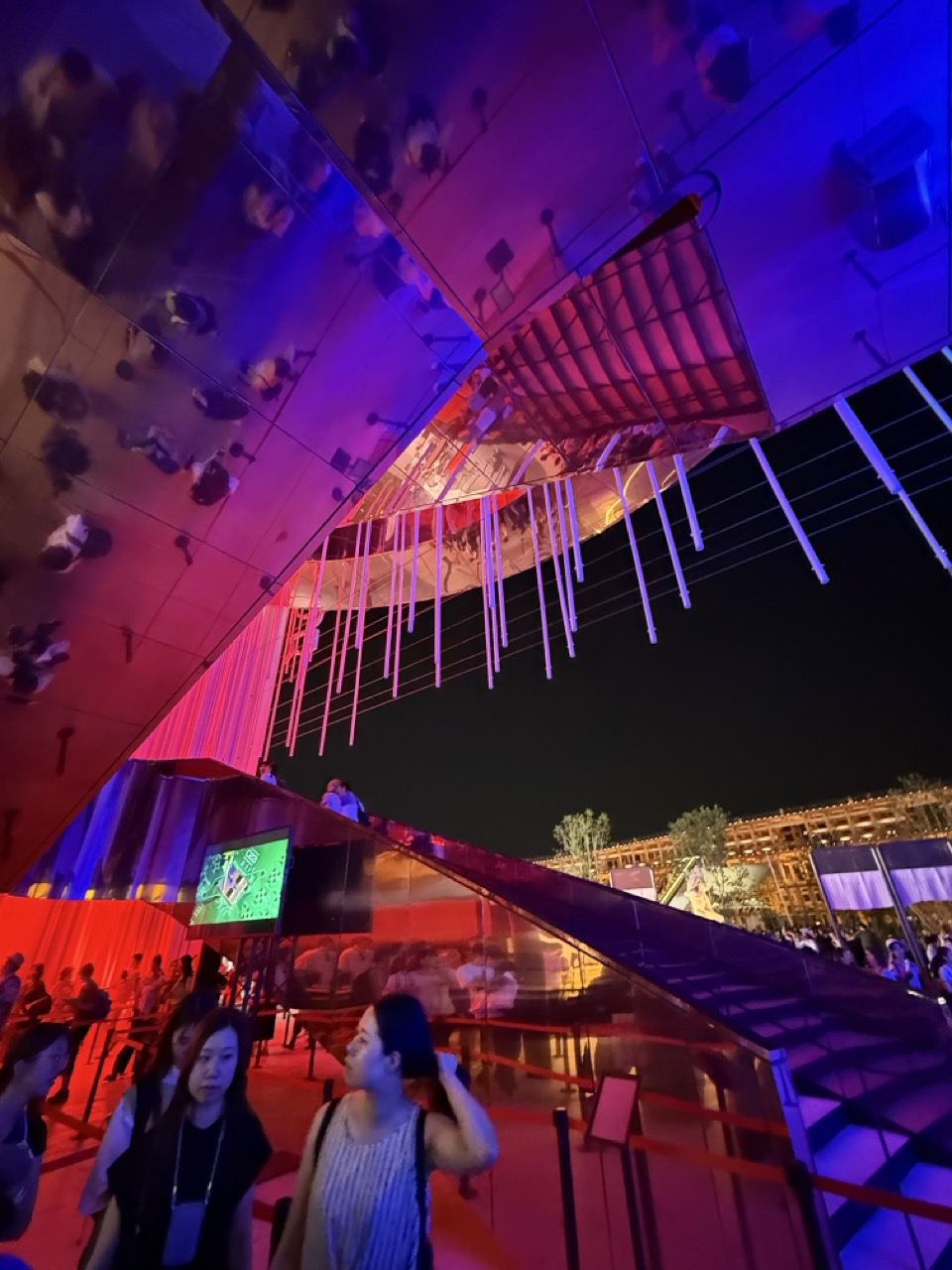

1. Overall Rating (0–10) — 7.0
This photograph captures the vibrant energy of a nighttime public installation, where dynamic lighting and reflective surfaces create a sense of movement and wonder. The interplay of red, blue, and purple hues imbues the scene with a futuristic, almost surreal atmosphere, while the mirrored architecture distorts and multiplies the figures, adding layers of visual complexity. While the image is compelling in its mood and scale, it feels slightly overwhelmed by the density of elements, which can distract from a singular focal point.
2. Composition (0–10) — 6.0
The low-angle perspective emphasizes the grandeur of the structure, but the tilted frame and overlapping reflections create a sense of visual chaos. The people in the foreground serve as grounding elements, yet their placement feels somewhat haphazard, competing with the architectural spectacle.
3. Lighting (0–10) — 8.0
The use of colored lighting is dramatic and intentional, casting vivid reflections across the metallic surfaces and enhancing the immersive quality of the scene. The contrast between the bright, saturated lights and the dark night sky creates depth and drama.
4. Color & Tone (0–10) — 7.5
The bold palette of red, purple, and blue is both striking and cohesive, evoking a sense of modernity and celebration. The color harmony is strong, though the high saturation risks appearing slightly overexposed in certain areas.
5. Creativity (0–10) — 8.0
The image demonstrates strong creative vision in capturing the interplay between architecture, light, and human interaction. The mirrored surfaces and dangling light elements offer a unique, almost kaleidoscopic effect that elevates the photograph beyond a simple documentation.
6. Technical Quality (0–10) — 6.5
The image is reasonably sharp, with good clarity in the foreground subjects and lighting elements. However, the motion blur on some figures and slight overexposure in the light sources suggest limitations in exposure control or shutter speed.
7. Emotional Impact (0–10) — 7.0
The photograph conveys excitement and awe, inviting the viewer to feel immersed in the experience. The energy of the crowd and the spectacle of the installation evoke a sense of shared wonder, though the visual complexity can make the emotional connection feel slightly fragmented.
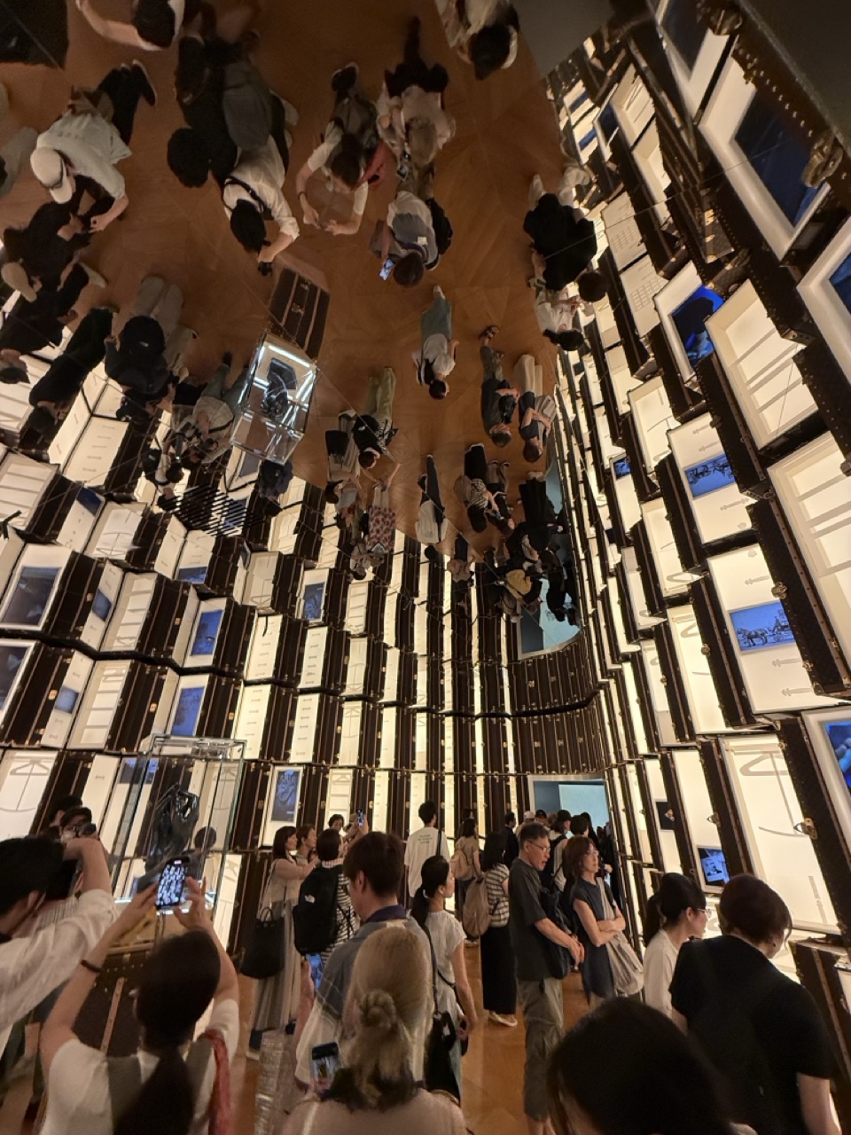

1. Overall Rating (0–10) — 7.5
This photograph captures the mesmerizing disorientation of a mirrored gallery installation, where the inversion of perspective transforms a crowd into a living, swirling pattern. The architectural repetition and the human element create a dynamic tension between order and chaos, evoking both awe and unease. While the composition is visually striking, the slight distortion and overexposure in the light panels slightly diminish the image’s clarity and emotional depth.
2. Composition (0–10) — 8.0
The inverted perspective creates a strong visual anchor, drawing the eye toward the center where the crowd converges. The symmetrical arrangement of mirrored panels enhances balance, while the scattered figures introduce organic movement, preventing the frame from feeling static.
3. Lighting (0–10) — 6.5
The artificial lighting within the display units casts a cool, even glow, enhancing the reflective quality of the space. However, the brightness of the illuminated panels creates slight overexposure, reducing detail in the highlights and giving the scene a slightly flat appearance.
4. Color & Tone (0–10) — 7.0
The palette is dominated by neutral whites, blacks, and metallic tones, punctuated by the cool blue of the screens. This restrained color scheme enhances the technological and modern feel of the space, though a touch more warmth could have added contrast and visual interest.
5. Creativity (0–10) — 8.5
The choice to photograph from an inverted angle is highly original, transforming a standard gallery scene into a conceptual and immersive experience. The interplay between architecture, reflection, and human presence demonstrates strong artistic intent and conceptual depth.
6. Technical Quality (0–10) — 7.5
The image is sharp and well-focused, capturing the details of both the architecture and the individuals. However, the wide-angle lens introduces some distortion at the edges, and the lighting conditions led to uneven exposure across the frame.
7. Emotional Impact (0–10) — 7.0
The photograph evokes a sense of wonder and disorientation, inviting viewers to question their perception of space and reality. The presence of people adds a layer of relatability, making the abstract environment feel both alien and familiar.
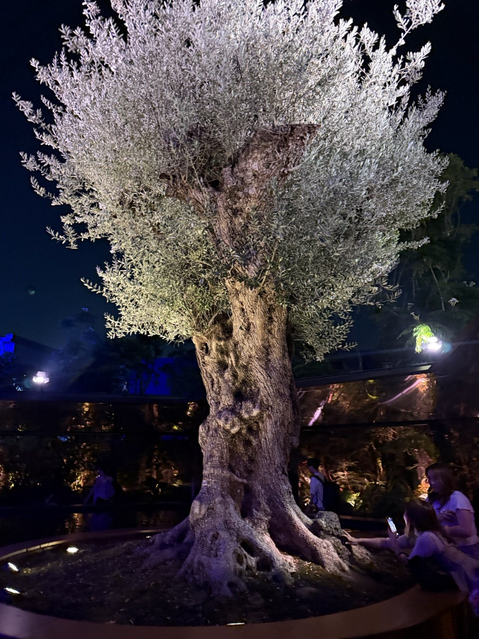

1. Overall Rating (0–10) — 7.0
This nighttime portrait of an ancient olive tree radiates quiet majesty, its silvery foliage glowing like moonlit mist against the dark sky. The dramatic uplighting accentuates the tree’s gnarled texture and storied presence, transforming it into a living monument. While the composition is compelling, the presence of onlookers and artificial lighting in the background slightly undermines the scene’s solemnity, grounding it in a more casual, tourist-oriented context.
2. Composition (0–10) — 7.5
The tree is centered and dominates the frame, creating a strong focal point. The low-angle perspective enhances its grandeur, while the inclusion of people in the lower right adds a sense of scale and human connection. The circular planter grounds the composition, though the background clutter slightly disrupts visual harmony.
3. Lighting (0–10) — 8.0
The use of uplighting creates a striking contrast between the illuminated canopy and the deep night, enhancing texture and depth. The cool, white light on the foliage lends an ethereal quality, while the subtle purple and blue ambient glows in the background add atmospheric depth without overpowering the main subject.
4. Color & Tone (0–10) — 7.0
The palette is dominated by cool whites and silvers in the foliage, contrasted with the dark, earthy tones of the trunk and background. The subtle blue and purple accents in the surroundings contribute to a moody, nocturnal atmosphere, though the color temperature feels slightly artificial due to the artificial lighting.
5. Creativity (0–10) — 7.5
The image transforms a natural subject into a theatrical spectacle through deliberate lighting and framing. The juxtaposition of the ancient tree with modern visitors and ambient lights suggests a narrative of heritage meeting contemporary experience—elevating the photograph beyond mere documentation into a contemplative visual statement.
6. Technical Quality (0–10) — 8.0
The image is sharp and well-focused, particularly on the tree’s trunk and leaves. Exposure is well-managed, capturing detail in both the brightly lit canopy and the darker areas. The low-light conditions are handled effectively, with minimal noise and clean handling of highlights.
7. Emotional Impact (0–10) — 7.5
There is a quiet reverence in the image, evoking a sense of awe at the tree’s age and endurance. The interplay of light and shadow, combined with the presence of people in quiet observation, creates a contemplative mood—inviting the viewer to reflect on time, nature, and human connection to the past.
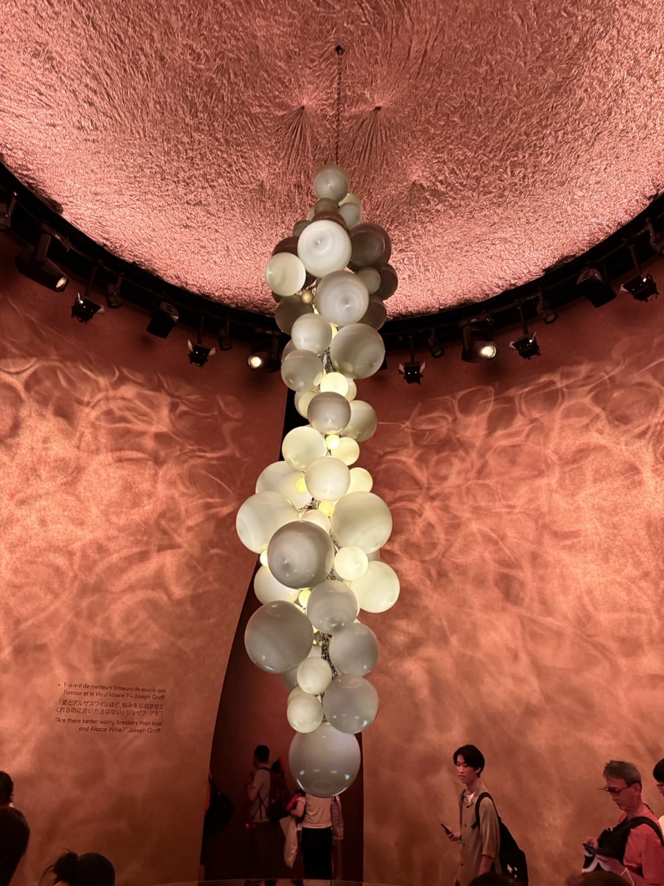

1. Overall Rating (0–10) — 7.5
This image captures the mesmerizing interplay of light, texture, and form within an immersive art installation, where the suspended cluster of glowing orbs becomes a focal point of quiet elegance. The warm, ambient glow and the organic, undulating surfaces of the room evoke a dreamlike atmosphere, drawing the viewer into a contemplative space. While the presence of visitors grounds the scene in reality, it also slightly disrupts the sense of serenity, preventing the image from achieving full visual harmony.
2. Composition (0–10) — 7.0
The vertical arrangement of the bubble-like chandelier draws the eye upward, creating a strong central axis. The curved walls and circular ceiling enhance the sense of enclosure and depth, while the positioning of the visitors adds scale and narrative context. However, the lower foreground is slightly cluttered, and the inclusion of multiple figures on the right edges introduces visual distraction.
3. Lighting (0–10) — 8.5
The lighting is masterfully controlled, with the internal glow of the orbs providing a soft, diffused illumination that enhances the warm, textured surfaces. The ambient pinkish-orange hue casts gentle shadows and highlights the organic contours of the architecture, creating a deeply atmospheric and immersive mood.
4. Color & Tone (0–10) — 8.0
The palette is rich and cohesive, dominated by warm terracotta and soft white tones that blend seamlessly. The contrast between the luminous orbs and the deep shadows adds depth and dimension, while the subtle gradations in tone contribute to the image’s tranquil and otherworldly quality.
5. Creativity (0–10) — 8.5
The concept of the installation—organic forms suspended within a sculptural, cave-like space—is highly original and evocative. The integration of light, material, and architecture demonstrates a strong artistic vision, transforming the space into a sensory experience that feels both intimate and expansive.
6. Technical Quality (0–10) — 8.0
The image is sharp and well-exposed, with clear detail in both the foreground and background. The focus is appropriately placed on the central installation, and the camera’s angle effectively captures the scale and spatial dynamics of the environment.
7. Emotional Impact (0–10) — 8.0
The image evokes a sense of wonder and introspection, inviting the viewer to pause and reflect. The interplay of light and shadow, combined with the organic forms, creates a meditative atmosphere that resonates emotionally, making the experience feel both personal and universal.
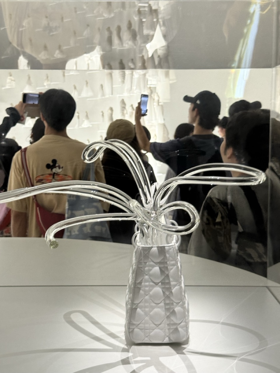

1. Overall Rating (0–10) — 6.0
This photograph captures a striking juxtaposition between high fashion and public spectacle, where a designer handbag is transformed into an art installation. The clarity of the central object contrasts with the blurred, distracted crowd, creating a layered commentary on consumer culture and visual obsession. While the concept is compelling, the image’s documentary quality—reinforced by the reflections and phone-wielding spectators—detracts from its aesthetic cohesion, leaving it more as a cultural snapshot than a polished visual statement.
2. Composition (0–10) — 6.0
The handbag and glass sculpture dominate the foreground, drawing focus, but the reflections and overlapping figures in the background create visual clutter. A tighter composition with a more controlled depth of field could better isolate the subject.
3. Lighting (0–10) — 7.0
The bright, even lighting enhances the transparency of the glass and the texture of the quilted handbag. However, the reflections on the glass case introduce visual noise, slightly disrupting the clarity of the subject.
4. Color & Tone (0–10) — 6.0
The monochromatic palette of whites and grays lends a clean, minimalist feel, but the lack of tonal variation limits the image’s visual depth. The cool tone reinforces the sterile, museum-like atmosphere.
5. Creativity (0–10) — 7.0
The integration of a luxury accessory into an artistic display is conceptually bold. The inclusion of the audience, capturing their engagement through smartphones, adds a layer of irony and commentary on modern art consumption.
6. Technical Quality (0–10) — 7.0
The focus on the handbag is sharp, and the detail in the quilted pattern and glass form is clear. However, the reflections and slight overexposure in the background reduce overall technical refinement.
7. Emotional Impact (0–10) — 5.5
The image evokes a sense of detachment and irony, highlighting the spectacle of art and fashion. While intellectually engaging, it lacks the emotional warmth or resonance to deeply connect with viewers.
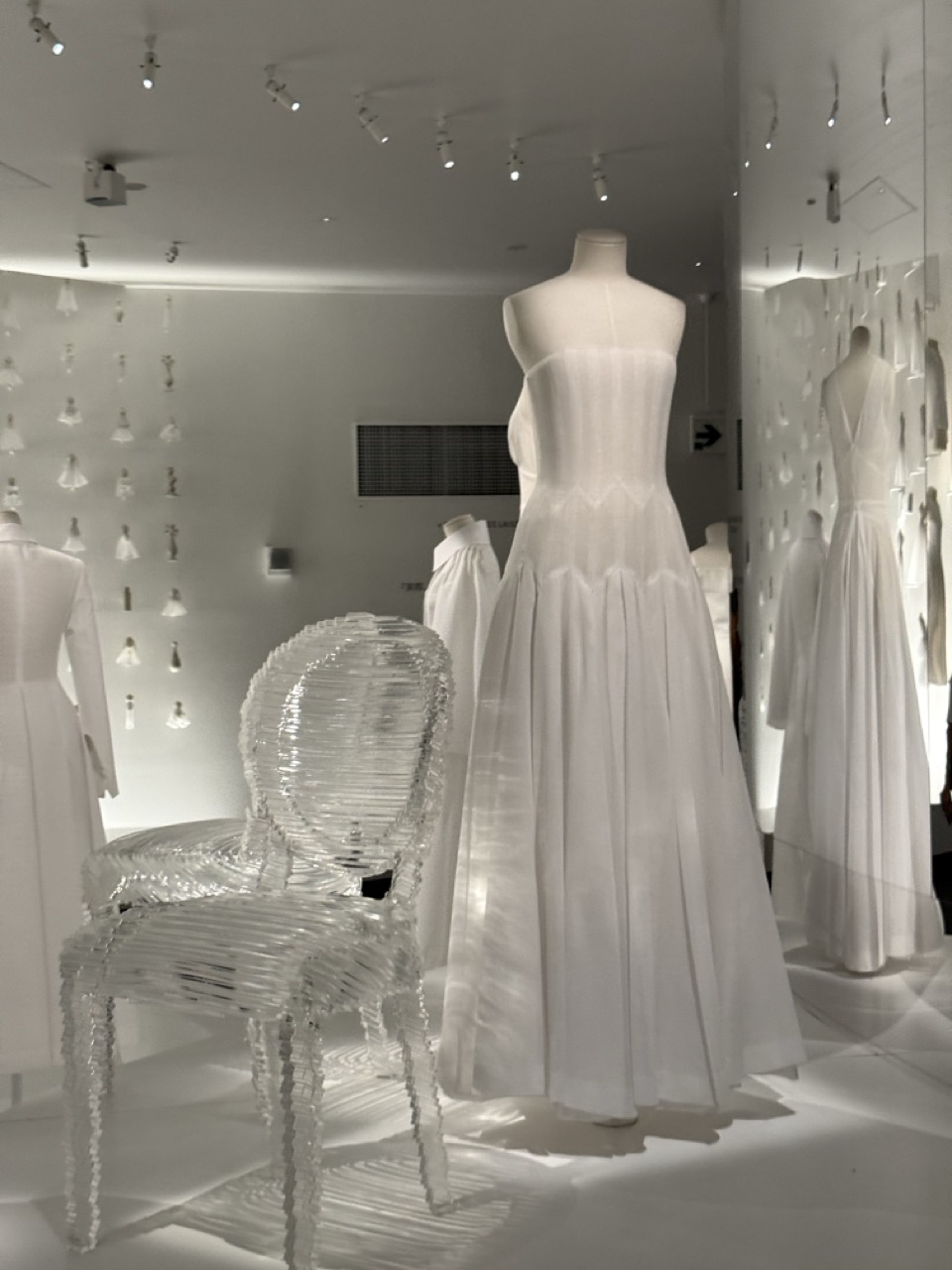

1. Overall Rating (0–10) — 7.0
This photograph captures a serene, almost ethereal fashion display, where the interplay of light and form creates a meditative atmosphere. The monochromatic palette and soft diffusion of light enhance the purity of the white garments and the sculptural chair, evoking a sense of quiet elegance. While the composition is visually cohesive, it occasionally feels slightly overexposed, diminishing some of the subtlety in texture and shadow.
2. Composition (0–10) — 7.0
The central mannequin draws the eye, with the transparent chair in the foreground adding depth and visual interest. The repetition of white dresses in the background creates rhythm and balance, though the left side feels slightly crowded, pulling attention from the main subject.
3. Lighting (0–10) — 7.5
The overhead track lighting casts a soft, even glow that highlights the textures of the gowns and the intricate structure of the chair. The diffused light minimizes harsh shadows, contributing to the image’s dreamlike quality, though some areas appear slightly washed out.
4. Color & Tone (0–10) — 7.0
The monochromatic white palette reinforces a sense of minimalism and purity, with subtle tonal variations adding dimension. The lack of color limits emotional contrast, but enhances the focus on form and light.
5. Creativity (0–10) — 7.5
The use of a transparent, sculptural chair alongside the flowing white dresses creates a striking visual dialogue between materiality and transparency. The arrangement suggests a narrative of fashion as art, merging function with aesthetic expression.
6. Technical Quality (0–10) — 7.0
The image is sharp and well-focused, with clean detail in the fabric and chair. The exposure is generally balanced, though some overexposure in the brighter areas slightly reduces detail in the highlights.
7. Emotional Impact (0–10) — 7.5
The photograph evokes a sense of calm and refined beauty, inviting contemplation of the interplay between design, light, and space. The absence of people allows the garments and objects to stand as silent protagonists, creating a quiet, introspective mood.
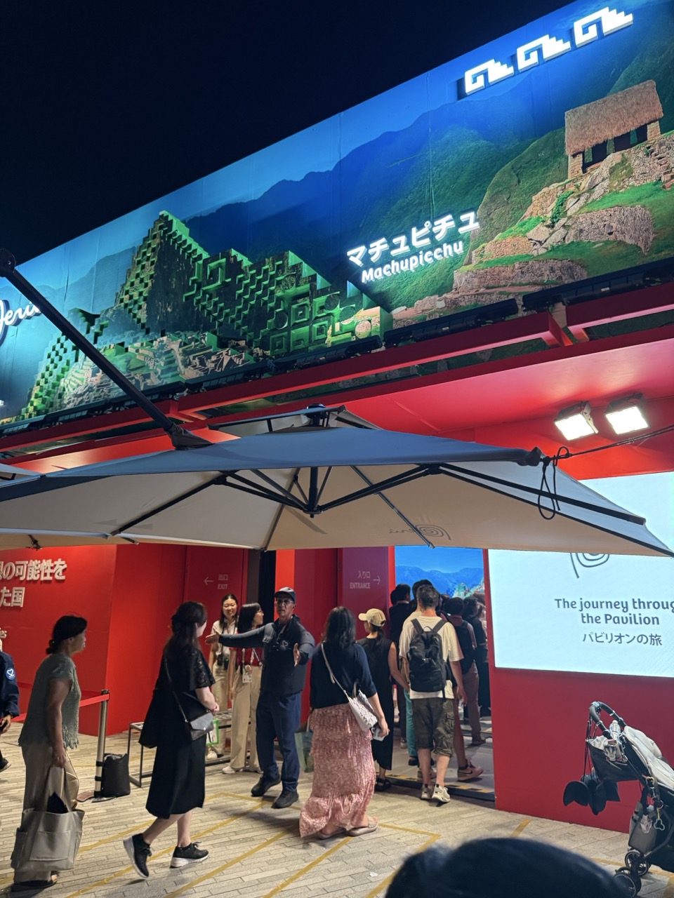

1. Overall Rating (0–10) — 6.0
This photograph captures a lively nighttime scene at a cultural exhibition, where the juxtaposition of ancient Machu Picchu imagery against a modern, brightly lit pavilion creates a compelling visual contrast. The large digital display and bold red walls lend energy and narrative to the space, while the crowd’s movement adds a sense of real-time engagement. However, the composition feels slightly cluttered, and the low-angle perspective flattens the scene’s depth, reducing its visual elegance.
2. Composition (0–10) — 5.5
The low-angle shot emphasizes the towering display but creates a crowded, uneven balance. The large umbrella dominates the foreground, partially obstructing the view, while the entryway and signage are slightly off-center, disrupting visual harmony.
3. Lighting (0–10) — 6.5
Artificial lighting from the overhead fixtures and the digital screen provides strong illumination, highlighting the vibrant reds and the bright display. However, the lighting is uneven—some areas are overexposed, while others fall into shadow, creating a slightly harsh contrast.
4. Color & Tone (0–10) — 7.0
The bold red walls create a striking backdrop, complemented by the cool blue and green tones of the Machu Picchu display. The contrast between warm and cool colors adds visual interest, though the overall palette leans slightly toward artificiality due to the lighting.
5. Creativity (0–10) — 6.5
The fusion of ancient heritage with modern exhibition design is conceptually strong, and the use of the digital display as both backdrop and storytelling device adds a layer of narrative depth. The scene captures a moment of cultural interaction, though the execution lacks subtlety.
6. Technical Quality (0–10) — 7.0
The image is sharp and well-focused, with clear details in the display and signage. The exposure is generally balanced, though some highlights on the screen are blown out. The framing, while not ideal, captures the scene’s energy effectively.
7. Emotional Impact (0–10) — 6.0
The photograph conveys a sense of curiosity and exploration, as visitors gather to experience the exhibit. The blend of historical reverence and contemporary presentation evokes a feeling of cultural continuity, though the crowded atmosphere tempers the emotional intimacy.
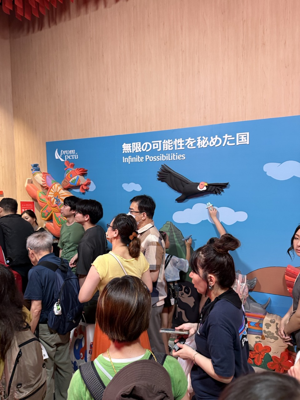

1. Overall Rating (0–10) — 6.0
This photograph captures the lively energy of a cultural exhibition, where visitors engage with vibrant, colorful displays that celebrate Peruvian heritage. The scene feels authentic and immersive, with the crowd’s curiosity and interaction adding a sense of movement and life. However, the composition is slightly cluttered, and the lighting lacks dramatic contrast, which keeps the image from feeling fully cohesive or artistically compelling.
2. Composition (0–10) — 5.5
The crowd fills the frame densely, creating a sense of immersion but reducing focus on any single subject. The placement of the blue backdrop and the large bird cutout provide visual anchor points, though the overlapping figures create a slightly chaotic balance.
3. Lighting (0–10) — 5.0
Even, ambient lighting illuminates the scene without harsh shadows, but it flattens the depth and fails to emphasize the rich colors of the artwork. The lack of directional light diminishes the sense of atmosphere.
4. Color & Tone (0–10) — 6.0
The bold blue wall and vivid cultural motifs create a dynamic palette, with pops of red, orange, and green drawing the eye. However, the overall tone is somewhat muted due to the flat lighting, preventing the colors from truly popping.
5. Creativity (0–10) — 6.5
The image captures a moment of cultural exchange and public engagement, with the playful design elements and bilingual text adding narrative depth. The juxtaposition of modern exhibition design with traditional motifs offers a thoughtful commentary on global cultural representation.
6. Technical Quality (0–10) — 7.0
The focus is generally sharp, and the image is free from significant noise or blur. However, the framing and depth of field could have been better controlled to highlight key elements.
7. Emotional Impact (0–10) — 6.0
The photograph conveys a sense of wonder and connection, as visitors engage with the display. While the emotional resonance is present, it’s restrained by the visual busyness and lack of a clear focal point, leaving the viewer slightly detached.
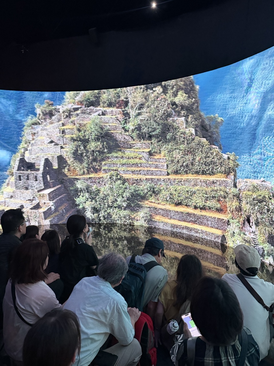

1. Overall Rating (0–10) — 7.0
This photograph captures a compelling fusion of technology and history, where a large-scale immersive projection of Machu Picchu envelops a seated audience in a sensory experience. The juxtaposition of the ancient ruins against the modern viewing space creates a dynamic tension between past and present. While the scene is visually engaging and rich in narrative potential, the image's impact is slightly diluted by the clutter of the audience in the foreground, which partially obstructs the grandeur of the projection.
2. Composition (0–10) — 6.0
The composition is anchored by the curved projection screen, which draws the eye toward the center of the image, but the overlapping figures in the foreground create visual distraction and disrupt the sense of depth. A more deliberate framing would emphasize the scale of the display and enhance the viewer’s immersion.
3. Lighting (0–10) — 7.0
The lighting is balanced, with the projection providing bright, vivid illumination that contrasts sharply with the darkened room. The ambient light from the screen enhances the textures of the ruins and casts soft reflections on the audience, adding depth and atmosphere.
4. Color & Tone (0–10) — 7.5
The colors are rich and vibrant, with deep blues in the sky and lush greens in the vegetation creating a striking contrast against the earthy tones of the stone terraces. The tonal range is well-balanced, enhancing the realism of the projected landscape.
5. Creativity (0–10) — 8.0
The image demonstrates strong creativity in its concept—blending cultural heritage with immersive technology. The use of a panoramic projection to simulate a visit to Machu Picchu is both innovative and evocative, transforming a passive viewing experience into an interactive journey.
6. Technical Quality (0–10) — 7.5
The image is sharp and clear, with good focus on the projection and sufficient detail in the audience. The camera appears to have handled the low-light conditions well, maintaining clarity without excessive noise.
7. Emotional Impact (0–10) — 7.0
The photograph evokes a sense of wonder and awe, not only for the historical site but also for the technological achievement that makes such an experience possible. The audience's engagement suggests a shared moment of discovery, though the intimacy of the experience is slightly diminished by the presence of the crowd.
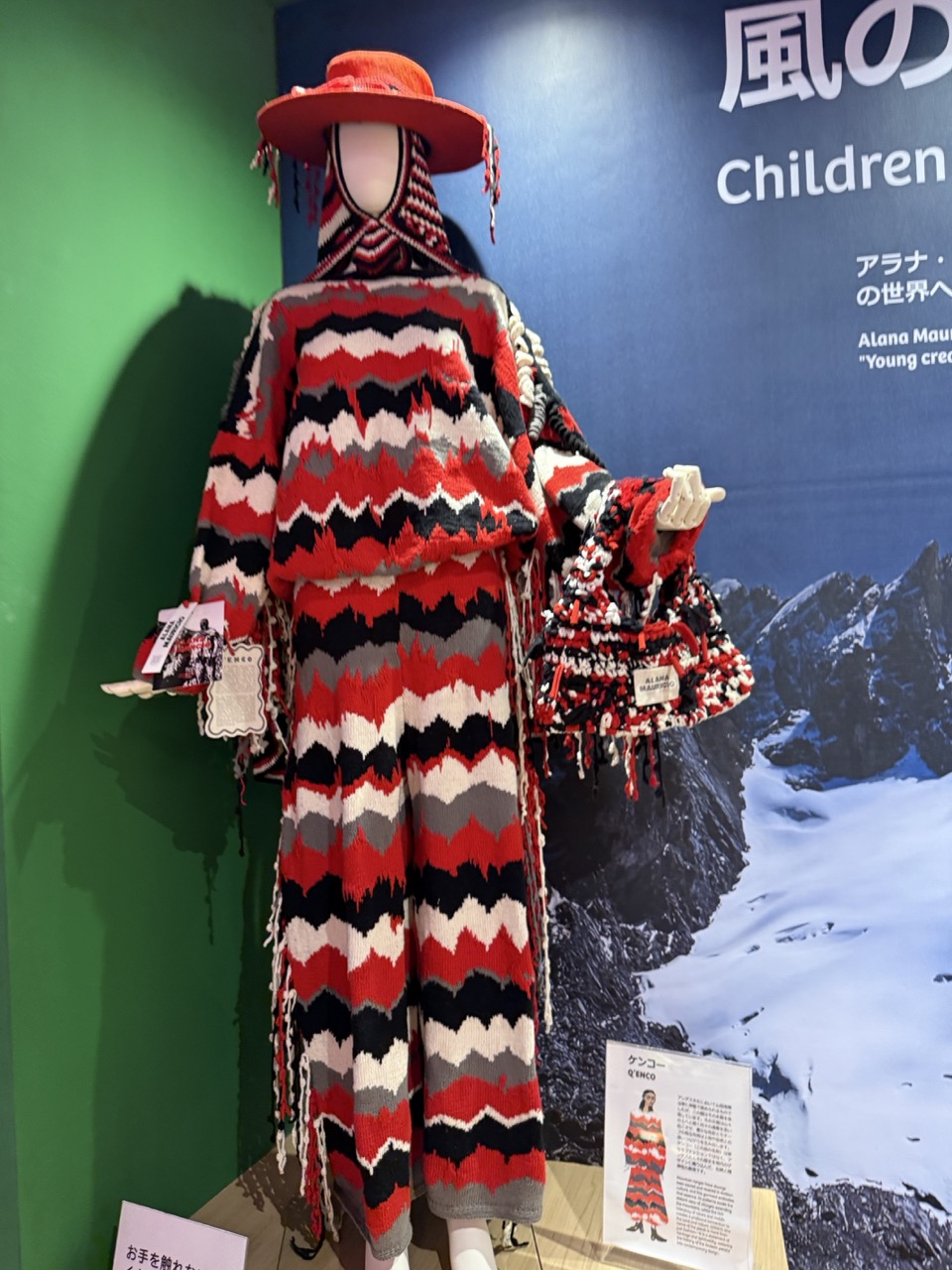

1. Overall Rating (0–10) — 7.0
This photograph captures a bold, handcrafted knit ensemble displayed in a museum or gallery setting, where the vibrant pattern and tactile texture command attention. The juxtaposition of the colorful, rhythmic design against the stark, snowy mountain backdrop creates a compelling visual dialogue between human creativity and natural landscape. While the lighting and composition are functional, they slightly undercut the garment’s dynamic presence, leaving the image feeling more like a documentation than an immersive experience.
2. Composition (0–10) — 6.5
The mannequin is centered but slightly off-kilter, with a cluttered foreground of signage and a partially obstructed view. The framing includes too much background and signage, which distracts from the garment’s intricate design.
3. Lighting (0–10) — 6.0
Even, overhead lighting illuminates the piece clearly but lacks directional depth, flattening the texture of the knit and casting a shadow that disrupts the visual flow.
4. Color & Tone (0–10) — 8.0
The striking red, black, and white zigzag pattern is rich and vivid, creating strong contrast against the cool blue and green background. The color harmony is bold and intentional, enhancing the garment’s cultural and artistic resonance.
5. Creativity (0–10) — 8.5
The design itself is highly original and expressive, blending traditional craft with contemporary fashion. The concept of presenting it in a natural, mountainous context suggests a narrative of cultural heritage and environmental connection, adding layers of meaning.
6. Technical Quality (0–10) — 7.5
The image is sharp and well-focused, with clear detail in the knitwork. The exposure is balanced, though the white balance leans slightly cool, muting the warmth of the reds.
7. Emotional Impact (0–10) — 7.0
The piece evokes a sense of pride and resilience, reflecting the skill and tradition behind the craft. The mountain backdrop adds a quiet reverence, inviting contemplation of identity, nature, and legacy.
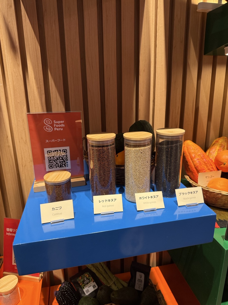

1. Overall Rating (0–10) — 7.0
This image presents a vibrant and informative display of Peruvian superfoods, with a clear focus on quinoa varieties and their cultural context. The warm wood backdrop and bold blue shelf create a visually engaging contrast, while the bilingual labels and QR code suggest a thoughtful effort to educate and connect. The composition is slightly cluttered, and the lighting, while functional, lacks the subtlety needed to elevate the scene into something more artistic. Still, it succeeds as a clean, purposeful showcase of food heritage.
2. Composition (0–10) — 6.5
The subject is well-centered with a strong horizontal line from the shelf, but the inclusion of surrounding elements—like the basket of produce and lower shelf—creates visual noise. A tighter crop would emphasize the quinoa display and improve balance.
3. Lighting (0–10) — 6.0
Even, diffused lighting illuminates the scene effectively, but the lack of directional highlights or shadows gives it a flat, commercial feel. The warm ambient glow from the wooden wall adds depth, but the overall lighting lacks drama.
4. Color & Tone (0–10) — 7.5
The bold blue shelf contrasts strikingly with the warm wood tones and the earthy colors of the grains, creating a dynamic palette. The use of red and white on the sign adds visual punch, though the saturation is slightly overdone, giving it a slightly artificial quality.
5. Creativity (0–10) — 7.0
The concept of presenting superfoods in a curated, labeled display is both informative and visually engaging. The inclusion of Japanese and English labels suggests a global audience, adding a layer of cultural storytelling. While not groundbreaking, the approach is smart and purposeful.
6. Technical Quality (0–10) — 7.5
The image is sharp and in focus, with clear text and clean details on the labels and grains. The depth of field is adequate, and there are no visible artifacts or noise, indicating strong technical execution.
7. Emotional Impact (0–10) — 6.5
The image evokes curiosity and appreciation for global cuisine, particularly the significance of quinoa in Peruvian culture. While it informs rather than inspires, the warmth of the materials and the inviting presentation create a sense of authenticity and care.
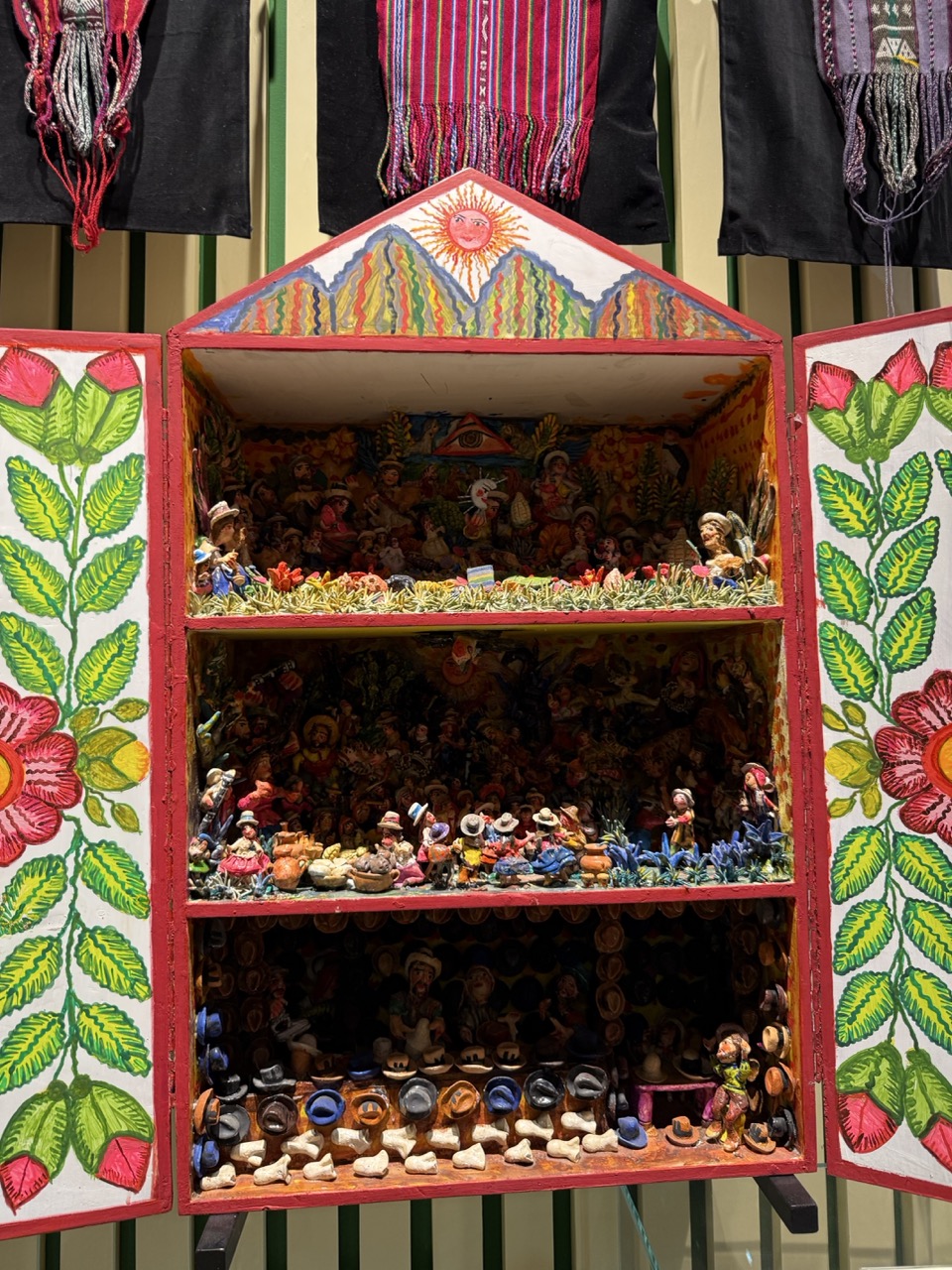

1. Overall Rating (0–10) — 8.0
This photograph captures the vibrant soul of traditional folk art, where every detail speaks of cultural storytelling and artisanal pride. The richly decorated miniature house, filled with intricately crafted figures and symbolic motifs, radiates a sense of celebration and community. While the composition is dense and visually busy, it successfully conveys the energy and complexity of the craft, drawing the viewer into its colorful world. The only limitation is the slightly cluttered framing, which, while authentic, risks overwhelming the eye.
2. Composition (0–10) — 7.5
The central placement of the miniature house creates a strong focal point, and the open doors invite the viewer into the scene. However, the surrounding textiles and vertical green slats in the background slightly distract from the main subject, creating a sense of visual tension.
3. Lighting (0–10) — 7.0
The lighting is even and bright, effectively illuminating the details of the painted surfaces and figures. A soft, diffused light enhances the colors without creating harsh shadows, though a subtle directional light might have added more depth to the interior layers.
4. Color & Tone (0–10) — 9.0
The palette is rich and celebratory, with bold primary colors—reds, greens, yellows, and blues—creating a lively, harmonious visual rhythm. The contrast between the vivid artwork and the neutral background enhances the vibrancy of the subject.
5. Creativity (0–10) — 9.5
The photograph captures a deeply cultural and symbolic piece with authenticity and reverence. The artist’s use of narrative layers—both in the physical structure and in the symbolic elements like the sun, mountains, and folk figures—demonstrates a strong creative vision that celebrates tradition.
6. Technical Quality (0–10) — 8.0
The image is sharp and well-focused, with clear detail visible in the smallest figurines and painted textures. The depth of field is sufficient to capture the interior intricacies, though some background elements are slightly soft.
7. Emotional Impact (0–10) — 8.5
The image evokes a sense of wonder and connection to heritage, inviting the viewer to contemplate the stories embedded in the miniature world. Its warmth and vibrancy create a joyful, almost reverent emotional resonance.
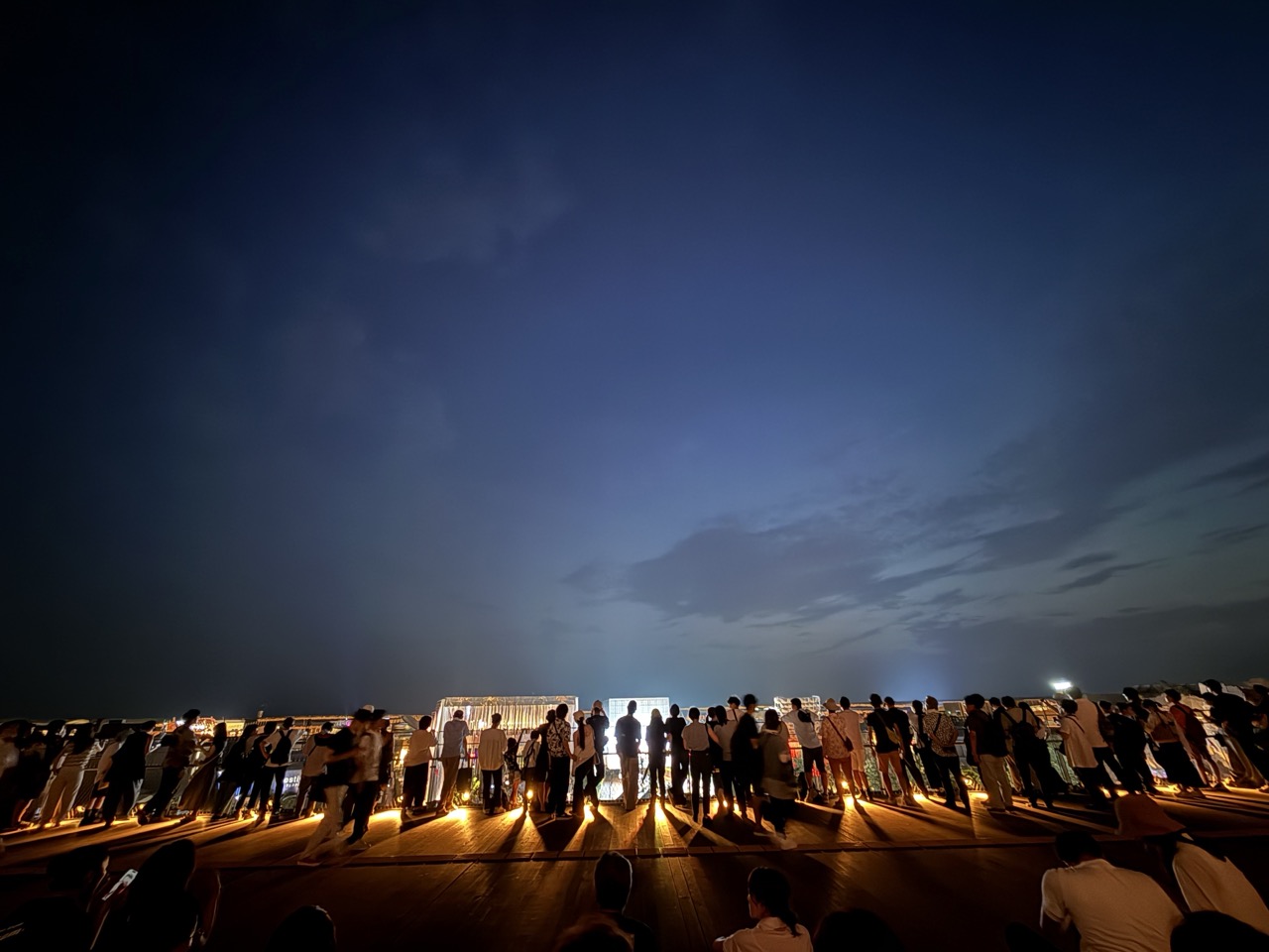

1. Overall Rating (0–10) — 7.0
This photograph captures a quiet, contemplative moment as a crowd gathers on a rooftop at dusk, silhouetted against a deepening twilight sky. The interplay of warm artificial light and the cool tones of the evening creates a mood of shared anticipation, suggesting a communal event or performance. While the scene feels authentic and immersive, the composition’s low horizon and uneven lighting slightly weaken its visual cohesion.
2. Composition (0–10) — 6.5
The low angle emphasizes the vastness of the sky, but the crowd’s uneven distribution creates visual imbalance. A more centered or symmetrical arrangement would strengthen the sense of unity.
3. Lighting (0–10) — 7.0
The contrast between the warm ground-level lights and the cool blue of the sky creates a striking atmospheric effect. The silhouettes are well-defined, though some areas appear slightly overexposed due to direct lighting.
4. Color & Tone (0–10) — 7.5
The palette of deep blues and golden yellows evokes a serene evening mood. The limited but deliberate color scheme enhances the contemplative tone, with good contrast between light and shadow.
5. Creativity (0–10) — 7.0
The image succeeds in capturing a fleeting communal moment, blending documentary realism with poetic atmosphere. The choice to frame the crowd as silhouettes adds a layer of mystery and universality.
6. Technical Quality (0–10) — 7.5
The focus is sharp on the central figures, and the exposure is well-managed despite challenging low-light conditions. The image is free of noticeable noise or distortion.
7. Emotional Impact (0–10) — 7.0
The scene conveys a sense of shared experience and quiet anticipation, inviting the viewer to imagine the event unfolding. The mood is reflective and inclusive, though the lack of individual detail keeps the emotional connection at a distance.
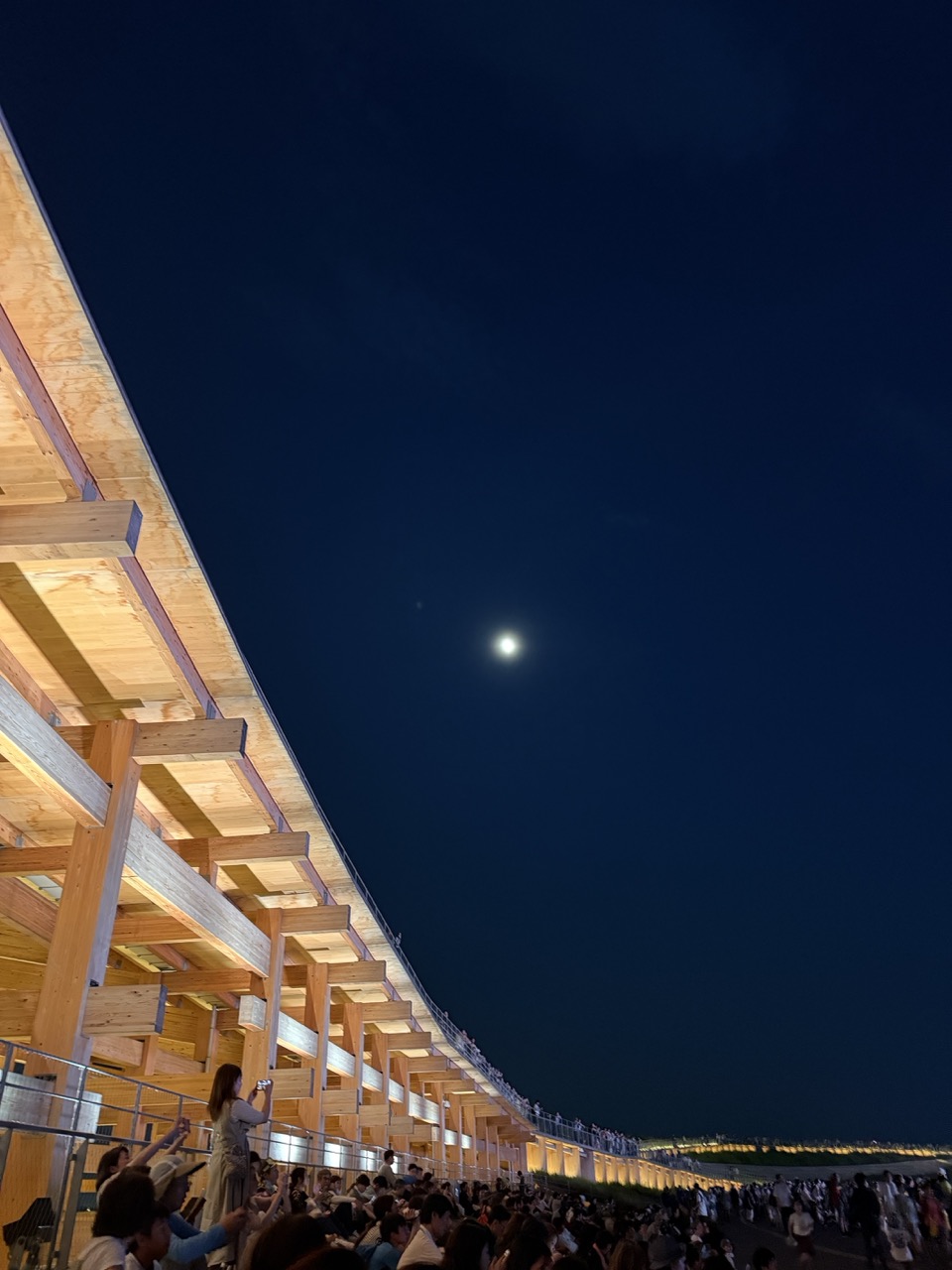

1. Overall Rating (0–10) — 7.0
This photograph captures a striking interplay between architecture, crowd, and celestial light, evoking a sense of shared wonder under the night sky. The low-angle perspective emphasizes the scale of the wooden structure and the vastness of the moonlit sky, creating a moment that feels both intimate and expansive. While the image is compelling in its mood and composition, the sheer density of the crowd slightly undermines the sense of clarity and focus.
2. Composition (0–10) — 7.5
The diagonal sweep of the wooden structure leads the eye dynamically across the frame, creating a strong sense of movement and depth. The placement of the moon near the upper center balances the weight of the crowd and architecture, though the lower-right area feels slightly overcrowded.
3. Lighting (0–10) — 8.0
The soft, warm glow from the structure contrasts beautifully with the cool, deep blue of the night sky, enhancing the mood. The moon acts as a natural focal point, casting a serene light that highlights the scene’s quiet energy.
4. Color & Tone (0–10) — 7.5
The palette is rich with deep indigo and warm amber tones, creating a harmonious contrast that feels both natural and atmospheric. The subtle gradation in the sky adds depth, while the wooden tones provide a grounding warmth.
5. Creativity (0–10) — 7.0
The image successfully blends human presence with architectural and natural elements, suggesting a communal experience. The low-angle perspective and celestial framing offer a fresh take on a nighttime gathering, though it remains grounded in familiar visual storytelling.
6. Technical Quality (0–10) — 7.0
Sharp focus and clean detail are evident in the structure and moon, though some areas of the crowd are slightly soft due to lighting and movement. The exposure is well-balanced, preserving detail in both shadows and highlights.
7. Emotional Impact (0–10) — 7.5
The photograph evokes a quiet sense of awe and togetherness, capturing a fleeting moment where people gather under the moon. The combination of scale, light, and shared experience invites viewers to feel a part of the scene, even from a distance.
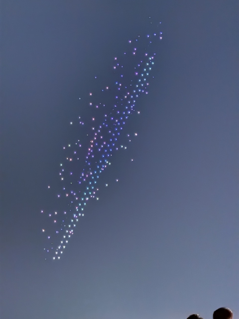

1. Overall Rating (0–10) — 7.0
This image captures a mesmerizing display of illuminated drones forming a dynamic, star-like pattern against the twilight sky, evoking a sense of wonder and technological elegance. The composition draws the eye upward along the diagonal trail of lights, creating a striking visual narrative of motion and light. While the scene is inherently captivating, the low-light conditions and slight blur reduce the crispness of the individual lights, tempering its overall impact.
2. Composition (0–10) — 7.5
The diagonal arrangement of lights creates a strong visual path, leading the viewer’s gaze from the lower left toward the upper right. The silhouetted heads at the bottom ground the scene and provide a sense of scale, though their minimal presence keeps the focus on the aerial display.
3. Lighting (0–10) — 8.0
The ambient twilight provides a soft, cool backdrop that enhances the visibility of the glowing drone lights. The contrast between the bright, colorful points and the darkening sky creates a natural luminous effect, with the light sources themselves forming the primary subject.
4. Color & Tone (0–10) — 7.5
The gradient of cool colors—ranging from deep blue to soft purple and white—adds depth and visual interest. The tonal range is balanced, with the dark sky providing a neutral canvas that allows the lights to pop without overwhelming the frame.
5. Creativity (0–10) — 8.0
The use of drone technology to create a choreographed light display demonstrates innovative storytelling and a modern artistic vision. The abstract arrangement of lights suggests movement and emotion, transforming a simple sky into a canvas of dynamic expression.
6. Technical Quality (0–10) — 6.5
While the subject is clear and the focus is generally sharp on the light trails, some individual lights appear slightly soft or blurred, likely due to motion or camera shake. The low-light conditions also introduce a subtle grain, reducing overall clarity.
7. Emotional Impact (0–10) — 8.0
The image evokes a sense of awe and quiet celebration, capturing a fleeting moment of beauty and human ingenuity. The upward gaze and the luminous trail inspire wonder and connection to the shared experience of witnessing such a spectacle.


1. Overall Rating (0–10) — 6.8
This photograph captures a vibrant public space centered around an extraordinary architectural sculpture, blending human activity with artistic innovation. The interplay of the organic, cage-like structure and the orderly plaza creates a dynamic tension between nature and design. While the image effectively conveys the scale and energy of the scene, it is slightly held back by a lack of compositional focus and underwhelming lighting, which softens the visual impact of the structure’s intricate details.
2. Composition (0–10) — 6.0
The wide-angle framing includes a broad view of the plaza and the sculpture, but the placement of the structure too far in the background and the scattered pedestrians create a sense of visual clutter. A tighter composition or lower vantage point could better emphasize the sculpture’s form and its relationship with the people.
3. Lighting (0–10) — 6.5
The soft, even daylight provides clear visibility across the scene, but the lack of strong shadows or directional light flattens the sculpture’s texture and depth. The overcast quality of the sky mutes the colors and reduces the drama of the moment.
4. Color & Tone (0–10) — 6.2
The palette is dominated by neutral grays of the pavement and the soft blues of the sky, with the sculpture’s pink and silver tones offering a subtle contrast. While the colors are harmonious, they lack vibrancy, which diminishes the visual punch of the artwork.
5. Creativity (0–10) — 7.5
The choice to photograph this unique architectural installation in a public setting is inherently creative, capturing the interplay between art, space, and everyday life. The inclusion of people adds a narrative layer, suggesting the structure as a cultural and social hub.
6. Technical Quality (0–10) — 7.0
The image is sharp and well-focused, with clean details in both the foreground and background. The exposure is balanced, though the low contrast and lack of dynamic range limit the overall clarity.
7. Emotional Impact (0–10) — 6.0
The photograph evokes a sense of curiosity and urban exploration, inviting viewers to consider the relationship between people and art. While it captures the atmosphere of the location, the emotional resonance is tempered by the distance and neutrality of the composition.
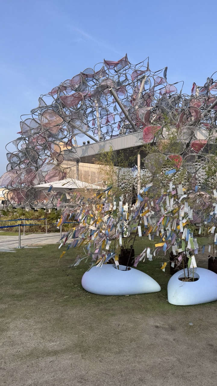

1. Overall Rating (0–10) — 7.0
This photograph captures a vibrant fusion of art and nature, where a whimsical sculpture of intertwined chairs and a wish-tree adorned with colorful tags create a sense of playful wonder. The composition balances the organic chaos of the installation with the clean geometry of the surrounding space, and the soft daylight enhances the delicate textures and hues. While the scene feels slightly cluttered, the interplay of materials and cultural symbolism gives the image a compelling, narrative depth.
2. Composition (0–10) — 6.5
The foreground elements—the wish tree and white planters—draw the eye effectively, while the large chair sculpture dominates the background. However, the framing feels slightly off-center, with too much empty ground and sky, reducing visual tension and balance.
3. Lighting (0–10) — 7.0
Soft, natural daylight illuminates the scene evenly, highlighting the translucency of the chair panels and the vividness of the tags. The clear blue sky provides a clean backdrop, enhancing the colors without creating harsh shadows.
4. Color & Tone (0–10) — 7.5
The palette blends warm pinks and reds from the chairs with the soft pastels of the wish tags, all set against the cool blue of the sky and green grass. The contrast between the vibrant installation and the neutral ground tones adds visual interest and a sense of harmony.
5. Creativity (0–10) — 8.0
The concept of transforming discarded chairs into a sculptural canopy and combining it with a traditional wish tree is imaginative and culturally resonant. The juxtaposition of industrial materials with natural elements creates a thought-provoking dialogue about memory, community, and renewal.
6. Technical Quality (0–10) — 7.5
The image is sharp and well-focused, with clear detail in both the foreground and background. The camera appears to have captured the textures of the metal and paper accurately, though there's a slight loss of detail in the shadowed areas of the sculpture.
7. Emotional Impact (0–10) — 7.0
The photograph evokes a sense of curiosity and nostalgia, inviting viewers to wonder about the stories behind the wish tags and the origins of the sculpture. It feels celebratory and inclusive, suggesting a space where personal and collective memories converge.
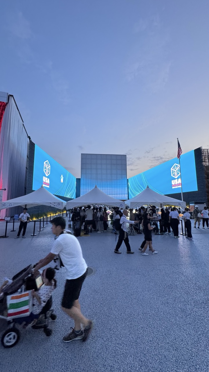

1. Overall Rating (0–10) — 6.0
This photograph captures the bustling energy of a public event at dusk, where modern architecture and digital displays create a sense of scale and occasion. The motion of the man pushing a stroller adds a human element that grounds the scene, though the image feels slightly overwhelmed by the ambient lighting and composition. While the setting is visually engaging, the lack of a clear focal point and the flatness of the evening light prevent it from achieving greater emotional or artistic resonance.
2. Composition (0–10) — 5.5
The wide-angle perspective captures the expansive space but results in a cluttered foreground and midground. The placement of the stroller in the lower left creates a dynamic entry point, yet the scattered figures and tents dilute the visual hierarchy.
3. Lighting (0–10) — 5.0
The fading natural light of dusk is balanced by the bright blue glow of the digital screens, which dominate the scene. While the lighting effectively highlights the venue’s branding, the overall exposure lacks depth, and the ambient light creates a flat, washed-out appearance.
4. Color & Tone (0–10) — 5.5
The cool blue tones of the screens contrast with the neutral gray pavement and soft sky, creating a modern, almost futuristic palette. However, the lack of warm accents and the oversaturation of the blue reduce the overall tonal harmony.
5. Creativity (0–10) — 6.0
The juxtaposition of a family moment against a high-tech event space offers a subtle narrative of everyday life within a larger cultural context. The use of motion and scale is conceptually interesting, though not fully realized.
6. Technical Quality (0–10) — 6.5
The image is sharp and clear, with adequate detail in both the foreground and background. The low-light conditions are handled competently, though some noise is visible in the darker areas.
7. Emotional Impact (0–10) — 5.5
The photograph conveys a sense of movement and public gathering, but the emotional connection is muted. The focus on a transient moment is undercut by the overwhelming visual environment, leaving the viewer with a sense of observation rather than intimacy.
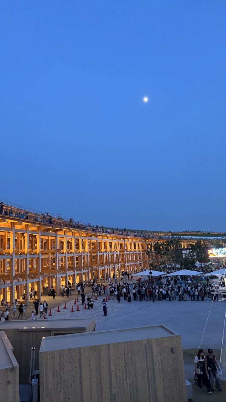

1. Overall Rating (0–10) — 7.0
This photograph captures a tranquil yet vibrant evening scene at a modern architectural gathering, where the warm glow of wooden structures contrasts beautifully with the cool twilight sky. The presence of the moon and the lively crowd lends a sense of quiet wonder and communal energy. While the image is visually compelling, it is slightly hampered by a lack of compositional focus and a muted emotional depth that keeps it from feeling truly immersive.
2. Composition (0–10) — 6.0
The wide-angle perspective captures the scale of the space, but the cluttered foreground and uneven distribution of people create a sense of visual distraction. The strong diagonal of the wooden structure draws the eye, yet the lack of a clear focal point weakens the overall balance.
3. Lighting (0–10) — 7.5
The interplay between the artificial warmth of the building’s lights and the cool blue of the evening sky creates a striking contrast. The moon adds a subtle focal point in the upper right, enhancing the atmospheric mood, though the overall lighting lacks dramatic depth.
4. Color & Tone (0–10) — 7.0
The dominant blue and amber palette creates a harmonious and calming effect. The warm glow of the wood and the soft ambient light give the image a cohesive tone, though the colors, while pleasing, are somewhat restrained in vibrancy.
5. Creativity (0–10) — 6.5
The image successfully blends architecture, nature, and human activity into a single frame, suggesting a narrative of urban life and shared experience. However, the approach is more observational than inventive, missing a unique artistic perspective.
6. Technical Quality (0–10) — 7.5
The image is sharp and well-exposed, with clean details in both the illuminated architecture and the darker areas. The focus is consistent, and the camera work appears stable, allowing for a clear depiction of the scene.
7. Emotional Impact (0–10) — 6.5
The photograph evokes a sense of calm and curiosity, inviting the viewer to imagine the events unfolding below. The quiet beauty of the moment resonates, but the lack of a personal or emotional anchor keeps the connection to the viewer from feeling deeply personal.
Loading map...