Osaka is Japan's vibrant third-largest city and undisputed food capital, offering an intoxicating blend of ancient traditions and cutting-edge modernity. It captivates every traveler with experiences ranging from historic castles and tranquil temples to dazzling neon-lit districts and world-class culinary delights. The city's unique, relaxed yet energetic character, along with its famous "Kuidaore" (eat until you drop) philosophy, makes it an unforgettable destination that will redefine your perception of Japan.
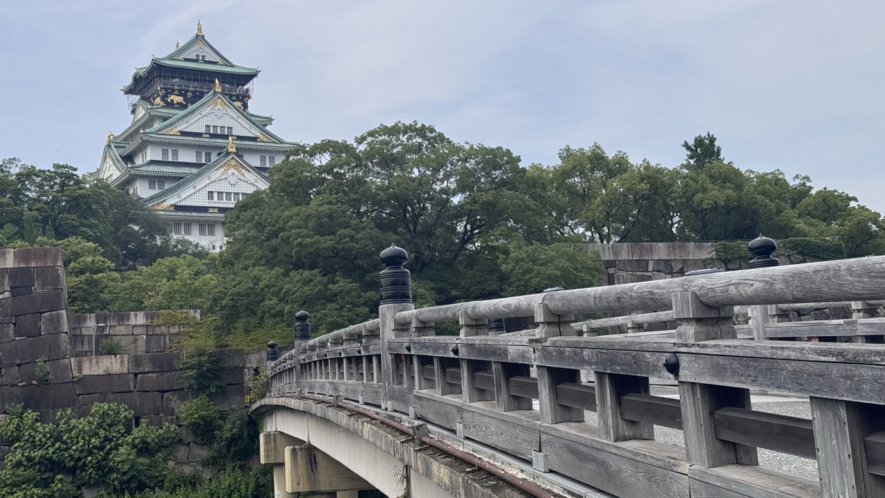

1. Overall Rating (0–10) — 7.0
This photograph captures the majestic presence of Osaka Castle with a grounded, almost cinematic perspective, where the ancient wooden bridge in the foreground leads the eye toward the historic structure. The interplay between the weathered wood, lush greenery, and the ornate castle creates a compelling sense of time and place. While the overcast sky tempers the image’s vibrancy, the composition’s depth and cultural weight lend it a quiet grandeur that feels both authentic and evocative.
2. Composition (0–10) — 7.5
The bridge acts as a strong leading line, guiding the viewer’s gaze toward the castle, which is framed effectively by the trees. The diagonal of the bridge adds dynamic tension, while the stone wall on the left balances the visual weight, creating a harmonious and layered composition.
3. Lighting (0–10) — 6.0
The soft, diffused light from the overcast sky minimizes harsh shadows and evenly illuminates the scene, allowing details of the castle and bridge to be visible. However, the lack of direct sunlight results in a muted atmosphere, slightly dampening the emotional intensity.
4. Color & Tone (0–10) — 6.5
The palette is dominated by natural greens, grays, and the white and green of the castle, creating a cohesive and historically resonant tone. The muted colors reflect the subdued lighting, though a touch more contrast or saturation could enhance the visual impact.
5. Creativity (0–10) — 7.0
The photographer employs a classic travel-photography approach with a thoughtful eye for framing and perspective. The use of the bridge as a narrative device—inviting the viewer into the scene—adds a layer of storytelling and spatial awareness.
6. Technical Quality (0–10) — 8.0
The image is sharp and well-focused, with clear details in both the foreground and background. The depth of field is appropriately managed, keeping the bridge and castle in focus while maintaining a natural sense of distance.
7. Emotional Impact (0–10) — 7.5
There is a strong sense of historical reverence and calm contemplation, evoked by the quiet presence of the castle and the weathered textures of the bridge. The viewer is drawn into a moment of stillness, feeling the weight of centuries in a single frame.
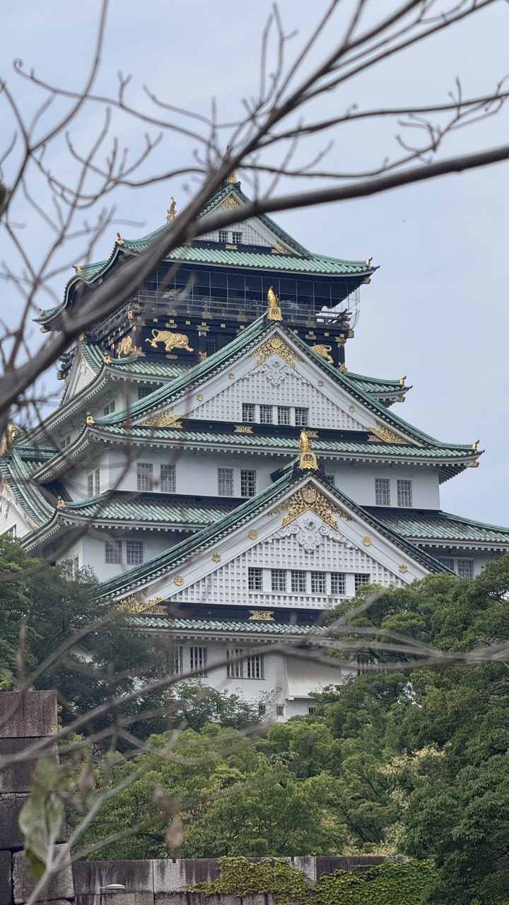

1. Overall Rating (0–10) — 7.0
This photograph captures the grandeur of Osaka Castle with a delicate interplay between tradition and nature, where the historic structure emerges through a veil of bare branches. The framing adds depth and a sense of discovery, inviting the viewer to look beyond the foreground into the layered architecture. While the overcast sky tempers the vibrancy of the scene, the composition successfully conveys a contemplative mood, balancing architectural majesty with organic framing.
2. Composition (0–10) — 7.5
The use of foreground branches creates a natural frame, adding depth and leading the eye toward the castle. The slightly off-center placement of the tower enhances visual interest, though the composition feels slightly crowded due to the overlapping elements.
3. Lighting (0–10) — 6.0
Diffused light from the overcast sky softens shadows and evenly illuminates the castle, preserving detail across the structure. However, the lack of direct sunlight diminishes the richness of textures and the golden accents, resulting in a muted overall tone.
4. Color & Tone (0–10) — 6.5
The palette is subdued, with the white walls and green tiles softened by the gray sky. The golden ornamentation provides subtle contrast, but the overall tonal range lacks vibrancy, giving the image a quiet, almost somber feel.
5. Creativity (0–10) — 7.0
The inclusion of bare branches as a framing device adds a poetic, seasonal quality, suggesting a transition between winter and spring. This choice elevates the image beyond a simple architectural portrait, infusing it with narrative and emotional context.
6. Technical Quality (0–10) — 8.0
The image is sharp and well-focused, with clear detail in both the foreground and background. The depth of field is appropriately managed, allowing the castle to remain the central subject while the branches remain softly out of focus.
7. Emotional Impact (0–10) — 6.5
The photograph evokes a sense of reverence and stillness, drawing the viewer into a moment of quiet reflection. The juxtaposition of ancient stone and fragile branches creates a contemplative atmosphere, though the lack of dramatic lighting slightly limits its emotional intensity.
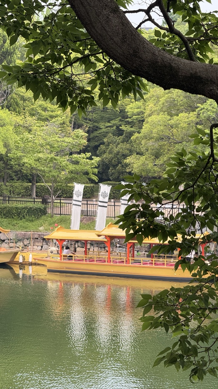

1. Overall Rating (0–10) — 7.0
This photograph captures a serene moment in a Japanese garden, where the vibrant yellow boats contrast beautifully with the lush green foliage and calm water. The framing through the tree branch adds a natural, intimate feel, drawing the viewer into the scene. While the image is peaceful and visually balanced, it lacks the dynamic lighting or emotional intensity to elevate it beyond a pleasant snapshot.
2. Composition (0–10) — 7.5
The foreground branch creates a natural frame, guiding the eye toward the boats and enhancing depth. The diagonal line of the branch and the horizontal alignment of the boats create a balanced, harmonious structure, though the composition slightly favors the left side.
3. Lighting (0–10) — 6.5
Soft, diffused daylight evenly illuminates the scene, creating a calm and tranquil mood. The lack of harsh shadows preserves detail in both the foliage and the water, but the flat lighting slightly diminishes the image’s visual drama.
4. Color & Tone (0–10) — 7.0
The palette is rich with natural greens and the bright yellow of the boats, creating a pleasing contrast. The tones are well-balanced, with the water’s reflection adding depth and a subtle coolness that complements the warm yellows.
5. Creativity (0–10) — 7.0
The use of the tree branch as a framing device adds a thoughtful, painterly quality to the image. The scene itself is familiar, but the composition gives it a quiet elegance that feels intentional and reflective of the location’s cultural atmosphere.
6. Technical Quality (0–10) — 8.0
The image is sharp and clear, with fine detail visible in the leaves, water ripples, and boat structure. The focus is well-managed, and the exposure is balanced, resulting in a technically sound photograph.
7. Emotional Impact (0–10) — 7.5
The image evokes a sense of peace and contemplation, inviting the viewer to imagine a quiet stroll through a traditional Japanese garden. The harmony of nature and human presence creates a soothing, almost meditative experience.
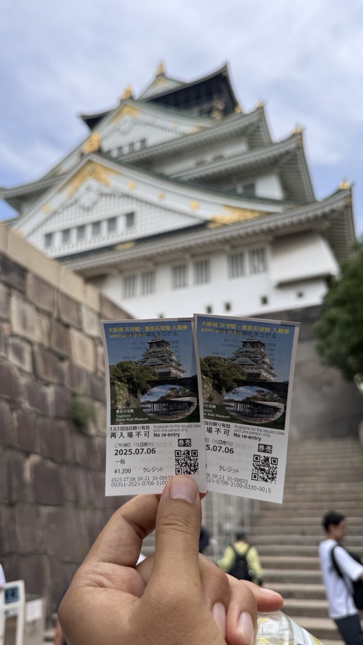

1. Overall Rating (0–10) — 6.0
This photograph captures a personal moment at Osaka Castle, blending a tourist’s perspective with a historic landmark. The inclusion of admission tickets in the foreground adds narrative depth, grounding the image in a specific time and place. While the composition is clear and the subject matter compelling, the shallow depth of field and lack of strong visual contrast slightly diminish the image’s overall impact, leaving it more as a memory than a polished photograph.
2. Composition (0–10) — 6.0
The hand holding the tickets is centered in the foreground, creating a natural focal point, while the castle serves as a blurred backdrop. The diagonal lines of the stone steps add subtle movement, but the framing feels slightly off-center and unbalanced.
3. Lighting (0–10) — 6.0
Soft, diffused daylight evenly illuminates the scene, minimizing harsh shadows and preserving detail on the tickets. However, the overcast sky results in flat lighting that lacks drama or directional emphasis.
4. Color & Tone (0–10) — 5.5
The palette is dominated by muted grays and whites, with only the gold accents on the castle providing a touch of warmth. The colors are natural but underwhelming, failing to convey the grandeur of the setting.
5. Creativity (0–10) — 6.5
The juxtaposition of the tickets against the iconic castle creates a narrative of travel and experience. The first-person perspective adds intimacy, though the execution remains straightforward and conventional.
6. Technical Quality (0–10) — 7.0
The focus on the tickets is sharp, and the image is free of noise or blur. The depth of field is appropriately used, though the background is overly soft, limiting contextual detail.
7. Emotional Impact (0–10) — 6.0
The image evokes a sense of personal achievement and travel fulfillment, particularly for those familiar with Osaka Castle. It connects the viewer to a moment of shared cultural experience, though the emotional resonance is tempered by the image’s documentary tone.
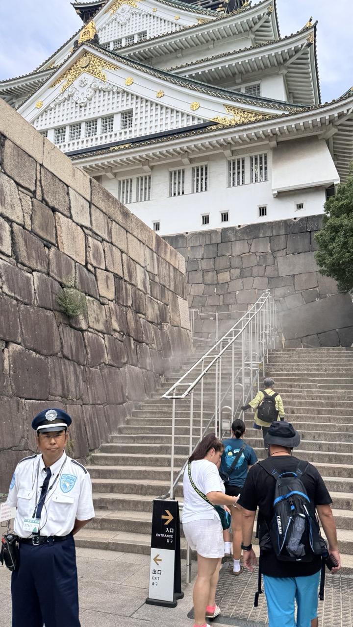

1. Overall Rating (0–10) — 7.0
This photograph captures the grandeur of Nagoya Castle with a compelling blend of historical architecture and everyday human activity. The juxtaposition of the ancient stone walls and ornate structure against the modern visitors and uniformed staff creates a narrative of continuity and public engagement. While the image is rich in context, the slightly cluttered foreground and overcast lighting temper its visual impact, preventing it from achieving a more refined aesthetic.
2. Composition (0–10) — 6.5
The diagonal line of the staircase draws the eye upward toward the castle, creating a sense of movement and scale. However, the placement of the security guard and signage on the left slightly disrupts balance, while the crowd in the mid-ground introduces visual noise.
3. Lighting (0–10) — 5.5
Diffuse daylight under an overcast sky provides even illumination but lacks depth and contrast. The lack of strong shadows diminishes the texture of the stone walls and softens the architectural details of the castle.
4. Color & Tone (0–10) — 6.0
The palette is dominated by neutral grays and whites, punctuated by the blue and gold accents of the castle and the vibrant clothing of the visitors. While the colors are natural, they lack vibrancy, giving the image a somewhat muted quality.
5. Creativity (0–10) — 6.5
The composition effectively captures the interaction between people and a historic landmark, suggesting a story of tourism and cultural preservation. The framing feels candid and observational, lending authenticity to the scene.
6. Technical Quality (0–10) — 7.5
The image is sharp and well-focused, with clear details in the architecture and signage. The exposure is balanced, and the camera’s resolution captures the textures of the stone and fabric accurately.
7. Emotional Impact (0–10) — 6.5
The image evokes a sense of place and shared experience, connecting the viewer to the everyday life surrounding a historic monument. While it does not elicit strong emotion, it succeeds in conveying a quiet moment of cultural continuity.
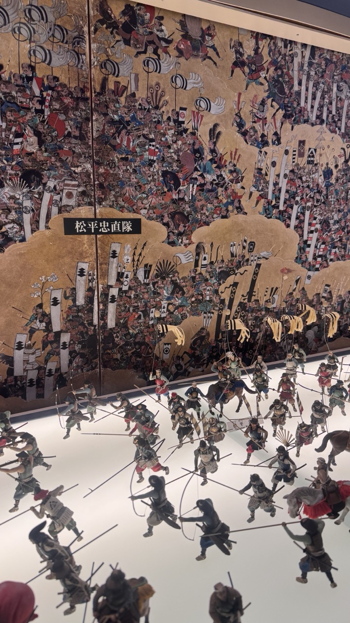

1. Overall Rating (0–10) — 7.5
This photograph captures a dynamic interplay between historical art and contemporary display, where the vivid chaos of a traditional Japanese battle painting is mirrored by a meticulously arranged diorama of miniature warriors. The juxtaposition of the ornate, gold-leafed scroll and the modern, well-lit exhibit space creates a compelling dialogue between past and present. While the image’s clarity and detail are impressive, the crowded composition and reflective surface slightly diminish its visual cohesion, preventing it from achieving a fully immersive impact.
2. Composition (0–10) — 6.5
The framing captures both the grand scale of the mural and the intricate detail of the diorama, though the foreground figures slightly dominate, creating visual imbalance. The vertical orientation emphasizes the height of the scroll, but the angle risks cluttering the lower third.
3. Lighting (0–10) — 8.0
The lighting is bright and even, enhancing the visibility of both the painted and sculpted elements. The white platform effectively illuminates the diorama, while the ambient light on the scroll preserves its rich gold tones and intricate details.
4. Color & Tone (0–10) — 7.0
The palette blends the warm golds and deep reds of the scroll with the muted, earthy tones of the warrior figures. The contrast between the vibrant background and the cooler, more uniform foreground creates visual interest, though the overall tone is slightly flat due to the strong artificial lighting.
5. Creativity (0–10) — 8.0
The concept of placing a physical diorama in front of a historical painting is inventive and conceptually rich, emphasizing the narrative continuity between art and history. The arrangement invites viewers to consider the battle from both artistic and experiential perspectives.
6. Technical Quality (0–10) — 8.5
Sharp focus, clean detail, and accurate exposure highlight the textures of the painting and the fine craftsmanship of the figurines. The image is well-executed technically, with minimal noise or distortion.
7. Emotional Impact (0–10) — 7.5
The image evokes a sense of awe and historical gravity, drawing the viewer into a moment of cultural reflection. The scale and detail inspire contemplation of the conflict depicted, though the clinical presentation of the diorama tempers the emotional resonance.
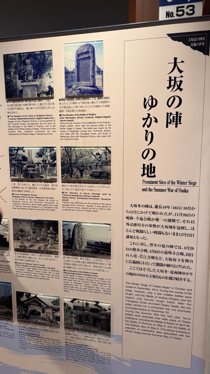

1. Overall Rating (0–10) — 6.0
This photograph captures a historical information panel with a clear focus on the Winter Siege of Osaka, presenting a dense blend of text and archival imagery. The composition effectively conveys the educational intent of the display, with a strong emphasis on cultural and historical context. However, the image lacks visual dynamism due to its flat presentation and over-reliance on text, which limits its emotional resonance. While informative, it feels more like a documentary record than a compelling visual narrative.
2. Composition (0–10) — 6.5
The framing is straightforward, centered on the panel with a slight tilt that introduces a subtle sense of candidness. The layout of the text and images follows a logical grid, but the uneven spacing between sections disrupts visual harmony. The inclusion of the "No. 53" sign in the upper right adds contextual grounding but slightly distracts from the main content.
3. Lighting (0–10) — 6.0
The lighting is even and functional, likely from indoor artificial sources, which ensures legibility of the text. However, it lacks depth and contrast, creating a flat appearance that diminishes the visual texture of the paper and photographs. The absence of directional light or shadows reduces the panel’s three-dimensional presence.
4. Color & Tone (0–10) — 5.5
The palette is dominated by neutral whites and grays, with black text and sepia-toned historical images. While appropriate for a historical display, the muted tones contribute to a somber and unengaging aesthetic. The lack of color vibrancy limits the image’s ability to capture attention or evoke emotion.
5. Creativity (0–10) — 5.0
The image functions as a straightforward documentation of a museum or site exhibit, with little room for artistic interpretation. While the subject matter is rich and historically significant, the execution is purely utilitarian, offering no unique perspective or narrative twist.
6. Technical Quality (0–10) — 7.5
The photograph is sharp and clear, with good focus on the text and images. The resolution is sufficient to read the content, and there are no noticeable technical flaws such as blur or noise. The camera’s alignment and exposure are adequate for the environment.
7. Emotional Impact (0–10) — 5.0
The image conveys a sense of historical weight but fails to emotionally engage the viewer. The dense text and lack of visual storytelling elements create a barrier to emotional connection, making the experience feel more academic than evocative.
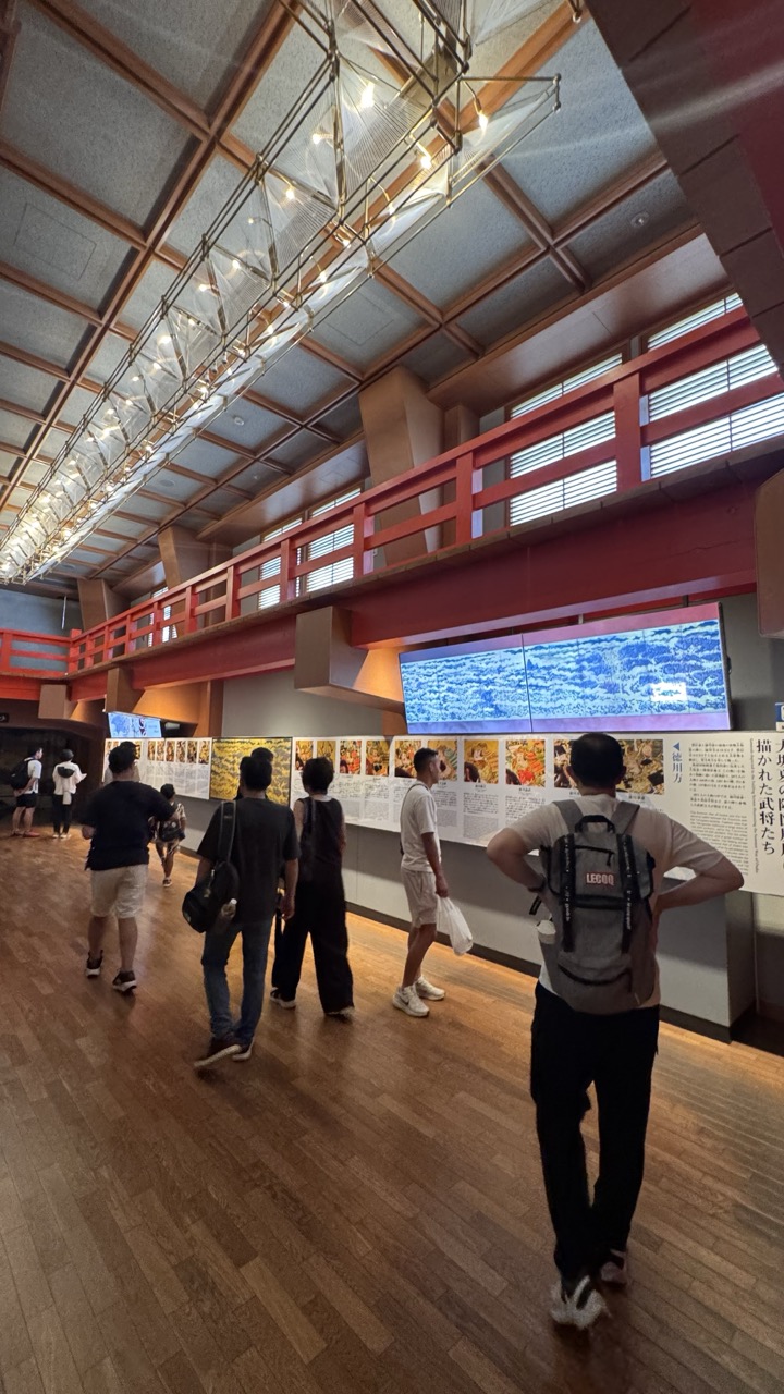

1. Overall Rating (0–10) — 6.8
This photograph captures the quiet energy of a museum gallery, where visitors engage with a cultural exhibition in a space that blends modern design with traditional Japanese aesthetics. The interplay of light, wood, and red accents creates a sense of movement and depth, while the low-angle perspective draws the eye toward the architectural details and the display wall. While the image effectively conveys the atmosphere of the space, it feels slightly overexposed and lacks a clear focal point, which keeps it from feeling fully composed.
2. Composition (0–10) — 6.0
The diagonal line of visitors guides the eye through the frame, but the lack of a strong central subject creates visual dispersion. The high vantage point and wide angle flatten the scene, weakening the sense of depth.
3. Lighting (0–10) — 7.0
The overhead lighting is bright and even, illuminating the space effectively, though some areas appear washed out. The warm glow from the chandelier-like fixture adds a subtle warmth, enhancing the architectural details.
4. Color & Tone (0–10) — 6.5
The palette is dominated by warm wood tones and deep reds, balanced by the cool blue of the digital display. While the colors are harmonious, the overall tone is slightly flat due to overexposure, which dulls the richness of the hues.
5. Creativity (0–10) — 6.5
The photograph successfully captures a moment of cultural engagement, blending architectural beauty with human presence. The fusion of traditional elements with modern display technology adds narrative depth, though the composition could be more deliberate.
6. Technical Quality (0–10) — 7.5
The image is sharp and well-focused, with clean details in the floor, ceiling, and display panels. However, the exposure is uneven, with some highlights blown out, particularly in the upper portion of the frame.
7. Emotional Impact (0–10) — 6.0
The scene evokes a sense of curiosity and quiet exploration, inviting the viewer to imagine themselves among the visitors. While the emotional resonance is present, it remains subtle, limited by the lack of a compelling focal moment.
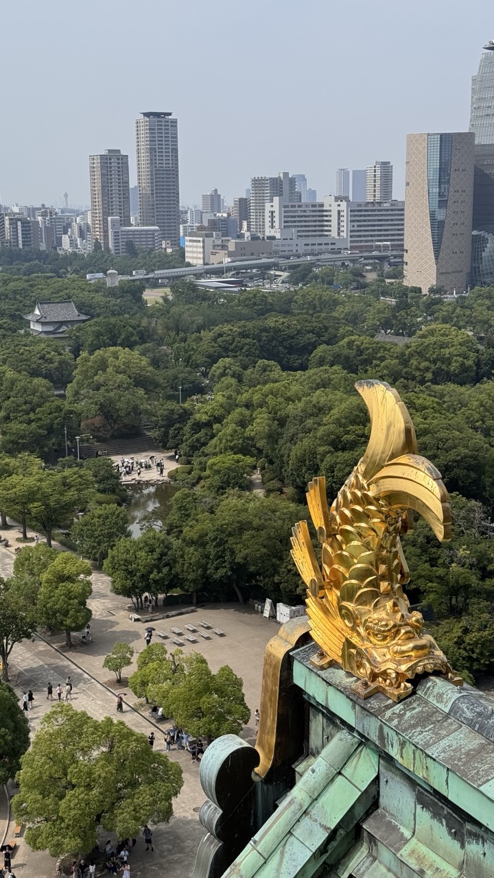

1. Overall Rating (0–10) — 7.5
This photograph masterfully juxtaposes the ancient and the modern, with the ornate golden komainu on the temple roof serving as a radiant anchor against the sprawling urban landscape. The elevated perspective creates a powerful sense of scale, drawing the eye from the sacred, gilded detail to the quiet bustle of the park and the distant city skyline. While the hazy atmosphere softens the image’s overall clarity, the visual tension between tradition and progress gives it a compelling, contemplative mood.
2. Composition (0–10) — 8.0
The golden komainu in the foreground establishes a strong focal point, leading the viewer’s gaze diagonally across the lush green park and into the cityscape. The balance between the ornate foreground and the expansive background creates depth and narrative flow, though the slightly cluttered lower-left corner introduces minor visual distraction.
3. Lighting (0–10) — 6.5
The overcast, hazy light diffuses evenly across the scene, softening shadows and lending a muted tone to the city. While this enhances the atmospheric quality, it slightly diminishes the vibrancy of the gold and the contrast of the green roof, preventing the image from fully capturing the brilliance of the moment.
4. Color & Tone (0–10) — 7.0
The rich, saturated gold of the komainu stands out against the verdant green of the roof and trees, while the neutral tones of the city provide a calm backdrop. The overall palette feels harmonious, with the warm gold offering a striking contrast to the cool, slightly desaturated cityscape.
5. Creativity (0–10) — 8.0
The image’s strength lies in its conceptual duality—placing a symbol of Japanese tradition within the context of a modern metropolis. This visual dialogue between past and present elevates the photograph beyond mere documentation, turning it into a thoughtful commentary on cultural continuity.
6. Technical Quality (0–10) — 7.5
The image is sharp and well-focused, particularly on the golden ornament, with clean detail visible in the textures of the roof tiles and foliage. The slight haze in the distance is a result of atmospheric conditions rather than a technical flaw, preserving clarity in the foreground.
7. Emotional Impact (0–10) — 7.0
There is a quiet reverence in the composition, evoking a sense of timelessness and continuity. The viewer is invited to reflect on the enduring presence of tradition amid the relentless march of urban development, creating a contemplative and slightly nostalgic emotional resonance.
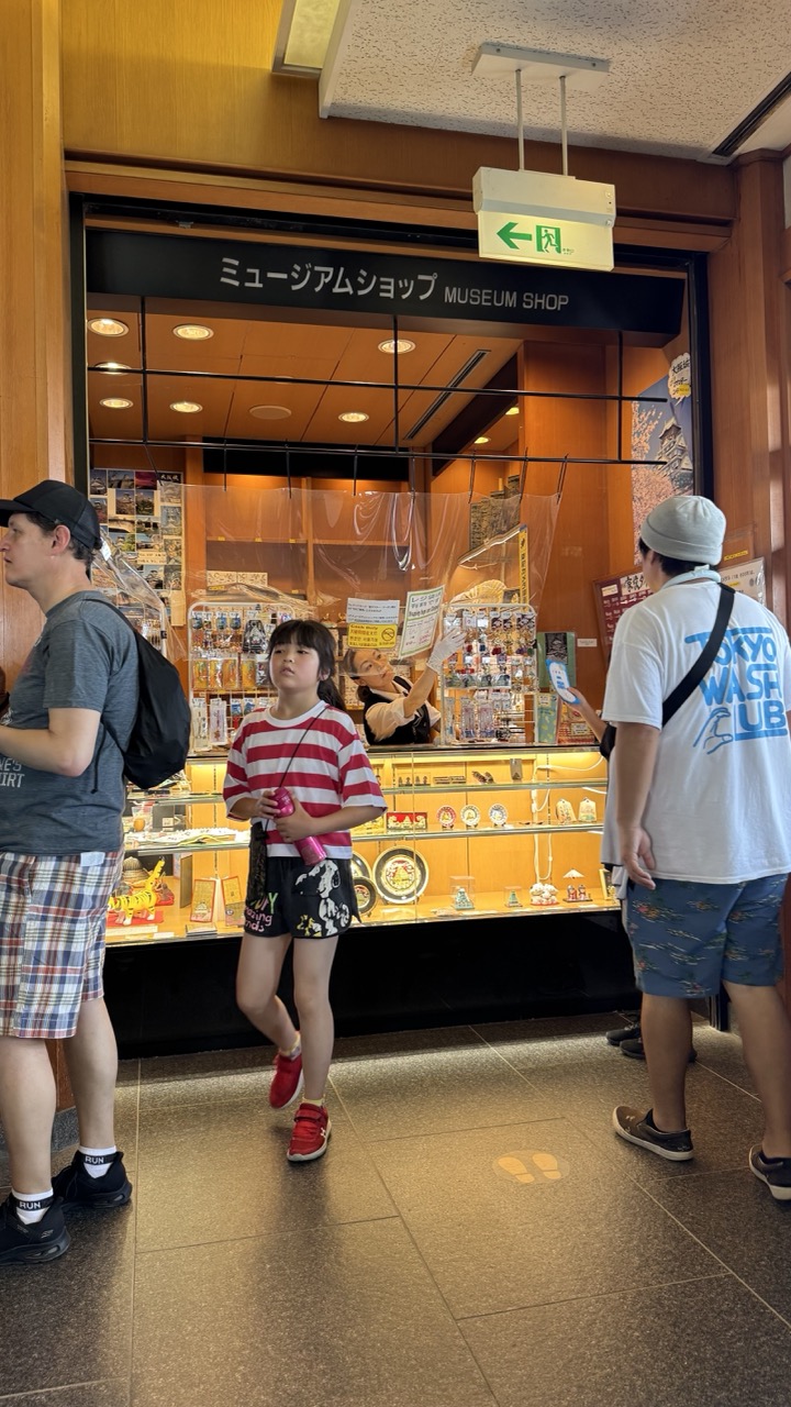

1. Overall Rating (0–10) — 6.0
This photograph captures a candid moment in a museum shop, where the quiet rhythm of tourism unfolds amid curated souvenirs and everyday interactions. The composition feels natural and unposed, with the girl in the striped shirt anchoring the scene as a focal point of youthful curiosity. While the image conveys a sense of place and travel, it lacks visual depth and emotional resonance, feeling more like a snapshot than a compelling narrative.
2. Composition (0–10) — 5.5
The framing is slightly cluttered, with overlapping figures and a busy foreground that distract from the central subject. The placement of the girl off-center and the diagonal line of the shop sign create visual tension, but the lack of leading lines or intentional balance reduces the image’s compositional strength.
3. Lighting (0–10) — 6.0
The lighting is even and functional, typical of indoor commercial spaces, with overhead fluorescent fixtures casting a warm, yellowish glow. While it illuminates the scene clearly, the flat quality of the light flattens textures and diminishes the sense of depth, giving the image a slightly sterile feel.
4. Color & Tone (0–10) — 6.5
The palette is dominated by warm oranges and browns from the wood paneling and shop interior, complemented by the girl’s red-and-white stripes, which add a touch of vibrancy. However, the overall color temperature is somewhat muted, and the lack of contrast in tones prevents the image from feeling dynamic or visually engaging.
5. Creativity (0–10) — 6.0
The image is observational and documentary in nature, capturing a slice of life in a tourist setting. While the candidness lends authenticity, the lack of a unique perspective or thematic intent limits its creative impact.
6. Technical Quality (0–10) — 7.0
The image is sharp and well-focused, with clean details visible in the merchandise and signage. The exposure is balanced, and there are no noticeable technical flaws, though the depth of field is shallow, leaving some background elements slightly out of focus.
7. Emotional Impact (0–10) — 5.5
The photograph evokes a mild sense of nostalgia and curiosity, particularly through the girl’s expression and the context of travel. However, the emotional connection is limited by the scene’s everyday familiarity and the absence of a stronger narrative or emotional peak.
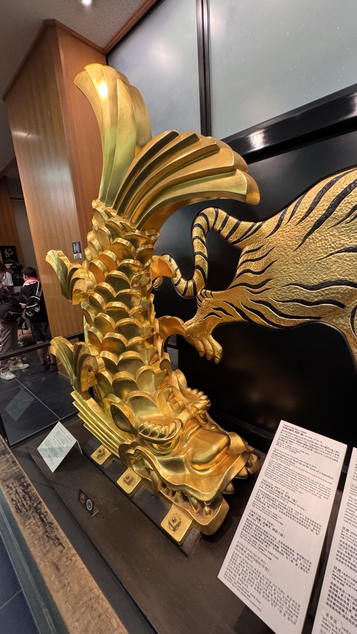

1. Overall Rating (0–10) — 7.0
This photograph captures the intricate craftsmanship of a golden Japanese ship ornament, evoking a sense of cultural heritage and maritime tradition. The interplay of light on the metallic surface highlights the sculpture’s elaborate details, while the museum setting adds context and gravitas. The composition is slightly cluttered by background elements, but the subject’s visual richness and symbolic power make the image compelling.
2. Composition (0–10) — 6.5
The sculpture is framed diagonally, drawing the eye along its flowing form, but the presence of informational plaques and background figures slightly disrupts visual harmony. A tighter crop would better emphasize the object’s artistry.
3. Lighting (0–10) — 7.5
The overhead lighting enhances the golden sheen and three-dimensional texture of the sculpture, creating depth and contrast against the dark background. The reflections are well-managed, though a more directional light could further accentuate the details.
4. Color & Tone (0–10) — 7.0
The dominant gold creates a luxurious and regal tone, complemented by the black backdrop and neutral wood tones. The contrast between the warm metal and the cool ambient light adds visual interest, though the color palette remains somewhat restrained.
5. Creativity (0–10) — 7.5
The image successfully captures a cultural artifact with a sense of reverence and storytelling. The choice to frame the sculpture against its informational context adds layers of meaning, suggesting both artistic and historical significance.
6. Technical Quality (0–10) — 7.5
Sharp focus and clear detail highlight the craftsmanship of the ornament. The depth of field is appropriate, keeping the subject in focus while softly blurring the background.
7. Emotional Impact (0–10) — 6.5
The image conveys a quiet awe for tradition and artistry, inviting contemplation of the object’s symbolic role. While emotionally resonant, the lack of human interaction or narrative context keeps the emotional connection somewhat distant.
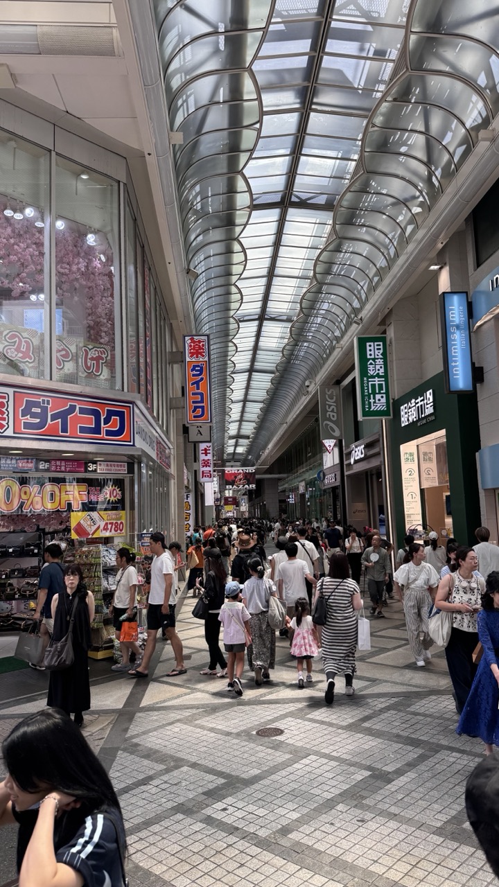

1. Overall Rating (0–10) — 7.0
This photograph captures the vibrant energy of a bustling Japanese shopping arcade, where the interplay of architecture, commerce, and daily life creates a dynamic urban narrative. The curving glass ceiling draws the eye forward, guiding the viewer through a stream of pedestrians, while the mix of signage and storefronts grounds the scene in cultural specificity. Though the composition is rich with detail, the sheer density of visual elements risks overwhelming the viewer, and the lack of a clear focal point slightly diminishes the image’s emotional resonance.
2. Composition (0–10) — 6.5
The strong leading lines of the arched roof and the path create a sense of depth and movement, guiding the eye into the frame. However, the crowded foreground and uneven placement of figures introduce visual clutter, and the absence of a dominant subject weakens the overall balance.
3. Lighting (0–10) — 6.0
Natural light filters through the translucent roof, creating a bright, evenly lit environment that enhances clarity. However, the diffuse quality of the light softens contrast and reduces the dramatic potential, resulting in a somewhat flat and neutral atmosphere.
4. Color & Tone (0–10) — 6.5
The palette is dominated by neutral grays and whites from the architecture, punctuated by the bold reds, blues, and greens of signage. While the colors are vibrant and culturally indicative, their abundance contributes to visual noise, preventing any single hue from standing out with emotional weight.
5. Creativity (0–10) — 7.0
The photograph effectively documents a slice of everyday life in a unique urban setting, using the arcade’s architecture as a framing device. The inclusion of diverse figures and commercial signage adds narrative depth, suggesting a story of community and commerce without overt staging.
6. Technical Quality (0–10) — 7.5
The image is sharp and well-focused, with clean details visible in both the foreground and background. The camera’s wide-angle perspective captures the full breadth of the arcade, and the exposure is well-balanced despite the mixed lighting conditions.
7. Emotional Impact (0–10) — 6.0
The image conveys a sense of movement and vitality, evoking the hum of city life and the rhythm of daily routines. However, the lack of a personal or intimate moment keeps the emotional connection at a distance, leaving the viewer as an observer rather than a participant.
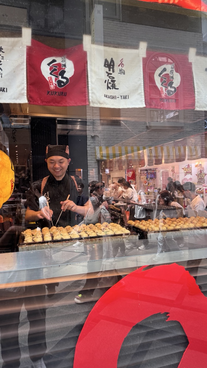

1. Overall Rating (0–10) — 6.0
This photograph captures the lively energy of a Japanese street food stall, with the vendor’s warm smile and the sizzling takoyaki creating a sense of authentic, everyday joy. The layered reflections and busy background add texture and narrative depth, but the image feels slightly overwhelmed by visual clutter, diminishing its overall clarity and focus.
2. Composition (0–10) — 5.5
The framing is cluttered, with reflections and foreground elements competing for attention. The vendor is centered, but the overlapping glass and signage disrupt visual flow.
3. Lighting (0–10) — 6.0
Natural daylight illuminates the scene evenly, though reflections on the glass soften the details. The bright interior lighting highlights the food and vendor, enhancing the sense of activity.
4. Color & Tone (0–10) — 6.5
The red and white banners provide strong visual contrast, while the warm golden tones of the takoyaki evoke appetite. The reflections introduce muted, neutral tones that slightly dilute the overall vibrancy.
5. Creativity (0–10) — 6.0
The image successfully blends candid street life with cultural specificity, capturing a moment of human connection and culinary tradition. The layered reflections add an artistic dimension, though they also complicate the narrative.
6. Technical Quality (0–10) — 6.5
The focus is sharp on the vendor and food, but the reflections and glass haze reduce clarity. The image is well-exposed, with no major technical flaws.
7. Emotional Impact (0–10) — 6.5
The vendor’s genuine smile and the bustling environment convey warmth and joy, inviting the viewer into a moment of shared cultural experience. The reflections add a layer of intimacy, as if the viewer is peeking in from the outside.
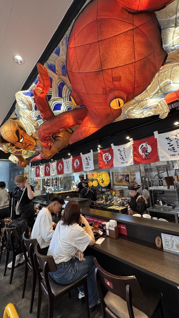

1. Overall Rating (0–10) — 7.0
This photograph captures the vibrant energy of a Japanese takoyaki restaurant, where bold design and cultural motifs collide with everyday dining. The oversized octopus lanterns dominate the space with theatrical flair, creating an immersive and playful atmosphere that feels both authentic and Instagram-ready. While the scene is visually dynamic, the cluttered arrangement of banners and signage slightly overwhelms the composition, and the lighting lacks the refinement to fully elevate the moment into something truly artistic.
2. Composition (0–10) — 6.5
The low-angle perspective emphasizes the dramatic scale of the ceiling decorations, drawing the eye upward. However, the framing includes too much background clutter, and the placement of diners and staff feels slightly accidental, diluting the focus on the central visual spectacle.
3. Lighting (0–10) — 6.0
Bright, even overhead lighting ensures clarity and detail, but it flattens the scene and diminishes the mood. The lack of directional or ambient light prevents shadows from adding depth or enhancing the theatricality of the large lanterns.
4. Color & Tone (0–10) — 7.5
The rich reds of the octopus lanterns contrast sharply with the cool blues and whites of the background, creating a visually striking palette. The warm glow from the lanterns adds a touch of vibrancy, though the overall tone is slightly overexposed in some areas.
5. Creativity (0–10) — 8.0
The use of oversized, whimsical octopus lanterns is a bold and original choice, blending traditional Japanese festival elements with modern restaurant design. This playful approach transforms a simple dining scene into a memorable, story-rich environment.
6. Technical Quality (0–10) — 7.0
The image is sharp and well-focused, with clear details in both the foreground and background. However, the wide-angle perspective introduces slight distortion, and the exposure is uneven, particularly in the ceiling and wall areas.
7. Emotional Impact (0–10) — 7.0
The photograph evokes a sense of fun and cultural celebration, capturing the joy and energy of a lively eatery. The combination of humor, tradition, and everyday life creates a relatable yet visually captivating moment that resonates with viewers familiar with Japanese street food culture.
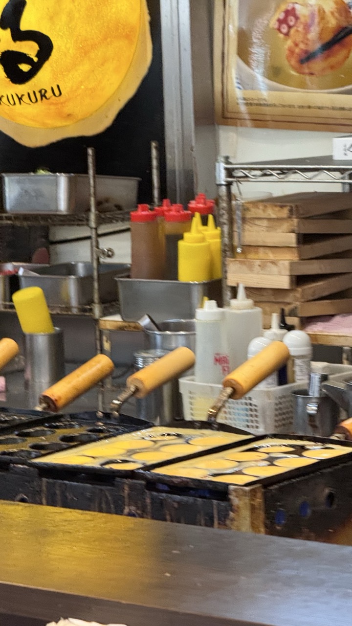

1. Overall Rating (0–10) — 6.0
This photograph captures the bustling energy of a Japanese street food stall, where the rhythmic preparation of takoyaki unfolds in real time. The composition feels authentic and immersive, drawing the viewer into the heart of the kitchen with its array of condiments, tools, and cooking equipment. While the image conveys a sense of immediacy and cultural specificity, it lacks visual polish and compositional refinement, holding back its potential to feel truly artistic.
2. Composition (0–10) — 5.0
The frame is cluttered and busy, with too many elements competing for attention. The foreground takoyaki grills dominate, but the background clutter and off-center framing create a sense of visual chaos rather than intentional balance.
3. Lighting (0–10) — 5.5
The lighting is functional and flat, likely from overhead fluorescent fixtures, which results in harsh reflections on the metal surfaces and a lack of atmospheric depth. While it clearly illuminates the scene, it fails to create mood or highlight texture.
4. Color & Tone (0–10) — 5.5
The color palette is dominated by industrial metallics, muted yellows, and reds from the condiment bottles, giving the image a utilitarian feel. There is a lack of tonal contrast and vibrancy, with the warm yellow of the sign providing the only strong visual anchor.
5. Creativity (0–10) — 6.5
The photograph captures a moment of everyday cultural life with authenticity and a sense of place. The focus on the cooking process and the surrounding tools offers a narrative glimpse into the rhythm of street food preparation, though it stops short of being stylistically bold or conceptually layered.
6. Technical Quality (0–10) — 7.0
The image is reasonably sharp, with clear detail in the grills and condiment bottles. Focus is adequate, though some parts of the frame appear slightly soft. There is no noticeable noise or blur, suggesting a decent camera handling under moderate lighting.
7. Emotional Impact (0–10) — 5.5
The scene evokes a sense of authenticity and culinary tradition, but the lack of emotional warmth or human presence keeps the viewer at a distance. It feels more like an observation than an invitation, leaving the emotional resonance underdeveloped.
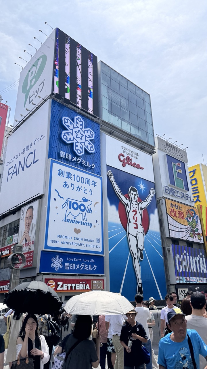

1. Overall Rating (0–10) — 6.0
This photograph captures the vibrant, chaotic energy of a bustling urban intersection in Japan, where towering billboards and pedestrian crowds collide in a visual symphony of commercialism and movement. The density of signage and the layered advertisements create a dynamic, almost overwhelming sense of place, yet the image’s clarity and candid framing keep it grounded in reality. While the composition feels busy and slightly disjointed, it effectively conveys the sensory intensity of a city like Osaka or Tokyo—where commerce and culture are inseparable.
2. Composition (0–10) — 5.5
The frame is crowded with overlapping signs and figures, creating a sense of visual chaos. The central Glico billboard provides a strong focal point, but the clutter of surrounding advertisements and the crowd in the foreground disrupts balance and flow.
3. Lighting (0–10) — 6.0
Natural daylight evenly illuminates the scene, preserving details across the billboards and crowd. The overcast sky softens shadows, creating a neutral tone that allows the bright colors of the signs to stand out without harsh contrast.
4. Color & Tone (0–10) — 7.0
A bold, saturated palette dominates, with vivid blues, reds, and whites on the advertisements drawing the eye. The contrast between the colorful signage and the muted tones of the pedestrians and pavement enhances visual interest and emphasizes the commercial nature of the environment.
5. Creativity (0–10) — 6.5
The image captures an authentic moment of urban life with a documentary edge, using the iconic Glico sign as a cultural anchor. While not overtly artistic, the layered storytelling through signage and movement offers a compelling glimpse into daily life in a major Japanese city.
6. Technical Quality (0–10) — 7.0
The image is sharp and well-focused, with clear detail in both the foreground and background. The exposure is balanced, and the digital clarity supports the complexity of the scene without noise or distortion.
7. Emotional Impact (0–10) — 6.0
The photograph evokes a sense of energy and motion, drawing the viewer into the rhythm of the city. While the emotional resonance is somewhat diluted by the visual overload, the image still conveys the excitement and vitality of a living, breathing urban landscape.
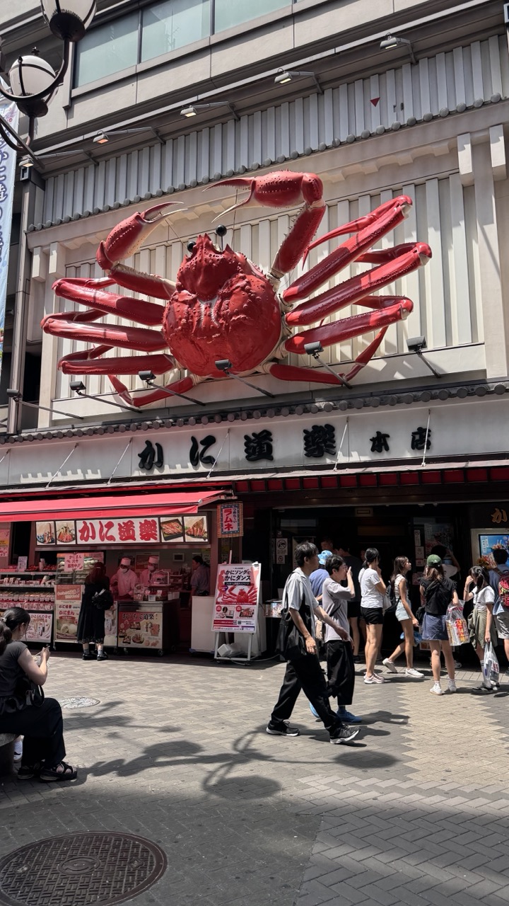

1. Overall Rating (0–10) — 7.0
This photograph captures the vibrant energy of a bustling Japanese street, centered around a striking, oversized crab sculpture that immediately draws the eye. The bold red of the crab contrasts sharply with the neutral tones of the building, creating a memorable visual anchor. While the scene is lively and full of life, the composition feels slightly cluttered, with too many elements competing for attention, which slightly undermines the image's overall cohesion.
2. Composition (0–10) — 6.5
The large crab sculpture dominates the upper frame, creating a strong focal point, but the placement of pedestrians and signage in the lower half introduces visual noise. A tighter crop or more deliberate framing would improve balance and guide the viewer’s gaze more effectively.
3. Lighting (0–10) — 8.0
Bright, natural daylight enhances the scene with strong contrast and clear shadows, emphasizing the textures of the pavement and the sculpture. The harsh sunlight accentuates the vivid red of the crab, making it pop against the neutral building facade.
4. Color & Tone (0–10) — 7.5
The palette is dominated by the bold red of the crab, balanced by neutral grays and whites, with pops of color from signage and clothing. The contrast between warm and cool tones adds visual interest, though the overall tone leans slightly toward the clinical due to the flatness of the building’s exterior.
5. Creativity (0–10) — 8.0
The use of the oversized crab as a whimsical, eye-catching sign demonstrates a clever blend of commercial branding and artistic expression. It transforms a simple storefront into a memorable landmark, suggesting a playful and inviting atmosphere.
6. Technical Quality (0–10) — 8.0
The image is sharp and well-focused, with clean details in both the foreground and background. The exposure is well-managed, capturing the bright daylight without overexposing highlights or losing shadow detail.
7. Emotional Impact (0–10) — 7.0
The photograph evokes a sense of curiosity and urban energy, capturing a moment of everyday life in a distinctive and engaging setting. The whimsy of the crab sculpture adds a touch of joy and wonder, inviting viewers to imagine the story behind the place.
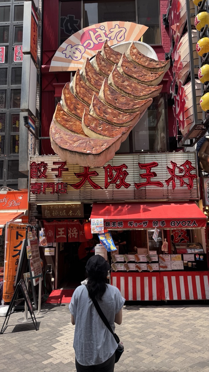

1. Overall Rating (0–10) — 7.0
This photograph captures the vibrant, sensory chaos of a bustling Japanese street, where bold signage and culinary spectacle collide. The oversized gyoza sculpture dominates the frame, creating a playful, almost surreal focal point that draws the eye upward, while the pedestrian’s quiet presence grounds the scene in everyday life. Though the composition is rich with detail, the sheer density of visual information risks overwhelming the viewer, slightly diminishing the image’s overall clarity and emotional resonance.
2. Composition (0–10) — 6.5
The subject is centered and balanced, with the gyoza sculpture anchoring the upper half of the frame. The pedestrian in the foreground adds depth and scale, but the cluttered surroundings—neon signs, awnings, and signage—create a visually busy environment that competes for attention.
3. Lighting (0–10) — 7.0
Bright, direct daylight illuminates the scene evenly, enhancing the vivid colors and textures of the signage and food display. The strong sunlight casts subtle shadows, adding dimension without obscuring key details.
4. Color & Tone (0–10) — 8.0
The palette is rich and dynamic, with bold reds, yellows, and warm browns creating a high-contrast, energetic atmosphere. The red and white stripes of the stall, combined with the golden-brown gyoza, evoke a sense of warmth and authenticity, reinforcing the culinary theme.
5. Creativity (0–10) — 7.5
The image leverages the theatricality of the oversized gyoza sculpture to create a whimsical, eye-catching narrative. The juxtaposition of the pedestrian’s mundane posture against the fantastical signage adds a layer of narrative intrigue, suggesting a moment of quiet observation within a world of sensory overload.
6. Technical Quality (0–10) — 8.0
The photograph is sharp and clear, with excellent detail in both the foreground and background. The focus is well-managed, allowing the signage and textures to remain crisp, even with the complexity of the scene.
7. Emotional Impact (0–10) — 6.5
The image evokes a sense of curiosity and delight, capturing the playful energy of urban Japan. While the scene is visually engaging, the emotional connection is somewhat tempered by the overwhelming visual noise, leaving the viewer as an observer rather than a participant in the moment.
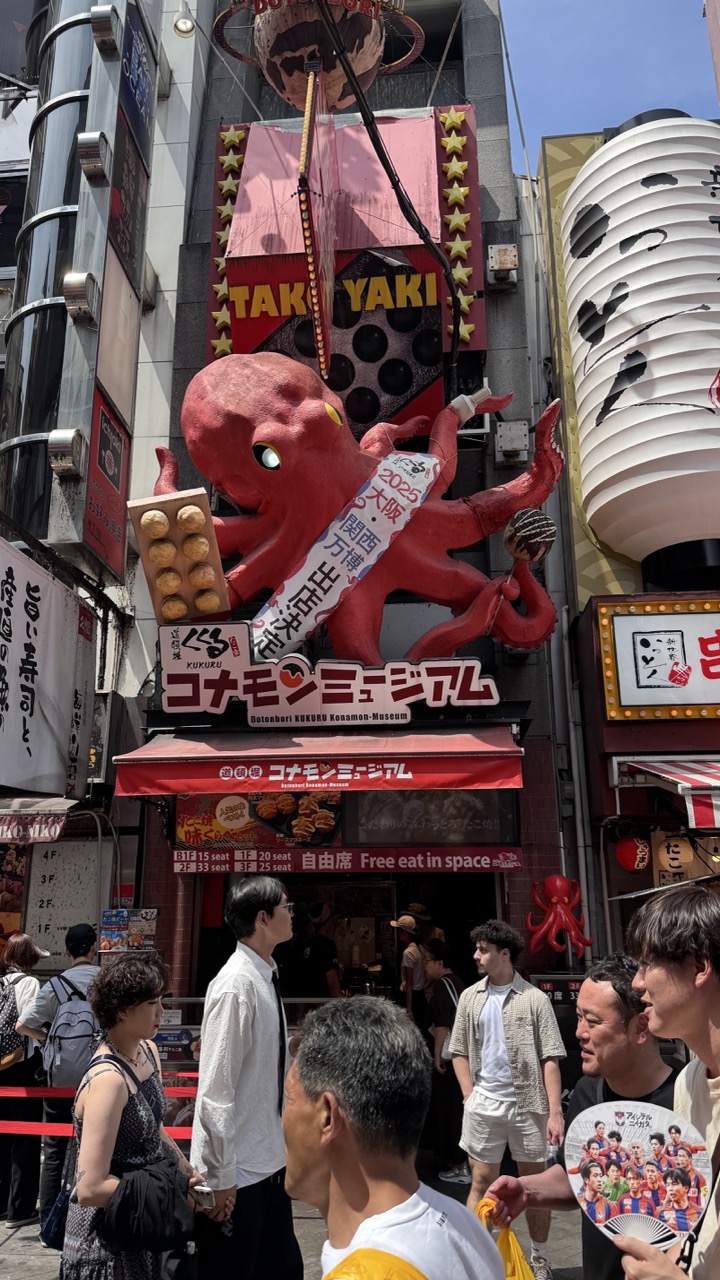

1. Overall Rating (0–10) — 7.0
This photograph captures the vibrant, chaotic energy of a bustling Japanese street, where commercial spectacle and everyday life collide. The towering red octopus statue and bold signage create an immediate sense of place—playful, loud, and unmistakably Tokyo. While the composition is busy and the lighting is harsh, the image succeeds in conveying the overwhelming sensory experience of a city known for its visual excess. The scene feels authentic and alive, though the lack of a clear focal point slightly undermines its visual cohesion.
2. Composition (0–10) — 6.0
The frame is crowded with signs, people, and architectural elements, creating a sense of visual noise. The large octopus sculpture draws the eye, but the diagonal lines and overlapping structures disrupt balance, making it difficult to focus on a single narrative thread.
3. Lighting (0–10) — 7.0
Bright, direct sunlight enhances the vividness of the colors and casts sharp shadows, emphasizing the three-dimensionality of the octopus and signage. However, the high contrast creates some blown-out highlights in the sky and deep shadows on the buildings, slightly reducing tonal depth.
4. Color & Tone (0–10) — 7.5
The dominant reds of the octopus and awning contrast sharply with the white lantern and blue sky, creating a dynamic and energetic palette. The warm tones of the signage and natural light give the scene a lively, almost cartoonish quality that reflects the playful tone of the location.
5. Creativity (0–10) — 8.0
The photograph embraces the inherent theatricality of the Konamon Museum and its surroundings. The choice to capture the full spectacle—people, signage, and architecture—feels intentional, transforming a touristy scene into a commentary on urban visual culture. The inclusion of the fan with football players adds a layer of cultural specificity and narrative depth.
6. Technical Quality (0–10) — 7.5
The image is sharp and well-focused, with clean detail across the frame. The camera appears to be steady, and the exposure is generally accurate, though slight overexposure in the sky and some areas of the signage suggests minor technical limitations.
7. Emotional Impact (0–10) — 6.5
The image evokes a sense of wonder and amusement, capturing the joy and absurdity of urban spectacle. While the emotional resonance is not deeply personal, it effectively conveys the excitement and energy of being immersed in a lively, sensory-rich environment.
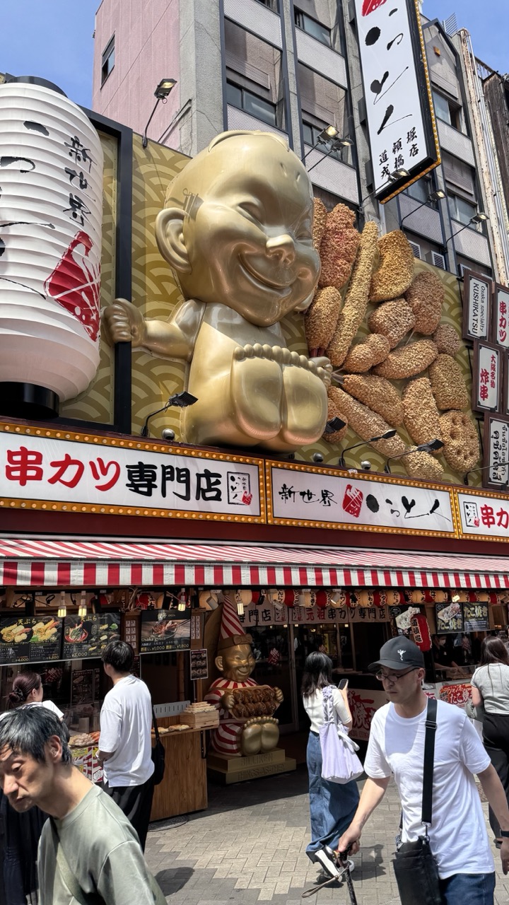

1. Overall Rating (0–10) — 7.0
This photograph captures the vibrant energy of a bustling Japanese street, centered around a whimsical and eye-catching storefront. The oversized golden mascot and playful signage create an inviting, almost theatrical atmosphere that speaks to the culture of street food and local charm. While the scene is rich with detail and narrative, the composition's busy nature slightly undermines its visual cohesion, leaving the image feeling more like a snapshot than a polished portrait.
2. Composition (0–10) — 6.5
The frame is dominated by the large golden figure and signage, which draw the eye immediately, but the inclusion of multiple pedestrians and overlapping elements creates a cluttered feel. The low-angle perspective enhances the scale of the installation, yet the diagonal flow of people and signage disrupts visual balance.
3. Lighting (0–10) — 7.5
Natural daylight provides even, bright illumination that highlights the textures of the golden figure and the red-and-white striped awning. The shadows are soft and directional, adding depth without overpowering the scene’s vividness.
4. Color & Tone (0–10) — 7.0
The palette is rich with warm golds, deep reds, and crisp whites, creating a lively and appetizing visual tone. The contrast between the metallic sheen of the statue and the earthy tones of the karaage (fried chicken) enhances the image’s playful energy.
5. Creativity (0–10) — 7.5
The image captures a uniquely Japanese commercial aesthetic—bold, colorful, and theatrical. The use of scale and character in the signage adds a layer of storytelling, transforming a simple food stall into a cultural landmark.
6. Technical Quality (0–10) — 8.0
Sharp focus and clear detail throughout the frame allow for rich texture and legible signage. The camera’s exposure is well-balanced, preserving detail in both highlights and shadows.
7. Emotional Impact (0–10) — 7.0
The image evokes a sense of joy and curiosity, inviting the viewer into a lively urban moment. The smiling mascot and casual passersby generate a feeling of warmth and everyday delight, suggesting a place where food and fun go hand in hand.
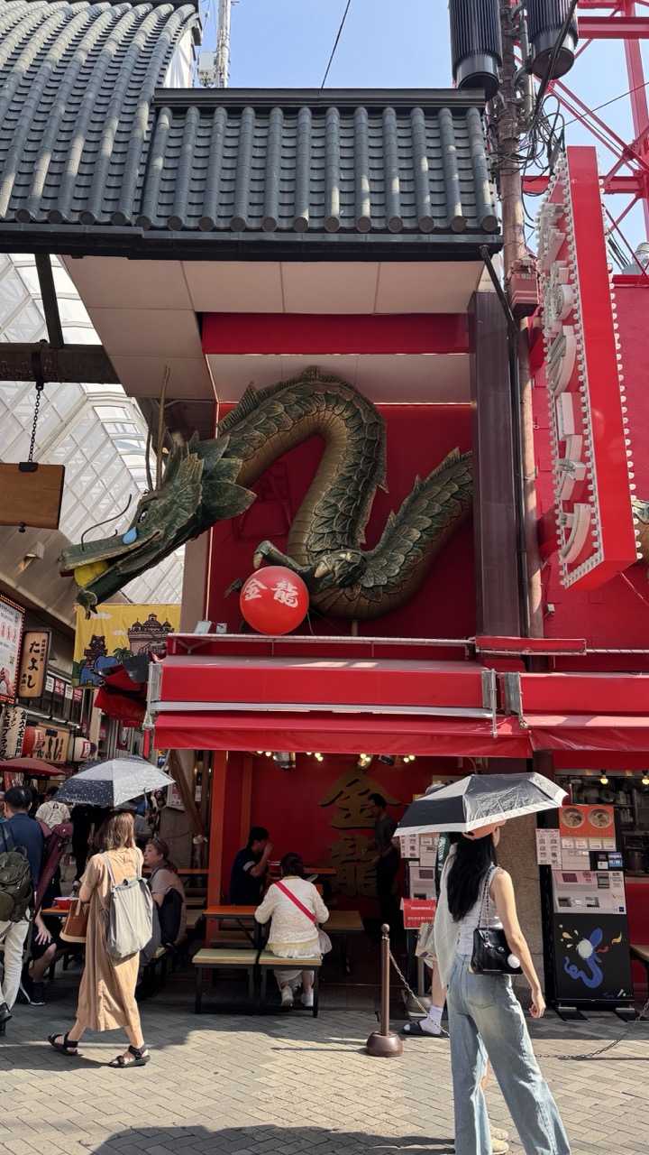

1. Overall Rating (0–10) — 7.0
This photograph captures the vibrant energy of a bustling Japanese street, where tradition and modernity collide in a dynamic visual dialogue. The striking dragon sculpture and bold red signage create an immediate sense of cultural identity, while the flow of pedestrians grounds the scene in everyday life. The image is rich in detail and narrative, though the cluttered environment slightly dilutes its visual focus.
2. Composition (0–10) — 6.5
The central dragon draws the eye effectively, but the composition feels crowded and slightly unbalanced due to the overlapping elements and off-center framing. A tighter crop would enhance focus on the main subject.
3. Lighting (0–10) — 7.5
Bright, natural daylight enhances clarity and color saturation, casting sharp shadows that add depth. The overhead light creates a lively atmosphere, though some areas of the frame are slightly overexposed.
4. Color & Tone (0–10) — 8.0
The vivid reds of the storefront and the deep green of the dragon create a bold, high-contrast palette that feels energetic and culturally resonant. The warm tones contribute to a lively, inviting mood.
5. Creativity (0–10) — 7.5
The image successfully blends cultural symbolism with urban realism, using the dragon as a narrative anchor. The choice to include pedestrians adds a layer of authenticity, transforming the scene from a mere snapshot into a story of place and movement.
6. Technical Quality (0–10) — 8.0
Sharp focus, clean detail, and well-managed exposure reflect strong technical execution. The image is free of major flaws and captures the scene with clarity and precision.
7. Emotional Impact (0–10) — 7.0
The photograph evokes a sense of wonder and immersion, inviting the viewer to step into the lively streets of a Japanese city. The energy of the crowd and the mythical presence of the dragon create a compelling emotional resonance.
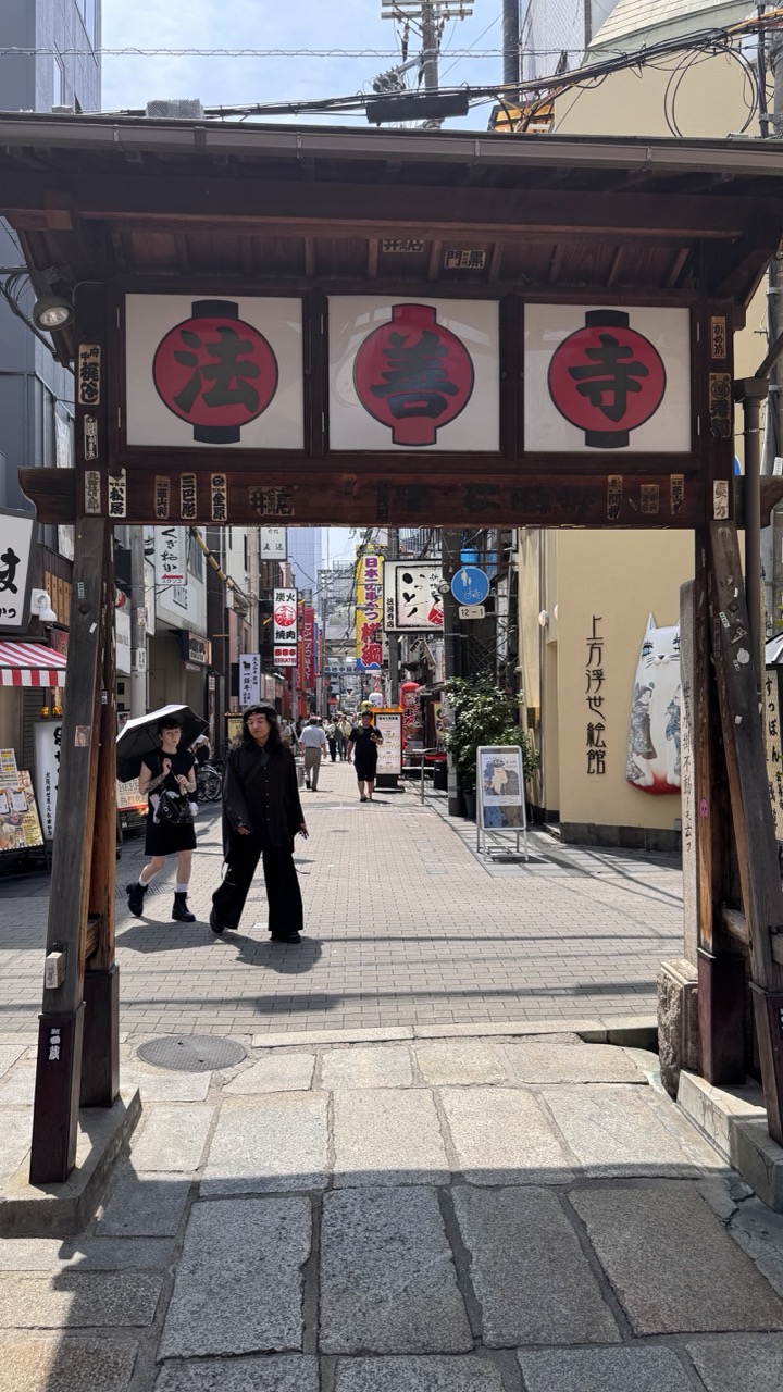

1. Overall Rating (0–10) — 7.0
This photograph captures the vibrant energy of a traditional Japanese street, framed by a striking wooden torii gate bearing the characters for "Hōzō-ji." The scene feels authentic and alive, with pedestrians moving through the frame under bright daylight, creating a sense of everyday rhythm. While the composition is strong and the cultural details rich, the slightly cluttered background and overexposed sky detract from the image’s visual cohesion, leaving it more documentary than poetic.
2. Composition (0–10) — 7.5
The torii gate serves as a powerful framing device, drawing the eye into the narrow street beyond. The diagonal stone path leads the viewer’s gaze forward, while the placement of figures adds scale and narrative depth. The slight asymmetry in the gate and signage adds visual interest, though the crowded midground slightly disrupts the balance.
3. Lighting (0–10) — 6.5
Natural daylight illuminates the scene with clarity, casting defined shadows that enhance texture and depth. However, the sky is overexposed, washing out details in the upper portion of the frame, and the harsh sunlight flattens some of the tonal contrast on the buildings and pavement.
4. Color & Tone (0–10) — 6.0
The palette is dominated by earthy browns, grays, and muted yellows, punctuated by the bold red of the lanterns. While the reds are striking and culturally significant, the overall tone feels somewhat flat and desaturated, limiting the image’s emotional warmth and vibrancy.
5. Creativity (0–10) — 7.0
The image successfully blends cultural authenticity with a sense of movement and place. The choice to shoot through the torii gate creates a layered narrative, inviting the viewer into a living, breathing streetscape. While not groundbreaking in concept, it captures a moment rich with cultural texture and human presence.
6. Technical Quality (0–10) — 7.5
The focus is sharp across the frame, particularly on the foreground and midground. The resolution is clear, and the detail in the stone pavement and signage is well-preserved. The wide-angle perspective is handled well, though the exposure challenges in the sky suggest room for improvement in dynamic range.
7. Emotional Impact (0–10) — 6.5
The photograph evokes a sense of discovery and quiet immersion in a traditional Japanese neighborhood. The presence of people gives the scene life, and the cultural markers invite curiosity. However, the lack of dramatic lighting or a strong emotional focal point keeps the viewer at a slight remove, making the experience more observational than deeply resonant.
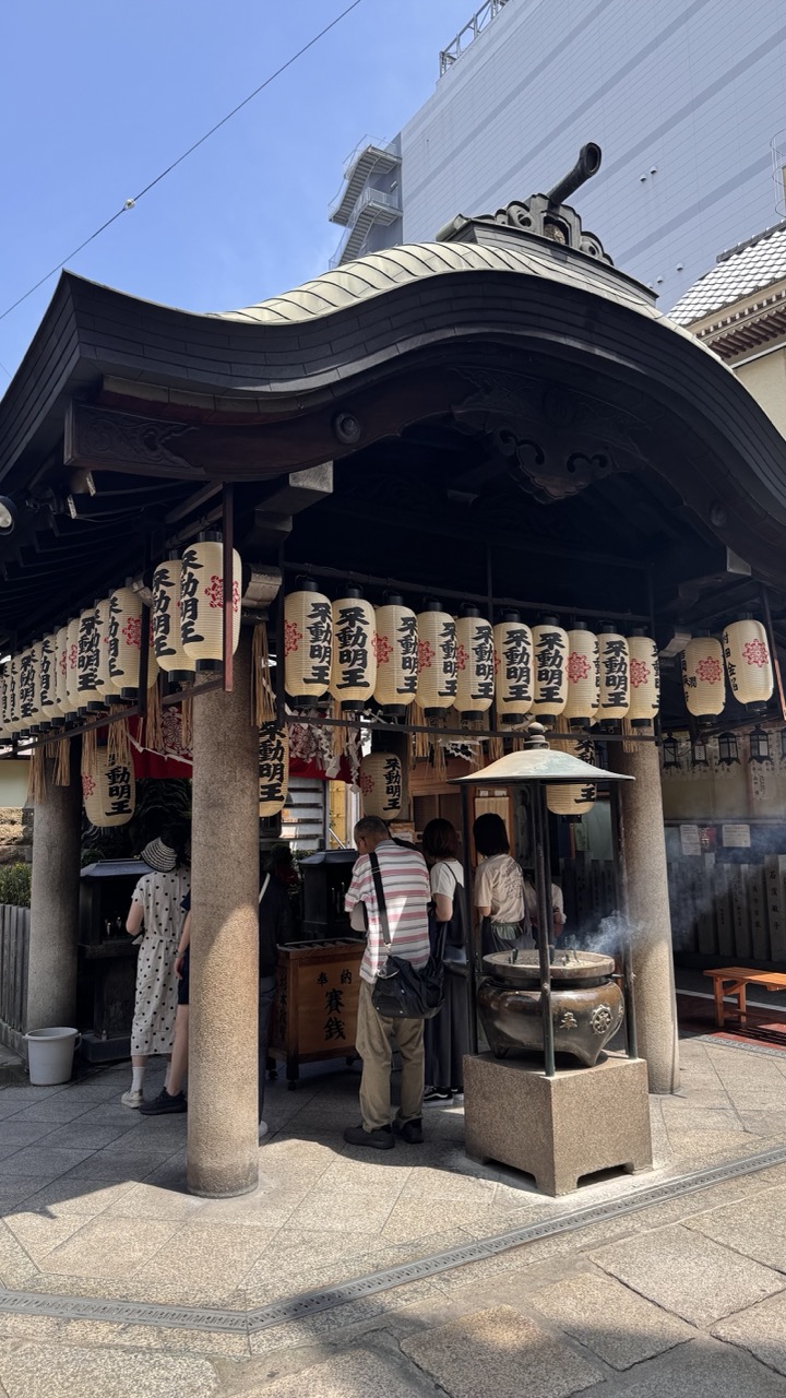

1. Overall Rating (0–10) — 7.0
This photograph captures the quiet reverence of a Japanese shrine nestled within a modern urban landscape, where tradition and daily life intersect. The interplay of the ornate lanterns, the rising incense smoke, and the casual visitors creates a layered narrative of cultural continuity. While the framing feels slightly cluttered by the surrounding architecture, the image successfully conveys a sense of spiritual calm amid the city’s pulse.
2. Composition (0–10) — 6.5
The low-angle perspective emphasizes the shrine’s architectural grandeur, but the inclusion of the modern building in the background disrupts visual harmony. The lanterns form a strong horizontal line, guiding the eye across the scene, though the scattered people and objects create a slightly busy foreground.
3. Lighting (0–10) — 8.0
Bright, natural sunlight enhances the textures of the stone and wood, casting sharp shadows that add depth. The contrast between sunlit areas and the shaded interior of the shrine creates a dynamic interplay of light and shadow, reinforcing the scene’s atmospheric quality.
4. Color & Tone (0–10) — 7.0
The palette is dominated by earthy tones—beige, black, and gray—accented by the warm cream of the lanterns and the soft red of the Japanese characters. The bright blue sky provides a striking backdrop, adding a sense of clarity and openness.
5. Creativity (0–10) — 7.5
The juxtaposition of traditional shrine elements with contemporary architecture offers a compelling commentary on urban spirituality. The inclusion of people engaged in ritual adds a narrative layer, transforming the image from a mere documentation into a moment of cultural observation.
6. Technical Quality (0–10) — 8.0
The image is sharp and well-exposed, with clear details in both the foreground and background. The focus is consistent across the main subjects, and the camera’s wide-angle perspective captures the scene without noticeable distortion.
7. Emotional Impact (0–10) — 7.0
There is a subtle sense of peace and reverence that resonates through the image, particularly in the quiet actions of the visitors and the gentle smoke curling from the incense burner. The viewer is invited to reflect on the enduring presence of tradition in a fast-changing world.
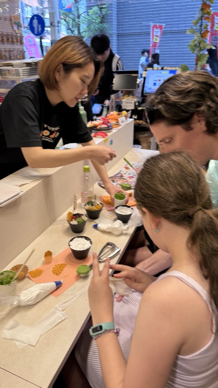

1. Overall Rating (0–10) — 6.0
This photograph captures a lively, hands-on food experience in what appears to be a Japanese dessert or sushi bar, where a staff member guides customers through a creative process. The scene feels authentic and candid, emphasizing interaction and engagement, though the composition is slightly cluttered and the lighting lacks dramatic flair. While the moment is engaging and full of cultural texture, the image’s overall visual impact is held back by its informal framing and flat lighting.
2. Composition (0–10) — 5.5
The frame is crowded with objects and subjects, leading to a busy foreground that distracts from the central interaction. The diagonal counter creates a dynamic line, but the placement of the main subjects—particularly the girl in the foreground—partially obscures the key action.
3. Lighting (0–10) — 5.0
The lighting is functional and evenly distributed, likely from overhead fluorescent sources, which flattens the scene and minimizes depth. While it clearly illuminates the subjects and their activities, it lacks warmth or directional emphasis that would enhance mood or focus.
4. Color & Tone (0–10) — 5.5
The color palette is mostly neutral, dominated by whites and grays, with pops of green and orange from the food and packaging. While the colors are fresh and appropriate for the setting, they lack vibrancy and contrast, contributing to a somewhat muted visual tone.
5. Creativity (0–10) — 6.5
The image captures a unique cultural experience—possibly a DIY dessert or sushi-making workshop—with genuine spontaneity. The inclusion of multiple hands and materials suggests a participatory, joyful moment, though the concept is more observational than artistically interpreted.
6. Technical Quality (0–10) — 7.0
The image is sharp and well-focused on the central subjects, with no significant technical flaws in exposure or clarity. The use of a smartphone camera is evident, but the details are clear and the depth of field is appropriate for the scene.
7. Emotional Impact (0–10) — 6.0
The photograph conveys a sense of curiosity and shared experience, particularly through the girl’s engagement and the staff member’s attentive guidance. While it invites the viewer to imagine themselves in the moment, the emotional resonance is limited by the lack of strong visual storytelling or atmospheric depth.
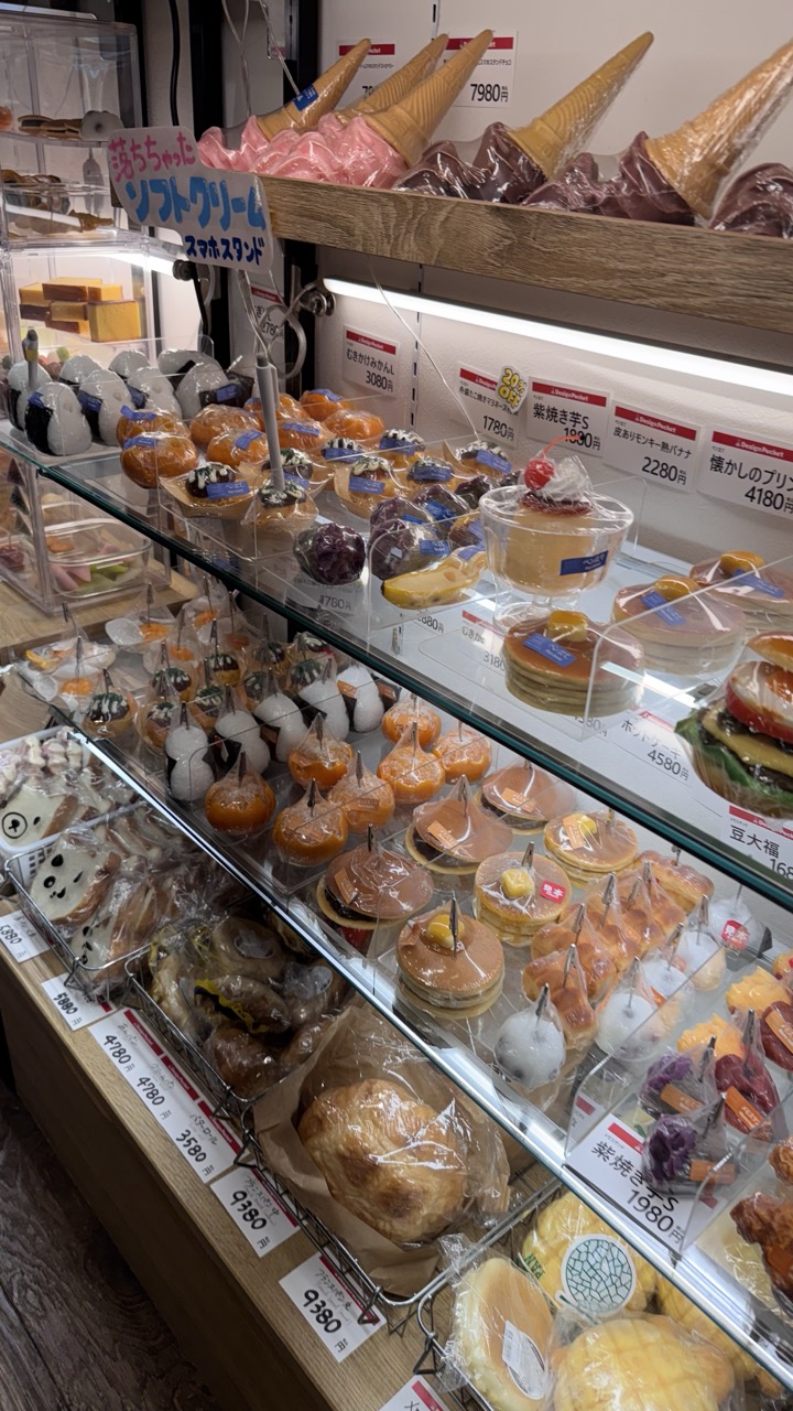

1. Overall Rating (0–10) — 6.8
This image captures the vibrant, almost whimsical abundance of a Japanese confectionery display, where playful shapes and bright packaging create an inviting sense of indulgence. The layered arrangement of desserts, from ice cream cones to themed cakes, offers a feast for the eyes, though the sheer density of items and signage slightly overwhelms the composition. While the scene feels authentic and lively, it lacks a clear focal point, making the viewer’s eye wander without a strong narrative anchor.
2. Composition (0–10) — 6.0
The diagonal flow of the display case guides the eye from bottom left to top right, but the cluttered layers and overlapping elements reduce visual clarity. A tighter crop or more intentional framing could enhance focus and balance.
3. Lighting (0–10) — 7.0
Even, overhead lighting illuminates the pastries effectively, enhancing their textures and colors without harsh shadows. The brightness supports the cheerful, commercial tone of the scene.
4. Color & Tone (0–10) — 7.5
The palette is rich and varied, with warm yellows, deep purples, and soft pinks creating visual harmony. The contrast between the colorful desserts and the neutral wooden and glass backdrop helps the treats stand out.
5. Creativity (0–10) — 7.0
The imaginative designs—such as the ice cream cone-shaped cakes and panda-themed sweets—show a playful, culturally specific creativity. However, the presentation leans toward commercial realism rather than artistic interpretation.
6. Technical Quality (0–10) — 7.5
Sharp focus and clear detail allow individual items to be easily distinguished. The image is well-exposed, with minimal noise or distortion.
7. Emotional Impact (0–10) — 6.5
The scene evokes a sense of delight and curiosity, tapping into the joy of discovery in a sweet shop. However, the lack of human presence and narrative depth keeps the emotional connection somewhat superficial.
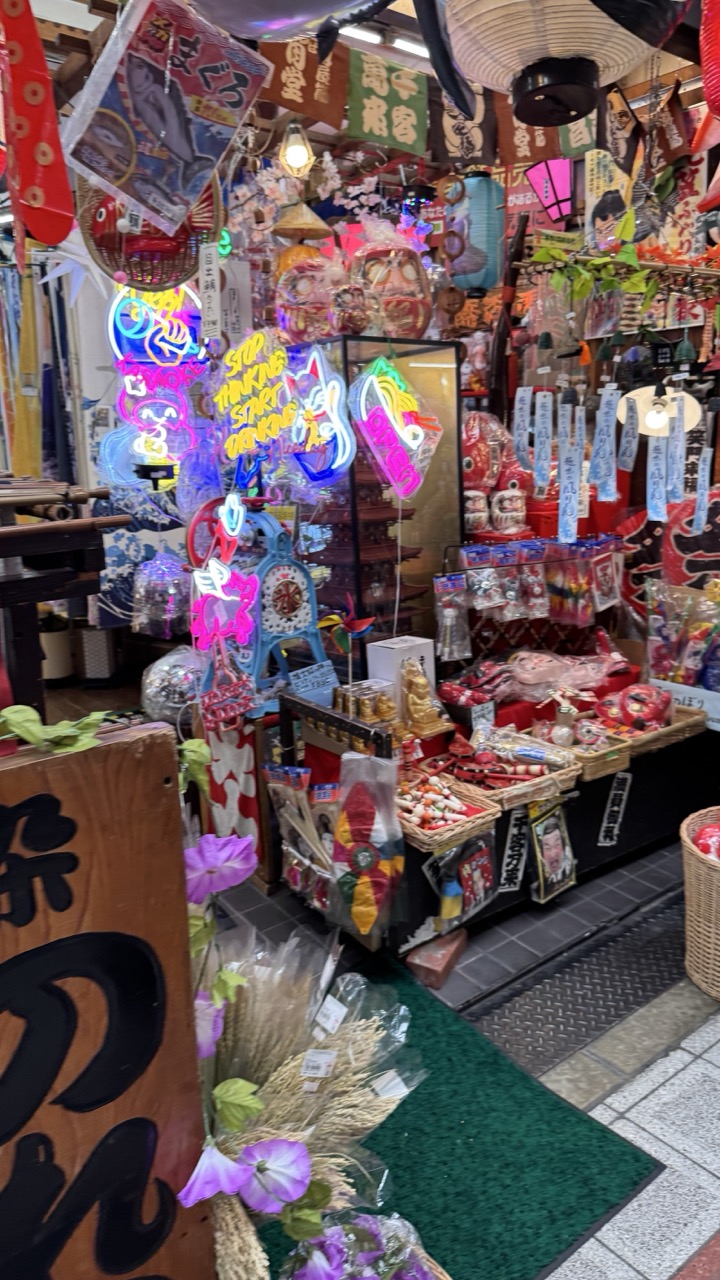

1. Overall Rating (0–10) — 7.0
This photograph bursts with the chaotic energy of a traditional Japanese souvenir shop, where cultural artifacts and modern neon signs collide in a vibrant, sensory overload. The density of objects—tassels, lanterns, masks, and glowing signs—creates a lively, almost theatrical atmosphere that captures the spirit of a bustling market. While the visual clutter risks overwhelming the viewer, the image successfully conveys a sense of cultural richness and playful disorder, offering a window into a world where tradition and kitsch coexist.
2. Composition (0–10) — 6.5
The frame is tightly packed, with a strong diagonal leading the eye from the wooden sign in the foreground to the neon displays in the midground. However, the sheer number of elements creates a slightly unbalanced feel, with the right side appearing more densely packed than the left, and some visual noise competing for attention.
3. Lighting (0–10) — 7.0
A mix of ambient overhead lighting and bright neon signs creates a dynamic interplay of light and shadow. The neon glows—especially the pink and blue signs—add pops of color and energy, while the soft overhead lights keep the scene grounded and readable. The lighting enhances the sense of a lively, indoor marketplace.
4. Color & Tone (0–10) — 8.0
The palette is rich and varied, with bold reds, purples, and blues from the neon and merchandise creating a vivid, energetic contrast against the neutral tones of the floor and wood. The saturation is high but not unnatural, and the warm and cool tones work together to create a visually stimulating scene.
5. Creativity (0–10) — 8.0
The juxtaposition of traditional Japanese elements—like paper lanterns and wooden masks—with modern neon signage is striking and inventive. This blend of old and new tells a story of cultural continuity and adaptation, making the image feel both authentic and whimsical.
6. Technical Quality (0–10) — 7.5
The image is sharp and well-focused, with fine details visible in the merchandise and signage. The camera appears to have handled the mixed lighting well, preserving detail in both bright and shadowed areas without significant overexposure or noise.
7. Emotional Impact (0–10) — 7.5
The photograph evokes a sense of wonder and curiosity, drawing the viewer into a space that feels both familiar and exotic. The overwhelming abundance of items suggests a place of celebration and ritual, and the viewer is left with a feeling of being immersed in a lively, joyful culture.
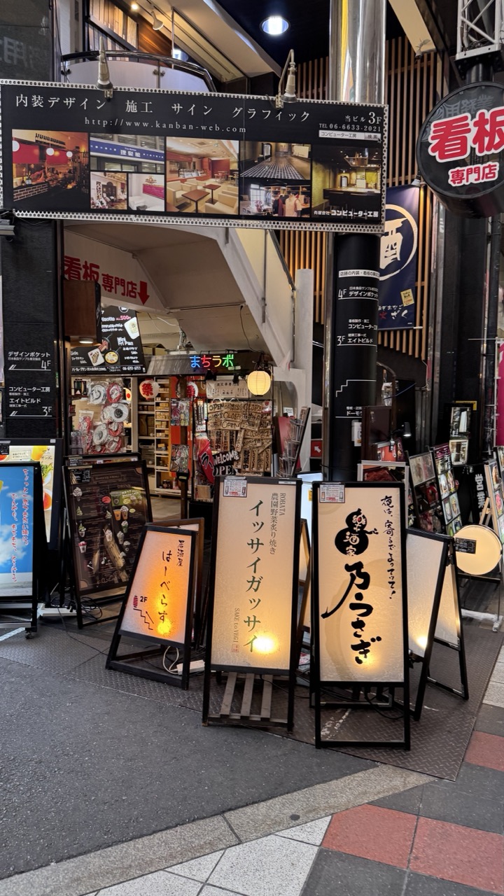

1. Overall Rating (0–10) — 6.0
This photograph captures the bustling energy of a Japanese street scene, where layers of signage and commercial activity create a dense, immersive urban atmosphere. The interplay of glowing signs, varied typography, and architectural details conveys the vibrancy of a city alive with commerce and culture. While the image succeeds in documenting a real-world environment, its visual clutter and lack of clear focal point prevent it from feeling cohesive or artistically refined.
2. Composition (0–10) — 5.0
The frame is crowded and busy, with multiple signs and structures competing for attention. The central A-frame signs provide a partial anchor, but the overall composition feels unbalanced and lacks a clear visual hierarchy.
3. Lighting (0–10) — 6.0
The mix of artificial lighting—particularly the warm glow from the illuminated signs—adds depth and atmosphere to the scene. However, the ambient lighting is uneven, with bright spots and dark shadows that reduce overall clarity and create visual noise.
4. Color & Tone (0–10) — 5.5
The palette is dominated by muted grays and blacks, punctuated by bursts of red, white, and warm yellow from the signage. While the contrast between light and dark is effective, the overall tone is slightly flat and lacks richness or dynamic range.
5. Creativity (0–10) — 6.5
The image captures a distinctive slice of urban life with a strong sense of place, relying on the inherent visual complexity of the environment. The layered signs and Japanese script lend authenticity, though the approach feels more documentary than expressive.
6. Technical Quality (0–10) — 7.0
The image is sharp and well-focused, with clear details visible in the signage and textures of the pavement. The camera appears to be steady, and the exposure is generally balanced, though some areas are slightly overexposed due to the bright lights.
7. Emotional Impact (0–10) — 5.5
The photograph evokes a sense of urban immersion and everyday energy, but its overwhelming density creates a sense of visual fatigue rather than emotional resonance. It invites observation but offers little in the way of intimacy or narrative depth.
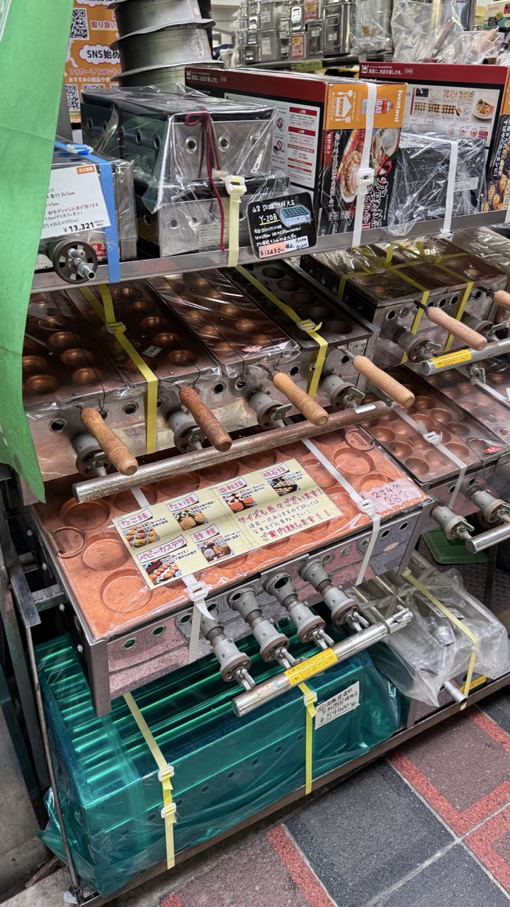

1. Overall Rating (0–10) — 6.0
This photograph captures the bustling, cluttered energy of a Japanese kitchen supply store, where rows of taiyaki and other molded pan machines are stacked like industrial relics. The scene feels authentic and unfiltered, with price tags and packaging reinforcing its commercial context, yet the composition is overwhelmed by visual noise, making it hard to focus on a single narrative thread. While it succeeds in documenting a slice of everyday commerce, the image lacks a clear focal point and artistic cohesion.
2. Composition (0–10) — 5.0
The frame is crowded and diagonally cluttered, with overlapping objects and uneven layers creating a sense of visual chaos. The lack of a clear subject or leading line makes it difficult to navigate the scene, and the low-angle perspective emphasizes bulk over beauty.
3. Lighting (0–10) — 5.5
Harsh overhead fluorescent lighting flattens the image, casting a sterile white glow that washes out textures and tones. While functional for showcasing products, it offers little mood or dimension, contributing to the image’s impersonal, commercial feel.
4. Color & Tone (0–10) — 5.5
The palette is dominated by metallic grays, dull browns, and muted packaging colors, with only the green plastic and orange price tags providing minor contrast. The lack of tonal variety dulls the visual impact and gives the image a slightly dated, utilitarian appearance.
5. Creativity (0–10) — 6.0
The photograph documents a niche cultural detail—Japanese food-making equipment—with candid authenticity. However, it leans more toward documentary than artistic expression, offering little beyond a straightforward snapshot of a store shelf.
6. Technical Quality (0–10) — 7.0
The image is reasonably sharp and free of major flaws like blur or noise, with legible text and clear details on the machines. The focus is consistent across the frame, though the density of objects limits depth.
7. Emotional Impact (0–10) — 5.0
While the image evokes a sense of curiosity about Japanese culinary culture, it fails to generate strong emotional resonance. The clutter and lack of human presence keep the viewer at a distance, making it more informative than evocative.
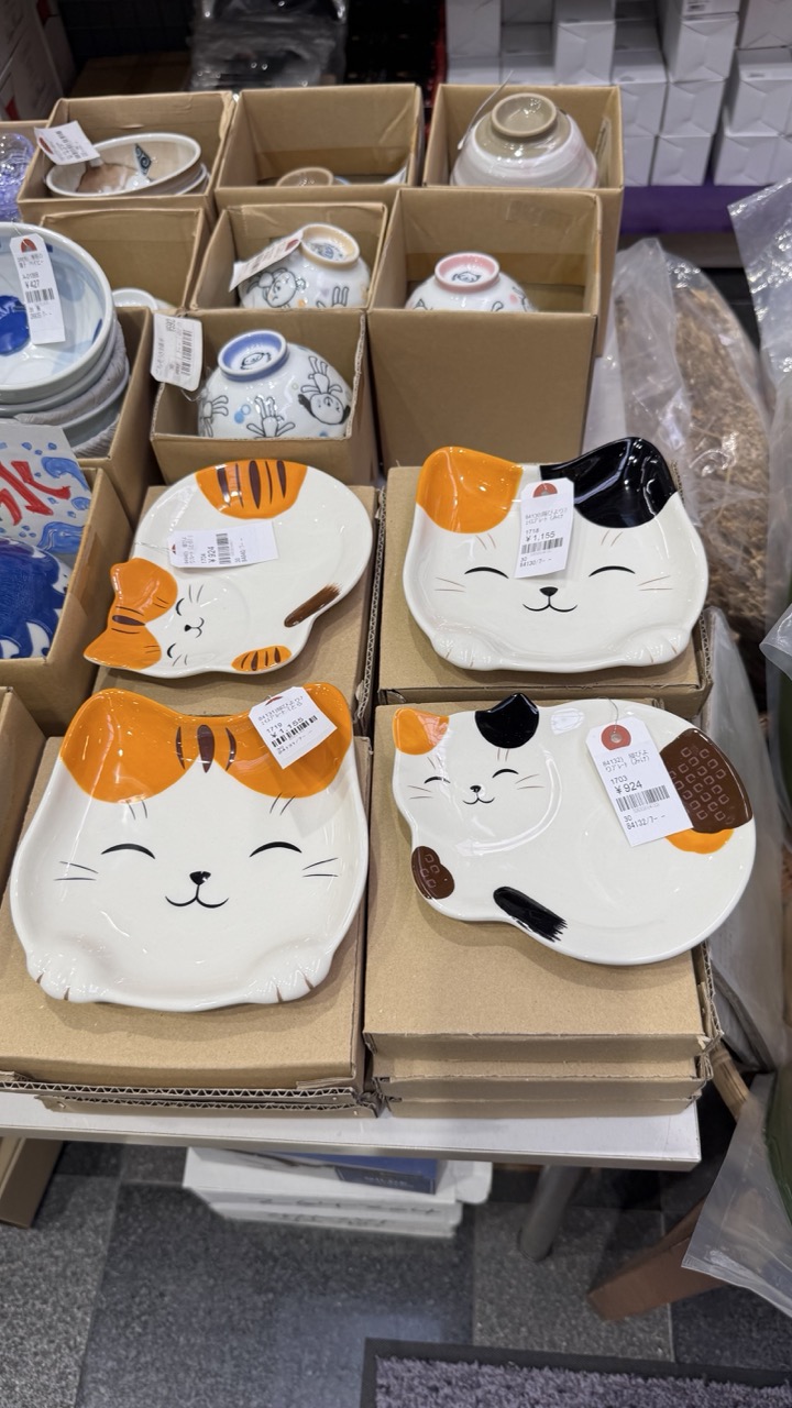

1. Overall Rating (0–10) — 5.8
This photograph captures a whimsical display of cat-shaped plates in a retail setting, where playful design meets everyday commerce. The arrangement feels candid and functional, with price tags and packaging reinforcing the scene’s commercial context, yet the charm of the ceramic figures offers a subtle warmth. While the composition is cluttered and the lighting flat, the image succeeds in conveying a slice of everyday retail life—quaint, slightly chaotic, and quietly endearing.
2. Composition (0–10) — 5.0
The frame is crowded and uneven, with overlapping boxes and a slightly tilted angle that disrupts visual balance. The central cat plates are the focal point, but surrounding clutter competes for attention.
3. Lighting (0–10) — 4.5
Harsh overhead fluorescent lighting creates flat illumination with minimal shadow, flattening the textures and reducing visual depth. The light is utilitarian, prioritizing clarity over atmosphere.
4. Color & Tone (0–10) — 5.5
The palette is dominated by neutral browns and grays from the boxes and floor, punctuated by the bright orange, black, and white of the cat plates. While the colors are cheerful, the overall tone lacks vibrancy due to the muted lighting.
5. Creativity (0–10) — 6.0
The concept of cat-shaped tableware is inherently playful and original, offering a whimsical contrast to the mundane retail environment. The image captures this juxtaposition well, though it remains more observational than artistically expressive.
6. Technical Quality (0–10) — 7.0
The image is sharp and in focus, with clear visibility of price tags and design details. However, the lack of intentional composition and lighting control limits its technical finesse.
7. Emotional Impact (0–10) — 5.5
The photograph evokes a sense of gentle amusement and nostalgia, particularly for fans of cute, functional design. The warmth of the cat motif offers a quiet emotional anchor, though the impersonal setting keeps the viewer at a distance.
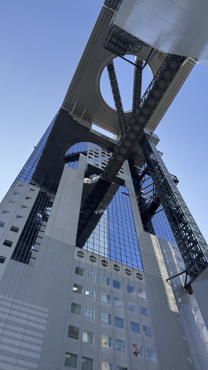

1. Overall Rating (0–10) — 8.0
This photograph captures the bold, futuristic architecture of a towering structure with striking geometric precision, evoking a sense of awe and technological ambition. The low-angle perspective amplifies the building’s imposing scale, while the clear blue sky provides a clean backdrop that highlights its intricate design. The image succeeds in conveying both the structural grandeur and the sleek modernity of the architecture, though it remains somewhat restrained in emotional depth.
2. Composition (0–10) — 8.5
The low-angle shot emphasizes the building’s verticality and creates a dynamic sense of upward movement. The strong diagonal lines of the steel bracing and the circular voids in the structure guide the eye through the frame, balancing the composition and enhancing its architectural drama.
3. Lighting (0–10) — 7.5
Natural daylight provides even illumination, highlighting the textures of the glass and steel. The bright, clear sky casts subtle shadows that add depth and dimension, while the reflections on the glass surfaces contribute to a crisp, high-contrast look.
4. Color & Tone (0–10) — 7.0
The palette is dominated by cool grays and blues, reinforcing the modern and industrial aesthetic. The tone is clean and crisp, though the lack of warm color accents tempers the image’s emotional resonance.
5. Creativity (0–10) — 8.0
The choice of angle and framing transforms a standard architectural subject into a visually compelling narrative. The interplay of geometry, reflection, and perspective demonstrates a strong artistic sensibility and a clear intent to celebrate structural design.
6. Technical Quality (0–10) — 8.5
Sharp focus and high detail capture the textures and lines of the building with precision. The exposure is well-balanced, and the resolution is high, allowing for rich detail throughout the image.
7. Emotional Impact (0–10) — 7.0
The image inspires a sense of admiration for human engineering and design, but its emotional impact is more cerebral than visceral. The viewer is drawn to the structure’s form and function rather than to a deeper emotional connection.
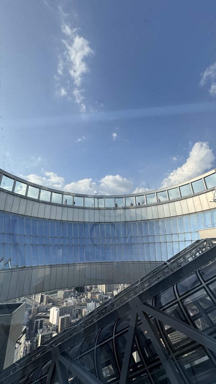

1. Overall Rating (0–10) — 7.0
This photograph captures the grandeur of a modern observation deck, where human scale meets architectural ambition under a vast blue sky. The sweeping curve of the glass structure draws the eye into the frame, while the city sprawls below, offering a sense of height and perspective. The image feels dynamic and immersive, though the reflection on the glass and slight lens flare introduce a subtle distraction that keeps it from achieving complete visual clarity.
2. Composition (0–10) — 7.5
The diagonal lines of the structure in the foreground create a strong sense of depth, leading the viewer’s gaze toward the curved observation deck. The placement of the sky above and the city below establishes a balanced yet dramatic composition, with the arc of the glass forming a natural focal point.
3. Lighting (0–10) — 8.0
Bright, natural daylight enhances the clarity and crispness of the scene, with soft shadows adding dimension to the glass and steel. The sunlight reflects cleanly off the windows, reinforcing the architectural lines and contributing to the image’s airy, open feel.
4. Color & Tone (0–10) — 7.5
The dominant blue of the sky contrasts beautifully with the cool grays and silvers of the modern architecture. The subtle gradations in the sky and the clean reflections on the glass lend a serene, almost meditative tone, with just enough warmth to avoid feeling overly sterile.
5. Creativity (0–10) — 7.0
The perspective—looking upward from within the structure—offers a unique vantage point that emphasizes both the scale of the building and the vastness of the sky. The inclusion of distant figures on the observation deck adds a human element, grounding the image in experience rather than just form.
6. Technical Quality (0–10) — 8.0
The image is sharp and well-focused, with fine detail visible in the glass panels and structural elements. The exposure is well-managed, capturing both the bright sky and the darker areas of the building without significant loss of detail.
7. Emotional Impact (0–10) — 7.5
There’s a sense of awe and contemplation evoked by the high vantage point and the sweeping view of the city below. The openness of the sky and the quiet presence of people on the deck invite reflection, creating a moment of stillness amid urban complexity.
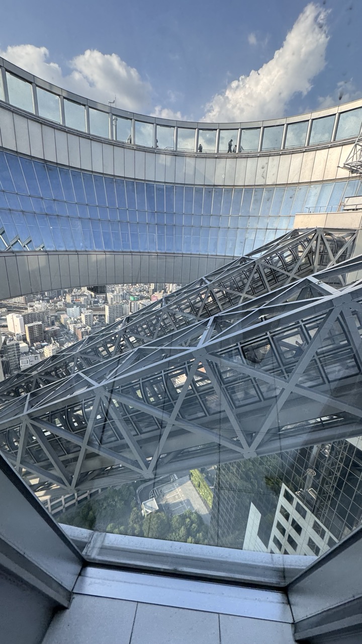

1. Overall Rating (0–10) — 7.5
This photograph captures the awe-inspiring scale and engineering of a modern observation deck, offering a dramatic perspective from within a towering structure. The juxtaposition of the intricate steel framework against the vast urban sprawl below creates a compelling narrative of human ambition and urban density. While the image is strong in its architectural detail and sense of vertigo, it slightly lacks the emotional warmth to fully engage the viewer beyond admiration of the structure itself.
2. Composition (0–10) — 8.0
The low-angle perspective emphasizes the towering presence of the structure, with the diagonal lines of the steel trusses guiding the eye toward the distant cityscape. The curved glass railing frames the top of the image, creating a sense of enclosure and height, while the city below adds depth and context.
3. Lighting (0–10) — 7.5
Natural daylight enhances the clarity and detail of the steel framework and glass surfaces. The bright sky with scattered clouds adds texture and contrast, while the shadows within the truss system create a dynamic interplay of light and form.
4. Color & Tone (0–10) — 7.0
The palette is dominated by cool metallic grays and blues, reflecting the industrial materials and the sky. The contrast between the cool tones of the structure and the warmer, varied hues of the city below adds visual interest, though the overall tone remains somewhat restrained.
5. Creativity (0–10) — 7.5
The composition leverages the unique vantage point to highlight both the architectural marvel and the urban environment it overlooks. The interplay of geometric lines and the sense of height offer a fresh perspective on a familiar cityscape, transforming a tourist view into a more contemplative image.
6. Technical Quality (0–10) — 8.0
The image is sharp and well-focused, with excellent detail in the steel trusses and glass surfaces. The exposure is balanced, preserving texture and depth without overexposure in the sky or underexposure in the shadows.
7. Emotional Impact (0–10) — 6.5
The photograph evokes a sense of awe and vertigo, capturing the thrill of height and the scale of modern architecture. While it effectively conveys the physical experience of being in such a structure, it remains more observational than emotionally intimate, leaving the viewer as a detached witness rather than an emotional participant.
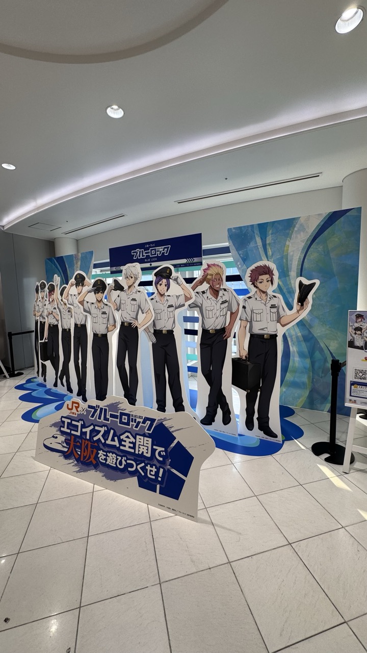

1. Overall Rating (0–10) — 6.0
This photograph captures a promotional display for the anime *Blue Lock*, set within a public space likely at a JR station in Osaka. The scene is visually engaging due to the bold, colorful cutouts of the characters and the energetic branding, but the sterile, fluorescent-lit environment undermines the vibrancy of the artwork. While the display effectively communicates its purpose as a themed event, the lack of atmospheric lighting and personal connection limits its emotional resonance.
2. Composition (0–10) — 6.5
The arrangement of the character cutouts creates a sense of depth and narrative flow, leading the eye from left to right. The low-angle perspective emphasizes the figures, though the cluttered foreground and visible structural elements (like the stanchion and signage) disrupt visual harmony and create a slightly chaotic feel.
3. Lighting (0–10) — 5.0
The lighting is functional and uniform, typical of a commercial interior, but lacks directionality or mood. The overhead fixtures produce flat illumination that washes out color and flattens the three-dimensional quality of the display.
4. Color & Tone (0–10) — 6.0
The bright blue and white palette of the backdrop and signage harmonizes well with the anime’s branding, creating a cohesive visual identity. However, the neutral floor and ceiling dull the overall impact, and the lack of contrast reduces the pop of the characters’ vibrant designs.
5. Creativity (0–10) — 7.0
The display effectively merges pop culture with public space, transforming a transit area into an interactive experience. The use of life-sized cutouts and dynamic poses adds a playful, engaging element that appeals to fans and passersby alike.
6. Technical Quality (0–10) — 7.5
The image is sharp and clear, with good focus and minimal noise. The wide-angle perspective captures the full scope of the installation, though some distortion is evident at the edges.
7. Emotional Impact (0–10) — 5.5
While the display evokes excitement and nostalgia for fans of the series, the impersonal setting and lack of human presence keep the emotional connection at a distance. The scene feels more like a promotional snapshot than a deeply moving experience.
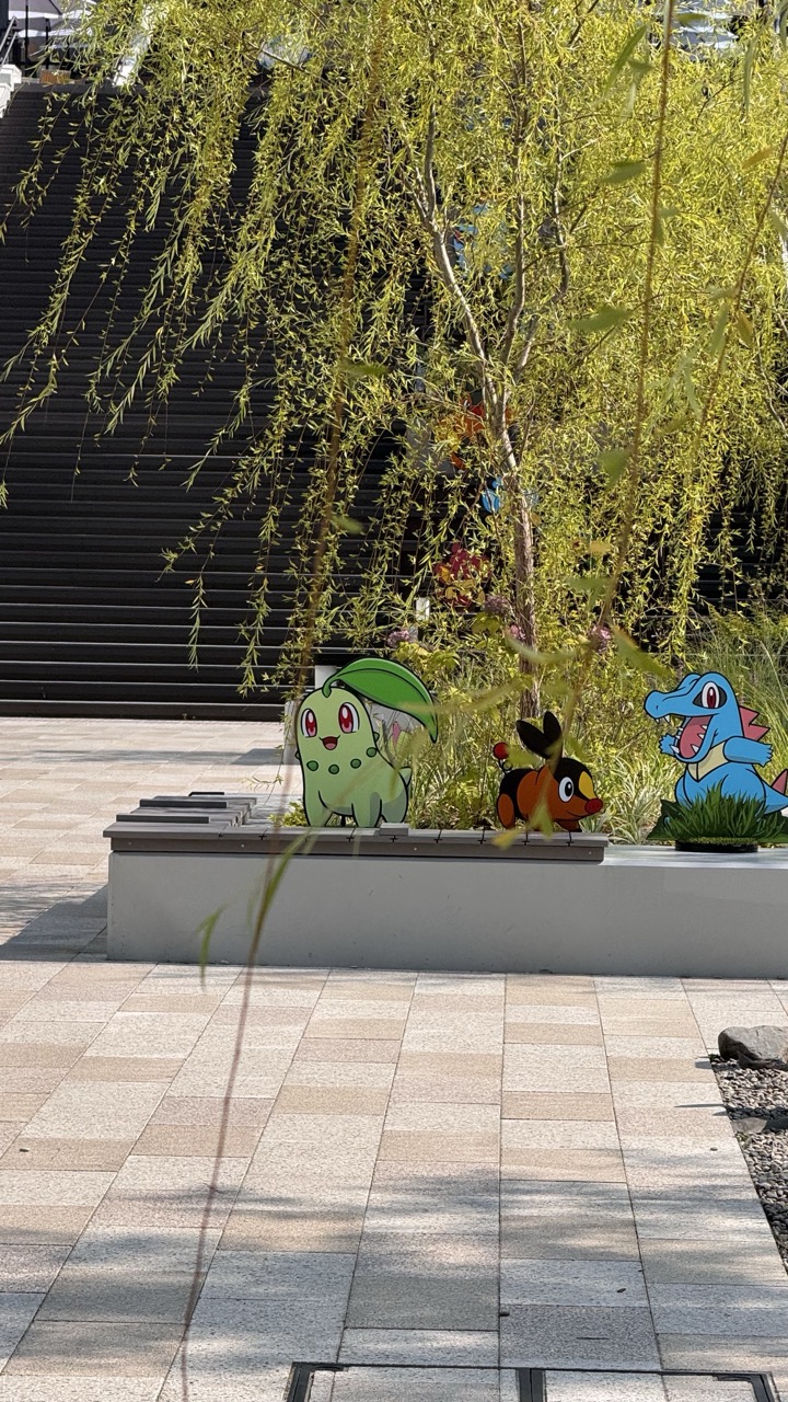

1. Overall Rating (0–10) — 6.0
This photograph captures a whimsical blend of nature and pop culture, where Pokémon cutouts are nestled among the branches of a weeping willow, creating a playful juxtaposition. The bright sunlight and vibrant colors lend a cheerful energy to the scene, but the composition feels slightly cluttered and unbalanced, with foreground elements partially obscuring the subject. While the concept is charming and well-executed in its intent, the image lacks the visual cohesion to feel truly polished.
2. Composition (0–10) — 5.5
The framing is awkward, with the foreground branches and a stray stem disrupting the view of the Pokémon figures. The low-angle perspective adds depth but also introduces visual clutter, pulling focus away from the central subjects.
3. Lighting (0–10) — 7.5
Bright, natural daylight enhances the vividness of the Pokémon cutouts and the fresh green of the willow leaves. The shadows are sharp and directional, adding dimension and clarity to the scene.
4. Color & Tone (0–10) — 7.0
The palette is lively and balanced, with the greens of the tree and the colorful Pokémon figures creating a harmonious contrast against the neutral tones of the pavement and steps. The warm sunlight adds a golden hue that complements the springtime atmosphere.
5. Creativity (0–10) — 7.5
The idea of integrating Pokémon into a natural urban setting is imaginative and delightfully unexpected. It speaks to a playful blending of nostalgia and environment, offering a unique visual narrative that feels both lighthearted and engaging.
6. Technical Quality (0–10) — 7.0
The image is sharp and well-exposed, with clean details in both the foreground and background. However, minor distractions in the foreground slightly compromise the overall technical polish.
7. Emotional Impact (0–10) — 6.5
The scene evokes a sense of joy and whimsy, especially for fans of Pokémon or those who appreciate the intersection of childhood nostalgia and public art. While it may not stir deep emotion, it successfully captures a moment of lighthearted delight.
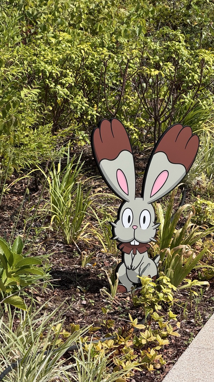

1. Overall Rating (0–10) — 6.0
This photograph captures a whimsical juxtaposition of a cartoonish Pokémon figure nestled within a natural garden setting, creating a playful contrast between fiction and reality. The vibrant greenery and bright daylight enhance the cuteness of the character, though the composition feels slightly staged and lacks narrative depth. While the image is visually engaging and clearly intended to delight fans, it stops short of transcending its novelty to become a compelling piece of visual storytelling.
2. Composition (0–10) — 6.5
The character is centered and clearly the focal point, with surrounding foliage framing it effectively. However, the inclusion of the sidewalk in the lower-right corner introduces a subtle visual imbalance, pulling attention away from the natural setting.
3. Lighting (0–10) — 8.0
Natural daylight illuminates the scene evenly, with soft shadows that enhance depth without obscuring detail. The sunlight highlights the texture of the leaves and the clean lines of the cutout, contributing to a cheerful and inviting mood.
4. Color & Tone (0–10) — 7.5
The palette balances the bright, saturated greens of the foliage with the soft pastels of the character’s design. The contrast between the natural tones and the stylized figure adds visual interest, though the color harmony is slightly disrupted by the neutral gray of the pavement.
5. Creativity (0–10) — 7.0
The integration of a fictional character into a real-world environment is a clever and imaginative concept, especially appealing to fans of the franchise. The image leverages pop culture in a lighthearted way, though it relies heavily on recognizable branding rather than original artistic expression.
6. Technical Quality (0–10) — 8.0
The image is sharp and well-focused, with clear details in both the character and the surrounding plants. The depth of field keeps the subject crisp while softly blurring the background, enhancing visual clarity.
7. Emotional Impact (0–10) — 7.0
The image evokes a sense of joy and nostalgia, particularly for viewers familiar with the Pokémon series. Its charm lies in the unexpected placement of the character in an everyday setting, creating a moment of delight and whimsy.
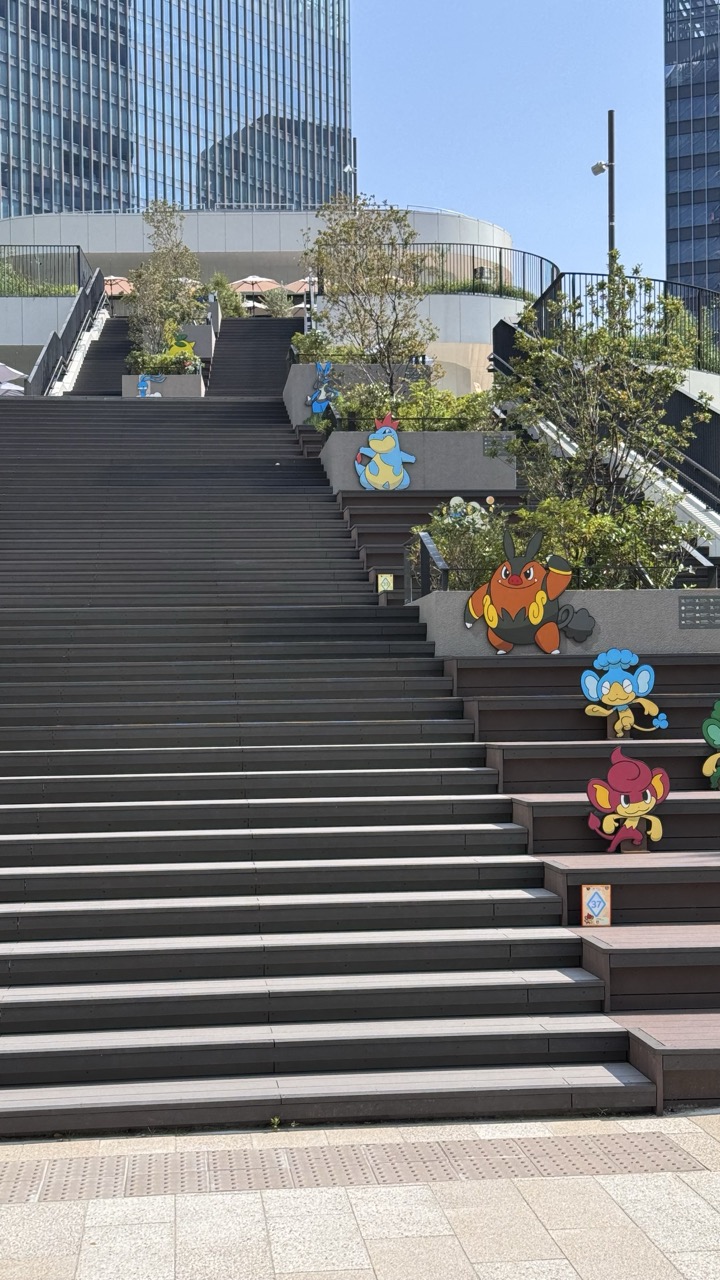

1. Overall Rating (0–10) — 6.0
This photograph captures a playful juxtaposition of urban architecture and pop culture, where Pokémon figures animate a stark staircase in a modern cityscape. The bright, sunny lighting and bold character designs inject energy and whimsy into an otherwise neutral environment, though the image feels more like a casual snapshot than a composed visual statement. The lack of human presence and the slightly chaotic placement of the figures temper the overall impact, leaving the scene feeling more staged than immersive.
2. Composition (0–10) — 6.5
The wide-angle perspective emphasizes the sweeping lines of the staircase, drawing the eye upward toward the skyscrapers. The Pokémon figures are placed unevenly along the steps, creating a sense of playful disarray that disrupts visual harmony but adds narrative interest.
3. Lighting (0–10) — 8.0
Natural daylight provides even, bright illumination, enhancing the clarity of the Pokémon cutouts and the textures of the concrete and metal. The clear blue sky adds depth and contrast, giving the scene a vibrant, daytime feel.
4. Color & Tone (0–10) — 7.0
The palette balances the cool grays of the urban structure with the warm, saturated colors of the Pokémon characters. The contrast between the muted tones of the environment and the bright, cartoonish figures creates a dynamic visual tension.
5. Creativity (0–10) — 7.5
The integration of Pokémon figures into a real-world urban setting is a clever and imaginative concept, blending nostalgia with contemporary design. The placement suggests a narrative—perhaps a promotional event or public art installation—adding a layer of storytelling to the scene.
6. Technical Quality (0–10) — 7.5
The image is sharp and well-focused, with clean details across the frame. The exposure is balanced, and the colors are accurately rendered, though the wide-angle lens introduces slight distortion at the edges.
7. Emotional Impact (0–10) — 6.5
The scene evokes a sense of playful surprise, appealing to fans of Pokémon and those who appreciate urban art. While it captures a moment of lighthearted fun, the absence of people or interaction limits its emotional resonance, making it more charming than moving.
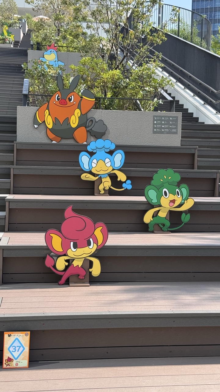

1. Overall Rating (0–10) — 6.8
This photograph captures a vibrant and playful outdoor installation of Pokémon figures arranged on a modern staircase, blending pop culture with urban design. The bright, saturated colors of the characters stand out against the neutral tones of the steps and foliage, creating a cheerful, inviting atmosphere. While the scene is visually engaging and clearly communicates its theme, the composition’s flatness and lack of dynamic lighting reduce its overall artistic impact.
2. Composition (0–10) — 6.5
The figures are arranged in a staggered, diagonal pattern that guides the eye upward, creating a sense of movement. However, the wide-angle perspective and the cluttered background slightly disrupt the visual flow, and the placement of the figures feels more like a display than a carefully staged scene.
3. Lighting (0–10) — 7.0
Natural daylight provides even illumination across the scene, enhancing the vividness of the Pokémon cutouts. The soft shadows under the figures help ground them in the space, while the bright, clear sky contributes to the overall cheerful mood.
4. Color & Tone (0–10) — 7.5
The palette is rich and lively, with bold primary and secondary colors of the Pokémon figures contrasting effectively against the muted grays and browns of the stairs. The greenery adds a natural balance, and the overall tonal harmony supports the playful tone.
5. Creativity (0–10) — 7.0
The integration of Pokémon characters into a public architectural setting is a clever and imaginative use of space. The choice to stage them as if they’re ascending the steps adds narrative charm, suggesting a journey or adventure.
6. Technical Quality (0–10) — 7.5
The image is sharp and well-focused, with clear details in both the foreground and background. The camera’s resolution and exposure are well-matched to the bright outdoor environment, preserving texture and color accuracy.
7. Emotional Impact (0–10) — 7.0
The photograph evokes a sense of nostalgia and joy, particularly for fans of the Pokémon franchise. The whimsical setup and bright colors create a lighthearted, cheerful mood that resonates with viewers of all ages, though the emotional depth is limited by the scene’s temporary, commercial nature.
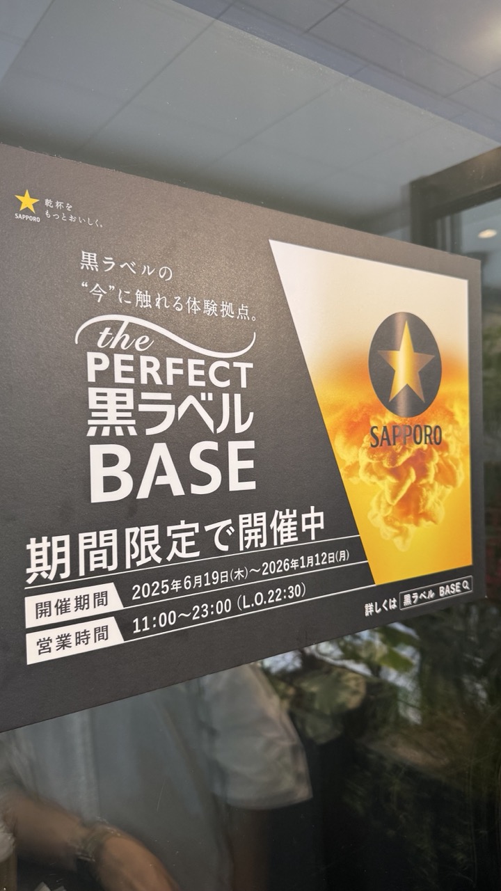

1. Overall Rating (0–10) — 6.0
This photograph captures a promotional sign for Sapporo's "the PERFECT 黒ラベル BASE" in a candid, documentary style, presenting a moment of urban life with quiet authenticity. The angled composition and reflection in the glass lend a sense of immediacy, while the clean typography and bold branding convey a modern, sleek aesthetic. However, the image feels slightly underwhelming due to a lack of visual depth and emotional resonance, as the focus remains on the sign’s informational content rather than its artistic potential.
2. Composition (0–10) — 6.5
The diagonal placement of the sign creates a dynamic frame, drawing the eye across the image. The reflection of a person and surrounding greenery in the glass adds layers of context, though it slightly distracts from the primary subject.
3. Lighting (0–10) — 6.0
The lighting is neutral and functional, likely from indoor fluorescent sources, which evenly illuminates the sign without creating harsh shadows. However, the flatness of the light reduces the image’s atmospheric quality.
4. Color & Tone (0–10) — 6.5
The contrast between the dark background and the vibrant yellow-orange gradient of the Sapporo logo creates a strong visual anchor. The muted tones of the surrounding environment keep the focus on the sign, though the overall palette lacks vibrancy.
5. Creativity (0–10) — 6.0
The image functions as a straightforward documentation of a public installation, with the inclusion of reflections adding a subtle layer of narrative. While not overtly artistic, it effectively captures a moment of everyday life in a branded space.
6. Technical Quality (0–10) — 7.5
The image is sharp and well-focused, with clear legibility of the text. The camera’s focus on the sign ensures that all key details are visible, despite the minor distractions from the reflections.
7. Emotional Impact (0–10) — 5.5
The photograph conveys a sense of place and time but does not evoke a strong emotional response. It feels more like a snapshot than an evocative portrait, leaving the viewer with information rather than feeling.
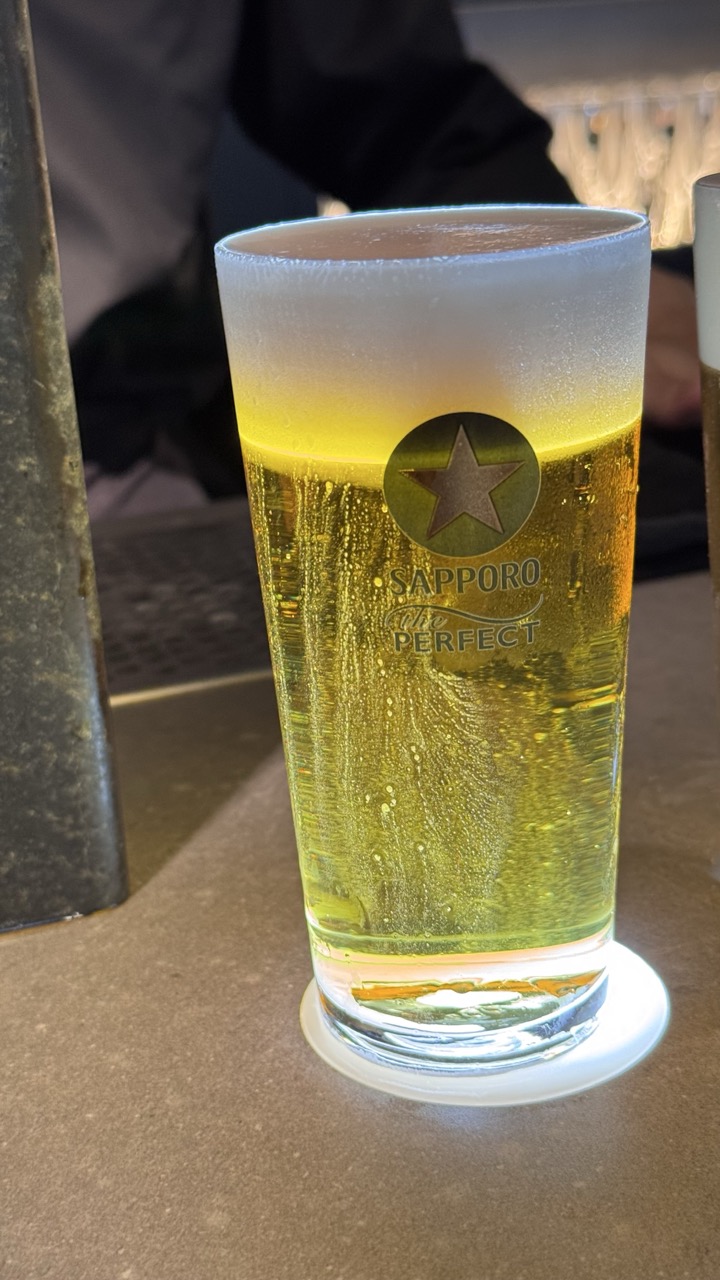

1. Overall Rating (0–10) — 7.0
This photograph captures the crisp refreshment of a chilled beer with a quiet, sensory appeal, inviting the viewer to feel the cool condensation and hear the fizz of carbonation. The focus on the Sapporo glass, with its golden liquid and frothy head, creates a moment of simple indulgence, though the background’s slight busyness tempers its overall refinement. The image succeeds in evoking a tactile experience, but it stops short of true artistic elevation.
2. Composition (0–10) — 6.5
The beer glass is well-centered and fills the frame effectively, drawing immediate attention. However, the cluttered background and the partial view of a second glass on the right create a sense of visual distraction, slightly undermining the image’s clean focus.
3. Lighting (0–10) — 7.0
The lighting is warm and directional, enhancing the golden hue of the beer and highlighting the condensation on the glass. The soft glow of the light source beneath the coaster adds a subtle touch of ambiance, though the overall exposure is slightly flat in the background.
4. Color & Tone (0–10) — 7.5
The palette is rich and cohesive, with the golden beer contrasting nicely against the muted tones of the table and background. The warm lighting enhances the inviting quality of the scene, and the cool condensation adds a pleasing textural contrast.
5. Creativity (0–10) — 6.0
The image is straightforward and observational, capturing a familiar moment with clarity and attention to detail. While it conveys a strong sense of atmosphere, it lacks a unique conceptual or narrative twist that would elevate it beyond a standard food or beverage photograph.
6. Technical Quality (0–10) — 8.0
The focus is sharp on the beer glass, capturing fine details like the bubbles and condensation. The image is well-exposed, with no obvious flaws in clarity or noise, and the depth of field effectively isolates the subject.
7. Emotional Impact (0–10) — 7.0
The photograph evokes a sense of relaxation and simple pleasure, tapping into the universal appeal of a cold beer. The warmth and texture of the scene create a comforting, relatable moment that resonates on a sensory level.
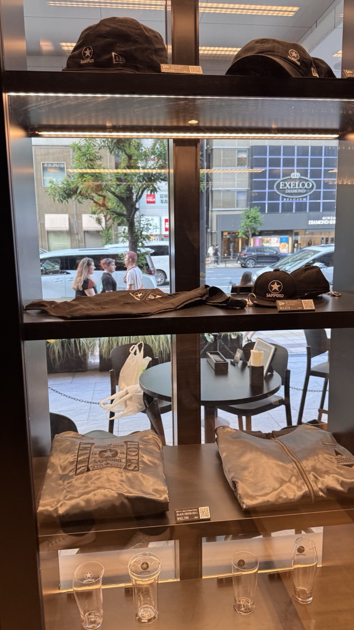

1. Overall Rating (0–10) — 5.5
This photograph captures a retail display in a Japanese urban setting, blending branded merchandise with the bustling street beyond. The composition leverages the reflective glass to merge the interior product showcase with the outside world, creating a layered narrative of commerce and daily life. However, the image feels slightly cluttered and lacks a strong focal point, with too much visual information competing for attention, diminishing its overall impact.
2. Composition (0–10) — 6.0
The layered shelves create depth, and the use of the window as a frame within a frame adds visual interest. However, the off-center placement of the hats and the uneven distribution of items disrupt balance, making the scene feel more like a snapshot than a curated composition.
3. Lighting (0–10) — 6.5
The interior lighting is warm and focused, highlighting the merchandise effectively. The natural light from outside adds contrast and context, though the reflections on the glass slightly obscure the background and create a subtle visual distraction.
4. Color & Tone (0–10) — 6.0
The palette is dominated by neutral browns, blacks, and metallics, which convey a sleek, modern retail aesthetic. The muted tones are consistent but lack vibrancy, giving the image a somewhat flat and commercial feel.
5. Creativity (0–10) — 5.5
The idea of juxtaposing the curated product display with the real-world street scene is conceptually strong, but the execution feels more documentary than artistic. The image captures a moment rather than a mood, limiting its imaginative appeal.
6. Technical Quality (0–10) — 7.0
The focus is sharp on the merchandise, and the exposure is well-managed. The reflections on the glass are present but do not significantly degrade image clarity.
7. Emotional Impact (0–10) — 5.0
The photograph evokes a sense of urban anonymity and consumer culture, but it does not elicit a strong emotional response. The viewer is more likely to observe than to feel, due to the lack of narrative or emotional resonance.

1. Overall Rating (0–10) — 6.0
This image captures a moment of casual refreshment, with the chilled Sapporo beer and condensation evoking a sense of immediacy and authenticity. The tight framing and natural lighting lend the scene a candid, lived-in quality, though the slightly cluttered background and lack of intentional composition keep it from feeling fully polished. The focus on the glass and the hand creates a personal, tactile experience, but the image stops short of transcending its documentary nature.
2. Composition (0–10) — 6.5
The hand and glass dominate the frame, creating a strong focal point. However, the off-center placement and partial obstruction by the fingers introduce a slight imbalance, while the background elements distract from the main subject.
3. Lighting (0–10) — 6.0
Natural daylight illuminates the scene evenly, highlighting the condensation and the golden hue of the beer. The light is soft and diffused, enhancing the coolness of the drink, though it lacks dramatic contrast or directional emphasis.
4. Color & Tone (0–10) — 6.5
The warm golden tones of the beer contrast nicely with the cool, metallic sheen of the condensation and the muted background. The color palette is natural and cohesive, with the black and white branding providing a clean visual anchor.
5. Creativity (0–10) — 5.5
The image relies on a familiar and relatable subject—cold beer on a warm day—but offers little beyond straightforward documentation. The inclusion of the orange peel adds a subtle touch of flavor and visual interest, but the overall concept remains conventional.
6. Technical Quality (0–10) — 7.0
The focus is sharp on the glass and the hand, with clear detail in the condensation and branding. The image is well-exposed, with no significant noise or distortion, though the depth of field is narrow, blurring the background unnecessarily.
7. Emotional Impact (0–10) — 6.0
The photograph evokes a sense of simple pleasure and relaxation, tapping into the universal appeal of a cold drink. While it feels genuine and relatable, the lack of narrative or emotional depth prevents it from resonating on a deeper level.
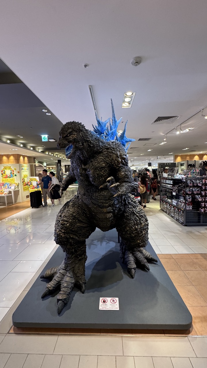

1. Overall Rating (0–10) — 7.0
This photograph captures a striking, life-sized Godzilla statue in a bustling shopping mall, where the juxtaposition of cinematic myth and everyday commerce creates an intriguing visual tension. The creature’s imposing form and glowing blue dorsal fins stand out against the sterile, fluorescent-lit environment, drawing the eye with its raw power and detail. While the setting tempers the monumentality of the subject, the image succeeds in conveying a sense of spectacle and cultural celebration—though a more deliberate framing might elevate its artistic impact.
2. Composition (0–10) — 6.5
The statue is centered and well-framed, but the surrounding mall environment introduces visual clutter, with shelves and passersby competing for attention. A tighter crop would enhance focus on the subject, while the diagonal lines of the floor and ceiling guide the eye toward the figure.
3. Lighting (0–10) — 6.0
Even, overhead fluorescent lighting illuminates the scene clearly but flattens depth and texture. The blue glow of the dorsal fins provides a subtle contrast, though the overall lighting lacks drama and fails to highlight the sculpture’s three-dimensional form with nuance.
4. Color & Tone (0–10) — 6.5
The palette is dominated by neutral grays and beige tiles, punctuated by the vivid blue of Godzilla’s fins and the occasional pop of color from merchandise. While the contrast between the organic, dark texture of the statue and the sterile surroundings is effective, the overall tonal range is subdued and lacks richness.
5. Creativity (0–10) — 7.5
The concept of placing a kaiju icon in a commercial space is inherently imaginative, blending pop culture with daily life. The image captures a unique moment of public engagement with a beloved character, offering a narrative of celebration and nostalgia.
6. Technical Quality (0–10) — 7.5
The photograph is sharp and well-focused, with clean details visible on the statue’s textured skin and the surrounding environment. The exposure is balanced, and the image is free of noticeable noise or distortion.
7. Emotional Impact (0–10) — 6.5
The image evokes a sense of awe and wonder, particularly for fans of the Godzilla franchise, while also hinting at the commercialization of iconic imagery. It invites viewers to reflect on the intersection of myth and modernity, though the emotional resonance is somewhat diluted by the mundane setting.
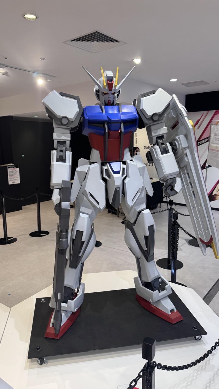

1. Overall Rating (0–10) — 7.0
This photograph captures the imposing presence of a Gundam model in a museum-like setting, where mechanical precision meets pop culture spectacle. The robot’s bold color scheme and intricate design stand out against the neutral backdrop, creating a striking visual contrast. While the lighting and framing are functional, they lack the dramatic flair that could elevate the image from a mere documentation to a powerful statement.
2. Composition (0–10) — 6.0
The robot is centered and well-framed, but the surrounding space feels slightly cluttered with barriers and background signage, which distract from the subject’s dominance. A tighter crop or adjusted angle could enhance focus.
3. Lighting (0–10) — 6.5
Even, overhead lighting illuminates the subject clearly, highlighting its form and structure. However, the flat, clinical quality of the light reduces depth and atmosphere, making the scene feel more like a display than a cinematic moment.
4. Color & Tone (0–10) — 7.5
The vibrant red, blue, and white of the Gundam pop against the neutral whites and grays of the environment, creating a strong visual contrast. The color palette is clean and intentional, emphasizing the robot’s iconic design.
5. Creativity (0–10) — 7.0
The image successfully captures the essence of the Gundam as a cultural icon, blending realism and fantasy. While the concept is familiar, the execution feels fresh in its straightforward presentation, inviting viewers to appreciate the scale and detail of the model.
6. Technical Quality (0–10) — 8.0
The image is sharp, with clean focus and balanced exposure. Details on the robot’s armor and joints are clearly visible, and the white platform provides a clean base for the subject.
7. Emotional Impact (0–10) — 6.5
The photograph evokes a sense of awe and nostalgia, particularly for fans of the franchise, but the sterile environment tempers the emotional resonance. It feels more like a museum exhibit than a moment of wonder.
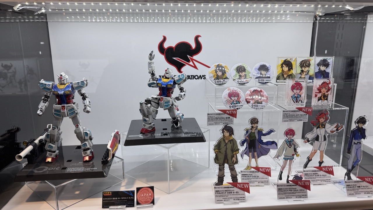

1. Overall Rating (0–10) — 6.8
This photograph captures a vibrant and meticulously arranged display of Gundam model kits and character merchandise, evoking the energy of a dedicated fan convention. The clean, well-lit presentation highlights the intricate details of the models and the colorful character designs, creating a sense of celebration for the franchise. While the composition is effective in showcasing the products, the sheer density of items and text labels slightly overwhelms the visual flow, preventing the image from achieving a more refined aesthetic.
2. Composition (0–10) — 6.5
The framing is balanced with two prominent Gundam models anchoring the left and center, while the character stands and badges fill the right side, creating a sense of visual rhythm. However, the crowded arrangement and overlapping elements introduce a degree of visual clutter, reducing the clarity of individual subjects.
3. Lighting (0–10) — 8.0
Even, bright lighting from above illuminates the display without harsh shadows, effectively highlighting the details of the models and the glossy surfaces of the merchandise. The use of backlighting adds depth and draws attention to the central branding.
4. Color & Tone (0–10) — 7.0
The palette is vibrant, with the bold reds, blues, and whites of the Gundam models contrasting nicely against the clean white backdrop. The character art introduces a range of expressive hues that add visual interest, though the overall tone remains slightly sterile due to the commercial setting.
5. Creativity (0–10) — 6.0
The display itself is a creative expression of fandom, with a clear intent to showcase new merchandise and models. However, the image is primarily documentary in nature, lacking a strong personal or artistic interpretation that would elevate it beyond a standard convention photograph.
6. Technical Quality (0–10) — 8.0
The image is sharp and well-focused, with clear details visible on the models and product labels. The depth of field is sufficient to capture both foreground and background elements, and there are no noticeable technical flaws.
7. Emotional Impact (0–10) — 6.5
The photograph evokes a sense of excitement and nostalgia for fans of the Gundam series, particularly with the recognizable characters and iconic mechs. While it connects emotionally through shared fandom, it doesn’t elicit a deeper or more personal resonance due to its straightforward, commercial presentation.

1. Overall Rating (0–10) — 6.0
This image captures a moment of personal engagement with a beloved franchise, where the tactile presence of a model kit box contrasts with the curated display of collectibles behind it. The composition effectively conveys the atmosphere of a hobbyist’s pilgrimage to a Gundam exhibition, but the flat lighting and informal framing limit its visual impact. While the subject is clearly meaningful to the photographer, the image feels more like a snapshot than a polished portrait of passion.
2. Composition (0–10) — 6.5
The box is centered and dominates the frame, creating a clear focal point. The inclusion of the hand and feet grounds the image in perspective, while the background display adds context. However, the cluttered background slightly distracts from the main subject, and the off-center angle gives the image a casual, unbalanced feel.
3. Lighting (0–10) — 5.5
The lighting is functional and even, typical of indoor retail spaces, but lacks direction or mood. The fluorescent overhead lights flatten the scene, muting the colors of the box and making the overall image feel sterile and unemotional.
4. Color & Tone (0–10) — 6.0
The box’s vibrant blue, red, and silver tones stand out against the muted beige floor and black display cases, creating a strong contrast. However, the overall color palette is restrained by the ambient lighting, which dulls saturation and reduces visual richness.
5. Creativity (0–10) — 6.5
The photograph successfully merges personal narrative with fan culture, using the model kit as a symbol of fandom. The perspective—seen from the photographer’s point of view—adds intimacy, but the concept is more observational than innovative.
6. Technical Quality (0–10) — 7.0
The image is sharp and in focus, with clear text and details on the box. The exposure is adequate, though not particularly dynamic. The framing, while informal, is intentional and functional.
7. Emotional Impact (0–10) — 6.0
The image evokes a sense of quiet excitement and nostalgia, particularly for fans of the franchise. The viewer can almost feel the anticipation of holding a new model, but the lack of expressive lighting and composition keeps the emotional resonance from fully resonating.

1. Overall Rating (0–10) — 7.0
This photograph captures the vibrant energy of a retail display dedicated to Japanese mecha model kits, with a strong sense of brand identity and visual appeal. The glowing case and bold graphics create an immersive experience that celebrates the craftsmanship of the models within. While the scene is visually engaging and well-structured, the crowded arrangement of figures inside the case slightly diminishes the clarity of individual pieces, and the surrounding environment feels more commercial than contemplative.
2. Composition (0–10) — 7.0
The hexagonal display is centered and framed to emphasize symmetry and balance, with the camera positioned at a slight angle to capture multiple sides. The inclusion of promotional graphics on the base enhances depth and context, though the abundance of text and models risks visual clutter.
3. Lighting (0–10) — 8.0
Bright, even lighting from within the display case highlights the models effectively, while the ambient overhead lighting complements the scene without creating glare. The use of LED strips along the top edge enhances the futuristic aesthetic and draws attention to the product.
4. Color & Tone (0–10) — 7.5
The color palette is rich and dynamic, with the contrast between the dark background and vivid mechanical figures creating visual excitement. The red and white floor accents echo the branding and add a sense of energy, while the metallic tones of the models convey a sense of precision and quality.
5. Creativity (0–10) — 7.0
The display successfully merges commercial intent with artistic presentation, using bold graphics and strategic lighting to elevate the product. The use of recognizable mecha characters like Evangelion and Gundam taps into fan culture, making the display both informative and emotionally resonant for enthusiasts.
6. Technical Quality (0–10) — 8.0
The image is sharp and clear, with accurate focus and exposure. The depth of field is sufficient to keep both the display and its surroundings in view, and the resolution allows for detailed observation of the graphics and models.
7. Emotional Impact (0–10) — 6.5
While the photograph conveys excitement and nostalgia for fans of the genre, the commercial nature of the setting tempers its emotional depth. The viewer is invited into a world of fandom, but the image remains more celebratory than introspective, leaving room for personal connection rather than universal resonance.
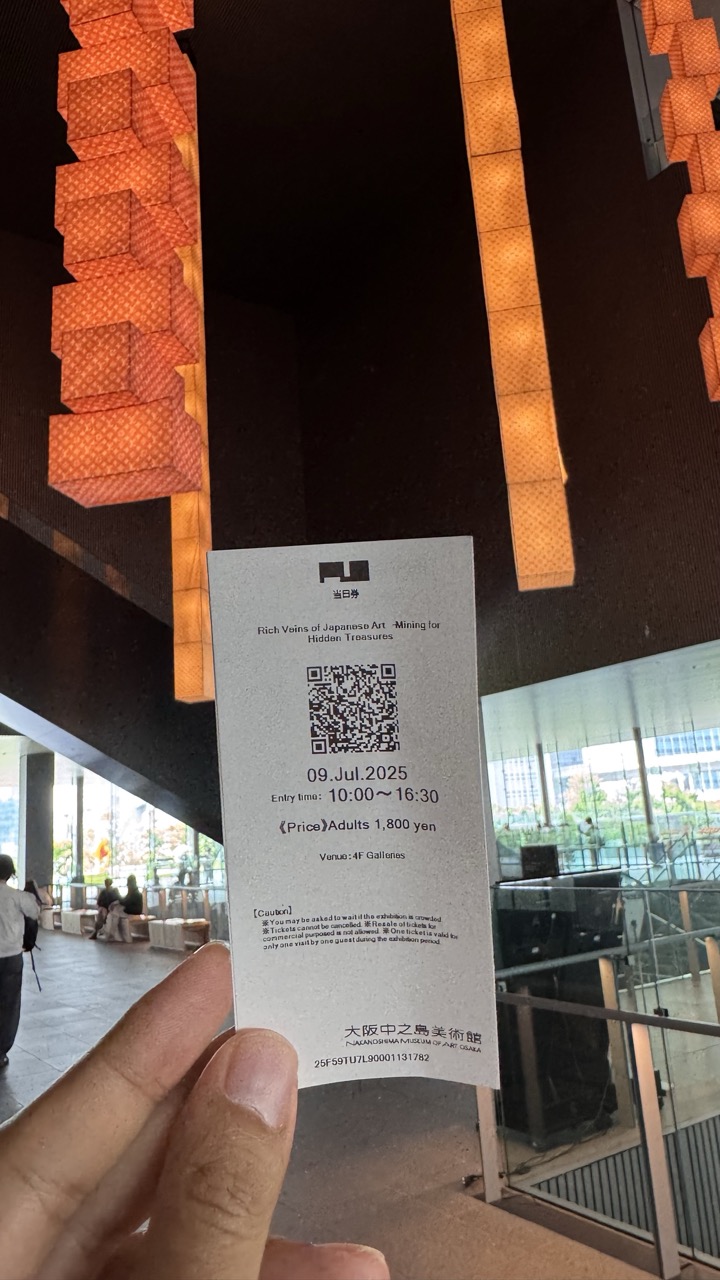

1. Overall Rating (0–10) — 6.0
This photograph captures a quiet, personal moment within a modern museum space, where the interplay of light and architecture adds a subtle layer of visual interest. The ticket serves as both a narrative anchor and a functional object, grounding the image in a specific time and place. While the composition is slightly cluttered by the hand and ticket, the warm glow of the hanging lanterns and the clean lines of the architecture lend a contemplative mood. The image feels more like a candid memory than a polished photograph, which limits its aesthetic impact but enhances its authenticity.
2. Composition (0–10) — 5.5
The hand and ticket dominate the foreground, creating a natural focal point, but the framing feels slightly unbalanced due to the off-center placement and the intrusion of the hand. The vertical lines of the lanterns provide visual rhythm, but the background elements—such as the railing and distant figures—distract from the central subject.
3. Lighting (0–10) — 7.0
The warm, diffused glow from the hanging lanterns creates a soft, inviting atmosphere, contrasting nicely with the cooler, ambient light of the museum interior. The lighting enhances the texture of the paper ticket and adds depth to the scene, though some areas of the background remain underexposed.
4. Color & Tone (0–10) — 6.5
The warm orange tones of the lanterns dominate the palette, creating a harmonious and inviting mood. The contrast between the warm foreground and the cooler, muted background adds visual interest, though the overall color temperature leans slightly warm, which may not suit all aesthetic preferences.
5. Creativity (0–10) — 6.0
The image combines documentary and artistic elements effectively, using a simple subject to convey a sense of place and experience. The interplay between the ticket, the architecture, and the ambient lighting suggests a quiet story of cultural engagement, though the approach is more observational than experimental.
6. Technical Quality (0–10) — 7.5
The focus is sharp on the ticket, allowing the text and QR code to be easily readable. The image is well-exposed, with good detail in both the foreground and background. However, the slight motion blur in the hand and the uneven framing slightly detract from the overall technical polish.
7. Emotional Impact (0–10) — 5.5
The photograph evokes a sense of quiet anticipation and personal connection to the space, suggesting a moment of cultural exploration. While the emotional resonance is subtle, the viewer is invited to reflect on the experience of visiting an art museum—its rituals, its quiet moments, and its sensory details.
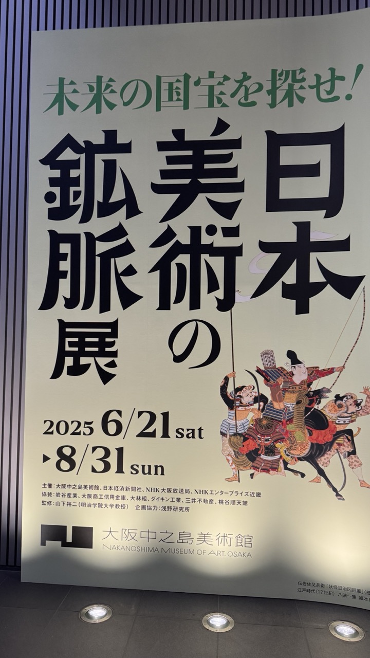

1. Overall Rating (0–10) — 7.0
This poster captures a bold, dynamic energy through its powerful typography and traditional Japanese imagery, evoking the grandeur of historical art and cultural exploration. The interplay of modern design with classical ukiyo-e aesthetics creates a compelling visual narrative, though the dense text and layered elements slightly diminish its immediate clarity. The composition succeeds in conveying excitement for the exhibition while grounding it in cultural authenticity.
2. Composition (0–10) — 7.5
The dominant vertical layout emphasizes the title’s weight, with the illustration anchoring the right side to balance the text-heavy left. The staggered placement of characters and image creates a sense of movement, though the lower-left text block slightly disrupts the visual flow.
3. Lighting (0–10) — 6.5
The scene is lit with even, ambient indoor lighting that clearly illuminates the poster’s details. While functional, the lighting is flat and lacks atmospheric depth, failing to enhance the poster’s dramatic potential.
4. Color & Tone (0–10) — 7.0
The palette blends muted cream with deep black text and a vibrant, traditional illustration in reds, blues, and golds. This contrast draws attention to the artwork while maintaining a cohesive, formal tone appropriate for a cultural institution.
5. Creativity (0–10) — 8.0
The fusion of bold, modern Japanese typography with a classic ukiyo-e illustration is highly original, creating a compelling dialogue between past and future. The design thoughtfully reflects the exhibition’s theme of uncovering “future national treasures.”
6. Technical Quality (0–10) — 8.5
The image is sharp and well-focused, with clean lines and legible text. The poster’s printed details are rendered clearly, and the lighting ensures all elements are visible without glare or distortion.
7. Emotional Impact (0–10) — 7.5
The poster evokes curiosity and reverence, inviting viewers into a journey of discovery through Japan’s artistic heritage. The dynamic illustration and strong text convey excitement and cultural pride, creating a sense of anticipation for the exhibition.
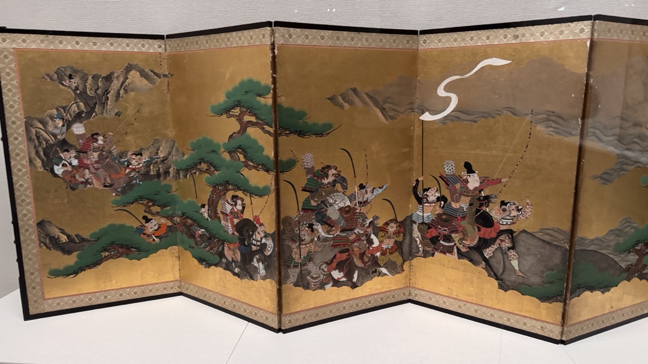

1. Overall Rating (0–10) — 8.0
This six-panel folding screen captures the dramatic energy of a samurai battle with rich historical detail and dynamic composition. The gold-leaf background elevates the scene, lending it a ceremonial grandeur, while the intricate figures and swirling movement convey a sense of urgency and narrative depth. Though the image is a photograph of a physical object, the screen’s visual power and cultural resonance shine through, though the slight glare from the glass case and neutral surroundings temper its full impact.
2. Composition (0–10) — 8.5
The folding screen’s panoramic layout guides the eye across the narrative, with figures arranged diagonally to create a sense of motion and tension. The central cluster of warriors builds a focal point, while the flanking trees and mountains frame the chaos effectively, balancing the dense action with natural elements.
3. Lighting (0–10) — 6.5
Even, diffuse lighting illuminates the screen clearly, preserving the richness of the pigments and gold leaf. However, the reflection on the protective glass and the sterile gallery environment slightly dull the luminosity and depth of the original artwork.
4. Color & Tone (0–10) — 8.0
The palette is dominated by warm golds, deep greens, and earthy browns, creating a harmonious and historically resonant tone. The contrast between the vibrant figures and the luminous background enhances the visual drama, while the tonal richness suggests the original craftsmanship and materials.
5. Creativity (0–10) — 9.0
The screen’s depiction of a historical battle with mythic overtones demonstrates remarkable narrative invention and stylistic mastery. The artist’s use of perspective, exaggerated motion, and symbolic elements—such as the swirling wind motif—elevates the piece beyond mere documentation into a powerful visual story.
6. Technical Quality (0–10) — 7.5
The photograph captures fine detail in the brushwork and gold leaf, with good clarity across the panels. However, the glass reflection and slight angle of the shot introduce minor distractions, preventing a perfectly crisp presentation of the artwork.
7. Emotional Impact (0–10) — 8.5
The image evokes awe and tension, drawing the viewer into a moment of intense action frozen in time. The combination of historical gravitas, vibrant energy, and ceremonial beauty creates a strong emotional connection, making the viewer feel both the drama and the reverence of the depicted scene.

1. Overall Rating (0–10) — 7.0
This photograph captures the sleek, geometric rhythm of a modern transit space, where the escalator becomes a visual conduit leading the eye into the depths of a contemporary architectural form. The strong leading lines and symmetrical framing create a sense of order and movement, while the interplay of light and material adds depth and texture. Though the scene is visually compelling, the lack of a distinct human story or emotional anchor keeps it from transcending mere documentation.
2. Composition (0–10) — 8.0
The low-angle perspective emphasizes the escalator’s linear geometry, drawing the viewer’s gaze upward and creating a powerful sense of depth. The symmetry of the structure, with the central escalator flanked by glass railings and reflective surfaces, enhances balance and visual harmony.
3. Lighting (0–10) — 7.5
Soft, diffused overhead lighting highlights the metallic textures and clean lines of the space, while the warm glow from the orange-lit column on the left introduces a subtle contrast. The light enhances the architectural details without creating harsh shadows, contributing to the image’s polished, modern feel.
4. Color & Tone (0–10) — 7.0
The palette is dominated by cool grays and silvers, punctuated by the warm orange accent and bright yellow safety markings. This limited yet intentional color scheme reinforces the industrial aesthetic while providing visual interest through contrast and focus.
5. Creativity (0–10) — 7.5
The image demonstrates a strong sense of design and intentionality, transforming an everyday urban element into a visually engaging composition. The use of symmetry and perspective suggests a deliberate effort to explore form and movement in a public space.
6. Technical Quality (0–10) — 8.0
The image is sharp and well-focused, with clean details in the escalator steps and surrounding architecture. The exposure is balanced, and the camera’s angle effectively captures the scene’s scale and geometry.
7. Emotional Impact (0–10) — 6.0
While the photograph evokes a sense of modernity and order, it remains emotionally detached—more a study in design than a narrative moment. The presence of people is minimal and anonymous, which limits the viewer’s emotional connection to the scene.
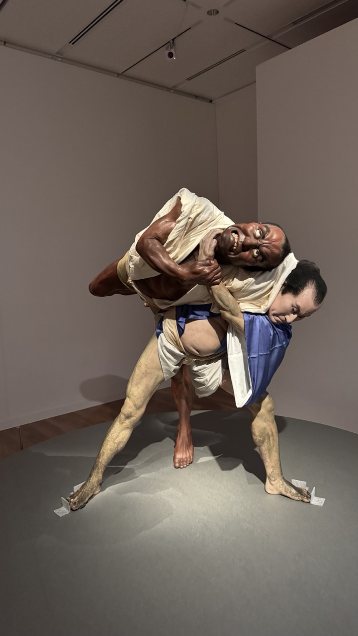

1. Overall Rating (0–10) — 8.0
This powerful sculpture captures the raw intensity of a physical struggle, rendered with astonishing anatomical precision and emotional ferocity. The figures' contorted expressions and dynamic tension convey a visceral narrative of conflict and endurance, amplified by the stark gallery setting. While the clinical lighting and neutral background serve to focus attention, the work’s true strength lies in its ability to evoke primal emotion—though it risks feeling slightly staged due to the museum context.
2. Composition (0–10) — 8.0
The sculpture is framed to emphasize the diagonal tension between the two figures, creating a sense of motion and imbalance. The centered placement on the circular platform draws the eye directly to the action, while the surrounding negative space enhances the drama without distraction.
3. Lighting (0–10) — 7.0
The overhead lighting casts strong, directional shadows that accentuate the musculature and depth of the figures. While functional and clear, the lighting is somewhat flat and clinical, lacking the atmospheric quality that might deepen the emotional resonance.
4. Color & Tone (0–10) — 7.5
The palette is restrained—natural skin tones, earthy beige, and a touch of blue—allowing the sculpture’s form and expression to dominate. The muted tones lend a somber, almost ritualistic quality, though a slightly warmer or cooler cast might have intensified the mood.
5. Creativity (0–10) — 9.0
The work is strikingly original in its fusion of hyperrealism and theatrical drama, evoking both ancient sculpture and contemporary performance. The expressive distortion of the faces and the physicality of the pose suggest a narrative beyond mere combat—perhaps a metaphor for struggle, survival, or transformation.
6. Technical Quality (0–10) — 9.5
The craftsmanship is exceptional: every muscle, vein, and facial wrinkle is rendered with meticulous detail. The materials appear seamlessly integrated, and the focus and sharpness capture the sculpture’s complexity with precision.
7. Emotional Impact (0–10) — 8.5
The sculpture commands attention through its sheer physicality and emotional intensity, evoking discomfort, awe, and fascination. The viewer is drawn into the moment of struggle, creating a powerful, almost uncomfortable connection with the figures’ pain and determination.
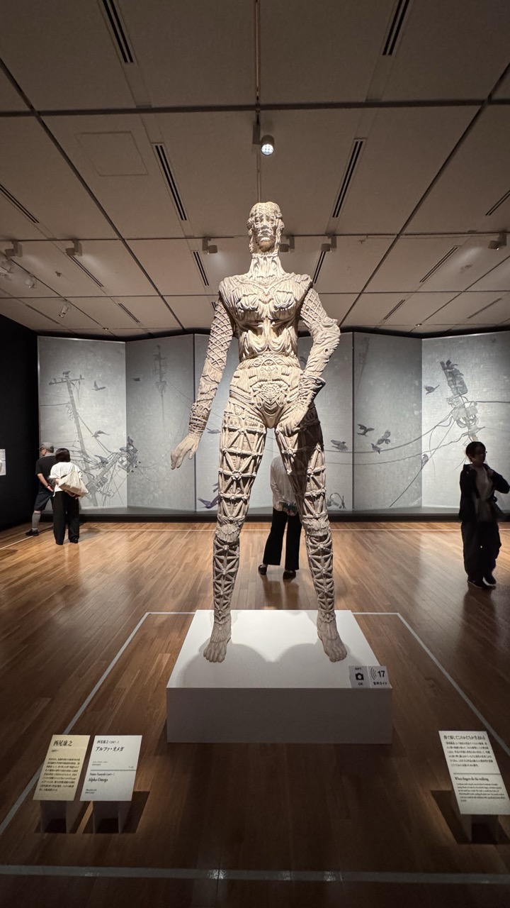

1. Overall Rating (0–10) — 7.0
This photograph captures the imposing presence of a large, intricately detailed sculpture within a museum gallery, where the interplay of art, space, and human scale creates a compelling visual narrative. The sculpture’s complex, geometric surface and central placement command attention, while the subdued lighting and minimalist surroundings enhance its dramatic weight. Though the image effectively documents the installation, the inclusion of visitors and informational placards slightly disrupts the aesthetic cohesion, grounding the scene in a more documentary than artistic mode.
2. Composition (0–10) — 7.5
The sculpture is centered and dominates the frame, creating a strong focal point. The wide-angle perspective emphasizes its scale, while the surrounding gallery space and subtle symmetry of the background panels lend balance. The positioning of visitors on either side adds depth and context, though their presence slightly interrupts the visual harmony.
3. Lighting (0–10) — 7.0
The overhead spotlighting effectively highlights the sculpture’s texture and form, casting soft shadows that accentuate its three-dimensional complexity. The ambient gallery lighting is subdued, allowing the artwork to stand out without glare or distraction. However, some areas of the background wall remain underexposed, reducing overall visual clarity.
4. Color & Tone (0–10) — 6.5
The palette is largely monochromatic, dominated by the off-white of the sculpture and the warm brown of the wooden floor, which creates a cohesive, neutral tone. The grayscale background panels reinforce this restrained aesthetic. While the lack of vibrant color supports the serious, contemplative mood, the overall tone feels slightly flat and lacks dynamic contrast.
5. Creativity (0–10) — 7.5
The photograph successfully conveys the grandeur and intricacy of the sculpture within its institutional context. The choice to include the surrounding environment and viewers adds a layer of narrative, suggesting the artwork’s interaction with the public. The composition reflects a thoughtful approach to documenting art in situ, blending aesthetic intent with documentary clarity.
6. Technical Quality (0–10) — 8.0
The image is sharp and well-focused, with clear detail visible in the sculpture’s surface and the surrounding space. The exposure is balanced, with no significant overexposed or underexposed areas. The camera’s perspective is stable, and the resolution captures fine textures and text on the plaques.
7. Emotional Impact (0–10) — 7.0
The image evokes a sense of awe and contemplation, drawing the viewer into the quiet intensity of the gallery space. The scale and complexity of the sculpture, combined with the subdued atmosphere, invite reflection. The presence of people adds a human element, grounding the experience and enhancing the emotional resonance of the artwork’s impact.
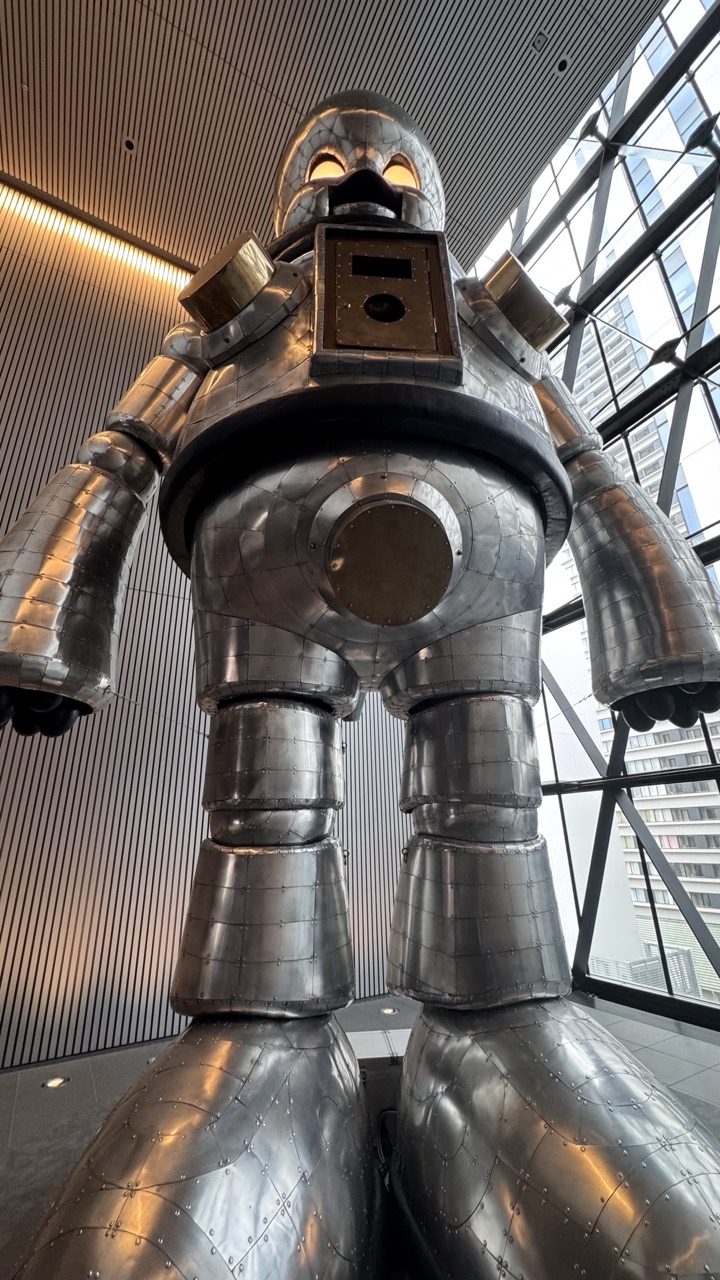

1. Overall Rating (0–10) — 7.0
This photograph captures the imposing presence of a towering metallic robot sculpture, evoking a sense of retro-futurism and industrial grandeur. The low-angle perspective amplifies its scale and dominance, while the interplay of warm artificial light and cool daylight through the glass facade creates a compelling visual contrast. Though the image is strong in mood and subject, the slightly cluttered background and lack of a clear focal point slightly dilute its overall impact.
2. Composition (0–10) — 7.5
The low-angle shot effectively emphasizes the robot’s monumental scale, with its vertical lines guiding the eye upward. The diagonal lines of the ceiling and the building’s glass structure add dynamic tension, though the right side feels slightly unbalanced due to the overexposed window area.
3. Lighting (0–10) — 7.0
The combination of warm interior lighting and natural daylight creates a layered, atmospheric effect. The highlights on the robot’s metallic surface are well-defined, enhancing texture, though some areas in the window reflect harsh glare, slightly reducing tonal harmony.
4. Color & Tone (0–10) — 6.5
The palette is dominated by cool silvers and grays, punctuated by warm golden highlights from the ceiling lights. While cohesive, the color scheme leans toward monotone, with limited vibrancy, giving the image a slightly sterile, industrial feel.
5. Creativity (0–10) — 8.0
The choice to photograph this sculpture from below is bold and imaginative, transforming a static object into a towering, almost sentient figure. The juxtaposition of the mechanical form against a modern architectural setting adds conceptual depth and visual intrigue.
6. Technical Quality (0–10) — 8.0
The image is sharp and well-focused, with fine detail visible in the robot’s riveted metal surface. Exposure is generally balanced, though the bright window area is slightly overexposed, suggesting a minor loss in dynamic range.
7. Emotional Impact (0–10) — 7.5
The sculpture’s imposing form and retro design stir a sense of awe and nostalgia, reminiscent of mid-century sci-fi visions. The viewer is drawn into a moment of wonder, as if standing before a guardian from a bygone era of technology and imagination.
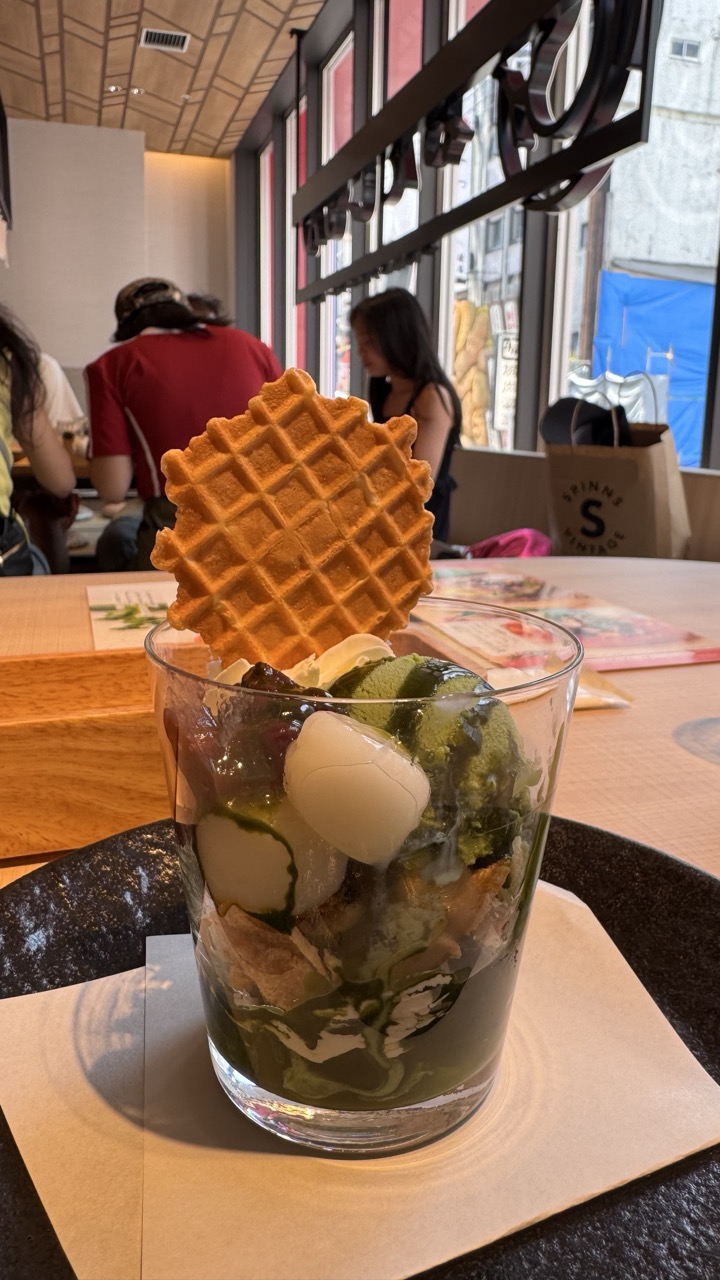

1. Overall Rating (0–10) — 7.0
This photograph captures the inviting allure of a matcha parfait in a bright, bustling café setting, where the interplay of texture and color draws the eye. The composition balances the dessert’s intricate layers with the ambient life of the space, creating a sense of immediacy and indulgence. While the image feels slightly overexposed and cluttered in the background, the subject remains compelling, and the warmth of the scene conveys a genuine moment of pleasure.
2. Composition (0–10) — 7.0
The parfait is well-placed in the foreground, with the waffle and layered ingredients creating visual interest. The background figures and café elements add context without overpowering the main subject, though the depth of field could be tighter to isolate the dessert more effectively.
3. Lighting (0–10) — 6.5
Natural light from the window illuminates the scene evenly, highlighting the dessert’s vibrant green matcha and golden waffle. However, the brightness causes slight overexposure in the background and reduces contrast, slightly flattening the image.
4. Color & Tone (0–10) — 7.5
The rich green of the matcha contrasts beautifully with the golden waffle and the soft whites of the mochi and cream. The warm, natural tones enhance the dessert’s appeal, though the overall palette is slightly washed out by the bright lighting.
5. Creativity (0–10) — 7.0
The image captures a moment of everyday joy with a sense of narrative, blending food and environment into a cohesive scene. The choice to include the café’s atmosphere adds authenticity and storytelling depth.
6. Technical Quality (0–10) — 7.5
Sharp focus on the parfait, with clean details in the glass and textures of the ingredients. The exposure is slightly high, but the image remains clear and well-defined.
7. Emotional Impact (0–10) — 7.0
The photograph evokes a sense of comfort and delight, inviting the viewer to savor a moment of sweet indulgence. The warmth and realism of the setting create a relatable, comforting emotional resonance.


1. Overall Rating (0–10) — 7.0
This image captures a moment of quiet indulgence, with a chilled coffee drink as the centerpiece, its texture and composition inviting the viewer to savor the scene. The shallow depth of field effectively isolates the subject, while the warm ambient lighting enhances the cozy, intimate atmosphere of a café. Though the background elements are slightly distracting, the photograph successfully conveys a sense of calm and sensory pleasure.
2. Composition (0–10) — 7.5
The subject is well-placed and framed to draw immediate attention, with a shallow depth of field that blurs the background and emphasizes the drink. The diagonal lines of the table and the surrounding objects create subtle visual movement, leading the eye naturally toward the glass.
3. Lighting (0–10) — 7.0
Soft, warm lighting enhances the drink’s creamy texture and casts gentle shadows, adding depth and dimension. The natural light source creates a cozy, inviting glow that complements the subject’s comforting nature.
4. Color & Tone (0–10) — 7.5
The warm, earthy tones of the drink and table harmonize beautifully with the golden hues of the lighting, creating a cohesive and pleasing palette. The contrast between the creamy coffee and the dark sprinkled powder adds visual interest without overwhelming the composition.
5. Creativity (0–10) — 6.5
While the image is grounded in a familiar café scene, the attention to detail—especially in the texture of the ice and the dusting of powder—adds a layer of refinement. The approach is more observational than experimental, but it effectively communicates a moment of quiet enjoyment.
6. Technical Quality (0–10) — 8.0
The image is sharp where it matters, with clear focus on the drink and well-managed exposure. The slight blur in the background is deliberate and enhances the composition, showing thoughtful control over depth of field.
7. Emotional Impact (0–10) — 7.0
The photograph evokes a sense of calm and comfort, capturing the simple pleasure of a well-made iced coffee in a relaxed setting. The warmth of the scene invites the viewer to pause and reflect on a moment of quiet satisfaction.
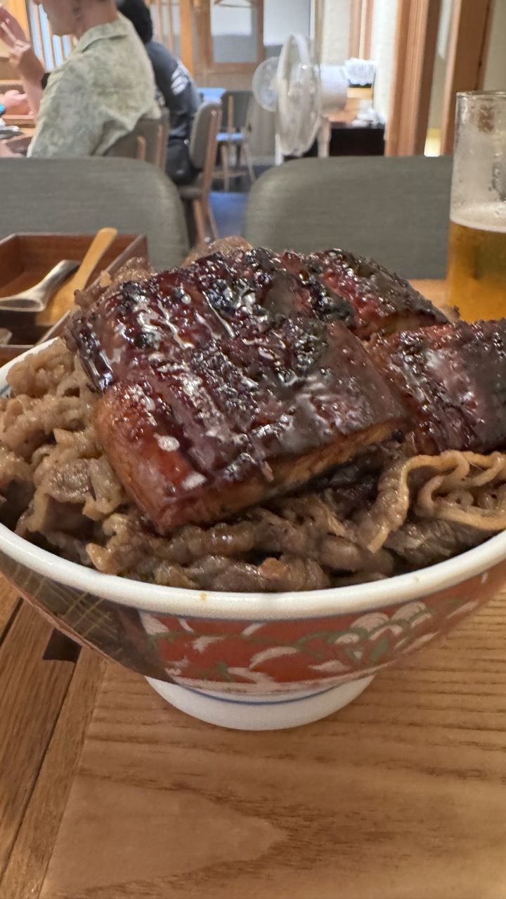

1. Overall Rating (0–10) — 6.8
This photograph captures the comforting essence of a traditional Japanese meal, with a glossy, caramelized eel resting atop a bed of rice and beef in a richly patterned bowl. The warm, ambient lighting and casual dining setting lend an inviting, authentic atmosphere, though the slightly cluttered background and soft focus detract from its visual polish. While the image succeeds in conveying the sensory pleasure of the dish, it falls short of cinematic refinement, feeling more like a spontaneous snapshot than a carefully composed still life.
2. Composition (0–10) — 6.0
The bowl is centered but slightly off-kilter, with the background elements—diners, fan, and table—competing for attention. A tighter crop would emphasize the dish and reduce distractions.
3. Lighting (0–10) — 6.5
Soft, warm indoor lighting enhances the glistening texture of the eel and creates a cozy mood, though the lack of directional contrast limits depth and dimensionality.
4. Color & Tone (0–10) — 6.5
The rich browns of the eel and the warm wood tones dominate, complemented by the red and green patterns on the bowl. The color palette is harmonious but slightly muted, with the golden beer adding a subtle pop of brightness.
5. Creativity (0–10) — 6.0
The image captures a relatable, everyday moment with cultural specificity, but its approach is straightforward and unambitious—more documentary than interpretive.
6. Technical Quality (0–10) — 7.0
The focus is soft on the main subject, and there’s a slight lack of sharpness, possibly due to low light or a shallow depth of field. The image is clear enough to appreciate the textures, but not flawlessly resolved.
7. Emotional Impact (0–10) — 7.0
The warmth of the scene and the indulgent nature of the meal evoke a sense of comfort and satisfaction. It invites the viewer to imagine the taste and aroma, creating a quiet, personal connection to the moment.


1. Overall Rating (0–10) — 7.0
This photograph captures the rich, savory appeal of a traditional unagi donburi with an inviting sense of immediacy, emphasizing the dish’s texture and composition. The glossy glaze on the eel and the fresh, crisp toppings create a mouthwatering contrast, while the warm, ambient lighting enhances the meal’s comforting presence. Though the background hints at a casual dining environment, the focus remains firmly on the food, making it the undeniable centerpiece—though slight compositional clutter slightly undermines its visual elegance.
2. Composition (0–10) — 6.0
The dish is well-centered, but the background elements—such as the chairs and blurred figures—distract slightly from the main subject. A tighter crop would emphasize the food’s details and improve visual harmony.
3. Lighting (0–10) — 7.0
Warm, ambient lighting enhances the dish’s natural colors and creates a cozy, inviting mood. The soft glow highlights the glistening sauce on the eel, adding depth and appeal without harsh shadows.
4. Color & Tone (0–10) — 7.5
The rich browns of the rice and eel contrast beautifully with the white and purple of the slaw, while the earthy wood tones of the table and background provide a natural, cohesive palette. The tonal balance is warm and inviting, reinforcing the dish’s comfort-food appeal.
5. Creativity (0–10) — 6.5
While the image is straightforward and effective in its documentation of a delicious meal, it lacks a strong conceptual or artistic twist. The strength lies in its authenticity rather than innovation.
6. Technical Quality (0–10) — 8.0
The focus is sharp on the dish, and the image is free from noise or blur. The camera captures fine details, such as the texture of the rice and the glaze on the eel, with clarity and precision.
7. Emotional Impact (0–10) — 7.0
The photograph evokes a sense of warmth and satisfaction, appealing to both the stomach and the senses. It invites the viewer to imagine the taste and aroma of the meal, creating a subtle but effective emotional connection to the dining experience.
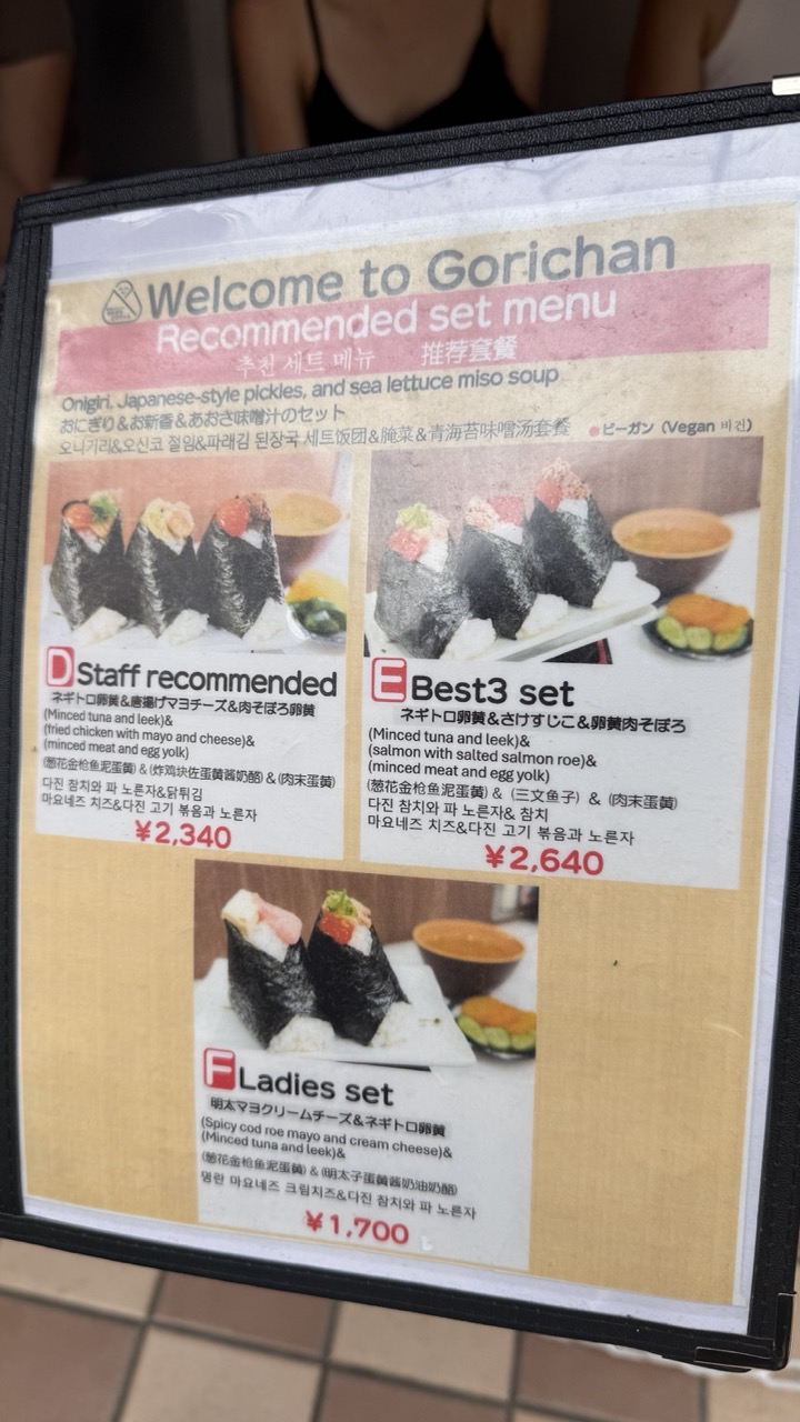

1. Overall Rating (0–10) — 5.0
This menu photograph captures a functional, informative snapshot of a restaurant’s offerings, but it lacks the visual polish to feel like a compelling image. The composition is cluttered and slightly tilted, and the lighting is flat and uninviting, which undermines the appeal of the food it’s meant to showcase. While it effectively conveys information, it fails to evoke the warmth or appetite that a well-staged food photograph should.
2. Composition (0–10) — 4.5
The frame is slightly off-center and tilted, creating a sense of imbalance. The menu’s text and images are densely packed, leading to visual clutter and a lack of clear focal point.
3. Lighting (0–10) — 4.0
The lighting is flat and evenly distributed, likely from overhead fluorescent sources. It lacks depth and mood, resulting in a sterile, documentary-style appearance that doesn’t enhance the subject.
4. Color & Tone (0–10) — 5.0
The color palette is muted, dominated by beige and white tones, with only small pops of color from the food images. The overall tone is neutral and lacks vibrancy, which diminishes the appetizing quality of the sushi.
5. Creativity (0–10) — 4.0
The image is utilitarian and straightforward, serving as a functional document rather than an artistic expression. There is little attempt to stylize or frame the subject in a compelling way.
6. Technical Quality (0–10) — 6.0
The image is sharp and in focus, with legible text and clear details. However, the slight blur on the edges and the uneven framing reduce its overall technical refinement.
7. Emotional Impact (0–10) — 4.5
The photograph feels impersonal and transactional, evoking little emotional response. While it informs, it fails to inspire curiosity or desire, leaving the viewer disconnected from the experience of dining at Gorichan.

1. Overall Rating (0–10) — 7.0
This photograph captures the vibrant energy of a Japanese onigiri shop, where colorful rice balls take center stage against the backdrop of a bustling kitchen. The composition draws the eye to the textures and variety of toppings—tuna, tamagoyaki, and pickled vegetables—offering a feast for the senses. While the background activity adds authenticity, the slightly cluttered frame and uneven focus prevent the image from achieving a more polished, gallery-ready quality.
2. Composition (0–10) — 6.5
The onigiri are well-placed in the foreground, creating a strong focal point, but the cluttered background and overhanging objects distract from the main subject. A tighter crop would enhance visual clarity.
3. Lighting (0–10) — 6.0
The lighting is functional and even, likely from overhead fluorescent sources, which accurately captures the scene’s natural ambiance. However, it lacks warmth and depth, resulting in a somewhat flat and clinical feel.
4. Color & Tone (0–10) — 7.5
The rich, contrasting colors of the toppings—vibrant orange, deep red, and golden yellow—pop against the dark nori and white rice, creating a visually engaging palette. The overall tone is natural and unfiltered, preserving the authenticity of the setting.
5. Creativity (0–10) — 7.0
The image successfully blends documentary realism with culinary appeal, capturing a moment of everyday life with artistic intent. The choice to include the chef in the background adds narrative depth, suggesting a story behind the food.
6. Technical Quality (0–10) — 7.0
The focus is sharp on the onigiri, with good clarity and detail, though the background is slightly soft. The exposure is balanced, with no harsh shadows or blown-out highlights.
7. Emotional Impact (0–10) — 6.5
The photograph evokes a sense of warmth and authenticity, inviting the viewer into a familiar, comforting scene. While it doesn’t stir deep emotion, it resonates with those who appreciate the artistry in simple, everyday food.

1. Overall Rating (0–10) — 7.0
This photograph captures the intimate, unpretentious charm of a casual Japanese eatery, where the focus on food and atmosphere conveys a sense of authenticity. The warm wooden tones and familiar restaurant details—like the soy sauce dispenser and the "Payment at your table" sign—anchor the image in a real-world setting. While the composition is inviting, a slightly tighter focus and more deliberate framing could elevate the visual storytelling, making the scene feel more curated rather than candid.
2. Composition (0–10) — 6.5
The foreground bowl of miso soup draws the eye, while the onigiri and background activity create depth. However, the composition feels slightly cluttered, with too many elements competing for attention and a slight lack of balance between the foreground and background.
3. Lighting (0–10) — 6.0
The lighting is functional and warm, typical of a small restaurant, but it lacks dramatic contrast or directional quality. The ambient light is even, though slightly dim, which softens the image’s overall clarity and visual punch.
4. Color & Tone (0–10) — 6.5
The palette is natural and harmonious, with earthy browns, muted greens, and soft whites reflecting the restaurant’s cozy tone. The colors feel authentic, though they lack vibrancy and could benefit from more saturation to enhance visual appeal.
5. Creativity (0–10) — 6.0
The image tells a quiet story of everyday dining in Japan, but it leans more toward documentation than artistic expression. The narrative is clear and relatable, but the approach is conventional, with little surprise or unique perspective.
6. Technical Quality (0–10) — 7.5
The image is sharp and well-focused, particularly on the bowl in the foreground. The depth of field is appropriate, and the details in the food and objects are clear, indicating good technical execution.
7. Emotional Impact (0–10) — 6.5
The photograph evokes a sense of warmth and familiarity, inviting the viewer into a moment of simple, satisfying dining. It captures the quiet comfort of a familiar meal, though it stops short of stirring deeper emotional resonance.

1. Overall Rating (0–10) — 6.0
This photograph captures the focused energy of a food preparation space, where routine and precision take center stage. The candid moment—of a worker assembling ingredients behind a counter—feels authentic and grounded in the rhythm of daily labor. While the scene is visually clear and well-observed, the lack of compositional flair and subdued lighting keep it from feeling truly compelling, as if it's more of a snapshot than a portrait of a moment.
2. Composition (0–10) — 5.5
The framing feels slightly off-center, with the subject partially cropped and a cluttered foreground that draws attention away from the main action. A tighter shot or better use of negative space could have emphasized the worker’s hands and the process of preparation.
3. Lighting (0–10) — 5.0
Even, fluorescent lighting dominates the scene, creating a flat, utilitarian atmosphere. While it ensures clarity, it lacks the warmth or directional quality that could add mood or highlight textures in the food or materials.
4. Color & Tone (0–10) — 5.5
The palette is dominated by muted whites, grays, and metallics, with only subtle pops of color from the food and packaging. The overall tone is clinical and functional, which suits the environment but limits visual interest.
5. Creativity (0–10) — 6.0
The image succeeds in documenting a real moment with authenticity, but it doesn’t push beyond straightforward observation. There’s no strong narrative or artistic interpretation, making it more of a record than a statement.
6. Technical Quality (0–10) — 7.0
The focus is sharp on the subject and the immediate foreground, with clean detail visible in the textures of the metal containers and the worker’s hands. The image is technically sound, though not artistically refined.
7. Emotional Impact (0–10) — 5.0
The photograph conveys a sense of quiet diligence, but the distance created by the mask and the impersonal setting limits emotional connection. It invites curiosity about the process but doesn’t evoke a strong personal response.

1. Overall Rating (0–10) — 6.0
This image captures the unassuming charm of a traditional Japanese restaurant, where cultural details are layered into a quiet urban scene. The composition feels authentic and grounded, though the clutter of signs and objects slightly undermines visual harmony. While it succeeds in documenting a slice of daily life, the image’s potential for emotional resonance is held back by a lack of cohesive narrative focus.
2. Composition (0–10) — 5.5
The frame is cluttered with signage and objects, creating a busy foreground that distracts from the central entrance. The vertical lines of the wooden slats and the hanging banner add rhythm, but the off-center placement of the door and the uneven arrangement of chairs disrupt balance. A tighter crop would improve focus and clarity.
3. Lighting (0–10) — 6.0
Natural daylight evenly illuminates the scene, preserving detail across the façade and pavement. The soft, diffused light avoids harsh shadows, allowing the textures of wood, stone, and fabric to read clearly. However, the flatness of the light limits atmospheric depth and emotional nuance.
4. Color & Tone (0–10) — 6.5
The palette is restrained, dominated by earthy browns, muted blues, and greys, which lend the image a calm, subdued tone. The blue noren and the red accents in the sign provide subtle pops of color, but they are not strong enough to create visual emphasis. The overall tonal range is limited, giving the image a slightly lifeless quality.
5. Creativity (0–10) — 6.0
The photograph captures a slice of cultural authenticity with a documentary sensibility. The inclusion of the Japanese characters, the traditional lantern, and the handwritten menu adds layers of storytelling. While not particularly inventive in its approach, it succeeds in conveying a sense of place through careful observation.
6. Technical Quality (0–10) — 7.0
The image is sharp and well-focused, with clear detail in the textures of the wood, fabric, and signage. The exposure is balanced, and there are no obvious technical flaws. However, the slight overexposure in the upper right and the uneven framing reduce the overall polish.
7. Emotional Impact (0–10) — 5.5
The scene evokes a sense of quiet nostalgia and everyday life, but the emotional connection is distant. The viewer is positioned as an observer rather than an participant, and the lack of a clear focal point or narrative thread keeps the image from feeling deeply resonant.
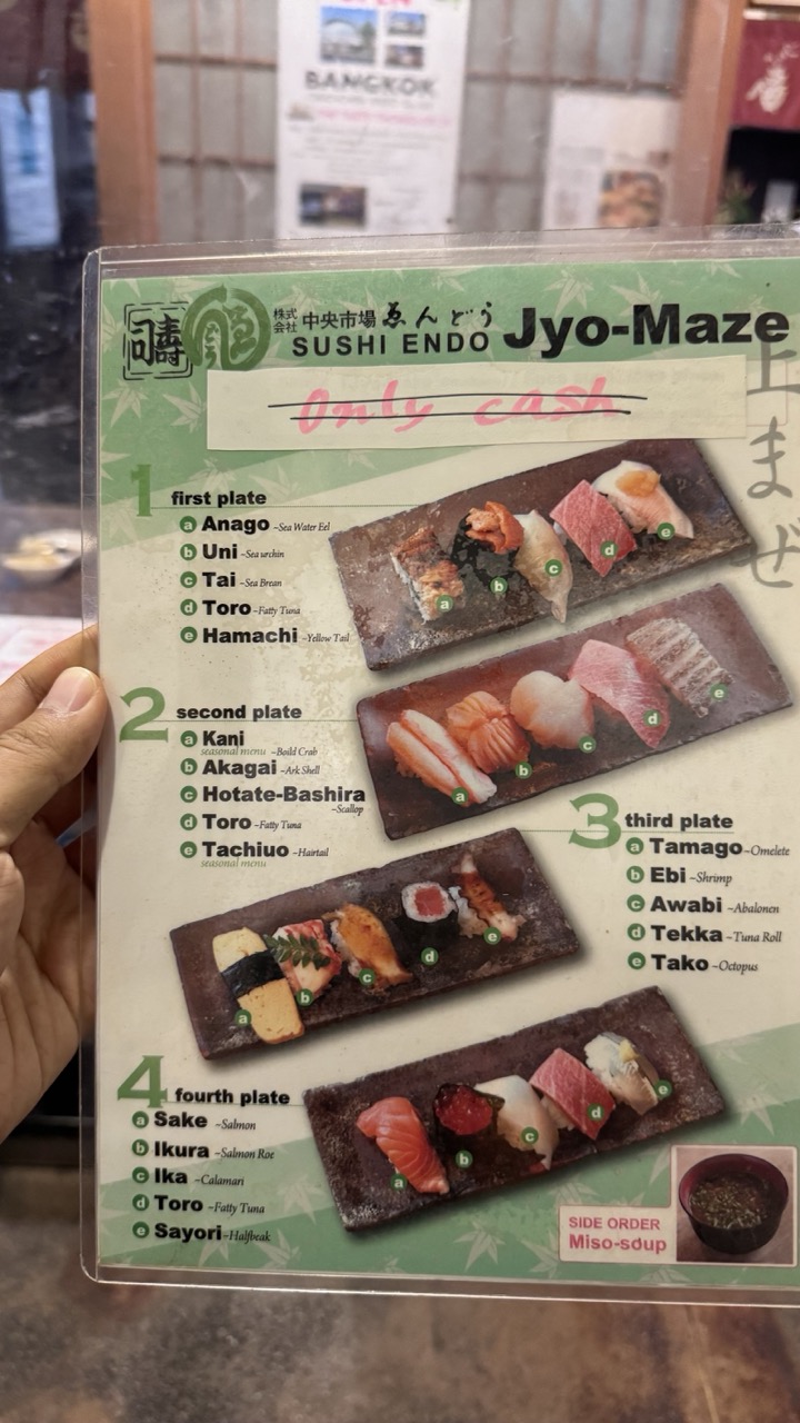

1. Overall Rating (0–10) — 5.5
This photograph captures a menu for Jyo-Maze Sushi Endo, presenting a glimpse into a Japanese restaurant’s offerings with a candid, documentary feel. The hand holding the menu and the slightly blurred background lend an authentic, in-the-moment quality, though the image lacks visual polish. The handwritten "Only cash" note adds a touch of realism, grounding the scene in everyday experience. While the subject is clear and the information legible, the overall composition feels more functional than artistic, with a muted atmosphere that fails to elevate the subject.
2. Composition (0–10) — 6.0
The menu is centered and angled slightly, creating a dynamic but balanced frame. The hand at the left edge grounds the image, while the background elements—though out of focus—add context without distracting. A tighter crop would improve focus on the menu’s details.
3. Lighting (0–10) — 5.0
The lighting is flat and even, likely from overhead indoor sources, resulting in soft shadows and a lack of contrast. While sufficient for legibility, it gives the image a neutral, unremarkable tone.
4. Color & Tone (0–10) — 5.5
The palette is dominated by the green and white of the menu, with muted tones from the surrounding environment. The colors are natural but lack vibrancy, contributing to the image’s subdued, unembellished character.
5. Creativity (0–10) — 5.0
The photograph is straightforward and utilitarian, capturing a moment without stylistic embellishment. The handwritten note and casual presentation offer a hint of narrative, but the approach is observational rather than expressive.
6. Technical Quality (0–10) — 7.0
The image is sharp and in focus, with clear text and readable details on the menu. The depth of field is appropriate, keeping the subject crisp while softly blurring the background.
7. Emotional Impact (0–10) — 5.0
The image evokes a sense of quiet anticipation, as if someone is about to enjoy a meal. However, the lack of dramatic lighting or composition keeps the emotional resonance subtle and understated.

1. Overall Rating (0–10) — 6.0
This photograph captures a quiet, intimate corner of a traditional Japanese establishment, where personal touches and history are layered into the wall’s surface. The arrangement of handwritten notes, dated signatures, and a small potted plant evokes a sense of continuity and community, yet the image feels slightly cluttered and underexposed, which dampens its emotional resonance. While the scene is rich in narrative potential, the lack of visual cohesion and lighting control prevents it from fully conveying the warmth of the moment.
2. Composition (0–10) — 5.5
The composition is uneven, with the large sign and scattered papers creating visual noise. The central focus is fractured by the overlapping elements, and the framing feels more like a snapshot than a deliberate arrangement.
3. Lighting (0–10) — 4.5
The lighting is flat and artificial, likely from overhead fluorescent sources, casting a dull yellow tone that flattens the textures of the brick and paper. Shadows are minimal, and the overall exposure is too dark, obscuring fine details.
4. Color & Tone (0–10) — 5.0
The palette is muted and dominated by beige, black, and gray, with little contrast or vibrancy. The warmth of the lighting adds a yellow cast that feels unintentional and slightly unappealing.
5. Creativity (0–10) — 6.5
The image succeeds in capturing a candid, authentic moment of human presence—guests leaving messages, a small plant as a symbol of care. The storytelling potential is strong, though the execution lacks artistic refinement.
6. Technical Quality (0–10) — 6.0
The image is reasonably sharp, but the low light and poor exposure compromise clarity. Some details on the papers are legible, but the overall image lacks crispness and dynamic range.
7. Emotional Impact (0–10) — 5.5
There is a quiet intimacy in the scene—personal messages, the passage of time marked by dates—but the technical limitations and cluttered presentation keep the viewer at a distance rather than drawing them into the story.

1. Overall Rating (0–10) — 7.0
This photograph captures the quiet intimacy of a space steeped in personal history, where handwritten messages and a framed photo create a layered narrative of memory and connection. The wall, densely covered in signatures and dates, tells a story of repeated visits and enduring relationships, evoking a sense of warmth and continuity. While the composition feels slightly cluttered, the authenticity of the scene gives it a powerful emotional resonance.
2. Composition (0–10) — 6.0
The framing is slightly awkward, with a tilted perspective that disrupts visual balance. The central photo acts as a focal point, but the surrounding tiles create a busy, uneven arrangement that pulls attention in multiple directions.
3. Lighting (0–10) — 5.5
The lighting is functional but flat, with a cool, artificial tone that casts little shadow or depth. While it clearly illuminates the wall, it lacks the warmth or directional quality that could enhance the mood.
4. Color & Tone (0–10) — 6.0
The palette is dominated by muted grays and off-whites, with the dark tiles providing contrast. The lack of vibrant color emphasizes the documentary nature of the scene, but a subtle shift in warmth could have enhanced the sense of nostalgia.
5. Creativity (0–10) — 7.0
The image succeeds in capturing a unique cultural moment—personal inscriptions on a public wall—blending documentation with storytelling. The layered textures and handwritten text lend an intimate, almost archival quality.
6. Technical Quality (0–10) — 7.5
The image is sharp and clear, with good detail in the handwriting and photo. The focus is consistent across the wall, and there is minimal noise, indicating strong technical execution.
7. Emotional Impact (0–10) — 7.5
There is a strong emotional pull in the authenticity of the signatures and the quiet reverence of the framed photo. It invites viewers to reflect on connection, memory, and the passage of time, creating a quiet but meaningful connection.

1. Overall Rating (0–10) — 7.0
This photograph captures the quiet dignity of a chef at work, framed by traditional Japanese elements that suggest both ritual and routine. The juxtaposition of the modern laptop with the handmade ceramic vase and the red noren curtain creates a subtle tension between tradition and contemporary life. While the composition feels slightly staged and the lighting lacks dramatic flair, the image succeeds in conveying a moment of focused stillness, where craftsmanship and technology coexist.
2. Composition (0–10) — 6.5
The large vase in the foreground dominates the frame, creating a natural visual barrier that partially obscures the chef. While this adds depth and cultural context, it also disrupts the viewer’s direct connection to the subject. The framing feels deliberate but slightly off-center, lending a candid quality that both enhances and undermines the image’s balance.
3. Lighting (0–10) — 6.0
The lighting is functional and even, likely from overhead fluorescent sources, which flattens the scene and diminishes the texture of the ceramics and fabric. While it ensures clarity, it lacks warmth and directionality, preventing the image from feeling immersive or atmospheric.
4. Color & Tone (0–10) — 6.5
The deep red of the noren contrasts with the dark vase and the chef’s white uniform, creating a traditional palette that feels deliberate and restrained. The muted tones of the metal counter and the soft green of the plant provide subtle variation, though the overall color scheme feels slightly washed out due to the flat lighting.
5. Creativity (0–10) — 7.0
The image is conceptually strong, using juxtaposition—traditional craft, modern technology, and quiet human presence—to tell a layered story. The inclusion of the flowering plant and the carefully placed vase elevates the scene beyond a simple snapshot, suggesting a deeper narrative about continuity and change.
6. Technical Quality (0–10) — 7.5
The focus is sharp on the vase and the chef’s face, and the detail in the ceramic and fabric is clear. The image is well-exposed with no blown highlights or crushed shadows, indicating competent technical execution.
7. Emotional Impact (0–10) — 6.5
The photograph evokes a sense of quiet contemplation, inviting the viewer to consider the unseen rhythm of a daily ritual. The masked face and the laptop suggest a world in transition, making the moment feel both intimate and slightly melancholic, though the emotional resonance is held back by the image’s observational distance.
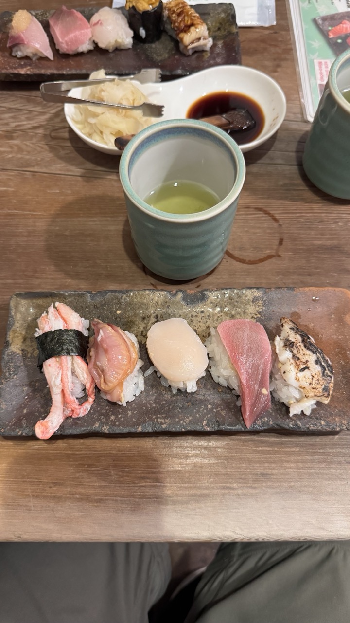

1. Overall Rating (0–10) — 7.0
This photograph captures the quiet elegance of a sushi meal, with a strong emphasis on authenticity and sensory detail. The arrangement of nigiri, tea, and condiments feels intimate and inviting, evoking the ritual of a traditional dining experience. While the composition is grounded in realism, a slightly more deliberate framing and attention to light could elevate the image from a casual snapshot to a compelling still life.
2. Composition (0–10) — 6.5
The horizontal layout creates a balanced, layered scene, but the foreground elements—particularly the person’s lap—interrupt the visual flow and distract from the main subject. A tighter crop would enhance focus on the sushi and table setting.
3. Lighting (0–10) — 6.0
Warm, ambient lighting enhances the natural textures of the food and wood, but the shadows are somewhat uneven, casting a slight glare on the cup and creating a flat appearance in the background.
4. Color & Tone (0–10) — 7.0
The earthy tones of the ceramic and wood complement the vibrant pink and white of the fish, while the green tea adds a subtle pop. The color palette feels harmonious and natural, though slightly muted due to the lighting.
5. Creativity (0–10) — 6.5
The image tells a story of a simple, mindful meal, and the inclusion of personal elements like the tea and condiments adds narrative depth. However, the approach is conventional, with little visual experimentation in angle or mood.
6. Technical Quality (0–10) — 7.5
The image is sharp and clear, with good detail in the textures of the fish, rice, and wood grain. Focus is consistent across the frame, and there are no major technical flaws.
7. Emotional Impact (0–10) — 6.5
The photograph evokes a sense of calm and satisfaction, suggesting a moment of quiet enjoyment. While it resonates with those familiar with Japanese dining culture, the emotional pull is moderate due to the slightly cluttered framing and lack of dramatic lighting.
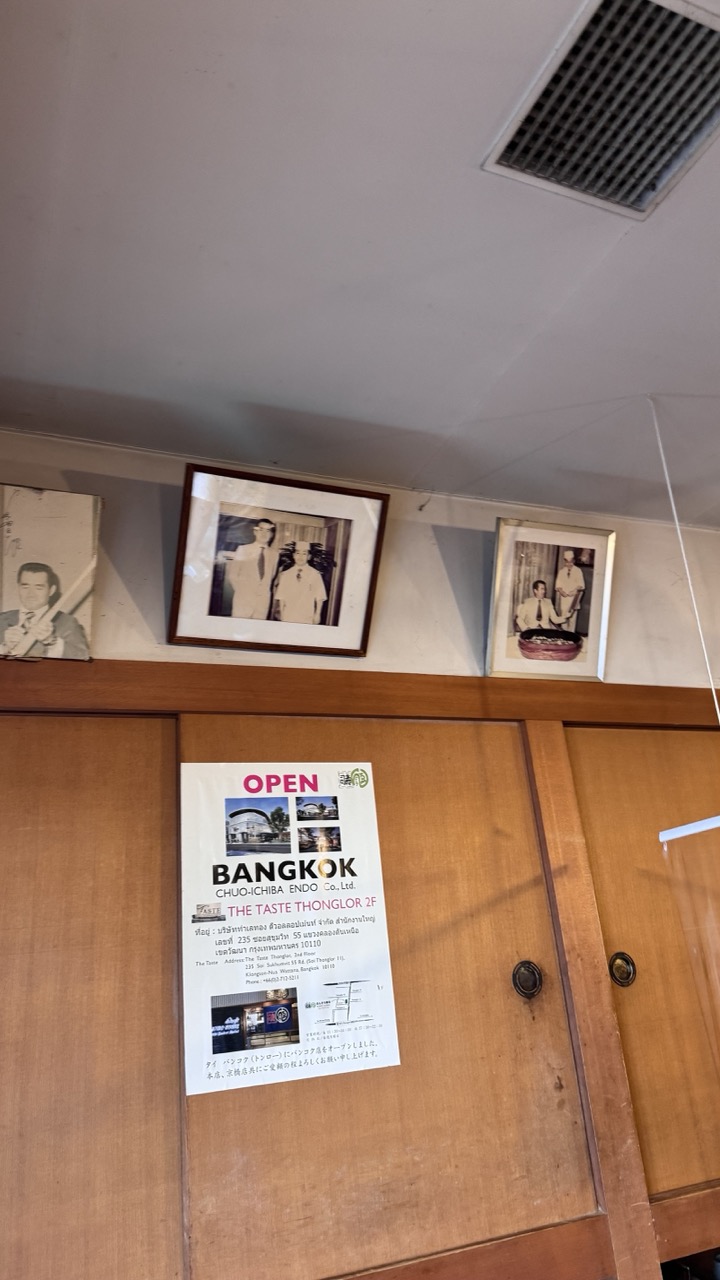

1. Overall Rating (0–10) — 5.5
This image captures a modest interior moment, where personal history and commercial function intersect in a quiet, unassuming way. The juxtaposition of framed black-and-white portraits with a modern business flyer creates a subtle narrative of continuity and legacy, though the composition’s low-angle perspective and cluttered framing diminish its visual appeal. While the scene feels authentic and grounded, it lacks the aesthetic refinement to elevate it beyond a simple snapshot.
2. Composition (0–10) — 5.0
The off-center framing and tilted angle create a sense of casualness, but the cluttered wall and awkward placement of the poster disrupt visual harmony. The focus is split between the portraits and the flyer, weakening the image’s narrative cohesion.
3. Lighting (0–10) — 4.5
Harsh overhead fluorescent lighting casts flat, unflattering illumination, with minimal shadows or depth. The light is functional but fails to enhance the mood or draw attention to key details.
4. Color & Tone (0–10) — 5.0
The palette is muted, dominated by beige walls, brown wood, and the white of the poster. The lack of contrast and color vibrancy gives the image a dull, documentary quality.
5. Creativity (0–10) — 6.0
The concept of layering personal history with current enterprise is conceptually interesting, and the inclusion of both Thai and Japanese text adds cultural context. However, the execution feels more observational than intentional.
6. Technical Quality (0–10) — 6.5
The image is reasonably sharp, with clear text and details visible on the poster and frames. However, the low angle and lack of focus on a single point reduce its overall technical impact.
7. Emotional Impact (0–10) — 5.0
The image evokes a quiet nostalgia, suggesting a long-standing family-run business. However, the detached, impersonal framing keeps the viewer at a distance, limiting emotional resonance.
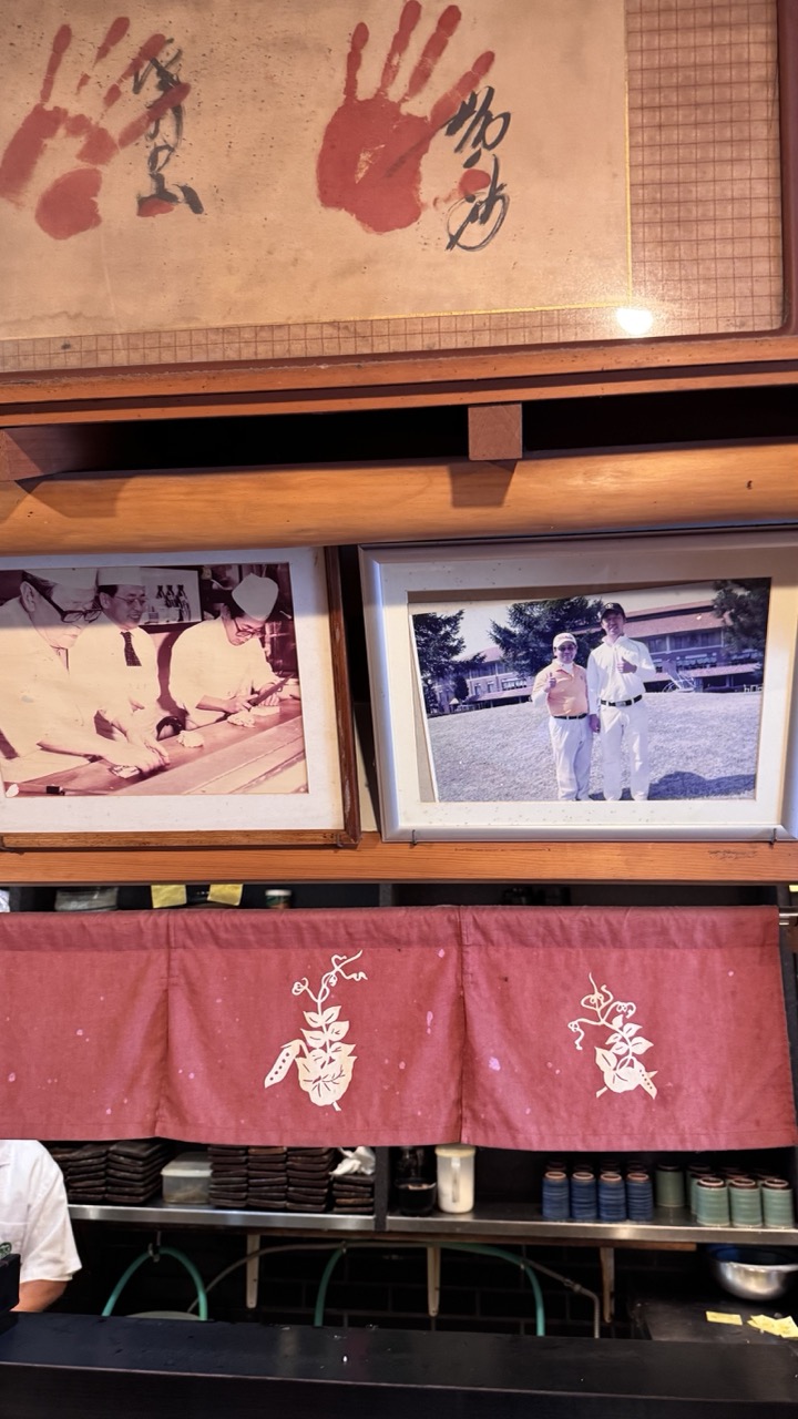

1. Overall Rating (0–10) — 7.0
This photograph captures the soulful authenticity of a traditional Japanese eatery, where history and craftsmanship are woven into the very walls. The layered composition—featuring framed memories, hand-stamped signage, and a classic noren curtain—creates a rich narrative of legacy and continuity. While the lighting and framing are functional rather than dramatic, the image succeeds in conveying a sense of time-worn warmth and cultural pride.
2. Composition (0–10) — 6.5
The vertical stacking of framed photos and the banner creates a balanced, layered effect, though the uneven alignment of the frames introduces slight visual tension. The central red noren acts as a natural focal point, grounding the composition.
3. Lighting (0–10) — 6.0
The lighting is warm and ambient, enhancing the nostalgic mood, though it’s uneven—brighter on the upper wall, dimmer below. This creates a subtle chiaroscuro effect, but some details in the lower shelves are lost in shadow.
4. Color & Tone (0–10) — 7.0
The dominant red of the noren and handprints provides a bold, symbolic contrast against the muted beige and wood tones. The sepia tint of the photos adds historical depth, while the green and blue ceramics below introduce a quiet, complementary harmony.
5. Creativity (0–10) — 7.5
The image is rich in storytelling, using everyday objects and textures as visual metaphors for tradition and memory. The inclusion of handprints and vintage photos transforms a simple interior into a living archive, demonstrating thoughtful, narrative-driven composition.
6. Technical Quality (0–10) — 7.5
The image is sharp and well-focused, with clear details in the photographs and embroidery. The depth of field is adequate, capturing both the foreground and background with sufficient clarity.
7. Emotional Impact (0–10) — 7.5
There’s a quiet reverence in the scene that evokes a sense of belonging and continuity. The viewer is invited to imagine the stories behind the photos and the hands that left their mark—this emotional resonance lingers long after the image is viewed.
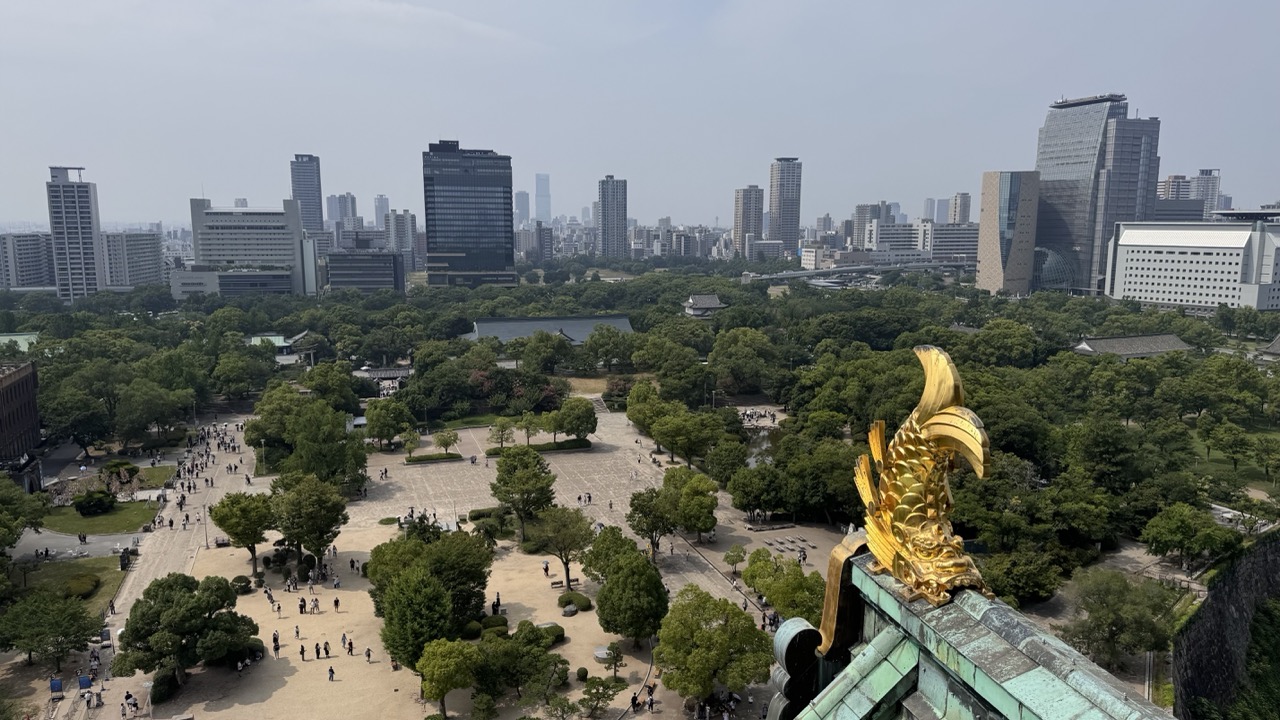

1. Overall Rating (0–10) — 7.5
This panoramic view masterfully juxtaposes the ancient and the modern, capturing the golden koi ornament of Osaka Castle as a radiant symbol of tradition against the sprawling urban skyline. The elevated perspective draws the eye from the ornate foreground into the bustling city beyond, creating a layered narrative of history and progress. While the slightly hazy atmosphere softens the scene’s vibrancy, the composition’s balance and cultural resonance elevate it into a compelling visual statement.
2. Composition (0–10) — 8.0
The golden koi in the foreground anchors the image, guiding the viewer’s gaze into the expansive park and cityscape beyond. The diagonal flow from the ornate roofline to the distant skyscrapers creates dynamic movement, while the open space of the plaza offers visual breathing room, enhancing the sense of scale.
3. Lighting (0–10) — 6.5
The soft, diffused daylight evenly illuminates the scene, minimizing harsh shadows and preserving detail across the landscape. However, the overcast sky lends a muted quality to the light, slightly dampening the potential richness of the golden ornament and the lush greenery.
4. Color & Tone (0–10) — 7.0
The palette balances the warm gold of the koi with the cool greens of the trees and the neutral grays and whites of the buildings. The subtle contrast between the traditional and modern elements is enhanced by the tonal harmony, though the overall saturation is restrained by the atmospheric haze.
5. Creativity (0–10) — 8.0
The choice to frame the shot from the castle’s roof introduces a unique cultural and symbolic perspective, transforming a standard cityscape into a layered meditation on time and identity. The integration of the koi—symbol of perseverance and good fortune—adds narrative depth and visual intrigue.
6. Technical Quality (0–10) — 8.0
The image is sharp and well-focused, with clear details in both the foreground ornament and the distant buildings. The exposure is balanced, capturing fine textures in the roof tiles and foliage without losing information in highlights or shadows.
7. Emotional Impact (0–10) — 7.5
The photograph evokes a sense of awe and contemplation, inviting the viewer to reflect on the coexistence of heritage and modernity. The quiet presence of the golden koi, standing watch over the city, imbues the scene with a dignified serenity and a subtle emotional weight.
Loading map...