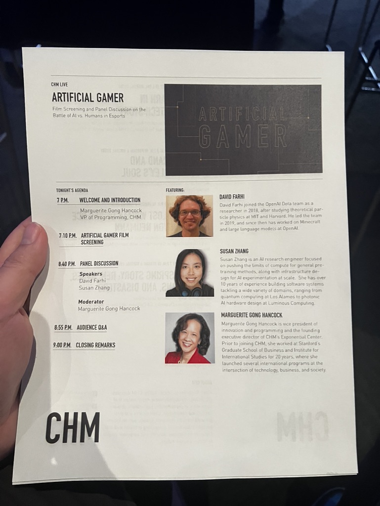
A documentary screening, "Artificial Gamer," showcases OpenAI's efforts to develop an AI bot capable of defeating Dota 2 world champions within a year. The film explores the team's push for machine learning advancements, including self-play and reinforcement learning, which enable the AI to learn strategies and react faster than humans.


1. Overall Rating (0–10) — 6.0
This photograph captures the atmosphere of a panel discussion on a modern stage, with a strong sense of event energy and thematic focus. The bold blue lighting and central screen create a cohesive, tech-forward mood, though the composition feels slightly unbalanced due to the wide-angle perspective. While the image effectively conveys the setting and subject matter, it lacks the visual precision to feel fully immersive or artistically refined.
2. Composition (0–10) — 5.5
The wide-angle framing includes too much of the surrounding space, diluting focus on the panelists. The stage is centered, but the audience’s heads in the foreground disrupt the clean view of the speakers.
3. Lighting (0–10) — 7.0
The deep blue wash from overhead fixtures creates a dramatic, immersive atmosphere that complements the tech-themed presentation. The screen is well-lit and readable, though some shadows fall unevenly on the stage floor.
4. Color & Tone (0–10) — 6.5
The dominant cool blue palette enhances the futuristic theme, but the overall tone is somewhat flat due to limited contrast. The red chairs provide a striking visual anchor, but the neutral tones of the stage and audience mute the vibrancy.
5. Creativity (0–10) — 6.0
The image effectively documents a live event with clear thematic intent, but it relies on standard event photography conventions rather than pushing artistic boundaries. The framing and lighting choices are functional, not inventive.
6. Technical Quality (0–10) — 7.0
The image is sharp and free of major technical flaws, with good focus on the stage and screen. The wide-angle lens introduces some distortion, but it doesn’t significantly detract from clarity.
7. Emotional Impact (0–10) — 5.5
The photograph conveys a sense of intellectual engagement and modernity, but the viewer remains at a distance due to the lack of intimate framing or emotional focus on the participants.


1. Overall Rating (0–10) — 6.0
This photograph captures a promotional flyer for a tech-focused event, conveying a professional and informative tone. The layout is clean and structured, with clear typography and purposeful visual hierarchy, though the image’s candid nature—held in hand with a dark background—undermines its potential aesthetic impact. While the content is compelling, the execution feels more like documentation than art, lacking the deliberate staging or emotional resonance to elevate it beyond a functional record.
2. Composition (0–10) — 6.0
The flyer is centered and angled slightly, with the hand and background framing it unevenly. The composition prioritizes legibility over visual harmony, with the text and portraits arranged logically but not artistically. The depth created by the hand and background adds context but distracts from the flyer’s intended prominence.
3. Lighting (0–10) — 5.0
The lighting is flat and ambient, likely from an indoor source, casting soft shadows and creating uneven exposure across the flyer. The darker background contrasts with the white paper, but the lack of directional or mood lighting results in a neutral, unemotional atmosphere.
4. Color & Tone (0–10) — 6.0
The palette is predominantly monochromatic—black, white, and gray—with the red accent in Marguerite Gong Hancock’s photo providing a subtle pop of color. The tone is restrained and corporate, aligning with the event’s technical subject matter, though the lack of vibrancy limits visual engagement.
5. Creativity (0–10) — 5.0
The creativity lies in the design of the flyer itself—functional, modern, and informative—but the photograph’s purpose is observational rather than expressive. The image captures the event’s identity well, but offers little originality in its framing or interpretation.
6. Technical Quality (0–10) — 7.0
The focus is sharp on the flyer, with clear legibility of text and portraits. The image is free of major technical flaws, though slight motion blur and uneven lighting reduce its overall polish.
7. Emotional Impact (0–10) — 5.5
The image evokes a sense of anticipation and intellectual curiosity, particularly for those familiar with AI and esports. However, the emotional resonance is muted by the photo’s documentary nature and lack of personal connection or narrative depth.


1. Overall Rating (0–10) — 6.8
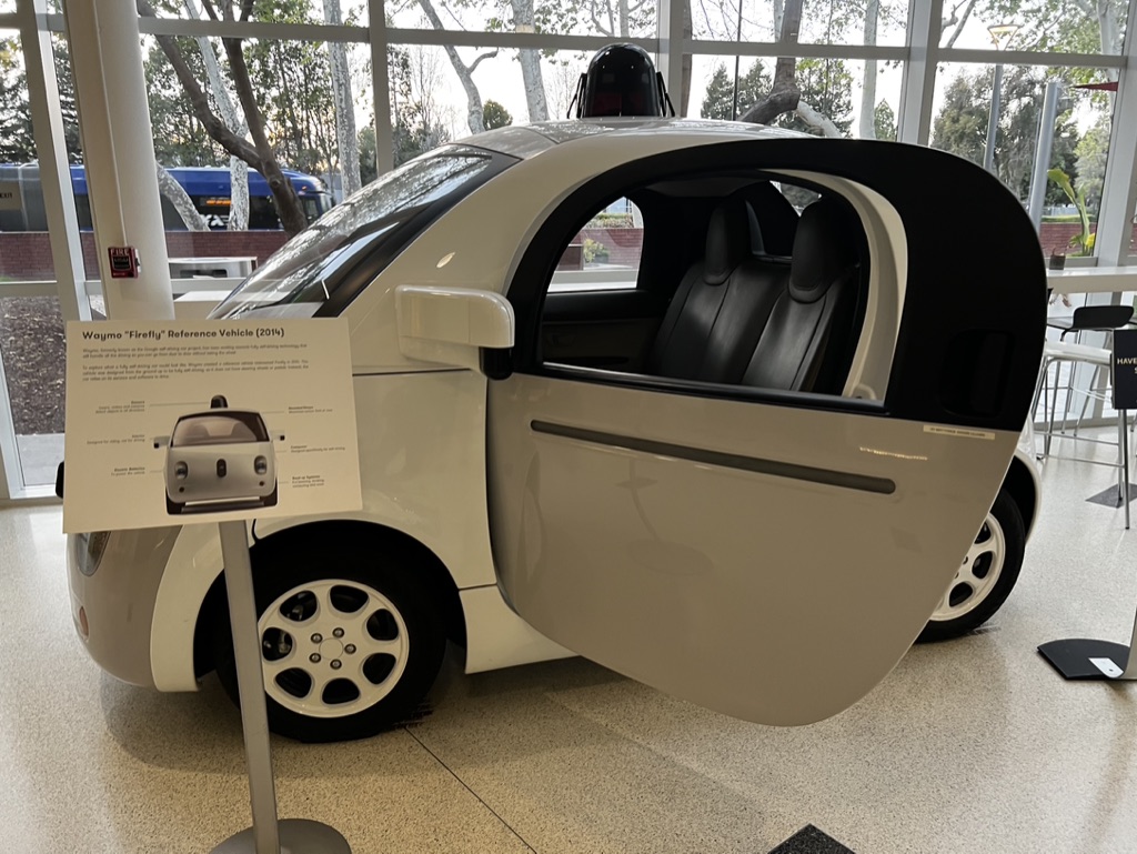
This photograph captures a futuristic vehicle in a museum-like setting, where the interplay of technology and human-scale design creates a sense of quiet anticipation. The open door invites curiosity, while the clean, bright environment underscores the vehicle’s innovation. While the composition is clear and informative, it lacks the dramatic tension or emotional depth that would elevate it beyond a straightforward documentation.
2. Composition (0–10) — 6.0
The car is framed slightly off-center with the sign partially obstructing the left side, creating a slight imbalance. The open door draws attention, but the background elements—windows, trees, and distant furniture—distract from the vehicle’s sleek form.
3. Lighting (0–10) — 7.0
Natural light from the large windows illuminates the scene evenly, highlighting the car’s smooth curves and reflective surfaces. The soft, diffused lighting enhances the futuristic aesthetic without creating harsh shadows.
4. Color & Tone (0–10) — 6.5
The neutral palette—whites, grays, and blacks—complements the vehicle’s minimalist design. However, the lack of color vibrancy gives the image a sterile feel, slightly dampening the sense of technological wonder.
5. Creativity (0–10) — 6.5
The image successfully conveys the concept of autonomous transportation, but it remains largely literal and documentary in nature. A more dynamic angle or narrative framing could have added conceptual depth.
6. Technical Quality (0–10) — 7.5
The image is sharp and well-focused, with clean details on the car’s body and interior. The depth of field is appropriate, keeping both the vehicle and the sign in clear view.
7. Emotional Impact (0–10) — 5.5
While the vehicle evokes a sense of progress and innovation, the image’s clinical presentation keeps the viewer at a distance. The emotional resonance is muted, leaning more toward intellectual curiosity than personal connection.
Loading map...