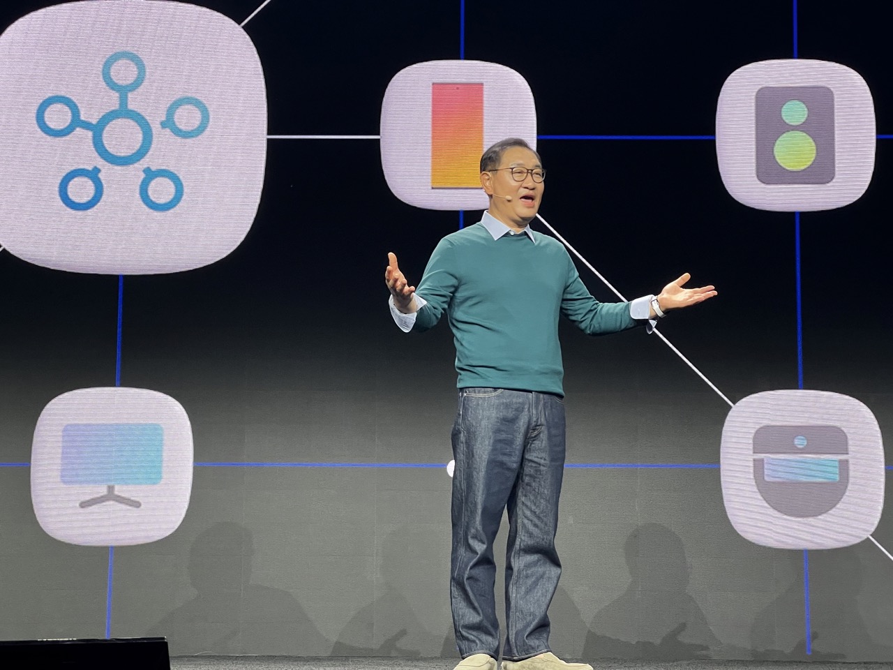

1. Overall Rating (0–10) — 7.0
This image captures a dynamic moment of presentation, with the speaker’s expressive posture and the vibrant backdrop conveying a sense of technological storytelling. The stage lighting and graphic design create a modern, engaging atmosphere, though the composition feels slightly unbalanced due to the large icons dominating the frame. While the subject is clearly the focal point, the visual weight of the background elements risks overshadowing the human element.
2. Composition (0–10) — 6.5
The speaker is centrally framed, but the surrounding icons create visual clutter, pulling attention away from the subject. The diagonal lines of the connecting wires add movement, but the asymmetry of the icons disrupts harmony.
3. Lighting (0–10) — 7.5
The stage lighting is well-balanced, highlighting the speaker with a soft, even glow while keeping the background graphics clearly visible. The contrast between the illuminated subject and the dark backdrop enhances focus.
4. Color & Tone (0–10) — 7.0
The color palette is modern and cohesive, with cool blues and muted grays creating a tech-forward aesthetic. The pops of warm orange and green in the icons add visual interest without overwhelming the scene.
5. Creativity (0–10) — 7.5
The integration of symbolic icons and clean design reflects a strong conceptual approach to visual storytelling. The image successfully communicates a theme of connectivity and innovation.
6. Technical Quality (0–10) — 8.0
The image is sharp and well-focused, with clean details in both the subject and the background graphics. The depth of field is appropriate for a stage environment.
7. Emotional Impact (0–10) — 6.5
The speaker’s open gesture and engaged expression convey enthusiasm, but the overwhelming scale of the digital graphics creates a slight emotional distance, making the moment feel more informational than intimate.
But innovation can also be burdensome for users if convenience is not at the forefront. Our teams are determined to deliver devices that are as smooth and accessible as they are advanced.
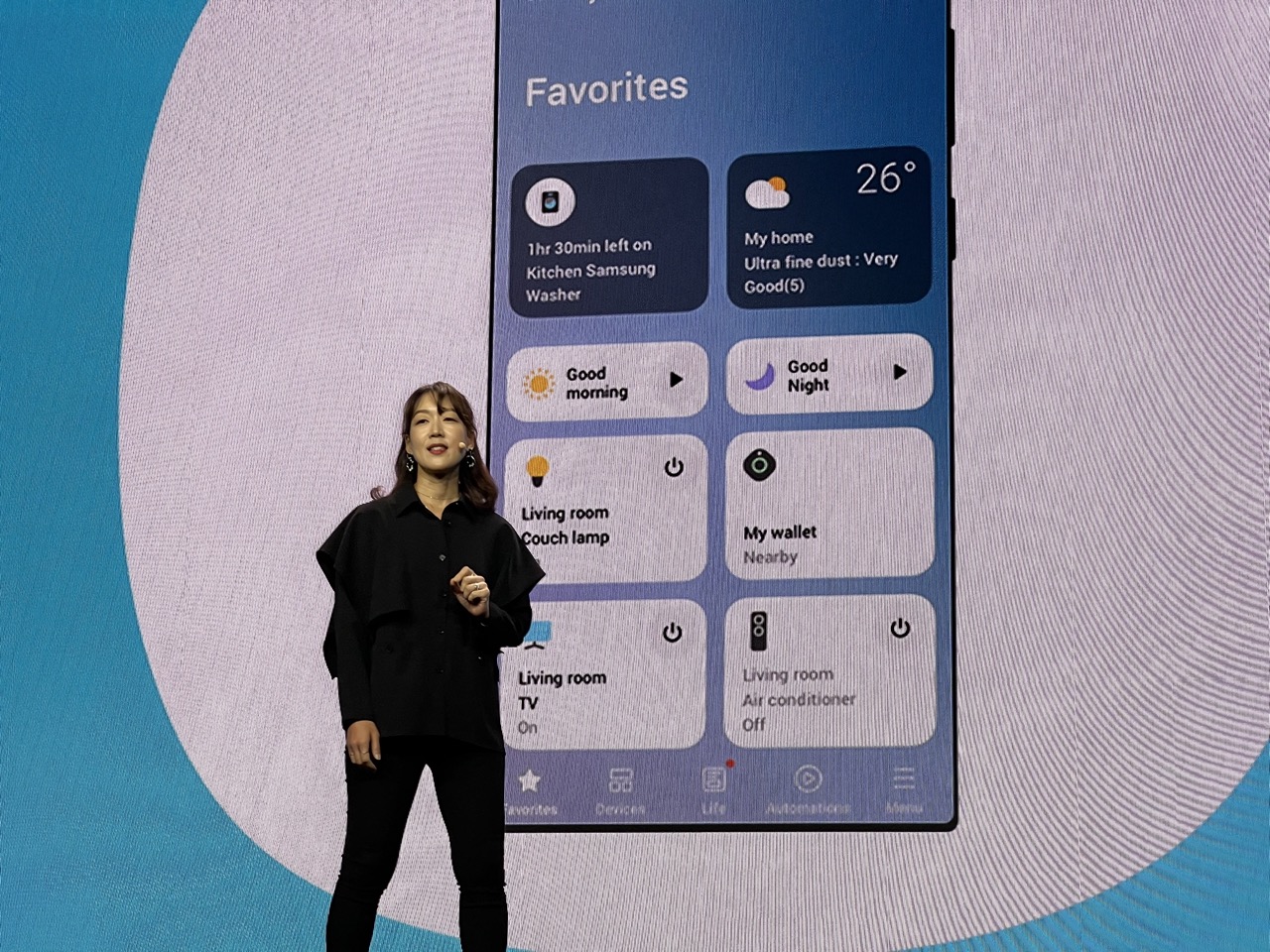

1. Overall Rating (0–10) — 7.0
This image captures a confident presenter on stage, showcasing a smart home interface with clarity and purpose. The large screen behind her effectively communicates the functionality of a connected ecosystem, while her poised stance reinforces the technological sophistication being demonstrated. The visual balance between human presence and digital interface creates a compelling narrative of innovation, though the scene lacks the atmospheric depth to feel truly immersive.
2. Composition (0–10) — 7.0
The subject is well-centered and balanced against the large screen, which dominates the frame. The circular graphic in the background adds visual interest and frames the display, drawing attention to the interface. The composition feels intentional and professional, suitable for a product demonstration.
3. Lighting (0–10) — 7.5
The stage lighting is even and bright, highlighting the presenter clearly without harsh shadows. The screen’s glow contributes a cool blue tone that enhances the futuristic feel, while the ambient light keeps the subject well-defined and visible.
4. Color & Tone (0–10) — 7.0
The color palette is dominated by cool blues and grays, reinforcing a modern, tech-focused aesthetic. The contrast between the black attire of the presenter and the bright screen creates visual separation, while the limited use of warm tones (like the yellow sun icon) adds subtle emphasis to key interface elements.
5. Creativity (0–10) — 6.5
The concept is strong and purposeful, effectively merging human presentation with digital demonstration. While the image is not artistically experimental, it successfully conveys the intended message of smart home integration and innovation.
6. Technical Quality (0–10) — 8.0
The image is sharp and clear, with good focus on both the presenter and the screen. The resolution of the display is crisp, and the lighting conditions appear well-controlled, resulting in a clean and professional technical execution.
7. Emotional Impact (0–10) — 6.0
The image evokes a sense of confidence and forward-thinking technology, but the emotional connection is somewhat restrained. While it inspires interest in smart home systems, it doesn’t elicit a deeper emotional resonance, remaining more informative than moving.
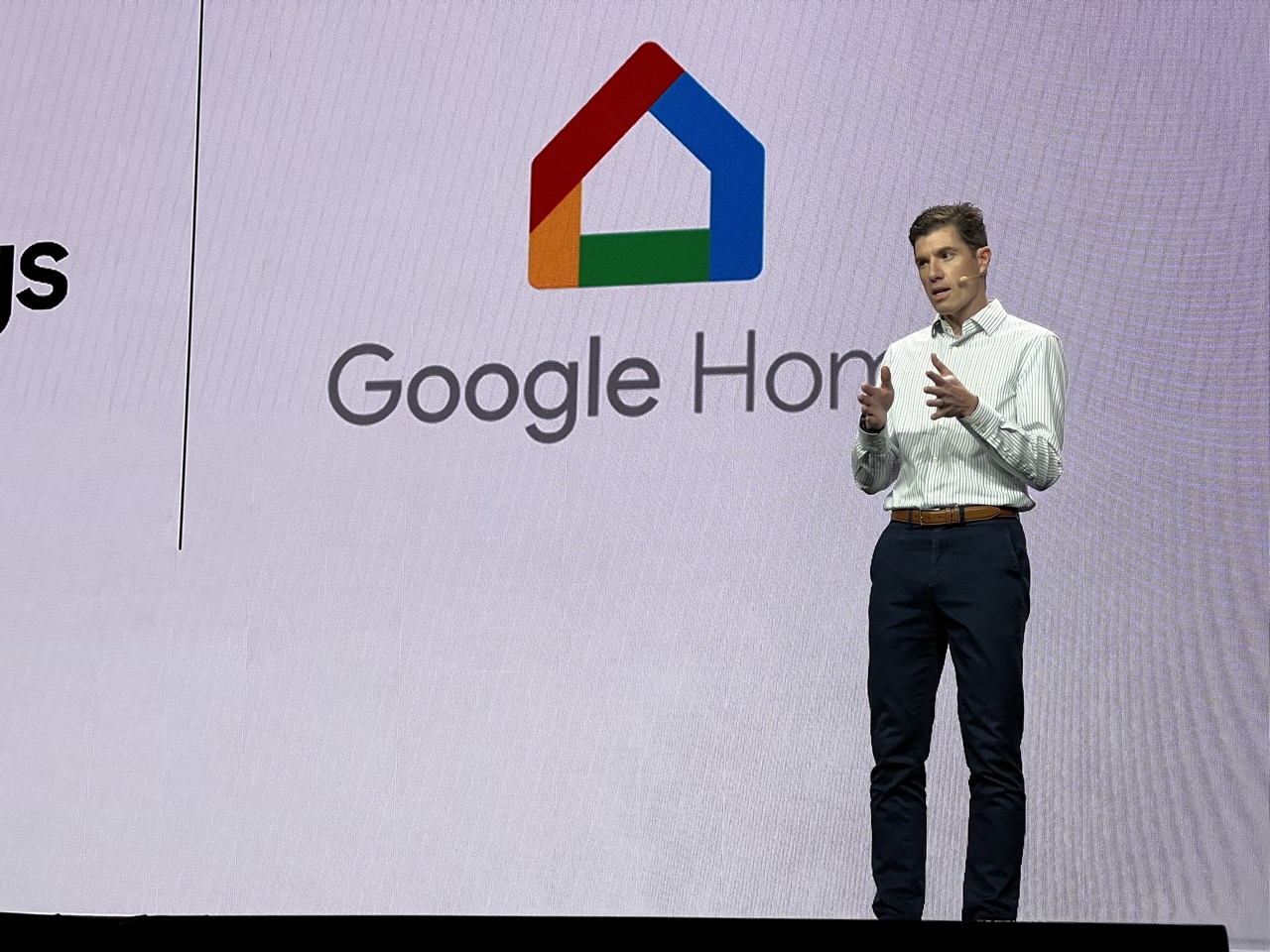

1. Overall Rating (0–10) — 7.0
This image captures a confident presenter on stage, delivering a message with clarity and purpose in front of a clean, branded backdrop. The strong presence of the Google Home logo establishes context and reinforces the corporate narrative, while the speaker’s gesture adds dynamism to the scene. The lighting and composition are professional, though the image lacks the emotional depth to feel truly compelling—its strength lies in its communicative clarity rather than artistic resonance.
2. Composition (0–10) — 6.5
The subject is well-placed to the right, creating a balanced but slightly asymmetrical frame. The large screen dominates the background, offering strong context, though the tight crop of the stage edge at the bottom limits spatial depth and grounding.
3. Lighting (0–10) — 7.0
Even, bright stage lighting illuminates the speaker clearly, minimizing harsh shadows and ensuring the subject stands out against the light backdrop. The cool tone enhances the modern, tech-focused atmosphere.
4. Color & Tone (0–10) — 7.0
The palette is restrained and professional—white, black, and the signature Google Home colors (red, blue, green, yellow) provide a clean, recognizable brand identity. The contrast between the vibrant logo and the neutral background draws attention effectively.
5. Creativity (0–10) — 6.0
While the image is effective in its purpose—documenting a corporate presentation—it is conventional in execution. The scene is functional and informative, but lacks originality in framing or visual storytelling.
6. Technical Quality (0–10) — 8.0
Sharp focus, clean detail, and well-managed exposure contribute to a technically sound image. The subject is clearly defined, and the background remains readable without distraction.
7. Emotional Impact (0–10) — 5.5
The image conveys professionalism and confidence, but the emotional connection is limited. The speaker’s expression is engaged, yet the overall tone remains detached, reflecting the formal nature of the event rather than evoking deeper resonance.
This ease of use across Samsung and Google is just the start, and we’re looking forward to delivering a more seamless, delightful home experience
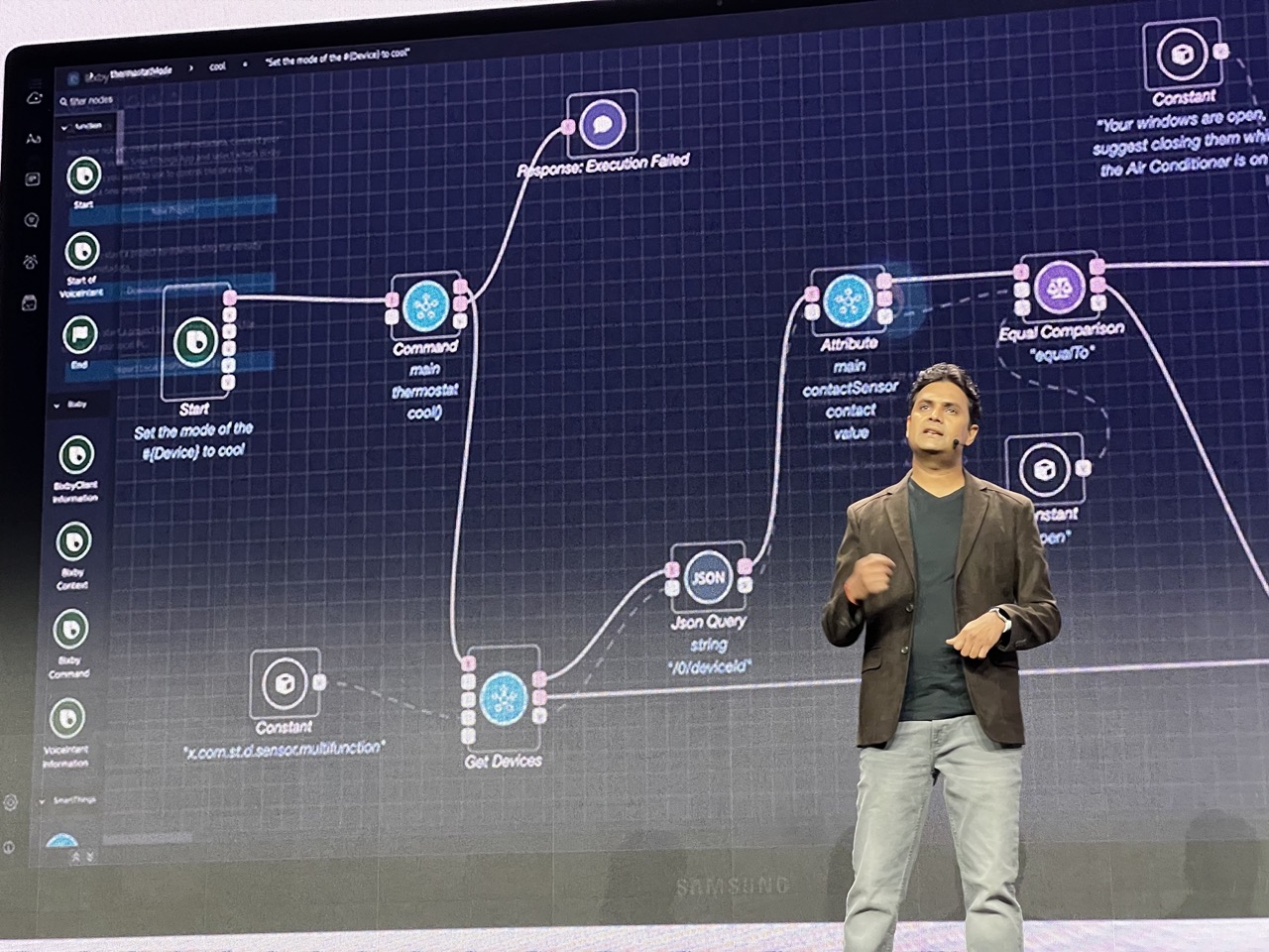

1. Overall Rating (0–10) — 6.0
This image captures a dynamic tech presentation, with the speaker actively engaging an audience while demonstrating a smart home automation workflow. The visual narrative is compelling, blending technical detail with real-time demonstration, though the low-light stage environment and digital screen glare slightly diminish the image’s clarity. While the content is rich and purposeful, the composition feels more like a snapshot than a polished photograph, limiting its aesthetic appeal.
2. Composition (0–10) — 6.0
The speaker is positioned off-center to the right, creating a balanced but slightly asymmetrical frame. The large screen dominates the left side, drawing the eye toward the technical diagram, which partially overlaps the subject. While the scene feels natural and documentary in tone, a tighter crop or more intentional framing would better unify the subject and context.
3. Lighting (0–10) — 5.0
The stage lighting is flat and functional, casting a cool, even glow that emphasizes the screen’s brightness while leaving the speaker underlit. The screen itself emits a strong blue-white light, creating reflections and glare that obscure some details. The overall effect is practical for presentation visibility but lacks atmospheric depth or visual drama.
4. Color & Tone (0–10) — 5.5
The dominant palette is cool and digital, with deep blues and grays from the screen interface contrasting with the warm brown of the speaker’s jacket. While the color scheme aligns with the technological theme, the lack of vibrant contrast and subtle color variation gives the image a muted, corporate feel.
5. Creativity (0–10) — 6.5
The image effectively communicates a moment of technological storytelling—bridging code, automation, and human interaction. The integration of a live demonstration into a photographic moment adds conceptual depth, though the execution remains largely observational rather than artistically reimagined.
6. Technical Quality (0–10) — 6.5
The image is reasonably sharp, with clear focus on the speaker and readable text on the screen. However, the ambient lighting and screen reflections introduce slight haziness, and the depth of field appears shallow, with minor softness in the background. The resolution is adequate for a presentation photo but not exhibition-ready.
7. Emotional Impact (0–10) — 5.0
The image conveys a sense of engagement and innovation, but the technical focus and neutral expressions keep the emotional tone detached. The viewer is invited into a moment of learning, not one of personal connection or inspiration—more informative than evocative.
For example, if you ask Bixby to turn on your air conditioner, Bixby can check if you have any windows open and let you know to close them, saving energy.
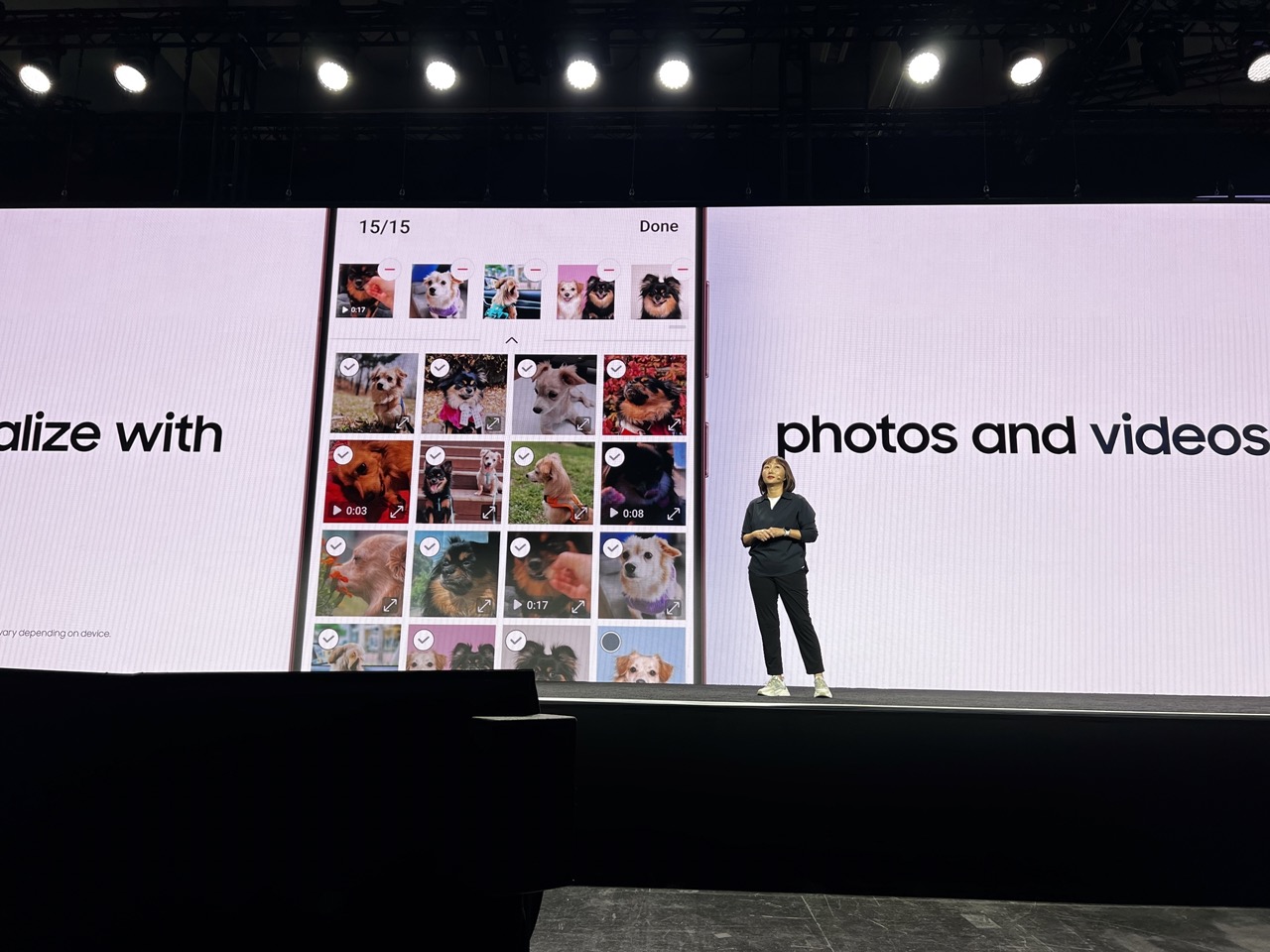

1. Overall Rating (0–10) — 7.0
This image captures a compelling product demonstration on stage, where the juxtaposition of a live presenter and a digital interface creates a narrative of modern technology in action. The clean stage design and focused lighting emphasize the content being presented, while the subject’s confident stance adds a human element to the tech showcase. The scene is strong in concept but slightly hindered by the visual dominance of the screen, which risks overshadowing the presenter.
2. Composition (0–10) — 6.5
The presenter is positioned off-center, creating a dynamic balance with the large screen. The wide framing includes stage elements that ground the scene, but the screen’s overwhelming size and content pull focus away from the human element, slightly disrupting visual harmony.
3. Lighting (0–10) — 7.5
The stage lighting is well-executed, with bright overhead spotlights illuminating the presenter and screen evenly. The contrast between the dark stage and the brightly lit display enhances clarity and focus, while the soft, uniform glow on the backdrop contributes to a polished, professional atmosphere.
4. Color & Tone (0–10) — 6.0
The palette is dominated by neutral whites and blacks, with subtle pops of color from the dog photos on the screen. While the overall tone is clean and modern, the lack of vibrant or varied hues gives the image a somewhat sterile feel, reducing its visual warmth.
5. Creativity (0–10) — 7.0
The image successfully blends a real-world presentation with a digital interface, creating a layered narrative about technology and personalization. The use of pet photos as a visual metaphor adds a relatable, human touch to a tech demonstration, showing thoughtful storytelling.
6. Technical Quality (0–10) — 8.0
The image is sharp and well-focused, with excellent clarity in both the foreground and background. The resolution is high enough to discern fine details on the screen and the presenter’s features, and the camera settings appear well-balanced for the lighting conditions.
7. Emotional Impact (0–10) — 6.5
The scene conveys a sense of professionalism and innovation, with a subtle warmth introduced by the dog photos. While the emotional connection is not immediate, the combination of technology and personal content invites viewers to reflect on how digital tools enhance everyday life.
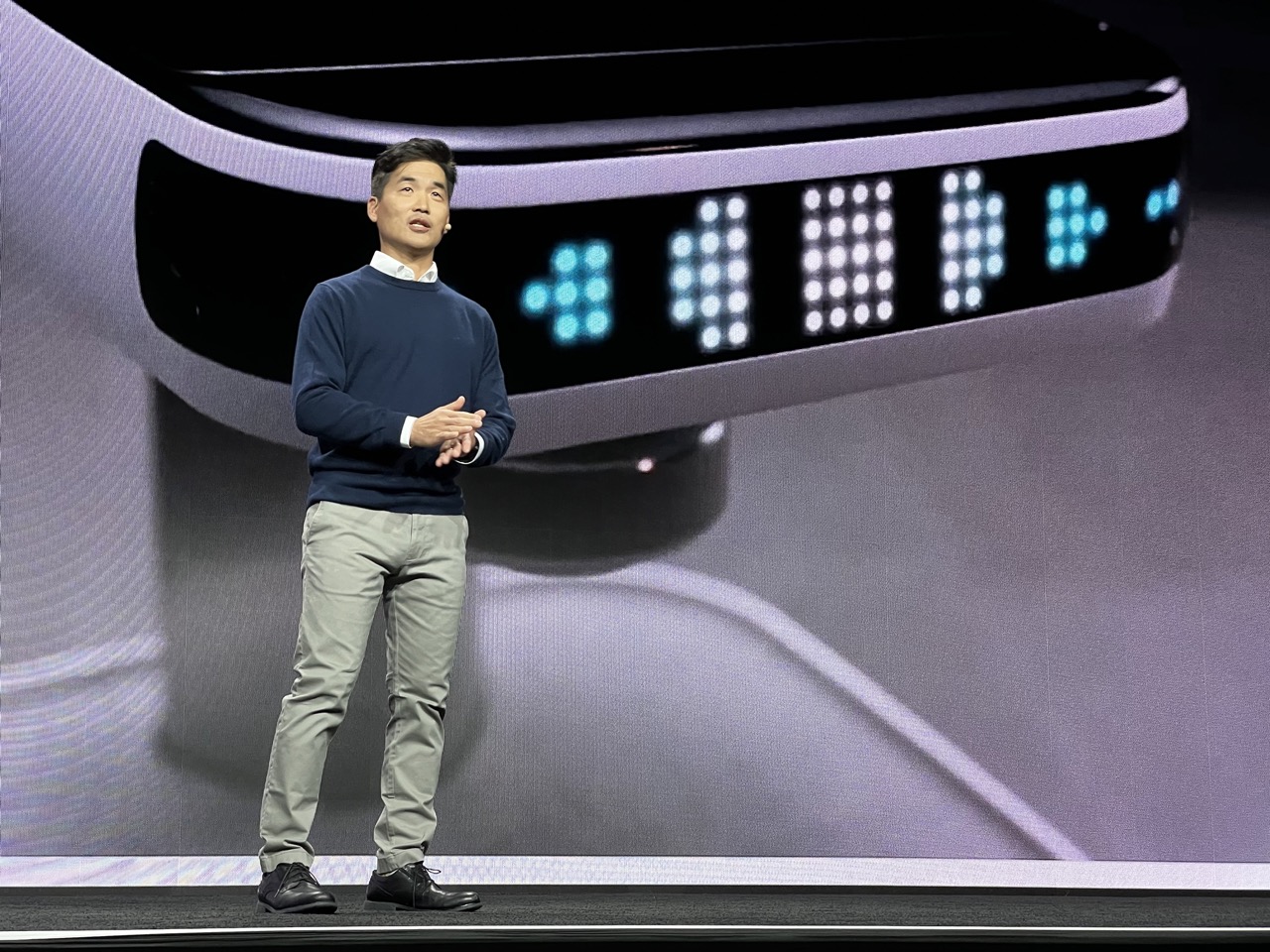

1. Overall Rating (0–10) — 7.0
This image captures a poised presenter on stage, exuding confidence and clarity in a high-tech environment. The sleek backdrop and modern lighting enhance the sense of innovation, while the subject’s calm demeanor grounds the scene in professionalism. Though the composition is strong, the lighting and color palette lean toward the sterile, slightly diminishing the emotional resonance of the moment.
2. Composition (0–10) — 7.5
The subject is well-placed off-center, creating visual interest, while the sweeping curve of the background draws the eye naturally toward the speaker. The large screen behind him provides context without overwhelming the frame, though the depth could be more pronounced to separate foreground from background.
3. Lighting (0–10) — 7.0
The lighting is balanced and even, highlighting the speaker without harsh shadows. A subtle rim light adds definition to his silhouette, while the cool blue glow from the screen contributes to the futuristic tone. The overall illumination feels professional and stage-appropriate.
4. Color & Tone (0–10) — 6.5
The palette is dominated by cool grays and blues, reinforcing a technological aesthetic. While cohesive, the lack of warmth makes the image feel somewhat detached. A touch of contrast or a complementary accent color could enhance visual appeal.
5. Creativity (0–10) — 6.0
The image functions as a strong documentation of a tech presentation, but it doesn’t break new visual ground. The creative strength lies in its clarity and context, rather than in bold artistic choices or narrative depth.
6. Technical Quality (0–10) — 8.0
Sharp focus, clean detail, and well-managed exposure demonstrate high technical proficiency. The image is free of noise and artifacts, suggesting a high-end capture in a controlled environment.
7. Emotional Impact (0–10) — 6.5
The image conveys professionalism and forward-thinking energy, but the emotional connection remains distant. The subject’s expression suggests enthusiasm, yet the clinical setting tempers the viewer’s ability to fully engage with the moment.
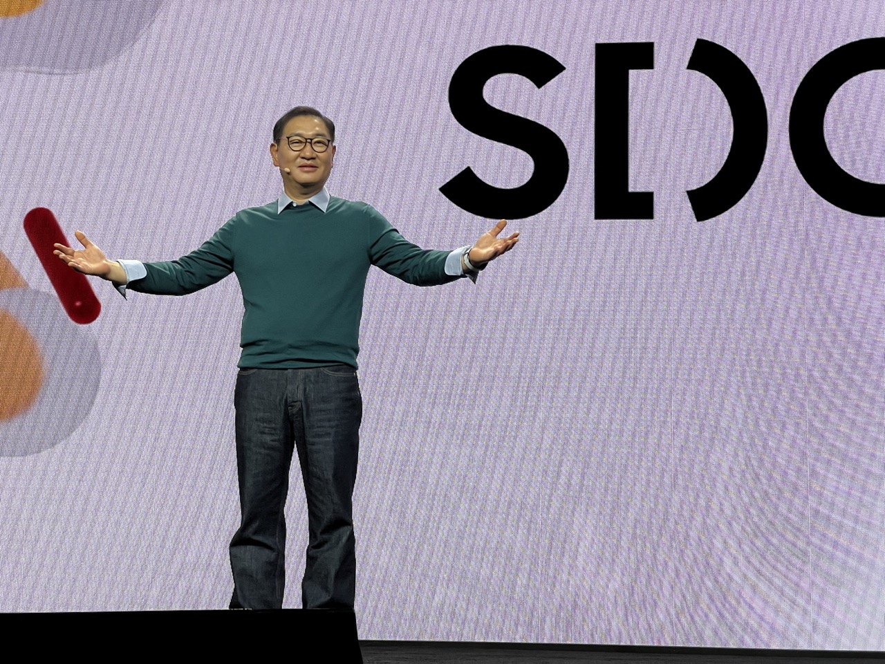

1. Overall Rating (0–10) — 7.0
This photograph captures a moment of confident presentation, with the subject’s open posture and clear stage presence conveying authority and engagement. The clean, modern backdrop and deliberate framing emphasize the speaker’s role as a central figure, though the slightly flat lighting and lack of dynamic depth limit its emotional resonance. The image succeeds as a strong corporate or product announcement portrait, balancing professionalism with approachability.
2. Composition (0–10) — 7.5
The subject is centered with balanced arm extension, creating a sense of openness and symmetry. The large screen behind adds context without overwhelming, though the tight framing leaves little room for movement or breath.
3. Lighting (0–10) — 6.5
Even and well-distributed stage lighting highlights the subject clearly, though it lacks dramatic contrast or directional texture. The flat quality supports clarity but diminishes mood and dimension.
4. Color & Tone (0–10) — 7.0
The muted lavender background provides a calm, tech-forward palette that complements the subject’s green sweater. The red accent on the left adds a subtle pop, enhancing visual interest without disrupting harmony.
5. Creativity (0–10) — 6.5
While the image is technically sound and conceptually clear, it follows a conventional corporate presentation aesthetic. The inclusion of the partial logo and gesture suggests a narrative of innovation, but the execution remains predictable.
6. Technical Quality (0–10) — 8.0
Sharp focus, clean details, and well-controlled exposure demonstrate strong technical execution. The image is free of noise or distortion, even under stage lighting.
7. Emotional Impact (0–10) — 6.0
The subject’s confident stance and slight smile convey calm assurance, but the formal setting and neutral expression keep the emotional connection at a distance. It feels more informative than intimate.
The future of something very dear to my heart: our planet. I believe we have a responsibility to help create a sustainable future. We do that through Everyday Sustainability, a belief that every stage of the product lifecycle can be more sustainable.
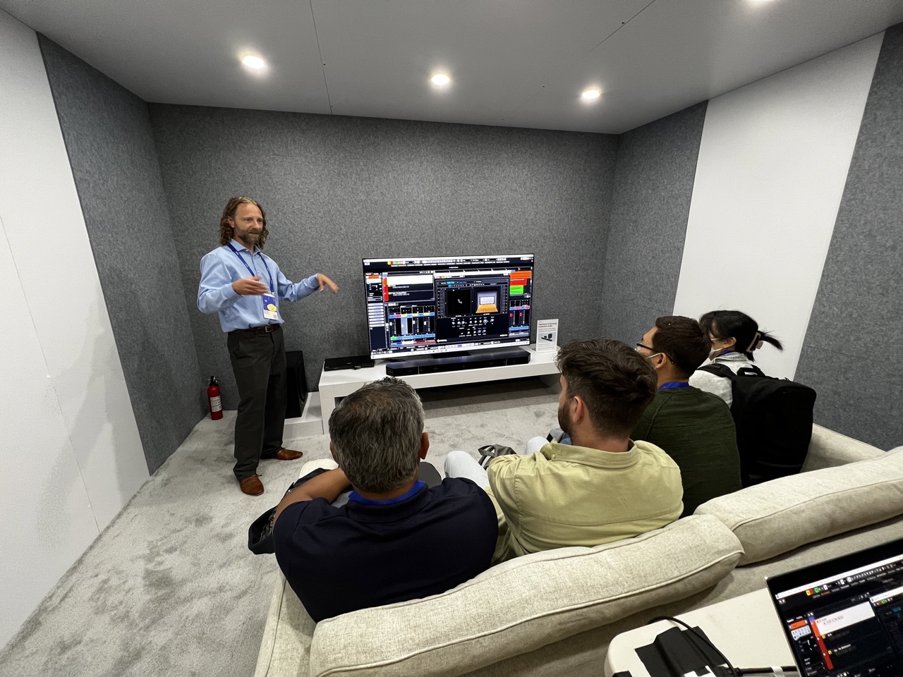

1. Overall Rating (0–10) — 6.0
This image captures a professional demonstration in a modern, acoustically treated room, conveying a sense of focused engagement and technological sophistication. The presenter’s dynamic gesture and the audience’s attentive posture suggest a compelling exchange, though the clinical lighting and sterile environment temper the emotional resonance. While the scene is well-framed and informative, it lacks the visual richness or narrative depth to feel truly immersive.
2. Composition (0–10) — 6.5
The composition effectively centers the presenter and screen, creating a clear focal point. The diagonal line of the couch and the audience’s gaze lead the eye toward the display, enhancing narrative flow. However, the cluttered foreground with the laptop and cables slightly disrupts visual harmony.
3. Lighting (0–10) — 6.0
The overhead recessed lights provide even, functional illumination, suitable for a demonstration space. However, the flat lighting lacks depth and fails to create dramatic contrast, resulting in a somewhat sterile atmosphere that undermines the scene’s potential mood.
4. Color & Tone (0–10) — 6.5
The palette is largely neutral—grays, whites, and muted tones—reinforcing the modern, professional setting. The screen’s vibrant interface introduces a splash of color that draws attention, though the overall tone remains subdued and slightly cold.
5. Creativity (0–10) — 6.0
The image successfully documents a real-world moment with clarity and purpose, but it leans toward straightforward documentation rather than artistic interpretation. The creative strength lies in the storytelling of a live presentation, though it lacks bold stylistic choices.
6. Technical Quality (0–10) — 7.5
The image is sharp and well-exposed, with clean detail across the scene. Focus is consistent, and the resolution captures fine elements like the screen’s interface and the presenter’s expression. Slight noise is present in the darker areas, but it does not detract significantly.
7. Emotional Impact (0–10) — 5.5
The scene evokes a sense of professional curiosity and shared learning, but the emotional distance created by the environment and lighting limits deeper connection. The viewer is an observer rather than a participant in the moment.
Loading map...