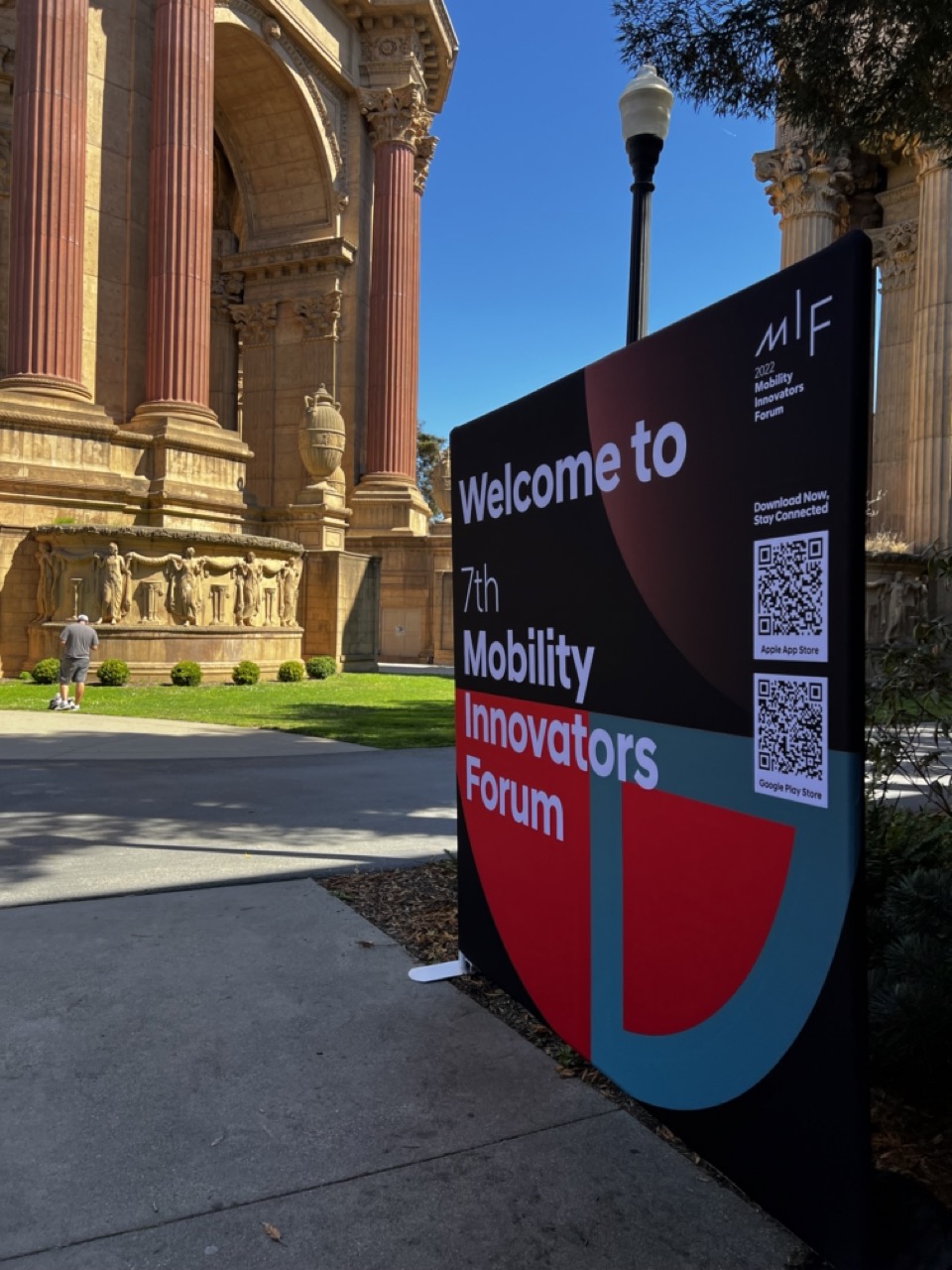
The Palace of Fine Arts in San Francisco hosted the 2022 Mobility Innovators Forum (MIF), a gathering of leaders to explore mobility's future. The event brought together innovators, startups, investors, and public sector leaders to discuss perspectives on shaping mobility ecosystems.


1. Overall Rating (0–10) — 6.8
This photograph captures a striking juxtaposition between modern event branding and historic architecture, creating a narrative of innovation meeting tradition. The bold signage for the 7th Mobility Innovators Forum dominates the frame, drawing attention to the contemporary purpose of the space, while the classical columns and sculptural details of the building provide a rich, textured backdrop. While the image succeeds in conveying context and place, the composition feels slightly unbalanced, and the bright sunlight flattens some of the visual nuance.
2. Composition (0–10) — 6.5
The sign is positioned off-center, creating a dynamic diagonal that leads the eye toward the architectural structure. However, the wide angle includes excessive foreground pavement and an unbalanced distribution of visual weight, with the building’s grandeur partially obscured.
3. Lighting (0–10) — 7.5
Strong, direct sunlight enhances contrast and defines the textures of both the stone and the sign. The clear blue sky provides a clean backdrop, allowing the vibrant colors of the sign to pop, though some areas of the frame are slightly overexposed.
4. Color & Tone (0–10) — 7.0
The bold red and teal of the sign contrast effectively with the warm beige of the architecture and the deep blue sky. The palette is vibrant and modern, though the overall tonal range is limited by the harsh midday light.
5. Creativity (0–10) — 7.0
The image creatively juxtaposes old and new, using the architectural setting as a metaphor for the forum’s forward-thinking mission. The inclusion of QR codes and branding details adds a layer of contemporary context.
6. Technical Quality (0–10) — 8.0
Sharp focus across the frame, clean details in the sign and building, and proper exposure in the well-lit conditions contribute to a technically strong image.
7. Emotional Impact (0–10) — 6.0
The photo conveys a sense of anticipation and progress, but the impersonal nature of the signage and the lack of human interaction slightly dampen its emotional resonance. It feels more like documentation than a moment of connection.


1. Overall Rating (0–10) — 7.0
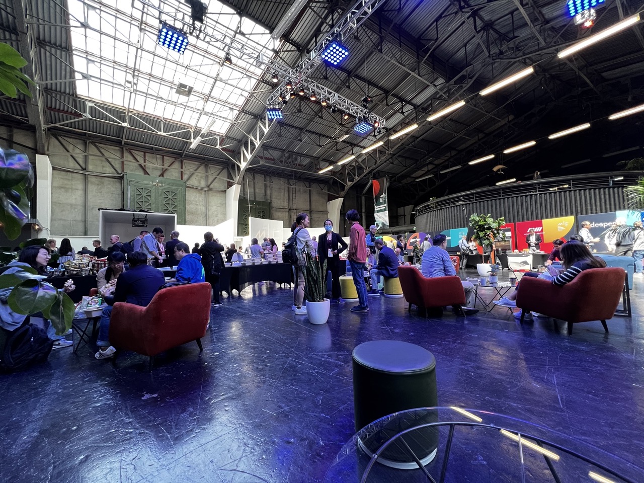
This image captures the vibrant energy of a modern event space within a repurposed industrial hall, where natural light floods through the skylight and contrasts with the cool blue glow of stage lighting. The composition effectively conveys movement and community, with people engaged in conversation and networking. While the scene feels authentic and dynamic, the visual clutter and competing light sources slightly diminish the image’s clarity and emotional cohesion.
2. Composition (0–10) — 6.5
The wide-angle perspective captures the expansive space, but the inclusion of foreground elements like the stool and glass table disrupts visual flow. The placement of people and furniture creates a sense of depth, though the lack of a clear focal point leaves the viewer’s eye wandering.
3. Lighting (0–10) — 7.0
Natural light from the skylight provides a bright, airy quality, while the blue stage lights add a modern, atmospheric edge. The interplay of warm and cool tones creates visual interest, though the reflections on the glossy floor introduce distracting glare.
4. Color & Tone (0–10) — 7.0
The rich red of the armchairs stands out against the dark floor and cool ambient lighting, creating a bold contrast. The overall palette is balanced, with the natural tones of the industrial structure grounding the more vibrant accents.
5. Creativity (0–10) — 7.0
The fusion of industrial architecture with contemporary event design is compelling and well-executed. The image tells a story of innovation and connection, using light and space to evoke a sense of dynamic community.
6. Technical Quality (0–10) — 8.0
The image is sharp and well-exposed, with clean details throughout. The camera’s ability to capture both bright and low-light areas without significant loss of clarity is impressive.
7. Emotional Impact (0–10) — 6.5
The photograph evokes a sense of engagement and collaboration, inviting the viewer into a moment of shared experience. While the atmosphere is lively, the lack of a central human subject limits the depth of emotional connection.


1. Overall Rating (0–10) — 6.0
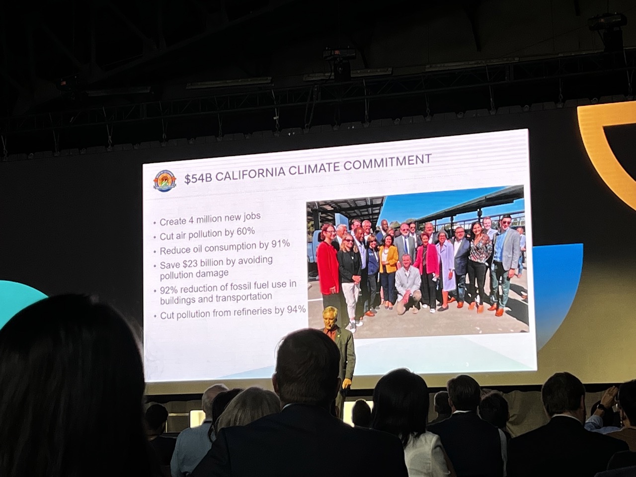
This photograph captures a moment of political advocacy within a formal presentation, emphasizing California’s climate goals with a blend of data and human presence. The image succeeds in conveying the gravity and scale of the initiative, though its documentary nature limits its aesthetic impact. While the composition is functional and informative, it lacks the visual tension or emotional resonance to elevate it beyond a straightforward record of an event.
2. Composition (0–10) — 5.5
The frame is cluttered with foreground silhouettes and stage elements, creating a layered but distracting view. The presentation slide is the clear focal point, but the audience’s presence disrupts visual clarity.
3. Lighting (0–10) — 6.0
The stage lighting is bright and even, ensuring the slide is clearly visible, though the audience area remains dimly lit. The contrast between the illuminated screen and shadowed foreground adds depth but also emphasizes the disconnect between observer and subject.
4. Color & Tone (0–10) — 5.5
The palette is dominated by the cool whites and blues of the screen, with warm accents from the slide’s photograph. The overall tone is neutral and corporate, lacking atmospheric warmth or visual dynamism.
5. Creativity (0–10) — 5.0
The image functions as a straightforward documentary capture rather than a creative interpretation. While the juxtaposition of the speaker, audience, and projected image offers narrative potential, the execution remains conventional and unremarkable.
6. Technical Quality (0–10) — 7.0
The image is sharp and well-exposed, with clear legibility of the slide’s text and details in the photograph. Focus is adequate, though slight motion blur in the audience suggests a fast-moving environment.
7. Emotional Impact (0–10) — 5.0
The photograph conveys a sense of urgency and institutional purpose, but the distance created by the audience’s silhouettes and the impersonal setting limits emotional engagement. It informs more than it inspires.


1. Overall Rating (0–10) — 6.8
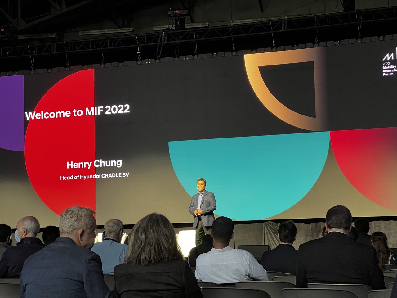
This photograph effectively captures the energy of a corporate event, with a clear focus on the speaker and the vibrant stage design. The bold colors and dynamic geometric shapes on the screen create visual interest, while the audience’s presence grounds the scene in reality. However, the image feels slightly overexposed and lacks the subtle tonal depth that would elevate it from a simple documentation to a compelling visual statement.
2. Composition (0–10) — 6.5
The speaker is well-positioned near the center, drawing the eye, while the audience in the foreground adds depth. The large screen dominates the background, creating a strong visual anchor, though the asymmetrical layout of the graphics slightly disrupts balance.
3. Lighting (0–10) — 6.0
Stage lighting highlights the speaker effectively, but the overhead lighting creates a flat, slightly harsh illumination across the audience and stage. The contrast between the bright screen and the darker venue results in some loss of detail in the shadows.
4. Color & Tone (0–10) — 7.5
The use of bold, saturated colors—red, teal, and purple—on the screen creates a modern and energetic palette. The contrast between the vivid graphics and the muted tones of the audience and venue enhances the visual impact, though the overall color balance feels slightly uneven.
5. Creativity (0–10) — 7.0
The graphic design of the stage backdrop is striking and contemporary, reflecting the innovative theme of the event. The composition leverages the contrast between the high-energy presentation and the quiet audience, creating a narrative of engagement and forward-thinking.
6. Technical Quality (0–10) — 7.0
The image is sharp and well-focused, particularly on the speaker and the screen. However, the high contrast and bright screen slightly overwhelm the exposure, leading to some loss of detail in the darker areas.
7. Emotional Impact (0–10) — 6.5
The photograph conveys a sense of professionalism and forward momentum, fitting for a corporate innovation forum. While it captures the moment’s significance, the emotional resonance is moderate—more informative than deeply moving.
Loading map...