The Android Dev Summit 2022 covered topics such as modern Android development, Google's developer tools (Android Studio, Kotlin, Jetpack libraries), and the introduction of Jetpack Compose, a recommended UI framework for new Android applications. The summit also explored Wear OS updates, including enhanced wearable UI components and templates for Android Studio, and Android Auto features with improved Google Assistant integration and support for third-party video streaming apps.
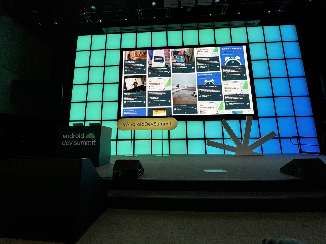

1. Overall Rating (0–10) — 6.0
This photograph captures the atmosphere of a tech conference stage with a blend of digital energy and corporate precision. The glowing backdrop and vibrant hashtag sign create a sense of anticipation and innovation, while the darkened audience space grounds the scene in reality. However, the image feels slightly static and lacks dynamic engagement—its strength lies in the visual language of the event rather than emotional resonance or compositional drama.
2. Composition (0–10) — 6.0
The stage is centered with a balanced arrangement of signage and the large screen, but the foreground and background are heavy with dark space, which reduces visual focus. The wide-angle perspective flattens depth, making the stage feel distant despite its prominence.
3. Lighting (0–10) — 7.0
The backlighting creates a strong contrast between the illuminated stage and the darkened auditorium, enhancing the futuristic tone. The gradient of teal to blue on the screen wall adds depth and mood, while the screen’s content is clearly visible and well-lit.
4. Color & Tone (0–10) — 7.0
The cool blue and green hues dominate with a cohesive, modern palette that reinforces the tech-oriented theme. The color temperature is consistent and intentional, though the overall tone leans slightly sterile, with limited warmth to add contrast or emotional nuance.
5. Creativity (0–10) — 6.0
The image effectively communicates the context of the Android Dev Summit through branding and design, but it functions more as a documentation of the event than an expressive interpretation. The collage on the screen adds visual interest, but the overall concept lacks a unique artistic twist.
6. Technical Quality (0–10) — 7.0
The image is sharp and well-exposed in the key areas—particularly the screen and signage—with minimal noise despite low-light conditions. Focus is accurate, and the framing captures the full scope of the stage setup.
7. Emotional Impact (0–10) — 5.5
While the image conveys professionalism and anticipation, it doesn’t evoke a strong emotional response. The emptiness of the stage and lack of human presence create a sense of detachment, making it feel more like a venue than a lived moment.
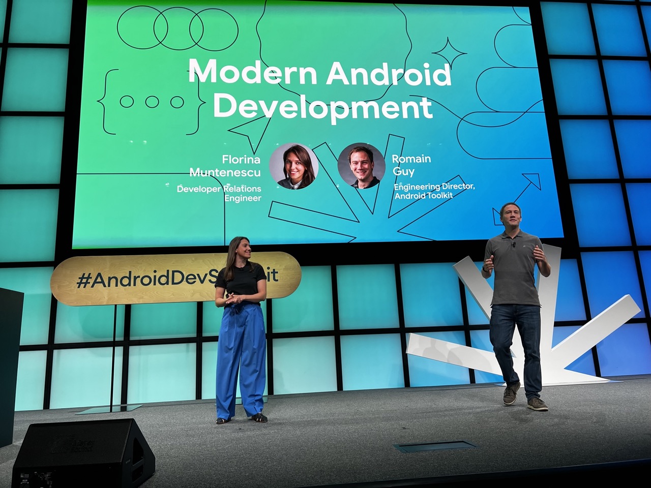

1. Overall Rating (0–10) — 7.0
This image captures a vibrant moment from a tech conference, where the energy of modern software development is brought to life through dynamic presentation design and engaging speakers. The stage’s bold color gradient and clean typography lend a sense of innovation and professionalism, while the speakers’ relaxed yet confident presence adds a human touch. The composition feels slightly unbalanced due to the placement of the man on the right, but the overall atmosphere remains compelling and forward-looking.
2. Composition (0–10) — 6.5
The stage is framed with strong geometric lines, but the placement of the male speaker on the far right creates an asymmetry that draws attention away from the central focus. The woman on the left provides balance, but the visual weight of the large screen dominates the scene.
3. Lighting (0–10) — 7.5
The stage lighting is bright and even, effectively illuminating the speakers and ensuring the screen’s content is clearly visible. The gradient background is well-lit, enhancing the visual appeal without causing glare or harsh shadows.
4. Color & Tone (0–10) — 8.0
The vibrant teal-to-blue gradient evokes a modern, tech-savvy mood, complemented by the clean white text and subtle geometric accents. The color palette is cohesive and energetic, reinforcing the theme of innovation.
5. Creativity (0–10) — 7.5
The design of the stage and screen reflects a contemporary, minimalist aesthetic that aligns well with the subject of modern Android development. The use of abstract shapes and clean typography adds a layer of visual sophistication.
6. Technical Quality (0–10) — 8.0
The image is sharp, with clear focus on both the speakers and the background screen. The depth of field is well-managed, and the details in the clothing, text, and stage elements are crisp and well-defined.
7. Emotional Impact (0–10) — 6.5
The image conveys enthusiasm and professionalism, inviting viewers into a world of technological advancement. While the emotional resonance is strong in terms of energy and purpose, it remains somewhat distant due to the formal setting and lack of personal connection.
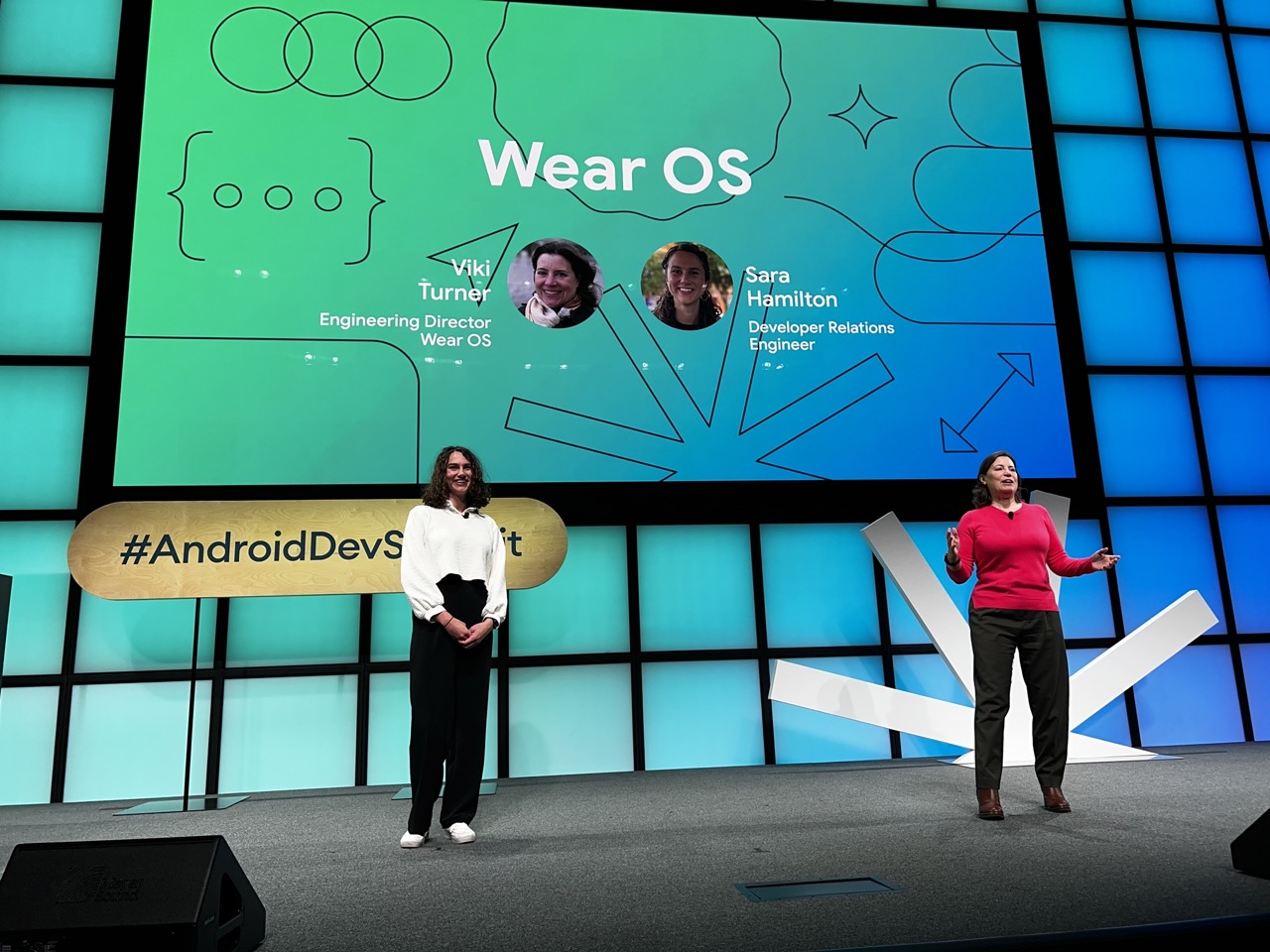

1. Overall Rating (0–10) — 7.0
This photograph captures a dynamic tech presentation with a clear sense of purpose and professionalism. The stage design and vibrant backdrop effectively communicate the energy of a modern developer event. While the lighting and composition are strong, the image feels slightly overexposed in the background, which slightly dilutes the visual impact of the presenters and the screen’s details.
2. Composition (0–10) — 7.5
The two speakers are well-positioned, creating a balanced visual flow from left to right. The large screen dominates the background, anchoring the scene, while the stage elements provide structure and depth. The inclusion of the hashtag sign adds context and grounding, though the framing slightly cuts off the full stage, reducing the sense of scale.
3. Lighting (0–10) — 7.0
The stage lighting is bright and even, ensuring the subjects are well-illuminated and the screen content is clearly visible. The cool blue and green tones of the backdrop create a modern, tech-forward atmosphere, though the high-key lighting slightly flattens the depth of the scene.
4. Color & Tone (0–10) — 7.5
The color palette is vibrant and cohesive, with a smooth gradient from teal to blue that complements the tech theme. The contrast between the warm red of the speaker’s sweater and the cool background enhances visual interest and draws attention to the presenter on the right.
5. Creativity (0–10) — 7.0
The image effectively captures a moment of innovation and collaboration, with the graphic design of the screen adding a layer of storytelling. The use of circular elements and clean lines reflects the modern aesthetic of the Wear OS brand, making the presentation feel both professional and approachable.
6. Technical Quality (0–10) — 8.0
Sharp focus is maintained across the frame, with clear details on the speakers, the screen, and the stage signage. The exposure is well-handled overall, though the background screen is slightly overexposed, leading to minor loss of detail in the brightest areas.
7. Emotional Impact (0–10) — 7.0
The image conveys enthusiasm and engagement, capturing the energy of a live tech announcement. The presenters’ expressions and body language suggest confidence and passion, creating a sense of connection with the audience and inviting viewers into the world of Android development.
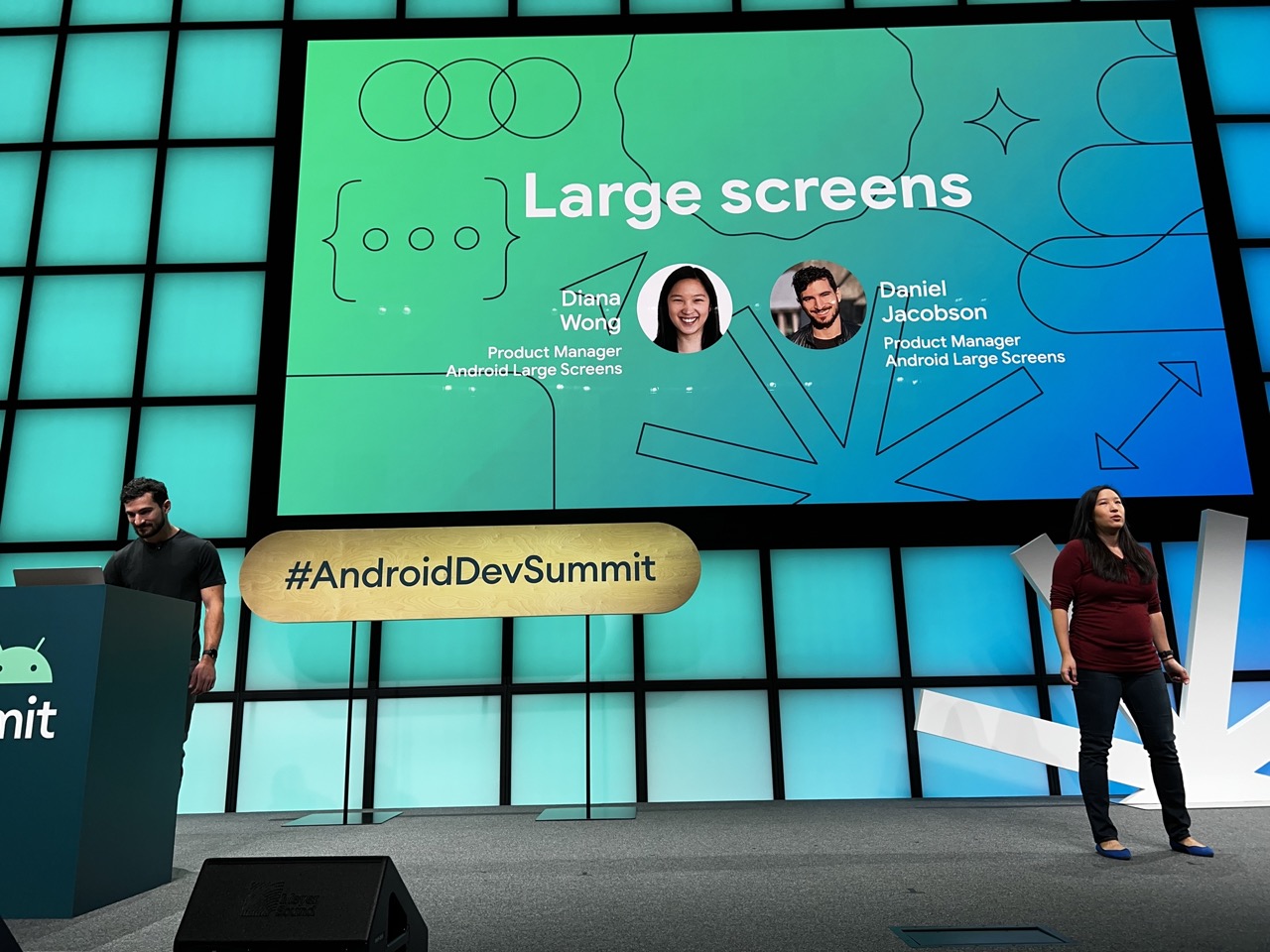

1. Overall Rating (0–10) — 7.0
This image captures the energy of a tech conference presentation with a strong sense of context and purpose. The stage design and branding are clean and professional, effectively communicating the event’s identity. While the composition is functional and well-organized, it lacks a compelling visual narrative, feeling more like a documentation than a striking photograph. The balance between the speakers and the large screen works well, but the scene could benefit from a more dynamic perspective or lighting to elevate its artistic impact.
2. Composition (0–10) — 7.5
The stage is framed symmetrically, with the large screen as the dominant focal point and the two speakers placed to either side, creating visual balance. The use of negative space and the clear separation between foreground and background enhances readability. The central placement of the hashtag sign adds a compositional anchor, guiding the viewer’s eye across the scene.
3. Lighting (0–10) — 7.0
The lighting is even and bright, typical of a conference setting, with strong illumination on the stage and the screen. The cool, teal-toned backlit panels provide a modern aesthetic, while the overhead lights keep the subjects clearly visible. However, the lack of directional or dramatic lighting limits the image’s depth and mood.
4. Color & Tone (0–10) — 8.0
The palette is cohesive and modern, dominated by a gradient of teal and blue tones that reinforce the Android branding. The clean contrast between the dark stage elements and the vibrant screen enhances visual clarity. The warm red of the woman’s top adds a subtle pop of color, drawing attention without disrupting the overall harmony.
5. Creativity (0–10) — 6.5
While the image is technically sound and effectively communicates its subject, it follows a conventional event photography style. The creative elements—such as the graphic design of the screen and the hashtag display—are strong, but the photograph itself does not push beyond standard documentation. There’s little sense of narrative or personal vision.
6. Technical Quality (0–10) — 8.5
The image is sharp and well-exposed, with clean details throughout. Focus is consistent across the scene, and the depth of field is appropriate for a wide shot. The digital clarity and lack of noise suggest high-quality equipment and good lighting conditions.
7. Emotional Impact (0–10) — 6.0
The image conveys professionalism and enthusiasm for technology, but it remains emotionally neutral. It feels more informative than evocative, appealing to the viewer’s intellect rather than their emotions. The expressions of the speakers are pleasant but not particularly expressive, and the overall atmosphere is one of controlled presentation rather than passionate engagement.
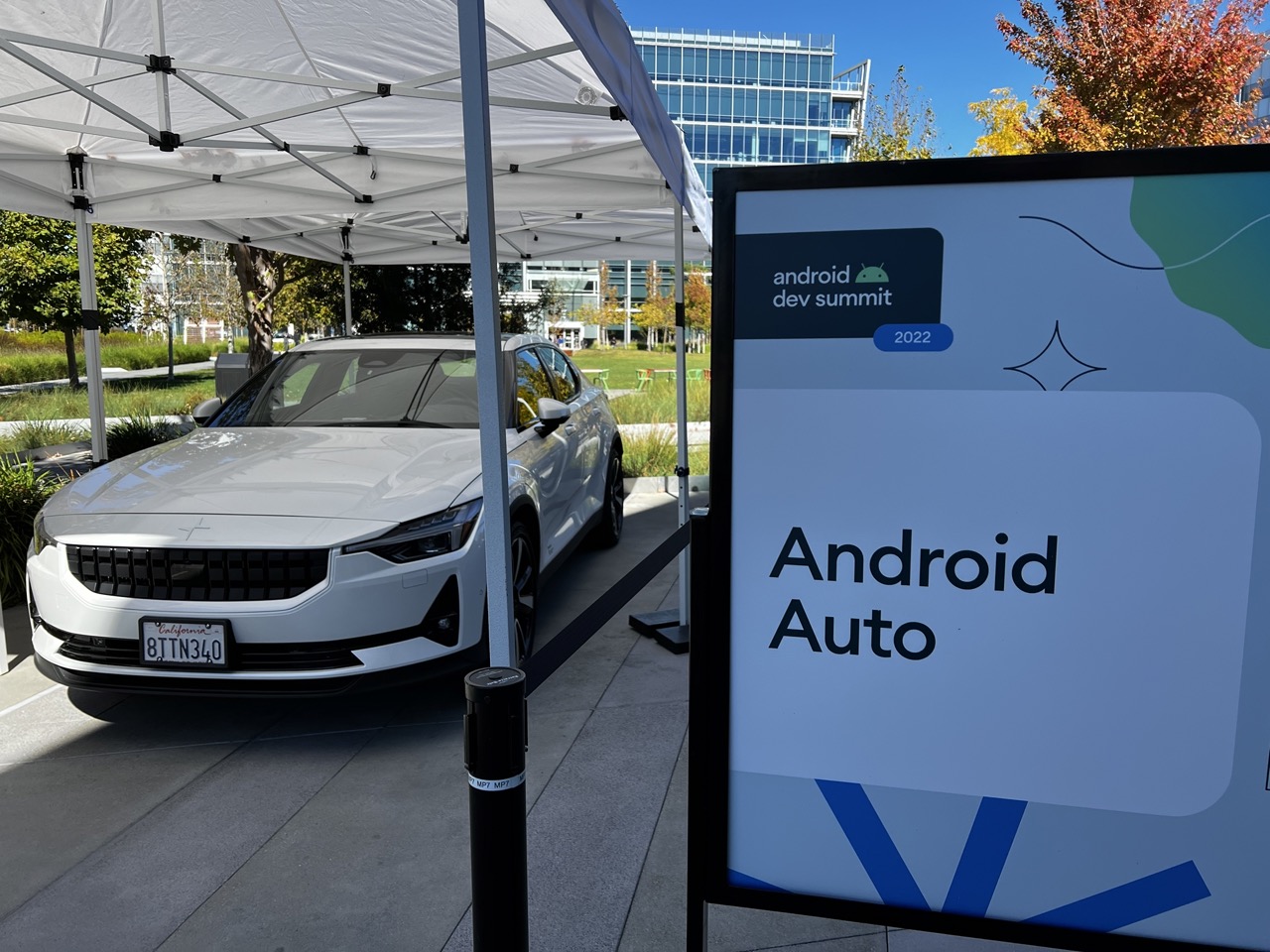

1. Overall Rating (0–10) — 7.0
This photograph captures a sleek, modern moment at the Android Dev Summit 2022, where automotive innovation meets digital branding. The white Polestar 2 under the tent stands as a polished centerpiece, its clean lines complementing the crisp, minimalist design of the "Android Auto" sign. While the image effectively communicates its event context, the framing feels slightly disjointed, with the sign dominating the right side and the car partially obscured by structural elements. A tighter composition and more intentional balance could elevate the visual narrative.
2. Composition (0–10) — 6.0
The sign occupies the right foreground, creating a visual imbalance, while the car is partially blocked by the tent pole and canopy. A more centered or symmetrical arrangement would improve harmony.
3. Lighting (0–10) — 8.0
Bright, natural daylight enhances clarity and highlights the car’s reflective surface. The shadows are well-defined, suggesting a clear sky and strong sun, which adds depth and dimension.
4. Color & Tone (0–10) — 7.5
The cool blue and white tones of the sign harmonize with the car’s metallic finish, while the autumnal tree in the background introduces a warm contrast. The overall palette is clean and modern, supporting the tech-forward theme.
5. Creativity (0–10) — 6.5
The image functions as a strong event documentation piece, but lacks a unique visual perspective. The straightforward, promotional framing limits artistic interpretation.
6. Technical Quality (0–10) — 8.5
Sharp focus, clear details, and balanced exposure demonstrate strong technical execution. The license plate and branding are legible, and there are no visible artifacts.
7. Emotional Impact (0–10) — 6.0
The image conveys a sense of innovation and progress, but the direct, functional presentation keeps the viewer at a distance. It informs rather than inspires, lacking emotional resonance beyond its contextual purpose.
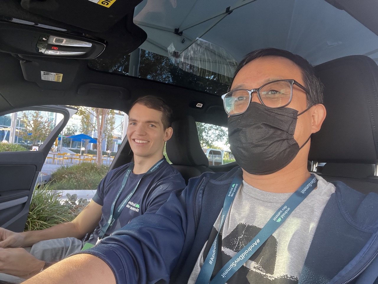

1. Overall Rating (0–10) — 7.0
This candid car selfie captures a moment of genuine camaraderie between two attendees at the Android Dev Summit, blending professionalism with personal warmth. The natural lighting and relaxed expressions lend authenticity to the scene, though the slightly cluttered interior and awkward framing undercut its compositional polish. The image succeeds as a personal memento, documenting a shared experience with quiet intimacy.
2. Composition (0–10) — 6.0
The frame is dominated by the foreground subject, leaving the passenger slightly off-center and partially obscured. The angle feels spontaneous, with the car’s interior elements—roof, headrest, and window—creating a tight, confined feel that limits visual breathing room.
3. Lighting (0–10) — 7.0
Natural daylight streams through the windshield and side window, creating balanced illumination with soft shadows. The light is even and flattering, highlighting facial features and the lanyards without harshness, though the overhead dome light adds a subtle, slightly artificial contrast.
4. Color & Tone (0–10) — 6.5
The palette is grounded in cool blues and grays from the clothing and car interior, with warm accents from the sunlight and greenery outside. While the colors are true to life, the overall tone is somewhat flat, lacking the vibrancy that would elevate the image’s visual appeal.
5. Creativity (0–10) — 7.0
The photo’s strength lies in its authenticity—capturing a real moment between colleagues at a tech event. The inclusion of event lanyards adds narrative context, grounding the image in a specific time and place, though the execution remains conventional rather than artistically bold.
6. Technical Quality (0–10) — 7.5
The image is sharp and clear, with good focus on the subjects. The depth of field isolates the two men effectively, and the exposure is well-managed despite the mixed lighting conditions inside the car.
7. Emotional Impact (0–10) — 7.5
There’s a strong sense of connection and shared joy, particularly in the passenger’s broad smile. The viewer is drawn into the moment, feeling a sense of inclusion in a friendly, professional gathering—making the image both relatable and emotionally resonant.
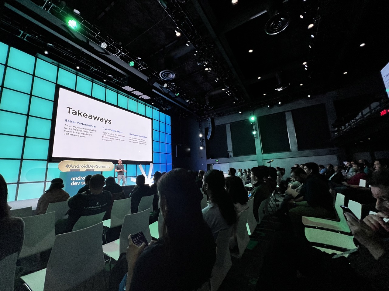

1. Overall Rating (0–10) — 6.0
This photograph captures the energy of a tech conference with a strong sense of atmosphere and context. The contrast between the brightly lit stage and the dim audience area creates a dramatic, immersive feel, emphasizing the focus on the presentation. While the image effectively conveys the event’s purpose and mood, its slightly cluttered composition and lack of a clear focal point prevent it from achieving greater visual cohesion.
2. Composition (0–10) — 5.5
The wide-angle perspective captures the full scope of the event but introduces distortion and visual clutter. The audience in the foreground partially obscures the view, and the stage is slightly off-center, creating an imbalance.
3. Lighting (0–10) — 7.0
The lighting is dynamic, with strong contrast between the bright stage and the darkened audience area. The teal and green stage lights add a modern, tech-oriented mood, while the spotlights enhance depth and focus.
4. Color & Tone (0–10) — 6.5
The cool teal and green hues dominate the scene, creating a cohesive, futuristic palette. However, the overall tone is somewhat flat due to the high contrast and lack of color variation in the audience area.
5. Creativity (0–10) — 6.0
The image successfully captures the essence of a developer summit with a sense of authenticity and immediacy. The choice of perspective and lighting adds visual interest, though the composition lacks a more intentional narrative focus.
6. Technical Quality (0–10) — 7.5
The image is sharp and well-exposed in the key areas, with clear details on the screen and stage. The low-light environment is handled well, with minimal noise despite the dark surroundings.
7. Emotional Impact (0–10) — 5.5
The photograph conveys the seriousness and engagement of a professional tech gathering, but the viewer’s emotional connection is limited by the distance created by the audience framing and the impersonal setting.
Loading map...