Mobile World Congress (MWC) 2023 took place in Barcelona, Spain with nearly 90,000 attendees, featuring announcements on 5G acceleration, reality+, OpenNet, Digital Everything, and FinTech.
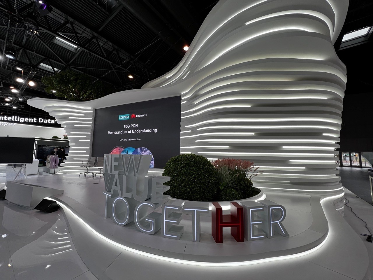

1. Overall Rating (0–10) — 7.5
This image captures the sleek, futuristic atmosphere of a high-tech trade show booth, where innovation and corporate collaboration take center stage. The interplay of light, form, and branding creates a visually compelling narrative of progress and unity. While the scene is striking in its design and clarity, the lack of human presence tempers its emotional resonance, leaving it more as a showcase than a story.
2. Composition (0–10) — 7.0
The sweeping curves of the illuminated structure draw the eye dynamically across the frame, creating a sense of movement. The placement of the large “NEW VALUE TOGETHER” sign anchors the foreground, while the screen and background elements provide context and depth. The wide-angle perspective enhances the scale but slightly distorts the edges.
3. Lighting (0–10) — 8.5
The strategic use of integrated LED lighting within the sculptural white panels creates a luminous, futuristic glow that defines the form and highlights the booth’s architectural elegance. The contrast between the bright, layered light and the dark ceiling enhances depth and drama.
4. Color & Tone (0–10) — 7.5
The monochromatic white and gray palette is punctuated by the bold red “H” in “TOGETHER,” serving as a strong focal point. The cool, neutral tones reinforce the technological theme, while the greenery introduces a subtle organic contrast that softens the otherwise sterile environment.
5. Creativity (0–10) — 8.0
The design is highly original, blending architectural sculpture with digital branding in a way that feels both immersive and purposeful. The integration of light and form reflects a forward-thinking vision, turning a corporate event into a visual statement of innovation.
6. Technical Quality (0–10) — 8.0
The image is sharp, well-exposed, and detailed, with clean lines and minimal noise. The wide-angle lens captures the full scope of the installation without significant distortion in the central area.
7. Emotional Impact (0–10) — 6.5
While the image conveys a sense of ambition and modernity, the absence of people or interaction limits its emotional warmth. It inspires awe for the design and technology but offers little personal connection.
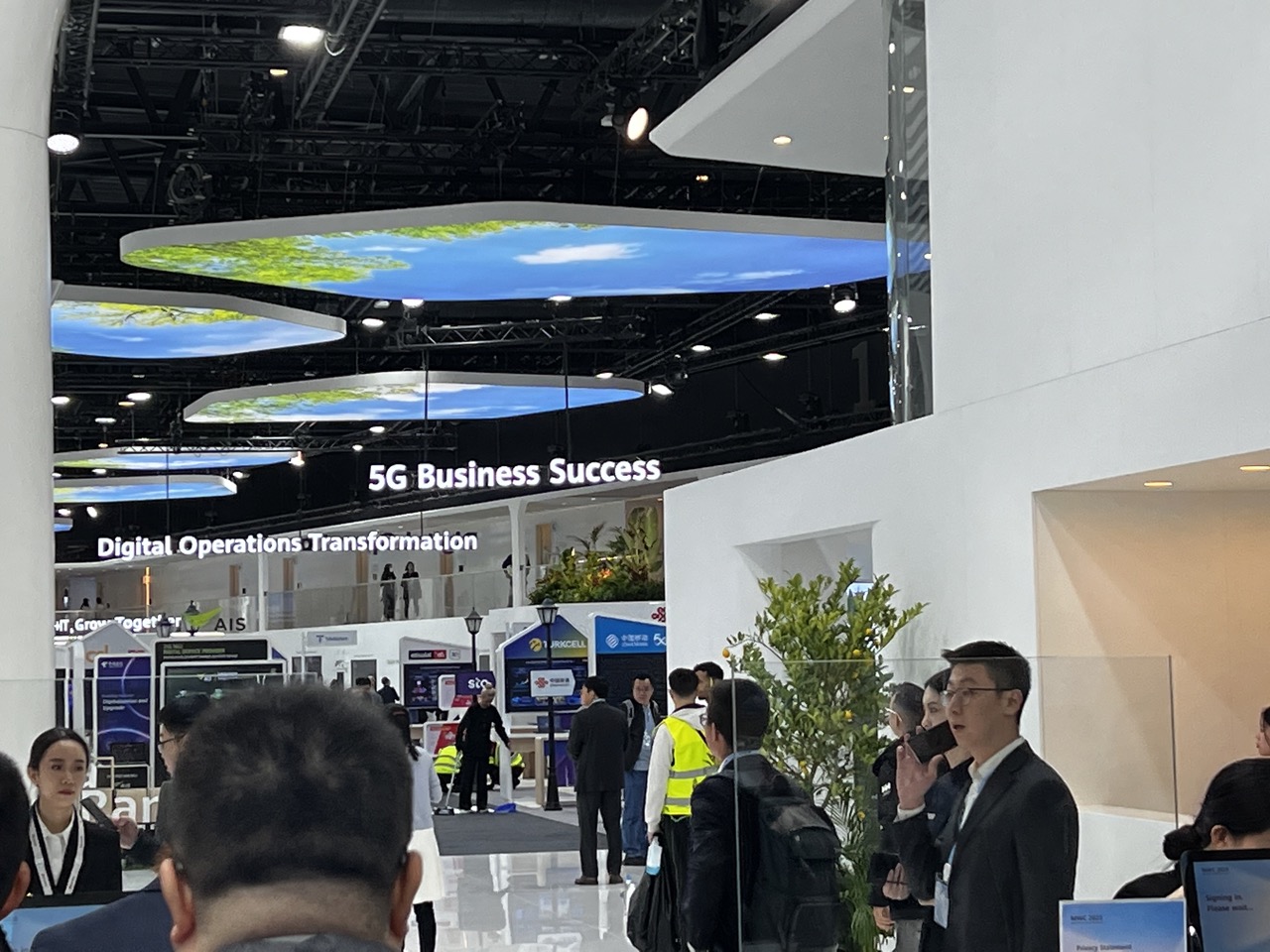

1. Overall Rating (0–10) — 6.0
This photograph captures the bustling energy of a tech expo, where corporate messaging and human activity intersect in a high-gloss environment. The overhead digital displays and signage convey a sense of innovation and scale, but the image feels more like a snapshot than a composed statement—overwhelmed by visual noise and lacking a clear focal point. While the scene is rich with context, it struggles to distill a singular emotional or artistic vision.
2. Composition (0–10) — 5.0
The frame is cluttered with foreground heads and mid-ground activity, creating a sense of visual chaos. The signage and overhead screens dominate the upper half, but the lower third lacks a coherent anchor, resulting in an unbalanced and disorienting arrangement.
3. Lighting (0–10) — 6.0
The space is brightly lit with even, functional overhead lighting, typical of an exhibition hall. While this ensures clarity and visibility, it also flattens the scene, diminishing depth and shadow play, which limits the mood and atmosphere.
4. Color & Tone (0–10) — 5.5
The palette is dominated by neutral whites and grays, punctuated by the blue and green hues of the digital screens and the occasional pop of a yellow safety vest. The colors are clean but lack vibrancy, contributing to a sterile, corporate aesthetic.
5. Creativity (0–10) — 5.5
The image documents a moment in time with a straightforward, observational approach. While the concept of showcasing a 5G business exhibit is compelling, the execution lacks originality—there’s little narrative or stylistic flair to distinguish it from a standard event photo.
6. Technical Quality (0–10) — 7.5
The focus is generally sharp, particularly on the signage and central figures, and the image is free from major technical flaws like blur or noise. However, the high level of activity and ambient light create a busy scene that undermines clarity.
7. Emotional Impact (0–10) — 5.0
The photograph conveys the energy of a corporate event but fails to evoke a deeper emotional response. The anonymity of the crowd and the impersonal environment create distance, leaving the viewer as a passive observer rather than an engaged participant.
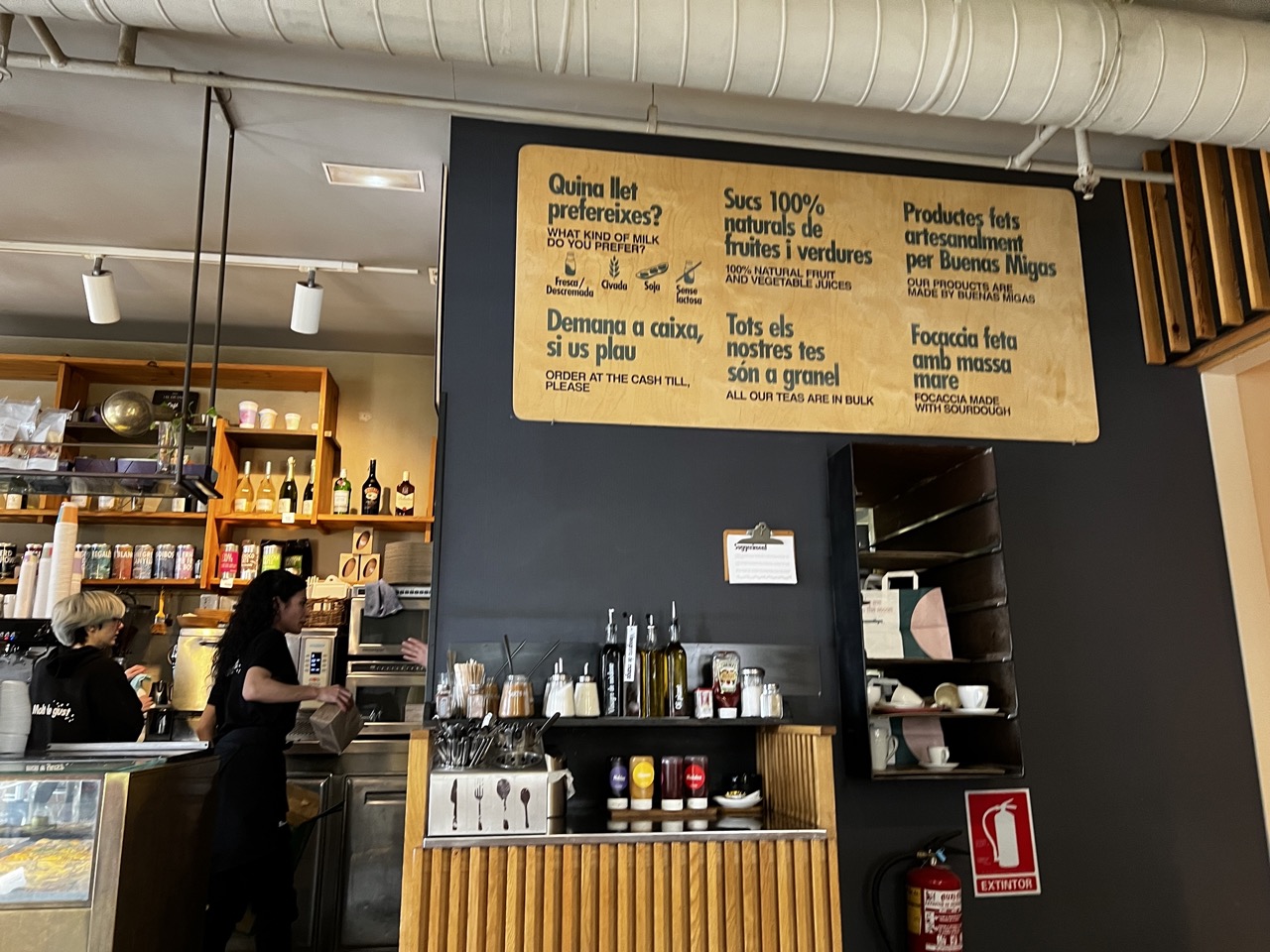

1. Overall Rating (0–10) — 6.8
This photograph captures the bustling authenticity of a modern café, where function and branding converge in a lived-in space. The warm wood tones and handwritten-style signage lend a welcoming, artisanal feel, while the staff at work injects a sense of real-time energy. The image succeeds as a candid document of everyday commerce, though its visual impact is tempered by a lack of compositional cohesion and overexposure in the background.
2. Composition (0–10) — 6.0
The frame is cluttered with objects and text, creating a busy visual field. The central sign dominates the upper half, drawing attention away from the human element on the left, while the uneven balance between the counter and shelving disrupts visual flow.
3. Lighting (0–10) — 6.5
The lighting is functional and even, with overhead fixtures providing clear illumination. However, the flatness of the light diminishes depth and texture, and the bright white ceiling pipes reflect light in a way that slightly overpowers the scene.
4. Color & Tone (0–10) — 7.0
The palette is grounded in earthy browns, deep blacks, and warm wood tones, creating a cohesive and inviting atmosphere. The muted color scheme is appropriate for the café setting, though the lack of vibrant accents limits visual dynamism.
5. Creativity (0–10) — 6.5
The image reflects a strong sense of place and branding, using signage and layout to tell a story of artisanal values. While not highly stylized, the approach is thoughtful and authentic, capturing the essence of a working café rather than posing for the camera.
6. Technical Quality (0–10) — 7.5
The image is sharp and clear, with good focus on the central counter and signage. The exposure is generally well-balanced, though the bright overhead lights cause slight glare and overexposure in the upper portion.
7. Emotional Impact (0–10) — 6.0
The photograph evokes a sense of quiet activity and routine, inviting the viewer into a familiar, comfortable space. While it captures the atmosphere of the café, the lack of a strong focal point or narrative moment keeps the emotional connection somewhat distant.
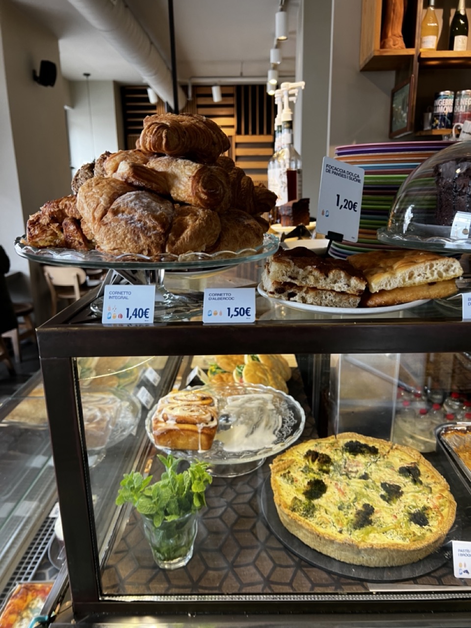

1. Overall Rating (0–10) — 6.8
This image captures the inviting warmth of a café’s pastry display, where the golden textures of croissants and savory tarts evoke a sense of morning indulgence. The composition balances abundance and detail, though the clutter of price tags and background elements slightly detracts from the visual harmony. While the scene feels authentic and appetizing, it lacks the refined staging that would elevate it from documentation to artistry.
2. Composition (0–10) — 6.0
The framing is slightly cluttered, with price tags and background shelves competing for attention. A tighter focus on the pastry display would enhance visual clarity and balance.
3. Lighting (0–10) — 7.0
Natural, soft lighting highlights the textures of the baked goods, creating a warm and inviting atmosphere. The light direction is even, with minimal harsh shadows, enhancing the appeal of the food.
4. Color & Tone (0–10) — 7.5
The warm golden tones of the pastries contrast beautifully with the green mint and muted browns of the interior. The color palette feels cohesive and appetizing, with a slight cool undertone in the background that adds depth.
5. Creativity (0–10) — 6.5
The image functions as a strong documentary snapshot of a café’s offerings, but it leans more toward realism than conceptual storytelling. The composition suggests a casual moment rather than a deliberate artistic statement.
6. Technical Quality (0–10) — 8.0
Sharp focus on the foreground pastries, clean details, and good exposure across the frame. The glass case reflections are present but do not significantly detract from clarity.
7. Emotional Impact (0–10) — 7.0
The image evokes a sense of comfort and familiarity, appealing to the viewer’s senses of taste and nostalgia. It invites the viewer to imagine the aroma and flavor of freshly baked goods, creating a quiet emotional connection.
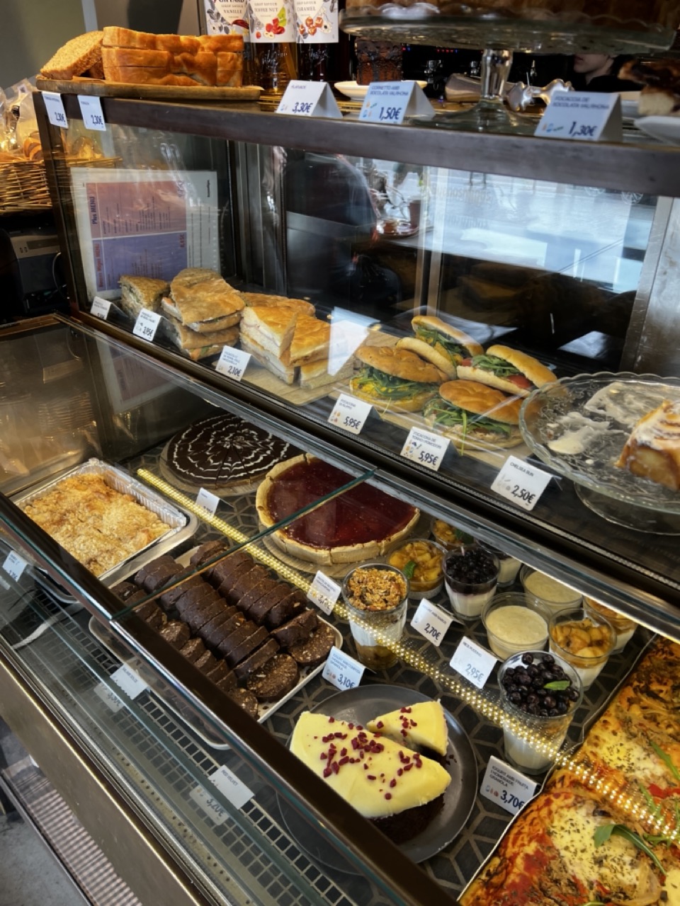

1. Overall Rating (0–10) — 6.8
This photograph captures the inviting abundance of a bakery display, where the variety of pastries and sandwiches speaks to a vibrant, everyday ritual of indulgence. The layered composition draws the eye through the glass case, emphasizing texture and detail, though the image’s potential for visual drama is slightly dampened by its candid, documentary feel. While it effectively conveys the warmth of a local café, it lacks the deliberate artistry to elevate it beyond mere documentation.
2. Composition (0–10) — 6.5
The diagonal lines of the display case create a dynamic flow, guiding the viewer’s gaze from the foreground pastries to the back shelves. However, the cluttered arrangement and reflections on the glass slightly disrupt visual harmony and focus.
3. Lighting (0–10) — 6.0
The interior lighting is functional and even, illuminating the food without harsh shadows. However, the reflections on the glass and the slightly flat tone reduce depth and atmospheric quality.
4. Color & Tone (0–10) — 7.0
A warm, golden palette enhances the appeal of the baked goods, with rich browns and vibrant reds in the desserts creating visual interest. The color balance is natural, though some areas appear slightly washed out due to lighting.
5. Creativity (0–10) — 6.5
The image successfully captures a slice of daily life with authenticity, showcasing a variety of textures and offerings. However, the lack of a distinct narrative or stylistic flair limits its originality.
6. Technical Quality (0–10) — 7.5
Sharp focus and clear detail allow the textures of the food to shine. The camera captures fine elements like the glaze on the cake and the crumb of the bread, though the reflections on the glass slightly compromise clarity.
7. Emotional Impact (0–10) — 6.0
The photograph evokes a sense of comfort and familiarity, tapping into the universal appeal of fresh baked goods. While it connects through relatable imagery, it stops short of stirring deeper emotional resonance.
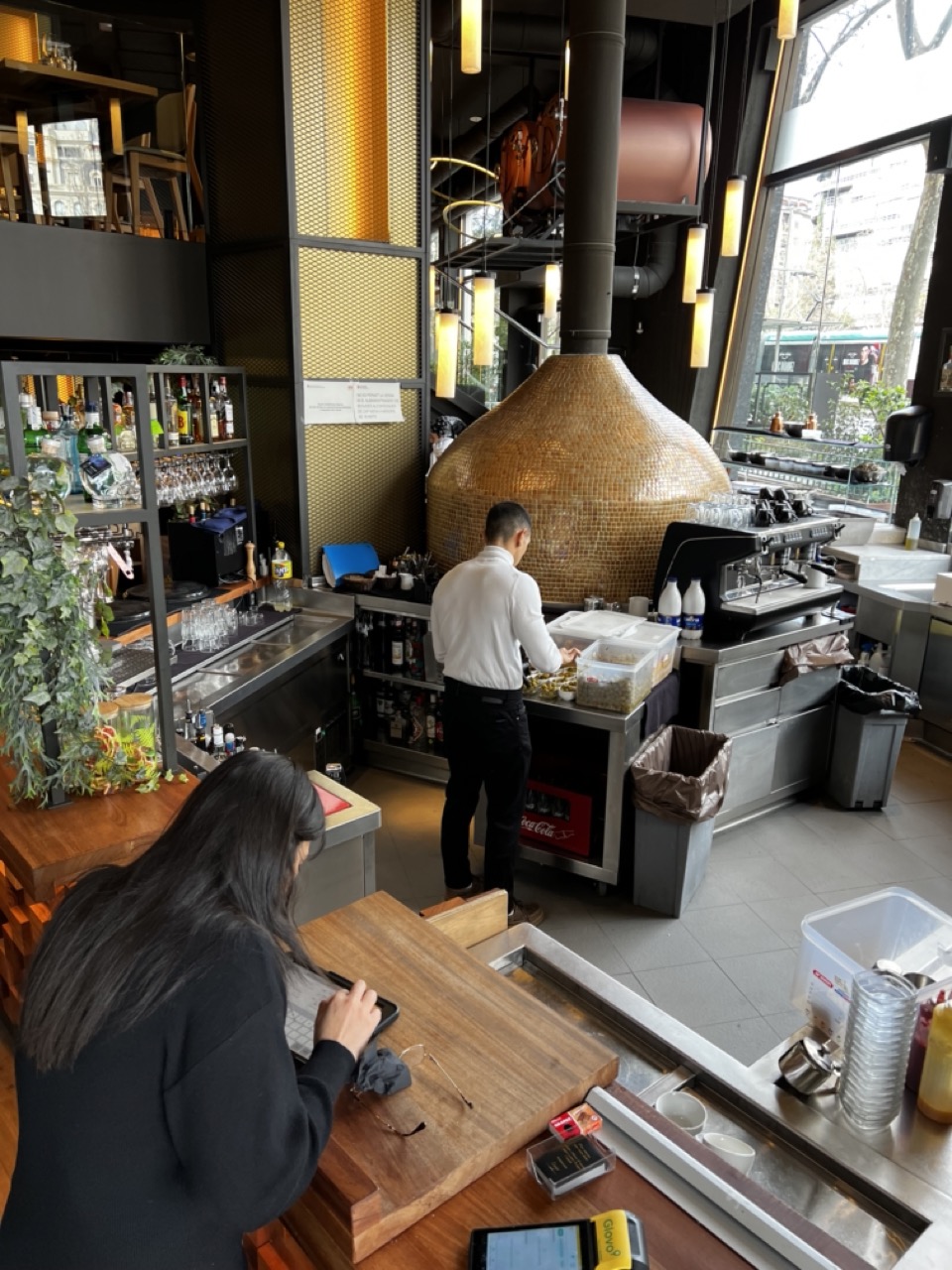

1. Overall Rating (0–10) — 6.8
This photograph captures the intimate rhythm of a modern café, where the warmth of human activity contrasts with the industrial design of the space. The composition draws the viewer into a quiet moment of service and focus, with the golden mosaic oven serving as a striking focal point. While the image effectively conveys a sense of place and routine, the slightly cluttered environment and flat lighting keep it from achieving a more elevated aesthetic.
2. Composition (0–10) — 6.5
The framing includes both foreground and background activity, creating depth, but the cluttered counter and overlapping elements in the lower right slightly disrupt visual flow. A tighter crop or clearer separation between the woman at the counter and the staff behind the bar would enhance balance.
3. Lighting (0–10) — 6.0
Natural light from the large window on the right illuminates the space, but the mix with warm overhead fixtures creates uneven tonal distribution. The highlights on the mosaic oven are strong, while the left side remains slightly underexposed, reducing overall atmospheric cohesion.
4. Color & Tone (0–10) — 6.5
The palette is grounded in neutral grays and metallics, punctuated by the warm golden tones of the oven and the dark wood of the counter. While the colors are harmonious, the lack of vibrancy gives the image a somewhat muted, documentary feel.
5. Creativity (0–10) — 6.0
The image captures a candid moment within a distinctive interior, blending architecture and daily life. The choice to include both the worker and the customer adds narrative, but the approach is observational rather than interpretive.
6. Technical Quality (0–10) — 7.5
The image is sharp and well-focused, with clean detail throughout. The depth of field is appropriate, keeping both the foreground and background elements clear, though minor noise is present in the darker areas.
7. Emotional Impact (0–10) — 6.0
The photograph evokes a sense of calm, everyday life in a curated urban space. While it conveys authenticity and quiet industry, it doesn’t elicit a strong emotional response—more a snapshot of routine than a moment of connection.
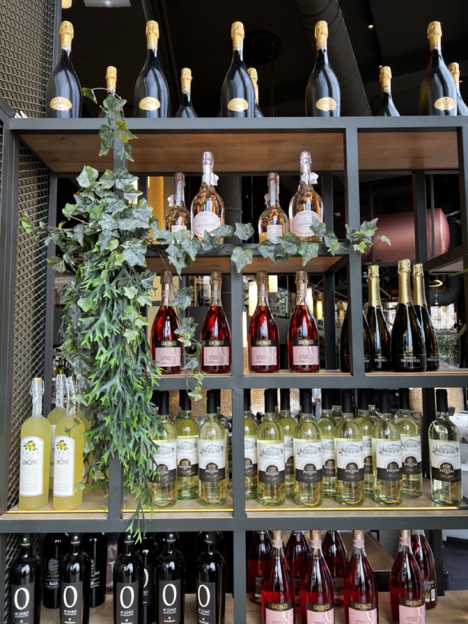

1. Overall Rating (0–10) — 7.5
This photograph captures a meticulously arranged wine display, exuding a sense of curated elegance and modern sophistication. The interplay of varied bottle shapes, labels, and the cascading greenery adds visual rhythm and texture, while the industrial-style shelving grounds the scene in a contemporary aesthetic. Though the composition is strong, the sheer volume of similar labels risks visual repetition, slightly diluting the impact of individual branding.
2. Composition (0–10) — 8.0
The grid-like shelving creates a structured, balanced framework, with the ivy adding organic contrast and visual flow. The subject is well-centered, and the use of leading lines from the shelves guides the eye through the layers, enhancing depth and organization.
3. Lighting (0–10) — 7.5
The lighting is warm and directional, accentuating the reflective surfaces of the glass bottles and highlighting the textures of the labels and foliage. Soft shadows add dimension without overpowering the scene, contributing to a welcoming, upscale ambiance.
4. Color & Tone (0–10) — 8.0
The palette harmonizes rich golds, deep reds, and soft greens with neutral black and wood tones, creating a visually cohesive and inviting atmosphere. The contrast between the dark bottles and the lighter labels enhances legibility and visual interest.
5. Creativity (0–10) — 7.0
While the concept is grounded in commercial presentation, the integration of natural elements like ivy and the strategic use of lighting elevate the image beyond a simple product shot. The arrangement suggests thoughtful curation, blending functionality with aesthetic appeal.
6. Technical Quality (0–10) — 8.5
The image is sharp and well-focused, with clean detail throughout. The depth of field is managed effectively, allowing both foreground and background elements to remain clear and engaging.
7. Emotional Impact (0–10) — 7.0
The photograph evokes a sense of refined indulgence and warmth, suggesting a welcoming space where quality and care are prioritized. It invites the viewer to imagine the experience of browsing a well-stocked, thoughtfully designed wine cellar or bar.
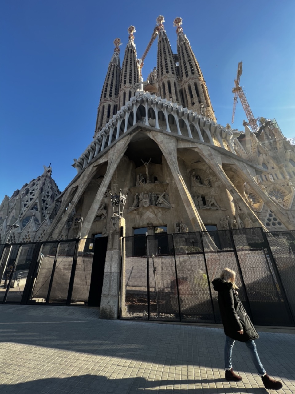

1. Overall Rating (0–10) — 7.5
This photograph captures the awe-inspiring scale and intricate detail of Sagrada Família under a brilliant blue sky, with a solitary figure adding a sense of human scale and quiet contemplation. The low-angle perspective emphasizes the cathedral’s soaring verticality and ongoing construction, evoking both reverence and the passage of time. While the composition is strong and the subject iconic, the presence of construction barriers and a somewhat static figure slightly diminish the image’s dynamic energy.
2. Composition (0–10) — 7.0
The low-angle framing effectively highlights the cathedral’s grandeur, while the placement of the walking figure on the right creates a balanced diagonal that leads the eye into the frame. The inclusion of the fence, though necessary, introduces a visual interruption that slightly disrupts the flow.
3. Lighting (0–10) — 8.5
Bright, direct sunlight enhances the textures of the stone and casts sharp, dramatic shadows, adding depth and dimension. The clear blue sky provides a vivid contrast to the earthy tones of the architecture, reinforcing the scene’s clarity and boldness.
4. Color & Tone (0–10) — 8.0
The palette is rich yet restrained—warm stone tones against the cool blue of the sky create a natural harmony. The high contrast between light and shadow enhances the image’s visual impact without appearing over-processed.
5. Creativity (0–10) — 7.5
The juxtaposition of the unfinished cathedral with the modern visitor offers a compelling narrative about legacy, time, and human connection to art. While the subject is well-known, the perspective and framing lend a personal, contemplative quality.
6. Technical Quality (0–10) — 8.0
Sharp focus and clean detail across the frame demonstrate strong technical execution. The exposure is well-balanced, capturing both the bright sky and the intricate shadows of the architecture.
7. Emotional Impact (0–10) — 7.0
The image conveys a sense of wonder and humility, inviting the viewer to reflect on the scale of human ambition and the quiet dignity of everyday presence in the face of monumental creation.
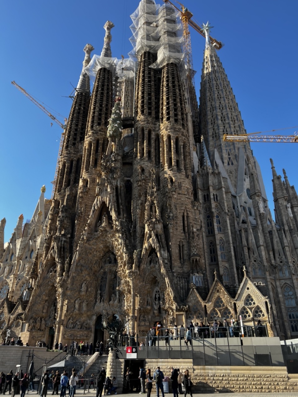

1. Overall Rating (0–10) — 7.5
This photograph captures the awe-inspiring grandeur of Sagrada Família under a clear blue sky, where the interplay of organic architecture and ongoing construction tells a story of devotion and time. The towering spires and intricate stone carvings are beautifully highlighted by the bright daylight, while the presence of visitors grounds the scene in human scale. Though the framing feels slightly cluttered by construction elements, the image successfully conveys both the monumental ambition and the living, evolving nature of Gaudí’s masterpiece.
2. Composition (0–10) — 6.5
The low-angle perspective emphasizes the cathedral’s verticality, but the inclusion of cranes and scaffolding disrupts visual harmony. A tighter crop might better focus on the architectural details.
3. Lighting (0–10) — 8.5
Strong, direct sunlight enhances texture and depth, casting sharp shadows that accentuate the building’s complex surface. The clear blue sky provides a clean backdrop that makes the stone stand out.
4. Color & Tone (0–10) — 7.5
The warm, golden tones of the stone contrast beautifully with the cool blue sky, creating a balanced and visually engaging palette. The natural light enhances the richness of the material without oversaturation.
5. Creativity (0–10) — 7.0
The image captures both the spiritual and the temporal—showing a sacred space still in progress. This duality adds narrative depth, though the composition leans more toward documentation than artistic interpretation.
6. Technical Quality (0–10) — 8.0
Sharp focus and high detail reveal the fine textures of the stonework. The exposure is well-balanced, preserving highlights and shadows without overprocessing.
7. Emotional Impact (0–10) — 8.0
The image evokes a sense of wonder and reverence, amplified by the juxtaposition of ancient craftsmanship and modern construction. It invites reflection on legacy, faith, and human perseverance.
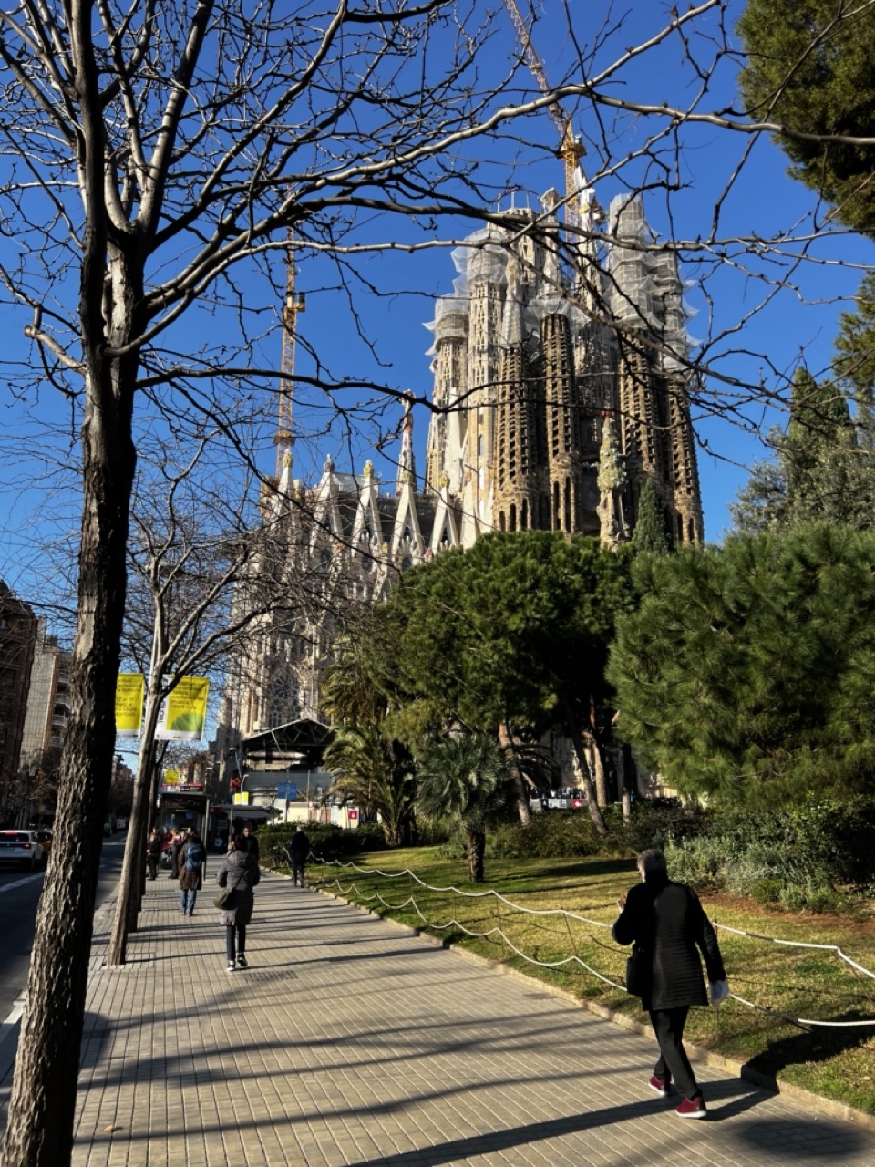

1. Overall Rating (0–10) — 7.0
This photograph captures the grandeur of Sagrada Família framed by the delicate silhouette of bare tree branches, creating a striking contrast between nature and architecture. The bright blue sky and crisp sunlight enhance the intricate details of Gaudí’s masterpiece, while the foreground path and pedestrians add a sense of scale and movement. The image successfully balances the monumental with the everyday, though the framing feels slightly unbalanced due to the overwhelming presence of the tree on the left.
2. Composition (0–10) — 6.5
The diagonal line of the tree branches draws the eye toward the cathedral, but the left side of the frame feels weighted by the tree trunk, creating an imbalance. The pathway leads the viewer into the scene, but the composition could benefit from more visual symmetry.
3. Lighting (0–10) — 8.5
Strong, direct sunlight enhances the textures of the cathedral’s façade and casts long, defined shadows across the walkway. The clear blue sky provides excellent contrast, giving the image a crisp, vibrant quality.
4. Color & Tone (0–10) — 7.5
The palette is dominated by the warm beige tones of the stone, the deep green of the trees, and the rich blue of the sky. The colors are vivid but not oversaturated, maintaining a natural and harmonious feel.
5. Creativity (0–10) — 7.0
The use of the bare branches as a natural frame is an inventive compositional choice, adding depth and a seasonal mood. The juxtaposition of the unfinished cathedral with the everyday life of pedestrians lends a narrative quality to the scene.
6. Technical Quality (0–10) — 8.0
The image is sharp and well-focused, with clear details in both the foreground and background. The exposure is well-balanced, capturing the brightness of the sky without losing detail in the shadows.
7. Emotional Impact (0–10) — 7.5
The photograph evokes a sense of awe and quiet contemplation, capturing the enduring presence of a cultural landmark. The blend of human activity and architectural majesty invites the viewer to reflect on time, progress, and beauty.
Loading map...