Preston Lau: A Journey Through Memories, Tech, and Humanity
Welcome to my personal blog that delves into the intricate tapestry of personal albums and the fascinating intersection of ever-evolving technology and humanity. Come along on a journey with me as we delve into the seamless fusion of creativity, state-of-the-art AI and robotics, intricately interwoven within the tapestry of our shared awareness. Have fun!
Secret Entrances to the Louvre Paris
AI Summary
To avoid long lines at the main entrance, consider visiting the Carrousel du Louvre, an underground entrance with short wait times (usually 5 minutes) that grants access to the same areas as Le Pyramide. After passing security, spend more time exploring the museum's vast collection of artworks and history.
Secret Entrances to the Louvre: Beat the Summer Crowds
With the streets teeming with visitors eager to see Paris' iconic monuments like the Eiffel Tower, Notre Dame, and Disneyland (which surprisingly outranks even the Eiffel Tower in annual visitors), the Louvre is, of course, high on everyone's list. But with popularity comes long waits. I’m talking 3+ hours long.
Standing in line is no one’s idea of a perfect morning. But for many, a visit to the Louvre (and seeing the Mona Lisa) is a must-do, once-in-a-lifetime experience. So, how do you avoid those infamous lines that seem to wrap around the courtyard and stretch forever? Here are some insider tips to help you bypass the main entrance and make the most of your visit.
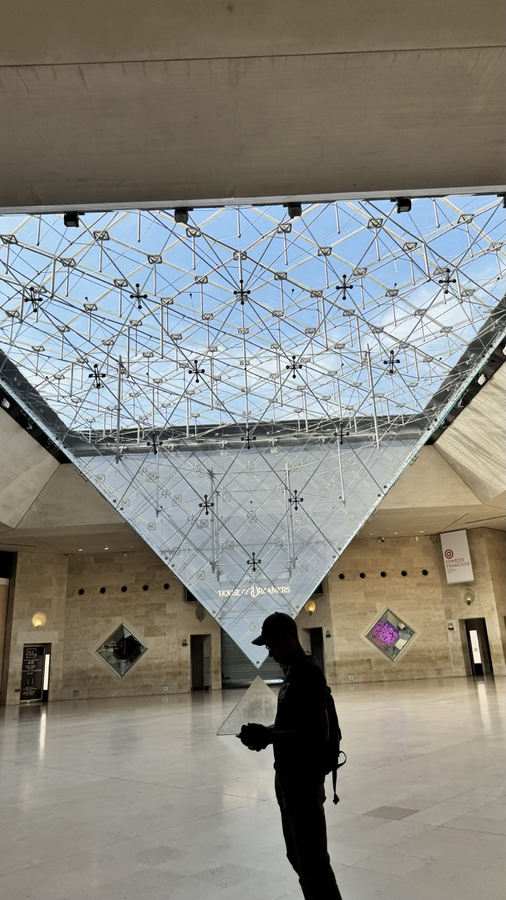
1. Overall Rating (0–10) — 7.0 This photograph captures the grandeur of the Louvre’s glass pyramid with striking geometric clarity, where the interplay of light, structure, and human presence creates a contemplative atmosphere. The silhouette of the figure adds narrative weight, grounding the monumental architecture in a moment of personal experience. While the image is visually compelling, its emotional resonance is slightly muted by a lack of dynamic lighting and color depth.
2. Composition (0–10) — 7.5 The low-angle framing emphasizes the towering scale of the pyramid, while the diagonal lines of the glass structure guide the eye upward. The figure’s placement on the right creates a balanced asymmetry, enhancing the sense of depth and spatial grandeur.
3. Lighting (0–10) — 6.0 Natural light filters through the glass, illuminating the space evenly but with a cool, neutral tone. The silhouette effect is strong, yet the lack of contrast or directional warmth tempers the mood, making the scene feel more observational than dramatic.
4. Color & Tone (0–10) — 6.5 The palette is dominated by cool grays and blues from the glass and concrete, punctuated by the soft purple glow of the artwork in the background. While the tones are cohesive, they lack vibrancy, contributing to a subdued and somewhat sterile atmosphere.
5. Creativity (0–10) — 7.0 The juxtaposition of the modern pyramid with the classical museum interior offers a compelling visual dialogue. The inclusion of a solitary figure adds a human element, transforming the image from a mere architectural record into a quiet meditation on space and time.
6. Technical Quality (0–10) — 7.5 The image is sharp and well-focused, with clean lines and clear detail in the glass structure. The exposure is balanced, preserving texture in both the ceiling and floor, though minor overexposure in the sky area slightly detracts from the overall refinement.
7. Emotional Impact (0–10) — 6.5 The scene evokes a sense of quiet awe and introspection, amplified by the solitary figure lost in thought. While the mood is contemplative, the cool lighting and lack of vivid color limit the emotional intensity, leaving the viewer with a sense of distance rather than connection.
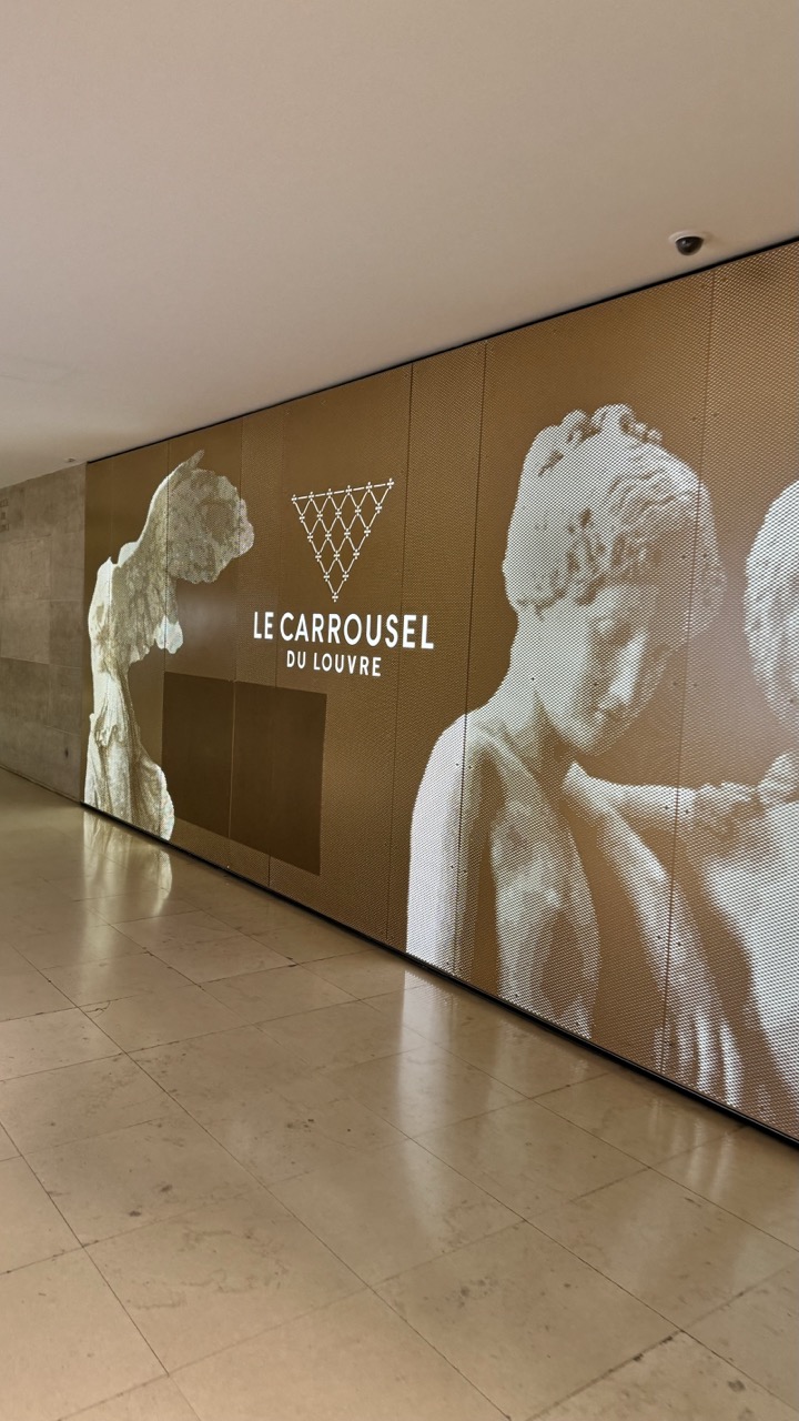
1. Overall Rating (0–10) — 7.0 This image captures the quiet grandeur of a modern museum corridor, where the interplay of classical sculpture and contemporary design creates a compelling visual dialogue. The warm, neutral tones and expansive space evoke a sense of reverence and continuity, while the digital display adds a layer of modernity. Though the scene is visually cohesive, it lacks a strong focal point, slightly diminishing its emotional pull.
2. Composition (0–10) — 6.5 The diagonal sweep of the wall and floor guides the eye across the frame, but the central placement of the "Le Carrousel du Louvre" text disrupts the balance. The large sculpture on the left provides visual weight, but the right side feels slightly unbalanced due to the dense imagery.
3. Lighting (0–10) — 7.0 Soft, ambient lighting enhances the warm tones of the space and highlights the texture of the wall. The even illumination avoids harsh shadows, allowing the details of the projected sculptures to be clearly visible.
4. Color & Tone (0–10) — 7.5 The palette is unified by warm beige and gold tones, creating a cohesive and elegant atmosphere. The monochromatic projection of the sculptures contrasts subtly with the background, adding depth without disrupting harmony.
5. Creativity (0–10) — 7.0 The fusion of classical art with modern digital display reflects a thoughtful blend of tradition and innovation. The choice to integrate the Louvre’s branding into the architectural narrative is both functional and aesthetically integrated.
6. Technical Quality (0–10) — 8.0 The image is sharp and well-focused, with clear detail in both the floor and the wall. The lighting is consistent, and the exposure is balanced, capturing the textures and tones accurately.
7. Emotional Impact (0–10) — 6.5 The image conveys a sense of calm and cultural continuity, but its impersonal scale and lack of human presence prevent a deeper emotional connection. It invites contemplation rather than immediate engagement.
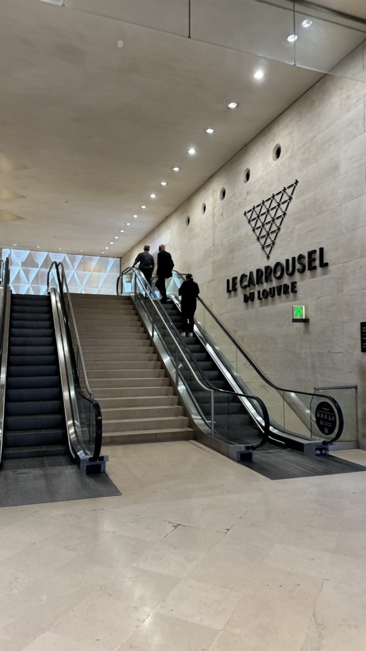
Le Carrousel du Louvre Entrance
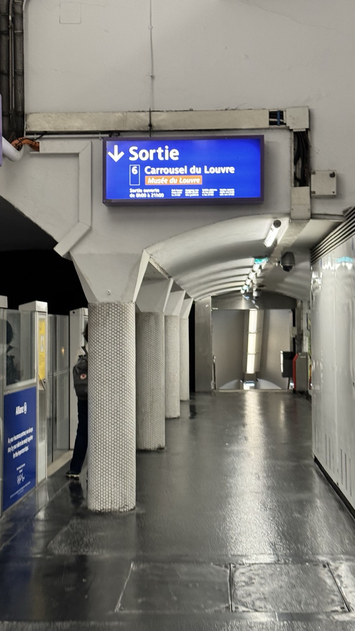
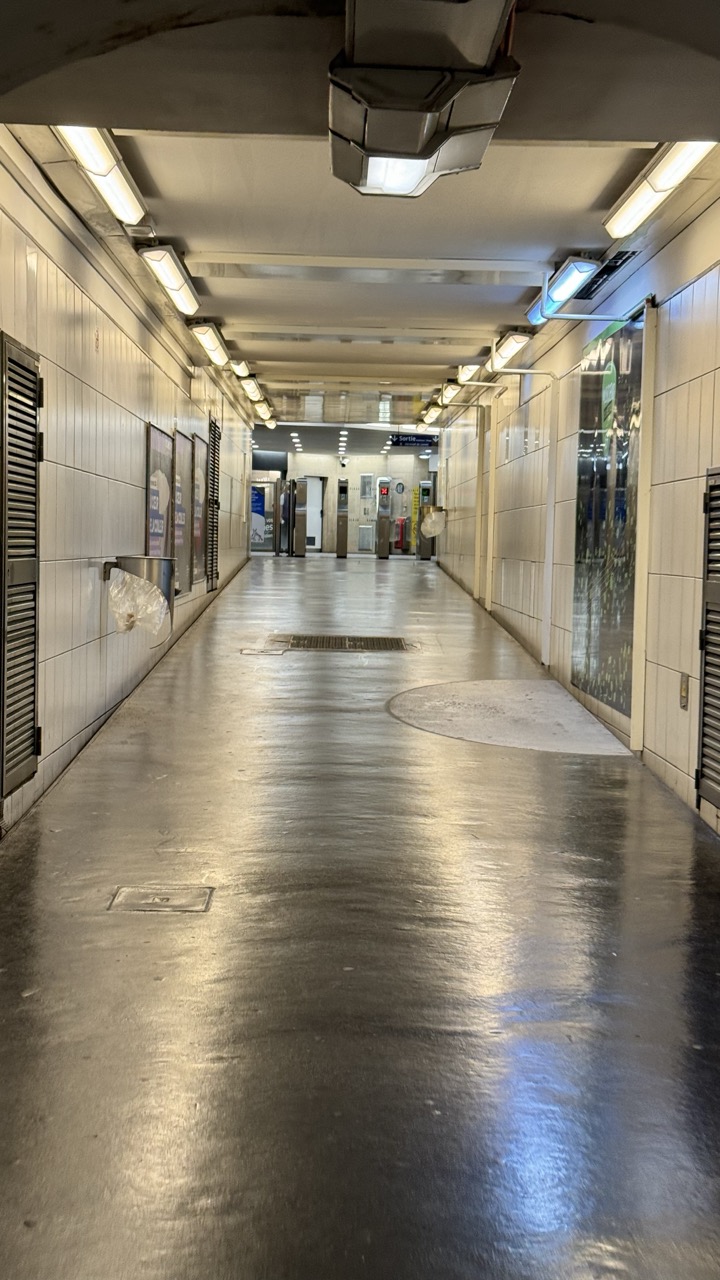
1. Overall Rating (0–10) — 6.0 This photograph captures the quiet, utilitarian atmosphere of a Parisian metro station, where functionality and urban rhythm converge. The wet floor and cool lighting lend a sense of late-night solitude, while the digital sign adds a touch of modern clarity. Though the scene feels authentic and grounded, it lacks visual dynamism, and the composition's straight-on perspective feels more like documentation than artful storytelling.
2. Composition (0–10) — 6.5 The strong linear perspective draws the eye down the corridor, creating a sense of depth. However, the central column and off-center signage disrupt balance, and the composition feels slightly cluttered by architectural elements.
3. Lighting (0–10) — 5.5 The artificial lighting is functional but flat, casting a sterile glow that emphasizes the utilitarian nature of the space. The reflections on the wet floor add texture, but the lack of contrast or directional warmth limits atmospheric depth.
4. Color & Tone (0–10) — 5.0 The palette is dominated by cool grays and whites, punctuated by the blue of the sign. While the color scheme is consistent with the environment, it feels muted and lacks vibrancy, reinforcing the image’s impersonal tone.
5. Creativity (0–10) — 6.0 The photograph captures a moment of urban quiet with a documentary sensibility. The choice to focus on the exit sign and the empty corridor suggests a narrative of transit and movement, but the execution remains conventional rather than imaginative.
6. Technical Quality (0–10) — 7.5 The image is sharp and well-focused, with clear details in the sign and structural elements. The wet floor adds a subtle layer of visual interest, and the camera settings appear to handle the low-light conditions effectively.
7. Emotional Impact (0–10) — 5.5 The image evokes a sense of isolation and late-night stillness, resonating with anyone familiar with the rhythms of public transit. Yet, the lack of human engagement or emotional warmth keeps the viewer at a slight remove.
1. Overall Rating (0–10) — 6.0 This photograph captures the quiet, almost eerie stillness of a subway corridor after hours, where the absence of people transforms a utilitarian space into a moment of urban solitude. The reflective floor and long perspective draw the eye forward, evoking a sense of journey and isolation, though the sterile environment and mundane details slightly diminish its emotional resonance. While the image succeeds in conveying atmosphere, it stops short of transcending its documentary origins.
2. Composition (0–10) — 7.0 The symmetrical alignment of the corridor creates a strong sense of depth and direction, with the central perspective guiding the viewer toward the distant turnstiles. The overhead fixtures and tiled walls form a rhythmic pattern that reinforces the linear structure, though a slight tilt in the horizon line slightly disrupts the balance.
3. Lighting (0–10) — 6.0 The fluorescent lights cast a cool, uniform glow that emphasizes the corridor’s clean, institutional feel. The reflections on the wet floor enhance the sense of space and add visual interest, though the lighting lacks warmth and nuance, contributing to the image’s impersonal tone.
4. Color & Tone (0–10) — 5.5 The palette is dominated by muted whites, grays, and metallic tones, creating a monochromatic, clinical atmosphere. The lack of vibrant color reinforces the sterile mood, but also limits the image’s visual dynamism and emotional range.
5. Creativity (0–10) — 6.5 The photograph leverages the inherent geometry and repetition of the subway corridor to create a visually compelling composition. The use of reflection and perspective adds a layer of abstraction, transforming a mundane scene into something almost cinematic, though the concept remains grounded in realism.
6. Technical Quality (0–10) — 7.5 The image is sharp and well-focused, with clear details in the floor texture and wall tiles. The exposure is balanced, and the reflections are captured with clarity, though there is a slight overexposure in the ceiling lights.
7. Emotional Impact (0–10) — 5.0 The image evokes a sense of quiet loneliness and urban emptiness, but the emotional connection is restrained by the impersonal setting and lack of human presence. It feels more like a snapshot than an intimate moment, leaving the viewer observing rather than engaging.
This secret entrance is your best bet, especially if you don’t already have a ticket. The Carrousel du Louvre is essentially the underground entrance to the museum. To access it, take the metro to ‘Palais Royale-Musee du Louvre’ on line 1 or 7, or enter from 99 Rue de Rivoli. You’ll walk down two sets of escalators into a small underground shopping strip. Keep going past the shops until you reach the inverted pyramid.
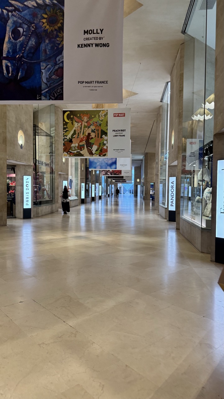
1. Overall Rating (0–10) — 6.0 This photograph captures the quiet grandeur of a modern retail corridor, where art and commerce converge in a spacious, minimalist setting. The wide perspective emphasizes the scale of the architecture and the curated presence of branded installations, yet the emptiness of the hall lends a slightly detached, almost cinematic quality. While the composition draws the eye forward with deliberate symmetry, the lack of human energy and narrative tension keeps the image from fully engaging the viewer.
2. Composition (0–10) — 7.0 The strong leading lines of the corridor guide the eye toward the vanishing point, creating a sense of depth and order. The central placement of the banners and balanced storefronts enhance symmetry, though the presence of a single figure on the left introduces a subtle asymmetry that prevents the image from feeling rigid.
3. Lighting (0–10) — 6.0 Diffused overhead lighting evenly illuminates the space, minimizing harsh shadows and preserving the clean, polished aesthetic of the marble floor. While functional and consistent, the lighting lacks warmth or dramatic contrast, contributing to a sterile atmosphere.
4. Color & Tone (0–10) — 6.5 The palette is dominated by neutral beige and cream tones, punctuated by the vibrant hues of the banners. The contrast between the muted architecture and the colorful artwork creates visual interest, though the overall tone remains subdued and restrained.
5. Creativity (0–10) — 6.0 The juxtaposition of high-end retail with pop art installations offers a contemporary commentary on culture and consumerism. While conceptually strong, the execution leans toward documentation rather than artistic expression, with little emphasis on mood or personal interpretation.
6. Technical Quality (0–10) — 7.5 The image is sharp and well-focused, with clean lines and even exposure. The resolution captures fine details in the floor texture and signage, and there are no visible technical flaws such as blur or noise.
7. Emotional Impact (0–10) — 5.0 The spacious, empty corridor evokes a sense of calm and order, but also a certain loneliness. The absence of bustling activity prevents a strong emotional connection, leaving the viewer as an observer rather than a participant in the scene.
On a day when the line at Le Pyramide stretches on forever, the line at Le Carrousel du Louvre might be just 5 minutes long! Even in the busy summer months, this entrance never sees the extreme waits that the main entrance does.
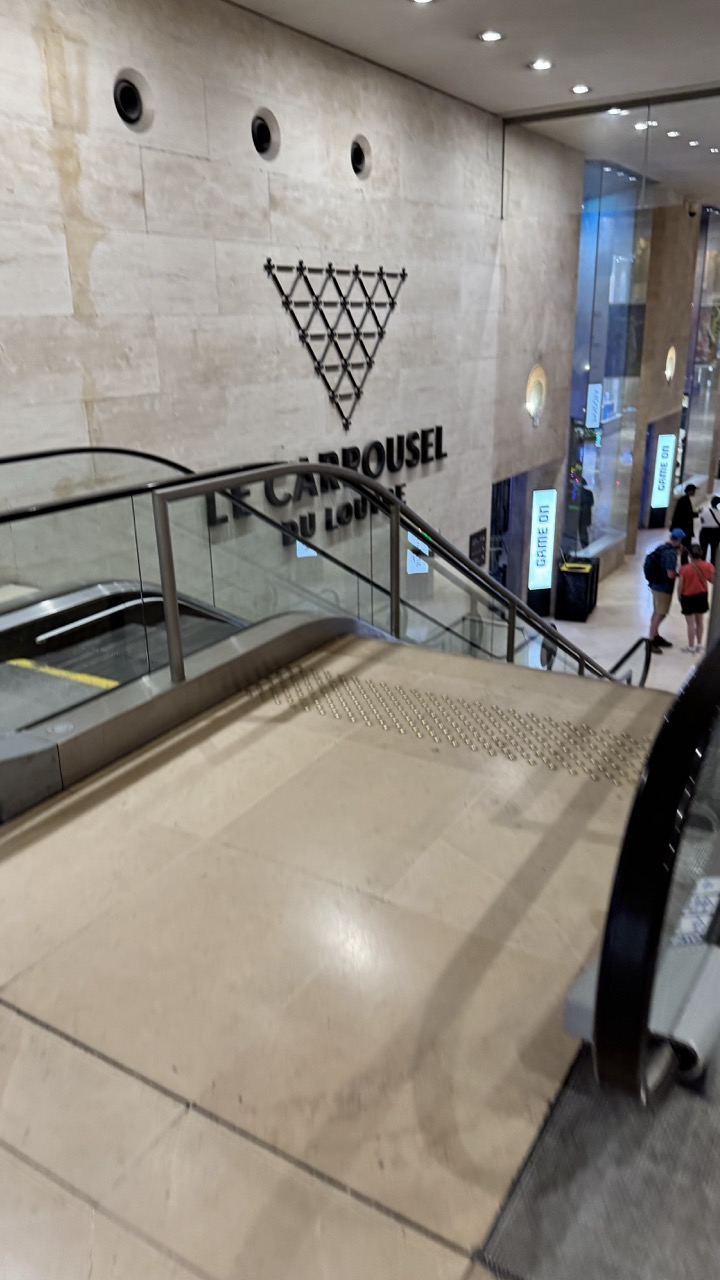
1. Overall Rating (0–10) — 5.5 This photograph captures the sleek, modern interior of a public space, likely a luxury lounge or upscale shopping venue, with a focus on architectural detail and branding. The clean lines and minimalist aesthetic are visually coherent, yet the image feels more like a casual snapshot than a deliberate composition. The lack of a strong focal point and the slightly cluttered background detract from its visual impact, leaving the scene feeling functional rather than inspiring.
2. Composition (0–10) — 5.0 The framing is slightly off-center, with the escalator leading the eye diagonally but not toward a clear subject. The wall signage is prominent, but the surrounding elements—such as the people and digital displays—distract from the intended focus.
3. Lighting (0–10) — 6.0 The lighting is bright and even, provided by recessed ceiling fixtures, which effectively illuminates the space without harsh shadows. However, the cool, artificial tone lacks warmth and fails to create a sense of ambiance.
4. Color & Tone (0–10) — 5.5 The palette is dominated by neutral beige and gray tones, which align with the minimalist design but result in a flat, monotonous appearance. The absence of vibrant color limits the image’s visual appeal.
5. Creativity (0–10) — 5.0 The image is straightforward and documentary in nature, capturing a moment in time without significant artistic interpretation. The branding is clear, but the overall concept lacks originality or narrative depth.
6. Technical Quality (0–10) — 7.0 The image is sharp and well-focused, with clear details visible in the signage and floor texture. However, the slight angle and lack of intentional framing reduce its overall effectiveness.
7. Emotional Impact (0–10) — 4.5 The photograph conveys a sense of quiet neutrality—neither inviting nor alienating. It reflects a space designed for efficiency and luxury, but fails to evoke strong emotion or a deeper connection with the viewer.
1. Overall Rating (0–10) — 6.0 This image captures the sleek, modern interior of Le Carrousel du Louvre with a sense of architectural grandeur and quiet movement. The clean lines and polished surfaces convey a sense of institutional elegance, while the presence of people adds subtle life to the space. However, the overall composition feels somewhat static and impersonal, lacking the dynamic energy needed to elevate the scene beyond a simple architectural document.
2. Composition (0–10) — 6.0 The escalators create strong diagonal lines that guide the eye upward, balanced by the symmetry of the staircase and the wall signage. However, the wide framing dilutes focus, and the placement of the subjects feels slightly off-center, reducing compositional harmony.
3. Lighting (0–10) — 6.5 The recessed ceiling lights provide even, functional illumination, enhancing the clean, minimalist aesthetic. While the lighting is effective in revealing texture and form, it lacks atmospheric depth, resulting in a flat, clinical feel.
4. Color & Tone (0–10) — 6.0 The palette is dominated by neutral beiges and grays, contributing to a calm, sophisticated tone. However, the lack of contrast and color variation gives the image a somewhat monotonous appearance, diminishing visual interest.
5. Creativity (0–10) — 5.5 The image is conceptually straightforward, emphasizing place and function over narrative or emotional expression. While the branding and architecture are visually striking, the execution feels more like documentation than artistic interpretation.
6. Technical Quality (0–10) — 7.5 The photograph is sharp and well-exposed, with clear detail in both the foreground and background. The focus is consistent, and the camera’s handling of the reflective surfaces and lighting is technically sound.
7. Emotional Impact (0–10) — 5.0 The image evokes a sense of order and modernity, but it remains emotionally detached. The anonymity of the figures and the sterile environment prevent a deeper emotional connection, leaving the viewer as an observer rather than an participant.
After passing through the security check here, you’ll enter the same part of the Louvre as everyone who waited in line at Le Pyramide, but with a lot more time to spare. With the extra time saved, you might even enjoy a macaron from the famous Ladurée store located within the Carrousel du Louvre shopping strip.
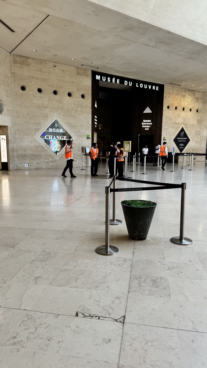
1. Overall Rating (0–10) — 6.0 This photograph captures the quiet order of the Louvre’s entrance hall, where the grandeur of institutional architecture meets the subtle rhythm of daily operations. The expansive stone floor and high ceilings convey a sense of scale and permanence, while the presence of staff and visitors adds a human touch without disrupting the calm. However, the image’s potential is held back by a lack of visual drama—its neutrality, though technically sound, fails to evoke a deeper emotional or aesthetic response.
2. Composition (0–10) — 6.5 The wide-angle perspective emphasizes the vastness of the space, with the entrance and signage anchoring the composition. The placement of the stanchions and potted plant in the foreground creates a subtle sense of depth, though the central axis feels slightly unbalanced by the off-center positioning of the "CHANGE" sign.
3. Lighting (0–10) — 6.0 Even, diffused overhead lighting illuminates the space uniformly, preserving detail without creating harsh shadows. While functional and clear, the lighting lacks warmth or directional character, contributing to the image’s neutral, documentary tone.
4. Color & Tone (0–10) — 5.5 The palette is dominated by muted beige and gray tones, reflecting the stone materials and institutional design. The orange vests of the staff provide a small but effective pop of color, drawing the eye and adding a touch of life to the otherwise monochromatic scene.
5. Creativity (0–10) — 5.0 The image functions more as a straightforward documentation than an artistic interpretation. While it successfully captures the location and context, it offers little in terms of unique perspective or conceptual depth.
6. Technical Quality (0–10) — 7.5 The image is sharp and well-focused, with clean lines and balanced exposure. The wide-angle lens captures the space effectively, though the slight tilt in the horizon suggests minor framing imperfections.
7. Emotional Impact (0–10) — 5.0 The photograph conveys a sense of quiet anticipation and routine, but its emotional resonance is limited. The impersonal scale and lack of human drama keep the viewer at a distance, making it more informative than moving.
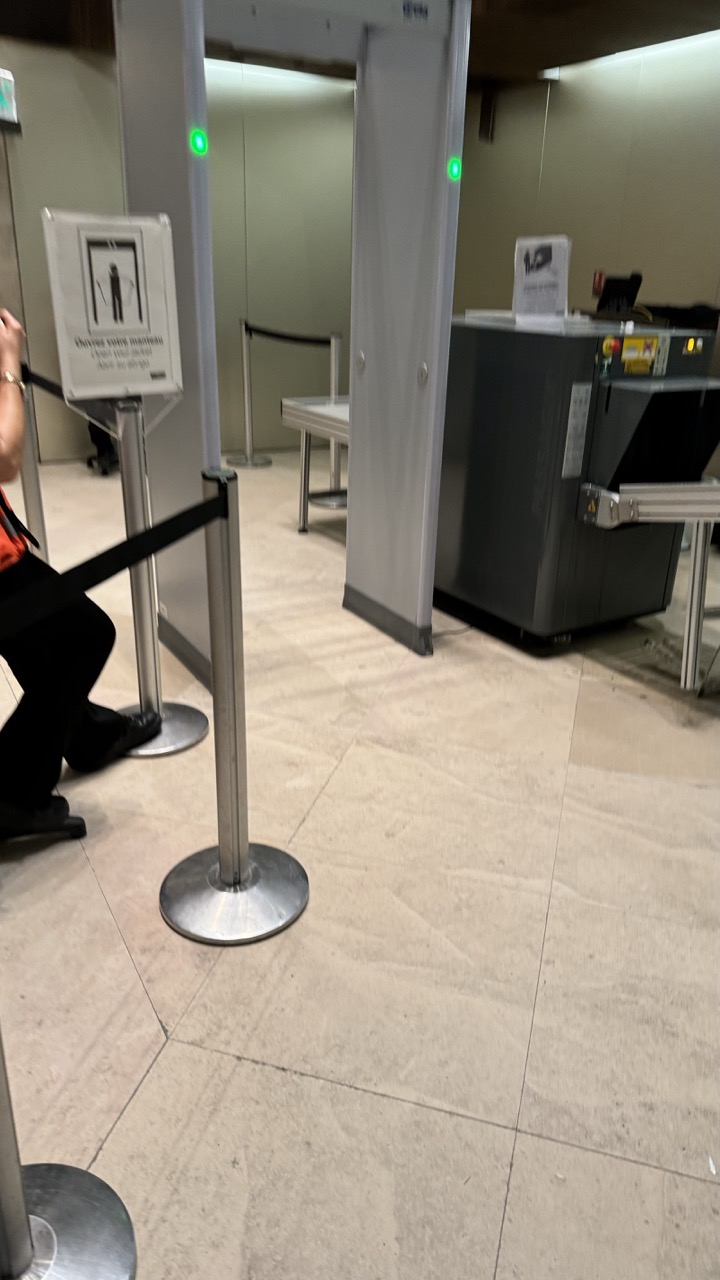
1. Overall Rating (0–10) — 5.5 This image captures the sterile, routine atmosphere of an airport security checkpoint, where functionality overrides aesthetic appeal. The scene is defined by its utilitarian design—metal barriers, muted tones, and functional signage—yet it fails to evoke a strong emotional or visual response. While the environment is clearly depicted, the lack of human engagement or dynamic framing leaves the image feeling static and unremarkable, more like a snapshot than a photograph.
2. Composition (0–10) — 5.0 The frame is cluttered with barriers and equipment, creating a sense of visual congestion. The diagonal line of the stanchions leads the eye awkwardly, while the off-center subject and empty space dilute focus.
3. Lighting (0–10) — 4.5 Harsh, even fluorescent lighting flattens the scene, eliminating shadows and depth. The green lights on the metal detector offer a small point of color but do little to enhance the mood.
4. Color & Tone (0–10) — 5.0 A neutral palette of beige, gray, and silver dominates, reinforcing the institutional feel. The lack of contrast or tonal variation makes the image feel washed out and visually dull.
5. Creativity (0–10) — 5.5 The photograph documents a familiar scene with straightforward realism, but lacks originality in framing or perspective. It captures the environment accurately but does not offer a fresh or compelling interpretation.
6. Technical Quality (0–10) — 7.0 The image is sharp and clear, with adequate focus and no noticeable technical flaws. However, the lack of compositional refinement limits its overall impact.
7. Emotional Impact (0–10) — 4.5 The image conveys a sense of impersonal routine, evoking the mundane anxiety of travel security. While it communicates a recognizable context, it fails to connect emotionally or provoke deeper reflection.
By using these secret entrances, you can spend less time in line and more time soaking up the incredible art and history that the Louvre has to offer. Happy exploring!
Discovering the Louvre Museum: A Journey Through History and Art
The Louvre’s history dates back to the late 12th century when it was initially constructed as a fortress by King Philip II. The remnants of this medieval fortress can still be seen in the museum’s basement, offering a fascinating glimpse into its origins. Over the centuries, the Louvre underwent numerous transformations, evolving from a royal palace to a public museum.
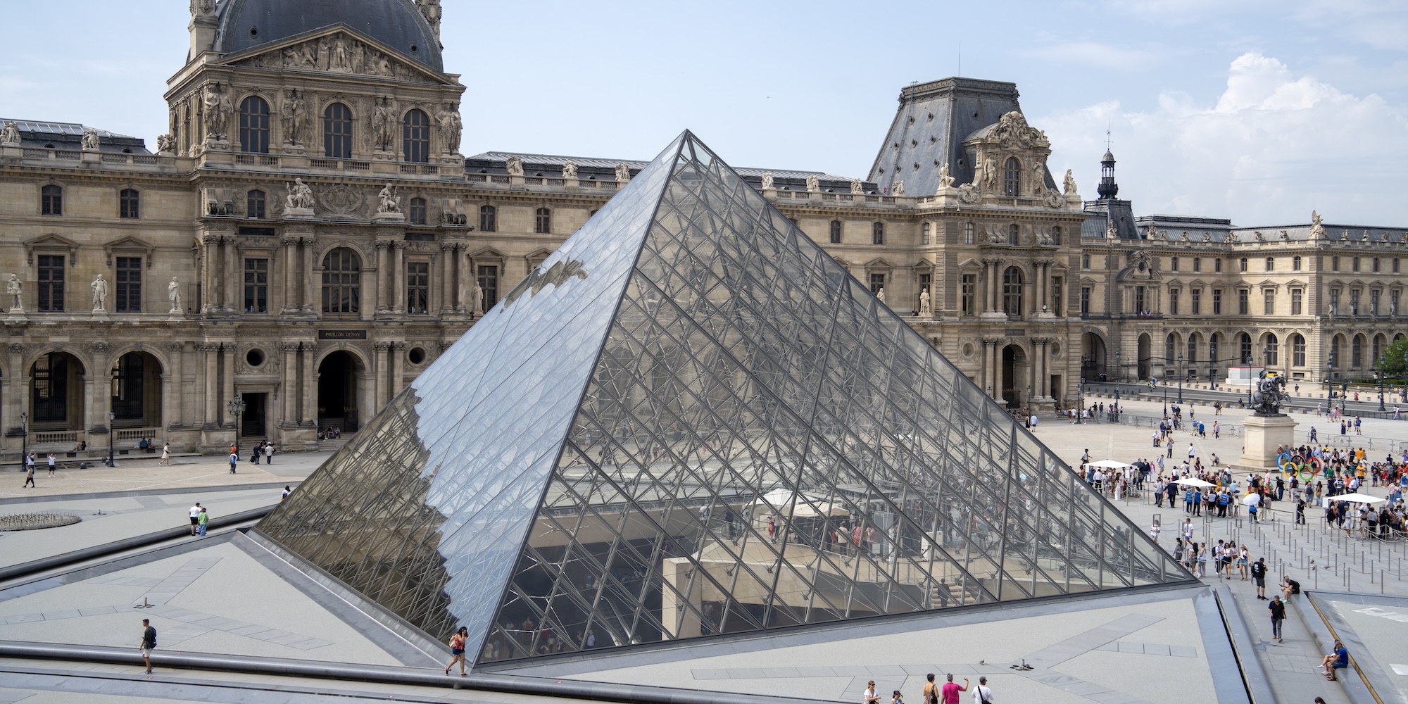
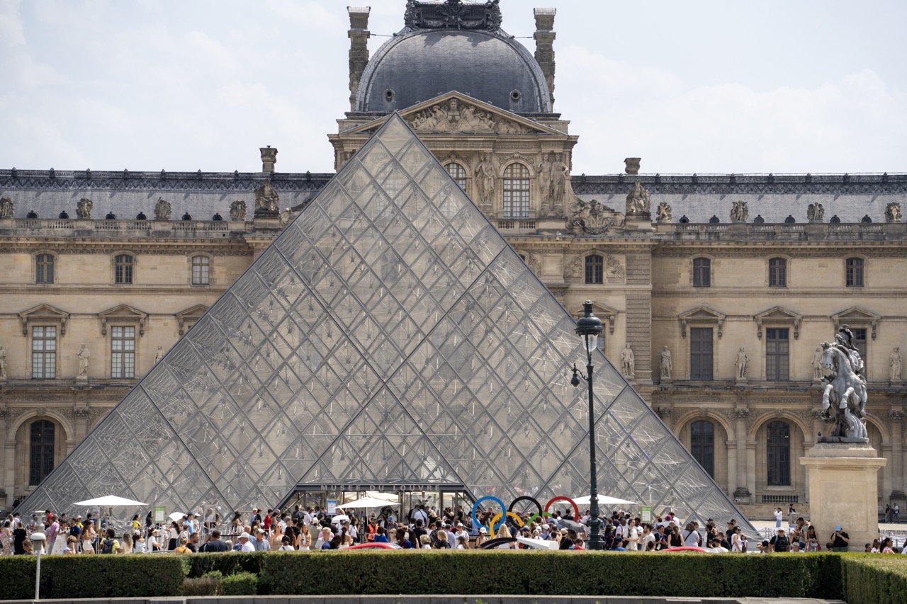
1. Overall Rating (0–10) — 7.0 This photograph captures the iconic juxtaposition of modern architecture and classical grandeur at the Louvre, where the glass pyramid stands as a bold symbol of cultural convergence. The bustling crowd and bright daylight lend a sense of vitality and global resonance, though the image's strength lies more in its documentary clarity than in emotional depth. The composition balances the monumental scale of the building with the human element, creating a scene that feels both familiar and alive.
2. Composition (0–10) — 7.5 The pyramid dominates the frame with strong diagonal lines that draw the eye toward the central entrance, while the symmetrical facade of the Louvre grounds the image. The placement of the statue on the right and the lamppost slightly off-center adds visual interest and depth, creating a balanced yet dynamic arrangement.
3. Lighting (0–10) — 7.0 Natural daylight illuminates the scene evenly, enhancing the transparency of the glass pyramid and highlighting the texture of the stone façade. The soft shadows suggest a midday sun, contributing to the clarity and crispness of the image while avoiding harsh contrasts.
4. Color & Tone (0–10) — 6.5 The palette is dominated by neutral tones—beige stone, grey glass, and muted sky—giving the image a restrained, realistic quality. The Olympic rings add a subtle splash of color, but the overall tone remains subdued, emphasizing the architectural and cultural weight of the setting.
5. Creativity (0–10) — 6.0 While the subject is inherently striking and widely recognized, the photograph remains a conventional travel snapshot. It captures a well-known landmark with clarity and respect but lacks a unique visual or narrative twist that would elevate it beyond a standard representation.
6. Technical Quality (0–10) — 8.0 The image is sharp and well-focused, with fine detail visible in both the pyramid’s glass panels and the architectural elements of the Louvre. The exposure is balanced, and the depth of field captures both foreground and background clearly.
7. Emotional Impact (0–10) — 6.0 The image conveys a sense of awe and cultural significance, but the sheer number of people and the commercial elements (like the Olympic rings) slightly dilute the emotional resonance. It feels more like a tourist record than a deeply evocative portrait of place and history.
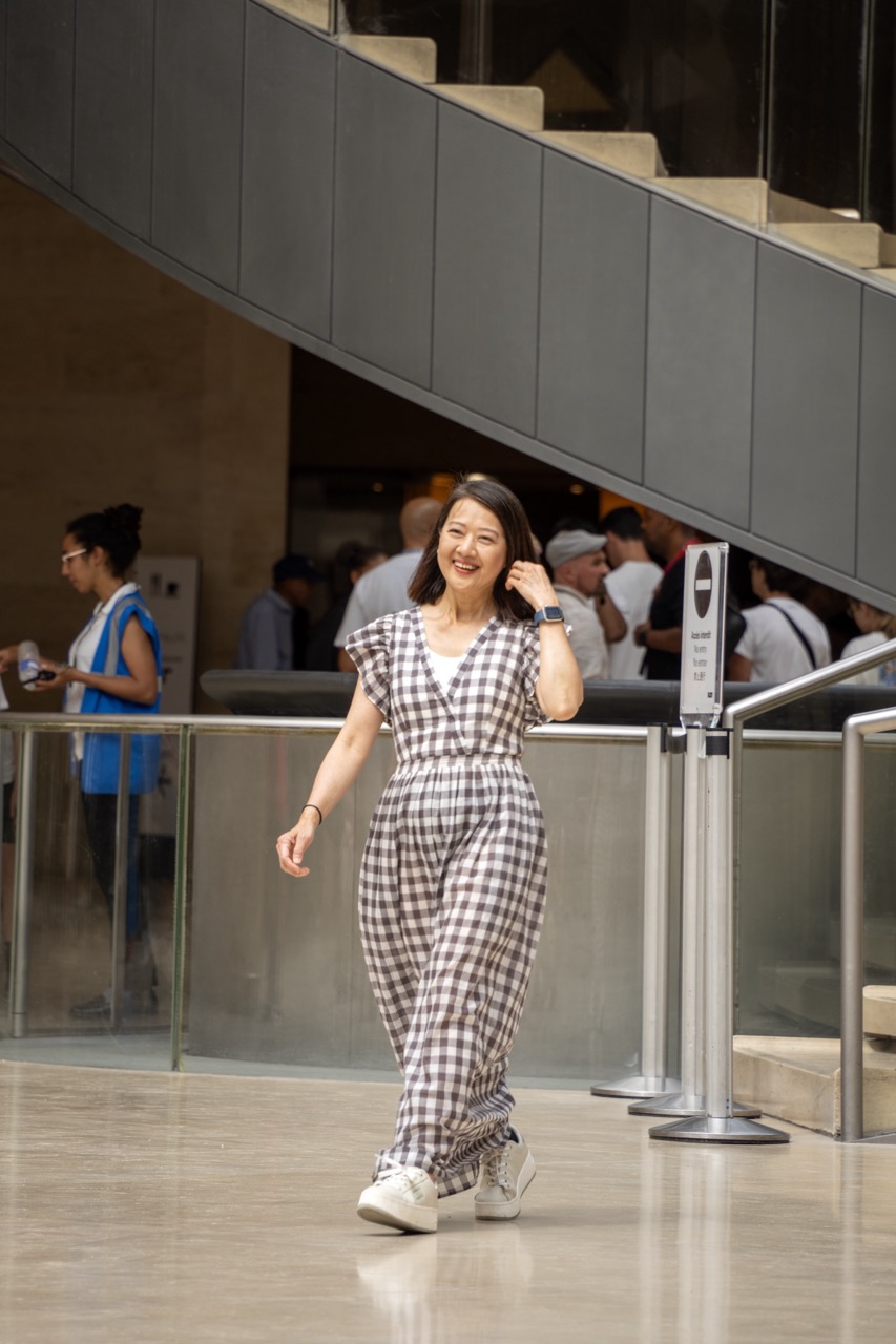
1. Overall Rating (0–10) — 7.0 This photograph captures a moment of genuine joy and movement within a modern architectural space, where the subject’s warmth and ease stand in contrast to the cold, structured environment. The candid nature of the shot and the subject’s radiant smile give it an inviting, human quality, though the surrounding context feels slightly underdeveloped. With more intentional framing and depth, the image could transcend a simple snapshot into a compelling portrait.
2. Composition (0–10) — 6.5 The subject is well-placed in the lower third of the frame, creating a sense of forward motion, but the diagonal staircase and railings introduce visual noise. A tighter crop would enhance focus on the woman, reducing distractions from the background.
3. Lighting (0–10) — 7.0 Natural, diffused light illuminates the scene evenly, highlighting the subject’s features and clothing texture without harsh shadows. The ambient light complements the architectural setting and supports the image’s candid tone.
4. Color & Tone (0–10) — 6.0 The neutral palette of grays and beiges dominates, with the checkered jumpsuit providing a subtle visual anchor. While the colors are harmonious, they lack vibrancy, giving the image a slightly muted feel.
5. Creativity (0–10) — 6.5 The interplay between the subject’s warmth and the sterile environment offers a compelling narrative, but the execution remains grounded in realism rather than conceptual depth. The candid moment is engaging, but the composition doesn’t push beyond the observational.
6. Technical Quality (0–10) — 8.0 The image is sharp and well-focused, with clean detail in the subject’s clothing and expression. The exposure is balanced, and the camera’s focus on the woman ensures clarity in the foreground.
7. Emotional Impact (0–10) — 7.5 The subject’s genuine smile and relaxed posture convey a sense of happiness and confidence, creating an immediate emotional connection. The viewer is drawn into the moment, feeling the warmth of the scene despite its urban surroundings.
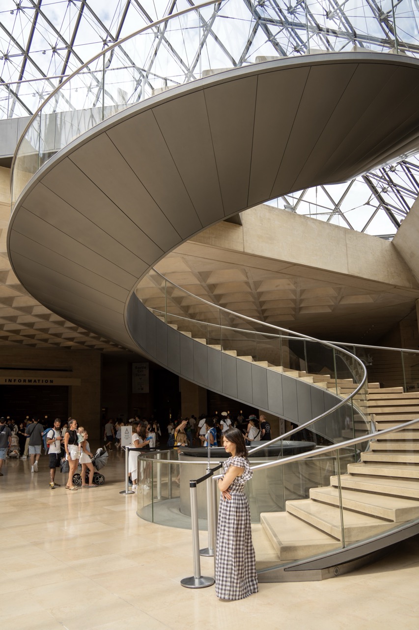
1. Overall Rating (0–10) — 7.5 This photograph captures the grandeur of a modern architectural space with a quiet human presence at its heart. The sweeping spiral staircase, framed by the glass and steel canopy above, draws the eye upward with dynamic elegance, while the woman in the foreground provides scale and a moment of contemplative stillness. Though the composition is strong and the setting iconic, the image feels slightly restrained—more a document than a deeply evocative portrait of place and emotion.
2. Composition (0–10) — 8.0 The spiral staircase dominates the frame with a powerful diagonal sweep, creating a sense of movement and depth. The woman is placed off-center, balancing the visual weight while adding narrative context. The open space to the left allows the eye to wander into the background, enhancing the sense of scale and activity.
3. Lighting (0–10) — 7.5 Natural light filters through the glass pyramid above, casting a soft, even illumination that highlights the architectural details without harsh shadows. The light enhances the clean lines of the structure and gives the scene a luminous, airy quality.
4. Color & Tone (0–10) — 7.0 The palette is largely neutral—beige, gray, and silver—creating a calm, cohesive atmosphere. While the colors are restrained, they complement the architectural setting well. A slight coolness in the tone enhances the modern feel, though a touch of warmth might add more visual warmth.
5. Creativity (0–10) — 7.0 The image leverages the iconic architecture and the spiral form to create a visually compelling narrative. The juxtaposition of the individual against the monumental structure adds a subtle human element, suggesting themes of exploration and scale. While not radically original, it is thoughtfully composed and conceptually grounded.
6. Technical Quality (0–10) — 8.5 Sharp focus and excellent clarity capture the fine textures of the materials—polished stone, glass, and metal. The exposure is well-balanced, with no blown highlights or lost shadows, and the depth of field keeps both the subject and the architecture clearly defined.
7. Emotional Impact (0–10) — 7.5 The photograph evokes a sense of awe and quiet introspection, inviting the viewer to consider their own place within vast, designed spaces. The solitary figure, lost in thought, adds a layer of emotional resonance, suggesting a personal moment amid public grandeur.
The Royal Residence
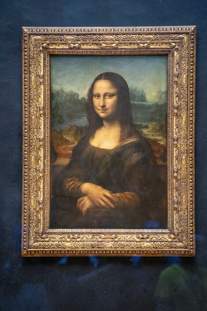
In the 16th century, King Francis I transformed the fortress into a royal residence, inviting renowned artists to his court. This period marked the beginning of the Louvre’s connection to the arts. Francis I’s acquisition of Leonardo da Vinci’s “Mona Lisa” was a significant milestone, setting the foundation for the Louvre’s impressive collection.
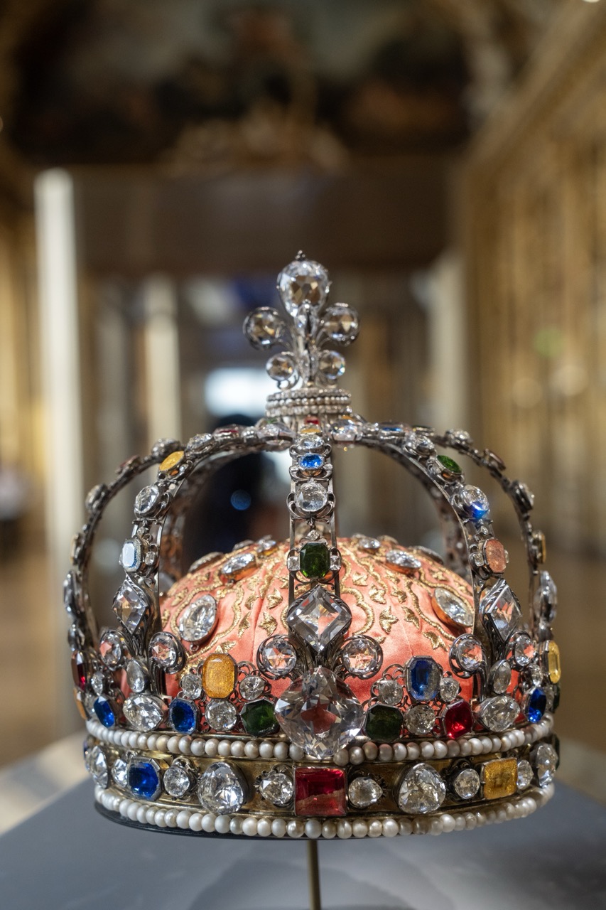
1. Overall Rating (0–10) — 8.0 This photograph captures the opulent grandeur of a regal crown with striking clarity, showcasing its intricate craftsmanship and vibrant gemstones. The shallow depth of field elegantly isolates the crown from the softly blurred background, drawing the viewer’s eye to the rich textures and colors. While the image excels in detail and mood, the lighting, though effective, lacks a dramatic contrast that might elevate it further into the realm of theatrical artistry.
2. Composition (0–10) — 8.0 The crown is centered with strong visual dominance, framed to emphasize its symmetry and verticality. The shallow depth of field creates a natural vignette, focusing attention on the crown while allowing the museum setting to remain subtly present, enhancing context without distraction.
3. Lighting (0–10) — 7.5 The lighting is soft and diffused, highlighting the facets of the gems and the metallic sheen of the crown without harsh glare. The ambient light enhances the jewel tones, but the overall illumination feels slightly flat, missing the dynamic play of light and shadow that could deepen the sense of luxury.
4. Color & Tone (0–10) — 8.5 The rich palette of gemstones—deep blues, vibrant reds, emerald greens, and golden yellows—stands out against the warm peach of the velvet cushion. The tones are harmonious and saturated, creating a sense of regal splendor, while the neutral background allows the crown’s colors to dominate.
5. Creativity (0–10) — 8.0 The choice to photograph the crown in a museum setting, with its historical ambiance, adds narrative depth. The focus on the crown’s intricate details and the careful use of depth of field convey a sense of reverence, transforming a simple object into a symbol of power and tradition.
6. Technical Quality (0–10) — 9.0 The image is exceptionally sharp, with precise focus on the crown’s jewels and metalwork. The depth of field is expertly controlled, and the exposure is balanced, preserving detail in both highlights and shadows.
7. Emotional Impact (0–10) — 8.0 The photograph evokes a sense of awe and reverence, inviting the viewer to contemplate the weight of history and the symbolism of monarchy. The combination of beauty, craftsmanship, and solemnity creates a powerful emotional resonance, drawing one into the story behind the crown.
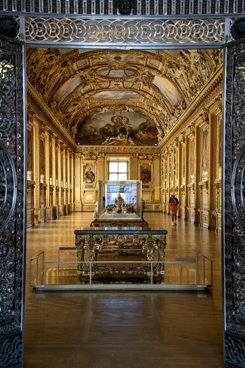
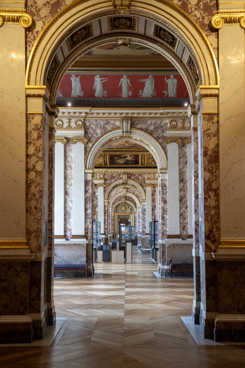
1. Overall Rating (0–10) — 8.0 This photograph captures the opulent grandeur of a Baroque gallery, where architectural splendor and historical artistry converge in a breathtaking display of symmetry and detail. The framing through the ornate gate adds depth and narrative, drawing the viewer into a world of royal excess and artistic mastery. While the image is rich in texture and composition, its slightly cool color balance and subtle digital noise slightly temper its overall luminosity.
2. Composition (0–10) — 9.0 The symmetrical perspective and use of the gate as a natural frame create a powerful sense of depth and focus, guiding the eye toward the central tableau and the distant fresco. The placement of the display case and the lone visitor enhance the scale and narrative of the space.
3. Lighting (0–10) — 7.5 Natural light from the window at the far end illuminates the hall with a soft, diffused glow, accentuating the gold leaf and architectural details. The lighting is even and controlled, though the upper sections of the ceiling remain slightly underexposed, losing some of the fresco’s subtlety.
4. Color & Tone (0–10) — 8.0 The warm golden tones dominate the scene, reinforcing the luxurious and historic atmosphere. The contrast between the polished wood floor and the richly decorated walls creates a harmonious palette, while the cool blue of the glass case provides a subtle visual counterpoint.
5. Creativity (0–10) — 8.5 The choice to frame the image through the iron gate adds a narrative layer, suggesting a moment of discovery. The photograph transcends mere documentation, offering a contemplative view of history and artistry through a carefully constructed lens.
6. Technical Quality (0–10) — 8.5 Sharp focus across the depth of field captures the intricate details of the ceiling, walls, and floor. The image is well-exposed, with minimal noise and clean edges, showcasing high technical execution.
7. Emotional Impact (0–10) — 8.0 The photograph evokes a sense of awe and reverence, capturing the majesty of a bygone era. The solitary figure adds a human element, inviting reflection on the passage of time and the endurance of art.
The Louvre continued to serve as a royal palace until the late 17th century when King Louis XIV moved his court to the Palace of Versailles. The idea of turning the Louvre into a public museum emerged during the French Revolution. In 1793, the Louvre officially opened its doors to the public, showcasing artworks seized from the royal family and the nobility.
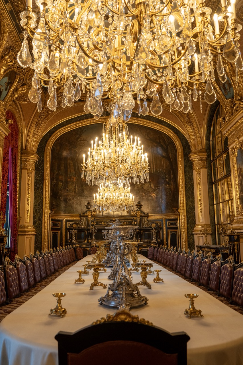
1. Overall Rating (0–10) — 8.5 This photograph captures the opulent grandeur of a historic banquet hall, where light, texture, and symmetry converge to evoke a sense of regal splendor. The illuminated chandelier serves as a radiant focal point, casting a warm glow that enhances the richness of the gold leaf, deep red velvets, and dark marble. While the scene is visually overwhelming in its detail, the image's strength lies in its ability to convey both luxury and historical weight with cinematic clarity.
2. Composition (0–10) — 9.0 The symmetrical framing creates a powerful sense of balance and order, drawing the eye directly to the central chandelier and the long table. The repetition of chairs and candelabras adds rhythm, while the architectural details on either side anchor the composition, reinforcing the room’s formal elegance.
3. Lighting (0–10) — 9.0 The interplay of the chandelier’s warm glow and the soft, diffused natural light from the windows creates a layered and atmospheric effect. The light highlights the textures of the gilded frames and marble, while the subtle shadows add depth and dimension to the space.
4. Color & Tone (0–10) — 9.0 The rich, saturated reds of the drapery contrast beautifully with the deep golds and dark marbles, creating a harmonious and luxurious palette. The warm tone of the lighting enhances the richness of the colors, evoking a sense of timeless elegance.
5. Creativity (0–10) — 8.0 The image successfully captures the essence of a grand, historical interior, emphasizing both its architectural beauty and ceremonial function. While the subject is inherently dramatic, the photographer’s choice to frame it with such precision and balance demonstrates a keen artistic sensibility.
6. Technical Quality (0–10) — 9.0 The image is sharp and detailed, with excellent control over focus and exposure. The fine textures of the gilding, fabric, and crystal are rendered with clarity, and the depth of field is well-managed to keep the entire scene coherent.
7. Emotional Impact (0–10) — 8.5 The photograph evokes awe and reverence, transporting the viewer into a world of historical privilege and ceremonial grandeur. The sense of stillness and formality invites contemplation, creating a quiet emotional resonance with the past.
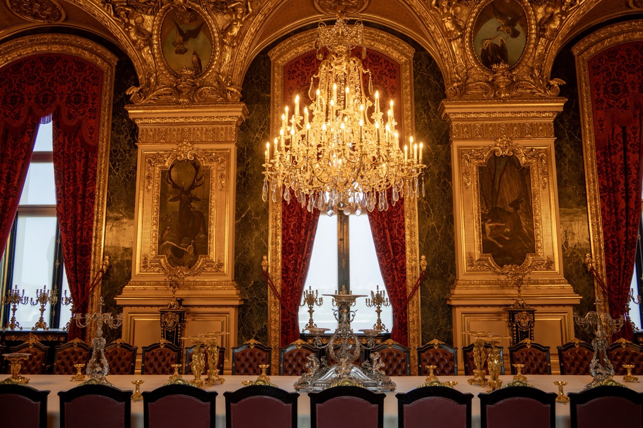
1. Overall Rating (0–10) — 8.5 This photograph captures the opulent grandeur of a historic dining hall with breathtaking clarity and reverence for its architectural splendor. The layered chandeliers and gilded details create a sense of infinite luxury, while the long table and formal arrangement evoke a bygone era of royal ceremony. The image balances richness and restraint, though the sheer density of ornamentation risks overwhelming the viewer’s eye if not carefully framed.
2. Composition (0–10) — 9.0 The symmetrical composition draws the eye down the central axis of the table, emphasizing depth and order. The placement of the chandeliers creates a strong visual rhythm, with the foreground chair framing the scene and leading into the richly decorated space beyond.
3. Lighting (0–10) — 9.0 The warm glow of the chandeliers creates a dramatic interplay of light and shadow, highlighting the textures of the crystal and gold. The lighting is both functional and atmospheric, casting a golden radiance that enhances the room’s regal character while preserving depth and detail.
4. Color & Tone (0–10) — 8.5 The palette of gold, deep burgundy, and white creates a harmonious and luxurious color scheme. The contrast between the dark wood and the luminous chandeliers adds visual richness, while the soft, warm tones evoke a sense of timelessness and elegance.
5. Creativity (0–10) — 8.0 The image successfully transforms a static interior into a narrative of power and refinement. The choice to capture the space from a low, intimate angle enhances the sense of awe, making the viewer feel as though they are about to sit at the table for a grand feast.
6. Technical Quality (0–10) — 9.0 Sharp focus and precise exposure reveal fine details in the chandeliers, upholstery, and ornamentation. The image is free of noise and distortion, with excellent control over depth of field that keeps the central elements in crisp clarity.
7. Emotional Impact (0–10) — 9.0 The photograph evokes a profound sense of awe and reverence, transporting the viewer into a world of historical grandeur. The combination of light, scale, and meticulous detail inspires a quiet admiration for craftsmanship and tradition, leaving a lasting impression of beauty and power.
Architectural Evolution
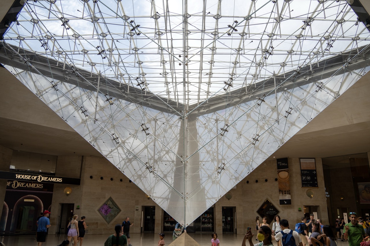
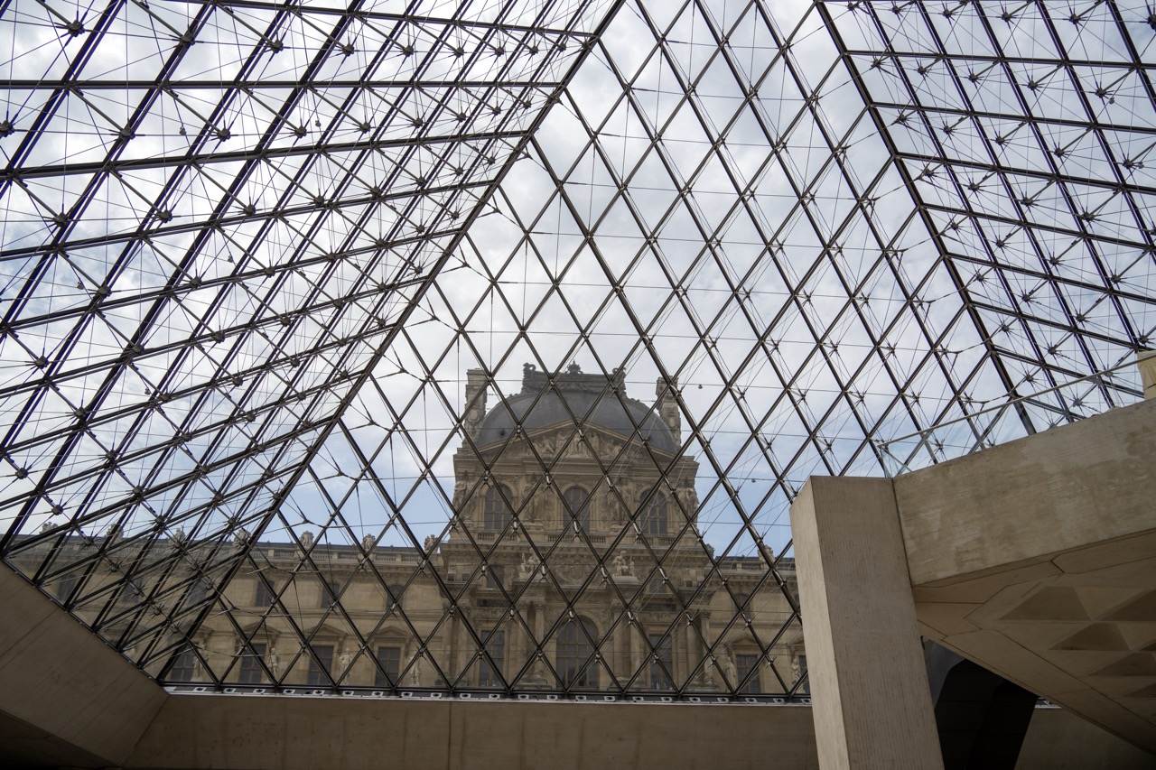
The Louvre’s architecture reflects its rich history and evolution. The iconic glass pyramid, designed by architect I. M. Pei and inaugurated in 1989, serves as the museum’s main entrance. This modern addition contrasts beautifully with the historic palace, symbolizing the Louvre’s blend of tradition and innovation.
1. Overall Rating (0–10) — 7.0 This photograph captures the grandeur and geometric brilliance of the Louvre’s glass pyramid, transforming an architectural marvel into a lens for human scale and wonder. The upward perspective emphasizes the structure’s soaring complexity, while the presence of visitors grounds the image in lived experience. Though the composition is strong, the sheer density of architectural lines risks overwhelming the viewer, and the lighting, while clear, lacks dramatic contrast to elevate the moment.
2. Composition (0–10) — 7.5 The low-angle, centered framing draws the eye upward through the pyramid’s apex, emphasizing its symmetrical elegance. The diagonal lines of the glass structure create dynamic tension, while the people below provide scale and narrative context. The inclusion of signage and surrounding walls grounds the image, though the lower third feels slightly crowded.
3. Lighting (0–10) — 7.0 Natural light filters through the glass, creating a bright, diffused glow that highlights the intricate framework. The overcast sky softens shadows, ensuring even exposure across the structure. While the lighting is clear and functional, it lacks the warmth or contrast to imbue the scene with mood or drama.
4. Color & Tone (0–10) — 6.5 The palette is dominated by cool whites and grays of the glass and steel, punctuated by the beige stone of the Louvre’s walls. The colors are restrained and realistic, reflecting the modernist aesthetic of the pyramid. A touch of warmth in the lighting or more vivid pops from the visitors’ clothing could enhance visual interest.
5. Creativity (0–10) — 7.0 The choice to frame the pyramid from below offers a fresh perspective on a well-known landmark, emphasizing its architectural ambition. The inclusion of people within the frame adds a layer of storytelling, suggesting the intersection of art, history, and public life. The image feels both documentary and contemplative.
6. Technical Quality (0–10) — 8.0 Sharp focus and high resolution render the intricate details of the glass and metal structure with precision. The exposure is well-balanced, capturing both the brightness of the glass and the details in the shadowed areas of the hall. There are no noticeable technical flaws.
7. Emotional Impact (0–10) — 6.5 The image evokes a sense of awe and intellectual curiosity, inviting the viewer to contemplate the harmony of modern design and historical legacy. While the emotional resonance is strong in concept, the lack of dramatic lighting or a focal human moment keeps the connection from fully engaging.
1. Overall Rating (0–10) — 7.5 This photograph masterfully juxtaposes modern architecture with classical grandeur, framing the Louvre’s historic façade through the geometric lattice of its iconic glass pyramid. The interplay of lines and textures creates a visually compelling dialogue between past and present. While the overcast sky tempers the image’s vibrancy, the composition’s clarity and structural balance lend it a quiet elegance that feels both monumental and contemplative.
2. Composition (0–10) — 8.0 The low-angle perspective emphasizes the pyramid’s soaring geometry, while the classical building is centered through the grid, creating a strong visual anchor. The concrete foreground frames the scene effectively, guiding the eye toward the architectural harmony at the center.
3. Lighting (0–10) — 6.5 Diffused daylight softens the scene, minimizing harsh shadows and allowing the intricate details of both the glass structure and the stone façade to be visible. The overcast sky, while reducing contrast, enhances the image’s calm, contemplative mood.
4. Color & Tone (0–10) — 6.0 The palette is restrained, dominated by cool grays and muted beige tones. While the color harmony is strong, the lack of warmth limits the image’s emotional depth and visual richness.
5. Creativity (0–10) — 8.0 The conceptual framing—viewing a historic landmark through a modern structure—demonstrates thoughtful composition and symbolic intent. The photographer captures a moment where architecture becomes metaphor, bridging eras with quiet precision.
6. Technical Quality (0–10) — 8.5 The image is sharp and well-focused, with fine detail visible in both the glass framework and the distant architecture. The exposure is balanced, preserving detail in both highlights and shadows.
7. Emotional Impact (0–10) — 7.0 There is a sense of reverence and timelessness in the image, evoking awe at the coexistence of old and new. The viewer is invited to reflect on history, innovation, and the enduring power of design.
Exploring the Louvre’s Collections
The Louvre houses an extensive collection of artworks spanning from ancient civilizations to the 19th century. With over 35,000 pieces on display, it’s impossible to see everything in one visit, but here are a few highlights:
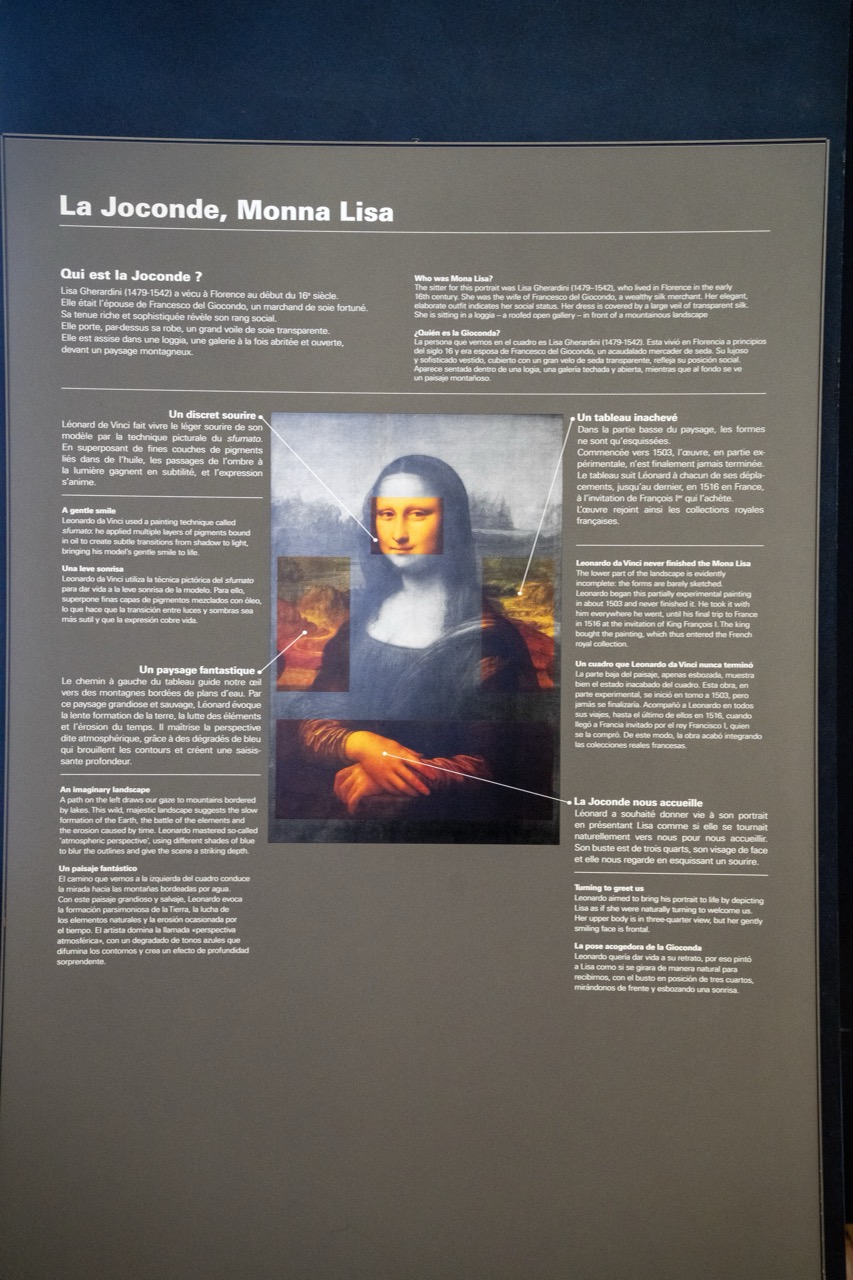
Leonardo da Vinci’s “Mona Lisa” is undoubtedly the Louvre’s most famous painting. Visitors from around the world flock to see her enigmatic smile, making it one of the most visited and iconic artworks in history.
1. Overall Rating (0–10) — 7.5 This photograph captures the enigmatic presence of the Mona Lisa within the solemnity of a museum setting, where the painting’s timeless mystery is framed by the weight of history. The deep blue wall enhances the portrait’s mystique, while the ornate gilded frame underscores its cultural significance. Though the image is rich in context, the flatness of the display and the absence of human interaction slightly diminish the emotional immediacy of the encounter.
2. Composition (0–10) — 7.0 Centered and symmetrical, the portrait dominates the frame, with the ornate frame acting as a visual border that reinforces its importance. The dark background provides contrast and focus, though the composition feels static, lacking dynamic tension.
3. Lighting (0–10) — 7.5 Soft, even lighting highlights the painting’s surface without glare, allowing the subtle sfumato technique to be appreciated. The lighting is controlled and respectful, emphasizing the artwork’s delicate textures and tonal transitions.
4. Color & Tone (0–10) — 7.0 The deep blue backdrop creates a dramatic contrast with the warm gold of the frame and the earthy tones of the painting. The palette is subdued yet harmonious, with the muted greens and browns of the landscape reinforcing the painting’s timeless quality.
5. Creativity (0–10) — 7.5 The image succeeds in framing a world-renowned masterpiece within its cultural context, evoking both reverence and curiosity. The choice of a dark, moody background elevates the painting’s stature, transforming the photograph into a contemplative homage.
6. Technical Quality (0–10) — 8.0 Sharp focus and clean detail capture the texture of the canvas and the intricate carvings of the frame. The image is technically sound, with no distracting artifacts or misalignments.
7. Emotional Impact (0–10) — 8.0 There’s a quiet awe in the way the painting is presented—its enigmatic smile and the stillness of the museum space invite introspection. The viewer is drawn into the same contemplative space that has captivated audiences for centuries, evoking a sense of wonder and historical connection.
1. Overall Rating (0–10) — 5.5 This image captures an informational display about the *Mona Lisa*, presenting a blend of artistic analysis and historical context in a museum-like setting. While the layout is organized and informative, the photograph itself is technically flat, with a lack of visual depth that diminishes the inherent drama of the subject. The tone is academic and restrained, which suits the content but limits emotional engagement. A stronger composition and lighting would elevate it from a simple documentation to a more compelling visual narrative.
2. Composition (0–10) — 5.0 The central placement of the *Mona Lisa* image is balanced, but the surrounding text panels create a cluttered, segmented feel. The diagonal lines of the text and the overlapping annotations disrupt visual flow, making the image feel more like a page from a brochure than a cohesive artwork. A tighter framing and more intentional use of negative space would improve focus.
3. Lighting (0–10) — 4.0 The lighting is flat and even, likely from overhead museum fixtures, which washes out subtle textures and shadows. This creates a sterile atmosphere that fails to highlight the visual richness of the painting or the tactile quality of the display. The lack of contrast and directional light diminishes the sense of depth and presence.
4. Color & Tone (0–10) — 5.0 The palette is muted, dominated by grays and off-whites, with the *Mona Lisa*’s soft earth tones appearing dull under the fluorescent light. While the colors are accurate, they lack vibrancy and warmth, contributing to the image’s clinical feel. A warmer tone would enhance the historical and artistic resonance.
5. Creativity (0–10) — 6.0 The display creatively integrates the painting with explanatory text, using arrows and close-ups to guide the viewer through key features. This pedagogical approach is effective and thoughtful, though the execution feels more utilitarian than imaginative. The concept is strong, but the presentation lacks stylistic flair.
6. Technical Quality (0–10) — 6.5 The image is sharp and free of motion blur or noise, with clear legibility of the text. However, the perspective is slightly tilted, and the edges of the display panel are slightly out of focus, indicating a casual capture rather than a deliberately composed shot. The technical execution is competent but unrefined.
7. Emotional Impact (0–10) — 5.0 The image conveys intellectual curiosity rather than emotional resonance. While it invites contemplation of the *Mona Lisa*’s mystery, the cold, detached presentation distances the viewer. The lack of atmospheric lighting and emotional nuance keeps the experience informative but not moving.
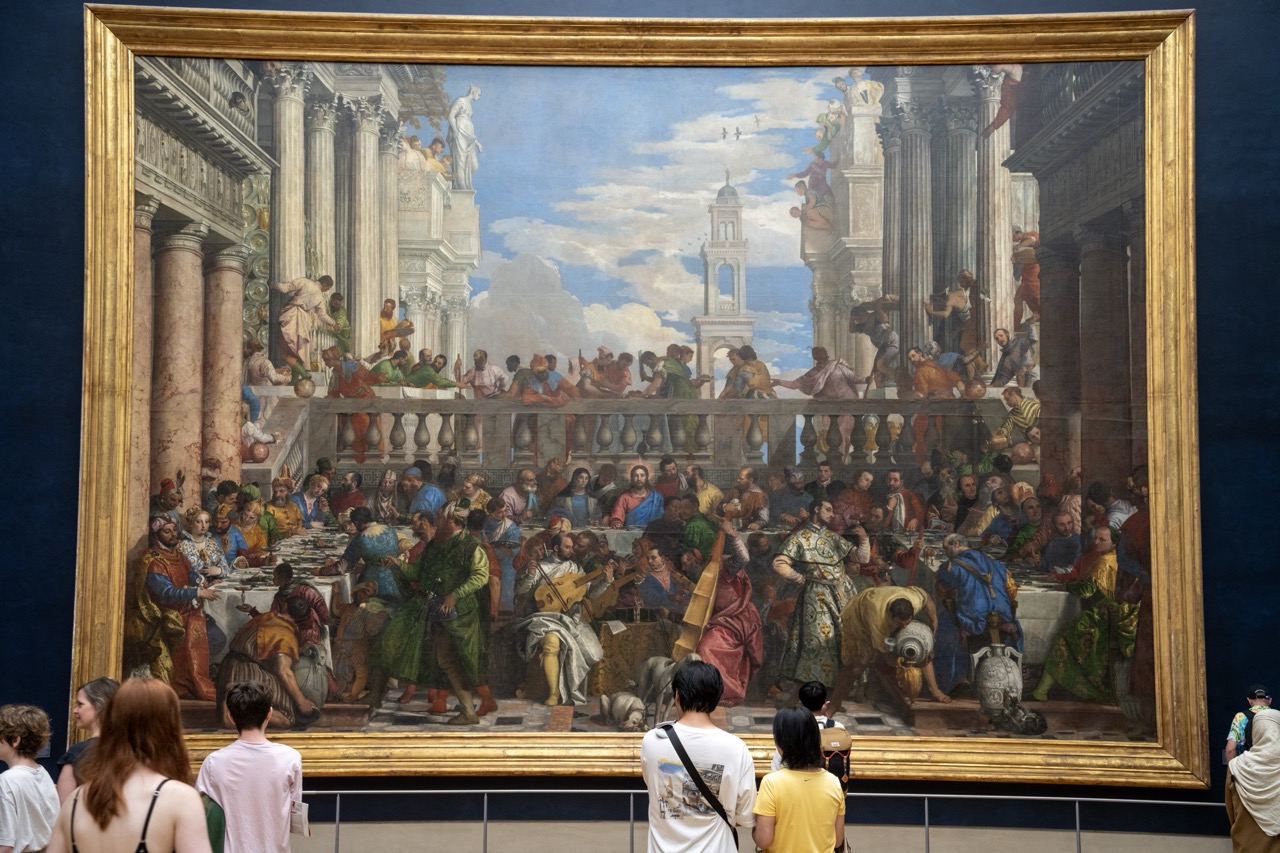
The Marriage at Cana by Paolo Veronese
Another magnificent piece in the Louvre’s vast collection is "The Marriage at Cana" by Paolo Veronese. This enormous painting, measuring 6.77 meters by 9.94 meters, is a masterpiece of the Italian Renaissance. It depicts the biblical story of Jesus turning water into wine at a wedding feast, featuring over 130 figures in a lavish banquet setting. The grandeur and intricate details of this painting make it a standout work that captivates visitors with its vibrant portrayal of a joyous celebration.
1. Overall Rating (0–10) — 7.5 This photograph captures the grandeur of a monumental Renaissance painting displayed in a museum, where the viewer’s gaze is drawn to both the artwork and the human presence observing it. The painting’s intricate composition and vibrant storytelling are powerfully framed by the gallery’s dark backdrop and the contemplative figures in the foreground, creating a layered narrative of art, history, and experience. While the image successfully conveys the scale and significance of the piece, the framing slightly dilutes the painting’s visual dominance, making it feel more like a document than a moment of aesthetic revelation.
2. Composition (0–10) — 7.0 The painting dominates the frame, but the inclusion of visitors in the foreground introduces a sense of scale and context. The low-angle perspective enhances the painting’s grandeur, though the crowd’s positioning slightly disrupts the visual flow toward the central subject.
3. Lighting (0–10) — 7.5 Even, ambient lighting in the gallery highlights the painting without glare, preserving its rich colors and textures. The contrast between the illuminated canvas and the dark walls enhances focus on the artwork, while the natural lighting from the painting itself adds depth and drama.
4. Color & Tone (0–10) — 8.0 The painting’s warm, earthy palette—rich golds, deep reds, and luminous blues—is beautifully rendered, with strong contrast between light and shadow enhancing its three-dimensional quality. The dark museum setting further accentuates the vibrancy of the original artwork.
5. Creativity (0–10) — 7.0 The photograph is conceptually strong, merging the historical artwork with contemporary viewers to create a dialogue between past and present. While the approach is conventional, the juxtaposition adds narrative depth and invites reflection on the painting’s enduring relevance.
6. Technical Quality (0–10) — 8.0 Sharp focus and clear detail across the frame, particularly in the painting’s intricate elements, demonstrate strong technical execution. The golden frame is well-defined, and the depth of field effectively keeps both the artwork and foreground subjects in view.
7. Emotional Impact (0–10) — 7.5 The image evokes a sense of reverence and awe, not only for the masterpiece but also for the shared human experience of encountering art. The quiet contemplation of the viewers enhances the emotional resonance, making the moment feel both intimate and monumental.
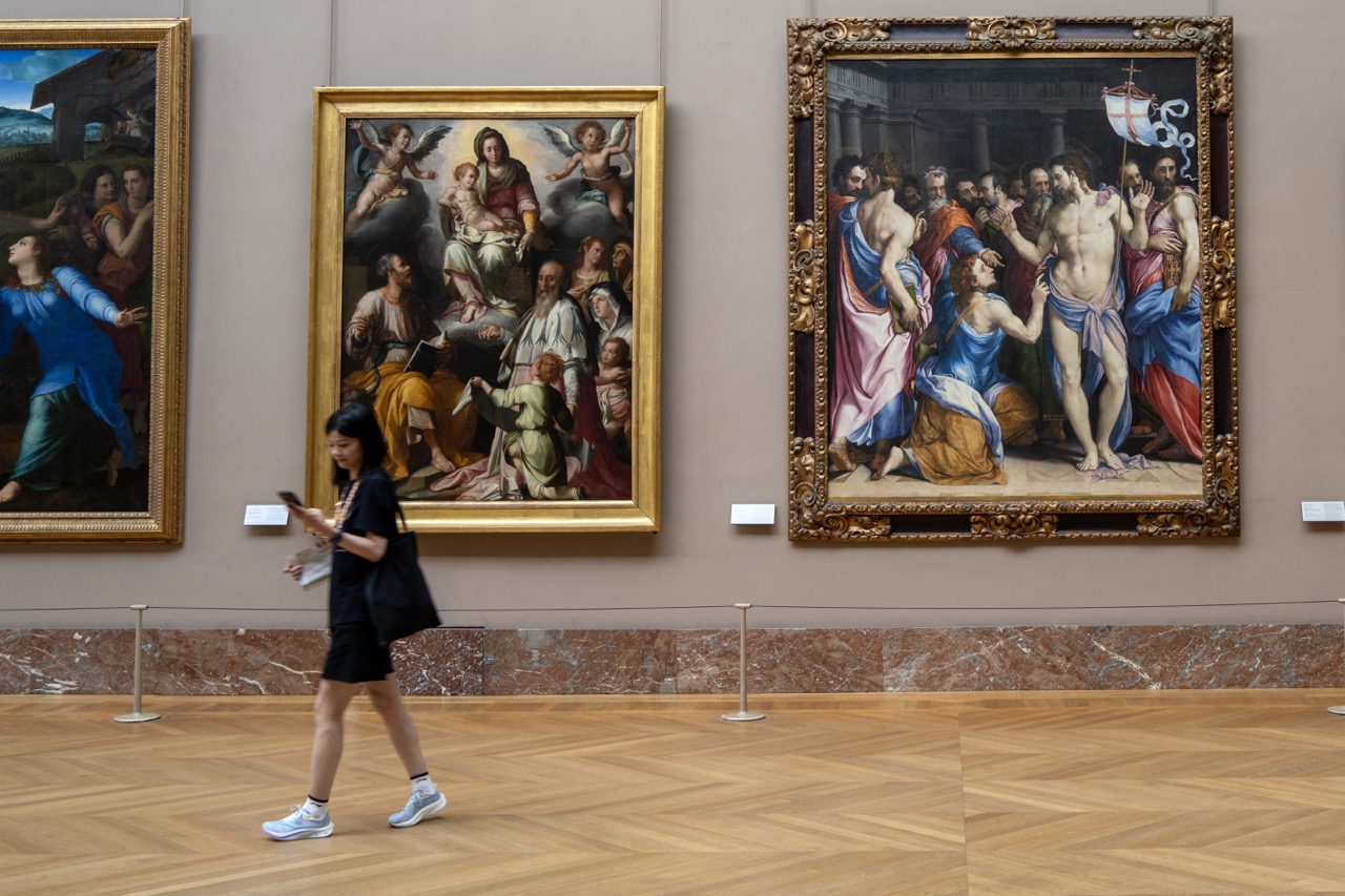
L'Apparition de la Vierge à saint Luc et saint Yves by Jacopo Chimenti
One of the lesser-known yet equally captivating masterpieces in the Louvre’s collection is Jacopo Chimenti’s "L'Apparition de la Vierge à saint Luc et saint Yves." This stunning painting portrays the Virgin Mary appearing to Saint Luke and Saint Yves, surrounded by a divine glow. Chimenti’s attention to detail and use of vibrant colors create a mesmerizing scene that draws viewers into its sacred narrative.
1. Overall Rating (0–10) — 7.0 This photograph captures a quiet moment of contemporary life intersecting with centuries-old art, creating a subtle dialogue between the past and present. The juxtaposition of the casually dressed woman moving through the gallery against the grandeur of the classical paintings evokes a sense of timelessness and cultural continuity. While the image is visually balanced and conceptually rich, it remains restrained in its emotional reach, offering more observation than revelation.
2. Composition (0–10) — 7.5 The diagonal motion of the woman across the frame creates dynamic tension, leading the eye through the space. The arrangement of the three paintings establishes a rhythmic balance, with the viewer's gaze naturally moving from left to right, while the herringbone floor adds visual depth.
3. Lighting (0–10) — 8.0 Soft, even gallery lighting illuminates the paintings without glare, preserving their details while casting a warm, neutral glow across the space. The lighting enhances the textures of the paintings and the polished wood floor, contributing to a calm, contemplative atmosphere.
4. Color & Tone (0–10) — 7.0 The palette is composed of earthy golds, deep blues, and muted reds in the paintings, which contrast with the neutral tones of the gallery walls and the woman’s dark clothing. The overall tonal harmony is strong, though the colors of the paintings slightly overpower the more subdued surroundings.
5. Creativity (0–10) — 7.5 The image leverages the contrast between modernity and tradition in a visually engaging way, capturing a fleeting moment of human presence in a space dedicated to enduring art. The choice of a moving subject against static masterpieces adds narrative depth and conceptual resonance.
6. Technical Quality (0–10) — 8.5 The image is sharp and well-focused, with clean lines and clear detail in both the foreground and background. The exposure is balanced, and the depth of field effectively keeps both the subject and the paintings in focus.
7. Emotional Impact (0–10) — 6.5 The photograph conveys a quiet introspection, inviting the viewer to reflect on the relationship between art, time, and individual experience. While emotionally subtle, it carries a gentle sense of reverence and curiosity that lingers after viewing.
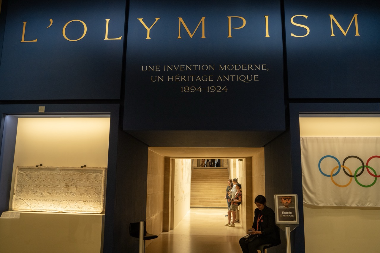
New Olympism Exhibition
In an exciting addition to its already impressive array of exhibits, the Louvre Museum has recently launched the "Olympism" exhibition, celebrating the rich history and cultural significance of the Olympic Games. This exhibition coincides with the upcoming Paris 2024 Olympics, bringing a fresh perspective on the ancient and modern games.
1. Overall Rating (0–10) — 7.5 This photograph captures the solemn grandeur of a museum exhibition dedicated to the modern Olympic movement, blending historical reverence with contemporary design. The deep blue backdrop and golden lettering evoke a sense of institutional prestige, while the interplay of light and shadow draws the eye toward the inviting entrance. Though the composition is strong, the inclusion of casual visitors introduces a slight disruption to the otherwise curated atmosphere, hinting at the intersection of public engagement and historical narrative.
2. Composition (0–10) — 7.0 The central archway serves as a strong focal point, guiding the viewer’s gaze into the gallery space. The symmetry of the signage above and the balanced placement of the display cases and flag enhance visual harmony, though the inclusion of the seated figure on the right slightly disrupts the formal alignment.
3. Lighting (0–10) — 8.0 The use of directional, warm lighting within the display cases highlights the artifact while creating a subtle contrast with the darker surrounding space. The soft glow from the entrance further emphasizes depth, enhancing the sense of movement and discovery.
4. Color & Tone (0–10) — 7.5 The deep navy blue and gold palette exudes authority and timelessness, complemented by the warm beige of the hallway and the vibrant Olympic rings. The contrast between the cool and warm tones adds visual interest and reinforces the theme of tradition meeting modernity.
5. Creativity (0–10) — 7.0 The photograph successfully captures both the intellectual and emotional weight of the exhibit, using the juxtaposition of historical text and modern visitors to suggest a living legacy. The inclusion of the Olympic flag adds symbolic resonance, grounding the image in its cultural context.
6. Technical Quality (0–10) — 8.5 Sharp focus, clean detail, and well-managed exposure demonstrate strong technical execution. The depth of field is appropriately controlled, keeping both the foreground signage and the distant figures in view without sacrificing clarity.
7. Emotional Impact (0–10) — 7.5 The image evokes a contemplative mood, inviting viewers to reflect on the evolution of the Olympic ideals. The quiet presence of the visitors adds a layer of human connection, suggesting that history is not just preserved but actively experienced.
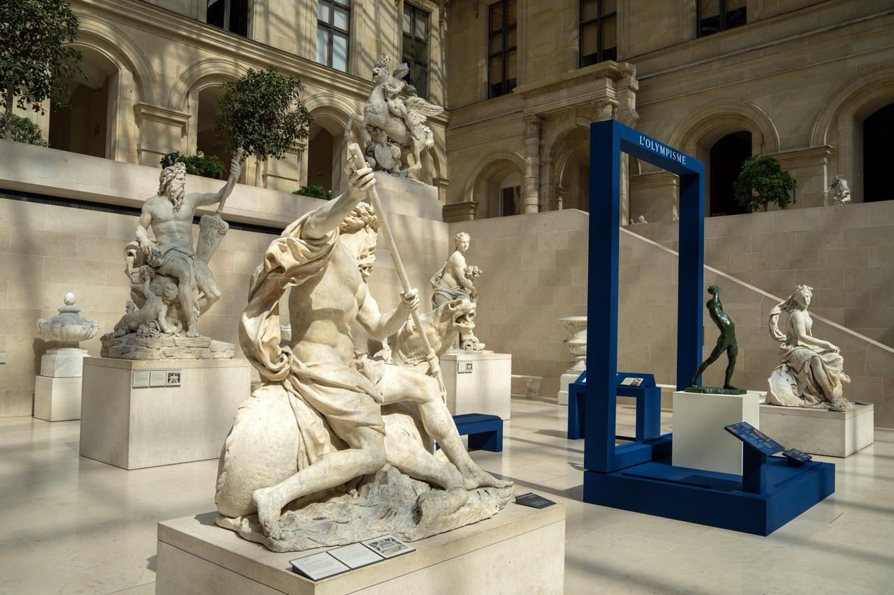
1. Overall Rating (0–10) — 7.5 This photograph captures a harmonious dialogue between classical sculpture and contemporary art within a grand museum space, where light and form converge to evoke both reverence and curiosity. The interplay of ancient marble figures and the bold blue frame of *L'Olympisme* creates a compelling visual contrast, grounding the scene in both history and modernity. While the composition is rich in narrative and detail, the overall effect is slightly restrained by the clinical clarity of the lighting, which tempers the emotional resonance of the setting.
2. Composition (0–10) — 7.0 The framing effectively balances the foreground sculpture with the architectural backdrop and surrounding artworks, creating depth and guiding the eye across the space. The placement of the blue frame serves as a strong visual anchor, though its central positioning slightly disrupts the symmetry of the classical arrangement.
3. Lighting (0–10) — 8.0 Natural light filters through the upper windows, casting soft, directional shadows that enhance the texture and volume of the marble sculptures. The even illumination highlights sculptural detail without overpowering the scene’s atmospheric quietude.
4. Color & Tone (0–10) — 7.5 The palette is dominated by warm stone tones and the crisp blue of the modern installation, creating a striking yet balanced contrast. The tonal range is well-managed, with subtle shadows adding dimension without sacrificing clarity.
5. Creativity (0–10) — 8.0 The juxtaposition of classical and contemporary art—particularly the bold blue frame referencing *L'Olympisme*—introduces a conceptual layer that elevates the image beyond mere documentation. It invites reflection on tradition, progress, and the enduring power of artistic expression.
6. Technical Quality (0–10) — 8.5 The image is sharp and detailed, with precise focus across the scene. The camera’s wide-angle perspective captures the scale of the space without distorting the sculptures, and the exposure is well-balanced.
7. Emotional Impact (0–10) — 7.0 The photograph evokes a sense of contemplative reverence, inviting the viewer to step into a space where past and present coexist. While the mood is calm and dignified, the lack of human presence keeps the emotional connection at a respectful distance.
Ancient Olympic Artifacts: The exhibition features a remarkable collection of ancient artifacts, including Greek vases, sculptures, and medals that date back to the original Olympic Games held in Olympia, Greece. These pieces provide a fascinating insight into the early traditions and cultural importance of the games.
Olympic Posters and Memorabilia: Visitors can explore a diverse array of posters, memorabilia, and paraphernalia from various Olympic Games throughout history. This section highlights the evolution of the games and their impact on global culture.
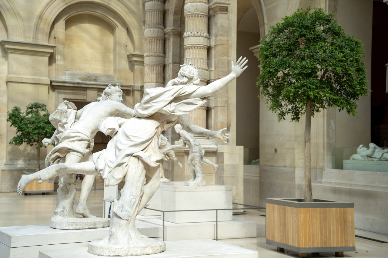
1. Overall Rating (0–10) — 7.5 This photograph captures the dynamic energy of a classical marble sculpture within the hushed grandeur of a museum gallery. The interplay between the fluid motion of the figures and the solemn architecture creates a compelling dialogue between art and space. While the composition is rich in historical texture and narrative potential, the presence of modern planters and barriers subtly disrupts the timeless atmosphere, hinting at the tension between preservation and display.
2. Composition (0–10) — 7.0 The sculpture is well-framed, with a diagonal flow that guides the eye from the foreground figures into the depth of the gallery. The placement of the tree in the right foreground adds balance, though its modern form contrasts with the classical subject, slightly disrupting visual harmony.
3. Lighting (0–10) — 7.5 Soft, diffused overhead lighting enhances the texture and form of the marble without harsh shadows, allowing the viewer to appreciate the sculptural details. The even illumination complements the architectural space, lending a calm, contemplative mood.
4. Color & Tone (0–10) — 7.0 The palette is restrained and cohesive, dominated by the warm beige of the stone and the muted green of the trees. The tonal range is gentle, with subtle contrast between the white marble and the surrounding architecture, creating a unified and dignified aesthetic.
5. Creativity (0–10) — 7.0 The image successfully juxtaposes movement and stillness, modern and classical elements, offering a layered narrative about art in its institutional context. While not overtly experimental, it conveys a thoughtful engagement with the setting and subject.
6. Technical Quality (0–10) — 8.0 The image is sharp and well-focused, with fine detail visible in the marble’s surface and architectural textures. Exposure is balanced, and the depth of field appropriately frames the sculpture while including contextual background.
7. Emotional Impact (0–10) — 7.5 There is a quiet reverence in the image, evoking a sense of awe for both the sculptural mastery and the enduring presence of art. The viewer is invited to reflect on the passage of time and the enduring power of human expression.
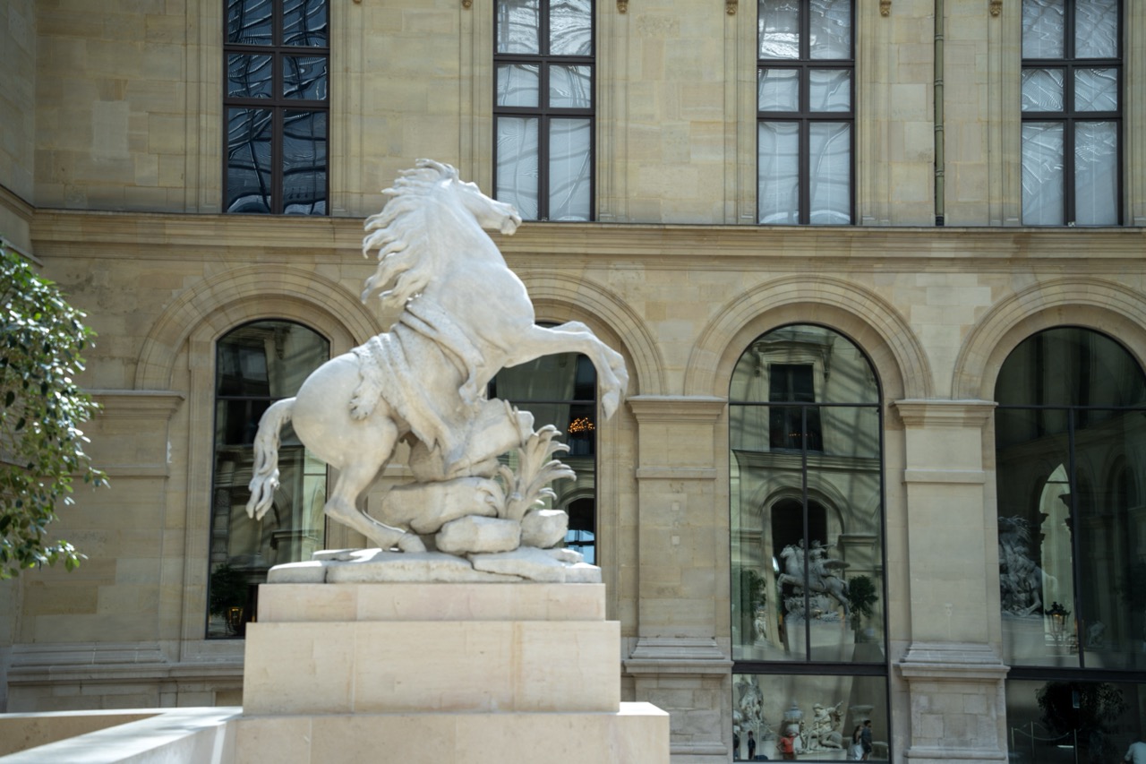
1. Overall Rating (0–10) — 7.0 This photograph captures the poised elegance of a marble horse sculpture within the grand courtyard of a historic Parisian palace, where classical art and architecture converge in quiet harmony. The sculpture’s dynamic form contrasts beautifully with the restrained symmetry of the stone façade, while the reflections in the glass arches add a layer of visual depth and modern resonance. Though the lighting is slightly flat and the composition lacks a strong focal anchor, the image succeeds in conveying the dignity and timelessness of its subject.
2. Composition (0–10) — 6.5 The sculpture is centered, creating a balanced focal point, though the surrounding architectural elements slightly distract. The arches and glass reflections add visual interest but compete for attention, creating a slightly cluttered foreground.
3. Lighting (0–10) — 6.0 Natural daylight illuminates the scene evenly, preserving the sculpture’s details without harsh shadows. However, the light lacks directional warmth, giving the image a cool, almost clinical quality that slightly diminishes the sculpture’s dramatic presence.
4. Color & Tone (0–10) — 6.5 The palette is restrained—soft beige stone, pale marble, and muted green foliage—creating a cohesive, harmonious tone. The lack of strong color contrast keeps the image subdued, which aligns with the classical setting but limits visual impact.
5. Creativity (0–10) — 7.0 The juxtaposition of the ancient sculpture with modern glass and reflections introduces a subtle narrative of time and continuity. The framing suggests a quiet dialogue between past and present, lending conceptual depth to the image.
6. Technical Quality (0–10) — 8.0 The image is sharp and well-focused, with clean detail in both the sculpture and the surrounding architecture. The exposure is balanced, and the depth of field is adequate, ensuring clarity across the frame.
7. Emotional Impact (0–10) — 6.5 The photograph evokes a sense of reverence and contemplation, inviting the viewer to pause and reflect on the enduring power of art. While the mood is calm and composed, it remains emotionally reserved, leaving the emotional resonance to the viewer’s interpretation.
Art and the Olympics: The exhibition also explores the intersection of art and the Olympics, showcasing how artists have captured the essence of the games through paintings, sculptures, and multimedia installations. This section celebrates the creativity and inspiration that the Olympics have sparked in the art world.
Fun Fact: The Louvre’s Extensive Underground Network
Here’s a fun fact about the Louvre that might surprise you: beneath the museum lies an extensive underground network of tunnels and spaces. These underground areas include storage rooms, conservation labs, and even hidden passages. During World War II, the Louvre’s underground network played a crucial role in protecting its priceless collection from being seized by the Nazis. Museum staff and volunteers moved thousands of artworks to secret locations throughout France, ensuring their safety until the end of the war.
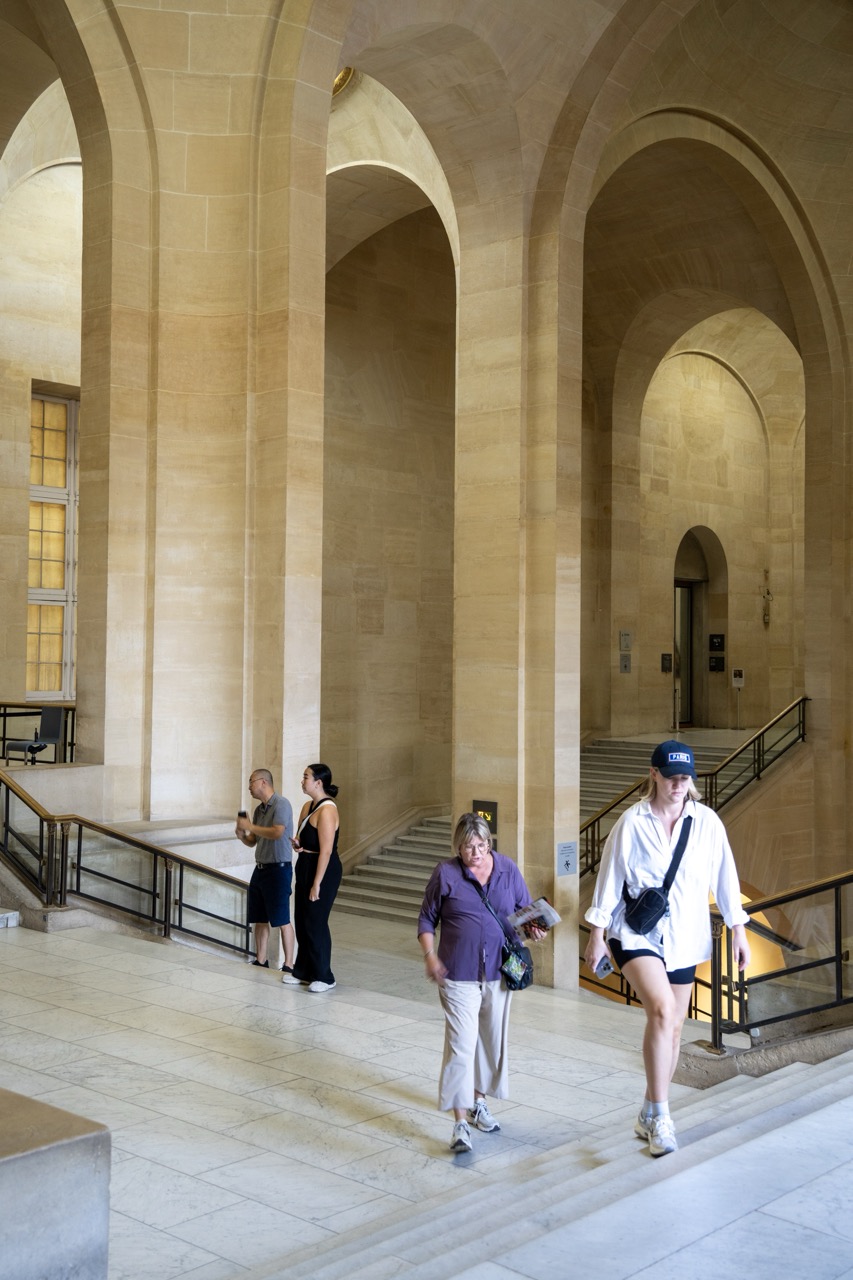
1. Overall Rating (0–10) — 6.8 This photograph captures the grandeur of a monumental interior, where the interplay of light and architecture evokes a sense of timeless elegance. The warm, honey-toned stone and sweeping arches create a serene, almost reverent atmosphere, while the casually dressed visitors ground the space in contemporary life. Though the image successfully conveys the scale and mood of the location, the composition feels slightly static, and the candid nature of the subjects, while authentic, doesn’t fully engage the viewer emotionally.
2. Composition (0–10) — 6.5 The strong vertical lines of the columns and the rhythmic arches create a sense of order and depth, guiding the eye through the space. However, the placement of the figures feels somewhat scattered, with the woman in the foreground slightly disrupting the balance. A more intentional arrangement of the subjects could enhance the visual flow.
3. Lighting (0–10) — 7.0 Natural light filters softly through the windows, casting a warm, even glow that enhances the texture of the stone. The light’s direction adds subtle depth and dimension to the arches, contributing to the architectural drama without creating harsh shadows.
4. Color & Tone (0–10) — 7.5 The warm, earthy palette of beige and cream stone is harmonious and cohesive, with a gentle contrast between the lighter floor and the slightly darker columns. The muted tones evoke a sense of calm and timelessness, though a touch more vibrancy in the subjects’ clothing could add visual interest.
5. Creativity (0–10) — 6.0 The image is a strong architectural portrait, capturing the relationship between space and human presence. While it avoids overt staging, the lack of a clear narrative or focal point limits its creative impact. It functions more as an observation than an interpretation.
6. Technical Quality (0–10) — 8.0 The image is sharp and well-focused, with clean detail throughout the architecture and a clear depth of field. The exposure is balanced, and the camera’s handling of the ambient light results in a technically sound capture.
7. Emotional Impact (0–10) — 6.5 The photograph conveys a quiet dignity and reverence for the space, but the emotional resonance is tempered by the distance between the viewer and the subjects. The sense of awe is present, but not deeply personal or compelling.
1. Overall Rating (0–10) — 8.5 This photograph captures the grandeur and symmetry of a classical museum gallery with remarkable elegance, where architectural detail and spatial depth converge to evoke a sense of timelessness. The layered arches and rich marble textures create a rhythmic visual journey, while the warm lighting enhances the richness of the materials. Though the scene is devoid of people, the image feels alive with historical resonance, though a subtle touch of human scale might deepen its narrative.
2. Composition (0–10) — 9.0 The use of leading lines through the repeating arches creates a powerful sense of depth and balance, with the central alignment guiding the viewer’s gaze into the distance. The symmetry is nearly perfect, reinforcing the formal grandeur of the space.
3. Lighting (0–10) — 8.0 Warm, ambient lighting enhances the golden tones of the marble and gilded details, casting soft shadows that emphasize texture and dimension. The lighting is controlled and deliberate, highlighting key architectural features without overexposure.
4. Color & Tone (0–10) — 8.5 The palette is rich and harmonious, dominated by warm marbles, gold accents, and the deep red of the frieze, which adds a focal point of contrast. The tonal balance is excellent, with a subtle warmth that enhances the opulent atmosphere.
5. Creativity (0–10) — 8.0 The image successfully transforms an architectural interior into a visually poetic narrative, using symmetry and perspective to evoke both reverence and awe. The choice to capture the space without human presence allows the architecture itself to become the subject.
6. Technical Quality (0–10) — 9.0 Sharp focus throughout the depth of the hall, with excellent clarity and minimal noise. The camera’s resolution captures fine textures in the marble and gilding, and the exposure is well-managed across the scene.
7. Emotional Impact (0–10) — 8.5 The photograph conveys a profound sense of quiet majesty and historical continuity, inviting the viewer to step into a world of classical artistry and imperial design. It stirs contemplation and admiration, making the viewer feel both small and connected to history.
Visiting the Louvre Museum is an unforgettable journey through history and art. From its origins as a medieval fortress to its transformation into a world-class museum, the Louvre’s rich background adds depth to its incredible collection of masterpieces. Whether you’re captivated by the enigmatic smile of the Mona Lisa, the majestic presence of the Winged Victory of Samothrace, or the timeless beauty of the Venus de Milo, the Louvre offers endless opportunities for exploration and inspiration.
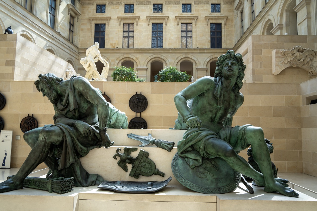
1. Overall Rating (0–10) — 8.0 This photograph captures the grandeur and emotional weight of a classical sculpture installation within a museum courtyard, where ancient art meets architectural elegance. The interplay of light and shadow across the patinated bronze figures enhances their dramatic forms, while the warm stone of the surrounding walls provides a refined backdrop. Though the composition is rich with detail, a slight overexposure in the upper background reduces the depth of the scene, tempering its overall impact.
2. Composition (0–10) — 8.0 The statues are framed symmetrically, with the two central figures anchoring the image and guiding the eye toward the background. The inclusion of the white marble sculpture and the architectural arches adds depth and balance, creating a layered, museum-like narrative.
3. Lighting (0–10) — 7.5 Natural light illuminates the scene from the left, casting soft shadows that accentuate the textures of the bronze and stone. While the overall lighting is even, the bright sky in the upper portion slightly overexposes, softening the architectural details.
4. Color & Tone (0–10) — 7.0 The palette is dominated by earthy tones—green patina, beige stone, and muted browns—creating a harmonious and historically resonant atmosphere. The subtle green of the bronze contrasts gently with the warm background, though the color range could be more dynamic.
5. Creativity (0–10) — 7.5 The image successfully merges historical art with its institutional setting, evoking a sense of timelessness and reverence. The choice to include both the foreground sculptures and the background architecture tells a story of continuity and preservation.
6. Technical Quality (0–10) — 8.5 The image is sharp and well-focused, with fine detail visible in the textures of the bronze and stone. The exposure is generally well-managed, despite the slight overexposure in the upper sky.
7. Emotional Impact (0–10) — 7.5 The photograph conveys a quiet reverence for classical art and the spaces that house it. The expressive poses of the figures and the calm, contemplative setting invite reflection, creating a sense of awe and connection to the past.
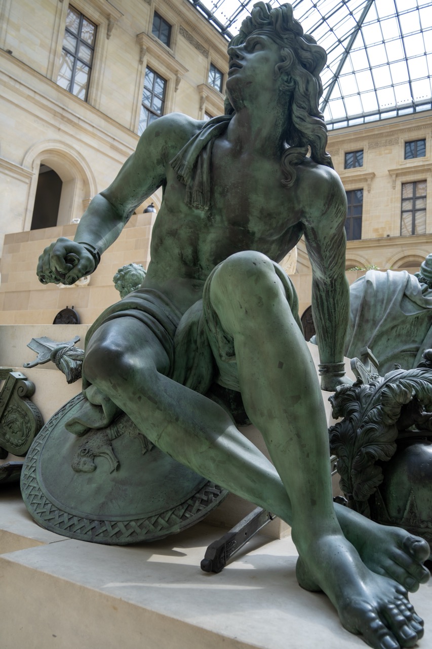
1. Overall Rating (0–10) — 7.5 This photograph captures the dramatic presence of a classical bronze statue within the grand, light-filled nave of a museum, where history and architecture converge. The composition emphasizes the sculpture’s dynamic pose and weathered patina, while the surrounding space lends a sense of reverence and timelessness. Though the image is strong in its subject and setting, the slightly low-angle perspective and cluttered base detract from the sculpture’s full narrative weight.
2. Composition (0–10) — 7.0 The statue is framed diagonally, creating a sense of movement and tension. However, the foreground elements—such as the shield and scattered fragments—introduce visual noise, slightly disrupting the sculpture’s commanding presence.
3. Lighting (0–10) — 8.0 Natural light from the glass ceiling bathes the scene in soft, diffused illumination, highlighting the bronze’s texture and green patina. The interplay of light and shadow enhances the sculpture’s three-dimensionality and adds depth to the space.
4. Color & Tone (0–10) — 7.5 The dominant verdigris green of the bronze contrasts beautifully with the warm beige of the stone architecture and the cool tones of the glass roof. The color palette is harmonious and evocative, reinforcing the classical atmosphere.
5. Creativity (0–10) — 7.0 The image successfully juxtaposes the human form with its architectural context, suggesting a dialogue between art and environment. The low-angle perspective adds drama, though the inclusion of surrounding artifacts slightly dilutes the focus on the central figure.
6. Technical Quality (0–10) — 8.5 Sharp focus across the statue ensures fine detail is visible, and the exposure is well-balanced. The clarity of textures—from the bronze’s surface to the architectural stonework—demonstrates strong technical execution.
7. Emotional Impact (0–10) — 8.0 The photograph evokes a sense of awe and contemplation, inviting the viewer to reflect on the endurance of art and the weight of history. The upward gaze of the figure and the soaring architecture combine to create a moment of quiet grandeur.
The new Olympism exhibition brings an exciting dimension to the museum, celebrating the cultural and historical significance of the Olympic Games. It’s a perfect complement to the museum’s diverse collection, offering a unique and interactive experience for visitors.
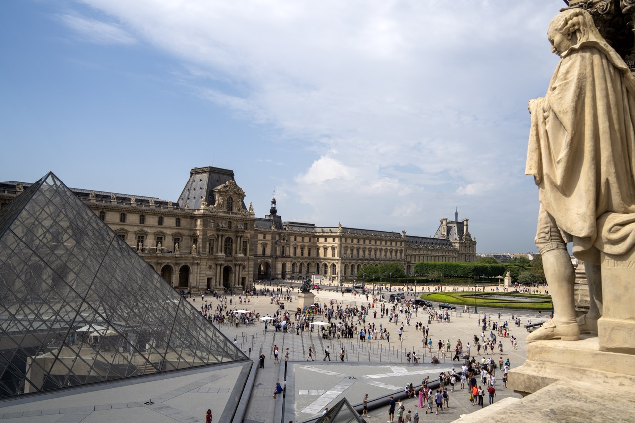
1. Overall Rating (0–10) — 7.5 This photograph captures the grandeur of the Louvre in a way that balances iconic architecture with human presence, offering a sense of scale and liveliness. The juxtaposition of the modern glass pyramid with the classical façade creates a compelling visual dialogue, while the statue in the foreground adds depth and a narrative anchor. The image feels authentic and immersive, though the crowded scene slightly dilutes the monument’s solemnity.
2. Composition (0–10) — 7.0 The statue on the right frames the scene effectively, guiding the eye toward the pyramid and the expansive courtyard. The diagonal of the pyramid adds dynamism, though the composition feels slightly unbalanced due to the heavy visual weight of the statue and the wide, open space to the left.
3. Lighting (0–10) — 7.5 Natural daylight enhances the textures of the stone and glass, casting soft shadows that define form and structure. The slightly overcast sky provides even illumination, avoiding harsh contrasts while preserving detail across the scene.
4. Color & Tone (0–10) — 7.0 The palette is largely neutral—beiges, grays, and muted blues—reflecting the architectural tones of the Louvre. While restrained, the colors feel cohesive and appropriate for the setting. A touch more vibrancy in the sky or the greenery could add contrast.
5. Creativity (0–10) — 7.5 The inclusion of the statue as a framing device adds a layer of storytelling, suggesting a journey through time—from classical sculpture to modern design. The angle and perspective offer a fresh take on a well-documented location, emphasizing both history and contemporary life.
6. Technical Quality (0–10) — 8.0 Sharp focus across the frame ensures clarity in both the foreground and background. The image is well-exposed, with balanced detail in highlights and shadows, and no noticeable noise or distortion.
7. Emotional Impact (0–10) — 7.0 The photograph evokes a sense of awe and wonder, capturing the energy of a world-renowned cultural site. The presence of people adds warmth and relatability, inviting viewers to imagine themselves in the space, though the sheer number of visitors tempers the sense of serenity.
As you wander through its grand halls and marvel at its treasures, remember that the Louvre is more than just a museum—it’s a testament to the enduring power of art and culture. Until our next adventure, keep exploring, and let the beauty of the world’s masterpieces inspire you.