The Jardin d'Acclimatation is a blend of natural beauty, entertainment, and cultural history in Paris, featuring a modern masterpiece, the Louis Vuitton Foundation. The garden, originally established in 1860, offers rides, attractions, art installations, and animal enclosures, making it a delightful time capsule with something for everyone.
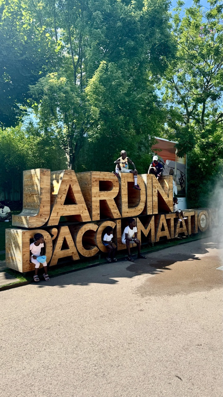

1. Overall Rating (0–10) — 7.0
This photograph captures a vibrant, sunlit moment of children interacting with a large wooden sign in a lush park setting, radiating youthful energy and playful curiosity. The natural light enhances the scene’s warmth and authenticity, though the composition feels slightly unbalanced due to the heavy visual weight of the sign. While the image succeeds in conveying a sense of joy and community, it stops short of transcendent visual storytelling—remaining a strong document of a moment rather than a deeply resonant work of art.
2. Composition (0–10) — 6.0
The large wooden letters dominate the frame, creating a strong focal point, but their placement shifts the visual weight to the upper right, leaving the lower left underutilized. The children’s placement adds dynamic interest, yet the uneven distribution of subjects and space reduces compositional harmony.
3. Lighting (0–10) — 8.0
Bright, natural sunlight enhances the scene’s clarity and warmth, casting soft shadows that define form and depth. The dappled light filtering through the trees adds texture and dimension, creating a lively, inviting atmosphere.
4. Color & Tone (0–10) — 7.5
The rich greens of the foliage contrast beautifully with the warm, natural tones of the wooden sign and the children’s clothing. The palette feels balanced and cohesive, with a slightly warm cast that reinforces the summery, cheerful mood.
5. Creativity (0–10) — 7.0
The image captures a spontaneous, joyful interaction that feels both candid and intentional. The choice to frame the children within the sign adds narrative depth, transforming a simple landmark into a stage for human connection.
6. Technical Quality (0–10) — 8.0
Sharp focus and clear detail throughout the image highlight textures—from the grain of the wood to the children’s expressions. The exposure is well-managed, with no significant over- or underexposed areas.
7. Emotional Impact (0–10) — 8.0
The photograph evokes a strong sense of childhood innocence and communal joy, drawing the viewer into a moment of unfiltered happiness. The warmth of the scene and the children’s relaxed postures create an immediate emotional connection.
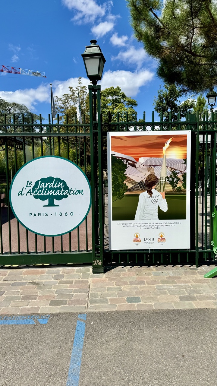

1. Overall Rating (0–10) — 7.0
This photograph captures a vibrant moment at the Jardin d'Acclimatation in Paris, where the energy of the Olympic Games meets the charm of a historic park. The bright blue sky and bold signage create a sense of celebration and occasion, while the juxtaposition of the Olympic torch poster against the traditional green gate adds narrative depth. The image is slightly cluttered by the foreground pavement and distant crane, but the overall composition conveys a lively, contemporary moment in a timeless setting.
2. Composition (0–10) — 6.5
The framing centers on the gate and signage, creating a balanced focal point. The diagonal line of the pavement and the vertical elements of the gate and lamp post guide the eye naturally toward the poster, though the inclusion of the crane and background elements slightly disrupts the harmony.
3. Lighting (0–10) — 8.5
The bright, natural daylight enhances the vividness of the colors and casts clear shadows, emphasizing the sunny, celebratory atmosphere. The strong sunlight creates a high-contrast scene, highlighting the poster and the greenery behind.
4. Color & Tone (0–10) — 7.5
The rich blues of the sky and greens of the trees contrast beautifully with the white and orange tones of the poster, creating a dynamic and engaging palette. The warm hues of the Olympic artwork stand out against the cooler background tones.
5. Creativity (0–10) — 7.0
The image successfully blends cultural heritage with modern global events, using the iconic setting of the Jardin d'Acclimatation to frame a contemporary moment. The inclusion of the Olympic poster adds a layer of storytelling that elevates the photograph beyond a simple snapshot.
6. Technical Quality (0–10) — 8.0
The image is sharp and well-focused, with clean details in the signage and poster. The exposure is well-balanced, capturing the brightness of the day without losing detail in the highlights.
7. Emotional Impact (0–10) — 7.5
The photograph evokes a sense of pride and excitement, capturing the anticipation of the Paris 2024 Olympics within a familiar, beloved Parisian landmark. It invites viewers to feel part of a shared moment of national celebration.
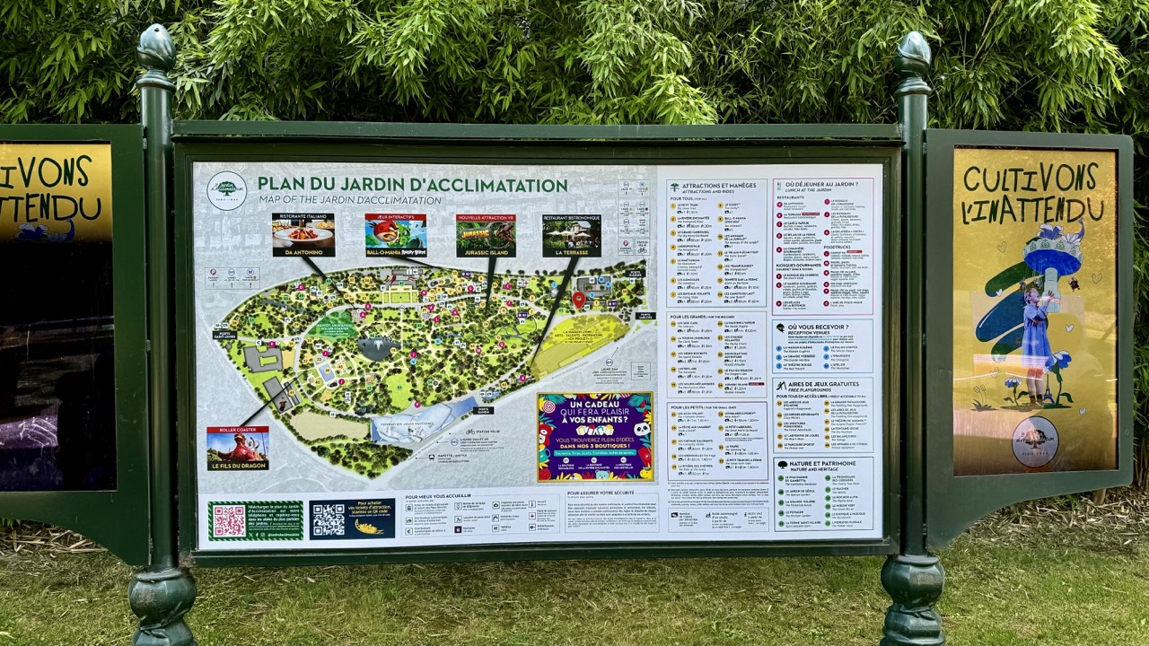

1. Overall Rating (0–10) — 6.0
This image captures a functional park information board in a lush, green setting, conveying a sense of organized leisure and visitor guidance. The composition is straightforward and informative, but lacks visual dynamism, with the dense text and graphics competing for attention. While the natural backdrop adds a pleasant contrast, the image feels more utilitarian than artistic, prioritizing information over aesthetic engagement.
2. Composition (0–10) — 6.0
The central map is well-framed and centered, but the surrounding panels create visual clutter. The left and right side panels disrupt balance, drawing the eye away from the main subject. A tighter crop or cleaner framing would improve visual harmony.
3. Lighting (0–10) — 7.0
Natural daylight evenly illuminates the scene, preserving legibility and detail across the signage. The soft, diffused light avoids harsh shadows, enhancing readability while maintaining the verdant atmosphere of the garden.
4. Color & Tone (0–10) — 6.0
The palette is varied, with the green foliage providing a natural backdrop to the bright, multicolored signage. However, the abundance of text and logos creates a visually busy effect, with no dominant tonal harmony. The colors are functional rather than expressive.
5. Creativity (0–10) — 5.0
The image is observational and documentary in nature, offering practical insight into the park’s layout. It lacks a unique artistic perspective or narrative twist, relying on the inherent information of the sign rather than creative interpretation.
6. Technical Quality (0–10) — 7.0
The image is sharp and clear, with well-focused details on the map and text. The depth of field is appropriate, keeping the signage in focus while softly blurring the background foliage, which enhances readability.
7. Emotional Impact (0–10) — 5.5
The scene evokes a sense of anticipation and mild curiosity—ideal for visitors planning their day. However, the lack of human presence or emotional narrative keeps the viewer at a distance, limiting deeper emotional resonance.
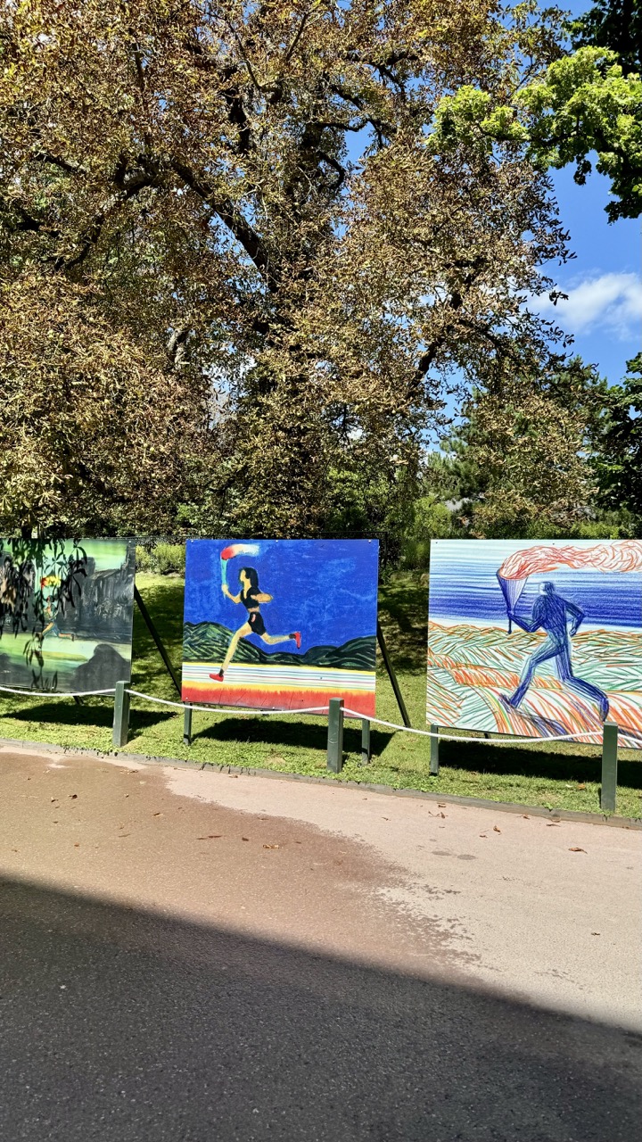

1. Overall Rating (0–10) — 7.0
This photograph captures a vibrant outdoor art installation with a playful, celebratory energy, where colorful painted panels stand in contrast to the natural setting of trees and sky. The juxtaposition of stylized, dynamic figures against the calm park environment creates an engaging visual dialogue between art and nature. While the image is strong in mood and concept, the composition feels slightly scattered, and the framing lacks a clear focal point, softening its overall impact.
2. Composition (0–10) — 6.0
The arrangement of the three panels creates visual rhythm but lacks a dominant focal point. The low-angle perspective and diagonal road edge add dynamism, but the uneven spacing and partial visibility of the leftmost panel weaken compositional harmony.
3. Lighting (0–10) — 8.0
Bright, natural daylight enhances the vividness of the artwork’s colors and casts soft shadows that give depth to the scene. The overhead sun creates even illumination, though the slight overexposure in the sky reduces detail in the upper foliage.
4. Color & Tone (0–10) — 8.5
The bold, saturated colors of the paintings—especially the deep blues and fiery reds—pop against the green grass and muted tree tones. The contrast between the warm, energetic palette of the art and the cool, natural tones of the surroundings creates a lively, harmonious balance.
5. Creativity (0–10) — 8.0
The choice to display stylized, figurative art in a public park setting is imaginative and thoughtfully integrated. The artwork’s dynamic, almost animated quality suggests movement and energy, inviting viewers to engage with the scene as both a cultural and environmental experience.
6. Technical Quality (0–10) — 7.5
The image is sharp and well-focused, with clean detail in both the foreground and midground. Exposure is generally well-managed, though the sky is slightly overexposed, and the asphalt shows minor texture noise.
7. Emotional Impact (0–10) — 7.5
The photograph evokes a sense of joy, playfulness, and curiosity, drawing the viewer into the celebration of movement and creativity. The combination of art and nature creates a mood of peaceful engagement, inviting contemplation and delight.
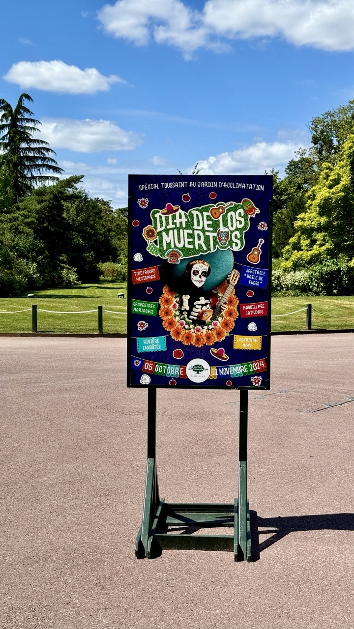

1. Overall Rating (0–10) — 7.0
This photograph captures a vibrant Dia de los Muertos promotional sign set against a serene park backdrop, creating a striking contrast between cultural celebration and natural tranquility. The bold, colorful poster draws the eye with its festive design, while the bright sky and green foliage lend a sense of openness and occasion. Though the image is strong in composition and thematic clarity, its documentary nature slightly limits its artistic depth.
2. Composition (0–10) — 7.5
The sign is centered and well-framed, with the surrounding landscape creating a balanced, symmetrical backdrop. The use of negative space at the bottom emphasizes the sign’s prominence, while the diagonal lines of the trees and railing add subtle visual interest.
3. Lighting (0–10) — 8.0
Natural daylight enhances the scene, casting clear shadows and highlighting the vivid colors of the poster. The bright, even illumination under a partly cloudy sky gives the image a fresh, crisp quality.
4. Color & Tone (0–10) — 8.5
The rich, saturated hues of the poster—deep blues, fiery oranges, and bright yellows—stand out dramatically against the green and blue of the natural setting. The contrast in tone between the celebratory design and the calm environment amplifies the image’s visual appeal.
5. Creativity (0–10) — 7.0
The image succeeds in capturing a cultural moment in a visually engaging way, blending tradition with a modern outdoor setting. The choice to feature the sign as the focal point with a natural backdrop adds narrative depth, though it remains primarily observational.
6. Technical Quality (0–10) — 8.0
The image is sharp and well-focused, with excellent clarity throughout. The depth of field is appropriate, keeping both the poster and the background in view without distraction.
7. Emotional Impact (0–10) — 7.5
There is a warm sense of celebration and cultural pride conveyed through the poster’s design, which resonates against the peaceful park setting. The viewer is invited to imagine the festivities to come, creating a hopeful and inclusive emotional tone.
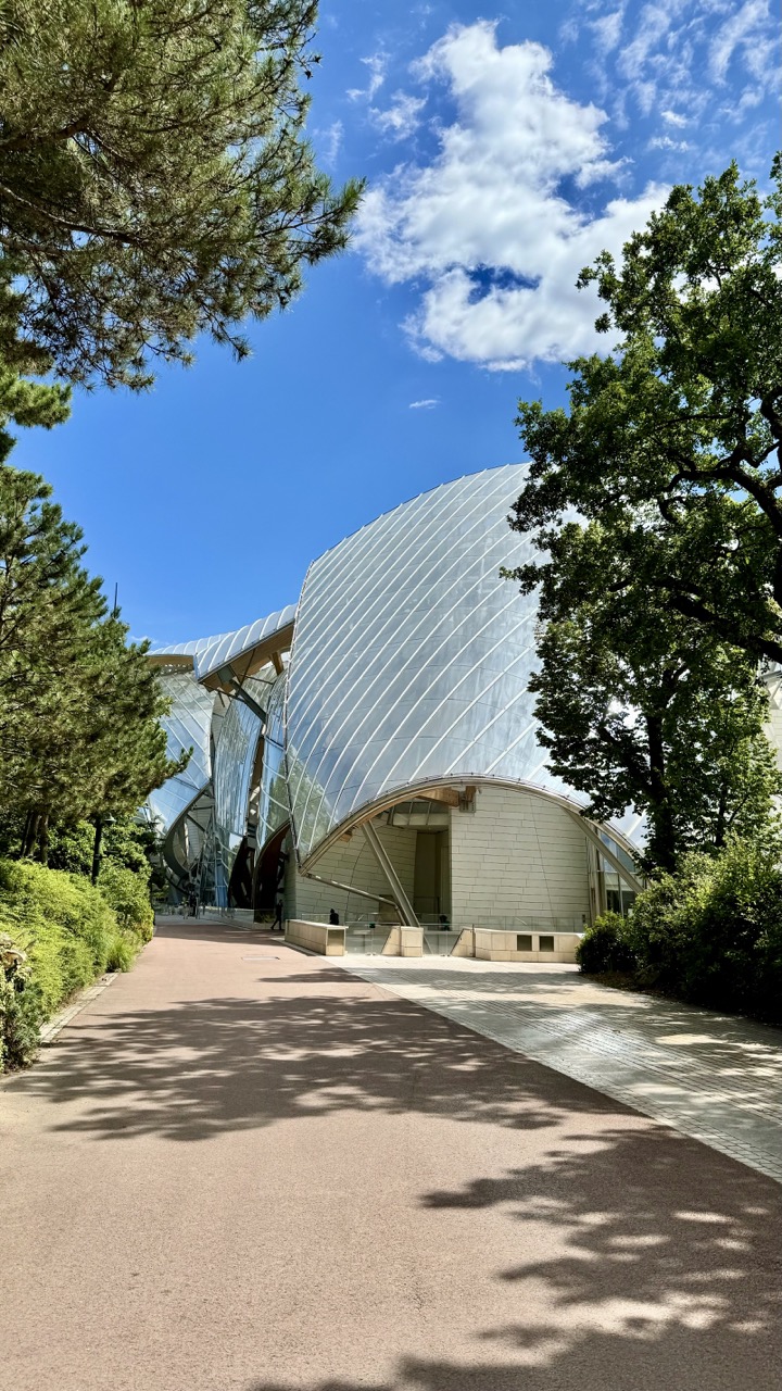

1. Overall Rating (0–10) — 8.0
This photograph captures a striking harmony between modern architecture and natural surroundings, where the fluid curves of the glass-clad structure echo the organic forms of the trees. The bright blue sky and dappled sunlight lend a sense of serenity and grandeur, while the wide pathway invites the viewer into the scene with quiet intention. The image excels in atmosphere and visual balance, though its straightforward perspective slightly limits narrative depth.
2. Composition (0–10) — 8.5
The low-angle perspective emphasizes the scale of the building, while the framing by trees on both sides creates a natural archway that guides the eye toward the structure. The leading path enhances depth and draws attention to the entrance, achieving strong visual flow.
3. Lighting (0–10) — 9.0
Bright, natural daylight enhances the clarity and texture of the glass panels, creating a dynamic interplay of light and reflection. The shadows of the trees on the pavement add rhythm and contrast, enriching the composition with depth and movement.
4. Color & Tone (0–10) — 8.5
The vibrant blue of the sky contrasts beautifully with the soft greens of the foliage and the cool silver of the glass, while the warm beige of the walkway grounds the scene. The palette is balanced and refreshing, with excellent tonal range and natural vibrancy.
5. Creativity (0–10) — 7.5
The image reflects a compelling fusion of nature and futuristic design, evoking a sense of optimism and innovation. While the concept is visually strong, the execution leans slightly toward conventional architectural documentation rather than bold artistic interpretation.
6. Technical Quality (0–10) — 9.0
The image is sharp, with precise focus across the frame. The exposure is well-balanced, capturing detail in both the bright sky and shaded areas, and the resolution highlights the textures of the glass and pavement.
7. Emotional Impact (0–10) — 8.0
The scene evokes a sense of calm, wonder, and quiet awe—inviting contemplation of human ingenuity within a natural setting. The viewer is drawn into a moment of peaceful observation, making the image emotionally resonant and memorable.
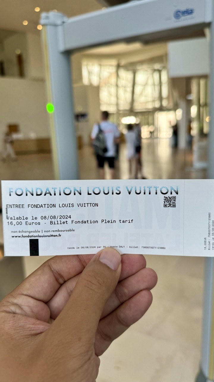

1. Overall Rating (0–10) — 5.5
This photograph captures a candid moment of cultural engagement, centered on a ticket to the Fondation Louis Vuitton, but the shallow depth of field and cluttered framing undermine its visual cohesion. While the ticket provides a clear narrative anchor—personal experience, travel, and access—it is overshadowed by a busy, unfocused background and an awkwardly placed hand. The image feels more like a snapshot than a composed photograph, lacking the balance and intentionality needed to elevate its story.
2. Composition (0–10) — 5.0
The ticket dominates the lower half, but the hand and out-of-focus background create visual noise. The subject is off-center, and the tunnel-like frame of the security gate draws the eye away from the focal point.
3. Lighting (0–10) — 6.0
Soft, diffused indoor lighting provides even illumination, though the bright background causes slight overexposure and diminishes contrast. The green light on the scanner adds a subtle pop of color but disrupts the otherwise neutral tone.
4. Color & Tone (0–10) — 5.5
The palette is dominated by neutral beiges and whites, with the black text and green light offering minimal contrast. The lack of vibrant color reduces visual energy, making the image feel flat and transactional.
5. Creativity (0–10) — 5.0
The concept is straightforward and personal, but the execution lacks originality. The framing and focus choices feel unintentional, prioritizing documentation over artistic interpretation.
6. Technical Quality (0–10) — 7.0
The ticket is sharp and legible, with clear text and QR code. However, the background is significantly out of focus, and the hand partially obscures the ticket, reducing overall clarity.
7. Emotional Impact (0–10) — 5.0
The image conveys a sense of anticipation and personal memory, but the technical and compositional limitations keep the viewer at a distance. It feels more like a record of an event than an evocative portrait of experience.
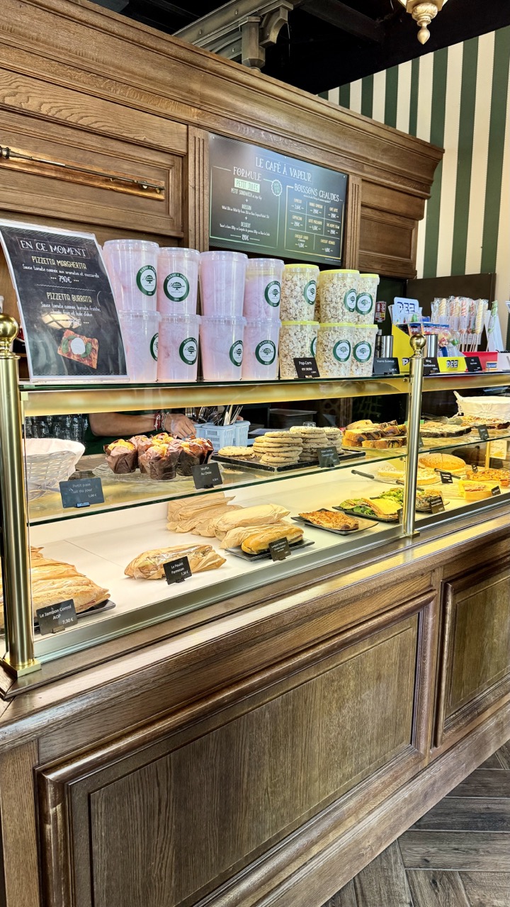

1. Overall Rating (0–10) — 7.0
This photograph captures the inviting warmth of a traditional café counter, where rustic wood and curated displays evoke a sense of comfort and craftsmanship. The arrangement of pastries, cotton candy, and a clear menu offers a rich narrative of indulgence and choice, though the composition feels slightly overladen, with too many competing elements drawing the eye. Still, the image succeeds in conveying the sensory appeal of a cozy, well-stocked bakery.
2. Composition (0–10) — 6.5
The frame is filled with layered elements—pastries, signage, containers—creating a busy, almost cluttered feel. A tighter focus on the central display or a diagonal line from the counter to the back would improve visual flow.
3. Lighting (0–10) — 7.5
Even, warm interior lighting enhances the textures of the baked goods and wood, casting a cozy glow that complements the café’s ambiance. The overhead lights create soft reflections on the glass, adding depth without glare.
4. Color & Tone (0–10) — 7.0
The palette balances warm browns of the wood with the soft pinks of cotton candy and the crisp greens of the striped wall, creating a playful yet cohesive look. Slight warmth in the tone enhances the inviting atmosphere.
5. Creativity (0–10) — 6.5
The image presents a familiar scene with an appealing arrangement, but it leans more toward documentation than conceptual storytelling. The juxtaposition of traditional pastries with cotton candy adds a touch of whimsy, but it's not fully explored.
6. Technical Quality (0–10) — 8.0
Sharp focus across the display case, clean detail in the textures of the food and wood, and well-balanced exposure indicate strong technical execution. The glass reflections are managed without distracting.
7. Emotional Impact (0–10) — 7.5
The photograph evokes nostalgia and comfort, tapping into the universal appeal of a sweet treat and a warm café. It invites the viewer to imagine the smell of fresh bread and the sound of a busy counter, creating a sensory pull.
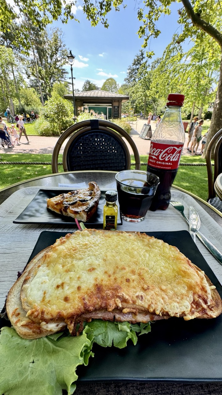

1. Overall Rating (0–10) — 7.5
This photograph captures a vibrant, sun-drenched moment of leisure in a lush park, where the warmth of a summer day infuses the scene with inviting energy. The composition balances a richly detailed meal in the foreground with a lively, natural backdrop, creating a narrative of relaxation and simple pleasure. While the image is visually appealing and emotionally engaging, its slightly cluttered framing and flat lighting prevent it from achieving greater artistic refinement.
2. Composition (0–10) — 7.0
The foreground meal draws immediate attention, while the background activity and greenery provide context and depth. The diagonal placement of the table and the overlapping elements create a sense of layered space, though the composition feels slightly crowded due to the inclusion of multiple objects.
3. Lighting (0–10) — 8.0
Bright, natural sunlight enhances the vividness of the colors and textures, from the golden crust of the sandwich to the glistening leaves. The overhead light casts soft shadows, adding dimension without overpowering the scene.
4. Color & Tone (0–10) — 8.0
The palette is rich and harmonious, with warm yellows and greens dominating, complemented by the bold red of the Coca-Cola bottle. The contrast between the dark plates and the bright surroundings creates visual interest and emphasizes the food.
5. Creativity (0–10) — 7.0
The image successfully blends everyday life with a sense of place, capturing a slice of urban leisure in a park setting. The storytelling is effective, but the concept remains familiar—less about originality and more about evoking a shared experience.
6. Technical Quality (0–10) — 8.5
The image is sharp and well-focused, particularly on the food in the foreground. The depth of field is appropriately managed, keeping the main subject clear while softly blurring the background, enhancing visual clarity.
7. Emotional Impact (0–10) — 8.0
The photograph evokes a strong sense of warmth, contentment, and relaxation. It invites the viewer to imagine the crispness of the bread, the crunch of lettuce, and the gentle hum of park life, making it feel both personal and universally relatable.
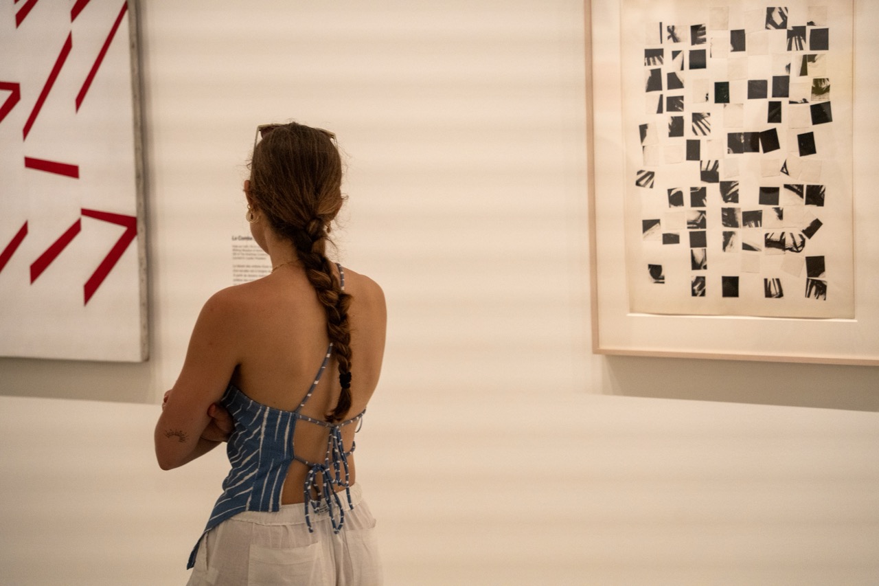

1. Overall Rating (0–10) — 7.0
This photograph captures a quiet, contemplative moment in an art gallery, where the viewer becomes part of the narrative as she engages with abstract works. The composition balances human presence with artistic expression, creating a sense of introspection. While the lighting and color palette are subdued, the image succeeds in conveying the stillness and focus of an art-viewing experience, though it lacks the visual dynamism to fully elevate the scene.
2. Composition (0–10) — 7.5
The subject is positioned off-center, creating a natural visual path from her back to the artworks on either side. The framing leaves room for the gallery’s minimalism, allowing the abstract pieces to coexist with the human element without feeling overcrowded.
3. Lighting (0–10) — 6.5
Soft, even gallery lighting illuminates the space without harsh shadows, preserving the subtle textures of the artworks and the subject’s form. The slight warm tone adds a gentle atmosphere, though it slightly flattens the depth of the scene.
4. Color & Tone (0–10) — 6.0
The palette is restrained—dominated by whites, blues, and blacks—with the red geometric piece offering a bold contrast. While the colors are harmonious, their muted intensity limits visual impact, giving the image a more observational than expressive quality.
5. Creativity (0–10) — 7.0
The juxtaposition of the viewer’s casual attire and the formal gallery setting introduces a subtle narrative tension. The inclusion of the viewer’s back invites interpretation, making the photograph feel less like a mere documentation and more like a meditation on art and perception.
6. Technical Quality (0–10) — 7.5
The image is sharp and well-focused, with clean details in the subject’s hair, clothing, and the artwork. The depth of field is appropriately controlled, keeping both the viewer and the surrounding art in clear view.
7. Emotional Impact (0–10) — 6.5
The image evokes a sense of calm attentiveness and personal reflection, inviting the viewer to consider the act of looking itself. While emotionally resonant, the distance created by the subject’s turned back prevents a deeper emotional connection.
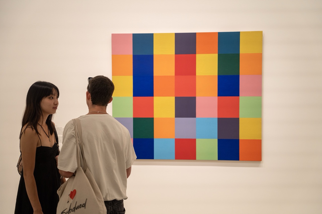

1. Overall Rating (0–10) — 7.0
This photograph captures a quiet, contemplative moment in an art gallery, where the vibrant abstraction of the painting contrasts with the subdued presence of the viewers. The composition balances human interaction with artistic expression, creating a narrative about how people engage with modern art. While the image is visually engaging and well-framed, the slightly overexposed lighting and lack of dynamic contrast temper its overall impact.
2. Composition (0–10) — 7.5
The subjects are positioned off-center, drawing the eye toward the colorful artwork, which dominates the frame. The diagonal line formed by the couple’s gaze and posture guides the viewer naturally to the painting, creating a sense of shared focus. The negative space on the left enhances the composition’s balance and allows the artwork to command attention.
3. Lighting (0–10) — 6.0
The lighting is bright and even, typical of gallery spaces, but it flattens the scene and reduces depth. The overhead illumination casts soft shadows, yet it lacks the directional warmth or drama that could elevate the mood. While functional for showcasing the artwork, it diminishes the photograph’s atmospheric quality.
4. Color & Tone (0–10) — 8.0
The painting bursts with saturated, harmonious colors arranged in a grid, creating a lively focal point. The neutral tones of the gallery walls and the couple’s clothing serve as a perfect contrast, allowing the artwork to stand out. The overall palette feels balanced, with the warm and cool tones complementing each other effectively.
5. Creativity (0–10) — 7.0
The photograph captures a relatable, everyday moment in a cultural setting, blending documentary realism with aesthetic intent. The inclusion of the viewers adds narrative depth, transforming a simple scene into a commentary on art appreciation. While not overtly experimental, the image succeeds in its quiet storytelling.
6. Technical Quality (0–10) — 7.5
The image is sharp, with clear focus on both the subjects and the artwork. The exposure is well-managed despite the bright lighting, and the depth of field is appropriate for the scene. The framing and alignment are precise, suggesting a careful and deliberate approach to composition.
7. Emotional Impact (0–10) — 6.5
The image evokes a sense of calm curiosity and quiet engagement. The viewer is invited to consider not only the artwork but also the human experience of encountering it. While the emotional resonance is subtle, it lingers—suggesting a moment of connection between people, art, and place.
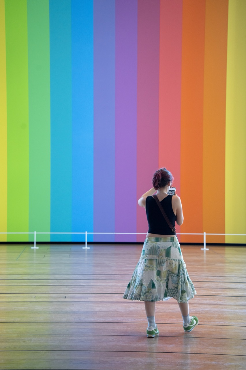

1. Overall Rating (0–10) — 7.5
This photograph captures a quiet moment of engagement between a viewer and a vibrant, immersive art installation, where color becomes both subject and environment. The contrast between the individual’s contemplative stance and the bold, rhythmic stripes creates a compelling narrative of human interaction with abstraction. While the composition is visually striking, the image’s emotional resonance is slightly tempered by a lack of narrative depth beyond its aesthetic appeal.
2. Composition (0–10) — 7.0
The subject is placed off-center, creating a dynamic balance against the dominant vertical stripes. The leading lines of the wall and the railing guide the eye toward the figure, enhancing the sense of scale and perspective.
3. Lighting (0–10) — 8.0
Even, diffused lighting enhances the purity of the colors and minimizes harsh shadows, allowing the installation’s chromatic intensity to dominate the frame. The soft glow adds to the meditative atmosphere of the space.
4. Color & Tone (0–10) — 9.0
The vivid, saturated vertical stripes create a powerful visual rhythm, with a harmonious progression from green through blue, purple, red, orange, and yellow. The warm wooden floor and the subject’s muted patterned skirt provide subtle contrast, grounding the scene in reality.
5. Creativity (0–10) — 8.0
The image cleverly juxtaposes the personal act of photography with the grandeur of the artwork, suggesting a dialogue between observer and observed. The choice to capture the moment from behind adds a layer of introspection and universality.
6. Technical Quality (0–10) — 8.5
Sharp focus and clean detail across the frame highlight the textures of the floor and the clarity of the colors. The camera angle and depth of field are well-executed, maintaining attention on both the subject and the artwork.
7. Emotional Impact (0–10) — 7.5
The image evokes a sense of wonder and quiet contemplation, inviting the viewer to reflect on the relationship between art, perception, and personal experience. The warmth of the colors and the stillness of the moment foster a gentle emotional connection.
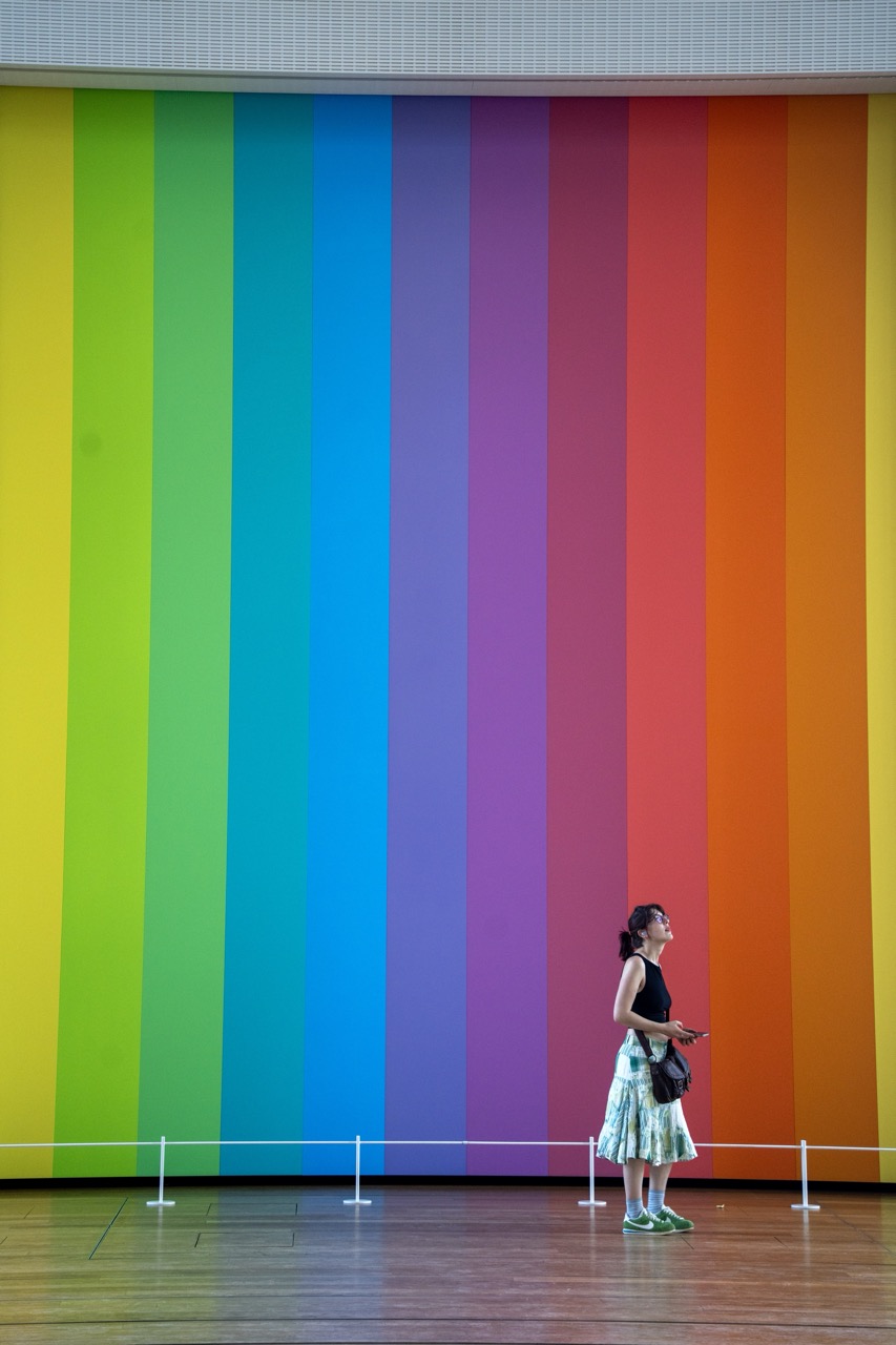

1. Overall Rating (0–10) — 7.5
This photograph captures a striking interplay between human presence and vibrant color, transforming a simple gallery moment into a contemplative visual statement. The bold, rainbow-striped wall commands attention, while the woman’s quiet observation adds a sense of scale and introspection. Though the composition is visually arresting, the image feels slightly restrained by its documentary clarity, missing the subtle emotional layer that would elevate it beyond a mere record of an experience.
2. Composition (0–10) — 7.0
The subject is placed off-center, creating a sense of balance against the dominant vertical stripes. The low angle and wide frame emphasize the scale of the artwork, though the empty space at the top and the minimal foreground could be tighter to enhance focus.
3. Lighting (0–10) — 7.5
Even, diffuse lighting illuminates the scene without harsh shadows, allowing the colors to appear rich and true. The light enhances the vibrancy of the stripes while maintaining a neutral atmosphere appropriate for an art gallery setting.
4. Color & Tone (0–10) — 9.0
The vivid, saturated vertical stripes create a dynamic and harmonious rainbow palette that dominates the frame. The contrast between the bold background and the more subdued tones of the woman’s outfit draws attention to both the artwork and the observer, reinforcing the theme of human interaction with art.
5. Creativity (0–10) — 8.0
The image leverages the visual power of color and scale to suggest themes of perception and wonder. The juxtaposition of the individual against the overwhelming artwork is both conceptually and aesthetically compelling, offering a fresh take on the art-viewing experience.
6. Technical Quality (0–10) — 8.0
The image is sharp, with clean focus on the subject and background. The resolution and exposure are well-managed, capturing fine details in both the wooden floor and the wall’s texture.
7. Emotional Impact (0–10) — 7.0
The photograph evokes a quiet sense of awe and contemplation, inviting the viewer to consider the relationship between people and the art they encounter. While not overtly dramatic, the emotional resonance lies in the understated beauty of a moment of reflection.
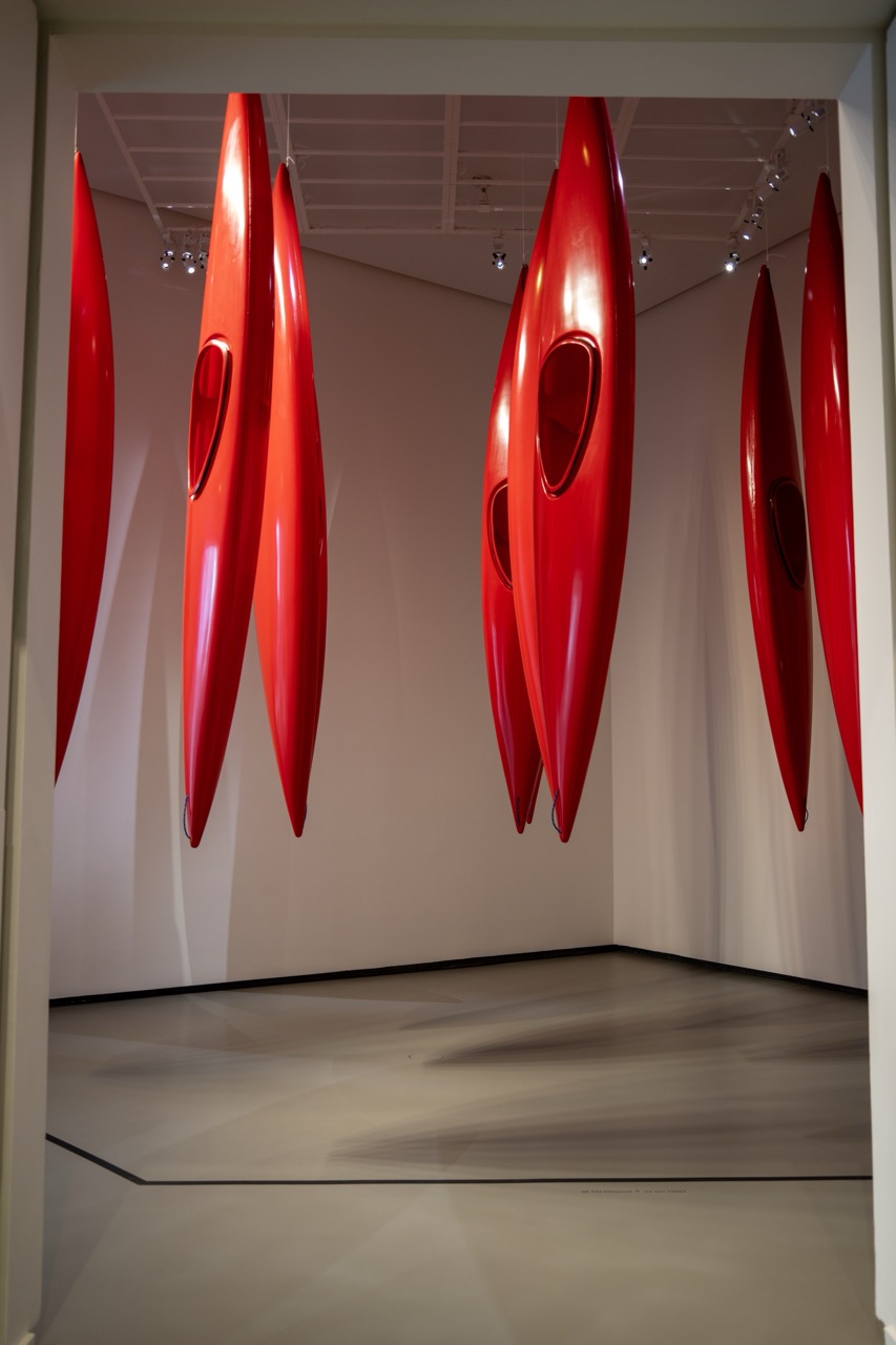

1. Overall Rating (0–10) — 7.5
This photograph captures a striking art installation of suspended red kayaks, their glossy forms creating a bold visual rhythm against the neutral gallery space. The repetition and symmetry evoke a sense of movement and balance, while the clean environment enhances the sculptural quality of the pieces. The image succeeds in conveying the installation’s scale and intention, though the slightly sterile presentation tempers its emotional resonance.
2. Composition (0–10) — 8.0
The framing centers the arrangement of kayaks, using the corner of the gallery to create a sense of depth and symmetry. The vertical lines of the kayaks guide the eye upward, while the diagonal floor lines add dynamic tension, resulting in a well-balanced and visually cohesive composition.
3. Lighting (0–10) — 7.5
The overhead track lighting casts soft, directional highlights on the glossy surfaces of the kayaks, emphasizing their curves and reflective quality. The lighting is controlled and intentional, enhancing the objects' form without creating harsh glare or deep shadows.
4. Color & Tone (0–10) — 8.0
The vibrant red of the kayaks contrasts sharply with the neutral white walls and floor, creating a powerful visual statement. The monochromatic color scheme is unified and bold, with subtle variations in tone adding depth and dimension to the scene.
5. Creativity (0–10) — 8.5
The use of everyday objects—kayaks—as art pieces suspended in a gallery setting is both conceptually engaging and visually striking. The arrangement transforms the functional into the aesthetic, suggesting themes of motion, fluidity, and the intersection of nature and design.
6. Technical Quality (0–10) — 8.0
The image is sharp and well-focused, with precise detail visible on the kayak surfaces and clean edges throughout. The exposure is balanced, preserving highlights and shadows without overexposure or loss of detail.
7. Emotional Impact (0–10) — 7.0
The scene evokes a sense of calm contemplation and visual intrigue, inviting the viewer to reflect on the transformation of the mundane into the monumental. While not overtly emotive, the installation's quiet power and elegance create a lasting impression.
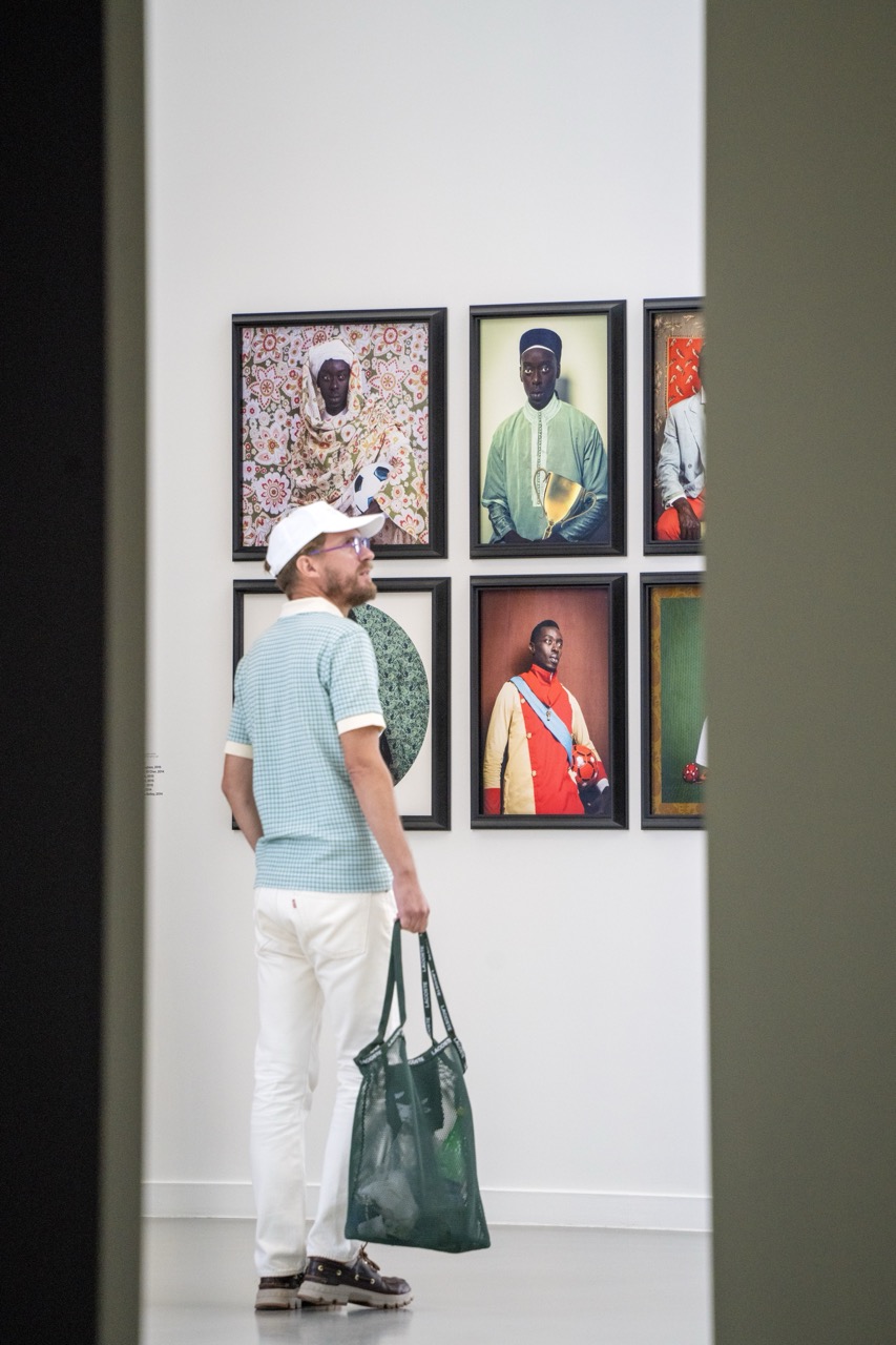

1. Overall Rating (0–10) — 7.0
This photograph captures a quiet moment of contemplation within a gallery space, where the viewer’s presence becomes part of the artwork’s narrative. The interplay between the observer and the portraits—rich in cultural expression and vibrant color—creates a layered dialogue between art and audience. While the framing feels slightly constrained by the surrounding architecture, the image succeeds in conveying a sense of introspection and connection, elevating a simple scene into a thoughtful visual story.
2. Composition (0–10) — 7.0
The subject is placed off-center, creating a dynamic balance with the gallery wall and the surrounding frames. The use of the corridor’s edges as natural framing devices adds depth and guides the eye toward the central figures, though the tight vertical framing slightly compresses the scene.
3. Lighting (0–10) — 8.0
Even, diffused gallery lighting illuminates the space without harsh shadows, enhancing the clarity and detail of both the subject and the artworks. The soft glow highlights the textures and colors of the portraits while maintaining a neutral, contemplative atmosphere.
4. Color & Tone (0–10) — 8.0
The palette is harmonious, with the bright, saturated colors of the portraits contrasting against the muted whites and grays of the gallery walls. The green tote bag subtly echoes the tones in the artwork, creating a visual link between the observer and the subjects he admires.
5. Creativity (0–10) — 7.5
The image captures a layered narrative—art, identity, and the act of viewing—offering a meta-commentary on how we engage with culture. The juxtaposition of the casual visitor against the formal, stylized portraits adds conceptual depth and a sense of cultural curiosity.
6. Technical Quality (0–10) — 8.0
Sharp focus on the subject and the wall of portraits, with clean edges and well-managed depth of field. The image is technically sound, with no visible noise or distortion, allowing the details of clothing, expressions, and textures to be clearly rendered.
7. Emotional Impact (0–10) — 7.0
There is a quiet reverence in the moment, as the man’s stillness suggests deep engagement with the art. The emotional resonance lies in the intimacy of personal reflection within a public space, evoking a sense of shared humanity and cultural appreciation.
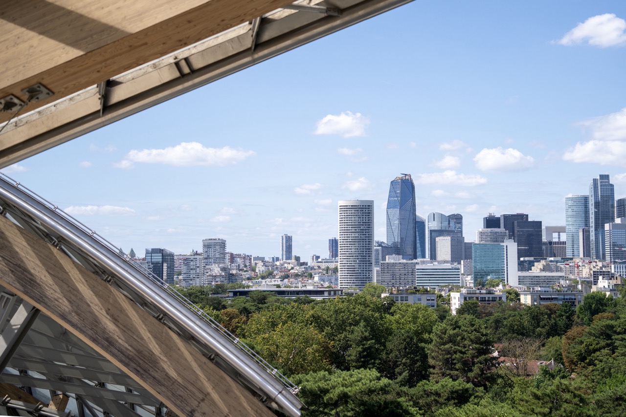

1. Overall Rating (0–10) — 7.5
This photograph captures a compelling juxtaposition of nature and urbanity, framed through a modern architectural structure that adds depth and perspective. The composition draws the eye toward the city skyline, where sleek glass towers rise above a canopy of green trees, creating a harmonious balance between the built environment and the natural world. While the image is visually engaging and well-executed, its emotional resonance is slightly tempered by the lack of a strong focal point or narrative thread, leaving the viewer with a sense of observation rather than connection.
2. Composition (0–10) — 7.0
The diagonal lines of the wooden and metallic structure in the foreground create a dynamic frame, guiding the viewer’s gaze toward the city skyline. The placement of the trees in the midground provides a natural layering effect, enhancing depth. However, the framing feels slightly asymmetrical, with the skyline appearing slightly off-center, which reduces compositional harmony.
3. Lighting (0–10) — 8.0
Natural daylight illuminates the scene evenly, with soft, diffused light enhancing the textures of the architecture and foliage. The bright blue sky and scattered clouds add visual interest and contribute to a sense of openness and clarity. The lighting effectively highlights the reflective surfaces of the skyscrapers while maintaining detail in the shadows.
4. Color & Tone (0–10) — 7.5
The palette is dominated by the cool blues of the sky and the greens of the trees, creating a refreshing contrast with the neutral grays and whites of the urban structures. The tones are well-balanced, with a natural vibrancy that enhances the image’s realism. A slightly cooler white balance enhances the crispness of the scene, though a touch more warmth could have added subtle emotional depth.
5. Creativity (0–10) — 7.0
The use of the architectural foreground as a framing device is a strong creative choice, offering a unique vantage point that transforms a typical cityscape into a more intimate and layered view. The interplay between organic and geometric forms adds conceptual interest, though the image remains largely observational rather than deeply interpretive.
6. Technical Quality (0–10) — 8.0
The image is sharp and clear, with fine detail visible in both the foreground structure and the distant skyline. The focus is well-managed across the frame, and there are no noticeable technical flaws such as noise or blur. The exposure is balanced, preserving detail in both the highlights and shadows.
7. Emotional Impact (0–10) — 6.5
The photograph evokes a sense of calm contemplation, inviting the viewer to reflect on the coexistence of nature and urban development. While the scene is aesthetically pleasing, the emotional impact is moderate—more serene than stirring—due to the lack of a strong human element or narrative focus.


1. Overall Rating (0–10) — 8.0
This photograph captures a striking harmony between modern architecture and natural surroundings, where the fluid curves of the glass-clad structure echo the organic forms of the trees. The bright blue sky and dappled sunlight lend a sense of serenity and grandeur, while the wide pathway invites the viewer into the scene with quiet intention. The image excels in atmosphere and visual balance, though its straightforward perspective slightly limits narrative depth.
2. Composition (0–10) — 8.5
The low-angle perspective emphasizes the scale of the building, while the framing by trees on both sides creates a natural archway that guides the eye toward the structure. The leading path enhances depth and draws attention to the entrance, achieving strong visual flow.
3. Lighting (0–10) — 9.0
Bright, natural daylight enhances the clarity and texture of the glass panels, creating a dynamic interplay of light and reflection. The shadows of the trees on the pavement add rhythm and contrast, enriching the composition with depth and movement.
4. Color & Tone (0–10) — 8.5
The vibrant blue of the sky contrasts beautifully with the soft greens of the foliage and the cool silver of the glass, while the warm beige of the walkway grounds the scene. The palette is balanced and refreshing, with excellent tonal range and natural vibrancy.
5. Creativity (0–10) — 7.5
The image reflects a compelling fusion of nature and futuristic design, evoking a sense of optimism and innovation. While the concept is visually strong, the execution leans slightly toward conventional architectural documentation rather than bold artistic interpretation.
6. Technical Quality (0–10) — 9.0
The image is sharp, with precise focus across the frame. The exposure is well-balanced, capturing detail in both the bright sky and shaded areas, and the resolution highlights the textures of the glass and pavement.
7. Emotional Impact (0–10) — 8.0
The scene evokes a sense of calm, wonder, and quiet awe—inviting contemplation of human ingenuity within a natural setting. The viewer is drawn into a moment of peaceful observation, making the image emotionally resonant and memorable.


1. Overall Rating (0–10) — 5.5
This photograph captures a candid moment of cultural engagement, centered on a ticket to the Fondation Louis Vuitton, but the shallow depth of field and cluttered framing undermine its visual cohesion. While the ticket provides a clear narrative anchor—personal experience, travel, and access—it is overshadowed by a busy, unfocused background and an awkwardly placed hand. The image feels more like a snapshot than a composed photograph, lacking the balance and intentionality needed to elevate its story.
2. Composition (0–10) — 5.0
The ticket dominates the lower half, but the hand and out-of-focus background create visual noise. The subject is off-center, and the tunnel-like frame of the security gate draws the eye away from the focal point.
3. Lighting (0–10) — 6.0
Soft, diffused indoor lighting provides even illumination, though the bright background causes slight overexposure and diminishes contrast. The green light on the scanner adds a subtle pop of color but disrupts the otherwise neutral tone.
4. Color & Tone (0–10) — 5.5
The palette is dominated by neutral beiges and whites, with the black text and green light offering minimal contrast. The lack of vibrant color reduces visual energy, making the image feel flat and transactional.
5. Creativity (0–10) — 5.0
The concept is straightforward and personal, but the execution lacks originality. The framing and focus choices feel unintentional, prioritizing documentation over artistic interpretation.
6. Technical Quality (0–10) — 7.0
The ticket is sharp and legible, with clear text and QR code. However, the background is significantly out of focus, and the hand partially obscures the ticket, reducing overall clarity.
7. Emotional Impact (0–10) — 5.0
The image conveys a sense of anticipation and personal memory, but the technical and compositional limitations keep the viewer at a distance. It feels more like a record of an event than an evocative portrait of experience.
Loading map...