Preston Lau: A Journey Through Memories, Tech, and Humanity
Welcome to my personal blog that delves into the intricate tapestry of personal albums and the fascinating intersection of ever-evolving technology and humanity. Come along on a journey with me as we delve into the seamless fusion of creativity, state-of-the-art AI and robotics, intricately interwoven within the tapestry of our shared awareness. Have fun!
Year 2008 Best Photos
Photography is a way of feeling, of touching, of loving. What you have caught on film is captured forever it remembers little things, long after you have forgotten everything. - Aaron Siskind
1. Overall Rating (0–10) — 7.8 This photograph captures a tender, intimate moment between two infants, radiating warmth and quiet connection. The contrast between the wide-eyed, curious gaze of one baby and the peaceful, slightly smiling expression of the other creates a compelling emotional narrative. While the composition is simple and effective, the soft lighting and gentle color palette enhance the natural charm, though a bit more visual depth could elevate its impact.
2. Composition (0–10) — 7.5 The framing centers the two babies closely, emphasizing their bond. The placement of the baby on the left, looking directly at the camera, draws the viewer in, while the second baby’s profile adds balance and a sense of movement. A slightly tighter crop might have further focused attention on their expressions.
3. Lighting (0–10) — 8.0 Soft, diffused lighting enhances the gentle mood, casting even illumination that highlights the babies’ delicate features without harsh shadows. The light feels natural and flattering, contributing to the image’s overall warmth and intimacy.
4. Color & Tone (0–10) — 7.5 The pastel tones—cream, soft pink, and muted brown—create a harmonious and soothing palette. The slight coolness in the background helps the subjects stand out, though the overall tone is subdued, slightly limiting the vibrancy of the image.
5. Creativity (0–10) — 8.0 The image captures a candid, emotionally rich moment with a clear narrative of sibling-like affection. The choice to focus on the contrast in expressions—alertness versus sleepiness—adds a layer of storytelling that feels both authentic and artistically considered.
6. Technical Quality (0–10) — 8.5 The image is sharp and clear, with precise focus on the babies’ faces. The depth of field effectively isolates the subjects from the background, and the post-processing is clean, preserving natural skin tones and detail.
7. Emotional Impact (0–10) — 9.0 The photograph evokes a strong sense of tenderness and innocence, resonating with viewers on a deeply human level. The quiet intimacy and genuine expressions create an emotional connection that lingers, making it a touching and memorable image.
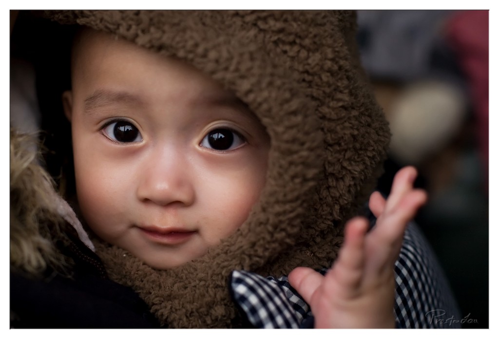
1. Overall Rating (0–10) — 8.0 This intimate portrait captures a child’s quiet wonder with remarkable tenderness, drawing the viewer into a moment of pure, unguarded innocence. The soft texture of the hood contrasts beautifully with the child’s smooth skin and wide, reflective eyes, creating a sense of warmth and vulnerability. While the composition leans slightly toward the left, the emotional resonance and clarity of expression elevate the image beyond mere documentation into something deeply human.
2. Composition (0–10) — 7.0 The subject is framed closely, emphasizing facial expression, but the off-center placement and the child’s raised hand create a slight imbalance. A tighter crop or slight shift in angle could enhance visual harmony.
3. Lighting (0–10) — 8.0 Soft, directional light gently illuminates the child’s face, enhancing depth and dimension while preserving the natural warmth of the moment. The subtle highlights in the eyes add a sense of life and connection.
4. Color & Tone (0–10) — 7.5 The muted earth tones of the brown hood and checkered fabric create a cohesive, natural palette. The slightly cool skin tones are balanced by the warmth in the background, and the overall tonal range feels rich without being overprocessed.
5. Creativity (0–10) — 8.5 The image transcends a simple snapshot through its focus on emotional truth and the subtle interplay of texture and gaze. The choice to isolate the subject with a shallow depth of field enhances the narrative quality, making the moment feel both personal and universal.
6. Technical Quality (0–10) — 9.0 Exceptionally sharp focus on the eyes and face, with smooth bokeh that separates the subject from the background. The image is free of noise and exhibits fine detail in both skin and fabric textures.
7. Emotional Impact (0–10) — 9.0 The child’s direct gaze and soft expression evoke a powerful sense of curiosity and quiet contemplation. The image resonates deeply, inviting empathy and a fleeting connection with the subject’s inner world.
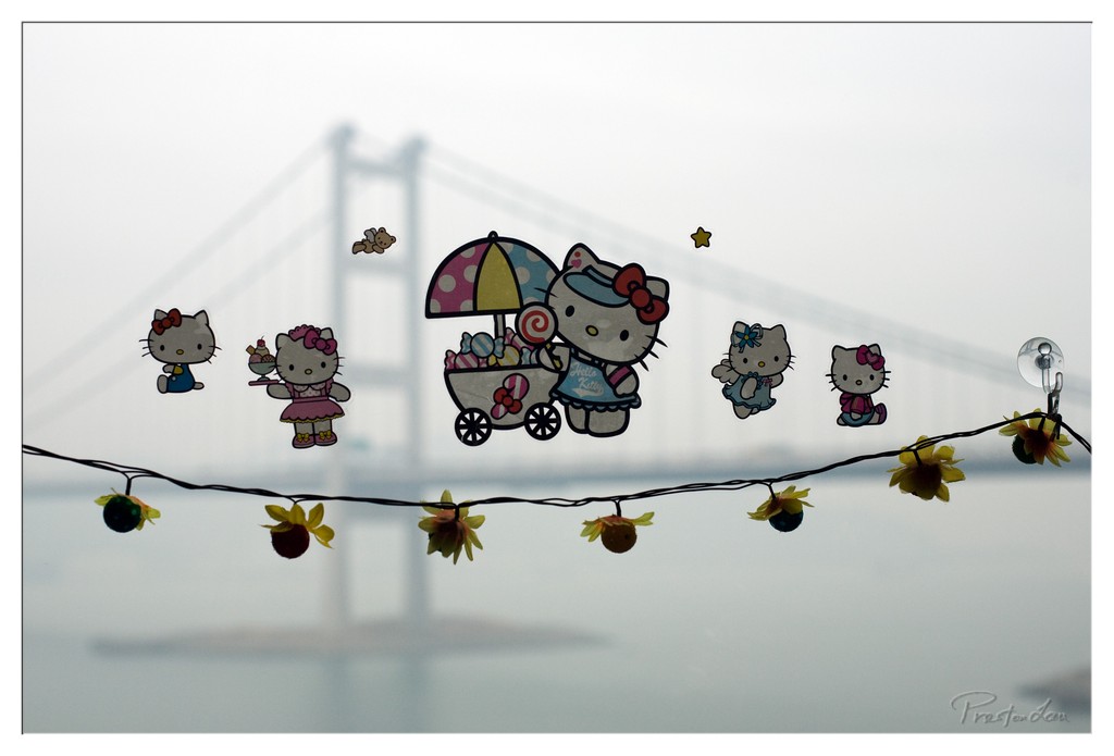
1. Overall Rating (0–10) — 6.0 This photograph presents a whimsical juxtaposition of playful, colorful Hello Kitty decals against the muted, hazy silhouette of a bridge, creating a dreamlike contrast between childhood nostalgia and urban stillness. The soft focus and foggy atmosphere lend a gentle, almost melancholic mood, though the composition’s cluttered foreground slightly undermines its visual clarity. While the image captures a quiet, reflective moment, it feels more like a candid snapshot than a fully realized artistic statement.
2. Composition (0–10) — 5.5 The string of lights and stickers create a busy horizontal line that divides the frame unevenly. While the central Hello Kitty figure draws attention, the scattered placement of the other characters creates visual distraction.
3. Lighting (0–10) — 6.0 Diffused, overcast lighting enhances the foggy atmosphere and softens edges, contributing to a calm, subdued mood. The lack of harsh shadows supports the ethereal quality of the scene.
4. Color & Tone (0–10) — 6.5 The pastel hues of the stickers stand out against the pale gray and white background, creating a gentle contrast. The yellow flowers add a touch of warmth, though the overall tone remains restrained and muted.
5. Creativity (0–10) — 7.0 The blend of pop culture iconography with a serene, atmospheric backdrop offers a unique and slightly surreal narrative. The juxtaposition of the familiar and the overlooked is both playful and contemplative.
6. Technical Quality (0–10) — 7.0 The focus is soft but intentional, aligning with the atmospheric intent. The image is sharp enough to identify details, though the background blur is not precisely controlled.
7. Emotional Impact (0–10) — 6.0 The image evokes a sense of quiet nostalgia and childlike wonder, but the emotional resonance is tempered by the lack of a strong focal point and the slightly cluttered arrangement.
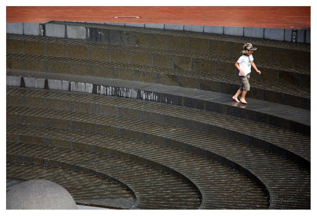
1. Overall Rating (0–10) — 7.0 This photograph captures a quiet moment of solitude and movement, where a lone child traverses a vast, curved staircase that echoes the rhythm of urban design. The interplay between the human figure and the monumental architecture creates a sense of scale and introspection, while the wet stone and muted tones lend a contemplative mood. Though the image is strong in composition and atmosphere, it lacks a deeper emotional punch, feeling more like a snapshot of a place than a narrative moment.
2. Composition (0–10) — 8.0 The sweeping curves of the steps create a strong leading line that draws the eye toward the child, who is placed off-center to enhance visual balance. The diagonal movement adds dynamism, while the layered architecture provides depth and rhythm.
3. Lighting (0–10) — 6.5 Soft, diffused light enhances the texture of the wet stone and reduces harsh shadows, creating a moody and cohesive atmosphere. The lighting is even but slightly flat, lacking strong directional contrast to elevate the scene.
4. Color & Tone (0–10) — 7.0 The palette is restrained, dominated by cool grays and earthy browns, with a subtle warmth in the upper brick surface. The tonal range is well-balanced, contributing to the image’s contemplative tone and visual cohesion.
5. Creativity (0–10) — 7.5 The juxtaposition of the small child against the grand, geometric structure offers a striking visual metaphor for solitude and journey. The use of the curved steps as a natural compositional device adds originality and narrative depth.
6. Technical Quality (0–10) — 8.0 The image is sharp and clear, with precise focus on the child and detailed texture throughout the stone surface. The exposure is well-managed, preserving detail in both highlights and shadows.
7. Emotional Impact (0–10) — 7.0 The image evokes a sense of quiet reflection and minor melancholy, inviting the viewer to consider the child’s journey—both literal and symbolic. The emotional resonance is subtle but effective, especially for those who see themselves in the solitude of urban spaces.
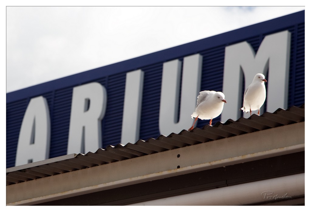
1. Overall Rating (0–10) — 7.0 This photograph captures a quiet, almost cinematic moment where two seagulls perch on a corrugated roof, framed by the bold, partially obscured letters of a building sign. The juxtaposition of the natural birds against the industrial backdrop creates a subtle narrative of urban wildlife, with a touch of humor in the accidental "ARIA" illusion. While the image is visually engaging and well-composed, it stops short of true artistic mastery—its strength lies in the serendipity of the moment rather than deliberate staging.
2. Composition (0–10) — 7.5 The birds are placed off-center, drawing the eye naturally across the frame, while the diagonal line of the roof adds dynamic tension. The negative space above the birds provides balance, and the cropped sign creates intrigue, though slightly distracting.
3. Lighting (0–10) — 6.5 Soft, diffused light from an overcast sky evenly illuminates the scene, minimizing harsh shadows and highlighting the texture of the birds’ feathers. The lighting is effective but lacks dramatic contrast, giving the image a neutral, documentary feel.
4. Color & Tone (0–10) — 6.0 The deep blue of the sign contrasts sharply with the white birds and sky, creating a strong visual anchor. However, the overall palette is somewhat muted, with a cool tone that slightly dampens the warmth of the scene.
5. Creativity (0–10) — 7.0 The image leverages serendipity—both the positioning of the birds and the partial text—to generate a playful narrative. The conceptual layer adds depth, transforming a simple moment into something slightly whimsical and thought-provoking.
6. Technical Quality (0–10) — 8.0 The focus is sharp on the birds, capturing fine feather detail. The exposure is well-balanced, and there is no noticeable noise, indicating strong technical execution.
7. Emotional Impact (0–10) — 6.5 The scene evokes a sense of quiet observation and mild amusement, inviting the viewer to ponder the story behind the birds’ perch. It doesn’t elicit strong emotion, but it lingers in the mind as a charming urban snapshot.
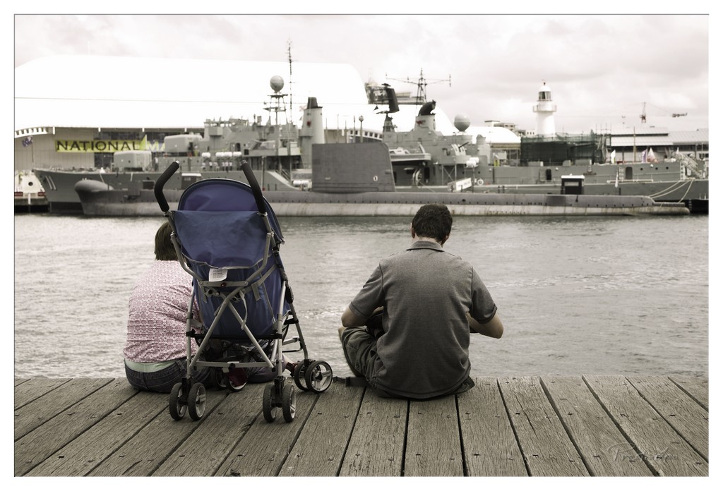
1. Overall Rating (0–10) — 6.8 This photograph captures a quiet, contemplative moment between two individuals on a dock, their backs turned as they gaze toward a naval vessel and the National Museum of the Royal Navy in the distance. The muted, desaturated tones lend a reflective, almost melancholic atmosphere, while the selective color of the stroller adds a subtle focal point. Though the image succeeds in evoking stillness and introspection, the heavy tonal wash and slightly flat lighting prevent it from achieving greater visual depth or emotional resonance.
2. Composition (0–10) — 7.0 The subjects are positioned off-center, creating a balanced yet dynamic arrangement that draws the eye toward the ship and museum. The wooden planks in the foreground provide strong leading lines, while the stroller acts as a visual anchor, reinforcing the theme of family and time.
3. Lighting (0–10) — 5.5 Diffused, overcast light flattens the scene, reducing texture and depth in the water and sky. While the lighting is even and avoids harsh shadows, it contributes to a somewhat lifeless quality that undermines the potential drama of the maritime setting.
4. Color & Tone (0–10) — 6.0 The desaturated palette enhances the somber mood, but the lack of vibrancy dulls the image. The blue of the stroller stands out as a deliberate accent, but its contrast feels slightly artificial, disrupting the otherwise cohesive tonal harmony.
5. Creativity (0–10) — 7.0 The choice to foreground the stroller and frame the couple from behind creates a narrative layer—suggesting a story of family, memory, or transition. The juxtaposition of domestic life against the backdrop of naval power is thoughtfully composed, lending the image a poetic, almost cinematic quality.
6. Technical Quality (0–10) — 7.5 The image is sharp and well-focused, with clean details in the wood grain and the distant ship. The exposure is balanced, and the post-processing is controlled, though the heavy tonal filtering slightly compromises naturalism.
7. Emotional Impact (0–10) — 6.5 There’s a quiet intimacy in the scene, evoked by the stillness and shared gaze. The emotional weight lies in what is left unsaid—the unspoken stories behind the couple, the child in the stroller, the ship in the distance. While it doesn’t overwhelm, it lingers, inviting reflection.
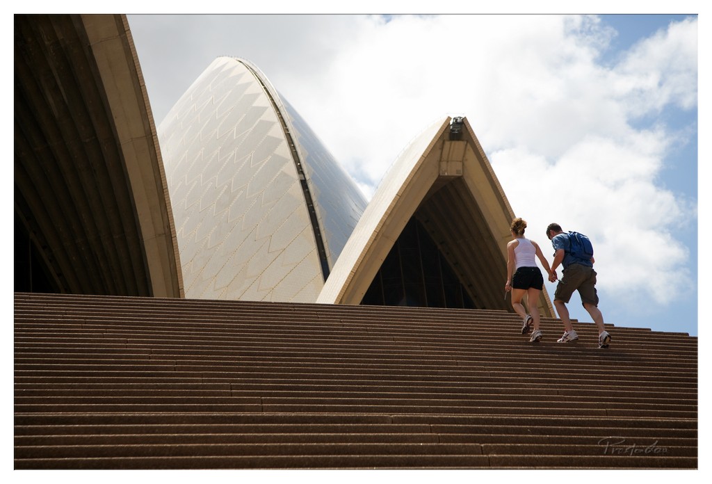
1. Overall Rating (0–10) — 7.5 This photograph captures a quiet, intimate moment of two people ascending the steps of the Sydney Opera House, set against its iconic, sculptural forms. The low-angle perspective emphasizes the grandeur of the architecture while grounding the human element in a sense of shared journey. While the composition is strong and emotionally resonant, the overcast lighting slightly tempers the visual impact, preventing the scene from reaching its full potential.
2. Composition (0–10) — 8.0 The low-angle framing creates a powerful sense of scale, drawing the eye upward along the diagonal of the steps toward the couple and the Opera House’s sails. The couple is positioned off-center, adding dynamism, while the repeating lines of the stairs guide the viewer’s gaze into the frame. The architectural symmetry of the sails balances the composition, though the foreground steps dominate slightly too much.
3. Lighting (0–10) — 6.5 Natural daylight illuminates the scene evenly, with soft, diffused light due to the cloudy sky. This prevents harsh shadows and allows the texture of the tiles and the curves of the sails to be clearly visible. However, the lack of strong directional light or golden-hour warmth gives the image a somewhat neutral, documentary feel rather than a dramatic or poetic one.
4. Color & Tone (0–10) — 7.0 The palette is dominated by warm browns of the steps and the pale cream of the Opera House’s shells, contrasted with the soft blue and white of the sky. The colors are harmonious and restrained, lending a calm, contemplative mood. A subtle increase in saturation could enhance the visual richness without overwhelming the natural tones.
5. Creativity (0–10) — 7.5 The image successfully merges human narrative with architectural grandeur, transforming a tourist moment into something poetic. The use of scale and perspective evokes a sense of journey and aspiration, making the photograph more than a simple snapshot. The choice to focus on the couple’s ascent, rather than the landmark itself, adds a layer of storytelling that feels both personal and universal.
6. Technical Quality (0–10) — 8.0 The image is sharp and well-focused, with clear detail across the frame—from the texture of the steps to the pattern on the shells. The exposure is balanced, with no significant loss of detail in highlights or shadows. The watermark is subtle and does not detract from the image.
7. Emotional Impact (0–10) — 8.0 There’s a quiet intimacy in the way the couple walks hand-in-hand, their shared movement suggesting connection and shared purpose. The imposing architecture contrasts with the smallness of the individuals, evoking feelings of adventure, love, and human scale within a monumental space. The viewer is invited to reflect on their own journeys, making the image emotionally resonant.
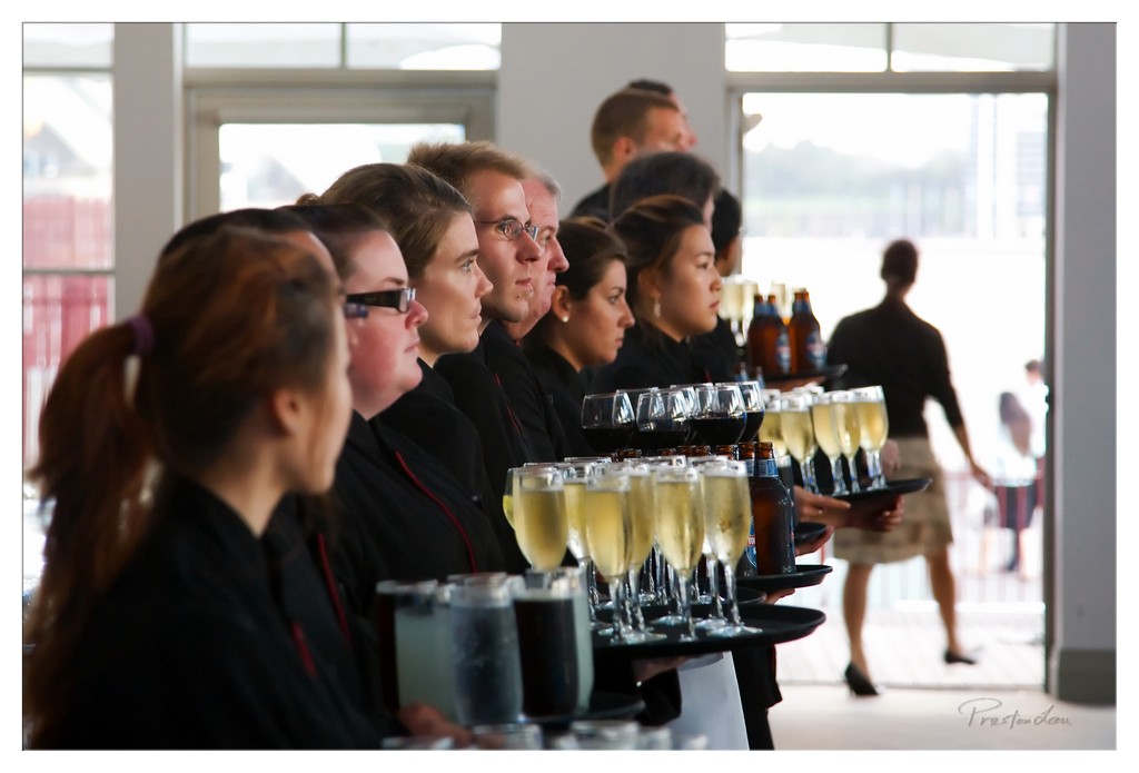
1. Overall Rating (0–10) — 7.0 This photograph captures a moment of poised professionalism among a line of servers, their expressions focused and composed as they carry trays of drinks. The diagonal alignment of the figures creates a sense of rhythm and anticipation, while the soft natural light from the windows enhances the atmosphere of a high-end event. The image feels candid yet controlled, though the shallow depth of field slightly obscures the background, limiting narrative context.
2. Composition (0–10) — 7.5 The diagonal line of servers draws the eye through the frame, creating a strong sense of movement and unity. The use of negative space on the right balances the visual weight of the subjects, while the blurred figure in the background adds depth without distracting.
3. Lighting (0–10) — 7.0 Natural light from the large windows bathes the scene in soft, diffused illumination, highlighting the faces and glassware with gentle highlights. The backlighting creates subtle rim light on the servers’ hair, enhancing dimension, though the overall exposure is slightly bright in the background.
4. Color & Tone (0–10) — 6.5 The palette is dominated by neutral blacks and grays, punctuated by the golden hues of the champagne and amber bottles. While the colors are balanced and realistic, they lack vibrancy, giving the image a slightly muted, documentary feel.
5. Creativity (0–10) — 7.0 The photograph effectively conveys the quiet intensity of service in a luxury setting. The choice to capture the moment in profile, with a shallow depth of field, emphasizes the collective focus of the staff, offering a subtle commentary on uniformity and discipline.
6. Technical Quality (0–10) — 7.5 The focus is sharp on the central figures, with smooth transitions into the background blur. The image is well-exposed with minimal noise, and the lens choice enhances the sense of depth and intimacy.
7. Emotional Impact (0–10) — 6.5 There’s a quiet dignity in the servers’ expressions, evoking a sense of dedication and professionalism. While the emotional resonance is restrained, it invites viewers to reflect on the unseen labor behind elegant events.
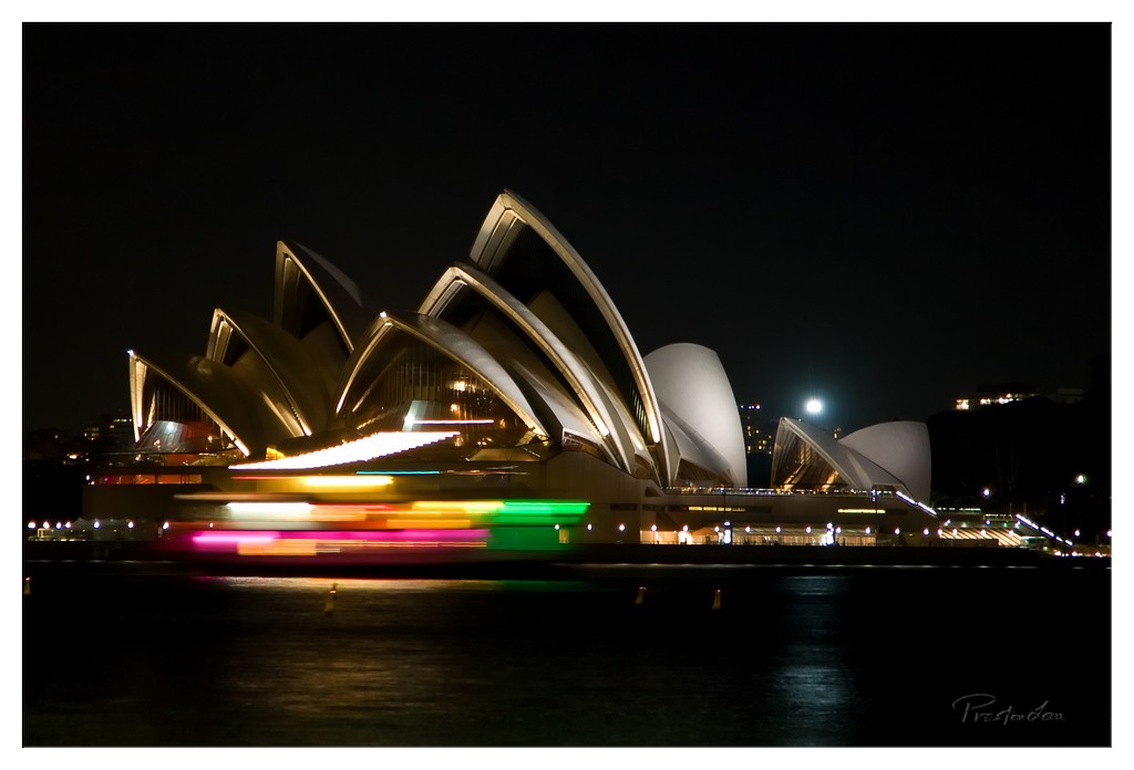
1. Overall Rating (0–10) — 7.5 This nighttime portrait of the Sydney Opera House captures a dynamic interplay between stillness and motion, where the iconic architecture stands as a luminous monument against the dark canvas of the night. The vibrant light trails from a passing boat inject a sense of energy and life, contrasting beautifully with the timeless form of the building. While the image is compelling and well-conceived, the heavy black of the sky and water slightly diminishes the overall visual depth, making the scene feel more like a staged moment than an immersive experience.
2. Composition (0–10) — 7.0 The Opera House is well-centered, anchoring the frame with its recognizable silhouette. The horizontal light trails create a strong visual counterpoint, adding movement across the lower third. However, the composition feels slightly top-heavy, with too much dark space above the structure, which could be better balanced with more ambient detail or a slightly tighter crop.
3. Lighting (0–10) — 8.0 The lighting is masterfully used, with the Opera House’s warm golden glow standing out against the deep black of the night. The long-exposure technique captures the ambient city lights and the colorful streaks from the boat with clarity and vibrancy, creating a dramatic contrast that emphasizes both the stillness of the architecture and the flow of life around it.
4. Color & Tone (0–10) — 7.5 The palette is rich and atmospheric, dominated by the warm yellows and whites of the building’s illumination, contrasted with the cool purples, greens, and reds of the light trails. The dark tones of the water and sky create a deep, moody backdrop that allows the colors to pop, though the overall tone remains somewhat flat due to the lack of mid-tone variation.
5. Creativity (0–10) — 8.5 The photographer demonstrates strong creative vision by using long exposure to transform a static landmark into a living, breathing scene. The juxtaposition of the Opera House’s timeless elegance with the fleeting, colorful motion of the boat adds narrative depth and a sense of poetic rhythm, making the image both visually striking and conceptually engaging.
6. Technical Quality (0–10) — 8.0 The image is technically sound, with sharp focus on the Opera House and well-controlled exposure. The long exposure is executed cleanly, with no visible noise or blur beyond the intentional light trails. The watermark is subtle and does not detract from the composition.
7. Emotional Impact (0–10) — 7.0 The photograph evokes a sense of wonder and motion, capturing the pulse of a city at night. The contrast between the enduring symbol of culture and the transient flash of movement creates a contemplative mood—hinting at the passage of time and the harmony between permanence and change. While emotionally resonant, the image’s dramatic effect is slightly restrained by its lack of atmospheric subtlety.
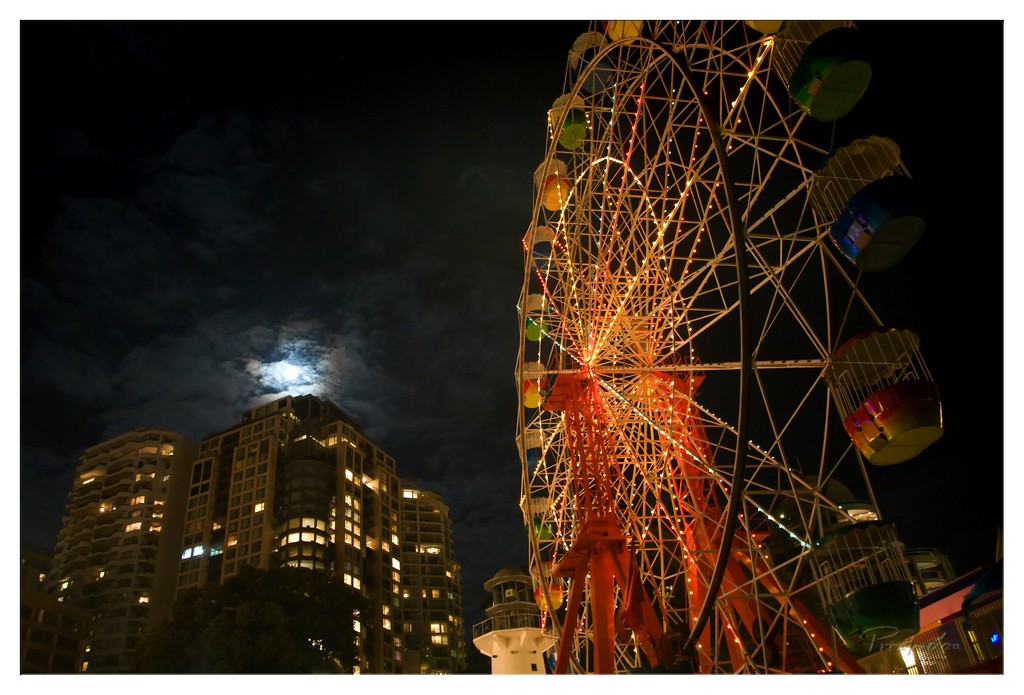
1. Overall Rating (0–10) — 7.5 This nighttime photograph captures a striking juxtaposition between urban modernity and playful whimsy, with the illuminated Ferris wheel glowing against a moody, cloud-draped sky. The moon, partially veiled by clouds, adds a celestial layer of drama, while the warm lights of the residential towers ground the scene in everyday life. The image balances spectacle and serenity, though the composition's asymmetry and slightly heavy vignette temper its overall cohesion.
2. Composition (0–10) — 7.0 The low-angle perspective emphasizes the scale of the Ferris wheel, while its diagonal placement creates dynamic tension. The moon and buildings on the left provide visual counterbalance, though the framing feels slightly off-center, pulling attention away from the wheel’s structural harmony.
3. Lighting (0–10) — 8.0 The interplay of artificial lights—warm glows from the Ferris wheel and the cool, diffused light of the moon—creates a rich contrast. The long exposure enhances the brightness of the lights and softens the clouds, adding depth and a dreamlike quality to the scene.
4. Color & Tone (0–10) — 7.5 The warm yellows and reds of the Ferris wheel stand out vividly against the deep blues and blacks of the night sky, while the moonlight introduces a soft, silvery tone. The palette is balanced and evocative, with a strong sense of atmospheric depth.
5. Creativity (0–10) — 8.0 The choice to frame the moon behind the buildings and integrate the urban landscape with the amusement ride is imaginative and visually compelling. It transforms a simple night scene into a narrative of contrast between leisure and domesticity.
6. Technical Quality (0–10) — 7.5 The image is sharp and well-exposed, with minimal noise despite the low-light conditions. The focus is clear on the Ferris wheel, and the dynamic range is effectively managed, though the corners show some vignetting.
7. Emotional Impact (0–10) — 7.0 The photograph evokes a sense of quiet wonder and nostalgia, blending the excitement of a fairground with the calm of a city at night. It invites contemplation on the coexistence of play and routine in urban life.
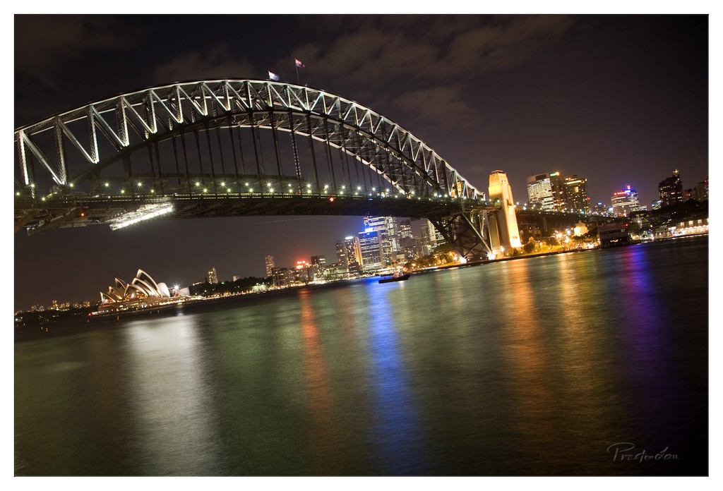
1. Overall Rating (0–10) — 8.0 This nighttime cityscape captures the grandeur of Sydney with striking clarity and balance, where the illuminated Sydney Harbour Bridge dominates the frame like a sculptural arch against the deep night sky. The reflections on the water add a layer of visual harmony, while the distant Opera House and city skyline provide context and depth. The image succeeds in conveying both the scale of the architecture and the quiet energy of the city at night, though a slightly more dramatic sky or tighter framing could elevate its emotional resonance.
2. Composition (0–10) — 8.5 The bridge is framed with strong diagonal lines that lead the eye across the image, while the Opera House on the left and the city skyline on the right create a balanced, symmetrical feel. The low angle enhances the bridge’s scale, and the water’s surface acts as a natural leading line, guiding the viewer toward the illuminated landmarks.
3. Lighting (0–10) — 8.0 The artificial lights of the bridge, city, and Opera House create a vibrant contrast against the dark sky, with the long exposure capturing the glow and reflections with clarity. The light direction is mostly frontal and ambient, emphasizing the architecture’s form and contributing to the scene’s nighttime atmosphere.
4. Color & Tone (0–10) — 8.5 The palette is rich with deep blues and blacks of the night, punctuated by warm yellows and whites from the city lights, and cool purples and blues in the water reflections. The tonal range is well-balanced, with the luminous highlights complementing the dark shadows without losing detail.
5. Creativity (0–10) — 7.5 The image is a strong, well-executed representation of a familiar subject, but its creativity lies more in technical mastery than in conceptual originality. The use of long exposure and reflection adds a poetic quality, transforming a classic view into something serene and contemplative.
6. Technical Quality (0–10) — 9.0 Sharp focus, clean exposure, and excellent control of light and motion blur indicate high technical skill. The long exposure smooths the water and captures light trails effectively, while the image remains free of noise or distortion.
7. Emotional Impact (0–10) — 8.0 The image evokes a sense of awe and tranquility, capturing the timeless beauty of Sydney at night. The stillness of the water and the glow of the lights create a meditative mood, inviting quiet reflection on the city’s iconic presence.
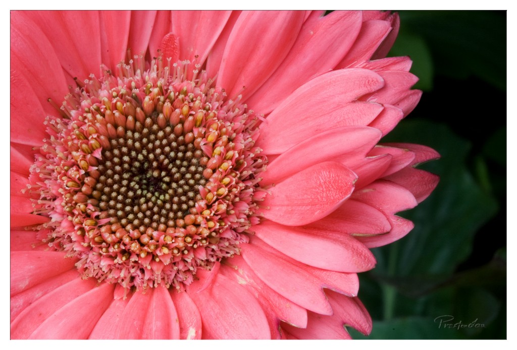
1. Overall Rating (0–10) — 8.0 This image captures the delicate complexity of a pink gerbera daisy with striking intimacy, drawing the viewer into the flower’s intricate center. The vivid color and tight framing emphasize natural beauty and structure, while the dark, blurred background isolates the subject with elegance. A slight overexposure in the petals tempers its impact, but the composition remains compelling and visually rich.
2. Composition (0–10) — 7.5 The close-up framing centers the flower effectively, guiding the eye toward the detailed disc. The diagonal arrangement of the petals adds subtle dynamism, though the composition feels slightly off-center, creating a minor imbalance.
3. Lighting (0–10) — 7.0 Soft, diffused lighting highlights the texture of the petals and central disc without harsh shadows. However, some areas of the petals appear slightly overexposed, losing fine detail and tonal depth.
4. Color & Tone (0–10) — 8.5 The rich, saturated pink of the petals contrasts beautifully with the dark green background and the earthy tones of the flower’s center. The color palette is harmonious and vibrant, enhancing the image’s natural allure.
5. Creativity (0–10) — 8.0 The choice to focus tightly on the flower’s center and the use of a shallow depth of field lend a poetic, almost abstract quality to the subject. The image transforms a common flower into a study of pattern and color.
6. Technical Quality (0–10) — 8.0 Sharp focus on the flower’s center and clean details throughout the frame demonstrate strong technical execution. The background blur is smooth, and the image is free of noticeable noise or artifacts.
7. Emotional Impact (0–10) — 8.0 The image evokes a sense of quiet wonder and appreciation for nature’s intricate design. Its vividness and intimacy invite contemplation, creating a moment of still beauty that feels both personal and universal.
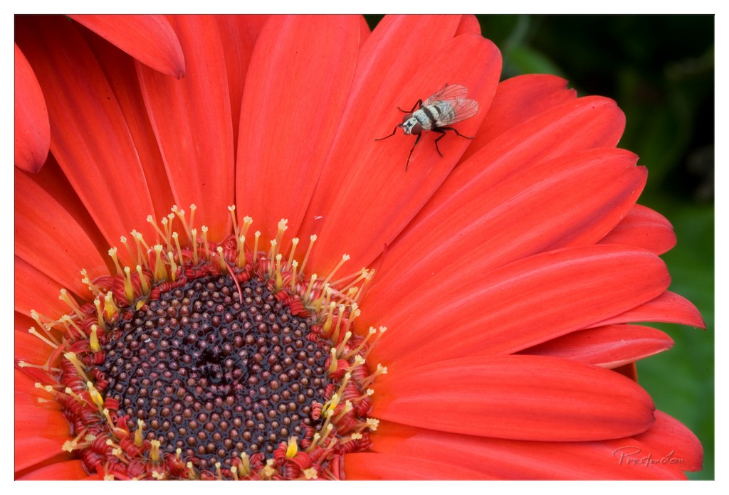
1. Overall Rating (0–10) — 7.5 This macro photograph captures a striking contrast between the vivid, saturated red of a gerbera daisy and the delicate, intricate form of a fly resting upon it. The composition draws the eye to the interplay of organic textures—the soft, velvety petals and the fine hairs on the insect—while the dark, blurred background enhances the flower’s luminosity. While the image is visually arresting, its emotional depth is slightly restrained by the unremarkable placement of the fly, which feels more incidental than symbolic.
2. Composition (0–10) — 7.0 The flower dominates the frame with a strong diagonal presence, guiding the eye from the lower left toward the upper right where the fly rests. This creates a balanced, dynamic tension, though the fly’s position, while clear, is slightly off-center and could benefit from tighter framing to emphasize its role in the narrative.
3. Lighting (0–10) — 8.0 The lighting is soft and even, highlighting the texture of the petals and the fine details of the fly without harsh shadows or overexposed highlights. The gentle illumination enhances the flower’s rich red tones and gives the scene a natural, almost ethereal quality.
4. Color & Tone (0–10) — 8.5 The bold, saturated red of the petals contrasts beautifully with the dark brown center and the muted gray and white of the fly. The green backdrop provides a subtle complementary contrast, enriching the overall palette and giving the image a vibrant, lifelike quality.
5. Creativity (0–10) — 7.5 The juxtaposition of the delicate fly against the bold flower creates a compelling micro-narrative—suggesting both fragility and resilience in nature. While the subject is familiar, the choice to focus on this quiet moment elevates the image beyond mere documentation into something more contemplative.
6. Technical Quality (0–10) — 9.0 The image is exceptionally sharp, with fine detail visible in the fly’s wings, legs, and the pollen-laden stamens. Depth of field is precisely managed, isolating the subject with a smooth, creamy bokeh that enhances focus and clarity.
7. Emotional Impact (0–10) — 7.0 The photograph evokes a sense of quiet wonder, inviting the viewer to pause and appreciate the small, often overlooked interactions in the natural world. The fly’s presence adds a layer of vulnerability, prompting reflection on the fleeting nature of life, though the emotional resonance is subtle rather than overwhelming.
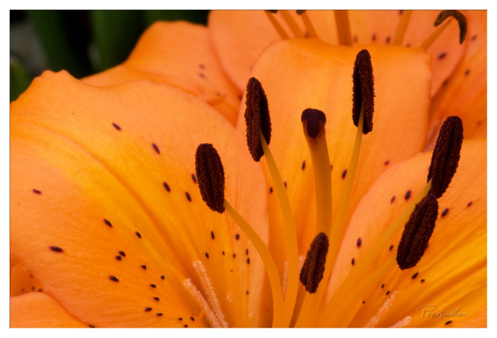
1. Overall Rating (0–10) — 8.0 This macro image captures the intricate beauty of a lily with striking clarity and warmth, transforming a simple floral subject into a richly textured visual poem. The bold orange hue and delicate spotting on the petals evoke a sense of natural elegance, while the deep focus on the stamens draws the eye into the flower’s core. A slight overexposure in the highlights tempers its overall impact, but the composition remains compelling and emotionally resonant.
2. Composition (0–10) — 8.0 The central placement of the stamens creates a strong focal point, with the petals radiating outward in a balanced, organic pattern. The tight framing enhances intimacy, though a subtle shift in angle might have better emphasized the symmetry of the bloom.
3. Lighting (0–10) — 8.0 Soft, directional light enhances the texture of the petals and highlights the dark anthers, creating a luminous glow. The warm tone suggests golden-hour illumination, enhancing the flower’s natural vibrancy without harsh shadows.
4. Color & Tone (0–10) — 9.0 The warm orange dominates with rich saturation, complemented by the deep brown of the stamens and the soft green backdrop. The contrast between the bright petals and dark speckles adds visual depth, while the overall tonal harmony feels both vivid and balanced.
5. Creativity (0–10) — 8.0 The photographer elevates a common subject through meticulous close-up detail and a painterly approach to light and color. The image tells a quiet story of life and structure, inviting contemplation beyond mere documentation.
6. Technical Quality (0–10) — 8.5 Sharp focus on the central elements ensures clarity, with fine detail visible in the pollen and petal texture. The exposure is well-managed despite minor highlights, and the watermark is unobtrusive.
7. Emotional Impact (0–10) — 8.5 The image evokes a sense of awe and intimacy, inviting the viewer to pause and appreciate the delicate complexity of nature. Its warmth and depth stir quiet wonder, making it both visually and emotionally engaging.
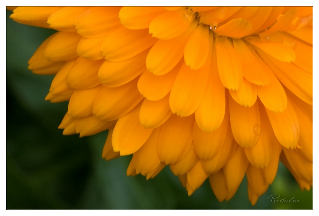
1. Overall Rating (0–10) — 8.0 This image captures the vibrant warmth and delicate texture of a marigold in stunning macro detail, where the interplay of light and color evokes a sense of natural vitality. The rich golden petals dominate the frame with a striking clarity that draws the eye inward, while the soft, blurred green background provides a serene contrast. Though the composition feels slightly cropped, the image excels in conveying the quiet beauty of a single floral moment, making it both visually arresting and emotionally resonant.
2. Composition (0–10) — 7.5 The diagonal placement of the flower creates a dynamic flow, leading the eye from the lower left toward the center. However, the tight crop slightly cuts into the frame, giving a sense of imbalance and limiting the full visual context.
3. Lighting (0–10) — 8.5 Soft, diffused light enhances the natural glow of the petals, highlighting their texture and subtle gradients. The gentle highlights and shadows add depth without creating harsh contrasts, creating a luminous and inviting mood.
4. Color & Tone (0–10) — 9.0 The vivid, warm orange of the petals contrasts beautifully with the deep, muted green background, creating a harmonious and vibrant palette. The color temperature enhances the natural warmth of the flower, evoking a sense of sunlight and life.
5. Creativity (0–10) — 8.0 The macro perspective transforms a common flower into an intricate, almost abstract composition. The focus on texture and color, along with the subtle inclusion of a water droplet, adds narrative depth and a sense of quiet discovery.
6. Technical Quality (0–10) — 9.0 The image is exceptionally sharp in the focal plane, with crisp detail on the petals and a smooth, pleasing bokeh in the background. The exposure is well-balanced, with no overexposed highlights or lost shadows.
7. Emotional Impact (0–10) — 8.5 The photograph evokes a sense of tranquility and appreciation for nature’s small wonders. The intimate framing and radiant color invite the viewer to pause and reflect, creating a moment of quiet beauty and connection.
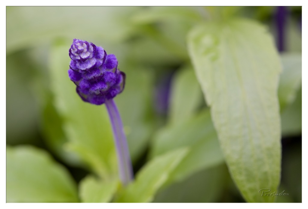
1. Overall Rating (0–10) — 7.5 This photograph captures the delicate intricacy of a purple flower with a soft, dreamlike quality, inviting quiet contemplation. The shallow depth of field beautifully isolates the subject, drawing attention to its textured bloom, while the surrounding greenery provides a natural, harmonious backdrop. Though the image is visually pleasing, it could benefit from slightly richer color saturation and more dynamic contrast to elevate its emotional resonance.
2. Composition (0–10) — 7.0 The subject is well-placed off-center, creating a balanced and natural feel, while the soft bokeh enhances focus on the flower. A slightly tighter crop might further emphasize the bloom’s detail and reduce visual distraction.
3. Lighting (0–10) — 7.5 The lighting is soft and diffused, likely from an overcast sky or shaded environment, which gently illuminates the flower without harsh shadows. This contributes to the image’s serene and delicate mood.
4. Color & Tone (0–10) — 7.0 The palette is harmonious, with the deep purple of the flower contrasting beautifully against the muted greens. The tones are natural but slightly subdued; a touch more vibrancy could enhance the visual impact.
5. Creativity (0–10) — 7.5 The use of macro focus and shallow depth of field demonstrates a thoughtful approach to capturing a fleeting moment in nature. The composition evokes a sense of stillness and intimacy, elevating it beyond a simple botanical record.
6. Technical Quality (0–10) — 8.0 The image is sharp on the flower’s bloom, with clean focus and no visible noise. The lens choice and aperture were well-suited to the subject, resulting in a technically sound capture.
7. Emotional Impact (0–10) — 7.0 The photograph conveys a sense of tranquility and quiet beauty, evoking a moment of stillness in nature. While emotionally warm, it remains somewhat restrained, allowing the viewer to reflect rather than feel overwhelmed.
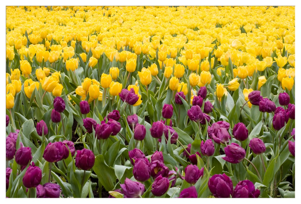
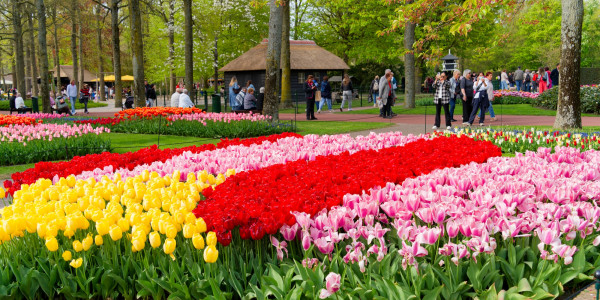
1. Overall Rating (0–10) — 8.0 This photograph bursts with vitality, capturing the rhythmic beauty of a tulip field in full bloom. The bold contrast between the vibrant yellow and deep magenta flowers creates a dynamic visual harmony, while the lush green foliage grounds the composition in natural richness. Though the image leans toward the conventional, its color saturation and sense of abundance give it a joyous, almost celebratory energy that resonates with the viewer.
2. Composition (0–10) — 7.5 The diagonal division between the purple and yellow tulips guides the eye across the frame with gentle movement. The foreground placement of the magenta blooms adds depth and focus, while the expansive field of yellow creates a sense of scale and continuity. Slight over-crowding in the lower third tempers the balance, but the overall structure remains engaging.
3. Lighting (0–10) — 8.0 Soft, diffused daylight enhances the natural vibrancy of the flowers without harsh shadows or glare. The even illumination allows each petal to glow with rich color, and the subtle highlights on the green leaves add texture and dimension. The lighting supports the scene’s lively mood while preserving detail.
4. Color & Tone (0–10) — 9.0 The complementary pairing of yellow and purple creates a striking, eye-catching palette, enhanced by the lush green of the foliage. The tones are rich and saturated without appearing unnatural, giving the image a vivid, painterly quality. The color harmony is masterful, evoking a sense of springtime exuberance.
5. Creativity (0–10) — 7.5 While the subject is familiar, the deliberate color blocking and composition elevate the image beyond a simple floral snapshot. The interplay of color and pattern suggests an intentional artistic vision, transforming a natural scene into a rhythmic, almost abstract tapestry.
6. Technical Quality (0–10) — 8.5 The image is sharp and well-focused throughout, with fine detail visible in the petals and leaves. The exposure is balanced, and there is minimal noise or distortion. The framing and depth of field are controlled effectively, capturing the scene with clarity and precision.
7. Emotional Impact (0–10) — 8.5 The photograph radiates warmth, joy, and renewal—qualities associated with spring and nature’s vitality. The sheer density of blooms and the bold color palette evoke a sense of wonder and delight, inviting the viewer to feel immersed in the beauty of the moment.
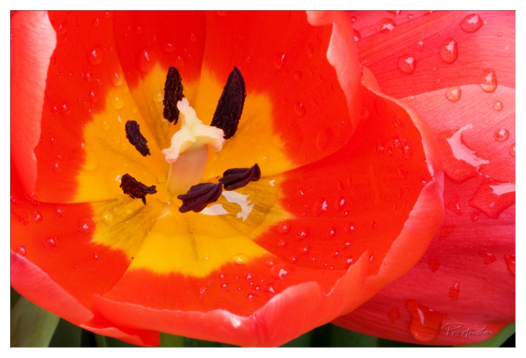
1. Overall Rating (0–10) — 8.0 This close-up of a tulip captures the delicate tension between vibrancy and fragility, where the bold red and yellow petals glisten with raindrops like jewels on a crown. The composition draws the eye directly into the flower’s heart, emphasizing both its intricate structure and the freshness of a post-rain moment. While the image is rich in detail and color, it borders on being overly saturated, slightly diminishing the natural subtlety of the bloom.
2. Composition (0–10) — 8.0 The framing centers the tulip’s reproductive core, creating a strong focal point with the petals radiating outward in a natural, balanced arc. The slight diagonal tilt adds subtle dynamism, while the overlapping petal on the right provides depth without distracting from the main subject.
3. Lighting (0–10) — 8.5 Soft, diffused light enhances the flower’s textures and highlights the water droplets with a gentle sheen. The even illumination brings out the warmth of the yellow center while preserving the depth in the red petals, creating a luminous and immersive effect.
4. Color & Tone (0–10) — 9.0 The vivid red and yellow create a powerful, harmonious contrast that feels both energetic and inviting. The saturation is high but controlled, giving the image a bold, almost painterly quality while maintaining natural tonal transitions.
5. Creativity (0–10) — 8.5 The choice to focus on the interior of the tulip with water droplets adds a poetic, almost sacred quality to a common subject. The macro perspective transforms a simple flower into a microcosm of life and renewal, demonstrating a keen eye for natural beauty.
6. Technical Quality (0–10) — 9.0 Exceptional sharpness in the center of the flower, particularly on the stamen and petals, contrasts with a soft blur in the background. The focus is precise, and the image is free of noise or artifacts, showcasing strong technical execution.
7. Emotional Impact (0–10) — 8.0 The image evokes a sense of renewal and quiet wonder, inviting the viewer to pause and appreciate the intricate beauty of nature. The freshness of the water droplets and the vivid colors stir feelings of vitality and renewal, creating a deeply calming yet uplifting experience.
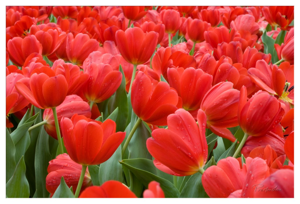
1. Overall Rating (0–10) — 8.0 This photograph bursts with life, capturing a dense field of red tulips in full bloom with an almost tactile intensity. The vivid color and glistening water droplets lend a sense of freshness and vitality, evoking the crisp energy of a spring morning. While the composition is rich and immersive, it borders on overwhelming, slightly sacrificing subtlety in favor of sheer visual impact.
2. Composition (0–10) — 7.5 The tight framing fills the image with tulips, creating a sense of abundance and rhythm. The diagonal sweep of blooms and leaves guides the eye across the frame, though the lack of negative space makes the arrangement feel dense rather than expansive.
3. Lighting (0–10) — 8.0 Soft, diffused light enhances the rich reds and greens without harsh shadows, highlighting the delicate texture of the petals and the shimmer of water droplets. The even illumination gives the scene a natural, luminous quality.
4. Color & Tone (0–10) — 9.0 The bold, saturated reds of the tulips contrast beautifully with the deep green foliage, creating a dynamic and harmonious palette. The color temperature is warm and inviting, reinforcing the vitality of the scene.
5. Creativity (0–10) — 7.5 The image captures a familiar subject with striking clarity and energy, transforming a simple floral scene into a celebration of color and life. The focus on texture and detail adds a layer of sensory richness that elevates it beyond a standard nature photograph.
6. Technical Quality (0–10) — 8.5 Sharp focus across the frame reveals fine details in the petals and droplets, while the exposure is well-balanced and the depth of field effectively isolates the foreground from the softly blurred background.
7. Emotional Impact (0–10) — 8.5 The image radiates joy and renewal, evoking feelings of warmth, vitality, and the simple beauty of nature in full bloom. The viewer is drawn into the lushness of the scene, feeling the freshness of a rain-kissed garden.