Preston Lau: A Journey Through Memories, Tech, and Humanity
Welcome to my personal blog that delves into the intricate tapestry of personal albums and the fascinating intersection of ever-evolving technology and humanity. Come along on a journey with me as we delve into the seamless fusion of creativity, state-of-the-art AI and robotics, intricately interwoven within the tapestry of our shared awareness. Have fun!
Tokyo Opera City Art Gallery Japan Day 3
AI Summary
The Tokyo Opera City Art Gallery offers a visual feast and a journey through art history, with a collection of artistic expressions spanning eras and styles. The gallery showcases traditional Japanese painting, Western impressionism, and contemporary works that challenge conventions and spark conversations. Its architecture is a harmonious composition of light and space that complements the artworks, creating a unique experience for visitors.
Tokyo Opera City Art Gallery is a haven where creativity resonates and history comes alive. From timeless masterpieces to contemporary expressions, this gallery promises an experience that's both a visual feast and a stroll through the annals of art history. So, let's step into the gallery and immerse ourselves in a world where art and history harmonize!
The Gallery's Grand Overture
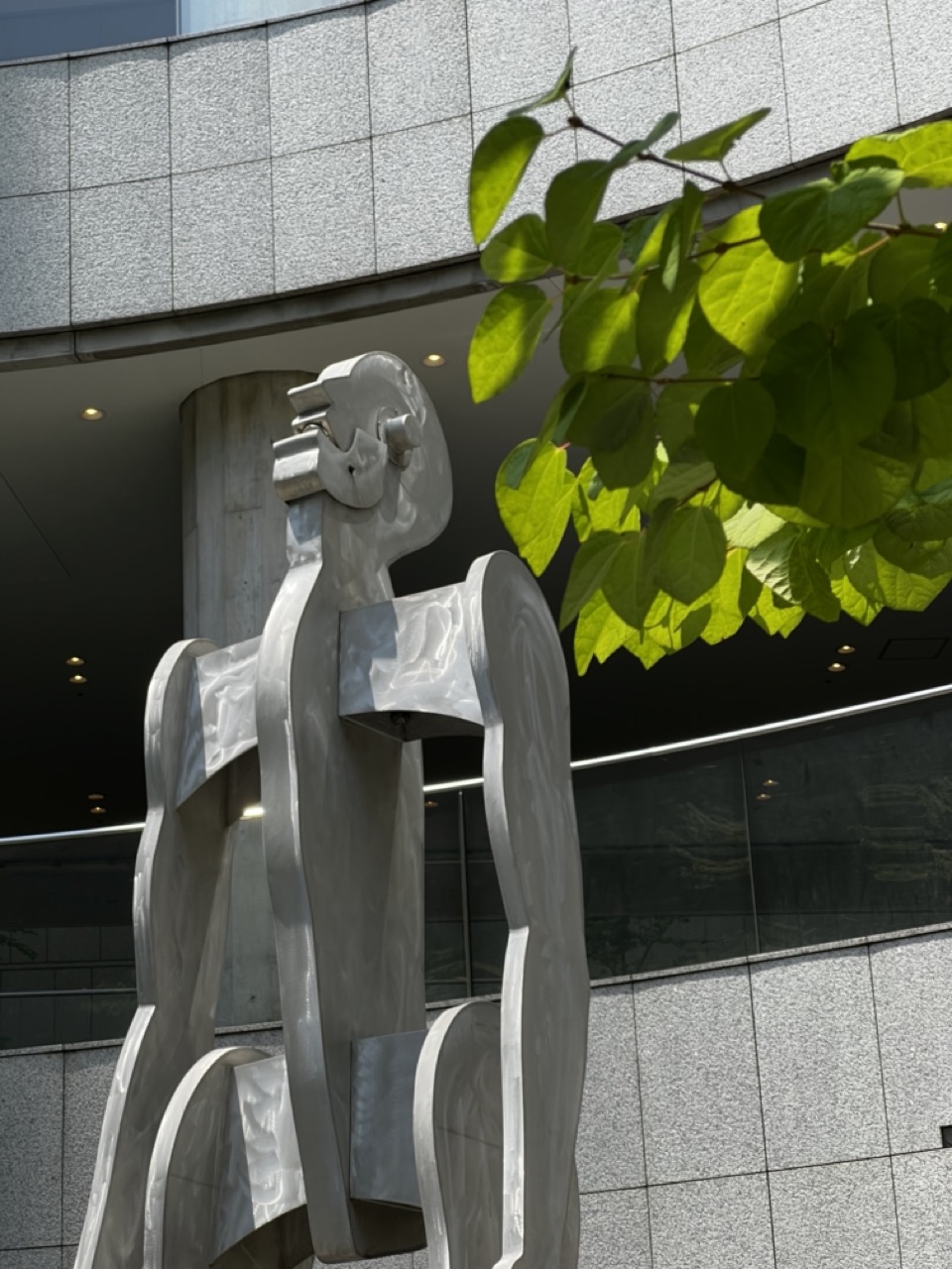
1. Overall Rating (0–10) — 7.0 This photograph captures a striking juxtaposition between modern architecture and organic growth, with a metallic sculpture serving as a mediating figure between the two. The interplay of light on the reflective surface of the sculpture and the vibrant green leaves creates a dynamic visual tension. While the composition is strong and conceptually rich, the slightly cluttered framing and overexposed foliage reduce the image’s overall cohesion.
2. Composition (0–10) — 6.5 The sculpture is placed off-center, creating a dynamic balance with the leafy branch entering from the upper right. However, the overlapping elements and lack of negative space slightly disrupt the visual flow, making the frame feel busy.
3. Lighting (0–10) — 7.5 Natural daylight enhances the reflective quality of the sculpture, with highlights and shadows defining its form. The backlighting on the leaves creates a luminous effect, adding depth and contrast to the scene.
4. Color & Tone (0–10) — 7.0 The palette is dominated by cool grays of the building and sculpture, punctuated by the vivid, sunlit green of the leaves. The contrast between these tones enhances the visual interest and reinforces the theme of nature reclaiming urban space.
5. Creativity (0–10) — 7.5 The image successfully captures a moment of harmony between art, nature, and architecture. The choice to frame the sculpture through the foliage adds a layer of narrative and visual intrigue, suggesting a dialogue between the man-made and the natural.
6. Technical Quality (0–10) — 8.0 The image is sharp and well-focused, with clean details in both the sculpture and the leaves. The exposure is balanced, though the highlights on the leaves are slightly blown out.
7. Emotional Impact (0–10) — 7.0 The photograph evokes a contemplative mood, inviting the viewer to reflect on the coexistence of nature and urban life. The serene presence of the sculpture, softened by the organic frame of the leaves, creates a sense of quiet resilience.
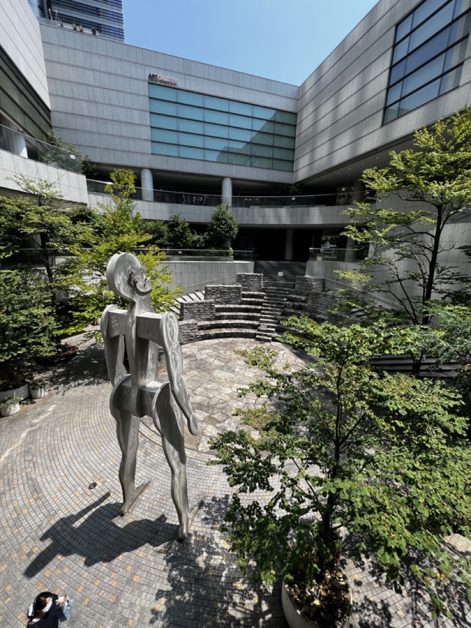
1. Overall Rating (0–10) — 7.0 This photograph captures a serene urban courtyard where modern architecture and organic greenery converge, anchored by a striking abstract sculpture. The interplay of light and shadow across the stone pavement and foliage enhances the sense of depth and calm. While the composition is strong and the setting compelling, the presence of a partial figure in the lower corner slightly disrupts the visual harmony, grounding the scene in the mundane rather than the artistic.
2. Composition (0–10) — 7.5 The sculpture is well-placed in the foreground, drawing the eye toward the ascending stone steps and the modern building beyond. The diagonal lines of the pavement and foliage create a natural leading path, while the framing by surrounding trees adds balance and enclosure.
3. Lighting (0–10) — 8.0 Bright, natural daylight enhances the textures of the stone, metal, and foliage, casting crisp shadows that define form and space. The high contrast between sunlit areas and shaded recesses adds dimension and visual interest.
4. Color & Tone (0–10) — 7.0 The palette is dominated by cool grays and greens, reflecting the architectural and natural elements in harmony. The subtle warm tones of the stone tiles introduce a gentle contrast, while the blue sky provides a clean backdrop that keeps the focus on the central scene.
5. Creativity (0–10) — 7.5 The image successfully blends urban design with artistic expression, using the sculpture as a narrative focal point. The juxtaposition of modern architecture, natural elements, and human presence creates a layered, contemplative atmosphere.
6. Technical Quality (0–10) — 8.0 The image is sharp and well-focused, with clean detail in both the sculpture and background. The exposure is balanced, preserving texture and depth without overexposure or loss in shadows.
7. Emotional Impact (0–10) — 7.0 The scene evokes a sense of quiet contemplation and urban tranquility, inviting the viewer to pause and reflect. The open space and natural light contribute to a peaceful mood, though the partial inclusion of the photographer slightly tempers the immersive quality.
1. Overall Rating (0–10) — 7.0 This photograph captures a quiet moment of cultural engagement, where a young visitor stands before surreal artworks in a gallery, creating a subtle dialogue between observer and art. The composition balances the human element with the grandeur of the paintings, and the clean, bright setting enhances the contemplative mood. While the image is grounded in realism, its narrative potential is slightly limited by the lack of emotional intensity in the subject’s expression.
2. Composition (0–10) — 7.5 The subject is well-placed off-center, allowing the large painting to dominate the frame while still maintaining a sense of narrative balance. The diagonal line of the gallery wall and the alignment of the artworks create a natural visual flow, guiding the eye through the scene.
3. Lighting (0–10) — 8.0 Even, soft lighting illuminates the space without harsh shadows, enhancing the clarity of both the subject and the artwork. The ambient light complements the muted tones of the paintings and contributes to the calm, gallery atmosphere.
4. Color & Tone (0–10) — 6.5 The palette is largely neutral—white walls, wood floors, and muted greens and grays in the paintings—though the vibrant purple bag adds a striking pop of color. While the overall tone is cohesive, the color contrast is modest, preventing the image from feeling visually dynamic.
5. Creativity (0–10) — 6.0 The image functions as a straightforward documentary record of an art visit. While the juxtaposition of the viewer with the surreal paintings suggests a layer of interpretation, the execution remains conventional, lacking bold artistic risk or narrative depth.
6. Technical Quality (0–10) — 8.5 Sharp focus and clean detail are evident throughout, from the texture of the wooden floor to the fine lines in the paintings. The exposure is well-balanced, and the image is free of distracting artifacts.
7. Emotional Impact (0–10) — 6.5 The photograph conveys a sense of quiet curiosity and appreciation, but the subject’s reserved smile and the neutral environment keep the emotional resonance at a distance. It invites reflection on art and experience, but doesn’t deeply stir the viewer.
Nestled amidst Tokyo's bustling streets, the Tokyo Opera City Art Gallery stands tall as a bastion of culture. As you step through its doors, you're greeted by a sense of anticipation, much like the hushed excitement before the curtains rise on a grand performance.
A Canvas of Time and Expression
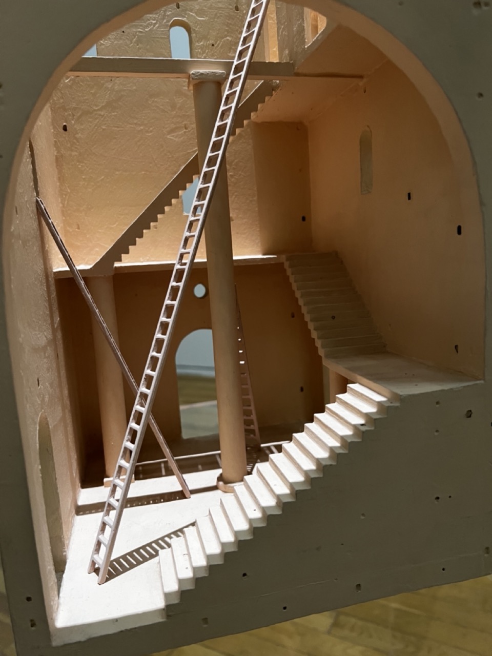
1. Overall Rating (0–10) — 7.0 This photograph captures a meticulously crafted architectural model, revealing a labyrinthine interior of staircases and arches that evoke both wonder and disorientation. The warm, earthy tones and the play of light and shadow lend the structure a dreamlike quality, suggesting a space both functional and fantastical. While the model’s complexity is compelling, the image’s slightly awkward framing and uneven lighting temper its overall impact, preventing it from achieving a fully immersive presence.
2. Composition (0–10) — 6.5 The arched frame provides a natural vignette, drawing the eye into the layered interior. However, the diagonal ladder and staircase placement create a sense of visual tension, with the left side feeling slightly more dominant than the right, disrupting compositional balance.
3. Lighting (0–10) — 6.0 Soft, directional light highlights the textures and depth of the model, creating subtle shadows that enhance its three-dimensional quality. However, the lighting appears uneven, with some areas overexposed and others cast in flat shadow, reducing overall tonal harmony.
4. Color & Tone (0–10) — 6.5 The warm, sandy palette of beige and cream tones evokes a Mediterranean or desert aesthetic, supporting the model’s architectural mood. The limited range and lack of vibrancy, however, give the image a muted, almost monochromatic feel, slightly dampening its visual energy.
5. Creativity (0–10) — 8.0 The image is conceptually strong, presenting an imaginative architectural construct that blurs the line between reality and abstraction. The choice to photograph a model through a natural frame adds a layer of narrative and discovery, suggesting a hidden world waiting to be explored.
6. Technical Quality (0–10) — 7.5 The focus is sharp on the central staircase and ladder, with fine details in the textures clearly visible. The depth of field is appropriate, though the model’s edges show minor softness, likely due to the camera’s distance and lighting conditions.
7. Emotional Impact (0–10) — 7.0 The photograph evokes curiosity and quiet contemplation, inviting the viewer to mentally navigate the winding paths and ponder the purpose of this enigmatic structure. Its architectural complexity and subtle storytelling create a sense of intrigue, though the lack of human presence keeps the emotional connection at a distance.
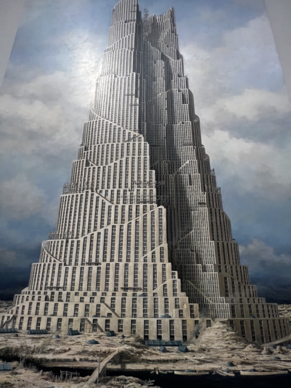
1. Overall Rating (0–10) — 7.0 This image presents a striking vision of a monumental, spiraling skyscraper rising from a desolate, post-apocalyptic landscape, evoking both awe and melancholy. The intricate architectural design and dramatic sky lend a cinematic grandeur, while the ruins at its base suggest a world reclaimed by time. Though the realism of the rendering is compelling, the image's emotional weight is slightly tempered by a lack of dynamic contrast in the foreground, which keeps the viewer from fully immersing in the scene’s narrative.
2. Composition (0–10) — 7.5 The low-angle perspective emphasizes the tower’s immense scale, drawing the eye upward along its spiraling structure. The asymmetrical form and layered geometry create visual rhythm, while the foreground ruins provide grounding context. A slight imbalance in framing gives the composition a dynamic tension, though a more deliberate focus on the base might enhance narrative clarity.
3. Lighting (0–10) — 7.0 The soft, diffused light from above creates a subtle halo effect around the tower’s upper levels, enhancing its ethereal presence. The interplay of light and shadow across the building’s textured surface adds depth, while the stormy sky introduces a sense of foreboding. However, the lighting lacks strong directional contrast, resulting in a somewhat flat overall mood.
4. Color & Tone (0–10) — 6.5 The muted, desaturated palette of grays and sepia tones reinforces the bleak, timeless atmosphere. While the limited range lends a cohesive, somber tone, it also reduces visual vibrancy, making the image feel slightly monotonous. A subtle infusion of color—perhaps in the sky or ruins—could amplify emotional resonance.
5. Creativity (0–10) — 8.0 The fusion of futuristic architecture with a post-collapse environment is highly original, suggesting a rich backstory of collapse and rebirth. The design of the tower—both intricate and imposing—conveys a sense of engineered resilience, while the setting evokes themes of isolation and endurance. The concept is compelling and thoughtfully realized.
6. Technical Quality (0–10) — 8.0 The image is rendered with high clarity and attention to architectural detail. Focus is sharp throughout, and the texture of the building’s facade and surrounding debris is finely delineated. The seamless integration of digital or painted elements suggests strong technical execution, though minor tonal inconsistencies in the sky hint at post-processing.
7. Emotional Impact (0–10) — 7.0 The image evokes a quiet, introspective melancholy, inviting contemplation on the fate of civilizations and the endurance of human ambition. The juxtaposition of the towering structure against the ruined earth creates a powerful sense of contrast between aspiration and decay. While the emotional pull is strong, the subdued lighting and lack of human presence keep the connection to the viewer at a measured distance.
The gallery's collection is an ensemble of artistic expressions, each stroke of paint and every chisel mark a note in the grand symphony of creativity. From classical to contemporary, the artworks span eras, genres, and styles, inviting you to journey through the evolution of art itself.
Masterpieces of the Ages
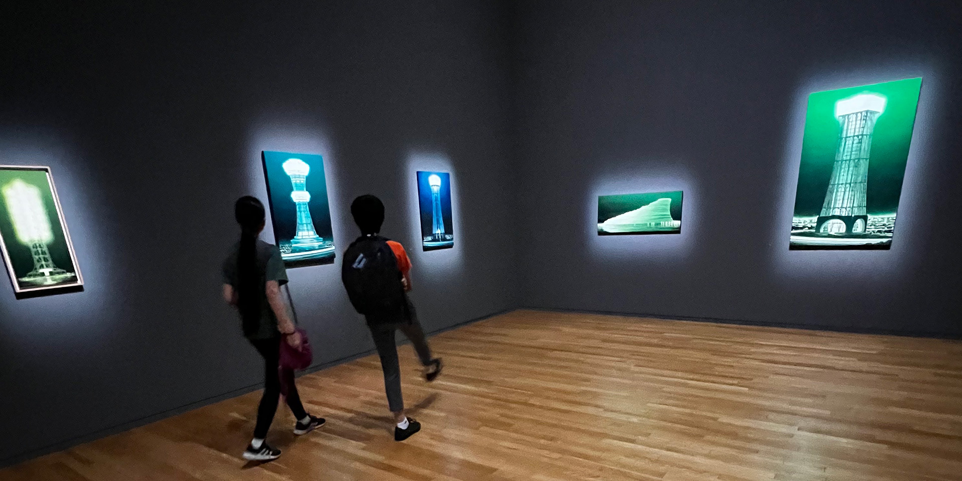
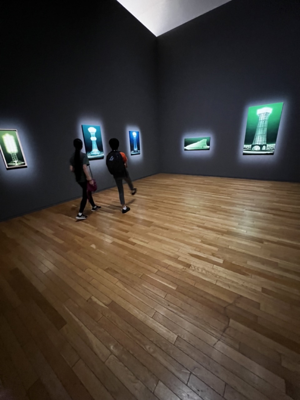
1. Overall Rating (0–10) — 7.0 This photograph captures the quiet contemplation of a museum gallery, where light and space converge to frame a series of striking, glowing artworks. The interplay between the dark walls, the warm wooden floor, and the luminous images creates a meditative atmosphere, drawing the viewer into the scene as if they were walking through it. While the composition is strong and the mood evocative, the image feels slightly restrained—its potential for emotional depth is held back by a lack of visual drama in the lighting and framing.
2. Composition (0–10) — 6.5 The wide-angle perspective emphasizes the gallery’s spaciousness and the symmetry of the room, with the two figures providing a sense of scale and movement. However, the low angle and wide framing push the viewer into an observational role, making the subjects feel somewhat distant and the artwork slightly underemphasized.
3. Lighting (0–10) — 6.0 The gallery’s lighting is functional, with spotlights highlighting the artworks but creating uneven illumination across the space. The overhead light source casts a soft glow, but the overall ambiance is subdued, with shadows in the corners reducing visual clarity and emotional intensity.
4. Color & Tone (0–10) — 6.5 The palette is dominated by deep grays and warm wood tones, creating a grounded, neutral backdrop that allows the green-tinged artworks to stand out. The contrast between the cool, glowing images and the warm floor adds subtle visual interest, though the overall tonal range remains restrained.
5. Creativity (0–10) — 7.0 The photograph captures a moment of quiet engagement with art, transforming a simple gallery visit into a narrative of exploration. The choice to include the viewers adds a layer of human context, suggesting the artwork’s role in shaping public experience, while the glow of the images lends a futuristic, almost cinematic quality.
6. Technical Quality (0–10) — 7.5 The image is sharp and well-focused, with clean lines and minimal noise. The exposure is balanced, preserving detail in both the illuminated artworks and the darker areas of the gallery, though the wide-angle lens introduces some distortion at the edges.
7. Emotional Impact (0–10) — 6.5 There’s a sense of calm and introspection, as the visitors move slowly through the space, absorbed in the glowing visuals. The mood is contemplative, but the emotional resonance is muted—perhaps due to the distance created by the framing and the lack of dynamic lighting—leaving the viewer as an observer rather than a participant.
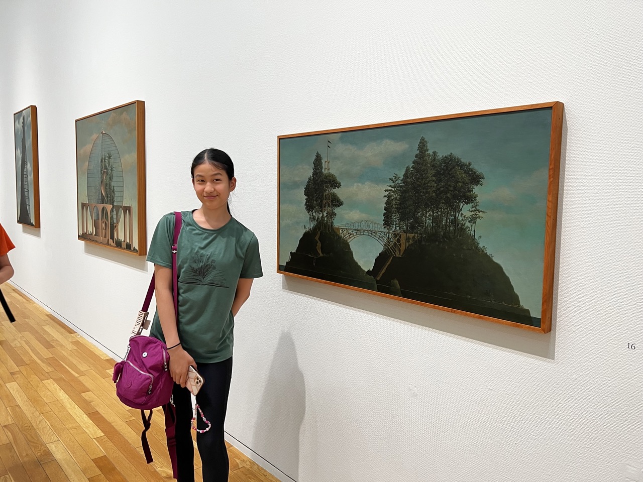
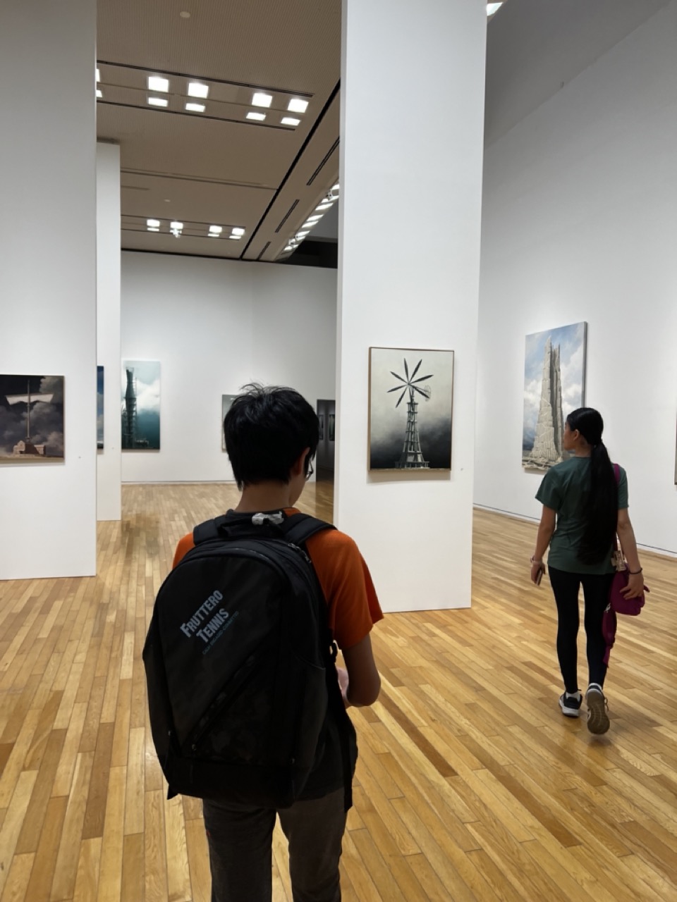
1. Overall Rating (0–10) — 6.8 This photograph captures the quiet rhythm of a museum visit, where the viewer becomes part of the gallery’s narrative. The composition, though candid, conveys a sense of movement and contemplation, drawing attention to the interplay between art, space, and human presence. While the lighting and framing are functional, the image's strength lies in its subtle storytelling—offering a glimpse into the meditative experience of art viewing without staging or pretense.
2. Composition (0–10) — 7.0 The diagonal placement of the two figures guides the eye through the space, creating depth and a sense of progression. The central pillar acts as a framing device, subtly directing attention to the artwork on either side.
3. Lighting (0–10) — 7.5 Even, bright gallery lighting illuminates the space effectively, highlighting the artworks without casting harsh shadows. The overhead fixtures contribute to a clean, institutional atmosphere that complements the setting.
4. Color & Tone (0–10) — 6.5 The palette is dominated by neutral whites and warm wood tones, with the black-and-white photographs providing contrast. While the colors are natural and restrained, they lack vibrancy, reinforcing the subdued mood of the space.
5. Creativity (0–10) — 6.0 The image functions more as a documentary snapshot than a conceptual piece, yet it finds artistic value in the juxtaposition of movement and stillness. The inclusion of the backpack adds a touch of everyday realism, grounding the scene in personal experience.
6. Technical Quality (0–10) — 7.5 The focus is sharp on the foreground subject, and the exposure is well-balanced. The slight motion blur in the walking figure adds dynamism without compromising clarity.
7. Emotional Impact (0–10) — 6.5 The image evokes a quiet introspection, capturing a moment of cultural engagement. The viewer is invited to step into the gallery’s calm, reflective space, feeling both observer and participant.
One could spend hours gazing at the masterpieces that adorn the walls – from the delicate intricacies of traditional Japanese painting to the bold strokes of Western impressionism. Each piece carries with it the echoes of its creator's passion, inviting you to delve into their world and witness the birth of their artistic vision.
A Glimpse into Japan's Artistic Heritage
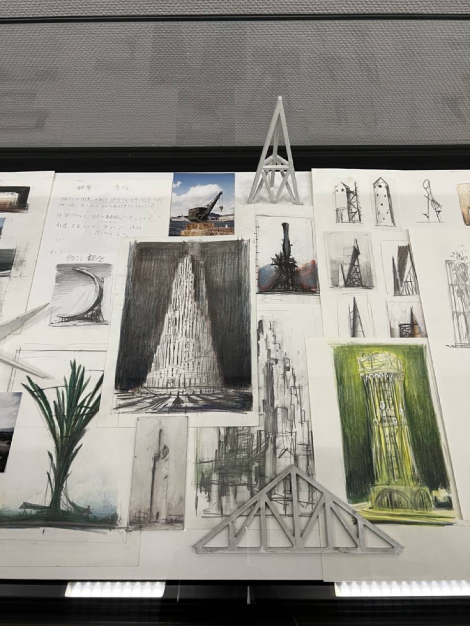
1. Overall Rating (0–10) — 7.0 This image captures the layered complexity of an architectural design process, where sketches, models, and photographs converge into a narrative of conceptual evolution. The collage feels both chaotic and intentional, reflecting the raw energy of creative development. While the visual density is engaging, the lack of a clear focal point slightly undermines its coherence, leaving the viewer to navigate a sea of ideas without a guiding thread.
2. Composition (0–10) — 6.0 The composition is densely packed, with overlapping sketches and models creating a sense of visual clutter. The central tower sketch anchors the frame, but surrounding elements compete for attention, resulting in a slightly unbalanced arrangement.
3. Lighting (0–10) — 6.5 The overhead lighting is functional and even, illuminating the board clearly but without dramatic effect. The glare from the fluorescent strips at the bottom slightly distracts from the details, while the overall cool tone flattens the textures of the paper and materials.
4. Color & Tone (0–10) — 6.0 The palette is largely neutral, dominated by whites, grays, and blacks, with the exception of the green-toned sketch that provides a subtle pop. The lack of vibrancy keeps the image grounded in a documentary style, though the muted tones contribute to a sense of intellectual austerity.
5. Creativity (0–10) — 7.5 The image celebrates the creative process itself, showcasing the iterative nature of design through a mix of media and concepts. The juxtaposition of hand-drawn studies, photographic references, and physical models suggests a rich, multi-dimensional approach to architectural thinking.
6. Technical Quality (0–10) — 7.5 The photograph is sharp and detailed, capturing the textures of paper, graphite, and model materials with clarity. The focus is consistent across the board, though the slight reflections from the lights introduce minor distractions.
7. Emotional Impact (0–10) — 6.5 There is a quiet intensity in the image, evoking the dedication and introspection of the designer at work. The viewer is invited into a private realm of thought and experimentation, but the emotional resonance remains cerebral rather than visceral.
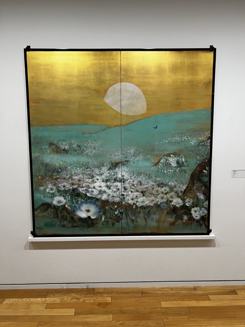
1. Overall Rating (0–10) — 8.0 This artwork radiates a serene, meditative quality, blending traditional Japanese aesthetics with contemporary expression. The luminous gold background and delicate floral forms create a dreamlike landscape that feels both timeless and intimate. While the composition is visually rich, the gallery setting slightly distances the viewer from the emotional core of the piece, keeping it more observational than immersive.
2. Composition (0–10) — 8.0 The balanced division of the diptych frames the central moon and horizon with harmony, guiding the eye across the layered landscape. The placement of the flowers in the foreground adds depth, while the minimal negative space in the upper half enhances the sense of vastness.
3. Lighting (0–10) — 7.0 Even, diffuse gallery lighting highlights the texture of the gold leaf and the subtle variations in paint, though it slightly flattens the luminosity of the gold. The ambient light complements the artwork’s reflective surface without creating glare.
4. Color & Tone (0–10) — 8.5 The palette of shimmering gold, soft teal, and crisp white creates a luminous, ethereal atmosphere. The contrast between the warm gold and cool green-blue tones enhances the visual tension between earth and sky, while the white flowers provide a grounding focal point.
5. Creativity (0–10) — 9.0 The fusion of traditional folding screen aesthetics with modern painting techniques demonstrates bold artistic innovation. The symbolic use of the moon, birds, and blossoms evokes a poetic narrative, suggesting themes of transience and renewal in a deeply personal visual language.
6. Technical Quality (0–10) — 8.5 The artwork displays meticulous craftsmanship, with fine brushwork and a richly textured surface. The gold leaf application is flawless, and the paint layers are handled with precision, conveying depth and luminosity.
7. Emotional Impact (0–10) — 8.0 The piece evokes a sense of calm and contemplation, inviting the viewer into a quiet, almost sacred space. The gentle interplay of light, color, and symbolism stirs a deep emotional resonance, suggesting a moment of stillness in the midst of nature’s cycle.
As you move through the gallery's halls, you encounter a tapestry of Japan's rich artistic heritage. Traditional woodblock prints, tea ceremony ceramics, and intricate textiles tell tales of a culture deeply rooted in aesthetics and craftsmanship. It's a journey that bridges the past with the present, giving you a deeper appreciation for the artistic legacy of the nation.
Contemporary Chronicles
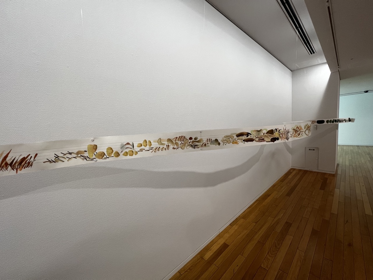
1. Overall Rating (0–10) — 7.0 This photograph captures the serene and contemplative atmosphere of a minimalist gallery space, where a long, horizontal artwork unfolds like a natural timeline along the wall. The piece, composed of organic materials and earthy tones, evokes a sense of quiet narrative and ecological awareness. While the clean, uncluttered environment supports the artwork’s delicate presence, the image’s slightly flat lighting and unremarkable framing temper its overall visual impact.
2. Composition (0–10) — 7.5 The elongated artwork dominates the frame, creating a strong horizontal line that draws the eye across the gallery. The low-angle perspective emphasizes the length of the piece and the expansive space, though the corner of the room slightly disrupts the continuity. The wooden floor and white walls provide a neutral backdrop that enhances the artwork’s subtle textures.
3. Lighting (0–10) — 6.0 The lighting is even and functional, typical of a gallery setting, but lacks dramatic contrast or directional warmth. While it clearly illuminates the artwork, the overhead fixtures produce a uniform brightness that flattens depth and casts a long, shadowy reflection beneath the piece, subtly detracting from its delicate details.
4. Color & Tone (0–10) — 7.0 The palette is restrained and cohesive, dominated by soft whites, warm wood tones, and the natural browns and yellows of the artwork. This muted, earthy tonal range reinforces the organic theme of the piece and contributes to the calm, meditative mood of the space.
5. Creativity (0–10) — 7.5 The installation itself is a compelling fusion of natural elements and gallery presentation, inviting viewers to consider the intersection of art, nature, and space. The horizontal, narrative-like arrangement suggests a story or process, offering a thoughtful and immersive experience that feels both intentional and poetic.
6. Technical Quality (0–10) — 8.0 The image is sharp and well-focused, with clean lines and accurate detail. The camera’s perspective is stable, and the exposure is balanced, capturing the textures of both the artwork and the surrounding environment with clarity.
7. Emotional Impact (0–10) — 7.0 The photograph conveys a sense of stillness and reflection, allowing the viewer to engage with the artwork’s quiet rhythm. The absence of people or movement enhances the meditative quality, evoking a feeling of reverence for the natural materials and the space they occupy.
The Tokyo Opera City Art Gallery isn't confined to the past; it's a living canvas that embraces the contemporary spirit. Exhibits that challenge conventions, provoke thought, and spark conversations dot the gallery's calendar. These modern works offer a glimpse into the ever-evolving world of art and its constant dialogue with society.
Symphonic Spaces and Architectural Wonders
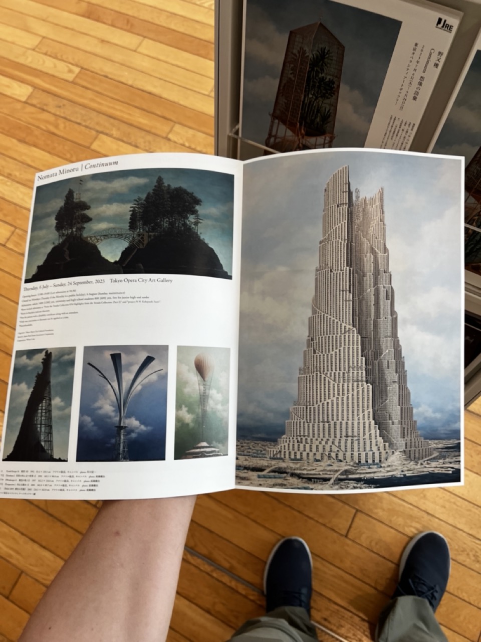
1. Overall Rating (0–10) — 6.0 This photograph captures a quiet, introspective moment of someone engaging with an art catalog, blending the personal with the conceptual. The image succeeds in creating a layered narrative—where the viewer is both observer and participant—yet the shallow depth of field and casual framing keep the focus from fully resonating. The juxtaposition of the hand-drawn, surreal architecture in the catalog against the mundane setting of a wooden floor and sneakers grounds the image in reality, but the composition lacks a stronger visual anchor to elevate it beyond a simple snapshot.
2. Composition (0–10) — 5.5 The photograph is framed from a first-person perspective, which creates intimacy but also a sense of informality. The catalog dominates the center, but the surrounding elements—hands, shoes, and background art—distract slightly, creating visual clutter. A tighter crop focusing on the catalog and hands would improve balance and emphasize the subject.
3. Lighting (0–10) — 6.0 Natural, ambient light illuminates the scene evenly, preserving the textures of the wood floor and the glossy pages of the catalog. The lighting is functional and unobtrusive, though it lacks direction or mood, resulting in a flat, documentary feel that matches the casual context.
4. Color & Tone (0–10) — 5.5 The palette is muted, dominated by the warm brown of the wood, the gray of the catalog pages, and the dark blue of the shoes. The tonal range is limited, and while the colors are cohesive, they lack vibrancy or contrast, which diminishes the image’s visual impact.
5. Creativity (0–10) — 6.5 The photograph’s strength lies in its conceptual layering—showing a viewer absorbed in surreal, architectural art while standing in a real-world space. This duality adds depth, though the execution remains more observational than expressive, limiting its originality.
6. Technical Quality (0–10) — 7.0 The image is sharp in the central area, particularly on the catalog, with clear text and details. Focus is consistent across the main subject, and there is minimal noise. However, the depth of field is narrow, causing the foreground and background to blur slightly, which affects overall clarity.
7. Emotional Impact (0–10) — 5.5 The image evokes a sense of quiet contemplation and curiosity, suggesting a personal connection to the art. Yet, the emotional resonance is restrained by the lack of dramatic lighting or composition, leaving the viewer as a passive observer rather than an engaged participant.
The gallery's architecture itself is a work of art, a harmonious composition of light and space that complements the artworks it houses. With its expansive windows and meticulous design, it's a canvas that frames the artworks within, creating a visual harmony that's a masterpiece in its own right.
As you conclude your visit, the echoes of the artworks and the whispers of history stay with you. The Tokyo Opera City Art Gallery is more than just a collection of artworks – it's a gateway to cultural understanding, an ode to creativity, and a testament to the human spirit's ability to create, transcend, and inspire.
Art's Eternal Melody
1. Overall Rating (0–10) — 7.0 This photograph captures the indulgent joy of a strawberry sundae with a sense of immediacy and intimacy, as if the viewer is about to take a bite. The vibrant pink ice cream and glossy sauce create a visually rich centerpiece, while the hand holding the glass adds a human touch that enhances the experience. The composition is slightly cluttered, and the lighting feels flat, which tempers its overall impact, but the subject’s natural appeal shines through with undeniable charm.
2. Composition (0–10) — 6.5 The subject is centered and well-framed, drawing attention to the sundae, though the surrounding elements—hands, sleeve, and table—introduce visual noise. A tighter crop would improve focus and balance.
3. Lighting (0–10) — 5.5 The lighting is bright and even, likely from overhead indoor sources, but lacks depth and direction, resulting in a somewhat flat appearance that diminishes texture and dimension.
4. Color & Tone (0–10) — 7.0 The palette is warm and inviting, with soft pinks and creamy whites complemented by the neutral beige of the saucer. The contrast between the vibrant ice cream and the muted background creates a pleasing visual harmony.
5. Creativity (0–10) — 6.5 The image captures a familiar moment with a personal, candid quality. While not highly original in concept, the emphasis on texture and human interaction gives it a subtle narrative edge.
6. Technical Quality (0–10) — 7.5 The focus is sharp on the ice cream and glass, with clear details in the texture of the scoop and the sauce. The exposure is well-balanced, with no major technical flaws.
7. Emotional Impact (0–10) — 7.0 The image evokes a sense of comfort, pleasure, and nostalgia—common associations with dessert and shared moments. The viewer is invited into a personal, sensory experience, making it emotionally resonant despite its simplicity.
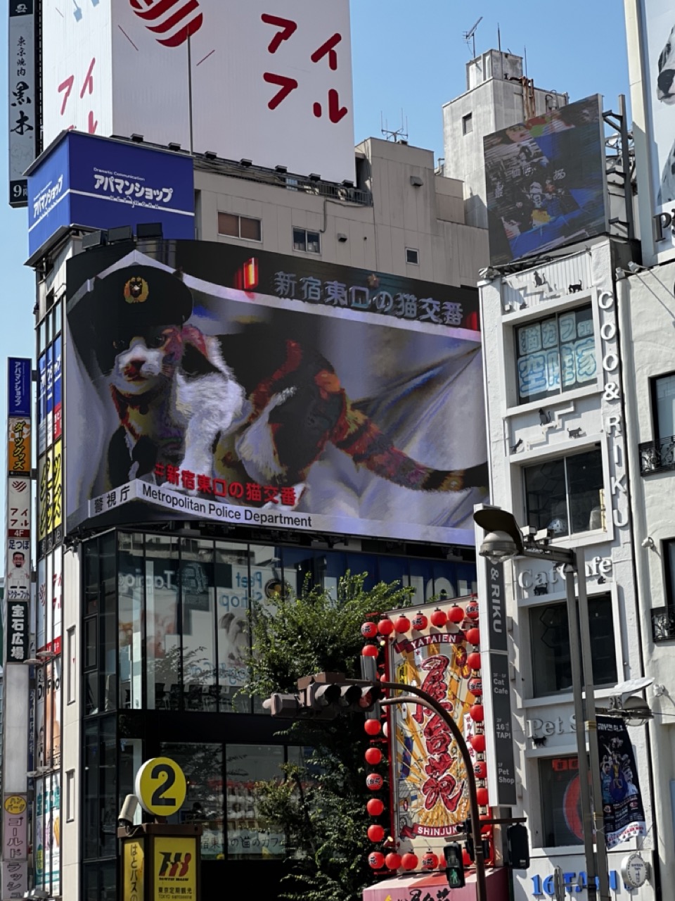
1. Overall Rating (0–10) — 7.0 This photograph captures the vibrant, chaotic energy of a bustling Tokyo street, where urban density meets whimsical pop culture. The oversized billboard of a cat in a police uniform stands out as a playful cultural statement, blending humor and tradition in a visually layered cityscape. While the scene is rich with detail and narrative potential, the sheer number of signs and architectural elements creates a sense of visual overload that slightly undermines cohesion.
2. Composition (0–10) — 6.0 The frame is tightly packed, with overlapping signs and structures creating a busy, somewhat disorienting effect. The central billboard draws the eye, but the surrounding clutter competes for attention, weakening compositional harmony.
3. Lighting (0–10) — 8.0 Bright, natural daylight enhances clarity and detail, casting sharp shadows that define the three-dimensional depth of the buildings and signs. The clear blue sky provides a clean backdrop that helps the colorful signage pop.
4. Color & Tone (0–10) — 7.0 The palette is rich and varied, with bold reds, blues, and yellows dominating the scene. The contrast between the vibrant advertisements and the neutral tones of the buildings creates a dynamic visual rhythm, though some colors verge on garish.
5. Creativity (0–10) — 8.0 The juxtaposition of the anthropomorphic cat police officer with the gritty urban environment is clever and culturally resonant, reflecting Japan’s unique blend of tradition and playful innovation. The image tells a story not just of a place, but of a moment in contemporary city life.
6. Technical Quality (0–10) — 8.0 The image is sharp and well-exposed, with clean focus across the frame. The high resolution allows for detailed observation of the signage and architectural textures, showcasing strong technical execution.
7. Emotional Impact (0–10) — 6.5 The scene evokes a sense of curiosity and mild amusement, capturing the overwhelming yet fascinating nature of urban life in Tokyo. While it doesn’t elicit deep emotion, it leaves a lasting impression of cultural vibrancy and visual absurdity.
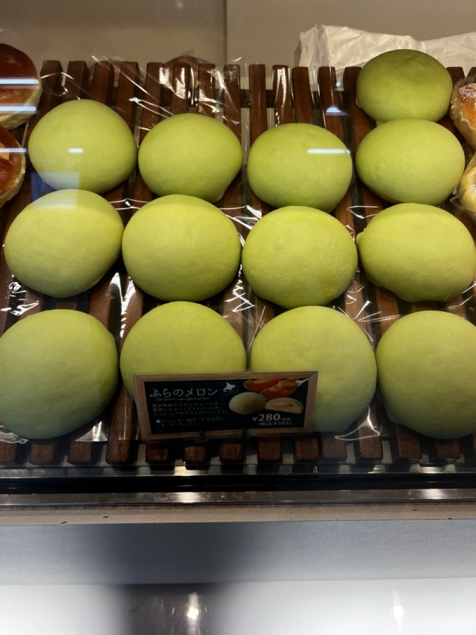
1. Overall Rating (0–10) — 6.0 This photograph captures the inviting stillness of a bakery display, where rows of vibrant green melon buns promise sweetness and softness. The uniformity of the buns creates a rhythmic visual pattern, but the reflections on the glass and the cluttered background slightly disrupt the clarity and elegance of the scene. While the image successfully communicates the product’s appeal, it feels more like a casual snapshot than a polished food portrait.
2. Composition (0–10) — 6.5 The buns are arranged in a grid-like pattern, creating visual order and repetition. However, the reflection of overhead lights and the partial view of other baked goods distract from the central subject, reducing compositional harmony.
3. Lighting (0–10) — 6.0 The lighting is bright and even, typical of a retail display, which ensures the buns are clearly visible. However, the harsh overhead light creates glare on the glass and flattens the depth of the scene.
4. Color & Tone (0–10) — 7.0 The soft, pale green of the buns stands out against the warm brown of the wooden rack, creating a pleasing contrast. The color palette is cohesive and appetizing, though slightly muted by the ambient lighting.
5. Creativity (0–10) — 5.5 The image is straightforward and functional, capturing a product in a commercial setting. While the color and arrangement are appealing, there’s little narrative or artistic innovation beyond showcasing the buns.
6. Technical Quality (0–10) — 7.5 The focus is sharp on the buns and the price sign, and the image is free from major technical flaws. The clarity of the text and the texture of the buns are well-rendered.
7. Emotional Impact (0–10) — 6.0 The image evokes a sense of comfort and familiarity, tapping into the universal appeal of fresh bread. However, the lack of atmosphere and personal touch keeps the emotional connection from fully resonating.
1. Overall Rating (0–10) — 5.5 This photograph captures a straightforward display of packaged crepes in a refrigerated case, emphasizing product detail and commercial presentation. While the composition is functional and clearly communicates the subject, it lacks visual dynamism and emotional resonance. The flat lighting and repetitive arrangement give the image a utilitarian feel, more like a catalog shot than a compelling photograph.
2. Composition (0–10) — 5.0 The framing is tight and centered on the product, but the overlapping packages and cluttered background create visual confusion. A cleaner, more deliberate arrangement would improve clarity and balance.
3. Lighting (0–10) — 5.0 The lighting is bright and even, typical of retail environments, but it flattens the scene and eliminates depth. There are no strong shadows or highlights to add texture or dimension.
4. Color & Tone (0–10) — 5.5 The color palette is dominated by neutral whites and browns, with the yellow packaging providing a slight pop. The tone is consistent but muted, lacking vibrancy or contrast to make the food appear appetizing.
5. Creativity (0–10) — 5.0 The image is observational and documentary in nature, with little artistic interpretation. While it effectively shows the product, it does not convey a unique perspective or narrative.
6. Technical Quality (0–10) — 7.0 The image is sharp and well-focused, with clean details visible through the plastic packaging. There are no technical flaws, though the lack of depth of field limits visual interest.
7. Emotional Impact (0–10) — 4.5 The image feels detached and impersonal, failing to evoke a strong emotional response. It communicates information rather than experience, leaving the viewer with little sense of desire or connection to the product.
As you step back into the vibrant streets of Tokyo, the melodies of the art and history you've encountered continue to play in your mind. The Tokyo Opera City Art Gallery isn't just a building – it's a sanctuary where time travels in strokes of paint and whispers of creativity. Until we meet again, keep your eyes open to the stories told by brushstrokes and the symphonies woven by artistic vision!